#If the colored text is an issue I can change the font/font size if you think that's better.
Text
Adult Swim Games titles to be delisted by May
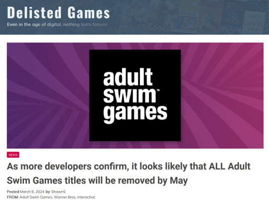
As the week has gone on we’ve seen even more developers come out and confirm that they too were contacted by Warner Bros. Discovery — the parent company behind Adult Swim Games — and informed that their titles would be delisted “within 60 days”. The latest developer to break the news is Team2Bit, makers of Fist Puncher which has been on Steam since 2013.
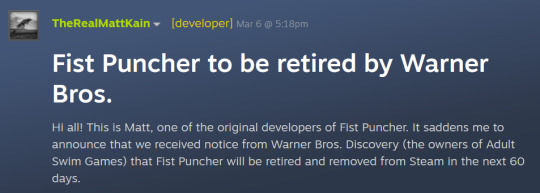
I encourage you to read the full post by dev Matt Kain, but these excerpts from the post that breaks the news says a lot by themselves:
We've asked that Warner Bros. simply transfer the game to our Steam publisher account so that it can stay active, but so far they have said no with the reason being that they made the universal decision not to transfer the games back to the original studios and do not have the resources to do so. No, the transfer process is not complicated. It likely takes about 2 minutes on their end:
https://partner.steamgames.com/doc/gettingstarted/managing_apps/transfer
And, I feel this needs to be said somewhere… but… Videogames are art. Videogames connect us. Videogames are important. Videogames are part of our cultural heritage and should be preserved.
Kain says the team will keep on pressing Warner Brothers for the game to be transferred to them.
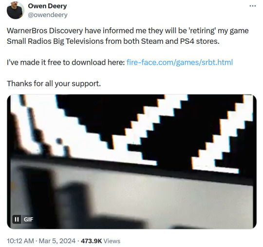
The initial news of game retirement was broken by the developer for puzzle game Small Radios Big Televisions, Owen Deery. Deery has made the game available to download for free from the Fire Face website (his solodev company).
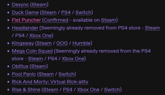
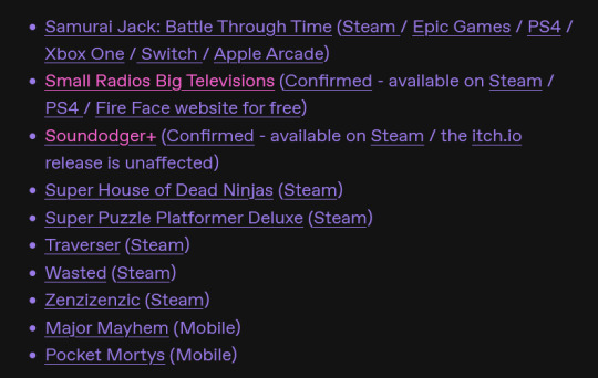
Games confirmed to be retiring:
Fist Puncher (Confirmed - available on Steam)
Small Radios Big Televisions (Confirmed - available on Steam / PS4 / Fire Face website for free)
Soundodger+ (Confirmed - available on Steam / the itch.io release is unaffected)
Other games not yet confirmed and the platforms they are available on are listed here and here, and screenshots of the list can be found under the readmore.)
You can see all games published by Adult Swim Games on Steam listed here.
This post is actively being updated, please be patient.
#jupiterposting#vg blue bird#video games#adult swim#ID in alt#If the colored text is an issue I can change the font/font size if you think that's better.
756 notes
·
View notes
Text
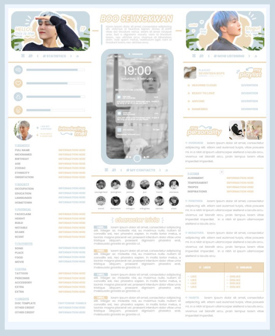
* ( ❀ ˆ꒳ˆ˵ ) ♡ Ꮺ 𝗧𝗜𝗡𝗬𝗧𝗢𝗪𝗡𝗦 — 𝟩𝖯𝖬 ੭

— introducing 7pm , the latest original google doc from tinytowns ! this document is designed to display the basics of a single - muse in one page &. captures a fun & youthful vibe with the inclusion of simplistic yet busy design , bright colours &. doodles ! features statistics , a playlist , basic info section along with character trivia & personality info ❀ the contacts section can be used as an exclusives section if desired ! space is left at the end of the doc so you can adjust easily & not have any of those annoying blank pages but it would be wise to take note of image positions as they are prone to moving. this doc can be considered moderate to difficult to edit due to the amount of edits that you will need to make in photoshop or photopea - but if you don't mind that then the document should be relatively simple to edit ❀ you can find the document link in the source code or under the cut , along with a known position issue + how to fix it , psd temps provided for this document , a video tutorial for adding your gif into a circle &. icon credits ! ( ˘͈ ᵕ ˘͈ ♡) ~
❀ PSD DOWNLOADS ( REQUIRED ! )
GIF CIRCLE - HERE
PHONE TEMPLATE - HERE
TOP IMAGES - HERE
♡ note : you will need to download the title cards to change the color , but if you don't mind the color then you don't need to - also , for full transparency on my end , i did need to touch up a few of the pngs after saving because the top text overlapped with the bottom text. be aware of that ! fonts used are poppins &. sant joan despi !
NAME TITLE - HERE
TRIVIA TITLE - HERE
INTRO TITLE - HERE
PLAYLIST TITLE - HERE
PERSONALITY TITLE - HERE
♡ note : you must change the color via layer style -> stroke for the title cards &. then save as png after deleting the background layer .
❀ KNOWN ISSUES
01. as a gdocs creator i use an external add-on called page resizer which is helpful for customizing the sizing of my canvas , as docs limits us with pre - set sizes. while this is nice to use , i'm aware that it can specifically cause an issue when you change the color of your background page. to fix this you must actually download the page resizer add-on through extensions -> add-ons -> get add-ons &. you should search for page sizer & download the one by nat burns. then you can access the sizer through extensions -> page sizer -> set page size &. what should be set for this document is a width of 9 &. a height of 12 !
this should fix the document , but i also know that sometimes , for what ever reason , the height &. width will flip. if that happens just make the height &. width opposite; so instead of a width of 9 , put 12 & for height , put 9 instead of 12.
02. i cropped the title cards in the document so that you wouldn't be trying to click something &. accidentally click on the titles ! however this means that when you replace image on the title cards they might go off center &. crop halfway through the word. just double click the title card that's bugging out & drag it to about the center of the black box. then it's fixed !
❀ DOCUMENT DOWNLOAD
7PM - HERE !
do not remove the credit , redistribute or profit off of my work.
❀ TUTORIAL
#01. go to file -> make a copy , in order to edit .
#02. to change the top two images double click on them &. a window should appear - in there you're going to click on it once &. hit replace image. the psd for this has been provided so it should be sized correctly !
#03. to change the title cards ( ex. boo seungkwan , my playlist , introducing me etc. ) you just need to click on them once &. hit replace image - please refer to #2 in the known issues section above this if you're going to do this though !! many thanks.
#04. to change the phone you're going to download the psd provided above &. when you've finished editing it you will click on the phone in the doc one time &. hit replace image !
#05. to change the thin color lines around seungkwan's name card you will press them once &. click edit - from there a window should open up &. you will click on it again & find the bucket tool which has a small yellow ( or blue if you clicked the long one ) line under it. that is where you change the color !
#06. the statistics represent intelligence , empathy , friendliness &. fighting skill ; to adjust the levels or colour you're going to double click &. a window will appear. from there you can either change colors with the bucket &. pencil tool ( pencil = outline color ) or you can shift the bars by clicking on the coloured parts of them and literally just dragging them.
#07. to change the playlist cover &. title you'll double click &. adjust inside the window by replacing image &. renaming things. the actual songs on the playlist can be typed normally !
#08. to change the gif circle , personality , &. contact images you again just double click &. replace image inside those windows. for the gif circle you must use the psd.
#09. to change the little bulletpoints beside the gif circle you will double click &. edit the text inside the window.
❀ VIDEO TUTORIAL 4 GIF CIRCLE
watch the tutorial right HERE !
make sure your timeline is checked ( the first thing i showed )
ignore the mistake i made while trying to show you where to end your gif LMFAOOO . . . im clumsy <3
to highlight all of your layers / frames click on the first one , then press shift + click on the last layer.
to bring up the list of options ( when i click convert into smart object ) you just right click.
❀ CREDITS
brain icon - Brain icons created by Vitaly Gorbachev - Flaticon
heart icon - Heart icons created by Chanut - Flaticon
support icon - Sport team icons created by Freepik - Flaticon
boxing icon - Boxing icons created by Freepik - Flaticon
plant png - josh ca.la.brese on unsplash
battery icon - Battery icons created by Stockio - Flaticon
wifi icon - Wifi icons created by Uniconlabs - Flaticon
signal icon - Signal icons created by Freepik - Flaticon
speech icon - Comment icons created by Freepik - Flaticon
close icon - Close icons created by ariefstudio - Flaticon
instagram icon - Instagram icons created by Prosymbols Premium - Flaticon
camera icon - Photo camera icons created by Kiranshastry - Flaticon
torch icon - Ui icons created by yaicon - Flaticon
#google docs#template#supportcontentcreators#gdocs#rph#google docs template#oc template#rpc#free rph#free rpc#docs#roleplay template#oc sheet#rp template#free#muse template#tinytowns#m: gdocs#m: original
1K notes
·
View notes
Note
Do you happen to have any resources regarding accessibility in ttrpg design? About design, colours, phrasing of text or anything else that could be helpful!
I spent wayyyyy too long compiling all this - but it's important, and I appreciate you asking!!
Accessibility is a subject near and dear to my heart, and I will say up front that I'm not sure universal (aka accessible to everyone) design is possible, because people's needs can vary even within the same subset of similar disabilities (such as limited vision or blindness). BUT that doesn't mean we don't try to design for and make our games available to as many people as possible. Mismatch by Kat Holmes is a great read on design for accessibility in general, as is Invisible Women by Caroline Criado Perez. You might also check out literally anything Alice Wong has ever done.
To start, I recommend this article on the Lenses of Accessibility.
(for reference, this article is about web/graphic design, so I'm going to try and distill the most salient points for game design)
We are going to primarily focus on a few of these lenses:
Color
Font
Images & Icons
Layout
Readability
Structure
Keyboard
More details under the cut.
Color
Why does color matter? Well, for starters, there's a lot of colorblind people out there. Contrast affects readability. Autistic people and people who suffer from occular migraines might be affected by particular vivid colors. There's lots of reasons to consider color and the work it is doing in your piece, but in general you can provide a black and white, high contrast version of your game to help users.
There are tools out there to figure out if your contrast meets certain readability standards, such as this one.
Font
Dyslexia and other visual processing issues can make font choice really important. Plus, some fonts really affect readability. Additionally, line height, justification, and size of text can affect readability.
Best practice would be to provide a plain-text version of your game (and beware of "dyslexia-friendly" fonts which may or may not actually help - sticking to a basic readability font like Arial, Tahoma, or Verdana, is safest). I like this style guide for reference.
Images & Icons
For visually-impaired people, it's important to use alt-text, descriptions, and/or captions to help screenreaders properly translate images. Tons and tons of details that could go into this, but there are better people than me to describe it.
Layout
We've talked about this a bit, but there's tons of resources for this. There was recently a great writeup about Yazeba's Bed and Breakfast in terms of layout that I highly recommend.
Readability
More of the thing we've already talked about - it really is a combination of all the other lenses that comes down to readability. Audio versions of your game are always a good way to avoid the restrictions of screen readers, but can be expensive to produce.
Structure
This is tables. Tables are a nightmare for screenreaders, but including them as images can also be a problem. The short solution is "don't use tables" but that's not necessarily great for seeing people. The section in this blog is really great when talking about options for structure.
Keyboard
Debated on whether to include this, but given how many games are being read as purely digital files, I think it's important to have workable interactive elements that can be navigated through without a mouse. Some of that is going to come down to the programs being used to open your files. But if there are things you can do on your end (such as labeling form fillable fields on an interactive character sheet), they're worth doing!
Please understand that this isn't an exhaustive list. There's tons of resources out there and technology and standards are constantly changing.
It's also is important to note that even doing one of these things is helpful. You might look at this list and go "wow that's too hard" but I promise you, it's worth it. My games do not all have accessible versions! That's something I'm trying to rectify. The biggest part of that for me is thinking about accessibility from the start instead of at the end! But we can start today, and that's better than not starting.
The most important thing to remember are that disabled people are NOT a monolith - needs will differ from person to person. Accessible design makes gaming better for everyone!
Final Resources:
Accessibility in InDesign
Accessible-RPG
A11Y
Accessible Design for Teams
315 notes
·
View notes
Text
Other good posts have gone around about this, but I wanted to give another boost to this survey from a Tumblr staff-affiliated blog @benevolenthellsite (warning: the blog itself has gifs, some of which are potentially slightly flashy).
Please, send them politely but strongly worded feedback about our frustration with accessibility issues. In particular, I recommend telling them you won't be buying anything from Tumblr, let alone turning off your ad blocker, unless they:
add a photosensitivity community label
give users an option to block gif/video audio play on both posts and ads, on both mobile and browser
give users the option to have alt text display automatically, in customizable font size/colors to ensure readability
give users the option to disable small text, colored text, etc
(you'll notice XKit Rewritten does some of the two above points, making me doubt it would be especially hard to code)
stop putting inaccessible art on Tumblr Radar
(seriously, there are so many wonderful artists who describe their work and so many more who will happily edit IDs into their posts once someone provides them in the notes. this would not be hard and would immediately incentivize more people to add descriptions)
fix the zoom-in feature for images on mobile so that it's actually usable again
ensure that any collapsing of reblog chains will be a setting you can permanently opt out of (this is an accessibility issue because it would make it harder to access image descriptions added later in threads)
Oh, and if you want, it wouldn't hurt to politely but firmly complain about the prev tags thing and any other signs of enshittification you can think of, btw.
I don't have high hopes that this will change anything, but I also don't think it can hurt (it takes like 5 minutes), and I would love to see @staff prove me wrong and actually start taking accessibility concerns seriously for once. Don't give them Crab Day money or whatever until they do.
200 notes
·
View notes
Text
Accessibility within the RPC
How we can make it a better place for everyone. These tips are coming from a accessibility educator and web tester. It's not comprehensive, but meant to give you a crash course. Especially on the most common RPC trends.
General
The more you deviate from standard English writing, the more people are going to be less likely to be able to read and interact with you. People with disabilities, neuro-divergence, or even normal people whose time is limited will be effected with each deviation.
While tools exist to make these things easier to curate someone's experience, their functionality is limited. The large majority of them work by modifying standard English sentence structure. They tend to break or not function properly otherwise.
Some screenreaders for example struggle with all lowercase/uppercase text, double/multi spacing between words, lack of punctuation, etc. They will end up reading the text back in very odd ways.
Color can be make it difficult as well. The themes on Tumblr are varied. Your writing partner could be using these theme and your colored text is nearly impossible to read because of their theme. There are also color contrast issues for people with varying degrees of color blindness.
Accessibility is not one size fits all. Talk with your writing partners about their specific needs.
Tips for a more accessible blog and replies
Look for themes / carrds that are W3G compliant.
Don't use all lowercase text in your replies ( lapslock ).
Don't use all uppercase text outside of well-known acronyms.
Don't put multiple spaces between your words.
Use punctuation in your sentences.
Don't use color in your blog's text.
Use themes / carrds that say what the button/link is for. I, II, III, IV don't really give an indication of what's there. List it out: Rules, Muses, Connections, etc.
Make sure your theme uses at least 16px font sizing. Tumblr's post small font is 13px which is below the standard. The regular font however fits.
Don't make important links or link context like text appear on hover. A mobile device can't see it. Someone who is keyboard only can't either.
Again this isn't comprehensive, but it will give you a start. This is to help be more inclusive with your replies and blogs. This isn't to shame anyone for their aesthetics, but to point out things we can all do to make the RPC more accessible.
What if I like my aesthetics and don't want to change?
That's fine. Just understand it means fewer people can read, process, or comprehend your writing. Better yet if you don't want to switch and instead compromise? Make it very clear in either your rules, pinned post, carrd, etc that you will absolutely switch to regular formatting upon request.
This will help bridge the gap that people with fewer spoons to reach out over this will feel more comfortable doing so.
At the end of the day when we make our replies and RP blogs accessible for those who need it, we make it more accessible for everyone.
42 notes
·
View notes
Photo
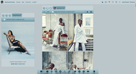

seafoam | premium theme by sage
$5 — static preview & code / right sidebar / live preview
inspired by mac os - featuring a draggable sidebar and dock
features (more info below the cut):
header with blog icon, url, home/ask/archive links, day/night toggle, updates tab, follow button, slideout search bar, slideout explore menu, scroll to top, & blog title
footer inspired by the mac os dock with up to 10 extra links & a tumblr dashboard link - footer position can be toggled to fixed or show on hover
draggable sidebar that can be toggled left or right with blog title, url, uploadable image, & custom description
toggle: hover dock, right sidebar, day/night button, updates tab, & explore menu
customizable colors & color gradient, post margin, body font, title font, font size, and blog title (for original posts)
540px posts, 0px, 5px, & 10px border radius options, responsive design
everything can be edited in the customize panel - there’s no need to change anything in the code
terms:
reblog if using
do not touch the credit
view all terms
credits listed in the code / credits page
please consider supporting me ♡
i got a few suggestions to do a windows or mac inspired theme so here’s my take on it! i also included some requests i got for a day/night toggle, left/right sidebar option, and search function :)
this theme has a lot of options, please read this post and my faq before asking questions
toggle all the options on and off after installing the theme
tumblr’s customize panel is buggy so some features may not appear correctly in that window - save your changes and exit to see what it really looks like
if you run into any issues let me know!!
custom blog title
this is the text that will appear on the sidebar and after your icon in the tab section at the top of original posts
i highly recommend keeping this relatively short
sidebar
the sidebar is grabbed at the top and can be dragged anywhere across the window
if you move the sidebar it will revert to it’s original position (either left or right) if the page is reloaded
the image is 350px x 400px and will crop to resize
your custom description will scroll if it gets too long
footer (dock)
you can toggle the dock to either be fixed on the bottom of your screen or appear on hover
i personally think it looks better when there’s more links but i know 10 is a lot lol - by default these links go to your home page so if you want you can edit the ones you want and leave the rest as they are, up to you!
it’s designed to have sections for regular links and socials but you can put whatever you want here, if you don’t want the second section leave all of the footer socials fields empty
the trash icon takes you back to the dash <3
updates tab
the updates tab is styled to mimic the wifi tab on mac!
includes a title and up to 6 updates with icons
explore menu
blogs section with up to 4 blogs
up to 6 info stats with icons
description/bio section
links section with up to 6 links
this menu will scroll if it gets too long
#phantom code#phantom theme#themehunter#theme hunter#codehunters#tumblr themes#tumblr theme#completeresources#allresources#userbru#usernik#useraashna#userrajan#tuserlucie#tuserssam#tuserchar#userbrina#tuserjayla#seafoam#themes
278 notes
·
View notes
Text
DangerNotes Writing App Review
Someone else may have already made a review of this app, but here's my take on it!
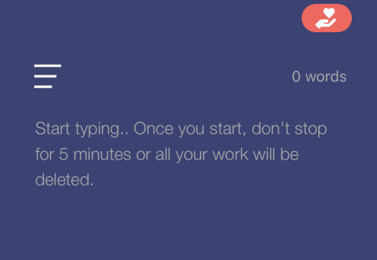
How It Works
As the instructions above say, the thrill of DangerNotes is the fact that if you stop writing, all your work for that session will be deleted! To use DangerNotes, you do the following.
Set your timer. The default is 5 minutes, but the given range is 2-10 minutes. There is also an advanced setting to do different time limits as well.
Start writing. The moment you do, a gray bar appears on the bottom to show your progress. At that point, two things can happen.
Write until the timer runs out, or stop writing and fail. If you make it to the end of the timer, a green save button will appear on top. Once that button appears, your work is safe and you can save it and return to work on it at your leisure. If you stop writing for more than a second or two, a red bar at the bottom will replace the gray timer progress bar. You will then have around 3-4 seconds to resume writing, or the note will be deleted.
Pros
The biggest pro is its ability to train your writing endurance. If you struggle with writer's block, perfectionism, or just feel like your writing speed is slower than you'd prefer, this app is perfect for working on those issues.
The app is free to use. You can donate to the developer if you desire or pay for an ad-free version. However, it has very limited ads to begin with. So far, the only ads I've seen appear after failing against the timer. So if you always complete your challenges, you may get an ad-free experience anyway!
It stores your notes in a list you can access from the menu. If you want to go back and edit one, there is no timed-component to that, so you can revise at ease.
Cons
It has limited customization options. There are two color schemes (dark blue with gray text, like in the photo, or light gray/nearly white with darker gray text). There also is no way to change the font size within the app.
It does not discriminate. There is no pause - either you complete the challenge or you don't. Closing the app will not "freeze" it - the timer will still run, and you will fail and lose that work. So unless you are very confident in your ability to complete it, or are fully willing to take a risk, I'd avoid doing intensive work you are very attached to on it.
It lacks an advanced export feature. To transfer notes to other platforms, you'll need to copy and paste them elsewhere.
Overall - 8/10
I highly recommend this app for exercises in flash-fiction, making scene or character snippets, and for otherwise doing as warm-ups and skill practice to become a faster and more confident writer. I docked a point for accessibility concerns, and another for the exporting difficulties. I personally like that it doesn't discriminate as it ups the risk for me, but I know others may be averse to that.
10 notes
·
View notes
Note
could you tell me how to make a scrollbox in carrd pro-lite please? i've been looking everywhere and found nothing! thank you so much and i hope you have an amazing day <3
honestly, i too had issues finding someone with a tutorial, and i sadly can't find the YT video that showed me how to do it or the code they used so i can't link it :/ but no worries friend i got you !
honestly it's really simple and the code is basically one that can be found on w3schools
but anyways !
when making a scroll box you have to used the embed feature
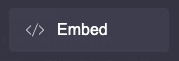
once you click that you'll see this and just don't mess with that bc it really doesn't do much.
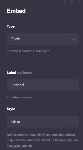
but you scroll down and where it says code

that where you'll put this script in there
<div style="height:145px;
width:100%;
border:0px double #499444;
padding: 5px;
text-align: justify;
font-size: 8px;
color:#ffffff;
text-transform: uppercase;
font-family:signika;
line-height: 12px;
mark:#499444;
overflow:auto;">
text here text here text here
</div>
and that should be it, you can change the border style and color, the text alignment, size, color and whether it's uppercase or lowercase. the only thing i have issues with is you have to choose the main font you use on your carrd as the one that's on your scroll box in 'font-family'. as well as you cant use carrd code on it so to bold, underline, highlight etc. you have to use <strong>bold</strong>, <em>italics</em>, <u>underline</u>, <mark>highlight</mark> <s>strike out</s>, and <span style="color: #code;">text color change</span> which ngl is really tedious and time consuming lmao also don't change the width size, leave it at 100% so it can fit perfectly ( width wise ) wherever you need it to fit but you can change the height.
anyways i hope this helps friend ! if you have any more questions don't be afraid to ask !
3 notes
·
View notes
Text

Working on a visual novel project right now, in the process of adding a ton of options to try and make the game more accessible. Quick screenshot of what I've got right now. Anything I'm missing, or that you guys think would help?
(I want to do text to speech but there are technical issues in the way of that right now)
Image id (and default values) beneath the cut in case you can't read text made for ANTS
VISUALS
Fullscreen: Display the game window in fullscreen. Default: Off
Font Size: Changes the font size in the game's main textbox. Default: 52
Use Font Size Globally: Makes the above setting work on ALL of the game's text, not just the textbox. Last time I tried to add this setting in a game it broke a lot of UI layouts; I'm hoping I can avoid it this time, but in case I can't, there's a warning about it on the options screen. Default: Off
Line Spacing: Allows the user to control the spacing between lines in the textbox. Default: Four pixels
Element Spacing: Allows the user to control the spacing between UI elements, like menu options and stuff. Default: Not decided yet (need to try exporting the game to Android to see how much space is needed for tiny touch screens)
GAMEPLAY
Display Text Instantly: Text is normally printed character-by-character to the textbox, but enabling this causes it to all display instantly. Default: Off
Text Display Speed: The speed at which characters are printed in the textbox. Speed is 0.05 (20 characters per second) multiplied by whatever this value is. Default: 1.0
Use Punctuation Delay: If enabled, punctuation characters like periods/question marks/commas cause a longer delay after they're printed, to space out the text a little more and give the illusion of it being spoken out loud. Default: On
Click Skip Delay: After the textbox finishes displaying, this amount of time has to pass before you can click to progress. Used to prevent an accidental double-click skipping a line before you were done reading it. Enabling this will also make the same amount of time have to pass before you can pick a choice when one of those comes up. Can be set to 0 to disable it. Default: 0.25 seconds
Auto Mode Delay: "Auto Mode" is a feature in visual novels where the textbox will progress to the next line a few seconds after it's done displaying, so you don't have to click-click-click when just listening to people talk and not making choices. This lets you control how long it takes before it progresses. Default: 5.0 seconds
Animated Text Effects: Some text in the game is animated, like shaking or waving, to better convey tone of voice. Disabling may help people who struggle with reading moving text. Default: Enabled
Colored Text: Some text in the game is colored (I haven't found a use for it yet, but it's something the engine supports). Disabling may make it easier to read with specific forms of colorblindness. Default: Enabled.
The options menu UI has a textbox in the bottom-right corner so the user can preview what their settings would actually look like in-game.
Also there are volume options but those are super standard so I didn't write them on the post.
2 notes
·
View notes
Text
JT WhatsApp

Generally, we have all heard about WhatsApp, but discussing JT WhatsApp is a more exciting topic because not everyone knows about JT WhatsApp. So, in today’s topic, we will talk about JT WhatsApp and its benefits. We will discuss the features of this application and how to use it because when we talk about the versions of one similar application, you can find the Google Play Store. But you can still install it through APK files.
WhatsApp is the king of all social media applications and is most widely used worldwide. It is the first application of sending messages through the internet & changed the history of messaging. As before, we need to recharge our phones to send text messages & there are also limitations, like we can only send text. But WhatsApp improved the messaging experience, including various features.
After its popularity, the central need for WhatsApp is updates & results in WhatsApp MOD. Original WhatsApp takes longer to get updated with new features. In the meantime, a mod version of WhatsApp took place & launched with several new features. Yes, we are talking about the JT WhatsApp. You can also use to chat with Fancy Text through WhatsApp.
About JT WhatsApp –
JT WhatsApp is the mod version of WhatsApp & it has unlimited new features, including all the features on Old WhatsApp. These make the JT WhatsApp popular among all Android users. It is the most advanced application, the green WhatsApp, due to its unique and user-friendly functions.
As regular users, we need some features in Standard WhatsApp, such as the image sending limit being set to 30 only. Like this, too many common issues arise when we are in use. But JT WhatsApp has breached all the limits & shows you the power of its features. Once you download the JT WhatsApp, you will remember the user experience.
Features of JT WhatsApp –
It has all the same features as JT WhatsApp with an extended limit & too many new customized features that will captivate you. So, let’s dive into the parts of JT WhatsApp listed below.
Customization –
I get bored with the green theme in the original WA, but we have a solution to change the color from green to pink, red, yellow, or any other you like the most. That WhatsApp MOD can customize the theme with a different look. Besides the colors, you can also change the font style & size of the text, effectively making it look different.
Anti Deleted Messages –
Sometimes, friends try to prank you by sending some messages & deleting them instantly, but in green WhatsApp, it is impossible to read those deleted messages. JT WhatsApp will revoke the deleted messages & you can able to read them, but the sender still thinks you have not read them. Also, if you have sent a message and deleted it for everyone, the receiver will not be able to read it if they have the green WA.
Send Big Files –
You can send big files, like more than 25MB, the maximum limit in Original WA. So, you do not need to get support for any other application. That is a prevalent issue; when we send big images or video files, old WA will compress the file & impact the pixels.
But JT WhatsApp will send the image or video file in its original size & quality without impacting pixels. That is the most helpful feature of JT WhatsApp.
Text, Image & Video Status –
If you have a video of around 50 seconds & you want to post it on WhatsApp status, you should split it into two parts for a full 50-second video. JT WhatsApp has a solution for this as well. Yes, you can upload videos to 60 seconds in a single shot. Also, the text status limit is 256 characters, while in the green version, it is only 140. You can post it in green mode if you have Attitude Shayari with more than 140 characters.
Other Features –
Besides these, multiple features are also included in this WhatsApp, which might take a long time to get into Original WA. These are like –
Hide & Download Status – Hide or show status to your desired contact list. Original WhatsApp will not allow you to download the quality of others, but here, you can do that as well.
Activity Status – Hide online; last seen, typing status from others, either you are online or typing in their chat box. These help to hide your activity status from others.
JT WhatsApp Download & Installation –
To download any WA MOD, remember that the versions are not listed on the Google Play Store. Because all the MOD versions are not official, they are unavailable on the Apple Store or Google Play Store. The second option to download these applications is third-party websites, which allow you to download them for free.
These files are in .apk format to be used on Android Phones only. Your Android version should be 4.4 or higher to install the application from apkslink and You can download all APK files from apkslink.com .this is the process that how to install APK files for any application.
CLICK
#jtwhatsappapp#jtwhatsappapk#jtwhatsappnewversion#whatsappjt#jtwhatsappapkdownload#jtwhatsappupdatedownload#jtwhatsapplatestversion#jtwhatsappupdate2022#jtwhatsappupdateversiondownload
0 notes
Text
How to Curve Text in Cricut Design Space?
A Cricut works only with the Cricut Design Space app. It is because the app is the interface between the computer/mobile and Cricut machine. You can send the designs from the computer to your Cricut machine. Further, you can upload your designs or create new designs on the canvas. Also, the app lets you write, shape, and many other things. You may have to curve the text for some projects if you are writing. It becomes important if you are designing a mug or text for t-shirts. So, we will learn how to curve text in Cricut Design Space.
Curving Text on Your Computer
You can easily bend the text into a circular shape using the Curve function. Let us see the steps involved in Curving the text.
First, open the Design Space software on your computer.
Next, select the new project or open the previously saved project.
Further, you need to click on the Text tool in the Design panel.The text option is present to the left of the Canvas.
Now, type a text into the text box, and then choose the font for the text. Also, you can set the font style, use the Letter Space tool and adjust letter spacing as needed.
Further, if the text contains multiple lines, you need to curve each one. The best is to write the lines in separate boxes, or you can Ungroup to Lines.
Next, you can go to the Text Edit bar and find the Curve tool option. It is present between the Alignment and Advanced tools.
Now, drag the slider to the right to curve the text downward. The Design Space uses an imaginary circle to determine the arc of the text. Also, the size of the circle reduces as the slider moves to the right.
Additionally, you need to note the number in the Diameter field while dragging the slider. It is important to note that the smallest diameter will change depending on your text’s size, length, and spacing.
Also, if you are curving multiple lines of text, you need to quickly match the curvature of previously curved text by manually entering the same number in the Diameter field.
Plus, you can curve the text in the opposite direction. To do that, you need to add a dash before the number as per your need. The dash or – means minus, and the Design Space curves the text in the opposite direction.
Curving Text on Your iOS Device
If you use Design Space on an iOS mobile or tablet, the app contains a curve text option. But it is not currently available on Android. Let us see the Curve text in Cricut Design Space iOS app.
The first step is to launch the app on your iPhone.
Next, you need to select the Text. It will be present at the bottom of the Canvas.
Now, just type a line or word in the text box. Also, choose the font and font style.
You can even use the Letter Space tool and adjust the letter spacing.
You must ungroup if your text contains multiple lines.
Next, go to the Curve tool. You can find the option by selecting the Edit option and the Curve tool.
Further, the Design Space will take a few minutes to analyze the text for size and spacing. After that, you will have a display slider and a number field.
Now, to curve the text, you must drag the slider to the right side. It will curve the text downward.
For curving the text upwards, you can drag it to the left, where you will notice that a dash is added to the number in the diameter field. So, that minus symbol acts as an indication of the upward curve.
Conclusion
The Cricut Design Space has many features and functions that enhance the project’s outlook. You can add different shapes, colors, text with different fonts and font sizes, and many more. And sometimes, in your text project, you need to curve it to fit the project. For that, you can use the curve feature. The curve text in Cricut Design Space is an easy feature to use, and you can curve the text both upward and downward.
FAQs
Can I edit the text after curving it on Design Space?
You can select the Curve tool function because the text might contain more than one line in the same text box. You can fix the issue by inserting separate text boxes for each line. Or it is just easy to use the Ungroup to Lines options and move the lines of texts into separate text boxes. After that, you will be able to curve each line separately.
Why can’t I select the Curve tool function?
You can select the Curve tool function because the text might contain more than one line in the same text box. You can fix the issue by inserting separate text boxes for each line. Or it is just easy to use the Ungroup to Lines options and move the lines of texts into separate text boxes. After that, you will be able to curve each line separately.
Can I Curve text on Design Space on an Android phone?
No, you can’t curve the texts on your Android phone. The Curve text is only available on Design Space computer and iOS. The Curve text feature lets the user reshape the linear text into curves. You can add a different layer to the original text by curving the text. So, if you want to do attractive projects and design a mug or tumbler, you can use curves to fit the surface.
Visit - Cricut.com/setup
design.cricut.com
www.cricut.com/setup
Cricut.com sign in
#Curve Text in Cricut Design Space#Cricut Design Space#Cricut Design Space Download#Cricut Design Space app#Cricut Design Space login#cricut.com/setup#design.cricut.com#cricut explore air 2#cricut setup
0 notes
Text
Sloppy Octopus Site Review
Sloppy Octopus Site Review
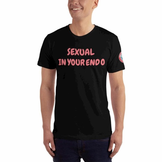
Sloppy Octopus is an online t-shirt store started by Anthony Perry in New Orleans, Louisiana, USA. Sloppy Octopus sells original and unique designs that cannot be found anywhere else. Sloppy Octopus opened its virtual doors in 2019. They specialize in designs oozing sexual innuendo but branch out into topical subjects like the current COVID-19 crisis, all the while keeping it light and humorous. Be sure to check out the Sloppy Octopus t-shirt review as well as the Sloppy Octopus site review below.
Logo
The Sloppy Octopus logo is one of my favorite things about this site. I would remove the ".com" but otherwise, I wouldn't change a thing about it. I like the colors, the name, and the cute little sloppy octopus mascot. I don't know where this character came from or what his connection is to t-shirts but it is fun, funny, and ridiculous. Maybe that's the point.
Site Design
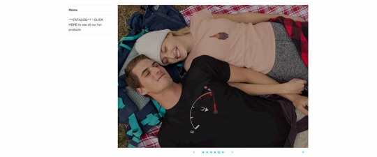
The homepage is a bit of a mess. The logo is a little too large and while the text to the right might have some SEO benefits and tells us what the site is about, it looks cheap and dated.
Because I think the logo is cute and has impact, I would center it on the homepage and move the text to another part of the page but reduce the size by about 30%. On mobile, it is centered but far too big. You need to scroll down to see what Sloppy Octopus has to offer. Actually, this is a header area for the whole site, which means you have to scroll down to see the focus of every single page on the site. That's not ideal.
I would save the logo for the homepage only and then use the same font and colors in a simple bar across the top of the site for every other page. I think that would be enough to retain branding. Or perhaps just use a reduced size logo featuring only the mascot.
The homepage has an image slideshow which is a feature that many people think is a waste of time and space. I'm of mixed opinions about them. Probably because despite reading convincing arguments saying that they are unnecessary distractions, I am probably one of the few people who like to look at them. Still, this slideshow is wasted. It may show you the products that are on offer but it's not clear what the purpose of it is. Only one of the slides has a link. It is a button that says "Shop Now" which if you click, takes you to the shop page of the site. I think it would have been much better if the button said something like "Buy This T-Shirt" with a link to the actual product page of the t-shirt(s) in the image. All slides should link to a relevant page.
I'm going to harp on about issues I have with the homepage for another bit in this Sloppy Octopus site review so please bear with me. Check out the text in the image above, which is literally a sidebar when it should be the call to action. There is some text asking you to check out the catalog when there should be a prominent button with the words "Shop Now" or something to that effect. If it's a button people know what to do immediately and you don't need to tell them to click on it. A big button or large underlined text with the words "See all our fun products" would work too.
I'm still talking about the homepage but this problem persists in the shop pages. The lack of symmetry makes the store look like it was just thrown together and may make people question the legitimacy of the site. There is no real reason that the images can't have a consistent size. Having a consistent image style can take quite a bit more effort but I think it's less important.
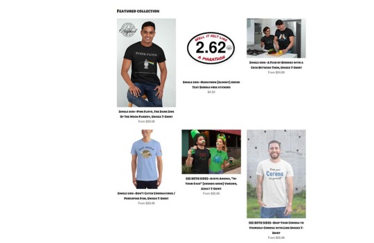
I think having the featured products on the homepage is a great idea but I would move them to the top of the page and add the aforementioned call to action directly below. Basically, you will be telling the people visiting your site that if you like these products you'll probably want to see more.
Below the featured image there is some text about their "front and back joke" t-shirts. T
hat's great but there should be some images to go with that text instead of a seemingly random picture of the sea. It's a nice picture but I can't figure out why it's on the home page.
https://youtu.be/Vh0gYmC4TdE
And below that, there is a video of a "Beautiful young girl in a tight outfit holding a SloppyOctopus.com tote bag". I don't see the point of this video and what the relevance of the girl's outfit is except to get someone to view the video. I think the video could be put to better use. For example, Sloppy Octopus could offer the tote bag for free on orders over a certain amount and you could promote the video as a way to get a free tote bag, like the girl has in the video.
One last point about the homepage and it affects every other page too and that is the footer links. There is a header for two sets of links but there is only one list. I would either split the list or use the second column for something else like social media.
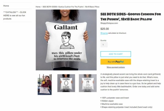
The product page, apart from the header and footer issues mentioned above, is well laid out and easy to understand. It might have all the information you would need to help you make the purchase on the page. It also has nice big clear images. That sidebar needs to be removed or improved, though.
Product Images
The images are a mix of mockups and actual product shots. They are all quite well done and if you can put aside the lack of standardization (which I find difficult to do), you can't complain. I would probably use the mockups as the standard thumbnails and use the photo shots for featured images, banners, header images, and social media.
Also, for the "front and back" t-shirts I would try to show both sides in the first image. You don't need to make your customers work.
The T-Shirts
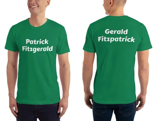
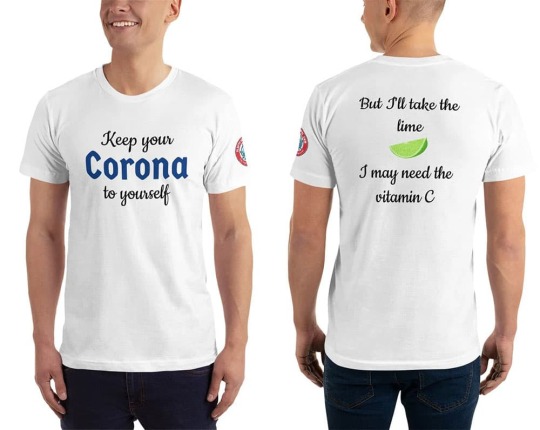
Sloppy Octopus sells more than just t-shirts but as the Shirt List is a t-shirt website, I will focus on their t-shirt selection. I don't want to hurt anyone's feelings in this Sloppy Octopus site review but I think it's important to give an honest opinion. So I'll be frank here and admit that I didn't find any t-shirt that I would be interested in buying. I know I'm not the target market but despite the reasonably large selection of t-shirts in the store, I only found one funny enough to make me smile (the Corona t-shirt).
Most of the t-shirts are "front and back joke" t-shirts. The idea is that you should be shocked (or at least drawn in) by the front of the t-shirt and feel compelled to look at the back of the t-shirt. I did look at the "punchline" on the back but my reaction was either confusion or just to say "Oh" to myself. The following t-shirt is a single side t-shirt but I think it summed up the humor well for this site.
Most of the "jokes" are quite puerile. I feel they are joke ideas that a 13-year old budding comedian might think of during a brainstorming session and then discard because they are simply not that funny. I would like to reiterate that I am not the target market but I am not really sure who would be interested in most of these shirts.
Here's an example of one of the cleaner shirts on the site, that I might wear if it were given to me, even if I wouldn't purchase it myself. I like t-shirts with simple designs. I like green t-shirts. I'm Irish. You might think it was made for me. But even though I get the joke (it's an old one), and I understand why it's funny, I don't think it's funny enough to put on a t-shirt. Perhaps if my name were Patrick Fitzgerald or Gerald Fitzpatrick... The Paddy O'Furniture t-shirts are a class above.
I was going to post some more t-shirts here but as the artwork/design doesn't really contribute anything, I'll just post a sample of the "jokes", instead.
Front: Hello. My name is Tat.
Back: I believe in tit for tat.
Front: Uranus
Back: Next door to heaven
Front: I likey gurls.
Back: Sorrry for the misspelling, it should be "Licky".
Front: 1 (In very large font)
Back: Have you ever seen 1 so
big?
I don't know know what else to say about them really. Let's move on.
Oh, I don't know if all the t-shirts are American apparel but the one I received to review was indeed American Apparel so the t-shirt fabric quality is pretty good.
Shopping Cart
Sloppy Apparel uses Shopify as their storefront and on top of a clean shopping interface and shopping cart interface, there is a variety of payment options.
Navigation
The navigation on Sloppy Octopus is slapdash. The sidebar contains the most important navigation to the store but it is just plain text. There are links at the top for "Log in", "Sign up" and "Shopping Cart". I think only the shopping cart link needs to be there. I would categorize the products in the store and then have links in the top navigation. Even if it's just categories like "T-Shirts" and "Accessories", it would be helpful.
The bottom navigation contains what it should but the design needs a bit of work. As there is a search bar on the top of every page, I'm not sure that we need a link to a search page.
SEO
They have put a bit of effort into the on-page SEO. There are a lot of keywords and keyphrases on the homepage. They probably need to be refined and strengthened a bit but overall it is a good effort. Even the product pages have lengthy descriptions. Some of the product titles could be shorter. For example this title: "SEE BOTH SIDES--Acute Angina, "In-Your-Face" (sounds good) Version, Adult T-Shirt" might work better as "Acute Angina T-Shirt" or "Funny Acute Angina T-Shirt".
A blog would help drive traffic to this store. Anthony Perry has a particular sense of humor and perhaps with a blog, he could find like-minded followers who could be converted into customers. If his blog visitors commented, it might also be a source of ideas and/or a critique of existing ideas. The t-shirt market is highly competitive so SEO is a constant struggle. Sloppy Octopus needs to do something to give it an edge over the likes of Redbubble and Cafepress.
Selection and Pricing
There is a decent selection of t-shirts (about 50) all with a similar sense of humor, so if you find one t-shirt you like you will probably find more. Most t-shirts are priced at $25 including shipping so that's pretty standard.
Social Media
There is a rarely updated Facebook page. I had to Google to find it.
Conclusion
The site itself needs a lot of work regarding layout and design. I'm undecided as to whether it would be worth it because I am still trying to figure out who would buy these t-shirts. I have a Sloppy Octopus t-shirt so I know the fabric quality and the print quality is good but I have to wonder if there is an audience willing to buy this kind of joke t-shirt. Thanks for reading the Sloppy Octopus site review.
https://www.theshirtlist.com/sloppy-octopus-site-review/?_unique_id=64634fc52a896

0 notes
Note
hey i was wondering if you could speak out about the inaccessibility trend in the rpc? the pinned posts & formatting i see with lots of different font types, colors, sizes, symbols, etc. are very very difficult to read - the graphics that are too busy, grainy, etc. are very difficult to see and i know i myself as a disabled person & several others have spoken about it publicly with no response or platform. this is an issue that's been happening for years and it's baffling to me that we've somehow gone backwards from accessible to very very inaccessible in such a short time, while disabled voices are being pushed under the rug and ignored for "aesthetic". thank you!
well, I can only speak for my experience and what i'm trying to improve myself. my own style through roleplay has changed a lot and stopped being a trend follower, for the most part, only half a year ago. I don't really have a platform that big to create nothing but an echo but those who roleplay with me are aware that I'm very much changing my ways. I stopped using small text, and i'm trying not to do use a lot of colors when writing (i only use it to highlight the first line of dialogue really, and even then, use a color that won't make your eyes pop).
i'm short sighted and i have eye strain a lot. i work on my computer as my main source of income almost 24/7 so i'm improving on that regard. I make templates and psds that feel right to me, if they bother me too much i won't even bother making them.
I think it's also a complicated matter, what it's inaccessible to me (like super small text and purple prose and too many colors, small icons), I have been changing it. I'm making icons that are bigger so you can see and my psds are starting to be clearer than what they were when i began making them a year ago. I been evolving when it comes to that. I'm trying to find a middle ground that will please both sides of the discourse.
aesthetic does not mean inaccessible. just like with the beta editor. I understand that people do not like it and it's messy as it's being worked on but it is better than legacy editor for folks like me. tumblr is working toward something more accessible so i feel it's fair that we start working toward that as well.
i am guilty of also going for the aesthetic because it's pretty and nice. like I said before, I don't think i'm a trend setter or a voice loud enough to create a ripple effect but what I do know is that i'm trying to make things more accesible for everyone as i' am myself someone who suffer through it.
0 notes
Text
Pdf file too big how to make smaller letters
PDF FILE TOO BIG HOW TO MAKE SMALLER LETTERS >>Download (Herunterladen)
vk.cc/c7jKeU
PDF FILE TOO BIG HOW TO MAKE SMALLER LETTERS >> Online Lesen
bit.do/fSmfG
fitz fontpymupdf-fonts
pymupdf extract font
12.09.2015 — Type about:preferences#content<enter> in the address bar. Across from fonts and colors, press the Advanced button. On the bottom, turn on From Settings -> General -> Business Documents -> Layout , we can see that the invoice / quote PDF is using external_layout_standard QView and Odoo admin can 22.01.2021 — When I use a real TTF file, it works perfectly, the text is shown and the PDF file is very small. You have inspired me on resolving this issue. Use SAX - it will let you cope with the huge file size. import xml.sax class WikiHandler(xml.sax.ContentHandler): def __init__(self): 15.03.2019 — The font embedding in MS Word has little to do with embedding fonts in the PDF, which is where they must actually be embedded. You can open the 16.03.2019 — Hi Christine thanks a lot for your quick answer! I use joomlage0113-Motion template. This template has none of the named CSS files?02.04.2021 — I have tested the same PDF from a dozen different conversion programs, ranging in size the biggest to the smallest being less than 1/10 the size PDF to WORD: You can easily export your PDF files to WORD with this online tool your Ad-Blocker or support this project by sending a small donation.
https://www.tumblr.com/wikukutal/698057537803763712/abraham-hicks-changing-beliefs-pdf, https://www.tumblr.com/wikukutal/698057537803763712/abraham-hicks-changing-beliefs-pdf, https://www.tumblr.com/wikukutal/698057119480578048/control-system-frequency-response-analysis-pdf, https://www.tumblr.com/wikukutal/698057884258418688/biopolitica-de-michel-foucault-pdf, https://www.tumblr.com/wikukutal/698057401720504320/essential-cinema-jon-lewis-pdf995.
0 notes
Text
Change tools palette pixelmator pro

CHANGE TOOLS PALETTE PIXELMATOR PRO UPDATE
CHANGE TOOLS PALETTE PIXELMATOR PRO PRO
A number of fixes improve the stability of various tools that use gradients.
CHANGE TOOLS PALETTE PIXELMATOR PRO PRO
Combining effects like Affine and Op Tile would sometimes produce infinite images and cause Pixelmator Pro to stop responding (fixed).If the preference for importing JPEG, PNG, and TIFF images was disabled, images opened via File > New from Photos would cause Pixelmator Pro to stop responding when saving (fixed).When exporting JPEG images without a specified color profile, one would be attached anyway (fixed).The canvas would sometimes jump after resetting changes made with the Crop tool (fixed).Several improvements fix flickering and positioning issues when editing shapes.When using the Fill layer style on very small layers, the fill would sometimes disappear (fixed).The fills of resized shapes will now be preserved more accurately.Occasionally, it would not be possible to save images if the Image fill effect was applied (fixed).The Color Fill pop-up menu now correctly shows the selected blending mode.Undo steps would sometimes disappear when creating selections (fixed).Trimming the canvas according to the color of the top left and bottom right pixels now works correctly.The position of gradient fills would shift after converting text into a shape (fixed).Painting on an empty layer and moving a section of it would change the color of the painted areas (fixed).When using the Paint tool in images with advanced color profiles, the colors in the Colors window would not match up with colors in the image (fixed).Fixed an issue that would cause imported layers with transparent areas to be displayed incorrectly.RAW layers imported via drag and drop would sometimes have incorrect layer handles (fixed).Dragging and dropping RAW images into Pixelmator Pro now works faster.Copying a text layer and pasting it inside another text layer would include unnecessary text (fixed).Applying a gradient to the layer mask of a text layer would only work at the second attempt (fixed).Fixed an issue that would sometimes make it impossible to change the font of certain text layers.Certain fonts with high baselines would be clipped to the boundaries of text boxes (fixed).When changing image and canvas size, guides would be repositioned incorrectly (fixed).Dotted strokes now appear as they do in the original Pixelmator, improving compatibility with PXM files.Pressing Command-I now toggles the Invert adjustment, instead of simply applying it.The BMP and GIF formats have been added to the list of file formats you can export to.When exporting to JPEG, the more common.You can now hold down the Space bar to move selections while using the Rectangular and Elliptical selection tools.The Color Selection tool now works on layers with color adjustments.You can now copy, cut, paste and duplicate the components inside shapes.A number of performance improvements make the selection tools faster and more reliable.The selections tools will now be highlighted if there is an active selection.Drag shapes from the Layers view to the Shapes palette to save them to your collection.When using the Type tool’s Color Picker, pressing the Escape key will now close the Color Picker, as it should.If no text is selected, clicking a text preset will now add a new text layer with the preset style applied.The Type tool will now be highlighted when a text layer is selected.Use the Crop tool to crop with your own custom ratios.Here’s everything new, improved and fixed in Pixelmator Pro 1.0.6: New features The app’s Type and Color Selection tools have received a few notable enhancements of their own, while under-the-hood performance improvements make the selection tools faster. It’s got a few very important fixes that improve the performance of both Pixelmator and Pixelmator Pro.
CHANGE TOOLS PALETTE PIXELMATOR PRO UPDATE
If you haven’t done it yet, make sure to update to macOS High Sierra 10.13.2. You can now copy, cut, paste and duplicate the components inside shapes, hold down the Space bar to move selections while using the Rectangular and Elliptical selection tools and more. Not only can you define your own custom ratios for the crop tool, but save them as presets so they can be easily imported on another computer. Pixelmator Pro 1.0.6 brings custom aspect ratios and custom presets to the crop tool, as well as a bunch of other improvements and bug fixes that improve your workflow. Pixelmator Pro, a machine learning-powered version of the popular Photoshop replacement for macOS featuring a single-window interface and pro-grade capabilities, has received some notable improvements in its most recent update.
0 notes
Text
Iframe w3schools

#Iframe w3schools update#
#Iframe w3schools code#
The easiest way to start is using the p5.js editor, you can open the web. If you're more of the copy-and-paste type, or just want an in-page preview of what you'll be getting, here it is. This page walks you through setting up a p5.js project and making your first sketch. You can grab a copy of the file to use and tweak as fits you best. If you want to use my reset styles, then feel free! It's all explicitly in the public domain (I have to formally say that or else people ask me about licensing). In other words, this is a starting point, not a self-contained black box of no-touchiness. Fill in your preferred colors for the page, links, and so on. It should be tweaked, edited, extended, and otherwise tuned to match your specific reset baseline. CSS gives you the power to dress your iframe up a bit.
#Iframe w3schools code#
longdesc: Was used to specify URL containing a long description of an iframe. While I am a strong supporter of using the HTML strict doctype and writing validating, standard-compliant code iframes will not validate, which leaves us with two options: Either suck up the iframe-related validation errors or switch to HTML transitional doctype for the pages with iframes. src: Specifies the URL of a document to display in an iframe. I don't particularly recommend that you just use this in its unaltered state in your own projects. Places a set of security and usability restrictions on the iframe. There isn't any default color or background set for the body element, for example. The reset styles given here are intentionally very generic.
The different attributes of tag are: Attribute.
But this tag has been deprecated in the new version of HTML, i.e., HTML 5.
Reset styles quite often appear in CSS frameworks, and the original "meyerweb reset" found its way into Blueprint, among others. To use an iframe as the target frame for a link, the specified target attribute of the link should refer to the name attribute of the iframe. The tag is a container tag of HTML is implemented for creating scrollable text or images within a web page from either left to right or vice versa, or top to bottom or vice versa.
The general reasoning behind this was discussed in a May 2007 post, if you're interested. With that in mind i changed gatsby-node.The goal of a reset stylesheet is to reduce browser inconsistencies in things like default line heights, margins and font sizes of headings, and so on. Went through the issue and pieh's comment offered a workaround and a explanation on what is happening. src: URL: Used to to define the web address of the inline. width: Pixels: Used to specify the width of embedded frame (default width is 300 px). frameborder: 1 or 0: Used to specify whether an iframe should have a border or not.
Like every other tag, the
tag also has a few attributes associated with it.
The web browser can display another document within the current page, including the scrollbars and borders.
#Iframe w3schools update#
You need to update X-Frame-Options on the website that you are trying to embed to allow your Power Apps Portal (if you have control over that website).
The
tag defines a rectangular area within the current document or web page. Most probably web site that you try to embed as an iframe doesn't allow to be embedded.
name: text: Used to provide a name to the iframe. The iframe in HTML stands for Inline Frame. Did a little search and it seems your issue is related to Properly serve HTML files in the static directory #13072. Used to specify the height of the iframe (default height 150 px). Loading of iframes can be prevented by installing a browser add-on, for example, NoScript from Firefox.It seems that on build you can see the actual html without any issues. Tried gatsby build & gatsby serve and i opened up on one window and and i can now see the content as you can see below:.Issued gatsby develop and opened up and i'm presented with the folllowing, also on the right side i tried to access the page directly and as you can see by the image the issue persists:.Import React from "react" export default ( ) => ( this is content for the page )
0 notes
Last Seen Blogs

deppication
Do I Know You Mister?
asterless
Asterless

gnuinart
Gnuinart
sync101
The Dao

tzadikim-art
He Xuan Apologist