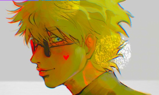
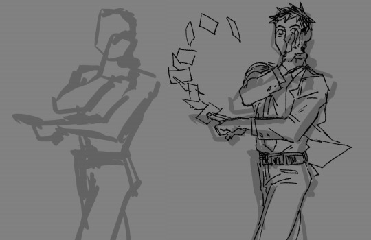
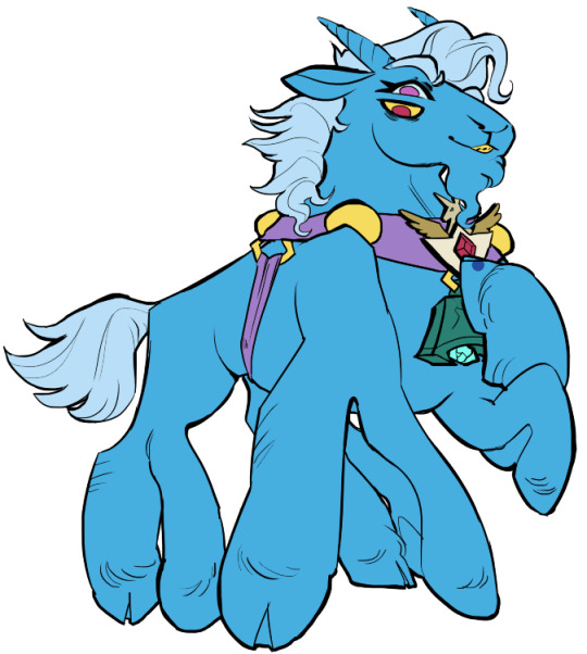
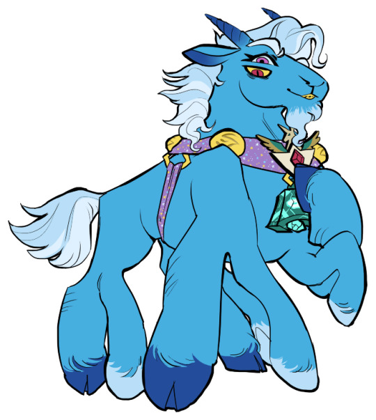
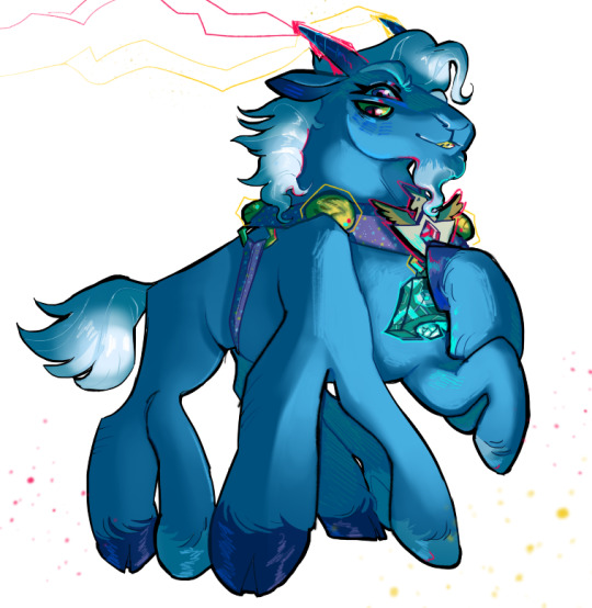
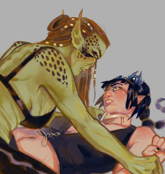
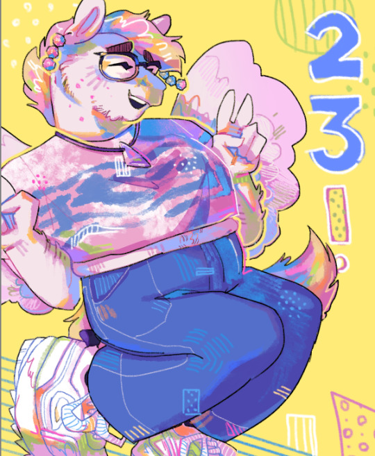
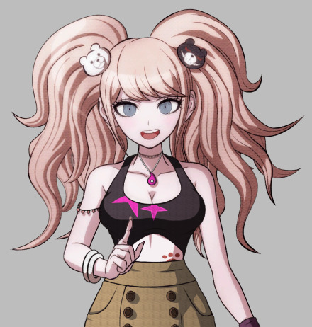
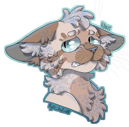
#Hope you like the slightly different artstyle
Note
I MISSED A NAP PILE??


#Ask blog#Ok we're back#Hope you like the slightly different artstyle#Next few asks will be antasma focused#And then we'll go back to The Lore#Antasma#prince peasley#mario and luigi dream team#mario and luigi rpg#ask blog#mario and luigi#mario series
27 notes
·
View notes
Text
+

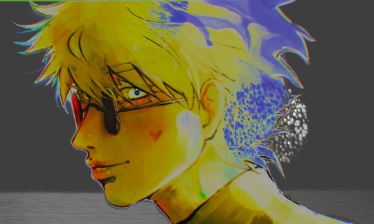
(eyes only 4 u)
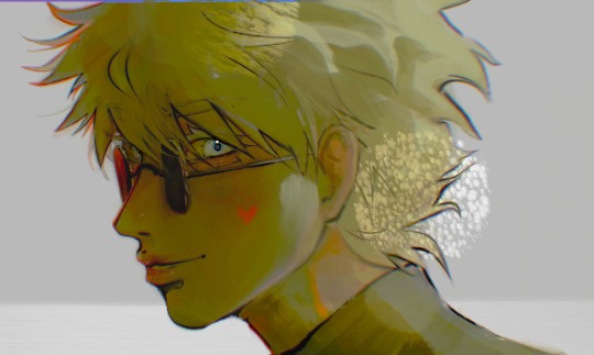
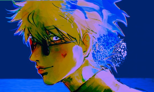
EDIT: HI IM IRRATIONALLY ANGRY AT THIS DRAWING HAVE SOME COLOUR BLORBSIFICATIONS
#crunchy ah (slightly edited for my sanity) screenshot i took from the procreate timelapse#its so different to the 'final product [linked in “+”]' cuz i kinda ended up scratching the whole thing and sketching on top at the end lol#the process of drawing this was PAINFUL (was fighting for dear life against art block at the time)#but while checking the (painful. awful.) timelapse i kinda went 'hm. the eye kinda popped right tho...'#so i took that and went beep boop to fix it just a bit and im posting this too enjoy#呪術廻戦#五条悟#gojo satoru#jjk#jjk fanart#jujutsu kaisen#jujutsu kaisen fanart#satosugu#gojo fanart#gojo satoru fanart#gojo#stsg#and yeah. i was messing with artstyles (and failing and crying-) and still am so... uh hope u like the art and that you can see details tha#make my art mine even when i cant rly see or appreciate it myself lol#that being said art is bound to improve and evolve with time and life so im not too worried ^^ (artblock still sucks tho hah)#+ the glasses are crooked / in a wrong angle and I KNEW THIS WHILE DRAWING BUT WAS TOO DARN LAZY + ratio (YEAH! RATIO!!)
33 notes
·
View notes
Text
OK heres zeno coloring tutorial 2.0 !!!! i'm gonna do it kind of in chapters i guess?
chapter 1: choosing base colors
when i'm choosing base colors i always pick everything based on a specific off-white! my 'default' off-white is this kind of very light cyan color but i change it regularly based on character designs/environment/lighting whatever,, examples here!
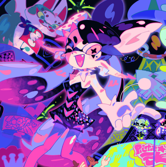
for callie in this piece, i based everything off of this pinkish color! her skin tone, tentacles, outfit etc are all chosen to harmonise/contrast with the pink color

and with this piece, i used a slightly darker blueish color as they're in space but there's still a lot of light... and the lighter colors in the background (the explosion) make a sense of depth i guess? i used that blue color and chose similar cool colors to harmonise with it!
so i more or less base the tone of the colors in the piece off the off-white! warm off-white = warmer colors (like the nova valentine's day art) and cold off white = cooler colors (like the explosion nova and paro art). but i switch up this formula often !!
chapter 2: coloring specific things
here i'll go over some specific textures and stuff like skin and hair ... skin first !!
for skin, i like to use a variety of tones! there are different ways to draw cooler and warmer skintones that other people have gone over way better than i have but basically for skin i use this part of the color wheel and pick the darker tones of oranges/reds/pinks etc. (for darker skintones, i go to the middle of the color square thingy, and for lighter tones, i usually slide down the upper-right side)

when it comes to shading skintones, it's pretty straightforward, just a darkish-purple and a pinkish color on 100% multiply, and i always add a little shadow on the nose and blush becuz i think it's cute
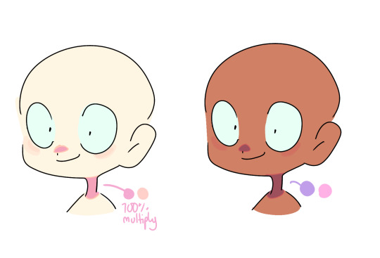
(also i like to add reflective spots on darker skin tones sometimes because 1. darker skin tones reflect in real life and 2. it's fun)

next up is hair... this is very specific to my artstyle but i like to add 3-6 long oval line thingies to the hair to mimic reflection ! it looks cool, it's a good way to show off different colors in the design and i like to switch it up sometimes based on a character's personality!! (like how the frye pic above has a lighting bolt shaped hair thing, or how my teto design has a wing shaped hair thing to mimic her wings in her chimera form!) (note: it doesn't always need to be lighter than the actually hair color and it usually isn't)

for other materials like metal, screens, etc etc... i just add random X marks lol... and reflections!!!

(also, just a general thing, but adding little saturated lines to shading really adds depth and color imo!!)
i would put more tips with refs but tumbles only allows 10 images per post ;w; so i will simply close off by saying don't be afraid to add overlays and filters to your art!! overlays can really help harmonise colors and filters like brightness and contrast can help colors pop... try not to completely rely on them for color choice tho!!
and that's basically it !!! this is not a definitive 'how to draw/color' post... i am not a color theorist... i just wanted to show people how i choose colors cuz a lot of people say they like my color choices! honestly i don't know much myself but i hope that this and the philosophy of 'do what looks good' will help you all o_ob thank you and goodbye
#long post#ah its so freeing to have zero character limit on this site#i did want to add more pics tho 😭#i would make a part two but i dont have much else to say#hope this helps people maybe#also idk how to add a cut/'continue reading' thingy on mobile so if someone could tell me how id appreciate it 😭😭😭
936 notes
·
View notes
Note
i've noticed that some card sets have different styles compared to other sets. Did they ever talk about this or a more in depth explanation about it? I find it really interesting how some cards have a more painty style and how some have a strong lighting and stuff like that.
in some of their blog posts they will talk about stylistic choices, but nothing much on why some sets get to have different artstyles and some just have regular coloring/shading. I don't think they really need to though since it honestly just comes down to "this set is meant to have a retro feel so lets draw it in a comic-like style" or "this one is new year themed so let's make it look like it was drawn on traditional paper". I don't think there's like a specific system they use to decide what sets get different styles and what sets don't.

While some sets before this had used slightly different styles/textures, the first card to use an entirely different style was probably Ena's card from Blank Canvas. Starting from this event there was a trend where the banner card for an event would quite often have fancier art than the rest of the set (compare Haruka's Painful Hope card and Akito's POU card to the rest of their respective sets), but over time this has kinda evolved to just be entire sets having unique art styles. Ena's card being the first one kinda proves the "it's just based on the theme" idea of it.
If you wanna read them, here's all the colorful palette art blogs. They have more information about the stylistic choices and processes behind the card art.
88 notes
·
View notes
Note
Hey Neyla! I hope it’s ok that I ask but is there a brush setting you prefer on procreate? I’ve been inspired by your art for eons but I can’t comprehend photoshop. You can totally disregard this if you don’t use procreate though!
Hello! I don't know how long this message's been sitting in my inbox because i didnt check in for a while 🥺 I hope you get to see this either way!
I don't use procreate unfortunately, but I can explain the settings I use for my brushes on CSP in general, and if it works like any other art software then you should have similar settings on procreate
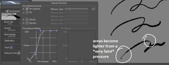
for sketches/linework, I will very often use an opaque & slightly textured round brush. the most important for me is for the brush to have that fuzzy sort of texture that gives the impression of using a pen/marker on paper.

note that i am actually terrible when it comes to line weight, it's definitely not something i work on a lot other than in backgrounds, so I don't actually bother too much with pen pressure settings.
the only rule I abide to is to always set the minimum value above 0 (anywhere between 20-30 is what I use). this is because when I started drawing, I used to be very heavy-handed and would wear out my pens too quickly-- so setting a minimum can help you become more aware of how hard you're pressing on your pen and make gentler strokes.
another fun little setting i use is opacity: like I said, I use opaque brushes for lines, but I like to reduce a tiny bit of opacity when brushing very lightly to give that impression of pen on paper.
There's a couple more brushes I use for coloring or rendering; the major sticking point being that I don't use pen pressure to control brush size that much. If I want to make thinner/smaller strokes, I'll simply reduce the brush size because it's easier for me to control!
(also, opacity is something I'll use a lot more when I'm working on colors)

just know that this is my way of handling it, and it may not suit your style. pen pressure may be another artist's best friend, so please make sure you try out what works best for you :)
finally, some art softwares come with stabilization. I don't use it personally, unless i'm actually trying to do really smooth curves (which is practically never). stabilization can also make CSP lag a lot with higher values and large brushes. the use of stabilization doesn't make you a bad artist or a lazy one, and not using it can make your lines look a tiny bit wobbly if you're not used to doing quick strokes. use stabilization at your own leisure!
on a different note, i know this wasn't part of the question but I'm bringing this up since it's something I tend to hear from people who say they were inspired by my art (thank you by the way🥺💕!!) : don't be misled by artstyles that "make it look easy"! my sketches may look very simple and natural because i'm more adept at bringing out the essential and discarding details in a design. this is not necessarily what you want for your art style; maybe you like drawing details a lot, maybe you prefer the lazy way out going straight to the point. neither are good or bad, only what you like to do matters.
also, if you're frustrated by your work, don't be afraid to draw over it as many times as you want, adjusting things with the lasso tool or deform if something feels off then drawing over again. sometimes you'll be satisfied with your first take, and sometimes you'll need 3 bases before its acceptable (examples below)-- it all depends on your mood, energy, motivation, desired outcome, format, or even just randomness
oh and, sometimes the best way to enjoy drawing..is to find something to obsessively draw (,:
take care!
239 notes
·
View notes
Note
hiii!! your artstyle is SO COOL to me- as in sometimes i'll just stare at some of your pieces because theyre all so great. i was wondering if you were comfortable sharing your process when it comes to art?? i'd love to see how you do things!
Hi!! I'm sorry this took so long to answer, I hope you still find it useful. It means a ton to me that you enjoy my art so much! <3 It's easy to feel discouraged by the Invisible Hand of Internet Engagement, so I really appreciate your ask.
General thoughts (NOT rules, just things I consider or do a lot):
Things that appear one solid color irl can be broken down into multiple colors through artistic interpretation. I see a lot of beginner artists paint trees as solid green, when there's a lot of yellows, blues, and browns in there! A FANTASTIC example of this is jadenvargen, whose color use is masterful and I can only aspire to emulate one day.
Base colors are not saturated; saturation is reserved for pops of color and details
Shadows are purples, blues, and greens
Reference is your best friend!!!
So the nitty gritty for those who want to see: with digital art there's two main avenues I take. The first one is lineart, and the second is painterly. All IDs are in alt text.
My process for lineart pieces:
I always start off with a sketch; for this example I'm using one of my pieces from @/mylittlefusions (that isn't actually posted yet but will be later today) - a Grogar and Trixie MLP G4 fusion. I like to fiddle with brush selections until I get the effect I want, and then go slow on the lineart to make sure it's how I want it, so this can be time consuming!
I've been trying for distinct shapes; I hate when my art gets muddled, I feel like the end piece is less impactful when I don't put in the right amount of contrast and distinctive silhouettes. Just something I've been thinking about and trying to improve.
Then I add base colors, going for slightly desaturated colors. I like to use saturated/bright tones to contrast or draw attention to something. I put the base-base colors down in one layer and then add details as a mask layer:
Then comes shading!! I'm a big fan of a multiply layer set to cool tones like blue, so I usually start there. If I think it needs to be different I can change it later. In this instance, I filled the whole canvas in the shading color as a mask over the base colors, and then erased where needed. Now that the shading is done, I often go back and color the lineart :)
Last but not least is my favorite part, painting on top! The extent to which I do this depends on what I think is needed, but I usually at least paint on top of the multiply shading to add some nuance, i.e. the greener bits on the background limbs. Here I added bright magic outlines to pop from the more desaturated character.
My more painterly style is a different story though! I use the same thoughts about color and shading, but I usually forgo multiply layers entirely and just do colors by eye. I still do a sketch, usually. Here is an example using my Lae'zel / Shadowheart piece.
The sketch is a disaster zone lol - but I painted below it using base tones, again desaturated. Once I feel I don't need the sketch anymore, I keep painting, making a new layer when I feel like being cautious about a change I'm making.

After I feel that I've got base colors down, it's time to get more contrast in using darker and/or more saturated colors! Then, like with my lineart process, I paint more details on top of everything else - reflections, jewelry, body hair, etc. I try to communicate shadow and distance with purples and blues, but I'm still working on it.

Another example real quick, where i did my typical lineart process base work and then painted on top of the shadow layer and the entire piece as a whole:
Thanks for reading if you stuck around, and thank you for the ask, friend! ^^
6 notes
·
View notes
Text
Some thoughts about the new trailer!
below the cut
It's been so long... and finally... it's here!!!!
theories! theories first.
So, it seems like Homura might be doing her own version of the incubator pitch? (become a magical girl and all that) which would mean that she's been doing that part, presumably to keep things stable (to fight off the curses caused by her honestly still not ok soul gem so that madoka doesn't have to awaken perhaps?) I think that the new girl is going to be meant to show that- how things work in this new world, and why they maybe don't. (her outfit probably looks similar to homura's because homura made her a meguca, maybe?)
there's some telephone symbolism, but idk much about that kinda thing. the sounds for it are great though. I noticed that one of the voices over the phone was calling her "akuma-sama" (devil), and though this is absolutley a stretch i'm just going to connect that to my opinion that Homura isn't really a "devil", she just thinks of herself as one (because of guilt, going to catholic school, something something)
the voices on the phone also mention, multiple times, "bring hope". once again, something something madoka, the world is trying to set itself back to normal and Homura wants madkoa to not have to go back to being the law of cycles. the phone also says "release that girl" so yeah.
now! the designs! wow those're different!
I think sayaka's mummy wraps is because of what homura did at the end of rebellion- it's reminicent of the sayaka from the concept movie, so i'm going to assume that's what it is.
but all the other outfits are different too! Mami and Kyoko, the uniforms, everything! obviously, if it's all of this, then it's intentional, and it means something.
everything is almost, but not quite the same- if you saw a silouette, or from a distance, then you could maybe think it's the same, but not up close. the first thing this made me think of was like, the fading of memories? currently, this world is sustained by homura. but if her memory of some things starts getting a bit muddled, then would the things themselves change too? it could also be indicitive of a timeskip of some kind. maybe we'll see high school mami lol.
the last thing! as a tried and true magia record fan, I hope that this movie has nothing to do with it. I don't want it to be influenced by the game, connect to the story, none of it. one thing that i noticed though, was that the animation looks a lot like the artstyle of the magireco anime.
i'm... not really sure about this? mostly because some of the high-intensity action scenes from the magireco anime could get kind of hard to follow, which isn't a problem that the main series has ever really had all that much. it also looks kind of off in some scenes.
but! I'm going to give it the benefit of the doubt. the slightly off artstyle could be like the outfit chagnes- to show that something is wrong here, things are off.
also i love the crazy enviornments and "everything is 7 medaphors deep" artstyle of rebellion. glad to see it make a return!!!!!!! the music is also so good!!!
overall: I am excite!!!!!!!!!!!!!!!
#pmmm#magia record#thoughts#madoka magica#walpurgis rising#i did not proofread this at all#thus why it is under a cut#also there's some very very slight negativity at the end#gonna go watch the trailer on repeat now#watching the trailer while playing homu in magireco; an immersive experience
14 notes
·
View notes
Note
hi there! I'm an intermediate artist looking for a style change, and was wondering if you had any advice on learning anime style art? I absolutely love your style so much!
Hi!
First of all thank you so much! I'm happy you like my art style ;;
Changing a style in an instant is very difficult (trust me I completely changed my style to a cartoon one once, but then slowly went back to anime haha), but the most important thing you need to know is that there's no one "anime artstyle"
There are different ways to draw eyes, features, proportions, etc.
Do you have a favourite style? Or do you just like multiple ones from different artists/shows?
A useful method I found is practicing by trying to copy a style completely, it helps you find out which aspects of it you like the most.
Once you copy multiple ones you can try to combine the ones you like, or even just choose to follow one you liked the most.
It's not wrong since you probably won't stick with it long and your style will evolve slowly no matter where you start.
I'm bad at explaining this kind of stuff because I just tend to go with the flow haha, sometimes I just change my style slightly for a specific piece and that's ok! I started with copying the naruto style lol
But I hope this helps you in a way!
15 notes
·
View notes
Note
please just ignore the incorrect spelling, i did this on my notebook
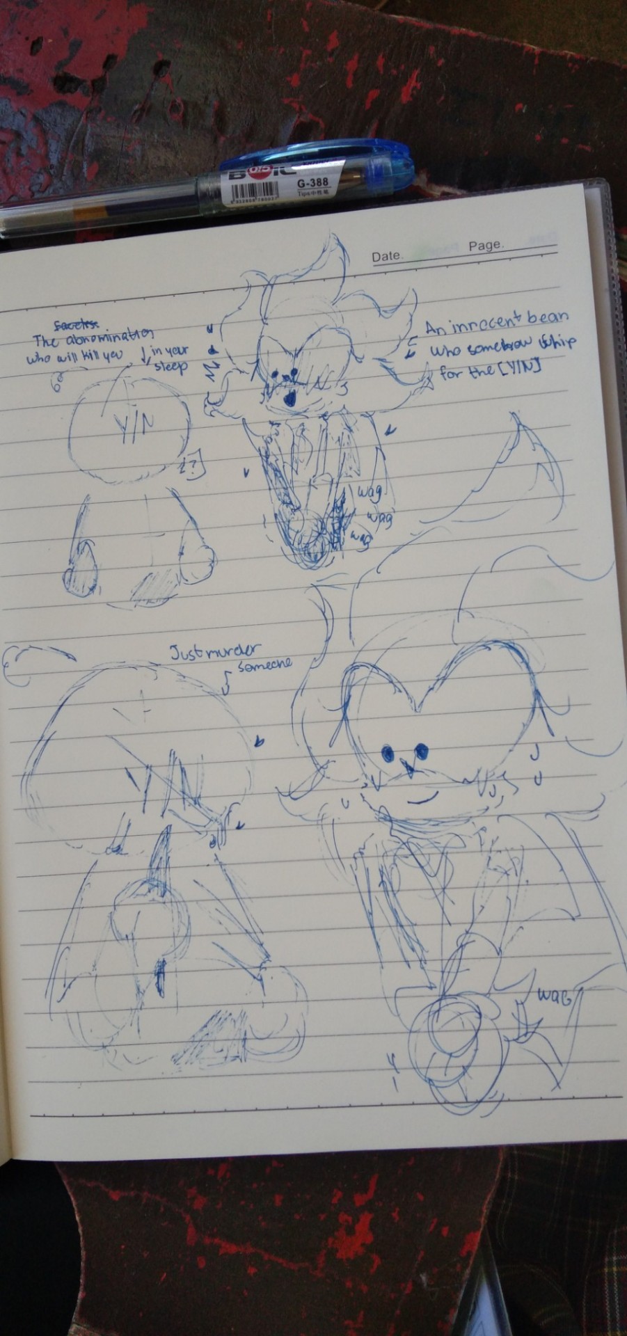
Ah yes. Me, my attempt to blend two different artstyle in one drawing, and my favorite trope.
First, how are you ? and second what's your favorite yandere-darling trope?
For me abomination-darling and (ⁿᵒᵗ ˢᵒ) innocent yandere if you catch my drift?
-𝐣𝐬𝐭 𝐚𝐧𝐨𝐧
Aww! Thank you for taking time out of your day to send me your absolute adorable art dear!
I'm doing alright at the moment dear, I hope you're doing alright & taking good care of yourself, both physically & mentally!
Your rough yet clean style is quite eye-catching, The way you drew Silver is so damn cute! His little tail wags I can't-
Not to mention your depiction Y/N is both incredible & hilarious. I love a good feral/unhinged Y/N, never fails to bring a smile to my face.
As to answer your second question,this can be either platonic or romantic, though I adore a good skeptic/cautious darling who's aware that there is something odd about the yandere's behavior but can't quite put their finger on it until it's too late, I absolutely live for a laid-back/easygoing darling that doesn't mind the yandere's behavior (particularly if it's a romantic yandere), especially if we think of it from the yandere's perspective, initially confused by your lack of fear of their obsession with you & slightly worried that it might be a trick & that we'll leave them. I can just picture, Y/N being just like-
(Laid-back) Y/N: Just don't kill my family or friends & I'll date you/stay in the relationship 😌
Yandere:
13 notes
·
View notes
Note
scene from a dream: the rest of the kids on the ground acting as lookout, hunter and gus looking over a wall, gus just laying partially on top of it, making circles with his fingers like looking through glasses, his legs dangling in the air; hunter standing on top of a bench's back to see over the wall, using actual binoculars
closeup (with "looking through binoculars" effects) on what they are watching, it's a small group of animals in the zoo, voiceover: gus saying "look at that, it's like they're trying to convince us that possums are real", hunter joins in with a "it won't work, even the artstyle is slightly different from the rest"
Dream Hunter, be polite, they came from the amphibiaverse, you know the artstyles don't translate.
I do hope the BI kids see an opossum in the human realm and lose their minds. Opossums are so funny, they're just little guys!
26 notes
·
View notes
Note
How do you make your sprite edits?
Hey! I'm flattered that you're interested, that's very sweet of you <3 I'm sorry if this reply came later than you expected but I thought for this I'd made a small tutorial, so I had to get screenshots for the whole process and stuff ehfuerhgr
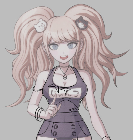
So first, I start with grabbing the DRS bathing suit sprite of the character I want to edit because those sprites have the least amount of detail for me to erase (for this example let's use Junko)

Then I turn the opacity down on her model and start a basic sketch of the outfit design on top of it on another layer. Because the base has a lot of dark lines and details, I change the colour of the sketch to bright red so it's easier to see the difference.

After that, I make a new layer and start the lineart. Because the artstyle uses inconsistent line length, I try to do the same with my lines (a good tip is to see how the line width looks on the original base and try to mimic it on your own lines, it may not be 100% accurate but it'll at least be closer to the original style than if you used the same width throughout)
Then, I add the colours and the shading. This part gets a little complicated, because instead of doing the base colours and the shading on the same layer, I make one layer for the shading and then create another layer for the colours, which I put underneath the shading layer so I can keep the shading consistent (another tip: follow the shadows on the original base where appropriate and then add any extra shadow for stuff like fabric folds. This is especially important if you're editing a female character because of the shading around their breasts)
Next, I go back to the base and edit out any details from the original bathing suit that wouldn't be there with the new outfit (Junko's actually a good example for this, as her bathing suit covers her midsection but my outfit design doesn't, so I would have to edit it to look like it's exposed)
(Another tip is to add shading in accordance to the new outfit, such as the beaded armband in the picture above)
Buckle up for this part because it's a Lot-
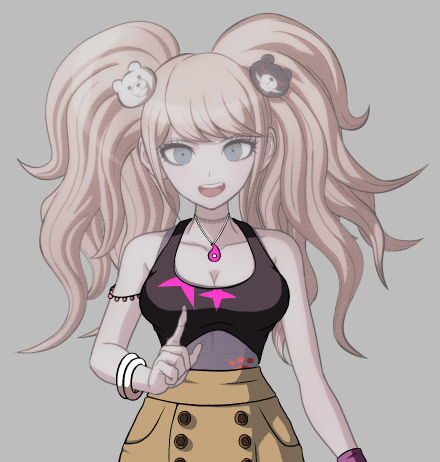
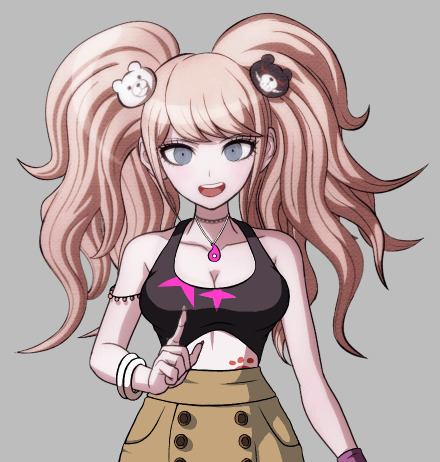
This part might be a little confusing because I realised after taking the screenshots that I might have done the process...out of order? Compared to how I usually do them at least lmao. So what I ended up doing was blurring the lineart and shading layers slightly to match the blurriness of the original sprite, merging those layers + the colour layer together, making yet another layer, choosing a dark colour that fits the palette of the original character and making a circular gradient over the outfit, as the original sprite also has a gradient.

Then I searched for the polka-dot texture you see in Junko's hair and overlaid it with the outfit, resized it, blurred it and set it's opacity to where it matches with Junko's hair as much as possible (thanks @sir-sunny for this tip!)
(The texture that I use is the first result that shows up on Google Images when you search 'danganronpa texture overlay', which was made by JLE42 on Deviantart, who says it's free to use)
Generally I don't name my layers, and I usually delete the obselete ones as I go on, but for the sake of this tutorial I decided to keep them so y'all know what they look like. These are the result of this one edit:
(Before the gradient)

(After the gradient)
After that, I add every layer except the sketch layer together so it's one image (depending on the layering, I have to add certain layers in different orders so the last image is as neat as possible)
And there you have it! I'm sorry if this got hard to follow, this is my first real tutorial and I'm extremely bad at articulating myself efhiuerg. I hope it's at least enough for you to get an idea of how I work!
(Any messy bits I intentionally left in because the THH sprites are messier than the other games and I wanted to replicate the style as much as possible)
(Program is Firealpaca btw lol)
#Danganronpa#Danganronpa sprite edit#Sprite edit tutorial#Tutorials are harder than I thought :')#Still kinda fun tho!!
49 notes
·
View notes
Note
heyyyy!!! i was wondering, do you have any advice on making heavy stylisation look good? I really like your art style and I want to stylise my art in a similar vway (obv not actually copying) but it looks weird. how do you make it good? ( i'm sorry if you don't do asks like this pls feel free to ignore my stupidity )
hmmmm i think i kiiiinda get what ur tryna say but im also not very smart so if i answer this wrong then i am sorry 👍 also this is rlly long sorry again LOL
when it comes to heavy stylization you can be pretty free as long as you make sure the thing u drawing is still recognizable as what u want it to be, so maybe if u struggling with people not being able to tell what ur drawing, ask them/ur friends how to make it look like what ur tryna draw. if that makes sense.
u also gotta keep the MAIN things that represent what ur drawing. like. whats the first thing u think of when u think of it, for example: when i think of cats, i think of long tails, unique faces, and funky poses. so when i draw a cat those are the things i KNOW i NEED to add or else it wont make sense. when i think of a dog, i think of expressive eyes, big mouths & snouts and strong legs. when i think of birds i think of very different beaks and lots of types of feather patterns & colours. that makes sense? i think? if u arent sure what the thing ur drawings main things are, LOOOK AT REFERENCES!!!!!! LOOK AT REFERENCES EVEN IF U KNOW WHAT UR DRAWINGS MAING THINGS ARE ACTUALLY!!!! TRUST ME, IT HELPS!!!!!
when it comes to MY artstyle, specifically when i draw cats, i always like to make the head the most interesting part. the head is the beginning, where i start. the head can either be a circle or a square, with a little chin added to the bottom. then on the cheeks i add the fur. the fur, imo, is one of the things that can either make or break a good design. if you make a soft, kind, motherly, cute character spiky and over detailed, people wont recognize it and it wont make sense to then, so u gotta make the character soft and round. the ears are… the ears. they are simple in shape, but strong in the emotions they convey. to me, ears down means sad, ears back means angry, ears pointed up mean interested/shocked and then a relaxed looking ear means. they are relaxed. i try to over exaggerate this alot because it helps the character show their emotion better
the face of the character is the hardest & most important to me. the size of everything on the face is very important; younger/ “cuter” characters have bigger eyes, and a less detailed muzzle while stronger/menacing characters have small eyes, a bigger muzzle & more detailed facial features. i LOVE to use eyebrows to exaggerate the emotions the character is feeling. thats also why i believe the eyebrows are one of the MOST important parts in ur art, because just changing them slightly can alter the entire way a character looks. the nose is. idk the nose is the nose i dont add anything special to it other than in i want to make a character look bratty/mad i add a little…. uhhhh… line above the nose that looks like snarling ??? i hope that makes sense. the mouth is also pretty important. i like to make the mouth extra big and think about the way a HUMAN mouth expresses emotions, instead of a cats. try not to add too much detail to the inside of the mouth aswell, UNLESS your trying to get that to be the main thing people look at
for the body, you can be pretty free with the body, ESPECIALLY when its a cat. remember this; cats are VERY flexible, so u can have alot of fun with the pose. ive seen alot of artists sketch out their poses with boxes and circles, but imo, it makes the character look stiff (unless its a person). try to sketch your cat with lots of curves, less sharp angles (unless thats what ur going for), DONT draw the fur in your sketch; it wont help and will probs just confuse u. body SHAPE is also rlly importan. similar to what i said earlier, if u draw a cat whos meant to be muscular and menacing and big, drawing them with soft, little legs and a small, round body will confuse the person looking at ur art. cat bodies irl are kinda all the same but thats BORING so u gotta mess with it. make legs and necks tall and skinny, make neck fur way too big and make ur cat look like its a body builder, make it look like a munchkin cat. HAVE FUN WITH THE BODY!! thats all im tryna tell u here. if u limit urself to realism, you’ll never develop your own special artstyle. youve gotta put a bit of creativity into ur art, yknow? make u cats look like theyre from a cartoon! make it look like a kid did it! who cares!!!!!
other important things u gotta watch out for; you MUST. size the body up enough that it looks like it could hold the head. what im saying is try not to make ur cat look like a funko pop (unless thats what ur going for then thats fine). you can still make the head big, but dont make it look like a toy (like i said, unless thats what ur going for). and when it comes to patterns & fur colours, i like to try to make the patterns look semi-realistic but i go CRAZY with the colours. ive found no matter what colours u give ur cat its probably still gonna look like a cat, so have fun!!!!!
i hope this sort of makes seense ?????? if it doesnt then im sorry
24 notes
·
View notes
Photo
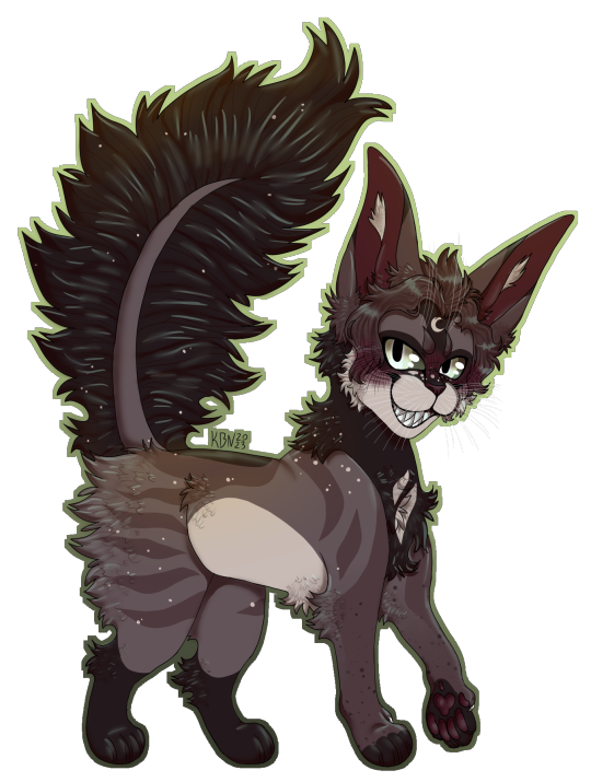
just an art dump! sorry it’s so long, i’ve done a LOT of art since my hawkfrost drawing i showed you here a while back-
funnily enough none of these characters belong to me, either coming from commissions or as art payment for, like, designs and stuff. some of them are from as far as, like, 2-3 months ago, so if the artstyle is slightly different in some that’s why.
If you’re interested in my artstyle, enough to want to commission me through paypal or points, just message me and we can get talking! i need to update my carrd so i’ll tell you prices there pal. ^^
hope you the post, have a good day/night friends! see you in, like, the next 3 months lol.
bye bye!!!
#commission#digital commisions#art commisions#art#furry character#character art#cat#cat art#furry commissions#furry#furry community#furryfandom#cat character
3 notes
·
View notes
Note
Do you have any tips for pmd sprite editing?
hmm yeah i got some. unsure if my explanations will be good without visuals but ill try my best
first things first is that you can edit these sprites on pretty much any art program, just as long as it has a pencil tool (or any tool that can make singular pixels w/o changing colors or creating extra pixels around it). i used ms paint for the longest time to do this, and it's pretty great for sprite editing if you don't mind the lack of layers and lack of transparency. spriters resource is pretty much the best way to get pmd spritesheets, and while they don't have every single asset in the game, they come pretty close.
as for editing overworld/dungeon character sprites, i usually choose a base to reference off, so that im sure i can replicate the artstyle. (for example, i used the treeko sprites as a reference for my snivy sprite) these sprites use pure black for their outlines, but if you look closely, not everything is outlined in black. there are even some sprites that are not completely outlined around the edges. it's mostly a lot of looking closely at a lot of different sprites, but eventually you do recognize similarities between different pokemon sprites (how they're stances, how they move, etc.).
portrait sprites are something that ive still yet to replicate perfectly, because they work really strangely. they have a lot of seemingly random greyish pixels in them, the outlines are not completely black, and the colors change with each emotion. it makes me wonder if the portraits were drawn in a larger size and scaled down instead of drawn point by point like the overworld sprites. here are a few things ive noticed though:
1: the change in colors between emotions seem to reflect the background color of each emotion. (happy will have slightly more yellow colors, angry will have slightly more reddish colors, and so on)
2: while the greyish pixels are seemingly random in their placements, they will always be around outlines and color changes, and they will typically be one of three or four colors.
3: the main outline on the character will have the darkest shade of grey/black in the middle of the line, with the lighter shades being placed around that line. however the dark line will not always be complete, meaning there will be lighter grey pixels in the main outline, if that makes sense (it's hard to describe without a visual)
basically, with portrait sprites, you have to pay super close attention to what color things are at all times.
if you're creating a brand new sprite, it's a good idea to sketch out what you want it to look like first. it doesn't have to be neat or anything, just as long as it helps you know what you want to make.
as for backgrounds, i haven't attempted one in a very long time, but it's important to note which game you want it to look like. the backgrounds for the 2d pmd games change artstyles depending on what game you're looking at (in fact, the added backgrounds for explorers of sky have a different artstyle from the ones originally from explorers of time & darkness). i have never tried creating a whole new background yet, so i don't have many tips to give for this sadly
anyway sprite editing is very fun and i hope at least one of these tips will be useful lol
22 notes
·
View notes
Text
Thoughts on rewatching FMA CoS for the first time in around a year:
Love the beginning. Prime 03 comedy
The CoS artstyle is undoubtedly my favorite art style in any version of fma (I know it's really close to the regular 03 art style but They Are Not The Same. The reason all my art has those lines on characters' cheeks is from seeing CoS)
The gender envy I get from waistcoats in general combined with the gender envy I get from Ed... Yeah......
Like the continuity of Ed being absolute shit at driving a tractor in 03 and being no better at driving a car here <3
Why is Ed taller than Mustang when they stand next to each other in the opening???
"Just an old habit of mine" I hope Edward knows I care for him
The audio's timing is slightly off in the YouTube version of this and it's really starting to bug me. I really CoS was on Netflix
It makes absolutely no sense that Noah can see ppls pasts by touching them when no form of "magic" (alchemy, Envy's shapeshifting, etc) works here
I've talked before about how much I love quietly sad protags (Jon, David 7, etc) so CoS Ed is really getting to me
This movie has so many side characters who I want to punch in the face (Hughes especially)
I am once again Caring Too Much about/for Envy but this time I think I have more justification than other times
This movie has a lot of new plot stuff that simply can't bring myself to be interested in
Idk why the wiki theorizes that Eckhart is alternate universe Dante. Logically alternate universe Dante would've died like 400 years before this
Wrath!!!!!!!!!!!!! :)
Hm my feelings on Alfons are mixed. Like. I do know that the fact that he let Noah live with him and was kind to her indicates that he definitely doesn't hold nazi beliefs or anything. And I do realize that since his goal in life was so niche/expensive working with the Thule society was probably the only chance he would get to fufill his dream (especially given the economic recession, and his lung cancer). But still his choice to ignore Ed's warnings about them along w/his "showing them Germany isn't beaten yet" line is Not Great
I feel like Lang's "maybe I'm trying to avoid being forced out of my dream" line could have some sort of wider plot symbolism relating to either Ed feeling like this world is a dream or Alfons' dream of building rockets but if so I'm not good enough at analysis to understand it. Maybe I'm overthinking and it only means what it seems to tho
Wrath doesn't seem to use alchemy at all during his fight with Gluttony??? Did he lose that ability when he lost Ed's limbs or something???
Speaking of Wrath's fight with Gluttony. I'm so sad it's unreal.
On a different note though. I don't think it would make sense that Wrath would get to see Izumi again given the precedent for how the gate works it's not like she had just died a few minutes before like when Al brought Ed back or anything
Also. Did the ppl animating the bit in the gate just. Forget how CoS Wrath looks. Bc in the rest of CoS Wrath has automail and looks noticably older bc of the timeskip, but in the gate he looks 13 again and has his limbs back?????
Ok I'm going to stop trying to find things to nitpick about Wrath's death simply bc I'm upset that he died. Back to your regularly scheduled reactions
...So time to be upset about Envy's death instead! Literally wtf was CoS thinking by reducing him to a plot point and then killing him off like that?!?! I know Envy's a terrible person but like. He got treated like a lab rat and experimented on by literal nazis for an extended period of time. I think some sort of vengeance for him is called for
It's sort of like my thoughts on the Slicer brothers ig. Like yeah you suck but the punishment really doesn't fit the crime and they had no right to do that to you.
Wrath's death makes me so sad and Envy's makes me so mad I'm generally just suffering rn
I really wish Noah could've gotten through the portal. Obviously Amestris is no Shamballa like she thought but still
"Welcome home" The dramatic irony of this when I know full well how CoS ends 😭😭😭😭😭😭😭
CoS really said, "Oh, so Al lost all his memories of the traumatic things that happened to him in armor? Guess we'll give him new traumatic experiences to make up for it!" (Seriously though Alphonse doesn't deserve this he's 13)
Why can the gate be opened from just one side but has to be closed from both
CoS's and TMA's endings reminds me of each other and theyre both bittersweet in a way that rips my heart out
The way CoS ends is so plothole-y but still makes me so emotional
9 notes
·
View notes
Note
I know it's mostly a fandom joke because of fate's general artstyle, but if marisbury really was a "romani face," do you think it was hard for olga to be around romani for that reason? it nagged at me, since romani was portrayed as oddly distant in olga's perception of him, and it reminded me of how marisbury was always so calm and smiling, but also nearly unreachable to her. idk, they just seemed to be in oddly similar from her point of view? made me think (love your content by the way! I hope you're having a good day!!!)
(Thank you. I am. I hope you’re having a good day too!).
Hmm. I was mostly surprised Olga didn’t have a grudge about Marisbury’s obvious special treatment toward Roman (perhaps the mangaka forgot or she wasn’t around Marisbury enough if she visited Chaldea to perceive it). I think Olga’s perception of him seems fine. Not sure if it’s about his potential similitude (he tried to argue once, for example, while Marisbury was this perpetual distant idol). He’s the sole character that she doesn’t perceive has a negative impression on her (even in the end where even Lev got that, Roman appears to remind her Mash wouldn’t do that) which demonstrates that Olga never actually perceived Roman against her, although she decided to distance herself from him and Lev slightly due to their bond with Mash. But you can see he tried to reason with her and advise her, but she refuses him. He’s not the type to pry when someone else can do it. Lev giving her medicine from Roman in Turas Realta is an example, he probably trusted Lev because he was able to reach out for her better than he did, although he always had an eye on her mental and physical health (as seen in Camelot and Fuyuki).
Perhaps it’s because he’s warm and laid back that often people forget that Roman was the type of who was “friendly to everyone, but nobody’s friend.” He distanced himself from other people because of the vision he saw and his ever-increasing paranoia put a barrier between him and other people since the beginning. He also has a deep self-loathing and guilt (about things out his control mostly) to the point he thought it was natural for people to hate him, and this was internalised into him which demonstrated in his self-destructive way of life. He felt worthless. I think his regular temperament must be similar to Solomon (based on his description): peaceful, cowardly, easy-going, easy to be loved by the ones who work for him (without any supernatural bias as Servants did) but that still behaved the same (with an extra layer of a clumsy loser). He really closed himself off unless the other person would invest in breaking his walls like Da Vinci did (his personality is a little different when he interacts with her or Merlin, because I think that’s his temperament as the human Roman), or unless he felt a connection toward them like Mash too (I think Roman projected his issues onto her as well). In a way, he didn’t ‘raise’ Mash but actually both becoming humanised through their bond. Roman was sincere and frustrated about his limited emotions at the time, that’s why he was unfit to be Mash’s “senpai.” He cultivated them slowly in that decade he lived, but still considered himself worthless and stripped himself from the freedom and enjoyment of his second human life (that’s why Da Vinci said his existence was “hell”). That’s why it wasn’t surprising he was caring and cordial but always at an arm’s reach. That’s how Romani was, actually.
12 notes
·
View notes
Last Seen Blogs