#Composition Scheme Impact
Text
Casual analysis of graphic design and composition (ft. a bit of colour theory) since I’m a bit rusty and haven’t thought about them in a while
Hm? Some shots in Al-Haitham’s and Kaveh’s demos share a similar composition…
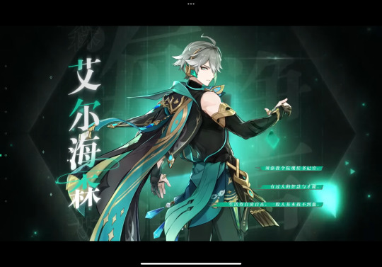
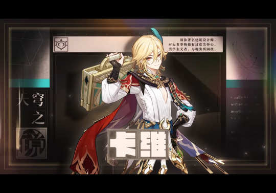
But it’s interesting that the more logical one uses informal symmetry in his character title card and the more emotional one uses formal symmetry… So many rectangles in Kaveh’s card (‘course it helps that hanzi characters are in squares)… It’s kinda surprising, but still it brings out the flow of the illustration well. (Of course, Chinese hanzi can be read horizontally or vertically, so they’ve more freedom in typography, but I bet they changed the graphic layout a bit for the English demo…)
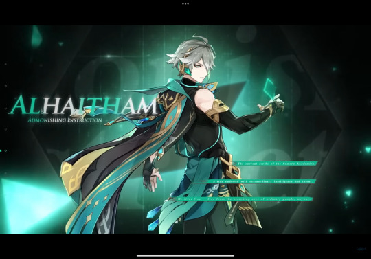
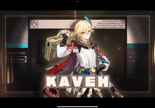
hah, yeah, I thought so. See how Kaveh’s cape can’t frame the center boxes anymore, and how there’s no space to the right of the synopsis in the upper right, and most of all how the two squares on the bottom left is now a quarter of the original size, leaving an empty space there (though if they rotated the words vertically it could fit into the rectangular space well).
Al-Haitham’s English title card isn’t bad, per se, but they could’ve put some shadow on the left side of the illustration so the text could stand out, and move the three green lines to the right side a bit more, so not everything is slightly to the left side when there’s no reason to. (The negative space on the two sides in the Chinese version is roughly the same size.)


These two shots are both long shots that show the character’s full body, but Al-Haitham is in a slightly low angle, and Kaveh is eye-level with the “camera”
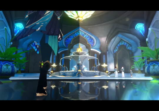
This one’s another low angle full shot with Al-Haitham’s lower body, with a bunch of analogous colours. Also this one’s background uses formal symmetry again (even reflecting off the ground) while the placement of the characters are in informal symmetry (the large image of Al-Haitham balances out the small figures near the fountain)
#procrastinating… on syntax assignment#Al-Haitham would probably tell me to go finish it#but. if their models have dark skin#to reflect their inspirations#of the Arab mathematician and physicist al-Haytham#and Iranian mythological figure Kaveh the Blacksmith#then their title cards have to use different colours since the official colour scheme#(the value contrast) in the demos ride on the fact that the characters are pale-skinned#in other words#the illusts stand out against the dark background because the characters are pale-skinned#dusk analysis#Genshin impact#kaveh#genshin kaveh#composition#art composition#graphic design#al haitham#al-haitham#alhaitham#genshin alhaitham#genshin analysis#long post
40 notes
·
View notes
Text
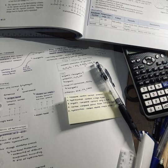

human resource management pt.1
currently revising for my business exam tomorrow, so here's an explanation of each human resource management topic. (i have found that translating my chaotic notes into tumblr post format is super helpful for revision).
but nene, what is hrm?
human resource management (hrm) refers to the process of governing a business's workforce.
there are many hrm topics explored in ibdp, and i'm going to explain some of these topics with their definitions, and features.
demographic change refers to the shifts in the composition of a population over time. this could be age-structure shifts or shifts in a population's educational attainment. advantages of age-structure shifts include having a more experienced workforce, and the ability to provide work mentorship opportunities. negatives of this include workforce aging, skill gaps, and increased healthcare costs.
a skill gap means that employee performance and productivity may be hindered, which can impact the overall organizational efficiency. companies with skill gaps may struggle to keep up with competitors who have a more skilled workforce. this means demographic change can negatively impact business growth.
additionally, a business may have to deal with increased healthcare costs. a company may choose to invest in employee wellness programs (preventative care) or create negotiations with healthcare providers to combat this, and save wasted finance.
another hrm topic is employee welfare, which refers to the well-being, health, safety, and overall quality of life of employees within an organization. this is relevant since employee productivity is directly linked to employee welfare. features of this topic include good working conditions, benefits, health and safety measures, work-life balance initiatives, and paid leave.
advantages of an employee welfare focus include greater employee satisfaction, greater productivity, increased employee retention, and a better reputation for the business. investing in employee welfare seems like a no-brainer, however, these schemes require capital - which can be a burden for small businesses.
furthermore, when employees leave the company- the current scheme is redundant. the business is also faced with the challenge of creating a better scheme than its competitors.
one solution may be to invest in flexi-time (another hrm topic). flexi-time, short for flexible time, is a work arrangement where employees choose the starting and finishing times of their workday. the features of this topic include compressed hour times, working from home, and job-sharing.
flexi-time promotes better work-life balance in employees and allows for reduced commuting costs. the employee keeps their full pay and benefits and it is easy to manage transitions into retirement. can you see how this links to employee welfare?
disadvantages of flexi-time do exist, though. flexi-time may result in lower productivity, if the employee's work-life boundaries are blurred or they feel isolated and disconnected. this means that additional supervision of employees may be required, to prevent distractions. this strategy can also cause understaffing.
///
the hrm topics explored in this post include demographic change, employee welfare, and flexi-time. i hope you were able to learn something from this post!
i'm going to continue writing the rest of the topics, and i will link the following posts here:
part 2 | part 3 | part 4
thank you for reading! i look foward to any feedback or questions from other ibdp business students.
❤️ nene
image source: pinterest
#elonomh#that girl#productivity#student life#academia#student#becoming that girl#elonomhblog#chaotic academia#study blog#ibdp#ibdp student#business#human resources management#study#studyblr#study motivation#studying#study aesthetic#study hard#study inspiration#study inspo#100 days of studying#study notes#study space#study community#studyabroad#studyblr community#study with me#studygram
29 notes
·
View notes
Note
In response to the other anon asking if you guys look for our identities, frankly i couldnt care less if you know who i am, its fairly easy to figure out. i just like reasons to relate myself to Deer. I did a self portrait once as a deer mount pouring blood. it was quite...something. definitely got a lot of responses to that one.
as for art being subjective vs objective:
i can see where each of you in coming from in that sense. some things ARE blatantly what they are and it would be kind of wild to say otherwise. like who am i to tell Da Vinci that the Mona Lisa is actually an space cat alien, not a woman. but i do still think its possible to get multiple interpretations out of her.
i will also be the first to say im not a fan of the genre of what is technically in the art world called a "ready-made". basically like what you said, taking an object that already exists, fastening it to something, setting up lighting for it, etc. ya know, MINOR changes and calling it art. im not a big fan. its lazy and unoriginal in my blunt opinion. it doesnt create new ideas and thoughts in my brain unless i BS them. like if i see an apple on a pedestal, im taking it at face value, because its simply an apple on a pedestal. it being placed on something doesnt make it any less or more to me. its just an apple. and according to your definition, it would not be art since it does not cause or create new ideas or conversation to flow. it furthers nothing.
unfortunately, in the art community, its hard to have this debate because the widely used definition is the "everything is art" one and some people cannot take criticism to save their life. if you tell suzy sue that her michael jackson x barack obama fanart is not visually compelling and offer her advice, she might cancel you on twitter. we all need to stop being wusses and also stop being rude in the art world. its important to give your fellow artists helpful and meaningful critique and feedback without being harsh or condescending. and it is of equal importance to learn to accept that feedback and use it to better yourself as an artist.
i think another big thing for me and whether something is actually art is the design itself. does it have an interesting composition? does it use an impactful color scheme? does it have a focal point? etc, etc. if these points can be argued for a piece, im more willing to call it art.
realism is also a point of contention because some will ask "whats the point if it just looks like a photo?" the skill, the effort, the time. the unique touch of human hands that gives it a slight charm even in the most hyper realistic pieces. that is the point.
have another piece as a treat. a drawing i did from life for class last semester, its a plant. about as opposite as you can get from the other piece i shared:
https://imgur.com/a/hkcqYKK
-🦌
Light:
Ooh, that's interesting. Why the choice of deer, though, so specifically? Is it for some reason, or just an instinctive decision?
And I agree with your point on what you've referred to as "ready-made". I guess, for art to be meaningful, it has to mean something in the first place, and an apple sure as hell doesn't mean anything to people. Honestly, it seems like lazy artwork to me, even though I'm not an artist. But I'd like to ask you: what exactly would you define as 'ready-made'? Would that mean, then, that photographers' work are technically also 'ready-made', as all they're doing is taking picture of something preexisting and hence not creating, in that sense? What's the boundaries between something that's art, and something that's 'ready-made'? Is it something that you can define at all?
There's this branch of art called 'Dadaism', and there are some works inside that may be considered 'ready-made' in a way. For example, Marcel Duchamp's Fountain and Bicycle Wheel are famous examples of that art movement. And Dadaism was actually made up of artists who wanted to use this nonsensical, crazy form of art to express horror and disgust of the bloodshed that occurred during World War 1. It was commonly known as the 'anti-art' movement, and its main purpose was to create art that would confuse, shock or even aggravate the public.
This ties in to what you'll see Ryuzaki discuss below. Perhaps the occurrences of this 'ready-made' art isn't really the art itself, but it's the thoughts and emotions the artist wanted to express when making the art. And, if this 'ready-made' art exists because of a true effect the artist intended to create on the general public, then it's arguable that it could be considered as art, because isn't art used to express your feelings in the first place? Even though I still don't really consider 'ready-made' pieces as art...it's still interesting food for thought.
And your piece is wonderfully drawn. I love how you rendered the leaves; it looks really beautiful. Kind of reminds me of Chinese bamboo paintings...I'd love to see more of your work, if you'd like to share!
Lastly, thanks for your ask. I love having these kinds of discussions, even though I unfortunately took a long time to get back to you..
L:
wow.. the plant piece is beautiful.. all of the strokes come out so nicely and eloquent. it really makes me want to see this deer self portrait now. that sounds even more intriguing. no pressure though, of course. i just think it's a really fascinating idea.
and as much as i despise "ready-made" pieces too, i honestly have a slight respect for them. i would still consider them art, because i do think it evokes a conversation, but specifically the kind of conversation that makes you question it's existence, if that makes sense.
for example, that duct-taped banana i mentioned in the last ask, that's actually what made me question the whole idea of art in the first place. if something so insignificant can be considered so valuable to people, then who am i to tell them that it's not really art? maybe it is. or maybe the questioning of what it is was the whole point. maybe, the conversation it was actually sparking was more-so like.. a rebellion. a taunt. almost as if it were saying: "you want art? i'll give you art. and you'll be forced to take it."
if i remember correctly, there was actually another artist who did that exact thing. his name was richard mutt and he submitted a urinal with a signature of his name as an art piece. it was stupid, and absurd, and that was the point. he submitted it to prove that if he signed his name on it and paid the application fee, the group he submitted it to would've accepted it no matter how thoughtless. he made an art piece that was meant to depict what stupid art looks like, and it worked. so as much as i despise the pieces, i do still think they're art, at least to an extent.
it's things that are made with the intent of gaining either popularity, money, or whatever else there is that i don't consider art. i'd go into more detail about it, but there's already a video out there that depicts it really well, so i'll just link it here. it's by cj the x and he's known for being very chaotic, so it might be a difficult to listen to at first, but i personally really like it. their points always wrap together really nicely as the video continues and the humor is my style, so i swear it's worth a watch, hah.
anyways. i'll stop myself there so i don't annoy you too much, but i do also agree with your points on the design, process, and overall thought that gets put into art pieces. i really like this discussion overall, actually. i apologize if i sounded rude at all, i have no intention to. i enjoy being able to converse about these topics, haha. so thank you for letting me, truly.
3 notes
·
View notes
Text
youtube
The Tortured Poets Department
Track 1 – Fortnight feat. Post Malone
The song sets the scene of a woman stating that she should have been taken away to an asylum but no one came to get her. So, she's not in a good place mentally, didn't get help, so is a functioning alcoholic to cope.
The narrator goes on to explore the idea of her ex-lover years on becoming her neighbour. Your wife waters flowers // I want to kill her - this lyric reinforces her mental instability and tells us about the animosity towards her ex-lover's wife. It also demonstrates her ex-lover is now in a happy marriage with a nurturing person.
She then goes on to describe her own unhappy marriage:
All my mornings are Mondays // Stuck in an endless February // I took the miracle move-on drug // The effects were temporary
At this point is when I felt like it was metaphorical, composite piece as it ties in a few different moments of Taylor's life. It is speculated that February 2023 is when she split up with her long-term boyfriend, and she moved onto her rebound; represented here as the miracle move-on drug. This didn't last either, therefore the effects were only temporary.
Later on in the song, the narrator says my husband is cheating // I want to kill him bringing it back around to contrast her marriage against her ex-lover's marriage. To me, this feels like an insecurity and anxiety of the narrator's, believing that her ex-lover will get his happy ending but she's still stuck in a place where she isn't happy.
I believe the use of 'fortnight' here isn't literal, either. It is a metaphor for how the relationship had such a significant impact on her, but in the grand scheme of her life, it was a blip in time. It wasn't long enough for her because she was hoping for forever.
I don't think 'neighbour' is literal, either. I think because these are all celebrities who run in the same circles and go to the same award shows and ceremonies, she will inevitably bump into them and have to suffer through watching them with someone new and being happy without her.
I believe the outro of the song is from the perspective of the ex-lover trying to reach out, but she's not allowing that door to open anymore (I've been calling ya, but you won't pick up). This could also be interpreted as a communication barrier and how they're just misunderstanding each other all the time. Then he's encouraging her to move on (move to Florida, buy the car you want), but she doesn't want to do this without him (but it won't start up 'till I touch, touch, touch you).
Florida here could also be interpreted as the rebound. Move on with the rebound or someone else because the ex-lover can't offer her what she needs from him, but the thing is, she doesn't want to move on yet. She feels like she can't because she loves him and she can't start up without him. It's ruining her life to love him.
Overall, the song sounds like a reflection and regret. She still holds a lot of love for her ex-lover and wishes him well (all of this to say // I hope you're okay but you're the reason // and no one's here to blame // but what about your quiet treason?).
The treason line is intriguing, perhaps this is a glimpse into cheating and it is why they were only together for a 'fortnight', but at the end of the day she still loves him and it is ruining her life because she doesn't want to move on without him and it is pushing her towards insanity.
Back to list of analyses.
#taylor swift#the tortured poets department#ts ttpd#the tortured poets department review#ttpd fortnight#fortnight#taylor swift fornight
2 notes
·
View notes
Text
FEATURE
Unconscious Places: Thomas Struth's Conceptual Approach to the Built Environment

Thomas Struth, Greenwich Street, New York, Tribeca 1978.
Thomas Struth’s work is characterized by a meticulous exploration of themes related to the human-environment relationship. His initial artistic practice involved capturing everyday scenes of mostly vacant streets. These photographs were first presented in 1987 at the Kunsthalle Bern in a solo exhibition titled ‹Unbewusste Orte› (Unconscious Places).
The title of this first body of work, ‹Unconscious Places,› directs attention to the psychosocial impact of urban spaces, influenced by both architects and inhabitants. Beyond European and North American cities, Struth’s photographs analytically explore various global sites. Over time, his method has evolved from a strict central perspective composition to a pictorial language that deviates from the original scheme, adapting to the architectural nuances of individual urban spaces.
Read more here → allcitiesarebeautiful.com.
#allcitiesarebeautiful#thomas struth#unconscious places#art#photo book#built environment#human-altered landscape#düsseldorfer schule#new topographics#new topographic movement
3 notes
·
View notes
Photo
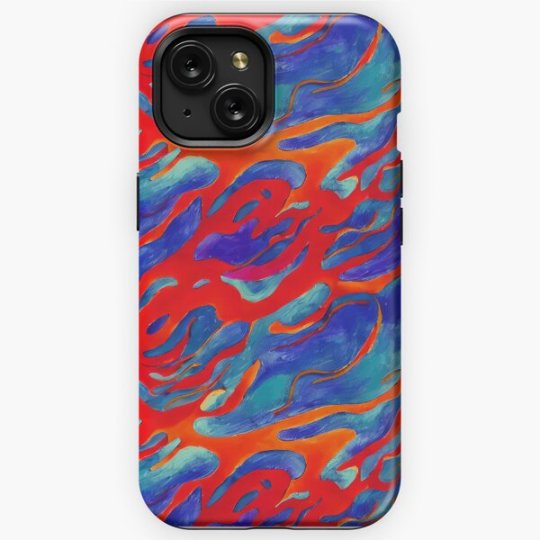
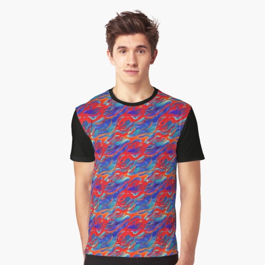
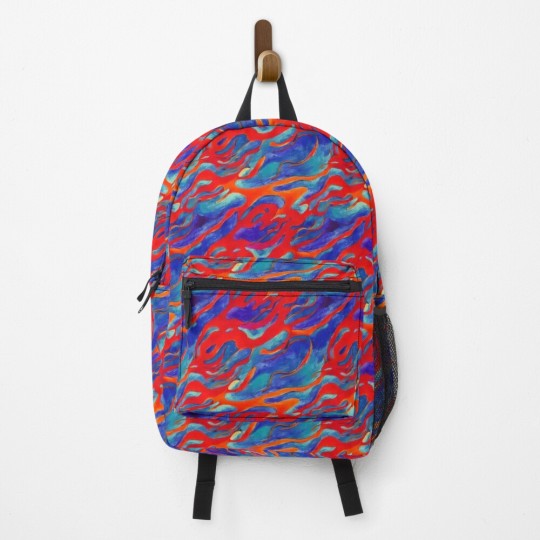
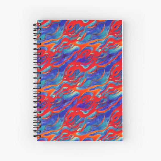
This background pattern showcases a captivating abstract painting characterized by a striking color scheme of blue and red. It epitomizes the essence of modern art with its bold brushstrokes and vibrant hues, executed using acrylic paint. The dynamic contrast and creative composition of this artwork make it a visually impactful piece that invites viewers to immerse themselves in its abstract pattern and artistic expression.
#findyourthing#redbubble#abstract#abstract painting#modern art#acrylic paint#colorful design#vibrant hues#creative composition#blue and red#abstract pattern#pattern
1 note
·
View note
Text
Piano (Final Rose)
“So...” Victoria drawled as she continued to play a deep, melancholy song on the piano. “You’ve finally discovered my plot.”
Eira glanced from her cousin to the snake around her neck and then to the raccoon turning the pages of music for her. “Did you seriously learn how to play the piano just so you could give a villainous monologue?”
“In my defence,” Victoria replied. “It’s not like learning to play a piano at this level was hard. Yeah, true artistic mastery would be difficult, but playing a piano well enough for a monologue is easy.”
Eira sighed. “You’re insane, you know that, right?”
“I’ll have you know that I am completely sane. I’ve been tested.” Victoria’s lips twitched. “Then again, I am also a genius. Maybe I’m completely insane but just very good at pretending to be sane.”
“I can believe that.”
“Anyway,” Victoria said. “Why don’t you bring Sigrid here? It would be better if I didn’t have to repeat my villainous monologue. It just doesn’t have the same impact the second time.”
X X X
Author’s Notes
Incidentally, both Lightning and Averia are good enough (even without Saviour) that they both could have become concert level pianists had they pursued that profession. Sigrid is the same although her musical talent extends to instruments in general, albeit only playing and not really composition.
Victoria learns a lot of stuff solely to troll people or for her various schemes. It mildly aggravates Eira since Victoria can learn in days what would take her months or even years.
10 notes
·
View notes
Text
Movie Review | Terrifier 2 (Leone, 2022)
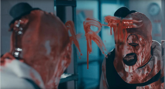
I was not a fan of the first movie, whose cruelty I found a bit much to take despite thinking it was competent enough as far as modern slashers go, but I decided to give this a look given the fairly ecstatic reactions from my Letterboxd circle. And having seen it, I'm ready to throw my hands up in the air and admit that I don't get it. I found this overlong and lacking in any real grace notes, and as a result it might be my least favourite thing I've sat through in quite some time.
I see a lot of reviews praising it for its ambition, but is that just the runtime? Having a two and a half hour slasher seems maddening in concept (ninety minutes is the perfect runtime for these things), but I'm not sure the movie ever uses this runtime to its benefit. For all the narrative ideas here, none of them feel expansive or divorced enough from the movie's influences to have much novelty. There's no added scope to full up that runtime. Just more of the same. Just endless scenes of Art the Clown doing some insufferable epic mugging before brutally murdering and mutilating his victims in agonizing detail. (The mugging isn't just limited to Art; there's a pretty excruciating dream sequence as well.) While I generally think watching movies at faster speeds is idiotic, this is one case where I can sympathize with the impulse, as this feels like a ninety minute movie playing in slow motion.
In theory I'm the target audience for this, as I love violent horror movies and likely enjoy a lot of the same movies the filmmakers do. But with every gore gag, while I suspect most viewers might be impressed with the audacity of the bodily destruction being depicted, I found myself muttering "Seems a little excessive." So I found myself feeling disconnected from the majority of horror fans, as what appeals to me about splatter movies is less the extremity of the splatter itself but the way the splatter is delivered. The elaborate colour schemes and camera moves of Dario Argento, or the way Lucio Fulci will set up a thick fog of dread and pierce through it with a scene of horrific violence so that it carries a sledgehammer impact. I can't fault the quality of the special effects here, which depict acts of mutilation and dismemberment that stretch the physical possibilities of what can be done to the human body. But the presentation of these scenes is monotonous, Art mugging for endless minutes, taking apart his victims' bodies, all shot in uninspired compositions and a hideous colour scheme. (I found this movie extremely unpleasant to look at for different reasons than the filmmakers intended.) Perhaps if the movie brought a viewpoint to this violence other than "check out how cool this looks!" I might have gotten something more out of it, but especially at this runtime, I found the effect numbing more than anything else.
As for Art, I found him an effective villain in the first one, but after this, I'd be happy to never look at his stupid fucking face ever again. In the shorter runtime, I found him creepy enough, but here, I think it becomes clear how manufactured a presence he is, something too obviously designed to really unsettle. There's a found quality to some of the creepiest slasher villains, something tossed off, simple enough to be both plausible and needle into your subconscious. Look at Michael Myers with his William Shatner mask or Jason in the second Friday the 13th with his potato sack. Total blank slates. Body language defined purely by their capacity for murder. Look at Freddie Krueger in the original Nightmare on Elm Street and the way he feels like a collection of disconnected horrific sensations. Then compare them to Art the Clown and his overly detailed makeup and costuming, his elaborate physical gestures. I know which one I find creepier.
3 notes
·
View notes
Note
WDYM ART ENVY I LOVE YOUR ART I ART ENVY Y O U SOMETIMES YOUR ART IS SO CUTE AND THE COLORS ARE ALWAYS SO NICE
ndajkhdsjka awwwww thankyuu ~ i really appreciate that~

i mean we all have strengths and weaknesses: ussually ill envy art that's strength is one of my weaknesess: tbh i only will get art envy if the artist is younger then me: because then that means they devoloped their strengths like more than me if that makes sense?
i think it does help to remember that the artists i envy probably have artists they envy and their art weak spots as well, and to look back on my work that im proudest of and my old art to remind myself of the time and effort id put into developing my skills
i am always open to constructive critism on my work: i want to improve as much as i can >:33
I also really want to start making like: guides to drawing? like teaching art and sharing what ive learned from studying(aka just observing) different pieces as well as my own process: and if want the topics of them to be super specific (like instead of just colors: it would be making color schemes that pop, and instead of just composition it would be using empty space to frame a subject etc)
i think part of why art envy in general comes from for a lot of people is that they dont know how to like, start, like they dont know how to go about trying to do that one thing that they admire in art: so i think that it'll make a positive impact to try and share all of our skills owo~
4 notes
·
View notes
Note
Currently drawing redlife Jimmy
Two colour scheme ideas: mostly red and black with a little yellow for tango
Or mostly black with a little red (with something else for tango)
Lmk what u think because I'm indecisive
hmmm well u can draw attention to canary with like a yellow pop, but that might take out the impact of red life, it really depends on your composition
8 notes
·
View notes
Text
RX-178 Gundam Mk-II
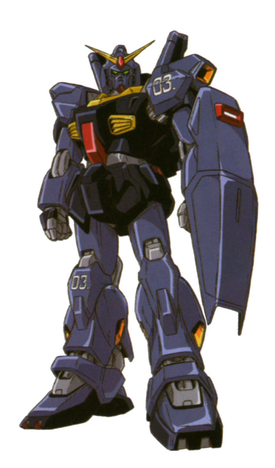
---------------Gundam Mk-II (Titans colors)--------------
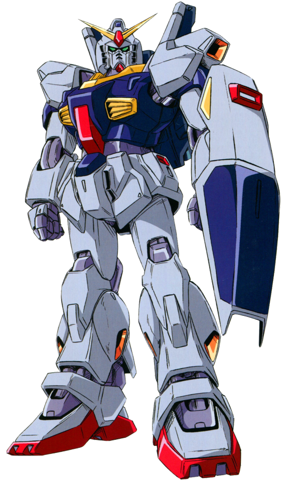
---------------Gundam Mk-II (AEUG colors)--------------
Origin: Mobile Suit Zeta Gundam
Timeline: Universal Century (U.C.)
Unit Type: Prototype General-Purpose Mobile Suit
Pilot(s): Limited-Production; Most notable pilots include Kamille Bidan and Emma Sheen
Developer: Titans
Operator: Titans, Earth Federation Forces, Anti-Earth Union Group
------------------------------------------------------------------------------
TECHNOLOGY AND DEVELOPMENT
A successor to the famous RX-78-2, the Mk-II was developed by the Titans in December of U.C. 0086 and was the first mobile suit to use the new movable frame concept. In it, the movable frame incorporates all the mobile suit's vital mechanisms excluding the weapons, armor and propellant tanks. This approach drastically improves on the suit's responsiveness, reliability, agility and energy efficiency,
The movable parts of the legs on the Mk-II were exposed, based on the prevailing design idea that avoiding being hit is more important than mitigating damage once hit. This stems from the fact that no existing armor could fully protect against beam weaponry, so its better to increase the suit's mobility through weight reduction rather than equip more armor onto it.
It also featured the 360-degree panoramic screen and linear seat cockpit that would become standard in Universal Century mobile suits. Meant to eliminate blind spots, provide the pilot a larger field of view and protect them from G-forces and impact shocks, the cockpit could also double as an escape pod, able to be ejected from the suit if needed.
The most major flaw of the Mk-II was its armor material; it used the by-then obsolete titanium alloy ceramic composite, instead of the significantly stronger luna titanium of its predecessor. This also caused rigidity issues in the frame's leg sections, a problem that persisted even after six design revisions. Despite all of that, the Mk-II was one of the most agile mobile suits available in its hayday, albeit for a short time.
------------------------------------------------------------------------------
EQUIPMENT
Its weaponry remained mostly the same as its predecessor, wielding a pair of beam sabers for close combat stored on the backpack, a beam rifle as its main ranged weapon, a hyper bazooka for heavy firepower, and a physical shield. It didn't have the head-mounted vulcan guns of its predecessor, though it could be outfitted with an external vulcan pod. It also used a clay bazooka, a weapon designed to fire adhesive rounds meant to immobilize enemy machines, though it could be loaded with different types of ammunition, including conventional explosive shells.
The Mk-II also had its very own support vehicle called the Flight Armor. A sub-flight system developed by Anaheim Electronics for the Anti-Earth Union Group, it was designed to protect the Mk-II during atmospheric entry while also serving as a regular SFS within the atmosphere.
------------------------------------------------------------------------------
HISTORY
There were three total Mk-II units developed by the Titans at the start of the Gryps Conflict. Char Aznable (under the Quattro Bajeena persona) got word of the three prototype units, and led a team with the goal of infiltrating the colony in which they were being kept and stealing them. The plan proved successful thanks to the help of Kamille Bidan, who took one of the suits. In the end, all three were stolen from the Titans and used by the AEUG from then on.
Two of them were sent to Anaheim Electronics to be dismantled and studied, and the last one was kept in service and repainted in a navy blue-on-white color scheme. The Mk-II was eventually outclassed by the Titans' new transformable mobile suits, but it still participated in many of the AEUG's most important missions.
To try and bring the Mk-II up to current standards, the AEUG commissioned Anaheim Electronics to build a new support craft for the Mk-II, the FXA-05D G-Defenser. It could dock with the Mk-II to create the RX-178+FXA-05D Super Gundam, which had superior speed, mobility and firepower. This didn't address anything in the end, as the Mk-II still suffered in performance compared to the latest Titans mobile suits near the end of the Gryps War.
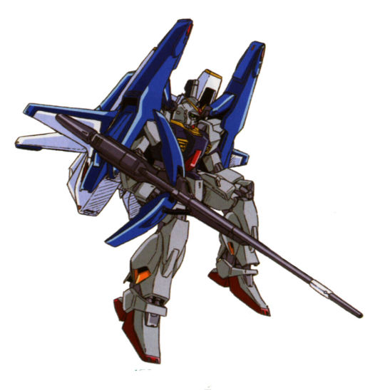
During the First Neo Zeon War, the Mk-II was once again called to action against Neo Zeon. It wasn't officially designated a pilot and it was unable to become the Super Gundam due to the G-Defensor being destroyed during the Gryps Conflict. At the end of the First Neo Zeon War, the Mk-II was severely damaged and abandoned. Its said the suit was recovered and repaired, but ultimately retired from service after the AEUG was re-absorbed into the Earth Federation, being put into storage alongside the MSZ-006 Zeta Gundam.
------------------------------------------------------------------------------
LEGACY
A Full Armor pack was proposed as an upgrade for the Mk-II, where it would have been known as the FA-178 Full Armor Gundam Mk-II. This never came to be, as the FXA-05D G-Defenser was perceived to be more well rounded and not as heavy on the Mk-II, thus the Full Armor pack was never used.
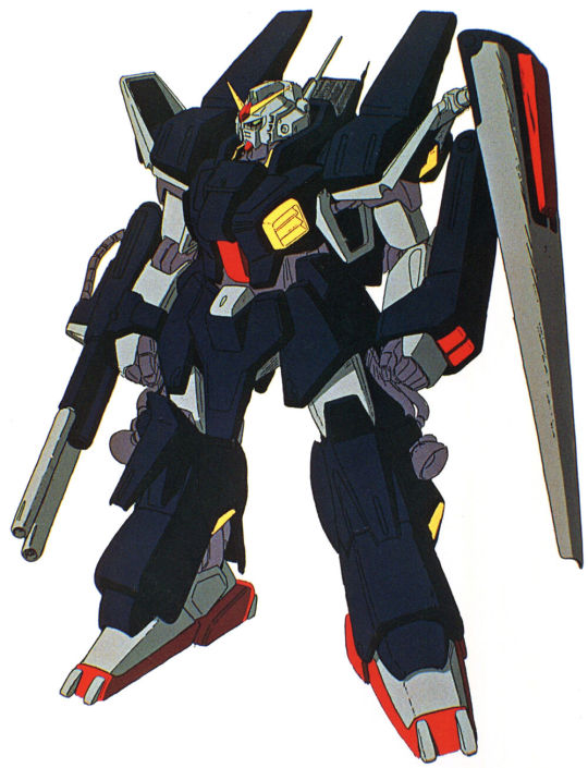
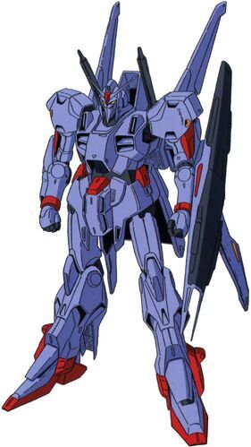
The Mk-II lead to a list of several different mobile suits, most notably the titular Zeta Gundam and the MSF-007 Gundam Mk-III featured in the Zeta Gundam Mobile Suit Variations design series.
------------------------------------------------------------------------------
Personal Opinion Its really clean, I dig it. I think I prefer the Titans colors just a little bit more, but the AEUG version looks really good in motion too.
4 notes
·
View notes
Text
Reflective statement
1. Research Skills: Reflection on my research skills
For my posters I researched and explored on different issues which lead me to choose to focus on some ideas that included Hawkes Bay, farming, the environment and making the planet greener. I looked into articles and ideas of inspiration using Pinterest. Researching different ideas helped me think of the main idea, colour scheme and how I wanted to layout my posters. This helped me gather information such as statistics and ideas to incorporate into my designs further on although I did go through some trial and error on finding statistical facts that related specifically to New Zealand. I could improve my research by diving deeper into specific information on the issue to gain more knowladge into it. I decided to research more specifically on statistics from New Zealand to make it more specific to my theme.
2.reflection
Creative process: To start off with my design process, I began by sketching out different concepts that represented my theme at the time of environment and farming in Hawkes Bay. Sketching ideas was most helpful to me as it gave me a visual representation on the possibility of what my two posters could look like. I wanted to create visuals to show the beauty of the region. However, that took away the type of aspect of my posters, so I later tried to focus on the typography. As my posters were relaying overly on the image too much. I decided to create a textural image to the backgrounds to add more depth while still keeping the main focus on the typography. Once I had some solid ideas, I moved on to refining them using InDesign.
3. Decision Making: Making decisions for my project was a mix of challenges and exciting moments. One of the difficulties I faced was finding the right balance between the environmental aspect and the use for my typography in my posters while also exploring InDesign. As I went through trial and error with my initial theme and idea. I wanted to convey the message of preserving the environment while also acknowledging the significance of farming to the local community in Hawkes Bay. However, after more feedback, I decided to focus on mainly the environmental factor and made that my main focus. To overcome this, I experimented with various compositions and colour schemes and did more research. I also redefined my font later on to connect more to my theme by using photoshop to create a liquified blur effect font while still keeping it on the minimalistic side. Until I found my three colours that would most represent my idea the best. I also experimented with different fonts until I was able to find one that went both of my posters. I also decided to link both of my posters together to create a more connected look by using the same colours on both.
4. Overall Progression: Throughout this project, I've learned a lot about the intricate relationship between the environment and farming in Hawke's Bay from my initial ideas. I like how design can be a powerful tool to raise awareness. One of the breakthrough moments for me was when I came up with a visual concept that effectively communicated the need for sustainable farming practices without overshadowing the beauty of the environment. However, I then decided to keep my main focus on one theme which was the environmental issue of keeping the earth greener by focusing specifically on New Zealand statistics. As this was much clearer and more effective to communicate through. Moving forward, I would like to continue exploring this theme and refining my design skills to create impactful visual through the use of typography and connecting my posters.
0 notes
Text
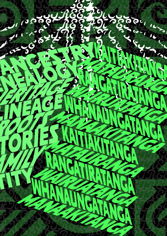
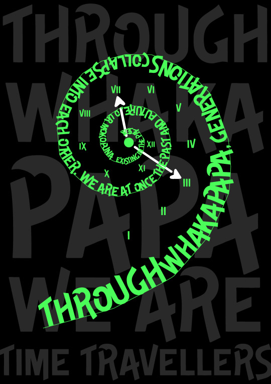
Final Posters
Design Choices:
Color Scheme: The use of neon green text on a black background remains consistent, ensuring high contrast and visibility. The green and black combination gives a modern and bold aesthetic.
Typography and Layout: The text is organized in spirals, stairs, and layered compositions. This variety in layout adds visual interest and reflects the complexity of cultural heritage and time.
Cultural Symbols: Incorporating Māori cultural elements such as the koru spiral and words like "Whakapapa," "Whanaungatanga," and "Manaakitanga" adds depth and meaning.
Adding Another Layer of Meaning and Interpretation:
Spiral and Stairs: These shapes represent the journey through time and the layered nature of ancestry. The spiral symbolizes growth and continuity, while the stairs represent progression and the building of knowledge over generations.
Cultural Terms: The inclusion of Māori terms emphasizes the importance of cultural values and concepts, highlighting the connection to heritage and the land.
What is Working:
Visual Impact: The posters are visually striking with their high contrast and bold typography, capturing attention effectively.
Symbolism: The use of cultural symbols and meaningful shapes adds a rich layer of interpretation, connecting the viewer to the themes of ancestry, growth, and continuity.
Cohesion: Despite the variety in layouts, the consistent color scheme and typography create a cohesive set of posters.
Ideas for Animation:
Text Flow: Animate the text to flow along the spiral and stairs, highlighting the journey and continuity.
Growth Animation: For the koru spiral, animate the text to grow and unfurl, symbolizing new life and growth.
0 notes
Text
Blog Post 30
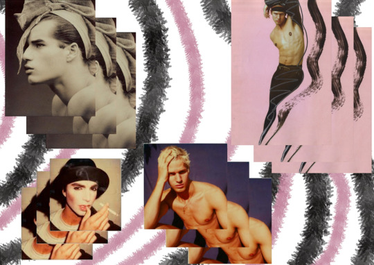
The next page of my sketchbook is dedicated to showcasing four distinct pieces of photography by Tony Viramontes. Each photograph captures a unique aspect of masculinity and expression, which resonates deeply with my work. In the bottom left, there's an evocative image of a man wearing makeup, challenging traditional notions of masculinity and highlighting the fluidity of gender expression. To the right of this photograph is another compelling shot of a shirtless man, his hand resting on his head, exuding a sense of vulnerability and introspection. Above this, in the top right section of the page, I placed an image of a shirtless man posed in front of a pink backdrop, accompanied by a bold, black fluid brush stroke. His pose, characterised by its feminine quality, further explores themes of gender fluidity and nonconformity; but yet simultaneously comfortability. This photograph is particularly striking for its juxtaposition of delicate and bold elements, creating a visually intriguing contrast. Finally, in the top left corner, there's a photograph of a man wearing a bow on his head, an image that playfully subverts traditional masculine aesthetics and emphasizes the performative aspects of gender. To enhance the visual impact of these photographs, I layered each image three times, one above the other. This repetition adds depth, making the compositions more captivating and dynamic. The layered effect creates a nice sense of intensity, drawing the viewer's eye and inviting a deeper engagement with the subject matter. Behind and around these layered images, I added pink and grey/black brushstrokes. These strokes serve to frame the photographs, creating a background that ties the different elements together. The use of pink and grey/black not only complements the colour scheme of the photographs but also adds a textured, artistic flair to the page. Tony Viramontes’ photography was a deliberate choice, as each image contributes to the exploration of themes central to my narrative namely, the fluidity of gender and the breaking down of traditional masculine norms.
0 notes
Text
Elevating Hotel Lobbies With Large Abstract Paintings For Hotel Lobbies
When guests first enter your hotel lobby, it's crucial to create a remarkable and captivating impression. The lobby serves as the primary space that sets the aesthetic mood for the entire hotel, so it's essential to have a stunning focal point that only monumental artwork can provide. Large abstract paintings for hotel lobbies offer a range of customizable statement pieces that can enhance and elevate your interior design. These paintings can include vibrant abstracts, dramatic landscapes, or celestial marvels, all of which can be tailored to match the ambiance and style of your hotel.
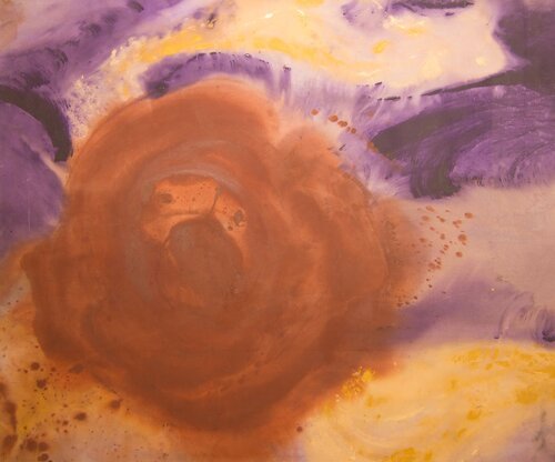
Captivating Large Abstract Paintings
At the heart of my practice lies a passion for abstract compositions. Without recognizable forms, abstract art intrigues viewers, sparking imagination and conversation. Large abstract paintings for hotel lobbies utilize depth, texture and bold color combinations for maximum visual impact. Large colorful abstract acrylic paintings on canvas emphasize commanding scale. The customizability of abstracts also allows us to tailor palettes to your brand colors or interior design scheme.
For one hotel project, we created an eight-painting abstract series in luminous gold and silver tones with hits of the signature red accent color found throughout the property. The metallic sheen and modern geometric shapes reflected the glamorous Art Deco interiors. The oversized art ushered guests into a world of 1920’s luxury the moment they entered.
Energizing Large Colorful Abstracts
While some spaces call for refined neutrals, hotels seeking a lively welcoming atmosphere can leverage the vitality of colorful abstract paintings. Vibrant colors exude approachability and optimism. Acrylic abstracts on canvas often feature bold applications of crimson, electric blue and bright yellow with thick visible brushwork. The colors jump forward, creating an invigorating pop of energy. For maximum dynamism, we paint on curved canvas to add an extra dimensional element. The colors appear to dance across the fluid shapes. These animated compositions foster a sense of playfulness and celebration for spaces like all-day dining rooms or poolside lounges.
Transportive Large Landscape Oil Paintings
If looking to reflect a specific regional charm or transport guests to an aspirational destination, large envisioned landscape oil paintings set an immersive scene. Our interpretation of environments relies on color, light and texture rather than detail to evoke a sense of place. Skies swelling with moody blues and purples contrasted by warm sandy cliffs. Foliage in lush greens and chartreuse yellows to suggest thriving nature. We simplify compositions to amplify the emotional resonance. The grand scale draws viewers deeper into the painting as if entering a new world. For resort or adventure hotels, these transformative vistas adorn lobbies flawlessly.
Vibrant Large Oil Paintings of Trees
For a natural touch with uplifting overtones, Large, colorful oil paintings of trees bring organic life into the built environment. The enduring positivity associated with trees translates beautifully to hospitality spaces. Our large oil tree paintings use loose Impressionistic brushwork in vivid emerald greens, sunny yellows and eye-catching fuchsia. The colors exude joy and optimism. Branches often extend beyond the canvas edge, suggesting continuity with the surrounding architecture. These colorful arboreal companions foster welcoming, revitalizing spaces for guests to enjoy.
0 notes
Text
sketch book
Journaling
Unity and variety- principle declaring that in art beauty can come from the variety of diverse components grouped together
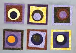
Balance- the distribution of the visual weight of objects, colors, texture, and space. If the design was a scale, these elements should be balanced to make a design feel stable.
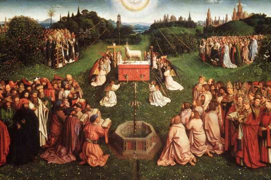
Emphasis and subordination -Emphasis points underscore concepts, themes, or ideas the artist wants to express. Subordination removes attention from a particular area, in order to emphasize something else.
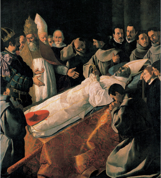
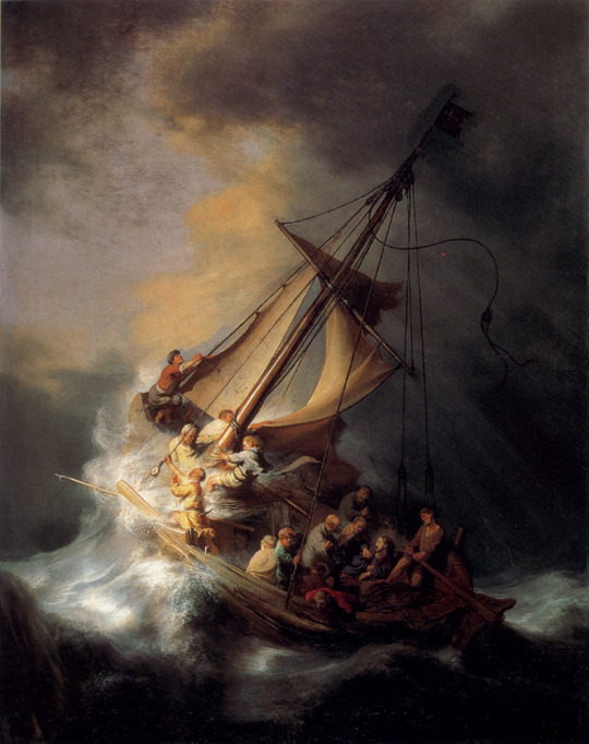
Directional forces - paths created or implied within an artwork that lead the eye through the composition.
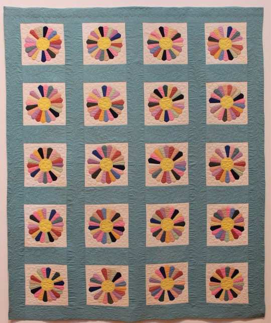
Repetition and rhythm - Repetition is a series of similarly curved lines or a recurring motif. Rhythm is the sense of movement in a design, created by the interactions and spaces between different elements.
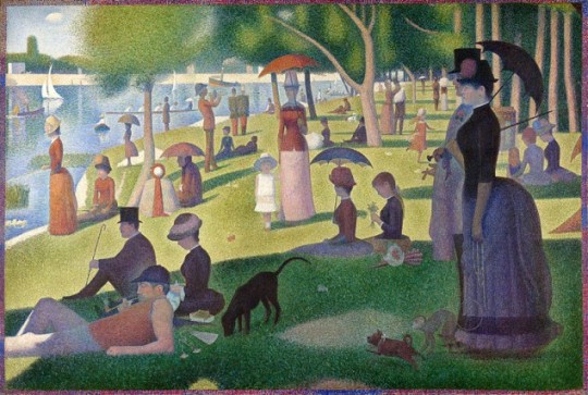
Scale and proportion - Proportion describes the relationship between the dimensions of different elements and an overall composition. Scale refers to an artwork's size and how parts of a composition relate to each other.
2. writing and looking
Figure 4.7
Damien Hirst, Posterity-The Holy Place. 2006. Butterflies and household gloss on canvas. 89 5/8” x 48”
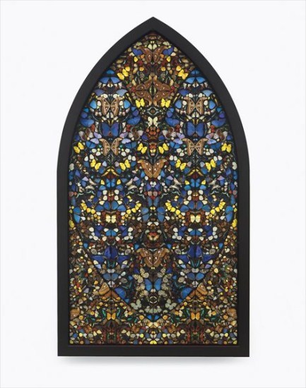
"Posterity – The Holy Place" by Damien Hirst, created in 2006, is a striking and intricate piece that exemplifies the artist's fascination with life, death, and beauty. The artwork is composed of real butterflies and household gloss applied to a canvas. Measuring 89 5/8 inches by 48 inches, the piece is notable for its symmetrical arrangement, reminiscent of stained glass windows found in places of worship.
The butterflies, meticulously placed, create a vibrant and colorful mosaic that contrasts with the gloss background, adding a reflective quality that enhances the visual impact. The use of butterflies, which are often symbols of transformation, is a recurring theme in Hirst's work, reflecting his contemplation of the cycle of life and death. The title, "Posterity – The Holy Place," suggests a contemplation of the future and the sacred, inviting viewers to reflect on the enduring beauty and transient nature of life. The composition’s symmetry and order convey a sense of reverence and tranquility. In summary, the composition of Damien Hirst's "Posterity – The Holy Place" is a complex interplay of natural elements and man-made materials, combining to create a work that is both visually stunning and thought-provoking.
3. connecting art to my world
During a visit to the Smoky Mountains in Tennessee, I was awed by the breathtaking views of Gatlinburg. The rich hues of the autumn foliage, with leaves ranging in value from deep burgundy to bright gold, were incredibly vivid in their saturation. The intensity of these colors, especially as the sunlight filtered through, created a mesmerizing, almost surreal landscape that filled me with a sense of warmth and awe. The vibrant autumnal palette contrasted beautifully with the cool, misty blues and grays of the distant mountains, adding depth and serenity to the scene.
In contrast, a rainy day in New York revealed a different but equally captivating palette. The cityscape was shrouded in varying shades of gray, from the soft, muted tones of the mist to the darker, more intense values of wet asphalt and steel. The occasional pop of a bright umbrella or a taxi cab's yellow provided a striking visual contrast, highlighting the saturation of these colors against the subdued background. These rainy views evoked a sense of reflection and tranquility amidst the city's hustle and bustle.
If I had to pick a color scheme for my life, it would incorporate the deep, comforting tones of burgundy, symbolizing my favorite color, along with the vibrant and warm colors of autumn, reflecting the loving people and happy moments that enrich my life. Additionally, I would include the cool, calming grays and occasional bright accents of a rainy New York, representing moments of reflection and the vibrant contrasts that punctuate everyday life.
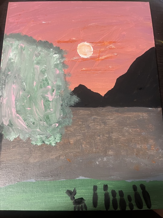
4. art project
5. photo/design
Group 4 interactive design
my instagram for you page that shows what I would be interested in. www.instagram.comLinks to an external site.
This is my spotify account that shows what I am listening too and other genres I may be intrested in. https://www.spotify.comLinks to an external site.
This is my hulu account that shows what I am watching and what I may be interested in watching next. https://www.hulu.comLinks to an external site.
This is my pinterest board that also shows what my interests are and gives me more of what I am interested in. www.pintrest.comLinks to an external site.
This is my Hollister account that gives me the options to view the best deals. https://www.hollisterco.com/shop/usLinks to an external site.What makes a good interactive design to me is that the design in question is already fixed to my liking due to my activity of liking or showing interest in certain places. For example, with my media of Instagram and my choice of streaming services it saves everything I watch and like and then it gives me recommendations based on those things. As well as the shopping sites it helps others and myself to find similar things to what I have bought. I believe that each and every one of my interactive design that I chose does fulfill its purpose.
0 notes