#webcomic collection
Text
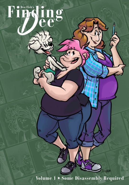


If you're a fan of the strip, and want to bring the series home in dead-tree volumes, you are SOOOO in luck!
FINDING DEE is a hilarious & heartfelt look into the semi-autobiographical misadventures of a 40-Something cartoonist trying to make it in comics while navigating the ins and outs of coming out as transgender.
4, 80(ish) page, black & White volumes are now available, collecting the entire series from its debut in 2017 to June of 2023: https://www.amazon.com/dp/B0CLKWV9C3
#webcomic#comicstrip#comic collection#trade paperback#webcomic collection#print#print collection#finding dee#transgender#trans#trans comic#lgbtq#lgbtq comic#slice of life comic#transgirl#transgirl comic#semiauto#semi auto
37 notes
·
View notes
Text
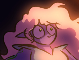
why Aurora's art is genius
It's break for me, and I've been meaning to sit down and read the Aurora webcomic (https://comicaurora.com/, @comicaurora on Tumblr) for quite a bit. So I did that over the last few days.
And… y'know. I can't actually say "I should've read this earlier," because otherwise I would've been up at 2:30-3am when I had responsibilities in the morning and I couldn't have properly enjoyed it, but. Holy shit guys THIS COMIC.
I intended to just do a generalized "hello this is all the things I love about this story," and I wrote a paragraph or two about art style. …and then another. And another. And I realized I needed to actually reference things so I would stop being too vague. I was reading the comic on my tablet or phone, because I wanted to stay curled up in my chair, but I type at a big monitor and so I saw more details… aaaaaand it turned into its own giant-ass post.
SO. Enjoy a few thousand words of me nerding out about this insanely cool art style and how fucking gorgeous this comic is? (There are screenshots, I promise it isn't just a wall of text.) In my defense, I just spent two semesters in graphic design classes focusing on the Adobe Suite, so… I get to be a nerd about pretty things…???
All positive feedback btw! No downers here. <3
---
I cannot emphasize enough how much I love the beautiful, simple stylistic method of drawing characters and figures. It is absolutely stunning and effortless and utterly graceful—it is so hard to capture the sheer beauty and fluidity of the human form in such a fashion. Even a simple outline of a character feels dynamic! It's gorgeous!
Though I do have a love-hate relationship with this, because my artistic side looks at that lovely simplicity, goes "I CAN DO THAT!" and then I sit down and go to the paper and realize that no, in fact, I cannot do that yet, because that simplicity is born of a hell of a lot of practice and understanding of bodies and actually is really hard to do. It's a very developed style that only looks simple because the artist knows what they're doing. The human body is hard to pull off, and this comic does so beautifully and makes it look effortless.
Also: line weight line weight line weight. It's especially important in simplified shapes and figures like this, and hoo boy is it used excellently. It's especially apparent the newer the pages get—I love watching that improvement over time—but with simpler figures and lines, you get nice light lines to emphasize both smaller details, like in the draping of clothing and the curls of hair—which, hello, yes—and thicker lines to emphasize bigger and more important details and silhouettes. It's the sort of thing that's essential to most illustrations, but I wanted to make a note of it because it's so vital to this art style.
THE USE OF LAYER BLENDING MODES OH MY GODS. (...uhhh, apologies to the people who don't know what that means, it's a digital art program thing? This article explains it for beginners.)
Bear with me, I just finished my second Photoshop course, I spent months and months working on projects with this shit so I see the genius use of Screen and/or its siblings (of which there are many—if I say "Screen" here, assume I mean the entire umbrella of Screen blending modes and possibly Overlay) and go nuts, but seriously it's so clever and also fucking gorgeous:
Firstly: the use of screened-on sound effect words over an action? A "CRACK" written over a branch and then put on Screen in glowy green so that it's subtle enough that it doesn't disrupt the visual flow, but still sticks out enough to make itself heard? Little "scritches" that are transparent where they're laid on without outlines to emphasize the sound without disrupting the underlying image? FUCK YES. I haven't seen this done literally anywhere else—granted, I haven't read a massive amount of comics, but I've read enough—and it is so clever and I adore it. Examples:


Secondly: The beautiful lighting effects. The curling leaves, all the magic, the various glowing eyes, the fog, the way it's all so vividly colored but doesn't burn your eyeballs out—a balance that's way harder to achieve than you'd think—and the soft glows around them, eeeee it's so pretty so pretty SO PRETTY. Not sure if some of these are Outer/Inner Glow/Shadow layer effects or if it's entirely hand-drawn, but major kudos either way; I can see the beautiful use of blending modes and I SALUTE YOUR GENIUS.
I keep looking at some of this stuff and go "is that a layer effect or is it done by hand?" Because you can make some similar things with the Satin layer effect in Photoshop (I don't know if other programs have this? I'm gonna have to find out since I won't have access to PS for much longer ;-;) that resembles some of the swirly inner bits on some of the lit effects, but I'm not sure if it is that or not. Or you could mask over textures? There's... many ways to do it.
If done by hand: oh my gods the patience, how. If done with layer effects: really clever work that knows how to stop said effects from looking wonky, because ugh those things get temperamental. If done with a layer of texture that's been masked over: very, very good masking work. No matter the method, pretty shimmers and swirly bits inside the bigger pretty swirls!
Next: The way color contrast is used! I will never be over the glowy green-on-black Primordial Life vibes when Alinua gets dropped into that… unconscious space?? with Life, for example, and the sharp contrast of vines and crack and branches and leaves against pitch black is just visually stunning. The way the roots sink into the ground and the three-dimensional sensation of it is particularly badass here:

Friggin. How does this imply depth like that. HOW. IT'S SO FREAKING COOL.
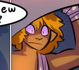
A huge point here is also color language and use! Everybody has their own particular shade, generally matching their eyes, magic, and personality, and I adore how this is used to make it clear who's talking or who's doing an action. That was especially apparent to me with Dainix and Falst in the caves—their colors are both fairly warm, but quite distinct, and I love how this clarifies who's doing what in panels with a lot of action from both of them. There is a particular bit that stuck out to me, so I dug up the panels (see this page and the following one https://comicaurora.com/aurora/1-20-30/):

(Gods it looks even prettier now that I put it against a plain background. Also, appreciation to Falst for managing a bridal-carry midair, damn.)
The way that their colors MERGE here! And the immense attention to detail in doing so—Dainix is higher up than Falst is in the first panel, so Dainix's orange fades into Falst's orange at the base. The next panel has gold up top and orange on bottom; we can't really tell in that panel where each of them are, but that's carried over to the next panel—

—where we now see that Falst's position is raised above Dainix's due to the way he's carrying him. (Points for continuity!) And, of course, we see the little "huffs" flowing from orange to yellow over their heads (where Dainix's head is higher than Falst's) to merge the sound of their breathing, which is absurdly clever because it emphasizes to the viewer how we hear two sets of huffing overlaying each other, not one. Absolutely brilliant.
(A few other notes of appreciation to that panel: beautiful glows around them, the sparks, the jagged silhouette of the spider legs, the lovely colors that have no right to make the area around a spider corpse that pretty, the excellent texturing on the cave walls plus perspective, the way Falst's movements imply Dainix's hefty weight, the natural posing of the characters, their on-point expressions that convey exactly how fuckin terrifying everything is right now, the slight glows to their eyes, and also they're just handsome boys <3)
Next up: Rain!!!! So well done! It's subtle enough that it never ever disrupts the impact of the focal point, but evident enough you can tell! And more importantly: THE MIST OFF THE CHARACTERS. Rain does this irl, it has that little vapor that comes off you and makes that little misty effect that plays with lighting, it's so cool-looking and here it's used to such pretty effect!
One of the panel captions says something about it blurring out all the injuries on the characters but like THAT AIN'T TOO BIG OF A PROBLEM when it gets across the environmental vibes, and also that'd be how it would look in real life too so like… outside viewer's angle is the same as the characters', mostly? my point is: that's the environment!!! that's the vibes, that's the feel! It gets it across and it does so in the most pretty way possible!
And another thing re: rain, the use of it to establish perspective, particularly in panels like this—

—where we can tell we're looking down at Tynan due to the perspective on the rain and where it's pointing. Excellent. (Also, kudos for looking down and emphasizing how Tynan's losing his advantage—lovely use of visual storytelling.)
Additionally, the misting here:

We see it most heavily in the leftmost panel, where it's quite foggy as you would expect in a rainstorm, especially in an environment with a lot of heat, but it's also lightly powdered on in the following two panels and tends to follow light sources, which makes complete sense given how light bounces off particles in the air.
A major point of strength in these too is a thorough understanding of lighting, like rim lighting, the various hues and shades, and an intricate understanding of how light bounces off surfaces even when they're in shadow (we'll see a faint glow in spots where characters are half in shadow, but that's how it would work in real life, because of how light bounces around).
Bringing some of these points together: the fluidity of the lines in magic, and the way simple glowing lines are used to emphasize motion and the magic itself, is deeply clever. I'm basically pulling at random from panels and there's definitely even better examples, but here's one (see this page https://comicaurora.com/aurora/1-16-33/):

First panel, listed in numbers because these build on each other:
The tension of the lines in Tess's magic here. This works on a couple levels: first, the way she's holding her fists, as if she's pulling a rope taut.
The way there's one primary line, emphasizing the rope feeling, accompanied by smaller ones.
The additional lines starbursting around her hands, to indicate the energy crackling in her hands and how she's doing a good bit more than just holding it. (That combined with the fists suggests some tension to the magic, too.) Also the variations in brightness, a feature you'll find in actual lightning. :D Additional kudos for how the lightning sparks and breaks off the metal of the sword.
A handful of miscellaneous notes on the second panel:
The reflection of the flames in Erin's typically dark blue eyes (which bears a remarkable resemblance to Dainix, incidentally—almost a thematic sort of parallel given Erin's using the same magic Dainix specializes in?)
The flowing of fabric in the wind and associated variation in the lineart
The way Erin's tattoos interact with the fire he's pulling to his hand
The way the rain overlays some of the fainter areas of fire (attention! to! detail! hell yeah!)
I could go on. I won't because this is a lot of writing already.
Third panel gets paragraphs, not bullets:
Erin's giant-ass "FWOOM" of fire there, and the way the outline of the word is puffy-edged and gradated to feel almost three-dimensional, plus once again using Screen or a variation on it so that the stars show up in the background. All this against that stunning plume of fire, which ripples and sparks so gorgeously, and the ending "om" of the onomatopoeia is emphasized incredibly brightly against that, adding to the punch of it and making the plume feel even brighter.
Also, once again, rain helping establish perspective, especially in how it's very angular in the left side of the panel and then slowly becomes more like a point to the right to indicate it's falling directly down on the viewer. Add in the bright, beautiful glow effects, fainter but no less important black lines beneath them to emphasize the sky and smoke and the like, and the stunningly beautiful lighting and gradated glows surrounding Erin plus the lightning jagging up at him from below, and you get one hell of an impactful panel right there. (And there is definitely more in there I could break down, this is just a lot already.)
And in general: The colors in this? Incredible. The blues and purples and oranges and golds compliment so well, and it's all so rich.
Like, seriously, just throughout the whole comic, the use of gradients, blending modes, color balance and hues, all the things, all the things, it makes for the most beautiful effects and glows and such a rich environment. There's a very distinct style to this comic in its simplified backgrounds (which I recognize are done partly because it's way easier and also backgrounds are so time-consuming dear gods but lemme say this) and vivid, smoothly drawn characters; the simplicity lets them come to the front and gives room for those beautiful, richly saturated focal points, letting the stylized designs of the magic and characters shine. The use of distinct silhouettes is insanely good. Honestly, complex backgrounds might run the risk of making everything too visually busy in this case. It's just, augh, so GORGEOUS.
Another bit, take a look at this page (https://comicaurora.com/aurora/1-15-28/):

It's not quite as evident here as it is in the next page, but this one does some other fun things so I'm grabbing it. Points:
Once again, using different colors to represent different character actions. The "WHAM" of Kendal hitting the ground is caused by Dainix's force, so it's orange (and kudos for doubling the word over to add a shake effect). But we see blue layered underneath, which could be an environmental choice, but might also be because it's Kendal, whose color is blue.
And speaking off, take a look at the right-most panel on top, where Kendal grabs the spear: his motion is, again, illustrated in bright blue, versus the atmospheric screened-on orange lines that point toward him around the whole panel (I'm sure these have a name, I think they might be more of a manga thing though and the only experience I have in manga is reading a bit of Fullmetal Alchemist). Those lines emphasize the weight of the spear being shoved at him, and their color tells us Dainix is responsible for it.
One of my all-time favorite effects in this comic is the way cracks manifest across Dainix's body to represent when he starts to lose control; it is utterly gorgeous and wonderfully thematic. These are more evident in the page before and after this one, but you get a decent idea here. I love the way they glow softly, the way the fire juuuust flickers through at the start and then becomes more evident over time, and the cracks feel so realistic, like his skin is made of pottery. Additional points for how fire begins to creep into his hair.
A small detail that's generally consistent across the comic, but which I want to make note of here because you can see it pretty well: Kendal's eyes glow about the same as the jewel in his sword, mirroring his connection to said sword and calling back to how the jewel became Vash's eye temporarily and thus was once Kendal's eye. You can always see this connection (though there might be some spots where this also changes in a symbolic manner; I went through it quickly on the first time around, so I'll pay more attention when I inevitably reread this), where Kendal's always got that little shine of blue in his eyes the same as the jewel. It's a beautiful visual parallel that encourages the reader to subconsciously link them together, especially since the lines used to illustrate character movements typically mirror their eye color. It's an extension of Kendal.
Did I mention how ABSOLUTELY BEAUTIFUL the colors in this are?
Also, the mythological/legend-type scenes are illustrated in familiar style often used for that type of story, a simple and heavily symbolic two-dimensional cave-painting-like look. They are absolutely beautiful on many levels, employing simple, lovely gradients, slightly rougher and thicker lineart that is nonetheless smoothly beautiful, and working with clear silhouettes (a major strength of this art style, but also a strength in the comic overall). But in particular, I wanted to call attention to a particular thing (see this page https://comicaurora.com/aurora/1-12-4/):

The flowing symbolic lineart surrounding each character. This is actually quite consistent across characters—see also Life's typical lines and how they curl:

What's particularly interesting here is how these symbols are often similar, but not the same. Vash's lines are always smooth, clean curls, often playing off each other and echoing one another like ripples in a pond. You'd think they'd look too similar to Life's—but they don't. Life's curl like vines, and they remain connected; where one curve might echo another but exist entirely detached from each other in Vash's, Life's lines still remain wound together, because vines are continuous and don't float around. :P
Tahraim's are less continuous, often breaking up with significantly smaller bits and pieces floating around like—of course—sparks, and come to sharper points. These are also constants: we see the vines repeated over and over in Alinua's dreams of Life, and the echoing ripples of Vash are consistent wherever we encounter him. Kendal's dream of the ghost citizens of the city of Vash in the last few chapters is filled with these rippling, echoing patterns, to beautiful effect (https://comicaurora.com/aurora/1-20-14/):

They ripple and spiral, often in long, sinuous curves, with smooth elegance. It reminds me a great deal of images of space and sine waves and the like. This establishes a definite feel to these different characters and their magic. And the thing is, that's not something that had to be done—the colors are good at emphasizing who's who. But it was done, and it adds a whole other dimension to the story. Whenever you're in a deity's domain, you know whose it is no matter the color.
Regarding that shape language, I wanted to make another note, too—Vash is sometimes described as chaotic and doing what he likes, which is interesting to me, because smooth, elegant curves and the color blue aren't generally associated with chaos. So while Vash might behave like that on the surface, I'm guessing he's got a lot more going on underneath; he's probably much more intentional in his actions than you'd think at a glance, and he is certainly quite caring with his city. The other thing is that this suits Kendal perfectly. He's a paragon character; he is kind, virtuous, and self-sacrificing, and often we see him aiming to calm others and keep them safe. Blue is such a good color for him. There is… probably more to this, but I'm not deep enough in yet to say.
And here's the thing: I'm only scratching the surface. There is so much more here I'm not covering (color palettes! outfits! character design! environment! the deities! so much more!) and a lot more I can't cover, because I don't have the experience; this is me as a hobbyist artist who happened to take a couple design classes because I wanted to. The art style to this comic is so clever and creative and beautiful, though, I just had to go off about it. <3
...brownie points for getting all the way down here? Have a cookie.
#aurora comic#aurora webcomic#comicaurora#art analysis#...I hope those are the right tags???#new fandom new tagging practices to learn ig#much thanks for something to read while I try to rest my wrists. carpal tunnel BAD. (ignore that I wrote this I've got braces ok it's fine)#anyway! I HAVE. MANY MORE THOUGHTS. ON THE STORY ITSELF. THIS LOVELY STORY#also a collection of reactions to a chunk of the comic before I hit the point where I was too busy reading to write anything down#idk how to format those tho#...yeet them into one post...???#eh I usually don't go off this much these days but this seems like a smaller tight-knit fandom so... might as well help build it?#and I have a little more time thanks to break so#oh yes also shoutout to my insanely awesome professor for teaching me all the technical stuff from this he is LOVELY#made an incredibly complex program into something comprehensible <3#synapse talks
743 notes
·
View notes
Text


111 notes
·
View notes
Text
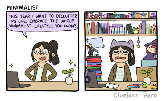
#457 Minimalist
I swear I'm not a hoarder
Facebook | Instagram | Shop
#Clueless Hero#webcomic#gaming#videogames#minimalism#maximalism#figure collecting#books and reading#comic books#fan merch#fandom#hobbies#clutter
146 notes
·
View notes
Text
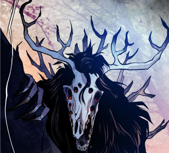
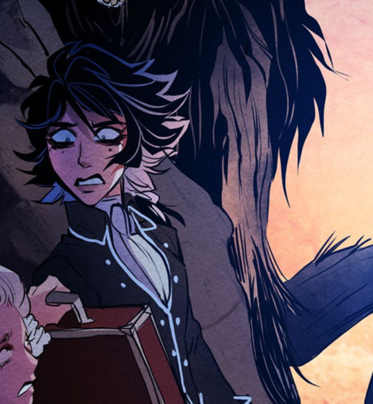
theo stop scaring the students (idk if this is even possible)
ok so in regards to this post i made yesterday i thought i would just like add to it.
going to once again state i literally have no clue what i'm talking about everything i talk about i say with like 99.999% uncertainty and i'm always open to being wrong and having conversations about characters and stuff like that's my JAM.
anyways, i have only two real possible like things to back me up on this:
the fact that it looks like a dear skull. in the comics we learn that theo loved to hunt and he would often bring home venison for lenore and it ends up being her deathwish meal. i also looked up a deer skull for this and guys as somebody who hates bones i did this for you all
i want to say the picture below looks like it's horse hair that's overgrown, or i want to say it's like bits of bark from a tree. either support my idea.
see the way that looks makes me immediately think of the way he died. since we all know he died by basically having a tree fall on him in a storm.
my only question is how did he get out here? because, being honest and this will not be poetic in the slightest, bro looks a bit deranged. and we know that theo, when he was at nevermore, was the top student.
which then just makes me wonder if he went rogue/he did something that fucked up his place in the spotlight and he was booted out and look he's here. i suggest all of these things not out of thinking i'm correct but because i literally have no clue.
with episode 100 coming out literally tomorrow, this could be the dumbest thing i've ever posted because i could have my theory shot down immediately. and if it is, i'm going to laugh. and if it isn't– i might just like, i dunno, crawl into the fetal position and wonder how i was correct.
i never get things like this right.
#theo nevermore#theo stop scaring your sister!!#nevermore webtoon#nevermore webcomic#nevermore#lenore collect your brother he's doing his cosplay dead deer stuff again#is this why he chases them down#“dear sister of mine!” and it's just random growls#best family reunion ever#ex wife and brother meet irl!
55 notes
·
View notes
Text
missed the weird and wild comics world by a few years. stuck in the endless ammonia walmart (webtoon)
#cannot express how much i wish i didn’t have to use it for FTS#i really#really dislike it#sigh#i have my doubts about a webcomic collective wanting my work#or a publisher#idk man i am#awash with nostalgia for a thing i saw but was not part of#all the people that inspired me as a kid with their webcomics#i missed their wonderful world#and i’m lost in the concrete maze of the current internet
127 notes
·
View notes
Text
It’s here! 🎉
Monstrously Cute: Volume 1 is now on sale!
It collects the first 150 comics and features a never before seen concept art section! 🐍🐺🐈🦇
✨a.co/d/2VA23V6✨
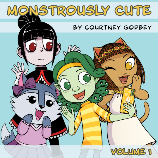
#monstrously cute#comic books#comics#comic strip#comic collection#comic book#webcomics#webtoon canvas#drawing#illustration#courtney art
33 notes
·
View notes
Text
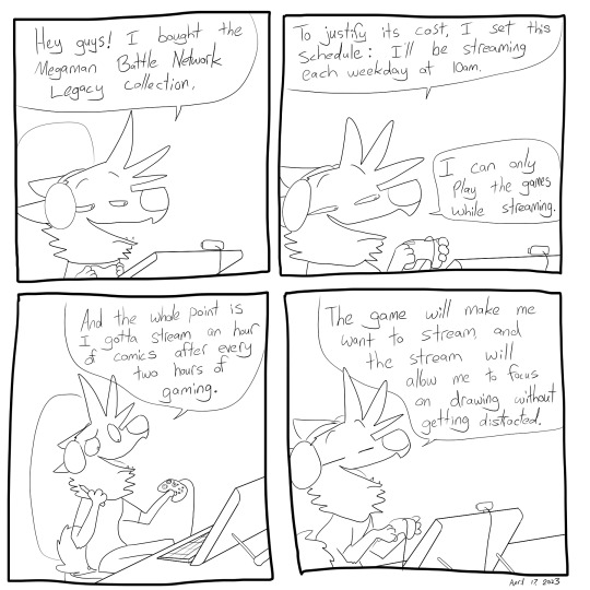
Dogstomp #3029 - April 17th
Patreon / Discord Server / Itaku / Bluesky
#comic diary#daily comic#comic journal#autobio comics#comics#webcomics#furry#furry art#april 17 2023#megaman battle network legacy collection#comic 3029
60 notes
·
View notes
Note
NO I WILL NOT (reading lhjc and c2p because of u after i finish dzyb ((im at ch 127
HAVE FUN also can i please influence someone to read you get me going a manhwa by oh doyeon and mascareto and one of my fav romcoms ever
#im on a webcomic reading streak so i also have some that will make u shit and scream and cry if anyone want those recs..........#guys u have to understand the wy i read bl webtoon like im curating a classics lit collection ready to dish out rec on unsuspecting victims
103 notes
·
View notes
Photo

SpiderForest’s member application season is open now through June 30!
Do you make a webcomic and want to be part of a great collective? Read on!
At SpiderForest, we aim to provide a supportive environment for our members to grow, teach, and build each other up. We offer free hosting to our creators, help newcomers get a website up and running if needed, and cross-promote each others’ work. Members are also encouraged to host their own events and collaborations through our Hub and Discord chat.
Some examples of SpiderForest collaborative projects and events include:
Print and Digital Comic and Art Anthologies
Cross promotional events to share readers
Holiday fanart exchanges (April Fool’s, Secret Santa) and group art collages
Monthly figure drawing streams
Convention appearances at Small Press Expo and Thought Bubble
And much more!
Our applications are open to active webcomics of all genres and styles! If you are interested in joining our community, please take a look at our guideline page and let us know if you have any questions!
Apply here
144 notes
·
View notes
Note
How am I supposed to find indie webcomics? I’m up-to-date on a handful of them and love them all but I’m just not sure how to find new ones. Most searches for webcomics lead you to the mainstream sites.
I mean mainstream sites are fine in and of themselves if you're following the series you like there (especially if the creators of those comics are trying to opt into things like Ad Rev), but if you're wanting to find stuff outside of Webtoons and Tapas, here are some other methods to do so:
Random Webcomic - About as unbiased as you can get, literally sends you to the website for a comic it pulls at random. All comics in the roulette are user-submitted so for the most part, they're all still active or at least have live sites. Sometimes you'll find the odd broken link tho ;0
Top Webcomics - A collective of webcomics competing for top spots. Offers plenty of ad space where people advertise their comics whether or not they make it to the top of the voting pool. And has genre listings you can browse if competitive listings aren't your thing.
The Webcomic List - A collection of webcomics submitted by users that are then crawled by the site's bots to check for new updates. It has a list for most recently updated, but also sorts by genre. Definitely one of the most "old school" listings to exist.
SpiderForest - A jury-picked collection of webcomics. Once every year or two they open submissions where people can pitch their new or ongoing comics - if they're picked, they get a special listing and features on the site, and can either have their existing website affiliated with SF branding or have a new site created for them by the staff. It's all non-profit and it mostly serves as a community of creators and readers, they are not a publisher, but they offer a wide variety of titles.
Hiveworks - Similar concept to SpiderForest except they're an actual publisher so they offer even more benefits to their selected creators including print deals and merchandising, but as such they're way harder to get into. Their submissions have been closed for a VERY long time but they offer a wide array of comics that typically appeal to general-audiences (i.e. there are no NSFW comics AFAIK).
GlobalComix - A platform that, while not new anymore, has been making strides in competing with platforms like Webtoons and Tapas. Has a lot of Western-style comics but their library variety has been growing and I'm pretty sure they're planning on releasing an app soon (if they haven't already).
ComicFury - The final frontier of old school early 2000's webcomic platforms. Run by one guy, this site allows for full HTML/CSS customization, domain hosting, and all those fun little things from an era long gone by. The front page sorting is set to "Recently updated" by default so there's no algorithm bullshit, no editors playing favorites, just classic 2000's era reading.
As a final note, the best part about browsing for comics that have their own sites is that they usually include listings of other comics that are similar to their own. Sites like Tamberlane will often have roulettes of other recommended comics that you can sift through.
There are plenty other comic aggregation sites out there too, of course, but these ones should help you get started if you're looking for other platforms and archives that aren't subject to corporate scrubbing or picky algorithms. It helps decentralize the Internet just a little bit more and rejuvenate what made webcomics so amazing in the first place - independent ownership, accessibility, and unapologetic existence.
Enjoy! <3
82 notes
·
View notes
Text
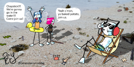


i got lazyyyy at the end lol cause like i drew so many feet that im probably gonna be hunted by the HSC fandom for sport
anyways hope my art processes well..! i had a good time at the beach and took a nice photo I used here for my comic :}
[ The Trio-V (Henry V, Rose E, and Charles R) are platonic! DNI if NSFW / FETISH ]
#Henry Ventriloquest AU#Henry Ventriloquest#Rose Ellisha#Charles Rebelivin#Scott McCoolsvile#my art#comic#webcomic#Henry Stickmin AU#what else can i tag#oc#ocs#original character#summer#beach#trans#transgender#YEAH IM ADDING THESE TOO suck it!!!! charles is ftm and rose is mtf!!!!#Henry Stickmin Collection#Henry Stickmin Collection AU#berenmon art
73 notes
·
View notes
Text
instructions extremely clear
94 notes
·
View notes
Text
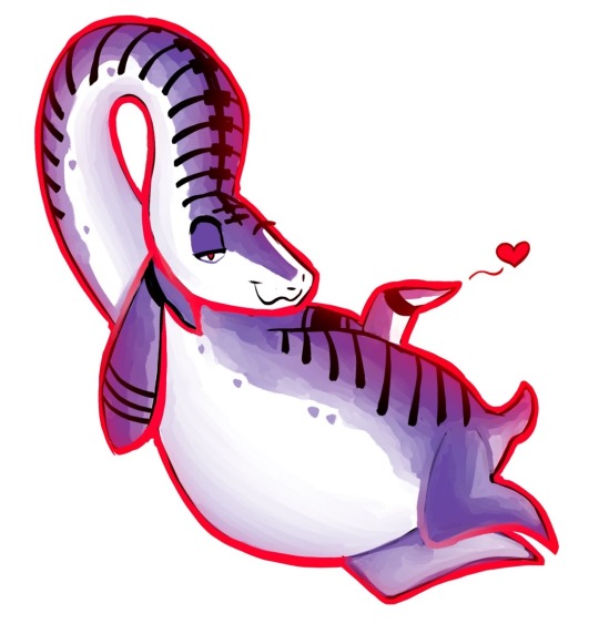
Breaking out of ✨yet another✨ artblock with something new~
and of course it’s something blue seems I really can’t escape this color lol

#Latest addition to my collection of sad butterfly boys#I really looked at that frame with clothes with butterfly buttons and that was it#srsly tho#read Catechism it’s amazing!!!!#Catechism webcomic#Catechism webtoon#catechism comic#noai#no ai art
40 notes
·
View notes
Text
chop chop nevermore fandom give me more theories and speculations
#guys my brain literally won’t work i’m so tired of going to the nevermore tag and im there on the latest i just WANT TO SEE MORE PEOPLE YAP#let’s collectively yap and share theories i’d love to do this please#nevermore webtoon#nevermore webcomic#please ☹️☹️☹️#anything about my gothic lesbians please#pls
57 notes
·
View notes
Text
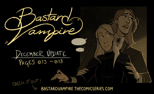
i finished page edits ahead of time bc i'm going to visit family, i was originally going to schedule them for the 31st but i've decided i'm too impatient 😂 Happy early new year! 🦇 💖
Beginning | Page 13
Tip Jar | Discord (update pings and commissions)
#bastard vampire comic#bvc#my art#webcomic#webcomics#update#these little update images are genuinely so much fun to put together lol#can't wait to collect them up once i have a bunch of them
20 notes
·
View notes
Last Seen Blogs
everyprocrastination
Every Procrastination
smokeys-liveblogs
Toph voice: this page looks great!
youknowmisfits
NATHAN YOUNG
babymoon1
Call Me Luna

healthandfitnessinformatics79
Untitled