#unityrain.art
Text
quick lil doodles of guys with comic profile pics while eating breakfast
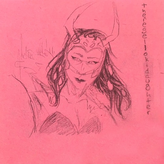
@therese-lokidottir (favourite):
@imreaallyasorry (terrible at this angle sorry lol):

@lokidanger (the best):

@taw-k:

#unityrain.art#unityrain.fanart#comic loki#comics loki#loki#loki fanart#thor#comic thor#comics thor#fanart#art#sketch#no image description
24 notes
·
View notes
Text
❅Jotun Loki Design❅
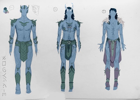


my submissions for @jotun-design-party, though i don't know if it's too late (deadline was december 17th, and it it still dec 17 for me {by less than an hour} but idk if it is for it). If i missed the deadline, i'm sorry.
I had been looking forward to this for several months (and even started a separate jotun loki design months ago in preparation/excitement), but i just haven't been able to do much as of late. Which is sad. And while i had been planning to enter the contest for months, as it drew nearer i realized i probably wouldn't be able to. Which was very sad, because this is one of the only things i've actually looked forward to in forever :(.
As such, though, i really didn't want this oppurtunity to go to waste, like so many others i've had to, and especially in light of magpiemurder going to leave its account soon, i just decided i'd have to push though and do it. I spent pretty much all of today just drawing drawing drawing. Traditional sketched, and then "quickly" added colour digitally (it took several hours as well).
also. all the designs are supposed to be symmetrical (save design 四 and the nails in designs 三&四), so if you see any mistakes... sshhh
More on designs:
一: average battle outfit made from thick, rubbery frost beast leather
二: ceremonial battle armour, used in head shaving ceremony and first battle of a war. Made from thick and (some) thin leather, as well as some mercury metal rings, beads, and bone
三: average every-day wear (inside the city). made of fur, cloth woven from fur, thin leather mercury and bone.
四: average every-day wear (inside city). Likely for around-city wear, not relaxing indoors, due to the uncomfortableness of the beads. Made of fur fabric, fur, thin leather, beads, some bone.
五: average everyday wear (inside city). By far my favourite. For the loincloth, i tried making it look like celtic knots that start right at the top, then sort of get looser and "fade-out" at the end. Thin leather, fur fabric, bone, beads, possibly mercury metal rings.
六: everyday travel wear (outside of city). Not made for warmth, but for protection agains the elements (sharp stone, cutting blizzards, etc). Thick leather, mercury rings. Since loki is royalty, the under layer on theirs is made of black fish scale (the rarest) (also it's supposed to be slightly iridescent but i couldn't do that). For less lavish options, under layers could be made of simply thinner leather, fabric, or a nothing. The nothing option has the jotun wearing it craft an under layer out of ice, and allows for more skin avaliable to make ice for other uses. Also notice how lokis gloves leave the palm bear; this is to allow for the ability to still make ice.
also wanted to say pretty much any of these outfits could be worn with cloaks (save design 一) but i didn't draw them
also: i wanted to do another outfit, a traditional wedding attire. I imagine the jotnar wouldn't actually wear clothes for a wedding, but rather make their own covering out of their own ice. Being their own design, it shows their partner "who they are", and the transparency of the ice represents vulnerability and transparency (in communication; honesty).
jotun headcanons
#sorry if any of this didn't make sense i'm tired and not rereading that#there is currently 18 minutes left of December 17th where i am#i think#i can't do math. it's 11:42pm.#i'm very tired#and i worked on this for hours#okay#bye#loki#jotun loki#concept art#loki fanart#fanart#art#artwork#mcu loki#og loki#2011 loki#jotunheim#unityrain.txt#unityrain.fanart#unityrain.art#magpiemurder#oh look now it's 11:47#no image id#no image description#no id#also i know the feet look wierd but that's bc i hate feet and do not want to spend any time learning how to draw them. yucky yucky#genderfluid loki#fem loki
32 notes
·
View notes
Text

Jötunn Loki
Oil pastel with posca pen detailing
i made this all in one sitting last night. This seems to just be a thing with pastels for me. I won't use pastels at all for weeks and weeks and months and then all of a sudden out of nowhere i'll bust them out, get hit with inspiration, and create an entire finished piece all in one sitting. This isn't the first time it's happened. It's especially wierd since i like.. never make finished pieces.
Anyways. I like how it turned out. I think i accomplished what i wanted with the piece and i like the colours and the abstract elements and the emotion. Jotun Loki <3
#unityrain.fanart#unityrain.art#art#artwork#fanart#loki fanart#jotun loki#jotun loki art#jotun loki fanart#jotun form#loki#mcu loki#loki art#traditional art#oil pastel#oil pastels#no image id#no image description
71 notes
·
View notes
Text
Finished My Baby!!!
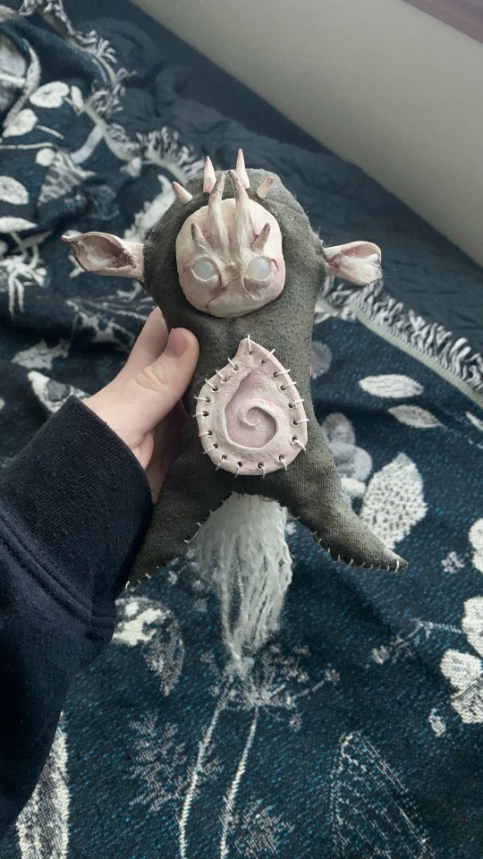
a litol creechur...
also it's legs are *slightly* bendable but i forgot to do it in the video
#unityrain.art#finished wip#art#artwork#doll#dollmaking#doll making#ooak doll#custom doll#diy#goblincore#creeture#creature#creechur#lil guy#faecore
33 notes
·
View notes
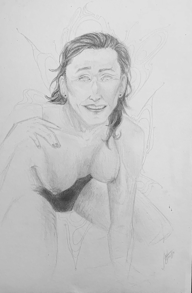
Text
fem loki sketching
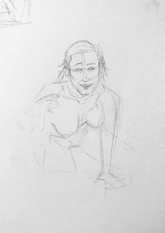
fem loki sketching
#FEM LOKI SKETCHING!! !!!#oh i forgot to post the one i did the other day#fem loki#loki#mcu loki#og loki#loki fanart#fanart#art#artwork#sketch#unityrain.art#unityrain.fanart#no image description#fem!loki#genderfluid loki#nonsexual nudity#tw nudity#nudity
15 notes
·
View notes
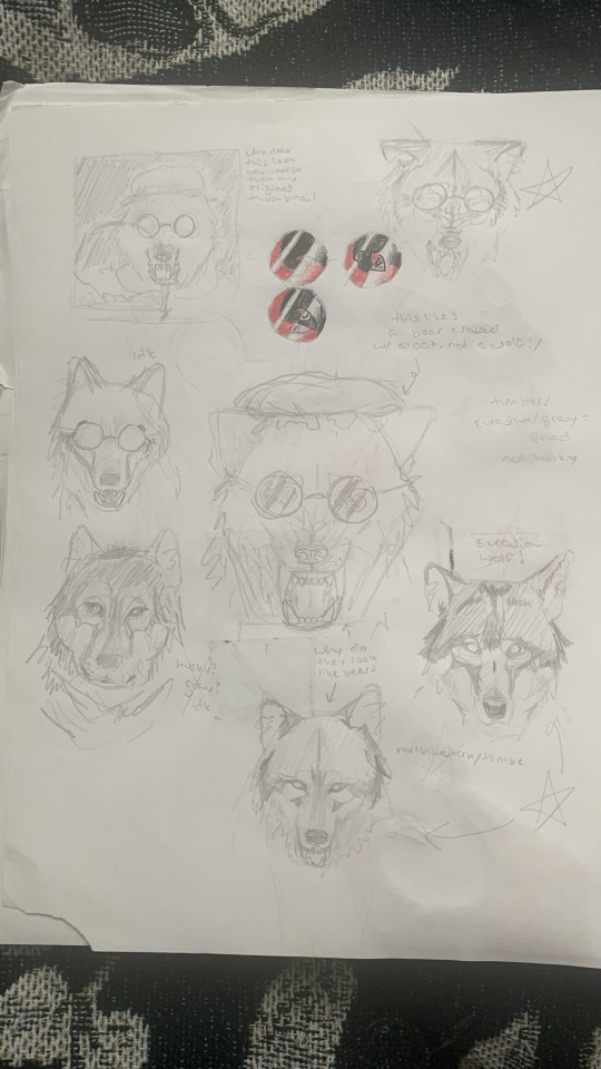
Text
decided to draw the various loki versions of artists i follow/talk to in my style (more or less):
(sorry if it's blurry idk what to do)

technically the last one feels like cheating bc by then my Art Ability for the day had run out so i took a different, incomplete picture of loki id drawn a while ago and edited it in and touched it up a lil bit digitally, but that means it doesn't look exactly like my style >:/ that's not what loki usually looks like when i draw them sorry :(
artists: @imreaallyasorry @cosmic0artist @ magpiemurder (<- i don't think it wants to be tagged)
#between my phone hating dim lighting and tumblr image processing hating pencil sketches idk if this is even visible#unityrain.fanart#unityrain.art#draw this in your style#loki#mcu loki#comic loki#comics loki#loki fanart#fanart#art#you can tell the quality of each one decreasing as my Art Ability for the day ran out...
23 notes
·
View notes
Text

ロキ!!! <3・゚♡*♥˚✧
more on the drawing:
near the bottom i did i a design that looked like valaskálf (asgardian palace), except that it's upside down, like how lokis whole world turned upside down when he found out he was jotun.
i also think it represents him falling from the bifröst? idk. it's not the view loki would see of asgard when he falls, and also the design is placed beneath loki instead of above, so it doesn't make sense in that sense, but idk it just has falling vibes. maybe bc it sort of looks like and downwards arrow?
and then in the top right hand corner is the design that showed up on his hand in jotunheim during the fight
and the jotun markings on him are on the more shaded side of his face, fading him into literal darkness of the drawing even quicker. so it's also symbolic but in a more abstract way
#unityrain.art#unityrain.fanart#loki#mcu loki#2011 loki#tdw loki#og loki#jotun loki#loki fanart#fanart#art#traditional art#this was NOT made with charcoal bc charcoal is fucking evil#graphite#jotunn loki#no image description
11 notes
·
View notes
Text

So! I wanted to see if i could write in Japanese in a gothic-calligraphy-like hand.
(forgive the orange highlighter, it was the only chisel-tip writing ustensil on the entire floor)
epic reading below:
originally, this seemed like a challenge, for a few reasons:
English is very simple, so you are able to embellish a lot. Japanese is not, so you can't really embellish/if you do, they could be confused for other strokes and therefore other kanji.
Japanese has plenty of diagonal strokes, while English does not. And with the technique used in this sort of calligraphy, you can't really make them look very interesting.
And above all, In the english logo of Attack on Titan, they use a really cool gothic-like font, so i was interested to see how they did the Japanese logo, but it wasnt similar at all (not very interesting in its own sense either). Which made it seem like it's just not possible. Which made it more of a challenge. (also note that i have never watched or read aot):

Now, Japanese and English are two entirely different languages. Even just written in the blandest, most boring font with a ballpoint pen, they give off completely different vibes, aesthetically.
Typical/Traditional calligraphy for each also give off different vibes, though there are similarities:

However, some fonts/lettering/calligraphy can look pretty similar when effort is put in:

So, i decided to finally try it out for real today and totally not avoid my English assignment rather than simply attempting to doodle a word here or there half-heartedly.
also, i did do some embellishments, which may make it hard to read if you actually know Japanese, but it does that in English too so lol. I did refrain from doing too many, though.
So, to compare the Japanese to the English in the gothic font side by side, it'd look like this:


(i edited the colouring bc orange highlighter is just way to hard to read). Now, the Japanese is pretty unreadable compared to the English, but I figured that was in-part due to the English having space and lower+upper case, so i did another English version where everything is capitalized:
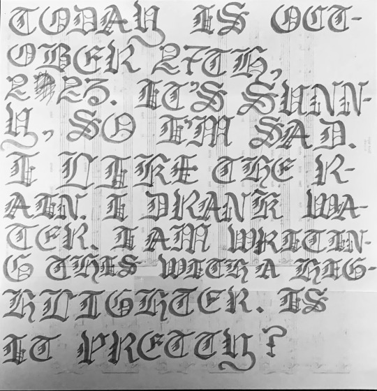
(i ran out of room and had to tape a second paper to it haha). But as you can see, pretty hard to read to (and it would be even harder without the spaces).
So Anyways, do you think the gothic Japanese gives off similar vibes to the English gothic?? how'd i do?
#long post#calligraphy#gothic calligraphy#japanese calligraphy#chinese calligraphy#font#fonts#handwriting#unityrain.txt#unityrain.art
28 notes
·
View notes
Text
SHE IS MY BEST FRIEND AND MY WIFE AND I WANT TO KISS HER
#!!!!!!#unityrain.fanart#unityrain.art#still think the thumbnail turned out better :/ :(#loki#mcu loki#og loki#fem loki#fem!loki#genderfluid loki#loki fanart#fanart#art#artwork#traditional art#graphite#no image description
8 notes
·
View notes
Text

☕ Do you do warmup sketches before drawing? (Bonus: do you have any to share?)
nope! many times i'll do practice sketches for really nice official pieces, but not "warm up" sketches. here are some practice sketches for the red riding hood set i did though (and haven't finished the last piece for still asdjdjs):


🌈 Do you use more warm or cold colors?
COOL!!! i love cool colours so so much <3
8 notes
·
View notes
Text


sketches for my latest oneshot (in hopes that you will read it), in which loki kills the avengers by command of the Black Order during his visit to Midgard.
(also i'm so so so pleased with how thor turned out, i don't draw him very often)
#unityrain.fanart#unityrain.art#unityrain.author#loki#mcu loki#thor#mcu thor#the avengers (2012)#avengers 1#fanart#loki fanart#thor fanart#chitauri scepter#the chitauri scepter#loki's scepter#art#artwork#traditional art#sketch#sketchbook#oneshot#ao3#archive of our own#loki fanfic#loki fanfiction#avengers fanfiction#fanfiction#fanfic
26 notes
·
View notes
Text
reference images:


x x x
#poll#tumblr poll#polls#tumblr polls#art#artwork#painting#acrylic painting#<- sad that i have to use plastic :(#pottery#scultpure#thumbnails#unityrain.txt#unityrain.art
8 notes
·
View notes
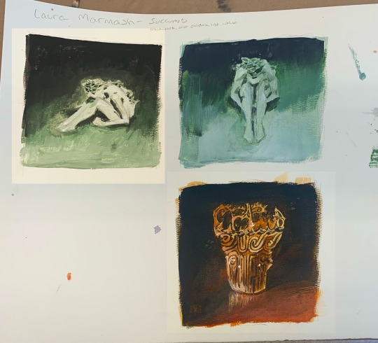
Text
@magpie-murder here is the full page, you can also see the colour mix testing i tried (though the colours don't translate perfectly digitally). also there is a kitty.
12 notes
·
View notes
Text
Old Artwork!
Loki sketches i did in may of 2022, one of the few times i drew the entire year. Turned out pretty nice though. Pencil on paper.

32 notes
·
View notes
Text
Space Practice!

Practicing drawing space, since i'm not that skilled at it (evident in the first drawing, the top left). Decided to try oil pastels, because it seemed like way too much work with coloured pencil, and I wasn't in the mood for watercolour.
Sorry for the undreadable handwriting, i didn't want to smudge the drawings + my hand have been sorta shaky today??
Also. Space freaks me out. This is not just because i like space, i don't like space. I was doing it to see if it'd work in the 10 panel comic i'm doing for my english class. Idk if i'll incorporate it or not though, due to various reasons.
15 notes
·
View notes
Text
work in progress (hopefully)
Jotünn loki sketch during class. one of the first times i've been actually inspired to draw in a long time (there are more clothes than what it may look like bc it's not coloured in yet)

got my reference from here. tbh i gotta thank @magpie-murder for my burst of inspiration. I've barely drawn the past few years and i've missed it but just haven't been able to get myself to do it much, so thank you
#jotun loki#loki fanart#loki#mcu loki#fanart#marvel fanart#jotun form#sketch#wip#current wip#pencil drawing#unityrain.art#unityrain.fanart
26 notes
·
View notes
Last Seen Blogs

alexandravives-blog
ALEXANDRA VIVES

vaibhav97-stuff
Untitled
crackedvesselvintage
Cracked Vessel Vintage

bakamikkun
The Different Path of My Life

lasruioneas
ki residences showroom