#twitter logo
Text
The saga continues
586 notes
·
View notes
Text
organize seu perfil ᘇᘓᗢ
- tirar o "traduzir bio": ( ͏ ͏ ͏ ͏ ͏ ͏ ͏ ͏ ͏ ͏ ͏ ͏ ͏ ͏ ͏)͏
- nome invisível: ( ؘ ) ( ִֶָ ) ( ً )
- pra centralizar a bio: (⠀⠀)
- linha invisível (⠀⠀⠀⠀⠀ ⠀ ⠀⠀)
- headers preta, branca e transparente:


fav & rt if se usar <3
#kpop#kpop icons#kpop headers#kpop layouts#kpop bg#kpop girls#twitter#twitter layouts#twitter locs#twitter links#twitter long locs#twitter logo#twitter icons#twitter x#tweet#twitter name change
155 notes
·
View notes
Text


martin grasser 🩵
44 notes
·
View notes
Text
34 notes
·
View notes
Text
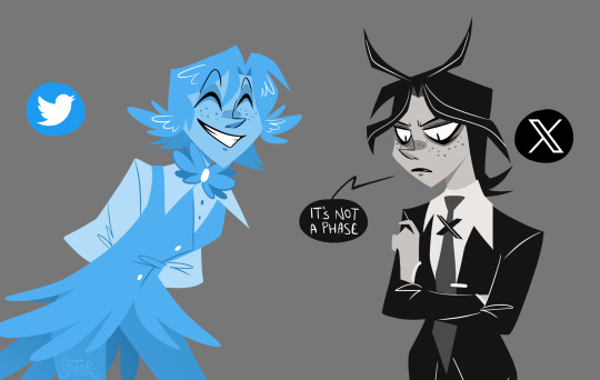
The Twitter X logo takeover is like...
haha would you believe i designed a X logo character! in any case i designed them for an animatic to Biggering but i was too exhausted to animate it so i made the second best thing i could think of!
the logo change is so rapid! the app icons flickering back and fourth between twitter and X is like a fight for survival! its very interesting to me haha
a vibrant natural creature crossed out with a greyscale manmade object, eep!
here are the concepts i did for the X guy in a car trip!
#x logo#twitter#animation#object head#twitter logo#wahh i dunno tags hi guys#never know what to tag for things that arent fandom related...
47 notes
·
View notes
Text
🐦 - ✖️
#twitter#elon musk#twitter meme#twitter logo#X twitter#social media#logotype#logo#blue bird#meme#lol#cool#evolution#timeline#years ago#network#redes sociais
24 notes
·
View notes
Text

He loves "X"
16 notes
·
View notes
Text
"Alphabet" is still google.
"Meta" is still facebook.
"X" is still Twitter.
Same companies. Same product.
It all cope, and for Elon, it's cope AND ego. Sad sad, fraudulent man! I hope you continue to burn all your money in whatever your trying to do.
8 notes
·
View notes
Text
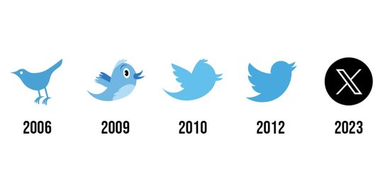
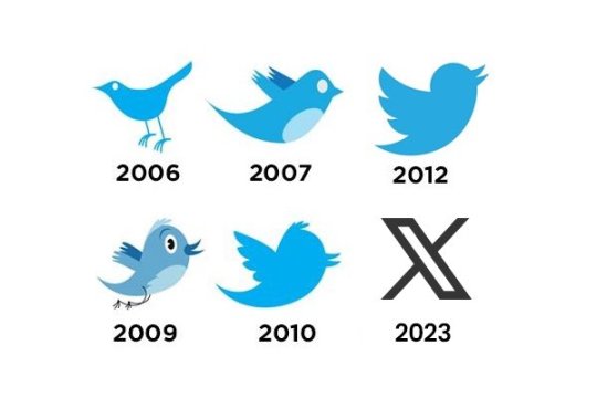
Twitter Logo | Blue & Whitebird to Grey X
Introduction
The Twitter logo, with its iconic blue and white bird, has become one of the most recognizable symbols in the digital world. Over the years, it has undergone various transformations, each representing a different phase in the platform's growth and evolution. In this blog, we will take a journey through time to explore the fascinating evolution of the Twitter logo from the blue & white bird to the sleek Grey X we see today.
Birth of the Blue & White Bird
Twitter was founded in 2006, and it didn't take long for the platform to adopt its first official logo. The original Twitter logo featured a cute and chirpy bluebird, designed to symbolize the essence of tweeting short messages, much like a bird's chirp.
The blue color represented trust, communication, and serenity, while the white background provided a clean and minimalist feel, reflecting the simplicity of the platform.
The Power of Simplicity
As Twitter gained popularity, it became a powerhouse of information sharing, connecting people worldwide in real-time. With this growth, the Twitter logo evolved as well. In 2010, the company decided to drop the text and focus solely on the bird icon, leveraging the power of simplicity in branding.
The revised logo retained the blue color but made minor adjustments to the bird's posture and features, making it more refined and recognizable.
The Grey X Emerges
In recent years, as social media platforms faced increasing challenges, Twitter underwent a significant rebranding process.
In 2012, the bluebird took on a darker shade of blue, reflecting maturity and strength. The year 2016 marked a pivotal moment as the company decided to shift its focus beyond just being a platform for sharing short messages.
With this shift in vision, the iconic blue bird was transformed into a sleek, upward-facing Grey X.
The color change to grey symbolized neutrality, authority, and sophistication. The upward direction of the X represented progress, innovation, and moving forward.
Embracing Change and Versatility
Twitter's decision to change its logo to the Grey X not only represented a new direction for the company but also allowed for greater flexibility in branding. The Grey X could adapt seamlessly to various backgrounds and color schemes, making it more versatile for different marketing campaigns and initiatives.
A Symbol of Resilience
As Twitter faced challenges in maintaining a healthy and inclusive platform, the Grey X also became a symbol of resilience.
It represented the platform's commitment to constantly evolve and improve, addressing issues like fake news, online harassment, and misinformation.
Conclusion
The evolution of the Twitter logo from the blue & white bird to the Grey X mirrors the growth and transformation of the platform itself. From its humble beginnings as a microblogging site to becoming a global communication hub, Twitter has come a long way. The Grey X serves as a reminder of Twitter's commitment to progress, adaptability, and resilience in the face of change.
As we look to the future, it will be fascinating to see how the Twitter logo continues to evolve, reflecting the ever-changing landscape of social media and digital communication. What will the next chapter of the Twitter logo bring? Only time will tell, but one thing is for sure – the Grey X has solidified its place as an enduring symbol of the Twitter brand.
3 notes
·
View notes
Text

I love going outside and hearing the alphabet sing to me. "Tweet tweet," says the letter X. Truly poetic
5 notes
·
View notes
Text

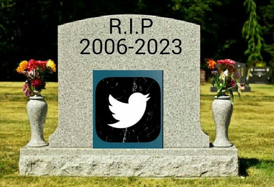
The bird has been double-crossed! 😱
2 notes
·
View notes
Text
you guys… it happened… the twitter’s bird logo at the top of the homepage changed to X logo… i don’t like the design… the blue bird was fine


#this was announced a few months ago but i didn’t know it would be… like this#bring the blue bird back#twitter x#twitter logo#twitter drama#my thoughts#meme#text#photoset
29 notes
·
View notes
Text
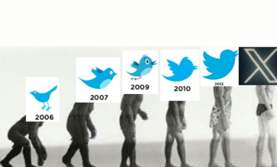
EVOLUTION
10 notes
·
View notes
Text
Shall we flip Elon the bird?
3 notes
·
View notes
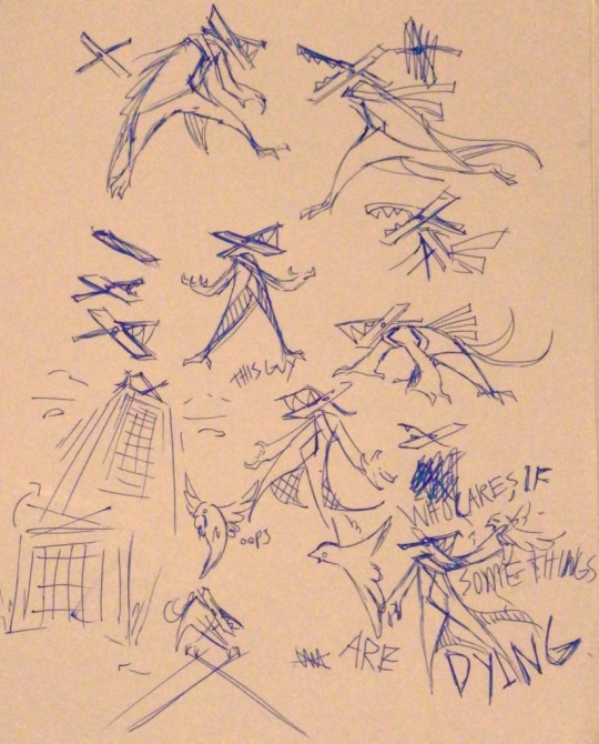
Text

They're killing the bird so I drew this
4 notes
·
View notes
Text
Watch me redesign the Twitter X logo
#twitter#twitter x#elon twitter#twitter logo#bird site#logo design#logo#graphic design#logo redesign#redesign
0 notes
Last Seen Blogs


mark-demolition
mark

myloshinobu
Shipping Heros Boys
yeahyeahbeebisii
a pasadise of sweet teats

leviathansartstudio
Leviathans_