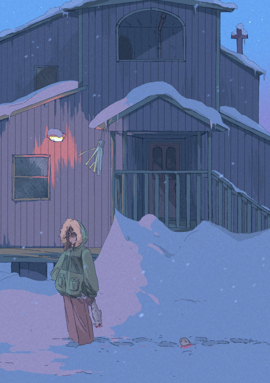
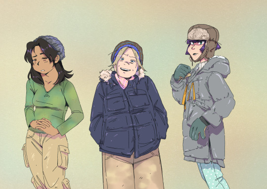
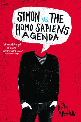
#this will probably be the last limited palette drawing for now
Note
heegjbuh
for the colour palette thing
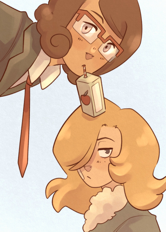
'anxiety' for blitzen???
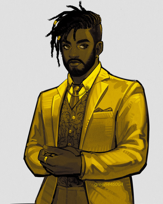
#thanks for the request#mcga#magnus chase#magnus chase and the gods of asgard#mcatgoa#blitzen mcga#fan art#my art#ask#request#riordanverse#i’m never quite satisfiied with my drawings of Blitzen but we’re getting there#can’t believe i’ll be his age next year#this will probably be the last limited palette drawing for now
391 notes
·
View notes
Text
Turns out it's been a while since I've talked about Rachel's medical fetish art so it came as a shock to people when I mentioned it in the last post (I've got quite a few asks about it lmao) So I'm gonna enlighten y'all real quick on what I'm referring to, and yes, it's probably exactly what you're thinking of when you hear the word 'medical fetish'.
CONTENT WARNING: DISCUSSION OF MEDICAL FETISH ART AND DEPICTIONS OF NEEDLES!!!!
So the name "used_bandaid" is one Rachel started using back in the early to mid 2000's. She went by a LOT of different pennames back then, including but probably not limited to:
Pepper_maid
madame_issue
Usedbandaid/used_bandaid
Rach Alex
Rachel Royale
Raquel
Medical Tophat/Medical_Tophat
Frill_house
Gingerbreadcoffin (? this one's kinda weird because the link itself with this username just goes back to her used bandaid MySpace account , so idk if she ever actually used it or if it was even affiliated with her lol)
Now you're probably about to ask, "Puff, how do you know these are all her?" and that's because Rachel still had all of these accounts interlinked through her projects, primarily The Doctor Pepper Show. She seemed to change up usernames often just for the hell of it.
Anyways. I'm not gonna show much of it here because I do think it's better to leave certain things in the past, but there's a LOT of her old work that implies the stuff that's questionable/problematic in LO has always been a part of her identity as an artist (DDLG, hot pink self-insert MC, etc.)
One such example is "madame issue":
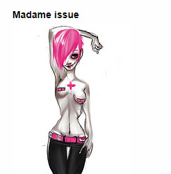
This is such a 3-in-1 smoking gun for everything we see in LO. The reference to bandaids (see: used bandaid, which was part of her URL slug for her old flickr where this drawing comes from), the hot pink color palette, and of course, the fact that this character is almost DEFINITELY a self-insert of Rachel, thanks to that shared name.
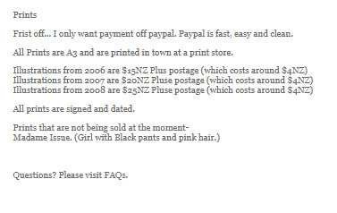
She's also stated in old commission/print posts that Madame Issue was the one print she wouldn't sell.
She doesn't explicitly say why but I think it's pretty safe to assume it's because Madame Issue is her.
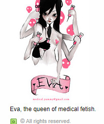
We also have Eva, "the queen of medical fetish". And the tags are... pretty self-explanatory.
That said, that's as much as I'm gonna go into with her old art, because a lot of it does get quite personal with her and I don't really think it accomplishes much more to continue digging up old skeletons, at least not unless they can be seen as parallel to LO (which some of them are and I'll likely be sharing more of those ones in a later post).
That said, there ARE still pages that are accessible without the use of the Wayback Machine that advertise her as a medical fetish artist without the need for extensive digging. If you search up The Doctor Pepper Show on Google, you'll actually find a reddit thread asking what happened to Rachel's old work, and there are comments with loads of resources to access her pre-LO content. You'll also find the listing for The Doctor Pepper Show on The Webcomic List, which literally describes it as a medical fetish comic: "This is a comic set in a world where evil doctors rule, girls wear frilly underpants and people use their manners. *May I please blow your f**king head off?* This comic features Gothic dandys, EGL (Gothic lolitas) and medical fetish fashion. (Neo victorian setting)"
I'll let y'all do your own digging from here, there's a LOT to unpack honestly and while I can't keep you from doing your own research, practice due diligence with what you choose to share. Again, I don't think it's a crime in and of itself for Rachel to want to distance herself from her past as a medical fetish artist, so I think it's only really relevant to show the things that are clearly still influencing LO (like her love for the movie Lolita or the very clear sexualization of youthfulness). While we can try to leave the past where it is, she does still write LO with a lot of the most problematic features of her former identity, and it makes it all the more bizarre that if she is trying to distance herself from it all, then why would she stick with one of the pennames that's the most easily tied back to medical fetishism?
TL ; DR: Rachel started off online with medical fetish and gothic lolita art (at least as far back as we can trace it) and elements of that past are still present in LO today. Use that info responsibly lol
#lore olympus critical#lo critical#antiloreolympus#anti lore olympus#ama#ask me anything#anon ama#anon ask me anything
156 notes
·
View notes
Text
To love or not to love, that is the questio-
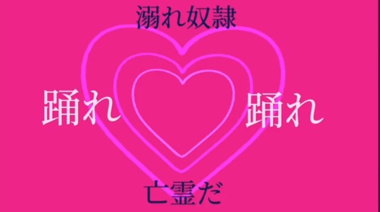
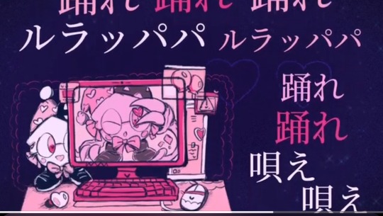
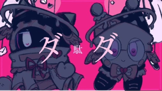
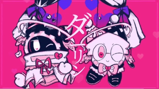
Ok whoops wrong reference. Happy Valentine's Day everyone! I made a MV of the song "Darling Dance" by Kairiki Bear featuring my favourite little tricksters for the occasion!
I'd rather you go straight to Youtube to watch it because Tumblr always finds a way to cut the quality, lol.
Eng subtitles are available too!
youtube
Here it is! Hope you enjoy my pride and joy. Basically like a hopeful child but in video format. Reblogs are specially appreciated because Youtube sucks at promoting new channels!
This also acts as a behind-the-scenes post, so let's get straight into that, shall we?
MV Project 1 "Darling Dance"
Illustration time: 37 hours
Editing time: Approx. 30-35 hours
Total: 70 hours
*Cough* Holy freakin' moly does making an MV take so long. Before you roll off your bed, I'll say that part of the reason making the art took so long was because I have trouble drawing Marx consistently.
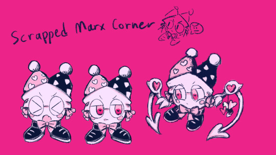
Here's some unused assets! Look at them, they're all salty over not making the cut.
In all seriousness though, a lot of times I don't really see a lot of editors/ MV makers getting appreciation for their efforts. And now that I've personally experienced making an MV for the first time, it's also increased my admiration to the people who dedicate their time to this! All the kudos to them.
Now, I'll go scene by scene then comment along the way! Spoilers ahead!
Verse 1


Pretty good for what it is. In the first image, you see that heart behind Magolor? I discovered the motion of it on complete accident lol. Capcut is hard to figure out..
I also really like the color palette of 2nd image. That art of Marx was the last one I did during production (aka I drew it this morning), and just look at him. He's such a bastard he's the best.
Pre Chorus 1

Mmmm yeah it sure is the pre chorus! I put a bar behind the text in the middle because I didn't want people to stare into their soulless eyes for too long. That probably worked!
1st Chorus
When I first added in the expression change, I fangirled over it a little on the first rewatch. Like, come on! They suddenly look mischievous, and the color change on the background! I know I drew it but still!
For the rest, I experimented a little with all the "Nah"s! I think it ended up well. Most of the lyric editing in this MV is completely original, so I had a couple of things to try out!
Verse 2

This song is horrifically outdated because it says Twitter instead of X!! (/sarcasm)
This scene is my second favourite. I'm really proud of the details on the tabs and the editing at the beginning! Wish I could put more images but the app only allows ten. Bummer.
Pre Chorus 2
I think it's cute, and I used it as my pfp on YouTube! That's about it though.. image limit is killing me I can't put anything here :(
Chorus 2
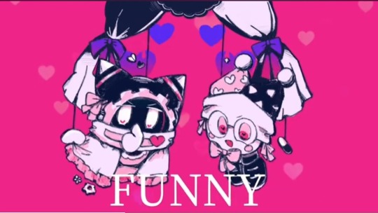
...Not gonna spoil it! I like how I drew them, but there ain't anything notable. Unless you look at the last image I put right before the bridge. :)
Bridge
This is where my editing comes in freakin' clutch. Ooooooh it's so satisfying to look at. Chef's kiss. Also those Marxs (Marxes?) are really cute.
The second part of the bridge is nice as well! I tried to make the lyrics snap to the rhythm. Glad I added that tv effect in the bg too!
Chorus 3
This scene is my favourite! Wanna know why?
This sequence right here. I think I will etch it into my brain forever... I love me some snappy editing. Like a lot. Like a lot a lot!
The second part of the chorus is like the original song's MV! I loved the hearts popping in and out whoever thought of that is a genius. Putting it into the MV was a good decision!
And that's a wrap! Hope you enjoy the MV as much as I enjoyed making it. And, stay tuned for next time! I have a feeling a certain jester is getting his own solo MV...
Feel free to leave your thoughts either in the Youtube comments section or here. See you around!
#kirby#magolor#marx kirby#marxolor#blood sweat and a lot of tears were put into this..#curse me and my need of adding ribbons and pink to everything (/j)#i really do hope you all will like it though! all the best.#Youtube#flashing#cw flashing
56 notes
·
View notes
Text
Last season's anime: Frieren episode 7-10
Shit I guess I'm full on liveblogging this one now.
This time we have episode 7 dir. Naoto Uchida (known for work on Mob Psycho 100), episode 8 dir. Tomoya Kitagawa (who also directed ep. 2), episode 9 dir. Kōki Fujimoto (key animator on a whole buncha stuff, this is his debut as an episode director), and episode 10 dir. Nobihide Kariya (who debuted not so long before as an episode director on Bocchi).
So at the end of the last post about Frieren, I commented that I found the demons underwhelming as antagonists, and hoped they would have their motivations fleshed out some more beyond 'ontologically evil baddies'. Well.
lmao.

So Frieren and the gang are travelling. We get a lot more on the Great Mage Flamme, who is Frieren's mentor figure. At this rate... she's probably gonna turn out to still be alive or some shit.
They roll up in another ridiculously picturesque town. The backgrounds in this show are apparently based heavily on the concept art paintings of Seiko Yoshioka, who gets credited under various roles including 'layout designer' and even 'worldview illustrator'. She did a crazy amount of work to design all the different settings, giving them distinctive cultural motifs and architectures and colour palettes and so on.
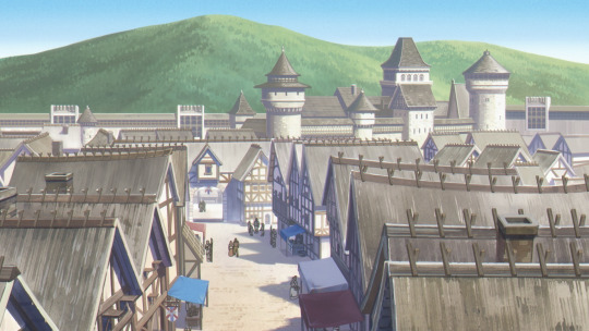
Since this town covers a whole four-episode arc, we get a number of different views of it. There's definitely a reasonable amount of historical care put into the design of those city walls - even sketchy and in the distance you can spot the hoardings and appropriately narrow crenellations, as well as the machicolations on the tops of the towers. (Though unfortunatelly some of those details seem to get forgotten in the later episodes.)
The streets in the town seem kinda wide and clean but it fits the austere vibe. The main thing I'm wondering is what exactly they eat in this town - it's triple-walled in hostile territory without much in the way of farmland in sight, or indeed roads that aren't tiny.

I'm pretty sure they built a model of at least parts of this town in 3D, because as well as certain 3D tracking shots (unfortunately hampered by the lack of any parallax mapping on the floor)...

...we also get shots like this one, which feature a crazy 3-point perspective:
I wouldn't say it's impossible to draw this, but it would be a hell of a lot easier to block it out roughly in 3D and then paint in the details.
Mind you, that's not even the wildest perspective we get in this episode. Check this out:

Absolutely bananas. I love it.
But tbh the praise I have for this arc is pretty limited to this kind of technical stuff. Let's get into the story. (Though you can be sure I'll have more to say about the animation!)
At this point the story shifts gears from this fairly low-key exploration of grief and the passing of time, into more standard action anime territory.
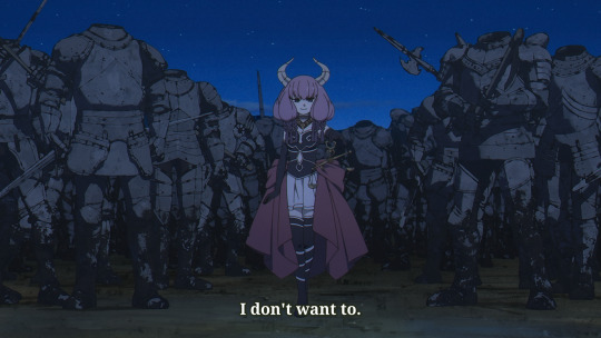
Shortly after arriving in this town, our heroes discover that it has been infiltrated by demons in the guise of peace emissaries. Frieren attempts to attack immediately, but she allows herself to be subdued rather than harm the guards, so off she goes to jail.
Luckily, wizard jail still has pretty generous visiting hours, so she's able to explain the deal with demons to the gang. Frieren declares that demons always lie to gain an advantage over humans, illustrated through a flashback in which a young girl demon begged for mercy, only to betray the townspeople a bit later. Having been proven right, Frieren summarily executes the girl.
I think it's worth comparing this storyline to a couple of other similar storylines in other works of fiction.
First of all, in NieR Replicant/Gestalt, there is the story 'The Little Mermaid', which was adapted into a segment in the game in the remake. A postman takes pity on a girl on a shipwreck, not realising that she is a terribly powerful monster who is struggling to maintain her human appearance. The girl starts killing people to try to maintain her connection with the postman. Eventually, the player shows up and discovers what's been going on. Their intervention provokes the girl to revert to monster state and there's a big boss fight. However, at stake in the fight is the girl's identity. Depending on how you play the boss fight, there are two possible endings, and both of them make overt parallels between the monster girl and your party member Kainé, and one portrays the grief of the postman who cannot let go of his affection for the monster.
Secondly, the second episode of last year's Tengoku Daimakyou features a woman who is trying to protect a monster which she believed to have taken on the consciousness of her son after it ate him. The monster has been curiously non-hostile to the woman - she persuades our protagonists to back off, and they agree. Then it abruptly kills her! Oh shit. Fight scene, they kill the monster, etc.
But as they depart, the protagonists are left discussing whether the monster could really have had the son affecting its actions, whether it was just drawn to prey etc. The monster's motivations are left distinctly unclear, and the protagonists conclude there's no way to know the truth. Throughout the rest of the season, the exact nature of the monsters remains an open question.
In both cases, we either know or it is strongly implied that the monsters are fundamentally human, or derived from humans somehow. A certain amount of effort is spared to try and at least raise the question of the monster's subjectivity, and even if a monster has to die, they play it for tragedy.
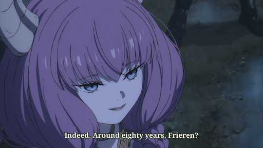
So, let's return to Frieren. We're introduced to the demon girl. She ate a kid, but she staves off execution by pleading for her mother.
The villagers decide to give her a chance to atone. Before long, she kills the village chief who took pity on her. Frieren's party show up and she does small Shaft head tilt...
She's no longer pretending and talks in a much more level voice. She explains that she wanted to give a replacement daughter to the family of the girl she ate, by removing the village chief, for the sake of living in peace. This goes down about how you'd expect. Frieren goes ahead and kills her. As she's dying, Frieren asks why she called for her mother when demons don't raise kids. The answer she gets:
She is surprisingly forthcoming on this front, and honestly, self-preservation is something like an understandable motivation. The impression you get from this flashback sequence is a being that is amoral, and encountering humans as something alien and, honestly, kinda threatening. Why she killed the girl in the first place is an open question - they explicitly say that the demons don't have to eat humans. Even if she kinda felt like it, you'd think she'd be able to figure out it would be an unwise move.
But as far as the show is concerned, the point of this flashback is to establish one thing: demons are lying liars who lie. Frieren is the only one who knows the truth, which is that you must shoot them on sight.
You might think the show would leave some doubt about whether Frieren is justified in having such a severe attitude towards the demons - is she just prejudiced? But nah we go pretty much straight into the demons saying 'Frieren is right about everything, now let'ss discuss our evil plan'.

Props to this guy (he has some longish German name I can't remember) for making this random bench feel like a throne though. Like on some level he's just soft-voiced evil anime aristocrat guy but he does pull it off.
Anyway, one thing definitely doesn't seem to add up. Frieren says that demons are solitary creatures who speak in a human voice only to deceive, but the demons seem to be pretty happy to natter away to each other when no humans are around and express all sorts of thoughts and even express (fairly reserved) emotions. The boy is arrogant, the girl is protective of her boss, etc. The guy is a smooth liar and manages to wriggle out of being killed by the earl by playing the 'we're the same, let's put an end to this' card. But we're constantly reminded it's fake, he's a lying liar who's ontologically evil.
I think the super-deceptive adversary with no qualms about telling any lie is something that can be done well to create an incredibly paranoid scenario. I can't believe I'm mentioning ratfic again in the space of two posts, but this is something Worth The Candle performed very effectively. Though honestly the fantasy of the perfect manipulator who plays everyone like a fiddle is a recurring device in fantasy.
Here... the acting is strong on our main sussy demon dude. But as a worthy adversary, he's not super convincing. He lets his underling run off and get killed, and his response when the jig is up is to reveal that he's super OP and kill everyone nearby, except the governor, who he tortures. So the manipulation angle seems questionably motivated, like he wants the earl to lower the barrier so the demon army can come in... but you're kind of left wondering why he didn't already just go and kill everyone in the city since nobody who isn't Fern or Frieren can touch him. I guess he's trying to get that low chaos route.
I won't continue the beat-by-beat summary. There is a cool fight scene in Frieren's jail cell though, which has some well-integrated 3D. Frieren totally no-sells the boy's attack and cuts his arms off. Lotta dismemberment in these episodes! The main demon guy has some tasty blood-based powers, lots of monofilament whip slicing imagery (also a thing in Tengoku Daimakyou oddly enough). In general the action scenes in this show continue to be super tight. There is a pretty cute bit where Stark is trying to free the earl and can't cut through the rope holding him to a chair, the earl is going 'leave me', and I was sitting there going like 'why not destroy the chair', and then Stark does. So props for that.
Towards the end of ep 8, we learn that Frieren is actually a suuuuper scary battle mage. She was the one who researched the demon killing spell. OOooooohhh.

Seems our demon guy hasn't changed his style in 80 years lol.
And she did not think it too many.
So we already knew that Frieren was part of the party that killed the demon king, the last living person who knew Flamme, etc. etc., so it's not exactly surprising to see once again that she's kind of a big deal. What we seem to be setting up here - or at least maybe I'm just hoping for something more than 'only our hero is wise enough to know coexistence is impossible and a war of annihilation is the only option' - is to suggest a parallel between Frieren and the demons. They're incredibly long-lived, they love to obsessively study magic, they both have a very cold affect, they're calm under fire. If it turned out that Frieren is a demon that would be a fun angle, but I don't think it really tracks. Rather, the framing is suggesting that, when confronted with demons, Frieren is not so different...
We get a title drop in any case - turns out the anime title is an in-story title for its main character. In Japanese: 葬送のフリーレン Sousou no Frieren. 葬送 is translated by jisho.org as
attending a funeral procession; seeing off the deceased; burial of someone's remains; observing a burial
The fansub I'm watching translate it (when used for the character) as 'Frieren the Elegy', which has about the right vibe! In the context for the show title, they translate the same phrase as Frieren: An Ageless Elegy which involves a little more interpolation, but I think it works. The official English title is Frieren: Beyond Journey's End, which is very direct but not a bad subtitle at all. Then again, maybe the bar is in the floor since 'Delicious in Dungeon'.
Anyway, after all that setup, we finally get the big fight episode. Because you see, in contrast to the earlier story which skipped over decades in a montage, this arc spans a whole four episodes. It's not badly done, but it's definitely feeling much more like a standard fight-driven show at this point.
We also meet Aura, one of the demon generals. She looks like a youngish girl and has a habit of doing the sanpaku eye smirk.
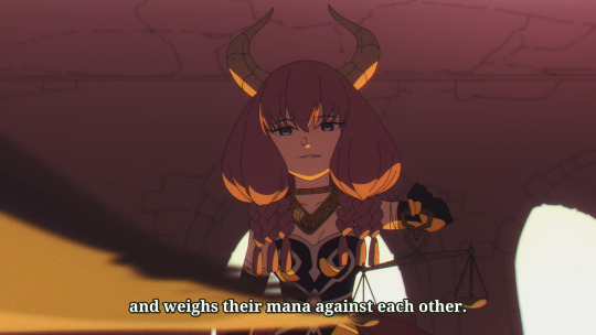
Her schtick is that she has magic scales that let her dominate people. Then she cuts their heads off and walks their corpses around. This is represented by a big army of suits of armour, mostly rendered in CG. They've done some kind of filter to make the linework less even, but the difference in shading style is quite noticeable.
From there it's a lot of 'my gambit vs your gambit' and 'who has more mana'. The fights are, without doubt very nicely animated, although the CG castle set used for the big camera moves feels a bit... lacking in detail compared to the gorgeous painted backgrounds. Anyway, Stark wins his fight by the power of GUTS and DETERMINATION, and Fern wins her fight by being a fast analytical type who can stay cool under fire and also knows Frieren's special demonbuster spell. Though a lot of Fern's fight is just kind of both participants standing still with impassive expressions shooting either blood or big laser beams at each other or zipping all around the castle.
Of course, the major turning points in the fight hinge on flashbacks to moments with mentor figures. This is an anime, and more specifically, it's Frieren.
One thing that is interesting is that the 'point of view' indicated by internal monologue often moves from Fern to the demon guy. We get to see him try to think through how to beat her, unsuccessfully. By contrast Stark's fight takes Stark's POV. I don't think we're expected to sympathise with the demon exactly, it's a way of underlining just how badass Fern has now become thanks to Frieren's levelling up regime.
I admit Frieren has lost me a bit by this point. It's not that it's bad at being a fight anime, it hits us with a whole series of stylishly composed and strongly animated cuts. Not novel necessarily, but absolutely well-executed. But it's not a very interesting direction to take the story! I don't care about this town, we'll be leaving it in an episode or two anyway, and the only named character in it is the earl. I wanna know more about the demons but what we get is kinda just a succession of Guys With Powers. He can make his blood fly around and stab people. She can copy anyone's moveset. He has a monofilament wire. She has a magic scale that mind controls you if she has more mana.
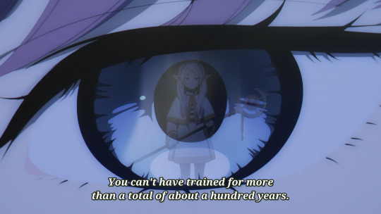
So how does Frieren beat the magic scales? ez. It's kind of spelled out as soon as they introduce the scales, but they spend a whole episode explaining how she's been using a relentless mana retention regimen for the last thousand years to hide her power level so that demons underestimate her. It kinda belabours the point lol. Like it kinda has to because if it doesn't try to make a big deal out of the mana hiding thing, you're just left with 'Frieren wins because her number is bigger'. But... Frieren wins because her number is bigger.
I don't hate fight-driven anime. They can be a ton of fun. But honestly, after the emotional impact of the first few episodes, taking it this way seems like it's wasting the early show's strengths. But, I hear episode 11 sees the return of Keiichirō Saitō as enshutsu, and it's said to be one of the best episodes in the show, so I'm not gonna drop it! It's certainly more than pretty enough to be worth watching through to the end.
There is a good amount of nice stuff in this last episode. The pseudo-Roman town is a cool depiction of a different material culture a thousand years prior to the main story. The 'field of flowers' magic is called back as a specific invention of Flamme - Frieren's whole deal is to kind of go around doing things to commemorate dead people and it turns out the flowers thing lets her do it twice over! We get to set up some parallels - Frieren could intuit that Flamme was a super OP mage, and Himmel could do the same for her.

We also get some worldbuilding stuff about the demons: they have to constantly display their power level to determine their place in the demon pecking order bc they're soooo individualistic. This seems a little dubious to me - like are the demons really so dumb? Is 'hide your power level' such an incomprehensible concept? It seems like it would lead to some kind of Diplomacy-like situation where other demons would team up to take you down.
Honestly, I think what bothers me about all this is like... I don't like the concept of an ontologically evil monster at the best of times, but the demons are obviously not mindlessly malevolent with no inner lives. They talk and scheme and feel things (such as 'proud of their magic'). They have an honour system. But the narrative doesn't quite seem to be able to acknowledge that this is what it's doing. Besides levelling up their magic, we have no idea what the demons want, still, except that it seems to involve killing humans sometimes.
Anyway! kvin has an article about this section, so if you'd like to read about who did which bit and how they worked together resourcefully and where the storyboard creates imagery of separation and so on, there ya go! It sounds from this article like the manga gets a better handle on what it's trying to do with the demons later on, so I'll hold out hope.
15 notes
·
View notes
Text
#mortallychaoticdtiys
Alright friends, grab a snack and take a seat because I have some rules to explain and I clearly don't have the gift of synthesis eheh~
As you can see (actually you can’t because I probably wrote one of my longest posts, I’m sorryy) there are two different prompts! I made them to give a little win to the artists who preferred to have some freedom and also to make this little contest accessible to everyone!
However let's finally talk about rules:
-Anyone can join regardless of their skill, this is only a silly thing to have fun together, don't overthink about it! 💕
-Both traditional and digital drawings are welcomed! There are no particular limits about the media used
-The drawing doesn't have to be completed or meticulously realized, even a quick sketch made in a couple of minutes will be loved and appreciated! ✨
-blatantly traced artworks are not allowed tho (referencing is fine!) and same thing goes for AI art, every drawing that falls under these categories will be "disqualified"!
- You can choose the prompt you like most! I guess you can do both... if you want to (?) But it's not necessary and most importantly it will not be "valued" as a bonus when I'll pick the winners
-You're free to make changes to the composition, color palette, poses ect. of the drawing! The only requirement is that the "original" prompt must still be recognizable!
-Once your pwetty drawing is ready just post it as you normaly would tagging me in the description and adding the hashtag #mortallychaoticdtiys. Feel free to dm me if you notice that I might have missed your post!
-The deadline for this dtiys will be a month from now so for the 7th of February! The winners will be announced after a couple of days and I'll begin working on the prizes from the 17th/18th trying to deliver everything (comic chapter included) in about a month!
-After the winners will be announced I'll contact them privately to get references and everything about the character they would like to be featured in the chapter and/or about the drawing commissions!
-as last, most importantly, have fun!!! 💕 💕 💕
-
-
-
Wow... I really wasn't expecting that many rules :oo I hope I didn't forget anything! (also if you have any doubt always feel free to dm me!)
HOWEVER I'd say I bothered you enough with boring information so you're free to go! Big thanks in advance to the artists who'll join and I really can't wait to see your beautiful artworks! 💕

Little thing i forgot, in case you missed the last post here's the prizes:
-First place: a 50$ worth art commission that can include two characters (full body/full color) with no background OR one (full body, full color) character + background
-Second place: a 25$ worth art commission that can include two full color characters (bust) OR one full body full color character (both without background)
-Third place: a 10$ worth commission, one character full color bust OR one character full body sketch
(the only requirement is that it must be at least vaguely related to the pl fandom, au, oc, crazy crossovers are absolutely fine just don't ask me to make a portrait of your grandma AHAH)
And since this wasn't enough there will be 5 more extra winners that as a prize will have their characters (or even themselves if they want) featured as a bg character in the upcoming chapter of my fancomic Artemis: Behind the Legacy.
#pl#desmond sycamore#professor layton oc#Artemis#mortallychaoticdtiys#dtiys#rules#drawing contest#I'm so hyped JYGJYJYGUK#thank you again for your support <3
60 notes
·
View notes
Text
4/6 Diary: Dead Projects
it's hard to acknowledge why something isn't working when you're in the middle of it, sometimes it's hard to even know why. There's a few plots that have been in my brain for years that I've rewritten and rewritten and rewritten with little success. I think a big part of failed projects is actually over-estimating ones own capabilities, for example I plan out mechanics that I don't have the experience to achieve, or characterization too far from my own experience that its not fun to write. I often plan out stories that require a lot of research and I feel like I can't write until I know everything-therefore most writing doesn't get done and what does is full of holes. It's kind of embarrassing to look back at stuff and just think "I didn't know what I was talking about at all."

Sometimes shit just doesn't work out. In the words of Pretty Boy Detective Club giving up on a dream can be more beautiful than achieving the dream itself.
Probably 90% of everything I try doesn't work out and it's been on my mind lately that that's a good thing. Of course in an ideal world we learn from finished works bc there are things from those you can only learn by sharing with others and by wrapping up a story and by saying goodbye to your characters but there isn't such a thing as an ideal world and everything we do we learn from whether other people see it or not. There is something special you learn from unfinished projects, the types you choose to put down forever, which is you are forced to acknowledge precisely why it could not get done.
These are all images from 2 retired vn/comic projects.


These projects are prisons for some of my best and worst writing, full of ideas with no through-line or real objective, and no real thorough understanding of these characters who I loved just collections of feelings and images and facts I thought were cool.
What is improvement? I'm not a person who looks at my old art and feels like I've gotten better at drawing, and when I look back at old writing I only really get the sense that I've become less cringe but not become a better writer. I think improvement is more esoteric than becoming better at the skills you use to express, maybe it's just knowing yourself better and playing to your strengths, and crystalizing what you want to say (or finding it in the first place). Aesthetics form naturally from writing and drawings that plainly express what they need too and they are drawn like blood from stone from work that is trying its hardest to be clever.
Personally I find these digital pages from 2020(21?) to be better drawings than anything I've done in the last two years in a technical way but it doesn't matter, I couldn't finish it, and I didn't know the characters. It's just portfolio work, it took me months to do five of them. They're just "cool shots" even though I didn't know it at the time.

As I get further into working on Youth Who Was Killed I'm noticing that cutting corners produces better results, there's more emotion in sketches so why finish a drawing, why design a logo which I'm not good at when I can use a font, why color grade the images myself when limiting the palette to one or two or three colors provides an unmuddied result? This is the kind of laziness you would think would harm 'improvement' but I've found that too much brute force is a highway to burn out, and then you're not learning anything at all.


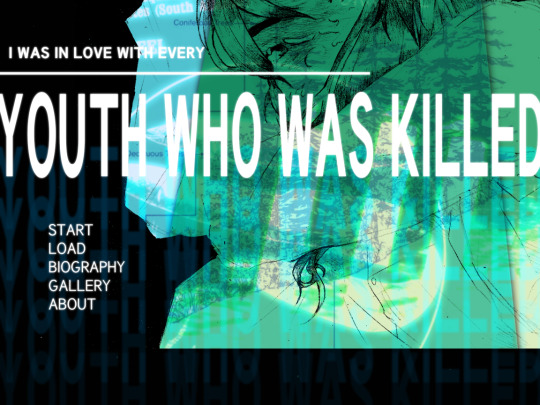
Making art is a war against human nature I think, cavemen definitely weren't built too instinctually develop a five year plan every new years. However it becomes like less of a war when you work with your nature rather than against it. Maybe. I don't know. I really hope I don't make a blog post two years from now about why I couldn't finish YWWK. If that happens blame ren'py.
i drew my ocs in funny t shirts for the first time in my life so maybe all that stuff i said about improvement being that you become less cringe is untrue, maybe you get more cringe. thats ok with me i guess.
#meow meow meow#youth who was killed#that feels like kind of a scary tag and maybe i should use the acronym i will decide later
53 notes
·
View notes
Text
"Cartoon" Book Covers - What's with them?
These are just some musings of mine. Just thoughts kinda organized with some things linked. Lately, there have been discussions about the recent trend of "cartoon" covers for books that have been coming out. As like any discussion of art, a lot of it depends on subjective opinion on how the covers look, the feel they evoke, and if it encourages people to read the book. Before I continue, I think it's important to define some terms and scopes and all that. Ready? (Also this is very long)
"Cartoon" covers seem to be the most prevalent in recent romance releases, however, cartoon covers exist in any genre and are not just a recent thing. (Recent here being loosely defined as within the last 10 year) Romance as a genre is derided, pretty much all throughout history until now which is awful. By talking about this, I am not trying to say that romance is a worthless genre that has nothing to say, in fact, I think the opposite! Romance is extremely important and worthwhile, from brain candy romance to literary romance. It is not a genre I read a lot, just because of my interests and such, but I do read them because I believe in reading a wide variety of books and that exposing yourself to different things is extremely important. But, since many romance books have cartoon covers nowadays, a lot of the books I'll be talking about are romance. Also, I am talking about the covers, not the books. Cover does not indicate book quality, but covers do serve as a sort of "appetizer" for them. I also will only be talking about books, as in novels and such (I am not sure how best to put this, I mean books mostly composed of words alone), not comics or other different types of books.
There's also the issue of how you would define a "cartoon". I will be using the definition of "Cartoon" given by the Oxford Learner's Dictionary, with a bit of modification.
Cartoon - a simple drawing showing the features of its subjects in a humorously exaggerated way, especially a satirical one in a newspaper or magazine. (X)
The modification being that humor/satire is not required to be considered a cartoon. Thus, the definition becomes this:
Cartoon - a simple drawing showing the features of its subjects in an exaggerated way.
Regarding Cartoon Covers, the recent prevalent opinion seems to be negative, with a variety of reasons as to why readers dislike these covers, which line up with my own reasons I dislike *some* of them.
For me, personally, they do not have enough thought or effort put into them. The compositions are not very creative and tend to be static, which is quite boring. They are generally quite simple, but not in a good way. Generally cartoon covers look cheap. However, Being simple does not equate to looking cheap. And yes, while there is something to be said here about how cartoon covers are cheaper for publishers and thus that is a reason they have become prominent, this is a separate (though related) issue. Figures rarely have actual eyes or features, and are not really anchored within the "scene" and they look stiff. Limited (if any) shading means these covers lack depth. The backgrounds are often silhouettes that are a slightly different cover than the overall background color. Honestly, they tend to have very limited color palettes in general. Since I am from the U.S, the covers will probably be U.S Versions.
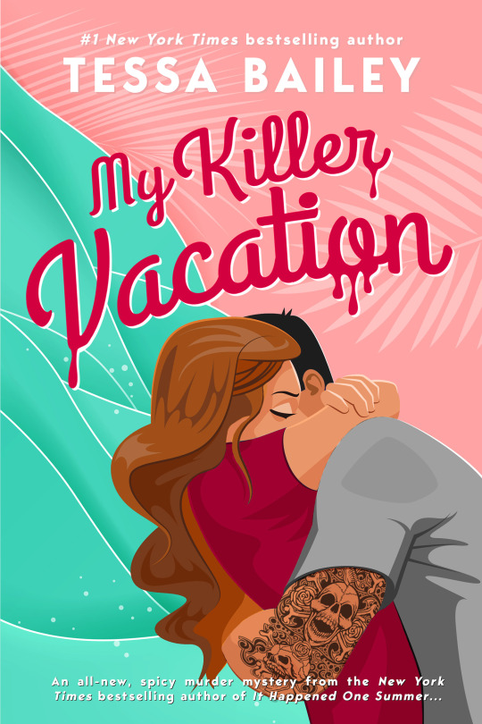
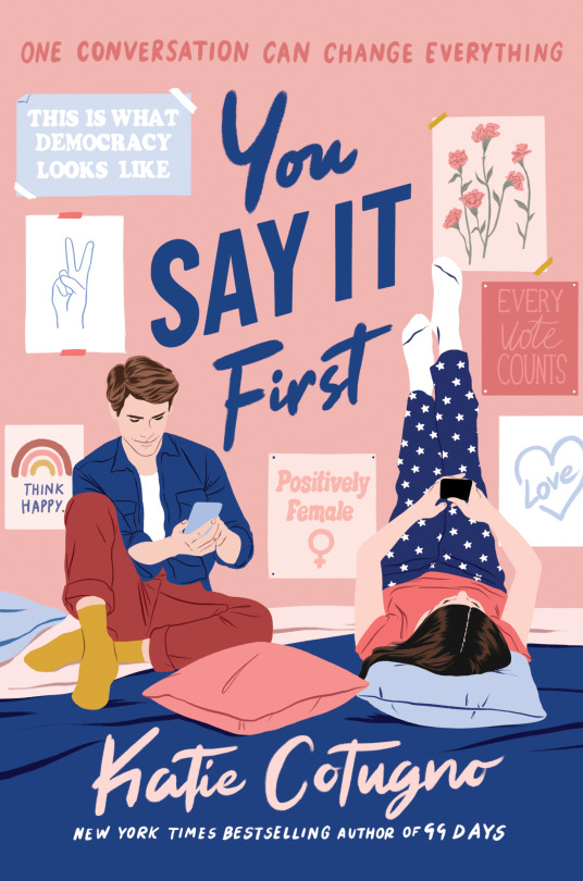
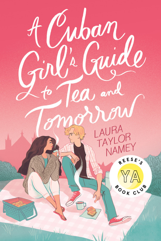
However, there is a distinction to be made I think between the types of cartoon covers drawing ire and cartoon covers that are not. IE "Good" covers and "Bad" covers. Of course, this is subjective and many love cartoon covers I would consider "bad", and inversely many that would dislike covers I love. In order to illustrate my point, I would like to present to you this cover of the Hate U Give, by Angie Thomas.
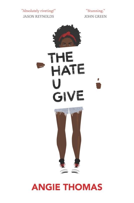
By the definition above, this is a cartoon cover. (This book is a YA Contemporary bildungsroman) It also matches some of the characteristics of covers I dislike. The composition is simple and the figure is not traditionally "anchored". But, I LOVE this cover. The symbolism of the title being on a protest sign is amazing and extremely fitting for the work. The sign itself serves to anchor the the young girl, and the contrast between the figure and the background, interrupted by the sign adds visual interest and makes the figure and title stand out. To me, it this cover feels "cared for" if you know what I mean.
In contrast, there is this cover of The Hating Game, by Sally Thorne:
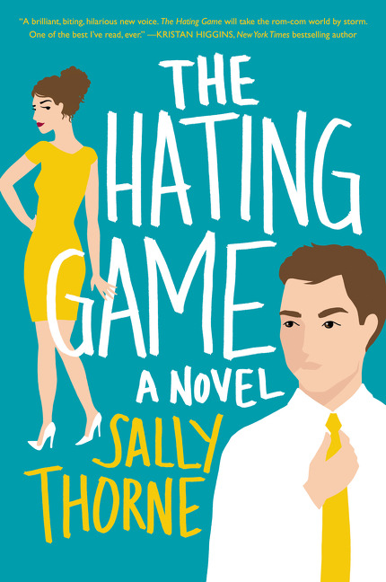
This cover is so awful. My first issue is the woman is so undefined that her pose looks unnatural. Her torso looks unnaturally twisted, as if she's both facing the reader and has her back to them. The man looks like a poorly done papercraft (No hate on papercraft itself) blob with his floating hand and the amalgamation of simple "layered" shapes. (Though there's not a lot there) The figures just float, and the composition is boring. This is a nitpick, but I dislike that the words overlap with the woman. Word placement and font are extremely important to book covers.
Some more examples of covers that I think are unappealing and that I think are the types of covers contributing to the dissatisfaction with covers that are "lazy, cheap, and hollow". Some are more unappealing than others.
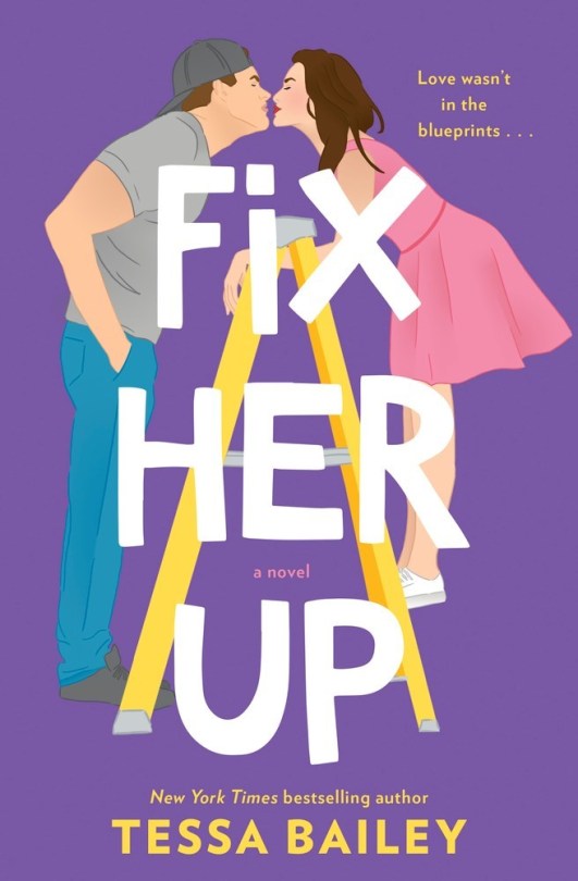


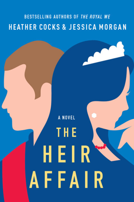

While I find these covers to be bad, the thing is that a lot of them actually have aspects that "could have been good." For instance, I like the Idea of the Covers for "Happy Place" and "The Heir Affair." "The Charm Offensive" Has a boring cover, yes, but I like the spotlights separating the figures. But overall, these covers seem poorly done, and "corporate." It's especially sad, I think because it discourages people from reading books they may enjoy and creates a negative association with cartoon art. There is also a metric FUCKTON of these types of covers. They're ubiquitous. In contrast, I want to highlight some cartoon covers that I think are good (Though not without flaws), and are not the same type as those above.


For me, all of these covers are leagues better than those above. They are visually interesting and dynamic. The figures don't look lifeless and stiff, and they all look unique to their own book. Arguments about if I should be comparing books of different genres and aimed at different audiences might unfold, but I think that's reductive. Cartoon covers exist in all genres for all audiences. Case in point:


Some of these I like and some I don't. I actually do think that *poorly done* cartoon covers are a legitimate problem. Since the genre most plagued by these covers is romance, it can encourage further dismissal and invalidation of the genre. If romance covers are largely perceived as cheap, hollow and insipid, those perceptions further color the perception of romance as a whole. I do not think that romance is any of those things, or that the covers should cater to people who hate romance. But, romance being generally a feminine interest is, like a lot of things considered feminine, mocked and considered inferior. I worry that prolific bad cartoon covers only serve to reinforce this horrible association. Additionally, the saturation of these covers begins to homogenize the romance genre covers making it hard to identify the type of story the book holds. Romance readers (AND AUTHORS) deserve book covers with effort and thought put into them, that match up with the type of book it is. Silly fun books should get silly, fun covers! More serious books should get more serious covers to match. (Of course, cartoon covers can be both but when silly cartoon covers are the only thing being created it's bad and leads into stuff I mentioned) And I know book covers, like most things, have trends. But still.
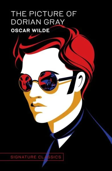
Book covers looking similar is not a crime, and it generally doesn't bother me. And I'm not trying to be mean or attack the designers of the covers I don't like, I'm just trying to critique and distinguish certain types of covers. I know a lot of this is subjective, and this is by no means anything definitive. This is just my thoughts on something I noticed. This is not -serious- analysis! I did not do any *in-depth* research. And I'm not even touching on AI images. It's just. This trend of simple, flat, blobby, cheap art in covers worries me. I know the publishing industry is beyond fucked and tiktok is NOT helping. Cartoon Covers can be quite lovely and amazing! That Cover for "The Picture of Dorian Gray" is one of my favorite book covers of all time. But the push for cheap mass appeal is creating/exacerbating problems. There's not even really anything wrong with going for mass appeal, (especially since book covers are supposed to draw the audience in) but when it becomes the ONLY aim, instead of being a fun/creative way to enhance the book/add to the experience through visual means as WELL as to appeal to readers, something very important is lost.
#eta#books#book covers#cartoon book covers#booklr#reading#romance books#romance genre#cover art#booktok#book cover art
7 notes
·
View notes
Text
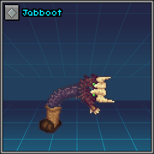
A while ago, I found an old sketch of a Fakemon I made, and I figured I'd try to redesign and reinterpret it to fit in with other monster-taming games! Some of the iterations have different names either to fit in with the game's naming scheme or because the design changed significantly. Redesigns and their respective games are listed below!

Pokémon:
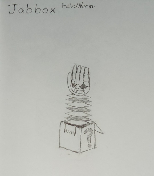
I'm mostly happy with how this came out. That said, I probably didn't need a second set of highlights for most of the drawing, and I'd like to find a brush that looks more pencil-like for the line art. When I originally drew this guy, I wanted to put a twist on the more typical mimic-mon design by having it striking from boxes and crates instead of the now-expected Pokéballs.
Temtem:
This is probably one of the furthest abstractions from the original I've drawn so far. There don't seem to be any creatures in Temtem that are especially inorganic looking (even the Cyber types are cyborg-like), so I figured I'd model it after a garden eel since they basically behave like an organic jack-in-the-box.
Nexomon:
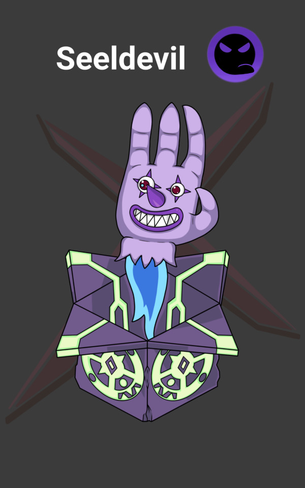
This was the first time I decided to change the name. To fit in with Nexomon's type system, I based the design off of the French name for Jack-in-the-boxes, "Diable en Boîte" (Devil in a Box". By the time this design was finished, I figured it didn't fit the name Jabbox anymore, so I changed it to "Seeldevil" (from "Sealed Evil" and "Devil").

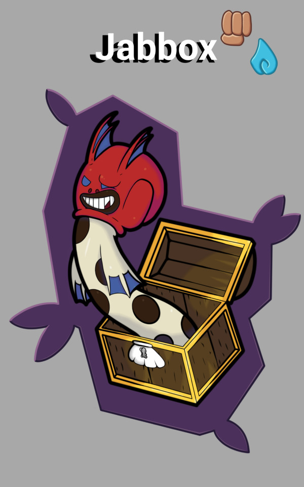
Cassette Beasts:
This one was the most like the original in design and behavior. The real gimmick to this iteration is that it'd be the only naturally occurring Glitter type in the game, being partly based off of glitter bombs. I also wanted to change the fist-head to an abstracted peace sign to fit the game's overall vibe, and it calls back to the slapstick trope of poking someone's eyes out ala The Three Stooges. I may also make a sprite from this drawing complete with bootleg recolors!
Siralim:
This was the first sprite-based design I made. I leaned a little into the monster-clown motif here so it could fit in with Siralim's more brutal takes on monsters. Moreover, this will likely be only one of two or three designs to not have a portmanteau as a name. In lore, these creatures would be crafted from the severed arm of a lesser demon and a few arcane machine components, now doomed to serving as both a babysitter and as a living toy. Variants of this design will have to come at a much later date cause making one pixel art hand was bad enough, making 5-6 extra would've broken me.
Monster Crown:
Speaking of drawing more pixel art hands! I wanted to lean harder into the monster-clown flavor since the denizens of Monster Crown are much more violent in their behavior. Making this sprite was a fun challenge since I was limited to a 4-color palette, and I intend to make the five other variant forms at a later date to go along with the game's cross-breeding system.
Coromon:
This is the last design I've made for now. I was initially intimidated by the prospect of imitating Coromon's art style as it's not only detailed but also smoothly animated. After axing the idea of replicating the animation style, I felt more comfortable working on this sprite. The overall design is derived from a theory that the original jack-in-the-box was based on a folktale about a demon getting sealed in a boot. I also threw in a few Muppet-esque elements so it'd better fit its Normal typing. The head is shaped like a "Devil Horns" sign, with the actual horns serving as the fingers and the single paw in place of the thumb. Making the Potent and Perfect recolors should be a much easier process and will likely be the soonest of the variant sets to come out.
Other planned designs:
Digimon, Dragon Quest Monsters, Ni No Kuni, Yo-Kai Watch
Lemme know if there are any other monster tamers/creature collectors with unique styles I should tackle!
#pokemon#fakemon#jack in the box#creature collector#monster tamer#sprite art#sprite#temtem#nexomon#cassette beasts#siralim#monster crown#coromon#fairy type#fighting type#jabbox
11 notes
·
View notes
Note
If it's okay, Brawler for the characters thoughts bingo thing? (Maybe Hoodlum too, if that's okay, I feel like you have something funny to say about him for some reason.)
I didn't expect to get more requests for this and I appreciate those!! Also, let me tell you right away - I didn't end up clicking with a lot of what was suggested in the bingo for these characters, but that doesn't mean I don't have a lot of Thoughts about them. Or that I don't care about them. I do. A lot.

For some reason I can't post the pictures side by side so I'll write about Brawler first and post the Hoodlum bingo next.
Brawler:
• They are soooooo cool looking & wow... they are LITERALLY me! :
Yes I put those two together ahdksdkk bEAR WITH ME,
Brawler. Strong man. Beautiful man. Pretty palette. Strong man. Dumb man. Long hair. Sort of my type. A few of my types. If you know you know. /ij
So yes, he is absolutely cool looking, I have a few screencaps of him I kept "just in case I want to draw him", and I did draw him early on (he might be the first AD character I drew? It was a screencap redraw I was pretty happy with.).
As for the second part... That's uh, a joke I still remember and sometimes reference, that I made on the Reddit-Discord server at the time, lol. I kept joking that they were making a live-action Akudama Drive adaptation and that I was going to portray Brawler. The joke is that I was the token short-hair woman, so Brawler wasn't the character anyone wanted me to claim... and also that I like claiming I am EXTREMELY jacked when I'm obviously not quite there yet. (I'm getting there.) So yeah, Brawler is #goals. And no, they didn't contact me for the stage adaptation. :(
• Wasted potential
This one... There's probably a lot to say that I'm not equipped to explain right now.
Hell I'm still mourning his death right now!!! There is something frustrating, on its own, about his early death. There is no doubt in my mind that his arc was over by this point - he was always written to die first. And in my opinion, that's what puts a limitation on his writing as well. He was a strong personality and could have had a lot more, interesting interactions with his surroundings, but he was instead written to be sent to death early.
And then... During these last couple years, I have been facing my own biases and ignorance, and have started to understand a lot more about the deeper issues within Kodaka's (among others) racist writing. Looking into what is still his biggest work to date, Danganronpa, it's easy to notice inherent biases that repeatedly come up in his writing, that appear underneath Brawler's representation as well. For this reason, my belief is that Brawler could have been given a lot more potential if it weren't for his creators' inherent racist biases. The disappointment of seeing the classic and extremely obvious trope of the one dark-skinned character dying first is the final nail in the coffin, and once again, takes away from the viewer's potential enjoyment of Brawler as a character.
• If they were real I would be afraid of them
Jokes aside he could absolutely kick my ass. And I don't trust him not to.
• If they were real I would marry them & the handbag thing
I think those speak for themselves.
I would say this sums up my main thoughts about Brawler. He is hot and dumb and I am a morosexual, so I definitely appreciated him. And miss him. He deserved better.
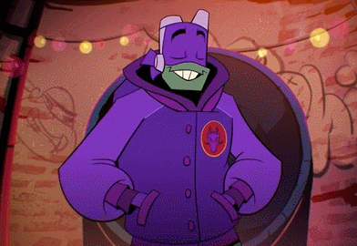
Hoodlum:
Like I said, I wasn't particularly inspired by these prompts when it comes to Hoodlum.
• Why do they look like that
I mean, I HAVE to ask that, right? ヽ(*。>Д<)o゜
His hair and face are on point, but the outfit? The colours? Oh honey. And WHY IS HE RIPPED. SERIOUSLY IT DOES NOT MAKE SENSE. It's that "I look skinnier wearing clothes" joke from Angel Beats! all over again. What the hELL
• They work better as part of a dynamic
I'm not the one saying that - the story is the one saying that. Doctor is the one saying that. She points it out correctly: Hoodlum needs someone to hide behind, and will use whatever means to get to that place. He will lie to someone like Brawler, he will obey to someone like Doctor. He, himself, mentions searching for someone to use early on - first Brawler, then Cutthroat, though at that point he can't help but defend Brawler, because you know, feelings.
Not that he isn't efficient enough on his own. I fully see and believe that he is - but he's the one who doesn't! During the events of Akudama Drive, he was at a point where he couldn't help but be like that... and then he died, so it kinda ends there.
• wow... they are LITERALLY me!
Like I said, I am a proud morosexual. (It's pride month after all! /j) I fully identify with Hoodlum's crush on Brawler. He is 100% me in that regard. Ψ( ̄∀ ̄)Ψ
The colour I use for my username on the Wiki was his role colour on that one server - and I use his flair with the text "morosexual" on the Akudama Drive subreddit. (✿◕‿◕✿)
With all that being said - I love Hoodlum and I believe that he is one of the characters whose arc was the most satisfying and well-rounded, when many shortcuts were taken for other characters in the anime. He's probably one of the deaths I'm most upset about? I'm not necessarily satisfied about the fact that all the Akudama had to die, I think it was a bit... overkill... and if I had to revive someone, Hoodlum would be one of my options. [Trying my hardest not to start talking about my other option because this is not about them,] His death wasn't fully unsatisfying, it made sense, I was glad Doctor died the way she did, I was glad he stood up for Brawler, but... Did he have to die? Did we gain much from that? Like, Junior survived in the Director's Cut, so my boy Hoodlum could have survived his injuries in a similar fashion. You know. Be weak, be flawed, but keep on living. He's such a well-rounded character and right as he died, he was learning so much about himself and his way of living. I could go on lol
#you caught me off my medication so i'm not even done but i'm already tagging to say this is going to be a rambling mess#akudama drive#akudama drive brawler#akudama drive hoodlum#character opinion bingo#ask
13 notes
·
View notes
Note
can you do donnie x reader who frequently makes him hand-made gifts? Like jackets, crocheted hats, baked treats, paintings, etc.
Handicraft
Pairing(s): Donnie x Gift Giver!Reader
A/N: See how I got this request done the day it was requested, since I chose to write it as headcanons, but I'm struggling to post the oneshot that's been in the drafts for a month 💀
Anyways, I think it's pretty clear I love talking about love languages NDKJSDKS

Donnie
💜 - Oh boy, am I gonna have fun with this one >:] (FYI I'm gonna dig into Donnie's love languages a bit)
💜 - OK so, as you might know, gift giving is one of the 5 main love languages, alongside many other minor ones
💜 - And I think we can all collectively agree, that gift giving is definitely Donnie's number one love language
💜 - He struggles with verbally showing appreciation [words of affirmation] and sometimes has difficulties with physical contact [physical touch]
💜 - So, my boy's gonna have to find another way to show his affection
💜 - And in comes the gift giving <3
💜 - Ok ok, onto you!
💜 - In my opinion, his reaction, well more specifically his thought process, might vary depending on how deep into the relationship you start making him things
💜 - Early on? Well, he'll gladly take them, maybe even just store it away somewhere safe if its something more long lasting, like idk a bracelet
💜 - Might be shy about wearing it in public
💜 - Ok well maybe not shy, more like embarrassed...of his brothers' teasing-
💜 - But if you're further along the line, then hell yeah
💜 - He'd wear any clothing and/or accessories you made with pride (as long as they're the right materials and don't get in his way or irritate his skin in anyway)
💜 - He don't care what his brothers have to say, cuz at this point, he's used to it
💜 - Can and will show off your stuff to the others
💜 - If you ever draw him anything or make him like a little clay figurine or something
💜 - You bet it's going straight to the shelf. Which one you ask? Well, only the one with the limited edition Jupiter Jim action figure, of course-
💜 - He makes sure it somewhere up high enough to not be damaged incase one of his inventions go haywire, but close enough so that if he's ever feeling down or unmotivated, he can just take a quick peek at it and BOOM- he's back, baby!
💜 - If you're the artsy kind, and you like to make stickers, oh lord-
💜 - If y'all have been together for a while, then he's probably going to let you stick a few here and there on bridge of his goggles, and maybe the little thing on his battle shell where it's on his shoulders? Straps? Idk man-
💜 - Now if you're the kind who likes to bake and/or cook, things get a little trickier
💜 - If it's something that suits his palette, then hell yeah, he might munch on it sometime outside the lab (No eating in labs kids)
💜 - But if it doesn't, don't worry these aren't going to waste
💜 - He'll give them to his brothers, Splinter, or even April if she's around
💜 - He'll make sure to stress that fact that he still appreciates it. I mean, you two could be in his lab, and he might be like, "I appreciate the cookies, by the way. I'll make sure my brothers send their regards after they've finished shoveling the remains into their mouths-"
💜 - And later, you two could be gaming together, and he might just pipe up and be like "Oh yeah, I appreciate you taking time out of your day to bake something for my brothers and I-"
💜 - Oh and expect him to make some stuff for you too
💜 - Gadgets, fidget toys, you name it
💜 - If it's tech, it's yours, love
💜 - By y'all's one year anniversary, expect to have a drawer, if not, a full set of shelves, filled with all the things he's given/made for you
💜 - I mean, you didn't expect him to not reciprocate, no? <3
--
Taglist! (DM, ask, comment, or ask in tags if you wanna be added!!)
@lemme-be-cringe-damnit @sleepytime-fics @ray-of-midnight-storm @hamthepan @charismakat
274 notes
·
View notes
Note
Rory rory rory! Requests are open! May i request for a simple drabble of al and tpt reader bonding while cae and levi are off to do their own?
Congrats on the milestone!
i wanna spend some time with you — tpt!au bonus reel
— levi ackerman x female reader (modern au | the parent trap au)
— summary: after deciding that levi will take caelum to the city, you propose a painting session for the afternoon with altair.
— word count: 1.5k
— notes: alia, my love !! i'm so sorry for the late response --- i'm just in my tpt feels today and thought that why not answer this little request. thank you for requesting, sweetheart! hope you enjoy this treat ^^ (ooh, and the banner is from the moodboard a lovely anon sent me!! thank you for those amazing boards, anon <33)
my masterlist is here if you want to check out this au
"Mom, am I really doing this right?" Altair cautiously asked you as he eyed the canvas in front of him.
To be honest, he didn't even know what he was doing with a paintbrush and some tubes of paint. Heck, he never did well in his art classes — his grades in his projects and outputs were just average. He never gave that much thought to how paintings came to life with a few strokes or how sculptures breathtakingly depicted real-life people.
That was until he knew of your profession.
Being one of the well-known fashion designers for dresses and wedding gowns around Europe, Altair was always at a loss for words every time you sketch a new idea for one of your clothing lines. It was so simple for you but for him, it would probably take hours just to make a decent drawing of a person's body proportions. You made it look like a normal person could do it but in reality, it was more than just talent when it comes to you. Altair heard of the stories from Levi that you took fashion design as a course in college and you had to endure many projects just to get where you are. It's almost like the word talent became something that limits your capabilities as a designer. That much Altair could pick up on as he watched you paint a wonderful rendition of the flower patch in the backyard. It was different from the real thing, but you added your touches to it, which made it look astounding.
Altair, on the other hand, spent the last five minutes staring at his painting until he could see an image of a sorry lump of clay.
You looked over at him and smiled at the initial state of his painting. "You're doing amazing, starlight. Much better than my first try in painting when I was your age."
Still, Altair appeared to be doubtful.
You placed your paintbrush on the palette beside you before scooting closer to your little boy. To not jolt him from scrutinizing his painting, you gently put your hands on his shoulders, with your chin on the crown of his head. "See that?" You pointed at the splotch of cream he carefully made earlier on the canvas. (You had to resist the urge to pinch his cheeks since his face of concentration was just too adorable for you to handle.) Altair nodded at you, his eyebrows still furrowed. Now, he looked so much like Levi with that face. "You can add some shadows for depth. Treat that as your base for now. Mix in a darker color to your cream or gold and follow the shadows on Captain's body."
His subject, Captain, was sleeping on the grass for a solid thirty minutes. Altair was glad the dog didn't wake up.
Altair followed your instructions and the more he painted the darker tones, the more his frown deepened.
"Mom, I think I made it worse."
The painting looked like there was a spill of coffee on a carpet of green.
"That's just your thinking, starlight," you told him. "May I?" You gestured to his paintbrush and he placed it on your palm. "Why don't we put a lighter shade this time to balance out the darker colors you put. Like this here and here." You then hummed. "Well, what do you think?" You looked down at him with a soft smile, heart swelling at his face filled with wonder. He looked up at you with the biggest smile. You ducked down and kissed him on the nose, making him giggle. "Does that look alright to you now, starlight?"
Altair eagerly nodded at you before returning your kiss, right in the middle of your cheek. "Thanks, Mommy. Are you sure you didn't take up painting when you were young?"
You chuckled, lifting Altair so that he could sit on your lap. You wished he would never grow up, just be your little boy so that you could lift him in your arms and cuddle with him until he falls asleep in your hold. Those bittersweet thoughts made you bury your face in his onyx hair, the familiar scent of home coming from him. How you wish you could strike a deal with Time and make this moment last for much longer. You tightened your embrace around Altair, his laughs following right after you tickle him in his sides.
"No, I never had much time for painting when I was young. I just did it whenever I felt bored around the house. If I wasn't in dance classes, I would've been told to get into painting."
"Oh, yeah, you're a ballet dancer, right?"
"Mmhmm. Did you know," he looked at you when you uttered the words, "that I played Odette when I was fourteen?"
"Isn't that the White Swan?"
You nodded in reply.
"Wow, so you also played the Black Swan?"
You shook your head. "I had a double for that. The principal ballerina told me I was too soft for Odile. They had to style the other dancer to look the same as me and hoped that no one in the audience noticed how we differ in the smallest of ways."
"Well, they suck for not giving you the other role," Altair grumbled, crossing his arms with a pout. "I know you would have pulled that off."
You lightly laughed while pinching his cheek. "We may never know because no one was willing to give it a try, even me. I was too scared to do so. I figured that if I'll play only one role, then I'm going to make it count. That was my last dance recital."
"Why did you stop, Mom?"
"Because I wasn't happy with it," you relayed. "I did it because Maman told me to."
"She wasn't happy that you quit?"
"You could say that."
Altair then placed his thumb and forefinger on his chin, deep in thought. It lasted for a minute and the star-eyed boy sat up straight on your lap. You waited curiously for him to tell you what genius idea he had this time. He turned to you with the night sky in his eyes, staring at you as if you placed the constellations there using pieces of thread. "Mom, I know just what to paint now!" When you opened your mouth to ask him what it was, he frantically waved his hand. "Don't ask! It's going to be a surprise!"
You laughed, kissing him on the forehead. "Okay, then."

"Beautiful, we're home," Levi called out from the front door, Caelum in his arms, sound asleep. There was no reply, worrying Levi as he went into the second living room, where you were sitting. He was about to announce again that they made it home safe, only to stop in his place when he saw your shocked and misty-eyed look. Your hand was covering your mouth while you stared at a canvas propped on an easel. With furrowed brows, Levi stood behind you to see what rendered you speechless. All he could say at the reason of your wonder was, "Damn, did you paint this, beautiful?"
You turned to Levi with a light jut of your bottom lip. "No."
"Then, who did?"
You glanced at the figure slumped beside you, a little boy of eleven curled up on the couch's throw pillows.
"Al?"
You nodded with a growing smile. "He told me it's going to be a surprise."
"Damn right it is. That looks good."
"Right?"
"Didn't know he has a knack for art."
"Me, too. He also asked Hange for the reference photo."
Levi looked at you in confusion. "Why did he ask Four-eyes for the reference? He can search that on the internet." The knowing smile on your face said it all. Eyebrows raised in realization, he asked, "... Wait, is this you?"
You only hummed a laugh, hands carefully threading through Altair's hair, the love you felt for your son traveling from your fingertips to his dreams. As for Levi, he adjusted Caelum in his arms before letting out a single laugh, half-smile lighting up his face. Both of his boys are brilliant, a fact that he sometimes couldn't grasp to this day. It started with the fencing phase, then this. The more Levi stared at the painting, the image of the girl on the canvas slowly became you. He always wanted to see you move as if the stage was entirely yours. Now, with Altair's painting, he could finally witness you enrapturing an auditorium of people. With a chest heavy with warmth for his family, Levi looked at you and Altair will eyes filled with unconditional love before glancing at the painting of you in a White Swan costume, back arched and face up to the sky — wings covering your arms as if taking flight. This would find its home on the walls of this mansion.
Every day with you and the twins, Levi knew he's the luckiest man in the universe.
taglist for tpt:
@loveprisms @halparkebitch @omlbarnes @a--nonymousse @nunufx @misslovingpearl @softsakusas @whalerus @sakuxxi @littleagxs @izzy-rose010 @dora-the-grownup @dren-whalen @whosveenus @bokkunto @alwayssleepingforreal @haikyuutothetop @awkwardspontaneity @tenaciouswritersheep @leviskata @hexll @poeticsorcery @shadowolf993 @pirate4ngel @purplecandygerl @p1nkfl0wers @kpostedsum @lynnleanist
for those who are in italics, i can’t tag you :<<
#rorywrites#the parent trap au#levi ackerman x you#levi ackerman x reader#levi ackerman#levi attack on titan#levi x reader#levi x you#levi x y/n#levi ackerman fluff#attack on titan x reader#attack on titan imagines#levi ackerman x female reader#snk x reader#snk imagines#snk x you#aot x reader#unedited <33 bear with me hduhwj
87 notes
·
View notes
Text
step-by-step comic page
@weremouse and I were talking yesterday about drawing comics, and the shortcuts and tricks that you end up figuring out to speed up the ordeal. I ended up breaking down one of my short-comic pages into the steps of my current process, and having done that I figured I’d post it here in case anyone else finds it useful!
everything under the cut, since this is pretty image heavy:
1. Panels! I freehand them these days, which saves a lot of time, and I like how it looks a bit softer and more dynamic, especially compared to the perfectly geometrical rectangles I used to do.

2. New layer for major lines, and a new layer for speech bubbles (I seem to have deleted the rough draft layer I was working on, but it was definitely there - no details, but I sketch out the panel layout/major shapes/speech bubbles beforehand and draw over that).
3. New layer for text, new layer for details like hair, tattoos, etc, and new layer for line shading (which is probably the single biggest step backwards I’ve taken in terms of saving time lmao)


4. And that’s the hard work! The rest is pretty easy. I color most of my short comics in greyscale and then add color later. Wouldn’t work nearly as nicely for full-color, but it’s a good quick way to color limited palette comics. First step is to pick a shade of grey for the overall background:
5. New layer, and block color the small panels. Use greys that contrast the background shade, either much lighter or much darker. (note - I didn’t color the car windows, since I wanted to shade what was ‘outside’ differently than the car interior. I also colored the road on this layer instead of the previous one, which was a mistake I just didn’t care enough to fix whoops).

6. New layer, color the people and any any other objects you want to shade/color separately from the background. Having the big panel background, small panel background, and people on three different layers makes it really easy to color them later.

7. Time to add color! I’ll break down the individual steps I used, but the tl:dr is that I make a couple different clipping mask layers attached to a layer of flat grey, and play around with color/opacity/layer settings with a big soft brush until I like how it looks. I use a lot of soft light and overlay! Anything on a clipping mask layer only affects the layer it’s clipped to, so you don’t have to worry about precision.
Once you’re happy with it, then do the same for the other two grey layers. Each grey layer ends up looking more or less like this:

I’ll use the people layer as the example - first clipping mask layer is set to soft light, at a low opacity, and I used purple with a soft brush to add some shadows.
Next is another low-opacity soft light layer - yellow and purple, with a watercolor brush, to add a bit of texture. It’s very very faint on the people layer (you can barely see it, honestly) but recreating it for the background levels I turned up the opacity a bit more.
And the last clipping layer is set to high-opacity overlay, painting on pink with another big soft brush. I like how sharper shadows and highlights look but they take up a lot of time so I almost never do them in comics. And I like the kind of glowy look that less-exact soft round brushes add.

8. And that’s the people layer done! Because I wanted the same colors throughout, I did the same set of clipping masks for each of the other two grey layers. but this is also a really quick way to color something like my comic cursed - if you want the people to be one color and the background another, or the small panels to be a different color then the big panels, just add a clipping mask set to color/hue/overlay/whatever else works over the grey layer in question and fill it with the color you want.
anyway! here’s the small panels with the same treatment, and then the background with the same treatment.
9. That’s highlights, shadows, and some basic color all set! The last thing is adding some additional soft light/overlay/etc layers on top of everything, filling them with different colors, and seeing what works. I want to get rid of the last of the grey, and unify the page’s color scheme a little more.
full disclosure: I have absolutely no idea what most of the layer settings actually DO. it’s a mystery. I’ll cycle through different settings with different colors and I am surprised pretty much every time by what happens.
What I ended up with for this comic was a layer of mid-opacity light grey, set to screen, which lightened the page a little:
Then above that a mid-opacity layer set to color burn, this one filled a pale blue. Now the remaining greys are more bluish, which is closer to what I wanted:
But still not quite the right atmosphere. So above that there’s a low-opacity vivid light layer, filled with the same purple I used for shadows. Now the color’s pretty much perfect.
But it looks a little dark, and the pink has been toned down by the cool-colored layers. So one final layer, on top of everything: soft light, full opacity, using a big soft round brush to add the same pink in places I want to be brighter.
And that’s the final page! The linework still takes a while, but I’ve pared coloring down to pretty much just clipping masks, haphazard soft brush application of colors, and dicking around with layer settings. I hope this is useful!
#long post#like. long#my art#process breakdown#i learned a LOT of shortcuts from seeing how other artists made comics#even if i didn't end up using them#understanding the options available has always been helpful!#so here's this
259 notes
·
View notes
Text
Tales from the SMP Presents: The Haunted Mansion
An ongoing exploration of how the Inbetween drives my Kingdom Hearts brain crazy with paranoia! Less of an analysis this time, because we got confirmation (VALIDATION!!), and more of speculation, but yeah!
First of all! I was right not to trust this fucker.
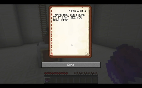
Just kidding, that’s not the first thing we’re gonna talk about here. First of all, a gentle recap!
As I’ve mentioned before, the Inbetween has some uncanny resemblance to the Kingdom Hearts world known as Castle Oblivion. Castle Oblivion is known for being the place where the main series protagonist lost all of his memories, and even had false memories implanted while he was getting deeper and deeper into it.
You might be curious as to how the Kingdom Hearts protagonist escapes.
He doesn’t.
He needs outside help, and a lot of it, to get him out of that situation. Even then, it takes a whole year. He drove his own heart into the bottom of the abyss in his desperation to save someone he was tricked into thinking he knew, and he didn’t even regret it, because he was saving someone.
... A lot of people on Dream SMP have different ideas on what it means to save people.
Also, the castle also had a very plot-twisty secret where it used to be the lush and wonderful home of these three friends before they fell apart; one was lost to the Evil Dark Side™ (not real name), the other was trapped in the Realm of Darkness (real name), and the last one fell into a coma for TEN (10) YEARS and his body was left to be protected in the heart of the land, which was then locked and turned into Castle Oblivion.
So, pretty fucked up place! Not inherently evil, but the place of great misfortune and just... not very good for everyone there.
Let’s start at the beginning!
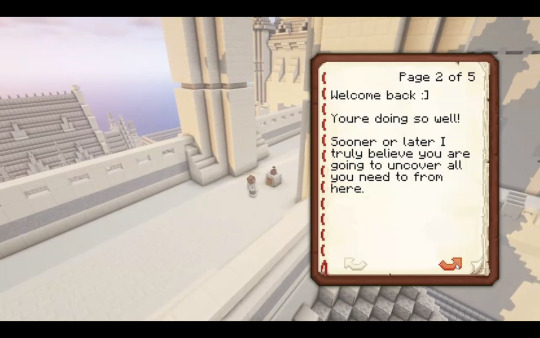
Welcome back indeed. Take notice of the wither rose in the pot, by the way, I’ll come back to this in a bit.
The first thing that stands out to me on this page is the smiley face, of course. It’s not the ever-iconic, ever-evil “:)”, but it’s similar enough that I think the callback is intentional. The smiley is c!Dream’s icon, of course, which... honestly makes me think that “:]” might be DreamXD, but that might be because I’m very very biased for the server god who simps for a dangerously apathetic cottagecore once-king.
Of course, it does also look kind of like Quackity’s face, and cc!Quackity has said something about big lore coming for him, but until further evidence is presented I’m disinclined to draw a connection there.
The Inbetween, as we’ve come to know the author of some of these books to be, being happy that Karl is continuing—it reminds me of the KH protagonist being told yes, good job, keep going, as he stumbles deeper and deeper into the castle that strips away memory after memory from his heart. Why does the Inbetween think that Karl’s time travel is important, his careful documentation of every story? Is it because the more he does it, the more he becomes attached? The more he becomes reliant on the Inbetween to feed the missing pieces of his memory?
Is it because the Inbetween, in parallel to c!Dream and c!Wilbur, prioritize the concept of story over the characters?
Things to think about. 🤔
Also kind of interesting that the Inbetween thinks Karl will eventually uncover “all [he] needs to”, which continues to make me think that the more c!Karl comes to the Inbetween the more he becomes... either dependent or over-trusting of it. Not sure. But weird things happen when it’s magic that tampers with memories, rather than trauma.
Basically, I’m getting “there is no war in Ba Sing Se” vibes.
The book continues to say that Karl probably has a lot of questions and that it would love to answer :] but never actually does. It’s trying to come off as helpful without actually being helpful. All it does is tempt him with the prospect of answers, and then draws him in deeper. “Continue onward, Karl.” But why?
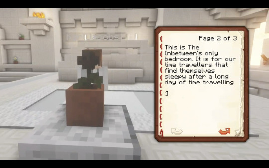
Another wither rose pot.
Sidestepping the very innocuous, very surface-level information offered here (because that’s it, it’s nothing about the workings about the Inbetween, it’s just a little sweet carrot to distract with), I cannot even begin to convey the absolute terror that consumed me at the word “sleepy.”
I mentioned earlier that one of the original characters who lived in the land that would become Castle Oblivion went into a coma, right? But it’s more commonly referred to as sleeping. The game is even called “Birth by Sleep”, and there’s a whole thing about trying to get him to “wake up”. So the idea that time travel can take something out of the traveller that makes them tired, the idea that there is one specific room for sleeping quarters within the Inbetween, paired with that not-quite-right smiley face—I am traumatized, I tell you.
Yes it could be a “haha look what I did with the sentence, because day is a form of time and they time travel so long day is a funny term” kind of smiley, but. Kingdom Hearts has trained me to be suspicious of any talk of sleep.
There’s something just mildly unsettling about the way it continues, with the references to the “many Karls” and the “many many great stories” that sounds borderline condescending.
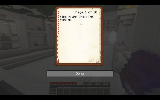
And now we get the, uh, “other” author. Notice how this one actually did not have a corresponding wither rose in a pot. I’m starting to think that the flower might actually be an indicator of the not-this-author-pictured-above, the probably-Inbetween-itself, so the fact that this book was found separately from a wither rose pot and it was tucked away under a tree... A tree, under which c!Karl will later find a bit of a refuge... yeah, different author. Or at least an author from a different time.
I’ll elaborate in a moment, but I do think that there’s three (3) mindsets/authors happening here: the sickly sweet Inbetween pretending to be good, the person trying to get c!Karl to distrust the Inbetween, and... someone who desperately wants c!Karl to stay in line.
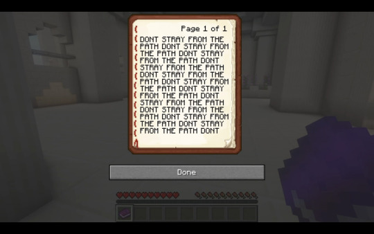
This is the third... I don’t want to say author, because it too has the wither rose pot and is trying to keep c!Karl playing along with the Inbetween, but it’s much less coherent and much more desperate.
No “:]”, either.
Some possibilities I’m considering:
the Inbetween, but it’s like, a security subroutine or a glitch in the system,
the Inbetween, but it’s from a future wherein c!Karl has fucked it up to the point of desperation,
Karl / the other author, but it’s from a future, where trying to stray from the Inbetween resulted in something traumatic happening and they don’t want it to happen anymore.
Some fun possibilities to keep in mind. Anyway!
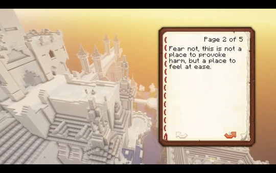
Ooh, the return of the wither rose pot.
For this part, the only thing I really have to say is that the repetition of the Inbetween trying to present itself as “a place to feel at ease” is... Well, as the lovely Fear has said in this post linked here, a place that tries and makes itself seem safe probably isn’t, because a genuinely safe place wouldn’t need to announce it all the time.
Very much sounding like a Ba Sing Se thing.
More importantly, the book actually says that it’s “wild” how the Inbetween is “so beautiful that even time travellers who go anywhere at anytime ever and they still choose here” with a good old “:]” tacked on at the end. That’s... that’s not just me thinking like that sounds kind of threatening, right? Like, time travellers can see anything anywhere, and they keep coming back to the Inbetween. Why?
Is it because they forget the beauty of anything else? Is it because it’s not beauty, but rather attachment and emotion that keeps someone going back to a place? If someone forgets their loved ones and precious things, then why would they go anywhere but the place where they’ve put all their stories?
Why did KH’s protagonist keep going deeper into Castle Oblivion even though he knew that the castle was taking apart his memories? Because he had one thing left: the fake, implanted memory, which told him that in order to save someone, he needed to push on no matter the personal cost.
So the real question is: are the time travellers coming back to the Inbetween because they want to, or because they no longer have a choice?
It regards all the different Karls with such... distant affection, too. “How beautiful,” it calls them, for wandering the blank halls with blank stares and blank hearts, none of which react to each other. It says that they “choose” to walk the halls, uncover mysteries, and tell stories. But what was the other choice? Was it really a choice at all?
Hmm.
Karl goes on to explore, and finds another book that does not have a wither rose pot, which tells him he has to go Under The Tree.mp3 and informs him that he “can’t afford not to”. Cool. Not ominous at all.
He finds another, which says the same thing.
Definitely not ominous. /s
The phrasing here is interesting, because it’s also phrased like a threat. Usually, when someone tells you that you “can’t afford not to”, you’re either looking at a scam or at the business end of a weapon. But the empty pages tell you that the author is trying to keep it down low. That’s one of the ways Minecraft players have found to express tone in the very limited form of Minecraft books, and it works splendidly.

Not to push my DreamXD agenda, but like... the door was iron. Iron doors are a weakness for Dreams and dreamons and, mayhaps, Dream’s dreamon.
I know it’s probably just because the iron door keeps in line with the color palette of the build but let me dream, alright.
Anyway, book content! And an interesting point of order: there is a wither rose pot. I said earlier that it might be an indicator of the Inbetween as an author, but that doesn’t make much sense now, does it? This is meant to be a place hidden from the “it” that I assume to be either the Inbetween itself or the one/s controlling it.
So why the wither rose pot inconsistency?
Unless it doesn’t mean that. Unless it’s just a metaphor for, say, memories withering away or something. Or maybe it’s just a pretty plant, for funsies! Who knows. If I had to guess, I’d say that (after much reflection) it’s likely less a mark of author and more a theme of, mm, memory status. The withering away of memories. It fits in with the Inbetween, because that’s what might be responsible for it, but the author/s of the book aren’t immune, either. They get blinks of clarity, with the hidden, tucked-away tomes, but they might not be completely free.
The next book, however, again lacks the wither rose pot. It might not be a coincidence that the one without the potential mark of a withering memory is the one that actually divulges some more information.
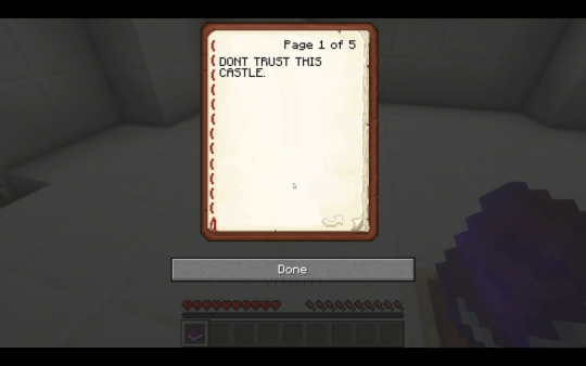
This book goes into slightly more detail about the warning, though not about whatever actual threat it is that the castle (which... Castle Oblivion, you know) presents.
It says that 1) it’s not what it seems, 2) the "truth about the other forms of you”, 3) this place “is not okay”, and 4) get in that portal we saw that was blocked off before.
We know that the Inbetween isn’t what it seems, but the “truth” about the other forms... Hm. This is, in fact, another Kingdom Hearts Thing. There’s a running joke that everyone on the very large cast of characters in KH that in the end, every person is actually either secretly a version of the antagonist (through possession or body splitting or whatever), or a version of the protagonist (through similar concepts). Multiple bodies and other forms is definitely a Thing in KH, though it’s not as oh-god-not-again definitely-bad as the sleeping thing.
I think the other forms have either become reliant on the Inbetween or have forgotten everything but the Inbetween, or both. Maybe more of the prior, since the warning is against trusting the place.
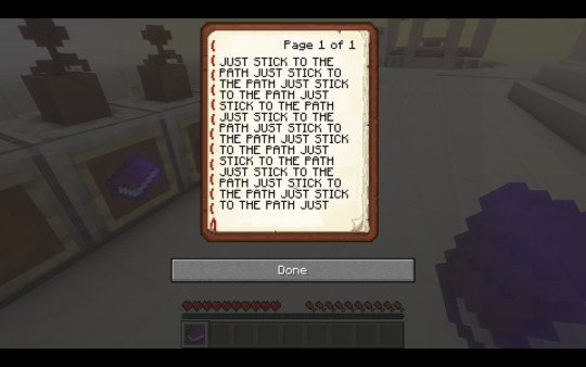
And, uh, this? Fucking terrifying. I love it to pieces.
Every single one of these books has a wither rose pot, and this is kind of why I think that the Inbetween or its master/s is, in some way, possibly functioning via routines and like... an AI. Or a genius loci kind of thing.
But good news, there aren’t 13 books, there are 14! This is important for Kingdom Hearts reasons, because Kingdom Hearts has a big thing about the numbers 13 and 7 (13 is the number of pieces of darkness, and 7 is the number of pieces of light, and this is equal somehow, don’t question it).
Now, 14 is an important meme number in the MCYT fandom, of course, but I don’t think it has terribly too much to do with the lore beyond a fun easter egg.
The books themselves trying to tell c!Karl to, essentially, go with the flow and the path that the Inbetween has set up for him is... something. I like the idea that it’s some future version of something trying to stop something from happening, but we all know it’s probably not going to work. Fun times.
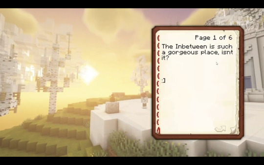
And finally, this.
The Inbetween is a bit of a narcissist, huh? It won’t shut up about how it’s so pretty and irresistible and the whole definition of, like, a honey trap. Oh my god it even describes it as ~mysterious~ as a good trait, that’s hilarious.
More pertinently, it also calls the Inbetween “a time traveller’s dream”.
A time traveller’s. Dream.
Again, not to push my DreamXD agenda, BUT—
But! Getting back on track, the book expresses its eagerness to see Karl again, says their relationship is gonna be great, reminds him that his stories are important, and then tells him that he needs the Inbetween/author just like the SMP needs him.
Uh. He’s going to need the Inbetween?
Hello?
Why? How? So far it’s presented itself as being pretty and perfect but it never said anything about necessity! What’s going on!
Very much reminded of how Castle Oblivion was presented as “you need to keep going in even though it takes your memories away because there’s someone you need to save [fake but you don’t know that because you don’t remember anything]”, and I am afright.
Talk about subtle strings being tugged at here. I’m really seeing the beginning seeds of a dependency thing being sown, and if it weren’t for the side books painting giant neon warning signs everywhere, I don’t know if it would’ve caught on. An artificially cultivated concept of how important and great the Inbetween is, and don’t you just want to take all those stories from that messy world elsewhere but come back here in the end to take a break and exist and explore and oh, isn’t the Inbetween great, isn’t it wonderful?
Man, c!Dream wishes he was this good at subtle manipulation.
tldr; there are multiple authors trying to tug c!Karl in different directions via those books. The Kingdom Hearts parallels predict that his memory will be at stake, and he might not be able to escape without help.
#tales from the smp#dream smp#general thoughts#the inbetween is a scary place im telling u#a Place that wants to be your friend but probably has ulterior motives? oof!!
72 notes
·
View notes
Text
Top 5 of 2020
I was tagged by @justsomeoneunordinary
rules: it’s time to love yourselves! choose your 5 (ish) favorite works you created in the past year (fics, art, edits, etc.) and link them below to reflect on the amazing things you brought into the world in 2020. tag as many writers/artists/etc. as you want (fan or original) so we can spread the love and link each other to awesome works!
This is probably my last post of 2020, and I had to take a couple of days to think about this because I really have no recollection of which works were made this year and which ones were made the previous year. 😅
I know which one was my least fave, but the top faves are a bit more difficult. This was a year of great growth in my art for me. I'm starting to settle into a style (starting to! I don't think I've found it yet), backgrounds became more and more intricate... And each piece helped in that in their own way.
I'm gonna have to settle for 5, but just know that this list is likely to change in like 5 minutes. I'm also not counting commissions because that would make this absolutely impossible.
4 Seasons
(I didn't link to the original post because only now I realise I never actually posted the full thing here..... Oops?)
This is a bit of a cheat. I didn't START the drawings in 2020, but since it was completed this year with Fall and Winter, I'm counting it as a 2020 piece. So sue me!
It's always going to be one of my faves, I think. It's the first time I went heavy with the background... I mean, this thing is almost all background. I also forced to work with limited colour palettes for each season which was a lot of fun.
I have Spring and Winter set as lock screen and home screen backgrounds. It works really well!

Train Ride
(click link for full picture)
It is by far the piece I've done that has been the most popular, everywhere I've posted it. And I don't really know why. I guess the number of characters involved? This is by far the most characters I have ever added to a piece. And I have silently promised myself never to do that again. This just took so long, and the poses were complex, and the details, but once it was finished that was such a satisfying feeling.
Even though one of the ideas I have for 2021 involve even more characters. Uh Oh.

First Date
(click link for full comic)
We go from one of the most popular to one of the least popular. 😅 But I don't really care, I'm really happy with how this turned out. One thing I really want to start doing is little comics, building up to one day where I can make a multipage comic on my own, and this was the first step in that direction. Well, technically the second. But still, I'm really happy with this, even if it's not anyone else's fave.
Take a Break
(click link for full picture)
Ah yes, the most intricate background I've ever done. I guess my mindset after "Train Ride" was "Hey, this was pretty hard to draw. LET'S MAKE IT HARDER!"
No regrets though. I really don't have a lot to say that I haven't already said other than working on those screens and the details there was so much fun, I was gutted when I realised some of it wouldn't show because of the composition. But then again, maybe I should have planned it better so they would.
Found Soulmate
(click link for full picture)
The most experimental one out of all the pieces I've done and... it was an absolute joy to draw this, from start to finish! It's also probably the least popular art piece I've posted, but in this case I kind of get it, since it's so far from my style and so different from everything else I post.
But what can I say? I had a blast! It was a joy to draw! I want to draw more pixel art of fake 8-bit Marvel dating games with these two! I was GENUINELY considering learning some basic programming to make a mini game like this. I have them as mini prints with UV coating around Stephen and Tony and I love them too. This was the most fun I've had drawing anything this year so I had to add it here.
#my stuff#my art#ironstrange#strangeiron#marvel#mcu#this was a fun way to look back#I'm not tagging anyone because I don't really like doing it but I do suggest you all do this if you're interested#also how ironic that most of my fave pieces have been my least popular ones#lol#it's always the way isn't it?
128 notes
·
View notes
Text
UPDATE: the day has finally come... i finished the refs.
and good lord it took way too long.
anyway, i finally did it! all 25 references are complete (50+ if you count all the alternate outfits/forms and redesigns) and now I can actually start focusing solely on writing!!
for the record this is SUPER important to development bc now I can have fixed palettes and less design mistakes in the finished product (Mad’s “redesign” alone had at least 10 at first).
And before you ask, no I probably won’t show the full references bc I did Redd’s as one of the first and I’ve improved since then and I do NOT want to draw him 3 times again. i am tired.
ANYWAY this will probably be the last sizeable update for Limited Edition for a while!! Or at least until I actually start coding again. Until then stay tuned :)
#scp#scp limited edition#limited edition updates#scp little misters#doctor wondertainment#its done.. i finally completed this beast of a reference sheet#i may now rest..
62 notes
·
View notes
Note
I love your art so much! you have such a cool style. the Falnorian fashion is really interesting, I was curios about the fabric patterns, would you mind sharing how you did it?
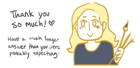
Sure! That project was a process of experimenting with the way brushes were textured in order to emulate the feel of different textures of cloth, but there’s also a couple places where I more explicitly crafted textures/brushes/etc. I’ll go through and show you the brushes used and any additional techniques that were relevant under the cut!
So a lot of this is just flat out instructions for how to do a thing in Photoshop. If you use different software, you may or may not have all the same layer settings and options. I don’t know how to post the brushes I use to the internet, but google around--there are a lot of cheap or free cool brushes for most drawing software. These are the ones I’ve accumulated over the ages.
Also I was gonna do all the outfits but I found I was repeating myself a lot, so you only get the ones with the most to teach you, which is like four of them.
An overall note- I worked in a CMYK file format which limits the available colors and in some cases majorly changed what colors looked like under relevant effects or when changing layer settings. I don’t generally recommend this unless you need your work to be printable because it constrains your palette, but there are definitely some things that are easier to make look cohesive with those kind of automatic color constraints, so. It’s a mixed bag.
This is one of my favorite texture brushes. It jitters color, and it has some fun texture to it that can be very different depending on how heavy you set the pen pressure and how long your strokes are. I used it as a baseline for both her dress and his coat and boots, to provide texture and also give me a set of varied colors to move around and blend and work with. I spent a while on her dress blocking out color more specifically from the set that brush provided before bringing in new ones. It’s fun too because when I do texture with it it feels kind of multicolored and blended.
His pants, and probably one of the most common brushes for the Western set. It’s got a somewhat more roughspun texture while also being able to go to just being flat and cover a decent amount of space between for light texturing.
A simple square brush which varies opacity by pen pressure, for shading him.
A mostly flat oval brush that I used for highlights on her clothing. Same deal--the opacity is determined by pen pressure. Helped smooth things out a bit, and with very bright lights helps make the cloth feel more reflective and satiny.
(It should be said I know nothing about fabric and satin just seems like the ting with that kind of reflectivity--I have no idea what the fabrics in my reference images are, they just look reflective and crinkle in certain ways.)
This is a brush that jitters saturation and brightness in a tad that looks a bit stripey, and I like it for his vest and their shoes because it feels a little rougher, and sometimes a bit knitted or wooly.
The base texture of both their main pieces of clothing is the same as brush number 2 from the last one, but this time with two colors overlapping one another to give it more depth and make it feel a bit rougher and thicker as material.
So this is brush 1 from the last set, but I’ve made it one color (the light green), copied it and changed the hue to a bluer shade, and then placed the two exactly one over the other, setting the bluer version to Vivid Light in the layer settings. Then you just futz around with the specific color and opacity til you’re happy with it.
The vest pattern is easy. Draw a row of shapes. Duplicate several times. Arrange in rows. If you need to, you can rotate rows a tad to get them to look good when they line up.
I have a celtic knot pattern. For his clothing I set one row of the pattern at the bottom, lowered the opacity, and used a soft brush with the smudge tool at 80% or 90% to pull the color from the top up over more of his clothing.
For hers, same deal but instead of using the smudge brush I set the layer to being some kind of color burn or linear burn in the layer settings and set copies of it in a line so it looks like a repeating texture.
You know all of these by now, they’re the ones that keep coming up and from now on I’m not going to talk about them anymore.
This brush looks like trees! And also I use it for weird cloud patterning on both these guys and the Lakeshore pair.
I made a brush that is dots! It is just a circle with the spacing settings turned up so that there’s distance between them. The dots brush is a fucking lifesaver. It can look like beads or coins or be converted into other patterning. It’s great. A+ don’t know why I didn’t do this earlier.
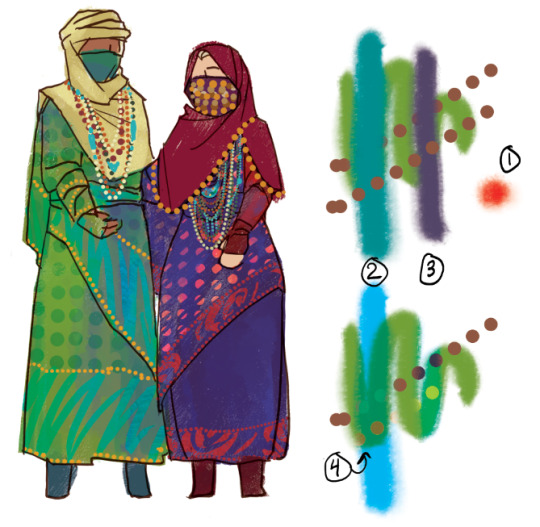
The last thing I have for you is mostly about layer settings, which I am very poor at explaining, so sorry about that.
I used a watercolor looking brush thickly for the Greyfen to give the cloth a kind of slightly iridescent silky vibe. How the colors work in the other points.
The difference between the blue stroke in the above version and the below version is that the bottom one is on a layer set to Pin Light. I’m not sure exactly what pin light does, but it tends to produce colors that kind of combine the feels of the relevant colors? It’s definitely one to use when you’re trying to make things shade in a way that feels iridescent.
The difference between the purple stroke above and below is the one below’s layer is set to Vivid Light. Vivid light tends to produce brightly saturated colors and I kind of have no idea how it works either. Just futz around with the hue of the Vivid Light layer until you like how things look.
Lastly, the bottom line of dots has been set as a Clipping Mask over the two stroke layers. Because of this, it only shows up where it overlaps those strokes, and I think takes on their properties? So it’s operating like it’s Pin Light over the Pin Light layer and making that weird gold color and acting like vivid light on the vivid light layer and making the yellow green. The Clipping Mask is your best friend because it saves you a lot of erasing and lets you make things transparent along with or otherwise fall in line with whatever they’re attached to.
I hope this was helpful and I’m sorry if it was confusing. Thank you again for your support and your interest!
33 notes
·
View notes
Last Seen Blogs
night-eyes1
(ノ◕ヮ◕)ノ*:・゚✧
sxtapee
𝐢𝐦 𝐣𝐮𝐬𝐭 𝐚 𝐠𝐢𝐫𝐥✩
littlebeelittleflower
the honey is sweeter when you love the bee
daughterofsarenrae
necromancy rights!
razberrypuck
#1 qcharlie understander