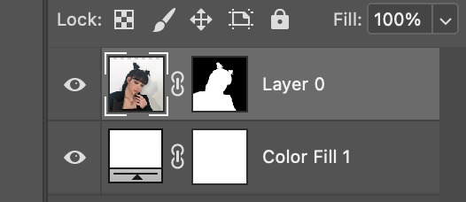
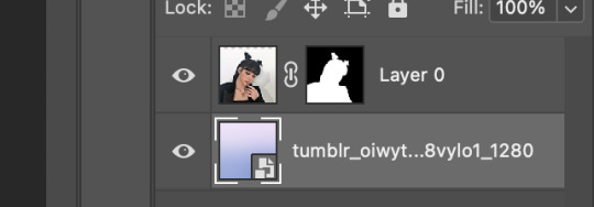
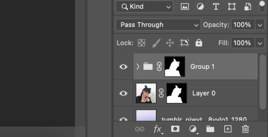
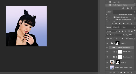
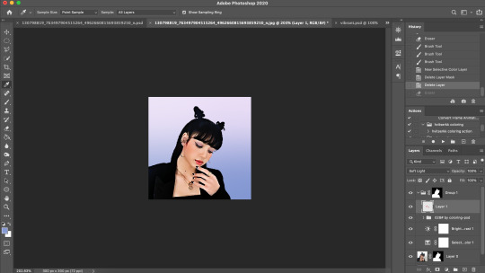
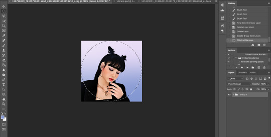
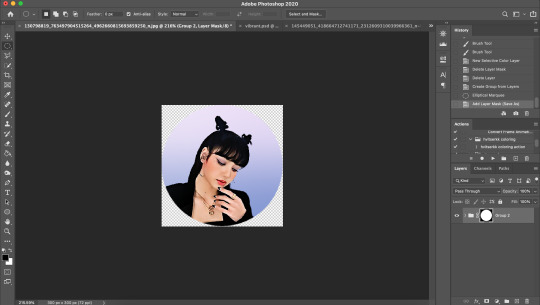
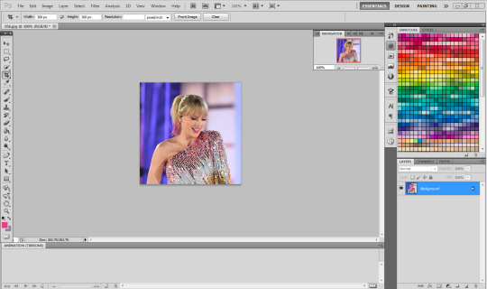
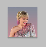
#there are at least 100 photoshop layers in it LOL
Text
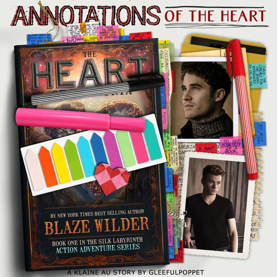
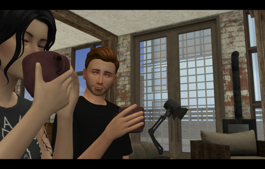
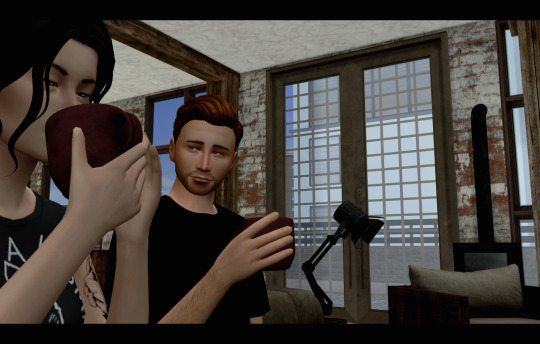
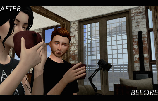
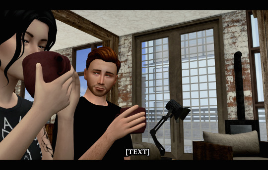
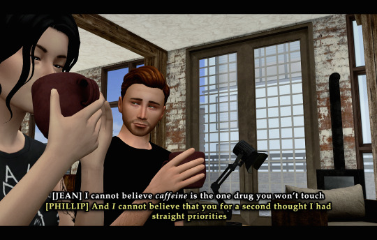
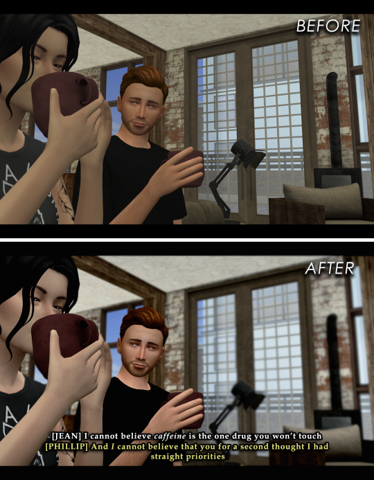
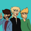
NEW STORY! Amid a period of healing solitude, Blaine crosses paths with Kurt, an inquisitive journalist. What begins as a casual conversation over an annotated book in a café becomes a blazing fire between their hearts. As the layers of their connection deepen, they learn to navigate the complexities of love, loss, and identity, unraveling a poignant tale that transcends the unexpected boundaries of their pasts.
For the @klaineccfanficlibrary 2024 Valentine's Day Challenge Annotations of The Heart
Chapter 1/14: I'll Be in Your Head [2787 Words]
You can read it on AO3 [here].
#gleefulpoppet writes#KlaineValentines2024#day 1#klaine fanfic#klaine fanfiction#glee#klaine#I started this artwork two weeks ago#there are at least 100 photoshop layers in it LOL#story: atoh
55 notes
·
View notes
Text
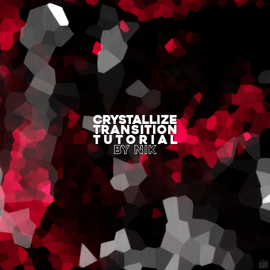
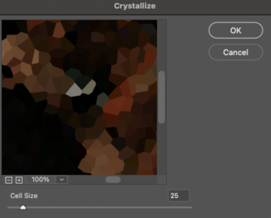
HOW TO: Do A Crystallize Gif Transition
Hi! I was asked to explain how I did the transition effect in this gifset, so here's a quick tutorial! Disclaimer: This tutorial assumes you have an intermediate understanding of gif-making in Photoshop using Video Timeline and requires the use of keyframes.

PHASE 1: THE GIFS
1.1 – Determine how many frames you need.
Since you need at least 2 scenes for a transition, consider limiting the amount of frames you'll use per scene. For a transition between 2 scenes that's 540x540px, I would recommend no more than 30 frames per scene (for a final gif that's 60 frames). Even that may be pushing it depending on your coloring. Just be sure to consider the dimensions and colors of your gifs in relation to the amount of frames to keep your final gif under Tumblr's 10MB limit.
1.2 – Import frames, crop, resize, convert to smart object for Video Timeline, color, blend, etc.
Do this as you normally would! If you need a tutorial for the basics, here's my tutorial. :) Please note, the methods in this tutorial only work with gifs that are converted into smart objects in the Video Timeline workspace.
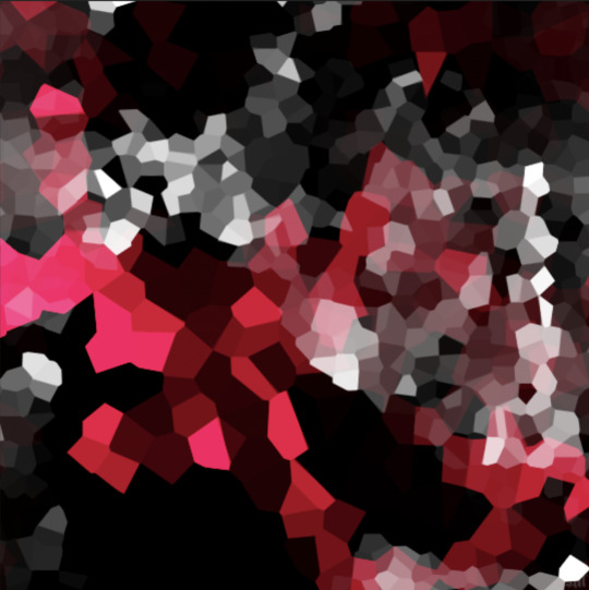
Tip A: I recommend using scenes where there's a lot of one color (or scenes where you can manipulate it to look like that). The crystallize filter on a gif creates A LOT of movement that can feel a bit chaotic. Having your gif be primarily one color reduces the eye strain a bit imo.
Tip B: I like how this effect looks with blended scenes because it allows me to use different "crystal" sizes (more on this in Step 2.2). Check out the USERGIF Resource Directory for plenty of blending tutorials!
1.3 – Move all your gifs into one document, group into folders, and arrange.
Once everything's in one doc, keep everything organized in a group folder! I have just two scenes, so that's Folder 1 & 2. Within those folders are the gifs I blended, which I labeled by gif color. Then, simply drag Folder 2 so it continues right after Folder 1. (Make sure none of your adjustment layers from Folder 2 accidentally affect Folder 1! You can do this by clipping your adjustment layers to match the length of the gif as I did, or using clipping masks.)
(Ignore that lone Hue/Saturation layer lol. I decided last-minute that I wanted my gif to lean more pink than red.)
PHASE 2: THE FILTERS
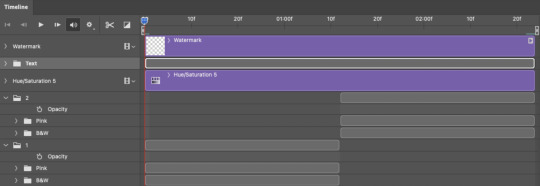
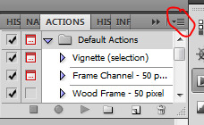
2.1 – Duplicate each scene.
We're going to use opacity keyframe animations on these duplicated scenes that allow it to go from "normal" to "effect" and vice versa. The filters will only be applied to the duplicates. In the screenshot below, all of my duplicates are highlighted:

2.2 – Apply the Crystallize Filter.
Above your sharpening settings, apply this filter by going to Filter → Pixelate → Crystallize. On the pink gifs, I made the crystals bigger (cell size: 45), and on the black and white gifs, I did a cell size of 25.
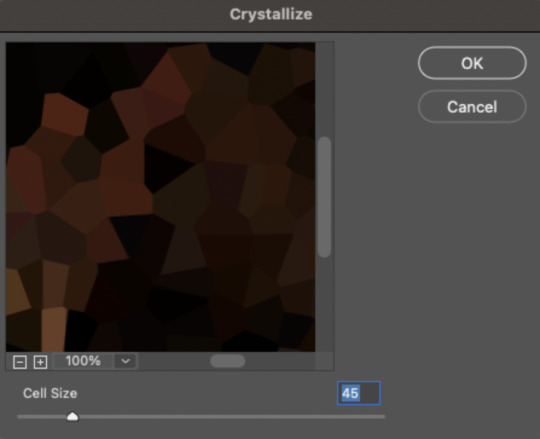
The different sizes help break up the uniformity of the crystals imo, creating more of a mosaic-like look, which is what I wanted to match my gifset concept.
2.3 – Apply the Oil Paint Filter (Optional).
Filter > Stylize > Oil Paint. Here are my settings (they're the same for both crystal cell sizes):
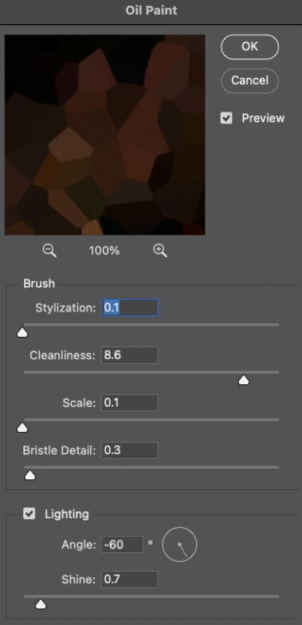
Brush – Stylization: 0.1, Cleanliness: 8.6, Scale: 0.1, Bristle Detail: 0.3
Lighting – Angle: -60, Shine: 0.7
This filter helps soften the cells a bit while adding some texture (left: no oil paint; right: with oil paint):

2.4 – Repeat steps 2.2 & 2.3 on all duplicated scenes.
PHASE 3: THE KEYFRAMES
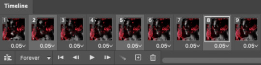
3.1 – Add opacity keyframes.
The very start and end of each scene needs an opacity keyframe set to 100% opacity. Move 0.09 seconds from each of those points, and place another opacity keyframe, this time set to 0% opacity. We're basically making the crystals fade in and out. Please reference the screenshot below for keyframe placement:

If you need more info on opacity keyframes, check out Phase 2 from this fade transition tutorial I did on usergif.
3.2 – Repeat step 3.1 on all duplicated scenes.
All the keyframes in Folder 1 should line up exactly and all the keyframes in Folder 2 should line up exactly!
PHASE 4: THE DUPLICATES
4.1 – Convert back to Frame Animation.
If you're not sure how to do this, I've written out the steps here. I rec the action linked in my general gif tutorial which I shared earlier!
4.2 – Delete duplicate frames.
Whenever you use keyframe animations, you'll get duplicate frames. That's just how it works, unfortunately. If you follow my steps exactly (specifically the 0.09-second spacing, which follows my tried-and-true 0.03-second rule), you'll have a total of 12 duplicate frames exactly — 3 duplicates per keyframe section. Just manually delete them! You can spot the duplicates by eye, but with this spacing, it's usually the 2nd, 5th, and 8th frame for each transition section. The selected frames below were my duplicates:
If you want to learn more about why there are duplicates and the math behind it all, I explained it in more detail in this ask.
4.3 – Export and you're done!
I hope this tutorial helps! Let me know if you have any questions :)
#gif tutorial#completeresources#usershreyu#usernanda#useryoshi#userzaynab#userrobin#usersalty#userhella#alielook#uservivaldi#tuserabbie#useraish#userabs#tuserlucie#mialook#resource*#gfx*
273 notes
·
View notes
Note
How does procreate compare to sai for you out of curiosity ?
I’m kind of 50/50 about it.. like once you’re more familiar with the UI and how everything generally works it’s super straightforward which I appreciate! the whole brush customisation aspect is a bit overwhelming for me since im just used to fiddling with a few settings then running with it but now there’s a whole customisation bar so you can get it to exactly what you’re looking for …. which is nice in itself but for me who has like .. virtually no clue on what she’s doing or what any of these means im just ????? 😭 but downloading custom brush packs is so easy too so im not gonna bother with that for now lol
drawing on glass is still a bit tricky for me too it feels like im constantly fighting for grip if that makes sense. I think im still used to how my tablet draws bc the stylus’ nib was a bit sharper compared to the apple pencil’s but it did left scratches on the tablet itself lol. I also like how easy it is to adjust the canvas sizes since you’re just dragging it (compared to sai where you have to type in the exact dimensions) but I also don’t like how they’ll give you less layers the bigger your canvas is 🥲 like I generally work on 3000 x3000 and I’d like more than 100 layers alas
ONE THING that im severely missing is sai’s marker tool though, specifically the marker tool with my own config. like that’s literally my bread and butter and i use that pen in virtually everything - both lineart and colouring. imo that brush gives my prev drawings that soft looking feel (if that makes sense??? idk) but it also doesn’t have that drag that procreate brushes tend to have. like ive been trying to replicate it in procreate or at least find one that feels similar but I haven’t had any luck so far 😭🥲
all in all I do like it better than photoshop or even krita, but I think im just so used to working on sai that I still prefer it, esp since that has the marker brush (my beloved). my opinion will prob change once i do actual illustrations on it though since I haven’t done a fully rendered piece yet and i want to see how I’ll adjust my workflow with the layer constraints. i do like the fact that there’s no colour differences though since the ipad screen is really nice so you don’t have to worry about colours looking different in diff screens
#I also don’t like how you can’t use clipping mask on groups 😭😭#like that’s what made shading easier in sai but now u have to merge everything to be able to do that sigh#i do like the convenience tho!!!! like my ass is really drawing everywheee and it’s SO easy to just boot procreate up and draw#so that’s a win for me specifically lol
15 notes
·
View notes
Note
1, 2 & 26, 27 :-)
hehe ty !!! <3
do you prefer traditional drawing, or digital?
hmmm probably id say digital as of late, considering it's what i primarily use for my finished work. but when it comes to sketching i 100% prefer traditional, i sketch in graphite almost entirely and only sometimes use pen
2. how long have you been drawing?
since i was little, pretty much! it's always been something i liked, and i'd spend a lot of time drawing on my own as a kid -- i was a little bit of a loner in that regard lmao -- because i wanted to be able to draw in the styles of artists i found inspiring, or at least render things i found interesting well enough that they'd actually look like those objects/animals/etc (which i think is common, except for when you're little you don't really think about how you'll eventually figure out your own style, since that takes a good while and lots of practice, lol)
26. for digital artists: what program(s) do you use?
procreate's my main workhorse, i do nearly everything in it. for zines i'll arrange them in indesign + use photoshop for photo editing
27. for digital artists: how many layers does a typical piece require?
anywhere between like 5-10 sounds right i think ... there are very few pieces where ive gone over 15 cause i'm allergic to using tons of layers in my work (it overwhelms me) ... sometimes ill work on just one layer because i tend to use the eraser or brushstrokes to cover mistakes/refine my work (which drives my friend crazy cause he can't comprehend working like that lmao)
8 notes
·
View notes
Note
Hi! I love your tutorials, and I may also have a question 😊 I've been making gifs recently, but I am having trouble with Tumblr showing them correctly. For example, I work on them in photoshop and then post them on Tumblr via desktop and they look fine when it comes to brightness. However, when I look at them on the mobile app, they are so dark, it bothers me. If I adjust the brightness of my phone (which really hurts my eyes LoL) they look fine again, however when I put it back to the lower brightness it's darker again, while other people's gifs do look brighter than mine. How do you ensure the correct brightness without losing quality? I've seen brighter gifs, but when I look at those on PC they are super grainy. Thanks in advance for the help!
Hmm. I’ve never actually paid much attention to the brightness of gifs, or at least not in a comparative desktop-vs-mobile light. That could be because I so rarely use the app (and often as a last resort, because I truly hate the mobile experience) but something I do keep an eye on is colors and colorings, just because something that drives me bananas as an editor is the fact that colors can look anywhere from mildly to wildly different between screens.
A general piece of advice I’d give to you or any creator—and I emphasize any, because I’d give the same advice even if someone isn’t experiencing this specific issue or something similar to it—is to save your gifset as a draft instead of posting it straight away, if you don’t already do as much. This allows you to see how the gifset looks on both screens, and make adjustments accordingly.
Now, in terms of advice that’s specifically brightness-oriented, I would probably recommend... the backwards of a lot of people? Because I use Curves to do everything. Literally everything: brightening, adding contrast, even color correcting if Color Balance isn’t quite getting the job done for me. I used to use Levels, but never do anymore unless I’m trying to create a silhouette. I never use, or so much as look at, Exposure. And the only time you’ll see me use Brightness & Contrast is to actually lower the brightness for scenes that are on the too-bright side of things.
You might find you like other adjustment layers better, which is more than fine. I’m a firm believer in there being no one particular or exclusive way of doing anything in Photoshop. But since I keep my computer at max brightness and keep my phone near or at min brightness, and I haven’t seen much of a difference (beyond colors) in how my gifs look, I thought I’d give a quick rundown of what I do in case you’d like to try it out.
My ‘base’ layers tend to look like this:
Curves (for brightness or brightness and color correcting)
Color Balance
Curves (for a little bit of extra brightness and some contrast)
Curves (for contrast; sometimes disabled if a scene already has a decent amount of contrast, or if the first Curves layer does double-duty)
And this is what my Curves layers typically look like:

The trick to using Curves without making things too grainy, I’ve found, is to avoid any extremes. Instead of tinkering with that first Curves layer on the far left, I a) adjust the opacity of the layer as I see fit, and b) duplicate it when a scene is still dark and calls for some added brightness.

Alternatively: The droppers on the left side will do a lot of the work for you in both the brightening and color correcting departments if you know what you’re doing. (And, like anything in Photoshop, it really is just playing around with it until you get a feel of how it works.)
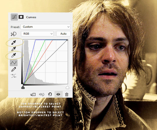
When picking the brightest point of a scene doesn’t brighten it to my standards, I go for the brightest point on or near a character’s skin (typically around the nose and forehead area; wherever the light hits them) or hair, if they have lighter hair like Ciri and Geralt do in The Witcher.
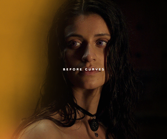
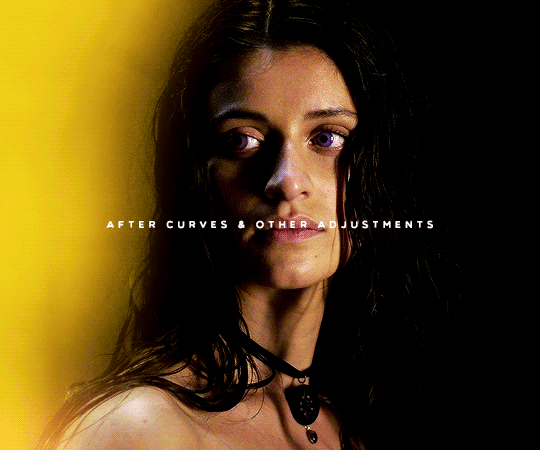
Here’s a quick Before and After look:
There’s obviously no 100% guarantee of retaining The Most Perfect Quality, especially when uploading on Tumblr, but as long as you’re working with HD footage (1080p or 2160p), sizing your gifs correctly, and choosing the right Save for Web settings, ensuring brightness shouldn’t mean loss of quality.
If you’re still experiencing issues with it, feel free to let me know! I’m always happy to work with people one-on-one.
#okie-dokie-artichokies#ask ava: an organizational tag and not an advice column (unless it needs to be)#ps asks
95 notes
·
View notes
Text
EDITING BOOTCAMP: WARWICKROYALS EDITING PROCESS
So, about five hundred years ago (or somewhere in that ballpark), an anon kindly asked me to share my editing process. It's been a long time coming because I've recently stopped using Pixlr (a free online photo editing program) and have moved on to 2020 Photoshop. I really recommend using Photoshop, it might be confusing or overwhelming at first, but I think it's worth it and ultimately it cuts your editing time in half once you get the hang of things. However, you can still use this tutorial if you're using GIMP, PIXLR, or whatever else. So, let's get into it (YUH)!
STEP 1 | ASPECT RATIO & SIZING
Alrighty, so what we have here is what I call a "raw screenshot." After playing around with multiple versions of ReShade and countless presets, I have come to the conclusion that I hate it. It makes my game slower, switching between filters is a pain and they just get in the way. But this is just my opinion, there are some very pretty ReShade filters out there, I just don't think they're necessary for a pretty screenshot.
When I load up my screenshots they are almost totally vanilla. I do use Luumia's NoGlo and NoBlu mods, but that's about it. I do not resize my screenshots at all, they are 1600x900 by default. However, one of the first things I do is add an aspect ratio (those two black bars you see at the top and bottom of the image) to give it a more "cinematic" feel.
I do this by adding a background layer and resizing the width from 900 to 1020. With the untouched screenshot in the centre, there should be two bars above and beneath it that are 60 px wide. I then colour the background layer black with the paint bucket tool. BOOM. Aspect ratio. Technically my edited posts are 1600x1020 when edited, but the screenshot remains 1600x900.
STEP 2 | PSD/PHOTOSHOP ACTIONS
The next step is for me to add my PSD. Think of it as your own personalized filter that changes how your screenshots will look. What your PSD does to your images is really just based on personal taste. For me, I love a rich screenshot with lots of contrast and strong blacks and more dramatic shadows. So, that's what my PSD does!
Your own PSD might look totally different for you. Maybe you what a lot of brightness, with warmer undertones, and lots of bloom. It's totally up to you! I recommend you play around with Photoshop's setting until you find an aesthetic that suits your own taste.
You can also download some Sims 4 PSDs and Photoshop actions from other creators. I really recommend those from @/intravertt here on Tumblr. They make ReShade presets, PSDs, and have a variety of other resources that are stunning.
Here's what my PSD looks like.
STEP 3 | SHADOWS AND HIGHLIGHTS, BRIGHTNESS, AND SHARPNESS
After adding my PSD I do some further edits to change how my screenshot looks. Because the shadows are so overwhelming, I add some highlights and might tweak with the exposure just to make sure nothing is too dark/under-exposed. I sometimes draw in some light shadows, but this is quite time-consuming so I don't most of the time. I also add a bit of sharpness to make certain details stick out some more. If the screenshot is taken outside, I will add some vibrance just to regain some warmth and make it look like my characters are in the sun.
Like PSD what you chose to edit, and how, it 100% up to you and what you what to achieve from your screenshots. I again recommend playing around with different settings to find something that works for you.
STEP 4 | ADDING TEXT
I recommend a text size of at least 35 pt. My texts are also bolded, outlined, and have a drop shadow, just so that it's easier to read for some people. Text tends to blend into the background and it's super annoying, so those elements help a lot. I also recommend using a sans serif font (ironic, I know, but I'm using a serif font exclusively for this arc for a reason, I swear). Also, make sure that the spacing is all good so the text isn't jumbled or crammed together. If your posts are word-y like mine (lol) you might feel the need to lower the spacing, just don't go crazy with it.
My text is centre justified. I write the name of the character who is speaking only once before their first line [LIKE THIS]. I start a new paragraph each time a new character starts speaking. To tell characters apart I assign different colours to each character, based on the order they are speaking in. The first character to speak is white, the second is yellow, the third is blue, etc. I recommend having some colour variation between characters' dialogue. Even if you have the name of who is speaking before each line, text of the same colour blends together easily.
Fun fact, I also often don't close off my paragraphs with a period or any punctuation (unless it's an exclamation point). Screw grammar, I just prefer it that way.
Here are some of the fonts I recommend, both serif and sans-serif:
Arial
Garamond
Century gothic
Book Antiqua
Josefin Sans
Perpetua Titling MT (this is the font I use in my banner)
Alte Haas Grotesk (My main sans serif font)
Can you tell I'm a author?
My loser ass legit has a list of favourite fonts
STEP 5 | BLUR/OVERLAYS/FINISHING TOUCHES
Adding blur to my posts is something I've just started doing at I don't know why. It's a great way to focus on certain objects/people and put things into perspective! It doesn't have to be a lot, but it does wonders. I just use a brush tool to go over the areas I want blurred. However, there are other faster ways to do this for sure such as cutting out and blurring the area you want out of focus separately.

If there are any clipping issues, like skin poking through clothing, I will go in with a tiny brush tool and paint over the skin with the same colour as the clothing's fabric. Sim's joints always look strange and jagged when bent (like the skin clips around a sim's bent elbow or leg, so annoying) so I'll often go in with the smudge tool with very little strength/hardness in order to remove that
Sometimes my posts have lens flares or little dust particles. These are just simple overlays I add with a layer mask + reduced opacity. You can find overlays like that easily online and maybe I'll make a post about how exactly I use them but we're DONE 'N' DUSTED for now. I hope this tutorial is useful for someone. This was fun! I'm totally down to do more in the future.
31 notes
·
View notes
Note
You told me a few days ago that your Cyberpunk 2077 screenshots involve quite a bit of post-processing in Photoshop, and since I'm still thinking about them... 😂 Would you like to share a bit of your PS-specific process? Maybe just in a broader sense, like for instance, if you use sharpening, brightness-contrast, color balance and/or mixing, levels/curves, etc! 💖 (and fyi I'm still amazed you manage to get the in game lighting and character positions right without mods!)
Oh, sure! ♥ No problem! But keep in mind that I do most of this stuff "a ojímetro" so to speak, trial and error.
I try to get the best possible image in-game (in terms of lighting, contrast, depth of field, etc.) to post-process it as little as possible. I also use ReShade, other people's, and my own presets.
By the way, I ended up installing AMM yesterday and although I don't understand 100% how it works, I can tell you that the improvement is so huge. I'm also using Cyberpunk 2077 Camera Tools by Otis_Inf (if I remember right, this is the same person who created the DAI and MEA Cinematic Tools and if it's not them, they were involved somehow) and I find it also so useful.
Hope it's helpful!
Crop/rotate the image if I did not like the angle I choose. Or if I want to go for something more portrait-ish style.
Filter>Sharpen>Smart Sharpen.
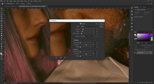
(Full-size image)
I think they're the default values since I don't remember changing them at all, but I've been using this PS version since 2017, so who knows, lol.
I'll continue under the cut!
Sometimes I skip this step in Cyberpunk because of how the game renders hair compared to other textures. It's already pixelated per se, so in some pictures, sharpening the image makes it look even worse.
I'm not always using all the next adjustments, depends a lot on the original shot, but overall, it would be something like this.
Layer>New Adjustment Layer>Curves
Preset: Lighter. You can adjust the curve and the opacity of the layer to your taste.
Layer>New Adjustment Layer>Curves
Preset: Linear Contrast.
Same as before!
Layer>New Adjustment Layer>Levels
Preset: Lighter
Layer>New Adjustment Layer>Hue/Saturation
I tend to increase the saturation a little bit, but it's just a matter of personal taste.
Once I'm happy with how it looks, I add some Actions. I don't remember where I found them, though. I got some of them with a pack of brushes by Angel Ganev, and the others (Instagram/Lightroom filters style) maybe from a photography blog. I think I googled "Photoshop Actions" and downloaded some.
Add Dark Vignette - Subtle
Color Filter - Violet (50% opaticy)
Color Filter - Pink (50% opacity)
Filter (Instagram style, 30% opacity or even lower, I don't like them very noticeable.)

(Full-size image)
Last (but not least, lol, I duplicate the Background (because I tend to screw it up like a lot, and some blur filter.
Filter>Blur Gallery>Field Blur
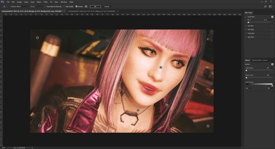
(Full-size image)
And... I think that's all! As I said, it's just trial and error... and figure out what works best for you and your personal taste.
If you need anything else, don't hesitate to ask! ♥♥♥
13 notes
·
View notes
Note
hola! cómo le haces para que tus icons te salgan en buena calidad?
Hi! I apologize but I cannot speak Spanish, so I am going to have to translate your ask through Google Translate. Which I know isn’t the best method, I’m sorry!
According to Google Translate, you’re saying “wave! How do you make your icons come out in good quality?”
Hopefully, that is close enough to what you’re saying and if so, first off, thank you for saying they are good quality! Secondly, I’ll walk you through my icon making process. It’s actually very simple and fast (at least IMO lol I can make an icon in like 5 minutes but I also use PS for a living so I’m pretty used to the program)
I’ll show you how to go from this random image from Lisa’s Instagram:
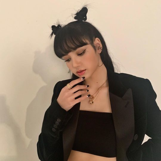
to this icon

FULL TUTORIAL UNDER THE CUT
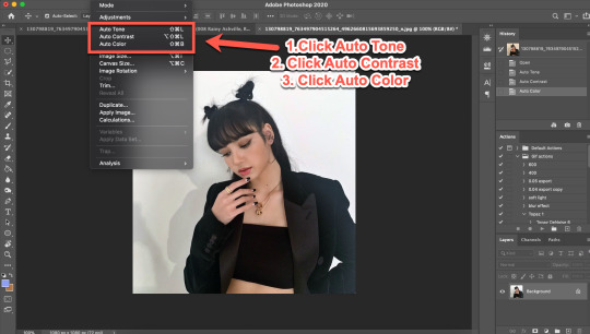
First off, open Photoshop and drop in your image (I have Adobe Cloud PS 2020)
Then I want to clean up the colors of the image, because the image is too yellow, and was clearly taken in bad lighting.
1. Click Auto Tone
2. Click Auto Contrast
3. Click Auto Color
That should help give the image a much nicer, natural color, as shown below:
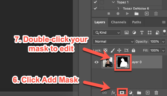
4. Select the Selection Tool
5. Click Select Subject
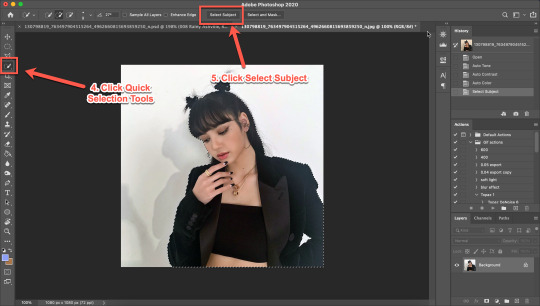
6. Click Add Mask
7. Double-click your mask to edit
8. Click View, then select Overlay V (this will help you see where you need to clean up your image)
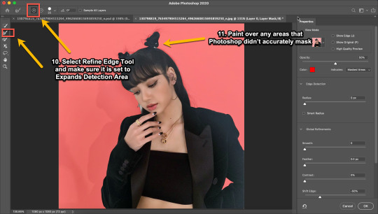
9. Adjust settings to the image (This part really just depends on your image. Generally, I always set the Shift Edge to -50%, as it helps take away any white fuzziness around the image. Smooth obviously smooths the edges, Contrast helps sharpen them, and Feather...feathers them....just don’t use Feather okay?)

10. Select Refine Edge Tool and make sure it is set to Expands Detection Area (aka the + symbol lol)
11. Paint over any areas that Photoshop didn’t accurately mask
12. Select your mask again
13. Select your Paint Brush tool (make sure it is set to Hardness 100 and an appropriate size for your image)
14. Set your Foreground and Background colors to White and Black (Just click the little black and white boxes above them)
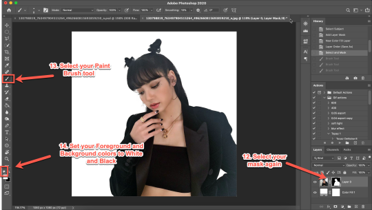
15. Using your paintbrush tool paint in (or out) details you need (In this case I just need to paint her face back in, so I use the brush tool set to white and paint where the pixels are distorted)
Now she is ready to be cropped and edited.
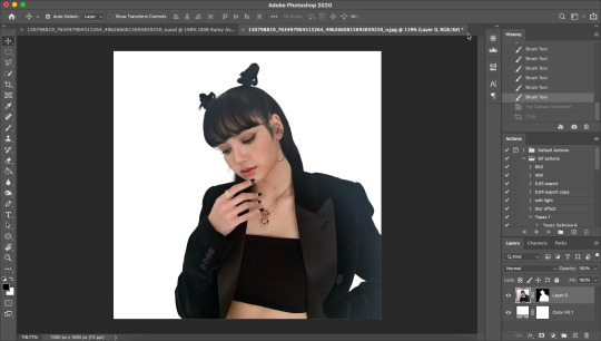
16. Flip/crop/adjust the image as desired (My best tip is to use the crop tool and put the focus of the image in the center of the grid)
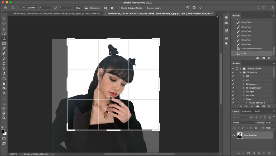
Here’s the final cropped image:
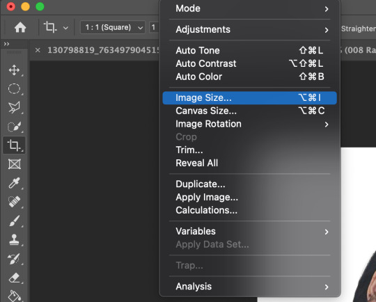
17. Click Image>Image Size
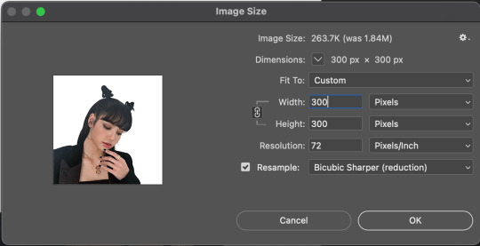
18. Set the Image Width to 300 Pixels, check Resample, and set to Bicubic Sharper (Reduction) and click OK
19. In your Layer Panel, select your Image, NOT your mask (nothing will happen if you edit your mask lol)
20. Click Filter>Noise>Reduce Noise...
21. Adjust to the following settings (or whatever you prefer to get the image looking smooth) Click OK
Now my image is smooth and free from noise and grain, but I want her to be more in focus.
22. Click Filter>Sharpen>Smart Sharpen
23. Use the following settings
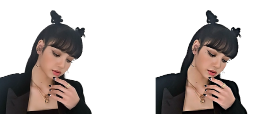
This is a basic sharpen that many editors use for gifs, edits, icons, etc, and you can just stop there for the sharpening step if you want, but I prefer my icons sharper, so I click Filter>Sharpen>Smart Sharpen again and this time, I use these settings:
You can see the differences below. The left side has just the basic sharpen, and the one on the right has both sharpens (you can clearly see the difference)
Once you’ve sharpened as desired, we’re ready to finally get to the fun and colorful part!
24. Add a gradient bg below your image (There are tons of free ones you can download from Tumblr or Google, or you can just make your own with the a gradient layer)
This next step is optional as not all images need it, but for this image, I need to do some badly needed image adjustments
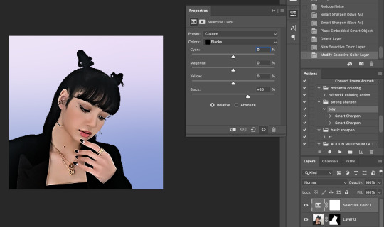
First I click the adjustment layer on my layer panel and click Selective Layer

Then I set the colors to Blacks and drag the Black to +35 to darken up the blacks on the image and give it a nicer contrast (selective colors are great, mess around with them as much as you want until you find a look you like!)
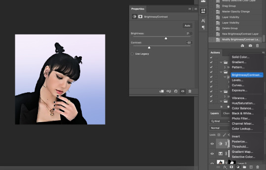
Then I make a Brightness/Contrast layer and adjust to what I feel works best for the image
26. Create a folder (if you did the above step, select the layers and then click the folder icon, it’ll just put them in the folder)
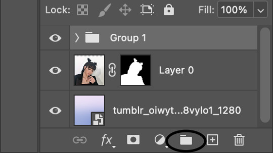
27. Holding down the alt key on Windows (or the Option key on Mac) click and drag your mask to the group layer. Now you have a folder that you can put PSDs and adjustment layers in without affecting your gradient background
28. Drag your PSD of choice. I am using this amazing PSD that is perfect for pale photos. I set the PSD to 50% opacity and it looks like this
Now, I could stop here, but I’m extra so I want to doctor up her face a little.
29. Above your PSD folder, create a new layer and set it soft light
30. Select your brush tool again, and pick a color that will work for enhancing an area of the photo. Then paint over that area.
Lisa is already pretty pale here, so I won't paint over her skin with a nice peach color like I do sometimes in darker photos. But I will add a nice pink flush to her cheeks and her lips.
Then I will use a lilac purple to paint over her eyeshadow. This brings an element of the background onto her face.
There’s not a lot that needs to be added to this particular photo, but here’s an example of another icon without and with soft light painted layers:
The left has no soft light painted layers, the right does. You may be thinking it looks too gaudy, but icons are tiny! Adding strong colors will help painted areas stand out. However, this is a completely optional step of course :)
31. Back to our current icon. Select all your layers, and click the folder icon again to place them all in a folder
32. Select your Elliptical Marquee tool and make a circle over your image
33. Click your mask button in the layers panel, and tada! You can now save out your icon and put it to use
Here is the completed icon:
If you got this far, thank you for reading, and let me know if you have any questions!
#ggnet#kgirlsquad#blackpinknet#idolady#femaleidols#lisa manoban#photoshop tutorial#icon tutorial#photoshop#tutorial#icon#icons#if this type of post doesn't belong in any of the group tags just let me know and i will remove the tag#wasnt sure if tutorials counted lol#Anon#ask
99 notes
·
View notes
Text
Hello my spooplings! :3 Well, it’s been a heck of a year… though it feels like it’s been several years crushed into the space of around four months. Yes, we all now exist in the liminal space between uncertainty and the next run of Bad News, but it is still the festive season. And in the spirit of the season, I wanted to share with you one of my new favourite art tricks!
(Now, this is on Photoshop, but most programs with brushes should have an equivalent, afaik!)
So if you follow a lot of horror artists like I do, you might have noticed that a lot of them use these cool opalescent colour variations, usually in light colours.
You can see my own attempts at it here, especially in the top two wings.

Idk if that’s actually a common thing, but I’ve always loved the effect and could never find any tutorials on how to actually do it, so here we go!
First thing to do is make yourself a noise brush (This is super fun to mess around with on it’s own, tbh.) by grabbing a hard bristly brush, like so
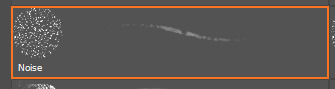
Anything hard with a bit of texture will probably work. But bear in mind you want to end up with something like this
(^These three are all on the same colour settings btw, so you might need to experiment with a few brushes before you find something you like.)
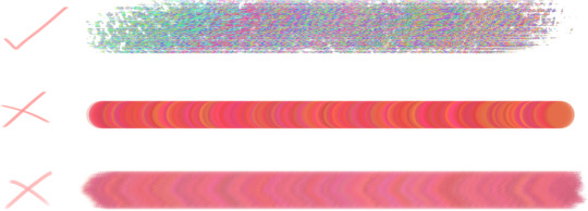
Now we can set the colour dynamics!

Idk why it took me so long to venture into this particular tab, but I HIGHLY recommend it. Even just a slight colour jitter can add a ton of interest to a brush, and you can even load the brush with both the foreground and background colour, and fade between them manually. I’ve not mastered that one yet, lol. Here’s the settings I use for a noise brush - MAX hue jitter, really crank that boy up. A bit of saturation and brightness jitter to taste. And tbh I don’t know what the purity does so I leave it XD There’s also a Noise option, click that on for shits an’ giggles why don’t we? Then save it out as a new brush preset. (And don’t forget to keep an exported copy of your up-to-date brush collection, cus Photoshop might just one day decide to just restore everything to default. RIP my sorted brush files :’) )
So now you have a noise brush, congrats! Aaaaaaand also a whole new folder full of other experimental dynamic colourshift brushes, if you’re anything like me. So how do we use it? Simple! Set a colour dodge layer over your image, set your noise brush to a super saturated colour (the hue doesn’t matter, unless it isn’t set to 100% colour jitter). It works best over midtones, but will also make your bright spots really pop (sidenote, a bit of midtone on a colour dodge layer is a really good way to pick out your hilights!).
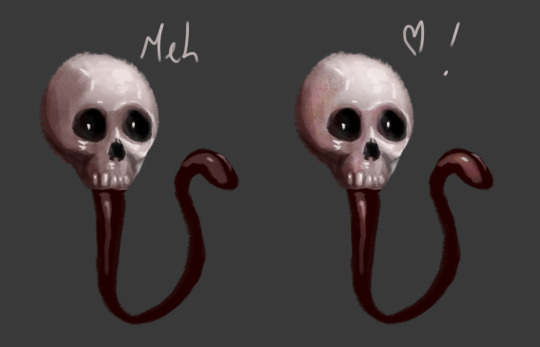
Here is a demonstratory Digits to er, demonstrate.
Try it on different layer styles as well, colour burn is good if you want to add texture to a spot that’s already really bright.
But yeah, that’s it, that’s my thing XD hope it at least gives you something different to experiment with over the holidays. And also I HIGHLY recommend trying colour dynamics with other brushes to see what happens. It’s a lot of fun.
Happy Holidays everyone! And er, so long 2020, you won’t be missed. At least I hope not.
~ Daemon
84 notes
·
View notes
Note
Hey, if you don’t mind me asking. I’m making some icons for myself (badly to say the least) but they look blurry on tumblr even tho they’re 200x200 and looking fine on photoshop. Would you mind telling me how do you finish your icon so they look with good quality?
hi anon!! i'm honestly always still learning myself, so i don't know how much help i can actually offer you, but i'll give you some things i think could potentially be causing problems!
firstly, though, i want to direct you to soph's icon tutorial, bc tbh i still use it when i make my icons lol. she's really thorough and reading her tutorials is how i learned how to do a lot of the creating i do now! there may be steps in there you might not be thinking of bc i know everyone creates a little differently, so i think it's worth checking out if even just for a different perspective bc something in it might help!
the biggest thing i have, though, for anyone else who may be having the same issue, is to make sure you're sharpening your icon before it gets uploaded. that was the first thing i thought of that could be causing the blurriness issue, especially bc tumblr compresses images
more tips + maybe a mini tutorial? (we'll see! i'm not used to explaining my process so bear with me lol) under the cut:
(to start, actually, i want to say i always hate assuming lack of knowledge, so i apologize if you know any - or all - of this already!)
full disclosure: i actually always make my icons 300 x 300 because i like to be able to see them lol, but 200 x 200 should work fine, especially because they get smaller when they're viewed anywhere on tumblr anyway. but i wanted you to know in case any of my settings don't work properly for you specifically bc i'm using them for a 300 x 300 canvas! it's definitely worth noting this is just my method, so who knows how it goes for anyone else. it's probably wrong to someone 😅
so as for sharpening - as you'll see in soph's tutorial, do all your color editing and whatnot first, and then sharpen it! i have an action i found in one of the 3459083 gif tutorials i have used, so i unfortunately don't know how to get it to you, but i can tell you what it does! this is the way i sharpen gifs, but i find it works fine for icons too.
i'm gonna show you a screenshot of the action as a whole (which may look daunting at first if you're unfamiliar, but don't worry) and then explain each step in it with screenshots + my settings:
you're going to be using smart sharpen here, so you definitely want to select your image (the colored screencap or whatever) and convert it to a smart object first.
then, with that same layer selected, under filters, go to blur > blur more.
after that, go to the filters tab again, sharpen > smart sharpen. that will bring up a panel, and these are my settings:

i actually originally used 0.4 for my radius, which is what i generally use on gifs because i thought it helped make them look less grainy, but i legit just tried 0.3 on this icon and it looks better! imagine that! always learning, like i said. most folks use either .4 or .3 radius, though. but test them out! experiment! see which one looks best on your icon.
anyway! then, after you click OK and the smart sharpen window closes out, you're gonna click the lil lines over on your layer where you've smart filtered it and edit the percentages for both blur more and sharpen, as you can see in the following screenshots:


i usually stick to around 35% for blurring, but depending on how wonky the sharpening makes your image, you may need to increase/decrease the percentage. the point of blurring it is to offset some of that nasty graininess that comes from using smart sharpen.
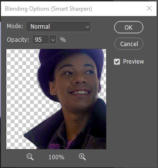
speaking of which! i usually wind up with my icons around 95% smart sharpening. as with blurring, this percentage really depends on how good/bad it looks as you tinker with the percentages. (like in the above screenshot, before i switched to 0.3 radius. even still, it will be tiny on tumblr, so i'm not SUPER worried about it, and sometimes having it be a little oversharpened can help it stay clearer when it's shrunk down)
and that's my sharpening done! i really think sharpening makes a HUGE difference when viewing images, especially icons. a lot of people will also paint over the colors on their icons to make them more vivid (which you can kind of see i did with jesper's shirt/tie thing).
the only other thing i would suggest is to also make sure you have enough contrast in the colors on your icon. i think if it's not contrasting enough, it could maybe look muddier when it's smaller. soph's tutorial has a lot of great tips on how to color icons and stuff to keep them vivid and contrasting too. (unless, of course, you're doing a pale/low-contrast one, in which case it may be less helpful lol)
anyway, i have no idea if this is what's been giving you trouble, or if you 100% know all this already, or if the issue is actually just tumblr, but that's how i get my icons to look crisper! i hope that if not my words but maybe soph's tutorial can help you, and i know she sometimes even links other outside tutorials in hers for even MORE in-depth help.
good luck!! 💛💛
#this got kinda long slfkjsdlfkjsd i hope literally any of this helped you!!!#i did try my best but again i'm decidedly not an expert lol#i hope your icon turns out well!!!!#b:answered#b:pshelp#anonymous
4 notes
·
View notes
Note
Hello! Do you have a tutorial on colouring the way you did for the rainbow gifset and the yellow & blue one?
hey! i didn’t before, but i wrote one under the cut for you! hope it helps :)
a couple of warnings before we begin: 1. i don’t use psds, i colour from scratch every time, i just always use the same steps so i can’t give you exact numbers for things, it’s just whatever i think looks best for a given gif; 2. i don’t actually know anything technical about photoshop, all that’s behind my decisions with layers and values is knowing from experience that it usually looks good like that, i don’t have technical knowledge to back it up; 3. i’m not gonna include pictures because my pc can’t handle running photoshop and a browser at the same time, but i will try my best to make this as detailed as possible (i’m sorry if i make it too detailed or not enough, i’m trying my best). now onto the actual tutorial!
my first layer is always exposure. i usually put -0,002 for offset and 0,90 for gamma correction. what value i choose for exposure depends on how bright the scene is, but it’s usually between 0,75 and 2,5.
after that, i do brightness, if i think it’s necessary. sometimes upping the exposure too much isn’t worth it because it makes whites and sometimes even just light colours way too white. in those cases, i’m just better off leaving it at a lower exposure and adding a brightness layer after it with a value between like 20 and 50.
next is levels. idk what things are called here, i just put 10 in the first arrow and something between 0,8 and 0,9 in the second and i do not mess with the third. all this in the rgb part, i don’t mess with specific channels in this layer. i do this bc i like my gifsets to have like defined blacks/darker tones, but if you don’t, you can just skip this.
after levels comes colour balance. i know some people swear by it, but i gotta be honest, i don’t use it in every gif. i only use colour balance if the tone of the gif is too far off from what i want. it depends a lot on the scene/show, but usually i wanna go from something green-tinted to more blue, just bc i like blue better, so i usually just put a blue value between 10 and 25 on all options (shadows, midtones, highlights). i like oranges/yellows/reds to look warmer, so i usually also add a little red in at least shadows. but this isn’t rocket science, i just mess around with the arrows until i think it looks pretty/easier to get where i want.
since you specifically asked about my rainbow gifs, i’m gonna admit here that i totally cheat on those. usually, i’ll purposefully choose a shot that is very still and/or very easy to manipulate into the colour i want (blues to greens and vice versa, blues to purples and vice versa, yellows to greens, reds to oranges, etc. etc.) so, depending of which of those two situations i have, i do one of these:
a. if the background colour is easy to convert, i’ll just use a hue/saturation layer to change it (or even selective color if it’s like really easy and i don’t wanna bother with making a separate layer for it). i just mess around with the arrows in the colour the gif does have until it changes to the colour i want.
b. if the scene is very still, i just paint the background. i just pick the colour i want, paint over the background and then set the layer to hue or color. that’s it. that’s my big trick. lol
ok, so, after i have the background colour i want, i add selective color layers. usually at least two, sometimes more. the first layer i use to mess with reds and yellows for the skin tone, whites if there’s a lot of brightness in someone’s face (usually put the blacks in a value between 25 and 75) and the greys and blacks in case the gif looks too dark (also only mess with the black values, but never more than positive or negative 10 in greys and no more than negative 1 or positive 10 in black). second layer i do minor adjustments on skin tone and really up the values on the colour i want. like, pushing the values to 100 upping it hahah for rainbow gifs, i usually add like between 2 and 5 layers after that just upping that colour.
once i’m happy with the selective color layers, i add another levels layer. once again, 10 on the first arrow on rgb, but something between 1,10 and 1,30 on the second. i also change the blue channel. i like skin tones and colours in general looking more on the warm side, so i go a bit overboard with it on those selective layers sometimes and it ends up just being very orange, so i use levels to scale that back a little. i put 10 on the first arrow in the blue channel, between 1,10 and 1,30 in the second and then between 1,45 and 1,25 on the third.
after that, i add a brightness layer, if necessary. same values as before.
the last step is vibrance. i don’t mess with saturation values, usually, only vibrance. i never go below 50 or over 100, but pretty much always it’s 80.
and that’s it! sorry this “tutorial” was so messy, but i hope it was still somewhat helpful :)
#anon#txt#ask#if you do use my tutorial to make gifs i'd love it if you like tagged me in it so i can see#but like no pressure :)#again hope it helps!!#also tagging it:#gif tutorial#so i can find it later.
5 notes
·
View notes
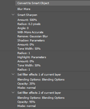
Note
hii!! i have a very silly question but how do you get your gifs to look so high quality even on mobile? is it bcs you only use ts files, or is it a sharpening setting / a particular layer? hope you have a great day!
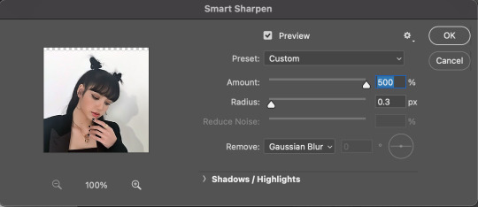
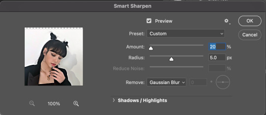
omg hi that's not silly at all!!! i actually don't use ts i just download the highest quality i can find from youtube mainly (so usually 1080p but 4k if it's available) and i use vapoursynth to resize (& sometimes denoise a little bit) ! i don't use vapoursynth to sharpen tho i just smart sharpen in photoshop:
the 1st setting i use is 500% with a 0.3px radius & reduce noise 10% + remove gaussian blur
if it still looks too blurry i'll apply smart sharpen again with 10% at 10px & reduce noise 10% ... honestly sometimes i'll apply this setting like 10 times (especially for film gifs) just to get it to not look so pixelated ;; if u overdo it it'll make people's faces look like wax sculptures tho so just. use in moderation lol for kpop gifs i'd say use this a max of 3 times otherwise it starts to look super fake
for colouring i find that for like.. midtones? the brighter they are the less pixelated they look on mobile. pixels show up easily on dark colours unfortunately :(( unless it's 100% black! so i might set a black point w/curves or i'll go to selective color & bring down the blacks. or the classic way of just adjusting the levels!! whatever works for u <3
i know kpop gifmakers don't like to do this but adding grain (or adding noise) can help make it less pixelated! but you're also making it more grainy so it's up to ur personal taste :))
ok !! & then when i save for web i use the default settings ? which are selective diffusion.. 256 colours.. 100% dither.. bicubic i think??? some people prefer adaptive over selective i honestly do not know the difference even tho i've saved with both before so totally up to u!! u can experiment to see what works best for u 💕
oh also this is such a hassle but i always always check on mobile before i post. i have a sideblog where i literally just dump my gifs & look at them on my phone to make sure they're not too pixelated it's very annoying & u might have to save ur gif like. 10.... times....... w different settings ....... but ! at least it won't be too pixelated??
i just realised i've been talking about 540px gifs this whole time ghhghfjg if you're making 2x2 sets or whatever then u definitely don't need to sharpen as much!!! anyways happy giffing!!! pls lmk if u want clarification on anything 💞
#thank u for this tho anon im virtually sending u pics of kermit w/heart emojis <3333 im honoured u think my gifs look ok sgshhd#also never forget the tried & true method of getting rid of a gif if it's really not looking too hot 💔💔💔#i can't tell u how many gifs i've trashed mmgmh i almost never post on this blog either all my gifs are on my sideblog 😔#i hate that tumblr compresses everything :/ like on twitter???? gifs are like. never pixelated????? wtf.#ANYWAYS. im sorry this is insanely long i hope this helps! im not exactly a veteran giffer so im sorry if some of this is plain wrong dgbdb#asks#anon#long post
2 notes
·
View notes
Text
color icon tutorial
ok i’m not super great at making icons but an anon requested a tutorial for my icons so i will post my process! it’s good for beginners i think (even tho i have been making these icons this way since 2016 lol)
you’ll need:
Photoshop CS5 or higher (I have CS5 which is quite old, I know, but I pirated it many years ago oops)
relatively hq pics to make icons out of
a psd (if you need some, tumblr.com/tagged/psd is what i periodically check for some).
an action (preferably sharpening action, since that is what i use)
a texture if you want
you, yourself, and you, and i guess this tutorial
i’m going to be making this as a beginner’s tutorial so it’s gonna go about as in-depth as one can be! it’s gonna include a lot so feel free to skip a lot of it if you are already pretty well-versed in photoshop or icon-making.
ITS SO LONG IM SO SORRY IT IS SO VERY IN-DEPTH I’VE EXPLAINED EVERY POSSIBLE THING I COULD’VE
but also if you have any questions at all, please let me know. i love teaching people stuff.
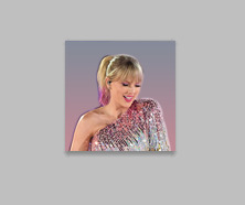
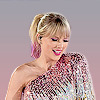
example of the icons that i make:

Hi hello welcome
Ok, so first open up Photoshop. I am using CS5.
You will need hq pics of whatever you plan to icon. I do 99% Taylor Swift, so I use taylorpictures.net for all my icon needs. Make sure they are of semi-decent quality, they don’t have to be amazing since we will be shrinking them down to a very small size so much of the quality is gonna disappear anyway but like, make sure you can at least tell the subject from the background distinctly (you’ll see why later).
This is the picture I am using for this tutorial (and will post icons separately):
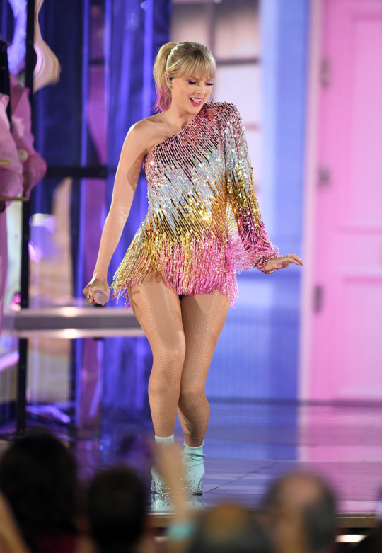
Open this in ps (File > Open > the picture)
Ok so now it’s the actual tutorial lol
1. Crop the image
We are not going to crop it to 100x100! Select the Crop tool and set the dimensions to 300 px x 300 px--MAKE SURE THAT YOU TYPE IN PX AFTER YOU TYPE IN 300, OR ELSE IT WILL CONVERT TO CM AND THAT WILL NOT WORK FOR THIS!
Next, crop the picture you want as much as you want--as long as you get what you want in the icon. For these kinds of icons, you just want to focus on one item--like Taylor, for example--instead of multiple (not Taylor and her backup dancers since this isn’t what my icons look like and you won’t be able to do that very well on a beginner level). Crop that to a 300x300 px size and click the check mark on the top bar to finalize it.

If your pic is hq enough--meaning a larger picture--it will probably look super small. That’s ok, it’s just proportional to the old picture. Go to the right side bar and select the Navigation tool.
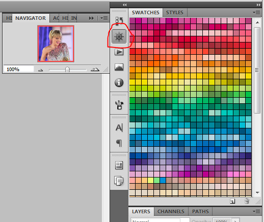
If that tool isn’t there, you will just have to go to Window and select Navigator, and it will bring that up for you.
See where it says 100% in the picture right there? It will likely say something like 25% or whatever if you just cropped it, so change it to 100% which will bring it to full size.
Cool! now it should look like this:
2. Use the Quick Selection Tool

Go to the left sidebar on Photoshop. Depending on which PS you have, it might look different. This is what mine looks like. Regardless, the icon should look relatively the same I believe across all Photoshop versions. If it’s not there, you might want to left click and hold down on some of the icons and see if it is an alternative option (it should be there already--but it is grouped with the Magic Wand Tool just in case).
This tool has three options in the top bar: free select, add, and subtract. Start with the middle option: add.

This will allow you to choose which parts of the picture you want to select to cut out for your icon. You can change the selection brush size, but I always keep it at 3px because it keeps it really precise.
Drag your mouse over the area of the image that you want included in your icon. This tool will automatically choose parts of the image that are similar--for example, Taylor’s blonde hair will like all be selected around the same time, but the pink/blue background will not be, since it can tell that those are starkly different colors and thus two different objects in the picture. It should have a crawling ants moving line around the areas of the picture you want to select. If you go outside of what you want included in your icon, that’s ok! That’s why the subtract option is there. Just select that--to the right of the Add option--and go over what you do NOT want in your icon to get rid of it using the Subtract tool. You might have to go back and forth between those tools in order to get exactly what you want in the final product.
I can’t show you my final outline for Quick Selection since it goes away when I screenshot, but after you’re sure you got what you want in your moving ants line, it’s time to finalize it.
Remember, this tool effectively cuts out the selected portion of the picture from its background.
3. Refine Edge
On the top bar, click the big rectangle button that says Refine Edge. It will bring up a window that looks sort of like this, but I have settings adjusted the way I like:
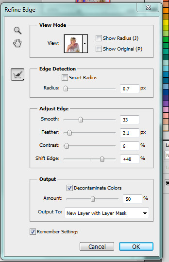
You can change these settings any way you’d like, but I generally stick with this. It’s also okay to mess around with them and see how you feel. If you don’t want to do that, you can just use my settings and edit anything you don’t like later.
Click OK to cut.

This has pretty much removed the background from the picture and only left what we cut out and a transparent background (hence the checkered background--that is space that doesn’t actually exist). You can also see some shadow from the background around her arms and hair, which we can delete out later very easily. That is a result of the settings from Refine Edge, which is why some people choose to lower the Feather bar so that it doesn’t include as much shadow--which is good for many pictures since a lot of these are straight cuts, but this can occasionally cut out part of the icon you want to keep or make it look weird since you want just a little space to mess up when it comes to the Quick Selection Tool.
Bonus step if you want a selective colored icon:
Some people like really vibrant icons that include re-coloring. I’m not very good at it, but what I do (and it sometimes turns out well--this is typically the way people do it, though they are less sloppy than I am) is select a color from the Swatches at the right that is similar to the one that they want to paint over. For example, if I wanted to make Taylor’s hair more yellow/gold and vibrant, I will choose a yellow. Select the Paintbrush tool. On the top bar, the Opacity will likely be set to 100%, which will basically color right over the picture and look weird. Set the opacity to something very light--mine is 20%--and paint over the part that you want to color. Make sure you do this in one stroke--if you paint over her hair with 20% opacity once, let go of the mouse, then go over it again, it’s gonna start building up and becoming more opaque!
You can also completely recolor a picture this way, like if you wanted Taylor to have entirely pink hair, you can use this same method but choose the pink you want instead of a similar yellow. This can be very difficult and tedious, so I don’t typically selective color my icons, though occasionally I do because I love those icons with obnoxiously vibrant colors.
4. Open texture/create new background.
Ok, so I do both of these things depending on the background I want. I have some textures saved such as this that I use for icons:
I didn’t make it--it’s pre-made by another artist on tumblr from whom I downloaded their texture pack. You can make backgrounds like these too, but I’m not very good at them.
SO you can either File > Open one of these pre-made backgrounds/textures, or you can make your own.
In order to do that, you can do File > New and change the settings to width: 100 pixels and height: 100 pixels. Under Background Contents, choose White. That’s very important! You don’t want transparent, it doesn’t help us. That brings up a new window on Photoshop next to the picture we’ve just cut out, just a small white square. You can paint that whatever color you’d like. Use the Paint Bucket tool and choose a color from the Swatches section on the right. This will make the background completely one color. However, if you want a gradient, you can do this several ways, but I do it like this:

Click that, go to Gradient, and mess around with the Gradient options and see how you like the background. Here’s one I made, for example:

Boom! Background for icon. I will use this since I made it for this tutorial so yeah it might not look amazing but here we are.
IF YOU USED THE TEXTURE I JUST POSTED OR YOU KNOW THE TEXTURE YOU ARE USING IS NOT 100x100--THE ONE I POSTED BUT DID NOT MAKE IS 200x200--THEN YOU NEED TO RESIZE IT TO 100x100.
You can do this by going to Image > Image Size and changing the 200 pixels x 200 pixels (or whatever is there) to 100 x 100.
5. Duplicate layer
Now it is time to combine these two images we’ve created. Go back to the original picture we worked on--mine is Taylor at the BBMAs--and go to the right sidebar. You should have two copies of this image now: Background and Background Copy. Background Copy is the cut out picture we are using for the icon. Right click on Background Copy and select Duplicate Layer...
This will bring up a window that asks what you wanna do with this layer.

Select the dropdown under Destination. Currently, the Document selected is the image we are already on (my Taylor pic was saved under 056.jpg) but we want to click the dropdown and select the pic that we are using for the background. In my case, it’s titled Untitled-1 since I didn’t change the name. Yours probably is too. Select whatever your background image is saved as and click OK.
Now go to the background image or texture that you just selected--your cutout should be there, but you can probably juuuust barely see it! That’s because your picture is about 3 times bigger than your background.
6. Resize layer
Use the Select tool--the very top icon on the left sidebar--and make sure Show Transform Controls is selected on the top bar. If it’s not, you’ll know--because you won’t be able to resize the image.

The square you are seeing (that isn’t the picture) is the layer we just duplicated onto the background, aka the icon. You’ll want to hold Shift and select the bottom right part of the image to resize to whatever you would like visible in the icon--it could be the entirety of the picture we cut out, or just part of it, if you realize you like how only part of it looks. Either way, you need to hold Shift while you do this, or else the image will NOT stay proportional, and it’ll look all wonky. Hold Shift the entire time you are resizing. This is what mine looks like:
You can see I both resized it and moved it a little to the right--you can use the Select tool to move it, but that might move it way too much since it does it incrementally, you can just use the arrows on your keyboard and move it by pixels which takes longer but is way more precise.
You can still see the shadows from the background on the icon, so select the Eraser tool (if the shadows bother you or you don’t like how it looks) and zoom waaay in. You want to be careful with the Eraser tool! (Also make sure Background Copy is still selected so you don’t accidentally erase the background. If you just have Background Copy selected while you erase, it will only erase whatever is part of that layer, it won’t bother the background).
While zoomed in, erase the pixels that are obviously discolored from the rest of the image. You can zoom in and out to check how you like it as it progresses.
Here is mine after I used the eraser tool on any parts of the image I thought were bad! It should lay on the background naturally.
Now that we’ve figured that out...
7. Sharpen/action
Now is the time to apply an action! Please sharpen your icons. You want them to look good on your blog or others blogs, and in order to do that, you need to sharpen them.
If you already have actions uploaded, cool! If you don’t know how, well, I sure am going very in-depth here so you’re in luck.
Download an action from any photoshop resource (or tumblr.com/tagged/photoshop-action is where I look occasionally). You will have to load them onto your Photoshop now. Click the button that looks like a movie Play icon on the right sidebar. This will bring up the Action list. Photoshop likely has pre-made actions for you, but we don’t use those because I never taught myself how to use those so maybe you can use them, I don’t know. I just use ones I download from Tumblr.
Click that little dropdown menu and click Load Actions...
This should bring up a file opener and you can select the action that you downloaded for this icon. It will download it into Photoshop and will now always be there--you don’t have to load actions every single time you want to use them. If you load them once, they should be there for the rest of forever.
Scroll down to find that action and select it. Now, make sure you still have Background Copy selected. I don’t care about applying an action to the background, just the copy, which is still our image that we cut out. Click the Play button on the Action list--pictured above on the very bottom of the screenshot, next to the Circle and the Folder icon. This will apply the action to the background copy. (Hint: if the Play button isn’t available, it’s probably because your action is in a folder. Click the dropdown of the folder and click the first thing under it--that should be the action and it will apply it).

There it is with the action applied! It’s muuuuch sharper--perhaps a little too sharp, but that’s ok, it won’t look bad on people’s blogs.
8. Add a PSD
To apply a PSD, File > Open and choose the PSD you want to use. I listed above where I find most of my PSDs, just download one you like. You can choose 100 different ones and try it out if you want. I use the same one for everything, by @toxicpsds (I believe it’s #6). This should open a third window with the PSD over a sample image (thanks to the artist!). You just have to select the PSD layer--not the image with it--and Duplicate Layer and put it on the image that we have produced thus far. It is the same process as when we took our cutout and put it on the background. (The PSD is probably under a group--mine says Group 1--so just select the group in its entirety--shift-click it if you need to).

You can tell the background is also lighter. If you don’t want the color of the background affected by the PSD, select Background Copy and the PSD together, right click on one of them, and select Merge Layers. This will put the cutout and the PSD in the same layer, which should take the PSD off of the background and revert it back to the color we had before. However, I really like what the PSD did to the background, so I will keep it this way.
I am finished now with my icon!
9. Save it for Web
To save the icon to be able to post on Tumblr, go to File > Save for Web & Devices, which will bring up a window like this. It might look a little different since I have my settings a certain way, but whatever.
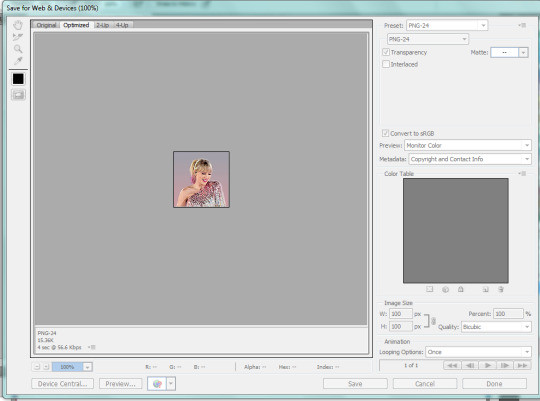
(Sorry this looks weird here, it’s just what happens when I screenshot. I’m not a tech wizard).
Your pre-saved things might look different, but make sure you are saving a a PNG-24 for the best quality. Just make your settings look like this, basically, then click Save.
There she is! All done!
If you have any questions, let me know! I tried to be really specific, but I’m not sure what level people are on Photoshop (probably better than I am) so just ask if I need to clarify anything!
60 notes
·
View notes
Note
2/12/22/32/42
2. What is your least favorite set you’ve made?
I kind of cringe when I see my early sets, but I’ll go easy on my past self who was just starting out, and I’ll say it’s this one, because I just don’t have an excuse for it. Shouldn’t have even posted it smh…..
12. What is the most embarrassing thing you’ve ever giffed?
Lmao definitely this! I don’t really have very many embarrassing sets I don’t think?
22. What fandom/movie/show/person etc do you gif the most?
Oof definitely joon!!! What can I say? I’m whipped lol
32. What is your favorite tool/adjustment layer in Photoshop?
Selective color is the most fun to play with! But I’ve also been playing around with curves a lot more than I did when I started! (See #2 for an excellent example of using curves in the absolute worst way lol)
42. How is your gif folder organized? Is it organized at all?
It’s not very organized lol…. I have my 100 days of joon stuff in a folder, and everything from my Yoongi bday countdown in a folder, but other than that, it’s kind of a mess lol
Send me questions for gif-makers!
1 note
·
View note
Note
5, 6, 12, 19, 20, 27, 30!!!!!
5. What’s your favorite thing to draw?BOOBS XDD
I actually love drawing hair. CRAZY LONG HAIR . gotta practice to make them dynamic and more movement lines.
6. What’s your least favorite thing to draw?feet. O.ohow do they work? I dont do very much feet at all tbh. the problem is that toesssss. if no tows its the right shape for the feet. ankle etc.
12. Is it okay for people to ask you about your process?Sure!!!! my process is very somewhat straight forward and also a decision system of the BS it or do it.i mainly use Sai then put some bloom and stuff in photoshop
19. What is the most difficult thing for you to draw?Handssssss
I have a problem with drawing hands and if I do managed to draw the hand nicely, the fingers don’t look like fingers. there's a specific curve and bulge the fingers have that i cant seem to get down O.o
AND the other eye. Its always so hard to get the other eye to look good. and right.sometimes you make it look too good and then you have to change back the other eye and the cycle continues.
20. What is the easiest thing for you to draw?the first eye.nothing to compare it to. free eye drawing and get that first emotion in hueheue. then put hair o nthe other eye so i dont have to draw it! LOL
27. For digital artists: how many layers does a typical piece require?70-100 layers
Because I haven’t had a way to shortcut. i put areas of the art into different sections and each section will have their own layer with some shading and lighting. and its gets annoying if I have to go back to it because I do not have the right color to go along that shading layers.
30. What inspires you to not just make art, but to be a better artist?The thrill of making something and finding the resulting image to be something physical that you made out from your mind. I want to put my ideas down on a canvas to finally see it in its glory. And I hope people like it.
11 notes
·
View notes
Note
Hello! I really love your work and must say that your pixel art style is really unique :3 Do you mind if I ask you which programs do you use to animate and draw? Also, could you please describe the process of drawing bc the only way of making pixel art I know about is stacking pixels xD
Thank you friend! I use Photoshop CS5 currently for all my pixel art, but I’m trying to expand to Aseprite as well, as it has a specific focus on pixel art. I’m not quite used to it’s animation though so sometimes I get impatient and switch back to PS for ease LOL. But if you want to do pixel art and can’t afford super expensive programs, Asesprite is literally 15 bucks. Super cheap, yet super effective. And a lot of professionals use it!! Mortmort has great tutorials on it (and pixel art in general). I may not be used to asesprite 100% yet, but I’ve heard those who are used to it definitely prefer it’s animation compared to photoshop.
So, a lot of people draw pixel art differently. When I first started, I did the outlines with detail, and then colored them in (like this piece from 2012). But now my process is usually do loose outlines, color them in sloppily, and then step by step fill in the details (like these pieces for example).
over all I think pixel art is done in two ways: outline first, then coloring. Like- for comparison- how graphic novels are typically done.
like this sprite by derekyu ((used by this very useful tutorial))
or this diorama by cocefi
or with blotches of colors that roughly paint the silhouette of objects or scenes and are later straightened out into details. Almost like a Bob Ross way of pixel art, for comparison again.
like this piece by johan vinet
or this piece by lennsan
I find myself switching between these two styles (or a blend of the two) depending on whether or not I want my pixel art to have defined outlines or not. I guess these methods of pixel art can also depend on whether you’re making just a single character or an entire background.
there are people who draw pixel art on one layer (which is the same as drawing with paint or pencils on paper, you got one sheet) but I find with pixel art having layers (which aseprite or photoshop, and in general most digital art programs provide) is a huge help. I actually have a habbit of keeping process of the pixel art pieces i made (even if I don’t always post them as gifs) and keeping that process by using layers for each step is a huge help for me. Of course, pixel art is still always possible on one layer like Microsoft Paint.
Most important though: pixel art is art- not a science or a list of rules, and can be done in a variety of ways. It can take a while to get in a comfortable progress (it took me a while at least, I felt a bit awkward and slow making pixel art for the first year or so), but honestly if you just keep practicing you’ll eventually get to a point where you don’t think about it, the outlines, coloring, details all become second nature!
I hope this helps you friend!! Good luck pixel art is a lot of fun! Just be sure you’re having fun making whatever it is you want to make :)
52 notes
·
View notes
Last Seen Blogs

artdecosupernova-writing
Whomst The Fuck
doomanddeatharethesamething
Doom and death are the same thing

somereaderinblue
Just another reader who likes to wear blue