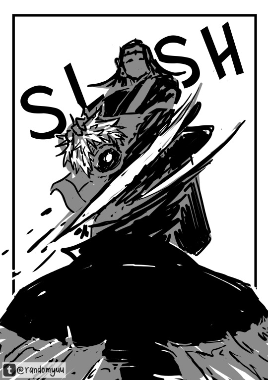
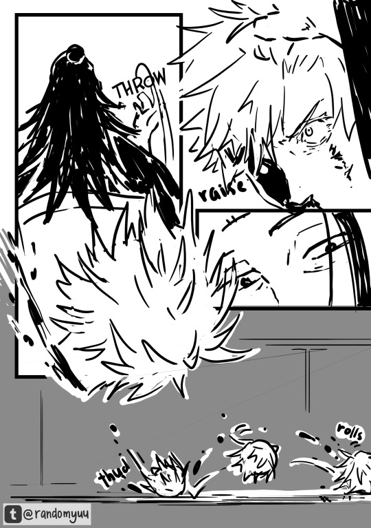
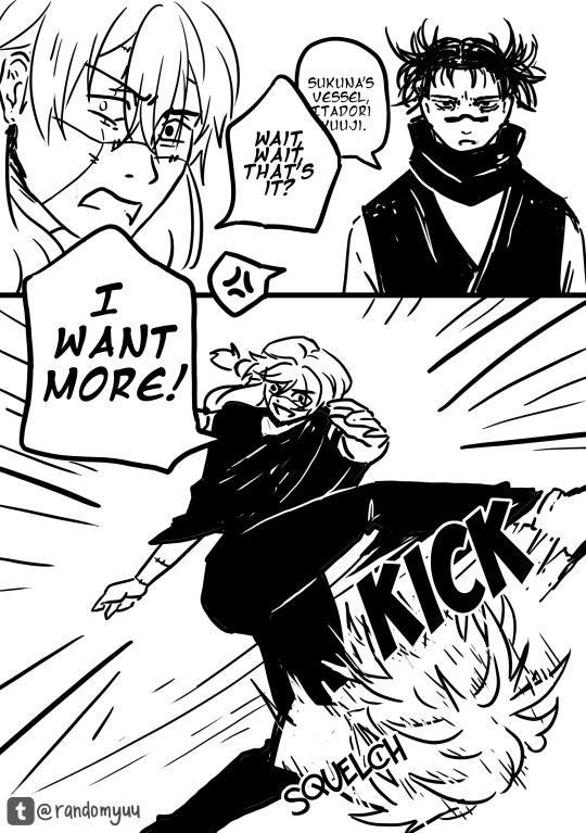
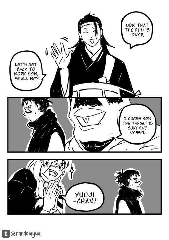
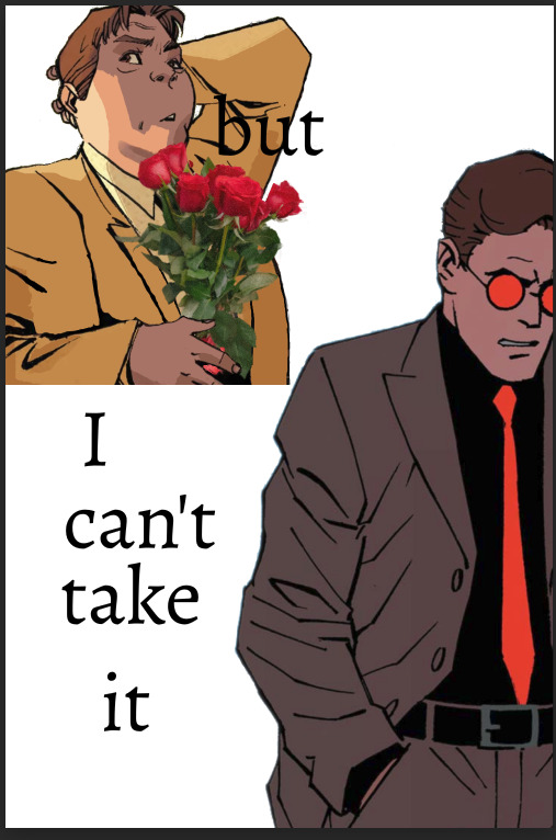
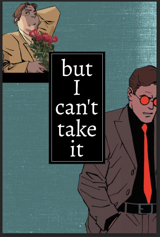
#the author is drawing the comic like storyboards
Text
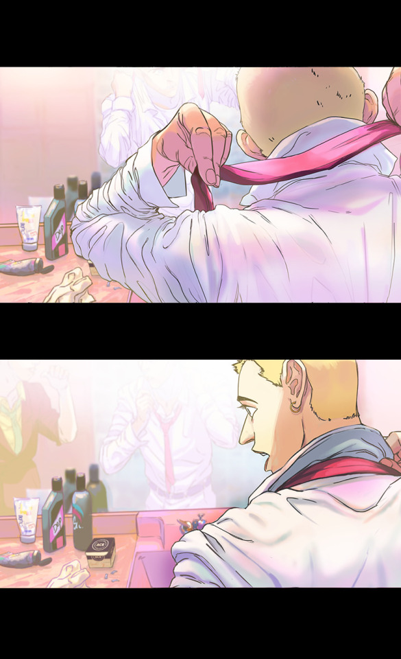
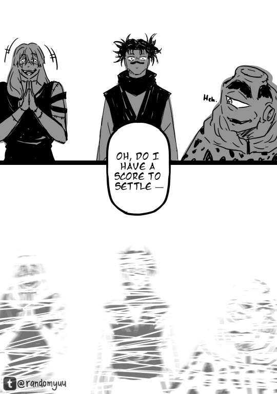
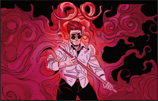
Oh my god, I was like, hey lets read that silly webcomics with the funny penis anatomy and then I ended up sinking it like 3 hrs and its 4am
#its not even a necessarily good comic 💀💀💀#the author is drawing the comic like storyboards#theres so much dialogue i just skip and i end up getting by just by flying thru#this was like homestuck all over again#and so much sex and transhuman and trans allegories#very cool concepts just the execution is all over the place#now im at the point where they keep doing flashbacks and hwuh the sexy rabbit lady is the og cyclops rabbit#i came for the funny penis but admittedly the sex was good bc god#something about the pseudo cannibalism becoming one is so fucking hot#its feast for a king#ieueegagshfhguvig#i havent stayed up this late in a long time#i usually fucking hate gore and intestines but since thsyre always described as tentacles and worms#i was able to avoid a lot of that disgust#they fuck nasty man!! almost all the characters try to fuck nasty#except for the cool marshmallow junji ito dude who literally ripped his face off bc he did NOT want to particpate in sex#the plot is kinda like doom eternal where humanity fucked up trying to get energy#but instead of mars its the moon and oh they fucked up earth too#.txt
2 notes
·
View notes
Text
comics and animation have a lot in common, but one interesting difference is that arranging pictures in space rather than time means there's a tradeoff between the amount of drawings you use to show an action, the amount of space each drawing is given, and the amount of pages you cover which determines the 'pacing' of the comic.
if you slice the page up into a lot of tiny boxes to show many stages of a motion like an animation, then each panel has correspondingly less space for background details, and it may affect the aspect ratio of panels. if you give yourself space for a large splash panel, then the pace will slow.
one solution to this problem is to break the convention that a panel is a single 'frame' of action and show multiple images of a character in the same background. Kentaro Miura did this sometimes, and Tradd Moore (on here - @traddmoore) is an expert who uses it frequently (I'll reblog his spiderman comic in a minute). Kamome Shirahama, a genius at creative paneling, also uses it in a couple of places.

a similar trick will have a single background continuous across multiple panels, showing a static 'camera shot' at different times.
the limitation of these methods is that breaking convention makes the panel a little harder to process - you need to make absolutely sure you cue the reader clearly about where to enter the panel. and it requires action that involves a large movement so the drawings don't overlap. so most authors use it as a 'once in a while' thing.
an opposite approach, used in early parts of Superpose by Seosamh and Anka and Goodbye, Eri by Tatsuki Fujimoto, is to go even harder with the cinematic convention and give each panel the aspect ratio and detailed backgrounds of a film camera, taking all the space you need - Superpose opens with about two panels per page which may be very similar to each other, creating a very deliberate sense of pacing. to pull this off you need to be either extremely fast at drawing like Fujimoto, or accept your comic taking a long time to get anywhere - and you also need to be very good at placing the camera in space. you're basically drawing fully rendered storyboards at that point.
one of the interesting difficulties of comic-making is controlling pacing. if you draw many very similar panels it will convey a sense of high concentration and intensity, or a heavy atmosphere, like a long take in a film. much like in prose, if you spend a lot of pictures on something it draws attention to it. so you want to use the 'slow down' sparingly for effect.
as in animation, you're also limited by your own capacity to draw all those pictures, and moreover the space to put them. this is one reason why comics in magazines tend to be sharply limited in page count, and webcomics tend to be very slow compared to other forms of serial fiction. (perhaps manga can make heavier use of pacing tricks by virtue of cheaper printing and endemic overwork. i don't think that's the full story though.) meanwhile, when Transmetropolitan started to experiment with manga-style pacing, apparently it upset fans who felt the story progression was being diluted. when reading Transmet in one go, though, you don't even notice. what works well in an anthology of hundreds of pages may work poorly in a serial.
i think the pace of the reader is often controlled primarily by the text - at least for me I find I sometimes have a tendency to jump very quickly over panels to get to the next bit of the story and have to consciously slow myself down to make sure I don't fail to appreciate the art. so while a series of text-less panels is effective artistically, you might want some words to act as speed bumps. but too much text per picture and your comic becomes exhausting to read, like Subnormality. and you don't want to over-explain what's conveyed perfectly well by the pictures, as many older comics do.
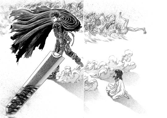
ideally, you use your text, small panels and large panels to create a sense of rhythm. a big splash panel can act as the full stop in a sentence, or a longer take after a series of rapid cuts. negative space is an especially powerful device in the right hands: when you hit a page of Chainsaw Man or Berserk that is almost entirely white after several pages of dense illustration, a character bursting into the void, there's an immediate 'wow' effect before you even process what's happening in the illustration. (i can't seem to find the chainsaw man example i had in mind, so here's one from berserk.)
and on that note, the other thing that comics have that animation doesn't is the impact of being confronted with the whole gestalt page. in the manga I was helping Fall translate when she died, We Are Magical Boys (Bokura wa Mahou Shounen), Fukushima Teppei frequently puts one panel much larger than the others so it dominates the page, usually a close-up or full length character portrait, allowing the cuteness of their unique art style to treasure centre stage. Sandman, which I'm currently rereading, is full of elaborate page compositions, where a drawing might not even be a panel per se, but a visual element. Witch Hat Atelier is full of elaborate borders and clever compositions. just look at this...

how did she come up with that! the absolute madwoman! the right side is relatively standard Atelier (establishing shots, the main cast eagerly stepping out of their panel) but on the left, we have a set of panels falling down from above onto a large splash panel. even though this image is concurrent, the panels invite us to appreciate it in chunks, and the page as a whole has this great visual of the pages of a book, continuing the image of the previous page. (more of this on upcoming post on Atelier)
a character emerging from their panel to overlap others, breaking up the monotony of the grid and adding a sense of depth to the page as a whole, is a reliably appealing motif. also, drawing one panel borderless, so it implicitly continues behind the other panels. large areas of black and white and choices of colour saturation can convey a mood to the page as a whole.
the danger you run is always the loss of clarity. the reader must be able to tell what panels to read in what order without thinking about it. Sandman will sometimes do a double page spread where you're supposed to read across both pages, and this consistently trips me up. Dresden Codak is by an adhd author and her drive to give every page an elaborate layout is very familiar to me, but especially in Hob, it messes with the flow of the comic overall.
so every comic page, every comic, is a fascinating balance of all these factors. how to create a strong, visually interesting composition, control the pacing appropriate to tone, create a thrilling sense of rhythm... all without sacrificing clarity.
not much more to say about this as yet, it's just something I'm thinking about while trying to lay out a page of Ghost Barrier. my tendency is to generally use larger panels, and try to be creative with layouts, but you have to consider not just each page in isolation but how they relate to other pages. so to make the splash panel land, I need to contrast with a denser page immediately beforehand.
the more I make comics the more of a feel I'll get. cool medium!
900 notes
·
View notes
Text
“You can’t rush art”
I think everybody can recall the quote from Toy Story 2. From the most satisfying part of the movie where we see a montage of Woody getting restored by a toy maker. It’s one of my favourites too, I absolutely loved looking at the different procedures used to fix a single toy. The toymaker’s precision and care were found mesmerizing by everyone. As a multi-hatted artist, one that can draw, sculpt, animate, and write, I can say that it’s spot on that there’s so much to do for a single piece of work. HOOO boy, you should see how me and Beefy are organizing Cursed to Charm, there’s so much.
For the upcoming webcomic, we design characters, give each and every one of them their stand-alone story, design different clothes, create the map, draw renders and posters, polish scripts for the episodes, plan to program the comic’s own website, make the backgrounds eventually, etc. To people who aren’t artists or take art for granted, to them, art is stroking a paper using a pen and BAM instant masterpiece. No no, it’s more than that.
Another thing I’d like to say about the comic is that the progress is very slow yet very fruitful because of the time taken. Me and my co-author came up with the idea at late November, which makes the comic four months old now. However, with all that time passed, we have already finalized the list of nine episodes of season one. We have also written seven out of nine summaries from that season before actually writing the dialogue in detail. We have a rough four seasons worth of story progression in the span of four months. Nyeh, excuse the little ramble about CtC, I’m just giving insight of how much should be done for the production of anything which leads us to the next point.
Art production in general.
Movies, animation, shows, video games, books, comics etc etc
All of these are part of art, some people would deny because it isn’t sophisticated like they’re lead to believe art is supposed to be. Art is literally just creation man, can’t get any simpler than that 😩 if you made something, then you made something woohoo! Congratulations you made art, cooking included. It came free with your fucking humanity.
Anyway, just like the webcomic, every single one of these listed also have a set of different procedures that will piece together the final output.
Let’s take Disney movies as a specific example, I want to talk about something real quick.
So one time, I was watching Tarzan with my parents and we stuck around for the end credits. My mom pointed out the animators are divided into sections and there’s so much names on them. There are different teams of animators for each character and these teams are divided in two for the storyboarders and the clean up artists. When the credits rolled a bit more, it showed that the background artists and colorists also have their own sections too. There’s so much people working on different body parts of a movie. I got the habit of reading end credits of every movie I watch, animated or live action, then I would compare the credits of old and new movies. Boy, let me tell you that the work space on old movies are FILLED compared to newer movies. One thing I noticed about Disney movies although, is that the old movies have more sections compared to new ones. The major difference of old Disney and new Disney are the length of the credits and the time gap of the movies. I’m really not trusting the way new movies have way shorter end credits while the publish time of new movies are getting narrower and narrower. Before the 2000s, movies usually come out twice a year and sometimes there’s a two-year hiatus before the next batch of movies are published. Now there’s at least two or three movies that publish yearly while also releasing a bunch of shows in the middle of it. I really don’t understand business talk with the way it sacrifices quality over quantity. Like I get having money is great and all but what’s the use of hoarding it? Especially when there’s so much news of people about to be in poverty and mass layoffs. Why should companies earn money if they’re not going to redistribute it back to the economy at all? This is a little off topic but I want to point it out that people in the 80s used to buy whole houses by being a janitor but nowadays people could barely afford a one room apartment even with three jobs. The Simpsons is an example of this because it was set in the 90s and the family is constantly reminded of how “poor” they are. They even created an episode that talks about the same job that supported people’s fathers will no longer support you nowadays (Poorhouse Rock ep22 s33). It’s fishy and I’m salty about it especially because I hear so much people complaining about how they’re not being given a chance to work. Anywho! Let’s go back to art.
I’m just spitballing my thoughts here but somehow they’re connecting either way. All I’m trying to say is that for the people who care so much about the quality of art, it’s noticeable that they get downgraded, not just by the look but by the way they’re written.
Example.
Clone High.
Jesus Christ, the new show is a nightmare and an insult to the original Clone High. The difference is clear with this one. The original Clone High was heavy satire of every single high school trope used in shows and movies. Every single character was meant to have one personality and that personality is the butt of the joke. The original did not care about making the characters appealing because the appeal is found in the way they interact, they clash so much and a lot of them are idiots. The writing is funny because the dialogue flows so easily unlike the renewal. The renewed Clone High takes itself too seriously and it tries too hard to be relevant. It’s funny to me that fans can draw the original’s art style more accurately than the animators hired. What’s even more frustrating is that concept art was released from the art head and the concept art looked way better than what they decided on the final designs. Other than the art style that tries to be marketable, the writing is insufferable with the way they try to be “relatable” without understanding why the original jokes were funny to begin with.
Now we’re all familiar with this cheap tactic of using the title of successful franchises to grab clicks and views. It’s every live action Disney film, it happened to Scooby Doo, Marvel shows, FNAF, some Cartoon Network shows, Megamind, and now even Kung Fu Panda. Basically MILKING. It would have been better if the productions TRIED to understand the original’s intentions which they forgot about. They ended up being disappointing at best and soulless at worst. I won’t be explaining much cuz I’ve already reached the minimum word count lmao. I’m just rambling here, I better not see anyone interrogate me in asks or replies. ANYWAY, I’m gonna get to the point real quick.
Back to the quote at the start of the post, people tend to forget that. Art is a skill, not a button people press and it gives you pretty pictures or videos. Art is a job and an effort. While art is subjective and it differs from person to person, one thing for certain is that art that is made ingenuinely will never be better than art that is made because the artist loves art. This is why the Tom & Jerry reboots with the lineless art style even if they had a storyboard artist who understood the cartoon wackiness (which were discarded for a “cleaner” and faster style). This is why it’s so frustrating to see concept art of movies which have more appeal than the final 3d models. This is why FNAF Security Breach was nearly unplayable.
Because they all rushed art.
They rushed in favour of what is marketable, no matter how unappealing it is. Everything could have been better, some final products are good, but all of them could have been better. As good as what were released pre 2010s when production had a passion. You can’t spell heart without art.
I’m just really passionate about art in any form since it’s everything that created me too. I will not be here at this point in time if it weren’t for me learning that there’s so much beauty in the world if you could just squint and appreciate why that’s so. I’m defined by my works and it only hurts and infuriates me that people who have the ability and accessibility to create better art than I do waste it for their personal gain or selfish intentions. Everyone could be a better person because of art just as it did to me. Again, it came to us the moment we’re born, art isn’t just a pretty picture, it’s everything we create out of love, passion, time, and effort.
But really, to the wise words of Chef Saltbaker, “like any good bake, heart and soul is the secret ingredient”
You can’t rush art.
98 notes
·
View notes
Text


1 like = 1 prayer for that poor scav
-.-.-.-.-.-.-.-.-
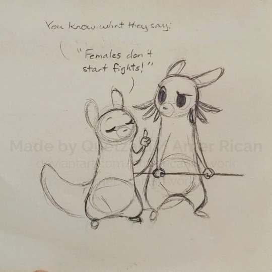
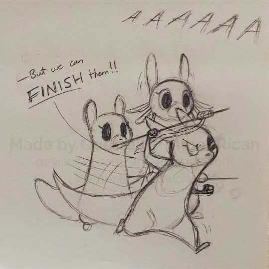
Sharing this little comic strip I made on sticky notes based off that one quote from The Aristocats. I've had the idea in my head for a bit now, and I figured I'd get in the habit of drawing out these little scenes I imagine now that I feel more comfortable with gestures and speech bubbles and that comic-type stuff. It also helps as practice for storyboarding, so that's nice too!
I like to think situations like this are fairly frequent; Monk is always trying to spread peace and kindness and such, but given she's pretty young and lacks authority, others (especially more cynical people like Artificer) have a tendency to dismiss her kindness advice as naiveté. Maybe she'll get through one day though...
#art#artwork#artists on tumblr#drawings#sketches#traditional#traditional art#comic#fanart#rain world#monk#artificer#rivulet#slugcat#scavenger#quetzalli draws#the artificer: guiding young slugcats along the path of violence since [whatever year rain world is supposed to be in]
171 notes
·
View notes
Note
Hey hey! (^-^)/ How are you doing? Love your work btw, it's always for pretty and fluffy! (* >ω<) I just had a couple of questions, and the first one was: What are your tips for an aspiring comic artist? f(^ー^; I wanna draw some of my favorite scenes from my fanfics, and I thought it might look kinda cool if it was kinda comic/webtoon style? (-。-;) Like what's your I guess take on that and how one might do that? And what about panel style, placement, and size? Is that all up to the artist, or do they have a rhyme and reason? Sorry if this was too long. You don't have to answer btw. I thought I'd give it a shot since y'know. (*´~`*) Anyways have a great day and keep of the good work! d=(^o^)=b See ya! (^_^)v
Hi!~
Pretty busy but fine and thank you! (//∇//)
That’s a big question and I’ll try to do my best! Explaining something that technic not in your native language can be uncertain so, I’m sorry in advance 🙏
First of all: Observe. Comics, doujins, mangas,… Just observe to learn how others do.
Comic is a narrative art so, the most important things in comic is the reading way aka the panels (the angles you choose), the speech bubbles and how you put them in your comic page. It’s really the first thing you have to put in your storyboard!
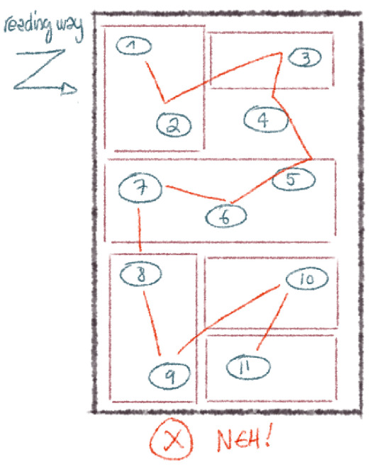

Texts in the speech bubbles are also veeeery important. Texts that are badly formatted is painful to read… Avoid doing cesura as often as possible and do nice text forms.


And please, if you choose a manga layout, do not put japanese speech bubbles, they’re really not suitable for western texts.
If you want to to a webtoon instead of a regular comic/manga, you have to thing your layout quite differently. Webtoons are more like storyboard for animation. Like a series of forceful scenes. Plus, you have to deal with the required format. I’m not pretty used to do some, I’m just working with a lot of them (I do the texts for them). I can recommend you Sweet Home (cw: horror, hikikomori) to see how the author use the long layout of the webtoon to skillfully instill the jump scares in their episodes!
A quick “how I do” to finish my blah-blah! ٩( ᐛ )و
First, I write my plot like a play (quick context for each act, full dialogues with stage directions) then storyboard. Tiny storyboard, I sketch 15 pages on an A4 page. Better global view. I can’t give specific advices on how to do panels (cause it’s something that just pops in my mind during my storyboard stage 💦) just keep in mind to diversify your angles especially during a talk between 2 characters. Don’t do a shot reverse shot, it’s just boring.
Then pages. I usually rework my storyboard at the sketch stage ‘cause I have a new eye on it lol

Also, don’t forget to think about the facing pages for the narration. You can do some fun page layout!

Tadaa! ✨
Hope it’ll help you and have fun with your comic! (о´∀`о)
30 notes
·
View notes
Text
so hold my hand (consign me not to darkness) [1/4]
Ah, yes. The fic that made me realise I’m in desperate need of Cursed Spirit Gojou in my ever-growing favourite GoYuu tropes.
Content Warning!
Major Character Death. Other characters are disrespectful to the corpse.
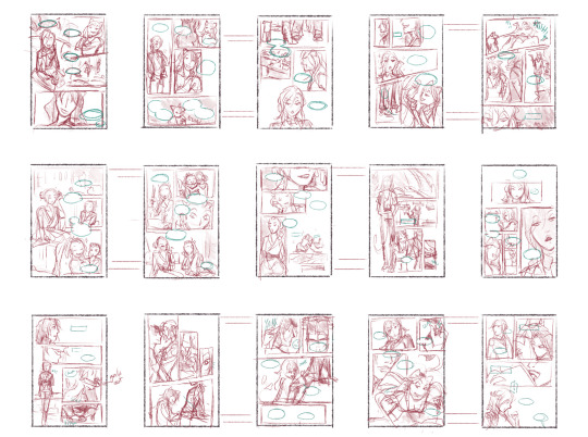
I highly suggest you read the fic first, or just the fic, since I don’t think I was properly able to adapt it into drawings. While I managed to use roughly two weeks of on-and-off planning, researching, and storyboarding, I only had a full week to finish it. You can read more of my thoughts below the comic if you’re curious.
Title: so hold my hand (consign me not to darkness)
Author: qalb_al_louz
It’s ongoing, and as of this drawing, the fic is in its third chapter. While this is (sexually) SFW, always be mindful of the tags! Please keep yourself safe and sound.
Please read from right to left, and enjoy!


You can only upload 30 images in one post, huh
Damn, I gotta divide it into parts
Part 1 | Part 2 | Part 3 | Part 4
Alrighty, I'll put my watered down unhinged thoughts below. No extra drawings down there if you're curious haha (unless you want to see the storyboard and the characters' full body character sheet, lemme know). You can skip the stuff underneath the Keep Reading for all parts.
This fic had me grinning from ear to ear every time I read this. The atmosphere, how it goes from POV to POV—of pure fear and panic—and the peak excitement I got when Yuuji properly meets Gojou, like brooooo 😭
Gosh I cannot emphasise how much I love this fic. I’ve always been wanting to make a whole comic out of it, especially since it was 2 chapters and it doesn’t look like the author will update it, but it just… kind of forgotten ∠( ᐛ 」∠)_
But then the author posted a new chapter and I told myself this is a sign I should really start.
also goddamn I was so naive to think I can tackle 2 chapters as comic—no I was in fact cannot
The moment I laid my eyes on the first paragraph, things were portrayed very vividly in my mind. The panel, the angle, Gojou's head rolling down... I was like, hell yeah. Then I continued reading and I finally succumbed to my desire to draw this out.
At first I want to adapt this into a vertical format like those manhwas. However the longer I try to learn and storyboard it... I am simply not yet comfortable with it, especially for such a big project. Even the 1st storyboard starts vaguely vertical before the panels quickly crammed into that B4-B5 format lol. The first sketch estimated 69 (heh) pages for 90% of chapter 1.
I said "no" for my own sanity and fully focused on the usual manga format and it was narrowed down to 60. Still a lot though, quantity and time-wise. So with a heavy heart, I can only do the majority of chapter 1 :”) I really really want to draw Sukuna talks back to Gojou—do you have any idea how good that scene was??? Gojou tried so hard to restrain himself, he’s so other I love him 😭
Due to the sheer length of this comic (I'm still in disbelief), I have limit lots of things, and that includes the drawing. If you've seen my other JJK fanarts, they are more rendered than this one. Well, this one is purely sketched with the help of the eraser to tidy up some lines. This is also the first fanart that I did purely on Photoshop, so I can control the typesets and drawings in one place. Usually, I use Photoshop for panels and typesetting and Krita for drawing.
I don't really like Photoshop's brush, but it did really well in curbing my perfectionist tendencies, so that's good.
It's also been quite a while since I draw in general (sobs) so... yeah, you might find differences, or not ¯\_(ツ)_/¯ But I hope you enjoy it nonetheless!
I know setting is important, but maaan I genuinely won't miss rereading chapter 83-93 with a heavy focus on background and character locations. I just want to read the action and dialogue😭 However continuity is really important. But my spatial intelligence is almost non-existent even GPS sometimes can't help me. All I'm saying is that if you find some silly drawing mistakes, do forgive me ∠( ᐛ 」∠)_I only drew all this in a week because otherwise I won't have another chance to complete this.
Well, lots of things I won't miss from this project, but haha let's talk about the characters instead because holy shit what was I thinking, starting this year drawing this many characters in the same project??? I have never drawn anyone here except for Yuuji, Gojou, Nanami and Megumi. I don't think I've ever drawn older Getou before. I already forgot how to draw my boy Yuuji and I gotta draw all these people???
This is what you call making a bad decision, kids. Don't do your "drawing warmup" after months of not drawing and tackling a project of a scale way bigger than you've ever tackled before.
Thank you for reading this far! I hope you find my complaint entertaining! But make no mistake, I genuinely still love the fic. Drawing this, even with all the headaches it gave me, only makes me adore this fic even more.
Thank you very much to each one of you who follows and leaves comments and tags on my silly art—it never failed to make my day :D
And I sincerely wish this one also made your day or even made your minute! I'll see you in the next part!
#yuu's art#jjk-fic-fanart#jjk-ship#五悠#goyuu#goyu#5u#gojou x yuuji#shibuya arc#shibuya arc canon divergence#lots of characters on this one#kenjaku#chousou#mahito#jogo jjk#gojo satoru
22 notes
·
View notes
Note
Hi!!!
I love your DN art so much, it gives me will to live, it gets me through the day.
I wanna draw like you oh my god you have this storyboard artist kind of style. Effortlessly expressive and dynamic.
Can I worship you? Jk jk (or am I?)
Your A is the best interpretation of this character I have ever seen. I love her.
I have some questions if you have a minute or two 🥺
Can you give me 3 favourite DN fics?
Do you have musical associations for characters (especially B)?
How do you personally feel about L and about Mikami?
What is your favourite food and day of the week?
Please never stop clowning ! 🤡❤️

This is extremely nice of you, thank you !! it's been ages since I've drawn canon DN stuff...
Thank you for the sweet message, I know I still have a long path ahead in terms of improvement as an artist but I value your words immensely as they motivate me to go on
now, THE QUESTIONSSss...
Fics I remember killed me on sight
This is how I disappear. (gen) 10/10, work of art, made me sit at the edge of my seat. I recommend everything from this author, definitely DO MIND the tags though! it's dark
If you're into AUs and Lawlight, here's one where Light runs for presidency (Those who stand for nothing fall for anything) and one where he's a cryptid investigator (The forest holds strange creatures), they're both awesome in unique ways. Both are explicit, take that into account
If you're interested in reading different interactions and a very unique twist to the canon events where Naomi is the protagonist, Silent Partner, Unifinished Business is amazing and very suspensey
This one is long, immense, ultra suspensey, with a lot of different characters interacting in interesting ways I never thought before, very lawlight and very explicit, (but I read it all in like 3 days because it caught me BAD and was foaming at the mouth during the entire course of it), also was the founding inspiration to my BB brainrot and design-> Nights
I also made a masterpost of all my favourite meronia (melloxnear) fics back when I was balls deep into it
Finally, my AWESOME friends have made abbie x my BB fics for me back in the days which I treasure with my heart, I feel a bit schoopid sharing them because they're basically my OCs and their story remains a secret but they're beautifully written and. I die. I die everytime I remember they did these for me -> First Christmas (explicit), Stand under my Umbrella (short n funny), Just Another Day (sad and short, based on a comic I did years ago)
ANd also, same author as Silent Partner, wrote Dead Letter Office as a gift to me once, and it melted me into a sugary puddle in the ground
Characters and music
Like every other BB kinnie / stan I have my fair share of associated songs, mostly by style and delusion and very few by actual fitting lyrics lol. But here's what I consider his theme song - and also, I headcanon HARD that he has Danny Elfman's voice
How I feel about L and Mikami
L is special to all of us, love the guy, haven't met a single DN fan who doesn't like L. He's just fun and unapologetic which is what I like about him the most.
Mikami I have a hard time caring about, he's just not my usual type of character at all. He's too rigid for me, although he has his unintentional funny side. I also felt he had no chemistry with any other characters, so that made him less interesting for me
Favourite day and week day
I've been very obsessed with cremonas lately : o]
And my favourite day is saturday now, cause I finally get to have some time for myself to exist!!!!!!!!!!!!! and not work!!!!!!!
#anonymous#AO3 is glitching severely for me and didn't let me see the abbiexBB fics that were made for ME but i guess#its because it's been long since I logged in#anyway thanks for the ask !!!!!!! it's been ages since I interacted with anonymous and have been feeling kinda crappy abt my art#so this was v welcome#have a good sunday#or a happy sunday like we say in my country#death note#fic recs#l lawliet
22 notes
·
View notes
Note
Your art style is phenomenal 💖
I also love coffee (it’s what keeps me awake on my writing/art benders). Favorite kind? ☕️✨
Also, what inspired you to be an illustrator? Your style is really unique and I wanna hear about your inspirations! 💫
Thank you so much!! <3
I think for coffee, I'd say my favorite might be an iced caramel macchiato (I got one with chocolate syrup the other day and it was hella good), it's just bitter enough that it's not over-sweetened and I like how it balances out. I also love any kind of mocha :>
A lot of my initial inspiration actually came from manga and anime! I drew a huge amount of Naruto fan art in my early teens, and I really aspired to be a manga artist myself for a good while there. Moving away from that style to develop my own has been important to me, but I learned a lot starting out from there. Watching anime also did a lot to shape my writing and storytelling (for better and worse), and I think it's what gave me a more cinematic mental approach to visualizing scenes. Sketching and storyboarding became an important part of my writing process, and over time that starting drawing me towards comics, along with inspiration from comic artists like Gerard Way, Gabriel Bá, and Gabriel Picolo.
I was also really inspired by C.E. Thornton, a self-published author who wrote The Guardians of the Light trilogy. She's a wonderful person and a brilliant writer, and she really encouraged me to keep creating my own stories.
In the past few years, I've been really inspired by comic and Webtoon artists I've met online! Mat Jester (Para-Professional, Cryptozoology), SodaWizard (Artificial Blood), Indiigocats (Misguided Ghosts), A.Berg (After Dark), and Wulvert (Paperteeth!) in particular are wonderful artists I admire. Seeing them work so hard to bring such beautiful characters and stories to life inspires and motivates me to work toward the same.
Thank you so much for the ask! I'm excited to check out your work :>
8 notes
·
View notes
Note
What do you use to make your comic edits? I really like them!! And is there like a process you follow? Like do you storyboard the rough idea first? Sorry if you've answered this somewhere before
Ohhhh man this is going to have to go under a cut due to pictures. Luckily whenever I make an edit I tend to DM my friend process pics while screaming about how horrible they look and how I can't figure out how to fix them. 💀 So some of the record exists!
I use a mix of three different programs. To be honest even though it's free, Photopea.com is my go-to for most functions, especially since they have a large pool of fonts to choose from which means I don't have to go into the font mines and download 500 different ones just to see what's going to look best. I also use Paint Shop Pro, which is the program I learned how to make edits (icons, back in the day) on when I was like 14. I have a newer version now since I finally had to retire the 15-year-old one on my broken laptop, and I still don't really know my way around it that well. It's not the most user-friendly software, but it is a lot better than Photopea at resizing images to make them larger. I also use Clip Studio Paint whenever I need to draw anything for an edit.
When I need resources, I often use dafont.com for fonts. I have a bunch of texture packs from various places on the internet, but my go-to nowadays for new stuff is pexels.com where you can get stuff with a royalty-free license. I also occasionally use my own photos for textures (took a bunch of wall photos in Italy- my dad thought I'd lost my mind). I don't use brushes all that often but there are other free resource spots.
As for process, I usually start with comic panels that I like visually and cut out the characters, then figure out what I want to do with them. For Kill Krew, I knew I wanted to use a bunch of the tiny Foggies, but I didn't know that I wanted to make it a story per se until I finished the first section of the edit where Foggy's holding a bunch of papers and I decided to make it kind of like he was authoring his own memoir. Then I just followed the events in the comic. For my volume 5 edits I did have more of an idea for the story I wanted to tell from the start and looked for comic panels that would fit it. (By the way: never forgiving the volume 5 editors for allowing so many different artists. It pained me to have to use a couple different artists in one edit.)
Anyway though kind of like when I'm writing fic, I just start with pretty much a blank canvas, plop the characters on, and hope they arrange themselves into something that looks cool. This is a very early draft of one of them next to a slightly more advanced draft:
A lot of the work honestly goes into choosing the background and marrying it to other elements such as the text and the cutouts. I use a lot of rectangles for this, as you can see in this Kill Krew one next to a near-final draft below. This is also the phase where elements get resized, whether for story-telling reasons or design reasons.
I also fool around a lot with layers and coloring. An unexpected layering choice can totally make or break an edit. See the original comic coloring (left) versus my coloring change (right):

Or this original panel (left) versus a combination of a picture of a starry sky and a coloring layer (right):

Font is also hugely important to me. I try to find ones that fit thematically AND also look great on the image. Like bad coloring or a bad background, an ugly font can also kill an edit. Choose wisely lmao.
Another thing to watch out for in an edit that's multiple images is to make sure they all look nice together and like they're part of one set. I find this probably the hardest, since different source images (comic panels in this case) often have different coloring requirements, but you want the colors to mesh well between different images. It's tough! And if you make extremely long edits like I do occasionally it's hard to even see what they look like together. Sometimes when I'm looking at them stacked in Photopea it looks like a tiny, tiny photostrip and I have to figure out what's working and what isn't. It's tough out there!
Anyway I think that's all I got! Hope that gave you some insight lol I'm glad I had these process pics because I usually just kind of go into a fugue state while making them and come out covered in blood!
7 notes
·
View notes
Text
excellent point!!
Prompt Week - 7 days, 14 simple prompts (2 per day). you know the drill. general is just going to be about the series at large, ship-focused is probably going to be takaeishi week electric boogaloo
Collaboration (Artswap) - Participants are paired up randomly in order to work on a single creation together. Traditionally it's a single illustration in which one person does the lines and the other does the colors, but you could also do other things like "one person scripts and colors a comic, and the other person does the linework" or "two writers pass a single google doc between them like a hot potato and they write alternating paragraphs" etc.
Podfic Challenge - A podfic is essentially an audiobook of a fanfiction. Either write and podfic a birdmen fanfiction, or ask for an author's permission to podfic (a portion of) a fic. You can get fancy, like adding sound effects or backing music, or just keep it simple and record something on your phone. Nice because it doesn't require you to create something in the traditional sense and is also a way to show appreciation to past fic writers. Not nice depending on how self-conscious you are about your voice.
Not My Medium Challenge - Create a fanwork in a medium you've never worked with extensively. For example, for myself, I'd consider illustrations, sequential art, meta essays, fanfiction, and music videos as mediums that I've worked in extensively, so I'd focus on other things such as meme compilations, music compositions, podfics, video essays, gifsets and edits, among infinite possibilities.
Draw A Comic Month - 4-week event with one week dedicated to scripting, storyboarding, linework, and colors/toning each. A comic can be as simple as a 2-panel comic to something as complex as a 30-page manga. This is one time where my comics advice is going to be ENTIRELY FREE OF CHARGE. I am going to sit in the birdmen discord at regular times throughout this event and do my best to make the comic of your dreams happen (guy who is obsessed with sequential art voice)
the collaboration is a COMMITMENT whereas the rest are things you can opt in and out at any moment. ok now go hog wild with the votes and let me know your bonus thoughts in the tags
#just thinking thoughts...#birdmen#polls#yeah I mean you could just skive out of the commitments like what am I going to do. ban you from future events. lol.#anyways be nice to me I spent some brain cells thinking of cool activities for enrichment in the enclosure#for the worried: yes I have hosted fandom events before. I did not enjoy it but I would do it for the birdmutuals#personally I like the bottom two as in I'd be most likely to participate in them#because like. lol. I know exactly what I want to make and these other things are just dreary obligations#but the bottom two are far enough from my home territory that I can like. get weird and have fun with it#also off-season secret santa and big bang were on the list#but then I wisely realized I was completely unwilling to moderate those activities so. lol. off the go#I don't think we have enough people who are willing to be bound by obligation anyways#the comics thing was originally going to be a hanzawa event#like all the detco folks have their pet peeve about canon#and the idea was that you drew a hanzawa-style comic about it#where it didn't have to look good or anything it just had to be silly#but. stealing that. we birding (we balling)
26 notes
·
View notes
Text
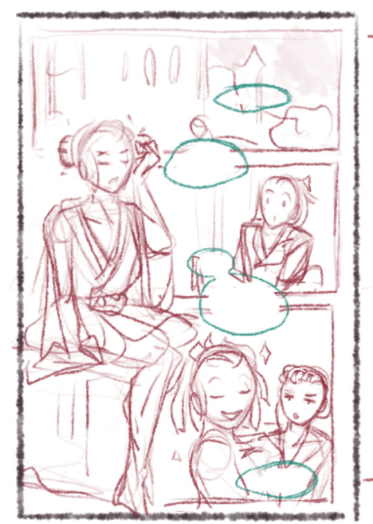
hello!
those 3 pages i've posted were a first attempt to adapt my story, 'creator kit', in comic form. now i don't like those pages much. i feel like they are lacking a lot of things (mainly, colors and detail)
however i made them when i was down in an effort to get the creative juices flowing again, and i feel like they succeeded in that goal.
problem is, my beloved drawing tablet i've had for three years is starting to fall apart.
i'll see what i can do for creator kit. i feel like i ought to go back to the drawing board (figuratively and literally) and maybe actually plot/storyboard the thing.
i have audhd and never managed to work in that way, but maybe i'll be able to. i just need to find out how to tell this story in a way that is satisfying, both to me and to potential readers.
thanks so much!
-ronan b., author of creator kit
(featuring a drawing of barniel inspired by a cover of the manga 'boys run the riot')
#announcement#am i doing this right?#hello tumblr#comic#barniel#creatorkit#oc art#original art#original character#original comic#anthro#art
2 notes
·
View notes
Note
What do you think, do you like this?
I can agree with a fair amount of this post. I’ve brought up some of those points in the past. I wouldn’t really say that people are necessarily wrong for viewing characters in a certain way. I just think it’s a learned behavior? We’re kinda trained by the media that we consume. So they might be embracing the stereotyping because of this?
Here is the thing, Varigo wouldn’t be popular in the fandom if the creators of this pairing didn’t work on the show. They used their work status to take advantage of the fandom’s love for Varian in order to boost their egos after their fan comic concept got rejected by Disney. These storyboard artists tricked us into creating content for their self insert AU. So of course Hugo is going to be treated like he’s better at everything. This is why most people don’t read self insert stories. Some can be good, but the majority consist almost entirely of cringy author wish fulfillment fantasies. These people wanted their character to steal the ‘show’ *cough*fam comic*cough*. This is why the AU wasn’t written like Varian’s story. Vat7K was always intended to be Hat7K. It’s fine for people to enjoy it, but they really should acknowledge it for what it actually is instead of treating it like a legitimate official sequel.
Personally I prefer more balanced pairings. Even rivalries are more fun when both parties have strengths and weaknesses that compliment each other. Forcing characters into relationship roles simply because of how they look is kind of disgusting to me. Let them be complex people who can think for themselves and try new things to satiate their curiosity.
Seriously, I think that the people who are uwu’ifying Varian are missing the entire point to his character design. Would we have been caught off guard by his arc as an antagonist if he was a big old macho man? Probably not… If you’re changing his personality in order to fit his looks, then all you’re doing is creating a glorified doppelganger OC. Because canonically Varian is a fairly assertive ambivert. The fact that he doesn’t neatly conform to what society expects of a young boy makes him special. The more we normalize things like cooking, cleaning, and even drawing as just things that normal people do. The less stigma and gendering there will be on such activities. We absolutely need more male characters like him in media. So why do people feel a need to dumb him down for ships? IDK... It bugs me.
Sorry, I went off on a bit of a rant. x___X
2 notes
·
View notes
Text
Review: “Heartstopper (Volume 1) by Alice Oseman

OVERVIEW
For this category, I selected the first book in the Heartstopper series. I had a lot of books I was considering for this category and just couldn’t pick one from (very long) short list. So, I did what I do in such situations and consulted an expert and asked my friend Aaron’s teenage daughter who is an avid reader and this was her suggestion. Aaron actually said their whole family has been reading this series and it’s much loved by all so I was sold.
The story is presented in graphic novel format and the visual storytelling works well overall for the narrative. The author/illustrator does some interesting visual things here and there but it’s not really drawn well at all. It’s hard to tell the characters apart because everyone looks basically the same and there are barely any backgrounds for most of the story so it’s just talking heads in fields of white. It’s interesting that this was adapted for the screen because the drawing style feels like a quickly-drawn storyboard for a future film production.
I read online that this graphic novel is based on very minor characters in another of the author’s books. Heartstopper was originally published as a webcomic on the author’s blog and that is exactly what this feels like visually–a quick collection of webcomics assembled not intended for print but that was printed later. The serial nature of a web comic also helps explain the episodic nature of each little scene. It’s not that the story doesn’t flow or feels choppy, just that it’s clear that it was drawn a few pages at a time over many weeks or months. At the time of this post, I’ve only read the first volume but I am definitely curious to see if the later volumes intended for print are drawn in a more thoughtful way.
RELEVANCE
This book is very age-relevant as it focuses entirely on high school-age characters. The characters are not terribly deep and the story is very straightward but nonetheless it feels very real. It’s a very relatable story for teens as it involves a situation many teens find themselves in–a friendship that blossoms into a crush which may or may not be mutual; in this story it is mutual and that leads to an eventual first kiss and (maybe in later volumes?) first relationship. It’s a very sweet (somewhat predictable and optimistic) high school romance story of the “opposites attract” variety. For LGBTQIA+ teens it’s relatable as a coming out story, as a story of falling for someone who may not even be gay, and the possibly familiar and often toxic “friends with benefits” sort of situation.
DIVERSITY/INCLUSION
This book focuses almost entirely on white teenagers at a private all boys school. There are two peripheral characters in the main character’s circle who are not white–Tao Xu, a fellow student, and (I think) Tara Jones, a student from another school who appears briefly towards the end of the story. The author/illustrator, Alice Oseman, is white, British, and identifies as an aromantic asexual. So, other than the fact that it’s an LGBTQIA+ love story with an LGBTQIA+ author, it’s not very diverse in any other way.
DIVERSE BOOKS WITH SIMILAR THEMES
Albertalli, B + Silvera, A. (2018). What If It’s Us?. Harper Teen.
Kobabe, M. (2019). Gender Queer. Oni Press.
La Sala, R. (2021). Be Dazzled. Sourcebook Fire.
Panetta, K. + Ganucheau, S. (2019). Bloom. First Second.
Sie, J. (2021). All Kinds of Other. Quill Tree
3 notes
·
View notes
Text

Joyful Experiment, Day #1: "Anna" Study, charcoal
"So I'll walk through this night
Stumbling blindly toward the light
And do the next right thing."
Art diary (and excuses, explanations) under the cut.
All things considered, I think this is a good start to the month. It's not polished by any means, but it's better than usual. Let me tell you the story of "the usual."
I drew all the time as a kid, but primarily for the sake of telling stories. I didn't make "hang-on-the-fridge" art. I made comics and magazines and newspapers and storyboards and scenes for computer games. Plenty of OC's, but I stole my style from 80's cartoons.
(Not my art, but very much the style I was learning from. Credit to Peyo, image from "Johan and Peewit")
Around eleven we moved to another province, and my pencil crayons disappeared amongst the luggage for months. I focused on writing instead, and write my first little novel that year. And thus I became a writer, not an artist. I honed my author craft religiously throughout my teens, and if I ever drew, it was mindless doodling during family read alouds - doodles of people who still looked weirdly like Smurfs and Care Bears despite being human. I went through a fortnight of sketching historical costumes out of a book, mostly for the validation from my parents, who loved them, but little of the experience stayed.
Then, I took an art history course that required us to sketch ten acknowledged masterpieces of the past. Our professor was not particularly picky about skill, as there was no artistic instruction in the course, and it was only necessary to produce something that demonstrated you'd looked at some art.
Nonetheless, perfectionist that I am, I spent ages on every one of those sketches. I made grids with a hundred squares and painstakingly reproduced every detail of the "Starry Night" and the "Muse of Comedy" and the Michelangelo-inspired philosopher in Raphael's "School of Athens." Several audiobooks sketched themselves into those works in the process - for me Rudyard Kipling and E. Nesbit are still heavily associated with charcoal fingers.
By the time I turned in my portofolio, I had rather astounded myself, because, while the work was nowhere near excellent, it was mindblowingly better than anything I had produced before. Because I was actually looking at the shapes and using reference carefully. My professor told me that though my art was rough there was something there and I should pursue it.
Reader, I did not pursue it. I seldom do aught but doodle, and I am capable of drawing two poses: Standing up straight with hands at sides, or with hands behind back. I cannot eyeball proportions, even making a character hold out a hand reveals that I have never seen a human arm in my life, shading tends to look a bit like leprosy -and just - it's a mess. Here's a good example of what my art looks like when I'm actually trying:

(It wouldn't be too bad if the character in question wasn't supposed to be a grown man...)
Things turn out a little bit better if I use reference, but frankly, I'm afraid to use reference that isn't someone else's art. Drawing from life or photos is HARD, because someone else hasn't made the artistic choices for me, hasn't chosen which lines are needed and which can be left out. But, that kind of thing is generally frowned on as intellectual property theft unless you keep the art strictly to yourself.
I want to start drawing from photos. I want to start mixing and matching elements from multiple photos. I want to mix ideas out of my head with appropriate reference. So... I picked a middle ground for this starting sketch. I picked a Disney CGI movie, because it's a bit like drawing from a photo, but still with a number of artistic choices already clear on the screen. (Also Disney is so huge I don't mind doing studies of their screencaps and posting them the same way I would just finding an Indie artist and doing a study of their work.)
It's a stepping stone - I don't want to stay stuck doing this kind of thing, but it's what I need to get the ball rolling. I'm not especially a "Frozen" fan, but I do have a soft spot for Anna.
Disclosures: When I uploaded the sketches I arranged them to be closer together for a more pleasing look, and I increased the clarity by 25% to make up for the greying/fading my scanner causes. Otherwise, this is the art as it looks on the page. For the large image of Anna, I did permit myself to cheat by tracing rudimentary markings to show the distance from eye to eye, from top to bottom of the face, etc, but I tried to avoid any major tracing. (It's from a screencap, not from lineart so there wasn't much in the way of lines to trace anyway.)
29 notes
·
View notes
Text
Recommended Watch: WhytManga
youtube
Title: How to Character Design | Easy Tips and Tricks for Beginners
Source: https://www.youtube.com/watch?v=QPX2IyOpMh4
By: Peggy Sue Wood | @pswediting
With almost 500k followers on YouTube, many of you reading this are likely already fans of, or followers of, Whyt Manga on YouTube. However, if you haven't heard of WhytManga (full name: Odunze Whyte Oguguo) yet, then let this be a brief introduction to this amazing creator!
My first encounter with @whytmanga on YouTube was about six months ago. I've been scripting a comic and wanted to learn more about character design/drawing to see if I could do some beginning-level sketch work or storyboarding prior to hiring an artist (or, perhaps, improving enough to do the art myself over time).
The channel came into my recommended section, given my preference for animation and manga, and by the end of the day, I had consumed multiple videos from this talented individual.
Based on my brief internship with Warner Brothers DC Comics Editorial Team and working as a freelancer with self-publishing authors in this field for a short while (and being a long-time fan of the medium), I would say that WhytManga really knows his stuff.
From design to layout, one of the key benefits of watching WhytManga's work is how well this creator breaks down the complicated processes of drawing and publishing your own work into a simplified step-by-step process. It really is a "do-it-yourself" and still find success sort of channel, which I greatly appreciate as someone who has worked a little in the field and found it, at times, to be overwhelming to view the back end of things when one is so new.
You can check out their Linktree here, including links to WhytManga's other social media accounts, books, and more. I highly encourage a self-exploration into what WhytManga (and the company they co-founded, Saturday AM) offers, as I think that WhytManga (Odunze Whyte Oguguo) is setting the stage for how American Comics can elevate in genre, character, and focus, to match what we see coming in and publishing internationally.
#whytmanga#manga#anime#comics#american comics#recommended watch#notes#note#publishing#comic creator#apple black#comic creation#write#draw#design#comic book#Youtube
27 notes
·
View notes
Text
Project Update
I've devoted quite a bit of time toward a comic project that I hope to share with everyone soon. By soon I mean... well, maybe not within a few days or a week from now, but hopefully by the end of October/beginning of November! Yeah, that sounds about right. I'm going to definitely push to post at least one page roughly around that time frame. This is also why I've slowed down with responding to ASKs or posting doodles. I've been really enjoying storyboarding the first chapter, which has surpassed 25 pages, so it has taken a lot of my attention this past week or two. 😅 Sorry -
This comic will be a long ongoing project too. I honestly don't see it being finished within a year, maybe not even two years — it really depends. Especially when considering how many chapters it'll take to fully showcase it in all its glory. Or the additional bits I might add for visual flavor; doodles, extra content, etc.
Before I ramble on further, I want to mention this comic will be my first attempt to tackle such a big project. Ya' know, something that isn't a simple illustration or a one-page-hit-wonder, basically. I don't expect it to be perfect by any means. Hell, I expect to take the opportunity given to me as a learning tool. Something that'll allow me to figure things out and grow within my style/skills. It will 100% not be perfect, is what I'm saying.
However, this is a perfect way to explain what I meant by "opportunity". The writer of this story is not me! Yup, I'm just the illustrator guiding you on this adventure. I have graciously been given permission to draw a lovely fanfic that I've adored ever since I stumbled over it back in 2020. I am working closely with the author and, in my eyes, see this as a collab of sorts. They get FULL credit to all scenes, dialogue, and plot. They are an amazing writer, and I feel most of you might have already read this fic by them. Especially if you enjoy or admittedly ship David and Michael. No, I'm not ready to say just "who" or which story. I don't want to give away too much just yet!
But, yes, this will be a David x Michael fancomic/webcomic. If you don't particularly like that ship or disapprove of them being paired in such a fashion than please, by all means, don't read it — no one will be forcing you to consume such content. I will say this for now that it will be mature. Explicit, even, in later chapters. Such pages will not be posted directly to tumblr, of course. Not even with the new fancy label system. But I will have a link available on those particular pages. Despite me defining this to be mature, it's mainly an emotional trainwreck. Seriously, be prepared for that.
As briefly mentioned, I do plan to post everything but said explicit scenarios to tumblr on a side blog dedicated specifically for the comic (and any other content related to it.) That side-blog will be kept neat and tidy as to keep it well archived and easy to read. More on that as it gets closer to me finally posting pages. (I'll post it to another website too, most likely, that allows explicit imagery which is where the link will probably take you)
Man, I am so excited for this project! I can't wait to share it with everyone! I know it'll be a long journey but for those interested in tagging along, I hope you all enjoy it 🥰
#random thoughts and rambles#95060#David x Michael#the lost boys#(honestly just me rambling about a comic project while trying to not give too much away at the same time)
12 notes
·
View notes
Last Seen Blogs
slexenskee
for me and skee

undeadgif
Undead Gifs

cheshireneechan
cheshireneechan
malibu9561
Unbetitelt

oliverspowervacuum
Olivers Power Vaccum