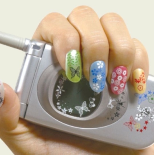
#taylor swift tutorial
Text
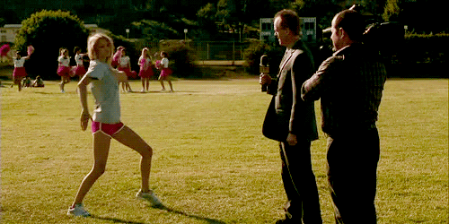
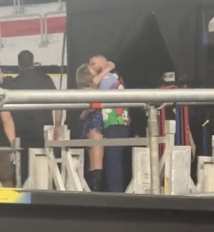
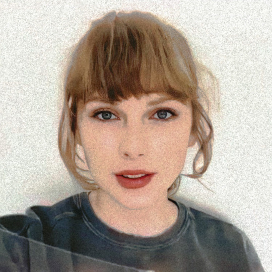
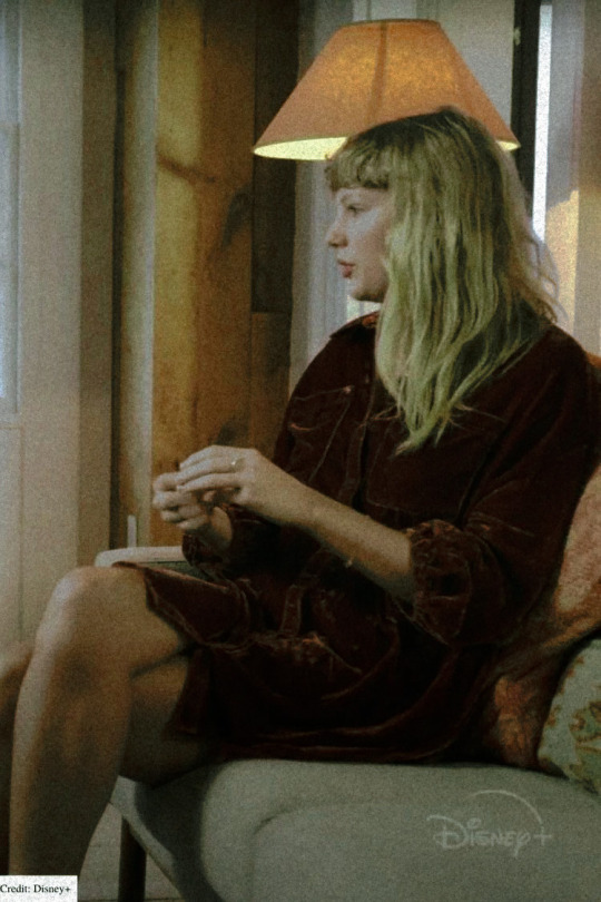
how it started vs how it’s going


#IM SO HAPPY FOR TAYLOR#i need him to make a tutorial on how to manifest#A MAN THATS NOT AFRAID OF HER FAME#taylor swift#travis kelce#pls theyre so in love I MIGHT STOP BREATHING#tayvis
340 notes
·
View notes
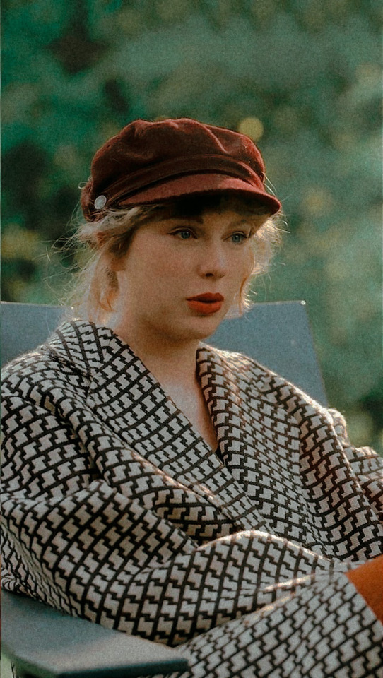
Photo
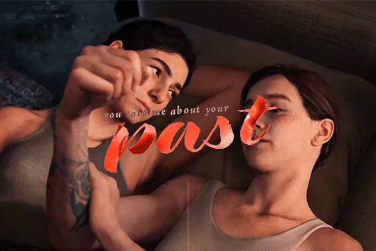

and I know it's long gone, and there was nothing else I could do.
#the last of us#tlouedit#ellie williams#the last of us 2#gamingedit#naughtydogsource#dina tlou#ellie x dina#tlou2#tuserdi#dina nolastname#the last of us part 2#tusereva#all too well#taylor swift#hehe remember when i posted the last edit and said more were on the way??? i'm two years late but IM BACK BABY#gotta prep for hbo to tear my heart into pieces <3#thank you SO MUCH for the glitching tutorial!!! it was super easy to understand#mine#sun edits#making my debut into the search function of this hellsite and praying it works#dina my poor sweet beloved
545 notes
·
View notes
Text
Badly drawn cane drawing tips from me ft. taylor swift

179 notes
·
View notes
Photo
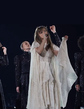
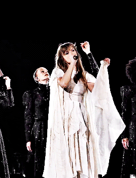
GIFFING THE ERAS TOUR: TUTORIAL, RESOURCES, AND ACTION
intermediate editing skill level required. this took hours to throw together, so please like and reblog if you use this in any way - or just to show support. video
RESOURCES NEEDED:
photoshop, obviously - i pay for it, so i have the most current version
i suggest vapoursynth - i will elaborate on this more in the tutorial
tour footage - personally i use tiktok, which i'll elaborate on too
my coloring action - linked in the tutorial
basic understanding of editing coloring layers - will elaborate
rizz's action pack for saving - also linked in the tutorial
YOU CAN FIND THE FULL TUTORIAL HERE - TUMBLR TEXT EDITOR SUCKS !
#tswiftedit#the eras tour#tswiftgif#userleah#*#taylor swift gif#taylor swift edit#tswiftgifs#tswiftedits#taylor swift gifs#taylor swift#the eras tour edit#eras tour#eras tour edit#eras tour edits#erastouredit#erastouredits#tutorials#photoshop tutorials#gif tutorial#gif action#actions#photoshop actions#photoshop#photoshop resources#tscreatorsnet#tscreators#dailytayloredits#dailytaylorswiftedit#dailytay
345 notes
·
View notes
Text
Some friendship bracelets for the Eras Tour Madrid 2024 ✨✨ @taylorswift @taylornation
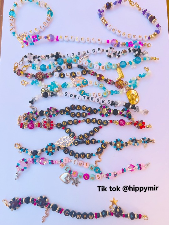
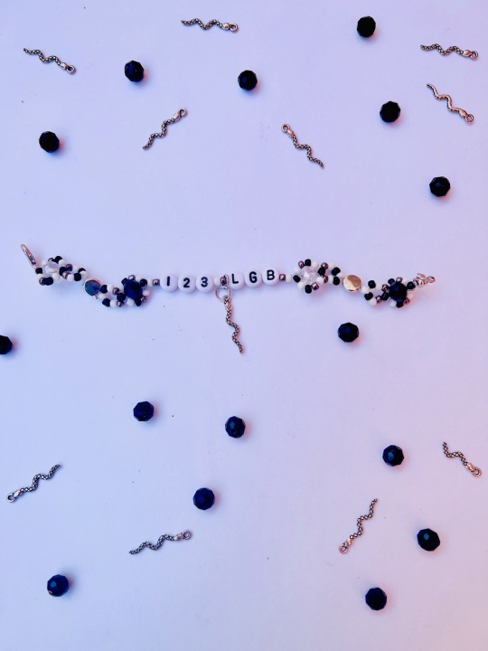

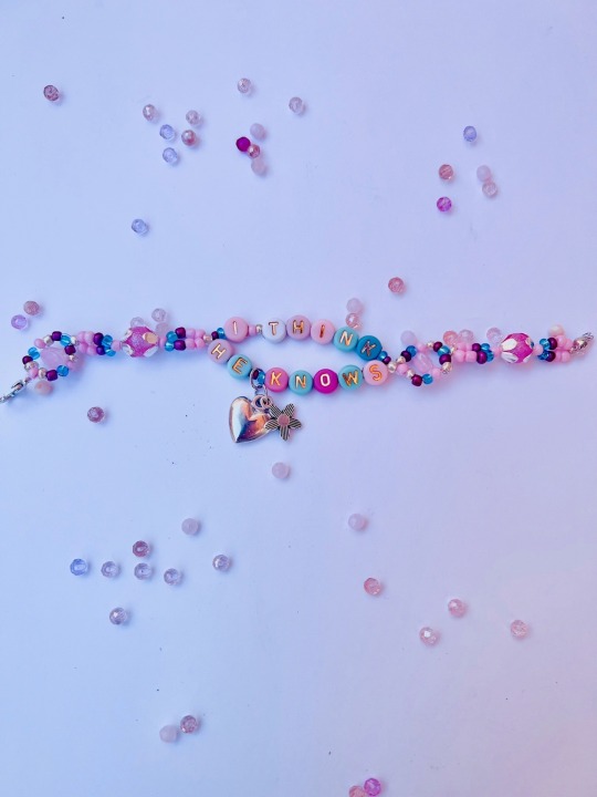
#lover#friendship bracelets#the eras tour#reputation taylor’s version#Madrid#taylor swift#1989 taylor's version#taylornation#taylors version#haul#tutorial#midnights#fearless#speak now#jewlery#taylor swift friendship bracelets
19 notes
·
View notes
Text
HAHAHA I FIGURED OUT HOW TO MAKE A TIKTOK VIDEO LIKE THE YOUTHS
I’m 27 and I felt like an 85 year old getting their first iPhone. I’d made a few before but not edited them in the app, and this is my first tutorial.
If you’d like to know how I paint skin, here’s a video!
#tutorial#art tutorial#digital art#digital artist#procreate#procreate tutorial#digital painting#eras taylor swift#taylor swift eras#taylor swift#taylor swift art#swifties
21 notes
·
View notes
Text
if you post any of the following, please like/interact with this post so that i can have more accounts to follow! i just made this new tumblr blog so i don’t have many accounts that i follow yet <33
- taylor swift
- horror/thriller
- books/reading reviews
- lana del rey
- small collectibles
- digital art/digital art tips and tutorials
- poetry
- music collecting
#taylor swift#horror#thriller#lana del rey#books#book reviews#digital art#digital art tips#digital art tutorials#poetry#collectibles#collectable figurines#music collecting#music collection#vinyl records#records#cds#me shitposting
7 notes
·
View notes
Text
how it started vs how it’s going
#IM SO HAPPY FOR TAYLOR#i need him to make a tutorial on how to manifest#A MAN THATS NOT AFRAID OF HER FAME#taylor swift#travis kelce#pls theyre so in love I MIGHT STOP BREATHING#tayvis
11 notes
·
View notes
Text
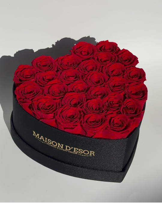
a LOVE language.
#love#flowers#friday#wildcardweekend#roses#photooftheday#art#quotes#dating#south africa#israel#free palestine#sonic the hedgehog#rottmnt#sonic prime#writers#tutorial#pit babe the series#taylor swift#beyonce#winter#snow#poetscommunity#affirmations#nature#tiktok#fitness#fashion#new year#music
5 notes
·
View notes
Link
I rarely promote anything but I really love this youtuber, and she doesn’t get nearly enough love! She does piano tutorials & free sheet music for Taylor’s music (and others) and she’s great!
(pls give this video views so that she’ll keep the taylor music coming haha)
#I’ve been playing piano since I was 9 and I’ve still learn things from her tips tbh#it's made me better at practicing#like more efficient i mean#taylor swift#all of the girls#need#Margarita Babovnikova#piano tutorial#sheet music
20 notes
·
View notes
Text
Doing my makeup and being a ‘The Tortured Poets Department’ Swiftie 🖤🚬🩶
youtube
#swifties#swiftie things#swiftie theories#swiftie tumblr#swiftie memes#swiftie merch#swiftieforever#swiftie for life#taylor swift#taylornation#ttpd#the tortured poets department#the eras tour#the eras movie#the eras taylor swift#makeup tutorial#taylor swift core#taylor swift merch#taylor swift moodboard#Youtube
5 notes
·
View notes
Video
youtube
All the girls you loved - Taylor Swift - Notas Flauta Cifra Guitarra Aco...
2 notes
·
View notes
Note
Hi! Do you have a colouring tutorial for how you make your icons maybe? They look lovely! xx
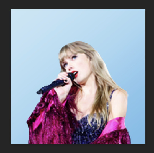
Hi! I don’t have a general coloring tutorial since I do different styles for every icon! That being said, I can provide a tutorial on this icon specifically. I use Photopea, but this should be the same process for Photoshop.

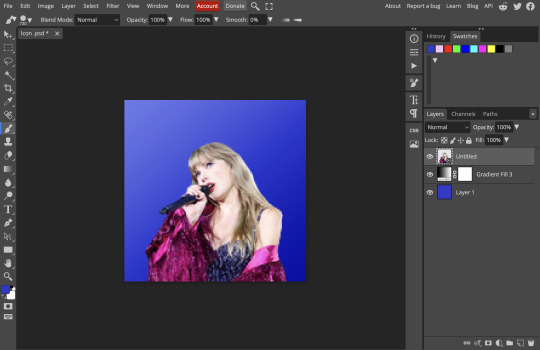
This is what I start out with, I apply a gradient fill layer to the background. I choose background colors based on what matches with the image.
In this case, I duplicated the image and put it on soft light and put the opacity to 50%.
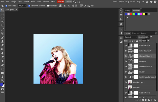
I applied the layers below. Levels is really important! I think it makes a big difference in edits. Here's the two images just with and without levels.
In selective color, I alter the red, magenta, yellow, white, and black. These are all up to personal preference, I increased the yellow by a lot and the magenta in this case. In color balance, I brought down the yellow-blue in shadows to -21%. In channel mixer, they were very minimal changes like bringing up the red in blue to 6%. I also sometimes change the opacity for some layers if I like the settings but think they're slightly much, like for channel mixer I changed it to 70%. I would probably skip channel mixer next time and focus on a different adjustment layer.
I add a gradient layer on top on soft light at 20% opacity.
I also added a hue/saturation layer to change the shade and brightness of the blue, I thought this one looked better with the image. I tend to go for bright backgrounds! They're easier to work with.
Sharpen the icon! I've used this sharpening action! You can adjust it for icons.
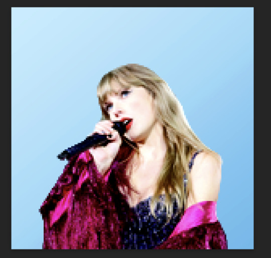
That's all for my coloring process for this icon! Since this image was already well-lit and didn't have any annoying filters, it was only a few steps. For the speak now icons I made, the color balance layers made a huge difference there. Hope this helps!
6 notes
·
View notes
Text


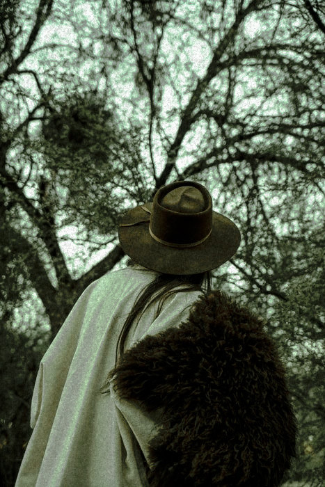

And the skeletons in both our closets
Plotted hard to mess this up
And the old men that I've swindled
Really did believe I was the one
And the ladies lunching have their stories about
When you passed through town
But that was all before I locked it down
Now you hang from my lips
Like the Gardens of Babylon
With your boots beneath my bed
Forever is the sweetest con
I've had some tricks up my sleeve
Takes one to know one
You're a cowboy like me
-cowboy like me
#editing tutorial#polarr filter#editing needs#polarr code#polarr codes#polarr filters#edit needs#edits#taylor swift#editing#polarr#edit#photo#art#filter#filtered#filters#soft#rp#debut#cowboy like me#evermore ts#evermore
12 notes
·
View notes
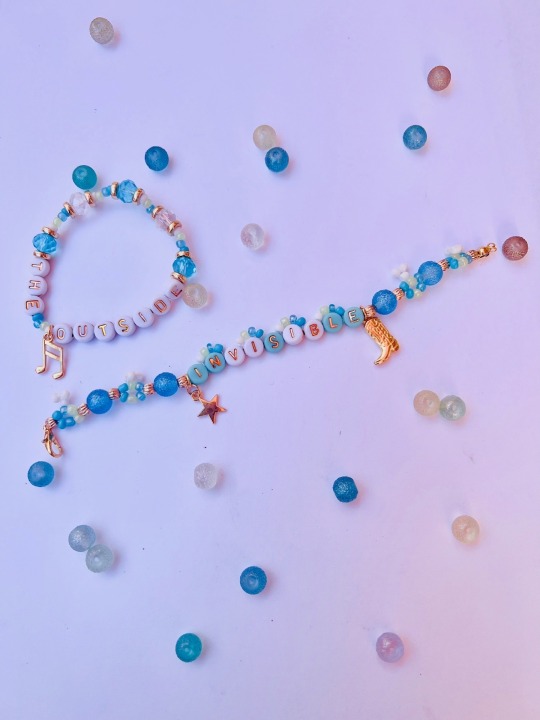
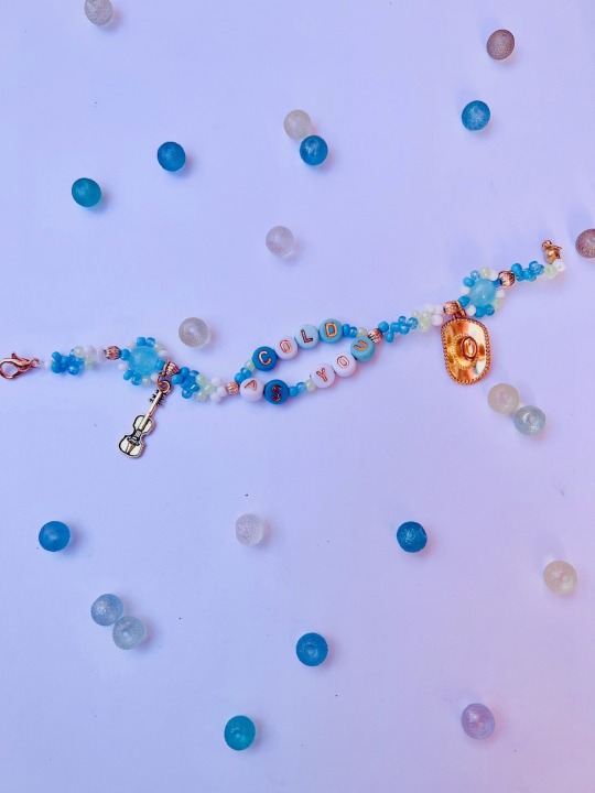
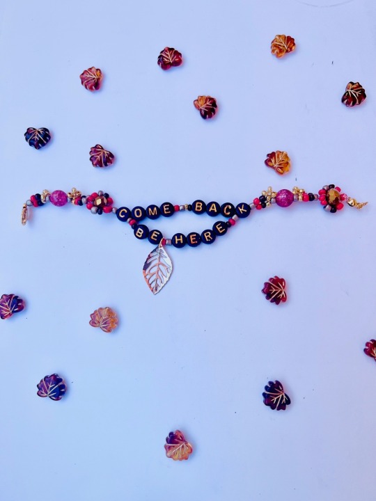
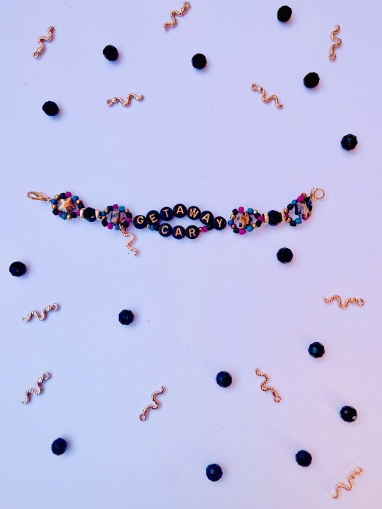
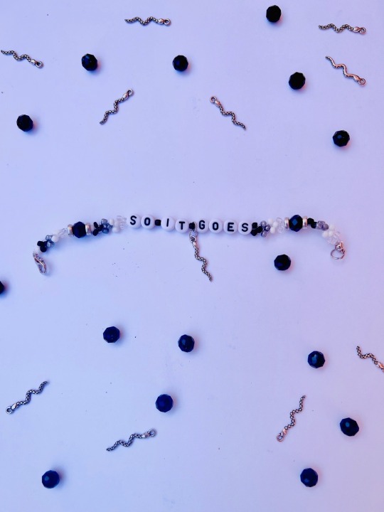
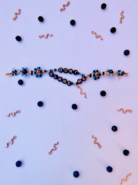
Text
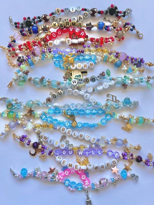
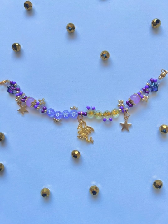
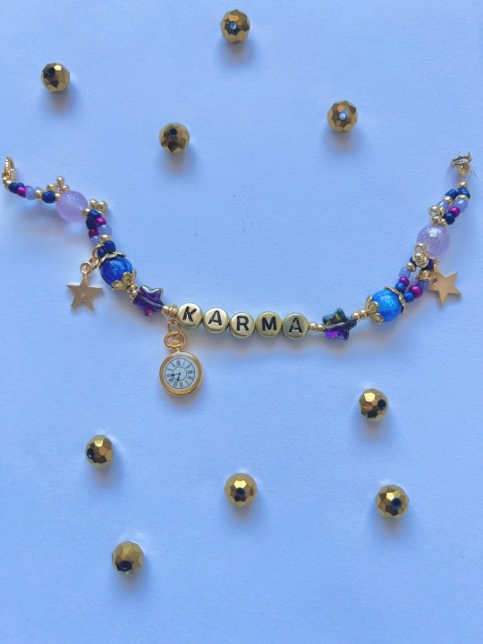
Some more friendship bracelets i made this week
More on my tik tok @hippymir !
3 notes
·
View notes

Last Seen Blogs
sararch
sararch

rdineshbabupdy
Untitled

snackpointcharlie
Snackpoint Charlie on WGXC
ue4journey
Unreal Engine Journey: 14 Days to Confidence, 42 Days to Mastery
chloecutiebaby
C Ú