#starting to warm up to lineart a little
Text

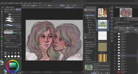
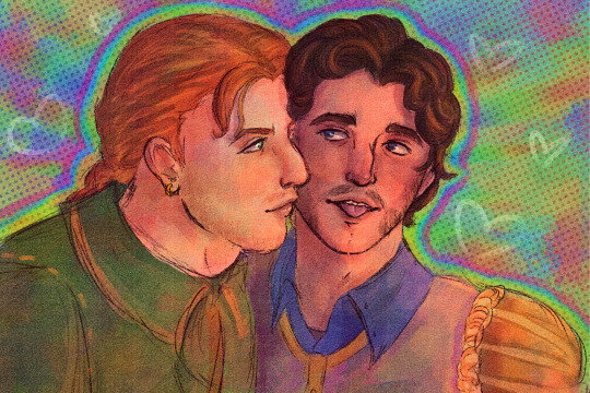
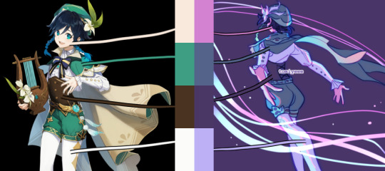
One of my fave brands of post is the transmasc and transfem versions of the same character hanging out. Anyway I think they'd be buddies
(Normally i don't make any visual distinction between the two but I felt it was necessary if I drew them together to distinguish which is supposed to be which)
#art#digital art#the owl house#hunter the owl house#hunter noceda#bailey noceda#idk if i met a version of me that was transfem i feel like wed get along like instantly#starting to warm up to lineart a little#transmasc hunter#transfem hunter
67 notes
·
View notes
Text
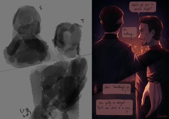
Someone asked me how I draw faces a couple months ago and I never had a good example to show so here‘s a little snippet and some text about how I think while drawing:
I always make a copy of my first sketch in case i mess up. Sometimes I try to do a clean up on a new layer, and it doesn‘t always work out. Not because the lines or anatomy is bad, but because i lost focus and with that I lost the gesture/energy and emotion of the original sketch.
Don‘t try to fix what‘s not broken. When that happens I go back to my original sketch and start again, often I draw straight on that same sketch layer, trying to carefully clean it up, staying zoomed out to stay focused on gesture and emotion instead of zooming in and only seeing individual lines. There‘s no need to completely redraw something on a new lineart layer if the original sketch looks already good.
Other factors can play in too (first drawing of the day, not warmed up, tired after long day) So don‘t force yourself into thinking your first attempt has to work out.

Bonus:
Learning when to stop and start over is not just good for faces, it‘s something that helped me improve at drawing in general, be able to draw faster and more efficiently. I started to adapt this years ago when I drew a lot of short comics.
This is especially useful if you tend to get stuck on specific parts on drawings e.g. one part of a face looks wrong and then you erase,re-draw,erase, re-draw -> repeat for an hour and get frustrated. (i think we‘ve all been there)
This is where you have to learn to STOP and START OVER. Recognizing the frustration cycle before it can happen. Re-Drawing the whole face/thing from scratch instead will often get you better results than trying to „fix“ a single sketch for hours. The longer you spend trying to fix a sketch the less likely you will want to start over because you already put so much time into it.
People often ask me how I draw a lot/fast and this is a big part of how☝️ Learn to stop early and start over if something doesn’t work instead of getting hyperattached to every single line you draw.
161 notes
·
View notes
Note
hi !! really hoping we haven’t asked this before and forgotten. but how do you sketch bodies / poses :O? your composition is always really nice and in general the way you draw bodies is great fhdjd
Not been asked yet to my recollection!
Bodies are a bit of a... takes time thing! But usually I try to have a pose or idea in mind that I'll thumbnail down somewhere on the canvas. Same with composition. There are a lot of little doodles or pose ideas that I mix and match before kicking a piece into gear.
Though, that being said, sometimes I know exactly what I want to do from the get-go go and it just takes a couple of tries and re-sketching to get it right! Warm-ups are also a big recommendation.
If you can- find pose references online too! I don't do this as often as I should but pose references always help keep anatomy a little bit more in place or "natural" looking (as natural as it can be in my style! Stuff is still exaggerated and more cartoonish after all)
The best way I can describe my sketching phases is kind of like chiseling away at something. I start more with basic form and loose shapes then erase and re-draw over top of it (and select tool edit lol) until I find its the way I want it!
And I do the same thing with color and lineart too! I draw over my lineart and color layers after everything is done in order to reshade or reshape an area I dislike.
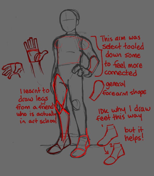
Not particularly a tutorial but just a general look on how I draw certain things!
Unfortunately, I don't think I have any thumbnails hanging around. Most of them have been on the Song Pieces and those files have had all their layers deleted and remade for the next song piece over and over and over lmao. But generally, those are small drawings in little boxes that help convey a composition you might want for a piece.
#voidthoughts#voidart#!!! the legs I think are too long on that sketch but fuckem they can have long legs#was surprised I even drew that decently tbh!! its the first thing I've drawn today!#asks#hope this helps
32 notes
·
View notes
Note
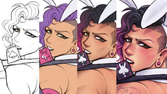
What's your usual process? Do you have a sketch layer and then a lineart layer or do you directly draw onto your sketch layer?
Here's the process for my last piece! I'm gonna try and explain my reasoning and add some art tips too.
I started out with an idea: a diver is playing hide and seek with a little mermaid and lots of little fish (I also had an older piece with the same concept).
Then I made some simple thumbnails.
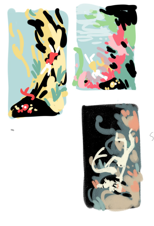
The third one was my favorite. I liked how the dark background and light characters made the characters stand out. The other two ideas were too busy with the colors.

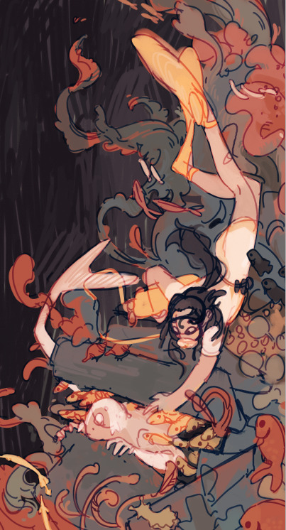
Loosely sketching on top of the thumbnail. I knew the characters would stand out in white, so I paid attention to the flow of their silhouettes. I really like how I got it so that the shape of the diver leads the eye into the merguy, and then the tail of the merguy leads the eye back to the diver.
Next, going straight from the sketch to colors. I think doing this preserves the energy of the sketch, and also I hate doing neat lineart.

Base colors. Red underpainting to give everything a warm undertone.
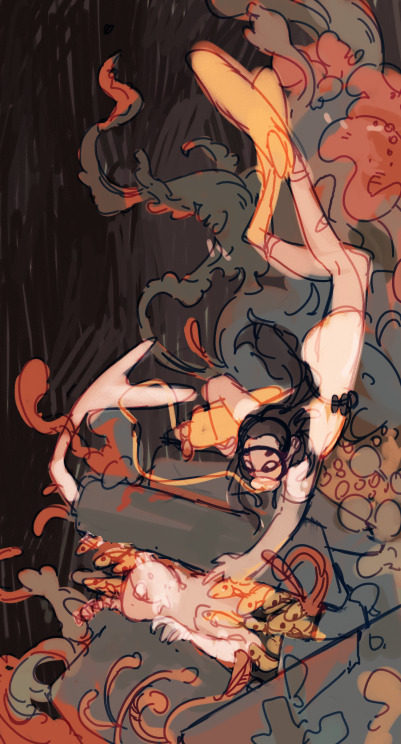
Blue, red, and a little green for the colorful corals. Yellow and light colors reserved for the characters to make them stand out.
Also changed the sketch layer to be blue, and set it as an overlay layer. I like how this makes it blend in with the colors.
Adding the fishes and more details.
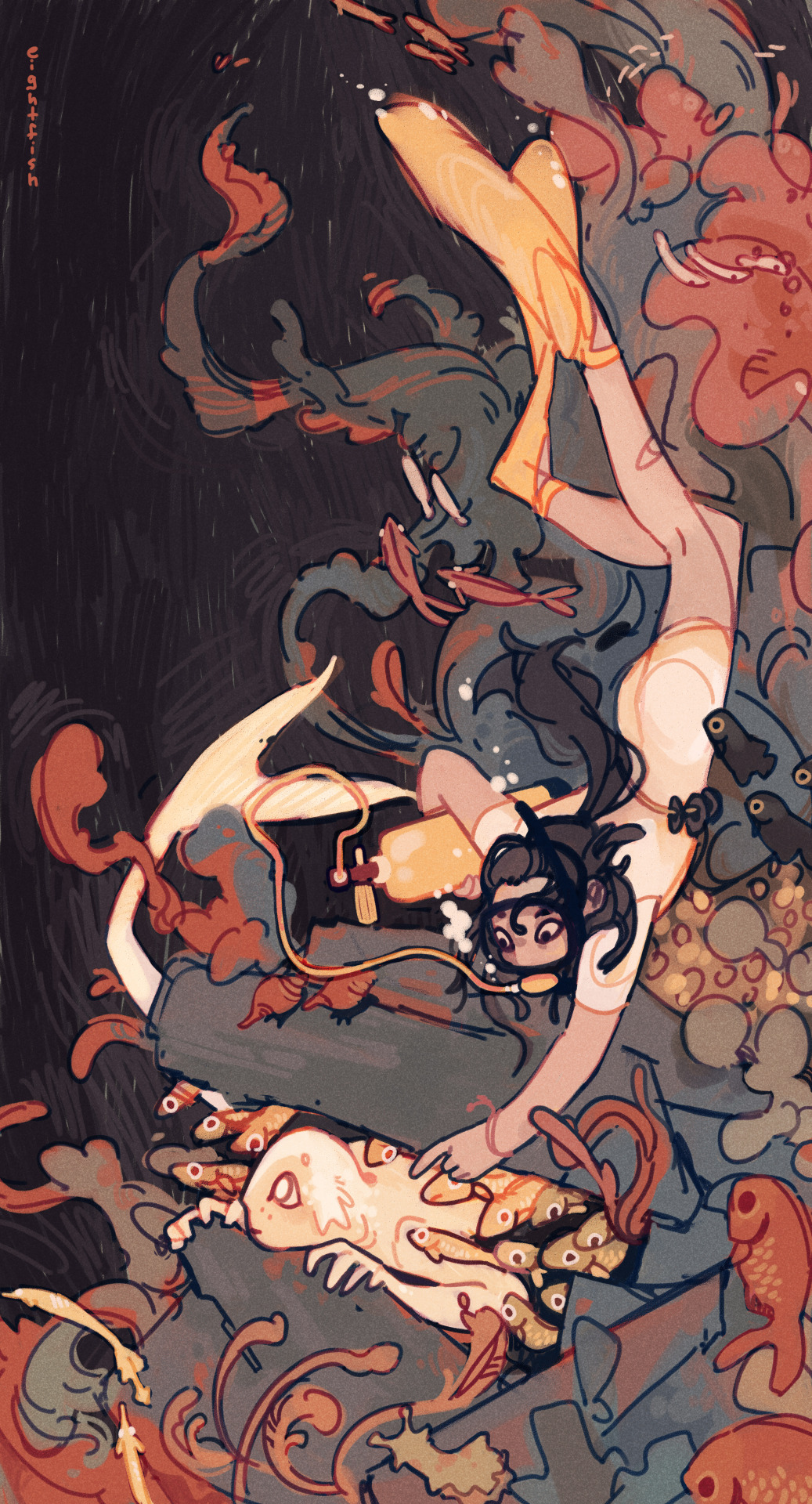
Then I merge all the layers together and paint on top of it to make sure everything is clear. Done!
I also added a simple texture (default watercolor paper texture in PaintTool SAI) as an overlay layer.
In general I have a fairly minimal process that doesn't use many layers or special effects.
I like drawing fast without thinking too much about anything besides how the piece is looking, and I like my pieces to have a loose and energetic feel. So I use one brush for everything, paint on mostly one layer, use only one or two sketch layers, and don't spend much time on rendering. It's just what I've found works for me and what I like to draw!
If I had to give a tip what helped me find my art process, I'd say experiment and spend more time on things that are important to you and you like doing, and cut out the things you don't like doing. So for me, that means spending more time on coming up with ideas and composition, and not spending time on lineart or meticulous rendering.
Hope this was interesting to read and feel free to send me any other art or comics questions anytime :)
115 notes
·
View notes
Note
saw your last fanart (16 of january) and it's so good
it beats me how this kind of colouring/painting is done though. how do you pick the right colours? the right places? the value of colour and it's warmth?
i always have trouble with colouring because i have a very strict basic knowledge of shadows and colours and no visual imagination
sorry for such a long ask
hi anon!! no need to apologize this is such a kind ask and i still really struggle with this sometimes. i didnt start experimenting with color in my art until around summer of 2022 and before that it was so frustrating to color that i almost didnt produce any colored work.
i also have complete aphantasia so my visual imagination is very limited! this leads to a lot of trial and error in my work because i cant tell what looks good until i simply try it lol
i will try to answer about my process as thoroughly as possible! but a lot of it is seriously just vibes, and playing around. a lot of what helped me was studying how artists i liked used color in THEIR work and trying to work it into my style.
a lot of the vibrancy and harmony in my work comes from my base layer, which i put under the sketch like im “priming” the canvas. when im coloring later on i let this base layer inform my choices and also let it show through in places for unification of the colors. its a lot like doing an underpainting except i dont go crazy on the range of values

the hardest part for me is doing the base colors over this layer. i dont have a lot of guidance for this because i kind of just pick colors to start with and then edit them bit by bit until it looks satisfying to me/matching the intended mood and harmonizing with the base layer. i edit the colors mostly by using gradient maps and layer modes until i find a version i like and merge it to just create a normal layer with the colors i want. i keep this base layer underneath my sketch
i render on top of my sketch/lineart always so i can better define the shapes and have smoother edges. this is the part where i really go crazier with my colors - some conscious decisions i make:
- where can i make my highlights and shadows stand out more? i accomplish this by choosing warm colors on the cool base or cool colors on the warm base. theres blue in the flesh tones of the face and orange in the blue tones of the coat.
- where does the rendering need to be more “clean”? someone viewing an art piece will gravitate to places in the drawing with finer detail, so i put a lot more work into the shapes and colors of the faces and the fish, because this is where i want someone to look the longest
another thing i usually do is pick one really saturated color and place it throughout the drawing. for thos one its that bright red, around the eye, blood, and outline of the fish as well as the characters’ hands.
this part of my process takes me the longest and can be seriously frustrating at times! something i always force myself to do is to keep working on it. whenever im like ok its done! i go back and render for another half hour and it ends up looking a lot better

gradient mapping the final drawing! for further unification i have a gradient map i made that works for most of my warm pieces

and i put it on top with an overlay layer mode and then adjust the opacity
it makes a big difference in the warmth and unification of the final drawing!! so honestly i cheat a little with my colors :P
i hope this helped a little bit with your question! my general advice is to also do some color studies of movies or pictures you like it really helped me get a feel for harmonizing color (and not being afraid to use really vibrant colors!!) again thank you for such an ask and good luck to you!!
20 notes
·
View notes
Text
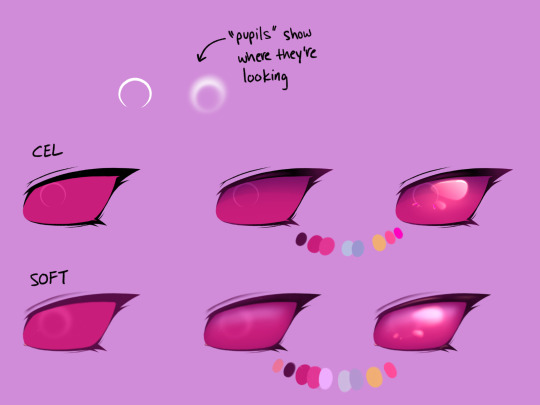
Irken Eyes
This is how I do Irken eyes in my more cel-shaded cartoony/anime style and my softer, semi-realistic style. I started giving them pupils (sorta) because I like being able to tell where they're looking.
I color part of the lines with a darker version of the eye color. I usually shade with cool colors and use warm colors for highlights. Using multiple layers of shadows gives them more depth. I like to add a few extra little highlights on base color layer, this time in neon pink, to make the eyes extra shiny.
In my semi-realistic style, I don't use a lot of pure black or white. I blend out my lines and use them to help create shadows. Normally, I'd break up the eyelashes more in this style, but I wanted to reuse the same lineart. If you want the eyes to bulge out more like an insect, shade along all the inner edges of the eye. The highlights are less stylized, and I added another layer of reflected light along the top of the eye that I don't always include in more simplified styles.
24 notes
·
View notes
Text
my drawing process (thank you @pepper-ika!)
i draw and colour for a long long time. i don't do the traditional sketch + lineart + colour -- sketches are hard to line, they're kind of time-consuming and usually they end up better than the lineart, so i just draw like normal and clean it up before colouring. i start at the head and end at around the feet, kinda like a person showering (lol). here i'm using your typical pencil brush you can find in any standard art program.

a tip i got from another artist was to colour using a thick, opaque pen brush that varies a lot in width. it saves a Lot of time. before they showed me that, i made the mistake of using a soft, painterly brush to colour my art. it hurt my wrist because i had to press really hard to get flat colour -- when all that time i could have just been using a pen brush! also, i start with soft colours because they're nicer to look at.

2. i do colourful midtones like redness in the skin or maybe a blue five o clock shadow if they have one. from this point onward, i use a flat square-ish brush combined with a painterly smudger and a soft airbrush.
i read somewhere that you should apply perfume on the moistest parts of your body so i kind of use that same idea when drawing redness. usually i do it where skin meets skin: folded arms, a crunched back, closed hands, and that place where the thighs touch the buttcheeks, lolol. and of course: the nose, lips, and ears. it makes the skin look real and warm and lively!

3. i lay down my shadows and lights, usually in that order. and at this point, i'm throwing extra shadow on wrinkles, fat, bumps, lumps, etc. a body without rolls is like an angel without wings!
also i smudge like CRAZY here. just like how it's impossible to have "too much gravy" on your chicken, it's impossible to have "too much blending" when you're drawing skin. blend that ish.
when it comes to the colour of the shadows, i always make shadows the base colour but darker and more saturated, and i move the hue a little to the left (for example: orange goes to red, green goes to yellow, purple goes to blue). i do that with, like, every colour. i can't tell if it's lazy or not but at this point i'm too scared to ask.

4. finally i make some minor adjustments like liquifying to fix lopsided eyes or oversized heads/hands. when i was in high school, my art teacher would say "great, but watch the size of the feet, hands, and neck," lolol. he was right ofc. when i go "hm... that looks a little weird," i have to trust that gut feeling because when i do fix it, it ends up looking way better. here is a horrifying gif illustrating that.

AHH!!!
alternatively you could do a messy line and color, then do a whole paintover like i did here. this is awesome for details because you dont have to go back and change the lineart - you just paint over and add whatever you want and redraw the line to fit it.
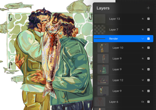
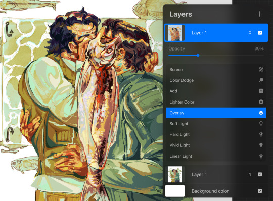
i dont really use the different layer modes that much. in this one i used a gradient map of the drawing as an overlay. idk if that really does anything major but it does create a new range of colors to play with. i also used a multiply layer to cast a big shadow over the card (layer 8) because it has this tiiiny little pattern that would be a pain in the butt to draw shadows over. everything else is pretty standard.
(and no i dont name my layers... yes i will be changing my name and moving countries)
another thing worth noting: i use airbrushing A LOT. i remember reading somewhere that using airbrushes is like. a cardinal sin. it’s not, man. it’s great. airbrushes and smudging are dope and i use them all the time.

i hope you found this helpful! have a great weekend <3
33 notes
·
View notes
Note
I AM ASKING U ABOUT THE SYMBOLISM IN THE JENNY PATCHES
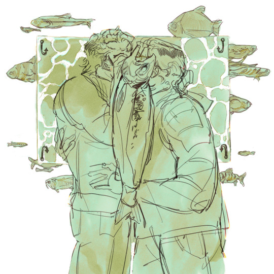
I am SO glad you asked :D please allow me to ramble for. way too long probably. (original post this is in reference to)
Let's start with Thief because that's the one that I nailed down the design for first. In this design: an hourglass almost out of time, a ring of three keys - a house key, a car key, and a skeleton key - and a compass keychain.
Jenny the Thief is the one who held the gate as long as she could before vanishing into the night, the one who traded in her old car for a custom Kawasaki to leave behind a no-longer-safe house (ring of keys). Thief is the one who didn't know her time was up until it had gone, the one who had to live through everything ending to understand how it happened (hourglass). When she left, it wasn't towards anywhere particular, just away from here, pick a direction and run (compass). Additional note for the skeleton key specifically: that one is mostly for me, because I wear a key like that on a necklace and I thought it fit nicely, but also it's for places and stories we can only guess at, events locked outside the scope of the narrative.

I had a lot more trouble nailing down the design for Warrior - it went through a few iterations. The original one had a sword and a pen: battles to fight and stories to tell. I talked with my friend Sunny @paladinboyfriend for a little while about it, bouncing around ideas; ey said something about Jenny being a bastion of hope glowing like a lighthouse, but burning too bright and consuming herself in the process, and I decided to go with a lighter as a modern analogue to that.
To me, Jenny the Warrior is the kind of person that everybody knows someone like - a couple years older than you and leagues more confident, a steadfast support who's always ready for anything and has just the tool for whatever problem arises ("also jenny is butch, so there's that" - Sunny). She's not an ancient hero, she's here and now, a warrior with a motorcycle and a leather jacket and a house where you can crash for as long as you need. So she gets a pocketknife instead of a sword and a lighter instead of a torch, tools for someone who protects and guides. A pen for countless unknown stories lived and told, for lines drawn and lines held for as long as she could. I added a carabiner attached to the knife (which, yes I know you wouldn't do that irl, it's about the design) because I felt like it filled out the design a little bit, and also, again, in my heart jenny is butch, and it felt like a nice little nod to that.
For both designs, I used the same flat color palette of gold, off-white, and a dark warm gray, since those are the general colors of the album color. I also used a thick and slightly textured brush for the lineart, because I like the slightly more flawed and organic feel it gave the pieces.
I think that's pretty much it, but I can probably come up with more to say about specific aspects of the designs if there's anything else you're curious about! thank you so much for asking and enabling my rambling about this set of drawings :D
#.lyr#ask#the mountain goats#jenny from thebes#long post#i <3 symbolism i <3 things that mean other things#id in alt text#kes tag#<- resident symbolism enjoyer enjoys symbolism; to the surprise of absolutely no one <3
21 notes
·
View notes
Note
Dear Mojo.
I unfortunately gave my Xisuma design... Wonderful eyes that I would qualified as... A little bit slutty.
At first I wanted him to have "Dad" eyes. But... Guess not.
How do you fix such beautiful things (drawn with a pen because I didn't have a pencil.) As that? (No photos will be added as it's literally a brand new sketch.)
i would love to help more if i could see the sketch but honestly i would embrace the sluttiness of his eyes. i think that he deserves to have at least 1 thing slutty about him
but if youre sketching with pen and you feel like you didn't do your xisuma justice, i reccomend warming up with doodles before drawing or starting another quick sketch where you do the eyes as you wanted.
another method to make this kind of stuff happen less is to have two pens, one lighter and one darker so that when you draw the sketch with a lighter pen and then go over with a darker pen where you didnt like
example:

or you can combine the two colours so you have lighter and darker lineart but the lighter colour also works as shading:
you can also try drawing with ball-point pens more like you would with pencils and start really light and then press more as you continue:
hope this helps a bit!
48 notes
·
View notes
Note
what's your painting process like? and how do you get that really nice texture on your paintings??
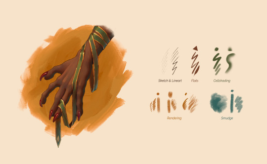
Hi! Thank you so much for the interest, I'm genuinely quite flattered! I made this little test image as a demo of how I paint, since I got a spare couple of hours after work today. Above are the brushes I use and below is a big step-by-step guide of my process.
Regarding the brushes, unfortunately, I'm unable to tell you where most of them came from. Sketch/lineart brush is Procreate's default "Little Pine", and the brush for flats is made by me out of a triangle preset. Everything else is reworked Photoshop brushes I got years and years back, reworked into Procreate brushes (and therefore missing any author/source information at this point).

Image description:
Step-by-step guide on how I have painted a creature's hand tangled in a ribbon. There are 7 steps.
Step 1: Sketch of the hand.
Step 2: Lineart of the hand.
Step 3: Flat colors of the hand.
Caption: I use a brush with color dynamics turned up very high (mainly hue) to create an overlay layer that creates an almost iridescent base texture. It’s great as an underpaint.
Step 4: Cell shadows with a soft blur are added to the hand. Area with subsurface scattering is circled on it.
Caption: I cellshade most of the piece with a softer brush and blur some areas to define hard & soft edges. I shade each object/material independently. To do that, I select the contents of the layer, for example the ribbon, create a new layer, and do the shadows of just the ribbon right above it.
To create this rim of warm subsurface scattering, I copypaste the shadows layer, use Gaussian blur to expand it, select the contents of the original shadows layer, and cut it out of the new subsurface layer.
This creates a rim on the edge of light and shadows, that you can set to Overlay and make orange/red.
Step 5: The image of the hand has a rainbow textured overlay on top. The overlay is shown seprately at high opacity right above it,
Caption: I use a brush with color dynamics turned up very high (mainly hue) to create an overlay layer that creates an almost iridescent base texture. It’s great as an underpaint.
Step 6: The hand is overpainted with fur textures and extra polish. Two areas with high and low fur definition are circled.
Caption: At this stage I merge shadows with their respective base layers (ribbon shadows merged to ribbon flats, nail highlights merged to nails, and so on). I create new layers on top to overpaint the original random iridescent texture and paint with intention. The colorful underpaint is a convenient base to eyedrop colors from, but it is too, well, random to keep as is. This is where I start rendering hair and fur.
Don’t forget to leave areas of less detail to let the eye rest!
Step 7: Extra definition was added to the hand. Additional light source is added beneath.
Caption: At this stage I’m adding finishing touches:
- Another yellow light layer for extra depth.
- Subtle teal light source from underneath the palm.
- Really dark multiply layer on top that creates tiny accented areas that are not reached by the light.
62 notes
·
View notes
Text
Ijiranaide, Nagatoro-san - Rant
I am currently watching season 2 and I have some thoughts (about both seasons).
First of all why did I start watching this anime? Erm... So I know what the target audience is, it's people who self insert as Naoto and want to date Nagatoro. As for me? Oh, it's the other way around. I think Naoto is cute and I want to bully him. I thought maybe my female friends were similar but the only friend I have who read the manga wants to make out with Nagatoro. Sorry, I forgot lesbians exist.
Uh, anyway yeah Naoto is cute and I want to be Nagatoro. Not sure if girls like me watching this was intended since these anime are usually made for lonely dudes, lol. Anyone else feel like me though?
The scrunkly.
Okay, so, my thoughts on season 1... Lemme check the episodes to bring back my memory a little bit, as I watched that to calm down from the stress that is social work during last Winter.
The first two episodes made me really scared to watch this series, for real.
Nagatoro just straight up mentally tortured Naoto, and not in the hot way. I felt really bad for him because I know what it's like to be the shy nerd kid. Anyways at around episode 3, I think, Nagatoro starts showing her softer side more. And she hardcore crushes on Naoto.
The dynamic between Nagatoro and Naoto is really cute in my opinion, even if it is very simple. Nagatoro has her first crush because she finally found a guy that doesn't bore her to death but she doesn't know how to handle it so she bullies the fuck out of him. Naoto is pretty much the opposite? He doesn't really realize how much he likes Nagatoro sometimes and thinks he would rather not be around her. He tries to manage that by fighting her off in which classic anime romcom things happen. You know the "Holy crap you did something on accident, PERVERT!" thing, except it sometimes works really well. Maybe it's just because I think both of them are really cute, but I like when they have their little "Oh god, we both fucked up" moments.
Then there's the more obvious romance aspects and they're by far my favorite. The momens of honesty and the cute glances... Yep, they're adorable. I don't want to give away too much, sorry. Just know it's, in my opinion, the best thing in the series.
I don't care for the side characters by the way, but they can be enertaining when they point out how obviously both of our main characters are trying to "prove" that they don't like each other. They're the audience, the "just kiss already!" guys.
Also funny face cute. I like when she snaps. I like her. The cutesy.
Okay no, for real, I love when Naoto and Nagatoro support or protect each other when they really need it. They can be a bitshitty towards each other sometimes but in the end they're actually kinda... healthy? Like Nagatoro is creepy but I love when the girl is a creep instad of the guy, since Naoto is actively watching out not to disturb Nagatoro. And how she will constantly accuse him of being a creep makes sense later when you realize that she's actually much worse than him, lol.
Okay let's get to season 2, since I keep using too many screencaps of that season anyway.
Oh boy, another anime studio took over with season 2 (now OLM, before it was Telecom) and it's very noticeable. The animation is stiff and sometimes just straight up doesn't move right, the art is a lot more bland, in season 1 there were a lot of beautiful warm colors and lineart, and the voice direction is very strange...
That and also our main characters seem to regress a bit? Now being overly flustered over small things that they would've been fine with in season 1? I get it, they're supposed to be cute and awkward but it's the classic romcom regression...
I'm in the middle of watching season 2 and sadly the things I loved in season 1 just aren't that apparent anymore. It's still cute and I love Naoto and Nagatoro together, but I can hardly pay attention to that when Naoto is animated like Chargeman Ken.
^ little appreciation for the beautiful lighting in season 1!?
Anyway, Ijiranaide, Nagatoro-san will forever be my biggest guilty-pleasure comfort anime and I'm only a little ashamed.
Love ya
#anime#otaku#rant#anime review#ijiranaide nagatoro san#nagatoro#don't toy with me miss nagatoro#naoto hachioji#hayase nagatoro#anime rant#weeb#romcom#comedy anime#romance anime
26 notes
·
View notes
Text

This drawing's been through hell, jeez ( ̄  ̄|||) My drawing software starting messing up in the early lineart stages, so this drawing has been bounced between a couple different programs before I finally actually finished it- So if anything looks a bit off, that might be part of it , sorry LMAO
A little semi-story post!
Kouko's incredibly scared of fire unless she's actively using a small one to cook, and even then she's unbelievably cautious with it, like it's some type of animal that might bite at any moment. It's an incredibly slow process of getting her to be comfortable near the group's campfire, and for the first part of her being with them, she avoided it entirely. But with support from others and a lot of slow desensitization to it, she eventually mostly overcomes her fear just enough to be able to properly warm up near it with them.
Inuyasha wasn't the only one helping her with this, but I just wanted to draw some InuKou art because I missed them LMAO
#oc x canon#ocxcanon#canon x oc#oc x character#inuyasha x oc#inuyasha#inuyasha oc#inuyasha fanart#inuyasha fanfiction#fancharacter#fan character#inuyasha fancharacter#fan oc#anime art#my artwork#my art
4 notes
·
View notes
Note
Hi! Big big biiiiiiiiig fan of your obikin work over on twitter, both for the naughty bits :3 and your art style like omg I love love loooooove the angular character design and the way u colour with scribbles hidden in it to look like it’s pencil coloured and the double lineart over (is it intentional or aesthetic thing?)
I wanted to ask a question: I noticed whenever I see your twitter art and tumblr art even tho it’s the same fan art some of the stuff on tumblr is slightly different like obi-wan/anakin’s face is more structured on tumblr version or slight change of pose or adding new things like obi-wan’s red lingerie in your obi-wan’s history of bras/lingerie while he’s naked on twitter version. Do you purposely change it for tumblr?
Hi there!! What a wonderful message to receive 🥺🙏 First of all, thank you for such kind words ❤️ I hope you don’t mind I answer both of your asks here!!
My art-style has been mutating through the years since I graduated and nowadays I’ve found a nice balance with this sketchy one I’m currently using (definitely influenced by Mikael Ross, his traditional cartoonish style is a huge inspo for me when i do comics). but I love trying new methods and switching things up every now and then. And yes, the double lineart is intentional!! I like how it gives some dimension and dynamism to the anatomy and makes it feel like animation 💞
And you are very observant!!! Bc I definitely change things in my art when I post them to different sites. part of it is because I’m kind of a perfectionist, and once i post something on twitter i start noticing all the mistakes and tangents and I just know i won’t post it on tumblr until i feel satisfied and fix things or re-do them. on the other hand, tumblr is very strict with the nudity stuff and i keep getting flagged every time i post something slightly suggestive (or maybe someone is reporting me 👀 won’t be the first time tbh) so i gotta tone things down, like adding obi-wan’s red lingerie in that one fanart while on tumblr he’s showing ass and cock HAHAHA. so yep, twitter gets ass and tits while tumblr gets the fixed 2.0 stuff. but in some way i kind of like the idea of posting different things on each site, like little easter eggs 🥰
I’m so excited for you to participate on the #UnderTheJediUniform tag 🙏 also tag me if you do it cuz my shadowban sometimes hides some of the art in the tag 😭 it started as a little idea and it warms my heart seeing people doing their drawings or fics or hcs about obi-wan in lingerie 💘 But take it easy specially if you are coming back from a creative burnout after uni, i was there too and it was no fun at all. sometimes is a way for our brain to tell us to take a break and nurture ourselves from different things other than drawing, like looking at different artists or photographers, watching movies, reading books and from life itself. and when you less expect it, you will suddenly get struck with the need to grab a pen 😊
thank you again for this lovely message, it really made my day!!! as you said, there‘s always shit happening and disgusting losers trying to drag you down in this fandom, but messages like this and the wonderful people that i have met through obikin is an enough reason to stay and keep doing what i want ❤️
12 notes
·
View notes
Text
My Typical Art Process✨🌈
Was gonna reply to anon with this, but figured it was a bit too unrelated so I'll make a separate post! I do kinda wanna share my process anyway for anyone curious. I made something similar for twitter once but I no longer use twitter and my style has changed since then so here's a new one!
Tl;dr I draw for fun only and I have learned that textures and overlays and post-processing can do a LOT when it comes to making something look more "complete" while also not taking a lot of additional time. This is just my personal style spawned from my laziness and my love of harsh colors😆

I'll put it below the cut because it's long!
So to begin with, when I doodle (as opposed to a proper drawing that I take my time on) this is my typical "lineart":

I just draw the… what do you call it? The under parts… Like the circle and shapes, etc. to get the pose. Then lower the opacity and do another sketch on top of that. Then I lower the opacity of that and do ANOTHER sketch on top. 😆 I do that as many times as necessary until it looks like something. I don't worry a ton about anatomy or messiness or stray lines, it's just for fun to get an idea out of my head :)
Sometimes I also leave the under-sketches in or sometimes I turn the layer off. For this one I left them in.

Then I turn on all my textures, overlays, and H/S/L correction layer and crank the saturation up. The selected colorful layer was something I made once and saved it as an image material so I can just slap it on any time as an overlay. You will see it in almost all of my art, she's my beloved crutch and also I just like it lol. Other than that, I sometimes use paper textures that CPS came with and sometimes I make a perlin noise layer with the smallest grain size and set it to 'soft light'.
I also have recently been using a manga screentone overlay that comes with CSP.
Then I start coloring underneath!
This is how it looks without all of the blinding colors and textures I put there to distract you from the mess lol
Even in ones where I DO put in effort and try to use better anatomy and clean up a lot of the scribbles I pretty much never use clean lineart simply because I cannot be bothered 🤷🏾♂️ I don't really do anything different here, I just spend more time one it:
Also, even then the overlays and textures do a lot of the heavy lifting. Some of the overlays and effects I draw myself like the rainbow boarders around them and of course the doodle hearts. I don't draw backgrounds very often but I don't like an empty background so overlays or little doodles or text effects typically go there.

I should also mentions that I use the lightroom mobile app to further enhance all of my art, as shown above in the before and afters. I don't really have much to say on this point. I used to use lightroom mobile a lot when I did doll photography and I pretty much just wing it based on what I learned doing that. I like to mess with the texture settings and do masking edits to change the foreground and background independently to get better color balances. Like a bozo I pay for the subscription but I bet you could use any old editing app.
Oh, and I do pretty much everything with these brushes here. I got them a while back when they were free for 48 hours but unfortunately they are no longer free and cost 80 clippy now :( Should also warn you that they saturate any color and idk how to stop it from doing that so I just adjust the color accordingly before using or edit in post. Very nice though!!
Some other (free) things I like and use a lot:
Warm color set
Watercolor paper texture (free)
Cloud brushes
Watercolor auto action
Real paper textures
Prism brushes
Freckle brush
Aaaaand that's basically it!
#eye strain tw#we do not discuss my 100+ layers...#long post#artists on tumblr#digital art#jun rambles
11 notes
·
View notes
Text
just because i feel like it:
some random thoughts about the art i made for ironstrange week + the very rough thumbnails for each piece (putting this under the read more so this doesn't take up too much space bc this is a Very long post)
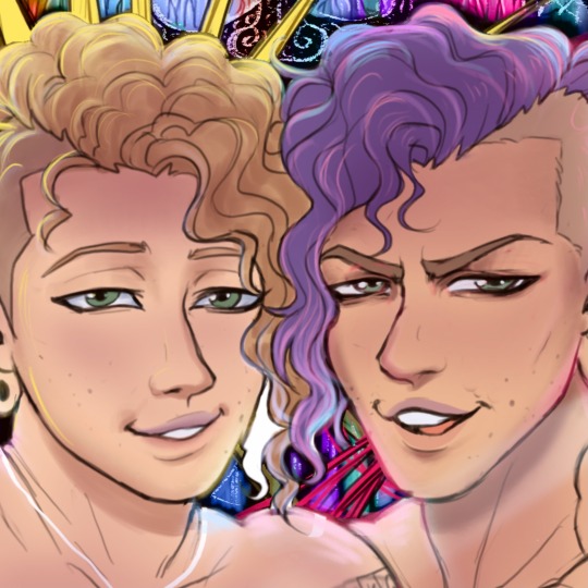
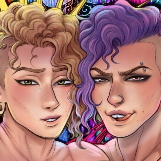
day 1 - red/wrath

first fanart for this fandom! there are a few things i don't like about this piece (questionable anatomy, use of values could be improved, + stephen's hair makes him look like a wet cat /hj) but i do like the lighting and the theme of red spider lilies. i've always wanted to draw them and i love their symbolism of death and final goodbyes—feels very fitting for these goofs :b
i started working on this a good amount of time in advance, and i'm glad i did—this was one of the only pieces i used a painterly style for despite it being my preferred style; it takes me a lot longer than lineart + color, so i didn't get the chance to use it again throughout the event (with the exception of day 6)
day 2 - nervous/orange
i struggled with the anatomy on this one—i don't draw back views often (or, at all really) so the first panel was pure pain. the second panel wasn't much better; it took several attempts to pose the hand in a way that looked somewhat natural. pretty pleased with how this turned out all things considered, though! my only qualm with this is the rushed shading, but that's what happens when you're a slow artist on a time constraint :,)
day 3 - yellow/cheerful

i think this may be one of my favorites from this event. i'm very very happy with the lighting and overall atmosphere of the piece :)
i realize now that i used flowers as a theme for every color prompt—anyways, like i said in the tags of the original post for this, i very loosely referenced yellow primrose (symbol of happiness, warmth, & love, conventionally given to those in long-term relationships or someone who has always been there for you through thick and thin)
day 4 - intrigued/green
i ended up liking this better than i expected to! i had to play around a lot with the lighting/color scheme before i was satisfied with it, though that's on me for not having much of a plan for it beforehand (with most pieces, i already have an idea of the color scheme when i start working on them). not much else to say about this one except surgeon stephen my beloved <3
day 5 - blue/serene

this was the first time i've properly drawn a kiss and holy hell how do ship artists do it. that shit is so difficult. i struggled a lot with the anatomy and ended up changing the poses a bit; i also flipped the composition because 1. it looked slightly better that way and 2. i could include tony's ring <3
and yes stephen's mug says 'cunt' (with the handle being painted in black to form the 'c'—very much inspired by jacksepticeye's mug); for tony's i had to search for funny mug designs lmfao
i was going for a very domestic/warm atmosphere, which i think was more or less accomplished, so i'm pretty happy with this overall :)
also, not really pertinent but i was listening to sweater weather on loop while drawing this so. make of that what you will.
day 6 - grief/indigo

ah, this piece. definitely my favorite of the 7, love how this turned out despite ripping my own heart out a bit while making it :,) listening to hyacinthus on repeat didn't help
my initial idea for this—the thumbnail in the top left—was going to be one of them bleeding out in the other's arms, but i had another idea that i felt more drawn to so i chose that instead (this was a very last minute change so the thumbnail is pretty much just a couple of stick figures pfft).
i decided to go back to the painterly style since it felt more fitting for this & i'm glad i did, although it was a little rushed towards the end when i was adding in the final details (the butterflies are pretty much just lasso tool + glow layer). this was also my first time drawing stephen's robes and. man that was a pain to figure out. get a simpler outfit stephen.
day 7 - purple/disdain

had to end the event on a happy note! this was very rushed but i still like how it looks, though the bg petals are a bit janky.
the prompt 'purple' immediately made me think of violets, which were used as gifts for newlyweds so. here we are (they also happen to be symbolic of faith, mystical awareness, and spiritual passion—pretty fitting for our favorite wizard)
i didn't dedicate as much time i should've to actually making the violets look like violets instead of some generic flower but again, slow artist under time constraint. i did spend a lot of time with the expressions in this one though! i really wanted to convey a sense of pure joy and love, and i'm very happy with the result in that regard :)
something that i noticed was that it had become a lot easier for me to draw these two by this point. suppose it makes sense considering i'd literally been drawing them nonstop for 2 weeks lmao, but it was still pretty cool to see how quickly i managed to finish a sketch i was happy with, compared to when i was working on the first few days (good lord was it difficult drawing stephen in the first piece, especially at that angle)
anyway, prepare to see more of them in the near future because the brainrot is far from over. if i am this attached to them without having seen the majority of marvel movies featuring them (i'd literally only watched ds1 until yesterday when i watched im1—yes i started shipping them without knowing who tony was, i don't know how either), i think i'd be a puddle by the time i catch up on everything :D
whoo that was a lot—if you've read this far, thank you and have a cookie 🍪
#ink rambles#ironstrange#not gonna use any other tags bc there's no art i haven't posted already pfft
15 notes
·
View notes
Note
how long does it take you to draw and colour? since you post everyday which is great for me :D
any tips for colouring cause Im still tryna figure all that out
hmm welllll, i don't exactly time how long it takes to draw but my partner said that sometimes i'll be working on a piece when they go to sleep and i'll still be working on it when they wake up 7 hours later so...my guess is anywhere from 3-8 hours each depending on complexity? at least for the art that i normally post, most of which is relatively simple.
not entirely sure what kind of tips you were looking for, but i'll just throw out some of my thought processes and stuff i try to keep in mind whenever i color. i'm gonna try and keep these relatively to the point so i won't go into much detail on art terms n whatnot, BUT i am also pretty terrible at explaining things so if you need clarification on anything, feel free to ask!
(sorry it's so longggg, i got carried away. i am...very wordy when it comes to art lol)
i like to block in the colors during the sketching stage before i do the lineart, especially for pieces where i know i want to do something funky with the color palette. you can see this in a lot of my process shots. doing colors in the planning stage just gives me a lot more freedom to focus purely on the colors and shading and how they work with the composition, without having to worry about the minute details like making sure the colors are inside the lines.
in order to save time while coloring, i'll usually just select the negative space (after making sure all the lineart is closed) > expand selection by 1 pixel (to make sure the edges are hidden within the liineart) > invert selection > fill bucket, then use clipping layers above that to color individual areas.
layer modes are your friend! i use multiply, overlay, and glow dodge (this one may be specific to mangastudio?) in almost every one of my drawings, but it's definitely worth playing around with all of the modes just to familiarize yourself with them if you haven't already.
color is honestly SO subjective. i'm never a fan of color picking (from source material or my own refs or whatever) bc while it may have its uses when it comes to consistency, imo it's much more fun to make them up as i go. you get a lot more variety from piece to piece while also familiarizing yourself with the character's palette that way. usually i'll start by deciding on the overall mood/palette (cool/warm, de-saturated, neon, pastel, etc), filling in the background color, then picking the characters' colors based on that. like with this venti pic, i started with a purple background and based my colors around that purple so they all fit the specific look i was going for. i could maybe get a similar effect by starting with the normal colors and using filters, shading, layer modes, etc to get the funky colors, but it will be much harder/more work and doesn't get as drastic of an effect imo.
on that note, don't be afraid to use shades/colors that may seem odd! you'd be surprised how many times i've used gray in place of blue, orange, purple..basically any color. in the above example, you can see just how different the colors ended up being from the original. after i decide on my palette + bg color, i'll just throw down the color i think will work and then (bc that first guess is usually wrong and meant only as a ballpark estimate) see if it needs to be warmer or cooler/darker or lighter/more or less saturated/etc and adjust accordingly. it's like mixing paint or tuning an instrument! it takes a little bit of practice, but after a while you start to get the hang of what colors will look like in which color palettes. white is usually the easiest to start with bc it will always just be tinted whatever color your palette is (like how the "white" in the above example is just a light purple).
this and the next point are more about shading but i include it as part of the coloring process: the easiest way i've learned to do shading is to darken the entire image/character/part you want to shade (usually with a solid color multiply layer) then add in the lighting either by erasing parts of the multiply layer or by using a separate layer set to overlay or glow dodge (or a similar lightening layer mode). it works a lot better than drawing the shadows imo because it kind of mimics how light works in real life; things are dark by default until you let light in and it hits what it can while leaving the rest still dark.
if you want to blend shadows, i usually still use the above method, but just blur certain areas of it and when i'm deciding which parts to blur (bc i don't just do so indiscriminately) i'll mentally sort all of the shadows into 2 categories:
shadows created by light being blocked by an object: like putting your hand in front of a flashlight. these shadows will retain their sharp edge, but can transition into the 2nd category if they are far enough from the obstruction, like how your hand's shadow will become blurrier the further you move it from the flashlight. the more distance between a light source and the surface it's projecting onto, the more chances for the light to scatter = softer edges
shadows created by light "rolling" off the surface: like the shadows on a ball or rounded surface. these will get blurred and i usually like to put a little bit of color along the blurred edge (a different and usually brighter/more saturated color than the rest of the shadows) just to add some life to the shadows.
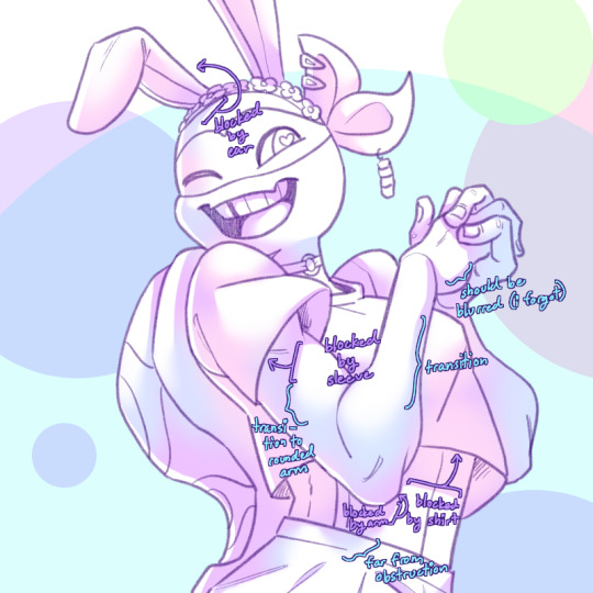
here's an annotated version of this mikey pic with just the shadows so it's a lot easier to see :) sorry im bad at annotating..
aaaand this post has probably gotten way longer than you were hoping for so i'll cut it off here 😭 hope this has been at least somewhat useful, and good luck with your art!
27 notes
·
View notes
Last Seen Blogs
serpentes2452
le animalé634

n7india
Untitled

cineastua
Cineast в картинках
rafcs
* 𝐫𝐮𝐧 𝒷𝑜𝓎 𝐫𝐮𝐧 .

obedientdrone
An obedient drone