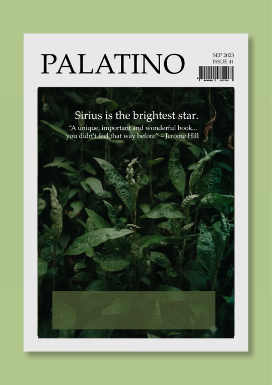
#palatino
Text
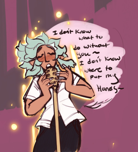


Bard Magic sure has gotten crazy since human technology got more integrated in the demon realm, huh?
(I love harpy Bronnie and her cool emo mullet and her red feathers…..)
721 notes
·
View notes
Text
ROUND 1 - RED GROUP


Propaganda under the cut.
Palatino: "preferred font of intellectuals, artists, and girlbloggers. looks slick and sexy and professional. looks like you have an MFA. looks like you're going to get published in a critically-lauded anthology by 2030. everyone loves Palatino or hates Palatino because they can't be Palatino."
Charis SIL: "Gorgeous serif font, based on an absolute classic (Bitstream Charter), made by SIL International and with full support for all Latin and Cyrillic characters, including all phonetic characters (including IPA and all it's extensions). The ultimate serif font for phonetic transcription and a beautiful choice for everyday use."
59 notes
·
View notes
Text


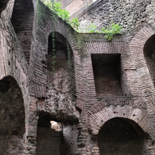
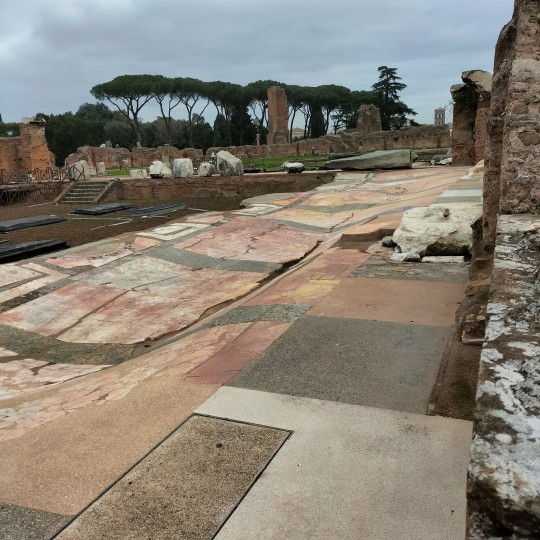


visited the palatine hill + palatine museum
#paiawon.txt#tagamemnon#archaeoblr#archaeology#art history#rome#roma#palatine hill#palatino#palatine museum
9 notes
·
View notes
Text
Palatino Bold Font
Palatino Bold is a bold font that is suitable for fun designs.
Download this font now-
https://www.freefontdownload.org/en/palatino-bold.font


#Palatino#PalatinoFont#freefontdownload#freefont#art#creative#graphicdesign#wallpaper#fonts#typography#calligraphy#design#webdesign#handwritten#calligraphic#type#typeface#lettering#handlettering#weddingfonts#weddinginvites#savethedate#weddingdetails#weddinginspiration#brand#branding#branddesign#brandingdesign#businesscard#businesscarddesign
12 notes
·
View notes
Text
SCOPERTE / Colosseo, scoperta una nuova eccezionale domus tra il Foro Romano e il Palatino
SCOPERTE / Colosseo, scoperta una nuova eccezionale domus tra il Foro Romano e il Palatino
I mosaici alludono forse alle imprese militari del proprietario, verosimilmente un patrizio di rango senatorio.
TUTTE LE FOTO: MiC / Parco archeologico del Colosseo
Ennesima straordinaria scoperta a Roma. Il Parco archeologico del Colosseo, nell’ambito di un progetto di studio e ricerca, ha riportato alla luce alcuni ambienti di una lussuosa domus di età tardo-repubblicana, di cui erano state scavate alcune strutture murarie nel 2018, e un tempo esistente esattamente nell’area in cui, in età augustea,…

View On WordPress
#antica roma#archeologia#domus#età romana#Foro Romano#notizie#Palatino#Parco Archeologico del Colosseo#Roma antica#scavi#scavi archeologici#scoperte
4 notes
·
View notes
Photo
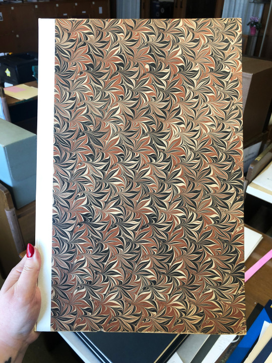
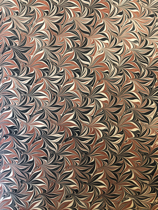


Marbled Monday
It’s time for another Marbled Monday! This week we have some gorgeous marbling found in the binding of C-S The Master Craftsman by American book collector and businessman Norman H. Strouse and British book designer and historian of print John Dreyfus. The book includes two essays about English artist and bookbinder T.J. Cobden-Sanderson, each by one of the authors. It was published in 1969 by the Adagio Press in Harper Woods, Michigan and printed by Leonard Bahr, who founded the Adagio Press. Printed in Palatino type designed by Hermann Zapf, the book is printed on handmade Tovil paper, which was printed dry (usually this type of paper is best printed on damp). Bahr explains in the colophon that there were many issues faced while printing the book, namely time (owing to the fact that “The Adagio Press is a sparetime printing activity, confined to the evening and weekend hours available after normal employment”) and the number of pages able to be set at one time due to the amount of type owned by the press. The book was printed in an edition of 329 copies. Our copy is another gift from our friend Jerry Buff.
Oddly enough, the 2-page colophon doesn’t mention the marbled paper used for the binding! The marbling pattern isn’t to be found in my trusty reference from the University of Washington Libraries and appears to be a unique, floral or foliage-inspired design. Done in cream, black, and red, the pattern features flowers or leaves with the colors swirled together. It’s interesting and lovely, especially when you get up really close to see the swirly interstitial bits.
View more Marbled Monday posts.
VIew more posts about work by the Adagio Press.
-- Alice, Special Collections Department Manager
#The Adagio Press#Marbled Monday#T.J. Cobden-Sanderson#Norman H. Strouse#John Dreyfus#Leonard Bahr#Adagio Press#marbled paper#patterned paper#marbling#Palatino#Hermann Zapf#Jerry Buff
50 notes
·
View notes
Text
Dr. Nadine Chahine

Dr. Nadine Chahine is an award winning Lebanese type designer. She has an MA in Typeface Design from the University of Reading, UK, and a PhD from Leiden University, The Netherlands. Nadine’s research focus is on eye movement and legibility studies for the Arabic, Latin, and Chinese scripts. She has numerous awards including two Awards for Excellence in Type Design from the Type Directors Club in New York in 2008 and 2011. Her typefaces include: the best-selling Frutiger Arabic, Neue Helvetica Arabic, Univers Next Arabic, Palatino and Palatino Sans Arabic, and Koufiya.
Nadine’s work has been featured in the 5th edition of Megg’s History of Graphic Design and in 2012 she was selected by Fast Company as one of its 100 Most Creative People in Business. In 2016 her work was showcased in the 4th edition of First Choice which highlights the work of the 250 top global designers practising today. In 2017, Nadine was selected by Creative Review to their Creative Leaders 50 which aims to celebrate, educate and inspire those who are leading creative businesses, organisations and teams in the UK.
Source
Some of her work:


0 notes
Text
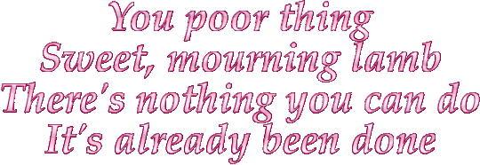
Ptolemaea - Ethel Cain
#Ptolemaea#ethel cain#ethel cain lyrics#gif warning#glitter text#pink#palatino linotype bold italic#lyrics#you poor thing sweet mourning lamb#fate#album: preacher’s daughter
589 notes
·
View notes
Note
So I saw the instrument ask and I hope this is cool to drop this question I’ve been puzzling over. If not just ignore this. I don’t have anyone else to theorize with.
I read a fic where all the au! Skeletons end up in the og world on the surface (classic scenario.) They use nicknames for each other but they have to register “legal” names with the government (for jobs and licenses etc.) Sans and Papyrus are already taken so they use other font names as for it. Ever since I’ve read it I can’t decide what names each would go by and I want your opinion.
There are only two I’ve decided on:
Swapfell Sans - Garamond
Underfell Papyrus - Roman (from times new Roman obvs)
But I’m going crazy trying to decide on any others and I seek your counsel.
I have a list of possible fonts but I don’t want to drop it on you because this ask is already kinda long but if you do want it I’ll send it. Sorry again for the text dump.
IT'S ABSOLUTELY ALRIGHT <333 I'd love to see if I can help out any :o!! (*grabby hands* GIMME LIST. I LOVE LISTS.)
What are your criteria and thoughts for picking fonts👀? Is it just Vibes or are there any specific reasons for the ones you've chosen so far :?
I really like Roman for UF!Papyrus... sharp, tight and snappy- full of straight lines and points... free of frills and loops but still stylish in it's own right! Also somewhat disliked in certain spaces PLUS it has the inherent correlation between the Romans [empire] and UF!Papyrus' role in the royal guard !
Tangentially related, I found an article by the NY Times (coincidence? I think not!! /lh /j) that's just all about Garamond (the font), and it's especially fun to read with the context of Swapfell!Sans
"And where some see elegance, others perceive fussiness. There’s a stereotype associated with the sort of person who loves Garamond: The Garamond Guy, if you will, is irritatingly uptight, so certain of his own profundity that his words must be conveyed with the weight of a 500-year-old French typeface."
Source
#i feel like ive probably read that same fic...#esp. if SF!Sans' brother was called Palatino lol#sorry i havent given any help yet im reclining on a fancy fainting couch and batting my eyelids at u because i love getting asks-#-except instead of looking cool and or sexy i just look a bit like a limp noodle draped over the cushions. what was i saying#i also went thru a crisis abt what legal names to give the skeletons a while back lol#i didnt go anywhere with it because it is relevant for 1 (one) scene and thats it so i just named sf!sans Sans Serif#purely because i think he was the first to get the paperwork done and classic sans' legal name is either-#- 'comic sans' or 'sans' (all lowercase)#velwy.txt#inbox#anon#do i need to make a tag for these lol#mindmortar
24 notes
·
View notes
Text

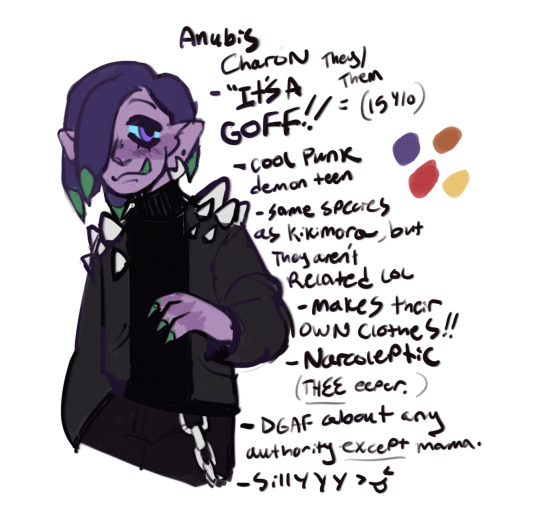
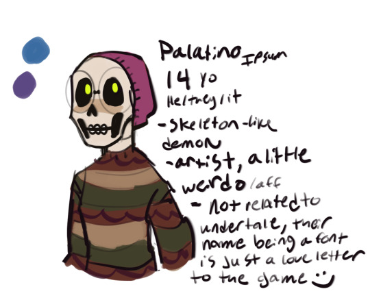

Behold… some Cool Teenz
wanna keep making characters for this lore-world that are just ocs, not fankids of characters we really know in the og show :] they are so sillay
#my art#the owl house#toh#toh nextgen#Isabelle McNamara#Anubis Charon#palatino ipsum#jewelia applerot
406 notes
·
View notes
Note
Hello I found ur site on neocities and I love it so much!!!!!!!!!!!!!!!! What font did u use for the text?? I cant find the font used for the sh item things
Thanks I'm glad you like it!! I really gotta update it more but I've been distracted with a lot of stuff lol
To answer your question though, I use Palatino Linotype (which I didn't have to download or anything, you can literally just go
font-family: "Palatino Linotype", Palatino, serif; (or even just the first bit I think)
and that works!)
I also used letter-spacing of 0.1em (although you can adjust that if you need, I kind of just try things til they work lol), since the font by default wasn't as spaced out as it looks in-game.
In most places I also use a text shadow that's offset equally in both ways
Also I know you didn't ask about this part, but the colours I used are:
white (for most text)
#303030 (text shadows)
#7c7c7c (grey text)
#B6B6F1 (text in about/updates/contact pages)
Hope that's helpful!
#for me?#rambles#I think I saw some post comparing Palatino to the subtitles in-game and they looked basically identical#and that's where I got the idea to try it#Not sure if it's actually the font they used#but it looks basically the same so it's good enough for me
4 notes
·
View notes
Video
youtube
Heinrich Isaac / Concerto Palatino, Alla battaglia I Vous ou la mort (Flemish Courtly Love Songs), 1996
7 notes
·
View notes
Text

#mcr#my queuemical romcom#flashing#glitter text#id in alt text#mcrphilly#my chemical romance#vampire#font; palatino
16 notes
·
View notes
Text
Plasma and Palatino robot forms!

12 notes
·
View notes
Photo
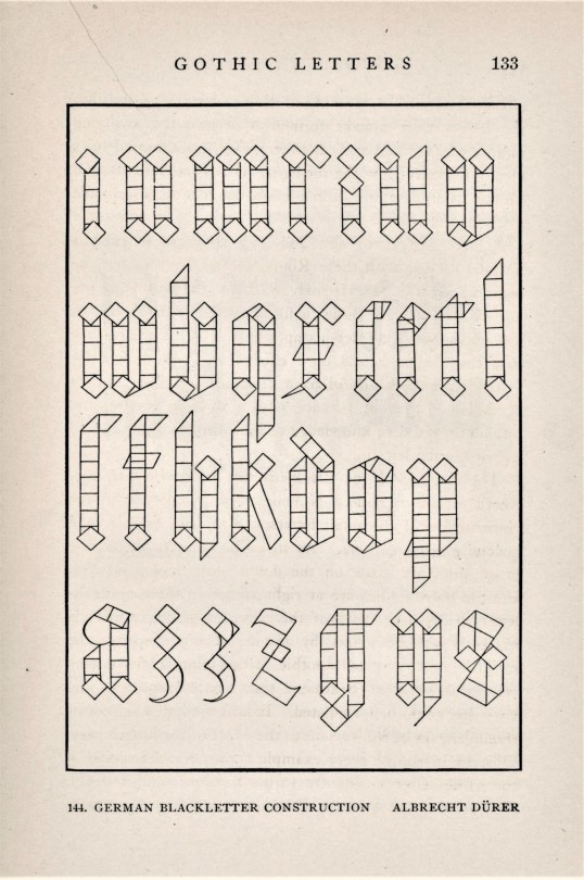

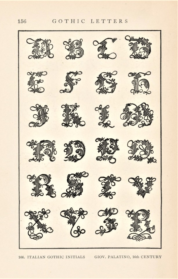
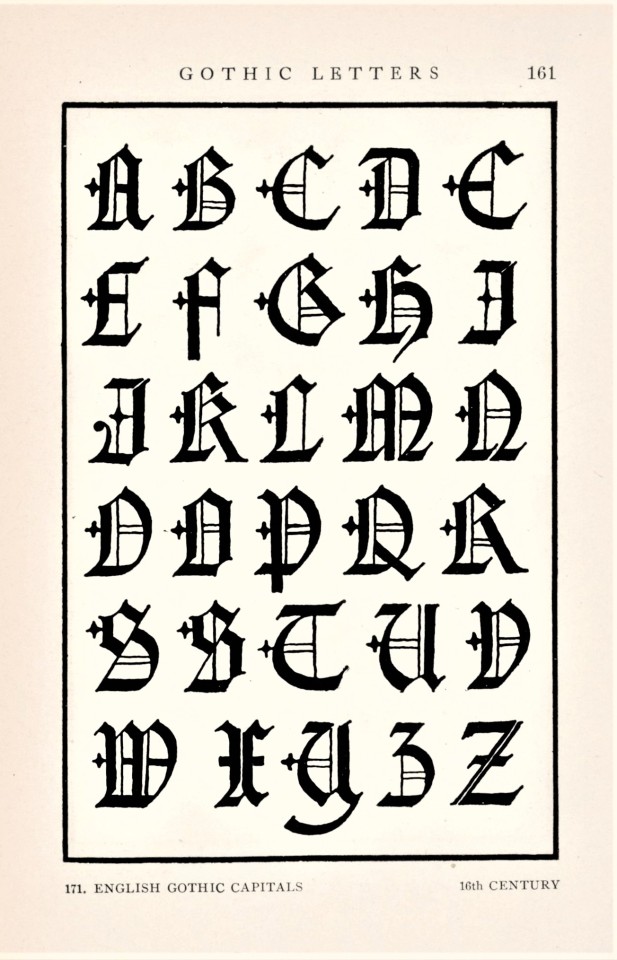
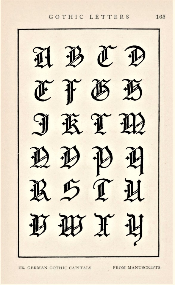

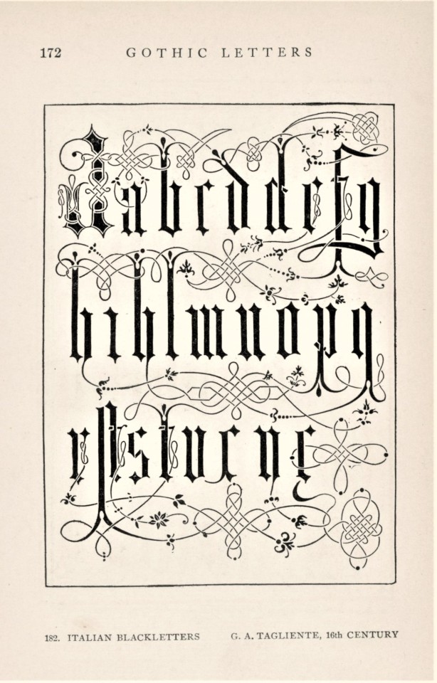
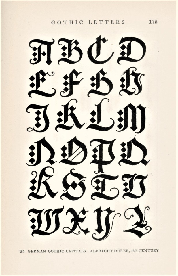

Typography Tuesday
This week we present a variety of Gothic letter forms from American architect Frank Chouteau Brown’s manual Letters & Lettering; A Treatise with 200 Examples, originally published in Boston by Bates & Guild in 1902. Our copy is a later printing published in 1914. The very first metal types were Gothic forms developed in Germany in the 15th century, and the Gothic remained the principal form to encode the German language until the early 1940s. Today, it is almost entirely used as a display face.
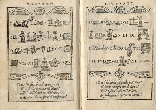
Shown here are designs devised by the German artist Albrecht Dürer (1471-1528), the Italian calligrapher and writing master Giovanni Antonio Tagliente (1468-1527), Italian calligrapher Giovanni Battista Palatino (c.1515 - c.1575), German calligrapher Paul Franck (fl.1600-1655), and one by Frank Chouteau Brown himself. Of the Gothic form, Brown writes:
Unlike Roman letters, which attained a complete and final development, Gothic letters never reached authoritative and definitive forms, any more than did Gothic architecture. Every individual Gothic letter has several quasi-authoritative shapes. . . . yet this very variability and variety constitute at once the peculiar beauty of Gothic and the great difficulty of so drawing it as to preserve its distinctive character.
Our copy of Letters & Lettering belonged to the English-American artist, graphic designer, and silk-screen printing pioneer Max Arthur Cohn, and was donated to us by his daughter Jane Waldbaum, professor emerita of Art History here at UWM.
View another post from Frank Chouteau Brown’s Letters & Lettering.
View more Typography Tuesday posts.
#Typography Tuesday#typetuesday#Frank Chouteau Brown#Letters & Lettering; A Treatise with 200 Examples#Albrecht Dürer#Giovanni Antonio Tagliente#Giovanni Battista Palatino#Paul Franck#Max Arthur Cohn#Jane Waldbaum#letters#lettering#type design#specimen books#specimens#20th century
222 notes
·
View notes
Last Seen Blogs

brawl-bucket
The Poles Of Art Are Good And Awesome

osakanadayo
題名未設定

sacrivoiced
* SACRIFICED / VOICE!

rake-rake
CURSED*

theresfirefly
A Little Dreamer