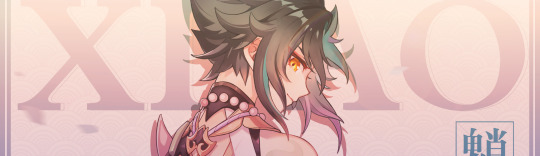
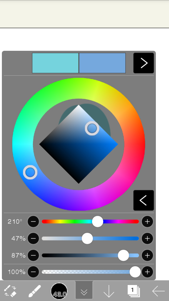
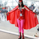
#messing around with my ibis paint app
Text
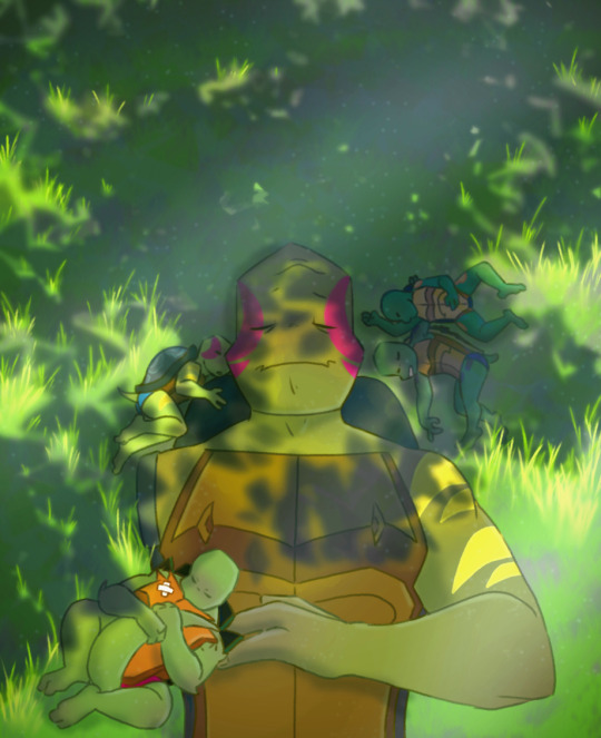
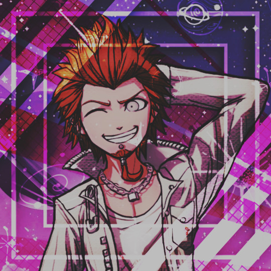
#rottmnt#rise of the teenage mutant ninja turtles#rottmnt donnie#rise of the tmnt#rottmnt leo#my art#rottmnt raph#rottmnt mikey#future leo#messing around with my ibis paint app#I don’t know how to background and colour#not yet#anyhow peaceful late spring afternoon#basking in the sun#turtle tots#peepaw leo
1K notes
·
View notes
Text
Free Apps/Assets that help me as an Indie Game Developer [Megapost]
Hi! I’m an indie gamedev who’s also in University, needless to say that I’m on a budget when it comes to my game creation. I’m making this post to organize my favourite free resources that helped me out.
Also, please note that I’m only commenting on the programs themselves, not the companies/individuals that run them.
For Pixel Art, I use/recommend Dotpict.It’s completely free, you can resize canvases and input custom sizes. It has the essential tools for pixel art creation, and is great to use on small screens with the default point-and-click system. It can also be used on larger touch screens with in “Pen mode”. It also supports animation! Alternatives include Pixquare and Resprite, which function similar to Aseprite for computer. (Resprite does have limited exports in the free version.)
I was recommended Notion by a fellow gamedev friend for organizing ideas/stories. It’s essentially a files-within-files organizer where you can make groups, add pages to the groups, and link other pages. I now use it for my concepts, and am really enjoying it so far.
My go-to for fonts is DaFont. The website allows you to sort and filter in order to only show 100% free fonts to use in your projects. I’ve been using this site for years, and from my experience each download was completely safe.
I’m an RPGMaker user, and rpgmakerweb is a great resource for finding free plugins. Yanfly is also one of the most popular picks for plugins as well. Galv and SRDude are amazing creators with some of the best plugins I've personally ever used.
Launchpad is a beat-mixer app with a literal labyrinth of samples. You can get a free trial to have access to all of them, and I’d recommend it for people looking to explore different genres for in—game music. It’s super fun to just mess around in. You can record and export as well.
FireAlpaca is my personal recommendation for a free digital art software for computer. I’ve used it in the past, and it’s truly a great free alternative to expensive art programs. Krita is also a great free option!
Cymatics is a great resource for free-to-use royalty-free samples/loops. I have a huge sound library thanks to them, and I haven’t paid a cent. Joining their email list also gets you more free packs & the occasional free giftcard.
YoutubeDL is a free and open-source program on Github that allows the safe (speaking on personal experience) download of Youtube videos, as well as audio format. I use this to download royalty-free samples/SFX that are posted on Youtube for anyone to use. You can also download a .exe from their website with the YTDL program directly in it (my personal choice).
Online-Convert is a free online file converter. I've personally relied on it to convert my music into OGG format, and I haven't had any problems with it so far. There are many other converters for lots of different needs and formats as well.
BFXR is a free downloadable program that is great for making digital sound effects for your games. I was actually recommend this program by my prof in first year. You can use all FX in any use for free!
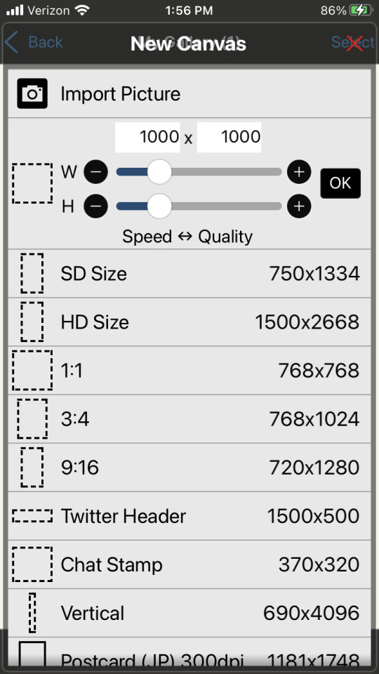
Ibis Paint X is a free drawing app for Apple devices/other mobile devices that support pen pressure. You can upgrade to the full version, but the free version has a lot of options.
Fortelling is great for planning out stories and worldbuilding. It’s optimized for writers to keep track of their projects. You can make timelines, add characters with customizable traits & avatars, create locations, specify items/languages/species, and a lot more. There is a premium subscription version, but I’m perfectly content with the features that come with the default.
Design Cuts is a website for lots of artistic resources, including Procreate brushes, graphic design assets, and more. They give out weekly freebies, as well as an extended commercial license included with every purchase. There’s frequent sales too, and you get so support independent artists.
Feel free to reblog/add your own favourite free resources to share with other devs/artists! I’ll update this post as needed.
Website / Discord Server / Patreon
#game development#game developers#gaming#indie dev#game dev#indie games#indie developer#indie game#indie rpg#pixel art#rpgmaker mv#rpgmaker#art#free apps#game dev blog#artists on tumblr#pixel sprite#indie gamedev#pixel game#artist resources#artist help
460 notes
·
View notes
Note
i wanted to ask, on your sketches / doodles what brush do you use and/or is there a way to recreate it?? it looks rlly cool!! it reminds me of those rainbow pencils where each line would be a diff color ^_^
I am using a custom brush on ibis paint!
It's my main line art brush but with a rainbowy tint added to it
I know that's not the best way to describe it since it's not useful for other apps but most of my brushes were created out of messing around with the settings without much thought put into it

16 notes
·
View notes
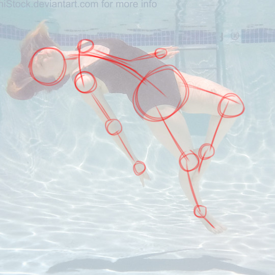
Photo

This art piece made me scream into the fucking void omfg, this was brutal. 77 layers and a lot of folders on Ibis Paint X. Hopefully I didn’t miss any mistakes cause I did when I showed this to Discord, and while I was posting this I almost forgot to unhide Ben’s pillow.
In one of the Ben 10 Discord’s I’m in, someone was like “Hey I’m working on a Ben 10 character mixtape and was tempted to add Brutal by Olivia Rodrigo for Ben just for these lines.” And I was like “Yo I’m tempted to draw that!” And here we are 4 days later. (In app time says like 16 hours and 18 minutes lmao.)
More details about the drawing under the cut cause, boy oh boy does Allie have a lot to talk about with this piece.
I used a lot of screenshots from the show as a reference in order to draw how I saw this in my head. The second one was actually a reference to Young Justice episode Misplaced where Billy saw Robin, Kid Flash, and Aqualad on the TVs from the store he was walking past.
“I feel like no one wants me” I was originally just going to do only Azmuth and Ben, but I wanted to do a three thing and I ended up going with Julie since their relationship in UA was rocky. (I also debated using Grandpa Max over her, but I couldn’t think of a time where Max was like that.) Also fun fact everytime I kept writing “feel” I did “fell” and took me so long to get it right. I was gonna go with a school background, but I couldn’t get it right so I went with what I did.
Y’all know how when your life is a mess everyone seems like a shadow to you and everything around you is fuzzy? That’s what I was going for there. Also the fact that people want Ben for his aliens, not himself.
“And I hate the way that I’m perceived” For the news report I did use the screenshot of that pose itself because I honestly couldn’t get it right when trying to freehanded it nor did I want to straight up trace it cause of how I had the TV screens. Figured there was no harm in using the screenshot itself for it. Just like “feel”, I had a tough time writing “perceived” correctly, I kept doing “pre-” over “per-”. Listen pretty sure I’m dyslexic so bare with me, English is hard.
“I only have two real friends” Despite the fact that Kevin and Gwen are in their Season 3 Alien Force outfits, this takes place in UA. I went with those outfits for that lyric simply because I wanted to lmao. (And I guess cause it makes more sense cause before Vilgax came back the trio was having a good time? It makes sense I swear.)
“And lately, I’m a nervous wreck” I was originally using a photo of Danny from Danny Phantom as a reference cause he’s been a nervous wreck in some episodes, and I couldn’t remember Ben ever being nervous like how I wanted to draw him to do a reference. But Danny just ended up being thrown out the window when that wasn’t working out, ended up doing what I did though.
I was originally gonna color the floor, but I was playing around with brushes on Ibis and that happened. I kept it cause it worked for what I was going for lol.
Also just a FYI, my DeviantArt is Kira Sema so that’s why my watermark in the panels say that over my actual name/username here. I’m trying to keep my newer artwork with a consistent watermark that leads somewhere if someone were to look up the name. (Despite the fact I’m still very backlogged on uploading old/current artwork to my DA.)
#Ben 10#ben 10 fanart#ben 10 uaf#ben 10 alien force#ben 10 ultimate alien#ben 10 art#ben tennyson#gwen tennyson#kevin levin#azmuth#julie yamamoto#brutal olivia rodrigo#lyric art#Fun fact I don't even have this song on my playlist yet I drew a whole goddamn art piece of it#Sad Ben hours#One of these days imma make an animatic cause I've had ideas for my own stuff lol
19 notes
·
View notes
Text
Welp. My picsart app has been blowing up and it doesn't look too good in terms of future edits for the time being. :(
#i've already tried the fixes#but it just dcrashes over and over again#been messing around with ibis paint and it kinda sucks?#very clunky and i miss the super simplicity picsart had#like a basic cloning button?#nope#here: try to use this super laggy 'clone pen'!#i feel like my tablet can barely handle the app#it might be time to start searching for a new tablet#twitter stopped working#reddit crashes pretty often#and now picsart#:(
0 notes
Note
i love ur colored panels so much and im considering taking it up myself 🧍🏻do u have any advice or anything :000
AUGH thank u sm🥺🥺🥺 I do all mine on ibis so like my advice might be dif than how it would be on other art programs but!
50% opacity on your shading layers (PLEASE separate the shading and base colors omg you will regret it if you don't) and use a blur tool also at 50 % (altho I do sometimes blur more or less depending, and same w layer opacity but that's normally what i do)
If you are struggling w a color palette, coolors.co will be ur best friend forever, it even has hex codes and stuff! I try and keep my color palette on the panel (altho I normally ajdjfj forget if I'm not doing one from this site but it's a godsend for blushing and stuff!)
If ur doing a chapter cover, go to the file page on the Jojo wiki and find the highest quality one! You can also like def do normal panels that way but I normally have multiple scans I check to get the best quality (I find the shonen jump app is normally the highest quality ones? Esp w smaller panels!)
Big big one (esp bc I struggle w shading), but having the official colors pulled up, it can help a lot, esp if you're staring at an area and have NO idea what the section is!
I uh? Overuse layers a lot (the foolymes one was like 50 layers before I merged) but I keep each color on a different layer so I can rly easily adjust it if I don't like it (I believe you can do this all on the same layer and select w medibang but this is what I do w ibis!) And then merge when I've finished literally everything
I normally just like use my default brush (in ibis it's Dip pen (hard)) to color and sometimes with shading I'll use a watercolor or pastel brush although I normally use the same brush for everything!
For like eyeshines and details that are painted black (ie the baseball threads on the foolymes one were black) you just add a layer on top of your panel and color over so if it messes up you can really really easily just erase it and it doesn't ruin progress!
Also for face shading I normally look at makeup contour guides! It helps to know where exactly everything goes!
Also def start w smaller panels! The chapter covers can get rly rly long and maybe a bit overwhelming so like finding a panel that's just like a face can make it a lot easier (at least from experience!)
Oh also w face shading I normally have it layered with the bottom layer being the shading, middle layer being highlight, and top being blush! I color pick from the base skin and adjust until it works right but it's also def some trial and error! I also like don't blend those layers until they're all down just to make sure I have stuff in the right place!
I don't have a like particular method to coloring overall other than I normally save the big areas for last so I can have a layer underneath and just hit it with a big brush and not have to worry about going around a million things! (I normally use the felt tip pen (hard) brush for this as it goes up to 1000 pixels!)
Shading legit is soooo important tho, like flat colors can def look good (and I do always pass my flats to a friend to make sure the colors work before I start shading, it helps to have a second pair of eyes esp when you've been working on SMTH for so long) but shading adds so much dimension and highlighting can be so so so good too! I think it just like depends on what you're going for but shading is so helpful in the long-run esp when i get the hang of it!
12 notes
·
View notes
Note
I have a quick question!
So i've been trying to learn how to draw digitally and I was wondering what apps you use to draw on?
I've seen Ibis paint and I've been using that but honestly I don't even know where to start! Would you happen to have any advice?
i use Ibis Paint X because it’s free!!
honestly, i’m not a really good example of professional digital drawing especially since i draw with a phone instead of a tablet but uh here’s some tips
- mess around with layer blending modes. until a few months ago, i only ever used normal blending and it was so painful. the multiply blending mode has saved my life. here’s an example

here the layers are set to normal

looks weird right? but then set to multiply…
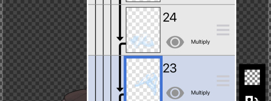
TADA!!!
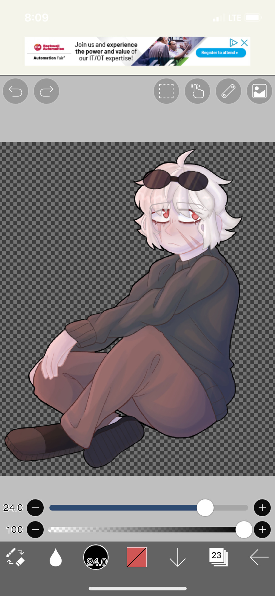
- if you’re starting from scratch learning how to draw, digital art is easily the fastest way to learn anatomy.
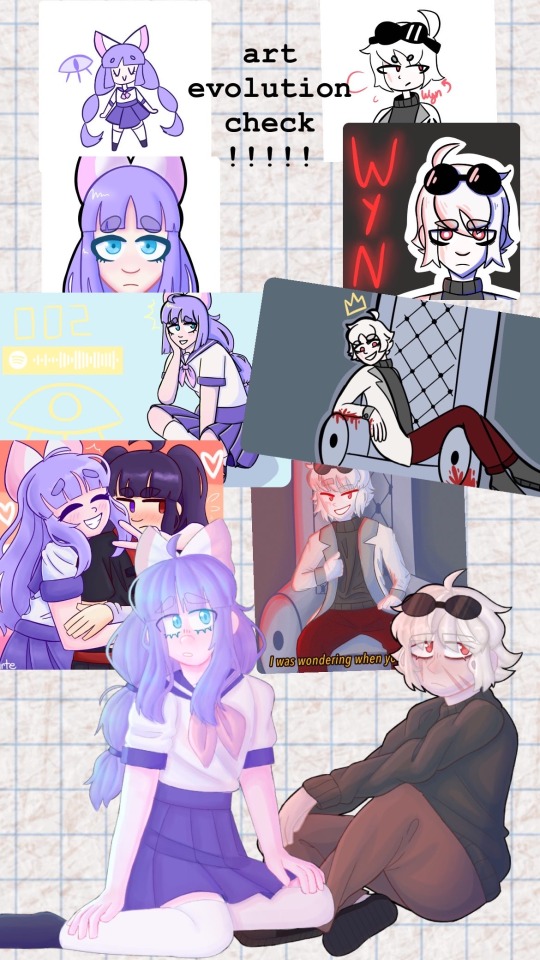
here’s the evolution of my art from sophomore to senior year. i’ve never taken actual art classes, so i’ve learned anatomy through break downs.
essentially, find stock photos online and breaking them down. (credits fo senshistock on deviantart for original photo)
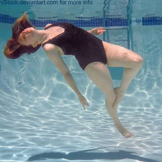

at first I would do this for every piece i drew (on the art evolution check it’d be the third piece down), then i just needed to do the red layer (4th down), and now i just normally need the spine, hips, and head position on complicated poses(5th down)
13 notes
·
View notes
Note
hi sumire! so i recently got into genshin writing myself because god, this game is addictive! plus your writing really gave me the push to try writing for genshin myself (rip other fandoms) but i was wondering how you made your gorgeous banners??
ohh a new writer in the making, hm??? i'd be excited to see your works soon <3
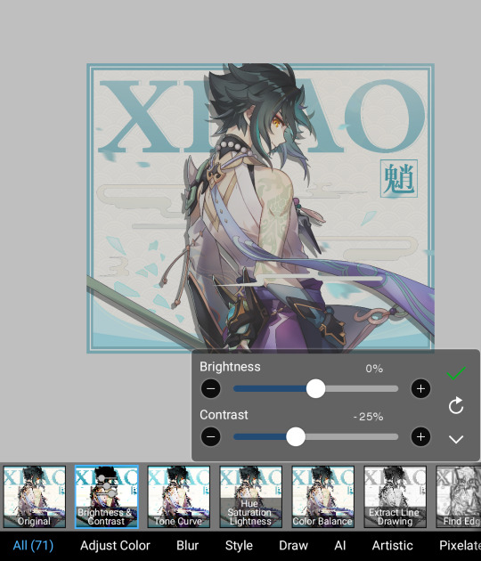
but haha my banners huh,,, you'd probably be underwhelmed :'D i don't know how to use photoshop (and idk how to edit anything in general) so i used the only app i have for art: ibis paint x,,, which is obviously not for editing photos,, anyway let's use this photo as an example lmao (i literally just messed around and tried to make the photo look decent)

import a photo of your choice and click on filters! this menu will show up (at this point, im already adjusting the contrast. these are my settings.)
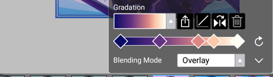
save it then swipe along the other options until you see this thing called “parallel gradation” and mess around with the colors until you're satisfied. you can also change the angle.

here are my settings btw (it's sunrise - bright). you can customize your own colors, but i stuck with an existing color palette.
and that's actually all i do lmao. it then turns out like this.

and if you crop out the places you think look too dark...
all finished!
#yes#very underwhelming isnt it#also may just change my banners back to however it was before#the ones i use rn are so Ugly#mail — !
63 notes
·
View notes
Note
CAN YOU DO A TUTORIAL ON HOW TO DO THE SCREENPRINTED EFFECT ON YOUR EDITS ILY
YEESSSSSSS
Just for clarification I edit by my phone, on ibis paint x, so this tutorial is for phone editing (but you can easily find similar effects and layer types on photoshop), also I'm linking some tutorials on photoshop that helped me a lot.

First let's start by texture in general!
I use a paper picture where the paper texture can be easily seen, you can find others searching for paper texture on google. I put the blend option on linear burn (sometimes two layers so it's more visible).
Then I add color grain in a separate layer on overlay (the value and intensity of the grain I change according to the picture).
And the last texture part is kinda complicated to explain. I use a certain dotted texture that the app makes and I change the blend mode according to which one looks better on the edit. Usually I go for overlay (100%) but hard mix (10 to 30%) looks better in some cases.
The second part is for blurrrr
As y'all may notice, when you print something it's never 100% straight lines, so I try to recreate the little blur.
I use the glass effect that the app offers in a small amount, like 2px, to mess the pixels around a bit and add gaussian blur, also a minimal amount so it doesn't look weird.
This effect combination really makes text look printed.
PHOTOSHOP TUTORIALS THAT MAKE A SIMILAR EFFECT: 1 , 2
MY TEXTURES

4 notes
·
View notes
Note
how you make that light effects in ibis paint x? or you use another app?
Nope, all Ibis! I tried to record twice, but the first died and the second was too big, so have screenshots instead. :,)
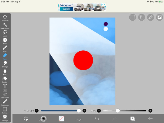
This is what the shading looks like without anything else. There are three layers; a glow layer, the sunbeam layer, and the purple shading (to contradict the green). I have formulated a tutorial of sorts below, and I hope any of this helps!
Here is the basic set up! I made a background that kinda resembles the bg I had on the original piece to kinda help out a bit. The red circle is the object sitting in the beam (i.e. Spinel), and the top layer is those two little dots. Those are the two colors I’m gonna be using (note neither are fully black or white!)

First, the sunbeam. I took my line tool and just made two lines and filled them in. You want to know where the lighting is coming from and slant accordingly, but that’s just a bonus step. Just make sure everything is straight.

Then, bring everything back so you can kinda see what you’re doing. Go to your eraser and select the airbrush. Then, after turning down the opacity, erase the bottom part of the beam and travel up, giving it a fading effect. I like to also run a couple strokes up and down to give that hard edge.
Optional next step: go to Gaussian Blur and blur the lines at the edges. I didn’t do that here, but I did on the poster!
Next, to cut out the sunbeam! It is not going to go through your object, so you’ll want to take straight lines again and just erase part of the beam. I don’t recommend blurring this part as where the edges of the light touch the object, it should be sharp, and picking to blur it the closer you get to the ground has always made it look weird in my experience. Maybe if you’re An Advanced Art Student you can try that? (I mean anyone can don’t let me stop you. This is just my personal experience.)

Next, that glow up in the corner! It’s literally just the airbrush! Make it as strong or as dim as you want, because we can adjust that stuff later! I like to put the glow on top of the object while the beam sits below them, but that is a personal choice that I find is easy to work with. Blends the character into the scene, while also not adding obnoxious visible erase markings on top. Again, personal preference! Do what you want and what feels right!
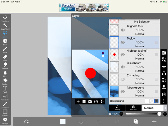

Okay, now turn down the opacity! By dimming the lighting, we can now see behind it better and it creates a softer texture. The dimmer it is, the less it will draw your eye, so find a good balance for the piece you’re working on. I like doing my shading/lighting last for this very reason.
Once you’re satisfied with that, it’s onto the shading. Rule of thumb: NEVER USE PURE BLACK. It can make your scene flat. Be sure to add in tones, even if they’re barely there! For this scene, I used purple, as it’s just the darkest natural color (in my eyes) and goes good with green/blue lighting. Play around with the colors until you like it. Then, most of the shading goes near the bottom of the pic, so as not to contrast the light up above, and goes around the sunbeam. I like to put it on the layer beneath. Add more where you think is necessary, and adjust the opacity!

And you’re done! Make any last-minute adjustments, fix the shadow in the beam, straighten beam lines, completely redo parts if you wanna- doesn’t matter. Mess with it until you’re satisfied, and then boom! You have a lovely beam of light cutting through the foliage!
These rules don’t always work, so do what you want to for the scene/piece you’re working with. If the light is coming from on-screen, the shading becomes more difficult to work with, but the lighting still follows the same basic rules. Feel free to use or ignore any of this.
Hope this helps!
#tutorial#lighting tutorial#drawing tutorial#ibis paint#dimond speaks#asks#answered asks#anon#long post#screenshots
57 notes
·
View notes
Text
How to have mismatched eye color in any picrew: a tutorial
*****
At the bottom I give a quick overview (but not a specific tutorial) of how you can also make various other things that are almost never available in picrews, some of these are harder than others: Other forms of Heterocromia, Inner eye ring colors, Custom scars, Custom skin tone variations (can make vitiligo, granted the picrew creator added enough skin variations), Custom hair color streaks
*****
Hate when you choose the perfect picrew, but your oc has some form of heterocromia and the picrew won’t let you show that?
Here’s a quick trick to fix it, with zero artistic talent required.
Everything we need is already in the picrew! We’re just going to use a simple layer trick to merge 2 of the same picrew
This will be user friendly for people who have no experience with digital art and will be done using a free mobile app. (Since most people don’t have computer drawing apps if they aren’t into digital art)
Needed: a picrew you like, a free digital art app (I’m going to use ibis paint X for this tutorial)
The link to the picrew I’ll be using for this. No orange eye color though, the one thing I needed lmao
Step 1:
Save two versions of the same picrew with differing eye colors in each as the only difference.
In my experience, the picrew stays built when you re-enter the link. So, just build it and save it as normal, then it will still be there and you can change the eye color before saving the second copy.
Your copies should look about like this: it’s important to keep the rest of picrew as a copy except for the eye color. The fewer differences, the easier it will be.
Step 2:
Ok, now the hardest part is over! Drawing apps can look scary if you’re not used to them, but it will be ok.
When we open IbisPaint X it will look like this:
You want to select ‘My gallery” and then hit the plus sign at the bottom left hand corner. You’ll then be given this menu:
Now this looks like a mess, butttt you’re just going to ignore it all and click import picture. You can then choose 1 of the picrew’s from your gallery. Don’t worry it doesn’t matter which you choose.
You will be prompted with this notification:
Cancel this. This will turn the work into lineart or something I’m not sure tbh. Not familiar with this app. But it will mess up our picrew. Accidentally did it? No problem! Just close the app and go back through the menu
Step 3:
So, now you have this:
We’re ready to overlap it with the other picrew we made!
I’m running out of the 10 photos per post, I’ll try to still give a visual for each step though. Hope it’s not confusing
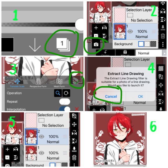
1- First we’re going to hit the ‘layers’ symbol at the bottom right
2- here we can see the layers, this app seems to automatically make a new layer for a new picture, so don’t worry about any of this! Select the add photo button and choose your picrew with the opposite eye color of the 1st
3- Dont mess with these settings, just push the green check! We don’t want to move the picture since we’re relying on them being directly on top of each other
4- cancel the lineart thing again
5- Now we have 2 layers, each with 1 version of your picrew
6- you can just tap above this menu to close it. It should appear as though our picrew has changed eye color.
Step 4:
Now for the fun part! We’re going to erase one of the eyes on this top layer to reveal the other color underneath!
1- We’re going to switch from pen to eraser using this button in the bottom left hand corner.
2- For the best precision, we’re going to want to zoom in towards the eye that isn’t supposed to be the current color (we can zoom in by placing two fingers on the canvas and pulling them apart. Idk what this is called. Reverse piniching?) The other thing we’re going to do is make the eraser smaller by sliding the top slider to the left.
3- Now we’re ready to erase! Carefully erase over the eye and it will change color. Be careful not the erase the other eye, or it will change color as well. If you make a mistake, the undo button is towards the top of the canvas
4- all done! Just gotta save it now. Push the button in the bottom right corner
5- When the menu comes up, you want to save as a normal PNG. Now it’s in your gallery!
Step 5:
Done!
It doesn’t look edited at all! Because it’s really not, we just combined two of the same art in different colors. No one would ever guess. It still has the same dimensions and everything!
*****
Other stuff you can do with this trick:
Although some of these take a lot more careful erasing, these shouldn’t require any actual drawing. You can use these basics to experiment with this stuff as well:
- A different colored ring around the middle of the eyes: put the middle color on the bottom layer and erase around the pupil carefully in a circle with a very small eraser brush size.
- eyes that are half colored, in a line down the middle (a form of heterocromia): layer order doesn’t matter, erase half of each eye carefully, depending on which color should be where.
- a color streak through the hair: this one will require careful erasing to look good. You’ll need a picrew where the hair is entirely the color of the streak, and a picrew with the surrounding hair color. Put the color streak layer on the bottom layer. Erase the top layer in the shape of the streak you want colored. You can place it anywhere. You can do this with faded hair tips as well, but how well that turns out will depend on the color difference the creator had between similar hair colors... in other words, if dark and light brown are closer together in color value, it will look more natural when you merge them. I would recommend putting the lighter hair color layer on the bottom. When you erase, you’ll be drawing where the highlights are, functionally the same as the color streak.
- you can make uneven skin tones or vitiligo if the creator has added enough skin tone variations to the picrew: to make vitiligo you’ll make a picrew with your lightest skin tone and a picrew with your darkest skin tone. You’ll put the lightest skin tone on the bottom layer. Then you’ll erase the top layer in the pattern where skin pigment has been lost. You’ll be able to control the pattern of color loss like this, and make any pattern you want! This layer order works best for putting light patches on darker skin. If you want to darken an area you’ll put the darker layer down first and erase the top layer with lighter skin into the pattern you want. Essentially: put light down first if you want to put a light pattern on dark skin. Put dark down first if you want to put a dark pattern on light skin
-custom scars if the creator has added enough skin tone variations to the picrew: this is the same idea as skin tone variations. This time though, we need a picrew with a pink tone skin color choice, a lighter one than the character’s skin tone can also work if you want silver scars. Make a picrew with normal skin tone for the character, and a picrew with the scar color. Put the scar color picrew down first, then add the normal tone one. Now when you erase it should make scars in any pattern you want!
If you’re having trouble erasing neatly, the answer is always to zoom in on the canvas and decrease the eraser brush size! Also you can undo and redo until it looks how you want!
That’s all I can think of right now! Hope everyone has fun making those OC’s that the picrews always seem to forget. And especially anyone who’s been left out themselves!
I have on anon asks if anyone has questions/problems using this tutorial! Or any questions about how to do something similar
Feel free to add other tips to this post as well!
*****
6 notes
·
View notes
Note
(Not a Request) how do you all make your edits look so good? I want to start my own edit blog sometime soon 😁
Ah thank you anon! I’d say, practice makes perfect! Most of the mods here (not all, I think) use Ibis Paint X and/or PicsArt, which are def good starter apps! I’d also rec finding your own style, make it special! If you have any more specific questions, feel free to ask and I’ll get to it! Good luck with your edit blog, by the way!
(I’ll save this to the drafts, just in case any other mods wanna add on!)
-Mod Lyn 📷
Also coming in!! Darling, editing takes lots of practice. But here are links to 2 tutorial posts I made on my other blog! I agree with everything lyn said, though these are here in case you want to learn some new tricks!!!-mod sonia💘
{☠️The Next Big Star!☠️}
Well anon lemme tell ya! See first I sold my soul and then I started f⚾️ckin around until I got what I like! Hope this helps! -Leon
{☠️The Next Big Star!☠️}
< good thing you censored that Mod Leon, a child could be roaming around here! Anyways~ just as Mod Lyn said. Ibispaint X is a good app, and picsart too. But i recommend Ibispaint since it has good effects there! Though you do gotta download some things.. to do the squares in icons you gotta click the 'FX' go to frame! And look for the name 'table count' and mess around with it! You can do experiments, experiment with brushes, filter and anything! Hoped Mod Monaca helped dear hiding Anon! >

> Mod Monaca <
I honestly just use ibispaint X for everyhing and use pinterest or google to find my overlays. I also use GIFshop for gif icons since I don't really know how to make my own.

🌸Mod Kirumi🌸
#📷 | Mod Lyn#📷 | Not A Request#☠️Mod Leon#☠️The Next Big Star!#🐱•adult talking!#🐱•hide in the mask!#🐱•geez modnaca!#🌸Mod Kirumi🌸#💘mod sonia💘#Q&A!
5 notes
·
View notes
Note
Hi! Are you able to tell me how you made the quote on this?
https://tsthearcher.tumblr.com/post/638850250643275777/there-is-happiness-insp
Sure!
Alright, keep in mind that for this edit, I used an app called ibis Paint X. From what I’ve seen on this app, it should be similar to Adobe Photoshop (if that’s what you’re using).
I started off with this basic background and the quote itself. For the quote, I used the font IM FELL DW Pica SC.


I then went into settings and clicked ‘select opacity’ for the text layer. From there, it selects the quote for you. Then, I added a new layer with a glitter image.

Since I had clicked ‘select opacity’ for the quote, that means that when the image was added- it looks like this (the left image). The image basically replaces where the quote was. From there, I went back to the layers and I changed the layer visibility off for the original text layer.

Now, I can move the layer with the glitter quote freely without the layer with the original quote getting in the way. From there, I used the lasso/selection tool to individually move each word.
After that, you can then mess around with the colors in that layer to make it look however you’d like. Here’s my end product!

I hope that this was what you were looking for and that it helped!
4 notes
·
View notes
Note
how do draw?
Oh geez what a broad question lol
It depends on what you want to know i guess! The advice i give you always depends on what you want to know since just straight up drawing is a whole mess of different tactics and styles.
My process is probably different than a lot of other people's, since i start all my art traditionally but always end it digitally lol
I guess I'll just tell you my process! Which may not help much with your question, but its a place to start i guess! (I'd take pictures while doing this but my sketchbook is downstairs and I'm stuck in a zoom meeting ;-;)
First i start with a sketch. If I'm having trouble with the pose, I'll draw a tiny figure in the corner of my page to help me get the basic form down. During the sketch, i start with the basic form and then begin sketching outfits and details, always starting with the torso and then ending with the hair and face!
Next i take a picture of the sketch and plug it into my art app i have on my phone- i use Ibis Paint for anyone who's wondering btw, its a great app for beginners and very user friendly and free too!!
Then I ink the sketch! Depending on the size of the drawing or the look I'm going for, my line thickness can change, but recently I've been pretty consistently using a line thickness of 5.0. For the hair i use a force fade of 40% on both the begining and end of the line too and for the laces on shoes and boots and for facial details i use a 4.0 thickness.
Next i do colors. I brush in a temp background color- usually like a simple light grey or brown- and then i just splash in colors in big blobs. I do this because in the past i would spend eons trying to select the entire area i wanted to color FIRST and the process added like an hour onto my art.
Then once all the the colors are in place and chosen, i crop it all down to fit the area i wanted colored. I also do my eyes durring this, and i actually do my eyes specifically different than i draw everything else- i choose a flat color, then i move the color selector in one direction or the other while also darkening or lightening the base color. Idk if that makes sense I'm just gonna show you a picture for this one-


And then i blend the colors together. The darker color is always on top while the lighter is always on the bottom.
After doing all the flat color i go back and color my lines! I do this by selecting a color just darker or lighter than the flat color of the part I'm working on- ex: if the shirt i had was a light blue, I'd make the lines around the shirt a slightly darker blue. Note: i don't do this for the face- the way that i draw eyes and faces makes doing this look odd. Instead what i do for eyes and faces, is where the face overlaps with the hair, I'll take an even darked color than the lines i used for the hair and make everything that overlaps that color, while the rest of the face is a soft greyscale or black.
After i color lines i go in with shading. First i decide whether or not i want cool or warm shading, then I pick one solid color and shade it all- i don't change the opacity of the colors i use to shade until the end though, and when i do change the opacity its always at 50%.
Along with shading, i do my highlights. Unlike with shading though, i hand pick the color of my highlights based on the color of what i am highlighting. If what I'm highlighting is a dark red, I'll pick a lighter red to highlight it with. I hardly use a hard white to highlight unless the base color is already light enough.
Then lastly, i do the background, sign the picture and add any other details i think are needed!
Anyway sorry if this wasn't what you were looking for, but if you come back asking a more specific question about how i draw I'd be more than happy to answer!!
3 notes
·
View notes
Text
Ok so several people have asked about this so I'll try my best to do a tutorial on how I make my emojis
I'm not good at tutorials, I kinda just learned this messing around with editing apps
Ok so the app I use is ibis paint, but I feel like this works with most programs

Firstly get your image. Make sure it's transparent. Load it into what ever app.

Get your flag, put it over the image and put it on clipping.
Make sure you also have a transparent of whatever you don't want to be covered by the flag and put it in the layer over the flag

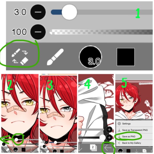
You then have your emoji. Make sure to save it as transparent
100 notes
·
View notes
Text

Thank you so much for your question @butter-cream-cat! I figured the best way to describe how I do my colorings would be with progress photos! See below the cut for a wordy explanation with pictures!
I use a free app on my ipad called IBIS Paint along with an Apple Pencil to do my colorings. I try to find a line art from Horikoshi’s twitter account, or a manga panel that I like. I clean up the line art and touch up some parts.
I then select a color palette that I want to use that fits the character and mood I want to portray. (I get a lot of my palettes from coolors.co, which is a website that has awesome palettes.) I then use the “felt tip pen (hard)” brush tool to lay the colors down. I do different layers for the different colors: for example I’ll do one layer for the hair, one for the skin, one for the shirt, and one for the bottoms. I decide where I want the light source to be and visualize where the light hits my subject. I use the “alpha lock” setting on the layer and I’ll pick a shading color and highlighting color and use the “airbrush” tool to create soft color differences. After this, I use the “alpha lock” setting again on my line art layer and I change the color of the lines from boring black to a more harmonious color. I pick this by using a darker color of the local colors around the area.


Next is the exciting part where it all starts to come together! I create a clipping group above a layer (for example the hair layer) and I use the “fade” brush tool to accent the layer with darker shadows and brighter highlights where the light is strongest. I repeat this for every other layer and add some final details in the eyes and hair, then…. TA-DA all finished!

I mess around with glowy effects and screening effects of particular layers, but that’s a whole other thing that I’m still learning about. I use a lot of color references such as this one to help me out.

Thank you again for your question @butter-cream-cat and I hope this is what you were expecting!
#bnhaedit#bnha manga coloring#answered asks#tumblr ate your ask so im glad I took a screenshot of it!#karakuda
27 notes
·
View notes
Last Seen Blogs

upnew
I'm boy

duxetesopic
Untitled
lavender-and-nightshade
Lavender & Nightshade
meat-pie-with-sauce
YELLOW &
BLACK
swede1952
Swede's Photographs