#lufthansa line
Text
No. 1 - Lufthansa
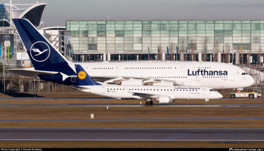
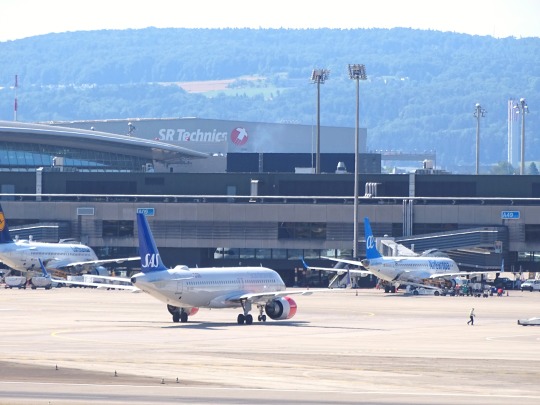
We begin with a large fish even by the standards of the large pond in which we operate. A very intentionally chosen large fish. Deutsche Lufthansa is Germany’s flag carrier and the second largest carrier in all of Europe by passenger volume. In 2018, they unveiled a new standard livery for their fleet of airplanes, and it...well. It’s this.
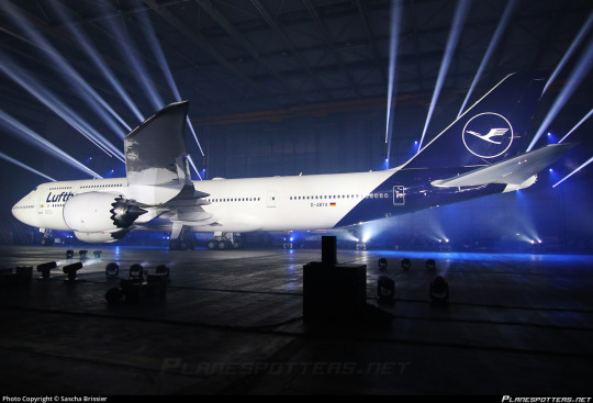
Even the presentation - good lord, is this an auto show?
My feelings on Lufthansa’s 2018 livery are visceral. There’s no mental evaluation required, no taking it in, thinking about the choices made - I look at the modern Lufthansa livery and immediately, profoundly know that I hate it. And that’s not just because of the specific choices made - which are bad - but because of the space they occupy amidst a creatively barren wasteland within livery design. This is going to be a very long post, which isn’t standard for this blog, but my goal for an introduction is to break down exactly the sort of design that made me feel the need to start doing this to begin with.
But in reality that’s only the beginning. Yes, Lufthansa’s livery is specifically disappointing, but it is so much more than that. It is the purest distillation of the greatest challenge aviation faces today, far weightier than scheduling issues, outdated IT, and runway incursions. It is not the worst example of it, not in the slightest, but it is a large airline which has a very textbook presentation of symptoms and thus feels like a great example to describe exactly what I hate about this sort of design. Let me explain.
Essentially, airlines have found a formula. It goes as such:
Almost entirely white body. (There is a name for this trend: Eurowhite.) In some cases, there may be a colour on the underside, generally either a light grey or whichever secondary shade the airline has committed to. In the case of this Lufthansa livery, it is just white.
Aside from the white body there will be either a single colour (generally some dark blue, or less often some sort of red) or a few colours, usually but not exclusively on flag carriers to match their national branding. (The proliferation of red, white, and blue flags out there means that a disproportionate number of airline liveries are these colours.) Unless it is literally just a white plane meant to be as generic as possible for short turn-overs when leasing, it will at least attempt to have some sort of design, but it will be minimal, and:
All of the detail will be on the tail. There may be coloured winglets or engine nacelles, but other than that it is only at the rear of the plane that you begin to see any interest. Usually this is just a logo, though it may be an abstract design which looks like a default tumblr header. It will often only be on the tail, with nothing at all on the body proper.
The name of the airline written in a sans-serif typeface which is set as default on at least one word processor. Rarely will anything creative be done with this. It will (usually, except in egregious cases) match the impotent attempt at graphic design which has been confined to the empennage and it will have all the charm of a large retail chain’s flyer describing the benefits you’ll definitely totally get if you work for them - sickeningly corporate. Low-cost airlines may slightly vary the theme by putting their website onto the livery, either towards the back or just instead of the airline’s name. The brave will also write it on the ventral fairing, but most don’t even bother with that simple act. Some airlines have their name written in the language spoken in the country they’re based in, usually beside the English text, but most are only in English despite operating in countries where this is not the most widely spoken language.
Not every livery which has these features is badly designed, as seemingly small changes can make all the difference. There is the occasional livery that fits most, if not all of these features that has some clever tweaks or design choices which makes me actually think it’s fine, acceptable, maybe even decent. (I have taken the initiative of making sure a few of these are among my early posts, just to demonstrate that it can be done). And some airlines depart from this entirely and come up with something even more hideous. Yet I somehow find myself respecting even these more than I do Lufthansa.
The Corporate Standard Livery Design (Lufthansesque design, if you will) is - and I do not think I am being dramatic at all here - an epidemic. Taxiing through most airports, you sometimes have to actually try to tell the planes parked around you apart in the sea of red, blue, and mostly white. And I spend a lot of time looking at planes.
These liveries do not only fail to inspire me. They instill in me a profound disgust. They are not trying to be good. They are trying to be what I described earlier - decent, not worth complaining about, because that’s cheaper and easier than designing something good. Graphic design is not anyone’s passion here. They’re just trying to toe the line. They’re so poisoned by the modern minimalist-design brain virus that they don’t realise that to be acceptable a livery this simple needs to do something interesting. There must be a creative decision made somewhere, a compelling feature, or you may as well be flying an MLA-formatted plane. In their striving for adequacy they become not just ambient, but lukewarm. They are a bottle of water which has sat in the sun for so long that when you drink it, even though you’re overheating and parched, it feels only negligibly better than the air you’ve been breathing in.
To be fair, I do not only hate the Lufthansa paintjob because it exemplifies whatever-ness. Even in an industry saturated with gross in-flight nothingburgers served with some stale biscuits and a paper cup of Lipton tea, Lufthansa manages to offend in specific and unique ways.
Throughout its long history Lufthansa has had a handful of different liveries, but from 2018 onwards this has been the situation. They’ve never been brilliant, but it’s only gotten worse over time. I normally would commit to a separate post for historical liveries, but in a move that I don’t foresee becoming particularly common I’d like to talk about the history and evolution of Lufthansa’s liveries from the golden age to now - the fall, if you will.

(image: lufthansa bildarchiv)
Their early liveries were already pretty much plain white or metal, but they still had a few features that made them seem a bit less like photocopy paper which was meant to be printed plain blue but only got through a tenth of the sheet before ink ran out. To begin with, they used a lighter blue and combined it with a vivid yellow to add some actual visual interest. The layering of the yellow over the blue where it curves around and below the nose and on the ends of the tailplane actually draws the eye. The font choice is nice and legible, spaced apart in the center of the fuselage. I imagine it was easy to read even from far away. (Shame it’s a bit blocked by the wings from some angles, though.)
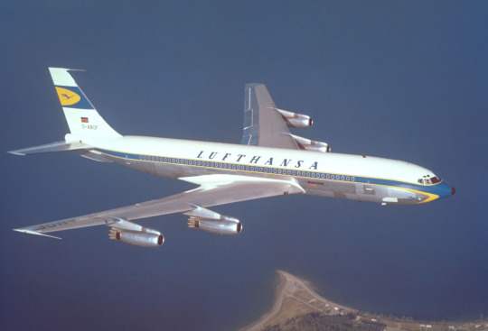
(image: lufthansa bildarchiv)
This early 707 design keeps the cheatlines extending past the nose but makes them sharper than the ones on the Connie to match the sleek profile of the jet. Back when this plane was painted adding white to your plane was a choice rather than the thing everybody was doing, which allows me to respect it for the choice it was instead of considering it the factory default. The bottom half, denoted by the cheatline, is left unpainted, which only adds to the sleekness of the overall profile, and the text is clear and plain but still aesthetically pleasing. The 707 is by modern standards pretty antique-looking; you can take one look at one and tell it isn’t particularly streamlined. This paint scheme, though, makes the plane look sharp and aerodynamic, despite not being revolutionary. I would go so far as to say I like this particular livery. This is, unfortunately, as good as it gets.

Oh. Oh no...
Let’s assess the damage here. The cheatlines now simply meet at the front without wrapping down to the belly of the plane and the nose is a simple black tip. I like it when airlines paint their planes’ radomes, and I wouldn’t mind it here if not for what it was replacing. The font has been replaced with a generic sans serif font which is closely spaced and put up into a corner, like the name on a homework assignment - it’s not really part of the total package, just there for administrative purposes. Most upsetting to me is the tail. While I wouldn’t say I love the little section on the old plane, it at least felt like it belonged there, creating a second blue-and-yellow layer above the white. Its placement on the fin above where it begins to taper gives the plane a bit of an aerodynamic feel. It’s certainly not changing the world, but it feels at home in the livery.
The new fin is a sharp downgrade. With nothing to mark the transition the fin abruptly goes from the white of the upper fuselage to a shiny blue which contains an enclave of the only yellow to be found on the entire aircraft. This makes the yellow stand out, as it has nothing to tie it in with the rest of the plane, and the fin itself feels almost like it’s been Frankensteined onto the fuselage from a different plane by a different airline. There’s nothing to mediate the transition from a block of white to a block of blue, like how the cheatline separates white and grey. It just is blue now, stop asking questions. This also means that the only part of the plane that the eye is really drawn to is...the tiny portion of the whole that is the fin, which may as well be floating detached in midair.
This is foreboding. Knowing what I know now, it feels like looking back at when a romantic partner began to act strange years later, after the divorce, as you walk by the house he bought with his mistress.
(image: g najberg)
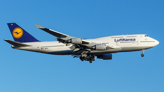
The most recent, and only, time I flew on Lufthansa was in 2014 and was aboard one of their 747-400s. (Actually, if you’d still like to fly on a passenger 747, Lufthansa is basically your only option.) At the time, they looked like this. This is...just sad. They got rid of the cheatlines, because that’s trendy now, and they painted the whole plane white and made an attempt at lip service to the old metal lower half by painting just a bit of the plane grey, like if a human stepped into a puddle of paint that only covered the very sole of their foot. And I’m being generous by showing a 747, a plane which inherently makes any livery look less boring by being interestingly shaped itself, instead of the classic slightly pointy single-decker tube. Not to mention the double-decker design makes the text vertically centered instead of the default Lufthansa look of awkwardly shoved nearly all the way up the fuselage.
In defense of the modern livery, it’s possible to argue it’s an improvement on this. Honestly, looking at them next to each other, it’s difficult to pick out which one I find less defensible.
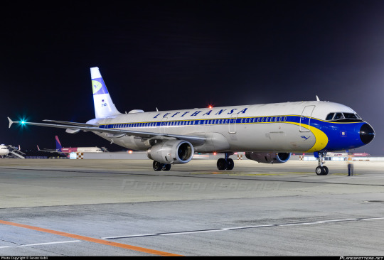
But then you see D-AIDV, an A321 painted in a heritage livery, and you feel the immediate, visceral “no!!! no go back!!!” as you remember that this is a false dichotomy and we could have something so much better if they weren’t peer-pressured into generic modern design.

And for what? For this?

(image: hvdfonts)
For the third time, I remind you of what we have been reduced to. We have achieved a state of reductio ad absurdum where this barely qualifies as a design. This plane is more or less a white blot. You can put as many insets as you want and it is still a white blot.
I am relatively sure that the font used is literally Helvetica. EDIT: I have been informed that it is not, in fact, Helvetica, but a custom typeface that happens to look almost exactly like Helvetica. This is, in my own opinion, worse! They did apparently use Helvetica in the past, though. Here is a very detailed description of the design process of the font, which manages to contain a grand total of zero ideas.
I would hate this on its own already, but it’s also so closely spaced and located so far up that it makes me feel like I’m suffocating. In my own experience as a dyslexic person, kerning is the single weightiest feature when it comes to if I can easily read something or not. While Helvetica, ugly though it may be, is generally considered a very legible font, any benefits from that are more than cancelled out by committing to making sure the entire name of the airline fits between the frontmost two doors with room to spare. It feels almost hostile.
Now, all given, I at least somewhat enjoy the shade of blue used for this livery, which is darker than the normal fare. I do miss the way the grey broke up the endless white space, though, and I mourn the yellow even more - in addition to being something to look at, losing it has also lost any visible reference to the flag of Germany, the country for which Lufthansa is the flag carrier. They don’t even have the black part of the German flag despite that being basically free. If they went for black instead of dark blue I would honestly respect this a hell of a lot more. One of the most recognizable flags in the world and instead your airline looks like a discount SAS.
Yeah, I said it. If we want to go even further with comparisons by including airlines that aren’t Lufthansa, this is basically the SAS livery. Except not, because the SAS livery does a lot that this doesn’t.
This is about Lufthansa, not SAS. I’ll look at SAS soon enough, because comparing their look to Lufthansa’s has made me appreciate it in a way I never used to. But I don’t think I need to elaborate too much for it to be clear why SAS’s livery works and Lufthansa’s doesn’t, despite the superficial similarities. SAS took their absolutely horrid previous livery and turned it into something which might not wow anyone but at least feels uniquely theirs, while Lufthansa had something which accomplished much the same and then diluted it into nothingness, Eurowhite writ large. Two washes and you’d wonder if your Lufthansa flight is actually a Smartlynx lease.
The way that the blue slices into the bottom of the fuselage and doesn’t fully cover the tailfin is...something? It’s a design element. It’s not nearly enough to save it, but it’s a design element. However, this presents another issue specific to Lufthansa’s paint job, best demonstrated with a specific plane:
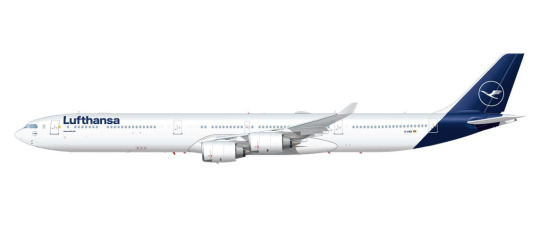
(image: lufthansa)
Lufthansa is the world’s largest operator of the Airbus A340, a somewhat eccentric airplane which is perhaps best thought of as a four-engined A330. I love this airplane, and am delighted seeing it overhead on my walk home from work, because Lufthansa is kind enough to operate a daily service with it to my home airport, but that’s beside the point. The point is this: what I have pictured is specifically the A340-600, which is the world’s second longest in-service airliner. Yes, longer than the A380 and the 747-400, and, in fact, only shorter than the 747-800. With a plane this long, the Lufthansa livery creates an incredible look of rear-heaviness. This plane looks like it should uncontrollably pitch up until it’s perpendicular to the ground every time it takes off. Of course this effect is less pronounced on shorter aircraft, but it’s still there, and I dislike it.

You can barely even tell there’s paint at all on a much smaller plane! And the white bit on the front of the rudder which looks okay on a conventional empennage looks downright horrible when it’s only on the very tip of the t-tail’s forward point.

Oh, and when you take the windows out for a freighter conversion it gets even worse.
This is a generic-brand airplane. It genuinely reminds me of generic branding. There is a specific brand that has this exact appearance and I can’t remember what it is but it’s right there and I’m fairly sure I’ve seen it at CVS. I don’t think that’s what you want to go for when designing an airline livery, especially for an airline representing a country, but if Lufthansa wasn’t going for that they’ve failed.
__________________________________________
Overall, Lufthansa’s livery is superbly boring and not terribly well thought out. It’s not worth this absolute dissertation on its own, but I’ve singled it out to complain about general trends, and for that I probably owe it an apology. Said apology is predicated on the fact that it is still a very underwhelming and bad design which could have used a lot more thought. There are a million ways this could have been made decent, and none of them were implemented because that would have taken effort and time and creative vision. I think this post actually required more time and effort than Lufthansa put into designing their planes.
That said, Lufthansa gets a final grade of D. It’s...bad, it definitely is. There’s the vague flavour of the start of something, like the very distant smell from a barbecue happening three blocks away, but is that really even a redeeming factor?
No. The second-largest airline in Europe should be able to do better. If I have to stare at rows upon rows of their planes any time I’m at a German airport, they should have the decency to make them interesting to look at.
#tarmac fashion week#region: europe#region: west/central europe#lufthansa#region: germany#grade: d#era: 2010s#era: 2020s#era: 1950s#era: 1960s#era: 1970s#era: 1980s#era: 1990s#era: 2000s#retired liveries#flag carriers#double sunrise#long haul#lufthansa group#lufthansa line#scandinavian airlines system#deltalike
183 notes
·
View notes
Text
So many people saying online check in isn't reliable but literally I have never had issues checking in online before which is why I'm stressing to high heaven lmao
#i always bitch about ryanair but y'know what? check-in is always reliable#easyjet? no issues#jet2? no issues#singapore airlines? no issues#virgin? no issues#british airways? no issues#ANA? no issues#lufthansa? had an issue printing a boarding pass at gardermoen but the actual online check-in was fine#flybe? worst fucking travel experience of my life so far and yet the online check-in was no problem#air china? ALL the issues :)#i fucking read the reviews with people talking about all the issues they had too and i was like ohh well it'll probs be fine#air china were the only flights left so not like i had much choice#ughh probs just gonna try and go to the airport stupid early#if no one's there to help i'll try online check-in again on my phone#if i'm still having issues i'll call them and at least by then their customer service line will be open#guess i'm getting what i paid for lmao this close to christmas booked 5 days in advance only £900#anyway thanks for your comforting messages i feel a little better knowing other people experience online check-in problems#christmas homecoming crisis
6 notes
·
View notes
Note
Dulles is a fine airport!
my issue Might be more with united airlines but the the amount of time i spent in hundreds-of-people-long customer service lines at dulles is like 12 hours and i simply do not want to go back to that place
#the chairs suck really bad#objectively i think clt is more hostile frankfurts security was astonishingly slow. hate heathrow#but i never really wanted to explode them with my mind. they didn't make me re-sign into the wifi every 30 min also#asks#wait also the long corridor where they play very loud music trying to get you to buy a credit card#which i had to pass like 8 times total trying to figure out how to talk to lufthansa. which actually involved#completely leaving the airport to stand in a different customer service line. which they they fucked up and held us prisoner in germany for#7 extra hours. but i digress
1 note
·
View note
Photo

All the speed... and quiet comfort, too!
#vintage illustration#vintage advertising#vintage travel#vintage aircraft#lockheed#lockheed super constellation#twa#trans world airlines#lufthansa#eastern air lines#lockheed aircraft corporation#kelly johnson
4 notes
·
View notes
Photo


The Star Alliance, the world's largest global airline alliance, was founded on 14 May 1997.
#United Airlines#787 Dreamliner#airplane#Swiss International Air Lines#Air Canada#Flughafen Zürich#Zurich#summer 2019#original photography#Austrian Airlines#Scandinavian Airlines#Lufthansa#Croatia Airlines#JFK Airport#John F. Kennedy International Airport#New York City#2018#travel#vacation#Star Alliance#founded#14 May 1997#25th anniversary#history#air travel#Schweiz#Switzerland#USA
1 note
·
View note
Text
BOYCOTTING FOR PALESTINE
The Official BDS Boycott Targets
The Updated List is Below:
EUROVISION. IT IS IN OUR TOP PRIORITY TO BOYCOTT EUROVISION
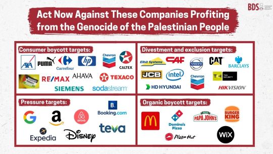
Consumer Boycotts - a complete boycott of these brands
Axa
Puma
Carrefour
HP
Cevron
Caltex
Israeli produce
Re/max
Ahava
Texaco
Siemens
Sodastream
Organic Boycott Targets - boycotts not initiated by BDS but still complete boycott of these brands
Macdonald's
Dominos
Papa Johns
Burger King
Pizza Hut
Wix
Divestments and exclusion - pressure governments, institutions, investment funds, city councils, etc. to exclude from procurement contracts and investments and to divest from these
Elbit Systems
CAF
Volvo
CAT
Barclays
JCB
intel
HD Hyundai
TKH Security
HikVision
Pressure - boycotts when reasonable alternatives exist, as well as lobbying, peaceful disruptions, and social media pressure.
Google
Amazon
AirBnb
Booking.Com
Expedia
Disney
Teva
Here are some companies that strongly support Israel (but are not Boycott targets). There is no ethical consumption under capitalism and boycotting is a political strategy - not a moral one. If you did try to boycott every supporter of Israel you would struggle to survive because every major company supports Israel (as a result of attempting to keep the US economy afloat), that being said, the ones that are being boycotted by masses and not already on the organic boycott list are coloured red.
5 Star Chocolate
7Days
7Up
Apple
Arsenal FC
ALDO
Arket
Axe
Accenture
Ariel
Adidas
ActionIQ
Aquafina
Amika
AccuWeather
Activia
Adobe
Aesop
Azrieli Group
American Eagle
Amway Corp
Axel Springer
American Airlines
American Express
Atlassian
AdeS
Aquarius
Ayataka
Audi
Barqs
Bain & Company
Bayer
Bank Leumi
Bank Hapoalim
BCG (Boston Consulting Group)
Biotherm
Bershka
Bloomberg
BMW
Boeing
Booz Allen Hamilton
Burberry
Bath & Body Works
Bosch
Bristol Myers Squibb
Capri Holdings
Costa
Carita Paris
CareTrust REIT
Caterpillar
Coach
Cappy
Caudalie
CeraVe
Check Point Software Technologies
Cerelac
Chanel
Chapman and Cutler
Channel
Cheerios
Cheetos
Chevron
Chips Ahoy!
Christina Aguilera
Citi Bank
Carrefour
Codral
Cosco
Canada Dry
Citi
Clal Insurance Enterprises
Clean & Clear
Clearblue
Clinique
Champion
Club Social
Coca Cola
Coffee Mate
Colgate
Comcast
Compass
Caesars
Conde Nast
Cooley LLP
Costco
Côte d’Or
Crest
CV Starr
CyberArk Software
Cytokinetics
Crayola
Cra Z Art
Daimler
Dr Pepper
Del Valle
Daim
Doctor Pepper
Dasani
Doritos
Daz
Dior
Dell
Deloitte
Delta Air Lines
Deutsche Bank
Deutsche Telekom
DHL Group
David Off
Disney
DLA Piper
Domestos
Domino’s
Douglas Elliman
Downy
Duane Morris LLP
Dreft Baby Detergent & Laundry Products
Dreyer’s Grand Ice Cream
eBay
Edelman
Eli Lilly
Evian
Empyrean
Ericsson
Endeavor
EPAM Systems
Estee Lauder
Elbit Systems
Expedia
EY
Forbes
Facebook
Fairlife
Fanta
First International Bank of Israel
Fiverr
Funyuns
Fuze
Fox News
Fritos
Fox Corp
Gatorade
Gamida Cell
GE
Glamglow
General Catalyst
General Motors
Georgia
Gold Peak
Genesys
Goldman Sachs
Grandma’s Cookies
Google
Garnier
Guess
Greenberg Traurig
Guerlain
Givenchy
H&M
Hadiklaim
Huggies
Hanes
HSBC
Head & Shoulders
Hersheys
Herbert Smith Freehills
Hewlett Packard
Hasbro
Hyundai
Henkel
Harel Insurance Investment & Financial Services
Hewlett Packard Enterprise
HubSpot
Huntsman Corp
IBM
Innocent
Insight Partners
Inditex Group
IT Cosmetics
Instacart
Intel
Intermedia
Interpublic Group
Instagram
ICL Group
Intuit
Jazwares
Jefferies
John Lewis
JP Morgan Chase
Jaguar
Johnson & Johnson
JPMorgan
Kenon Holdings
Kate Spade
Kirks’
Kinley Water
KKR
KFC
KKW Cosmetics
Kurkure
Keebler
Kolynos
Kaufland
Kevita
Knorr
KPMG
Lemonade
Lidl
Loblaws
Levi Strauss
Louis Vuitton
Life Water
Levi’s
Levi’s Strauss
LinkedIn
Land Rover
L’Oréal
Lego
Levissima
Live Nation Entertainment
Lufthansa
La Roche-Posay
Lipton
Major League Baseball
Manpower Group
Marriott
Marsh McLennan
Maison Francis Kurkdjian
Mastercard
Mattel
Minute Maid
Monster
Monki
Mainz FC
Mellow Yellow
Mountain Dew
Migdal Insurance
Marks & Spencer
Mirinda
McDermott Will & Emery
Motorola
McKinsey
Merck
Michael Kors
Mizrahi Tefahot Bank
Merck KGaA
Micheal Kors
Milkybar
Maybelline
Mount Franklin
Meta
MeUndies
Mattle
Microsoft
Munchies
Miranda
Morgan Lewis
Moroccanoil
Morgan Stanley
MRC
Nasdaq
Naughty Dog
Nivea
Next
NOS
Nabisco
Nutter Butter
No Frills
National Basketball Association
National Geographic
Nintendo
New Balance
Nutella
Newtons
NVIDIA
Netflix
Nescafe
Nestle
Nesquick
Nike
Nussbeisser
Oreo
Oral B
Old spice
Oysho
Omeprazole
Oceanspray
Opodo
P&G (Procter and Gamble)
Pampers
Pull & Bear
Pepsi
Pfizer
Popeyes
Parker Pens
Philadelphia Cream Cheese
Pizza Hut
Powerade
Purina
Phoenix Holdings
Propel
Ponds
Pure Leaf Green Tea
Power Action Wipes
PwC
Prada
Perry Ellis
Prada Eyewear
Pringles
Payoneer
Procter & Gamble
Purelife
Pureology
Quaker Oats
Reddit
Royal Bank of Canada
Ruffles
Revlon
Ralph Lauren
Ritz
Rolls Royce
Royal
S.Pellegrino
Sabra Hummus
Sabre
Sony
SAP
Simply
Smart Water
Sprite
Schwabe
Shell
Soda Stream
Siemens
StreamElements
Schweppes
Sunsilk
Signal
Skittles
Smart Food
Sobe
Smarties
Sephora
Sam’s Club
Superbus
Samsung
Sodastream
Sunkist
Scotiabank
Sour Patch Kids
Starbucks
Sadaf
Stride
Subway
Tang
Tate’s Bake Shop
The Body Shop
TEVA
Tesco
Twitch
The Ordinary
Tim Hortons
Tostitos
Timberland
Topo Chico
Tapestry
Tropicana
Tommy Hilfiger
Tommy Hilfiger Toiletries
Turbos
Tom Ford
Taco Bell
Triscuit
TUC
Twix
Tottenham Hotspurs
Twisties
Tripadvisor
Uber
Uber Eats
Urban Decay
Upfield
Unilever
Vicks
Victoria’s Secret
V8
Vaseline
Vitaminwater
Volkswagen
Volvo
Walmart
Wegmans
WhatsApp
Waitrose
Woolworths
Wheat Thins
Walkers
Warner Brothers
Warner Chilcot
Warner Music
Wells Fargo
Winston & Strawn
WingStreet
Wissotzky Tea
WWE
Wheel Washing Powder
Wrigley Company
YouTube
Yvel
Yum Brands
Ziyad
Zara
Zim Shipping
Ziff Davis
#free palestine#palestine#free gaza#israel#gaza#long post#from river to sea palestine will be free#palestinian lives matter#palestinian genocide#free free palestine#current events#fuck israel#anti zionisim#isntreal#defund israel#ceasefire#boycott israel#boycott divest sanction#boycott starbucks#boycott disney#boycott mcdonalds#boycotting#boycott divestment sanctions#my post#boycotts work
187 notes
·
View notes
Text
Which airlines have resumed flights to Israel?
"United Airlines announced on Wednesday last week that it will begin flights to Israel again from March, becoming the first United States carrier to resume flights after suspensions at the start of the war.
United plans initial flights to Tel Aviv from New York and New Jersey in the US on March 2 and 4, with a goal of having daily non-stop service restored from March 6. The carrier said in a news release that it had undertaken a detailed safety analysis before making this decision.
British Airways, which used to operate two flights between the United Kingdom and Israel daily, will resume operations on April 1, operating one flight daily for four days a week.
German airline Lufthansa, Switzerland’s flag carrier Swiss and Austrian flag carrier Austrian Airlines resumed flights to Tel Aviv on January 8. Meanwhile, Spanish airline Air Europa resumed flights to Tel Aviv on February 19. The Greek and French flag carriers, Aegean and Air France, both restarted flights to Tel Aviv in January.
Italy’s ITA Airways will resume flights between Tel Aviv and Rome from March 1, starting with three return trips weekly.
Brussels Airlines, the Belgian carrier, also announced on Wednesday last week that it will resume flights from March 24, with three flights per week from Brussels to Tel Aviv.
The Israel Airports Authority (IAA) also announced that the US-based Delta Air Lines will resume flights to Israel in May. Delta has not officially confirmed this yet, but the last update from the carrier said that flights will be suspended between New York and Israel until April 30."
Which airlines do not plan to resume flights to Israel any time soon?
"American Airlines has halted flights until October 28. Emirates, Turkish Airlines and Pegasus Airlines have also suspended flights to Israel until further notice.
TAP Air Portugal has suspended flights to and from Tel Aviv indefinitely, while Finland’s flag carrier, Finnair, announced it had cancelled its flights to Tel Aviv until October 29. Icelandair has cancelled flights to Tel Aviv, without any further update on its website.
Bulgaria Air cancelled all flights to and from Tel Aviv, also without providing details about a timeline to restart operations."
Which airlines have continued to fly to Israel throughout the war?
"In December, when only seven carriers were flying to Israel, around 80 percent of passengers were carried by Israel’s national carrier, El Al, followed by smaller Israeli carrier Israir at 10 percent and FlyDubai at 3.2 percent.
With almost all airlines suspending and cancelling flights after October 7, El Al saw a 32.5 percent rise in passenger numbers to 5.5 million for 2023 at Ben Gurion airport, which has continued to operate throughout the war."
43 notes
·
View notes
Text
Not what I usually post, but I need people to see this insanely intimate moment I had with two complete strangers at the airport the other day. This was typed out in my notes app on the bus ride from the airport so I’d get every fresh little detail from my memory.
“Sitting on a Lufthansa flight, eight hours from Frankfurt to Boston. We’re a half hour ahead of time, sitting on the runway awaiting an open gate. I hear a clang, and under my seat rolls a metal water bottle. I reach under and pass it back to the kid who dropped it. They wear a soft jean jacket with a shirt underneath reading something along the lines of “I’m really a moth and this is my human costume”.
“Here you go, bud.” I say.
They thank me.
Five, ten minutes later and everybody is getting up to be deplaned. I hear behind me the same kid talking to their mom. “There’s a type of jellyfish that can live forever. If something doesn’t eat it. They go back to an earlier stage of their life…”
I turn back and pull lobsters into the conversation. They tell me they went to an away science camp where they learned about marine biology.
“I’m Moth” they draw out the “th” sound.
I repeat it back: “Moth?? That’s such a cool name dude!”
The mom jumps in. “They named themself that!”
“What’s your name?” Moth asks me.
“Sam. My pronouns are he/him, what are yours?”
“They/them!”
“That’s so cool! I’m trans too!”
The mom again: “They have older siblings, so they’ve had a lot more time to think about these things than most other nine year olds.”
There’s a pause in the conversation here, and I can feel my emotions bending. “You know you’re the luckiest kid ever, right?”
“I am?”
“Mhm..” I’ve started to get shakey now. I look away and bring my arm to my face, trying to control my emotions. The mom looks at me, and waits a moment before saying, “y’know, I give out mom hugs to anyone who needs it.” She opens her arms and I lean into the embrace.
When it’s over I find myself saying “You’re the coolest person I know. I hope you have a great life!” to Moth as I leave. I wave behind me as I get off the plane.
“Me too!”
I wait on the edge of the group as the rest of the cadets trickle off of the plane and condense beside me. I see Moth and their mom walk by, and I catch the mom’s eye. We smile at each other. Moth doesn’t see me.
They came back. To find me. And Moth asks for a hug. (Or, more accurately, if they can hug 𝘮𝘦.)
“Of course!” I bend down. We’re at an awkward height, and I shift to see if I should kneel or remain. By the end I’m kneeling.
We hug more times than I remember. Eight, nine, ten times? I don’t rightfully know. Each hug they get more emotional, and I see tears well up in their brown eyes.
The mother says “sorry, I’m sorry, I didn’t know they’d start crying like this.” I tell her it’s fine, it’s okay.
Their straight, brown, a bit longer than shoulder length hair is messed up, and the mom is behind them, smoothing it behind their ear. So am I.
“It’s gonna be okay.” The mom says to them.
I tell them that they’re the coolest person I know. We hug, and each time we pull away, we hold each other’s arms, or grasp each others hands.
“Sorry about this. With the jet lag and stuff they start acting like a drunk person!”
Moth laughs through their tears, and I laugh with them.
“Sam’s gotta go with his group now,” the mother says. So I do.
The last time I saw Moth was about a half hour after our first interaction on the plane. I’m walking with my group to get my passport stamped. Moth is alone now, waiting for their mom outside a bathroom. I hug them one last time as I walk by, and file down through the seatbelt barrier maze.
I wave, and Moth smiles back.
And that’s it. That’s my whole story. As much as they’ll ever know of it, at least.”
#how do i even tag this#transgender#trans#nonbinary#transmasc#idk man#i cried writing this#and reading it through before posting#I’ve told about three people up till now#writing#(?) i guess#I’m a mess dude
17 notes
·
View notes
Text
To recap the last two days
4th of December. We know there's some problems with snow in Munich but our travel agency told us it's fine and that the worst that can happen is the entire flight being rerouted to a different city in Germany. We have a 2h taxi transfer to the airport and arrive at 11am. We check in and are told the connecting flight from Munich to Hannover was cancelled but that we can get a later flight the same day. It would be a 6h hour layover but it would be fine. We go through security. The timetable says something like "gate info in 217 mins" and I'm like surely that's a typo. We figure out the scheduled gate where someone tells us the Lufthansa website says the flight is delayed by 20 mins. We check the airport website and it says it's delayed by 3h. There's absolutely no one at the gate. A couple minutes later I refresh the page and the flight status is changed to cancelled. At the same time I get an email with a job rejection. Still no one at the gate. 20 minutes later someone confirms the cancellation and we all have to check out and go through security again and leave the airport then get told to simply call or email the airline and we all have a budget of 150€ for one day per person for a taxi and hotel and food. Which we all have to sort out ourselves. Lufthansa cannot be reached by phone, mail or chat bot because they're completely swamped with complaints. Our travel agency doesn't even know our flight is cancelled. We wait for almost 3h for our travel agency to find a new flight for us - which they couldn't book remotely - and we're told that a hotel is still our responsibility. We're told to find a Lufthansa office which doesn't exist and only by chance figure out where to go. We go inside the airport again at 4pm and physically stand in a queue until 9pm without food or water or the possibility to sit down - even though my mum has a mobility issue - until we can reschedule our flight. There's two people sharing one computer handling every single case. Two people were allowed to cut in line but I was told off for asking a question. Some people had to accept 4am flights through Serbia and one couple was told the only option was to fly to Greece and from there to Munich even though the company was aware the flight would be cancelled again and they'd just get stuck in a second country. We book a hotel afterwards and arrive there at 10pm. We order food online since their kitchen is already closed.
5th of December. We get up at 4am and are back at the airport at 6am. We're wearing the same clothes since we only packed for a week and have no clean shirts or underwear or anything. We drink a bad coffee, buy a croissant and board an airplane to London at 8:35am with half an hour delay. I have a middle seat. The business class is half empty with several people taking a whole row to stretch out and sleep while we know there's still other people stuck in Cyprus who were told this flight was full. The flight is 5h long. My mum has a high risk of thrombosis and no access to medication. We get a single bottle of water and a flapjack. At some point I try to go to the bathroom and am told to quickly go back to my seat and fasten my seat belt because we're about to experience heavy turbulence. A stewardess walks through the aisles saying the same. I panic. Absolutely nothing happens. Zero turbulence. By the time we're allowed to stand up again there's 6 people in the bathroom queue before me and I'm told I'm not allowed to stand in the aisle and have to wait at my seat. By the time I sit down other people have already joined the queue again. At some point the purser in the business class takes pity on me and I'm allowed to use the business class bathroom. We fly two time zones West and arrive at 11am (mentally 1pm) starving and with aching legs. We have to go through security again and have to throw away our water. My mum gets randomly selected for a security check. The airport is busier than I've ever seen it and I've been at Heathrow multiple times each year when I studied in England. People are inconsiderate and even aggressive. We eat a sandwich and try to buy some painkillers. Our layover is another 5h. An hour before our flight I suddenly get a panic attack that gives me muscle spasms and I just about manage to board the plane. By the time we board I have to pee really badly because I downed an entire bottle of coconut water to get my blood circulation back up after the panic attack. We have a half hour delay because there's unfinished paperwork. Another middle seat. I get up to go to the bathroom as soon as we reached cruising height and use the bathroom at the front of the airplane because they didn't close the business class curtains and I know they sometimes don't bother on this short flight. When I come back the curtains are drawn and I'm told off for crossing the curtains. We land at just after 7pm German time because of the delay in the third time zone of the day. We arrive home at 8pm.
9 notes
·
View notes
Text
This is probably the longest interview I've ever read.
"Why do you have to be happy all the time?"
Photo: Peter Rigaud/laif
Oscar winner Christoph Waltz in a long interview - about gold and dirt in Hollywood, careful filming, his role as a management consultant in "The Consultant", and the question of what Lufthansa did with his new Rimowa suitcase.
Interview by Alexander Gorkov
February 24, 2023
A long afternoon with coffee, cognac and cake. Christoph Waltz, visiting Berlin from Los Angeles, is always excited and attentive – he pauses between sentences and then always continues to formulate it ready for publication.
SZ : Management consultant Regus Patoff ostentatiously smells the young people who will report to him in the series “The Consultant” upon his arrival. He cuts his fingernails and nose hair in the office, he calls his people at three in the morning, monitors them...
Christoph Waltz: The fact that the young employees line up and I memorize their respective smells is a scene that immediately made sense to me when reading the pilot episode.
SZ: Which made reading fun?
CW: That's the thing about joy. Some things are fun, which then turn out to be rubbish. No, obvious, in the sense of light rising. Incidentally, at first I only knew the script for the pilot episode.
SZ: The books for the eight episodes weren't ready when it started?
CW: No, just the pilot. Then, after the whole production was okay, Tony Basgallop sat down and continued writing. Always in increments of two episodes. So when we were filming episode three, we didn't know what episode six was going to be like.
SZ: What about the Writers' Room, 20 authors, you imagine that would be more complex for a US production with an Oscar winner?
CW: That's already there. But that was not the case with the “Consultant”.
SZ: How much of it was created while shooting, i.e. spontaneously, also with regard to the character Regus Pattof?
CW: I can't say any more. Afterwards it might not matter anyway.
SZ: Jennifer Coolidge recently said she worked with the crew to develop this somnambulist of her character in "White Lotus" while we were shooting. Could these be signals that a certain desire for spontaneity and creativity is returning after rather bleak years in films and series?
CW: It would be nice anyway. Maybe word would slowly get around again that the fixation on algorithms and pie charts, i.e. on this alleged readability of the swarm behavior of viewers, does not tell any stories that could be worth experiencing for the viewer. So if there were no swarm at all. That filmed stories should be produced by film companies, not tech companies. With the unavoidable risks and side effects that always have an effect anyway.
SZ: The character of Regus Patoff, as diabolical as it is, is sometimes reminiscent of the characters of great comedians of yesteryear, whom one could, so to speak, watch while thinking...
CW: Thanks... Is the comparison possibly a bit bold?
SZ: There is a scene in "Sons of the Desert" in which Stan Laurel bites into an apple which he steals from what appears to be a fruit bowl - but it is not a real apple, but a decorative apple made of wax. And he thinks, and you can see it: Oops. So without making a grimace.
CW: Well...he doesn't think, "Oops!" He draws the viewer into his complication of recognition. He doesn't demonstrate clumsily how B follows A because that's what the script says. Rather, he involves himself and the viewer in an extremely complex process.
SZ: Namely?
CW: He bites into what he must think is a real apple because it looks like a real apple. Any normal prankster would now make a number out of the sudden recognition - spit out, suffocate, disgust, whatever the repertoire has to offer. But Stan Laurel sticks to the process: put to use as a real apple, the assumed reality now intensifies. He keeps chewing!
He calmly bites off more pieces, chews, swallows.
Under explainable difficulties. Which he still wonders about.Especially since he always secretly takes the apple from the fruit plate and puts it down again after biting into it. He doesn't want to get caught. And so he gets more and more involved and can't find out anymore. He has to eat the wax apple whether he wants to or not, even though the truth seems to be dawning on him.
SZ: You go nuts while watching...
CW: It's awesome. And to play that, this knowledge behind the lack of understanding - that requires very deep understanding, very deep knowledge. An insane intelligence too. But we're not just talking about a comedian here.
SZ: Rather?
CW: Genius...? Can one know?
SZ: Are we talking about the funniest two minutes in movie history?
CW: What would then be the second funniest and the least fun? I definitely want to avoid ranking, especially with a phenomenon like Stan Laurel. This perpetual ranking...blunt quantification. We thereby lose the ability to discuss the qualities.
SZ: Basically?
CW: Basically, of course. It takes constant attention, practice, and refinement, and it's tedious and tedious at times... I don't give a damn what rhetorical platitude any self-proclaimed expert can squeeze onto the internet about whatever.
SZ: But back to the faint hope of spontaneity and creativity...
CW: All I can say is that filming The Consultant was, of course, also an industrial process as a whole, which, however, miraculously relied largely on the non-industrial contribution of the individual. In this respect, this shooting differed significantly from what the series is about. Talented adults of different ages make their constructive contribution to the whole to the best of their knowledge and ability. It doesn't get much better than that... It's very different than, for example, checking in a suitcase at Lufthansa with childlike trust!
SZ: With the result?
CW: That I'll never see him again. And at Lufthansa, trying to get your suitcase back is a completely depersonalized and utterly industrial process.
SZ: Happens?
Happens.
SZ: Los Angeles – Frankfurt?
CW: Not at all! Munich – Berlin. I checked in the suitcase on December 16, 2022 – in the meantime, in the literal sense, in the box. I never saw the suitcase again. Not until today. A brand new Rimowa with nice things you've come to love inside.
SZ: How is the complaint made?
CW: Industrial. According to quantifiable measures. There has been a Property Irregularity Report, reference number BER-LH-33385, for more than two months. The Rimowa was originally supposed to be delivered to Berlin from Munich on December 30, 2022 with flight LH1934. I know all the numbers by heart. Some of the advisers at Lufthansa's complaints center also look familiar to me.
SZ: At least there's that.
CW: Yes, they are all very friendly, I have to say. They chat very understandingly, are diligent, give advice, and so one slips unnoticed into a labyrinth. You mutate into a process.
SZ: After all, one is a process. Isn't that a form of recognition?
CW: But on the contrary! You are fed into a digital metabolism and digested by the algorithm. The metabolic consequences do not deserve credit.
SZ: It is reminiscent of Kafka's trial. This is also possibly because the suitcase hasn't turned up again for two months.
CW: One is isolated, waiting, wandering around, lost in a digital labyrinth. For weeks, for months you think: where is my suitcase? I checked it in at a modern German airport with a leading airline on December 16th, 2022 to be returned to me at another modern German airport about an hour and a half later the same day.
SZ: With the result?
CW: Why result? It wasn't any of the two. Neither modern nor handed over.
SZ: Part of the fascination here is certainly that you ask yourself: What could be the reason for the apparently complete disappearance of the suitcase?
CW: For example, someone from Lufthansa recently told me that the weather was bad on December 16th. In the winter? In Munich? Snow and ice? For real?! That's why the train that my wife and I had originally booked was already cancelled... So did the suitcase fall out of the plane? It's a kind of conjecture industry, depending on which of the always friendly people at Lufthansa I'm talking to. Everyone suspects something different.
SZ: It may have been stolen.
CW: Even very likely - after all, a very personal and analogous twist of the story. Or it just got lost. Also analogue. If it were a medical emergency, I would have been dead weeks ago.
SZ: How about appearing as a sadist to Lufthansa and becoming unpleasant?
CW: I've thought about it. But nobody cares anyway. Because the friendly Lufthansa people are the biological extensions of the algorithm. It's definitely in the contract of employment.
SZ: Is Regus Patoff a sadist in The Consultant?
CW: I see it more as an attempt at correction. Or an excommunicated Archangel. A Knight of the Grail. He also does a job.
SZ: Which?
CW: He appears in the gaming company "CompWare" and confronts the young programmers with the ruthlessness of his methods with, how to put it...
SZ: ... oneself?
CW: Yourself and each other, yes. You then ask yourself a few essential questions: Am I still capable of making qualitative distinctions or only quantitative ones? So am I doing things for their quality or for their usability? By fixating on the short-term, quantitative usability of my work, am I anticipating obedience, an obedience that no political dictatorship forces me to? Do I still use my brain, which was made for the most complex tasks, or will I become a kind of task-specific artificial intelligence and will therefore soon be replaced by one? So in the end do I subordinate everything to this one and supposedly essential condition – usability, short-term economization?
SZ: A series about conformity?
CW: A hopefully entertaining series about conformity. Our business is entertainment. And yes: about conformity and what it takes to question it.
SZ: What does it take, courage?
CW: Courage is a jargon word. Everyone has courage - or thinks they have it, no? Even the heavily subsidized think they have guts. I can't really hear the talk of courage anymore.
SZ: So what does it require?
CW: Rather, does it require... effort, effort? It requires a brain, an on-going one. Our brain can distinguish between quality and quantity, it doesn't take any courage to do that. The brain can do it just like that - if it is reasonably well fed.
SZ: On the other hand, when since 1968 were some young people noticeably less conform than they are today? They demonstrate for climate protection, are language-sensitive, gender-sensitive, against racism, against ...
CW: So so ...
SZ: Yes, yes.
CW: Yes, yes, yes.
SZ: No?
CW: But. Naturally. And rightly so.However, I cannot understand that these sensibilities would be new apart from their preparation and the jargon. People haven't always thrown mush at paintings and blamed Vincent van Gogh to feed the networks spectacle, that's true. Since the Club of Rome report in the early 1970s, however, people have been demonstrating against environmental destruction, in Wackersdorf they did it in the mid 1980s, since the 1970s at the latest it has been about the rights of gays and lesbians, in the 1980s against discrimination against people infected with HIV , in the early 1980s half a million people ran through Bonn against the retrofitting – in the lead the Greens party, which is particularly active in this context today. Apropos - few figures in Germany fascinate me more than the Panzergrenadier from the Greens ...
SZ: Anton Hofreiter?
CW: Excellent material for a comedy. A transport expert does not become Minister of Agriculture after the election. So he stiffens, turns tomato red with anger – and is an expert on armament issues. boom.
SZ: At the same time, speaking of conformity, young people today are more likely to ask themselves the question of work-life balance, i.e. quality of life rather than pure income quantity .
CW: Can you balance yourself prophylactically? Even before it really starts to wobble? I don't know... In France, 17-year-olds are demonstrating against pension reform, right?
SZ: Well, a man from a leading management consultancy in Munich recently told me that highly qualified people have recently been telling him more often during job interviews: They are more interested in a four-day week than in more money, the competition is offering them that.
CW: This is initially understandable from the point of view of the consumer. The producer certainly has a different perspective because he might sooner or later lose the consumers, right? Which then makes the four-day week absolutely necessary. But then it is no longer a profit. So who is balancing what then? Or who? And could these job interviews be more of a European phenomenon?
SZ: Aren't the mindfulness consultants in the greater California area eager to proclaim this inner pendulum?
CW: Yes, maybe... And why? Voluntarily? The American person has to constantly make money, so does the mindfulness consultant with her web shop. The American man defines himself economically. In my area, with actors for example, especially those who have big plans, is it about work-life balance? They need follow-up contracts, they want to be part of a possible second season, the health insurance has to be paid for, school, kindergarten have to be paid for, life has to be paid for – not to forget the entertainment, i.e. the distraction from all of that also has to be paid for become. Not glamorous. Both parents work, not for reasons of social progress, but like crazy, and because there is no other way. Withoutwork no life , so work is better then – that would be the balance .
SZ: What's wrong with not getting gutted?
CW: Nothing! On the contrary. It is important not to be left out. Among other things, "The Consultant" is about. Of being literally gutted behind that mindful facade of colorful booths and walking around barefoot to feel yourself, and all that horrific, humiliating gibberish. About how the so-called creative people in particular completely subordinate themselves to economic success. And also from letting yourself be gutted. With what I am saying, I am only describing reality as I perceive it: economic success is the quality that constitutes the collective subconscious of the United States par excellence. Ranking makes this measurable. And tangible. I'm not saying that in a haughty manner, but up to a certain point as an equal among equals. In my first 35 years as an actor, I usually said, when someone came up with an offer: “Work? I'll do it! shit work? I do too!“
SZ: So shit movies.
CW: Why shit movies?
SZ: So the movies that...
CW: No! That was my life, with all due respect. Should everything that was good just be dropped now? There was some very good stuff there, thank you very much.
SZ: Forgive me.
CW: Clearly this was also training. Everything is always training. This is where the brain comes into play again. If it's allowed: mine. I always kind of knew why something was "shit". This is an immeasurable treasure, a treasure called experience.
SZ: Tempi passati.
CW: I am deeply grateful that my circumstances have largely changed over the past 15 years. But it doesn't change the fact.
SZ: Especially since one is usually wiser afterwards...
CW: Of course: You don't look forward to it while you're still in it. But you don't spend your life with gold alone. Nobody does that. I've actually worked on stupid films with the greatest colleagues from time to time. Here as there. But it is also about participating in life by doing. And with what? With good reason! For example, because you have a family and earn money, a very, very honorable process.
SZ: But this work does not really make you happy at the time of its creation.
CW: Why do you have to be happy all the time? Who invented the compulsion to be lucky? Everyone must always be happy... No wonder no one is happy. Except for the happiness industry.
SZ: The right to happiness - "the pursuit of happiness" - is one of the "inalienable human rights" in the USA! Since 1776!
CW: But not the right to be happy . The Right to Pursue Happiness ! pursuit ! Logically, this means, especially when it comes to forming a society, that I also allow others to strive for happiness to the same extent, not that I only try to enforce mine by force of arms.
SZ: Like I said, an American...
CW: The right to be happy only exists according to the mindfulness coaches just quoted, and those from 2023, not 1776. Those who make money by looking happy on Instagram. happiness industry. It's gotten tough in America. Hard and unforgiving. Europe is still a bit shy in this regard, but it will catch up.
SZ: Also in Hollywood, does that also affect the film industry there?
CW: yes sure, maybe not? But like I said, one can hope. I at least hope that something is changing for the better right now. If I'm not an optimist, at least I'm naive! But in terms of the years I've been living there now: the fixation on quantity, the fixation on the measurable, on pie charts, tools for reading users - it's not obvious that the parts of the brain where creative people used to be their Quality awareness suspected, meanwhile dry up?
SZ: That means you make everything ready for the user, so to speak?
CW: Do you have users or readers at the Süddeutsche ? If you still have readers: never consider them users... my non-authoritative advice. The technical means of spreading nonsense have never been available on this scale, and a repulsive figure like Donald Trump could only become President of the United States of America because there was fire from all channels, both digital and analog: He won't, will he? Will he?
SZ: Well, he ran for the post. Should you ignore that?
CW: Why should one ignore him - but hysterize for months? Because it sells? Trump as a repulsive figure was very old hat long before his presidency became more likely. He has been an obnoxious, vile phenomenon for decades. That was impossible to miss. But Trump, Brexit, all these dystopias from 2016 and after, they exist because they were spread , no longer communicated, and it's being disseminated for commercial reasons, while not conveying that each and every individual could care to expose Trump as a lie or to expose Brexit as a lie. We can all take a good look at our own noses here, with what we write, send, spread or help spread ... No feuilleton, for example, has to deal with Prince Harry.
SZ: Oh...
CW: Because it clicks? But does it make sense beyond that ? The sensitivities of a prince, apparently not the brightest candle on the candlestick, who publishes a tearful, post-pubertal commissioned work? Because daddy is always so mean? And why is he publishing it? Because you can make a lot of money with it and with a supposed "documentary". And the feuilleton sacrifices its integrity?
SZ: It also depends on how you reflect it.
CW: Reflecting does something quickly. Especially the so-called reflection is always extremely useful commercially and socially. Never looks bad either. The supply creates the demand.
SZ: Often there is also a demand that first ...
CW: Forgiveness! In the meantime, it often has features of self-incapacitation! And from the side of those who should know better! The lesson, by no means only in Hollywood, from the last few years: the so-called people are possibly much smarter than those in the know would like to give them credit for, and people have a flair for jargon and stupidity. They want to be entertained, of course, but not fooled. They often even want to be challenged, but not fooled. You smell the intention and you may not be upset right away, but you're always upset. The intention is always perceptible. For anyone who wants to take a look.
SZ: From this point of view, a fascinating, coherent but long scene like the beginning of “Inglourious Basterds”, in which an Austrian named Christoph Waltz, who was relatively unknown in the USA at the time, drinks milk as SS man Hans Landa and fills a meerschaum pipe, would hardly be seen today more possible, right?
CW: It might not even be attempted by most. Although, of course, there are still a select few who make great attempts. I now embrace every sincere eccentric I meet.
SZ: The scene lasts 20 minutes, an eternity by today's standards.
CW: 18 minutes ... It's all a matter of consciousness, the '68ers were right about that. And if my consciousness as a so-called creative person is solely geared towards the mercantile advantage, then this is communicated unmistakably. Basically, "The Consultant" tells from the guts here. anticipatory obedience,Timothy Snyder taught the right lesson: If you value our values, in a democracy, under no circumstances be hasty obedience. It's by no means all dirt that can be streamed or, rarely enough, seen in the cinema - but the sheer mass of what is produced may have reached a tipping point. The unconditional subordination to economic expectations is perceptible as such. Since the mouse bites from no thread. But is that really reason enough to watch the whole thing?
SZ: The thousand tiles of the streaming services, predictable plots and trigger points everywhere?
CW: And jargon instead of content! Everyone has been busy throwing themselves on the audience's laps over the years. Whatever you want: we do it, it will be delivered - in the desired jargon. Like the drug dealers and pornographers. But it's an unfounded claim. The intention is clear and therefore also clearly recognizable.
SZ: Ten years ago, after “Breaking Bad” and other fantastic, complexly told series, we were still talking about the golden age of television.
CW: And then streaming completely turned the entire film industry inside out. Everyone wants to do the business or at least not leave the business to the competitor alone.
SZ: Why didn't you continue to make series with complex narratives?
CW: Because industry has always embraced the avant-garde and then turned the tide. You then no longer trust the idea, certainly not the eccentric idea or even an intention that goes beyond the economic. But the stitch that you knit from it. This is how the mainstream has evolved for centuries. Today the algorithm works. The core business of the streaming service is the share price. Ergo: The decisive factor is the number of subscribers. But the subscription is not a single film. They are all films that can be squeezed into the offer. Ergo: the algorithm. The algorithm feeds only on the density of the mass. This mass of information only arises if the audience simply gets everythingcan be thrown to the table, the gold like the shit. The carpet bomb principle. Most bombs don't hit, the duds don't matter anyway, and some hit is bound to be there. It has to do enough damage to justify the whole rug though.
SZ: To the chagrin of those involved. So not just the viewer.
CW: Writers, directors, actors, many great people, not just young people with great ideas. And with fantastically functioning brains. Used to make the background look populated - quality swallowed up by quantity.
SZ: A black hole. How do you escape this?
CW: I'm not at the higher decision-making level, I'm just an actor, so I'm offered what's out there and what I'm eligible for...
SZ: ... at least in Hollywood.
CW: After all, why in Hollywood? It's the same everywhere. And certainly not only in film and television. All right, Hollywood, if that sounds better. I always want to go beyond this binary yes or no decision with an inquiry; So is the idea and possible design of a film or a series the rub or the dog buried? Is the idea worthwhile in qualitative, narrative terms, for example to spend a year or two of my life on? Who are the people to spend these two years with?
SZ: What is the reaction then?
CW: I often hear: "We are very interested in your input!" ... a shameless lie.
SZ: Fun.
CW: It's going ok. Little is discussed, little discussed or, God forbid, criticized. For speculating and calculating.
SZ: Movies have always cost money, have they not?
CW: Of course, it's nothing new that film costs money. The director John Boorman wrote a wonderful book about it a number of years ago, which is perhaps more relevant than ever: "Money into Light". No money, no film.
SZ: Which isn't bad per se.
CW: Yes,why? You don't even have to wish for anything else. But should the discussion in advance, when it doesn't cost anything and can be endless fun, only revolve around quantities and not at all about whether it's worth it from a qualitative point of view, i.e. literary, cinematic, artistic? Is there only one single intention? Money without Light ? One does not exclude the other! I don't want to understand how you can miss the really exciting, rewarding part of it all. Well, unfortunately I already understand. Everything is delegated somewhere intangible, where no one needs to answer questions.
SZ: As in the complaint case "Rimowa" and Lufthansa.
CW: In the film industry, when you have an idea, you say: “We could get that done .” Or: “I can’t get that done. That's actually mostly true, especially in the negative case. The result is films or series full of inauthentic stories, inauthentic speech, inauthentic images, underlaid with soapy, inauthentic music. They are films that are made because they are made.
SZ: Plus test screenings?
CW: Depends. I've seen a very, very ugly producer come close to flawless beauty after a successful test screening, simply because he was so happy. Why? Because 98 percent of test-watchers had ticked that they had just seen the best movie of their lives... this test-screening hit turned out to be a flop of historic proportions.
SZ: Now that's funny.
CW: Yes, yes.
SZ: Of course, our curious readers are curious to know which film it is. Will they find out?
CW: No.
SZ: And should we see an apple tree towards the end...
CW: Not necessary at all! Like I said, maybe something is changing. Perhaps the business model is reaching its limits in these excesses. Something has to change in order for it to continue. Streaming was a revolution, for sure, but the revolution can't eat its grandchildren.
SZ: Is Los Angeles still the right place then?
CW: I really, really like living in Los Angeles. Just in case it didn't sound Californian enough by now.
SZ: It wasn't always like this, was it?
CW: Not to that extent, no. But I love living there now more than ever. It's a unique collection of people, ideas, opportunities. Plus this beauty of nature. I don't want to miss that anymore. Incidentally, neither do the manners. I'm from Vienna, I like it when people follow the rules to some extent, even if it's just for reasons of a clearly distanced politeness that makes our everyday life a little easier. I'd rather be politely lied to.
SZ: Certainly interesting to come to Berlin in between.
CW: It's not interesting. It's horrible. Especially in winter.
SZ: Oddly enough, this fixation on making money goes hand in hand with great sensibilities, doesn't it? Fear of assault, wrong choice of words, all of that. Is it true that you have to take part in mandatory seminars before you start shooting?
CW: Yes. I don't do that.
SZ: Can you evade that?
CW: I don't know.I withdraw.
SZ: How?
CW: I don't need coaching to behave properly. I lead by example as I follow good example. I was brought up in such a way that I behave much better towards minorities and, by the way, also majorities, than the consciousness of the seminar leader is even able to assess. I could teach the seminar leader good manners .
SZ: Well, a privileged attitude, because of course, keyword economy, you won't do without Christoph Waltz in the end, does he attend the damn training course or not...
CW: In this sense: heartfelt thanks.
37 notes
·
View notes
Text
developing a parasocial relationship with the lufthansa lost baggage support line because i have to call them every single day
15 notes
·
View notes
Text
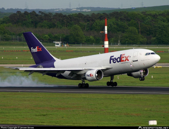
No. 44 - FedEx Express
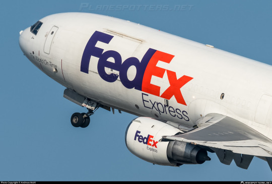
If you have ever sent or received a package, particularly if you live in the United States, you may be familiar with FedEx, and @magic-gps requested that I discuss their airplanes!
FedEx (founded and formerly known as Federal Express) is a massive network for transportation of mail and cargo, and Federal Express Express (okay, no, I can't call it that, FedEx is legally the full name even though we all know what it's really short for) is its airborne branch, making up the largest cargo airline by fleet and freight tonnes conveyed in the entire world. Their largest customer is the US Postal Service, with whom they have an exclusive contract - any USPS air mail is carried by FedEx Express - but they also fly for countless other clients. They cover so much ground (air) that they not only have a dozen hubs but an additional SUPERHUB, located in Memphis. They're what DHL is for Europe but doing bigger numbers, and that's with UPS, Atlas Air, and Kalitta Air to compete with. Although they're based in the US, their website claims that their destinations include every US zip-code, plus "over 220" countries and territories. There are 195 internationally recognized countries at present. I don't think saying they fly everywhere is even really hyperbole at this point.
FedEx's fleet is massive and eclectic. They have the world's largest cargo fleet, with 650 planes (which are named by employees, frequently after their children). Add in FedEx Feeder, a second fleet of small propeller airplanes dry-leased to local carriers for use ferrying small loads to the full-size jets, and there's a total of 699 FedEx liveries in the skies with 88 more on order. They occupy whole swathes of tarmac. They're everywhere. Like snails after the rain.

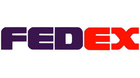
Oh, and apparently this livery was designed by Lindon Leader (what a name) of Landor Associates, the prolific and highly regarded design firm responsible for hits like the SAS belly stripe livery and misses like JAL's two previous designs. I have higher standards for liveries that are just absolutely everywhere, so let's see if Landor was able to live up to them.
I'm going to be specifically talking about, because I presume this is what the requester meant, the livery FedEx adopted in 1994. The timeline of this is interesting, because the name of the airline stayed Federal Express until 2000, when the entire company rebranded from Federal Express to FedEx and added the redundant 'Express' to the airline's name. I've always thought that was very funny, and while that's charming to me I don't think I should be encouraging things like this. It's just sloppy and a bit weird to say.
Before they adopted the livery they did briefly trial a new logo. From 1991 to 1994 they had this!
Boy do I not like that! It's significant to the history of the company in that it shifted the colorscheme from indigo and burgundy to purple and orange, except that the difference in brightness here is really almost upsetting and the logo itself is...it looks like that. It's very TRON somehow. I don't find the tackiness pleasant. It's just ugly. The typeface they chose is bad. The wriggly X is nice but every other letter looks a unique sort of hideous, with the E in particular looking like a rake made of sponge which has been placed in water and left to soak. Thankfully they moved on quickly, replacing this logo at the same time as their livery.
The fact that there's six years between the visual rebrand and official renaming is interesting. Federal Express was already colloquially known as FedEx before the official renaming, and used it in their branding, but they weren't legally FedEx yet, so for that little span their planes bore both names.

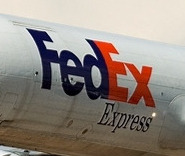
This adolescent period in the life of modern FedEx featured the 'Federal Express' subtitle in this serif mystery font which I haven't seen mentioned at all anywhere. I couldn't find many more pictures with the full 'Federal Express', but there's a scattering of seriffed planes out there, it seems. It looks a lot better with the 'Federal' taken out just by virtue of legibility, and I have to say I'm very keen on the way the subtitle is offset to align with the start of the E. It looks nice and aerodynamic. When the first word is taken out it has the extra benefit of lining 'Express' up with the 'Ex' that stands for it.
But there it is! The FedEx logo. Adopted in 1994, considered a contender for the best logo ever made, winner of over 40 awards.
I want to disclaim for a moment. I think it's always been somewhat implicit that my opinions are just one manifestation of the infinite variability of human thought and inevitably subjective but I do need to re-stress this now: these are my own hot takes. My opinion is not legally binding. Lindon Leader is an incredibly accomplished designer and I'm not even a designer at all. There is a reason that FedEx's logo is so widely acclaimed. My criticism of it is not an attempt to contest its legacy, and is - again - just my opinion. And it is an opinion colored not only by the fact that I'm an amateur, and by the fact that my tastes are different from other people's, but by the fact that this logo is quite literally older than I am, and tastes have most certainly evolved since then.

I think the FedEx logo is...okay. I certainly do not despise it, but I would stop very short of calling it the best logo ever. I'm going to talk about why I'm so underwhelmed by it, and it's going to sound like I don't like this logo for a bit, but if you power through that you will see that my opinion about it isn't as straightforward as the sum of my opinions about its parts.
The fantastic thing about this particular logo is that it's easily the most-discussed and best-documented bit of branding I've yet covered, so it was a delight to research. I didn't even have to call in my font wizard, for example, because Leader explicitly states what it is in this interview - a proprietary typeface heavily inspired by Univers 67 Bold Condensed and Futura Bold. I actually like Futura (the Cyrillic version is one of my favorite Cyrillic typefaces) but don't love Univers 67 - it reminds me way too much of the handwriting style I was drilled in at school. US schools have truly heinous taste in the penmanship they teach, and much like how Parker cursive inherently reminds me of third grade, Univers 67 feels to me like an adult version of something I've long since outgrown. The design of the letterforms here, with the exaggerated x-height and all the lines (crossbars included) having a uniform thickness of 'very', reminds me of the posters on the walls of elementary school classrooms.

Take a look at this. The green line is hypothetically where the baseline should be, but the E and D descend slightly below it. According to my font wizard this is fairly common as an attempt to some sort of visual trick, but I don't like it. I can make it out from a distance and it significantly bothers me.
Speaking of misaligned, I've always felt like the vertical line on the E was slightly wider than that on the D, but had dismissed this line of thought as an optical illusion - the darker color and the lack of detail at the top, plus the lack of gaps at any point in the E, artificially make the D look narrower than it is. I tried lining them up, and I was right, it's an optical illusion. I still hate it. What isn't an optical illusion is that the middle line on the E is thicker than the second line on the F - again, hate it!
And I just don't like this font! It's like if they fed different fonts to a neutral network and had it invent a weight bolder than bold, like the neural-network generated upperer and lowerer cases. I'm aware of the existence of ultra bold weights, and I'm not talking about those, because those are regular ugly and clearly made by humans. This looks like an algorithm expanded the letters until they were touching.
But the touching bit is intentional. The FedEx logo is hiding a little secret, perhaps the most frequently cited reason for why it's so beloved. Between the E and X, Leader slipped in an inconspicuous arrow.
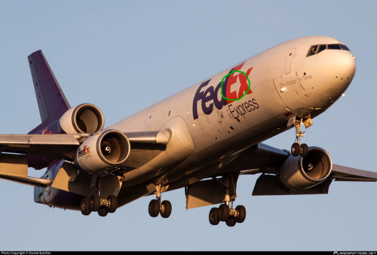
And I can't pretend this isn't really clever. It's subtle but once you see it you can never unsee it. My problem is that one feature doesn't make something good on its own, particularly when it's something you can easily miss at first. The Sneeze interview linked earlier sort of implies Leader built the font in large part around the idea of the arrow, and I find that a little problematic. Sometimes an idea is so fantastic you just can't let go of it, but when you're designing something you just can't be myopic like that. And, to be clear, I don't think Leader sacrificed the aesthetics of the wordmark to accommodate the arrow. I'm sure he personally thinks this font is beautiful. But when I evaluate it for myself, I can't allow one good feature to overpower my own dislike for the font overall, even if it is legitimately clever.
I do have some nice things to say, though. Well, mostly one nice thing. I love the color scheme. I think the purple and orange shades here are a wonderful choice, an uncommon one but one that manages to be a visually pleasing combination. If either of the shades were less saturated, or the purple were brighter, it would lose its cohesion, but Leader chose the perfect shades to bring out the best in each other. The old red and purple shades were absolutely hideous, but he transformed them into something great.
But at the end of the day my opinion of the logo on a granular scale is irrelevant. And I don't say that because I'm in the minority here or because I'm not allowed to have an opinion or anything else of the like. It doesn't matter because the FedEx logo is older than me and it is FedEx. When I see something purple and orange, I think of FedEx first. Let me use an example by invoking something better left dead.
In 2018 the Overwatch League, an esports league based around the maelstrom of poor decisions which is Blizzard's video 'game' Overwatch, played its first season. A charter member was the Florida Mayhem, a team which was in all honesty sort of a joke (though not exciting enough to live up to their name). I stopped following OWL after the first season, so I'm not sure if any of this has changed, but they finished second-to-last, made some very questionable choices on the management end, and were representing Florida. All of these facts are ontologically comedic. But above all, these were their team colors.
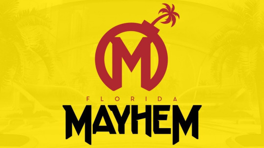

So, this creates the clear issue demonstrated above. Certain brands are so culturally entrenched that even a passing similarity in visual identity makes you immediately look like a pastiche, even if you're otherwise distinct. Mayhem's branding is, in my opinion, way better than McDonalds's, but it was still the right move when they changed to a completely unrecognizable color scheme in 2020. You just see some things and immediately recognize them.
The cultural specter of the FedEx logo is very useful to the FedEx livery. As long as you do not royally mess up - which they have not - a FedEx plane will immediately resemble a FedEx package, even if it doesn't actually look like one, since they're mostly white.
...well, okay, the planes are also mostly white. And I'll be honest, on the 727? This plane isn't half bad. The clean line of the t-tail makes this sort of straight-line-down livery look so much better, and the placement of the wordmark in front of the heavily swept wings keeps the white tube from looking quite so much like a white tube.
But the 727 isn't the only airframe they fly. They're the largest operator of six separate types, most of which are fully retired from passenger service, including the MD-11. Their MD-11s are literally the only trijets you'll see around in the US these days - they only started retiring their DC-10s in 2021, nearly ten years after they flew their last passenger flight. They're pretty unusual among large cargo airlines in that they flew the 747 for just over five years, and not particularly on their own initiative, having acquired a few from a merger with the Flying Tiger Line. So the way the livery looks on the 727 doesn't tell the whole story.
Okay. So that...is a couple of white tubes. That's somewhat unfortunate.
I want to clarify that, while this style of livery has become increasingly popular over time, culminating in its codification as an outright trend in the late 2010s and early 2020s, FedEx adopted this livery in 1994. It is wrong to say that the FedEx livery resembles TAM, Lufthansa, or Icelandair, and more correct to say that all of the above carriers are wearing a style similar to FedEx (though Qantas and MALÉV came first). Despite the fact that I've been known to call these 'Lufthansesque', Lufthansa didn't invent this style and didn't do it best. Still, doing it earlier doesn't excuse it.
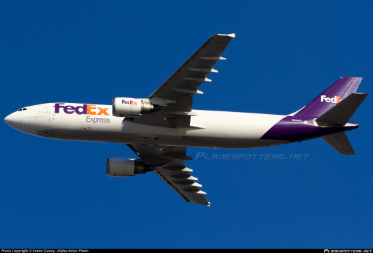
FedEx in particular suffers from the rear-heaviness issue. Though they have a larger logo which balances it out better than some (Lufthansa), it's kind of countered by the fact that FedEx exclusively operates planes I'd consider on the long and thin side. It makes the white look all the more dominant on the airframe.
FedEx does take one measure to mitigate this - the undersides are painted grey (in a style I've been calling 'Deltalike' to myself even though Delta absolutely did not do it first) instead of being the same white as the rest of the fuselage with the purple fully wrapping around. Also, they have the line remain straight on the third engine of trijets, instead of committing to one shade or the other, as older trijet liveries frequently did.
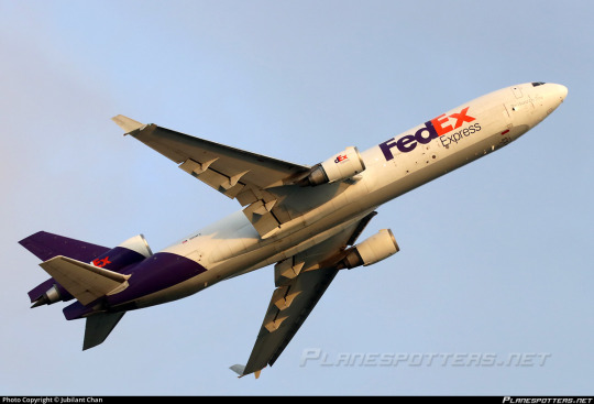

Compared to an ASL Airlines lease which keeps the underside white and the purple as a contiguous loop, this creates a much more streamlined look. But it's not enough to save this.
And I think what bothers me the most is how at odds this is with the thing people say is so brilliant about the logo - the arrow.
Arrows are, as Leader pointed out in his interview, definitely not a new phenomenon in airline liveries. Hell, we even had Arrow Air.

But there's a reason for that. Arrows represent forward movement. They're fundamentally indicative of speed, efficiency, and polish. And airplanes are more or less shaped like arrows, when you think about it.

Something being done very frequently doesn't make it somehow creatively bereft. And it's not like only painting the tail and the big of fuselage directly below it is reinventing the wheel either.
Cheatlines, and hockey sticks especially, were not a particularly new thing when my perennial example of 'boring idea, good execution', Kalitta Air, rolled out in the 1980s. In fact, they were done to death. But Kalitta Air's choice in color and shape, use of proportions, and stylish logo set it apart from every other airline to use this style.

There is a reason arrows are so common. They are speed and precision and kinetic energy. When you refuse to consider making something common your own, you often shoot yourself in the foot. With the logo constructed, with the motto 'the world on time' written on the nose of each plane, absolutely nobody would turn up their nose at FedEx having an arrow motif on its livery.

Ultimately, I'm a bit sad, because the FedEx logo, while I don't like a lot of the choices made in regards to the font, would provide a truly fantastic jumping off point for a livery that would elevate it beyond the point anyone could ever dismiss it as being part of a crowd of very similar designs, the way I have by lumping it in with Lufthansesques. Arrows, being a fundamentally long and tall shape, would also avoid the pitfalls of a livery type which I have already on multiple occasions critiqued for inherently creating a look of rear-heaviness, particularly on longer and thinner airframes, especially when the color used is a dark shade to contrast a white base.
That said, the FedEx livery gets a bit of a free pass where something like Lufthansa doesn't. FedEx's logo is so ubiquitous that unless you actively interfere with or muddle it, any plane bearing it will immediately be recognizable as a FedEx plane the same way a truck or package is. As a branding exercise it is certainly successful. It looks clean, it's by no means exceptionally ugly, it does its job...but it is so rich with potential and so impoverished in execution. Doesn't it just look like this plane isn't taking off, but being pulled by the weight of its purple slice towards the ground?

I'm giving FedEx a D+.
I don't feel good about doing this. I think this is an opinion which is not only contentious but downright unpopular. But as I've mentioned a few times my grades take into account more than just broad aesthetic appeal. Branding and environment factor in, but what also factors in is, as I said in discussing Saudia, wasted potential and a refusal to capitalize on what you have that's clearly good. When I graded Air Astra down for not reaching its potential I meant it as a kind gesture, not even a sort of tough love but an acknowledgment that I like what they have and I know they'll do better.
FedEx, however, is just disappointing. For the frequently cited best logo of all time, this is just unacceptable. This verdict brings me no joy, but the fact that this logo is so beloved doesn't mean I can go easy on it - to the contrary, it had a lot to live up to, and it just didn't.
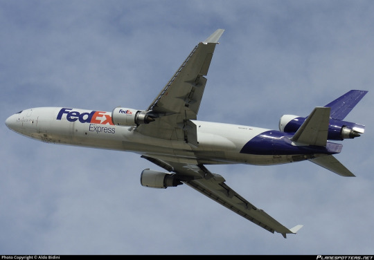
#tarmac fashion week#grade: d+#era: 1990s#era: 2020s#era: 2010s#era: 2000s#region: north america#region: united states#fedex#kalitta air#cargo carriers#requests#lufthansa line#landor portfolio#skywriting
28 notes
·
View notes
Text
I really feel like tumblr would appreciate some of Monty Python's takes on the police, particularly this one, picking up mid-sketch in episode 27:

Judge What is it now, you persistently silly usher?
Usher He can't hold the Bible m'lud.
Judge Well screw the Bible! Let's get on with this bleeding trial, I've got a Gay Lib meeting at 6 o'clock. Superintendent Lufthansa will you please read the charge.
Superintendent Is a charge strictly necessary, m'lud?
Judge (heavy aside) The press is here.
Superintendent Oh sorry! Right, here we go. You are hereby charged. One, that you did, on or about 1126, conspire to publicize a London Borough in the course of a BBC saga; two, that you were wilfully and persistently a foreigner; three, that you conspired to do things not normally considered illegal; four, that you were caught in possession of an offensive weapon, viz, the big brown table down at the police station.
Judge The big brown table down at the police station?
Superintendent It's the best we could find, m'lud ... and five... all together now...
The whole court shout together.
Court Assaulting a police officer!
Prosecuting Counsel Call Police Constable Pan-Am. (Pan-Am runs into court and starts beating Njorl with a truncheon) Into the witness box, constable ... there'll be plenty of time for that later on. (the policeman gets into box hitting at anyone within range; his colleagues restrain him) Now, you are Police Constable Pan-Am?
Constable No, I shall deny that to the last breath in my body. (superintendent nods) Oh. Sorry, yes.
Prosecuting Counsel Police constable, do you recognize the defendant?
Constable No. Never seen him before in my life. (superintendent nods) Oh , yes, yes he's the one. He done it. I'd recognize him anywhere, sorry, super. (the superintendent looks embarrassed)
Prosecuting Counsel Constable, will you please tell the court in your own words what happened?
Constable Oh yes! (refers to his notebook) I was proceeding in a northerly direction up Alitalia Street when I saw the deceased (points at Njorl) standing at an upstairs window, baring her bosom at the general public. She then took off her ... wait a tick. Wrong story. (refers to his notebook) Ho yes! There were three nuns in a railway compartment and the ticket inspector says to one of them. (the superintendent shakes his head) No, anyway I clearly saw the deceased...
Clerk Defendant.
Constable Defendant! Sorry. Sorry, super. I clearly saw the defendant ... doing whatever he's accused of...Red-handed. When kicked... he said: 'It's a fair ... cop, I done it all ... Right... no doubt about... that'. Then, bound as he was to the chair, he assaulted myself and three other constables while bouncing around the cell. The end.
Spontaneous applause from the court. Shouts of 'more! more!'. Pan-am raises his hands and the clapping and shouting dies down.
Constable Thank you, thank you... and for my next piece of evidence...
Superintendent I think you'd better leave it there, constable.
Prosecuting Counsel Excellent evidence, constable (the constable is removed, flailing his truncheon the while) ... Thank you very much. Now then Mr Njorl, will you tell the court please where were you on the night of 1126? (silence from the bandages) Move any part of your body if you were north of a line from the Humbet to the Mersey. (silence)
30 notes
·
View notes
Text
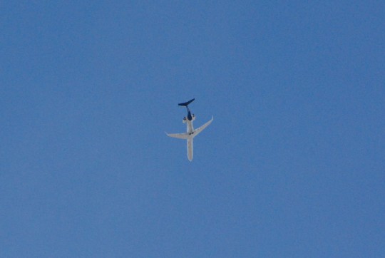


1) Lufthansa City Lines CRJ900
2) Transavia A319
3) TAP Air Portugal A321
2 notes
·
View notes
Text
Events 10.29 (after 1950)
1953 – BCPA Flight 304 DC-6 crashes near San Francisco.
1955 – The Soviet battleship Novorossiysk strikes a World War II mine in the harbor at Sevastopol.
1956 – Suez Crisis begins: Israeli forces invade the Sinai Peninsula and push Egyptian forces back toward the Suez Canal.
1957 – Israel's prime minister David Ben-Gurion and five of his ministers are injured when Moshe Dwek throws a grenade into the Knesset.
1960 – An airplane carrying the Cal Poly football team crashes on takeoff in Toledo, Ohio.
1964 – The United Republic of Tanganyika and Zanzibar is renamed to the United Republic of Tanzania.
1964 – Biggest jewel heist; involving the Star of India (gem) in the American Museum of Natural History in New York City by Murph the Surf and gang.
1967 – Montreal's World Fair, Expo 67, closes with over 50 million visitors.
1969 – The first-ever computer-to-computer link is established on ARPANET, the precursor to the Internet.
1972 – The three surviving perpetrators of the Munich massacre are released from prison in exchange for the hostages of the hijacked Lufthansa Flight 615.
1980 – Demonstration flight of a secretly modified C-130 for an Iran hostage crisis rescue attempt ends in a crash landing at Eglin Air Force Base's Duke Field, Florida, leading to the cancellation of Operation Credible Sport.
1985 – Major General Samuel K. Doe is announced as the winner of the first multi-party election in Liberia.
1986 – British Prime Minister Margaret Thatcher opens the last stretch of the M25 motorway.
1991 – The American Galileo spacecraft makes its closest approach to 951 Gaspra, becoming the first probe to visit an asteroid.
1994 – Francisco Martin Duran fires over two dozen shots at the White House; he is later convicted of trying to kill U.S. President Bill Clinton.
1998 – In South Africa, the Truth and Reconciliation Commission presents its report, which condemns both sides for committing atrocities.
1998 – Space Shuttle Discovery blasts off on STS-95 with 77-year-old John Glenn on board, making him the oldest person to go into space at that time.
1998 – ATSC HDTV broadcasting in the United States is inaugurated with the launch of the STS-95 space shuttle mission.
1998 – While en route from Adana to Ankara, a Turkish Airlines flight with a crew of six and 33 passengers is hijacked by a Kurdish militant who orders the pilot to fly to Switzerland. The plane instead lands in Ankara after the pilot tricked the hijacker into thinking that he is landing in the Bulgarian capital of Sofia to refuel.
1998 – Hurricane Mitch, the second deadliest Atlantic hurricane in history, makes landfall in Honduras.
1998 – The Gothenburg discothèque fire in Sweden kills 63 and injures 200.
1999 – A large cyclone devastates Odisha, India.
2002 – A fire destroys a luxurious department store in Ho Chi Minh City, where 1,500 people are shopping. More than 60 people die and over 100 are unaccounted for in the deadliest peacetime disaster in Vietnam.
2004 – The Arabic-language news network Al Jazeera broadcasts an excerpt from a 2004 Osama bin Laden video in which the terrorist leader first admits direct responsibility for the September 11, 2001 attacks and references the 2004 U.S. presidential election.
2005 – Bombings in Delhi, India kill more than 60.
2008 – Delta Air Lines merges with Northwest Airlines, creating the world's largest airline and reducing the number of US legacy carriers to five.
2008 – A pair of deadly earthquakes hits Baluchistan, Pakistan, killing 215.
2012 – Hurricane Sandy hits the east coast of the United States, killing 148 directly and 138 indirectly, while leaving nearly $70 billion in damages and causing major power outages.
2014 – A mud slide; the 2014 Badulla landslide, in south-central Sri Lanka, kills at least 16 people, and leaves hundreds of people missing.
2015 – China announces the end of its one-child policy after 35 years.
2018 – A Boeing 737 MAX plane crashes after taking off from Jakarta, Indonesia killing 189 people on board.
2 notes
·
View notes
Text
you know what? i am just so glad that we dont have to worry about the climate crisis anymore. apparently it has all been resolved and honestly, it is so so good to see that everything is normal and the world makes sense. i have to see my thesis supervisor in january. a flight from hamburg to stuttgart with a stopover in munich is both cheaper and quicker than a train ticket for the same dates 6 weeks from now. it just makes sense! i swear it makes sense. haha 😀 i could fly to london ON FRIDAY (that is the day after tomorrow) for €28,39 (granted, with ryanair, or i could wait until next week and fly with a real airline, BA, for €60 😃) but it would cost me anywhere from €12 to €25 just to get to the airport half an hour from my house. (half an hour by car that is. two hours by train lmao) i was also thinking about visiting my dad sometime between xmas and new years. sure, it's a busy travel week, so €121,80 for two train tickets doesn't seem too bad, right? only for €137 i can book a return flight with lufthansa. and that's 50 minutes on a plane vs 4+ hours on a train. 😌 what a world we live in! i mean honestly, they could PAY me €137 and i still wouldn't book a domestic flight. this is germany, not fucking australia. but please explain to me how any of this makes sense. you cant. because it doesnt. but yeah. it's even more infuriating with intra-european travel, and especially travel between mainland europe and the uk. like isn't it so wonderful that the channel tunnel is treated like some sort of carnival ride and you have to include 1-2 hours of check-in time in your itinerary because eurostar have delusions of grandeur and make you take off your shoes airplane style and also close their ticket gates 30 min before departure so they can sell you overpriced coffee and sandwiches? isnt that fun? like come on be serious for a moment. its a train. choo choo bitch why is your platform walled off? it shouldn't take a degree in international relations and 5-7 years professional experience in passenger transport for me to book a train from redacted germany to london england and yet here we are. i mean right now you can't even book eurostar trains via deutsche bahn directly lmao, and if you do a silly little preisermittlung, DB will charge you more for the eurostar train than what you'd pay if you booked the eurostar train directly on the eurostar website (rofl even) so of course you buy two separate tickets. but then if you arrive late in amsterdam or brussels or paris and maybe get stuck in the security or uk border control lines eurostar will just close the gates on you and go whoopsie ha ha bummer you have two separate tickets did you really think 2 hours transfer time was enough lol. and even if all of your trains happen to be on time and you do make the connection in a-dam/brussels/paris, you have to be so generous with your planning that you end up turning what could have been a 7 hour train journey into a day-long ordeal.
#this is not a hypothetical scenario btw#i went to london multiple times in 2019/20 and got stuck in brussels TWICE#the first time they said fuck you#i had to book a new ticket for the next day and get a hotel#the second time i got lucky and they just put me on the next train#like i am a certified plane hater#i am a licensed train lover#i actually WOULD be willing to pay a small premium if the experience was genuinely good I WANT THIS TO BE GOOD I WANT IT TO BE GOOD SO BAD#I WANT it to be a PROPER alternative to air travel#i want to be able to RECOMMEND it to people#but if its between this#and a 90 minute flight that is also cheaper??#like come on#anyway#this wasn't meant to turn into a rant#also gemma and diana if youre reading this#i know its been 86 years (well. one and a half) since we planned this trip but i really hope that i can make it happen soon#ish#🥴#&
1 note
·
View note
Last Seen Blogs

keithtensakyuubi
Insanity

centerofthecircle
Smiling Depression

bbangsoob
eir
olitzitalia
Anna❤️TnK

the-wereraven
Croissant & Lobster Cookie Enthusiast