#lufthansa group
Text
No. 1 - Lufthansa
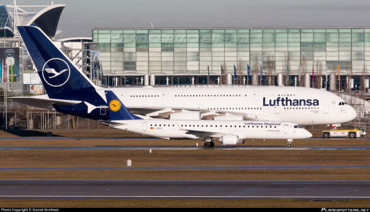
We begin with a large fish even by the standards of the large pond in which we operate. A very intentionally chosen large fish. Deutsche Lufthansa is Germany’s flag carrier and the second largest carrier in all of Europe by passenger volume. In 2018, they unveiled a new standard livery for their fleet of airplanes, and it...well. It’s this.
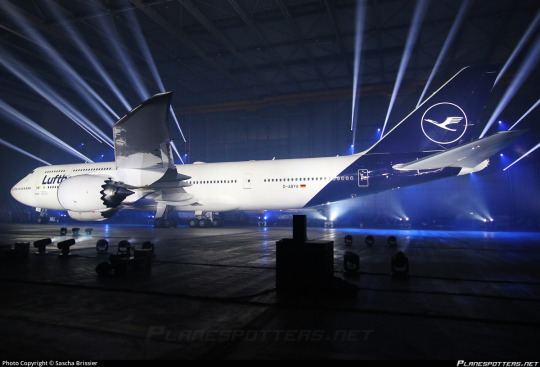
Even the presentation - good lord, is this an auto show?
My feelings on Lufthansa’s 2018 livery are visceral. There’s no mental evaluation required, no taking it in, thinking about the choices made - I look at the modern Lufthansa livery and immediately, profoundly know that I hate it. And that’s not just because of the specific choices made - which are bad - but because of the space they occupy amidst a creatively barren wasteland within livery design. This is going to be a very long post, which isn’t standard for this blog, but my goal for an introduction is to break down exactly the sort of design that made me feel the need to start doing this to begin with.
But in reality that’s only the beginning. Yes, Lufthansa’s livery is specifically disappointing, but it is so much more than that. It is the purest distillation of the greatest challenge aviation faces today, far weightier than scheduling issues, outdated IT, and runway incursions. It is not the worst example of it, not in the slightest, but it is a large airline which has a very textbook presentation of symptoms and thus feels like a great example to describe exactly what I hate about this sort of design. Let me explain.
Essentially, airlines have found a formula. It goes as such:
Almost entirely white body. (There is a name for this trend: Eurowhite.) In some cases, there may be a colour on the underside, generally either a light grey or whichever secondary shade the airline has committed to. In the case of this Lufthansa livery, it is just white.
Aside from the white body there will be either a single colour (generally some dark blue, or less often some sort of red) or a few colours, usually but not exclusively on flag carriers to match their national branding. (The proliferation of red, white, and blue flags out there means that a disproportionate number of airline liveries are these colours.) Unless it is literally just a white plane meant to be as generic as possible for short turn-overs when leasing, it will at least attempt to have some sort of design, but it will be minimal, and:
All of the detail will be on the tail. There may be coloured winglets or engine nacelles, but other than that it is only at the rear of the plane that you begin to see any interest. Usually this is just a logo, though it may be an abstract design which looks like a default tumblr header. It will often only be on the tail, with nothing at all on the body proper.
The name of the airline written in a sans-serif typeface which is set as default on at least one word processor. Rarely will anything creative be done with this. It will (usually, except in egregious cases) match the impotent attempt at graphic design which has been confined to the empennage and it will have all the charm of a large retail chain’s flyer describing the benefits you’ll definitely totally get if you work for them - sickeningly corporate. Low-cost airlines may slightly vary the theme by putting their website onto the livery, either towards the back or just instead of the airline’s name. The brave will also write it on the ventral fairing, but most don’t even bother with that simple act. Some airlines have their name written in the language spoken in the country they’re based in, usually beside the English text, but most are only in English despite operating in countries where this is not the most widely spoken language.
Not every livery which has these features is badly designed, as seemingly small changes can make all the difference. There is the occasional livery that fits most, if not all of these features that has some clever tweaks or design choices which makes me actually think it’s fine, acceptable, maybe even decent. (I have taken the initiative of making sure a few of these are among my early posts, just to demonstrate that it can be done). And some airlines depart from this entirely and come up with something even more hideous. Yet I somehow find myself respecting even these more than I do Lufthansa.
The Corporate Standard Livery Design (Lufthansesque design, if you will) is - and I do not think I am being dramatic at all here - an epidemic. Taxiing through most airports, you sometimes have to actually try to tell the planes parked around you apart in the sea of red, blue, and mostly white. And I spend a lot of time looking at planes.
These liveries do not only fail to inspire me. They instill in me a profound disgust. They are not trying to be good. They are trying to be what I described earlier - decent, not worth complaining about, because that’s cheaper and easier than designing something good. Graphic design is not anyone’s passion here. They’re just trying to toe the line. They’re so poisoned by the modern minimalist-design brain virus that they don’t realise that to be acceptable a livery this simple needs to do something interesting. There must be a creative decision made somewhere, a compelling feature, or you may as well be flying an MLA-formatted plane. In their striving for adequacy they become not just ambient, but lukewarm. They are a bottle of water which has sat in the sun for so long that when you drink it, even though you’re overheating and parched, it feels only negligibly better than the air you’ve been breathing in.
To be fair, I do not only hate the Lufthansa paintjob because it exemplifies whatever-ness. Even in an industry saturated with gross in-flight nothingburgers served with some stale biscuits and a paper cup of Lipton tea, Lufthansa manages to offend in specific and unique ways.
Throughout its long history Lufthansa has had a handful of different liveries, but from 2018 onwards this has been the situation. They’ve never been brilliant, but it’s only gotten worse over time. I normally would commit to a separate post for historical liveries, but in a move that I don’t foresee becoming particularly common I’d like to talk about the history and evolution of Lufthansa’s liveries from the golden age to now - the fall, if you will.

(image: lufthansa bildarchiv)
Their early liveries were already pretty much plain white or metal, but they still had a few features that made them seem a bit less like photocopy paper which was meant to be printed plain blue but only got through a tenth of the sheet before ink ran out. To begin with, they used a lighter blue and combined it with a vivid yellow to add some actual visual interest. The layering of the yellow over the blue where it curves around and below the nose and on the ends of the tailplane actually draws the eye. The font choice is nice and legible, spaced apart in the center of the fuselage. I imagine it was easy to read even from far away. (Shame it’s a bit blocked by the wings from some angles, though.)
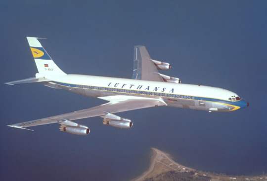
(image: lufthansa bildarchiv)
This early 707 design keeps the cheatlines extending past the nose but makes them sharper than the ones on the Connie to match the sleek profile of the jet. Back when this plane was painted adding white to your plane was a choice rather than the thing everybody was doing, which allows me to respect it for the choice it was instead of considering it the factory default. The bottom half, denoted by the cheatline, is left unpainted, which only adds to the sleekness of the overall profile, and the text is clear and plain but still aesthetically pleasing. The 707 is by modern standards pretty antique-looking; you can take one look at one and tell it isn’t particularly streamlined. This paint scheme, though, makes the plane look sharp and aerodynamic, despite not being revolutionary. I would go so far as to say I like this particular livery. This is, unfortunately, as good as it gets.

Oh. Oh no...
Let’s assess the damage here. The cheatlines now simply meet at the front without wrapping down to the belly of the plane and the nose is a simple black tip. I like it when airlines paint their planes’ radomes, and I wouldn’t mind it here if not for what it was replacing. The font has been replaced with a generic sans serif font which is closely spaced and put up into a corner, like the name on a homework assignment - it’s not really part of the total package, just there for administrative purposes. Most upsetting to me is the tail. While I wouldn’t say I love the little section on the old plane, it at least felt like it belonged there, creating a second blue-and-yellow layer above the white. Its placement on the fin above where it begins to taper gives the plane a bit of an aerodynamic feel. It’s certainly not changing the world, but it feels at home in the livery.
The new fin is a sharp downgrade. With nothing to mark the transition the fin abruptly goes from the white of the upper fuselage to a shiny blue which contains an enclave of the only yellow to be found on the entire aircraft. This makes the yellow stand out, as it has nothing to tie it in with the rest of the plane, and the fin itself feels almost like it’s been Frankensteined onto the fuselage from a different plane by a different airline. There’s nothing to mediate the transition from a block of white to a block of blue, like how the cheatline separates white and grey. It just is blue now, stop asking questions. This also means that the only part of the plane that the eye is really drawn to is...the tiny portion of the whole that is the fin, which may as well be floating detached in midair.
This is foreboding. Knowing what I know now, it feels like looking back at when a romantic partner began to act strange years later, after the divorce, as you walk by the house he bought with his mistress.
(image: g najberg)
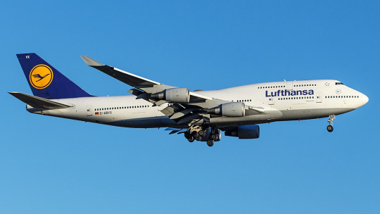
The most recent, and only, time I flew on Lufthansa was in 2014 and was aboard one of their 747-400s. (Actually, if you’d still like to fly on a passenger 747, Lufthansa is basically your only option.) At the time, they looked like this. This is...just sad. They got rid of the cheatlines, because that’s trendy now, and they painted the whole plane white and made an attempt at lip service to the old metal lower half by painting just a bit of the plane grey, like if a human stepped into a puddle of paint that only covered the very sole of their foot. And I’m being generous by showing a 747, a plane which inherently makes any livery look less boring by being interestingly shaped itself, instead of the classic slightly pointy single-decker tube. Not to mention the double-decker design makes the text vertically centered instead of the default Lufthansa look of awkwardly shoved nearly all the way up the fuselage.
In defense of the modern livery, it’s possible to argue it’s an improvement on this. Honestly, looking at them next to each other, it’s difficult to pick out which one I find less defensible.
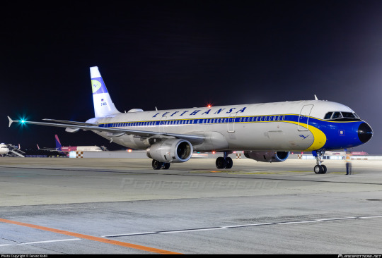
But then you see D-AIDV, an A321 painted in a heritage livery, and you feel the immediate, visceral “no!!! no go back!!!” as you remember that this is a false dichotomy and we could have something so much better if they weren’t peer-pressured into generic modern design.

And for what? For this?

(image: hvdfonts)
For the third time, I remind you of what we have been reduced to. We have achieved a state of reductio ad absurdum where this barely qualifies as a design. This plane is more or less a white blot. You can put as many insets as you want and it is still a white blot.
I am relatively sure that the font used is literally Helvetica. EDIT: I have been informed that it is not, in fact, Helvetica, but a custom typeface that happens to look almost exactly like Helvetica. This is, in my own opinion, worse! They did apparently use Helvetica in the past, though. Here is a very detailed description of the design process of the font, which manages to contain a grand total of zero ideas.
I would hate this on its own already, but it’s also so closely spaced and located so far up that it makes me feel like I’m suffocating. In my own experience as a dyslexic person, kerning is the single weightiest feature when it comes to if I can easily read something or not. While Helvetica, ugly though it may be, is generally considered a very legible font, any benefits from that are more than cancelled out by committing to making sure the entire name of the airline fits between the frontmost two doors with room to spare. It feels almost hostile.
Now, all given, I at least somewhat enjoy the shade of blue used for this livery, which is darker than the normal fare. I do miss the way the grey broke up the endless white space, though, and I mourn the yellow even more - in addition to being something to look at, losing it has also lost any visible reference to the flag of Germany, the country for which Lufthansa is the flag carrier. They don’t even have the black part of the German flag despite that being basically free. If they went for black instead of dark blue I would honestly respect this a hell of a lot more. One of the most recognizable flags in the world and instead your airline looks like a discount SAS.
Yeah, I said it. If we want to go even further with comparisons by including airlines that aren’t Lufthansa, this is basically the SAS livery. Except not, because the SAS livery does a lot that this doesn’t.
This is about Lufthansa, not SAS. I’ll look at SAS soon enough, because comparing their look to Lufthansa’s has made me appreciate it in a way I never used to. But I don’t think I need to elaborate too much for it to be clear why SAS’s livery works and Lufthansa’s doesn’t, despite the superficial similarities. SAS took their absolutely horrid previous livery and turned it into something which might not wow anyone but at least feels uniquely theirs, while Lufthansa had something which accomplished much the same and then diluted it into nothingness, Eurowhite writ large. Two washes and you’d wonder if your Lufthansa flight is actually a Smartlynx lease.
The way that the blue slices into the bottom of the fuselage and doesn’t fully cover the tailfin is...something? It’s a design element. It’s not nearly enough to save it, but it’s a design element. However, this presents another issue specific to Lufthansa’s paint job, best demonstrated with a specific plane:
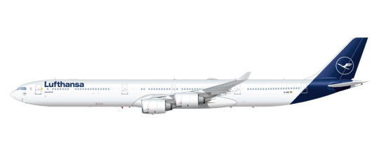
(image: lufthansa)
Lufthansa is the world’s largest operator of the Airbus A340, a somewhat eccentric airplane which is perhaps best thought of as a four-engined A330. I love this airplane, and am delighted seeing it overhead on my walk home from work, because Lufthansa is kind enough to operate a daily service with it to my home airport, but that’s beside the point. The point is this: what I have pictured is specifically the A340-600, which is the world’s second longest in-service airliner. Yes, longer than the A380 and the 747-400, and, in fact, only shorter than the 747-800. With a plane this long, the Lufthansa livery creates an incredible look of rear-heaviness. This plane looks like it should uncontrollably pitch up until it’s perpendicular to the ground every time it takes off. Of course this effect is less pronounced on shorter aircraft, but it’s still there, and I dislike it.

You can barely even tell there’s paint at all on a much smaller plane! And the white bit on the front of the rudder which looks okay on a conventional empennage looks downright horrible when it’s only on the very tip of the t-tail’s forward point.

Oh, and when you take the windows out for a freighter conversion it gets even worse.
This is a generic-brand airplane. It genuinely reminds me of generic branding. There is a specific brand that has this exact appearance and I can’t remember what it is but it’s right there and I’m fairly sure I’ve seen it at CVS. I don’t think that’s what you want to go for when designing an airline livery, especially for an airline representing a country, but if Lufthansa wasn’t going for that they’ve failed.
__________________________________________
Overall, Lufthansa’s livery is superbly boring and not terribly well thought out. It’s not worth this absolute dissertation on its own, but I’ve singled it out to complain about general trends, and for that I probably owe it an apology. Said apology is predicated on the fact that it is still a very underwhelming and bad design which could have used a lot more thought. There are a million ways this could have been made decent, and none of them were implemented because that would have taken effort and time and creative vision. I think this post actually required more time and effort than Lufthansa put into designing their planes.
That said, Lufthansa gets a final grade of D. It’s...bad, it definitely is. There’s the vague flavour of the start of something, like the very distant smell from a barbecue happening three blocks away, but is that really even a redeeming factor?
No. The second-largest airline in Europe should be able to do better. If I have to stare at rows upon rows of their planes any time I’m at a German airport, they should have the decency to make them interesting to look at.
#tarmac fashion week#region: europe#region: west/central europe#lufthansa#region: germany#grade: d#era: 2010s#era: 2020s#era: 1950s#era: 1960s#era: 1970s#era: 1980s#era: 1990s#era: 2000s#retired liveries#flag carriers#double sunrise#long haul#lufthansa group#lufthansa line#scandinavian airlines system#deltalike
183 notes
·
View notes
Text
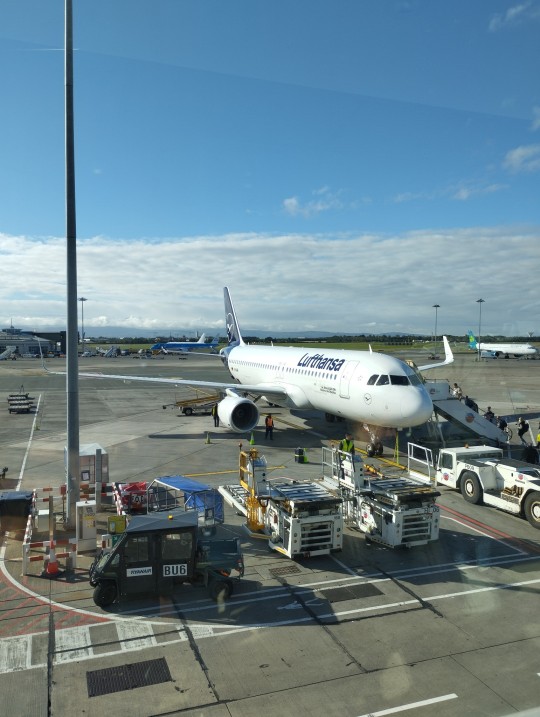
Lufthansa A320 📍 Dublin Airport
#Lufthansa#A320#airbus a320#dublin#dublin airport#lufthansa group#aviation#flying#plane#airplane#airport#airbus
15 notes
·
View notes
Text
Lufthansa hebt ab: Rekordverdächtige Erholung nach den Turbulenzen der Pandemie
Photo by Joe Ambrogio on Pexels.com
In einer Zeit, in der die Luftfahrtindustrie mit beispiellosen Herausforderungen der globalen Pandemie konfrontiert war, sticht ein Name hervor, der sich durch eine bemerkenswerte Erholung auszeichnet – Lufthansa. Die neuesten Berichte zeigen, dass der Fluggigant nicht nur den Sturm überstanden hat, sondern zu neuen Höhen aufgestiegen ist und eine…
View On WordPress
#Anpassung#Aufwärtstrend#Buchungen#Carsten Spohr#CEO#Erholung#Führungskräfte#Finanzen#Flugerlebnis#Fluggastzahlen#Flugreisen#Herausforderungen#Hoffnungsschimmer#Innovation#Luftfahrtindustrie#Lufthansa#Lufthansa Group#Nachfrage#operative Ergebnis#Pandemie#Passagier-Airlines#Rückkehr#Reisende#Rekordergebnis#Stabilität#Strategie#Turbulenzen#Umsatz#Wachstum#Zukunft
0 notes
Photo

Portuguese government looks to privatize TAP Air Portugal by 2024
The Portuguese government wants to finalize the privatization of TAP Air Portugal by 2024. Speaking to the media… The post Portuguese government looks to privatize TAP Air Portugal by 2024 appeared first on AeroTime.
https://www.aerotime.aero/articles/tap-privatization-2024
#Airlines#Aviation Economics & Finance#Air France-KLM#International Airlines Group#Lufthansa#tap air portugal#Rytis Beresnevicius#AeroTime
0 notes
Text
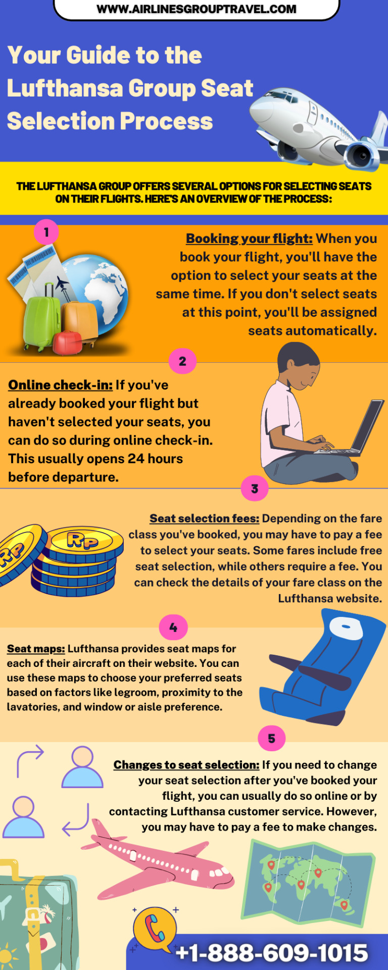
Your Guide to the Lufthansa Group Seat Selection Process
If you're planning to travel with Lufthansa Group, knowing about their seat selection process can make your journey comfortable and stress-free. The primary step is to check if your ticket provides the option of seat selection since this can vary based on the type of fare you have bought.
Visit Website:- https://www.airlinesgrouptravel.com/lufthansa-group-booking/
0 notes
Text
Lufthansa Flight Booking Confirmation
Contact for Lufthansa flight booking confirmation online by log into the official site or dial +1-844-902-4930 for best deals. Lufthansa manage reservations in easy way for all user, who make booking with them.

0 notes
Text
BOYCOTTING FOR PALESTINE
The Official BDS Boycott Targets
The Updated List is Below:
EUROVISION. IT IS IN OUR TOP PRIORITY TO BOYCOTT EUROVISION
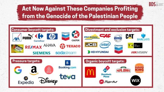
Consumer Boycotts - a complete boycott of these brands
Axa
Puma
Carrefour
HP
Cevron
Caltex
Israeli produce
Re/max
Ahava
Texaco
Siemens
Sodastream
Organic Boycott Targets - boycotts not initiated by BDS but still complete boycott of these brands
Macdonald's
Dominos
Papa Johns
Burger King
Pizza Hut
Wix
Divestments and exclusion - pressure governments, institutions, investment funds, city councils, etc. to exclude from procurement contracts and investments and to divest from these
Elbit Systems
CAF
Volvo
CAT
Barclays
JCB
intel
HD Hyundai
TKH Security
HikVision
Pressure - boycotts when reasonable alternatives exist, as well as lobbying, peaceful disruptions, and social media pressure.
Google
Amazon
AirBnb
Booking.Com
Expedia
Disney
Teva
Here are some companies that strongly support Israel (but are not Boycott targets). There is no ethical consumption under capitalism and boycotting is a political strategy - not a moral one. If you did try to boycott every supporter of Israel you would struggle to survive because every major company supports Israel (as a result of attempting to keep the US economy afloat), that being said, the ones that are being boycotted by masses and not already on the organic boycott list are coloured red.
5 Star Chocolate
7Days
7Up
Apple
Arsenal FC
ALDO
Arket
Axe
Accenture
Ariel
Adidas
ActionIQ
Aquafina
Amika
AccuWeather
Activia
Adobe
Aesop
Azrieli Group
American Eagle
Amway Corp
Axel Springer
American Airlines
American Express
Atlassian
AdeS
Aquarius
Ayataka
Audi
Barqs
Bain & Company
Bayer
Bank Leumi
Bank Hapoalim
BCG (Boston Consulting Group)
Biotherm
Bershka
Bloomberg
BMW
Boeing
Booz Allen Hamilton
Burberry
Bath & Body Works
Bosch
Bristol Myers Squibb
Capri Holdings
Costa
Carita Paris
CareTrust REIT
Caterpillar
Coach
Cappy
Caudalie
CeraVe
Check Point Software Technologies
Cerelac
Chanel
Chapman and Cutler
Channel
Cheerios
Cheetos
Chevron
Chips Ahoy!
Christina Aguilera
Citi Bank
Carrefour
Codral
Cosco
Canada Dry
Citi
Clal Insurance Enterprises
Clean & Clear
Clearblue
Clinique
Champion
Club Social
Coca Cola
Coffee Mate
Colgate
Comcast
Compass
Caesars
Conde Nast
Cooley LLP
Costco
Côte d’Or
Crest
CV Starr
CyberArk Software
Cytokinetics
Crayola
Cra Z Art
Daimler
Dr Pepper
Del Valle
Daim
Doctor Pepper
Dasani
Doritos
Daz
Dior
Dell
Deloitte
Delta Air Lines
Deutsche Bank
Deutsche Telekom
DHL Group
David Off
Disney
DLA Piper
Domestos
Domino’s
Douglas Elliman
Downy
Duane Morris LLP
Dreft Baby Detergent & Laundry Products
Dreyer’s Grand Ice Cream
eBay
Edelman
Eli Lilly
Evian
Empyrean
Ericsson
Endeavor
EPAM Systems
Estee Lauder
Elbit Systems
Expedia
EY
Forbes
Facebook
Fairlife
Fanta
First International Bank of Israel
Fiverr
Funyuns
Fuze
Fox News
Fritos
Fox Corp
Gatorade
Gamida Cell
GE
Glamglow
General Catalyst
General Motors
Georgia
Gold Peak
Genesys
Goldman Sachs
Grandma’s Cookies
Google
Garnier
Guess
Greenberg Traurig
Guerlain
Givenchy
H&M
Hadiklaim
Huggies
Hanes
HSBC
Head & Shoulders
Hersheys
Herbert Smith Freehills
Hewlett Packard
Hasbro
Hyundai
Henkel
Harel Insurance Investment & Financial Services
Hewlett Packard Enterprise
HubSpot
Huntsman Corp
IBM
Innocent
Insight Partners
Inditex Group
IT Cosmetics
Instacart
Intel
Intermedia
Interpublic Group
Instagram
ICL Group
Intuit
Jazwares
Jefferies
John Lewis
JP Morgan Chase
Jaguar
Johnson & Johnson
JPMorgan
Kenon Holdings
Kate Spade
Kirks’
Kinley Water
KKR
KFC
KKW Cosmetics
Kurkure
Keebler
Kolynos
Kaufland
Kevita
Knorr
KPMG
Lemonade
Lidl
Loblaws
Levi Strauss
Louis Vuitton
Life Water
Levi’s
Levi’s Strauss
LinkedIn
Land Rover
L’Oréal
Lego
Levissima
Live Nation Entertainment
Lufthansa
La Roche-Posay
Lipton
Major League Baseball
Manpower Group
Marriott
Marsh McLennan
Maison Francis Kurkdjian
Mastercard
Mattel
Minute Maid
Monster
Monki
Mainz FC
Mellow Yellow
Mountain Dew
Migdal Insurance
Marks & Spencer
Mirinda
McDermott Will & Emery
Motorola
McKinsey
Merck
Michael Kors
Mizrahi Tefahot Bank
Merck KGaA
Micheal Kors
Milkybar
Maybelline
Mount Franklin
Meta
MeUndies
Mattle
Microsoft
Munchies
Miranda
Morgan Lewis
Moroccanoil
Morgan Stanley
MRC
Nasdaq
Naughty Dog
Nivea
Next
NOS
Nabisco
Nutter Butter
No Frills
National Basketball Association
National Geographic
Nintendo
New Balance
Nutella
Newtons
NVIDIA
Netflix
Nescafe
Nestle
Nesquick
Nike
Nussbeisser
Oreo
Oral B
Old spice
Oysho
Omeprazole
Oceanspray
Opodo
P&G (Procter and Gamble)
Pampers
Pull & Bear
Pepsi
Pfizer
Popeyes
Parker Pens
Philadelphia Cream Cheese
Pizza Hut
Powerade
Purina
Phoenix Holdings
Propel
Ponds
Pure Leaf Green Tea
Power Action Wipes
PwC
Prada
Perry Ellis
Prada Eyewear
Pringles
Payoneer
Procter & Gamble
Purelife
Pureology
Quaker Oats
Reddit
Royal Bank of Canada
Ruffles
Revlon
Ralph Lauren
Ritz
Rolls Royce
Royal
S.Pellegrino
Sabra Hummus
Sabre
Sony
SAP
Simply
Smart Water
Sprite
Schwabe
Shell
Soda Stream
Siemens
StreamElements
Schweppes
Sunsilk
Signal
Skittles
Smart Food
Sobe
Smarties
Sephora
Sam’s Club
Superbus
Samsung
Sodastream
Sunkist
Scotiabank
Sour Patch Kids
Starbucks
Sadaf
Stride
Subway
Tang
Tate’s Bake Shop
The Body Shop
TEVA
Tesco
Twitch
The Ordinary
Tim Hortons
Tostitos
Timberland
Topo Chico
Tapestry
Tropicana
Tommy Hilfiger
Tommy Hilfiger Toiletries
Turbos
Tom Ford
Taco Bell
Triscuit
TUC
Twix
Tottenham Hotspurs
Twisties
Tripadvisor
Uber
Uber Eats
Urban Decay
Upfield
Unilever
Vicks
Victoria’s Secret
V8
Vaseline
Vitaminwater
Volkswagen
Volvo
Walmart
Wegmans
WhatsApp
Waitrose
Woolworths
Wheat Thins
Walkers
Warner Brothers
Warner Chilcot
Warner Music
Wells Fargo
Winston & Strawn
WingStreet
Wissotzky Tea
WWE
Wheel Washing Powder
Wrigley Company
YouTube
Yvel
Yum Brands
Ziyad
Zara
Zim Shipping
Ziff Davis
#free palestine#palestine#free gaza#israel#gaza#long post#from river to sea palestine will be free#palestinian lives matter#palestinian genocide#free free palestine#current events#fuck israel#anti zionisim#isntreal#defund israel#ceasefire#boycott israel#boycott divest sanction#boycott starbucks#boycott disney#boycott mcdonalds#boycotting#boycott divestment sanctions#my post#boycotts work
188 notes
·
View notes
Text
Another news item:
The german government is currently in the process of creating laws for the prohibition and judical persecution of members or sympathisers of not just hamas but a palestinian organisation called Samidoun, a "network for solidarity with palestinian prisoners" and is considering to outlaw more pro-palestinian organisations, including BDS, calling them extremist terrorist organisations.
here some excerpts from the second article, detailing three organisations that are deemed "antisemitic terrorist organisations" , which the german state either is currently in the process of outlawing with threat of prosecution in courts of law or deportation, or whose outlawing it is currently considering :
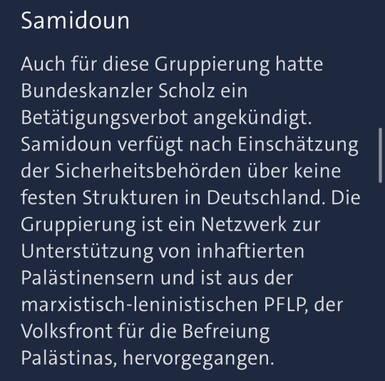
" Samidoun: Chancellor Scholz has announced a ban of activity for this group as well [context: the other group he announced a ban for is hamas itself] . According to the Security Bureaus Samidoun does not have solid structures in Germany. The group is a network for support of imprisoned palestinians and developed as part of the marxist-leninist PFLP, the popular front for the liberation of palestine.
Samidoun reacted "scandalized" to the announced ban. On its website the network speaks of a "racist hate campaign" of the german press "against palestinian and arab youth in germany and especially against the Samidoun-network" . [According to the network] the german state is a partner in the defamation and dehumanisation of the palestinian people as well as a partner of "the murderous war crimes and crimes against humanity of the occupational regime"
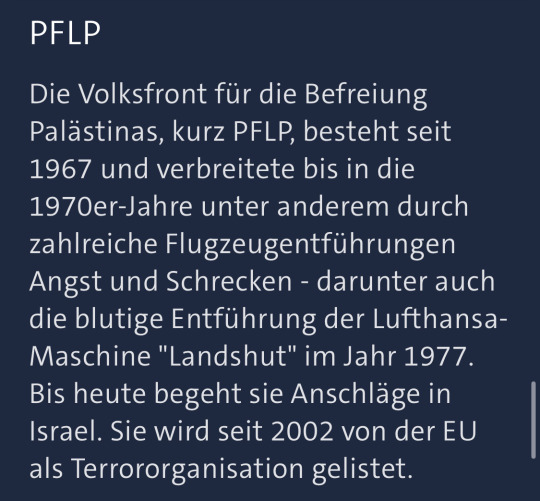
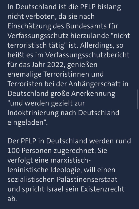
"PFLP: The popular front for the liberation of palestine, in short: PFLP, exists since 1967 and caused Fear and Horror in the 1970s , among other things via multiple airplane hijackings - among those the bloody highjacking of the Lufthansa-plane "Landshut" in the year 1977. Until today it is committing attacks in Israel. The EU lists it as a terror-organisation since 2002.
In germany the PFLP has not been outlawed so far, since according to the Federal Office for the Protection of the Constitution it is not "terroristically active" here. However, so the Report on Protection of the Constitution for the year 2022 says, former terrorists are enjoying great recognition among its followers and "are specifically getting invited into germany for indoctrination purposes".
The PFLP counts roughly 100 members in germany. It follows a marxist-leninist ideology, wants a socialist palestinian state and denies Israel's right to existence."
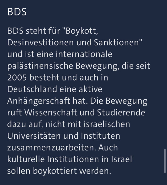
"BDS: BDS stands for "Boycott, Divestments and Sanctions" and is an international palestinian movement that exists since 2005 and has an active following even in germany. The movement calls for science and students not to work together with israeli universities and institutions. Cultural institutions in Israel are supposed to be boycotted as well.
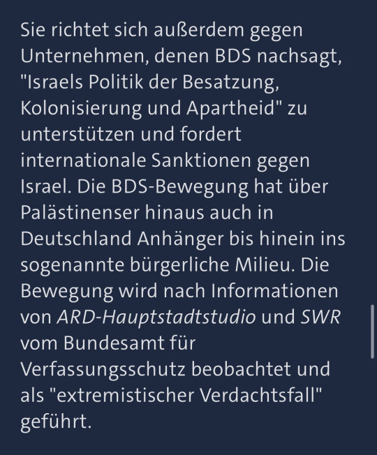
It also is directed against companies, who BDS claims support "Israel's politics of occupation, colonialism and apartheid" and calls for international sanctions against Israel. The BDS movement has not only palestinian followers but has followers in Germany as well, even in the so called civil milieu [context: they mean middle and upper middle class academics and other civilians] . According to the ARD-capital city studio and SWR's informations [two state sponsored news channels] the movement is being watched by the Federal Office for Protection of the Constitution and is listed as "an extremist suspect".
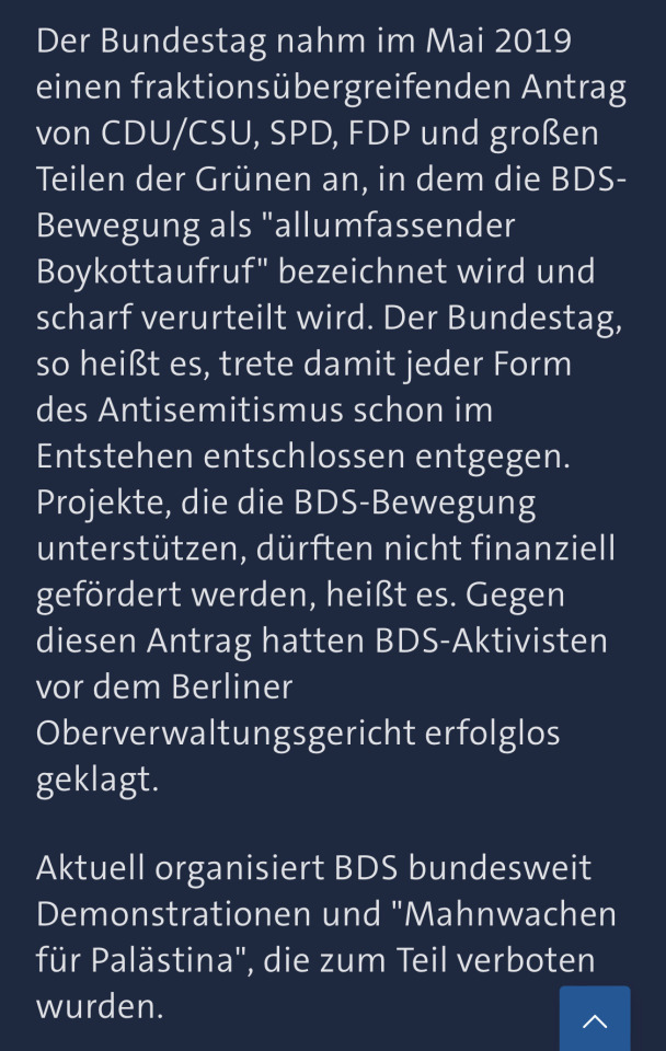
The german federal parliament accepted a comprehensive proposal by CDU/CSU [conservatives], SPD [social democrats] , FDP [liberals] and large parts of the Greens [progressives] , in which the BDS movement is described as an "allencompassing call for boycott" and gets condemned heavily. With this proposal the federal government, so it is said, is decidedly standing against any form of antisemitism even in its beginning stages.
Projects that support the BDS movement must not be allowed financial support, so it was said. BDS activists have sued against this proposition in front of the Berlin high administrative court, without success.
Currently BDS is organising demonstrations and "vigils for palestine" in all of germany, which in parts have been prohibited."
45 notes
·
View notes
Text
No. 48 - Eurowings
We're here today to talk about Eurow

Yes, Eurowings! Did you think those five letters started any other words? Silly. Let's discuss the aerosartorial choices of Eurowings, a member of - oh dear - the Lufthansa Group.
Eurowings! Eurowings is a former regional airline formed from the 1990 merger of Nürnberger Flugdienst, a regional airline that I'd heard of, and Reise- und Industrieflug, one I hadn't. After its acquisition by Lufthansa, it has been restructured into a low-cost subsidiary, making it something of the FlyDubai of Germany. That means I am yet again courting a C&D from the Lufthansa Group, and I am delighted to throw myself on this particular blade.
The process of Eurowings's evolution into its current state is somewhat tortuous, involving the cannibalization of its old subsidiary Germanwings (yes, this was subsidiary-ception, and while it happened after 2015 it seems to have been planned before...well, you know) and the establishment of an Austrian subsidiary which was moved to Malta last year and is named - get this - Eurowings Europe.
Eurowings has been going through it of late. Well, of ever, as far as I can tell. If you've ever been frustrated by a delay, spare a thought for the passengers of 2016's Eurowings flight 131, some of whom had their visas expire while stuck in their hotels in Cuba during their 60-hour delay. Every fourth flight could expect six hours or so of unscheduled quality time at the airport. Or, you know, 20 sometimes. 20 hours. Yikes! That's what happens when you start seven long-haul routes with one (1) A330 and a handful of various and sundry wet leases. A lot of their routes have been taken over by Lufthansa proper, which seems eager to kill the brand as soon as possible, and I can't blame them given it's somehow developed a worse reputation than actual Lufthansa. I've never flown with them. They served Boston for literally three entire months, but I wouldn't have flown Eurowings anyway. For my own taste their 'cheap' prices are still fairly expensive.

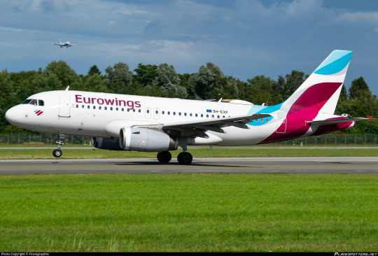
The Eurowings livery is unfortunately on more than just one plane for the moment. They have 95 A320 family members and four wet-leased Boeing 737s, giving them a very typical fleet for a low cost carrier. And they look like that!
Okay, first and foremost, I want to talk about their logo. It looks a lot like LATAM's logo.

Indeed, they even both use a variation on something adjacent to blue and something adjacent to pink. I think it's definitely a coincidence - they both were unveiled in 2015 - and even if it weren't I don't respect either one enough to defend its honor from the other.
So, those colors. I think I prefer the shades chosen by Eurowings, and in a competent livery design that palette could be extremely effective. I love LATAM's saturated pink and indigo, which made the mostly-white fuselage a disappointment, and I like Eurowings's desaturated fuchsia and cyan as a combination even more, but the lack of fuselage coverage gets even sadder when it's such light colors that fail to contrast against the white at all.

Unlike LATAM, Eurowings makes use of grey as both shading and background. I like this! I think it can make for a nice base to play with and a potential source of some interesting, dynamic designs.
Oh, and the logo is meant to look like an 'E'. I guess I can sort of see it, but it looks more like me attempting to get a pen that's starting hard going again. (Don't mix inks in pens, though. Especially not fountain pens.) Anyway, I don't really love the logo's shape in isolation but I do think it could easily lend itself to some totally acceptable fuselage layouts.
It's the wordmark that I think is interesting. This is about to be a long section about fonts but I promise that one, I have a point, and two, if you keep scrolling it will stop being about fonts.

The typeface used for the Eurowings wordmark is Soleto in medium weight. It was designed by Dalton Maag, a London-and São-Paulo based foundry. You've definitely seen their work around - they've done custom fonts for the likes of Pitney Bowes, Tesco, Fox Sports, Nokia, AT&T, Airbnb, Wix, USA Today, Google, and the flipping BBC, among others. And, well, a few that I would go as far as to say are pretty iconic:

Lush Handwritten is actually gorgeous in Cyrillic, by the way.
I would say they're not my favorite foundry, with a lot of their work trending towards somewhat boring sans-serifs that are not at all to my taste (you will never replace Gill Sans), but they've had some hits. They're also no stranger to airlines - they did a custom typeface for the TUI wordmark, which appears on their livery!

Blue side up appeal aside, I definitely want to someday talk about the strange beast which is TUI, the World's Most Misogynistic Airline.
So you might think that Dalton Maag was commissioned to make a nice custom font family for Eurowings, given Lufthansa literally used their money to commission a slightly different version of Helvetica, but you would be wrong. As their website makes no mention of a custom typeface for Eurowings, despite discussing modified versions of their existing products for other companies (like Fox Sports Cricket being a variant of Aller), I believe they are indeed using off-the-shelf Soleto, available via Dalton Maag's website as well as Adobe Fonts. Now, there is nothing inherently wrong with this, and I, who cannot afford a tablet to redesign the Eurowings livery, am not trying to wealth-shame an airline for not custom-ordering a typeface. They're far from alone. Another Dalton Maag user is Cebu Pacific, which uses Foco in a bold weight to decent effect, and I firmly believe that there's no reason to commission a second Helvetica if you want to use Helvetica. SAS uses Rotis Sans, and that's a massive airline with money to spare.

I just think the contrast here is funny. I could get the right to use the full Soleto font family for the entirety of Runway Runway's branding, title, and body text for one thousand sterling, or around $1350 in USD. This is, to me, a fortune and more money than I've had at any one time in literal years. It's also definitely not what Eurowings paid. I don't know what they paid, because Dalton Maag does custom quotes for unlimited licenses, but I don't want to imagine how much it cost to commission a firm to make a second Helvetica, so this just makes me think that Lufthansa really despises Eurowings. Pointless diversion? Maybe. I just think it's funny.
I think Soleto Medium is on the uglier side. I mean, I really don't like how Eurowings uses it in the same way I don't like Helvetica or the FedEx proprietary font - I really don't like really wide sans serifs used as titling, and I'm not sure why. Is it because it reminds me of elementary school? Is it because I find them sort of illegible? Are they just...ugly? Well, there's no such thing as objective ugliness, but this is my blog and I dislike them. They're certainly not at all memorable, which frequently makes their use something of an epic branding fail.
Soleto looks better than Helvetica, I'll give it that. A lot better. It's not really the typeface, though. It's the usage. While Dalton Maag's website does say:
Soleto is a flexible font family that can adapt itself to a wide variety of uses. [...] [it] is also quite capable of standing on its own.
It opens with:
Soleto is a contemporary sans serif font family with a quietly confident character. It works well for big areas of text, creating an even rhythm and texture, but can also make a statement at larger sizes.
And I think this is totally true, actually. As body text Soleto is fine! (This is via Dalton Maag's TypeTester feature, as are all future samples.)

This is 10pt Soleto medium, and it's a solid if generic sans-serif. Not overly ugly, totally legible. I'm not sure it's meant to be used for a logo, though. When I read 'statement at larger sizes' I think...titling, not airplane livery. A title for a website and an airplane wordmark are just different orders of magnitude.
How about titling? Well, I tried my own name in a couple different weights, and I actually think Soleto looks great in black italic.
This is a bit modern for my own taste, but I think this would look fine as a wordmark. Frankly, I think it would look good as an airline livery! It's not nearly as generic, it's almost a bit stylized even, and it's legible. The italic is always something I think looks nice due to its aerodynamic implications, and with a name as long as mine you don't really notice that this also does that obnoxious thing where the bottoms of certain letters dip beneath the baseline. Let's try some other weights!


Normally I prefer lighter weights in sans serifs, but no, Soleto looks worse the thinner it gets. These are, respectively, Light and Medium. Medium is what Eurowings uses!
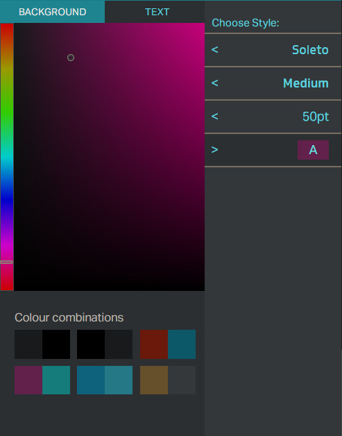
Oh, wow, would you look at that! One of their default color combinations is even basically the Eurowings scheme, though in reverse.

Well, this...doesn't look that bad, right? It's boring, but it doesn't actively make me wrinkle my nose.

So why is this such a problem? I mean, let's look at this picture of an airplane, as we do on this blog. I've chosen this picture because you can see a Finnair (post coming soon) plane in the background. Finnair has this neat spiky sci-fi looking wordmark, for which no typeface exists. This wordmark is absolutely huge, and in a very dark blue against white.
Meanwhile, Eurowings's logo is very similarly formatted to Lufthansa's. It's high up and closely spaced, making it feel a little claustrophobic. It's not...as bad as Lufthansa's proprietary Helvetica (Helvetica Neue Neue? Helvetica Ultra-Ultra-Condensed? Hellvetica?) but that's barely a compliment. Lufthansa has theirs well above the window-line all squished together, while Eurowings has the decency to use the windows as the underline you would think they're just perfect to be, but with a typeface that's medium weight, neither thick nor thin and with no italics or serifs, it becomes something of a small blob. To locate something that far up should be a stylistic choice. There should be no default choices in airline liveries. You can design a massive wordmark to cover the fuselage, or something which looks nice when localized to part of it, but you don't just get to do the equivalent of opening your text editor, typing in one word without indenting, and calling that a livery. Lufthansa doesn't get this, and neither, really, does any of the unfortunate airlines in the Lufthansa Group.
The color used doesn't blend into the white, but it also isn't like they're sharply contrasted. It just doesn't particularly draw your eye. It's a wordmark your eyes glide right over and it's not at all memorable. While grey or cyan could have been incorporated somehow to accentuate it, they weren't. For a livery that's mostly white to work, you generally need some sort of really vivid color. Kalitta Air's red and gold or Tibet Airlines' rainbow are examples of good use of a white fuselage. You could use a different background, but they stand on their own, and the white plays an active part in the color palette rather than just being a default canvas for it. Many airlines use black or dark blue for their wordmarks, and while these aren't the most creative choices they're used for a reason. Just look at Finnair. That's some contrast. It's nice and legible and distinct.
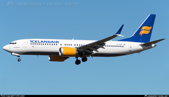

Icelandair's two most recent liveries use the same placement for their wordmark as Eurowings and Finnair respectively. Now, I actually like the wordmark on the old livery better. It has those nice trailing serifs and is in small caps, making it memorable and dynamic, and it doesn't feel closely spaced. The name 'Icelandair' teeters on the edge of being too long for this to work, but ultimately pulls it off. The modern livery dispenses with this much nicer font in favor of gigantic letters. While I like this less, it's still serviceable. It is gigantic, legible, and feels as natural as me sprawling out on a couch after work. It's simply expanded to its natural point. Adequately done on both archetypes.

Meanwhile, the lack of color contrast from the white fuselage was perhaps my main criticism of Air Astra's livery, which I otherwise quite like. It's probably the inverse of Eurowings, which is contrasted enough to be acceptable but entirely boring in design - well-designed, but please, please, please let me actually see it.

Eurowings just...well, I'm going to copy and paste exactly what I said earlier. There should be no default choices in airline liveries. You can design a massive wordmark to cover the fuselage, or something which looks nice when localized to part of it, but you don't just get to do the equivalent of opening your text editor, typing in one word without indenting, and calling that a livery.
And, as a final note, something that looks good on a webpage won't always look good on an airplane. The angles you'll see it from are completely different, it has to compete for the rest of the livery for your attention, and you can't necessarily put infinite space around it due to the very physically limited canvas you're working with. The Eurowings wordmark feels vertically cramped more than it does horizontally, because the windows are right below it and immediately above it the fuselage just...ends, from a two-dimensional view. Something looking okay in copy doesn't mean you can transfer it immediately to material.
Lindon Leader talked about this when discussing his design process for the FedEx logo in a very illuminating interview I cited heavily in my FedEx post. He looked at multiple pre-existing fonts but decided to create a custom one, and one of his reasons for this was:
[...] each had its potential limitations downstream in application to thousands of FedEx media, from waybills and embroidered courier caps to FedEx.com and massive signage for aircraft, buildings and vehicles.
Something can look acceptable or even sleek on a webpage, and that same wordmark can look downright horrible when applied to an airplane. I'll say this for FedEx - while I find their logo ugly it is absolutely good at what it needs to do. It looks no worse in any one medium or context than any other, and that's one of the reasons it's successful. It's not to my taste, but it's definitely well-designed, and I think one of the ways to improve the livery would actually be to somehow give it more real estate on the fuselage.

So the wordmark is, in my opinion, an abject failure. It's not even ugly but I mean that in the same way Wolfgang Pauli describes crackpot physics as not even wrong. Like, it's fine. It's nothing showstopping or even memorable enough to be picked out of an identity parade of default webfonts but I don't despise it. It's a common phenomenon and I'm picking on Eurowings because it's there and I know exactly what font was used and thus can mess around with it, not because it's the worst. Much like Lufthansa, it's an opportunistic victim. You know, the sort of post I'll end up hyperlinking to later, because even in its failure it's nothing exceptional.

I will say I enjoy the tiny outline of black on the letters. That's not on the wordmark proper, as rendered on their website m, but adding it was definitely the right move to help the magenta stand out from the white. Once you know about it you can notice how it makes the wordmark pop ever so slightly, turning an unmitigated catastrophe into a mitigated catastrophe. It's almost infuriating that they did this thoughtful little thing when you zoom out and remember what it's in service of. This honestly is a reoccurring thing with Eurowings.
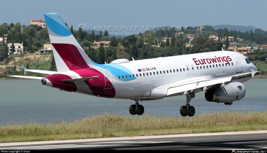
Look at that nice tail design! They could have slapped the logo on and left it at that, like so many other airlines, but they didn't. They use the same nice colors and the overlapping greys to create a design that is clearly their logo while also being abstract and dynamic. There's a lot of shapes, a lot of motion, and a lot of nice shades of cyan and magenta, and I love it!
See that airplane landing in the background? Think about what airline you think it flies for, and stick a pin in that for a minute.
Hey, uh...where's the rest of it, though?
So, yes. Eurowings shares the first five letters of its name with Eurowhite. If you're not familiar with the term (I have a glossary, by the way) it just means a livery that is almost completely white save for logos. One could argue that the fact that the pattern on the tail isn't limited to strictly the tail and does form some sort of attempt at a fuselage design means that Eurowings' livery isn't 'true' Eurowhite, but I'm not going to brook that. Eurowhite is a state of mind. There is a nice, abstract design here which could easily be extended further. There is a grey shade which could be utilized (as it is on the engines, which look like they're lost and wandered onto another livery by accident) and there are infinite ideas to be had on the planet, and instead the majority of the plane is just white.
If one thing is thought of as my thesis from this post, let it be this, said for the third time: there is no such thing as default. Things like this wordmark placement, this type of font, and the primarily white fuselage are not default. The fact that they are common and boring does not make them inherent until replaced. They are still an active choice just as much as designing a livery that doesn't utilize these features is. It was proposed, iterated on, signed off on, and implemented. Airlines don't start with a template they then alter. They start with a vast world of infinite possibilities and decide they want to do the same thing as everyone else - that's a choice just how any other act of cowardice is a choice. I think the misconception that boring design is a result of inertia and lack of effort is a harmful one. It is a choice. They choose to do this.
They do not choose it because it is right for their livery, because they like it. They choose it because it is common, it is safe. It is reliable and it doesn't rock the boat. I've said this before discussing Southwest and Flair - low-cost carriers should be willing to rock the boat. If you're going to advertise yourself as the no-frills option you shouldn't try to look all composed and corporate. You have nothing to lose with being bright and pretty and interesting, so why aren't you?
And that cowardice is what makes me hate it so much. Some liveries are ugly, and some are almost ugly but stop halfway to cower in a Eurowhite bunker in an attempt to stem the bleeding, but there's nothing more tragic than a livery so afraid of being ugly that it cuts off and cauterizes something beautiful. The fear of ugliness is the death of beauty. condor is worth one billion Eurowings.
(No, Eurowings does not fail the Star Alliance Test, though.)
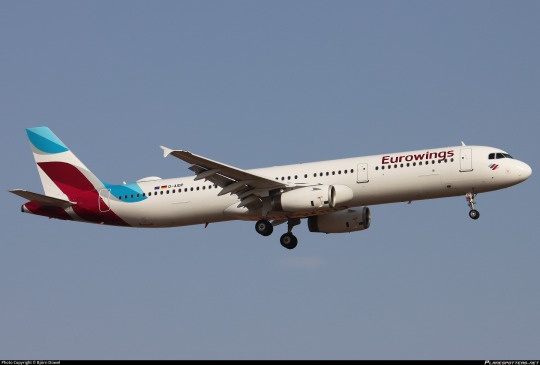
Like many of these designs that sort of just decide to stop after the tail, the longer a plane is the worse the Eurowings livery is on it. This is a very nice tail attached to a big white tube. Sure, Eurowings mostly operates somewhat short aircraft, but that wasn't the case when the livery was designed - back then they had A330s. Even now they have A321s.
Frustratingly, given how much I've ragged on this livery, I do still really like the tail. Even more frustratingly, you can see how easy it would have been to not have it be this way. The end of the cyan stripe almost begs to be held onto, weaved onto the rest of the fuselage, but it just isn't. It looks unfinished. It looks sad.


With all these shades of cyan and magenta to play with, the light heavily alters the way the colors on the tail look. They're never not pretty. It's a lovely colorscheme that's dramatically underutilized. The way it weaves together has so much potential, and it's attached to a white body. It looks like the paint job is unfinished. And that's what I hate the most about Eurowhite - good ideas left to languish, where a bit of custom letterhead does a better job of expressing your identity than an airplane livery.

The one feature Eurowings has towards the front of the plane is this little cheek decal of the Eurowings logo. Nice thought, but it almost looks actively worse when it stands out like that among an otherwise blank space. Plus, it's so small it might as well be a dot. It's cute, but in terms of overall effect on the livery it has the effect of making something mostly white look cluttered, which is just downright bizarre.

Obviously I can't endorse this. While not quite at the Lufthansa Line, with the actual bit of design happening on the tail instead of a sterile block, it doesn't cover much more fuselage than a proper exemplar of the phenomenon, and that's just always going to be a bit of a kneecap. Eurowhite is a state of mind, so much so that I almost think an unremarkable sans-serif font is as much of a codifying feature as a white body despite not being specified anywhere in the term. The same decision-making process leads both places, and the little black outline and cheek stamp and nice tail design just cant overpower that.
I'm giving Eurowings a D+.
Eurowings reminds me most of Saudia. They both have gorgeous colorschemes wasted on a design which burrows itself down as far into the substrate of artistic cowardice as physically possible. It's especially tragic and leaves me fighting myself over my final ratings. It feels wrong to grade such a gorgeous tail so harshly, but the good design features just make the bad package even more insulting. And at the end of the day I just have to put my foot down.
Sometimes I'm generous with grading because an airline is new, or because they're iterating on something that could be taken in a good direction. Eurowings isn't in the process of developing towards something nice, it's just Eurowings. It's an airline that stranded people in Cuba for 60 hours and Lufthansa seems to want it dead. I don't think we'll be getting a Eurowings livery overhaul anytime soon and I'm pessimistic about its longevity in general. Low-cost carriers and subsidiaries of large airlines are both easy come, easy go. Tears in the rain. 'Twas ever thus. Try not to get too attached.
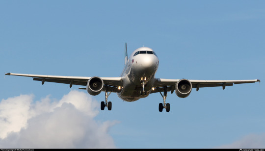
Remember that plane from earlier? Yeah, I've got no clue what airline it flies for, but I don't think I can rule out it being Eurowings. 'Twas ever thus.
#tarmac fashion week#grade: d+#era: 2010s#era: 2020s#region: west/central europe#region: germany#eurowings#low-cost carriers#lufthansa group#air astra#icelandair#lufthansa#tui#finnair
15 notes
·
View notes
Text

Lufthansa A320 ✈️
#lufthansa#lufthansa group#airbus#airbus a320#a320#aviation#flying#airplane#munichairport#austria#germany#deutsche lufthansa
7 notes
·
View notes
Text
Not what I usually post, but I need people to see this insanely intimate moment I had with two complete strangers at the airport the other day. This was typed out in my notes app on the bus ride from the airport so I’d get every fresh little detail from my memory.
“Sitting on a Lufthansa flight, eight hours from Frankfurt to Boston. We’re a half hour ahead of time, sitting on the runway awaiting an open gate. I hear a clang, and under my seat rolls a metal water bottle. I reach under and pass it back to the kid who dropped it. They wear a soft jean jacket with a shirt underneath reading something along the lines of “I’m really a moth and this is my human costume”.
“Here you go, bud.” I say.
They thank me.
Five, ten minutes later and everybody is getting up to be deplaned. I hear behind me the same kid talking to their mom. “There’s a type of jellyfish that can live forever. If something doesn’t eat it. They go back to an earlier stage of their life…”
I turn back and pull lobsters into the conversation. They tell me they went to an away science camp where they learned about marine biology.
“I’m Moth” they draw out the “th” sound.
I repeat it back: “Moth?? That’s such a cool name dude!”
The mom jumps in. “They named themself that!”
“What’s your name?” Moth asks me.
“Sam. My pronouns are he/him, what are yours?”
“They/them!”
“That’s so cool! I’m trans too!”
The mom again: “They have older siblings, so they’ve had a lot more time to think about these things than most other nine year olds.”
There’s a pause in the conversation here, and I can feel my emotions bending. “You know you’re the luckiest kid ever, right?”
“I am?”
“Mhm..” I’ve started to get shakey now. I look away and bring my arm to my face, trying to control my emotions. The mom looks at me, and waits a moment before saying, “y’know, I give out mom hugs to anyone who needs it.” She opens her arms and I lean into the embrace.
When it’s over I find myself saying “You’re the coolest person I know. I hope you have a great life!” to Moth as I leave. I wave behind me as I get off the plane.
“Me too!”
I wait on the edge of the group as the rest of the cadets trickle off of the plane and condense beside me. I see Moth and their mom walk by, and I catch the mom’s eye. We smile at each other. Moth doesn’t see me.
They came back. To find me. And Moth asks for a hug. (Or, more accurately, if they can hug 𝘮𝘦.)
“Of course!” I bend down. We’re at an awkward height, and I shift to see if I should kneel or remain. By the end I’m kneeling.
We hug more times than I remember. Eight, nine, ten times? I don’t rightfully know. Each hug they get more emotional, and I see tears well up in their brown eyes.
The mother says “sorry, I’m sorry, I didn’t know they’d start crying like this.” I tell her it’s fine, it’s okay.
Their straight, brown, a bit longer than shoulder length hair is messed up, and the mom is behind them, smoothing it behind their ear. So am I.
“It’s gonna be okay.” The mom says to them.
I tell them that they’re the coolest person I know. We hug, and each time we pull away, we hold each other’s arms, or grasp each others hands.
“Sorry about this. With the jet lag and stuff they start acting like a drunk person!”
Moth laughs through their tears, and I laugh with them.
“Sam’s gotta go with his group now,” the mother says. So I do.
The last time I saw Moth was about a half hour after our first interaction on the plane. I’m walking with my group to get my passport stamped. Moth is alone now, waiting for their mom outside a bathroom. I hug them one last time as I walk by, and file down through the seatbelt barrier maze.
I wave, and Moth smiles back.
And that’s it. That’s my whole story. As much as they’ll ever know of it, at least.”
#how do i even tag this#transgender#trans#nonbinary#transmasc#idk man#i cried writing this#and reading it through before posting#I’ve told about three people up till now#writing#(?) i guess#I’m a mess dude
17 notes
·
View notes
Text
Brands that user georgegraphys think would fit George (as team sponsor/individual BA jobs)
1. Samsung (Technology & Electronics)
I know George used Iphones but imo, Samsung would be a good fit to sponsor the team because a) their brand image definitely fit Mercedes & George a lot (bold, broad innovations, and of course, their main colours (Black, White, Blue) fits Mercedes official colour a lot or it doesn't clash against other colours, colour synchro is important too) + their CSR aligns a lot with Mercedes' as they focus a lot on energy efficient, sustainable, and renewable products
2. Cartier (Jewelry)
It is unlikely for Cartier to be a team sponsor, so i'd like to think of George doing a campaign for their collections. Was actually thorn between BVLGARI and Cartier (but then I thought BVLGARI would fit Lewis better, giving me maximalism vibes) whereas George imo, will look better with the simplicity that Cartier jewelry offers (i could honestly imagine Carmen & George doing this join Cartier campaign)

3. Brunello Cucinelli (Fashion)
This is highly unlikely as Mercedes and George are tied with Tommy Hilfiger (even if it happens, it would be an individual collab w/ George) but a collaboration with Brunello Cucinelli would blow people's minds. George actually wore plenty of Brunello Cucinelli clothes (one of them being the sweater he wore in Austria this year). Brunello Cucinelli emits the old money modest elegance, minimalism, and classic that would fit George a lot (as it seems like his fashion style is the opposite of Lewis' maximalism and stand out-ish)
plus, George is friends with THE Brunello Cucinelli's daughter alr on instagram 😜
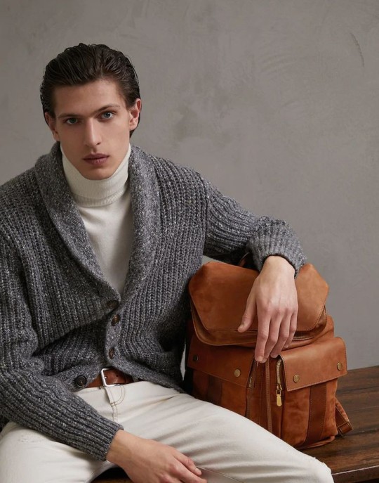
4. L'Oreal (Cosmetics & Personal Care)
I might sound like i'm drunk but HAVE YOU SEEN GEORGE'S HAIR?! L'Oreal can easily make him their model if they become a team sponsor or collaborate with him on a personal campaign. It's a perfect objective for L'Oreal. That's if we're talking about the haircare part, but the skincare? George could too. His skin is *chef's kiss* perfect for a L'Oreal CF shoot on a beach

5. Hennessy (Alcoholic Beverages)
Haven't looked up the F1 policy on this since they seem to be sponsored by Heineken and idk if another alcoholic beverages brand is allowed to sponsor a team. But hey... FUCK THE ENERGY DRINKS WE ROLL WITH THE ALCOHOLS. George's fancy commercial with Hennessy, while drinking a cognac? I'll take it. Plus points for Hennessy is that sophisticated beautiful product design they had (the bottle designs) and the logo 🥹🥹 (i'm a sucker for logos okay)

Other optional replacements:
Ritz Carlton/Marriott Bonvoy > Intercontinental Hotel Group
It's British and had the same vibes and elegance of an expensive hotel just like Marriott Group & Ritz Carlton (I prefer Ritz Carlton over all) but yeah could be switchable. We can still see George doing silly Marriot Bonvoy-like CF
IWC Schaffhausen > Tissot Watches
There won't be a really huge change between Schaffhausen to Tissot as both of them are similarly classic Mercedes vibes.
Police Eyewear > Michael Kors
I just prefer MK's design over Police even though Police ones that George wears are good. Plus point for MK is that they're more well known (opinionated statement)
Monster Energy > None (?)
I don't think an energy drink company sponsor is really needed in George's Mercedes.
Possibly other brand types that i'm interested in for Mercedes to partner with : Airlines (Lufthansa/Etihad Airways) or Luxury Goods manufacturer (Montblanc/Fortnum & Masons/Harrods)
Other than these brands : i personally think Van Cleef & Arpels, Guiness, Bottega Venetta, L'Occitane, and Salvatore Ferragamo to be a great contender in being a good brand for George. But if we're talking about British stereotypes, Lipton should sponsor him LMFAOOO
Conclusion is George doesn't lack brands that fits his image branding and personality. Haters should not worry about who'll sponsor Mercedes/George. There are lots of brands that fit George's Mercedes and George Russell himself, maybe you should broaden your brand knowledge 🤭😝☺️
#george russell#gr63#of course not all of these brands are interested to sponsor F1 teams or be involved in sports#but this is just an opinionated insight of mine on which would fit George's Mercedes#sponsor talks
9 notes
·
View notes
Text
Scotland: Glasgow Airport workers set to strike
Unite the union has announced key worker strikes at Glasgow Airport after OCS Group - which provides facilities management services - failed to improve its pay offer.
The dates for the 24-hour walkouts are 6 July and 11 July. [...]
Further strikes at both Edinburgh and Glasgow airports have been called off after deals were struck with the unions, with staff accepting 11 to 12 per cent pay rises. [...]
Birmingham Airport in the Midlands could also face summer travel chaos as around 100 key airport workers are voting on strike action.
Security officers, technicians and aircraft re-fuelers could stage walkouts from July over pay, potentially leading to "significant delays and cancelled flights", according to Unite.[...]
The Swedish Transport Workers' Union has announced security strikes from 3 July at Stockholm Arland Airport, Bromma Stockholm Airport and Gothenburg-Landvetter Airport.
At Bromma and Lanvetter airport, the strike would affect all work carried out by security staff meaning passengers may not be able to depart from the airport. At Arland, it wouldn't be a total walkout and could just affect baggage scanners meaning passengers would only be able to take carry-on luggage.
The strike over wages could continue on 5, 7, 10 and 14 July if no agreement is reached.
It will also include security staff at other businesses, including a nuclear power plant, with a total of 450 employees expected to be involved, according to Swedish national broadcaster SVT[...]
Italy: Strikes across public transport and airports in June and July[...]
On Friday 7 July, public transport staff across the country will strike for 24 hours. Everything from trains to ferries and metro services is likely to face delays and disruption due to the walkouts.
The level of disruption is likely to vary from city to city and even from service to service
On the same day as public transport workers stage a nationwide strike (7 July), ground staff at airports including Rome Fiumicino, Milan Malpensa and Amerigo Vespucci in Florence will stage walkouts. This could lead to airport delays.[...]
On Saturday 15 July staff at Italy's main air traffic control operator ENAV are going on strike for 24 hours. [...]
Spain: Daily strikes from airline staff
On 19 June, the Spanish Union of Airline Pilots (Sepla) began a third round of strikes against Air Europa, Spain’s third-largest airline.
It comes after a verbal deal reached on 8 June over pay and working conditions fell through.
The two-week walkout will last until 2 July, and has so far led to flight cancellations and delays. However, pilots and airlines are obligated to maintain a minimum number of flights during strikes in Spain.
Since 6 June, the Sepla union also began a “daily indefinite strike” against Air Nostrum, the regional airline run by Iberia. The strike has forced the cancellation of 20 per cent of the airline's flights and also delayed other flights.
The strike is taking place every weekday and there are no signs of a breakthrough in talks so far. [...]
Germany's EVG trade union, which represents railway and transport workers, has called a series of 'warning strikes' this year over pay. These have impacted Deutsche Bahn train services, among others.
Wage talks collapsed in June, bringing the prospect of more walkouts. Dates are yet to be announced but union members are set to vote on an unlimited strike.
This could begin from mid-July, hitting holiday season travel.
Lufthansa pilots are currently considering a new pay offer from the flag carrier. Workers have agreed on a truce on strikes that ends on 30 June, meaning summer walkouts could be on the cards if the offer is rejected.
Switzerland: Workers at Geneva Airport threaten strike
Workers at Geneva Airport represented by the Swiss Public Service Union have resolved to strike on Friday 30 June over a pay dispute.
Air traffic was brought to a standstill with dozens of flights cancelled. And now staff plan to continue the strike into Saturday 1 July.
The strike was announced immediately after the company managing the airport agreed to a cost-cutting plan for salaries on Thursday 29 June. Initially, it was feared the strike action would be immediate, but it was instead been called for Friday.
Geneva Airport is expecting disruption and has advised passengers travelling in the coming days to arrive 2.5 hours before their scheduled flight, with delays and cancellations likely.
30 Jun 23
17 notes
·
View notes
Text

Make your Group Travel easy with Lufthansa
Whether you're traveling for business or leisure, Lufthansa Group Travel provides exceptional service, comfortable accommodations, and unbeatable value. Let our team take care of your travel arrangements, so you can focus on making memories with your group.
0 notes
Last Seen Blogs

jsdchamp99
jacobspencer04
tuttoquellochenondicomai
Completamente

questersrest
go, save the world

dr-nerdhat-inc-blog
Gah I'm really lonely here...

puramolvi-blog
Untitled