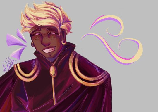
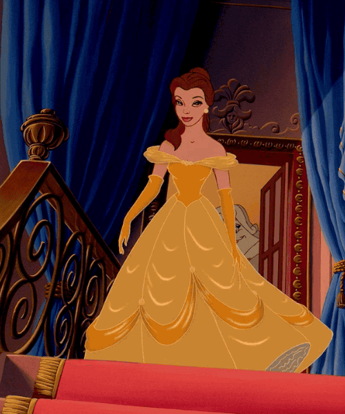
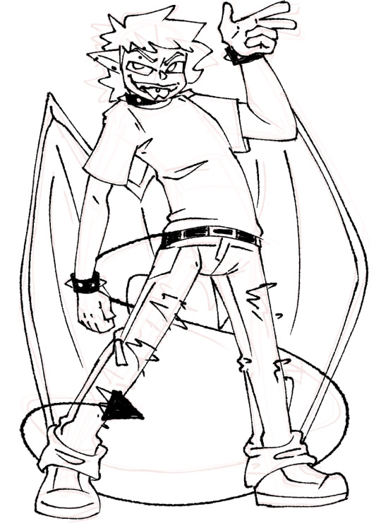
#lineart's traditional while coloring is digital
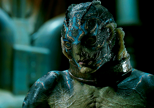
Photo
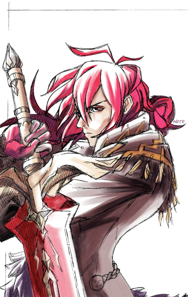
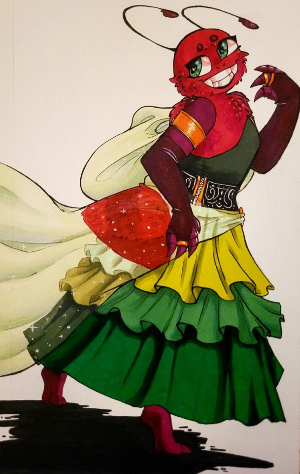
uncrowned king of mondstadt
#genshin impact#diluc ragnvindr#lineart's traditional while coloring is digital#this was fun#and challenging#heavily inspired by the old guilty gear art#i think i did a good job#ANYWAYS#MY BOY'S BDAY LET'S GOOOOO#oh look colored digital art
67 notes
·
View notes
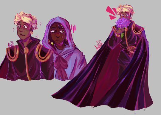
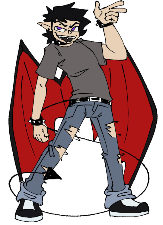
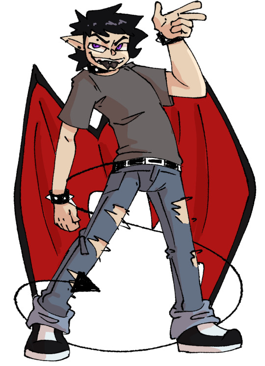
Text

I should be aware
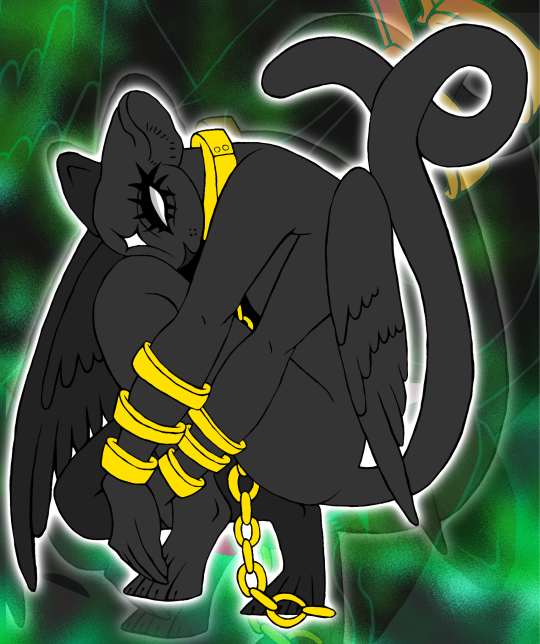
#art#digital art#artists on tumblr#oc#sfw furry#furry art#anthro#angel#wings#gold#chains#black#panther#multiple arms#tail#edited#green#devihashiart#//nao#thats their name#close enough#the one thats lived in my head since i was a child#i think#anywa this actually started out as a tradition drawing (lineart) then i cleaned up and colored the rest on ibispaintx#haven't done that in a while
9 notes
·
View notes
Text
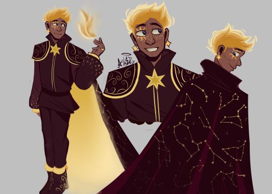
THE MOMENT WE WERE ALL WAITING FOR, FINALLY FINISHED THE DESIGN OF ASTER YESSSSSS ✨✨✨✨✨✨❤❤
This design belongs to the Wish rewrite called "The kingdom of wishes" (Written by @annymation and soon illustrated by @emillyverse and me)
Sorry for the delay, but this guy had so many things to draw and I also had a thousand ideas that it took me a while to capture them all (4 drawings wow, even I'm surprised lol)
Now after this introduction I will tell you the procedure of its design :]
2D MODEL:
-Maybe some don't notice it, but for the 2D drawing of Aster I didn't add many shadows, because in the classic Disney movies the animation doesn't have many shadows if we look closely, this is for several reasons (at that time they had to inking FRAME BY FRAME, can you imagine how much longer it would have taken to add detailed shadows? I really have respect for the animators)

(Here are some examples of what I'm trying to explain)
-As I said before, I didn't detach myself much from the concept art of the movie, I just added some other details that occurred to me, Anny and Emy.
-We decided that his cape would have the constellations of the signs of the zodiac (It was Emy's idea), which in the final result are on the cape, the constellations are noticeable more or less depending on Aster's mood.
-In the Wish rewrite it is mentioned that Aster's hair is like a candle (Reference to Hades) so I decided not to add the lineart in that part
His hair changes depending on his emotions, but not only that, but also his lineart, the calmer he is, the cleaner his animation will be, however with strong emotions (anger, sadness, nervousness) his details will be more neglected, especially when He is REALLY angry, by the way I made his hair look like a flame to give more drama to his design and also make a reference to Ember from Elemental
And as a final detail, the star-shaped gem that she has as a brooch changes color, just like her earrings.
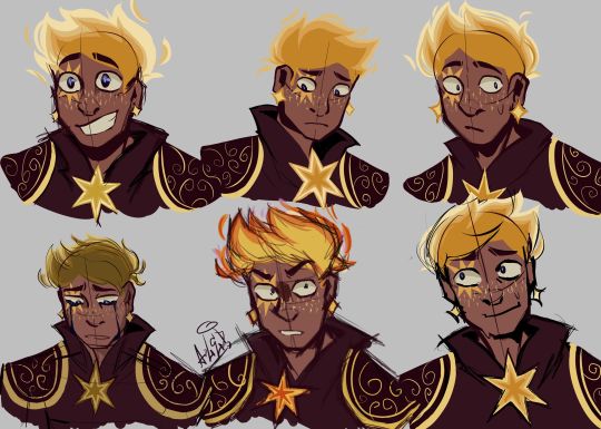
3D MODEL:
-When Aster disguises himself as a human, his details on his clothes would disappear and the shape of his accessories would change to ones without a star shape, also the tone of yellow would look duller, you know so as not to draw attention (although he is dressed like a prince with a giant cape, the boy doesn't know how to hide the truth very well lmao)
-In general, it's just that the design becomes simpler, the only thing that changes is her hair that is no longer a flame, her freckles that are no longer little stars, her clothes no longer have so many details and her mark on her eye disappears( ̄▽ ̄) .
By the way, I wanted to thank @the-autistic-idiot for giving us the great idea of Aster having a star-shaped mark on his eye :D.
-Also, I think that those who have seen my other Wish redesigns are wondering why it seems like I had spit a rainbow at Aster's 3D drawings, what happened is that when I was painting my neurons said ✨Change your coloring✨ and well, The drawing in the end came out like this, although I honestly like it better, it better represents how I draw in a traditional way
Yes, basically the coloring of my drawings is as if a unicorn had spit on them lol
FINAL COMMENTS:
-It was very fun to draw Aster! The boy really has a lot of changes, but thanks to him I already discovered my digital drawing style so I am satisfied.
-Again sorry for the delay, I know that for many Aster must be their favorite character so I hope your wait was worth it :]
See you next time!✨✨
#disney wish#wish 2023#disney#wish movie#sketch#wish#art#artists on tumblr#artwork#drawing#star wish#starboy#human star#wish star#starsha#star redesing#the kingdom of wishes#the kingdom of wishes fandom#the kingdom of wishes au#starboy wish#starboy x asha#asha and starboy#wish concept art#asha x star#wish asha#wish disney#disney fanart#disney movies#disney animation#walt disney animation studios
351 notes
·
View notes
Text
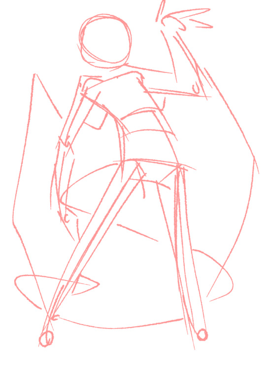
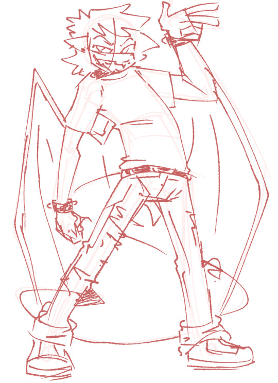
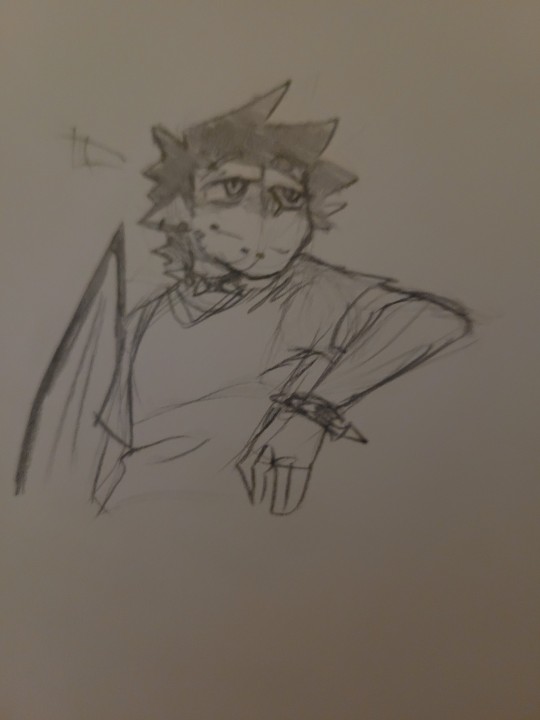
Current digital art process!
Acting on @shkika 's request because making my redraw for this post actually ended up giving me more confidence in my digital art process! As such, I'm gonna use it as a reference. And if this walkthrough of sorts turns out nice, I might do it again as my process evolves!
I started off with a quick sketch of sorts, trying to focus both on movement and volume, and get the general idea of where each element is located. I edit the image dimensions and placement of things a lot in this phase, as my ideas often tend to change once I actually begin drawing them. In this case, as I got it down, I decided I wanted it to look like some cheesy animal motivational poster, so that influenced where the text was.
From there, I began to clean and sometimes edit the sketch, mainly by thickening the lines to make the shapes more definite, and erasing what wasn't necessary and interfered with other parts. Volume is one of my biggest focuses in my drawings, so I try my best to get the volume of each character at least hinted at with the lines. This is something that will probably remain in my process for a while, as I quite dislike doing separate lineart and like the messy, sketchy feel anyway.

I also wanna mention, in addition to having references and such in other windows, I've recently begun having a second mini window of my current drawing off to the side so I can see what it looks like overall more easily, regardless of how much I zoom in on and flip the main window. It's quite helpful!
For reference, this is what the final sketch looked like:
Then, I went on to add the flat colors. Another tip: I almost always set my sketch layer to "Lumi & Shade" because I think it makes the line colors a lot richer, but since it's based on what colors are underneath, it colors the lines a lot more individually than changing the sketch color as a whole. Here's some comparison to a version without the effect (left):

Then, I add some shading using a (really nice) marker brush. This is honestly one of my favorite parts of the process, just trying to carve out all the volumes, especially since I usually use a pretty blue color for shadows!
Sometimes, I honestly just leave drawings finished at this step, because I adore the sketchy look so much, and because I really don't like the tediousness of more realistic rendering in the painting process; from what I've seen/experienced, it often involves having to basically paint the entire image over again, which I've realized I find REALLY boring (and is also why I clean the sketch instead of making a new lineart layer). As such, one of my hopes is to reach a point where I could almost completely avoid having to clean up the image in a traditional painting method, instead being able to lay down lines and colors so well that they convey nearly all the volume necessary on their own, still have that sketchy appeal, yet also look finished and professional.
Alas, I did do a bit of clean up on this image, but I think it still turned out alright!

Here's the finished drawing! I'll have to practice with this process a bit more to truly solidify it as my digital go-to, but nonetheless, I think this came out adorable! Thanks again shkika for the ask, and thanks to @mintscampi for the sweet prompt! I hope you guys like it!
#art#artwork#artists on tumbr#digital#digital art#digital artwork#painting#digital painting#process#painting process#art process#tutorial#fanart#rain world#slugcat#rw slugcat#slugpup#artificer#rw artificer#quetzalli draws#quetzalli's notes
88 notes
·
View notes
Text
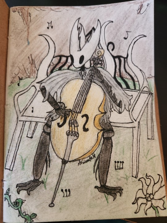
i think they should play the cello. as a treat
i feel like i ruined this the second i added color but by the time i did it was far too late to turn back. thats the unfortunate peril of traditional art
i dont hate it, still, but i liked it much better when it was just lineart, rip. still sharing it
heres the sketch. while the lines arent clean it represents it well enough
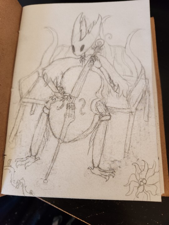
maybe ill go over the sketch digitally someday and clean it up to be just black and white art
#akira scribbles#hollow knight#hk#the hollow knight#thk#fanart#theyre plucking cause i didnt wanna draw a bow#sorry for how shit the cello looks. despite being a string player for 8 years i still cannot fully grasp a cellos proportions#probably because im a violinist
37 notes
·
View notes
Note
if I’ve already sent this ask before I’m so sorry, I’ve got adhd, but how did you find your art? (I’m in my questioning phase)
hihi!!! no problem! i think i have some kind of glitch with asks bc when i go look for them it says i have 3, but when i check it, there isn’t any so im sorry if any of u have ever sent asks and i havent answered them it’s probably bc of that😭
but anyways lets get on it!
finding you art style is not smth simple at ALL. ive been drawing my entire life!!! and ive had a bunch of different styles until now, they kinda used to change every few months or so, i was always happy with them but it never really lasted??? and i always had at least one part of the process of it to dread doing, for example, coloring.
it wasn’t until recently i FINALLLYYY found a style im 100% comfortable in.
it really takes experimenting and finding what elements of creating art you love and enjoy the most. for me, i used to mostly do traditional art, just pencil or ink sketching and i would OCCASIONALLY color them. so i really used to enjoy kinda the messiness of the pencil on trad mediums and stuff? and i never rlly found a way to translate that element to digital art which is the one i enjoy the most now.
brushes are very important! it depends on the look you like. since i like that pencil feel, i use a pencil looking brush! (softy from esbenlash’s procreate brush set) and i also got a paper feel screen protector for my ipad to enhance the experience🔥
i found i mostly enjoyed doing lineart and didnt rlly look forward to coloring, i didnt find my past styles enjoyable bc they kind of felt restricting in that area? since i didnt find a way to make it more abt the lineart and less abt coloring that i liked (ofc theres plenty! i just didnt find one for me)
so tbh i think what mostly influenced the style i enjoy the most now is film, and baroque art!
i had recently seen:
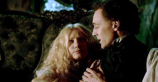
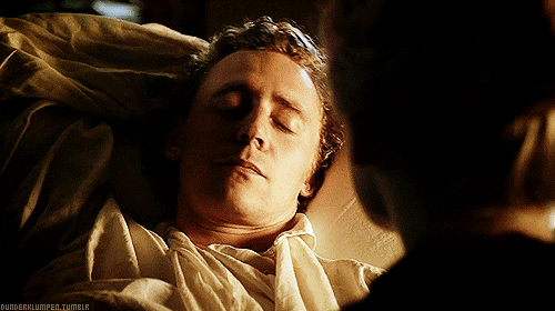
Crimson Peak (2015)

The Shape of Water (2017)
and ofc


Stranger Things DUHHHHH
and i fell in love with the way the lightning was, heavy dark shadows and moody lights, and tried to match my style to it and found that it highlighted all the things i enjoy doing the most while drawing! so thats where i am now
special mention to the one movie im obsessed with currently


The Crow (1994)
also has the similar style
all that + experimenting, studying other’s art i liked and finding elements to integrate to my art, ANDDD music also played a huge part in it. so as you can see for me its about kind of combining aspects of every single piece of media i like 😭
its not gonna be the same for everyone, but its always good to have a guide so i hope this was useful for you and anyone else! im always willing answer any art questions :)
don’t worry too much about speeding up finding your style, it’ll come to you eventually, so focus on enjoying the moment and learning, take mental notes of what you like and don’t like!
sorry this is kinda long as hell… but i like rambling
#perfect opportunity to show off these shots from my fav movies teehee#art truly is all one!#i love getting inspired from multiple medias and combining it into drawing#ari answers asks
18 notes
·
View notes
Text
Also a note: Kiku takes commissions. Just thought would make a post about it because Kiku hasn't posted about it in a while. Have taken commissions before, it's just been a while.
Kiku is best at drawing animals, anthros, and ponies, but has drawn lots of different things before. Process usually follows: pencil sketch on paper, then digital lineart, then color, if it's a color piece. Usually it would only be finished digital pieces but Kiku has a printer with a scanner now, so can do traditional sketch pieces and then scan and digitally send them to the commissioner. Right now traditional mediums are limited to pencil and paper ( Kiku only has a limited number of colored pencils suitable for commissioned pieces and no lining pens)
Kiku can do (when have the materials):
Traditional: Pencil and paper sketch, color pencil, and pen lineart pieces.
Digital: Sketch, lineart, full color pieces.
Prices are flexible and vary depending on piece complexity, medium, and how long the piece takes.
If there is enough interest Kiku can make a commission price page.
#kiku squeaks#disabled artist#artist#furry artist#autistic artist#art commissions#traditional artist#digital artist
15 notes
·
View notes
Text
Oooo! You're getting a special treat today. Two finished pictures in one post!


I was planning to post this fanart I did of @roxithewolf for a while but kept forgetting 😅. It's quite notable for me. I finally figured out how to make the 2000's anime eyes!
The way I go about it is colouring the eyes one flat colour. Then add a multiply layer. Clip it. Colour the top with a soft brush. I use the same colour as the original flat one. Then add a multiply layer. Clip it. Colour the top with a soft brush. Then do it a million times until it start to look black. Add a colour dodge layer. Clip it. Do the high lights with the soft brush.
Not the best tutorial. But you sort of have an idea of what I did... Hopefully. I should one day post a proper tutorial. Not because my art is all that amazing or that my art process is all that amazing. But it might set a foundation for someone just starting with digital art.
The other picture is of @vikfiv21-blog 's oc. I really like traditional painting for the freedom. I was getting quite fed up with how exact you have to be when doing digital art. Mainly with the lineart. Urg.
I like to keep my colours all messy. I would never have thought of adding green into the blue wings would look so good. You can mainly see the way I paint with white. When I mix paint I always dip my brush first into one of the primary colours and then into white. Leaving little bits of paint in the white. That's how I achieved the multi colored shirt.
I think I will end up talking way more about my painting process as time goes by. Especially because I'm going to paint a whole lot for the next couple weeks.
Do you have an OC you would like me to draw/ paint? I'm always look for an excuse not to work on my big long term project 😁.
Bobby out!
#my art#fanart#digital art#traditional painting#sort of guide?#squirrel and hedgehog#friend's oc#furry art#2000s anime
16 notes
·
View notes
Note
ur colors r so good and so vivid and beautiful all your art really stands out to me, it’s so bright and vibrant and brimming with character. howd u get so good w color?
thank you! and hm good question. I think like anything its ultimately just practice but thinking on it there's a few things that helped 4 me that I don't see mentioned a lot:
the single most important thing that made my art improve almost immediately once I realized it is that you can legitimately do fucking whatever. I think a lot of younger artists that look at like social media art tutorials a lot get it in their heads that there's a single perfect "system" that art functions in, like using a particular brush for lineart, a particular color and overlay filter to shade and highlight, a particular way to draw noses or hair or hands and while I think this certainly works for some people and even kinda happens automatically as you get better at art bc you create shortcuts for yourself you shouldn't really try to force it! I think the mark of a good artist is being able to vary these things, sometimes even within the same piece, and this goes doubly for color bc when you know how to use it well it can shift the mood of a painting a lot! Unless you're going for realism you can always say fuck it; red skin, purple shadows, green highlights. Whatever gets across the feeling you're going for y'know!
learning some basic color theory is obviously super important. I'm not gonna break it down here bc there's like hundreds of youtube videos on it but smth I recommend looking into is the distinction between local and non-local color! It'll help you start looking at art with more of an analytical eye so you can figure out what exactly artists you like are doing so you can try to imitate it in your own work. I personally learned a lot of what I know abt color from post-impressionist painters like Les Nabis, Toulouse-Lautrec, etc but you could just as well look at more contemporary art or even other people on social media
smth that helped me a lot is learning how to mix my own paint! I really think you only really need a handful of base colors (red, blue, yellow, green, pink, sienna, black and white) and should mix everything else from there. Those huge gouache or watercolor paint sets look very pretty but ultimately are mostly just a lot more expensive than they need to be, and mixing the paint yourself helps you figure out a lot about what base colors actually make up a certain hue. This knowledge even carries over into digital art bc the color wheel you have in most art programs is based off of traditional paint mixing so by familiarizing yourself with that you're simultaneously getting better at colorpicking! I used to be a digital-only artist and I saw a huge improvement in my digital art once I started working traditionally
I hope these helped somewhat! I should reiterate I'm not really classically trained in art at all and these are just what helped me figure stuff out! I've found a lot of it is just trying at it until you find something that works for you but maybe this'll speed it along :]
27 notes
·
View notes
Text

I ordered this cute commission of Jack and Suzy's ponified forms from https://www.deviantart.com/teonnakatztkgs
Please look under the cut for some important information
From the description
"I'm sharing this across as many platforms as I can as I'm faced with a horrible situation and desperately need help. In short I'm losing my home and need a down-payment for a new place. The renters market right now is insane. (Like 5000 sometimes 7000 dollars a month for RENT) I've managed to find a place but he refuses to go lower than 3000 down but the rent is doable with my income. But I have been on medical leave since early February due to seizure like activity while I was working. I still have my job and should be returning in April from medical leave. But the foreclosure starts in 2 weeks and ive been using my savings to get by and dont have anywhere near enough for a down-payment. I have begged the mortgage company to let me make payments to them and they have been shady and refusing for months and out of nowhere want to foreclose. It's not even my house I just live in it. They have been building up in my area for a while now and recently started a plaza very close to where I am. I don't know if it has anything to do with it but I need to move. My family will NOT help me with anything.
OK that out of the way.
I'm trying to save 3000$. It's a lot but I have to be able to get a down-payment. It's not just for my sake.
I will literally draw whatever you want however you want it.
Sketch doodle traditional: 1$
Sketch page traditional: 3$
Sketch page digital: 5-7$(comes flat colored more complex characters will be higher)
Black lineart fullbody: 10$
Colored lineart fullbody: 15$
Colored and shaded fullbody: 20$ (5$ more for each additional character)
Background: 10$
Customs:
Black lineart: 5$
Colored lineart: 10$
Adopts and OCs:
I'm selling EVERYONE except TK, Kalmin, Silver, and Silverstorm. I have cats, dogs, lions, ponys, etc. Just ask what your looking for I'm still trying to figure out how to use toyhouse to share them there. Depending on how much art they have they will be higher.
Please share if you can't buy"
#jackfrost1997#jackfrostmks#jackfrostmutantkillersnowman#suzy snowflake#suzysnowflake#suzy frost#suzette schneeflocke#suzette frost#mlp#mlp fim#mlp g4#mlp art#mlp oc#my little pony
16 notes
·
View notes
Note
Hey idk if you've answered this but what is your art process and what do you use for traditional and digital art?
Honestly I don't even know but at the same time I know the processes are very similar. I'll try and do my best HSNFKAH
Digitally I like to just Do Whatever Feels Good so it's a very "trust the process" kind of thing. Mainly when I draw digitally though I'll start with this.

Basically just making rough shapes and then the details on different layers while changing the opacity.
In the case of traditional it's a LOT more casual and I really don't have a good explanation for it? Basically skipping the rough detail layer and instead going to a sort of rough sketchy look (which is what I've been doing traditionally mostly these days.)
Digital linework is where I correct my mistakes (most of the time, if it's something Not Serious like this it'll be a lot looser looking!) And most of the time that's actually kind of where it ends lol, most of the digital stuff you see from me nowadays is only finished stuff I put effort into.
But when I finish lineart I tend to delete the sketch layer entirely so I don't mistake it for something else, and then color under the lineart layer.
And in this case I decided to give you a rough idea of how I do my shadows+highlights? I don't do it All The Time but I put them on separate layers and play with the layer settings !!! Genuinely cannot advise this enough it's really nice and fun to just see what looks best. In this case though I used a basic multiply layer for the shadows and then on a layer above it placed a few highlights where a general light source would be coming from.
Something I highly suggest is doing what feels right to you in the moment. If you're itching for something that you haven't drawn before, look at photos of what you want and then try and memorize as much of the look as you can! It's a neat little exercise for stylization I've found out, but it's also super useful for when you need references too. Don't ever be afraid of them.
Going back to trad. art though. When I'm not working with very quick sketches with pen/pencil it can come in two ways: clean pencil drawing or something made with pen+marker.
I use mainly Sharpies for colored traditional pieces, and my secret is that if you're limited on colors, LAYER IT ON!!! One shade of a green can give you a decent shadow!!! I use Micron pens for lineart and a white gel pen to sneak in a few little highlights here and there. On paper I don't put much emphasis on light and instead focus on the shadow part (mainly because it's hard for me to figure out a good lighter color for things HAHSHSJAH)
But genuinely whatever you do I don't think having a "style" is perfectly fine. It's a fluid thing that's ever-changing for some and if you fall under that category it doesn't mean that you're not skilled! Play around, have fun, generally just see what looks cool and cooler :)
#ask/answer#I hope this makes sense#I'm not good at explaining things and unfortunately i can't record myself for like an hour explaining it while also drawing in real time 😭
12 notes
·
View notes
Text


Recent doodles! ID under the cut
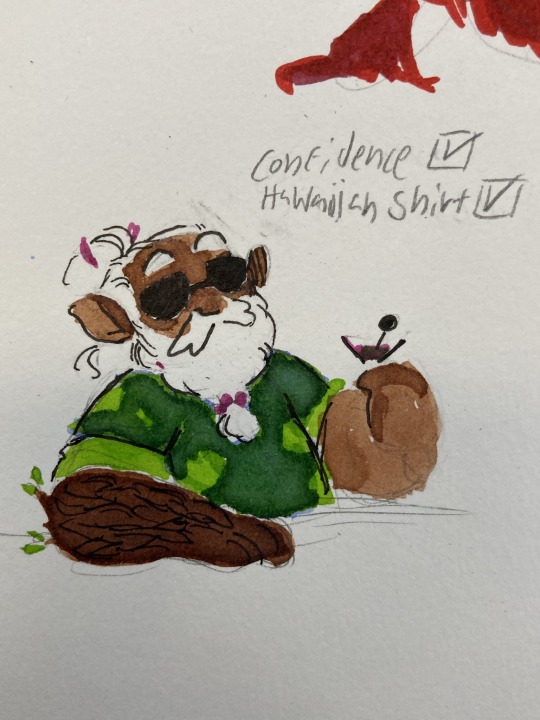
Image ID 1: A traditional half body drawing of Merle Highchurch. He is a male dwarf with medium brown skin and a white beard, with a receding hairline and wearing his hair in a partial bun. His right arm is made of wood; with a darker color than his skin and two small branches with leaves coming out at the elbow. He is wearing sunglasses and a dark green Hawaiian shirt with lime-green flowers on them, and is holding a martini glass with his left hand lazily. Above him, subtitles read: Confidence (followed by a box with a check mark) and Hawaiian Shirt (also followed by a checked off box.) End description
Image ID 2: A traditional drawing of a short eared owl (American subspecies) landing. It is uncolored, save for the red lineart which also colors the markings on its wings and face. It is landing angel-style, one talon before the other. Both wings are outstretched, though the one not facing the viewer is half-folded behind its back and shaded in. End description
Image ID 3: A digital drawing of Magnus Burnsides and Carey Fangbattle. Magnus is a tall, muscular human man with curly hair and sideburns, with a scar going down his left eye. Carey is a short dragonborn woman, with two horns, frilled ears, and crested “eyelashes” resembling the appearance of a crested gecko. Both are wearing athletic clothes, the former in a t-shirt and the latter in a tank top. Magnus, with a surprised expression, is holding in his hands a wooden duck. Carey looks proud, smiling with her eyes closed and giving him a thumbs up. End description
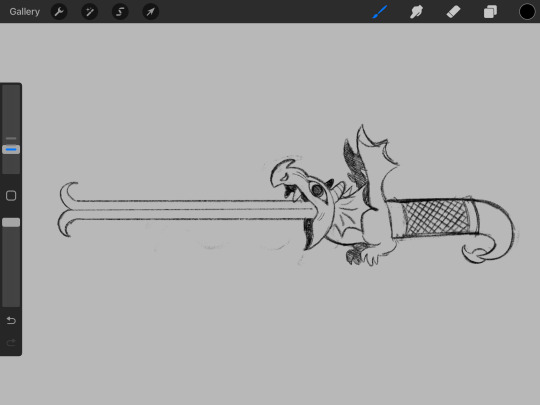
Image ID 4: A digital drawing of the Raging Flaming Poisoning Sword of Doom. It is uncolored. The blade itself resembles a dragon’s tongue, going straight out and forking at the tip in opposite directions, like two scythes being put together. The hilt/guard of the sword resembles a dragon’s upper body, with the guard being the head of the dragon with its mouth and eyes open wide. It has two horns and two frilled ears, and its front legs are right underneath, like a cat ready to pounce. The rest of the dragon has no legs, much like dragons of medieval manuscripts. Instead, its torso works as a handle, and is covered in leather to protect the hand. The end of the handle is the “tail” of the dragon, short and curled underneath itself, with a scorpion’s stinger at the tip. End description
Image ID 5: A traditional fullbody drawing of Magnus Burnsides and Carey Fangbattle. Magnus is a tall, muscular human man with dark curly hair and sideburns, a scar going down his left eye, and a tooth gap. He is giving a piggyback ride to Carey, who is a short dragonborn woman with two horns, frilled ears, “eyelashes” resembling those of a crested gecko, and a long curly tail. Magnus is rushing (pun not intended) forwards with a mischievous grin while Carey, with her eyes closed, turns back and shouts happily, hand beside her mouth to amplify the noise. End description
#ent’s art#the adventure zone#the adventure zone balance#short eared owl#asio flammeus#magnus burnsides#merle highchurch#carey fangbattle#taz magnus#taz merle#taz carey#taz balance#taz b#THIS POST CRASHED MY TUMBLR FIVE TIMES GOOD LORD
66 notes
·
View notes
Photo

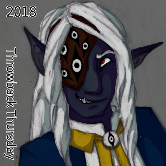


A very special throwback Thursday! Again!
This time a walk through Asim’s character design and how it changed over time and my journey through colorizing traditional pencil drawings.
Breakdown under the readmore.
(note: when I say “my DM”, he is also my partner who I have been building a DnD setting with, I wasn’t bullying a random DM into what I wanted, I was working with my partner to build a new setting while he was really stuck in Standard DnD and was letting that inform pretty much all the worldbuilding decisions.)
2017: The first color picture of Asim, and an attempt to colorize a messy pen sketch that I had been close to giving up on. The filter modes I used on the inking made the shadows harsh and dramatic, and while good for the piece, did not give me much control over the color. He was a basic drow with a color scheme picked out by my DM - my DM also insisted on shorter elf ears that didn’t emote and an overall human-like appearance aside from skintone.
2018: The DM had noted in an expression sheet I had distinctly drawn Asim’s canines - he said it made him look part orc but it was really just a stylistic choice I was playing around with. I leaned into it and suggested his father was half orc for a chance to give him more monstery traits and made his tusks a bit more prominent. I also used large emotive elf ears in the sheet to show the DM how it was a fun trait to allow. He agreed. I did some semi clean line art of a new expression sheet and experimented with coloring that. the line art gave me a lot more control with coloring, but I wasn’t entirely happy with it. The DM had given me a halfmask/eyepatch with a design I wasn’t too keen on but used it in the design anyway.
2019: Fully leaning into his orcish heritage, Asim as his stage persona Balam Yunuen. It was a expression sketch that got out of hand and I ended up fully shading it in pencil I loved it so much. Some more playing around with filters, having remembered a tutorial I saw on digital artists tinting their lineart, and I hit gold. My painting skills were still a little shaky but I learned a lot and he gained +1 Iridescent Skin.
2019 part 2: Another 2019 because I learned a lot that year and his design gained another tweak - a small snout and hints at the animal-like nose he would soon have. I found my stride with shading hair and have been going ham on it ever since.
2021: His sideburns! His finalized snoot! His resting crooked ears! Redesigning his eyepatch because dammit it’s my character he’ll look how I want him to look! At this point I had really settled into my style of colorizing my pencil drawings.
2022: Return of the chin tattoo! Redesigned and simplified into a sun-eye motif. Playing around with his cultural braid, the Makhiorya, a braid that you put beads on for everyone you invite into your family. Magical neck scar where his neck was torn out! I was beyond settled in my colorizing, I was getting bold with colors and lighting, constantly trying new things and learning from it.
2023:???? my kofi supporters are in the know on what’s coming ;)
Comms | Shop | Tips
#dnd art#dungeons and dragons#drow art#drow#half drow#half orc#dnd#dark elf#half elf#dnd paladin#monster art#monster boy#dnd character#dnd character art#throwback thursday#art throwback thursday#fantasy art
37 notes
·
View notes
Text
About barely present/halfassed sketches.
Having a detailed sketch has helped me achieve some of my best artistic creations, and I'm proud to say I'm unafraid to do a refining sketch layer. But recently I've been working in traditional (non digital, dip pen and ink specifically) media, and it reminded me the glory of the minimal sketch.
Glory to the minimal sketch! So much easier to erase, for one!
For another, it's freeing. It doesnt have to line up with the lineart at all. It's simply not saying enough for that to matter. I immediately stop worrying about accurately lining the sketch when the sketch is simply too basic bitch for that. Suddenly it becomes all about that sweet sweet lineart. And I fucking love lineart. Line weight, line saturation, line detail, it all communicates so much, way before you ever add any color.
If you follow this blog you'll (probably?) know that I am not an artist who frequently moves to the lineart step. A lot of my work is just refined sketches, because working close on lines is a lot of work, not gonna lie. Doesn't stop me from loving it, but as a result I just don't do it as much as I'd like. Especially not work that lets the lineart shine through above all else. Even with my dip pen and ink, I often find myself moving past the lineart step while I draw. Once you get that far, it's easy to feel dedicated.
I guess my point here is wing it. Here's a pen drawing of pants that I did with no sketch at all. Those were always my favorite art lessons in class: Just uhhh draw some fucking fabric i guess bro.

8 notes
·
View notes
Text
UPDATED COMMISSION PRICES!!!!
Hello all! I’ve decided that I’m due for updating my commissions info and lowering my prices, so here you go!
Base Sketches and Lineart
• Profile/headshot (shoulders up or higher): $5
Waist up: $10
Knees up: $15
Full body: $20
Full Color (can be in either black and white, monochromatic, or full color! Basically anything that fills in the lineart!)
Profile/headshot: $15
Waist up: $25
Knees up: $30
Full body: $35
Add shading/highlights: an additional $10
Each additional character/person/animal: is an additional $20
Backgrounds: negotiable, based on what you want and how much detail there is. For instance, a simple solid color background with no other details will be $1, while a background with a lot of detail will obviously be higher priced (DM me for more specifics)
Anything extra you'd like to add to your artwork besides what I've mentioned here: DM me and we will work something out!
I do BOTH traditional and digital art with basically any medium!
I additionally have revised the rules for my commissions, so I shall restate them here. Most of them are no-brainers but I still strongly feel they should be read and understood.
I will NOT draw:
Any nudity that is overly explicit and not tasteful or artistic
Anything overly NSFW or bordering on p*rnography
Anything with excessive blood or gore
Anything that is overly gross or involves k*nks and f*tishes
Anything promoting proshipping or the shipping of characters who are supposed to be children
Anything involving the shipping of real life people who never have been and never will be in a romantic relationship (e.g. "Maylor" for the band Queen)
Anything promoting p*dophilia
Anything with disturbing themes that can potentially be triggering to some (e.g. t*rrorism, s**cide, s*xual ass**lt, ab*se)
Anything that is hateful, demeaning, or discriminatory, toward groups of people who don't deserve it. Basically, no racism, sexism, xenophobia, homophobia, transphobia, ableism, etc.
Anything that involves the shipping of real life people who never have and never will be in a romantic relationship (e.g. Maylor and Deacury for the band Queen)
Anything that glorifies or romanticizes mental illnesses of any sort
2. I am currently only accepting payments in USD and through either P@yP@l or V3nmo.
Finally, PLEASE do not hesitate to DM me or send me an ask if you have any questions about anything!
Thank you once again to everyone who continues to support my artwork and blog!
#my art#angie's scribbles#commissions#art commissions#artists on tumblr#commissions info#open commissions
9 notes
·
View notes
Photo
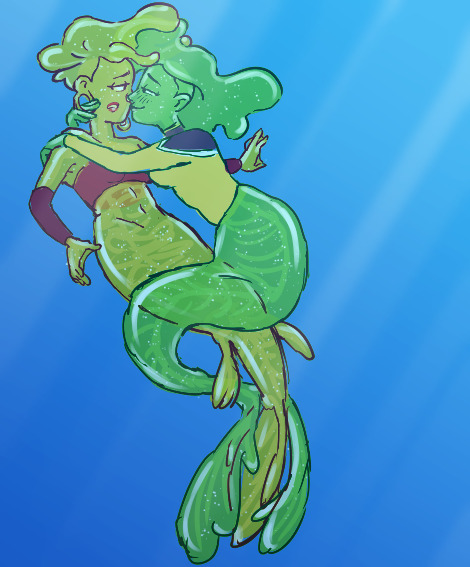
Image ID: digital art drawing of two slimegirl mermaids in a plain blue ocean background. They are Slamtha Uzgoel, a yellow slimegirl with a tail with a vertical flipper and foot-like fins, wearing a red wrap around her chest, and Eaurp Guz, a green slimegirl with a traditional mermaid tail. Guz, wearing the top of a yellow starfleet engineering uniform, is wrapping her tail around Slamtha’s, and her arms are around Slamtha’s shoulders, with fingers touching the gauge in Slamtha’s ear. Guz has a warm squinty smile and blush, while Slamtha looks at Guz with a hesitant expression. Their slimey hair is sort of mixing together in the water. End ID.
collaboration! Lineart by Ray @brbdaly, coloring by me! (the characters are also my original characters) Ray drew this tooth-rottingly sweet mermay drawing of [checks notes] enemies. it’s almost... too good to be true!
something something, Slamtha is recovering a pirate shipwreck at the bottom of the sea (it's a... spaceship wreck. it's just. in the water.)
and like
Ry'talla (one of Slamtha's pirate crew): hey so i just found out, i just saw in the uh the database that apparently they have telepathic beings called "Sirens" there that appear like your true love but uh, with a fish tail? that's kinda funny, right, like, you'd be able to tell it's not really your true love because your true love doesn't have a fish tail. Cuz that'd be ridiculous.
Slamtha: right right. of course. i would never. fall for such a thing.
#Slamtha#Eaurp Guz#Slimegirl#Mermay#Mermay2023#Mermaid#Star Trek#star trek original character#lower decks#siren
25 notes
·
View notes
Last Seen Blogs
b-yyearns
my gay brain wont shut up so here we are.
princess-alaia
That's Hot

yuusa
𝗬𝗨𝗨𝗦𝗔
vzm
⚢

donjam1
Untitled