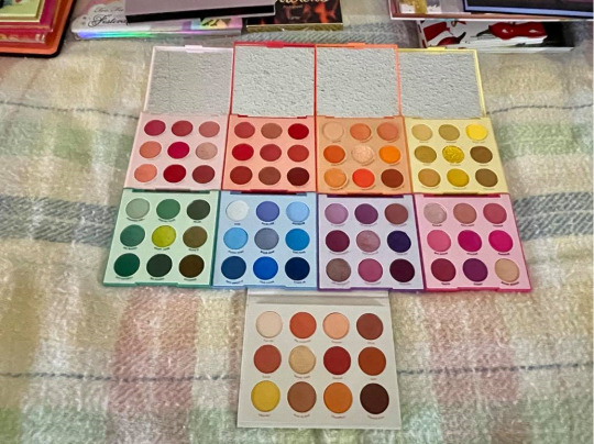
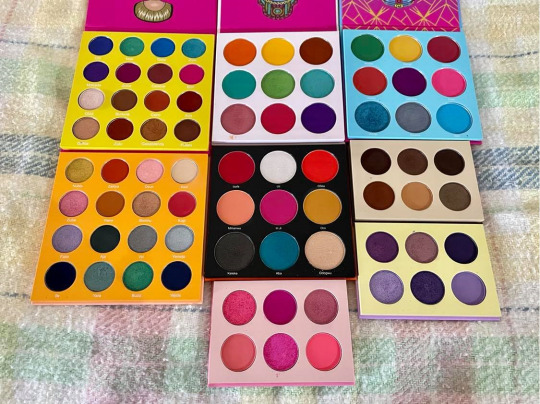
#i have a red version a purple version an orange version 3 other shades of pink versions.....
Text
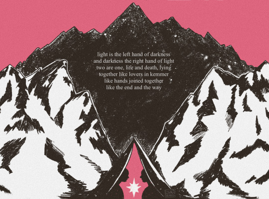
homage to one of my favourite books ever
#the left hand of darkness#ursula k le guin#artists on tumblr#sci fi#bookblr#evandered#hi everyone recently read tlhod again and good news! its still one of the greatest novels of our time#had to do a lil tribute couldnt get it out of my mind u know how it is#also choosing the colours for this was unbelievably difficult#i have a red version a purple version an orange version 3 other shades of pink versions.....
415 notes
·
View notes
Text
#mARTch 2024

text version (with more info!) under the readmore! please check it out if you're confused about anything <3
F.A.Q
do i have to draw every day?
no!!!! there are skippable days built into the event, please use them whenever you need them! i really don't want anyone getting a wrist injury!
can you share my art?
yep! i try to share entries to @bweirdevents daily during the event!! the tags can get busy tho so i might miss some posts OTL sorry
what are the tags?
#mARTch is the main tag, but this year you might find posts in #mARTch2024 too!
wait, i'm confused about a prompt...
full breakdown of all the prompts below ↓ with helpful hints if you're stuck!
_____
INTRO WEEK
this week is all about your artistic identity ... technically, you don't have to draw anything new this week if you have some art that already fits. the starter days are:
1 ⭐ self portrait
who are you? it doesn't have to be you IRL .. if you feel more comfortable drawing a fursona or mascot, that's fine too!
if you don't wanna draw, you can also just share old self portraits today and talk about why you drew yourself that way!
2 🤍 inspirations
see how this day doesn't have a star? that means it's optional and you don't have to do it at all!
but if you really wanna- tell us all about what inspires you to create art!
this could be anything from the people that inspire you, the shows you like, the pins on your big messy pinterest board, or concepts that you're drawn to! you can draw something about it, talk about it, or just post your inspirations! anything is fine
3 ⭐ fav thing to draw
what do you like drawing most? backgrounds? animals? one specific animal? bust of your oc facing left? cars? the same anime boy over and over and over? no judgement!! show us :)
_____
STUDY WEEK
this is the week we actually start drawing from reference!
polished art is not required at all, quick sketch studies are fine! please don't burn yourself out
4 🤍 plant
5 🤍 body
6 ⭐ animal
7 🤍 object
8 🤍 food
9 🤍 face
10 ⭐ hand
these ones are pretty self explanatory!
you can do them as realistic studies, or adapt them into your own art style, it's all fine! you can reference from your own photos or from resources on the web.. have fun!
_____
COLOUR WEEK
this is the week for playing with palettes and working on your colour theory skills!
if you're really struggling with these ones, don't worry about drawing scenes or characters, you can just have fun splashing colours around on an abstract canvas!
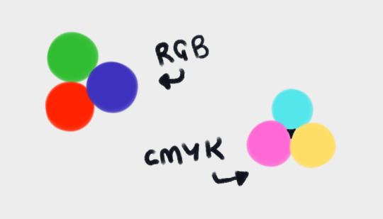
11 🤍 RGB
a set or primary colours typically used in digital/screen art - red, green and blue!
12 🤍 CMYK
a set of primary colours typically used in traditional/print art - cyan, magenta, yellow ... and key (black!)
for both of these days ↑ you can add in black and white.
and feel free to combine the two days into one, if you're struggling with a three-colour palette! use all six!
13 ⭐ WARM COLOURS
the warm side of the colour wheel, reds oranges and yellows!
14 🤍 MONOCHROME
monochrome doesn't mean black and white ... it means one colour! that can be any colour at all- shades of red, shades of purple, shades of green .. or yeah, grey if you really want!
15 🤍 COMPLIMENTARY
complimentary colours are the ones opposite each other on the colour wheel! they're kinda married

16 🤍 YOUR FAV COLOURS
pick any palette that works for you! where's your comfort zone? what looks nice to you? what colour combos do you always go back to?
17 ⭐ COOL COLOURS
the cool side of the colour wheel, purples, blues and greens!
_____
CREATIVITY WEEK
this week is all about vibes! try to create something that matches the mood of the prompt .. they're vague on purpose! don't overthink it, just draw from the heart!
18 🤍 SMALL
you could draw something that's really small, like an ant .. or draw on a canvas that's really small .. or use a really small brush .. get creative with it!
19 🤍 DANGER
try to capture the adrenaline .. the rush .. the fear that you associate with the word danger!
20 ⭐ SOFT
soft colours, soft textures, soft vibes ... whatever makes you comfy!
21 🤍 MIDNIGHT
darkness and secrecy .. spooky witchy vibes .. the tranquility of a forest at night .. the fun of a late-night party .. there's lots of ways you can take this!
22 🤍 POWER
what does this word make you think about? superpowers? control and oppression? literal electrical power? something else?
23 🤍 CHILL
chill as in calm? or chill as in cold? who knows .. it's up to YOU!
24 ⭐ LOUD
try to draw something that feels LOUD! BRASH! IN YOUR FACE! how can you convey sound through art?
_____
FUN + GAMES WEEK
this week is just for enjoying yourself! take it easy and have fun!
also .. another reminder! there are skippable prompts! if you're tired and struggling to get to the finish line, please don't hesitate to skip a day!!! or multiple days!! as many as you need!!!
25 🤍 TRY A NEW ART STYLE
copy the art style of a show you like, ask a friend if you can try their style, draw the eyes a new way, develop a totally new style on the spot... whatever you want!
26 🤍 DRAW WITH YOUR NON-DOMINANT HAND
righties, draw with your left!
lefties, draw with your right!
ambidextrous nation ... our time to show off!
27 ⭐ DRAW WITH YOUR EYES CLOSED
don't peek! try to draw something without looking!
if you really want, you can colour it with your eyes open after you draw the lines/sketch with your eyes closed... but please try not to cheat with the actual drawing part!
28 🤍 RE-DRAW SOMETHING OLD
find some old artwork you like, or something you feel like you can do better on now, and give it another go!
29 🤍 RE-DRAW A MEME
find a silly picture on the internet to redraw .. do you have any in-jokes with your besties?
30 🤍 DRAW A GIFT FOR A FRIEND
create something for someone you love <3
31 ⭐ FREE CHOICE
final day! you can draw anything you want today! show off your skills! draw something you've been meaning to draw! whatever!
_____
please refrain from reblogging this post after march ends - next year's prompts will be different, thank you!
if you have any additional questions, don't hesitate to shoot me an ask!
#🎨#mARTch#mARTch2024#events#art meme#art prompt#art prompts#art challenge#drawing prompt#drawing prompts#drawing challenge#march
890 notes
·
View notes
Text
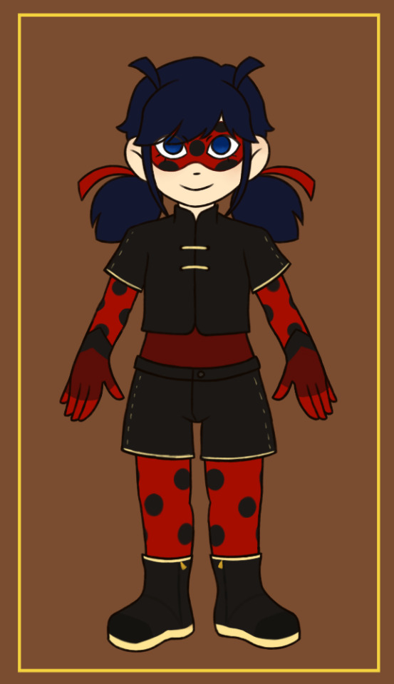

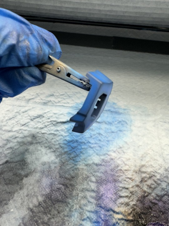
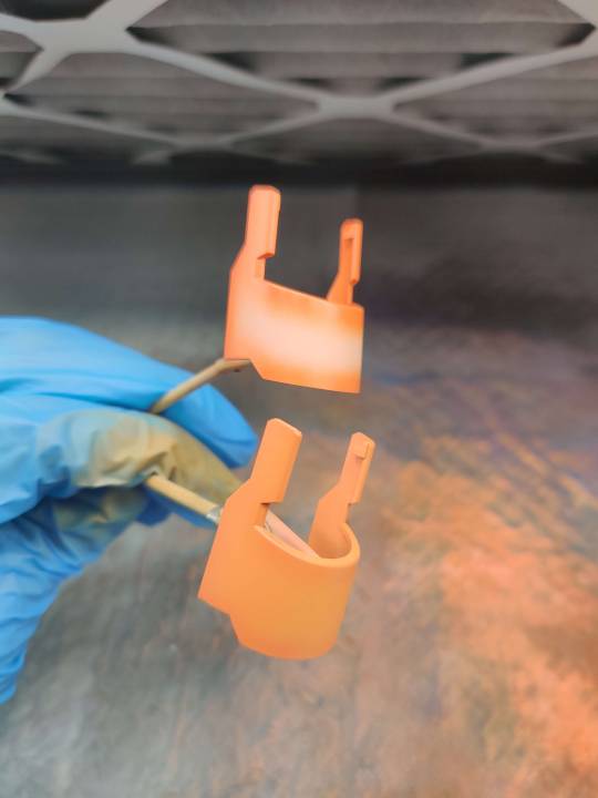
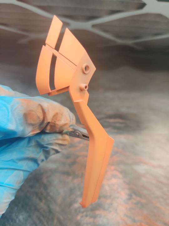
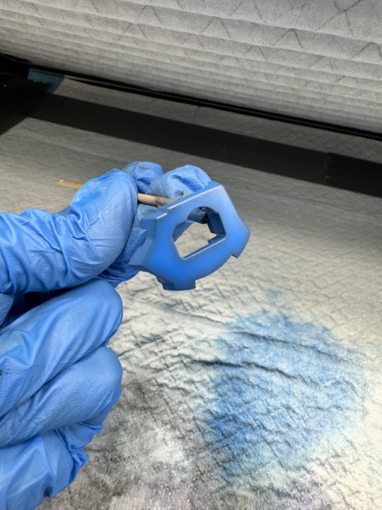
🇺🇸: So, I was still a little unsure about my original ladybug redesign, so I tried to make some alternatives with other changes and options.
In the second Image, there are 6 different items that I'm not sure which options I should pick: shirt (purple), sleeve length (orange), 'belly'/torso (green), gloves (blue) (connect or not to the arm, like 1 and 4), shorts (yellow) and boots (red). Which one do you prefer from each of these items? (Ps.: the already "built up" combinations are not variations I already "estabilished"! I just put some options together at random so it was easier to visualize them, but you can say any combination you want. I'm also not sure if I'm keeping the sleeves of the shirts and shorts with the golden details, but I'm already certain I'll keep the parts that show the sewing). (Ps.2: I didn't include the cape just so it was easier to see all the different parts, but I didn't remove it from the costume, it's still there).
The first pic is my favorite combination, but I also like shirt 5, belly/torso 3 and glove 1...
My main problems with the first version were mainly the upper part of the body (shirt and torso), but I also wasn't very happy neither with the original boots, nor with the way the shorts were "glued" to the costume. About the gloves, although I like the og black and simple gloves (to represent a ladybug's paws), I saw someone (unfortunately forgot who it was :/ ) saying that they found it important for ladybug to have red hands because of the scenes of her and chat doing "pound it", since is has focus on their hands, I thought it was an interesting concept and tried to change a little bit so I could keep the gloves, but with red details on them. (Ps.: the gloves are not exactly above the spots in the arms, so please ignore the glove position because it will not cover the spots). Although I like the gloves with darker shades of red, I don't think it is an 'harmonious' choice if that's the only part of the clothes that has that shade (if I don't choose torso 5).
Anyway, if you want you can also suggest any other changes (like "I like glove 1, but without the golden accents) in general!! Also, even if I decide my favorite parts in this one I'll definitely do at least a third redesign hahaha (since there's a specific element I want to include on the costume in general, but I'm still unsure of how I'm doing/including it)
🇧🇷: Então, eu ainda tava um pouco incerta sobre meu redesign original da Ladybug, então pensei em fazer algumas alternativas com outras mudanças.
Na segunda imagem, tem 6 itens diferentes que eu estou em dúvida entre quais opções escolher: blusa (roxo), tamanho da manga (laranja), 'barriga'/torso (verde), luva (azul) (Modelo com ou sem relevo), short (amarelo) e bota (vermelho). Quais vocês preferem de cada um desses itens? (Obs: os trajes "montados" não são as variações que eu já estabeleci! Só coloquei algumas opções juntas aleatoriamente pra ficar mais fácil de visualizar, porém podem falar qualquer combinação que vocês quiserem. Também não tenho certeza se vou manter as "mangas" das blusas e shorts com os detalhes dourados, mas a costura é de certeza que vou manter).(Obs2: só não coloquei a capa pra ficar mais fácil de visualizar, mas ela ainda está na roupa).
A primeira imagem é minha combinação favorita, mas também gosto da blusa 5, da barriga 3 e da luva 1...
Meus problemas principais eram principalmente na blusa de cima e na parte superior do torço, mas também não fiquei tão satisfeita com a bota original e nem com a forma como o short era "colado" na roupa. Sobre a luva, por mais que eu goste das luvas simples pretas (pra representar as patas de uma joaninha), vi uma pessoa comentando que acha importante as mãos da ladybug serem vermelhas por causa das cenas dela e do chat noir fazendo o "zerou" que têm foco nas mãos deles (infelizmente esqueci quem foi que falou isso :/ ), achei um conceito interessante e tentei mudar um pouco pra manter as luvas porém com detalhes vermelhos nelas. (Obs: as luvas não estão realmente grudadas nas bolinhas do braço, então ignorem as luvas posicionadas em cima das bolinhas). Por mais que goste das luvas com tons mais escuros de vermelho, não sei se fica muito harmônico aquele ser o único local da roupa com aquele tom de vermelho se não for escolher a opção 5 de barriga/torso.
Enfim, se quiserem também podem sugerir qualquer outra mudança (como "gosto da luva 1 porém sem o dourado") no geral!! Mesmo que eu decida minhas favoritas nesse aqui eu com certeza ainda vou no mínimo fazer um terceiro redesign hashushs (até porque tem um elemento específico que quero incluir nas roupas num geral mas que ainda não decidi como fazer)
#my art#miraculous ladybug#marinette dupain cheng#design#mlb unnamed au#miraculous au#redesign#ML#MLB#miraculous#marinette#ladybug#brazilian artists#artists on tumblr#character design#also made me a little “base” for Marinette so it is easier to draw multiple design options without having to redraw her every time#so you might see me using this many other times hahah
59 notes
·
View notes
Text
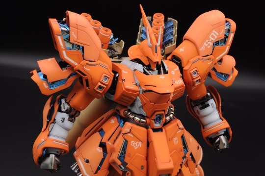
i wanna gab about preshading and how ive been doing it lately. trying to type longer guides on patreon and HV but let's try a quick and dirty version here and see if that helps me get those posts together better. as far as tools used for this, i use an iwata hp-cs and hp-ch (which are .3 and .2mm nozzle airbrushes respectively) along with gaianotes paints for painting gunpla. proper ppe (nitrile gloves, a well fitting respirator and a spraybooth that moves enough air) are a must when working with lacquers. dont give yourself lung or liver cancer for plamo plskthx. pics are from a mixture of the mg sazabi's WIP and some test junk i was doing with the hguc sinanju.
step 1: primer yer part
i like to use colored primers cause it really ups the saturation on the paint you use on it. pink for reds/oranges/yellows, blue for purple/blues, grey or white for whites/greys
step 2: mix your preshade color
ymmv on these but personally i like using a darker shade of the main color to do the shading by adding a complimentary color to it. for example, for these parts i mixed brown in to the custom orange color i made. you can use whatever you want though. some folks like using black as a preshade and that's ok! i preshade my orange-yellow paints with pure orange, and blues with either a darker blue or blue with some purple/black mixed in. to goal is to compliment/blend a bit with the color that's going on top.
step 3: go around the edges and panel lines with your dark color, leaving room to fill in with your main paint.
hope your hand is steady and your paints are mixed/thinned well! very carefully, go around the part and darken up the edges/panel lines/underside of your parts. i shade anywhere where the "light" might darken up on a real world object but i can't speak to how accurate of a sentiment that is, if that makes sense? it's just what looks 'right' to my eye to do it this way. but the part that's shaded above should serve as a good indicator. here are a few other parts pre-filling in:

i do this this way for three reasons: first and second, im lazy and cheap. i don't want to waste time and paint coating the entire part when i'm just gonna cover it up anyway. third, if i coat the entire part in the preshade color that's going to have an effect on the main color that's going on top. mainly, it's going to make it darker. i don't want that so i landed on shading stuff this way.
step 4: fill in your main color
okay so i always do a shitty job taking pictures of this step (that's why there are no sazabi pictures here) but once you have the edges and stuff painted now it's time to take your main color and fill in the primer-spaces. don't go over your preshade lines, just get as close as you can to that line. it's fine if you hit the edge a little, after all this is the topmost layer of color. even if it doesn't turn out perfect, just work with the wabisabi of the whole thing. embrace the shading not being perfectly uniform. after all, things in real life have degrees of variance.
take your time, work with a psi around ~12-15, thin your paints well, and be very gentle on the trigger. i work really really close to the part for this step and have to be very careful to avoid splattering or overspraying. this is probably???? one of the trickier parts of this??? i don't know. when you've been doing this for so long your definition of that sorta changes. if you need extra help, look in to something to help steady your arm/hand while doing this part.
step 5: blending
okay, so you've got your shading down, you filled in the rest of the space with the main color and it's feelin pretty good. but. there's one more step. get a little distance from your part and give the whole thing the lightest coat you can manage. the goal is to blend the primary color and shading layer together with one or two very light coats of paint. i'm not trying to cover up the preshading, i just want a very thin layer of the main color to harmonize everything.
see how the preshading isn't so stark now that we've given it those final two coats? i think this is the key to bringing the shading and main layers together. everything feels nice and "finished" now. from here, gloss coat the parts for panel lining and decals or flat coat (or whatever finish you wanna use) it if it's not getting any of those.
and...that's pretty much it. as an aside, glossy finishes tend to make the colors appear darker and flatcoats tend to look lighter but that could just be my eyes being weird.
and uhh....yeah. thanks for coming to my gunpla talk.
16 notes
·
View notes
Text
COLORS!
when i can't sleep i think about colors in netflix shows apparently and this has been haunting me
(ha! a pun)
*BOOK SPOILERS AT END.*
the primary color scheme of this show is blue&green/orange&red. it's done very obviously and veery intentionally.
blue is, clearly, Lucy's Color.
not only is it the only color she wears, she is the only character who wears it, with the exception of about 1/3 of the guests at the fittes ball. we will return to that. we will not return to that because i forgot my theory for why that was. aesthetics, we'll say.
similar to lucy, orange is George's Color. it's more or less the only color he wears, but he not the only person who wears it. joplin wears a good amount of orange and red as well.
Lockwood's color scheme is, for the most part, black and white. He does wear ties in shades of red and blue, but they're dark and muted. (also the gray hoodie of despair.) this could be to paint him as a colorless, "hollow" person, but could also be a reflection of his black and white approach to ghosts: they are not people, they are evil, they should be destroyed and thinking about them beyond that is a waste of time. if the show is renewed, it would be interesting to see if his color scheme changes over time. (possibly hard to do with his very specific outfit of choice)
(ok but sidenote, love that he wears versions of "lucy's color" and "george's color" over his heart ok bye)
(george and lucy do also sometimes wear bits of each other's colors as well and that also makes me happy)
this black and white, law and order, unnuanced approach to ghosts is also reflected in barnes and deprac as a whole:
now Fittes:
Fittes is gray, yes. That is their official color. Perhaps to represent iron and silver. Perhaps to represent the nuance between the black and white of DEPRAC. perhaps because marissa had boring taste. who's to say.
Fittes House also has quite a bit of red/orange in it. The uniforms have stripes of orange along the side.
making orange George's color could be a reference to him as a former Fittes employee. OR it could represent something that he and Fittes have in common.
i find it an interesting choice, given that Rotwell's color is red. you would think they'd want to use blue or purple or green to differentiate themselves. could mean something. could also just be that fittes had a zealous branding team.
are these rotwell agents? maybe! i hope that's a lion on their collars, that would be hilarious.
(tangent: i have a theory that, if the show is renewed, red would be holly's color. HOWEVER, i think she would either start red--as a "seductress" in lucy's mind or to represent rotwell--and fade to pink to show her true self, OR she would start a demure, feminine pink and dress in more reds as she lets herself be brave and a little unhinged. i'd take it either way. i love my daughter holly)
related: jacobs was red and yellow. perhaps a rudimentary version of fittes orange? a knock-off of the rotwell red? the costume department having a good time at the expense of these children? hard to say.
ghosts themselves come in shades of white, black, blue, green, and red. so far this hasn't proven to mean anything...unless??
yeah i don't know. i have ideas but i don't think they're sane or rational.
why did i include ghost pictures. their colors don't have meaning to me. i couldn't find a pattern. i am so tired.
but anna, you might be saying. who cares? it doesn't actually mean anything. they're just colors assigned to characters and lucy, as the main character, gets to be special and monopolize blue. it's just a stylistic choice.
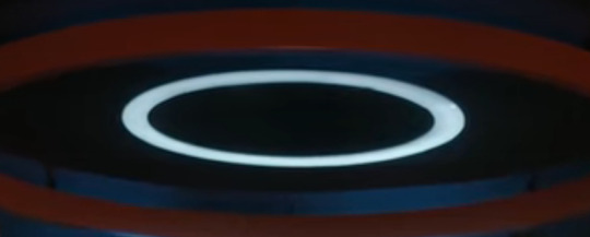
that's what i assumed. but then i saw THIS bad boy:
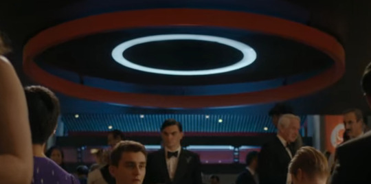
i might be grasping at straws. that center light might actually be white. maybe it's a Portal reference.
(tbh, it might actually be a Portal reference)
but knowing what i know about Fittes from the books...it gave me pause.
so what is it that these colors actually represent? it's not as simple as humans vs. ghosts, because the ghosts aren't all blue.
let's look closer at the dichotomy of george and lucy. in a way, they're two sides of the same coin when it comes to Visitors. where lockwood has no interest in ghosts other than eliminating them, george and lucy both want to know everything about them. lucy wants to know them as sentient beings, as people to help; george wants to know the what and why and how of it all, wants to end the problem, or at least understand it. they're the head and the heart of the agency. which leaves lockwood to be the hands. (insert sex joke here)
so, orange/red--george, joplin, fittes. even rotwell, though we don't see them. these are entities who are, for better or worse, trying to understand the problem, trying to get to the other side.
the opposite color, blue? it is the other side:
lucy is our liaison to the world of ghosts. she can hear them across the veil. the only one in blue. the only one with this connection. (other than marissa)
SO. A BLUE CIRCLE IN A RED/ORANGE CIRCLE. WHAT COULD IT MEAN.
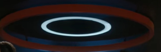
WHAT COULD FITTES POSSIBLY BE UP TO.
in conclusion, i'm tired as fuck, i think i just ranted about a basic color scheme for too long, and i think there was no reason to try and figure this out.
this might have just been a reason to ramble about how these two complement each other and they're best friends and i love them.
in conclusion: colors!
#lockwood & co. tv#lockwood & co.#lockwood and co#book spoilers sort of at the end#lucy carlyle#george karim#ok to rb
55 notes
·
View notes
Text
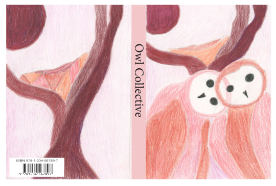
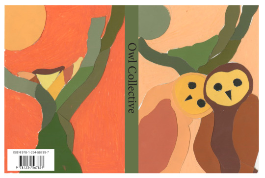
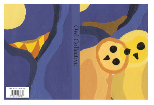
These are my final pieces for my book cover assignment. I had a lot of fun with this assignment and I like the way everything turned out. My base design was two owls huddled with each other by their nest for the front and a close up of the nest and moon for the back. for each cover I wanted to create a specific vibe with the color choices. for the painted version my triadic color scheme includes various purples and oranges. For this one I wanted to represent a night time scene with the owls being these figures glistening in the moonlight. For the color aid I went with and evening vibe, using reds and oranges to symbolize a sunset. For the color pencil version the monochromatic scheme was of red and I focused on the lighter shades of this color to create a soothing and loving mood.
While I did struggle with some bits of this project, mostly with the coloraid, I believe this project turned out well and I'm happy with the results I created.
below the cut is my original artist statement for this assignment.
For this assignment I was tasked to create various book covers with 3 different mediums drawing inspiration from book covers of the 60s/70s. Since book covers from those eras heavily focused on using simple designs with powerful colors to convey something about the book.
The subject for these covers is the barn owl since it’s one of my favorite animals. I chose owls because they have simple shapes, like circles, ovals, triangles, that can be easily broken down into simplistic designs.My design features two owls snuggled up next to each other since I wanted to depict these creatures is a more friendly way then they normally are seen as.
I drew inspiration from the example covers that demonstrated overlapping colors like the cover for Mensch und Tier since the transparent effect created from the colors fascinates me. The color choices I used play into how I depicted the birds. The painted piece contains a lot of purple and yellows to symbolize the night and the moon respectively. Likewise the colored pencil piece uses softer reds to elicit a feeling of love which reflects the way the birds are posed huddled next to each other in a nice embrace. Overall this was a fun project to work on
0 notes
Text
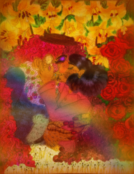
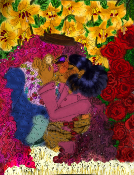
konju konju konju
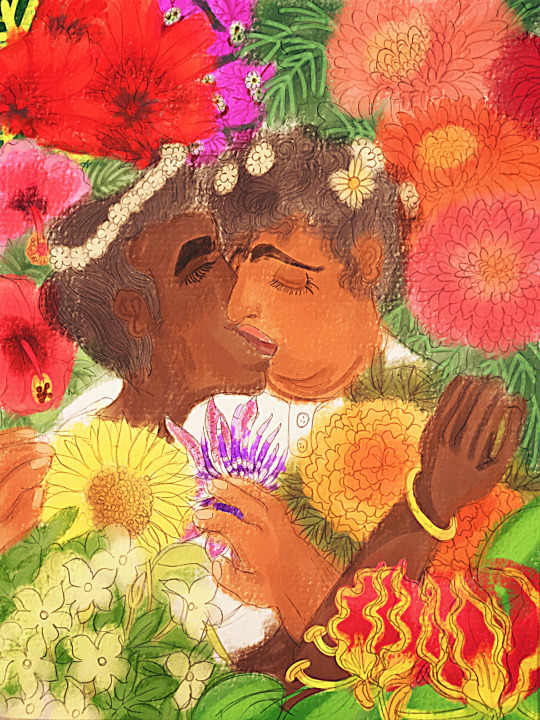
[ Image ID: Two drawings done in traditional and colored digitally.
The first image is Jameel and Saboor from the webcomic Puu, in a passionate kiss. Jameel is a thin dark skinned man with very thick eyebrows and short straight black hair. Saboor is a fat light brown skinned man with an unibrow and slightly curly short black hair. Here in the art he has a double chin. They both have long, protruding noses. They both wear white shirts. Jameel has a single gold bangle. They are embracing, with their hands on each other. Saboor seems lost in the feeling, while Jameel sweetly smiles.
There are simple white flowers on their heads, with Jameel having a flower crown while Saboor has scattered white flowers, with a bigger one with a yellow centre. Both of them are surrounded by flowers which are common to or found in Tamil Nadu. From Jameel’s back view to the left, jasmines and a sunflower spring to life. To the right, gloriosa lilies are unfurled. Marigolds are seen in front of Jameel’s outstretched hand on Saboor’s shoulder. Inbetween the sunflower and marigold, a passion flower sits in the middle. From the top of the drawing, to the left, the Indian coral tree’s flowers display in blazing red. Soft, deep pink hibiscuses drop down below them. To the right are voluminous chrysanthemums in peachy pink, red, orange and deep pink. Inbetween the left and right creep in small bougainvilleas. The leaves and veins in the leaves of each flower are in varying shades of green and varying sizes and shapes.
There is a bright, sunny, slightly warm filter over the drawing and its lines are very sharpened and clear. The gouache paint effect shows.
The second image is of Kamal Bora and Dr.Habit from Smile For Me kissing. Here in the artists interpretation Habit is more muppet-like. He has yellow fur, sewn-on blush patches with 3 big white freckles, more smaller fur-toned freckles, purple eyeshadow, ears with fluff in them, pink two toned hair which is dull on one side and brighter on the other, stitches and patches on his hands and deep red nails. He also has a snaggletooth. He wears his usual outfit, the coat looks fuzzier. Kamal wears a mild pink button-up shirt and a single small round gold earring. In the artist’s interpretation he has acne on his face, and eyebags. His hair fluffs out more and has a shine to it.
Habit is holding Kamal from above in a dip. Kamal caresses Habit’s blushing face, his other hand holding the nape of Habit’s neck. Their eyes are closed, they look happy. Deep yellow dog-tooth lilies with big bright, saturated leaves and dark veins come in from the top, from Habit’s side, while red roses with small dark leaves and bright veins bloom from Kamal’s side, both flowers representing the each of them. Fluffy dandelions sway below the couple.
The brush used is watery. There is a blur surrounding the picture, and a warm orange filter, with a faint orange glow coming in from all the sides. A very faint rainbow is seen passing the pair in the middle. end ID]
Talk and alt versions under the cut!
‘Konju’ is a Tamil word and it means something like acting very affectionately. I wanted to use it to express more precisely then an English expression!
Anyway..have I ever told all of you how much I love flowers being used to represent queerness?! I think its such a beautiful, poetic thing. I really wanted to draw something for that out of my own hands.
I realized in my knowledge were prominent two flower gays...
Puu is the first queer work I’d ever read with a Tamil sense about it..it was and is truly instrumental to me finding my identity. I am glad it touched me, far away from the country where I came from. The artist’s little jokes, poems, historical references and insights give it such lovely flourish. And the art-style change deeply impresses me as well, switching from simple shapes to abstract senses to Tinkle comic’s style. A message from it that sticks with me to this day is that tragedy is not a predetermined destiny to queer people such as myself and that, while unearthing history and legend is important, we simply exist in the now, and should be accepted as we are.
Puu is a comic which changed my life( and my name *winks* ). Maybe you could check it out...do heed the warnings. I’ll promote it until the end of time babes!
https://hiranyaksha.tumblr.com/puu-chapter-index
Smile For Me...OK, full disclosure, I’m half sleepy right now after tution and just kind of giving raw thoughts, so pardon lack of eloquence, i wish my tears could just soak through the keyboard and write proses.
Anyway..gosh..its my latest obsession going strong for a year and a half and onwards and into the stars, what do I say!! I get a painful twist of nostalgia. Like I’m sitting with an old friend in the grass and watching a mountain, everything glazed over in sweet, sweet, heartbreaking sepia.
This game is the gift that keeps on brushing my teeth. Its just...its just *wheatley voice* bloody good, that one. I admit..I’m not much involved now but while the game itself is great, the fandom is really what got me...it was very close to a home, away from the chaos of a my physical house. The characters are silly, lovable and gimmicky- thanks Kamal ‘’teeth lube’’ Bora- all with a goofball exterior with some chills covering a message of hope, human connection and second chances. Theres a song that I think is the BGM to my life, corny as that sounds heh, and I associate it with Smile For Me too. It has a special, secret place and importance with me.
And um, Platitudes from the epilogue made me cry. Hopefully the next time I’ll be bawling my pretty eyes out over that, I’ll have, like, facial hair and a few inches and a self-sewn doll of Dr. Habit in my arms, my ever faithful aide through medical school...hehe. I like to dream.
About the art itself, well I’m quite proud, imagine me twirling my stache smugly at your doofus self...
I picked common flowers or ones found in Tamil Nadu for Jameel and Saboor. I also described their appearances since the comic doesn’t have a wiki and stuff.
Habit and Kamal’s representations are fairly self-explanatory, except the dandelions. One of my dear friends told me this pairing fits the song Dandelions by Ruth B. once, and I liked the tune, and the rest is history. You can hear a cover I did of it gayly sobbing all over the mic!
Well, lets get onto the alts my dears!! They’re just more unedited versions.

[Image ID: The first image is the same as the first in the previous description with Jameel and Saboor except without filters and effects. It looks softer. The paint effect is still seen.
The second image here is the same as the second in the previous description with Habit and Kamal except unedited with no blur and warm filter. It has sharper lines and starker colors. end ID]
#I always end up frikking rambling XD#Well this deserves it#Im so proud#cries#my art#fanart#puu comic#yes these are companion pieces technically#jameel#saboor#jaboor#thats their ship name right?!#queer#habismal#smile for me#s4m#dr habit#kamal bora#Lets.freaking.post#Gasps#yes also habit is a muppet fight me
49 notes
·
View notes
Note
hI!! i love your art and was wondering if you could make a tutorial showing how you paint stuff? only if you can! it's just really pretty !!
hi nonnie! thats very flattering !! i’m sorry i dont think i’ll be very helpful bc i’m a mega noob as well :D but i’ll try my very best <3
my process is very tailored for speed instead of quality (oops soz LOL) so i do suggest this for if u have short doodle breaks ⬇️⬇️⬇️
thumbnailing (for comics) -> lines (sketch who?) -> bucket tool/color drop in the base color -> color in the lines -> one multiply layer for a “base” shadow (in the vid below its purple!) -> one (1) render/paint layer a.k.a lawless no man’s land
full rendering process & more general painting tips below the cut‼️
NOTE: i’ll be focusing more on traditional/fundamental tips for stylized art because i’m sure there’s a much more effective way in digital. I truly do only use one normal layer for render... i think this is bc before i made this blog, my only prior experience in drawing is middle school art class, so all i know is traditional painting on one layer.... pray i can answer this again in the future with something smarter lmao
🌺 MY PAINT PROCESS
1. Choose a color scheme!
It doesn’t have to be set in stone like below, but i at least keep in mind the color range i’d like to use depending on what i want to convey (ex. soft pastels for soft fluff, or warm colors for happy vibes). I try to be as limited as possible for base colors because I tend to go ham when painting, you’ll see later AHAHA
2. Base coloring + Base shadow
Base -> bucket tool in the color scheme (I know other artists are against this but when i discovered the bucket tool in digital art I immediately divorced manual coloring i’m sorry i loved you tho bae) (this is why my style and lines are simplistic as they are, so the color drop works!)
Base shadow -> in theory, warm-colored light creates cool-colored shadows and vice versa. because i’m a fluff addict i mainly use warmer light, so i like using blue/purple as the shadow. generally u can’t go wrong with complementary colors!! (yellow light & purple shadows / orange light & blue shadows).
I make a new multiply layer (decreased opacity just bc i like things soft okay) and clip it on the base layer, then block in the areas i think would get blocked from the light.
3. Color in the lines!
for simplistic styles i swear this works wonders. i just clip a layer to the lineart and manually color the lines with a darker but more saturated version of the base color. it just tends to look more dead i guess with low saturation lol (ex. u can see above i use both peach and red or pink for lines of skin, i guess it implies the blood under the skin too. or something :D)
4. RENDERRRR
when i’m not in a rush i just paint things completely (and mindlessly), but here are the things i almost always do:
line the shadows with a saturated color! i’m not sure this is common but i love it lol, in almost all my doodles just check the shadows—on the edges, there’s bound to be a wild color :D (usually its the light color, shadow color or a color scheme color but sometimes i’m just like boY do i loVe piNk)
my art major friend told me about saturated colors on desaturated bases and my life was changed forever lol. u can see below even when my base is very grayyy, my rendering is very gay :D ❤️🧡💛💚💙💜
make the shadows darker where i think they should be darker. usually i can just colorpick from that darker, saturated lineart color!
if it’s a more realistic piece i usually make the highlights lighter, but in simple doodles i find it unnecessary, and i dont like how light/white it looks :( i tend to just make the areas exposed to light more saturated
color in the rebound light~ in reality there’s usually not only one primary light source, at least there’d be secondary light from where light bounces off objects. in art we just emphasize that! so in large shadow areas, or in areas close to other objects/colors, i like to ‘splash’ other colors on
yeah this part is less intuitive for beginners and u have to learn a grasp on the concepts over time, like for lighting and structure. values can be more important than color, so i do suggest learning shading first before coloring, but only if u like (u can always be like me and just pull up references when u dont get how the light would fall on some materials :>). i have more general paint tips below! don’t give up okay, i believe in u nons, we’re all still in the eternal learning process together ( •̀ᄇ• ́)ﻭ✧
5. OOOOHHH SHINY ✨🤩
this step is just me being mesmerized by how easy it is to play with lighting in digital. i play around with the layer settings (multiply for shadow, overlay for light, and often try out the other settings too!). my favorite effect is the highlight glow thing, where u just make a copy layer of the highlights below the original layer, and blur it slightly so it looks like glow ✨✨🤩 overpriced acrylic could never
6. COLOR ADJUST / EDIT
Truthfully i usually skip this step, but my more pro friends really vouch for it!! i think definitely an incredible thing with digital is that u can edit proportions and even color after you’re done. i think they usually use like the curves adjustment layer in photoshop until they get colors they like, but for me, well, in a reaally diligent day i like to slap on the “auto” fliter in the iphone’s photos edit button lmaoooo
🌺 GENERAL PAINTING TIPS
learn basic theory: i think theres free courses everywhere online, but heres a few things u might like to have a basic understanding of: color, perspective, shape language, lighting, composition. don’t sweat it too much tho, it should be fun to explore the concepts!
and for drawing hoomans: proportion, gesture, expression, and veery basic anatomy. i find that overall forms are so much more important to learn than like detailed anatomy bc u can always look it up lol
but remember, u mostly want to learn the rules so u know better ways to break them :)
uuuuse manyyyyy referencessss every time u draww!
^this includes other people’s art — when u see good stuff, figure out why u like it and apply it to ur own art
get feedback!!!!
draw tons!!! brainrot helps !! ;D
aaand thank u for coming to my ted talk! sorry for the ramble nonnie, i hope u got something out of this lol
#VERY LONG POST ALERT‼️#thanku for enabling my rambliness nons#thanku for asking <3#love u anon#demi rambles#untagged#art advice#art tips#art tutorial#art#painting#i’ll update this as i go bc lord knows im also just a noob
182 notes
·
View notes
Text
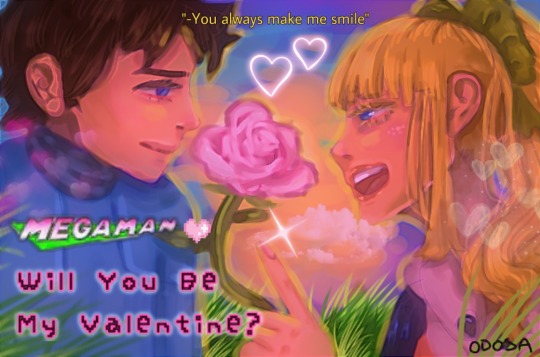
2021 Megaman Valentine’s Day Contest Results
Among the many things this past year or so has tested us with is delays, and I apologize that this year’s Valentine’s Day contest results are included in that. I certainly did not plan on this taking until March to get completed, and I am sincerely sorry to have kept you all waiting. But hopefully it is all worth the wait!!
Thanks once again to every single one of you who participated! I will be contacting the winners soon enough. Work will probably keep me from replying to everyone immediately, but I will send a message about prizes hopefully within 24 hours.
Also, my thanks to @subzeroiceskater for helping out with judging this year. Not to mention the promo pic above and other assorted bonuses that always bring me a big smile.
I might say this seemingly every year, but you all made judging this VERY hard. It might have something to do with the themes as well, but I think both of us flipped and rearranged our rankings repeatedly, and even then, it was hard to decide on who would place. XD Each one of you did an amazing job!
After the break, you’ll see the winners for both categories, along with all of the entries. Raffle prize winners will be noted below by their alias, as well.
Category 1: Kiss From a Rosered (Talent)
For our talent category this year, the theme focused on your favorite Megaman characters giving roses to their special someone, along with incorporating the symbolism of specific rose colors within the piece. That rose color was also to be the predominant color within the piece, to the best of your ability.
A grand total of 9 entries were submitted for this category. You can see the full gallery of all entries at full-size [HERE]. Each entrant’s name will also link to their individual pieces at full-size.
1.) Sapphire: *$100 prize*
Subzeroiceskater said:
Oooooh, this is so cute and pink! Piiink~ Ehem. I love the depth, angle, and color grading of these—notice how Roll’s black linework is at the forefront of the pic but colors mixes with the lights and colors from the sun further along the pic. There’s a lot to admire about how everything easy to read with so many competing elements like the similar hues and bright lighting.
Pink roses usually mean a gentler sort of love but did you know that different shades of pink could signify different things as well? A darker shade may mean gratitude; medium shade could be about a first love or congratulations while a light shade may mean admiration. Tron holding a singular pink rose with varying shades of pink while literally tripping over herself and a Servbot could only mean—that this is hilarious.
Miyabi said:
From a technical standpoint, I think your piece clearly felt the most polished, crisp and virtually professional of the bunch. But more than that, I felt it also best gave off the vibe of the rose color dominating the piece, but in very subtle, beautiful ways. Where as the pink sunset causes many of the normally white areas, like Roll’s collar/sleeves, parts of Gustaff, and more, to ooze that pink lighting. Even with her klutziness, you still also portrayed the feeling of sweetness, admiration and appreciation that a pink rose conveys. Just so pretty, calming, and joyful to look at!
2.) Forceway: *$75 prize*
Subzeroiceskater said:
There is a sort of gentle irony with how Skull Man and Shade Man are both robots modeled after horror symbols—skulls and vampires—but are here surrounded by a soft sea of pink roses. The dark night is often depicted as a primal fear because it hides our deepest fears but here—illuminated by the bright shining moon—the night is transformed into a scene of love—perhaps devotion, with how Shade is gently cradling Skull, as well with the church bell in the background. This is a very tender piece mixing the shadows and the sweet.
Miyabi said:
I know most digital art programs have the brushes and shortcuts to make detailing things like roses a lot easier, but your bed of roses certainly look all done by hand on your own, and that alone impressed me a ton! Based off of the Ariga Megamix tale of Skull Man not feeling appreciated or having a family after Cossack stored him away, I felt the pink roses and Shade showing him that he is actually appreciated here was a fantastic conceptual choice. Purples in the sky and Shade’s body split the canvas and contrast with the pink well, including how you used the pink for some of the stars in the sky. Beautiful job!
3.) DigitallyFanged: *$50 prize*
Subzeroiceskater said:
Yellow is a bright color, often evoking the sun, warmth, light, joy and hope. With roses, its positive connotations continue with possible meanings of friendship, care and remembrance. Tabby’s piece seems to evoke the last one the strongest—with Zero, broken and forgotten in a lab—but, not entirely, because of a bond that is stronger than apparent death lives on—even if in this moment, it’s only a memory. Even the roses are not real—just projections of what was once alive. This is fantastic use contrast with the dark, moody blues against the vivid, almost defiant yellows; and the repeated little motifs such as X crying and the water drops falling all over Zero. It stands out from the rest of happy entries with how sad it is but it still manages to be hopeful.
Miyabi said:
Zero’s blonde locks certainly are an iconic part of his design, so playing off of that and focusing on yellow as your rose color fit perfectly. You definitely made this a very emotive piece considering technically, neither of these two are even alive and moving here! As mentioned above, the little details like the water droplets balancing against Cyber Elf X’s tears, the digital lines to make it appear like X has created the cyber-roses for Zero, and Zero’s battle damage caught my eye immediately. You certainly captured the yellow rose symbolism of remembrance and friendly affection beautifully!!
And the rest of the wonderful entries, in alphabetical order by alias:
AbilityField: [Page 1] [Page 2] [Page 3] [Page 4]
*Raffle Prize Winner* Captain N Mega Man Cel


Subzeroiceskater said:
It’s so poetic about how this contest theme is about how the language of flowers is used to communicate feelings beyond just using words; and so, the comic is completely silent, relying on actions to convey its meaning. Yellow roses could mean friendship, care and affection; and it’s shown wonderfully with how Iris and Lan are so thoughtful with one another. It’s so cute how Iris missed Lan only because he was already out buying roses for her.
Given how hard comics are to make and how this is fully colored, I really wanted to give this first place—however I felt the color usage of yellow could have been stronger, especially with the last page, where it would have had the most impact. I had to squint and zoom out to even see if the lighting had changed. Still, it’s such a very warm and lovely work.
Miyabi said:
I always appreciate the effort people put into making multiple-page comics for these contests, and this is no exception! Even without dialogue, you did a great job at conveying your story through your art in each panel and it was easily understandable. Another utilizing the yellow rose, I certainly felt the friendship and warmth in your tale. As Subzero mentioned, the only thing keeping it from placing was that the yellow colors weren’t as dominant in other areas of the pic, besides the panel by Sal. Still, your coloring was very crisp and vibrant throughout each page, and it was an awesome submission!
aw-colorcat:
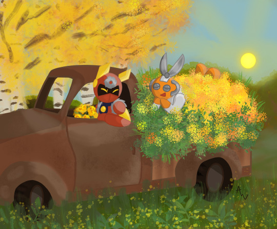
Subzeroiceskater said:
With the red for Metal Man, orange for Cut Man and the explosion of yellow flowers, that’s the trifecta of warm colors. Yellow roses could mean delight and this pic is delightful in all ways. Cut looks so cute practically swimming in the sea of flowers and greenery, as does Metal’s adorable expression—which is a feat since he only shows his eyes. I also really like the juxtaposition and balance of this piece from: the rust-brown car against green-yellow nature running wild, and Metal holding a bouquet meanwhile Cut’s covered with plants. It makes me want to get some fresh air myself!
Miyabi said:
Cut Man looks grateful for being able to ride in that pickup bed of flowers, and I have a feeling the two of them had a wonderful time just snipping and sawing away at all the stems to gather them all. XD Love how the yellow and oranges play off of both character’s color schemes nicely. The subtlety of the yellow flowers in the foreground, along with the sun and tree in the background all play off each other well, too! Just an absolutely cute pic!
Dark-Dullahan:
Subzeroiceskater said:
What a fantastic composition. Dark-Dullahan does away with most color, leaving the colors of the mixed-bouquet roses as the main focal point. Classic red for romance, a gentler pink for affection, mixed yellow roses to signify caring and probably so much more—seems like Nana can’t contain her feelings for Massimo. I love how the close up of the bouquet doesn’t just form a kind of heart at the top but serves as the divider between the two, like a diptych. With such a wonderful offering, Massimo would surely accept her feelings.
Miyabi said:
As you brought to my attention, your mixed bouquet had a few different meanings, such as the dark pink representing thanks to Massimo for saving Nana from Silver Horn, and the red tips on the yellow roses to symbolize falling in love. Certainly got those vibes from her shy demeanor, as she sheepishly tries to hand them to him. Also agree with Subzero that the line from the bouquet nicely works as a way to separate them uniquely with the background. Sorry you weren’t able to complete it as fully as you had hoped, but the concept behind it certainly was strong!
Donnie:
Donnie also sent in an alternate version made during the creative process, in a different artistic style, that I still feel needs to be shared, as well. Fun to see the contrast, yet still have the same feeling and mood to the piece.
Subzeroiceskater said:
Oh, I adore this one. It reminds me of a movie poster with the tagline. I love the extra PINK flourishes of the letterings like with the Mega Man logo color change and cute pixelated font and heart. Both Rock and Roll’s expressions are so cute, too—with his more subdued smile contrasted with her exuberant grin. Much like how the pink rose could mean many things like thoughtfulness, cheer or as a show of appreciation, this piece is positively sparkling with affection, hearts and all. It’s clever how the sunset is giving the picture an overall pinkish-red hue while having the yellow light as an outline. A darling piece.
Miyabi said:
With pink roses again, I truly liked the additional hue adjustments where you can feel the warmth and see the lighter pink mixed into their skintone, or areas normally of white - from eyes to teeth to the Megaman logo - that have taken on the pink in it’s place. With the painterly watercolor style you used, it all blends in nicely. Even in your earlier version, I feel you brought a strong game with the hues, but toned down the red from that version to make it feel much stronger towards pink, with a tighter crop of your canvas. It was fun to see how it evolved, and strengthened your piece in doing so! Fabulous job!
DragonMarquise:

Subzeroiceskater said:
No better way to show how madly in love you are than a bouquet of roses that run the gamut of—I can’t call these warm colors because these passions are running hot. Orange seems to be the dominant color here—which in roses could symbolize a love that’s passionate, fierce and deep. It’s also expressed nicely with the two lovers embracing, engaged in mid kiss, their bodies also forming a subtle heart shape, to emphasize the flurry of hearts around them. The bouquet is not just orange roses, however, but a mixed bouquet of the classic romantic red and the more affectionate pink—it’s a piece that’s bursting with all degrees of love.
Miyabi said:
You also certainly mastered the limited color pallette challenge as you tackled this piece! Orange, the color of passion, is certainly felt in their deep kiss and embrace. I too caught the heart shape their heads essentially form, which is then further enforced with the heart of hearts behind them. I thought that concept was pulled off very well. Perfect for the fiery intensity of Match, this turned out to be a very hot pic!
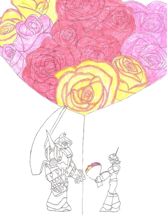
Mattasaurs:
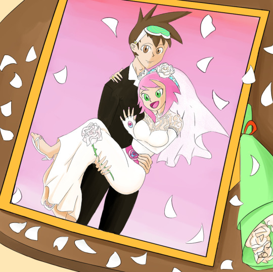
Subzeroiceskater said:
This one has a very clever framing (eh? EH?). The color white is often associated with purity, innocence and hope, and with white roses—weddings and marriage. Sonia dons the classic white wedding dress which has a très élégante design—and the little Lyra on her belt is very cute. The pink background is also very romantic and a nice way to tie in with her theme colors. I dig the lovey-dovey feel of Geo doing the classic bridal carry while clasping a single white rose...but seeing the thorns, I think he better watch his hand!
Miyabi said:
For a theme emphasizing color within the pic, I salute you for taking the biggest challenge in choosing white. In many ways, it could have been the hardest to keep as a predominant color, but still make the pic interesting and visually appealing. Choosing to have the petals all around the frame, with the bouquet nearby was a clever touch. With white often used for weddings and new beginnings, I think the concept of your piece worked just right, where it was subtle, but still incorporated enough other color to give the piece some life.
Category 2: Kawaii-rimi (Humor)
For our humor category this year, the theme focused on your favorite Megaman character gifting the plush form of another Megaman character to their crush, instantly created by a ninja-like character, to play off of the Kawarimi concept from the EXE series.
With just 3 entries in our humor category this time around, every entrant placed. You can see the full gallery of all entries at full-size [HERE]. Each entrant’s name will also link to their individual pieces at full-size.
1.) Mattasaurs: *$100 prize*
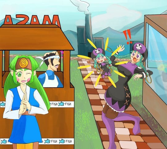
Subzeroiceskater said:
Y’know how blocks of wood are sometimes used by ninjas when they do that whole body switching thing? I think it’s clever how this pic has Sal—Woodman.exe’s operator—conjuring the doll. Everything about the pic is so fun and colorful: from Sal’s mischievous grin of accomplishment, Miyu being completely shocked by her chibi doppelganger (check out that body language!) and Masa’s confused expression.
Miyabi said:
Yes, while to some, Sal might not be the first one they think of when they think ninja in the Megaman Universe, but I certainly thought she still fits the bill in her design. Usually we don’t see this much emotion or shock out of Miyu, so seeing her torque her body, taken aback at a doll of herself, is amusing in it’s own right. Meanwhile, nothing fazes Masa. And a bit of randomness: oh man, seeing Masa’s head in profile, with his bandana...wow, I never realized how much his head shape with the bandana looks like a fish’s. I can’t unsee it now. Anyways, I also agree that the color, polish, and fun vibe made this a worthy winner!
2.) ColeManX: *$75 prize*
*Raffle Prize Winner* Captain N Cutsman Cel
Subzeroiceskater said:
E-Eyes? What did you mean by that, Mr. RT-55J? Although judging from the sparkle on those booblights… I understand, Cinnamon—if that happened to me, I’d be making asides to the camera, like I was in “The Office”, too. Cinnamon’s enthusiastic smile with this whole bizarre scene really sells it for me but shoutout to Marino’s smug satisfaction in the background.
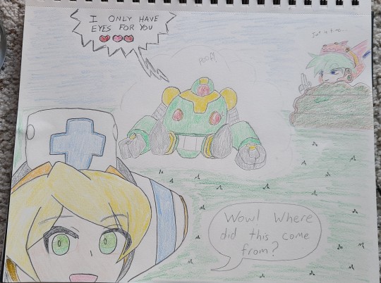
Miyabi said:
🎵 I kind of liked it your way
How you shyly placed your eyes on me
Did you ever know
That I had mine on you?🎵
RT says it only has eyes for Cinny right now, but it’s also known to be a little grabby hands, so I don’t know if I’d fully trust it...but good thing this is just a plush version. Time for the tables to be turned, and Cinnamon to get her claws and paws on it, instead. Very cute, although after the DiVE V-Day event, we all know this is a ruse and your pal boobeyes only belongs to the Ferham Fanclub. XD
3.) Ronin-Apprentice: *$50 prize*

Subzeroiceskater said:
This whole comic is so sweet and fluffy, nya! ~(=^‥^)ノ☆ It’s adorable how Proto brings up his gift first and the surprise is how Shadow handmade his gift. The little cat-eared Blues design is so darling--almost as cute as him fussing how totally NOT a cat he is. “Did you steal my cat.” had me snorting. Now I’m wondering where Tango went off to…
Miyabi said:
FU-SION-HA!
Aside from getting his own Super Adaptor, this is probably the closest we’ve got to seeing Tango and Blues merged as one. LOL I’m sure that plush would have a ton of fans wishing it actually existed. The panels where Blues embarrassingly hides behind his scarf and gets pet like a cat had me laughing! Very cute and adorable comic, that certainly had the most depth in terms of the theme of this category!
28 notes
·
View notes
Text
Makeup for Magick/Ritual p3: Beltane
We made it to Beltane, you guys! We did it! Is this actually going to go up in time without my computer freaking out? Only time will tell. And no, I didn't get a better phone.
.
.
.
I stole my sisters. ANYWAY!!!
It's the last of the three fertility sabbats (along with Imbolc and Ostara). And that's fertility in all its forms, by the way, not just the baby-making kind. You need fertile soil to for just about any kind of plant to grow, after all. The main colors that I, personally, associate with Beltane are bright/summery reds, lush greens, and… white. All colors of fertility, growth, passion, shmex… as you do. However! The entire rainbow spectrum is fair game. Think of all the colorful flowers, plants, and trees and stuff. For instance, just looking out my widow from where I'm typing this, you got the green of the new leaves on the tree, the reddish-orange color of the little helicopter seed fellas hanging from it, and little yellow, almost white, flowers on the bush in the neighbor's yard.

Any of the more nude palettes from Ostara are still in play. And DAMMIT! The picture's cut off at the edges. Because of course it is, why wouldn't it be? *groan* Whatever, let's get into Colourpop.
Top: Strawberry Shake, Main Squeeze, Orange You Glad?, Uh Huh Honey
Middle: Just My Luck, Blue Moon, It's My Pleasure, Oh La La
Bottom: Yes, Please!
If the red/green thing is what you wanna go for, grab the Just My Luck palette and either Strawberry Shake or Main Squeeze and you're good. And of course, as the rainbow spectrum goes, there it is. Hell, if you have the Fade into Hue palette, just grab that. I don't have it because, though the eyeshadow formula is decent for the price, there are pressed glitters in the palette. And unlike the BH eyeshadow formula, I don't think the CP formula is good enough to make up for the handful of arts-and-crafts-herpes shades you have to deal with in this palette.
Yes, Please! is here because Beltane is also a fire festival and this a cute and cheap fiery palette.
On to Give Me Glow!
Top: Summer Vibes, Extra Spicy
Bottom: Vintage Rose,Vivid Rose
Where there is the CP Yes, Please! Palette, there is the Give Me Glow Extra Spicy palette. Unfortunately, she's no longer available, but it's a great pick for this fire festival if you have it.
Kindly excuse the busted pans in my Summer Vibes palette, but a good chunk of these shades could work for Beltane. You can take it fiery or flowery, depending on what you're going for.
And if you want to look like a stereotypical flower fairy (and I mean that in the best possible way), the sister Rose palettes are the palettes to grab.
Now let's get the single-palettes out of the way.
Tarte's Tartelette Toasted palette is another one of those fire festival palettes, except more of a warm toned nude version of one as opposed to the bright fiery colors of Yes, Please! and Extra Spicy.
The Too Faced Life's a Festival palette is just full of great brights and those fun duochromes. Definitely the time to pull it out if you have it.
And then there's the ABH Modern Renaissance palette. This palette will give you serious vintage flower fairy vibes, and was the first time I got said vibe while using a palette. Okay,technically that was when I used the Makeup Revolution dupe palette, but that formula was utter trash.
And as for the ABH sub-brand, Norvina…

We got two. The Pro Pigment Palette Vol. 3, and the Pro Pigment Mini Palette Vol. 3.
The Mini's cherry reds, green and pinks and beautiful, and that white has a cherry red duochrome to it. Ignore the pressed glitter in the middle of the top row, the shades are pretty enough not to.
The larger Vol. 3 has some nice bright greens, reds, etc. that makes it great for the lushness of Beltane, even though it's meant to be a fall palette. Which it's also great for, but we'll get to that in a future post.
Now for BH Cosmetics!
Top: Trendy in Tokyo, Chillin' in Chicago
Bottom: Mimosa
Trendy in Tokyo is the typical rainbow palette, except the shimmers are more satin than metallic, so not my favorite of their Travel palettes.
Chillin' in Chicago would make a pretty good fire festival palette, and lays in between Tartelette Toasted and Extra Spicy/Yes, Please!. It's not as nude as Toasted but not as bright as the two others.
Mimosa's pinks with orange and yellow pops could give you a bright, flowery look.
And now the last of the palettes, Juvia's Place!
Left Column (Top to Bottom): The Masquerade Mini, The Magic Mini
Middle Column (Top to Bottom): The Zulu, The Festival,The Sweet Pinks
Right Column (Top to Bottom): The Warrior III, The Chocolates, The Violets
The Masquerade Mini's top two colorful rows are what you're reaching for if you want to do a fully colorful Beltane look, but can be paired with the bottom nudes if all you want (or can do because work or whatever) is a little pop of color. For The Magic Mini, you're looking at the top two rows, which are the warmer rows, and the purple duochrome (Faso) and the green (Buzo) in the bottom, cooler toned rows.
Both The Zulu and The Warrior III are beautiful colorful palettes. In Warrior III, I'd stick with the top six mattes. That green and red are beautiful, and that pink is almost neon in real life. The entire Zulu palette is good for brighter plant/flower looks. And that pink/gold duochrome in the bottom left corner? So beautiful.
In The Festival palette, I'd say all the shades except the metallic black, the deeper metallic teal, and the matte mustard gold. The red, pink and oranges are so beautiful and rich, guys! And that metallic white and gold? *chef kiss* But, guess what palette is getting pulled out for Samhain. X3!
The Chocolates, Violets and Sweet Pinks are basically companion palettes. The Chocolates have some "rich, fertile soil" vibes if you want to bring that into the look, while The Violets are fairly floral and The Sweet Pinks are more bright pops with a more floral matte and shimmer shade (top right, bottom left). The two pinky floral shades could actually be cute with the Violets, now that I think about it.
And finally, the singles! A few days ago, my first Terra Moons singles order arrived, but since I haven't really got to play with them much they won't be included in this one. Though they, as well as my first order of singles from Looxi beauty, will probably start showing up in my next post. Okay, Shroud singles first!
Top: Enigma, Azura, Vigor, Ignite, Vigil
Bottom: Oracle, Pillow Talk, Scrumptious, Magnetism, Soulstone
Pillow Talk, Scrumptious and Magnetism aren't pressed glitters, but definitely act and remove like they are. So, if you pick these up when Shroud reopens, keep that in mind.
Enigma (purple with a blue shift)
Azura (teal blue with a green shift)
Vigor (bright lemon-lime soda green)
Ignite (fiery copper)
Vigil (yellow-gold)
Oracle (champagne gold)
Pillow Talk (deep purple with a gold shift)
Scrumptious (coral red with a gold shift)
Magnetism (aqua green with a gold shift)
Soulstone (magenta)
And finishing off, Give Me Glow singles!

Column 1
My Sunshine (pale sunny yellow metallic)
Lucky Charm (light yellow metallic)
Lemon Lime (electric green with shifts of banana yellow)
Limeade (lime green)
Column 2
Peach Glaze (pale icy peach)
You're Cheesy (Mac n Cheese orange)
Havana (deep coral metallic)
Low Battery (neutral-toned, medium-dark red)
Column 3
Pink Frosting (icy bubble gum pink)
Heartbreaker (electric hot pink)
West Coast (deep vivid coral)
Floral Coral (peachy-pink coral)
Column 4
Strawberry Lollipop (reddish pink)
Pink Lemonade (pink base with electric gold a baby blue shifts)
Icicle (icy white)
Marshmallow (pure white)
Column 5
Pretty Little Lilac (icy lavender)
Electric Purple (neon pastel purple)
Bubbles (true icy blue)
Sky High (bright sky blue)
Column 6
Toxic (deep neon purple)
Purple Hills (a pure deep electric purple)
Under the Sea (deep sea blue)
Starboy (deep cobalt blue)
And we've reached the end of the Beltane post! Fun fact, the Beltane crossquarter day is on May 4th so, still relevant right? Yes? No? Maybe so? The fact that I was able to get this done by Beltane is a miracle in and of itself. Use these as color story inspiration for your own looks, maybe repost with palettes/singles you've found in your own stash, and I'll see you in the next one!
9 notes
·
View notes
Text
Don't mind me venting but I've been obsessed lately with how my relationships with some colours and colour in general changed over the years. Idk if there have been like psych studies about this or anything but. This is just me ranting about colours in my life idk this turned out waaay longer than I expected so yup all under the cut see you there.
(also please if you want to go on and on about your colours, feel free to add to this post I love to hear about people's colours)
Let's talk about red. So. My mom loves decorating and repainting rooms so even though we never moved, I've known 3 to 5 different versions of almost every room in our home. So I took that from here and I do like to repaint my room every now and then (yes that's relevant for the rest). So when I got into secondary school, wasn't a kid anymore, I wanted to redo my room and my mom offered to do it all over for my birthday (I wasn't allowed in my room for a week while she and my sister redecorated it all, big surprise and everything). The theme was basically black and white with specks of red and floral stickers on the walls. I loved it. Loved red. My favourite jacket was red, up until high school my favourite dress was red (and I didn't even wear dresses, I just had the one, that was red, and that I only wore on Christmas). I just couldn't wear and have and see enough red stuff.
Then I rejected red entirely. I didn't notice it at first, but thinking back, it's so obvious. I stopped wearing red. Sure when I got into high school and became that angsty teenager I wore fewer colours, more blacks and greys and browns, but red was still present from time to time. But at some point, I couldn't stand that colour anymore. When I moved out of my parents' house I visited a flat and when I got to the kitchen that was entirely painted red, even though the whole flat was great and in a good location, there was no way I could live there. But it hit me a couple months ago: I don't have many memories of high school, even less of secondary school, because I put it all away, 12-14 were the worst years of my (short) life and I hated almost every second of it. But I associated red so much with this period, that I couldn't stand the view of just a colour. High school was 6 years ago. I didn't have decorations or wear red clothes in 5 years.
In my first apartment, I decorated it in blues and green. My bedsheets were blue, I died my hair blue and green for almost a year. These two colours have followed me ever since. I started saying green was my favourite colour. I said I didn't like warm colours (fun fact: blue used to be considered a warm colour a few centuries ago). I used to say blue was the warmest colour before it was a thing. Blue felt safe, green felt like home, I needed those colours with me. Last year I painted my whole living room green with jungle décor.
But here's the thing: for the past couple of years, I've been obsessed with yellow. And not greeny kinds of yellow. I'm in love with deep warm ochres, mustard yellows and everything (and don't tell me about fashion and trend, I was into yellow before it was cool and six months later everything was yellow). Me??? Warm colours??? I didn't even notice it, at some point I must have bought a mustard sweatshirt and here I am now surrounding myself with yellow. Every time I see something yellow I'm like "ooh pretty" and then process that yeah it's yellow of course you think it's pretty. Sometimes I don't see it and my roommate has to tell me it's yellow and that's why you love it. I don't mind, I love loving yellow, that's a pretty colour. But it just happened... out of the blue? (see what I did there?) One day I wasn't like ugh warm colours and the next I was in love with yellow. Still didn't like red though. Well, sharp reds. I could do with dark, wine reds, purple reds. Not-so-warm reds. Orange was on thin fucking ice, had to be a very specific orange.
Remember my black and white and red room? I skipped a step there, in high school I repainted it in shades of brown, chocolate brown, taupe brown. Anyway. But last summer, I did it over again (that brown was so ugly omg I don't know how I put up with it for so long). With a dark blue wall. Because of course. But also yellow and orange decor. Yellow had been the main colour in my wardrobe for a year (so much so that I could go a whole week wearing yellow) (my friend called me Maya the Bee), but except for a plaid, yellow wasn't decoration material yet. But now yellow is starting to feel like me. Although I can't for the love of god imagine having a yellow wall. I don't know why, I just can't.
In the past few weeks, I've been thinking about redoing my room at my own place (yes I did the one at my parents' first but my place has a 4-meter tall ceiling so I can't just improvise, I need tools and a tall enough ladder) and I'm stuck with what colour scheme I want. Because do you know what colour I keep thinking about? Red and orange. Not like 4 red walls but. Red??? How am I even considering red??? And yet here I am. But a part of me is still like ugh no you don't like red and then the other part is trying to convince me that red is actually a pretty colour. And I'm just supposed to sit here and accept a colour that I rejected for almost a quarter of my life. That I've been rejecting for six (6) years. And it's so weird and I can't shake this feeling that red feels wrong.
But do you know what also happened in the last... 6 months maybe? I never talked this much about secondary school and high school and what I endured and lived during these years. Now that's just my two-bit psychology but. Maybe I've just started putting it all behind and liberating myself for the harassment and the pain and the self-hatred I suffered all those years ago. Maybe I'm healing a bit. And maybe red is starting to grow on me again.
#yes i'm supposed to be writing my thesis and not ranting about random thoughts on tumblr for 2 hours don't @ me#also still don't know what colour my room will be because i still feel kinda stuck rn and nothing seems obvious#i guess i'll figure it out when the wallpaper is down because this thing is u g l y#lil talk
5 notes
·
View notes
Photo


A Survey of the Best Goldenrods for your Garden (Part I)
Introduction:
Why goldenrods?
There are currently 136 species in the genus Solidago, three more than the last time I checked the astereae lab. (see https://uwaterloo.ca/astereae-lab/) Most of these species are native to North America. For those who see them on the roadsides as masses of weedy generic golden flowers, it seldom occurs to them that from July through October they are most likely witnessing the blooms of a dozen or more species. By far the most common and most widespread and aggressive goldenrods throughout the Americas are those within the Triplinerviae group, which includes S. canadensis, S. gigantea, and S. altissima all of which can be maddeningly difficult to accurately distinguish even for the experts. Weedy though they may be, there are many plant lovers including those in the cut flower trade who understand the value of the majestic diamond and pyramidal flower forms of the canadensis types. A few hybrids have been developed for the cut flower trade that are generally not available to gardeners. Cultivars sold in the nursery like S. canadensis ‘Goldenbaby are smaller diploid forms that are less aggressive and more manageable. But on the whole, only recently do we see a wider variety of garden worthy species entering the nursery trade.
This is a great benefit to gardeners as many of these varieties are well behaved and very attractive plants that don’t at all resemble their weedy cousins except in their trademark golden flowers. And it must be said, while posing the question, why goldenrods, that they do not cause allergies as they have long been accused of doing. Their pollen is heavy and sticky and not carried in the wind. It has been guilt by association, a purely circumstantial case, while the real culprits (one of them ragweed) are off the hook. Goldenrods depend on insects for pollination.
Which brings me to the overwhelming benefit to growing goldenrods: they are one of the most important food sources in the late season for pollinating insects, especially bees. And goldenrod honey is delicious. Gardeners who are aware of the decline in bee species throughout the world, should straightaway run to their nearest online nursery and begin shopping for appropriate Solidago species for their region of the country. Lastly, in addition to providing you a pictorial and descriptive list of some of my favorite forms, I do so to show another advantage to growing goldenrods. It has to do with form. If you think about most perennials, you notice that many plants come in a variety of colors, but by and large represent a single form. Goldenrods do it the other way around--they come in only two colors, overwhelmingly yellow/golden and a couple of white ones, but they come in a wide variety of flowering forms. I hope to introduce the unfamiliar to some of the more striking and unusual ones, that should provide imaginative gardeners with a lot of landscaping and design opportunities.
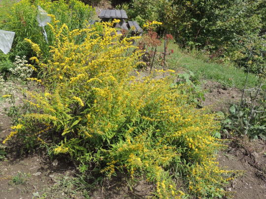
1 & 2. Solidago bicolor. Also called silver rod, this is one of the white goldenrods well suited to the garden. Beloved by bees and has a light lily-like or honey suckle fragrance. Widely adaptable in Eastern North America, from the Maritimes south to Alabama and Georgia and as far west as Michigan and Illinois. In the wild, it is often sparse and underdeveloped and makes little impression. In cultivation it can make a rich flowering stand in late summer and early fall producing refreshing cream-colored wands over a 4 to 6 week period. Planted in a mass with Helenium, Sedum, Persicaria or Panicum it will have people asking, ‘what’s that’, and ‘goldenrod, really?’ Can sustain winter damage, but I’ve been growing it for 7 years and still have a few of the original seed grown plants. Reseeds will replace spent plants, and its slender profile won’t take up too much room in your garden. Full sun and part shade, where it can reach 4ft in height. Usually about 2 to 3 ft in full sun.
3, 4 & 5. Solidago riddellii. In my opinion this is the finest and most versatile goldenrod you can grow in your garden. It has an elegant and striking presence from May to November that is just as suitable for refined plantings as it is for the wild or natural garden. What you have here is a distinctive and elegant foliar profile, strong stems and rich, vibrant flowering. Another plus (image 5) is that the spent flowers retract neatly and the golden color of the phyllaries shines through, so there is no drab phase many flowers and most goldenrods pass through. Rather a pleasant golden/brown appearance enhanced by bright chartreuse leaflets below keep it shining through October, along with flashes of variegated colored fall foliage in shades of gold, orange, red, pink, purple and bronze. Finally soft-gray mounding seed heads complete the show in November. This long-lived clumper is a native of moist conditions, but it performed beautifully in the drought conditions that 2020 brought. So at the very least it can withstand the occasional drought. 2 1/2 to 3 1/2 ft in height. Difficult to find in nurseries or from seed. I purchased my seed from Ernst Conservation Seeds. The prices per pound are staggering and have gone up considerably since I first purchased seed in 2013 but smaller portions can be purchased at more affordable prices. Pollinator paradise.
6 Solidago rugosa ‘Fireworks’. This variation of S. rugosa was discovered in North Carolina in 1973 and registered as a cultivar in 1993. A more beautiful structural plant is hard to find, that and the thrilling lateral blooms cascading in all directions puts this one in my top 5 goldenrods. Likely a tetraploid as it blooms a good month later than the native S. rugosa that grow in Vermont, and it displays a tetraploid’s vigor. This plant is tough as nails and completely immune to flopping or collapse. You can park a bike against it (not saying you would but sometimes kids do the darndest things). The foliage is unremarkable and coarse (thus the name rough or crinkle leaf goldenrod), but notice in image 6 that even at bloom time it maintains most of its lower foliage, so you don’t have to hide ugly legs as you do with most Asters and many fall blooming perennials. You do have to watch this one over time. This slow spreader won’t take over your garden, but a single plant will spread outward into a 3 or 4ft stand, with its underground rhizomes working their way into other plants. Very long lived and hardy. It blooms so late in the north my experience is that it never has time to set seed before it is cut down, either that or it is sterile. Long and short you won’t be troubled with seedlings.
7 & 8: Solidago caesia ‘Blue Stem Goldenrod’. Here is one that can be grown in sun or shade, and a bright graceful addition it is to the shade garden given it blooms in August and September when very little is flowering in anyone’s shade garden. It has lax stems that tend to arch, cascading on slopes and showing off the lovely linear quality of its axillary blooms. Quite bushy in full sun, sparser in shade. This is one of the more delicate goldenrods with its slender purple stems coated with a blue powder, thus the name (reminding me of wild Concord grapes of childhood that ripen at the same time as these bloom) Image 8.
9 & 10 Solidago speciosa ‘Showy Goldenrod’. Put this one in your top 5 goldenrods as well. The shorter diploid version is pictured in image 9 and the much taller bolder tetraploid (image 10) that blooms very late in the North. Image 10 was harvested from the disturbed ground along the NJ Turnpike about 3 years after construction occurred. There are foliage differences as well. The tetraploids I harvested showed no dentation on the leaves (they were entire and longer and smoother than those of the diploids I harvested from Central Massachusetts). I believe most of what you will find offered in the wildflower nurseries such as Prairie Moon and High Country Gardens are the earlier blooming, shorter diploid types. But don’t ask the nurseries, they will neither know nor care. If it says to 3ft, it’s probably diploid, if it says to 5ft, possibly tetraploid. Some of the NJ populations were as tall as 6 1/2 ft, which of course makes a lot of difference if you are planning a garden. Majestic, non-invasive clumps, with quarter inch individual flowers give these full flower heads their showy quality and what I can only describe as a radiant glow from a distance. Another plus are the often deep red stems that intensify in color in the fall and make for a spectacular contrast with the cloud-like off-white seed heads. A stand of these in your pollinator garden is definitely worth growing.
12 notes
·
View notes
Note
Idk if this has been asked already, but how long does it take you to create a comic/art piece? And what is the order of the steps you go through? (Btw I love your art)
That’s a good question! I’m gonna use the most recent page as the example. I’ve talked a little bit about how long it takes, but I haven’t really explained my process. Heads up, this is pretty long! I could have just put in one panel’s process, but it’s more fun to show the whole page
1. The Sketch ~ 1-2 Hours
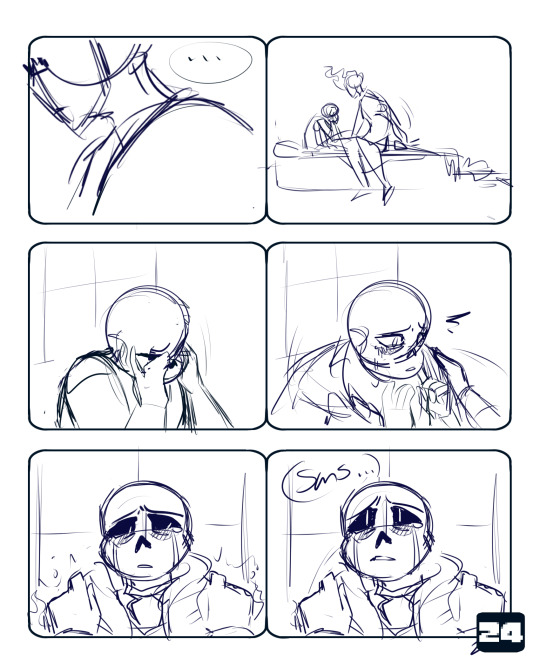
This can take a while for a number of reasons. A few factors could be business, tiredness, a lack of inspiration, creating too many options for myself, etc. But generally this part goes at a decent pace. I have a script that I follow loosely, where I’ve written dialogue and actions that seem good for what’s going on. I will spend more time on panels that I have a specific image in my head for. Those last two panels are much cleaner/more fleshed out than the previous four because I had a much better idea for how I wanted them to look.
2. The Lineart ~ 2-4 Hours
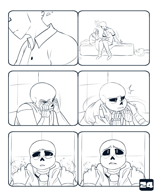
The lineart takes the longest, hands down. It’s the clean up, final changes/additions, and just making everything look all nice for the rest of the piece. This is where I spend like 5 minutes comparing facial expressions to see which one I like better, drawing another one, and then choosing the first one I drew.
3. The Background ~ 30 minutes
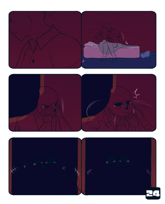
The coloring is so much faster than the lineart. I will usually go slower here on purpose because I enjoy it, and it’s a relaxing break from the lineart. I just color right underneath the lineart, I don’t worry about anything looking messy under the character linearts because I know they’ll just be covered up. Typically, if I start the lineart in the afternoon, I’ll get to this point and stop for the evening.
4. Flat Colors ~ 5 Minutes
This goes relatively fast as well. I take my time for the most part. It’s just tedious to select the lineart. I kind of color them differently. Sans gets his darkest colors first, and then I add light layers on top. With Grillby, I put on the lightest color for his shirt and the middle color for his flames (I use 3-4 colors for them). Doing that kinda helps me establish that Grillby is a light source and Sans is not.The color schemes are almost direct complements, and I do eventually add yellow to Grillby’s flames. It makes them contrast with each other, and is generally satisfying to look at imo. It also makes Sans’ colors somewhat analygous to his surroundings, because of the deep blues and reds. The purple does stand out, but not nearly as much as the bright orange.
5. Finishing Grillby ~ 45 Minutes - 1 Hour

I have a general routine for adding Grillby’s details, which is why it goes quick. ((There will be a separate post on that process later)) It only takes that long because I have to do it for multiple panels per page. I’m sure this page was even shorter because it mostly featured incomplete shots of him. To finish his flames, I use an airbrush to add the reds, then I do the same with the yellows. I take the brightest yellow on the palette and use that for his freckles, eyes, and mouth ((if it’s open)). The last thing I do is color his lineart a dark red. His eyes are lined with a darker red to compensate for the glow I put over them, which makes the lines look faint and hard to see. For his shirt, I shade it with the lighter pink color, and then airbrush the darker pink on the areas that are further away from his flames.
6. Finishing Sans ~ 1 hour

Sans definitely has a more drastic change than Grillby. Almost none of the original purple survives the overlay layers. I have two or three light layers on top of the flat colors. I use one of the colors that is from grillby’s color palette, it’s a slightly altered version of his flat orange. First I do hard lights, that don’t have their edges blurred. The top of his skull and those half circle shapes under his eye sockets are some of the most noticeable examples. Then I go over that layer with another overlay, but this time with an airbrush. I put it in the same areas, but it makes everything look softer. There’s one more overlay, which uses the dark purple of Sans’ shirt. It helps me to not make everything too light. On top of all three of those is a a Luminosity + Shade layer in the orange color to make the brightest spots pop.
7. Finishing Background Details ~ 15-20 Minutes

This is basically doing the same thing I did to Sans on the background. I use the same orange from Grillby’s color scheme and add light where it needs to go. I can be more lenient on details because it’s not the main focus of the page.
8. Adding the Glow ~ 5-10 Minutes
This is just me taking the orange light color and airbrushing it just above the background on a Lum + Shade layer. This goes under the layers that Sans and Grillby are lined and colored on. The next layer is the same as the last and goes over both figures. It acts as a final highlight to the lightest points of the two. Usually it’s the top of Sans’ skull, the tips of Grillby’s fingers, and the area around his mouth. Then I airbrush Sans and Grillby’s eyes in blue and orange respectively on a Lum + Shade Layer.
9. Text and Final Details ~ 20 - 30 Minutes

This is where I figure out where I want to place the dialogue, and add in anything I might have missed. In this case, I forgot to fully draw and shade Sans’ tears at the beginning. I slap my signature on and boom! All done!
I hope this was helpful! And sorry it’s super long 0v0;; If you need clarification on anything, feel free to ask!
325 notes
·
View notes
Text
Taron Egerton fluffy A-Z
requested: I’d LOVE to see how you put together a sfw/fluff version of a-z with taron egerton ❤️ I’m obsessed with your nsfw one and I think you get his personality so right!
A = Attractive: what do they find attractive about the other?
he’s attracted to how if you need something done, you’ll get it done. he loves how passionate you are, and how you love making new memories.
B = Baby: do they want a family? why/why not?
he absolutely does. he wants 3 kids, a cat and dog. he is such a sap when it comes to babies and toddlers, and you see how he is with his little sisters, which just makes you want to have kids with him more. you got pregnant with your first child, he was so happy he cried, holding the tests so close to his heart, whispering “thank you” over and over as you hug his head to his chest.
C = Cuddle: how do they cuddle?
he loves to have you snuggled into him, your arms tucked against your body with taron’s arms tightly wrapped around you, your head on his chest. he also loves to have you hold him. some days he comes home and he just needs you to hold him, petting his hair and kissing his nose.
D = Dates: what are dates with them like?
simple. taron doesn’t like to be photographed out in public on the streets living his life, so he likes to order food in, set up a fort on the bed or in the living room and little fairy lights and says “ta da!” when you come into the room. or, you two will sneak out and go to your favorite hiding spot and just sit there for hours, talking or not, looking out at the city.
E = Everything: “you are my ____” (e.g my life, my world…)
you are my sunshine
F = Feelings: when did they know they were falling in love?
when you come to visit him at work at you look at him in a certain way, and it makes his heart race. it got him distracted, yet he was still acting amazing. he would come back to his dressing room and just twirl you around and kiss you passionately and the look he has in his eyes, you knew what he wanted to say.
G = Gentle: are they gentle? If so, how?
taron wouldn’t hurt a fly. but when there’s photographers around and you get anxious, he won’t be too gentle to them, but so gentle to you. holding you close and whispering in your ear. at home, he’s the cutest thing ever. so cuddly and kissing your cheek as his thumb rubs you thigh as you two cuddle on the bed.
H = Hand/Hold: how do they like to hold? how do they like to hold hands?
if you’re standing up, he likes to stand behind you with his hands on your hips and your face next to yours, sometimes placing his chin on your shoulder. or he likes to hold you to his side, your hand rubbing his back and his arm around your shoulders, rubbing your arm. he loves to hold your hand. holding your pinkies together sometimes if you’re on red carpets. at home, you two are laying in bed watching a movie and he grabs your hand, linking his fingers with yours and putting them on his chest, tummy or in his lap. he loves to fall asleep on your shoulder holding hands in his lap.
I = Impression: first impression/s
he thought you were absolutely beautiful, and he didn’t even realize you had taken his breath away until after you pass. he sees you at the comic con getting interviewed and he can’t take his eyes off you.
you saw him on stage, and you couldn’t take your eyes off him either. you saw him in ‘rocketman’ and thought he was amazing in that and you saw photos of him on the red carpet at the premiere and you had sparkles in your eyes.
J = Joker: are they into pulling pranks?
not really. a couple jumpscares here and there, nothing serious like dyeing your clothes or anything.
K = Kisses: how do they kiss?
oh me oh my. taron loves to hold your face and rub his thumbs on your cheeks as he kisses you deeply. or he puts his hands on your neck. or his hands going down your sides, on your hips, pulling you in. he loves when he comes home from trips or a long, long day where you wrap your arms around his neck, fingers holding his hair as he holds your waist.
L = Love: who says I love you first?
he did. you two were just at home, and as you sat on the bed, he went over and sat across from you, holding your face and just staring. you smile and giggle, confused. “are you okay, babe?”
“i’ve just meaning to tell you this for a while. i didn’t think i was falling, but yesterday, it just hit me. i wanted to digest it, but god, yn, i love you. and i’m so happy that it’s you i love. i love you so much, yn. and you don’t have to say it back, but i just wanted to..”
“taron..” you place your hand on his cheek and smiled. “i loved you too, baby” he smiles widely and kisses you passionately, so happy that you feel the same about him as he does you.
he can’t stop telling you either. he’ll just come up to you randomly, kissing your lips and whispering, ‘i love you’
M = Memory: their favorite moment together
his favorite memory is taking you home and seeing you with his little sisters. seeing how you made them giggle and how they snuggled next to you as you read, (or commenting how funny your accent was if you weren’t from the uk) and taron couldn’t stop taking photos and videos, and when the four of you napped, one girl in your arms and the other in his, his mom takes a picture and he sets it as his wallpaper and smiles every time he looks at it.
N = Nickel: do they spoil? do they buy the person they love everything?
he wants to spoil you, but you don’t let him, yet he still does it. it’ll only really be once and a while. a new ring, or necklace. something you can always wear to remember him when he leaves for a bit. of course you would never forget him, but he would like to get you something where every time you look down at it, you think of him.
O = Orange: what color reminds them of their other half?
a nice shade of red, or a light purple
P = Pet names: what pet names do they use?
all the pet names under the sun. but his favorites were “love” “baby” “darling” and “sweetheart”
Q = Quaint: what is their favorite non-modern thing?
he loves older cameras! the ones that require film and not the digital ones. he likes having to take them to the store and see them developed and then hang them above the bed.
R = Rainy Day: what do they like to do on a rainy day?
he likes to stay in with coffee/tea, lounging around in his underwear as the two of you watch shows and movies. sometimes you’d facetime richard and bother him. you two would go to the store and buy different kinds of cookie dough, save it for a rainy day and bake them as you two listen to music and sing and dance around the kitchen.
S = Sad: how do they cheer themselves/each other up
he likes to listen to his music, or he won’t say anything to you and just lay down on top of you, sighing, and taking your hand himself and putting it on his head. he loves to just have you hold him and kiss him softly. it gets him happier every time.
T = Talking: what do they love to talk about?
he loves to talk about how much music had inspired him and helped him. he also loves to talk about how he met you, and how he was going to propose to you.
U = Unencumbered: What helps them relax?
being cuddled in your arms, listening to soft music, taking a nap, doing a cooling face mask, and listening to you read to him.
V = Vaunt: what do they like to show off? What are they proud of?
you, always you. talking about how good you are to him. he always love to show off his memorabilia from ‘rocketman’ as well.
W = Wedding: when, how, where do they propose?
he proposes on your 3 year anniversary, under the stars in the same spot he took you on your first date.
X = Xylophone: What’s their song?
faith by george michael
Y = You’re the ___ to my ___ (e.g the cookies to my milk, the macaroni to my cheese)
you’re the stars to my sky
Z = Zebra: if they wanted a pet, what pet would they get?
he’d want a golden retriever. they are such gentle dogs and he thinks they’re perfect with babies (which is true) and the golden retriever matches his energy well.
#taron egerton#taron egerton x reader#taron egerton x you#taron egerton imagine#taron egerton imagines#taron egerton blurb#taron egerton blurbs#eggsy unwin#kingsman#kingsman secret service#kingsman the golden circle
410 notes
·
View notes
Text
Categorizing Precure by Hair Color (Cure ver.)
Double feature!
Sorta. Anyways, civilian version is here.
Comments below cut.
Note: This will be continually updated as new additions come along.
Black:

Red:

Blonde:
Pink/Magenta:

Blue:
Purple:
Orange:
Green:

Black - When am I going to get another Cure with black hair again?
Hell, give me a Cure with white hair while you’re at it!
Red - Nagisa is classified as a ginger under the civilian version and her hair doesn’t undergo any drastic changes during transformation other than some restyling.
As for Rouge, had a bit of trouble with her in both forms. I mean, ok, let’s just all agree that Rin is a brunette and that her hair gained some extra coloring during transformation. But then...does it look more reddish brown or reddish orange to you?
I’m not entirely certain because the shade varies from art to art. Sometimes it looks red while other times it looks very orange.
In the end, I stuck her here after comparing her to the other Cures with orange hair. Rouge can pass for having a more natural (or at least closer to natural) hair color while theirs cannot so yea.
Blonde - There’s only ever been two groups (Splash Star, KiraPre) so far that didn’t have a blonde Cure. Can you believe that?
Pink/Magenta - lol, why is this one playing rivals with the Blondes? xD;
From Yes!5 onwards, DokiPre is the only season that doesn’t have a pink-haired Cure.
Blue & Purple - lmao, both of them are vying for third place.
Orange - Despite all these Cures with orange hair, only Sunny is an actual Orange Cure. And I’m not sure if that is a thing yet or are people still generally grouping her with the Reds?
Green - The Grails, lol
~~~~~~~~~~~~~~~
Update log:
3/25/20 - Post published.
29 notes
·
View notes
Text
BTS tag
rules: Answer the questions and tag more ARMY friends to play along
Tagged by @memeofthesoul @iuconic @cowboyjinbop @hobis-glasses @kookie-off-his-kookie 💜 y’all really wanted me to do this didn’t you? lol
1. First BTS song?
Dope
2. First bias?
Taehyung
3. Current bias?
Yoongi
4. Put the members in order of your bias list
This is highkey sacrilege, and whoever came up with this should be crucified lowkey kidding and I really want to refuse answering this, but if y’all held a gun to my head, I guess...
Yoongi > Tae > f̴̙̼̼̦͔̳̂́̅̂̚̕͝ͅú̸̢̲̰̞̤͍̠̖̆͌̊̕͘͝c̷̢̛͙̘̲͉̬͎̞̐̽͐̈́̈́́k̶̡͓͎̥̭͇͚͐̍̃ ̸̺̦̮̩̺̍̒̍̅̋̓͜t̸̯͔̩̳͋̂͑̏h̷̛̛̠̖̘̥̤́̎͊̀̔͂ͅͅí̵̥̹̻̻̲̟̦͙s̴̢̢̛̠̮͚͋͛͊̈́͌͘ ̵̘̗̼̺͈̋̿̌̾̚͜ś̶̨͇̭̈́̍̏͛̉͑h̷̖̓͛̔͑͗̆͘i̴̡̛̇͆͐͛̅̂̽t̵͚̍̈́̉̂ ̵̡̢̛̯͈̻͚͖̬̆̃̃͊̿͛Ị̵̣͙̓̿͗̓͠'̴̮̈́͌̂̓̍m̶̲͉͖͔̍̌̽ ̷̟̥͉̬̋̅̊̀̂͜ȏ̶̠͎̼̻͖̔̈́͌̿̽͗ͅu̴̖͍͖̤͚̱͉͉̅͆̈́̃t̵̨͖͉̥͇͈͕̼̓̂́̀̾̈́͝
5. Favorite BTS song?
These days, I really like Young Forever, You Never Walk Alone, and anything on MOTS:7 I can’t pick an overall favorite though
6. Favorite BTS song that is underrated?
We On, 2nd Grade
7. Favorite song of Wings?
all the solos + Blood Sweat & Tears, Cypher Pt. 4, 21st Century Girl
8. Favorite song of each LY Her, Tear and Answer?
Her: Serendipity, Best of Me, dimple, MIC Drop
Tear: Singularity, The Truth Untold, Paradise, Tear
Answer: all the solos + IDOL
9. Favorite music video?
Run, Fire, Blood Sweat & Tears (both Korean & Japanese version)
10. Favorite dancer?
Jimin (Hobi coming in a close 2nd)
11. Favorite vocalist?
JK (Tae coming in a close 2nd)
12. Favorite rapper?
Yoongi (idk how to answer this, they all have immaculate flow)
13. Favorite hair color on each member?
Seokjin: blonde, pink, purple, and light brown
Yoongi: listen, my man looks good in every color, but I’m especially a sucker for the green, blue, blonde (in all variations from AgustD blonde to MIC Drop blonde) and gray
Hoseok: orange, red, and dark brown
Namjoon: purple, blonde, and light brown
Jimin: pink, orange, and blonde
Taehyung: red, blue, blonde, and dark brown
Jungkook: 50 shades of brown, and pink
(+ black for everyone since that’s their natural hair color)
14. Favorite choreography?
Danger, Dope, Not Today
15. Favorite ship?
Yoonseok just compliment each other so well, 2seok is a true comedy duo, and Yoonjin will remain superior
(all on a fraternal level, of course)
Tagging @rapgodmyg @jintears @namuswife @thestral-balerion @chunghamor @wthkook @thefullmobb in case you haven’t done this so far and want to
#it's official: i've lost all track of tags#i postponed them so much they're piling up lol#pls bare with me and if you've tagged me in sth - i see you and thank you 💜#p: tag game
15 notes
·
View notes
Last Seen Blogs
warm-warmer-hot
Warm, warmer, hot

tr1hw1
Untitled
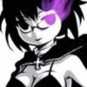
hottricksterfox
LUCKY DETECTIONキSEXY KNIVES
mysteries-x-mistakes
Mysteries and Mistakes

c0reisms
DANNY!!!