#graphics designers
Text
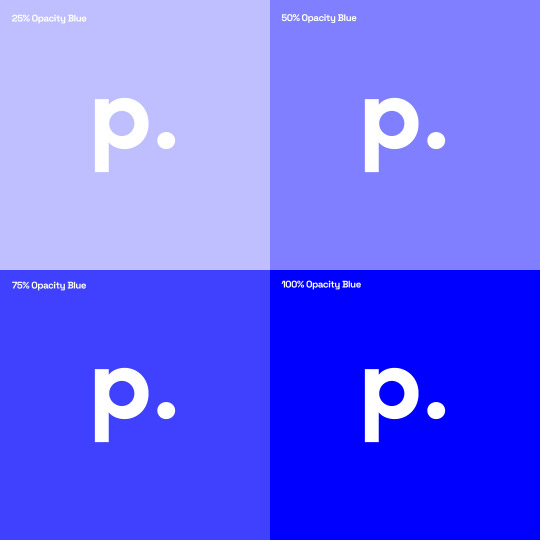
Propaganda designs with ADA compliance in mind.
We know that good color contrast helps people read better, especially those with visual challenges. Because of this, Propaganda always follow ADA guidelines when designing websites and other digital products.
Following ADA guidelines ensure a standard that creates a better user experience for all end users, including those that are visually challenged.
2 notes
·
View notes
Text
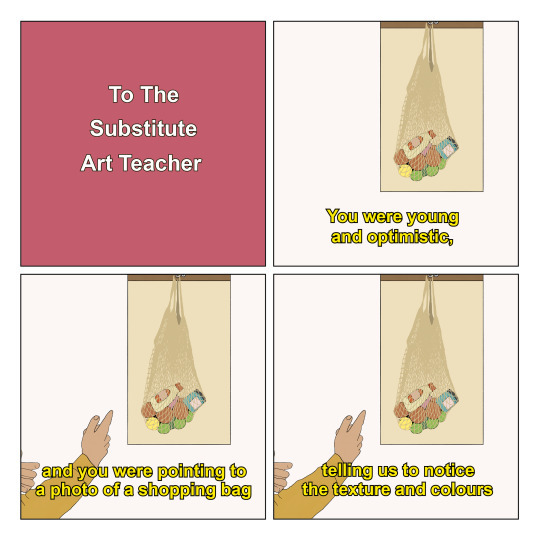
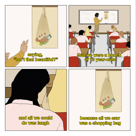
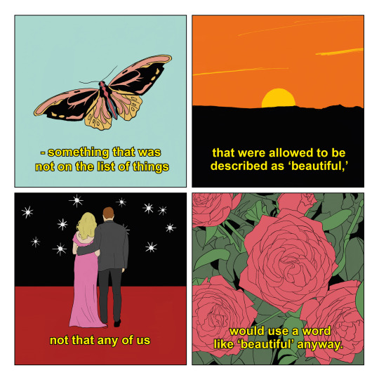

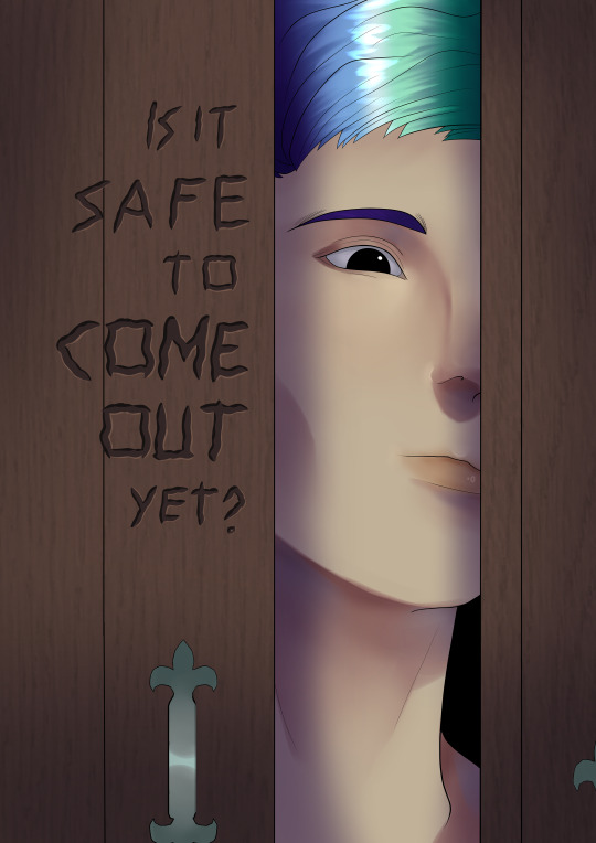
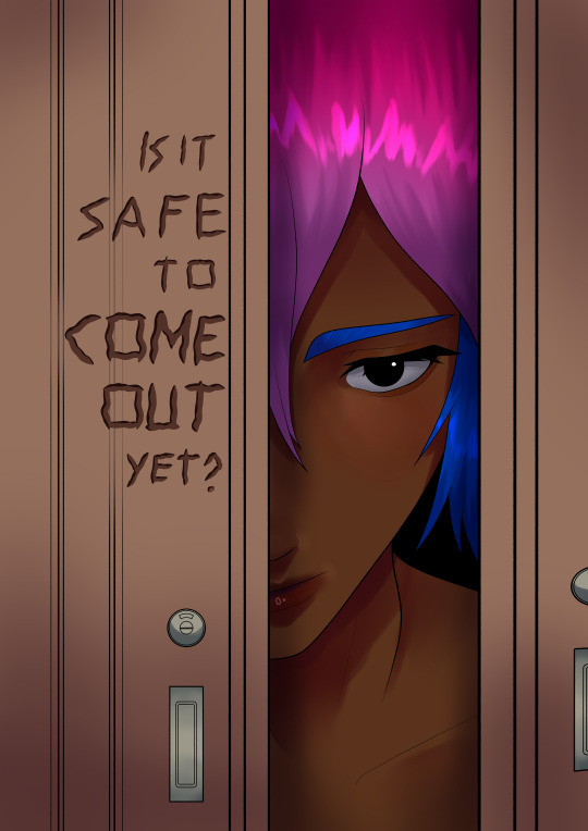
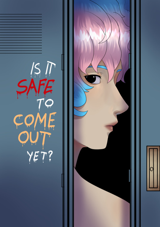
To The Substitute Art Teacher - Jordan Bolton
Pre-order my new book ‘Blue Sky Through the Window of a Moving Car’ here - https://smarturl.it/BlueSky
#jordan bolton#scenes from imagined films#illustration#art#graphic design#comix#comic#jordanbolton#poetry#comics#letters to strangers
211K notes
·
View notes
Text

shoutout to the "foolproof" bread recipe I fucked up entirely for inspiring this
#something different from what I normally draw!#I said this when I realized the bread was NOT making it and I made myself laugh out loud#also...if you happen to really like this it's available in my threadless shop - acorn.threadless.com#tw: cursing#typography#lettering#graphic design#illustration#original art#digital drawing#digital illustration#comedy#humor#relatable
20K notes
·
View notes
Text


Forgot I never showed my poster designs for this pride month
I did this for uni
#my art#digital art#art#original art#design#poster design#poster art#posters#graphic design#pride month#lgbt#lgbtqia#lesbian#gay#bisexual#transgender#trans pride#gay pride#lesbian pride#bi pride#pride#queer pride#queer#queer artist#queer community#trans#uni stuff
44K notes
·
View notes
Text
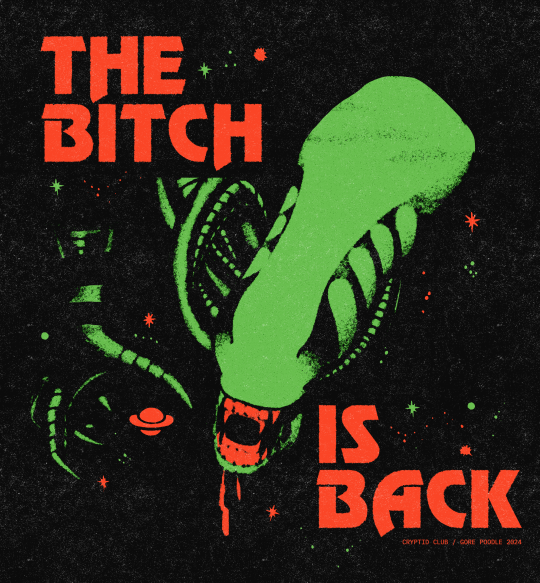
I've always loved the alien 3 promo stuff that say "THE BITCH IS BACK" so I made a design inspired by it
17K notes
·
View notes
Text
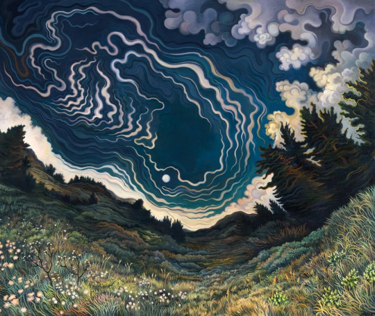
Moonrise
Phyllis Shafer — 2015
oil on canvas
#art#painting#portrait#oil painting#contemporary art#curators on tumblr#abstract#illustration#graphic design#aesthetic#college#landscape#photography#modern art#nature#nature photography#landscape photography#green#naturecore
17K notes
·
View notes
Text

nimona doodles I love her evil little smile >:)
#nimona#nimona movie#fanart#habs art#doodles#it was super different than the graphic novel but I liked it a bunch!#big fan of the character design the big eyes are right in my wheelhouse and I’m having a blast
35K notes
·
View notes
Text
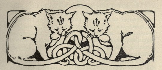
Cats with entwining tails. The great small cat, and others. 1914. Chapter header.
Internet Archive
18K notes
·
View notes
Text
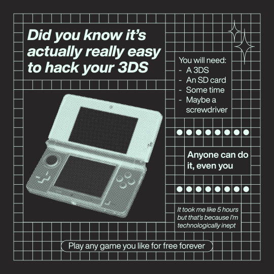
I made this a couple of months ago but. hack your 3ds. do it right now.
#my art#graphic design#3ds#3ds hack#hi everyone ill make new content soon sowwy ive been moving#the real reason im posting this is so i can link it from my neocities#oh i have a neocities btw. check out my main blog for that info
16K notes
·
View notes
Text
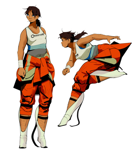
She hates robots. She fucking hates robots and she's coming to kill you.
#portal 2#chell#character design#fanart#my art#portal#artists on tumblr#god i love drawing mlp au stuff but i cannot tell you what a breath of fresh air it was drawing graphic scifi art again#reminder to all my new followers that i don't draw cottage core. i'm a scifi artist thru and thru
12K notes
·
View notes
Photo

Specimen, Fanette Mellier
Context: Pôle graphisme de Chaumont, 2009
Printed by: Imprimerie du Petit-Cloître
Description: 120 × 176 cm
This poster, announcing a series of “graphic design and publishing” themed shows, isn’t a conventional image. It’s more of a printed object linked to its subject. The front, fully saturated with color and technical elements related to printing (scale 1), is offset printed with a very thin raster. This space saturation, like an obsessive canvas, presents graphical tools that are a common vocabulary for books makers. The title and info are printed on the back. The fold lets the title appear: the poster becomes informative and evokes at the same time the delicate materiality of a page.
13K notes
·
View notes
Photo
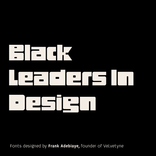
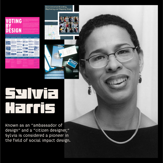
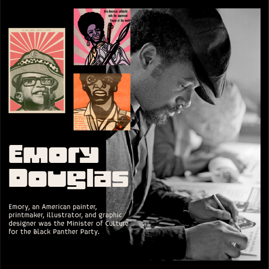
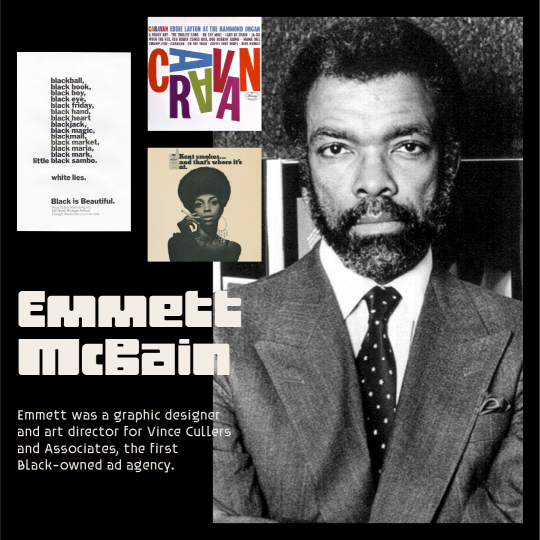
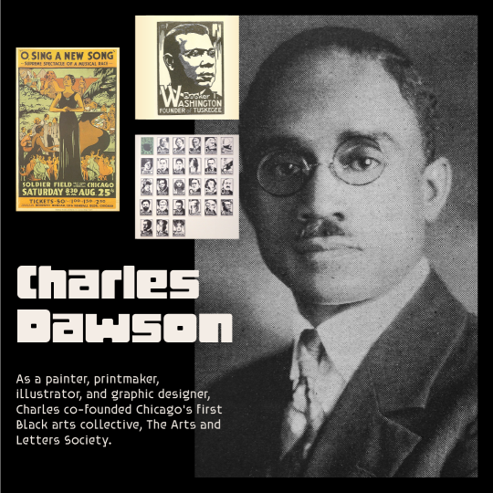
This month, we celebrate the works of influential black designers. With significant effects in both commercial design and fine art, these designers helped lay the groundwork for what our industry is today.Designers featured in this post: Charles Dawson, Emmett McBain, Emory Douglas, and Sylvia Harris.
#black history month#black history#black leaders#black leaders in design#graphic design#graphics designers#design
3 notes
·
View notes
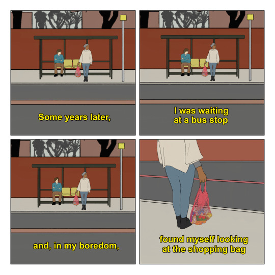
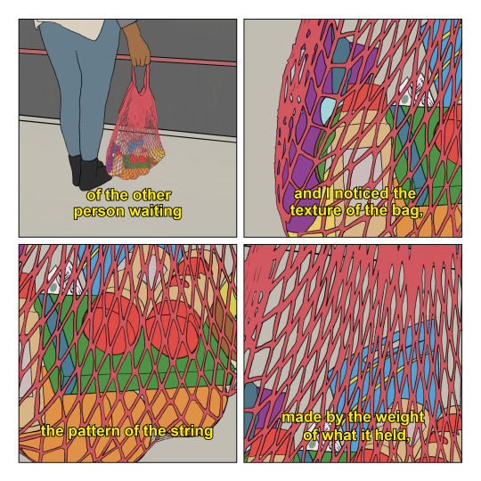
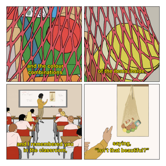
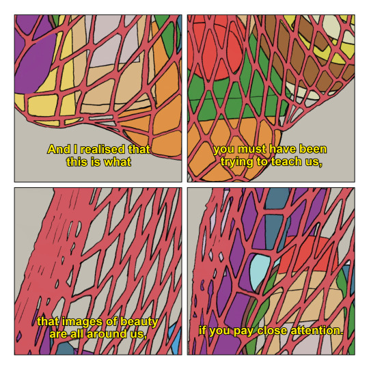
Text


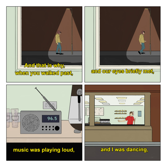

To The Person Who Walked Past The Window - Jordan Bolton
My first book ‘Blue Sky Through the Window of a Moving Car’ is now available to pre-order! Get it here - https://smarturl.it/BlueSky
#jordan bolton#art#scenes from imagined films#illustration#graphic design#comic#comix#jordanbolton#poetry#comics#letters to strangers
48K notes
·
View notes
Text
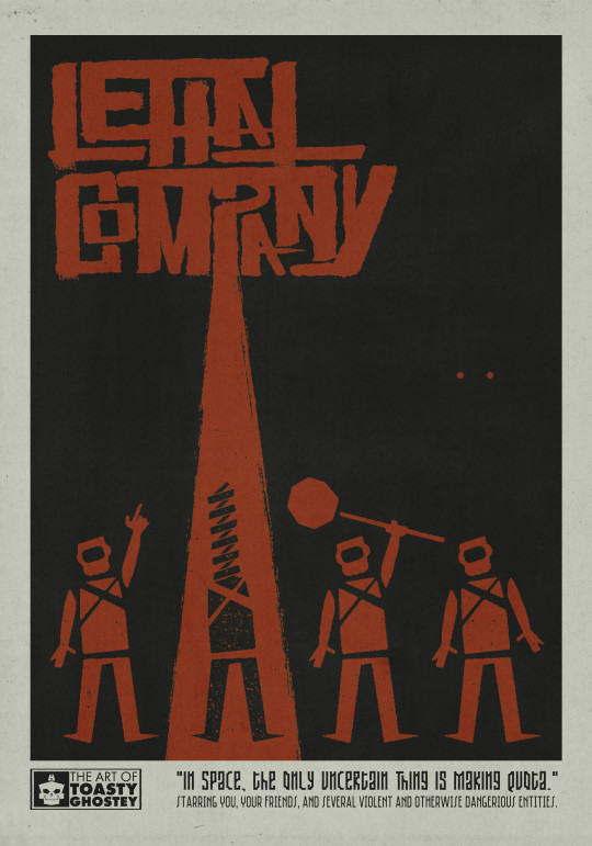
Every clip of this game might as well be cinema.
Edit: YOU CAN BUY IT NOW :))) (Free domestic shipping to the U.S.!)
10K notes
·
View notes
Text
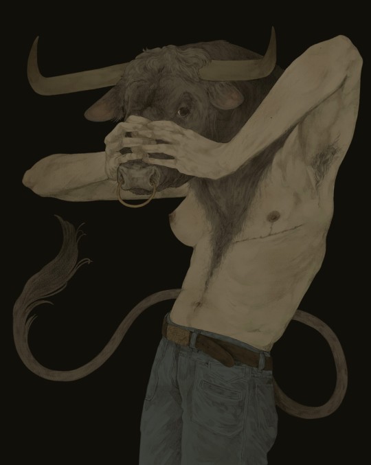
redraw of old minotaur drawing
#greek mythology#mythology#minotaur#art#illustration#digital art#drawing#graphic design#digital drawing#artist#queer art#queer artist
5K notes
·
View notes
Text
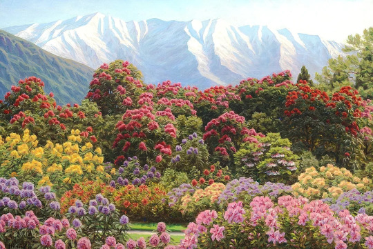
A rhododendron garden near Lake Como
Henrik Gamst Jespersen — Pre 1936
Oil on Canvas
#art#painting#portrait#oil painting#contemporary art#curators on tumblr#abstract#photography#henrik gamst jespersen#nature#landscape#nature photography#landscape photography#aesthetic#green#naturecore#illustration#graphic design#college#modern art
7K notes
·
View notes
Last Seen Blogs

christianegenessier
ℛ.ℛ.

pepefotosblog
JAT Pepe Almena
pepefotosblog
JAT Pepe Almena

five-miles-over
A Word That I Can't Forget