#fore edge
Text

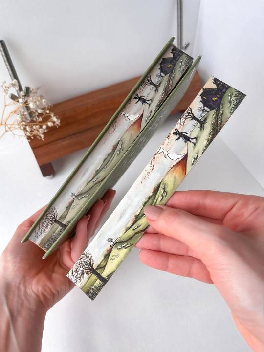
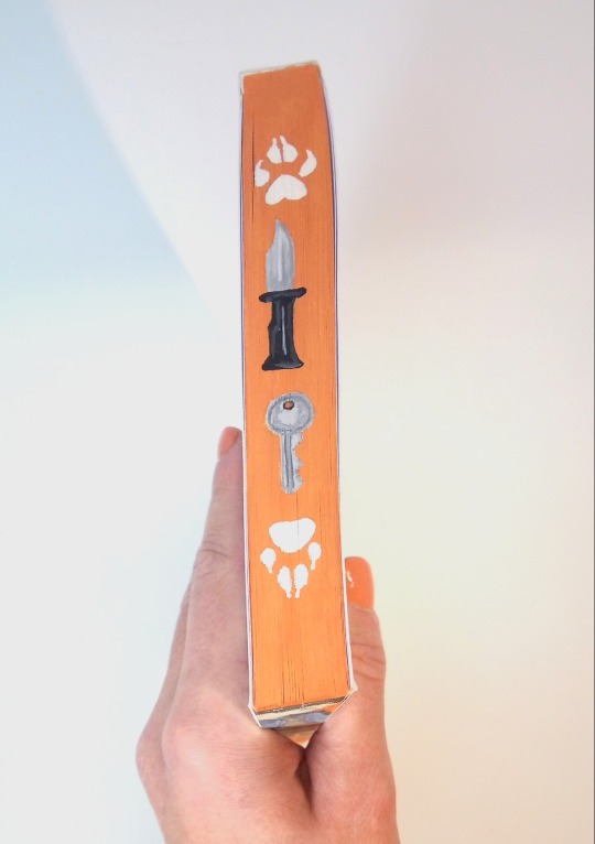
🖤The Raven King with a commissioned painting of Andrew🦊 🖤
#book art#fore edge#book painting#aftg#all for the game#the foxhole court#aftg art#book fanart#book edges#foreedgepainting#the raven king#the kings men#andreil#andrew minyard#neil x andrew#aftg andrew
587 notes
·
View notes
Text


Fore Edge Paintings by AliceInWaleslandArt on Etsy
412 notes
·
View notes
Text

Goldfinch on Donna Tartt's The Goldfinch
#fore edge painting#fore-edge painting#the goldfinch#book arts#my things#it's handmade gold watercolour on it!#I wanna post the vid too but gotta edit it a little
290 notes
·
View notes
Text
YouTube - Instagram - TikTok profile brimariepaints
134 notes
·
View notes
Text
shadow and bone trilogy painted by me ☀️
#cilyra#grishaverse#leigh bardugo#shadow and bone#netflix#alina starkov#darklina#ben barnes#crooked kingdom#inej ghafa#jessie mei li#fore edge painting
80 notes
·
View notes
Text
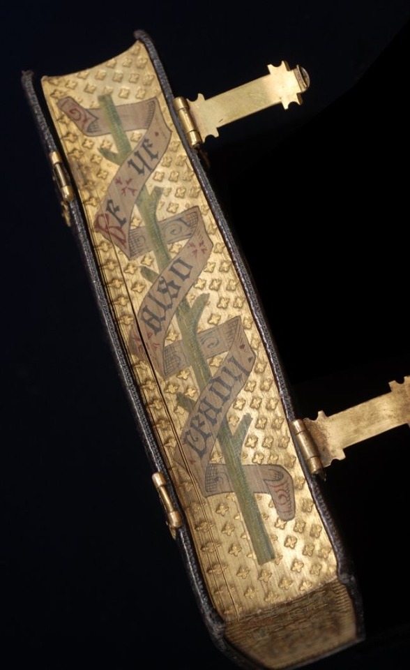
THE BOOK OF COMMON PRAYER. An early closed Fore-edge painting by Hayday Bindery on Gauffered edges.
#beautiful books#book blog#books books books#book cover#books#old books#fore edge painting#gauffred#book of common prayer
183 notes
·
View notes
Text
not a big fan of deckle/untrimmed fore-edges in general but i especially hate when perfect bound books have faux deckle edges. bitch who are you trying to fool. NOBODY thinks this was printed on paper from a mould and deckle AND it makes it harder to flip through! trim that shit off!!
#the trashcan speaks#devil venerable also wants to exploit the memoir class for evil purposes#like okay often perfect bindings are done by folding the pages into signatures and then trimming the spine edge#so it does make sense that you'd end up with page creep#but fuck page creep all my homies hate page creep#trim! his! ass!#and again. its a perfect bind so i KNOW you have a guillotine#JUST TRIM THE FORE EDGE INSTEAD OF FAUX DECKLING IT
18 notes
·
View notes
Text

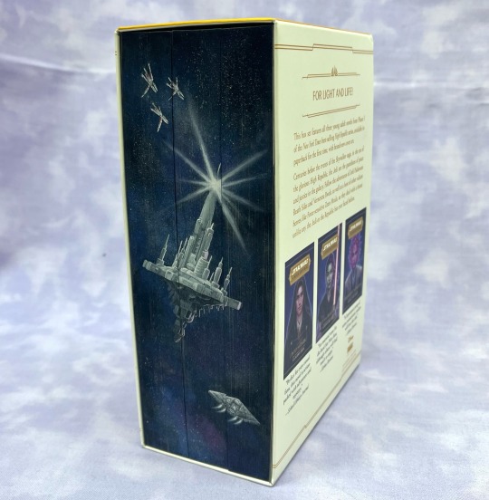

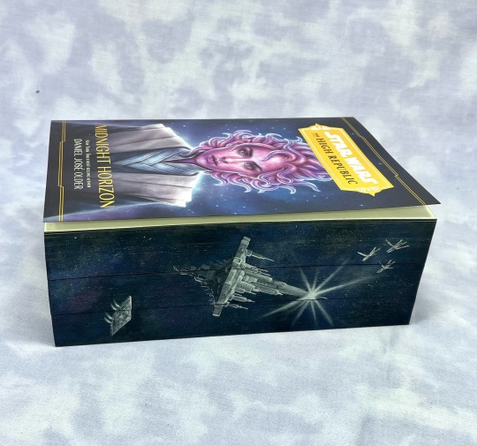

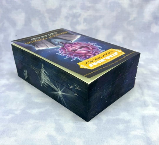
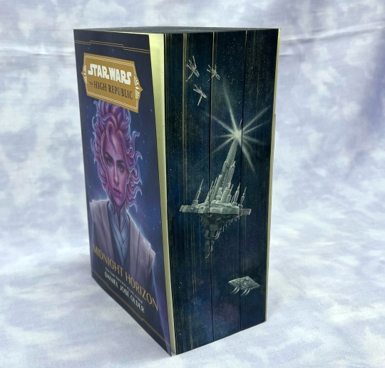

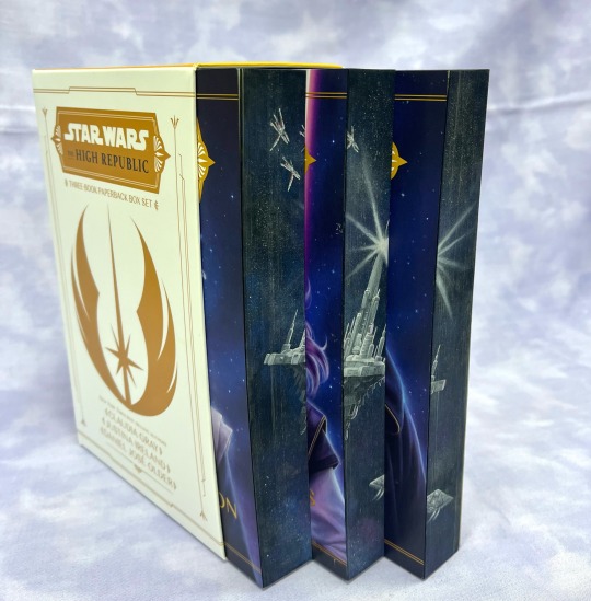
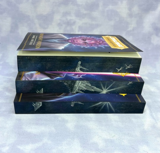
I finally committed to painting my phase 1 box set.
I had to put Starlight Beacon on there and the Vessel is similarly iconic. I tried to match the background to the cover art as much as possible. My airbrush is officially dead so I used a sponge instead but I think it came out pretty good. I think there’s still something to this I haven’t quite worked out because I still had issues with some of the paint cracking off and I had to go back and fix it but I think it looks okay, just a little faded. The paint’s probably on too thick but I forget how much is already on there.
Honestly, these are some of my favourite books (not that I read much else). I am perhaps a little obsessed.
#star wars#art#high republic#the high republic#fore edge painting#book edge painting#starlight beacon#jedi vectors#the vessel#into the dark#out of the shadows#midnight horizon#my art
49 notes
·
View notes
Text
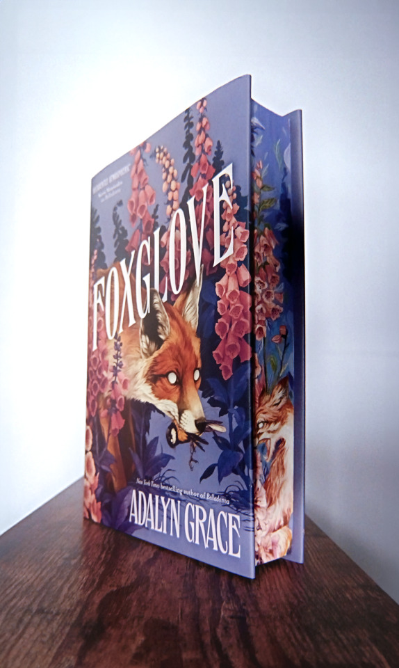

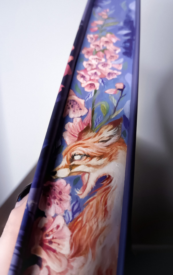
Foxglove by Adalyn Grace fore-edge painting 🦊
Check out more on my https://www.tiktok.com/@.weroni or https://www.instagram.com/wer0ni/ 🌻💖✨
#weroni#art#painting#foreedge painting#bookart#book edge painting#fore-edge painting#book art#booktok#bookstagram#foxglove#adalyn grace#belladonna
17 notes
·
View notes
Photo

Fore-edge Friday: Bolts of Blue?
The edges of this 18th century German work by Christian Pietist, Johann Arndt have been decorated using blue paste. We think it has an almost meteorological vibe--like rolling clouds or even lightning.
(For the lovely surprise we found inside, see our earlier post.)
Arndt, Johann. Sechs Bücher vom Wahren Christenthum … nebst dem Paradies-Gärtlein, samt Herrn D. Rambachs historischem Berichte von des sel. Arnds Person und wahrem Christenthume. Achte Auflage. Hof: Verlegts Johann Christoph Leidensrost, 1767.
#fore-edge friday#rare books#bookhistory#18th century#bookbinding#fore-edge#pretty books#fore-edge decoration
186 notes
·
View notes
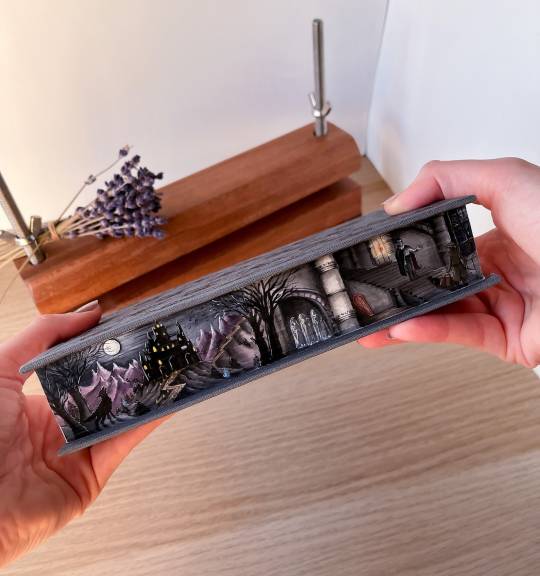
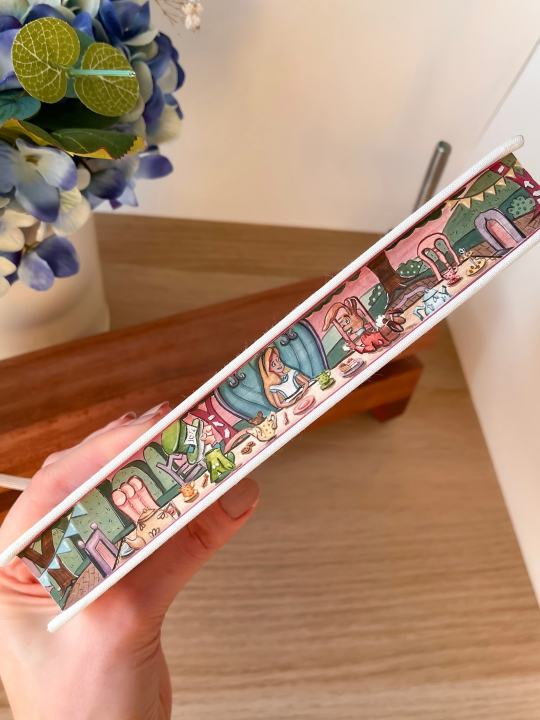
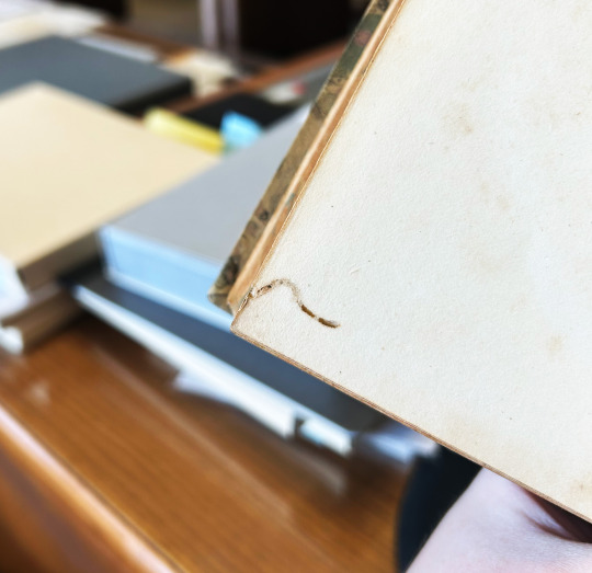
Text
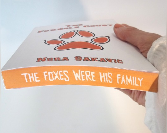

I painted the 'Foxhole Court' quite some time ago. This was a fun book to paint, mostly because I love painting Neil <3
#book art#fore edge#book painting#aftg#all for the game#neil josten#the foxhole court#aftg art#book fanart#book edges#foreedgepainting
274 notes
·
View notes
Text
(There is text below, if you’d care to read it)


I was looking at the photos above to see if any of the books had marbled fore edges (Gabriel Jim might be holding such a book in the first photo, but it might just be a trick of the light on ragged fore edges) and at the 3/4 binding on A Tale of Two Cities (4th photo) because I tend to get overexcited about marbled paper in/on old books, and though many questions that have arisen from this, I’ve only included a couple below.

Why is there what appears to be a skull in a jar in Aziraphale’s shop?? …is it poor Yorick?
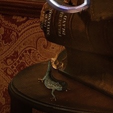
And what’s up with this little lizardy dude?

Let’s take a moment to ooh and ahh over the marbled paper and appreciate whoever in the props department found/made it. I know you can’t judge a book by it’s cover, but it’s always a nice bonus if it has marbled paper on the cover/fore edges/endpapers. I also love it because one day I got bored (and apparently had too much free time on my hands) so I decided to get a second copy of Good Omens (because I thought it would be easier with a hardcover than the paperback I already have) and make it look as close to an 18th century book as I could with my level of skill (which does not include bookbinding), and one part of that was gluing/using double sided tape some period style marbled paper over the cover/binding.
#thought(s) from yours truly#good omens#neil gaiman#gnu terry pratchett#aziraphale#a z fell and co.#william shakespere#shakespeare#hamlet#poor yorick#lizard dude#marbled paper#marbled fore edges#old books#old books (binding)#good omens the nice and accurate prophecies of agnes nutter witch#18th century
41 notes
·
View notes
Text


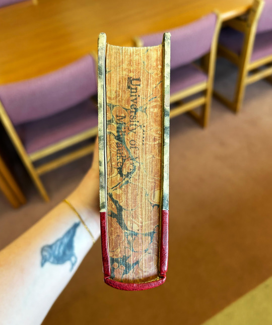
Marbled Monday
It's time for a touch of marbling to keep this Monday going! This marbling was found in our Shakespeare collection. The book is volume 18 of Samuel Johnson and George Steevens's The Plays of William Shakespeare: In Twenty-One Volumes, an annotated edition of Shakespeare's plays. This is a sixth edition revised by Isaac Reed that was published in 1813 and called the first variorum edition. Oddly enough, today, September 18, is the anniversary of Samuel Johnson's birthday in 1709, so happy birthday to Samuel Johnson!
The marbling on the covers is a swirled sort of loose, dotty leaf-esque pattern in muted green, mauve, and black, rather than a tight traditional pattern like peacock/bouquet. It has some zig-zag movement to it in places, and I'd love to see what a larger sheet looked like, but from what I can tell there's not really a uniform pattern to the marbling. Interestingly, the marbling on the covers does not match the marbling on the fore-edges, which is orange and blue, and just one of several things that leads me to believe this is not an original binding.
Another of those things is the wormholes present in the first and last pages of the book that are not continued in the endsheets, which are of a heavy, laid cardstock that seems too clean and too heavy to have been used at the time the text was printed. There is also no damage to the covers themselves, making me think they are newer than the text block. Overall, the color combinations on the book are interesting, with the bright red spine, green and purple and orange and blue marbling, and I must admit aren't my favorite.
View more Marbled Monday posts.
-- Alice, Special Collections Department Manager
#Marbled Monday#marbled paper#marbling#Samuel Johnson#George Steevens#Isaac Reed#worm holes#wormholes?#marbled fore-edge#Alice
25 notes
·
View notes
Text
Here's the money shot on video
39 notes
·
View notes
Text


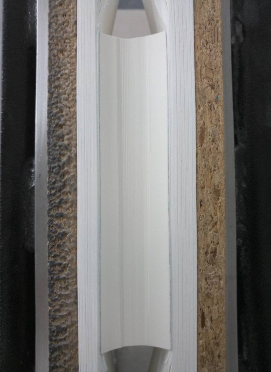

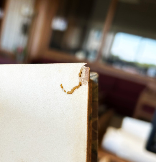
WIP
Sanding a badly shaped fore edge
With this one I somehow managed to really mess up the rounding. Even before backing it looked somewhat wonky and after, well, it didn't get any better.
To make the very uneven fore edge less obvious I wrapped a cardboard tube with sanding paper and went to work. Now this is the result.
(Sadly I forgot to take 'before' pictures so in the ones on the left I had already started sanding. The ones on the right are after I decided I'm done. There's still a small grove visible when pressed, but since I'm not going to colour the edge hat won't be problem.)


35 notes
·
View notes
Photo


I tried the “Fore-edge painting” and I love that ! <3
2023 © Paontaure
31 notes
·
View notes
Last Seen Blogs
comicscollecting
Notes from Comics Collecting

velmanator-blog
VELMANATOR

yungbud
Yungbud

pushpa-exports
Untitled
toootoooro-blog
Plant🌱Friend