#colorhistory
Text
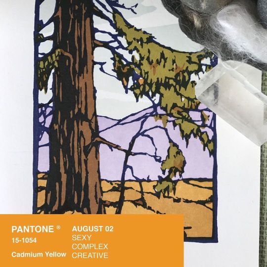
The Color Pink
I will be discussing a color today - specifically, pink. Though I chose it as my subject because of my love for the color, my research overwhelmingly talked about pink in the context of gender. I've been exposed to these gender stereotypes since I was a baby, so this discovery only intrigued me more about the color pink's history and psychology. So, without further ado, let's begin!
Firstly, what is the origin story of our current connotations with pink? And, correspondingly, the color blue? Well, it all began in the mid-20th century, according to the Fashion Institute of Technology, when the United States assigned blue to boys and pink to girls. Before this period, when pink first entered the realm of fashion in the 1700s, pink was seen as a typically more masculine, powerful color, as a lighter hue of red. Blue was considered more dainty and was targeted more toward girls. In his New York Times article titled Pink and Blue, author David Brooks found evidence of this narrative still being circulated in a 1918 Ladies Home Journal article, where it was said that the "generally accepted rule is pink for the boys, and blue for the girls." It seems confusing, then, that there was a swap between these colors' connotations. Could it be that 1940s society had suddenly decided women were more deserving of powerful pink? The UMKC Women's Center clarifies that the swap was still founded on deeply sexist principles, with pink suddenly being seen as "closer to red, a romantic color," which fit with the prevailing narrative of the time that women were more emotional than men. It was also attributable to shifting trends in high fashion. At one point, pink had been a symbol of luxury in fashion. Both men and women had worn it, but as men began wearing darker colors, which had come to be seen as more masculine, these powdery pink hues in clothing were more commonly worn by women. In a CNN interview with Valerie Steele, editor of the book Pink: The History of a Punk, Pretty, Powerful Color, Steele notes that "The feminization of pink began around there, … [as it] became an expression of delicacy," which explains the importance of high fashion trends in creating gender-coded colors.
Pink also had come to be seen as a more "sexual" color, according to the CNN article, with pink often being present in lingerie items worn predominantly by women. In the early 1900s, due to industrialization, pink became much more mass-produced, reducing its allure among the higher classes and turning pink into a more vibrant and common hue used by sex workers and the lower classes (CNN). Within the first two decades of the 20th century, pink slowly ascended into the world of high fashion thanks to several designers reviving the color in dresses and other pieces of clothing (CNN). These events triggered new classifications for pink and blue among the collective; particularly in America, postwar marketing solidified pink as a 'girl color' and blue as a 'boy color' (CNN). Though there were many efforts by second-wave feminists in the 1960s and 1970s to eradicate gender-coded colors, they were ultimately unsuccessful as the 80s brought about prenatal testing (Brooks). Once parents could find out the sex of their baby, infant products geared toward either gender became much more prevalent (Brooks). In today's world, pink is still pretty standard in products geared toward girls, and blue is just as common for boys (see the toy aisles in Target for evidence of that!). But there's been much more discourse about these gender divides in recent years, and gender-neutral options for children are simultaneously gaining popularity. Though we've not been fully relieved of pink and blue's designated genders, we might get there one day.
So, pink has a long history entrenched in political discourse. That's an essential facet of pink's story as a color. Moreover, the history of pink contributes significantly to how we perceive that color. After all, what we learn in our youth alters our perspective of the world, so it tracks that pink's feminine classification remains a part of how the color is seen. According to colorpsychology.org, these enduring marketing effects are seen when we look at the psychology of pink. Among other things, pink is still commonly associated with femininity, love, innocence, optimism, youth, and tenderness, all things that women are consistently expected to be. So, pink could represent the oppression of women. However, pink is just a color, even if it is intrinsically linked to women's struggles. Instead of turning away from the color pink to empower women, it would be even more impactful to re-appropriate pink as a symbol of power for women. People changed our perspective on pink, making it possible for us to change it again. I know that I went through a stage of rejecting all elements of femininity as a naive 12-year-old in an attempt to separate myself from what I saw as 'oppressive' colors, products, and personality traits. Being 'girly' shouldn't be seen as inferior in the first place, though. Once we classify femininity as worse than masculinity, a concept that women must distance themselves from to be respected, we shift the responsibility of sexism to the oppressed instead of those who perpetuate these ideas of women's inferiority.
I've come to appreciate the color pink much more in recent years than 12-year-old me ever would've imagined. Though it has sexist connotations, pink has become a color symbolizing strength, power, intelligence, kindness, assertiveness, and all the other adjectives that make me feel confident in myself. Besides, I don't necessarily choose to like pink because I am a woman. I prefer it because I like how the color looks. This reasoning should be the basis of all our choices in life - our individual tastes, not uncontrollable parts of our identity. The only thing that can hurt me from liking dolls, pink, or dresses is if I believe the prevailing idea that they are inferior. And I don't think that's true. Neither should you.
-Skizze
Links to Sources:
https://www.colorpsychology.org/pink/
https://archive.nytimes.com/brooks.blogs.nytimes.com/2011/04/22/pink-and-blue/
https://munsell.com/color-blog/why-that-color-gender/
https://exhibitions.fitnyc.edu/exhibitions-timeline/pink-the-history-of-a-punk-pretty-powerful-color/
https://www.cnn.com/style/article/history-of-color-pink/index.html
https://info.umkc.edu/womenc/2018/06/25/8369/
https://www.lafilm.edu/blog/the-psychology-of-color/
#skizze#facts#funfacts#politics#gender#feminism#feminist#pink#gender expression#gender history#history#womens history#politicalhistory#activism#blog#colorhistory#arthistory
3 notes
·
View notes
Text

Ground staff refuel a Spitfire of No. 19 Squadron from an Albion refueller at RAF Fowlmere, September 1940.
© IWM CH 1372
@colorhistory via X
47 notes
·
View notes
Photo

Sıcaktan bunalan İmparotor Penguenleri serinletmek. 1957 #animalsofinstagram #penguin #emperorpenguin #tarih #history #renklitarih #colorhistory #tbt #eskiler #foto #fotoğraf #fotografia #picture https://www.instagram.com/p/CRgqe19lsek/?utm_medium=tumblr
#animalsofinstagram#penguin#emperorpenguin#tarih#history#renklitarih#colorhistory#tbt#eskiler#foto#fotoğraf#fotografia#picture
33 notes
·
View notes
Text
Mummy Brown: A Most Tragic Hue That Everyone Used
Millions of people walk the hallowed halls of the Louvre every year to see some of the most important masterpieces of all time with their own eyes. With 35,000 pieces on display there is a lot to take in, and among them is Interior of a Kitchen by Martin Drölling. The scene is tranquil, showing an illuminated country kitchen where a young girl works on her needlework, another woman sits in her chair, and a girl sits on the floor playing with a cat. The detail is exquisite, and although the view from the window is bright the majority of the scene is painted in varying shades of brown, and it is this brown hue that places Interior of a Kitchen in a unique category. Drölling painted the work in 1815, but his paint had origins in ancient times.
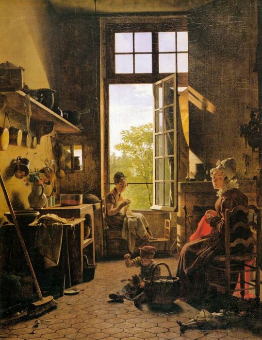
Interior of a Kitchen by Martin Drölling. Image via Wikipedia.
In the Medieval age medicine was still in its infancy, but one substance that was highly sought after for its medicinal purposes was bitumen. Referred to as early as the twelfth century, it was a substance believed to cure nearly any ailment. Bitumen was found naturally in the earth in the Middle East region, but rather than extracting it from the ground, it was believed that it could be obtained from another source, the long-dead bodies of ancient Egyptians. The Persian word for bitumen was “mum” or “mumiya” which lent itself to the word “mummy” and the black color of the wrapped corpses led people to (falsely) believe they were soaked in bitumen during the embalming process. It was impossible to extract the alleged bitumen from the mummies, so they ground up the dead ancient bodies and used that instead.
By the fifteenth century it was commonplace for merchants to visit Egypt and send large shipments of mummies back to Europe for an eager consumer looking to grind them up for medicine. At the time there were incalculable numbers of mummies at their disposal and according to Thomas Pettigrew’s History of the Egyptian Mummy the author writes, “No sooner was it credited that mummy constituted an article of value in the practice of medicine than many speculators embarked in the trade; the tombs were sacked, and as many mummies as could be obtained were broken into pieces for the purpose of sale.” After being lowered into the tombs merchants picked their new cargo and paid the inexpensive prices before loading their ships with bodies and parts that were doomed for the grinders of Europe. Once reduced to powder, the dead would be mixed into topical balms or straight into drinks to be immediately ingested. The demand for mummy medicine ran high with little to no consideration if the body was old, young, male, female, or cause of death. It was a trend that continued well into the 18th century.
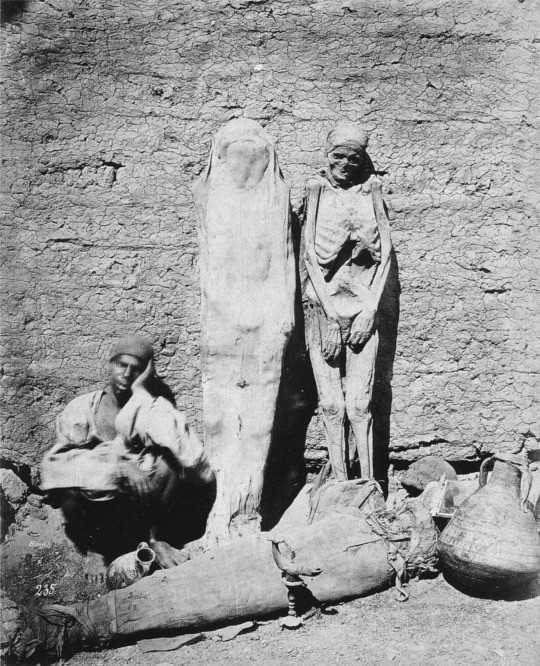
Merchant selling mummies on the street. Image via rarehistoricalphotos.com.
By the 1830s the general public became obsessed with all things ancient Egypt and relics from the time became highly desired collectible pieces with a mummy being at the top of everyone’s wish list. The ferocity in obtaining mummies sent people tearing into sacred sites and haggling with sellers on the streets who claimed the bodies they were selling were genuine. The monk Father Géramb stated in 1833 that “it would be hardly respectable, on one’s return from Egypt, to present oneself without a mummy in one hand and a crocodile in the other.” Once brought into the homes of Europe as unfortunate souvenirs the fascination with Egypt’s ancient dead manifested in mummy “unwrappings” or “unrollings” that began as scientific undertakings but evolved into public events that would often sell out. As the wrappings were unfurled those gathered would delight in the trinkets that would fall from them, the pieces of paper tucked inside, and the sight of the blackened body before them.
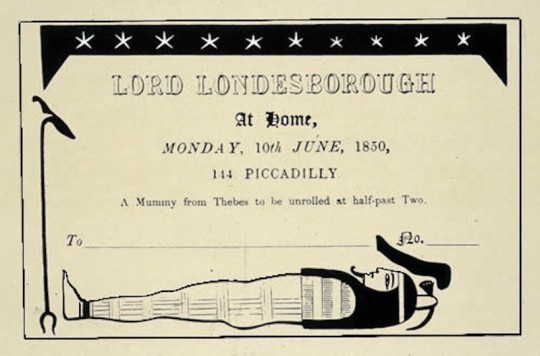
Flyer for a mummy unwrapping circa 1850. Image via medium.com.
Considering how Europeans strived to incorporate ancient Egyptians into their daily lives it is not surprising that they also made them a part of their art. With a shade resembling burnt umber, Mummy Brown was made by mixing white pitch, myrrh, and the ground-up remains of ancient Egyptian mummies. Beginning in the 16th century the paint became extremely popular with artists because of the unique pigment that could only be obtained from the mummies because of the specific substances used in the mummification process.
The use of Mummy Brown reached its height in the mid-eighteenth to nineteenth centuries when it was used by such famous artists as Sir William Beechey, Edward Burne-Jones, Lawrence Alma-Tadema, Eugene Delacroix, and Martin Drölling who used the paint extensively in Interior of a Kitchen. What is unclear though, is if artists knew exactly what they were painting with.
One artist who was unaware of his paint’s dark origins was pre-Raphaelite painter Edward Burne-Jones. As recalled by his nephew, author Ruyard Kipling, his uncle was spending a day with fellow artist Alma Tadema in the 1860s when he learned that the pigment’s name was not a metaphor, that the paint he had been using was in fact made from ground up mummies. Deeply disturbed by this, Burne-Jones went into his studio and came back downstairs stating that if it was made from dead Pharaohs then the tube in his hand needed to be buried immediately and with proper honor. According to Kipling’s later account of the day, “So we all went out and helped – according to the rites of Mizraim and Memphis, I hope – and to this day I could drive a spade within a foot of where that tube lies.”

Edward Burne-Jones. Image via Wikipedia.
The origins of Mummy Brown were never kept secret, but over the centuries people seemed to forget that the color’s name was literal. As the facts of the paint’s origin came back into collective knowledge people grew increasingly uncomfortable with the idea of painting with ancient human remains. C. Roberson and Co., one of the leading colorists of the 19th and 20th centuries, included Mummy Brown in their catalog until 1933. It took just over three more decades for the production of Mummy Brown to be officially declared over. The reason was as simple as it was tragic, there were no more mummies to use for paint. As stated by the managing director of C. Roberson and Co., “We might have a few odd limbs lying around somewhere, but not enough to make any more paint. We sold our last complete mummy some years ago for, I think, £3. Perhaps we shouldn't have. We certainly can't get any more”

Tube of Mummy Brown paint. Image via artinsociety.com.
Today the color Mummy Brown is made from materials completely unrelated to human remains. While it is known when the production of the color was finally stopped, it is difficult to estimate just how many works of art were created using the paint. In an unfortunate twist, many of the artists active at the height of Mummy Brown’s usage painted scenes of ancient Egypt making it entirely possible that the sacred deceased of Egypt were taken from their tombs only to be ground up and used to paint them.
Sources:
Ground Up Mummies Were Once an Ingredient in Paint by Rose Eveleth. https://www.smithsonianmag.com/smart-news/ground-mummies-were-once-ingredient-paint-180950350/
The Life and Death of Mummy Brown by Philip McCouat.
http://www.artinsociety.com/the-life-and-death-of-mummy-brown.html
Was This Masterpiece Painted With Ground Mummy? by Kristen Romey.
https://www.nationalgeographic.com/news/2016/09/mummy-art-painting-delacroix-pigment-ancient-Egypt/
#Husheduphistory#featuredarticles#history#AncientEgypt#AncientEgyptianHistory#Mummy#Mummies#arthistory#colorhistory#pigmenthistory#painting#paintinghistory#tragichistory#forgottenhistory#regrettablehistory#weirdhistory#strangehistory#creepyhistory#whatsinaname#historyiswild#historyisnotborning#historyclass#artclass#disrespect#shockinghistory#sadhistory#ingredients#paint#burntumber#pharoah
10 notes
·
View notes
Photo

Tarihle ilgilenenler takip etsin geri takip var:) __________________________________________ #history #renklitarih #colorhistory #tbt #eskiler #foto #fotoğraf #fotografia #ilginçbilgiler #enteresanbilgiler #hdpics #histtariyoryhd #historylovers #ww2 #worldwar2 #ikincidünyasavaşı https://www.instagram.com/p/CIgNQnoB1nI/?igshid=1ve1qgcd0hoh9
#history#renklitarih#colorhistory#tbt#eskiler#foto#fotoğraf#fotografia#ilginçbilgiler#enteresanbilgiler#hdpics#histtariyoryhd#historylovers#ww2#worldwar2#ikincidünyasavaşı
6 notes
·
View notes
Text
Color Theory History
I found that the overarching theme of this chapter was color relation and the many theories and approaches seen throughout history. I thought Aristotle summarized nicely how we have been trying to understand color since the beginning when he said “Verifications from experience and observation of similarities are necessary if we are to arrive at clear conclusions about the origin of different colors.” This concept by Aristotle is one of the easiest ways to understand color and set the groundwork for centuries to come. Whether it be Ostwald’s mathematical and scientific approach or Crossgrove’s more impressionistic approach both observe color in a way that verifies through experience and similarity.
One concept that intrigued me while reading was Faber Birren’s color triangle. It immediately stood out to me while reading because it was a color scale that showcases no color and instead focuses on tint, tone, and shade. Birren claimed that “there are only seven forms in the world of color…” and that “...all colors seen in the world will find classification on this chart.” While this triangle is incredibly simplistic looking it could be extremely helpful to artists alike as it focuses on the alteration of “pure” color, or as we know colors without the addition of black or white. It helps identify a range of tints and shades as well as clean tints, rich shades, and mellow tones. This color concept confused me at first but after researching I not only see the usefulness but also the profound importance.
1 note
·
View note
Photo
Pink is our favorite color here at Glam Observer so we’ve decided to dedicate an entire article to it and explain you why everyone loves pink and its history 🙌🏻head over glamobserver to read it. . Il rosa è il nostro colore qui da Glam Observer, perciò abbiamo deciso di dedicargli un articolo per farvi scoprire la sua importanza e da dove tutto è partito. Visita GlamObserver per leggere il post dedicato alla storia del rosa . . . . . . #pink #colorpink #pinkcolor #pinkhistory #girl #colorhistory #fashionbusiness #fashionhistory #fashioninudstry #fashiondesign #fashion (at Milan, Italy) https://www.instagram.com/p/BvJjNydnOkZ/?utm_source=ig_tumblr_share&igshid=1on7jlpsklsq6
#pink#colorpink#pinkcolor#pinkhistory#girl#colorhistory#fashionbusiness#fashionhistory#fashioninudstry#fashiondesign#fashion
2 notes
·
View notes
Photo

These three were part of a project that I did in college on color mood and history with some great reviews from my classmates XD The first was on abstract with a fire/lava color scheme to invoke a sense of warmth and life. The second was on minimalism with a pastel yellow/purple scheme that I wanted to convey sense of peace that spring might bring. Then the last one was on pointillism with an aquatic scheme since the circles look like bubbles! This was a really fun project and I got to work with my favorite bird, the owl! I hope you all like them! #owl #colormood #colorhistory #abstract #minimalism #pointillism #originalart #hilerygoudeauart https://www.instagram.com/p/Bwi8UKCjTDQ/?utm_source=ig_tumblr_share&igshid=mhgmyjo9t63w
1 note
·
View note
Photo
Discovered in 1818 and also known as Aurora Yellow. Reaction to sunlight makes it unsuitable for use in murals or exteriors. #colorhistory #colorstrology #colorinspiration #coloroftheday #knitweardesigner #arthistory #artinspiration #color https://www.instagram.com/p/CDaOTfVpNAY/?igshid=pajycczvpnkr
#colorhistory#colorstrology#colorinspiration#coloroftheday#knitweardesigner#arthistory#artinspiration#color
0 notes
Text
Color History
I found the history of art very interesting. I especially like when it talked about early color theory and how different civilizations interpreted the colors differently. It was also cool how Leonardo Da Vinci figured out simultaneous contrast and how it complimentary hues intensify each other. One thing that confused me though is the part where Runge created a three dimensional sphere out of just hues, I dont understand how he did that.
0 notes
Photo
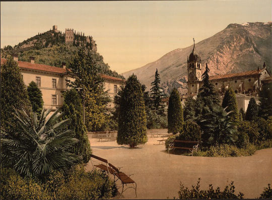
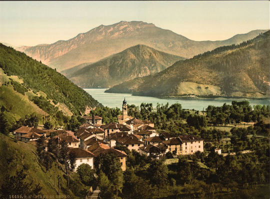
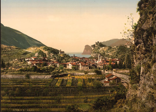
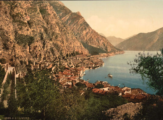
Spectacular 1890 Photographic Tour Of Garda Lake In Vibrant Color
#gardalake#gardalakeitaly#gardalakecolors#winetime#landscscape#nature#italy#italia#volgoitalia#1890#1890sphotochrom#photochroms#history#colorhistory#colorized
0 notes
Text

An engine fitter known as 'Lofty' at Middle Wallop in December 1942, demonstrating the daily activities of a typical 'erk'. He is seen here with his 'charge', Spitfire VC EE624/TM-R, flown by Squadron Leader R. Lewis, commanding 504 Squadron.
© IWM (CH 8010)
@colorhistory via X
15 notes
·
View notes
Photo

Obvodny Kanalı'nın setinde bir çift. Leningrad, 1966. #tarih #history #renklitarih #colorhistory #historylovers #historypictures #historyhd #foto #foto #fotoğraf #fotografia #picture #1960s #iyigunler #iyiakşamlar #goodnight #i̇yi̇geceler https://www.instagram.com/p/CbdVwzrMqBN/?utm_medium=tumblr
#tarih#history#renklitarih#colorhistory#historylovers#historypictures#historyhd#foto#fotoğraf#fotografia#picture#1960s#iyigunler#iyiakşamlar#goodnight#i̇yi̇geceler
2 notes
·
View notes
Photo

Today, I had the pleasure to observe examples of Murex snail shells at the Natural History Museum of Milano. Phoenicians (and later Roman) loved the reddish purple dye that they could extract from the murex rock snail they found in the Mediterranean . It took 12000 snails to dye one toga in Tyrian Purple which was super expensive. Only the highest Roman magistrates could sport a “toga praetexta” which has a stripe of Tyrian Purple over their white togas. Roman generals would wear a solid purple togas with a gold stripe called the “toga picta”, and which would later be worn by Roman emperors. Needless to say, wearing Tyrian purple was a sign of power and success. The term “purpura” in Latin lead to the shade “pourpre” in French which is the color reserved for cardinals. The term also lead to the more generic term “purple” in English. For those seeking to quench their fascination for the Murex snail and this little piece of history, Diamine makes a lovely ink called Tyrian Purple. 🐌💜 . . . #TyrianPurple #TyrianRed #CardinalPurple #Murex #Pourpre #Purpura #Caracol #Snail #Escargot #PigmentHistory #DyeHistory #ColorHistory #HistoireChromatique #ChromaticHistory #NaturalHistory #Antiquity #Phoenicians #Romans #DiamineTyrianPurple #NaturalHistoryMuseumOfMilan #HistoriaChromatica (at Museo Cívico de Historia Natural de Milán) https://www.instagram.com/p/B03nsbdiLJg/?igshid=1ad3kuh7rppus
#tyrianpurple#tyrianred#cardinalpurple#murex#pourpre#purpura#caracol#snail#escargot#pigmenthistory#dyehistory#colorhistory#histoirechromatique#chromatichistory#naturalhistory#antiquity#phoenicians#romans#diaminetyrianpurple#naturalhistorymuseumofmilan#historiachromatica
0 notes
Photo
Geri takip var. Sadece tarihle ilgilenenler takip etsin lütfen:) #tarih #history #renklitarih #colorhistory #tbt #eskiler #foto #fotoğraf #fotografia #ilginçbilgiler #enteresanbilgiler #hdpics #historyhd #historylovers #ww2 #worldwar2 #ikincidünyasavaşı https://www.instagram.com/p/CIX7YgqBivT/?igshid=1jymmbinqt3nb
#tarih#history#renklitarih#colorhistory#tbt#eskiler#foto#fotoğraf#fotografia#ilginçbilgiler#enteresanbilgiler#hdpics#historyhd#historylovers#ww2#worldwar2#ikincidünyasavaşı
0 notes
Text
Color Theory History
Within the document pertaining to the history of color, the author details the relationships between colors, specifics of color mixing, and how colors have been used and created over time.
Many color theories used to come from Aristotle who believed that colors such as red in sunsets, was the result of the white sunlight mixed with the darkness of night, or that colors such as green were more of a shadow than they were light, and blue was mostly only shadow.
Other artists such as Leonardo Da Vinci, observed a phenomenon he called “simultaneous contrast” in which he believed the colors “white, yellow, green blue, red and black” were the artists most basic tools since when juxtaposed they intensified each other's hues. In his paintings, Da Vinci would purposely use yellow flesh tones to intensify the reds and blues incorporated in a figures clothing. He also incorporated a term known as Sfumato, the use of a dark, smokey, softly blended background that created drama in the piece, adding depth and careful control of light and focus.
Another man came along, Sir Isaac Newton, a physicist, whose theories depicted that “all spectral hues are present in white light”. Even in current time we still refer to a similar model that shows the main colors red blue and yellow and white that when played off of each other create new colors (green, purple, orange etc.)
Moses Harris, an entomologist and engraver, was responsible for creating “the first model of pigment primaries”. His theory directly states what I explained in the previous paragraph, that all colors derive from the three primary colors, red, yellow and blue. He found 18 colors that derived from the mix of these primary colors and sorted them into tints (lighter values) and shades (darker values).
Later, a man by the name of Johann Wolfgang von Goethe who was a German Poet, focused on color as a visual phenomenon within the eyes, “rather than an aspect of. Light”. Goethe developed specific instructions on perfecting the use of colored shadows, especially those seen in nature and the natural world.
A German painter, Phillip Otto Runge, “presented color relationships within a sphere”. Pure hues would be located around the equator, and the axis would present a gray scale value. In light of this, a German teacher, Johannesburg Itten, reacted to Runge’s sphere, commenting that this model “is the most convenient for plotting the characteristic and manifold properties of the color universe”.
Michael Eugene Chevreul was a renowned chemist, “developed a finely graded, two-dimensional color circle”. This circle demonstrated the use of reds,blues, and yellows as primary colors, and the use of greens, oranges, and purples as secondary colors. He also noted the contrast between adjacent colors as analogous colors.
Artist, and Scientist, Ogden Rood, believed that there were three main variables that create the difference in colors. These variables were purity (saturation), luminosity (value), and hue. He also believed in the use of complementary colors, and therefore created “the circle of contrasting colors”.
Albert Munsell used three dimensions to describe color variation. These included “ hue, value, and chroma (saturation)”. Instead of the traditional use of three colors red, blue ,and yellow as primary, Munsell used five, with the inclusion of green and purple. He “sought an objective standard for precise pigment specifications”.
Lastly, a German Scientist, Wilhelm Ostwald, created a color model that quantified color variations based on mathematical steps. He used black and white “in geometric rather than arithmetic progression” as well as “an analysis of the light apparently reflected or absorbed by a surface”. “His system has been useful for grading colors for printing process” being a “subtractive method of color mixing”.
I think it is really interesting how deeply these individuals studied color and the way colors work together. They were able to critically play off of each other's theories to find the most effective way that color works. Their creation of charts and color guides has helped shape amazing works by artists throughout time. We still use these charts today and it has opened doors into all new forms of playing with color, to new art styles, technological advancements, psychology and color,and even as far as fashion and home decor. It has changed the way in which we both see and use color, and has given us a greater understanding of things, being that color is something most all of us see and interact with everyday.
3 notes
·
View notes
Last Seen Blogs

marshmallowfluffbuttmoved-blog
|Parallels|

ifwebefriends
Local Vinnie Dakota Stan

doodleswpancake
Pancake 🎗️

cellulitecity-blog
Oops

socialtraddox
Traddox