Last Seen Blogs

timenewsmag
Untitled

wefancyprincecollector-blog
Untitled

tara-phoenix
Tara Phoenix

donwidmerpaperarts
Don Widmer Paper Arts

atd-sportscars-blog
ATD-Sportscars
Text

My studio project inspired by and in conversation with James Turrell’s work.
1 note
·
View note
Text
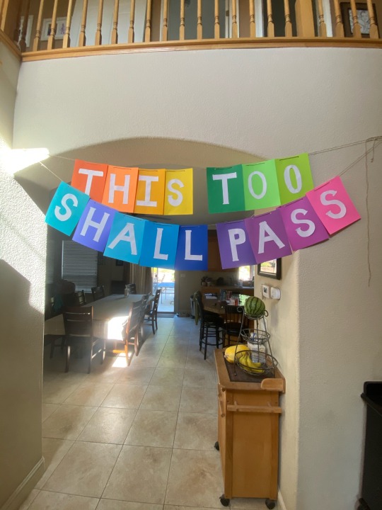


This too shall pass, an important reminder for me this week.
1 note
·
View note
Text
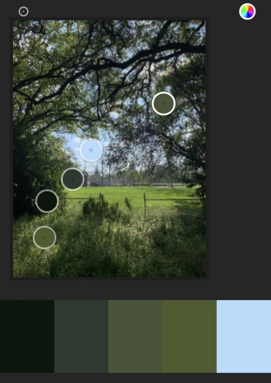
Color Focus: Black
This week to study black I chose to research “The Eye like a Strange Balloon mounts Toward Infinity” a lithograph by Odilon Redon and “Crest” a emulsion board by Bridget Riley. I found both of these pieces incredibly interesting due to their abstract and imaginative nature.
Bridget Riley’s “Crest” is an example of her incredibly popular style “Op Art”, an illusionist geometric form of abstract art. This artwork is considered important because of its use of simple geometrical shapes set out in intricate, repetitive patterns to create movement as well as other optical effects. It is art because of its complex and unique ability to affect the viewer's physiology and psychology of perception. This artwork’s use of black shows us the complex ability to create motion through extremely harsh contrast. Bridget Riley chose to use black in this piece because of its ability to achieve contrast and create unique optical illusions.
“The Eye like a Strange Balloon Mounts toward Infinity” is an example of Odilon Redon’s individualism and belief in the superiority of the imagination over observation of nature. This work is important because of its rejection of realism and impressionism in favor of a more personal artistic vision, which made his work unique. This is art because of Redon’s technique and ability to achieve gradations of tone, fine-line drawing, and rich depictions of light and dark. Redon’s use of color teaches us about the immense amounts of tones available in black. Redon chose to use black in this piece to emphasize a sense of mystery within a mystical space. Redon made close to thirty etchings and two hundred lithographs, and worked almost exclusively in black and white.
0 notes
Text
What is the role of the artist?
I believe that artists, and makers in general, have the unique ability to provide their audience with joy, interaction, and inspiration. Art also has the rare opportunity to give thoughtful critique to political, economic and social issues, pushing others to confront systems and engage thoughtfully while taking steps toward social progress. I don’t believe that an artist necessarily must be dictated by a role but I do believe that artists should seek to help others see the world in new and innovative ways.
0 notes

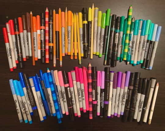
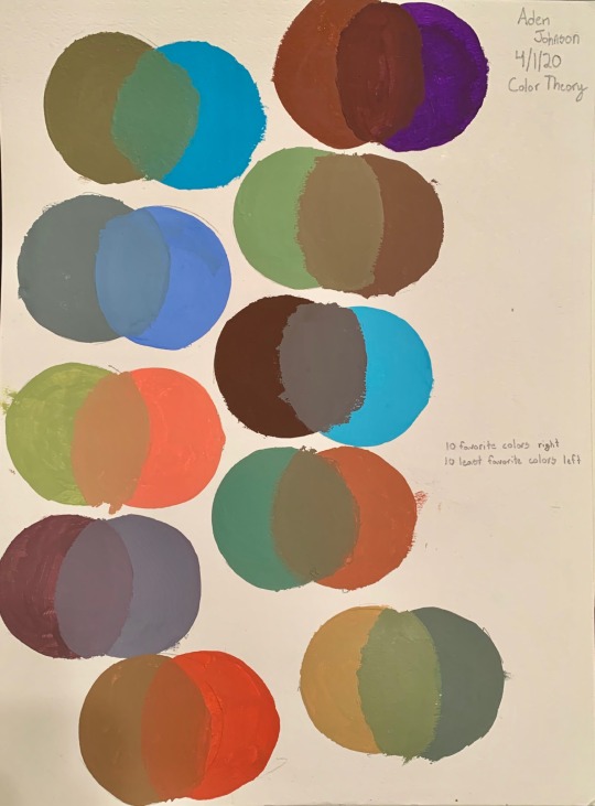
Text
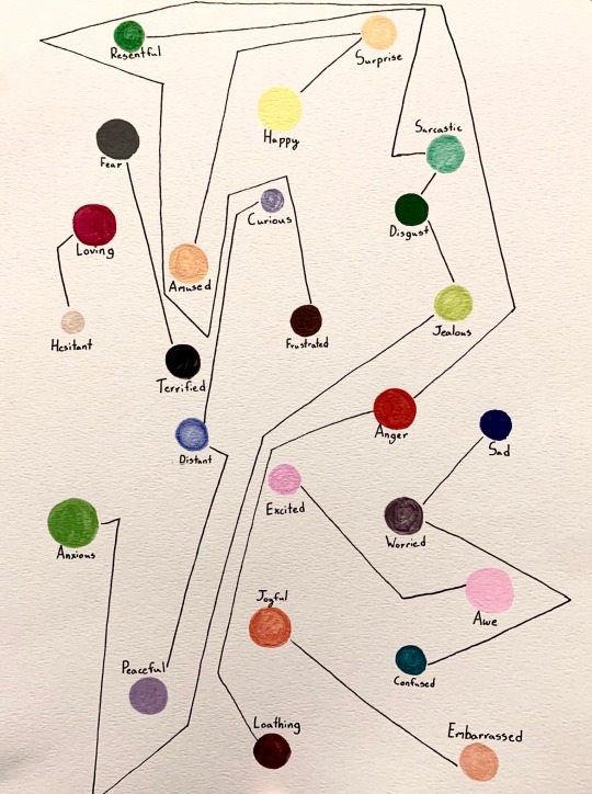
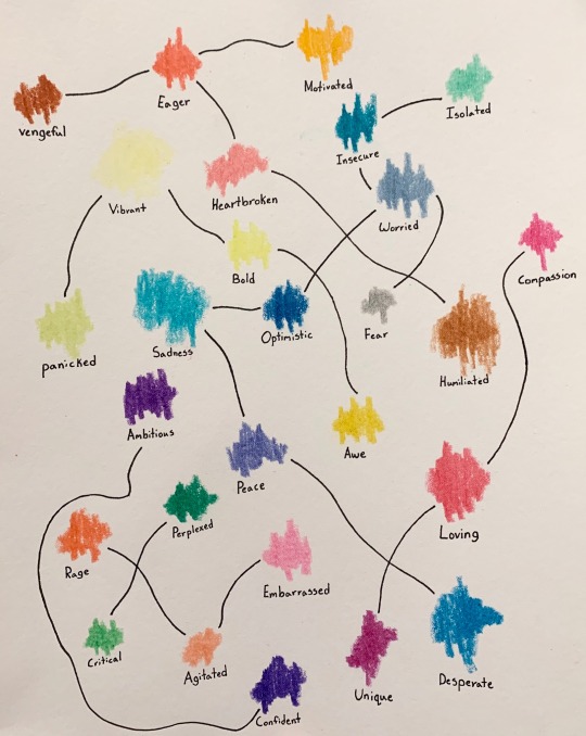
I chose to do 2 color emotion flow charts, 1 all gouche and 1 all crayon. I Had a blast working on this project!
2 notes
·
View notes
Text
Color Focus: Grey
In Gerhard Richter’s 1963 painting, “Bomber” we see his oil interpretation of a World War 2 air raid photograph. This is something that Richter would have experienced as a youth in war-torn Germany. This artwork is inherently important because of its historical documentation and expressive nature. “Bomber” is art because of its emphasis and investigation into detail, specifically grey and the despair it carries. This artwork teaches us about the inherent weight grey carries. Richter himself called grey, “the ideal colour for indifference, fence-sitting, keeping quiet, despair." Richter chose to use grey in this piece to demonstrate his emotional personal experience in postwar Germany.
One of Picasso's most famous works, Guernica is also one of his most powerful political statements. It was painted as an immediate reaction to the Nazi's devastating bombing practice on the Basque town of Guernica during the Spanish Civil War and is extremely important because of its expressive documentative status. Guernica, is art because of its unique ability to show the tragedies of war and the suffering it inflicts upon individuals, particularly innocent civilians. This work has become a perpetual reminder of the tragedies of war, an anti-war symbol, and an embodiment of peace. This artwork shows the immense power and expressive nature of grey and its ability to intensify drama. Picasso chose to use grey in this piece not only to emphasize the dramatic scene but also to emphasize important characters in Spanish culture.
0 notes
Text
In what ways do artists work with restrictions and rules? How might restrictions or rules help to form ideas?
I think that one of the most helpful things about restrictions is that it helps with the common struggle of not knowing where to begin. Oftentimes when I do not know where to begin I set myself parameters of what I will and won’t use in my project to get my creative juices flowing and begin the daunting task of creation. Most recently I've been restricting myself to work on a graphic design project daily for 2 hours or less. This has made approaching projects much less intimidating because I begin without the expectation that I'll create my best work. This discipline of restriction has helped me use my creative problem solving skills daily as well as taught me how to approach daunting projects.
0 notes
Text
Color Theory History
I found that the overarching theme of this chapter was color relation and the many theories and approaches seen throughout history. I thought Aristotle summarized nicely how we have been trying to understand color since the beginning when he said “Verifications from experience and observation of similarities are necessary if we are to arrive at clear conclusions about the origin of different colors.” This concept by Aristotle is one of the easiest ways to understand color and set the groundwork for centuries to come. Whether it be Ostwald’s mathematical and scientific approach or Crossgrove’s more impressionistic approach both observe color in a way that verifies through experience and similarity.
One concept that intrigued me while reading was Faber Birren’s color triangle. It immediately stood out to me while reading because it was a color scale that showcases no color and instead focuses on tint, tone, and shade. Birren claimed that “there are only seven forms in the world of color…” and that “...all colors seen in the world will find classification on this chart.” While this triangle is incredibly simplistic looking it could be extremely helpful to artists alike as it focuses on the alteration of “pure” color, or as we know colors without the addition of black or white. It helps identify a range of tints and shades as well as clean tints, rich shades, and mellow tones. This color concept confused me at first but after researching I not only see the usefulness but also the profound importance.
1 note
·
View note
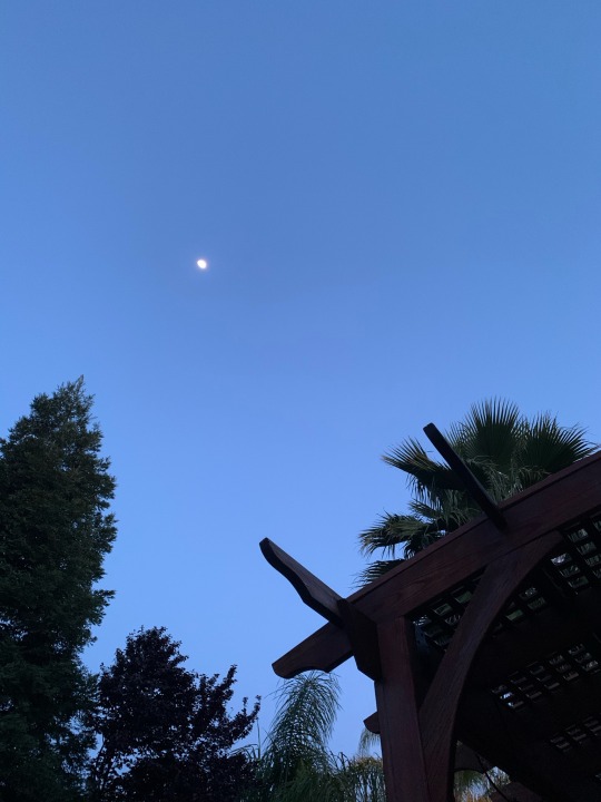
Text
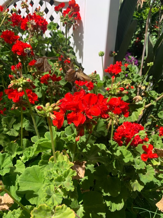
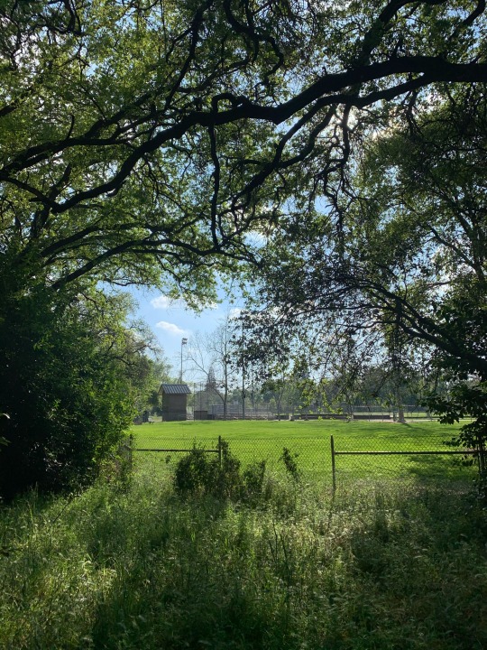
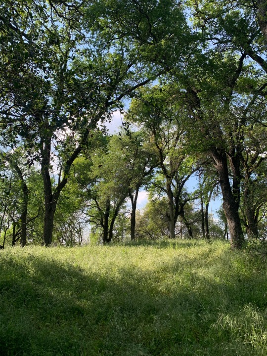
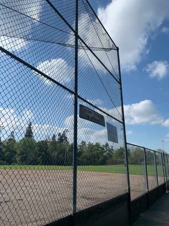
Chose to focus on the colors in the sky this week.


0 notes
Text
What distinguishes visual art from design? What distinguishes visual art from craft?
I think the main thing that distinguishes art from design is the intended purpose. Art is often created from a concept and is created to express a view or feeling whereas design is usually created from a fixed starting point trying to accomplish a goal, whether it be a message, an image, an idea or an action. A designer’s job usually isn’t to create something new but instead to create something that communicates and motivates their audience through design. I think the way to distinguish art from craft on the other hand is through outcome as opposed to approach. Craft is a type of work which results in a tangible output, for example, sculpting or carving where as art is described as an unstructured and open-ended form of work with much more emphasis on work that expresses emotions, feelings, and visions.
0 notes
Text
White Research
This week I chose to research Le Corbusier’s “Villa Savoye” and Kazimir Malevich’s “Suprematist Composition: White on White”. I felt both of these pieces were outside my comfort zone and was intrigued to research them.
I found “Villa Savoye” by Le Corbusier to be incredibly significant in Le Corbusier’s career because it was the culmination of a decade of work to articulate modern architecture. “Villa Savoye” was also an example of Corbusier’s Five Points of Architecture, which he viewed as a universal system that could be applied to any architectural site. This work was important because it represents Le Corbusier’s re-conception of the very nature of architecture, and his attempt to express a timeless look through the language of architectural modernism in 1929. This work of architecture is art because it has been designed to be both functional and elegant and the execution supports Corbusier’s idea that modern machines could create highly precise objects like classical forms valued by the ancient Greeks. I believe that Le Corbusier chose white in order to showcase how white accentuate’s the energy and fluidity seen in this design.
When researching “Suprematist Composition: White on White” by Kazimir Malevich I found that much of its importance lies in its geometric abstraction because in 1918 it was incredibly radical to have no reference to any outside reality. It is art because it is an expression of Suprematism which was Malevich’s theory of “the supremacy of pure feeling or perception in the pictorial arts” which was countercultural at the time. This artwork teaches us about the importance of white and it’s ability to generate a feeling not of borders defining a shape, but of a space without limits. Malevich chose white in this piece to accentuate the liberating sense of infinity and signify a realm of higher feeling, or “pure form”.
0 notes
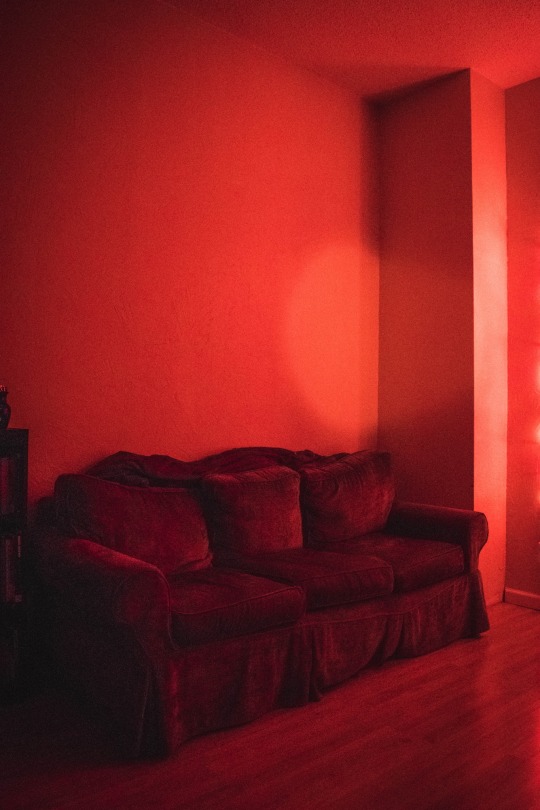
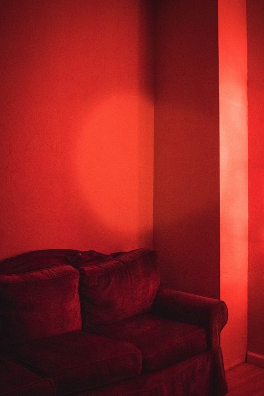
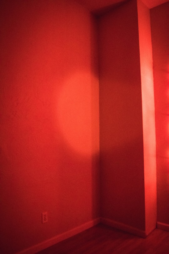
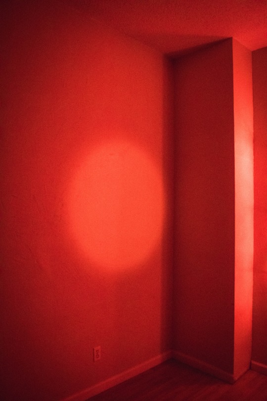
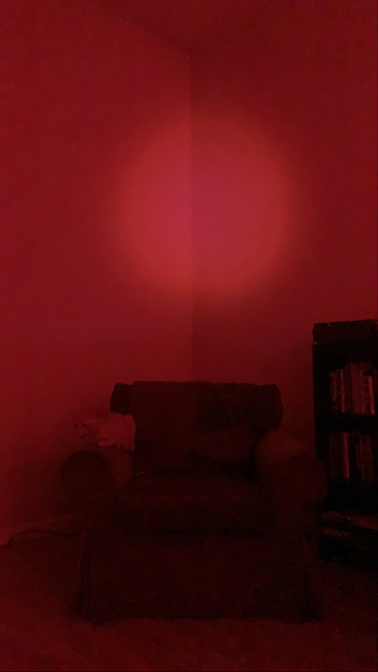
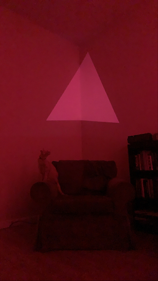
Text
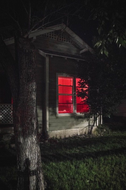
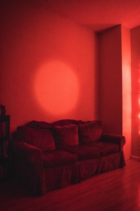
For my studio project I have been designing and experimenting with different projected light compositions. I have also been studying James Turrell’s light projections in more detail in order to understand how to best create a piece in conversation with his work. I’ve decided that while a single projected light source is interesting using other smaller light sources as well gets me closer to the feeling of ambience I am searching for. I already feel like I have learned a lot through this experimentation process and can’t wait to see how my final result turns out. Attached are photos of my potential compositions and examples of the ambience they create.
1 note
·
View note