#changed my brush settings and I think making linework is even easier now
Text
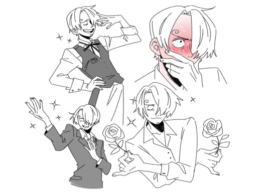
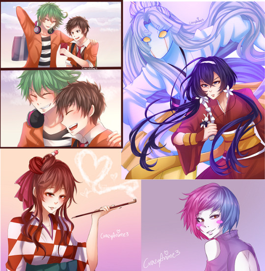
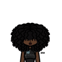
Ahh Inktober's finished and I missed drawing them!!
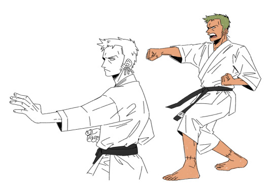
Can't convince me Sanji and Tamaki from ohshc are not related and also karate Zoro
#the Sanji pics are all poses from screencaps of Tamaki#they are so similar that when I was looking for Tamaki pics on pinterest I only had to click through a couple#until Sanji pics started appearing in between them lol#he's blushing bcs of Zoro so naturally#zosan#zoro#sanji#my art#changed my brush settings and I think making linework is even easier now
6K notes
·
View notes
Note
Hey :) I've been looking at your blog and first off, wow. Second, you're really good at digital drawing and I'm trying to get better at digital drawing but I can never seem to get the lines straight or the colours even and in the lines. So if it's not too much trouble, could you maybe tell me what app you use or what brushes you prefer? I'm currently using ibisPaint X and I'm drawing with a sketchpad :) it would really help if you gave me some tips too! Thank you!! Also, you're really talented hehe
Hi there, I'm glad you like my art thank you so much! ; u ; <3
And sorry for the late reply, I wanted to write up a full response with some examples!
So for my artwork, I use almost exclusively Paint Tool SAI. I specifically use the original SAI atm, though I want to try using SAI 2 more (the brushes just feel... different. I've been using SAI for a decade now, so it's where I'm most comfortable.)
SAI does cost money, but there are also free alternatives online as always. I'm not familiar with IbisPaint X, but I know that FireAlpaca and Krita are two good free options. I don't use a smart tablet or apps to draw, though, so I'm not sure what are the best options outside of PC.
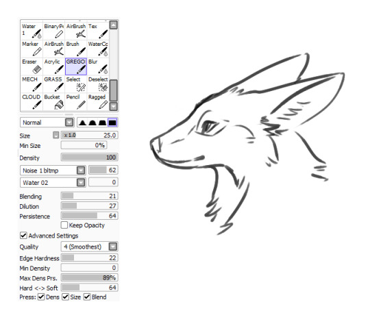
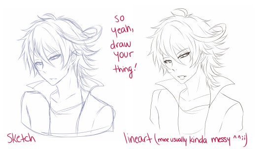
As for brushes, I use three brushes for my lineart-- though 2 of them much more than the third.
The first brush I use is my Marker brush. I've been using this brush to line my work for a very long time. It's thin and somewhat transparent (sometimes I copy-paste my lineart a couple of times to bulk out the transparency).

The second brush I named TEST when I made it and I just never changed it, so it's my very permanent TEST brush. It's sort of similar to my marker brush (it even uses the SAI marker brush base), but it's thicker and a little more ragged. I tend to change up my style when I use this brush.

The third brush I use for lines is not one of my "lining" brushes. It's a painting brush named GREGORY and I Mostly use it to paint backgrounds and details in fur. I change up the "blending" setting on it as needed. I usually only use this brush to line if I'm having artblock or am sketching around.
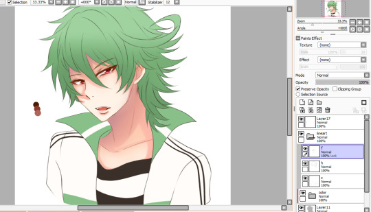
As for keeping lines straight, I honestly just gotta say-- there's tricks to cheat the system! The first, easiest thing is you can find the "stabilizer" setting on your art program, slide that bad boy up, and have some assistance with keeping your strokes smoother.
The second thing you can do is... not really "line" your artwork.
I tend to fight with lineart a lot. Sometimes it's not so bad (especially with my TEST brush), but a lot of the time I just line something and hate the end result, if I can even push myself to finish it.
So, instead of "lining" over my sketch layer, I just... make the sketch my lines.
My sketches are usually pretty detailed so I think that helps, but I basically just erase and go over the lines meticulously in small increments until I'm left with linework. And if I'm having trouble with a spot, I'll just make a new layer, "properly" line that spot, erase the section of the sketch under it, and then merge the layers and move onto the next section. (I also keep my fingers over my undo and redo hotkeys, since a lot of lining can be just undoing a mistake and redoing it until you like it.)
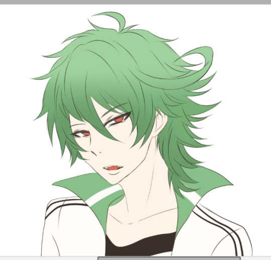
For example, here's this dragon I've been working on, in its original sketch:

And here it is halfway through the cleanup process, where you can see an amalgamation of clean lines amid the remaining sketch:

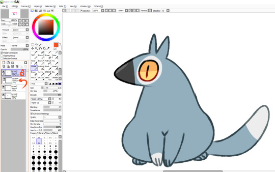
And here's how it looks now:
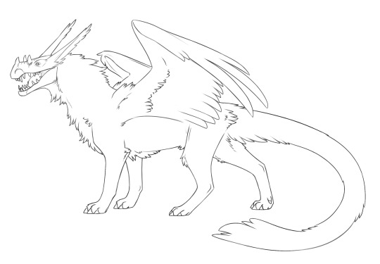
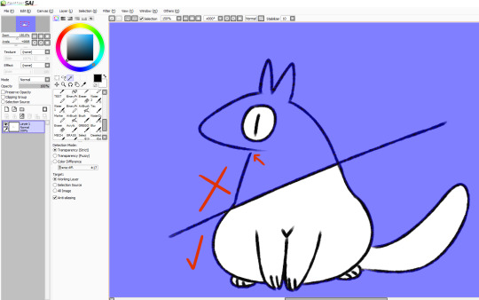
Lines won't cooperate? Make friends with the sketch! I often feel like it's easier to keep the personality of the original sketch when I do this also, though that's just personal preference.
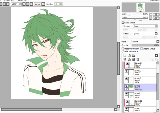
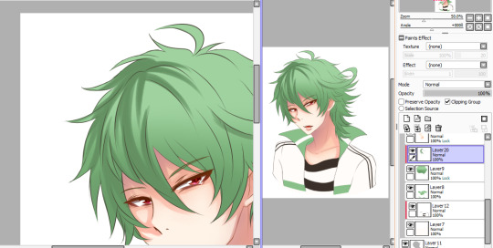
Now as for keeping colour inside your lines, Layers and layer settings are your friends-- that and the magic wand tool (which is a selection tool).
When I use the magic wand tool, I tend to select the area Outside of my drawing first
If there's a hole in my lines and I'm having trouble finding it, I cut a line across the drawing and use the magic wand tool again so I can see which section of the drawing the linebreak is in and fix it.
Once the lines are sealed, I invert my selection so it's inside the lines rather than outside! I prefer to start outside since I find it easier than individually selecting the inner parts of the drawing. It's worth mentioning that the magic wand tool is not perfect (especially if you have sketchy, ragged lines like I often do), so you might have to clean up the edges.

You can make layers under your linework that you can freely draw on without disturbing your lines, and they will conform to your magic wand selection as well. What more, though, you can also make clipping layers/groups which are layers that affect only the pixels below them.
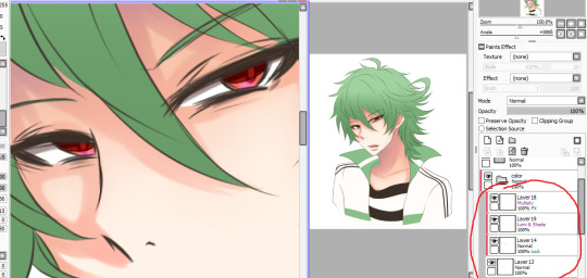
So like in this example here there are four layers. There's the lineart layer, the layer for the base fur colour, a layer for the details (beak, eyes, white spots), and then there's a clipping layer that is on top of the details layer.
Anything I draw on that clipping layer can only appear on pixels directly below it. This is useful for a lot of things like detailing and shading. It also means you can safely exit out of your magic wand selection and still remain in your perimeters.
You can also lock layers which is like using a clipping layer, only you're affecting that actual layer instead of going over it. Whichever one you want to use is pretty much just personal preference or situational.
You can also use these layer settings to colour in your lines, if that's something you want to do!
I hope some of this helps! I also hope that you're having fun with doing digital art! :D <3
#also I love your username#so-once-i-was-a-chicken#digital art#replies#art tips#art programs#art brushes#brushes#paint tool sai#maybe I should put some of this under a readmore but naw#long post#not art
223 notes
·
View notes
Text
Art Advice #4 - A Beginner’s Guide to Digital Art
Hi all!
This weeks entry into my Art Advice tag, where I offer various advice for artists of any skill level, is about digital art! Now, I am by no means an expert at digital (I’ve been doing it for nearly 8 years at this point and that is almost entirely self taught), but I have picked up a few pointers in that time which will hopefully help anyone just starting out!
(this blogpost is a little over 2000 words long btw)
A Beginner’s Guide to Digital Art
I know that the world of digital art has changed drastically in the 8 odd years since I started, but I’d still say that some of the options I started out with will be just as good for anyone who’s starting out now!
As always, I’ll be splitting this into sections to make it easier for you to navigate this post!
Part 1 - Equipment/Hardware
There are a lot of drawing tablet options on the market at the moment, and I’m not going to pretend that I know anything about half of them lol. But I think for a beginner, don’t worry about going for the most expensive option, even if the reviews are really good or your favourite artist uses it, especially if it is way above your budget!
An important thing to know is that there are two types of tablet. One is the plug-in kind. These are essentially a pad which you plug into your laptop or computer and draw on that whilst looking at the screen (they basically work the same way as a plug in mouse works). The other kind is the screen variety, which is a lot more like what most of us know as ‘tablets’ nowadays. And you draw directly onto the screen.
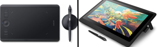
(a plug-in vs on screen tablet, both from Wacom)
Now, as for choosing between these, it is honestly a personal choice. But I’d say if you’re just wanting to try digital and you’re on a budget, a plug-in tablet can be really useful since it gets you used to the mechanics of what digital is like, and they are often significantly cheaper than the screen alternatives. I would say that plug-in tablets are a big learning curve, especially if you’re used to doing traditional stuff, but I do know a lot of professional artists who still use this kind of tablet when doing their work, so if it’s something you can get used to I would definitely consider it! Also, they’re often a lot more portable than some screen tablets! The first one I had was a Huion (a model so old that I can’t even find a link to it now lol), and I also know that Wacom are a well known brand that do some decent plug-in tablet. I’d recommend you do your own research on other brands and options, though!
Screen tablets are often a lot more expensive, but if you’re used to traditional art, they are a lot easier to get a handle of! But I know if you already have something like an iPad, or other general use tablets, then they offer apps that you can use to draw on (as well as things like the Apple pen, or other stylus’). The big difference between using these general tablets and ones specifically designed for drawing is pretty much purely a personal choice. I personally prefer the bigger screen of my XP-Pen tablet, along with a special screen protector that removes the shininess of the tablet screen and makes it feel more like ‘paper’ over when I used a general use tablet it draw. But if you already have an iPad, or something similar, then it’s honestly a really great starting point!
I think it’s important for me to mention that you don’t need fancy equipment to be an artist. The incredible Elicia Donze has revealed countless times how she has very basic equipment but still manages to produce the most stunning artworks! All you really need is some kind of drawing apparatus and a lot of patience lol! Getting good at any kind of art takes a lot of time and effort, but I would definitely say it’s worth it when you’re able to look back at your progress!
Part 2 - Software/Drawing Programs
Much like with the hardware discussion, choosing which program to use is entirely down to personal preference. I personally have never really liked Photoshop purely because it’s really complicated, but I know so many artists swear by it.
I think the main aspect to consider when you’re starting out is whether you want to pay for a program. Software like Photoshop, Clip Studio Paint and Procreate are some of the popular ones I hear about a lot of people using, but all require you to purchase or subscribe to them. So if you’re young or on a very tight budget, I’d honestly recommend the free alternative versions of these, such as Krita (Krita is quite a large program, but it has a lot of really awesome features and is very similar to Photoshop!), Gimp (this one is similar to Krita, but has slightly less options, I’d honestly recommend Gimp for anyone who does photo editing though!) or FireAlpaca (this is the one I use, by the way and it’s a pretty simple program, but has a lot of fantastic features and is perfect for how I work!). These don’t have as many features as some of the paid alternatives, but I honestly think all you really need to start digital art is some kind of ‘canvas’ and set of brushes!
Another great free program for beginners I’d recommend is MyPaint, which is great for doodling and just getting used to how digital art feels in comparison to traditional! It also has a bunch of ‘traditional style’ brushes, to make it look like charcoal or watercolour (which I’m sure the paid alternatives have too, but it’s always better when it’s free, I find lol...)

(this is an example of a drawing I did on MyPaint using the ‘charcoal’ effect brush!)
Most of the sites are pretty self explanatory, with sections dedicated to different brushes (I’ll go into the types of brushes later on in this post btw!), adjusting brush size, shape and opacity, a colour wheel, etc. You also have a section dedicated to ‘layers’ (another thing I’ll go into more detail later), and various ‘filters’ and editing options and effects you can add to your work to make it more interesting!
I’d really just recommend playing around with programs until you find your one!
Part 3 - The Pros of Digital Art!
I realise this section should probably earlier in this blog post lol, but I kinda wanted to go into what digital art can achieve in comparison to traditional art, and how beginner artists can utilise this!
I definitely didn’t take advantage of certain aspects of digital art when I first got into it, and they’re things that would have definitely made my life a whole lot easier lol!
Digital art allows you to tweak drawings as you do them. So if you accidentally drew the eye too far to the right, then you can easily move it to the right place. (I usually do this by selecting whichever area is wrong, cutting it out and then pasting it into a new area... And yes, there is probably a better and quick way of doing this but...I haven’t found that way yet lol...). And I honestly think that this has allowed me to look a lot more at a reference image in order to figure out where I’ve gone wrong with a drawing! Whereas with traditional art, I usually spend so long trying to get an eye right, that even if it’s slightly in the wrong place, I don’t want to completely redo that section. Digital allows you to completely rub out sections without leaving indents, which is honestly such a saving grace!
Another pro of digital is the Undo/Ctrl Z function! This means you can easily go back to before you made a major mistake with just a click of Ctrl Z... Though I have to say that this function has honestly ruined traditional art for me... Oh what wouldn’t I give for a real life Ctrl Z... But yeah, this is a great part of digital art and definitely something you will grow to love lol!
Another great thing about digital is that it allows you to flip and turn a canvas as you’re drawing on it. I spent a lot of time trying to turn my tablet around in order to draw certain parts of a piece before I realised you can turn the canvas itself without having to move yourself or your tablet!
Layers are another part of digital that can be super useful, and I have to be honest but I don’t really use them a lot. I know a lot of artists create layers for every section of their artworks (so, one for the linework, one for colouring, a separate one for the background, etc etc...). And there’s something really great about being able to paint without worrying about smudging into a previous section of the painting. This works well for my work since I do a lot of bright backgrounds. I also often create a lot of ‘versions’ of my works, so it’s useful to be able to change the background without affecting the main figure of the piece! (I have to say that I often work in one big layer when I’m doing paintings, just because I like how it feels more like ‘traditional’ art that way, but layers are such a brilliant tool, and definitely something you should play around with!)
The eyedropper tool is another one that is really useful! Although I never colour pick from my reference photos, I know some artists find this useful when they were just starting out (especially if you’re not sure what colour to make shadows or how to mix skin tones, etc etc). The eyedropper basically means you don’t need to mix your colours every time
Part 4 - Just some other things I wish I had known about when I was starting out lol...
This last section is just dedicated to a few things that I would have liked to have known when I was just starting out all those years ago.
First one is fluffy/textured brushes!
I spent most of my art life from 2013 until 2016 using ‘round’ brushes which are notoriously hard to blend with, so I’d recommend either downloading some fluffy/textured brushes (DeviantArt was where I got mine from a few years back, but there are probably other places you can get them for free too!) to your program of choice, since most of the programs I’ve used haven’t had fluffy/textured brushes as pre-set.
I may make another post about how I blend in my artworks if that’s something people would be interested in?
(this is an example of textured brush blending vs round brush blending... I usually opt for round brushes for rougher blending styles and the textured brushes for more smooth and ‘realistic’ blending... for a lot of pieces, though, I use both brushes (the round brushes are good for details!) in the same way that you use different sized brushes for real paintings!)
The next thing I wish I’d discovered earlier is the Brush Stabiliser option. Some programs may do this automatically, but the one I use (FireAlpaca) requires you to manually change the amount of stabilising you have on your brush. This is particularly useful if you want to draw neat lines or straight lines (the stabiliser essentially slows down the ‘ink’ as you’re drawing). I only recently started using the stabiliser, and although I still like having it mostly turned ‘off’ for doing sketchy work, it does make doing line work a lot easier, and also gives pieces a more polished look!
Next advice is to explore all the options you can in whatever program you use!
I feel like with certain programs, you can get overwhelmed by choice and you end up just using a few of the functions. But I’d really recommend just playing around with these programs, trying all the filters and editing options to get used to how the program works. You can often find interesting ways to adjust your artworks this way! In a way I’d recommend this way of working more than finding tutorials made by other people... Unless there’s a specific function you want to learn how to do, just having fun with digital art is a major part of it’s appeal to me!
~
There are probably a lot of other options I could go into, but this is already over 2000 words long, so I’ll leave it here for now lol! (I may do a part 2 though so... keep a look out for that!)
As always, if you have any questions to things I’ve said here, or are just looking for more advice, don’t hesitate to message me!
And if you like my work on here (art & blog posts) feel free to support me on my Ko-Fi! <3
#art advice#digital art#art advice for beginners#digital art for beginners#artist advice#digital art tips#artists on tumblr#just want to say again that i am not an expert at this at ALL lol#i just want to offer some really basic advice to anyone interested in starting out with digital!
92 notes
·
View notes
Video
I’ve learned a few things since my last tutorial post, so I decided to break down my process and write up a new tutorial for one of my more recent pieces.
Here is a link to the finished piece, commissioned and posted by @finnreyultd! Drawn in Photoshop CC 2019.
More below the cut!
1. Layout. Roughly sketch the major pose(s). It may help to split the canvas into a 3x3 grid and try to place points of focus where the grid lines cross. Another option is to use thick brushes and blot out large areas of light and shadow. Of course, don’t let that limit your creativity!

2. Detailed sketch. Once you’ve decided on the layout, refine the details of the sketch. Here’s where you correct proportion errors, use the transform tools, and flesh out where you will put the final lines. (I actually decided to switch to landscape orientation at this point!)
3. Outlines. Reduce the opacity of the sketch layer(s) and draw the outlines on a new layer at 100% opacity. This helps prevent that oh-no-I-accidentally-drew-all-of-my-good-lines-on-my-sketch-layer situation.
For the thickness of the outlines, Scott McCloud (and other artists) say to use a thicker line for the outermost lines of a form/character, and use thinner lines for inner details. The actual thickness is up to you, but this guideline has really helped me make my lines look cleaner, even in the sketching stage.
For the colour, I personally like to use a dark, partially saturated colour for outlines instead of black. If I need to, I’ll change it later using hue/saturation/lightness adjustments.

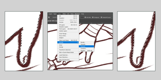
4. Block in flat colours. This step can be done by colouring in the flats manually or with the magic wand selection-- but that will depend on how clean the linework is. My lines don’t always connect at the corners, but this method works well enough lately.
Using the magic wand tool set to ‘Sample All Layers’, select an area or multiple areas to fill with colour. Go to Select> Modify> Expand... and expand the selection until it overlaps with your outlines (the number should be maybe half of the brush size, depending on your line thickness). Then you can fill this area with the desired colour on the flat colours layer. Here’s a video tutorial on how to do this and turn this into a handy quick action.
When choosing flat colours, I try to decide the background colour and lighting first, so it is easier to choose whether to choose colours that have unity with the background. In this drawing, I started with a dark reddish-grey background, so I chose flat colours that are slightly darker and tinted red.

When I’m done this step, I have one layer with all of the flat colours (or one per character) that looks like this:

5. Shading. Saying is easier than doing, of course...
Create a clipping mask on the flats layer. Using the flat colours layer as a way to select one colour/object/piece of clothing with the magic wand tool, I shade by painting within the selection on the clipping mask layer.
Now you don’t want to have to look at the flashing selection outline all the time, so you can hide them with ctrl+H, or View> Extras (off). The selection is still active, but the selection outline is hidden.

When it comes to how to shade, I can’t really explain that, except saying to look at real life examples (like reference photos, or your own hand next to a lamp) and try to capture the direct light, the core shadow, and the indirect or bounced light.
Realistic shading is much more complex than that, but this simplistic view of thinking about it really helps me for drawings like this. It also doesn’t hurt to exaggerate these shades (e.g. making bounced light that isn’t actually there) when it looks good!

Tip for blending: in Photoshop, holding the Alt key when you’re using the brush tool brings up the eyedropper tool, and the ‘x’ key switches between the two colours in the palette. These two shortcuts are really helpful for quickly picking and painting colours to blend your shadows and highlights together.
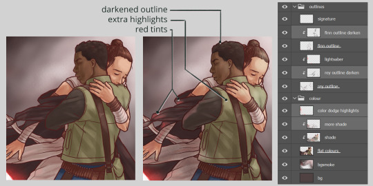
6. Zoom out. At this point you’ve probably been looking closely at your work for a long time. Zoom out and see if everything looks as you want it to.
Do the lights need to be lightened? Do the characters stand out from the background? Are the outlines too light or too dark or not thick enough? Does the image look like it needs to be tinted with a colour?
This is where I make new layers and try out adjustment layers and blending modes to see if edits like painting a big highlight over the whole image makes it looks better. I typically end up with a layer set to ‘Overlay’ or ‘Linear dodge” with some soft highlights over the foreground characters.
In this one, I also added a clipping mask over my outlines so I could darken them in places that needed to be darker, like Finn’s hair, or towards the shadow in the bottom left.
And voilà!

I hope that was helpful to anyone! Hopefully these concepts can be applied to other programs if you don’t use Photoshop!
Feel free to message me if you have any questions. Good luck to you and your art!
52 notes
·
View notes
Note
Looking to get into digital art. Any advice/sources/beginner tips you could share? Thanks a ton
Heyo! Thanks for your question! It took a while to get back to you, I know, but hopefully this lengthy post makes up for it, hehe. :D
Here’s some general advice/mini tutorials I thought might be useful for a beginner (some of it is just general art advice that I think is useful to remember when getting into digital art). Hope this helps and let me know how you go!
***
The boring important stuff
What kind of digital art do you want to create?
Might seem kind of redundant, but knowing what kind of art (highly realistic, illustration, manga etc.) will help you develop the right skills for you.
Focusing on one, maybe two, big styles/techniques/skills at a time will help you improve faster rather than focusing on a bunch of little things at once.
So just pick something you know you want to learn/improve etc. and go from there.
Draw. draw, draw. Play around and experiment.
The best thing you can do to learn and improve your digital art is draw a lot. When I first started there weren’t a lot of resources, especially the kind of stuff I wanted to do. And the tutorials I did find were so complicated I couldn’t do them anyway. Because of this, I think I did something like five drawings in three years. Pretty sad, huh? My work hardly improved at all and it felt demoralising. Sometimes I think back and wonder how much I could have grown if I had practiced regularly.
Resource: https://youtu.be/emcO79uteN4 (drawing advice)
Learn how to use your chosen tablet and program.
You don’t have to become a master at it, but learning the basics will go a long way. There’s a lot of tutorials for most of the digital art programs. You can just do a quick search and find videos explaining the basics. This will make your life easier!
Now for the basic digital art, mini tutorial stuff:
Linework basics:
Pen pressure
Each tablet will feel different, as will each program, so it never hurts to play around with your pen settings to find what’s comfortable. You can find quick tutorials that will show you how to adjust your specific pen pressure.
Stability
“Everyone has such clean, smooth lines! Except me! Mine are wobbly and terrible! They suck!”
No, friend, they have their pen stability adjusted to suit them, or have downloaded a brush set that helps them. Stability settings will depend on what program you’re using.
There are heaps of brush packs out there, but for linework specifically you’d want something that has a kind of slanted tip.
I often change what brushes I use, but some I like are:
https://gumroad.com/l/JYdba
https://sellfy.com/georgvw (lots of stuff here but costs a little. Inktober set it good)
They’re for procreate, but you could easily find some for photoshop or other programs too.
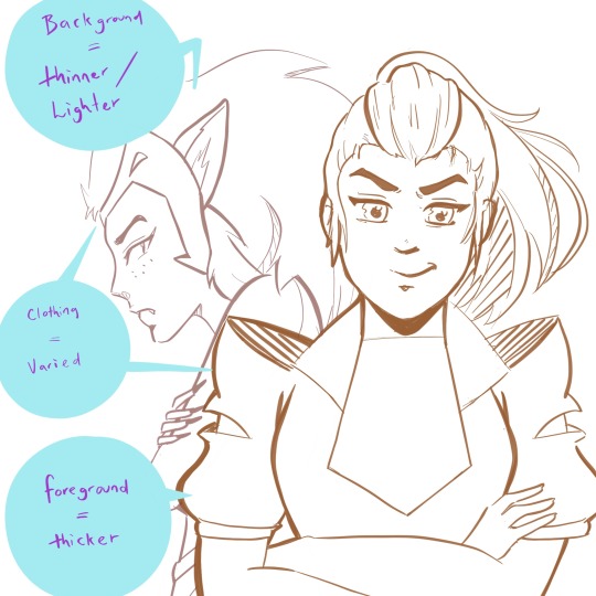
Inking/Line weight
This can be a little bit difficult to explain, and I’m not sure of any tutorial in particular that I think explains it completely. Your line work will add depth to your piece (unless the kind of art you’re doing is without linwork, then feel free to skip this).
The basics are:
Thicker lines are generally for things that need to be bolder, materials/substances that are more coarse or dense (e.g. thick jacket, boulders), for objects that are closer to you, and also for things that are more in shadow.
Thinner lines are generally for things that need to be more transparent, wispy (hair, for example), for light materials/substances (e.g negligee, leaves), objects that a further away or less important, and things that are in bright light.
Small example:
(yeah I couldn’t help but add a little she-ra to this post...)
The exception to the rule:
Overall, most people would agree that they want their art to look good/be compelling over something that is technically accurate. If this means making bolder lines on something that would typically be thin (maybe someone’s hair, for example) because it adds extra depth and an interesting look -- then you should do that.
Example, what I generally do with my lines:
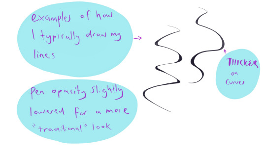
Shadows/Light Source
This can make your art go up a notch, and give greater depth to your illustrations -- even if you’re doing just some sketching. Knowing where your light source is will add more depth to both colour and black and white works. It can be tricky getting them right sometimes, but here are some general examples/rules.
(also, I’m no expert at this. these are just some things that I find generally useful).
Light source/Shadow examples:
Depending on the direction of the light source, will depend on where the shadows are.
(and of course I had to use zuko too because the dramatic lighting is perfect on him)
Shadows will change depending on the object, and the direction of the light.
Some things to keep in mind:
Things in shadow will generally have less detail (unless you decide you don’t want to do that for certain effects).
Interesting shadow shapes will usually win over making things technically correct.
Even googling “light source references” shows some decent results:
https://www.google.com/search?rlz=1C1CHBF_en-GBAU805AU805&biw=1536&bih=754&tbm=isch&sxsrf=ACYBGNQPqF22f6P5Fsz2VnrUFzOJ-RV8TA%3A1574554362929&sa=1&ei=-srZXfmuOPSH4-EPwOWouAs&q=light+source+refernce&oq=light+source+refernce&gs_l=img.3...568.1258..1376...0.0..0.274.1470.2-6......0....1..gws-wiz-img.......0j0i5i30j0i8i30.X4dgUAjeEVQ&ved=0ahUKEwj5k-2LyIHmAhX0wzgGHcAyCrcQ4dUDCAc&uact=5#imgrc=_
Also, this is a good resource too:
https://youtu.be/ZJkIaMECW6c
Basic Colour Theory/Colour Tips
Complementary colours are those that are found opposite one another on the colour wheel. They go great together in work because it can add contrast, drama, intensity, and just some great colour design.
When using complementary colours, it’s easy to just pick two colours opposite each other and decide to colour with them in equal amounts.
While this can be nice, if it’s the look you’re going for, it can also be overbearing if that’s not the look you wanted. One of the things I was taught by an artist friend, was to try and use the complementary as an accent colour -- to make things pop and come to life in the work.
These are just some things to keep in mind, and either way is good.
Resources:
https://youtu.be/Qj1FK8n7WgY
Colour theory continued -- Building Palettes:
So, building palettes that work/using only a few colours (something I’m still trying to learn!). There are many ways to do this. You can use a complementary pallet, an analogous palette for a harmonious effect, or even a monochromatic palette .
There’s also a triadic approach (plus a few other ones I don’t often use), but I honestly haven’t thought much about this so I’m not sure what advice I can give.
It’s basically three colors that are equally apart on the wheel, for example: red, blue and yellow. If you find this interesting and end up using it, show me the results -- I’d love to see!
*I’m a big fan of doing things either complementary or analogue when building colour palettes, but monochromatic paintings can have an amazing effect and it’s something I will definitely be trying in the future.
note: colour theory is in-depth, and a lot more complicated than this (largely due to most of us being taught incorrect colour theory as children -- technically some of the colour theory above is not quite correct but a comprehensive colour theory guide would take tutorial of it’s own). So if you’d like to know more just let me know.
Resources:
https://www.google.com/search?q=color+palette+ideas&rlz=1C1CHBF_en-GBAU805AU805&sxsrf=ACYBGNQJtnt9SzKjFpxC-HXzuivXPW6vGg:1574906679811&source=lnms&tbm=isch&sa=X&ved=2ahUKEwjViNHJ6IvmAhUv6XMBHaaHAp8Q_AUoAXoECAwQAw
Over Saturation
Saturated work can look really great if that’s what you’re going for, but a lot of the time this is something that happens by accident when learning how to use colours and it can look quite garish.
There’s a few things you can do to help with this.
Make a colour palette or guide before you begin to colour so don’t accidentally over saturate
Find a colour palette that suits your work and use them as your palette
If you’ve finished a piece, and it’s already too late to change it you can play around with the colour settings in your program (photoshop and procreate both have some settings you can toy with that can reduce saturation intensity)
*just like using complementary colours as an accent, you can use minimal bits of saturated colour to draw attention to certain aspects of your work you want noticed
A few other little things
● Another thing to think about is composition -- planning how you want your art to look (which could be something like: including negative space, using the rule of thirds, making a specific feature the anchor of the piece, line of sight etc.)
● Make a pinterest board (or whatever else might help). I make boards for things that inspire me, tutorials I might like to try, references, and even separate boards for individual projects. It can be a great place to store your ideas!
● Also, remember that you don’t need to start doing all these things at once. Start small. Small is good. :)
● Every once and a while go over the things you think you know well. You’ll be surprised how much a little revision can improve your skills, even with something you’re good at.
● USE REFERENCES!!!
So how was this? If you’d like me to go more in-depth in a specific area, I can sure try! Excited to see how your journey goes and I hope this helped! ^_^
xoxo
Rora
7 notes
·
View notes
Note
hello! i was wondering what program&brush settings you use for your artwork? im new to digital art and i really like the way you colour! Especially those light effects they're so extra cool!
omg Anony you’re such a wonderful being, thank you for liking my art enough to ask me that!
now watch me failing trying to explain things to you lmao. I’m self taught and I’m in no way the best at this, so what I’m going to tell you might still be flawed but this is how I do things o/
hmm it’s gonna be long so I’ll put it under a cut!
1) I’m using Paint Tool Sai for everything in my art but if I still feel the need to, I’ll use Photoshop to correct colors and lighting. for example in this progress gif:

you can see where I decided “no, I don’t like this cold blue feeling” so I went to Photoshop (because it allows changes much easier than Sai when it comes to colors) and I changed it to a warmer purple! you can always play in Photoshop and try to see different versions of your art, different colors will give off different feelings
most of my artworks don’t look the way they do at the end because while drawing I tend to be focused on other things (line, where to place shades, lighting, etc) while when the picture is done I can focus on the feeling I initially wanted it to have!
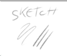
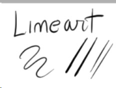
2) My usual brushes are really basic. also ignore my ugly writing.
Sketch: I use this to sketch because it has a nice and easy flow, I can get messy lines that look good (the latest Brahms Heelshire drawing I did is entirely drawn with this one!)

you can always switch between your brushes depending on what feeling you want your art to have
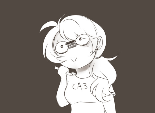
Lineart: this one has nice, smooth and bold lines. I like to play around with it’s size. I believe it’s the basic one Sai has
little advice: if you’re not happy with your lineart try to alternate heavy lines with tiny ones. for example:
you can see how bold her hair is, but adding thinner lines to the glasses, the folds of her clothes, hair etc. it will create a better dynamic of your picture and will leave the eye of the viewer to run around it! I’m honestly awful at explaining stuff fdkjsnjkfds ofc this is a personal preference but my linework improved since I started to think like this
Base color: this is the color tool sai gives you, I changed my names so I can’t remember its default name. I like it to be bold because when I was little I used to color entire coloring books, so even now digitally I like to color every bit like I’m using crayons haha. time consuming and useless but shhh. basically I put down every base color with this one

Acrylic: now this one is tricky, when I got it the first time I wanted to use it to shade, but using it I discovered it’s much better for blending. after I put down the main colors and shades I just use this one to blend them together and I sometimes paint with it too
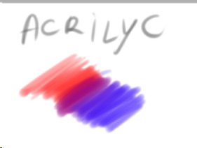

Blending: it’s literally the blur brush Sai provides you xDD
now keep in mind that using its settings (the things near the “Normal” option!) you can get different types of blur! always play around to see what looks good in your art. also remember that not every shadow has to be blurred or blended out, there are many ways shadows can look, using both blurred and heavy (cast) shadows in your art will definitely improve it. using real life references might help
Airbrush: the very brush Sai gives you. I’m using this one mainly for lighting. what I do is basically put down a hard light, like literally take a light color and place it where I see fit on the character, then I give it a bit of glow with the airbrush. one thing I noticed is that depending on the surface, the glow will change!

in this one you can clearly see the light on his cheekbone, but then there is a much weaker light on his face, that’s made with the airbrush and then blended into the structure of the face.the glow on the cheekbone and the ear is made with airbrush, using orange and playing around with the layer modes (overlay and luminosity, these are your best friends when it comes to lighting!)
lastly I want to present another best friend for us artists, the eraser

you can make highlights with the eraser too! you can cut the light in different shapes to give different feels and many other things, the eraser is definitely your best friend and not only in erasing mistakes. try to play around with it sometimes
Other things I learned:
try to use a different color for shading, using the exact color but darker will only make your art look dull, lifeless. the same goes for lighting! there are lots of tutorials on color theories and practices out there to help you with it
don’t be afraid to get wild, use oranges, reds, blues, purples in your skin and play around with the layer modes, you’ll see how much more alive it will feel. also don’t be afraid to try different styles, constancy is not the friend of a creative mind. experiment, try things, go out of your comfort zone. make it fun, make it personal. if you like drawing dogs then keep drawing dogs and enjoy it! don’t let labels and others to influence you and your spirit
ik this is obvious but never compare yourself with others. your journey is yours, you have a different hand, a different brain and a different being. this also goes to drawing things others did already! who cares there’s 0284e4895 other pictures with Kitbull already? draw yours, it will be unique and special because it has something from YOU in it, and no one can replicate that not even with tracing
watch people online! of course when you sit down to draw it will be completely different, but involuntarily you’ll learn and exercising you’ll find your own way of doing things. there might be much better ways for drawing lighting than I do, but this is how I feel good and I like to do it!
I know you hear this everywhere but really, practice, daily if you can! in October 2017 I tried to to the inktober challenge for the first time, I haven’t finished it and I was late anyway but I can tell you that trying to draw daily definitely improved my art. now I’m able to draw a picture per day with not much effort (yesterday I was able to draw three pictures with pretty good quality! o/ always start small and be proud of every step!!)
lastly, don’t be hard on yourself. every picture is a lesson, doesn’t matter how it came out. maybe the anatomy is wonky af, but you learned and your brain will remember what not to do next time. try and try and try and never say “my art sucks”, say “this pic doesn’t look how I wanted, but I still like it. I’ll do better next time!”. the moment you start to like your art you’ll see how much it will start to shine hehe
I might come out with more stuff but this is already really really long xD just be yourself, love your art and enjoy it!! lots of luck for you Anony, I hope I didn’t bore you and this will be helpful for you and others! :D
#ira geneve#art advice#tutorial#sai brushes#art tips#anon ask#ira rambles#wah this was long sorry#but it warms my heart to know some people look up to me for things#and I'll do all I can to help anyone
66 notes
·
View notes
Note
Hey hey!!.... do a coloring tutorial!!!.... Please?.. :3
Me knowing I’m terrible at explaining things and that I’m still learning how to hecking color too:
BUT SURE I WILL TRY MY BEST TO SHOW YOU WHAT I DO CURRENTLY. Cause it does really vary between each random drawing:
The way I color is weird sometimes cause I’m always trying a slightly different method??? and I’ve only recently started trying it this way. This will be a slightly watered down version of how I do things tho….
I’m going to draw something quick for this but hopefully it’ll get my point across kfjsalfjlsa
(picked Sakuya for this cause I can easily draw him pretty quick lol)
anyways yeah make your lineart (my own linework is usually a bit more “open-lined?” and has small imperfections that I usually correct bit by bit as I go along. Or you can do it before you start coloring. To me there is no wrong or right way to go about it I think? Do whatever is easier for you! Cause remember everyone does art differently!
1.) I like to keep all my things separate 90% of the time and before I start coloring I put all my color layers in a folder and add a “clipping group” layer to it:

to save time and if you need a more in depth explanation on how this works… here’s the video I watched to help me figure out how to do this. Really does help make coloring easier! (well for me at least I hope its useful for you too 😅)
2.) Add all the flat colors you need!
sometimes I like to blend a darker or lighter color into some of my flat colors with the blur tool (I try to keep the brush at a lower density like at 20% to avoid keeping everything getting too blended? If that makes sense.)

Tadaaaaaaaa
3.) I keep most of my layers pretty separate so it’ll be easier to add clipping group layers once I start the actual shading

You can use whatever skin color palettes you want for this!

the reason I do it like this is so it’ll be easier to blend later like this (I used the airbrush tool or you can use the blur tool again if you want) Again use whatever colors you want to darken or highlight or whatever you’re trying to go for?

Remember to click “preserve opacity” when you do this!!!! it’s next to clipping group!
4.) I don’t do a lot when coloring eyes….it really depends on how detailed I want to be. But since this is meant to be a simpler drawing it usually just looks like this and I use only two colors.

sometimes I’ll add a multiply layer or lumi and shade in there. I’m still learning how to color eyes too haha
5.) I add some shine to the eyes by putting one layer on top of everything else (including the lineart folder)and I preserve the opacity of my lineart and add some color to it (a lot of artist I know do this and when I watch art tip videos they usually recommend this cause it makes it look more lively? They say you shouldn’t really use black lines unless you are going for a graphic novel/comic kind of drawing?
—-GOING TO PUT THE REST UNDER KEEP READING SO THIS DOESN’T GET TOO LONG ON PEOPLES DASHES!!—-
6.) For hair I also do the clipping group thing. I set a lighter color for my flats so I can shade with a darker color later like this:
I ended up mixing another color in there and used the blur at very low density once again to make it a little softer? Remember don’t blend too much! One or two strokes of the brush is really all you need!

Also sometimes I like to add some pink (or any color can work depending on what you want to do) to the hair on of that and blend it in.

Also add some hair shine! (I use a lighter color from the original hair color so you still use it on “normal” setting still)
7.) All that stuff about using clipping group applies for clothes shading too. But instead of leaving it on normal I change it too “Multiply” instead, especially when there are smaller details on same area. It’s for when I want something done a little quicker?

and yeah gives you something like this! Remember when you switch to multiply the original colors when darken automatically so you might need to alter your colors a bit if you want it a little lighter!
also you can add some skin tone to the clothes too and blend it in if you want to continue the soft color effect to it?
done? That’s the basics I guess ¯\_(ツ)_/¯

there’s so many other things I could explain and fix here but I think you get the idea now. ^^ I HOPE SO AT LEAST.
I hope I helped even if just a little bit. I think it would have been better if I made a video instead…. maybe next time with a better drawing!!! 😂
Thanks for asking ❤💌✨
#ca3 asks#mermaibee#mflkaljaslf I wish I made a better drawing now cause the tiny imperfections are killing me now but oh well#sakuya watanuki
104 notes
·
View notes
Note
i have the Vergil motivation to start doing digital drawing. But its kinda intimidating. I mean I've always done things traditionally and I do know how to make designs on Adobe software but not drawing. I was wondering if you have a software that you prefer or would recommend; or just tips in general.
Hello anon! how are you doing? :D
Thank you for asking, I’m not en expert, but I’ll try to help you as much as possible :D. Also, bear in mind that english is not my mother tongue, so there may be some mistakes (ans I’m also a idiot who types really fast without re-reading xDD).
First of all, I assume that you own a graphic tablet, this tool is essentioal for digital art, as they have pen pressure and helps a lot to create unique effects! The brands I’ve seen people recommending the most latelly are Wacom and Huion. I can only give you my opinion about the first one though, I’ve owned a Wacom Intuos 4 for over 6 years and it has never failed me ♥ not even when I accidentally threw the pen inside my tea xD.
Now, speaking about software, I have tried 3: Paint Tool Sai (1 and 2), Clip Studio Paint and Photoshop. Each one has their pros and cons, and you also have to bear in mind what your computer can handle.
1. Paint Tool Sai:
This is the one that I use and like the most, the interface it’s quite simple and the only thing that may cause you trouble may be the brushes settings, but once you have created you own ones, the only preset you’d probably need to change is density.
This software comes with a pen stabilizer, which is very handy if you do linework, I always set mine to S-3 so it’s easier to get more accurate and less “crispy” lines, you may also notice that the pressure works a bit different, like it’s a bit more sharp.
For colouring I always set my flats with selections and the bucket tools, and then I add layers for shadows ans highlights. I always start with flat shadows and blend them using both the Brush and the Water tool. I may share my brushes presets for Sai 2 if you like. This software also includes a “transparent” color, which is really useful when you need to fix some blended areas or softly remove part of the colour.
I have used bot Paint Tool Sai 1 and Paint Tool Sai 2, I have noticed that in the second version brushes work a bit different, specially when it comes to using the transparent color. But Sai 2 comes with many enhacements which makes it more enjoyable, thing such as:
Elipse Rulers
Linear Rulers
Perspective Rulers (they work wonders even if you know 0 about perspective)
Text
Shapes
Gradients
Better compatibility with Photoshop’s layers
It seems that Sai 2 is going to be on Beta forever, but you can still download (illegally, lol) and use it, It’s my fave one, so I really recommend this one.
If you want to see more about its interface, I highly recommend you to take a look to my youtube channel, I tend to upload there some of my drawings speedpaints, I hope they can help you to understand hot it works.
2. Clip Studio Paint
I haven’t used this one that much, I only made my first V drawing with it, as well as some headshots for practicing.
This also comes with a pen stabilizer, but I noticed it didn’t worked the same way as Sai’s, it took me a while to get a level of hardness that I liked. The good thing is that it comes with a wide variety of pens, and I really recommend G-pen when it comes to making linearts, it has a nice and sharp finishing.
It also comes with poseable 3D models to use as references, I don’t really like to use them as they have anime-ish proportions and such, but some people may find them handy I guess. CSP also has a wide variety of resources such as premade images (grass, dust, floers, manga panels, halftones…) so this one may be a good option if you also plan to create comics and such.
If you are going for the paid version, you also get access to a marketplace in which people uploads their resources, and you may find some interesting ones there for free.
CSP also has rulers and perspective tools as far as I remember, but I haven’t tried the new ones (this software used to be called Manga Studio, and that was the first time I used it xD).
You can see me struggling with it in this video.
3. Photoshop
I think this is the one that everyone knows the most, right? xD. Though the use of Photoshop has been widely spreaded, we have to keep in mind that this software is very heavy to handle for some cumputers, you’ll probably need over 8GB of RAM memory (I have 16 GB and it still crashes some times) to make it run “properly”. I am isung CC 2015, since I don’t have enough space in my HD for CC 2019, and I would probably need an SSD to make it work smoothly.
I find it really difficult to do linework with Photoshop, it doesn’t have a pen stabilizer (unless you pay for the lazy nezumi plug-in), so the pen usualy “slips” more, I don’t really know how to call this, but I don’t like the feeling I get when I do linework with it. On the other hand, I find it really funny to sketch with it, don’t ask me why xD.
When it comes to colouting, you have to find the brushes that appeal to your style the most, and it’s also really easy to make your own, you can also make patterns and such. Bad thing that you have to use the sampler a lot, in the end you have to use 3465654 tools to blend properly in photoshop, when in either Sai or CSP you only need two, and this is depending on your style.
I have seen many people doing wonders with realist style in PS (you may take a look to @i-have-no-name-v‘s works, they are awesome!) though!
Other thing I don’t like about PS is their color wheel…It works totally different to Sai’s or CSP’s, and most of the times I find it hard to pick the tone I really need. You may also need a plug in tho swap your color wheel too.
I like to use Photoshop when it comes to adding effects to a drawing, be it lightin, particles, color corrections, etc. It’s very handy for this, and it’s also a good thing that both Sai and CSP allow you to save in .psd format.
I hope this long post has been helpful to you or to anyone that needs it, as I said, I have no problem in sharing my Sai 2 brushes presets if you want, you can either reply here or send me another ask ;D
8 notes
·
View notes
Last Seen Blogs
mallcong
mallcong
mrs-heyward
Popes Wife

alarriemadridista
Alarriemadridista Home Improvement
mascspomax
max

luminova143
Lumi/Ames