#can you tell I really wanted to use halftones
Photo
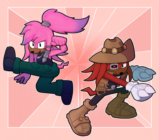
POV you are about to get KICKED and PUNCHED by a POWER COUPLE
--
Will I ever stop drawing @julie-su’s MXYL ideas? No!!
#sth#archie sonic#jenzart#Julie-Su#julie-su the echidna#knuckles the echidna#MXYL#knuxsu#can you tell I really wanted to use halftones#and nobody stopped me
128 notes
·
View notes
Note
Hi, not a request, just wanted to ask what program you use for your drawing? Your art is wonderful, I really love it. I've been trying to learn how to do the FX like you did in the "Be Polite" piece (the rainbow-y effect on the outline specifically.) If you would be so sweet as to share your process or at the very least a few tips to guide me in the right direction, I would appreciate it so much <3
Of course! I use Procreate for all of my digital art, which if you don’t have already, is totally worth the $13; it’s super versatile, not to mention satisfyingly easy to navigate. If it interests you, I use this Syrup brush for pretty much everything, including the Sniper piece (just crank the stability way down in settings).

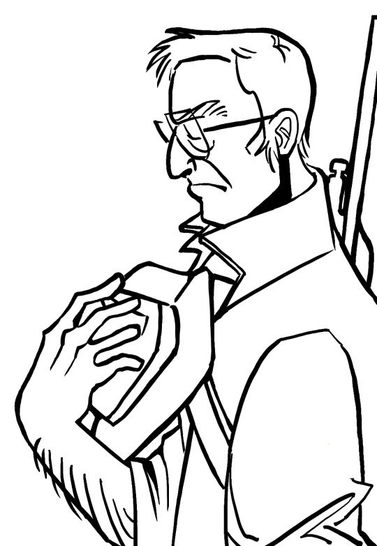
But anyway, the FX! Unfortunately, the effects I used on this particular piece came specifically with Procreate, and as I am not as familiar with other programs, I could not tell you whether they possess the same features or where you could find them.

Halftone will give you that “comic book” look, while Chromatic Aberration produces the rainbow one you asked about; you can adjust each to your liking.
However, I do remember a little trick from when I did not have Procreate that might give you what you’re looking for. I got some lines:
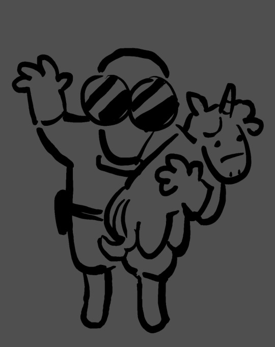
Duplicate this layer a two or three times, then set each of these duplicated layers to Alpha Lock and color them each red, green, and blue, or whatever you’re going for:
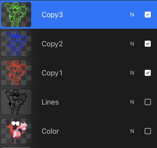
Offset each of the layers in a different direction from the original line work. I put blue off to the left, red to the right, and green a little upwards.

If that looks a little whacky, then play with opacity and layer settings (I used 50% opacity and Color Dodge).

And now we have Pyrovision. It kind of does the trick, and hopefully this is helpful knowledge! But who knows maybe you already found this tip
As for my process I will probably create a separate post, if that appeals to you. Thank you very much for the ask, it makes me really happy to see some interest my stuff. Have a nice day! :-)
11 notes
·
View notes
Note
HELLO could you tell me PRETTY PLEASE how did you make the halftone colored effect on your latest gr63 poster? tysm!
Of course!! I love talking about my graphics!!
I learned how to create the halftone effect from a guide I cannot find right now but my steps are as follows. heads up that I work in photoshop so everything is photoshop specific I fear.
Under the cut since there is a ton of images here o7
For the halftone effect
Import image of my choice and convert it to a smart object. This guide should theoretically work without a smart object with clipping and/or layer masks but smart objects look better + they keep my workspace more organized
In the smart object I create a new layer with a solid fill of #808080, convert it for smart filters (Filter > Convert for Smart Filters) and also set it to Hard Mix in the layer blending modes menu
Open the smart filters menu for the layer (Filter > Filter Gallery) and I create two layers, first Halftone Pattern with the following settings and on top of it Torn Edges with the following settings
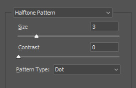
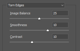
You can fiddle with these obviously but I have never changed these since I started using this for my halftone effect
4. Now your image probably looks like this, really wonky and bright
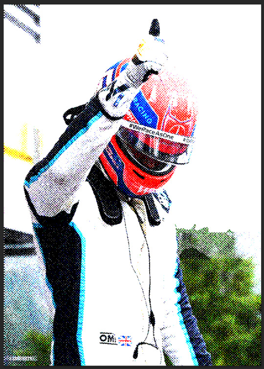
To fix it I create a new adjustment layer, usually Levels but I have used Curves before as well and fiddle with it until I like it. Dont be afraid to use multiple and just mask it! For example here Tadejs jersey is white but the background is black so to keep the texture I masked the jersey and adjusted it separately.
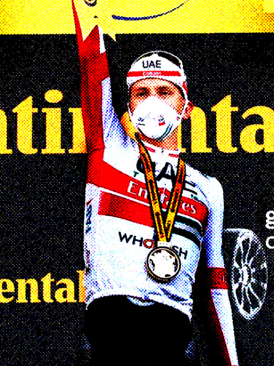
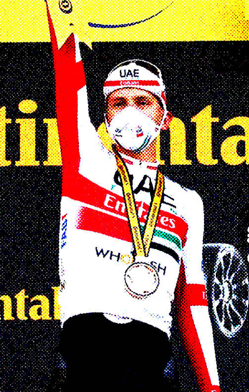
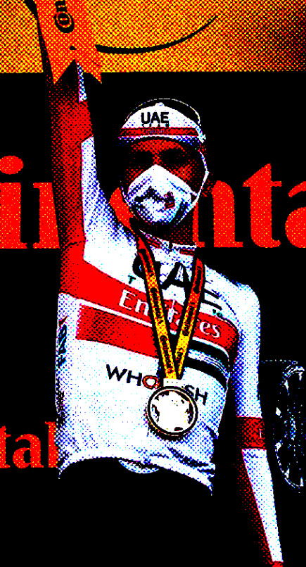
Final effect vs adjustments to keep the background texture vs adjustments to keep the jersey texture. By combining the latter two I achieved what I wanted
If I want my image in grayscale I also add a Black & White adjustment layer in between my initial image and the Levels layer, though for the effect I achieved with the George graphic we dont want that.
Gradient colors
First of all I make all my multicolored graphics using gradient maps. I am not particularly knowledgeable so my apologies but I cannot even try to begin explaining gradient maps.
So for a multi colored effect I create a gradient map once I have an image that I am satisfied with and adjust it until it looks good. Important that the color fully on your right on the gradient map is the color you want to have in the background which in my case is the beige I use everywhere.
After that I save my smart object as I would usually do (Ctrl + S) and exit to the main graphic and ideally, it should look the same in your graphic as the smart object looked.
Unfortunately I cannot help with color choices/color theory for the actual gradient map since I barely understand what is going on myself lmao. Fwiw personally I think Synth (@/jamesvowles) is awesome with colors and how they work together in his paintings so maybe he could be of any help o7
Solid colors
This is for cases like this, where all my colors are solid flat, no matter how many colors
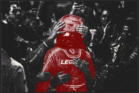
This is where the Black & White adjustment layer mentioned comes into play. For when I do solid colors only, even with multiple like in this graphic, I create a new color layer on top of all my other layers, fill it with the color of choice, and set the blending mode to screen. no idea why screen works, someone smarter with blending modes would probably be able to explain though.
For different colors I just mask out the areas I want the color to appear in.
Final step is to combine all my layers into a folder and under that folder I create a new solid color layer with the background color of my choice, in my case beige, and set the folder blending mode to darken. Once again, I have no idea how it works but it does and that what counts to me haha, someone smarter with blending modes would be able to explain most likely.
On a final note, do experiment!! Oftentimes I like getting to the point of where I would have usually used a gradient map (so no B&W layer) and then see what I can do with blending modes! Thats how I ended up with this image of Primož, its just a yellow color fill layer set to Hue blending mode
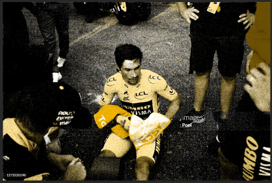
Hopefully everything makes sense, feel free to ask more if you are confused or want to know more about any part of my graphics <3
#ask#anonymous#erika.graphics#thank you for asking about my graphics I love talking about them!! do ask more if you want to i get stupidly excited about this
8 notes
·
View notes
Text
none of my friends will let me talk abt my favourite artists so im making this tumblr post so i can talk abt how cool these artists are before i explode
FIRSTLY HIDARI
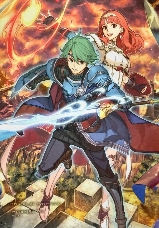

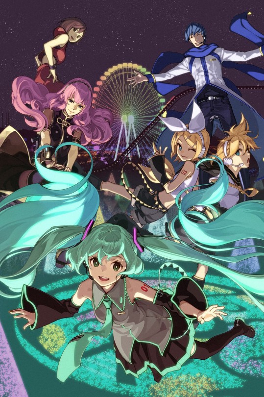
i love hidari's art it manages to be colourful and soft at the same time. look at how he paints hair. beautiful. gorgeous. stunning. it's so flowy and pretty god i wish i could do that. the colours are warm EVEN with characters with colder colour schemes. its so beautiful i love it.
NEXT YUSUKE KOZAKI

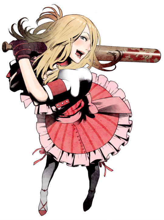

i cant really think of one thing to comment on i adore the lineart and the amount of details. i LOVE the shading especially on his no more heroes art. id have added more nmh rather than just bad girl but like. uhhh. lets just say no more heroes is a game you shouldn't play in front of ur parents. there is a guy who shoots lasers out of his crotch and has machine gun nipples. im not joking. just know the soundtrack fucks and yusuke kozaki's art is really cool.
FINALLY MIKA PIKAZO
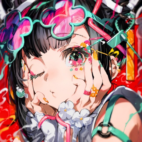

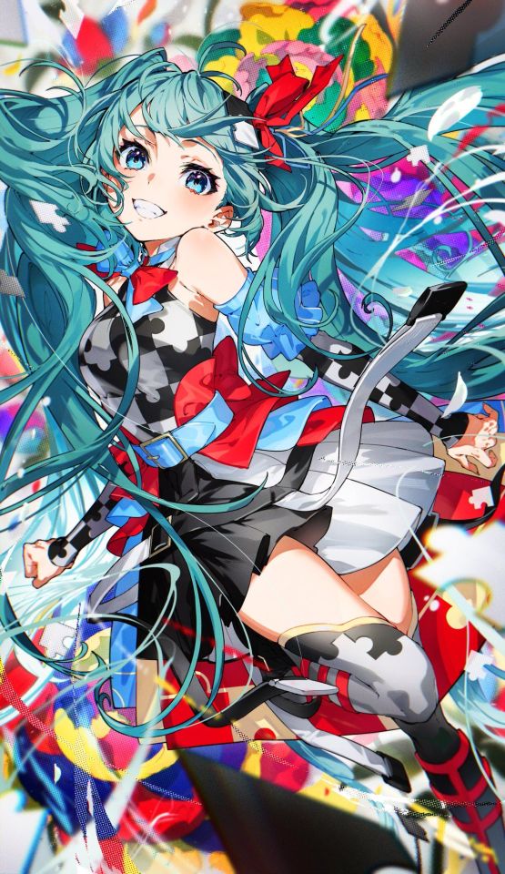
ohhhh my god OHHHHH MY GOD HER ART. i fucking adore it. i love how chaotic and messy and bold and colourful and BEAUTIFUL it all is. her use of colour is STUNNING. i especially love how she draws eyes. i love her use of halftones it really makes things pop. her compositions are brilliant. i have never been so envious. i really wanna start using bolder colours in my own art and it is all thanks to her. her art is just so striking. i am insane over her art i want to eat it. god. GOD. god. tell me this isn't the coolest shit ever. u cant. youd be lying. god BLESS.
anyways thank u for coming to my ted talk i am so normal
#i dont even have tags no thoughts head empty only mika pikazo#yes all these artists have worked on fire emblem games and thank god they did#there's a lot of other artists i love obvsies but i just wanted to get my top 3 out of my system#no more heroes is the wildest fucking game in existence btw its like what u would come up with if u took every drug at once#hack and slash games are just kinda like that tho. look at bayonetta and devil may cry.#okay im done byeeeeee
10 notes
·
View notes
Text
my favourite brushes in clip studio (plus a little bit of insight in how i do lineart and colours i guess????)
yay finally lol
here are some of my favourite brushes i use! if you have clip studio these are all free to download in clip studio assets!
and if you have any questions at all i would love to answer them!
will put all of it under the cut since it'll be kind of a long post
i use clip studio paint, the tablet i use is ~3 year old a wacom intuos pro medium, and i prefer using the felt pen nibs! ^^
sketching:
soipen by SORASORA (content ID: 1778407)
Gin puck-puck pen (진퍽퍽펜) by pogomgom (content ID: 1736852)
lineart:
Muda Muda Muda by lapinbeau (content ID 1715496) (this one i also sometimes use for sketching and colouring, it's really an all purpose brush to me, i love it! fun name too lol hehehe)
Kome Pen (komeペン) by _koi (content ID 1906801)
i also quite often use the regular round tip G-pen that comes with clip studio. when i use this one i play around a lot with line weight and varying pressure in my lines to make the lineart look more appealing and... organic i guess? i don't have any fancy settings on the brush itself i only use differing pressure on my hand for this lol. here's the pressure profile on my tablet sngdjkfghs idk if anyone is interested in this but!!!! here you go its nothing special

and then my current absolute favourite brush for lineart is this one called Brush Pen which i also think came with clip studio but i honestly have no idea. it's not in my assets downloads so either it came with the program or it's an older brush i transferred from photoshop, i have no clue! but i love it and i use this one for my lineart and flat shading in pretty much all my drawings rn.
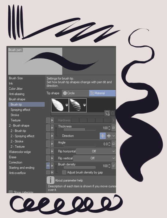

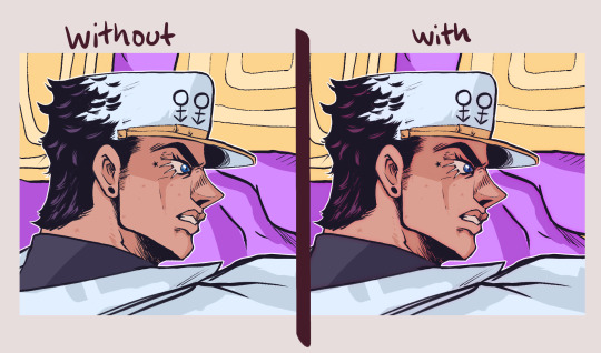
as you can probably tell i like my lineart a bit crunchy and textured. i never use plain black for my lineart, i either use a dark blue/purple or a rich pinkish red or brown. it makes the lines look less flat and muddy together with the colours. i also duplicate my lineart layer, and the duplicated layer i put underneath with a gaussain blur filter on. this one i usually shift the colour to a little more red/pink and also put the blending mode on overlay to sort of blend together nicely with the colours! :) see below what i mean, it looks way fuller and nicer with double lineart i think! but this is just personal preference (i used Brush Pen for lines here btw!)
anyway, more brushes:
Halftones, textures, effects etc:
Grunge Dot by Marredae (content ID 1777009)
Tone Brushes by seinotaph (content ID 1835931)
Glitch Brushes 2 by tsiox (content ID 1719160)
these are my current favourites! ^^ i don't like using too many brushes at once and i also always keep a balanced limited palette while colouring. here are the ones i'm using rn but i'm currently working on making it just one palette with all the colours i might need. it might take a while because i always forget to add colours i'm using and i want them all to fit nicely together

my colouring is done by using the lasso fill tool to get even flats i can easily select and shift the hues and colour balance of later if i need to. i use the Brush Pen for simple shading, after that i just go crazy with different blending mode layers (multiply and glow dodge my beloveds)
that's pretty much it i think, feel free to ask me a billion questions i love answering them!
#clip studio#clip studio paint#digital drawing#digital art#clip studio assets#brushes#csp brushes#csp#digital artist#digital illustration#corps art
19 notes
·
View notes
Text
—ateez college au series [cs]
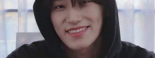
i imagine san to be a photography major
he has a very creative eye and looks at the world through a different kind of lens than everyone else
he’s been interested in photography ever since he middle school when he went to a photography exhibit on a field trip
san is a very expressive person and he wanted to somehow transfer his emotions into something tangible
and what better way to do that than through photography?
san has two cameras: film and digital
in high school, he didn’t have enough money to buy a professional camera so he just stuck to his phone camera
but when he got a job and collected enough money, he went and bought his first camera, the film one
you best bet san treasured it more than anything
he tried his best not to use it as much because there’s only a limited number of film and buying more was e x p e n s i v e
but when san graduated high school his parents gifted him with a digital camera too
wherever san goes, he’s always taking pictures, whether it’s on his phone or cameras
he usually uses his film camera for more personal things, like pictures of his family, friends, or places that are important to him, and he either hangs them up in his apartment or turn them in for assignments
and he uses his digital camera for editing purposes, like double exposure or halftones
his roommate, wooyoung, serves as his personal model from time to time
“hey wooyoung stand by that tree for a sec, i wanna get a picture” “omg wooyoung wait sit still, the lighting is so good here” “WOOYOUNG GET YOUR ASS OUTSIDE IT’S GOLDEN HOUR”
wooyoung is annoyed bc of this sometimes, but as soon as he takes one look at his roommate eagerly bouncing on the tips of his toes, camera clutched in his hands, he can’t bring himself to be upset about it
also the one time san submitted a photo of wooyoung for an assignment he received a perfect score on it so—
one time wooyoung asked san if he ever modeled for his own photos, and san said he’d much rather be behind the camera than in front of it
except for the photos his parents made him take when he was a kid, san never really liked having his picture taken
he always felt more comfortable taking someone else’s
oh and also because san doesn’t let a n y o n e touch his cameras, not even wooyoung
there was a time where wooyoung offered to take san’s photo for him and he practically leaped away when wooyoung reached for his camera
everyone in the fine arts building knows who san is because he’s always running around taking pictures
their campus always has a bunch of stray cats wandering around, and if photography wasn’t san’s weakness, then it was cats
“omg wooyoung look there’s a cat i need to take a picture of it—” “san you’ve already taken twenty pictures of the same cat, let’s go before we’re late to class”
san is also such a friendly and gentle soul, so it wasn’t hard for him to charm all of his professors
one professor in particular became really fond of san because he reminds him of himself when he was younger
he became sort of a father figure to san and even offered to give san tips on how to take better photos
he also gave san permission to go into the darkroom after class hours or on the weekends should he need them
you can imagine how much san took advantage of that (in a good way ofc)
if san wasn’t running around taking pictures, then he was probably in the darkroom developing them
for a few months, san was pretty much the only person who used the darkroom after hours, so he never really bothered knocking on the door before entering
but the one time he didn’t, he almost ran into someone on the way in
at the sight of someone else in the darkroom, san let out the loudest shriek, jumping backwards and hitting the door
you flinched at san’s shriek and stumbled backwards, catching yourself by grabbing onto the edge of a table
for a minute, the two of you just stared at each other, still in shock
san snapped out of it first
“oh my gosh, i am so sorry. i didn’t mean to scare you. i thought no one else was in here, ahh so sorry i should’ve knocked”
your heart rate finally went down to normal, and you straightened yourself up, giving the sheepish boy in front of you a gentle smile
“no it’s okay, don’t worry about it.”
san practically sighed in relief when he saw that you weren’t mad at him “well, now that we’ve officially scared the crap out of each other—” he stuck his hand out, flashing you a dimpled smile “i’m san, it’s nice to meet you”
your lips quirked up and you took his hand in yours, shaking it firmly “i’m y/n, it’s nice to meet you too”
and that was how san, a photography major, met you, also a photography major
apparently the two of you had managed to charm the same professor, and he gave the both of you access to the darkroom
you found out that san lived in the same apartment building as you, you being on the 3rd floor and him on the 2nd
the two you became fast friends due to your shared love photography
during visitation hours, you’ll either be in his apartment or he’ll be in yours
wooyoung, who isn’t a photography major, sometimes looks at the two you with the most confused expression because you guys will start firing off, using terminology that he doesn’t understand
sometimes if it gets too much, he’ll call yeosang and beg him to get him out of there
one time when you came over, you noticed the wall above san’s desk was practically covered in pictures
most of it was of people whom you assumed were san’s family, but you noticed wooyoung in a few of them, and then there were 6 other boys pictured too whom you weren’t quite familiar with
“hey san, are these friends of yours?” you asked
san looked up to where you were pointing, and his expression immediately softened
“yeah, that’s the gang. i use that wall to hang pictures of the people who are important to me”
your eyes widened, you weren’t expecting san to share that personal piece of info with you, but it made your heart warm nonetheless
“you’re such a sap san,” you teased, poking him in the arm
he rolled his eyes at you playfully, shoving your shoulder gently “shut up and get back to editing your photos”
for the next few months, your friendship with san grew tenfold
the two of you would often meet up after class just to hang out or grab some food
you both began to value the other’s opinion and would sometimes email or show each other photos you each took, asking what the other thought of it
you thought that having another person aside from a professor view your work, especially someone as passionate as san, made you improve
san always gave you his honest opinion, even if it wasn’t what you wanted to hear, but you were grateful nonetheless
one day, san was given a project by one his professors to photograph the same person or object for a whole month
and usually san would go and ask wooyoung, but he decided to change it up this time
so one day when the two of you were having lunch, san turned to look at you, his face set in a serious expression
“y/n, i have a very, very important question to ask you”
you raised your eyebrow at him, not used to seeing san’s face so serious
“what is it?” you asked, sitting up straight
“so i have a major assignment for class where i need to take pictures of the same person or object for an entire month, and i was wondering...if you wouldn’t mind being that person?”
your eyes widened, and san took this as a bad sign because his face immediately went from being serious to panicked “of course i’m not going to force you if you don’t want to!”
san looked up at you, patiently waiting for your response
it’s not that you didn’t want to, it’s just... “why me?” you asked
one corner of san’s lips quirked upwards, making his dimple appear
“why not?” he replied
“i’ve just...i’ve never really modeled for someone else’s pictures before,” you said sheepishly
san waved a hand at you “you don’t have to worry about that. trust me, i’ll make you look absolutely breathtaking” he flashed you a playful wink, and you rolled your eyes
“okay fine, i’ll do it”
and for the next two weeks, san has been snapping pictures of you left and right
most of the pictures he took were candid pictures, which you didn’t mind...until he took a picture of you eating your sandwich mid-bite
“san delete that right now!”
“nah y/n, i’m putting this in the blackmail folder”
“CHOI SAN”
tbh you thought being san’s model would feel awkward, but he actually made you feel super comfortable
he would always tell you that you were doing great, giving you a thumbs up after every picture that was taken
you enjoyed having san be your hype man, he made you feel really confident in yourself
during one of your sessions, san wanted to get a few posed pictures instead of candid, so he took you to one of the open fields on campus
it was the middle of autumn so the trees were a beautiful shade of bright oranges, maroons, and vivid yellows
san told you to stand underneath one of the trees
“okay so for this one, i want you to look away from the camera, and i’ll snap a couple photos, yeah?”
you nodded your head and proceeded to pose against the tree, eyes focusing on anything except the camera
meanwhile, san was moving back and forth and side to side, trying to capture multiple angles, some close up and some farther away
“alright y/n, for these next ones i want you to stare directly in the camera. you can choose whether to smile or not, okay?”
san readied himself, placing the viewfinder over his right eye
through it he could see you, still posing nearby the tree
however, san’s many years of experience with photography wasn’t enough to prepare him for what was to happen next
because as soon as your eyes made contact with the camera, there was a soft gust of wind, soft enough to carry a few fallen leaves and have them float around you
caught off guard by the sudden flurry of leaves, a quiet gasp left your lips, and then your eyes scrunched together as you let out the softest giggle
and then click
san’s finger froze on the shutter button, his mouth gaping slightly
he slowly lowered the camera from his face, eyes glazed over and mouth still open
you hadn’t noticed him take the picture, too focused on playing with the leaves flying around you
san tore his eyes away from you for just a moment, glancing down at his camera to check the picture he just took
what he saw made him choke on his breath
because there you were
he captured the picture at the exact moment you had burst into a bout of giggles, the multi-colored leaves were blurred near the edges, framing your face perfectly
the sun hit the surface of your skin perfectly, highlighting your features
your eyes were scrunched shut and your lips were quirked up, displaying the most perfect smile
for the first time in his, choi san was rendered...speechless
he had never seen something so...so...beautiful
“san?” your voice knocked him out of his stupor, and he whipped his head up to look at you, only to be rendered speechless again
you were staring at him with the softest of gazes, a gentle, serene smile on your lips
“how’d the picture look?” you asked curiously
san didn’t say anything, but his mind was racing with a billion thoughts
his lack of a response made you nervous, and you frowned “did...did it not turn out well? was it because i wasn’t looking? i’m sorry i can take it again if—”
“no!” san interrupted, standing up quickly
“no y/n, it was...it was perfect,” he breathed out
the look on his face and the tone of his voice were enough to make your cheeks flush a deep, deep red
you’ve never seen or heard san sound like that
it almost seemed like he was...he was...
“o-oh, do you mind if i see it then?” you asked, taking a small step towards him
san had allowed you to see the pictures, and you were amazed at how well they turned out
you turned to san and gave him a playful smile “wow, you were right. you did make me look ‘absolutely breathtaking’”
you were expecting san to scoff or say smth along the lines of “i told you so”
but he didn’t
instead he looked at you with the most sincere expression on his face, and he said “no, you did that on your own”
the sky was beginning to darken, so the two of you decided to head back to your apartments, bidding each other goodbye at the elevator
as soon as san reached his apartment, he practically shoved the door open and ran inside, scaring the shit out of poor wooyoung who was watching a movie in the living room
san didn’t even bother sending his roommate a greeting, opting to flee to his own room instead and slamming the door shut
he immediately whipped out his camera, took out the memory card, and inserted it into his laptop
the pictures he took of you earlier popped up on the screen, and san’s eyes immediately scanned for the one he wanted
once he found it, he enlarged the photo and, for the third time that day, choi san was rendered speechless
his chest began to hurt, and he reached up, clutching at the fabric of his sweater right above his heart
now...san had always had an inkling in his mind that he may have the tiniest crush on you
but he always waved it off, claiming that he just really liked you as a friend
but after what happened today, he can finally confirm it
choi san liked you
and they weren’t the trivial kind, the ones that lasted for only a moment and left soon after
no, these feelings burned with longing
but unlike most people, those who chose to deny their feelings and keep it to themselves, san was the complete opposite
he wasn’t the type to shy away from something, or in this case someone, who made him feel such strong emotions
he was going to do something about it...and he knew exactly how to do it
for the remaining weeks left in the month, san still took pictures of you for the assignment
but it was different this time
instead of his usual loud exclamations he used to hype you up, it was replaced with the fond smiles and eyes practically dripping with adoration
you didn’t know how to feel about this new development, but that didn’t mean you didn’t like it
it was nearing the end of the month, which meant that san’s project was reaching its end too
the two of you were having lunch together, just chatting about random things, when san suddenly pulled out a slip of paper from his pocket, handing it to you
“what’s this?” you asked, taking the slip of paper and reading it
“it’s an invitation. my class is putting on an exhibit to showcase the photos we’ve taken the past month, but it’s a private event so only people who were given invitations are allowed in.” san leaned forward, gazing at you with a soft twinkle in his eye
“will you go?” he asked
you nodded, smiling “of course, i’ve been waiting to see how the pictures turned out!”
san laughed at your enthusiasm, but he could feel the pounding of his heart going a mile a minute
a few days later was when the exhibition took place, and you arrived at the gallery, decked out in the fanciest clothes you could find
after the guard checked over your invitation, you walked inside and was surprised at the sheer number of people who were present
you looked around, searching for the familiar dimpled smile you’ve grown very fond of
“well, well, well look who finally showed up”
your face broke out into a smile when you saw wooyoung walk up to, dressed in a fitted button up with black slacks
“damn woo, first time seeing you in something other than a hoodie and sweats,” you teased,
wooyoung rolled his eyes in response, but he held out his hand for you
“come on, sannie is waiting for you”
you happily placed your hand in his, eager to see san’s display, and wooyoung couldn’t help but chuckle at your enthusiasm
he led you around the exhibit, carefully maneuvering around the large clumps of people until he finally stopped at a door
wooyoung opened it and gently tugged on your arm, moving your body in front of his
you looked over your shoulder at him, confusion written all over your face “wooyoung what are you—”
but before you could finish your sentence, wooyoung shoved you the rest of the way in the room, flashing you a wink before closing the door, leaving you standing in the darkness
“wha—jung wooyoung!” you reached for the doorknob, about to yank the door open
when the lights in the room suddenly switched on
you gasped, stepping back from the door and whipping your body around
what you saw made you freeze
because displayed on the walls of the room were blown up pictures of you
some were candid, and some were posed
it took you a second, but then you realized: these were the pictures san took of your for his project
you carefully walked towards one of the pictures posted on the wall
you remembered when it was taken; it was when you and san went to a cat cafe near the school
you were sitting at one of the tables, playing with a cat that decided to jump up on your lap
san thought it would be the perfect opportunity to snap a picture of that moment, and so he did
as you walked around, the memories of the past month with san started coming back to you
once you reached the middle of the room, you noticed a picture that was significantly larger than the rest
you let out a soft gasp
it was the picture san took of you in front of the tree a few weeks ago
you could hardly believe that the person in the photo was you
“which one’s your favorite?”
jumping at the sound of an oh so familiar voice, you peered over your shoulder only to see san leaning against one of the walls
he was decked out in an outfit similar to wooyoung’s, with his hair slicked back
needless to say...he looked amazing
you breathed out a laugh, fully turning around to look at him “it’s hard to choose. i just look amazing in every single one”
san’s smirk softened into a smile, and he pushed himself off the wall, making his way towards you
“which one’s your favorite sannie?” you asked
san bit his lip, cocking his head to the side
“hmm...i’d have to say all of them”
you giggled “is that so? why do you say that?”
san glanced over at you, and you almost choked on your breath at the look on his face
it was the same look he always gave you from behind the camera: pure, pure, pure adoration
you’d be lying if you said your heart wasn’t racing a mile a minute
san reached over, taking your hand in his and locking your fingers together
your eyes widened
san took a small step towards you, internally sighing with relief when you didn’t back away
you just stood there, waiting to see what he was about to do next
“they’re all my favorite because....” another step closer “...because you’re in them”
and that was the exact moment your heart stopped
san chuckled softly at your frozen state, and he brought your joined hands up to his lips, pressing a soft kiss on the top of yours
you swore your legs were about to give up
“people are about to come in any second now to see my display, but if you’re willing to wait for me until after, then i have something really important to tell you,” san said
you were at a loss for words, your mind stuck trying to process everything that just happened in a span of two minutes
just as san let go of your hand, the door to the room opened and wooyoung’s head popped in
“hey san, are you ready? people are waiting”
flashing you one more smile, san swiftly turned on his heel and nodded, gesturing for wooyoung to let people in
as soon as the crowd started filtering into the room, you were broken out of your frozen state by wooyoung gently pulling you to the other side of the room
and for the rest of the night, you stood in the back corner with wooyoung, quietly watching san walk around and the room and chatting with the people as they observed his work
you admit you were kind of embarrassed at the amount of people who were just staring at your pictures posted on the wall
wooyoung would notice and he’d tease you about it
after a while, the exhibition finally came to an end
wooyoung had left a few minutes earlier, which left only you and san in the room
as san made his way over to you, you averted your eyes to the ground, suddenly feeling awkward
but then you saw san extend his hand out towards you
“let’s talk outside,” he said softly, quietly encouraging you when you were hesitant to take his hand
once the two of you were outside, san led you to a nearby bench
despite his confidence from earlier, you could tell san was nervous now, from the way he was biting his lip and fiddling with your hand, which he was still holding
you waited patiently for him to speak, choosing to ignore the way your heart was about to explode inside your chest
after a few moments, san took a deep breath and looked directly into your eyes
“y/n...you know how much our friendship means to me right? when you and i first became friends, i was so happy to have finally met someone who shares the same love and passion for photography as i do. i truly enjoyed every moment we hung out together, and i especially enjoyed having you as my model for my project...”
he squeezed your hand, and you squeezed his back, urging him to continue
“and during the entire month where we spent every single day together, it made me realize that...i wanted us to be something more than...more than just friends. so what i’m trying to say is, i really really like you y/n, and i was wondering if we could give ‘us’ a try?”
it was completely silent for a few moments, but as san gazed at you with the most hopeful look on his face, and you couldn’t help but let out a breathless laugh
you honestly didn’t know what you were feeling, all you knew was that it was warm and comforting and that the only person who could make you feel that way was...san
“choi san, you are just as expressive with your words as you are with your photos,” you laughed, and you swore you’ve never seen him smile so big
“s-so does that mean...?” he trailed off
you smiled back at him, squeezing his hand once more “yes san, i am willing to give us a try”
now let’s just say, being in a relationship with choi san was so...refreshing
in the beginning of, you were kind of worried that things were going to change between the two of you
but when you saw san the next day, he greeted you with his usual sunshiney smile and that’s when you knew things were only going to get better from that point on
san is normally very touchy, but now that the two of you were dating, he became extra touchy
whenever the two of you are together, he’ll always have an arm around your shoulder or waist, or he’ll be holding your hand
he just feels more at ease if he’s holding onto some part of you
but of course he’d stop if you told him you were uncomfortable
also san would take a picture of you every chance he could get
the camera roll in his phone would just be pictures of you
he even made his own folder with just your pictures but would he ever tell you??? psshh no
one time wooyoung caught a glimpse of it and he snatched the phone out of san’s hand so quick, yelling that he was going to show you
when you came by their apartment that day, you walked in on the two of them in the middle of a wrestling match
wooyoung managed to toss the phone to you, and you caught it, checking to see what the two of them were fighting about
once you saw what it was, you blushed so hard and san groaned in defeat, rolling off of wooyoung and onto the floor
as you scrolled through the folder, you started to pout
“saaaan some of these are so ugly why do you still have them?”
your boyfriend whipped his head up so fast, and he had the most offended look on his face
“excuse me?? are you doubting my photography skills?”
you shoved the phone in his face “san this is literally a blurry picture of me mid-sneeze how could this possibly look good?”
but what he doesnt know is that you also have your own folder on your phone with just pictures of him in it
omg when the professor found out that the two of you were dating, the hugest grin broke out on his face and he was just oh so happy his two favorite students were together
when you and san are in the darkroom together, he’ll sometimes walk up behind you and just wrap his arms around you while you were developing your pictures
you’d always complain, claiming that he was distracting you, but tbh you secretly enjoyed it
you and san haven’t had your first kiss with each other yet, and that was because you were both too hesitant to be the one to make the move first
until one night
san had invited you to his apartment for a movie marathon since wooyoung was spending the night at yeosang’s
whilst san was getting the tv set up, you were sitting on the chair at his desk, mindlessly just looking around
you’ve been in san’s room countless times at this point, and pretty much everything looked the same since the last time you’ve been in there
but when you looked up at the wall above his desk, the same wall where san hung up a bunch of pictures of his friends and family, you noticed that there was an extra picture right in the center
your heart skipped a beat when you realized that it was the same picture san took months ago, the one where you were standing underneath the tree
you remembered what san had told you the first time you asked about the wall: “i use that wall to hang pictures of the people who are important to me”
san was too busy fidgeting with the tv to notice the look of pure joy on your face
“okay everything’s set up,” he turned towards you “y/n what movie do you wanna—mmph!”
san’s question was cut off by you throwing yourself into his arms and slamming your lips into yours
he staggered backwards, caught off guard
san was frozen for a few seconds, but then he relaxed and began to kiss you back
it was your first kiss with him and vice versa, and you could practically feel your heart getting ready to burst
when the two of you pulled away, san leaned his forehead against yours, a smirk tugging at the corner of his lips
“not that i’m complaining, but what was that for?”
you smiled at him “i’m just happy that i’m worthy enough to be put on your wall”
san’s face dawned with realization and he let out a breathy chuckle, tugging you closer to him and wrapping you up in a hug
“you were always worthy enough, it just took me stupidly long to realize it”
oh yeah san loves that picture of you so much that he made it his lockscreen and wooyoung wouldn’t stop teasing him about it for weeks
ofc you made him your lockscreen too
now don’t get me wrong, san is the absolute best hype man you could ever ask for
but sometimes a hype man needs their own hype man
so on days where san isn’t feeling like his usual cheerful self, you step up
now you’re the one feeding him compliments and giving him the warmest hugs
and when that doesn’t work, one of san’s weaknesses is kisses so you’ll cup his face in your hands and just plant the tiniest kisses on his cheeks, nose, chin, forehead, and eyes
it usually gets him in a giddy mood and he’ll eventually start giggling halfway through
when you see him crack that first smile, you get all excited and he just stares at you with the fondest expression on his face
san also likes it when you play with his hair, so he’ll lay his head on your lap and that’s when you know to just weave your fingers through his dark strands, occasionally massaging his scalp
you laugh because san reminds you of a cat whenever he lays on you
speaking of cats, the two of you practically adopted all of the cats that wander around campus
the two of you are honestly just so domestic and soft, everyone at your university practically melts when they see the two of you walking around holding hands
overall just a wholesome wholesome relationship
#ateez#ateez scenarios#ateez headcanons#ateez au#ateez imagines#san#san scenarios#san headcanons#san au#san imagines#san fluff#college au series
338 notes
·
View notes
Text
My approach to flat colors + limited palette drawings
This is a follow up to this post i made about how i go about figuring out a color palette for my limited palette drawings. an anon asked me about my actual technique of finishing them so this is gonna be an explanation of how I work in a limited palette with flat colors. I ended up with these thumbnails for a sketch last time so we’re gonna work from here and I’m gonna sort of walk through how i got to the finished version

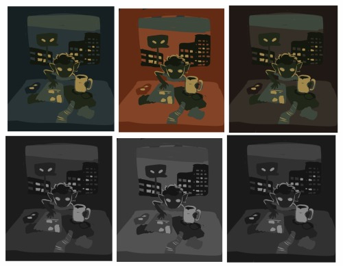
first things first: every part of this process is just developed as a result of me messing around. take my advice with a grain of salt and if you think you know a way to do something better/that makes you more comfortable. go with that over what I say.
I’m honestly a little surprised when people express confusion about how i draw like this because it’s SUPER simple - literally all you’re doing is just stacking solid color blocks of shape. its very imprecise despite how sharp everything ends up looking.
First things first is that you want to decide how you will be handling your edges throughout the duration. Do you want your shapes to be ultra-sharp and precise, or do you want a little bit of a wobblier, grainier edge? Both can look good but it’s VERY much a matter of situational basis. i’ve been favoring looser and grainier shapes so that’s how i’m going to be working on this.
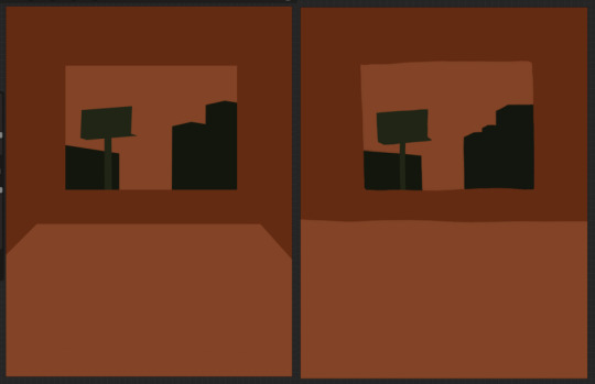
on the left here, you can see the shapes made with precise rectangular selections and an untextured pen, on the right, freehand drawn shapes and a grittier pen. There’s something immediately pretty different feeling about them. So play around with that first - its not something that’s fun to change halfway through! But lets step back a minute. It helps to work large to small. The two biggest shapes here are these orange chunks and everything gets stacked on top of them so i’m gonna do that first.
Now, a key feature of what i do: clipping masks. almost all digital art programs have them. What a clipping mask does is it constrains the pixels of a layer to the transparency of the layer below it. Here I have the light orange layer, and then on top of it the buildings and billboard are clipped to the orange. Most of you probably already know this and I’m overexplaining a bit, but there was a time when i didnt know how clipping layers worked and someone had to explain it to me.

now you’ll notice the shapes of the buildings are rough, and sloppy. here’s the fun part: since this is all about stacking shapes, only your exterior edges matter. this all gets filled in. be as sloppy as you want when you’re making your shapes. in fact, the outside edges get trimmed out a bunch to when i do this - i go in and erase them clean. Don’t be too finnicky about drawing perfect and precise! its a waste of time. As long as the silhouette is what you want, the interior can be a nightmare.
Working this way, it’s important to keep your layers stacked in a way you can make sense of. Right now there are four layers here: the background dark orange, the two main orange rectangle shapes, and then the buildings on one layer and a billboard on the other. I rack up a LOT of layers doing this and it makes it annoying in some aspects, but being able to freely recolor any one chunk without losing my detail is a key aspect of this.
So, I block those out
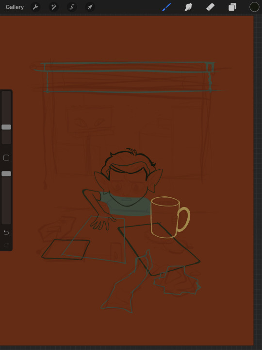
Next, I do the same for the smaller chunks that are still main shapes. There are once again, a lot of layers here. The top layer is the hair - you can see the head showing through it. The head and arm underneath the hair, same layer. Then the cup. Then the light green pieces of paper. Then the dark green ones.
The cup is technically farther forward than the head and arm so you would think it’d go on top, but the point isnt to recreate the foreground and background hierarchy with layers so much as it is to group things in a way i can work with. The cup goes underneath so it can be grouped with all the other objects on the table.
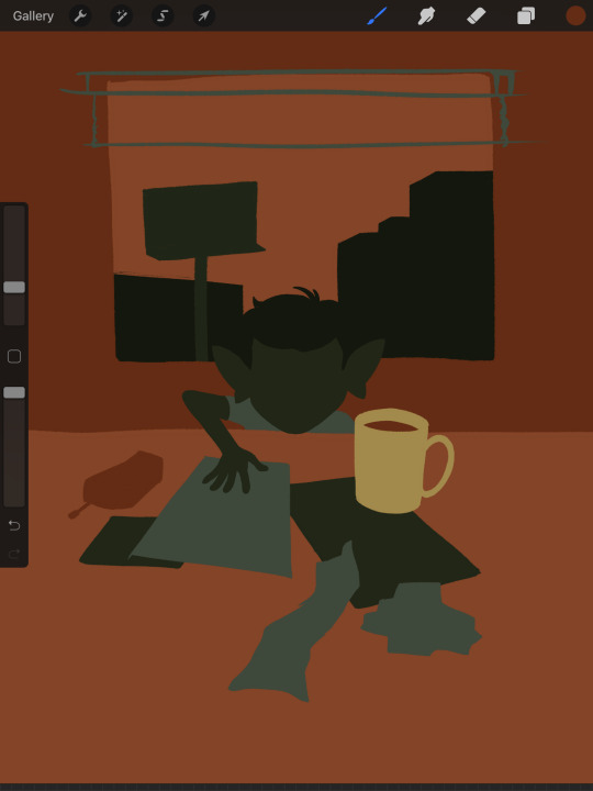
now, i just go and fill in all the shapes. i forgot to do the blinds but i get them later. you might notice a lot of these shapes are pretty rough, which was harder to notice before they were filled in. Now that I can see better, I go in with an eraser and clean up the edges until they’re the shape I want

sometimes erasing leaves little bits of ‘noise’ around objects like on this napkin here. i like to keep a little bit of this noise for texture, but if you dont like it make sure to get rid of it! if you’re working very crisp this will stand out a LOT
Next up is to add some detail onto the objects
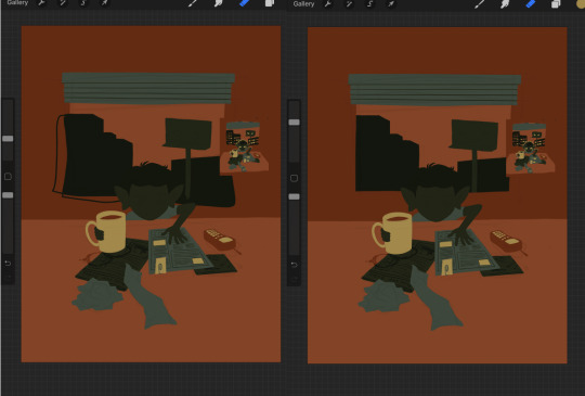
I flipped the canvas here because the head shape was wrong - the ears were uneven and i wanted to fix it. I want to go about adding detail onto the billboard and buildings. i do all detail with clipping masks - but the objects are clipped to another layer and so nothing can be clipped to them. instead, i unclip them and just erase by selection for the same effect
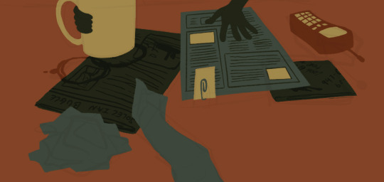
all of the text on the papers is clipped to the papers below it. the buttons are clipped to the phone. the yellow photos and card are actually another independent layer on top, in case i want to recolor them separately. im indecisive and end up recoloring things a lot. For the most part these objects are starting to become recognizable as more than just shapes
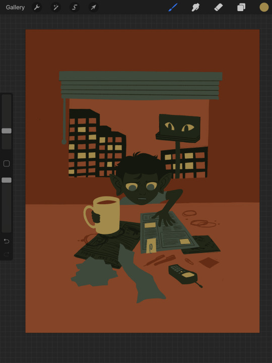
i go in an add the details on the background and character now. theres some more stuff on the table. the lines of the face and ears are on one layer, and the flats of the eyes below that. Here’s what each group of layers is, and what they look like on their own

The background/bottom chunk. Just the table, window, and shirt.
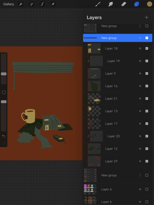
The middle bit. All the stuff on the table and the blinds.

Finally, the top, which is just his head and arm.
now this stage is the bare bones of the drawing. you can more or less tell everything that’s happening. it reads. but its very much lacking in something - it doesnt have a ton of depth or interest. and adding that additional detailing, the dept and interest, is where stuff starts getting REALLY tricky and subjective.
im gonna take you to a much simpler scenario to show the sort of options i go through at this stage
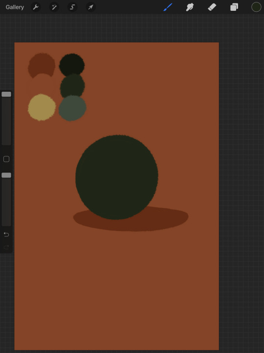
ahh its our dear friend, sphere casting shadow. this is, more or less, the kind of image we have. you can tell whats happening but it’s lackluster. there are TONSSS of ways frm here that you can go add interior detail to a shape once it has been established. here are some quick and SUPER rough examples
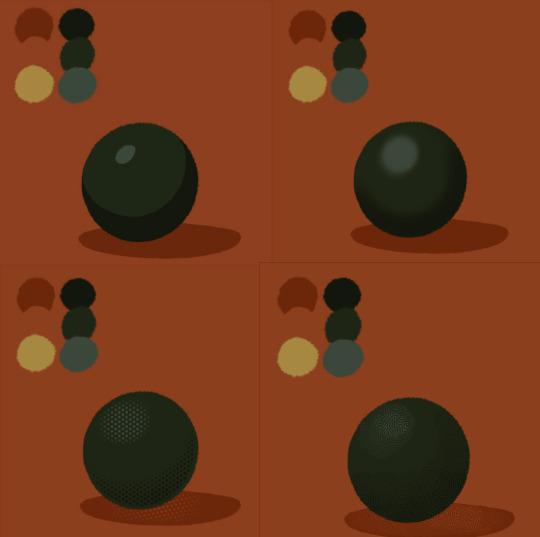
from top left to bottom right: flat cel shading, softer airbrushed/gradient shading, halftone, and a textured brush. Each of these has their strengths and weaknesses. They can also be combined.

for example, here’s the solid cel shading being used to contain a gradient/airbrushed detail. This image - probably the single oldest piece of my art i still willingly show people - is entirely colored with gradients being contained in cel-shaded chunks. It has a sort of soft, luminous quality but without losing its crispness.
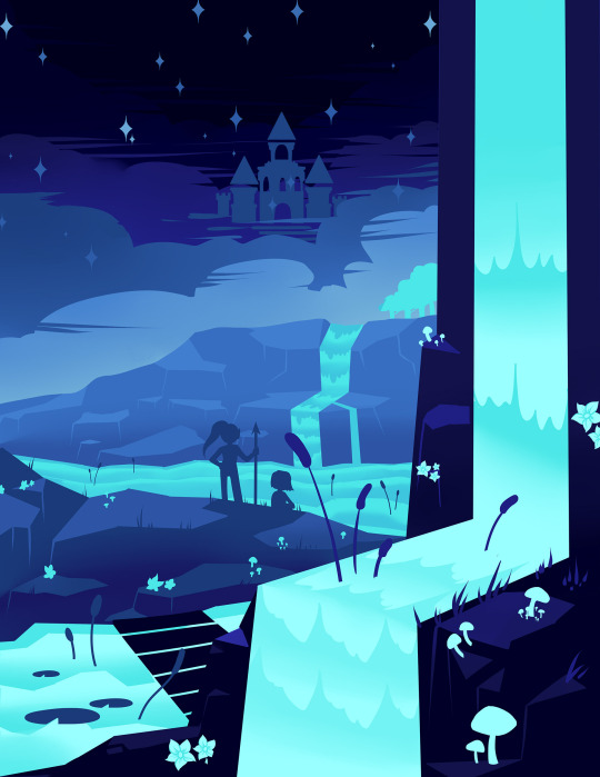
here’s a super quick bust with some variations of stuff going on. obviously this is no masterpiece but you see how different types of detailing can interact with each other and be used to distinguish materials too.

With the mob psycho comic I did, the detailing that wasnt line was done using a variety of halftones of different shapes layered on top of each other


by contrast parts of my ace attorney comic use a textured brush and have a sort of blended, papery feel
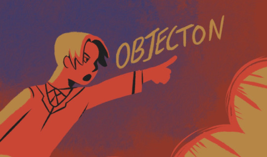
any of them can work for pretty much anything as long as you are using it with intent. practice around. mix styles of finishing together. find a comfort zone. the more you do it the more intuitive it becomes and at the heart of it this process is a very intuitive way of drawing because of how far removed it is from realism.
Now here is the trick - light and shadow.
Everything up to this point has been very flat and adding detail helps but there’s only so much that can accomplish. To get HEAVY light and shadow you need to think about things differently. I think if there’s any part of this process that’s complicated, its this one.
To truly get the most out of your palette, you need to pick chunks of an image to be in higher/lower light and then either ‘step up’ or ‘step down’ the colors in that chunk. here’s what I mean.
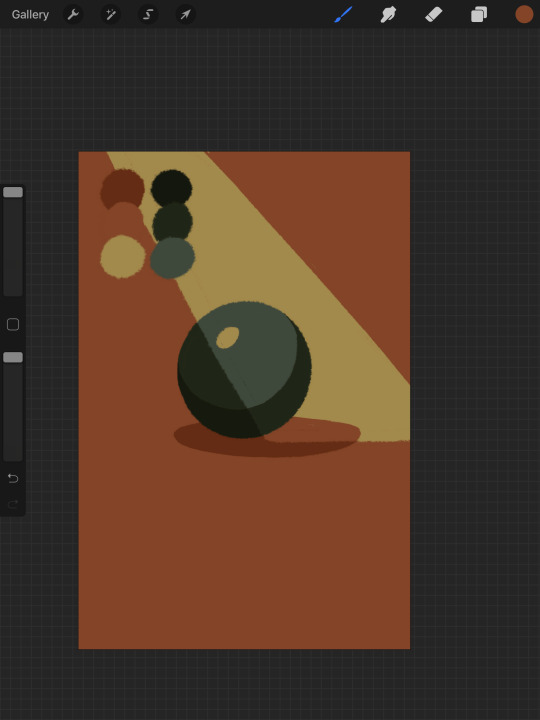
Here’s our ball with a beam of light on it. Everything Within the beam of light is one step in our limited palette lighter than anything outside of it. Here’s how I go about doing this: the shape of the beam of light is below everything else. Then, once I have the shape blocked out, i select it. With that selection in place, i go to EVERY SINGLE LAYER that’s effected, lock the opacity, and recolor that chunk. So what’s going on here is that there is only one more layer - the beam of light, below everything but the background, and the rest of this effect is just caused by every layer above it now being two-toned following the exact same silhouette. THIS is why it’s so important to keep your layers separate - if the shadow and highlight had been painted onto the base directly, i would not be able to do this without significant effort.
This works with all of the finishing techniques I talked about above
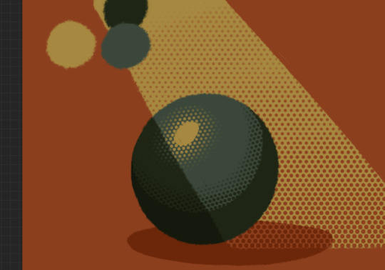
A combination of cel shading and half toning, all stepped up to give the appearance of heavier light on one area.This is also how I go about rendering transparency in this style. All of my layers are fully opaque and I allow the colors to do the work of conveying transparent material

Here’s our ball with the patterned/textured brush shading, being viewed partially through a window
it’s obviously not a very representational way of working, but as long as your audience UNDERSTANDS what you’re trying to convey, then you’re executing it successfully.
So with that, now we’re gonna go and finish this drawing.
For this one, I decide a big central shadow is necessary. In the original thumbnail, he was backlit, which I still plan on doing, and that wouldn’t make sense without casting a shadow.
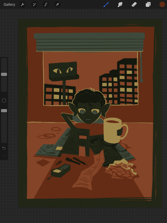
I’ve had to change the colors of some objects entirely in order to get this to work right. This is what I mean when I call this an intuitive process - some stuff felt weird, so I changed it. This also involves a bit of problem solving. The newspaper is now unable to be separated from his hand. Sometimes changing the color of an object makes that object look better, but ruins its relationship with the objects around it. It’s up to you to learn how to adjust and finagle things until you get it where you want.The paper he has and the napkin underneath it also all blend together now.
The next few parts of this process are REALLY just trial and error, where I toss a bunch of spaghetti at it until it works. It’s hard to decide what to screenshot, because I don’t know what will or will not be part of the finished drawing. To that end, you can watch the recording of this drawing here. This video isn’t edited at all so it contains a couple of minutes of really shitty sketching, and then all of the color thumbnailing work i did in the last post. Actually getting started on these final colors begins around the two minute mark. It is also sideways, I am sorry I don’t know why.
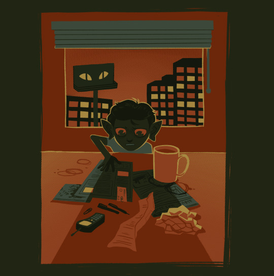
Now, here you can see where I’ve more or less worked things out. His hand’s not on the cup anymore because my friend pointed out it didnt have an arm attached to it. I added some halftoning to make a gradiating effect in the sky and on the table to give the impression of a sunrise. His eyes are different but as of posting this, I don’t like them and am probably about to go back and change them again. The Cup now has a shadow and some rim lighting. His hand is in shadow. The stain on the napkin is big enough to define the edge of the paper on top of it.
Little things like that.
The more you draw like this the more the way you need to think about your space becomes natural. I hope this helps and I wish you all the best of luck!
117 notes
·
View notes
Text
halftone
(seku caliga / miyala naida are the same person, she just has two names)
miyala is sipping on a beer in a corner of a bar. she is being hunted. her life, she thinks, is not in danger, but she is being hunted nonetheless. the force is cold and bristles like a hundred knives and the feeling intensified until the sharpest knife settles into the seat across from her.
miralians have the same teeth as standard humans, but this woman seems to have fangs, and while her posture is languid and arrogant, her gaze is serrated. knowing. seku bares her fangs back in a shark smile.
so whats a girl like you doing in a place like this, seku caliga?
the woman knows her name. or her fake name. or her real name. these days she’s not sure if she’s seku or if she’s miyala. there’s a hint of coruscant in her tones, and seku runs the side of her boot up the woman’s calf. i thought i might meet someone interesting here.
the woman takes a sip of seku’s drink. and now you have.
self assured, at least. have i? you haven’t even introduced yourself- or why you were looking for me.
maybe im looking for a quick- meal. the woman pauses after she says quick and draws out the word meal in a purr, and her nails caress down seku’s cheek. the force is screaming a warning, but seku loathes the force these days, and she leans into the touch. they’re barely alive these days. she’ll take her moments of feeling and adrenaline where she can get them, thank you very much.
im not a fool. but for you i can pretend for an hour. and then you can tell me your purpose.
its apparently an acceptable agreement. seku has a hotel room half a block away, and by the time they unlock the door they are ripping at each other’s clothes with the desperation of women who have had everything taken from them by a cold and unfeeling galaxy and are determined to steal something back.
it is the shriek of plasma as two lightsabers slam into one another. it is the melding of stars. it is a competition- but really, they’re both winning, and when the sheets are crumpled and both are wrung empty, the miralian woman asks about the sith knife in seku’s cargo hold.
i fucking knew it, seku slurs, exhausted. her shoulders are stinging where the other woman’s nails had dug into them. inquisitor. the woman’s eyes get a little sharper, and her smile, while tired, gets a little crueler. i said i wasn’t a fool, seku says, but you scratch my back... and i scratch yours.
that her last statement is not entirely metaphorical goes unsaid, but a wisp of humor enters the woman’s eyes before turning serious.
the miralian woman sits up. this is a business agreement now. she gestures for seku to continue, and seku pushes herself up to lean against the headboard. i acquire artifacts every so often. i don’t want them going to the hutts and i’d prefer to be on the empire’s good side. how about i give you first dibs, let you know of any particularly.... interesting pieces, and you clear my warrants in imperial space? and of course, i assume you know the value of contacts in other... spheres of influence and how keeping them out of the eyes of your peers might be helpful.
miyala doesn’t pretend to know how the inquisitorius works. but having an... ally on the inside would keep seku out of trouble. the inquisitor thinks, clearly weighing the idea. i suppose there are times when a more discreet agent could be of use. and miyala knows she has her in.
#and i feel trash lesbians in this chilis tonight#seventh sister#inquisitor#oc: miyala naida#refences to sex
4 notes
·
View notes
Text
Movie Poster Designs !🌿 (THE JUNGLE BOOK)
These are my film poster designs linked to my movie the jungle book I’ve created these different movie posters using techniques and skills I have learnt during my time at West Suffolk College I’m really happy with all of the outcomes I have experimented with different styles colours type faces and I’m happy with how they’ve come out and that I have a selection to choose from.
My target audience for the jungle book movie poster is for children and I tried to show this in my work And I think I have done a good job of applying that.

This was the first poster I created and it is my favourite I feel like I have used a wide range of techniques in this poster that I have learnt in previous lessons and I feel it works really well Together. Around the outside I have used my illustrations of leaves and half toned these images that I scanned in from my hand drawn poster. With the scans I then used the polygon lasso tool and went round the edge of my original image and then followed the steps to half tone the image after I had got the halftone image I then copied and pasted multiple layers and layered them on top of each other to give a Fuller look and look like you’re looking through the wilderness into the jungle.With the background I chose the colour black as it made the other colours stand out. The type face I used was called roaring jungle to create this typeface of individual letters representing characters I had to create it on illustrator I typed the phone out on illustrator and then I ungrouped and created each individual letter into an outline so I could manipulate them and have them different sizes. I’m really happy with how the type of jungle came out as are used each letter to represent a character the J represent Mowgli The U represent Baloo the bear the N is for shere Khan the G is for kaa and finally the LE represent Bagheera.
I turned the typeface into different characters as my target audience is children and children would be drawn to the title due to the different patterns on the letters and it gives you an insight into what the film is about and what the film contains.
One thing that I would change is when looking at the film poster is the colour of the font to the colour of the leaves because the different colours of green don’t work with each other and I feel like if I had the fun the same colour as the leaves it would link better.
Another thing that I would change is adding more colour to the leaves on the outside adding some orange yellow colours too separate individual layers rather than having different towns of green and brown.
If I was to do the movie poster again I may have added some sort of texture to the background so it is not so black and may have different tones within the background.
But overall when looking at this movie poster I’m really happy with how it came out and I feel like I have targeted it at the right audience which is children.

Here is another example of my movie posters I created this on photo shop using the same steps of the majority of my film posters which is half toning I follow the same steps as above with the half toning on my scans of my illustrations.This movie poster is similar too The movie poster above in the way of the type of concept with this type I decided to focus on one character in the movie which is Kaa the snake . In the movie the jungle book there is scenes in it where the snake hypnotises different characters so I tried to bring that into my movie poster by using Kaa’s eyes as the O’s in book And the rest of the letters are used as the print on Kaa’s body My aim was for the eyes to bring the audiences attention to the poster and sort of “hypnotise them” into being drawn to the poster I really like how this is come out I create my own version of the eyes from the jungle book and use different colours to create the body of car but still symbolise him from the 1967 film of the jungle book. Again are use the same background which is the black as it makes everything else stand out which is my main goal as I want my target audience of children to be drawn to the colours of the greens grounds and more and again the typeface that I have used gives the audience an insight into what is to come in the film.
If I was to do this post again I would add maybe the tone of the snake in the middle of the two O’s to show you that it is a snake even though you can tell and another thing that I would have done differently would be adding more texture to the typeface what I mean by this is adding black outlines to the shapes and giving shading on the letters.But overall I’m really happy with how this movie poster came out and I’m happy that I have used the character on my type so it draws the children’s attention and I feel like I’ve use the right colour palette to represent the jungle book.

This is the same movie poster as above but with a different border I’m not so happy with this movie poster as the edges of the illustrations are pixelated and the texture of the drawing is not smooth and you can see individual pen marks where I have coloured the illustrations in another thing that I don’t really like about this movie poster is the fact that I haven’t built up the edge of the poster like I have done with the others and I feel like there’s too much black seeping through from the background and the text which is darker to the border is being swallowed up by the background and is not the first thing that you are attracted to and that was my aim for my movie poster so I don’t think that I will be using this as my final outcome but I’m happy that I have experimented with my scan of my illustration and used itIn one of the posters to see how it would come out. I still am happy with how the illustration came out as it does represent the jungle as there are different styles of jungle leaves in it and I am happy with the colours that are used but when it is merged with digital work it doesn’t work well together and I feel like I needed to have digitally drawn them for them to work rather than hand drawn them.

This is the fourth movie poster that I experimented with and overall I’m happy with the outcome of it again I have used an element from the movie the jungle book to represent different characters for example in this movie poster I have used again the eyes of Kaa as they have bright colours in them and that will attract my target audience which is children and I have tried to use the eyes to draw people‘s attention like the same thing Kaa does in the movie with the other characters
With the typeface I have stuck with a basic colour of green so that the eyes which a multi colours stand out more which was my aim I have used the same tone of green as I have used on the outside with my halftone effect and I feel like it works well together and doesn’t clash the border around it is from the halftone workshop that we done with Jodi and are used it on these film posters as I liked the way that they came out as they gave a bushy and wilderness effect to create this bushy affect I laid up the original image and rotated some and used different colours to give it texture and definition and depth.
If I was to do this poster again I would change the shapes of the eyes to represent different characters such as Mowgli baloo and Bagheera as they all have different shaped eyes and I could use that to introduce different characters but not giving too much away. Another thing that I could’ve done is taken the eyes away from the whole poster and use the same colours that are in the eyes on the background to give it a tunnel effect look so the background is not so dark.
But overall I’m really happy with this movie poster as it’s one of my favourite outcomes that I have done and would be considering to have it as my final outcome.
1 note
·
View note
Text
Skull Oil Painting 💀 Still Life from Start to Finish
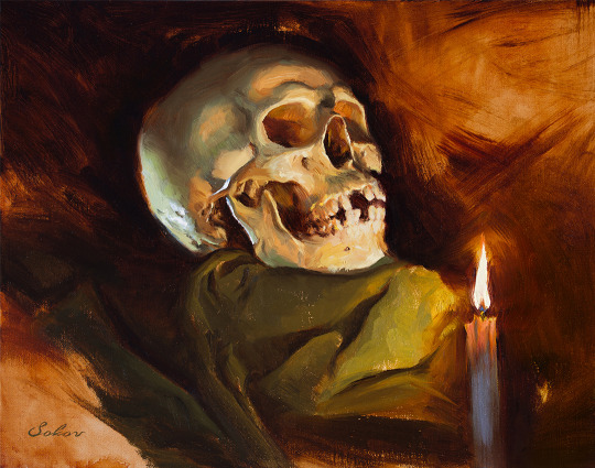
By Pavel Sokov
Setup and Preparation Stages
Before I start a painting, I like to come up with a couple of thumbnails to nail down the composition. I do these from imagination usually. So in these ones, I played with the placement of the skull, the direction of the lighting, and the orientation of the canvas. After coming up with these 4 thumbnail sketches, I got kind of a better idea of what I actually want from my painting.
Also, it sort of helps to have a thumbnail completed to use as reference when I start my painting because if I don’t have anything to look at it’s possible that when I start from scratch on my canvas, my subject will end up too big, or even worse, run off the page or something.
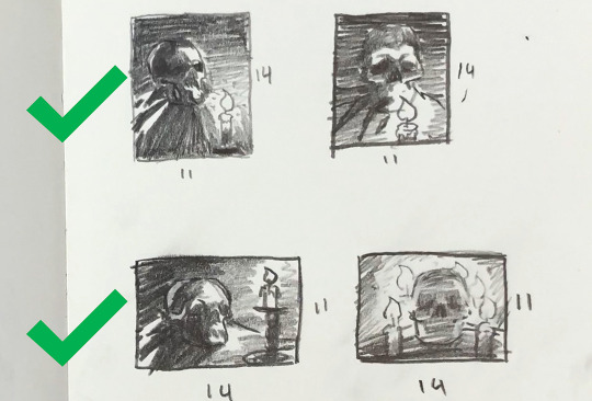
Composition is a bit of a feeling thing along with some guidelines. It’s not like stiff rules that you must follow. So having said that, I think I like sketch 1 and 3 the most.
You know, since the color temperature plays such a big role, I digitally painted this sketch with some invented color before actually making the setup, just to give an idea of what kind of mood this painting would be. And it also gave me an opportunity to plan some of the painting methods and steps that I’ll use in the actual painting process.
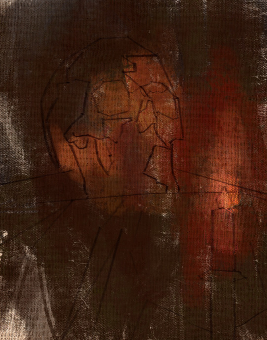
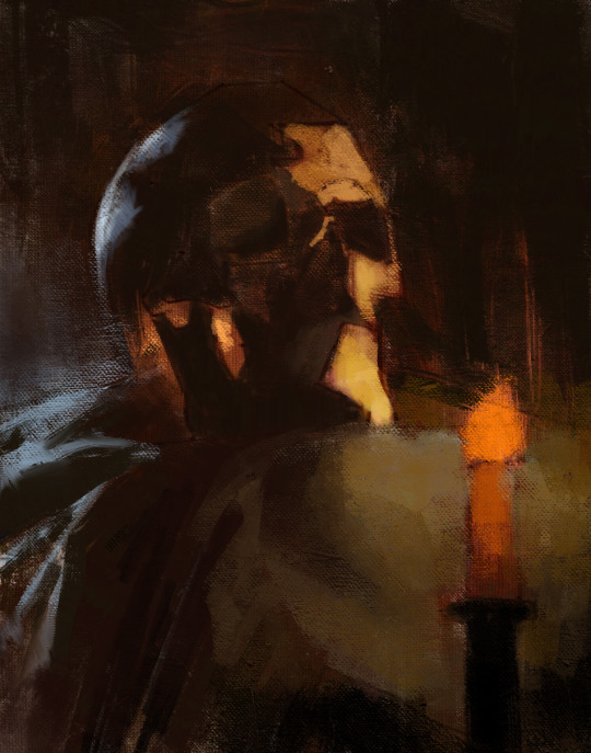
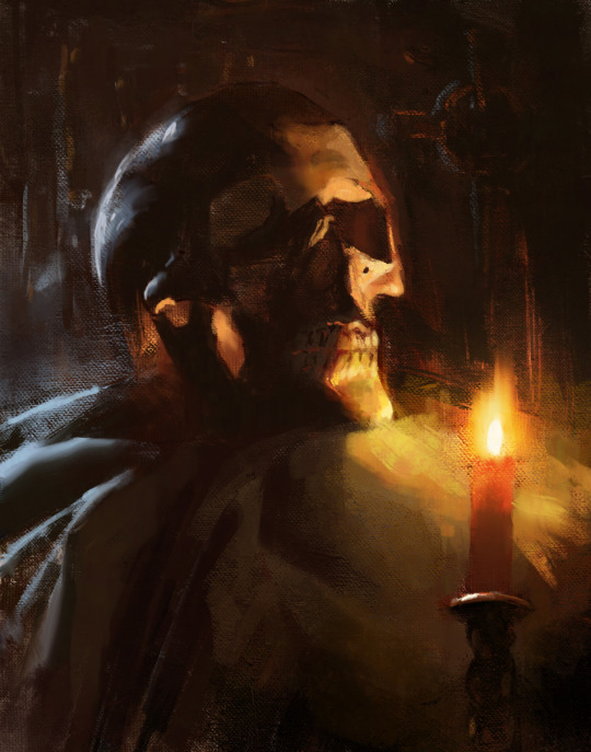
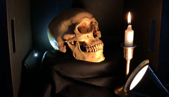
Okay, so with the sketches in mind, let’s put together the setup that I will paint from today.
Execution of the painting
So a big challenge to overcome here with this skull is that I want to paint it in the dark for a more dramatic and moody atmosphere since it’s Halloween and all, but at the same time, I want myself and my easel to be in the light so I can see and we can make this video.
Sadly, the candle doesn’t provide a strong enough light during the day, so we’re going to use a warm lamp instead.
Since we don’t want to burn the house down though by lighting that black box on fire, I think our candle shouldn’t be lit at the beginning stages of the painting.
I’m using a portable paintbox today that makes it convenient for me to paint anywhere I go.
For my brushes, I plan to use a lot of bristles because I want to load this painting up with a lot of thick paint, but I also packed a few softer brushes to get some soft edges in there too.
As my painting surface today, I am using an 11×14 linen panel. It’s actually one of my favorite sizes for life paintings.
I paint with a few different brands of oil paint, but there’s no need to name them or be concerned with what they are. What’s really important about that is that they’re professional grade and they’re not the student grade which are very difficult to paint with. It just doesn’t work, it’s like toothpaste, so just don’t even get it.
Okay, let’s squeeze out our paint. And don’t be afraid to use a lot. For the longest time, I’ve been so shy with squeezing out my paint. It’s been taking me years to paint thicket and thicker, and I gotta tell you, if you can skip all these years of being shy and just get straight into it and load up a lot of paint, it will save you a lot of trouble.
On my palette today we have:
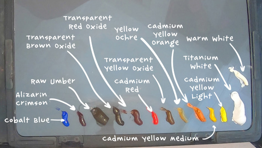
Titanium White, Warm White, Cadmium Yellow Light, Cadmium Yellow Medium, Cadmium Yellow Orange,Yellow Ochre,Transparent Yellow Oxide, Cadmium Red, Transparent Red Oxide, Transparent Brown Oxide, Raw Umber, Alizarin Crimson, and Cobalt Blue.
Underpainting and Drawing Stage
The very first thing I like to do when starting a painting is to tint the canvas. But you have to select your tinting color wisely, because it’s going to provide the underlying temperature to the whole piece. I often let this initial tint show through all the way to the end of the painting, particularly in the shadows.

In this case we have a very warm light on our subject so we can expect our painting to be pretty warm. I’m going to tint this canvas with that in mind by using something really warm like transparent red oxide, and I will mix it with a bit of Cadmium Yellow Medium in the area where the candle will go because later, all this warm underpainting should give this skull a nice inner glow. I am diluting my paint with gamsol here when I do my initial washes, because makes the paint behave like a watercolor, which is perfect for making a stain.
Drawing the Lay-in
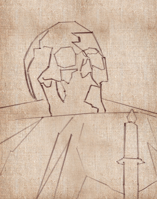
Okay, so now that our canvas is tinted, we can start to draw our linear lay-in on top of our stain. My favorite tool to do that with is actually a hard bristle brush. The reason why is that those stiff hairs, they allow me to get nice straight lines which are the exact type of lines that I find helpful at this stage to simplify the contours of everything that I’m drawing and to find those big shapes.
Don’t worry, we’re going to complicate these lines later when we go to paint them!
As you draw your lay-in, don’t forget to focus on the big shapes and the proportions of what you’re drawing. Don’t get carried away on details and things like that because it’s way too early at this stage. Simplify everything to its most basic elements. Find the big shapes and don’t mind the secondary forms for now. It also kind of helps to keep your horizon line in mind when you draw your lay-in. For example, in my case, I’m sitting below the skull and looking up at it.
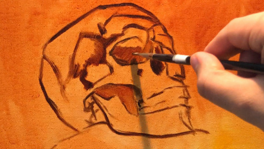
You have to ask yourself, are you looking up at the your set-up, or are you looking down at it? And, whatever the answer is, you have to design your lines with that in mind.
So if you’re noticing that your drawing is off at this stage, don’t be shy to move lines around until you get it right. Trust me, you’re gonna be saving yourself a lot of headaches if you fix things at this early stage than if you try to fix them later on when you have a lot of opaque paint down on your painting.
So right now I’m filling in the dark shapes on my underpainting because I find that it helps me see my mistakes better when I fill in the big dark shapes. With these dark shapes filled in, it’s much easier to judge the distances on your drawing.
Opaque Painting Stage
At this point I often like to take a kneadable eraser, or more often a napkin, and rub out the lightest areas. This helps me establish the light source a lot sooner before I even lay down the opaque paint. Just make sure to do this before your stain is dry, or else you won’t be able to do it anymore. You usually have about 10 minutes max depending on your surface before your wash dries, so be careful.
My goal here is to establish the big values, shapes and color temperatures as soon as I can, so to do that, I am going to cover the entire skull with some opaque paint, aiming primarily to tell the story of the lighting that’s hitting our skull. I am thinking a lot about color temperature. Our primary light is warm, so I’m mindful that my the parts that are in the light are going to stay warm. Often times, students want to lighten an area, so they grab a bunch of white. White is actually the coldest color, so the result of that is that the value of the area goes up and it does become lighter, but at the same time, the temperature goes a lot colder.
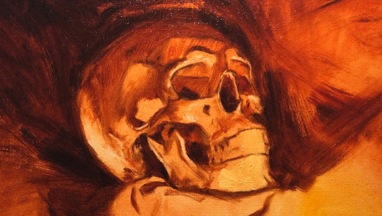
This is actually great if your subject is in a cold light, like maybe a North lighting window. But in our case, our subject is in a warm light, so that’s no good for us. When you want to lighten an area that’s in the light, consider using a color to lighten that area. In this case, to lighten my mixtures, I’m going to include some cadmium yellow medium, cadmium yellow, and transparent yellow oxide in my light mixtures to keep it warm. But conversely, if you want to darken an area, a lot of students reach for the black to darken things, and that creates a cold mixture as well. Try darkening a shadow with a warm dark. Something like transparent red oxide, transparent brown oxide, or alizarin crimson.
While you’re putting down that initial opaque paint, a good principle to work by is to paint the lights thicker and the shadows a little bit thinner. So that means you can’t be afraid to lay down some serious paint in the lights. If you keep the shadows more thin and flat, then the lights are going to feel more luminous in comparison. And I also love to let my warm underpainting show through in places in the shadows.
When you have dramatic lighting like this, you are bound to see a lot of contrast. Let’s make sense of all of it this way:
Since most of our subject is lit, make sure that the amount of values you use in lights is higher than in the shadows. In other terms, make the shadows more flat and have less values, like you could make the shadows just one value so that it looks a lot simpler than your halftones and your lights. As a result, the shadows will have less information in it than the parts that are lit.
I am thinking of the skull as an egg, with the closest part receiving the most light, and the parts farther away receiving the least amount of light. If the underlying “egg” of the skull reads well, then you are gonna be in good shape!
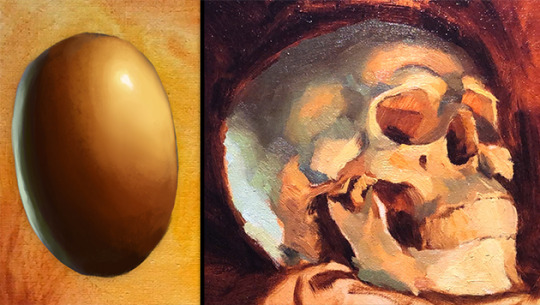
Our halftones are the most chromatic and the most information-dense parts. So in our case they are going to be the warmest parts of the skull. The lightest lights are pretty washed out, but they’re still warm.
Finishing Stage
To see the finishing touches make sure to watch the video below.
youtube
3K notes
·
View notes
Note
hello! I really want to do graphic work and you inspired me to do that or at least try. can you indicate the things i will need? for example this look that made dua (it was impeccable) you used ready materials right? can you tell me where. thanks :)
thanks! i honestly don’t think you ~need~ much apart from photoshop? i actually made all the textures/effects with smart filters myself on that graphic (such as noise, halftone), it’s just the pictures i needed to source. i do have an ipad pro which i use for sketches, but that’s definitely not essential. i get inspired by looking at behance (especially searching for freebies or mockups), or on the daily photoshop tutorials youtube. i also think spoongraphics is really helpful.
2 notes
·
View notes
Text
September 9th-September 15th, 2019 CTP Archive
The archive for the Comic Tea Party week long chat that occurred from September 9th, 2019 to September 15th, 2019. The chat focused on Ghost Junk Sickness by Kristen Lee and Laura Lee.

Featured Comment:
Chat:
RebelVampire
COMIC TEA PARTY- WEEK LONG BOOK CLUB START!
Hello and welcome everyone to Comic Tea Party’s Week Long Book Club~! This week we’ll be focusing on Ghost Junk Sickness by Kristen Lee and Laura Lee~! (http://www.ghostjunksickness.com/)
You are free to read and comment about the comic all week at your own pace, so stop on by whenever it suits your schedule! Remember, though, that while we allow constructive criticism, our focus is to have fun and appreciate the comic. Below you will find four questions to get you started on the discussion. However, a new question will be posted and pinned everyday (between 12:01AM and 6AM PDT), so keep checking back for more! You have until September 15th to tell us all your wonderful thoughts! With that established, let’s get going on the reading and the chatting!
QUESTION 1. What has been your favorite scene in the comic so far? What specifically did you like about it?
QUESTION 2. What reason, if any, do you think is behind Vahn’s red eyes and strange tattoos? For that matter, why do you think Vahn’s health is in such shambles and their tattoos constantly bleed? What does all this have to do with Vahn’s lack of memories and nightmares?
Capitania do Azar
1. My favourite scene is Boggs introduction, which I think it's super well executed (actually, that entire chapter is just ), I mean http://www.ghostjunksickness.com/comic/4-11 ? Good content right here
2. I figure those things are all related, yes, and I'm dying to know in which way and why. However, if I were to make an educated guess, I'd go and say Vahn was in a cult (highly unliky, but IMAGINE that) or at least implicated on something of the sort. Vahn's character is one of the big mysteries that makes this comic so interesting, in my opinion. Trigger hardly reacts to those tattoos and their bleeding, so figures that if he doesn't know how they came to be or what they mean, he knows something.
RebelVampire
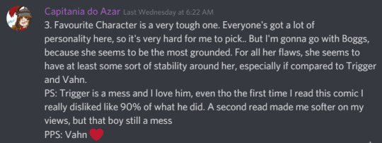
QUESTION 3. At the moment, who is your favorite character? What about that character earns them this favor?
QUESTION 4. Do you believe that June 7 can be saved, or is Fiachra right in that everyone should leave? If it can be saved, what do you think it will take? Further, do you believe Nyr and Alberich even get the chance to do so?(edited)
RebelVampire
QUESTION 5. What has been your favorite illustration in the comic so far? What specifically about it do you like?
QUESTION 6. What do you think exactly caused June 7 to be destroyed? Do you think this ties into current events? If so, how? If not, do you think the characters will ever figure out the cause behind the catastrophe?
Capitania do Azar
3. Favourite Character is a very tough one. Everyone's got a lot of personality here, so it's very hard for me to pick.. But I'm gonna go with Boggs, because she seems to be the most grounded. For all her flaws, she seems to have at least some sort of stability around her, especially if compared to Trigger and Vahn. PS: Trigger is a mess and I love him, even tho the first time I read this comic I really disliked like 90% of what he did. A second read made me softer on my views, but that boy still a mess PPS: Vahn
4. I think from a political standpoint, maybe it's not salvageable... But people have been and will keep on living on it, so does it really need saving? A lot of things have detrioriated, yes, but people are still living on it and it's not getting worse as far as I can see it, so.... But it could be deemed a project hard to back, and maybe it's easier to just call quits and leave, but I personally don't see that happening.
Capitania do Azar
5. Oh, do I have to pick just one? Because I could easily pick all the chapter covers!! The interior arts are also getting progressively better as the story goes, and the choice of halftones is But I love this page, it gives me them feels http://www.ghostjunksickness.com/comic/10-34
6. I can go full-on crazy theorist on this and say that it looks like Vahn has something to do with it, even if they don't really realize or remember it and I'm also gonna say that I got the feeling The Ghost is up there somewhere also participating in this business. Also yes, I think it's gonna come into play eventually and our main characters are gonna have to deal with some harshness on that front (no way something like that could be pretty or easy to deal with).
RebelVampire
1) My favorite scene is probably when Trigger panics about Vahn getting kidnapped and rushing after Vahn to try and save them. Trigger...Trigger is a very flawed character. Boggs is not wrong for calling Trigger out, and Trigger is real shit at expressing emotions. But in that moment? Man, Trigger was ripped raw and we finally got to see that nah, he really, really, really does care. He's just a screwed up individual with a lot of demons in the closet. It was a beautiful moment of character growth if short lived. 2) Honestly, I'm kind of on the same page as @Capitania do Azar in thinking that there's cult stuff going on. Maybe Vahn was meant to be some sacrifice to Vivian or something. Only because Vahn wasnt sacrificed but was fully prepped for it, they're stuck with the bleeding tattoos cause that tattoos really want them sacrifices to be happening. As for the nightmares and lack of memories, I assume Vahn's escape from whoever had them before was not a peaceful and mutual lets go our separate ways sort of thing.
3) My favorite character is ambassador Nyr because Nyr is tiny and wise and very adorable. And like, how can you not like Nyr? Just wants everybody to be happy and careful. 4) I think June 7 can be "saved" but that depends on your definition of saved. Like, the phrase "Rome wasn't built in a day" comes to mind. It will never be what it was, and I think for people like Fiachra, that means it's trash. But I think everyone could get the planet to a place where there's less crime and shortages.
That being said, I am skeptical Nyr and Alberich will get a chance to do so. I'm pretty sure this is gonna end with the planet getting more messed up cause some politicians think they know what's best despite not even really being around much.
5) My fave illustration is definitely the first panel on this page http://www.ghostjunksickness.com/comic/10-32. There's a great blend between detail, atmsophere, particles, and blurs in the distance. It makes for a really ethereal view that makes you go, "Yup, Boggmouth was right." 6) Once again, cult stuff. Probably the same cult stuff Vahn was in. Maybe because Vahn wasn't sacrificed to Vivian right everything went haywire and the phenomenon happened cause there was excess energy just released into the world. Or something like that. But I definitely think regardless of the answer, the characters will find out. I would be surprised if there was nothing to it given things we've learnt about it through Andrew.
RebelVampire
QUESTION 7. Which characters do you enjoy seeing interact the most? What about their dynamic interests you?
QUESTION 8. Who do you think the Ghost is, and what is the source of their mysterious appearance and abilities? How does this tie into Vahn given the Ghost had a picture of Vahn? Given material found, how might this also tie into the Crane woman?
Capitania do Azar
6) @RebelVampire oh I like your sacrificial takes, I didn't think of that
Capitania do Azar
7. Interactions between Trigger and Vahn are super interesting and they leave me wondering about so many things, as there's clearly something unstated going on there. Then, Trigger and Boggmouths' are the best because they're so wild no context is needed, ever ahah
8. I think Vahn and Ghost are related somehow, maybe deeper than we know... The Ghost sure is happy to have found them!! And that implies some sort of connection. Figures that should be connected to Vahn's past that we don't know off, their uncharacteristic abilities and maybe even to the destructive events on the planet. And also people did mention that there were some physical similarities, which also make me wonder very much about exactly what kind of connection could there be between the two! (who knows, maybe they were on the same cult)
RebelVampire
QUESTION 9. What sorts of art or story details have you noticed in the way the comic is crafted that you think deserves attention?
QUESTION 10. Why do you think Trigger is declaring he’s in trouble after saving Vahn? What do you think caused him to get into trouble? Further, why do you think Trigger is pushing Vahn away? Is it anger, or is there something else going on? Will he get out of trouble?
RebelVampire
7) I definitely like seeing Vahn and Trigger interact the most. Their relationship exists in this weird place between warm and tumultuous, which makes each interaction between them kind of fascinating. I also kind of feel they bring out the worst and best each other at the same time, which is not something you usually see. Like the only real way I have to describe their relationship is "It's a mess." XD 8) I think perhaps the Ghost is one of the few survivors from the catastrophe, and that whatever happened, the Ghost got mysterious powers from it. Perhaps the Ghost was a cult member if I continue to go with the cult theory. And going with the cult theory, I assume that's how the Ghost knows Vahn, maybe even helped kidnap Vahn from wherever Vahn is from. And the Ghost wants Vahn cause Vahn's sacrifice be needed or something like that. O_O I'm just spitballing mostly.
9) Honestly, the backgrounds. Like those are some nice details on the buildings, random objects, etc. There's a lot of world character going on, and the characters definitely feel integrated into their own world because of it. I feel this comic goes past even what makes for a passable background and takes it a step beyond,, which is always admirable. 10) Honestly, I think Trigger got himself marked for death because he made a deal with the devil to save Vahn's life. And Trigger is pushing Vahn away both out of hurt because Vahn almost got themselves killed, but also cause Trigger doesn't want Vahn to get caught up in whatever his trouble is.
RebelVampire
QUESTION 11. What do you think are this particular comic’s strengths? What do you think makes this comic unique? Please elaborate.
QUESTION 12. What do you think happened to Andrew during the June 7 catastrophe, and what might this have to do with the death of others around him? Further, what do you make of Andrew’s promise to someone named Roderick?
Capitania do Azar
9. Concerning the art (and tbh, storywise a little bit too), I like it that the influences the authors pulled from are clear, but the work still screams very personal and unique. I love the care with which the backgrounds are populated, weather with characters or items that make everything feel very alive. I also really like how we are slowly knowing more about the characters, and how even the silly moments build up on them!
10. If I have not mentioned this before, I am under the suspicion that Trigger knows more than he lets on, particularly about Vahn. There's something about the way he treats them that goes beyond "oh I really care about them", you know? So figures there must be something else that that Trigger knows and we don't (and possible, not even Vahn). Now, I don't think Trigger is pushing Vahn away, at least not on purpose. I just think he's not good at dealing with emotions, his or otherwise, and that anger is a safer bet to make sure he's heard. As for getting out of trouble, I don't think so. Trigger getting in trouble is what this comic has been all about, aha
I assume that's how the Ghost knows Vahn, maybe even helped kidnap Vahn from wherever Vahn is from
@RebelVampire they're from space Scotland, obviously
11. Character Design, for once: all characters are instantly recognizable and even tho they're all so different from each other, they all somehow make sense in the context of the story and none of them seems out of place. There's some really good character design craft in there. I like the balance between goofy/fun advantures and darkness/complicated relationships. It's easier to fall into either extremely problematic relationships with no redeeming features that make you wonder why even the characters are together, to relationships where nothing goes wrong. Between Trigger and Vahn you can see there are good things and bad things, and that's really fresh. Other relationships in the comic are also portrayed very well and are interesting to follow.
12. Honestly, the Andrew plotline gets me a little confused, but I gotta admit it's because I wasn't following it so attentively as I was Trigger and Vahn. So that's my fault in there. But I'm really anxious to find out in which way it's gonna merge with the other plotlines, and how it'll relate to The Ghost's case, ehe
RebelVampire
QUESTION 13. What are you most looking forward to in the comic? Also, do you have any final thoughts to share overall?
QUESTION 14. Why do you think Trigger avoided Boggmouth after abandoning Boggmouth so many years ago? Was it shame, or is there something else going on with Trigger? What consequences do you think there will be for Vahn finding out this past history?
RebelVampire
11) For me, the comic's strengths is probably the world-building and illustration. I've mentioned this before, I believe, but there's just so much detail in regards to how the world is portrayed. From the character designs, the ship designs, to how the society functions and has its own command structure. It's a really fleshed out world that has its own character, so that makes it just as interesting as the character. Thus, any exposition never feels dull, cause it feels just like learning some key development info about a person. 12) Given some of the pieces, right now I think that the catastrophe drove Andrew insane, possibly some of the others, and he started killing people around him. And someone he wound up being the last one standing. With this Roderick dude perhaps being one of the last people Andrew offed or something. And the kid in the picture looks like Vahn, so I'm gonna assume Roderick told Andrew to look out for Vahn or something. Although timeline wise Roderick couldve died much earlier in life. IDK. I definitely think Andrew murdered some people and lives with regret though.
RebelVampire
13) I'm looking forward to getting back to Trigger cause I'm interested to see wtf is even going on with Trigger anymore. He's such an emotional wreck right now, and I want to find out why he's such an emotional wreck. 14) Honestly, I think Trigger avoided Boggmouth both out of self loathing and unsureness about how to approach it. Apologizing isn't easy at all. Even assuming you can let go of your pride regarding it, there's a decent chance the other party either won't accept your apology or will sometimes make you feel even worse, possibly for the rest of your life. And being sincerely sorry but never forgiven is frankly an awful feeling. And I kind of feel this is kind of Trigger's thought process. He feels bad, but how could he reasonably accept Boggmouth to forgive him? So instead of apologizing, he just doesn't deal with the problem because even if he does apologize, it won't fix anything. It probably won't even make him or Boggmouth feel better about it. So thus he stubbornly backs his own bullshit up because he's just not able to emotionally cope with accepting any of that. As for consequences regarding Vahn, I think very little. I think Vahn might confront Trigger about Trigger being mysterious and not sharing stuff like that. But Vahn seems pretty loyal to Trigger so I don't think they'll ditch Trigger for something like that.
Capitania do Azar
13. Right now, looking forward to see Trigger again and what would come off a confrontation between him and Vahn, now that Vahn knows about His Past™. I also can't wait to know more about arm-swapping cults that include planet-destroying ghosts and space Scotland.
14. I think Trigger was a coward, but I don't blame him. It was a very difficult situation, and he was under a lot of stress and didn't know what to do, and his bad side won. I think shame and an unwilling to confront himself is mostly what's behind him avoiding Boggs for so long. But the past does have a way to find you, so he can't expect to stay hidden forever. Ahahah! As for Vahn finding out, I'm a big with @RebelVampire here. I think they may feel hurt and distrustful of Trigger for a while, but at the same time, they have already endured a lot on that relationship and they probably understand it wasn't exactly a conscious decision. Vahn doesn't look like the type to hold grudges anyway
mariah currey
So I didn't read enough of Ghost Junk Sickness to really answer any of the questions I don't think, but I did want to say that I really enjoyed what I did read of it. I got like 20 pages in when the Comment Storm was going on and meant to go back and read more, but life's been crazy. Anyway, I think the main characters and their dynamic were cute/fun and I'm planning to just back into it at some point when I have more time. Also, I really liked big hammer lady! (I even left a comment saying so XD) I feel like she probably isn't important but I thought she was rad.
FeatherNotes
These are all such good and wholesome comments/answers, thank you all for enjoying Ghost Junk!!i especially loved reading the theories the most!!
spacerocketbunny
Thank you so much for all the theories and feedback, it's been a treat to read through all if it!! Thank you so much for lending your time to our comic, I really aporeciate it!!
RebelVampire
COMIC TEA PARTY- WEEK LONG BOOK CLUB END!
Thank you everyone so much for reading and chatting about Ghost Junk Sickness this week! Please also give a special thank you to Kristen Lee and Laura Lee for volunteering the comic and creating it! If you liked Ghost Junk Sickness, make sure to continue to support it via some of the links below!
Read and Comment: http://www.ghostjunksickness.com/
Ghost Junk Sickness’ Ko-Fi: https://ko-fi.com/ghostjunksickness
Ghost Junk Sickness’ Store: https://hivemill.com/collections/ghost-junk-sickness
Ghost Junk Sickness’ Twitter: https://twitter.com/gjsickness?lang=en
#ctparchive#comics#webcomics#indie comics#comic chat#comic discussion#book club#bookclub#webcomic book club#webcomic bookclub#comic tea party#ctp#ghost junk sickness#kristen lee#laura lee
1 note
·
View note
Text
The Break of Day: Chapter 7
You guys are amazing, thank you for your support... <3
Everyone’s favorite vampire returns.
When his breath returned to him, and his lustful thoughts subsided, Louis knew he needed more answers. He pulled on his coat, running from his cove to follow Grace. What had she done to him? The wave of desire that flooded him minutes ago was unnatural, something he had never experienced before. This was a new power, and after seeing Grace’s shame, Louis knew she had done it on purpose. But why?
Louis wandered street after street, sniffing the air for Grace’s soft scent. He didn’t notice where he was going, only scanning for a sign of her presence. It was a large city after all, and she could have been anywhere. Perhaps, she could have left it altogether. Louis hoped, at least, that this was not the case.
He pulled his coat around his neck, keeping his head down as people passed him on the sidewalk. When the lights around him became brighter, he finally looked up. He found himself at the steps of a hospital, one that Louis had never gone near. His meals were not found in the weak or sick. Pausing with his hands in his pockets, Louis stared up at the modern glass building. It was so vastly different from the world he once knew; even spending years in the city, watching it shift and morph from a bustling settlement to a dirty metropolis, he would never fully grasp the way the buildings changed. The towering, ominous architecture of Wysteria was so impractical, yet served its purpose as a symbol of power, of fear. But this modern work- all shimmering glass and cold metal- for what reason was it designed as such? What was its purpose? Louis stared upward, noting how he could see into each patient’s room, observing both those who bustled about in the fluorescent lights and those who dwelled in the dark as a façade of privacy.
Louis stood still, just watching, wondering, lost in his thoughts and distracted from his mission. Until a particularly old scent caught his attention, one so very much like his own. He turned slowly, and saw an old face, unchanged by time, bounding down the steps of the hospital. His outfit was different than Louis could ever have imagined, the hospital scrubs and gym bag a stark contrast from the nobleman’s attire he had last worn in Louis’ mind. Even his hair, although the same snowy blonde, was a modern cut, with shortened sides and a slicked over top. He barely recognized the other vampire, apart from his scent. Louis didn’t even try to turn away as Leo noticed him.
The look on Leo’s face was something Louis could have expected from the Crawford: a moment of astonishment, and then a slow grin of pure satisfaction. “Mr. Howard,” Leo greeted, turning to walk to the other vampire. “I hadn’t expected to see you here.”
As Leo approached, Louis looked down to the hand that outstretched toward him warily. He took it in silence, giving it a brief shake.
Leo nodded, still smiling. “Nice hair, you look good with length. I wouldn't have picked it myself, but hey, we all have to adapt. I’m not sure how you found me, but I’m glad to see you.”
Louis sniffed, looking back toward the glimmering glass, reflecting city lights. “The feeling is not entirely mutual, unfortunately, Sir Crawford.”
Leo winced, almost laughing. “Wow, time really hasn’t changed you Howard. Didn’t anyone tell you nobody talks like that anymore? Let alone call anyone by that honorific. I see you also kept your accent.”
Louis rolled his eyes, sucking on his cheek and considering just walking away.
Leo seemed to sense this, and leaned in close. “I just got off my shift, snagged a few bags from the bank,” he whispered, shrugging the shoulder that held up the small duffle bag. In a lower voice, Leo asked, “Ți-e foame?”
Louis glanced down to the bag, then quickly back up to Leo’s snarky expression. He thought about Grace, wandering through the city alone. He wondered whether she would be able to find shelter that evening, and if she did, with whom? But Leo’s offer hung in the air, and Louis found his curiosity on the previously suggested matters at hand much easier to sate with Leo Crawford than with Leo’s wife. If there was something important that he needed to know, Louis could get it from the man pleasantly, quietly, without tampering in Irina’s temper. Louis glanced back up to the hospital steps, watching a couple run inside, one crying while clutching a bleeding hand, and one holding the other to their side for comfort. The metallic smell hit his nostrils, turning his senses toward the hunt. Then, gritting his teeth, Louis replied just as quietly, “Presupun.”
Leo grinned proudly, and clasped Louis on the shoulder, which caused him to flinch away from the former’s hand. “Follow me.”
______
The docks were quiet in the dead of night. Leo and Louis watched the ships shutter in the cold water, bumping into their wooden piers. They sat upon a mound of rocks that angled down into the water, creating a slope that could send both men into the frigid waves; but instead they sat comfortably atop a crooked, square boulder, using the flat top like a bench as they ate their lunch. Leo tore open a corner of the bag, carefully pushing away the blood from the top so as not to spill. He then sucked on the bag like a juice pouch, and motioned for Louis to do the same. Louis raised a harsh brow, but followed suit. The two men sat in silence, apart from the crashing of the water on the rocks just below.
Leo naturally broke the quiet first. “For how long have you lived in New York?” He spoke in their mother tongue, making Louis both grateful and uncomfortable.
“For nearly a century, by this time,” Louis replied in the same form.
Leo nodded. “Irina and I have lived for nearly forty years here,” he said. “It has been pleasant. My employment creates an easy life for us.”
“You could not have worked at the same establishment for this amount of time,” Louis said, before taking a drink from his pouch.
“Mm, true,” Leo said, slurping loudly. “It has been some time. No, I create a new person for each career. Hospitals, nursing homes, caretakers, more. And these things called blood drives.”
“Blood… drives?” Louis asked, turning toward Leo.
“Yes,” Leo said, turning as well, “a place where humans can freely give their blood. They believe it carries on to those in poor health, but we immortals tend to use a majority for ourselves.”
Louis frowned, tucking away the knowledge for later use.
“You hunt to feed, then,” Leo said, not quite a question.
Louis nodded. “Yes, I hunt.”
Leo did not press the subject. Unfortunately, he turned it toward something Louis was not necessarily excited to discuss. “Irina has told me that she saw you, already. I am sure you are not surprised by this?”
Louis shook his head. “I am not.”
“Then you know that we believed we were the last Wysterians,” Leo continued.
Louis nodded again.
Leo sighed through his nose, a heavy breath that spilled irritation. “I will not interrogate you, Louis. I believe you had reasons for your isolation, as you have a purpose for all actions. But, I will mask my frustrations with your choice. My wife, however, will not.”
Leo laughed then, and Louis almost snickered. He pictured the princess’ face red and pouting, her words spat into both of their faces in that shrill but commanding voice.
Leo’s face fell, and he took the last gulp of blood from the plastic in his hands. He swallowed, then faced Louis head on. “Listen,” he said, switching to the native language, “there are serious problems in the city, particularly with our kind and the humans.”
Louis licked the corner of his mouth. “Irina mentioned something dangerous. What is happening?”
Leo shook his head. “That’s the problem. We don’t exactly know, yet. Have you been reading the papers at all?”
“I do not concern myself with the current events,” Louis said honestly.
Leo frowned, but didn’t look surprised. “Well here,” he said, reaching into his bag and pulling out a roll of white papers, “this is from today. I just picked it up from the hospital’s news stand.”
Louis took the stack, and unrolled it to reveal the front page. In large, black letters, it read, “MASS SUICIDE: TWELVE DEAD IN DISCOVERED GRAVE.” Beneath it was a gruesome image, a pile of bodies in a pit dug into the floor of some abandoned building.
“This is the third one just this year. The papers think it’s some kind of cultic following that’s starting up,” Leo said. “You know, folks killing themselves in the name of God. Irina and I think it’s something more though. I mean, there were fucking childrenin that pit. And, just look at their necks.”
Louis looked closer at the halftones, noting the deep, black gashes along the victim’s necks, from their clavicle to their shoulders. He narrowed his eyes. “You believe these are vampires killing?”
Leo pointed to the wounds displayed on the page. “Look at the gashes, Louis. A person doesn’t commit suicide by slicing open their necks with this much force. This is how vampires kill, but not just any vampires would do this-”
“These are not the markings of a controlled immortal,” Louis said, his voice rising with Leo’s. “These are wild, animal almost. A child would make these.”
“Exactly,” Leo confirmed. “There’s a newborn vampire on the loose in New York.”
Louis shook his head. “No, no. Even as an infant, I did not sate my hunger like this. Only once, in pure rage, did I dare to take lives as this immortal has. This is not simply rogue actions, this is… controlled.”
Leo took back the paper, staring at the gore once again. “So… you think there is more than one?”
Louis shrugged. “There could be one, or there could be a hundred. It is impossible to say, but I do not believe this vampire is working alone. They left this grave too clean, too easy to find. Even a child would know to cover their tracks, lest they be discovered.”
“They wanted to be discovered,” Leo said slowly, watching the photograph on the page as if it would come to life any moment.
“Yes,” Louis said, staring warily out into the water. “They wanted to send a message.”
“But what could that message be?” Leo asked, staring at Louis now.
Louis watched as the first tinge of light hit the sky. He would have to return to his shelter soon. Standing, he straightened his coat, and looked down to an anxious Leo. “I do not know, but I do not believe it is a message solely meant for humans.”
#leo crawford#louis howard#midnight cinderella#cindy writes for y'all#midnightcindy#the break of day#chapter 7
15 notes
·
View notes
Text
Digital Abstract Typography-Process & Outcomes
Shown below are the process in which I did in order to achieve my outcomes. For this I used Illustrator in order to complete the grid leading to the complete arrangements of the distorted type.

Firstly I opened an Illustrator file and then inserted a grid which is 3 x 3 so then there are 9 boxes available to fill and then I used the type tool and a bold font and typed out the word “MOTORSPORT” in capital letters so then you can still figure out what the letters are when cut off at certain sections.

Then I selected the type and went to type-create outlines then object-ungroup so then you an individually select each letter, then I selected the letters I wanted to use for each square and duplicated them by holding down the options key and then dragging the letter/s to their designated square. From there I then rotated and scales a few of the letters and then arranged then so there was one letter or group of letters in each square and had them overlapping the lines so then they were distorted in a way of them not being in its original state.

Then to make the letters merge into the square I made sure then I selected each bit of text on the grid and right clicked and went arrange-send to back so then my text is then behind the grid despite it being difficult to tell as the grid and type is both in black. After that I selected each letter and the box in which it is inside of using the shift key and then right clicked and selected make clipping mask in order to clip the letter into the square and remove the square itself in which it was in.

This is the final outcome of all the letters and boxes being made into clipping masks and I am really happy with the results because it was a new technique in which I have learned as I haven’t used the clipping mask tool before, next I’m going to be using these letters to create an abstract typography edit.

For my 1st experimental typography edit I selected each letter from the grid and used the options key to drag each one in which I wanted to use onto another artboard and then I arranged them so then there were different sizes letters as well as some being rotated and in different sizes.

Then I added some spray paint markings by selecting the ones which I wanted to use and copied and pasted them onto my design (cmd c and cmd v) and then using the eyedropper tool I made sure that the colour of the the paint was the same colour as the type so then they blend into one another, from there I placed 3 of the spray paint elements under some of my letters but not too many so it becomes too overwhelming and then after that I also added a paint splatter effect on top of everything by selecting one of the boxes and copying and pasting it onto my design and scaling it so then it covered the area in which my design is in to give the effect as shown above.

Finally I added in some simple shapes in yellow using the shape tool because I felt as though my design was looking a bit plain as it lacked some colour and I thought yellow would be a good match as black and yellow are really bold when combined, I also made sure that I sent both shapes to the back of the letters by right clicking and going arrange-send to back so then it gives the appearance as shown above. Overall I really like this design because of its simplicity and how all the letters line up in one way or another despite being different sizes and rotations and I also feel as though the yellow shapes in the background elevate my design and makes it more bold.

For my second design I brought over the letters in which I wanted to use by using the options key and then I resized and rotated some of the letters and made sure that they lined up so they weren’t randomly placed, yet again I added in some spray paint effects by copying and pasting them (cmd c and cmd v) onto my design and using the eyedropper tool to make sure they matched the colour of the type. Then I used the shape tool again to add in a yellow rectangle along the centre of the design and then I decided to invert it as I thought it would look quite cool and different in comparison to my other design.

Overall I like this design because of the inverted section in the centre which I think looks really cool as both white type really stands out in terms of brightness on top of the yellow and I just think it looks quite interesting. For this design I also chose to not add the paint splatter over the top of the text because I wanted to have more of a bold approach to this design instead of a textured one like my 1st design.

Then for my 2nd design I repeated the same process but with a different word which is “adrenaline” which I did using one of the Helvetica fonts and the type tool.

Then I went object-expand then object-ungroup to make the type into individual letters to move by copying and pasting them (cmd c and cmd v), next I selected a few of the letters at a time and then rotated and scaled them in a box each. Once done I then selected the type and right clicked and went arrange-send to back.

Then I selected the type and the path behind it and right clicked-make clipping mask to bound the type to the box.

This is the outcome of the steps above.

Then I made 2 more artboards to then make some abstract typographic work with all of the sections put together in different formats such as the 1st one going more from the top to the bottom of the page and then the 2nd one is more central to the page.

I like this outcome because of how the combination of the yellow with the black really stands out and the textures in which have been used have helped to elevate my work in terms of making the type appear less plain, I also like how the halftone has added a bit of pattern to my work without interfering with the type itself as I want it to be bold. Overall I’m quite happy with how this turned out but if I could change one thing it would possibly be changing the colour of the halftone.

I think this is my favourite outcome because of how the changing of the opacity of the pink circles have given the typographic piece a but more of an interesting appearance as well as the use of circles instead of the rectangles in which I have previously used. Overall I’m really happy with how this has turned out and I plan to turn this into a mockup on Photoshop as a poster to showcase what it would look like in an actual real like scenario if I printed it off.
0 notes
Text
Pop art design development stages 2

Next I now had to make a duplicate layer of the Sinatra in case of mistakes, then I started to do the pop art design from following the tutorial it tells me to go onto filter gallery where I can find multiple patterns for the pop art style I used the halftone pattern and them chose the pattern to be dots since it shows the image in the pop art concept, I also did a quick play around with the contrast of the pattern this was mostly time consuming because I wanted to have a great amount of contrast that shows the pattern overlaying the image instead of more shadows to appear.

Once I was happy with the pattern tone I followed the tutorial more and it shows another step to make sure the black and white image is really crisp before I add the colour, I went onto filter, sharpen and smart sharpen from this image you see what settings I ended up using. I was then left up with a nice black and white image ready for the next step.

After doing the smart sharpen affect I knew it was time to add the colour I wanted to use for the background by holding control and then clicking on the new layer button it made a layer beneath the duplicated layer.

I went with a light bright blue since pop art uses bright colours and this was the result of what happened as I chose the colour on the blank new layer then using the other keyboard shortcut I’ve learned from following the tutorial which was alt and delete.

After the background colour was added I then started adding more colours onto Sinatra’s face and skin I wanted to keep the portrait of Sinatra to his actual appearance from the original image I went back on the original image and used the eyedrop tool to get the skin colour of Sinatra, went back to my portrait design and started to colour in Sinatra’s face.
I went around Sinatra’s face and tried to avoid his lips and eyes in case I can’t find his lips and eyes, once I finished with Sinatra’s skin I went back over to the original image of Sinatra, used the eyedrop tool and coloured Sinatra’s lips and eyes.

Finally I finished off Sinatra’s clothes and added more black to his hat and this was the final design, what I don’t like is with developing the portraits is the shadows that slightly fade away where I wanted to cover but overall I am very satisfied with the portraits designs and they have gone great within the posters I will develop too
0 notes
Text
Kids Drawing Revamp #1 - Easy Things to Draw
New Post has been published on https://easythingstodraw.net/kids-drawing-revamp-1-easy-things-to-draw/
Kids Drawing Revamp #1 - Easy Things to Draw

youtube
Kids Drawing Revamp #1 – Easy Things to Draw
This is a revamp of my little cousins drawing. I do it in my own style to show you my decision making in action. This is my version. This video was uploaded from my old channel, but I dubbed over it. Check out other stuff on my channel.
Hi guys, how are you doing, I’m Enrique and this is Easy Things to Draw, one thing that I said before and I’ll mention it again, is that I’m merging my two channels together, Sketch Monsters and Easy Things to Draw, I am taking a lot of the older videos from my channel Sketch Monsters and I’m going to put them here, although they are not exactly the same videos, I’m dubbing them again, because, the way that I spoke in those videos it wasn’t the best, especially with this one.
I don’t remember the pencil that I use with this drawing, but it’s not very important, you can use a regular pencil, it’s going to be okay.
What I’m going to do today is take a drawing of a child, which I think it was my cousin who drew it, and what I’m going to do with this is revamp it in my own style. if you like this idea, like the video that I posted on YouTube and let me know your opinion in the comments section or do something to indicate that you like this idea…
since I’m thinking of doing a series with this idea, getting kids drawings and revamp them, but the only way I have to know is if you guys tell me.
The first thing I have to do to start the drawing is to divide the head into thirds, I don’t really remember why I did that, this is a drawing that I made some years ago and the way to draw proportions for me has changed, I want this character to make it more like a vampire style, I mean in the child’s drawing he’s kind of a vampire, but I want to draw him with big bad ears and make it more notorious, since vampires tend to have bigger ears, although I don’t want it to look just like Spock.
I also want to do the section of the brown biggest and I want the character to look angrier, but it’s not making any furrow though, I’ve always been a fan of farrowing eyes, then continued with under the eyelid and add like some kind of bags under his eyes, I guess this character is like a vampire or something, now I’m going through the middle area of the eyes pushing up, it’s kind of pinching to that muscle from that area.
Also, don’t forget to check another tutorial Kirby Drinks Starbucks Unicorn Frappuccino – Speed Painting
He’s got a pretty big brow, I like that and besides, it’s very similar to the one Piccolo has, in the picture it doesn’t really look that big, but I feel like that’s what the picture is indicating so I’ll do it in this way. And again I’m changing my proportions since I want this character to look like a real face, so I’m giving him proportions of real faces, but as I said before I also want to give him that vampire atmosphere. the atmosphere of vampires it can vary depending on the style that one gives to them, some characteristics of these beings are, they were human beings, but now they are in a state where they are not completely live or dead, they need fresh blood to live.
Although this may vary because in other stories it is said that they took the souls of people, possess tusk, can infect other people and turn them into vampires, possess great strength and speed, may look like normal humans but also can look like monsters, this, as we can see here, depends on which style you like best, they cannot be reflected in mirrors, and many other things. There’s no definite style for vampires, but for me, I like the style of monster more than the human style.
Then I go with the nose and it’s like a lower flat nose, I’m going to draw the nostril kind of open and also this is very up. The nostril is really flat to the face, for examples like Michael Jackson or something like that, I’m not drawing the nose completely, I’m just doing the nostrils lines and I want to connect them using the half shade or halftone technique, no matter the name since it’s the same, it’s just up to you how you like to call it…
Now let’s check out the mouth and it’s making an angry face, there will be furrowing though, kind of like a laugh line, so I’m going to just put that in, and also, I’m gonna make the mouth asymmetrical, the reason why I want to do it in this way, is because I do not like that a drawing looks identical on both sides, I like to have some variety on the sides of the drawing, I like that both halves are different, even a little bit.
I could match it as much as I can with the picture but I don’t want to do that, so on one side of the mouth, I’m going to angling it off, you know, like “Rawr” and on the other side, it will be a little more relaxed.
I also want the gums to show up on the side that’s less relaxed, the teeth will be totally line along to the top, the ones that are in the most relaxed part of the mouth obviously you won’t see the gum, and not all the teeth have the same length, since this is a vampire one of its main characteristics of them are the tusk, I’m new in the vampire design thing, but a design of them that I really like, and I know everybody hated, it’s Van Helsing’s vampire design and I also like his werewolf design…
I think they’re really cool, the Van Helsing movie with Hugh Jackman, which most people don’t like, And I don’t blame them, it’s not really a very good movie but I like the design in it.
Then I mark the laughing line a little bit more, you can look at your own face if you need references, I don’t say that as an insult, I mean you can see how your face moves in the mirror, this is something you can see in animators, they usually have a mirror near them, so they can just look at the mirror at some point, and it makes it easier for them to add realistic movements to the faces of their characters, even when it’s the design of a cartoon you want that kind of realism in the way they express themselves.
Now I go back to the lower part of the lips, and also I mark the part of the jaw, I do the same thing I did before with my mouth, I’m angled it off a part of the jaw by pushing it down, and on the other side, I make more relaxed, I also fill the inside of the mouth and making this pushes the mouth back, then I finish connecting the head. I put this furrowing on the forehead so that way I continue pushing down the eyebrows and doing that gives my character an angry face effect.
Right now it looks strange without the ears, so I’ll put them on, I just wanted to finish the face before doing that, and this is something I’ve talked about in the past, I want to have that confidence in the drawing where I can continue and not feel weird about it, the general rule should be, that you slowly should bring up the drawing together, so for example, let’s say you have to deliver it at some point to a client, and they will know what’s going on with the drawing, because they will have a general idea, I wasn’t doing that with this one.
Then I go to the ear and I add the lobe, the good part of this face, is that it’s pre-generic and you can take many different directions. One thing that I didn’t put, is a piercing in his ears, because in the image you can see clearly that the character has them, then we move to the inside of the ear to give them more detail, one thing I really like to do is clean the edges, for this, I use shading and this makes the drawing look a lot better…
Now I have to draw the ear on the other side and I have to make them look similar, I mean, I still want to make them a little different and also doing this releases the pressure of having to match everything, I just say, well, it’s going to be asymmetrical, but in a way that the audience will know it’s going to be asymmetrical, I still have to measure these things anyway.
I go on with the ears and I’m trying to hit all the key shapes that make my character look symmetrical in that way without being a total slave to it, you know, then I’m hitting these cheek marks and continue with what follows. I continue putting a little bit shading to kind of ground and it’s looking pretty good so far, you could almost call this done, right now I’m just fiddling stuff trying to slightly even things out. To me, his right eye looks a bit like a smudge, as you get better you’ll always notice your own mistakes. One of the mistakes that I can notice is in the neck because now it doesn’t seem too strong to carry those ears.
The next thing I do is connect the nose with the mouth in the nasal area, putting what I think is called the philtrum. I go back and add a little more value around the eyes, you know with a little more shade, since I want the character to look a little more ominous, kind of giving it some dramatic effect,
now I’m just adding small details, you know, you’ll always going to wonder what’s missing, I also add Adam’s apple and we’re pretty close to the end, darken the mouth a little bit more, and add some key dark points in the eyes to kind of anchor the whole thing and that’s it…
One thing I want to say before I finish is that I have a page in Patreon and one of the things that I do there is correct your drawings, well not correct them, what I do is add another layer in Photoshop and I tell you in what you should work a little bit more directly in the drawing, I assess you personally as an artist and I give you some exercises that will help you improve, guys if you want to do that, go to my Patreon which is “easy Things to draw” and if you don’t, you can just go and say hi, I would also appreciate it if you would subscribe to my YouTube channel and give the notification bell, that way you can learn different aspects of art and become good at them…
And well, that’s all, thank you guys, I really appreciate your support throughout this time and I will continue to do these tutorials about how to draw easy things Where I’ll teach you how to draw step by step. The things I like to teach in my channel are anatomy, superheroes, monsters, robot or things related to mechanics, about how to learn new techniques, and more things.
I am also interested in teaching how to make drawings for beginners, but if you already have more experience, you are completely welcome to stay, it is always good to go over some themes. Although not all I do is teach how to draw, but I also like to talk about experiences that happen to most artist, If you have any doubts you can always comment or let me know in another way, and I will see how I can help you, also as I said before, tell me what you thought of this idea, goodbye and see you later.
BUY an ARM PENCIL CASE: http://arm-adillo.com
Hey guys for more information on upcoming events, contests and freebies, join our email list. SPAM FREE. Click Here to Sign Up!
Also, don’t forget to check another tutorial Kirby Drinks Starbucks Unicorn Frappuccino – Speed Painting
#artist#beginner art#drawings#easy things to draw#fun things to draw#How to Draw Easy Things#how to draw for beginners#how to draw step by step#Kids Drawing Revamp#learn to draw#New
0 notes