#bold letters
Text
EDIT: CHECK MY LATEST ADDITION BEFORE YOU START SHIT IN THE NOTES, THANKS.
warning for discord users
If you're on the app, immediately go to your dms and then "add friends". After the latest update they allow your contacts to find you and have that option turned on by default, so make sure it's unchecked!
This is very obviously not great for a multitude of reasons, but especially for people in vulnerable positions who do not want people in their contacts to see who they are on discord and/or know they have discord in the first place. I've also tried finding out if this is a thing on desktop but haven't been able to find any mention of it, so either it's not a "feature" (yet) or they've hidden it. Either way, stay safe, and turn off finding friends via contacts!

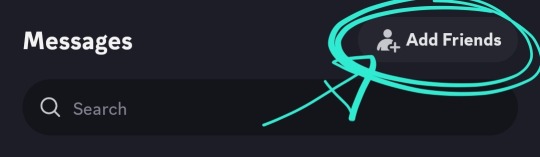

[ID: three screenshots from the discord app with circles around the buttons to press to get to this "feature". 1: the messages/DM button, 2: the "add friends button", 3: in the add friends page, the "allow contacts to add me" checkbox. /END ID]
#ling.txt#discord#fascinated by people seeing the edited post and then not even bothering to click on the bolded underlined capslocked link#in huge letters at the start of the post#tumblr is full of idiots god bless <3
70K notes
·
View notes
Photo

Reading the Sunday Comics 101 - Bold Lettering
0 notes
Text
watching dressrosa as a spaniard is so funny like you can't even begin to imagine
because at first you're just delighted to see your country serving as inspiration for one piece; between the architecture, the food, the dancing... it's great! you already knew that oda draws inspiration from real countries for his islands, but it never ocurred to you that you'd ever see your own!
then you get to the corrida colosseum and i know what you're thinking: that's roman! and yes, sure, gladiator fights and coliseums are generally associated with italy, but here's the thing: spain was a roman province for a long time, we do have plenty of roman ruins that include small coliseums, and we also have bullfighting rings! bullfighting evolved from gladiator fights, and the arenas are basically coliseums. so, while the corrida colosseum in dressrosa features gladiator fights, it's not entirely roman in its inpiration: there's a bull fighting in luffy's block, and there's the name! in spanish, "corrida" is the name of a bullfighting event, thus "corrida colosseum"
but. well. as it happens, words tend to have more than one meaning. and while "corrida" means what oda presumably researched it means when he named the dressrosa coliseum, it has a second, more widespread meaning.
"corrida" is slang for "ejaculation"
get any average spaniard, say the word "corrida" to them, and they'll be way more likely to think of sex than bullfighting. of course, context matters, and since the corrida colosseum is shaped like a bullfighting arena, the spanish braincell associates the "corrida" in there to the meaning oda was going for. but that doesn't mean that this picture out of context isn't absolutely hysterical for any spaniard:

and then there's that thing about how our former king shot and killed his younger brother, but that's a story for another day
#one piece#dressrosa#franky#robin#frobin#listen#if two ppl wear matching tshirts with the word ejaculation written across the chest in big bold letters i can only assume they're married#doflamingo#superrr#kir's originals
751 notes
·
View notes
Text
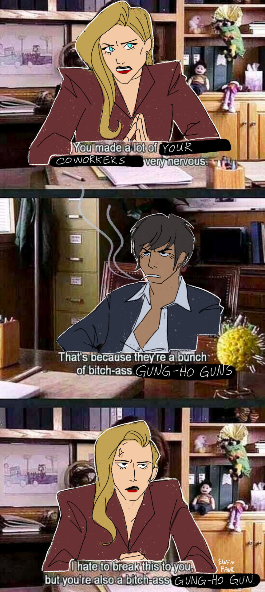
Wolfwood……….
[ID: A Trigun meme redraw. Elendira sits at a principal's desk and frowns, "You made a lot of your coworkers very nervous. Wolfwood sits in the chair in front of her and scowls unrepentantly, saying, "That's because they're a bunch of bitch-ass Gung-Ho Guns." Elendira, pissed, replies, "I hate to break this to you, but you're also a bitch-ass Gung-Ho Gun." End ID]
#thank you @princess-of-purple-prose for the ID!!!#Wolfwood manages Vash but who manages Wolfwood#wolfwood hasn’t attended a single company meeting how was he supposed to know#the pamphlet you got on your first day of work that said GUNG HO GUNS in bold red letters? nothing? okay.#trigun#nicholas d. wolfwood#trigun stampede#trigun fanart#trigun maximum#elendira the crimsonnail#elendira trigun#weeds
910 notes
·
View notes
Text

she's trying her best...on the wrong account
#oh my god if Artemy is a metaphor for jesus then is Aglaya just a very dedicated catholic fan?#your honour it was not heresy to find love in a stranger amidst the plague outbreak I was sent to solve#if you'd kindly move your attention to this printed paper I have here of his top 3 kins in this list#then you'd notice at third place just under apple dash that the holy son's name is written in clear bold letters#therefore Artemy Burakh is a jesus kinnie and as a devoted inquisitor of the church it was my duty to clap his che-#need to invent a ship name#aglaya first ofc bc she tops so#Lilurakh#lilchakh#so many possibilities#Artlilich#that one is good it rolls off the tongue#Artlaya#layart#Aglemy#I'm just making up new words at this point hopefully I don't end up spelling someone's made up oc name by accident#Artlilich is my fav tho#artemy x aglaya#aglaya x artemy#artemy burakh#aglaya lilich#♡otherfandoms#♡pathologic#pathologic 2#pathologic classic hd#pathologic#memes#lilakh
94 notes
·
View notes
Text
Message in a bottle.
#graphic#designer#design#artwork#graphicdesign#minimal#visual#typeface#typography#type#banner#editorial#poster#grafik#tumblr#arena#typo#letter#letters#lettering#typedesign#custom#bold#helvetica#edit#new#attico36
75 notes
·
View notes
Text
br*tish "people" really popped off with the word grey. i will give you that! grEy looks so pretty! she's so cutesy! she's my wife. grAy????? i don't know her!
#but i do want the discrimination against the letter z to end!#bc z is zesty and fun and silly!#z is the 🤪 emoji to me#bold of me 2 post this when they're all asleep lmfaoo my bad ily british ppl <3 i swear
125 notes
·
View notes
Text
hi what if joel blowing a gigantic load in your pussy and you feel it drip out as he fucks your ass from behind. what fucking if.
“aw, look at that… you’re such a sloppy fucking mess…”
“ya want some in your ass, too, whore? huh? ya want your daddy’s load in this little fuckhole, too?”
“good boy… daddy’s little cumdump…”
and ik the cuddling between rounds go hard as hell w/ him
#totally not inspired by the dick i just got#joel miller smut#joel miller x reader#tlou x reader#tlou smut#for all you cool kids out there: what if he puts it back in your pussy teehee#bro i feel like if i ever write atp i gotta put in giant fucking bold letters DO NOT TRY THIS AT HOME#bc ppl are stupid
61 notes
·
View notes
Text
Roman, who has always vibed with Mencken’s edgelord energy, sees no reason not to get on the good side of a history-smashing win. Roman knows who Mencken is, better than any of the Roys do; in Season 3, it was to him that Mencken expressed his openness to borrowing ideas from “H,” his pet name for Hitler. But what’s a little fascism between friends?
This had to be a rough episode for Team Roman, the “Succession” fans who love his broken-toy impishness and “Clockwork Orange” banter. He is funny, even while electing a white nationalist, telling his sister, Shiv, “It’s only spicy because if my team wins, they’re going to shoot your team.” That’s exactly what has always made him dangerous. Does he endorse Mencken’s worldview sincerely or ironically? Does it matter? Does an ironic arson fire burn any cooler?
His siblings respond with different flavors of ineffectiveness. Shiv, once a Democratic operative, is horrified at the “nightmare” of a President Mencken. But not horrified enough to sabotage her own schemes. Given the chance to ask the Jimenez campaign to promise to kill the Waystar sale — a deal she has been secretly working against her brothers to make happen — she fakes a call instead, and gets caught out. It’s a double-or-nothing bet with democracy as her stake, and she loses.
Kendall, meanwhile, resists with the force of a wall of Jell-O, telling Roman, “I don’t necessarily feel good about this.” Necessarily: On “Succession,” statements of principle are always hedged.
Kendall knows the stakes too. He wants to be good, or to be seen as good, and his daughter recently had an upsetting run-in on the street with an alt-right racist. But he also wants to win his company back. As often happens when he can’t reconcile his self-interest with his self-conception, he shuts down like a glitching robot, until learning of Shiv’s betrayal pushes him to push ATN to call the election.
His anger at Shiv is a reason, but it’s not the reason. As usual on “Succession,” this is about the money, and the dysfunctional family competition in which the money keeps score. As the brothers argue, Roman accuses Kendall of “big brother”-ing the election call, using seniority to get his way, just as Kendall did at dinner time when they were kids.
If only little Roman had gotten steak, we might have gotten democracy.
– James Poniewozik, “In ‘Succession,’ Democracy Goes Up in Smoke,” The New York Times, May 15, 2023
#i think people need to remember that literally no one in this show is a good person#and it pretty much says that in bold letters on the tin from the get go#if you can't take the heat get out of the kitchen etc.#succession#succession spoilers#quote
169 notes
·
View notes
Note
Why do you think mcu separated Thor and Loki? I still can't wrap my head around this how they are deliberately written out of each other's arc. This is not how it's supposed to be. They have no respect for the lore
it's called neglect of prior characterisation and it's symptoms of executive decision
#i can't even say it's bad writing#it's bad decision in bold red capital letters#like how are you going to be normal about their longstanding relationship being treated like a side story when it ran 3 movies
90 notes
·
View notes
Text
Steve: Well yeah, Eddie flirts with me constantly and touches me all the time and I do it back and everything, but we're just two guys horsin' around, y'know?
Everyone: No Steve. We do not know.
Steve: Yeah, Eddie's fruity with me, so what? Just because I'm a guy and he likes guys doesn't automatically mean he's into me. He's just comfortable being himself with me!
Everyone: Steve. He's sitting in your lap, playing with your hair. He calls you pretty boy, Steve. He's wearing your sweater, Steve. Steve, please.
#steddie#this is essentially the plot of the fic im writing#steve has-never-had-a-healthy-male- friendship harrington assumes that his friendship with eddie is what good normal male frienship is#everyone else watches on in abject misery as steves obliviousness reaches unbelievable new heights#steve briefly wonders where his interest in pursuing a romantic relationship has gone#then immediately comes to the wrong conclusion that he's simply transcended romance through the power of friendship#meanwhile eddie is tragically pining after a man who could not act more like his boyfriend but is tragically stupid#robin has become the conspiracy board meme from its always sunny#her board has IS STEVE BISEXUAL in big bold serial killer cutout letters on it. theres red string connecting pictures of him and eddie#and also him and bruce springsteen#its all very scientific#dustin and max add to it sometimes#steve harrington#eddie munson#steve harrington x eddie munson#stranger things
114 notes
·
View notes
Note
You said don't get you started on Ice's helmet or you'll be mean... please be mean. Please be mean to him. What is so disastrous about his helmet design?
my time has come. i will be mean to him. (thank you for getting me started on this. it bothers me every time I watch top gun.) this is also gonna be so long. yippee!
stopthatfool's issues with Tom "Iceman" Kazansky's helmet! aka this bad boy right below. (I'm sorry if anyone loves Ice's helmet, it's just not for me)
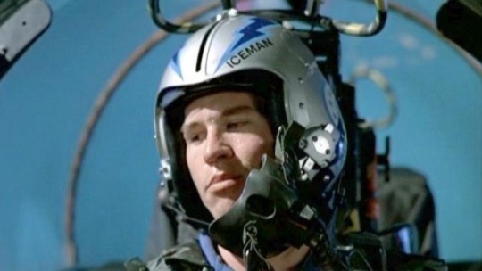
The placement of his name. WHY is it on the side? Both him and Slider have their names on the side. That makes me think it's a squadron thing? (the VF-213s) but regardless i don't care cuz i think it's stupid. (again sorry if someone thinks its genius. ok i'll stop apologizing)
My biggest issue with the fact it's on the side is that it creates this uneven weight distribution. The side with his name feels considerably "heavier" than the side without.
And the thing i don't understand is that Ice's name is evenly numbered!! He could fit 3 letters on either side of the line that comes down the helmet! the letters wouldn't be unevenly distributed, so I don't know why he felt the need to put it there!!
Here, I have "annotated" his helmet and provided other viewpoints of his helmet!

The font/typeface! Ice.. is that ARIAL?? and it's not even bolded??? so not only is his name to one side and weirdly small... it's skinny and unbolded. (like you're THE Iceman. Don't you want your name big and bolded? I shouldn't be searching for your name when you're Mr. Iceman!)
Looking at his helmet head-on, part of his name isn't even visible.. like ok ICEM!
And then! There's this weird switch up in the shapes and line types that he used-- the angular and sharp points of the lightning bolts and the half circles surrounding the squadron logo (is it a logo?? idk im gonna call it a logo)
What i think Ice is trying to do here is create a "connection" between the circular part of the logo and the lightning bolts as the bolts go all the way to the back of the helmet... but in my opinion... it's not working. like at all.
The comparison between the harsh lines of the bolts and then the curves is just kind of hard on the eyes (for me anyway). I just don't know where to look. Should i be following the leading lines of the lightning bolts? Or the curves of the half-circle things? Or should I be following the line of the lightning bolt in the logo?
And all throughout that... i barely end up seeing the name on the helmet.
Continuing off the logo... for Top Gun 1986, Ice and Slider are in the VF-213 squadron, but the movie switched the logo to the VFA-25s that looks like this on their flight suits-
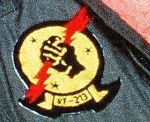
(yes that is the best quality image i could find from the movie my bad) So why does the logo on his helmet look like this???
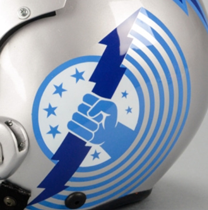
WHY do the fingers look like that. they look like hotdogs im so sorry. (logistically it was probably easier for the decals to be printed and then applied like this. but. we're not talking about technicalities here. right now i'm tearing apart the entire composition of Ice's helmet.)
I like version of the logo on their flight suits soooo much better! It's got more "rhythm" and flow to it that the lightning bolts lack! Plus no hotdog fingers.
Ok ok, now on the colour scheme. The harsh and bright blues I don't mind. Like yeah, you're The Iceman, punch me in the face with blue. I can forgive that. The thing that really bothers me.. is the silver/grey base of the helmet.
It's this really harsh grey that really doesn't help with the already harsh blues. I think he should've continued with the blue he has going. cuz this grey ain't working, king.
Ok, anyway. Since I should be studying, I'm obviously doing anything but studying. So i redesigned ice's helmet. ya idk.

it's kind of wonky.. but whatevs (ignore how the lightning bolt on the side view doesn't line up with the front view) (and ignore the inconsistences in the lettering. i was lazy and did it by hand)
I also didn't want to completely change/get rid of the aspects of Ice's helmet. So the changes aren't huge (except for maybe the name placement/"font")
ok I changed the background colour (finally, it's less all up in your face now) I continued with the blues and lessened the intensity just a little bit. I really wanted his name to be front and center!
Now the colour scheme is also consistent. No random black lettering (again, in arial???) there's now black in both his name, the outline of the lightning bolts and the logo!
Now his name is evenly distributed! See how it fits on either side of the line that comes down the center of the helmets from '86? See how you can actually see his whole name? See how it's heavier and fits the whole "iceman" theme better? (at least in my opinion)
Come on, Ice! You should've used the leading lines provided by the lightning bolts to guide people to your name! There's now a fun little overlapping moment!
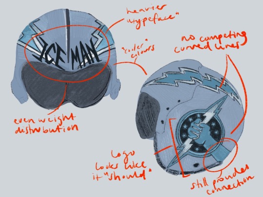
(ignore how i forgot to dot one of the i's in distribution whoops)
No more weird half circle things! No more conflicting leading lines! But! I decided to extend the arm of the squadron logo to continue the line of the lightning bolt as it moves backward. I think this makes the circle of the logo fit better, while simultaneously creating that "connection" he was trying to get in his actual design.
The lack of half-circle things also allow for the logo and lightning bolts to just "be." There's no distraction. it's not overly "busy" anymore (like maverick's helmet). It's simple, but he's The Iceman! He doesn't need it to say/have more!
And the use of the "actual" logo seen on Slider and Ice's flight suits creates that sense of movement that was absent before! Plus no hotdog hands!
Is this new proposed design perfect? Absolutely not! The logo and the lightning bolts still create a weird point of almost intersection that still bothers me. But I think fundamentally, there's always going to be issues with these two components: the circle will never quite fit in, and the lightning bolt the hand is holding will always "cut" the whole thing in half, creating a weird separation in the helmet, that will always bother me.
Anyway, this was a lot of fun! (I love being mean to these guys. they need their egos brought down a couple pegs!)
#now if only i put this much effort into my actual assignments regarding composition breakdowns....#looking at it now. i think i just spelt distribution wrong. blegh. whatever.#ICEMAN! big bold letters! like oh yeah! that guy!#long story short! i hate his helmet!#i hate hate HATE your hair and makeup today#like that clip from rupauls drag race u know?#top gun#top gun 1986#iceman#tom iceman kazansky#stopthatfool goes crazy and explodes#stopthatfool draws
59 notes
·
View notes
Text
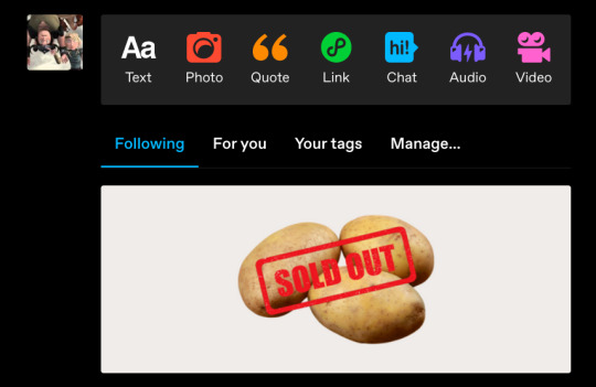
i'm so broken i opened tumblr and saw this and my mind immediately went 'ooh snotlout!!'
#the image of a bunch of potatoes stamped with snotlout's name in bold red letters is so fucking funny though#can somebody make that#snotlout snotlout oi oi oi#snotlout jorgenson#snotlout#how to train your dragon#riders of berk#defenders of berk#race to the edge#httyd#rob#dob#rtte#rosie's httyd brainrot
154 notes
·
View notes
Text
Noah and Maya together on the tonight show the last day of pride month we love un subtlety
The way that 2 or even 1 month ago we would all he freaking out about this
#Literally spelling it out in bright bold letters#stranger things#byler#will byers#mike wheeler#Robin buckley#noah schnapp#maya hawke
998 notes
·
View notes
Text
That part in the good omens book where Crowley calls Aziraphale Angel Infront of Anathema and she immediately assumes they're gay (they are) but with swap Radiodust and literally any bystander
They're not dating or anything, officially they're just good ole close friends/"aquaintences" but that's not stopping anyone
One of these days I'm gonna draw non canon art of swap Radiodust kissing for shits and giggles and literally no one can stop me
#radiodust#UpsideDown/Swap AU#swap au#hazbin hotel swap au#i love being an artist#i can literally draw whatever i want its great#if i do end up drawing it im putting a big ole sticker in the corner of the png with “NON-CANON” written on it in big bold letters#good omens mention
25 notes
·
View notes
Text
Random oc doodles because that class boredom hits deep
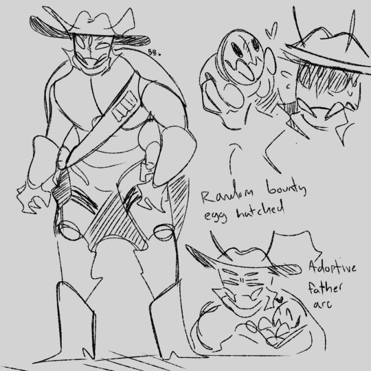


#digital art#art#ocs#original character#character art#Most of them was me going through old as hell messages and then finding their old character sheets#I cringe at old art so I was just like “yeahhh let's redraw some of these guys” and then we end up here#Anyways bug cowboy guy I named Chicken Sandwich and I don't even remember why#It's was just there in bold letters ontop of his art
19 notes
·
View notes
Last Seen Blogs
dilf-in-peril
Dilf in Peril
thatonedoctorwhoau
[On Hiatus Indefinitely]

tronthings-blog
Electrify the Boys and Girls
booshboys
you're made of sunshine.
premierjvalrie
Time To Get The Show On The Road