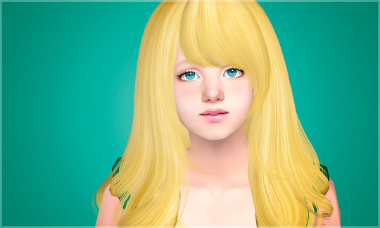
#also the only colour i mixed on the palette was the skintone
Text
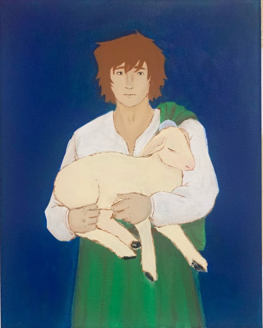
me yesterday: oough my brain is muddled with Virus and Illness.... how will i ever draw....
me after eating one (1) jello cup: I Must Paint
anyway its Galloway!!! i want to paint blood on his hands for the vibes but im gonna be hanging this where ppl can see it and ask me questions about it so im like ehhhhh
#my art#galloway#macbeth#macbeth art#shakespeare#shakespeare art#he's such a sad scared little man (affectionate)#also the only colour i mixed on the palette was the skintone#everything else is straight from the bottle
8 notes
·
View notes
Text
Voyage of Simself-Discovery: Met My Mismatch
In my attempts to make my game more aroace-friendly and generally a better fit for the simmer I’m becoming, I’ve been reconsidering a lot of my CC and mods for this rebuild... and I’ve made another slightly odd discovery about myself.
Turns out I have this sort of reverse-pickiness when it comes to textures: maybe it’s my dislike of being organised in general, maybe it’s the fact that everything in my home is pre-loved and held together with duck tape, maybe it’s the fact that Kulo Seeri has yet to invent furniture shops or paint palettes, but I’ve noticed during my build sessions that I actually prefer objects not matching! Also, I’ve applied the same logic to genetics: my default S1-S4 skintones are drawn from four different sets, custom skintones are also “a few each from different creators” and I mix and match DR face templates from various creators’ sets too.
So I’m going to embrace my eclectic tastes in future builds, and I have a more modern-looking, urban fantasy type hood in the planning stage where I can go all out with the quirky CC that wouldn’t fit in the Seeriverse even with my “matching is overrated” philosophy. Watch this space... and if you’re into everything having the same colours and textures, sorry not sorry. My game is going to make sense to me even if it only makes sense to me.
(P.S. My collection of vintage 80′s and 90′s My Little Ponies also displays the same reverse-pickiness. Give me visible signs of having been loved and played with by a kid over the sad little “I’ve been stuck in this box for over twenty years” ones any day!)
7 notes
·
View notes
Photo
A while ago I received an interesting question about game aesthetics. The person in that ask really struggles with downloading stuff and finding their own style. They asked me how I came up with what you see on my screenshots. Have you ever thought that you can recognize whose screenshot this is by just a quick glance? Is editing important in photoshop? How to take beautiful screenshots? Today let’s talk about how different one single game could be for each of us and what really makes this mysterious “sims aesthetics”.
EDIT: Sorry, it turned out to be huge with lots of random thoughts :D I hope at least one percent of these is useful!
NOTE: English is not my native language, I apologize for possible grammar or spelling mistakes. I tried my best in writing this!
Ok, let’s imagine that you’re a person who just obtained the sims game or just want a nice fresh start and demolished your download folder. (We all need fresh starts sometimes, right?) The struggle is that you have no idea which style you like the best. There are so many sims blogs. Everyone seems to enjoy what they post but you’re a little bit lost in that jungle. Don’t worry! I’ll try to guide you and share my thoughts.
STEP 1 Choose your general style
I roughly divide all sims blogs that I see on my dashboard into a couple of so-called styles. I’ve been doing it in my mind for ages. I like following different people and seeing diferent editing. None of them are better than others. I hope you understand that it’s just a matter of liking. Ok, here we go. Let me put this sorting hat on you :D
1. Realistic
Screenshot by @luchiatores
Perhaps, it’s the most important thing that you should decide for yourself. Wether you should use realistic textures in your game or you’d prefer to stick to more cartoonish maxis match ones. Why is it so important, to my mind? I like things that match. Just imagine game Witcher 3 where characters and surroundings are realistic. And now imagine Minecraft where things are pixelated. Both games are great, both games have certain beautiful styles. And now imagine Geralt hunting for monsters in a pixelated Minecraft swamp. A bit strange, isn’t it? :D The same applies to Sims. If you put a super realistic skintone on your sim and put a Maxis ponytail, that would probably look strange too. If you choose this style, just try to dig for a good quality content, start following simblrs in this style. Unfortunately, I’m not an expert when it comes to realistic content. So, try to drop an ask to someone whose realistic game you like. There are so many helpful people around in the sims community no matter what style they have :)
2. Trully Maxis Match
screenshot by @whattheskell
This is a complete opposite of a realistic style. I’ve always called people who use a lot of original maxis textures “trully maxis” :D If you can decorate a house without any custom content, if you like the way original hairstyles look, if you like Maxis clothes, you should go this way. From what I’ve spot after being so many years in the sims community, “trully” maxis simblr are so creative when it comes to storytelling. The stories that they write about either their sims/or maxis premades are so breathtaking. So much drama, so much fun. The only thing that I write about my screenshots is “Ok, this is my cat! Look, it can eat flowers and puke afterwardst! Yay! Cute”. If you choose this way, I can recommend you to check out @holleyberry, @didilysims or @moocha-muses. Obviously there are a lot more blogs that I follow. These people are just so sweet and helpful and they’re first who came to my mind.
3. Bright Maxis Matchery
screenshot by @muupi
This is where I refer myself to. This style is still Maxis but what stands out is the use of bright colours and saturated photoshopped pictures. Ah, my love for overedited pictures is endless <3 This is what I’m going to talk a lot below since it’s my cup of tea. It’s all about colours and pallete addiction. If you love looking at super bright/silly/cheery screenshots and they boost up your mood, than join the squad!
Basically, Maxis match (I’ll just shorten for MM from now on) players avoid super shiny skins or hair textures and prefer to have content with Simlish letters instead of English ones. This is a very important factor for me when I choose paintings or prints for T-shirts. I don’t know, I feel like it’s so cute that sims can’t understand our languages, talk this funny gibberish simlish language. It’s cute! There are so so many people that I can recommend. @lina-cherie @keoni-chan @kahlenas They are first who came to my mind <3
4. Grungy/cosmic
screenshot by @lilithpleasant
I don’t know if these are suitable words :D But this is how I describe people’s game who like aliens/supernatural sims/grungy textures with or without bright colours as well. Just think would you prefer a bit of a grungy stuff or less-textured but cleaner MM? You always need to think about textures while you download stuff. I can recommend to check out @pooklet or @furbyq-sims
5. Semi

screenshot by @whysim
You might ask me “Why am I not allowed to put a realistic skintone on a maxis sim? What the hell?” Of course, you are! Do it please, if you want. There are no rules, no restrictions. You CAN go semi-realistic, you CAN mix patterns, you CAN mix colours. There’s only one rule: please, enjoy what you do. Don’t be afraid to share your pictures on the Internet. There will always be people who can judje your style and say: “meh, it’s too dull, meh, it’s too bright, meh, too shiny, meh, too plain meh, meh, meh”. Just don’t pay attention and enjoy your game. As for semi-realistic I can recommend such wonderful people as @marvelann @lilith-sims @falkii @knowledgeaspiration
A bit about my style: I’ve always loved cartoonish/bright style. I’ve never ever played with shiny textures. Before Tumblr era I just played either without CC or with a bunch of maxis recolours. How I came up with the idea of cartoonishness? Pretty simple. It’s a part of my personality, I think :) I’ve always loved Disney/Pixar movies. Cartoons just make life a lot funnier! They make me happy. I’m a pre-school teacher after all :D. You can’t imagine how many cartoons I’ve watched throughout my life. I can quote Peppa Pig and will never be tired of that :D Before Tumblr I just played some funny legacies (I’ve never finished any though :D) When I found out about Tumblr, and such great content that can make my game even more Disney looking, it just blew my mind! Every time when I download stuff, I imagine that I’m watching a Disney/Pixar or whatever studio cartoon. When I create sims, I feel like I’m a cartoon designer. Pretty silly, right? :D
Let’s take a look at my screenshots from the past. I tried to find similar ones with a lot of greenery.
2014

2021
I stil like a lot of greenery. Editing has changed, photo angles have changed. But bright colours and Maxis stuff are forever in my heart <3
Risa (2014)

Gage (2021)
As I’m a big cartoon addict, I love recreating game/anime/cartoon characters. No matter, if they’re my favourite or requested ones. I love when my sims have different traits. I love when they’re funny looking/clumsy/absent-minded or when they’re evil/supernatural. When they are pirates/detectives/vampires or witches. This is my way of playing Sims. I love this game as it gives us possibilities to show your creativity, a chance to recreate our favourite characters. A chance to be a writer of storylines or if you’re bad at telling stories, just being “a cartoon designer” like me :)
STEP 2 Colour palettes
If you’ve chosen the path of “bright maxis matchery” than colour palettes are super important! Oh, you can’t imagine how addicted I am to certain colours. I can download GBs because of it.
Here are some of my favourite colour palettes:
1. Anna’s colours
My absolutely favourite palette. I would download absolutely anything in these pretty colours. Just looking at them makes me so cozy *0* There’s a photoshop action for those who want to recolour CC in this palette.
2. Poppet’s colours
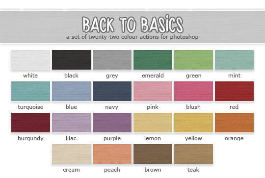
I especially like the latest one. So pretty! @poppet-sims is the queen of lovely recolours. She has some more palettes. But “Back to Basics is my favourite”
3. Eversims colours
@eversims has got a lot of pretty colour palettes. But the most iconic one is Ever So Lovely
So, these are the basic colours that I like downloading furniture/clothes with.
There are a couple more pretty palettes that I like:
Huning’s Pony Colours

Back in the days it was my ultimate favourite one. But these days I edit my pictures in Photoshop excessively and prefer calmer colours and add bright layers in photoshop instead.
Nyren’s Kosmic Colours
If you’re more into pastels, than try to download some stuff in this pretty palette.
You might wonder if I use all of these colours. Of course not! I have a selection of colours that I use: apple green, sky blue, yellow, red, pink, orange, purple, teal, mint. I absolutely love combining 2 or 3 of these in my interior shots. I also love choosing my sims’ favourite colours and dressing them/decorating their bedroom in this certain colour(s).
For example, my sim Mia likes apple green/purple and mint.

I think @deedee-sims can relate. While I prefer choosing a favourite colour per sim, she chooses favourite colour for the whole family!

This is a great idea, I think! :)
STEP 4 Bodyshop stuff
Ok, I hope it’s clear that I’m colour palettes addicted, now let’s move onto actual custom content and what I prefer adding to my game. I decided to divide CC by sections. Let’s start with Bodyshop.
4.1 Skintones
Another important thing that you need to choose for yourself. There are tones ofoptions. I’m going to recommend only MM skins as obviously I have no idea which realistic or semi-realistic ones are high quality.

screenshot by @deedee-sims
If you prefer trully maxis skintones, I recommend you to try Leh’s skintones. It’s super close to original ones in terms of shades. Also look at those button noses! These cute noses is the reason why I started using this skin back in 2014. But later I switched to Lilith’s feather as I wanted more variety and those noses there got a lovely shine.

It was my default skin for a lot of years. These days I own every possible skintone by Lilith and various blends by other people.
Lilith’s Alien Flavor
Lilith’s Android Skin Edit
Lilith’s Apple Pie Skinblend v.2
Lilith’s Apple Pie Skinblend
Lilith’s Apple Pie by Kahlena
Lilith’s Feather Skinblend
Lilith’s Feather Skins
Lilith’s Feather by Sim-Strangers
Lilith’s Feathers Colourful by Berrynooboos
Lilith’s Honey Supernatural Custom
Lilith’s Honey with freckles
Lilith’s Honey with no freckles
Lilith’s Honey Unnatural by Berrynooboos
Pixel-danger-sims pastel skins
Here’s a very handy set-up by Vimpse with Lilith’s skins being townified.
Try to choose one set of skins or download all of them by one certain creator. I need a lot of skins because I love creating tones of sims and I want to make them various looking.
4.2 Eyes

♦ Polaroid ♦ - my favourite
♦ Transcendental ♦

♦ Sleeping Lion ♦

♦ Sharp Eyes ♦

♦ Shallowed in the Sea ♦

♦ Hand Outs and Punch Ups ♦
These are just some of my eyes. There are some more by Poppet, by Kahlena. And I have various addons to these sets that I grabbed over and here. I remember having struggles of choosing only one set. But than I thought: why do I have to choose if I like all of them and want my sims to look as different as possible? I just love when they are cartoonish but high-quality with nice white clean sclera. Just look at Disney Rapunzel. You’ll see what I mean ^_^


There’s one little trick that most mm players do for making sims’ eyes bigger and rounder - adding a whiteline eyeliner by jesstheex. I personaly do it for every single sim of mine.
4.3 Makeup
I use tooooons of blushes, lipsticks and eyeshadows. I have everything by Lilith and Jesstheex. And lots of bits and bobs by various creators. I love using both matte or shiny textures. I sometimes add nose shine or use special nosemasks. There are various lovely things in my collection. What I can recommend you is to download a sim that you like by another creator with the help of Sims Clean Installer and just steal makeup from the sim to add to your collection *evil laughter* I recommend to do it because sometimes there are some mouth corners or various eyebags and etc which are difficult to find. It’s easier to grab them together with sims.
For example, I grabbed the shiny nosemasks from one of Lilith’s sims.
Sometimes I like adding a bit of shine on Sims’ noses. Some sims of mine don’t have shine. It really depends on a sim. But what I definitely like is cute button noses! I like using nosemasks to achieve that. I have all the masks by Lilith and these ones by kahlena.
4.4 Hair textures
Another important decision for you is the hair textures. I recommend you to choose one certain retexture. Back in the days, I used to have Remi’s textures
screenshot by @selenaq13
I liked Remi’s ones because they were non-shiny. They had maxis colours and a really cool yellowish blonde!
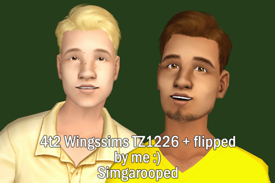
Receintly I switched to Simgarooped as I’ve always loved that there are 6 naturals. The yellowish blonde is still there! Plus my favourite Deedee-sims keeps updating every week with the retextures of new meshes <3
There are lots of various textures blends. Just search, download, play test. Think, if you’re ready to look at such type of hair hours of simming.
Also try to decide if you’d like to have more natural looking sims or go crazy and have supernatural/aliens. I used to have really bright sims with colourful skins and hairs.

Even my toddlers had unnatural hairs. It’s a lot of fun! But right now I prefer to create more natural looking sims though I like vampires/witches/aliens anyways!

screenshot by @honeylungsims
If you would like to have colourful supernatural sims, check out Honeylung! She has the brightest and most unusual supernatural sims <3
You’ll need a lot of face masks/bright lips/shadows. Check out @berrynooboos for the cutest alien CC.
4.5 Facial hair and Brows
I don’t think they should really match as long as they look great.
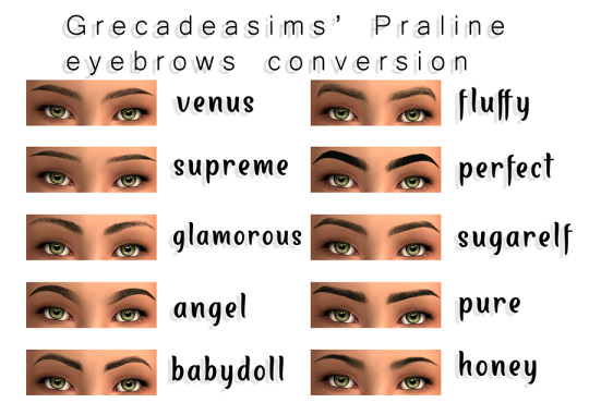
For example, I use eyebrows by @suratan-zir which are super cute and high quality but use Poppet’s textures instead of Simgarooped.

As for facial hair, I use some Poppet’s as well.
by Skoogy
by Poppet #1
by Poppet #2
by Simgaroop
4.6 Clothes
As I already mentioned, I love clothes in my favourite palettes. I love Simlish prints. There are so so many creators who share wonderful clothes.
I love @deedee-sims for age conversions, shoeswaps, morphs. I love @mdpthatsme for really cool 4t2 conversions. I love @moocha-muses for colourful T-shirts <3 Don’t be shy to send me a WCIF about a certain item of clothing.
STEP 5 Buy and Build
Tooons of bright recolours, IKEA items, Maxis add-ons, 3t2 and 4t2 conversions - all these things make my heart beat :D

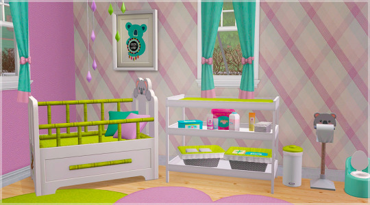
These days I play in a rural-type world. I download a lot of craftsman-style build things, a lot of plants and garden deco.
I love bright wallpapers and greenhouses, I love clutter and kids CC for nurseries. Patterns with polka dots and plumbobs. Sunflowers and tulips. This is what I usually drop into my download folder :)
STEP 6 Taking screenshots
No matter which recolours and textures you prefer, I think high-quality pictures are important. The first thing that you need to playtest for yourself is a camera mod. It’s upo for you, but I can’t live without Gunmod’s Camera Mod. There are some more available, just check out.
Also lighting is important since Maxis original is terrible. I use Dreadpirate’s mod.
I recommend to take screenshots in a camera man mode. Click Tab to enter it. Use W, A,S,D,E buttons to move right/left/up/down etc. And what’s important, use X and Z for zooming in and out. I always use Z for example, when I take close ups of my cats.

Don’t be afraid to experiment with angles. Try some artistic ones.
You can move your camera down and take a screen from below.

Or vice versa from above.
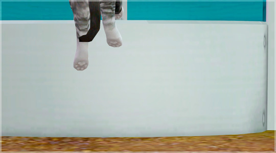
Sometimes I’ll just take a screen of my sims’ hands or feet. It really depends. I love spending hours on just “walking” in a camera mod around my sims houses.
Another useful feature of this mod is to use Ctrl +4,5,6,7,8,9 buttons.
These can fix the angles for you. And after fixing them, when you click on 4,5,6,7,8,9 you camera will go back to those positions. It’s very handy when you want to screen 2 sims who are talking and there’s no need to constatntly move camera from sidde to side. Just fix it and wait for them to perform cute emotions!
As a bonus, you can fic positions in the life mode too. For example, I always choose a proper angle from above where the wgole house can be seen. And wait for something cute/funny/to happen.
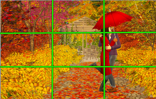
Also there’s such a thing as The Rule of Thirds. It’s the rule of photography composition. I always try to follow it :)

STEP 7 Photoshop Editing
I love oversaturated colours. It can be too much for someone’s eyes, but I like the brightness :) I’ll share some good Photoshop resources. Probably, one thing that I can recommend to absolutely everyone no matter how bright you want your screens to be is sharpening! Seems that Tumblr eats our picture quality for breakfast. Sims screenshots seem so blurry to me. I love sharpening them first.
I use sharpening from Kalekaloo’s action.
After sharpening I run the base from Eversims Action and then add some colour layers from Simburgerr’s one (I like gradients and fluffy lights layers especially). It makes the reds colours a little bit too saturated but I think it’s cute!
There are a some more cute actions and PSD files out there:
OhMySims - Action 1
OhMySims - Action 2
Sterina’s Action
Photoshop PSDs by Pleyita
Snapdragoned PSD
Mandragore PSD by Kiinuu
JellyBeanery’s Action
Roguebotanist
Nnilou - 12:51
A generic PSD by Knowledgeaspiration
Colorize IT by Bonnypixels
Colour Crush by Bonnypixels
Just Like Heaven by Pixeldemographics
For more tips/palettes/cute fonts I recommend you to check out @bepixeled
That’s all that came to my mind. I hope at least something was useful!
477 notes
·
View notes
Text
Current berry drama thoughts.
I will preface this by saying I am white, and would love to hear from POC about their opinions on this topic. I would consider myself a primarily berry simmer but not a hugely active member of the community these days, and I agree there is racism in the berry community. There’s a few points I would like to address.
As a white person I am sure I have done racist things as every white person has. I am doing my best to check myself, educate myself and recognise and stop if this occurs, and I invite anyone to please please call me out if you think I need to be called out. That said I try to create a diverse range of sims based on different cultures with features representative of those cultures within the bright and fun berry colour palette, and I aim to give my black sims darker skintones. I do have some sort of face blindness and I suck at recognising and recreating specific features, so I tend to search the gallery for sims from the background/race I want to use as a base to combat this. My recolour models are a mix of races, and I purposefully try to recolour black/afro textured hairs to ensure these options are available.
But even still I know my game can still be racist. If I’m making over townies the game spawns sims with mostly white features. I tend to reach for my white female sim model first. In my CAS legacy votes with a black spouse the children that win are always those that are lighter skinned or have less typically black features. When I request spouses for challenges people will rarely make POC sims unless I specifically ask for it. I have seen comments about berry simmers using black/Afro textured hairstyles on white-coded sims, and this is something I see a lot too and makes me uncomfortable but as a white person I never know if it is my place to comment or call it out. It absolutely is not all berry simmers as I know many people who are very careful and conscious, but it is still something I see often enough to be noteworthy to me.
I feel like any of these things individually is not much but I feel that collectively all these microagressions do add up and need to be addressed. I do not believe anyone in this community is intentionally being racist, but I do think that we all need to check ourselves and think more carefully about why we make certain choices or hold certain beauty standards.
Having said that, I do believe that this is an issue for simblr as a whole too, and we all need to do better.
I would also like to comment on some allegations that have been made that from my experience are false. I have never seen any form of fetishisation of lesbians in this community, and I have only witnessed one instance of transphobia which was many years ago and that person was promptly banned from the server in which it occurred and was no longer welcome in the community.
The idea that all berry simmers subscribe to the same overarching ‘lore’ is also false. There are certain ideas that are prevalent and common in many people’s stories, but equally as many people ignore these entirely or have their own. There’s probably as many interpretations of ‘Berry lore’ as there is of say, vampire lore in modern culture. Some people go all in and have incredibly well thought out lore, and some people like me just play exactly the same but with colourful sims. I am sure there are people whose interpretation of lore is problematic, but in my experience this is very rare and far from the norm.
This is just a few thoughts off the top of my head. With all that said I would love to hear the thoughts of simmers of colour on this issue as I would highly value your input. I’m heading to bed right now but if anyone has any further comments or input or ways in which I can do better or areas I need to further educate myself in, please drop me a message, preferably off anon.
17 notes
·
View notes
Note
I luved your Carla color palette analysis. Can you do an analysis on her facial features compared to her parents💞💞🥰
Okay,let’s do this.
Ipromise I haven’t been ignoring you on purpose anon. First time this was asked,I wanted to wait until Not Without my Magic premieredbecause I wanted to get a better look at Ash. The second time, I was caught upwith school and work and honestly, I don’t think I’m really qualified to dothis, but, here we go…

Carlaseems to have gotten most of her features from Ash. Her skintone, nose and eyeand lip shapes are all very similar – the only subtle difference being thatAsh’s lips are a bit fuller. I also believe she gets her hair colour from thatside as well, considering that Ash’s eyebrows are the same shade of dark brown.(I’m convinced her hair is a stylistic choice given the blue streaking).
Buther eye colour? That, I’m not sureabout. Victor’s eyes are green. Ash’s are blue. And Carla has these adorableviolet stars for eyes that, if I had to guess, might have come from one of hergrandparents because green and blue do not make violet.
Carla’sface, however, is a bit more rounded then both of them, which is either meantto be a mix between the two or is simply because she’s still young. Or she justhas a baby face and when she’s older, people will think she’s much younger.
And,speaking of that, she is a precious smol one.
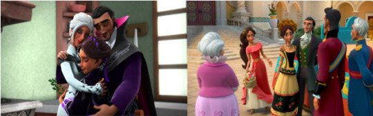
Seriouslythough, she seems rather petite and neither of her parents are very tall eitherit seems. I lean towards thinking that this likely comes more from Victor’sside though, because Carla is thinner and not as ‘full-figured’ as her mother. She’salso canonically about seventeen at this point and I’m not sure she’s going togrow much anymore if at all.
Well,I hope this was satisfactory enough. I really am awful with this sort of thing,but I also love any chance to talk about my precious smol one.
#SunsetCarla.
#elena of avalor#Carla Delgado#Victor Delgado#Ash Delgado#Delgado fam#Character analysis#kind of#ask me anything#anon ask#Adrianna talks#SunsetCarla
17 notes
·
View notes
Text
Anti-Haul Blogpost: "Not My Colours" Orange Eyeshadow Edition
Recently, I've been seeing lots of "anti-haul" posts on Youtube and elsewhere. Basically, in a nutshell, an "anti-haul" is just a list of things you didn't/aren't planning to buy - as opposed to a "haul" which is list of things you bought. From the posts I've seen, it seems to have been partly borne out of a bit of a backlash against Youtubers and "influencers" shilling all sorts of dubious makeup trends and products, so this trend helps people to articulate how they are saving money by highlighting what they are not buying, and what trends they're not buying into.
I'm all for it. I mean, as a beauty junkie and beauty blogger of 7+ years, of course I've hauled many a haul (and have the haul posts to prove it too! But I do agree with the general anti-haul sentiment that not every trend is worth getting into, and not every makeup product is for everyone - after all, not every "must-have" palette is suitable for every type of skintone, undertone, and colour preferences. And while I'm not about to stop hauling (oh no, not at all!), I do agree that I do enjoy my makeup stash best when my makeup purchases are thoughtful and curated, and when I don't just jump on every hype bandwagon. And, I get to save money! So for me, anti-hauling isn't at all "OMG DON'T EVER WEAR MAKEUP!!!111!!!11!", but more of "hey, not every makeup product/colour/trend is going to work for you, and you'll enjoy makeup more if you buy what you're happy wearing, and what looks good on you".
So, with that said, let's get into one of the recent makeup trends that just haven't been doing it for me - warm, orange eyeshadow! There have been a ton of warm and/or orange-y eyeshadow palettes released this season, and the orange eyeshadow was pretty much the "it" item of the summer, and still going strong. But for me, since I have an olive, neutral-cool undertone, the orange eyeshadow trend really just became the "swollen eye" trend. I do love some of these brands (and do indeed have other products from some of these brands here), but here are some of the recently-popular orange/warm/rust-toned eyeshadow palettes that just didn't do it for me.
1. Huda Beauty Desert Dusk Eyeshadow Palette
Huda Beauty Desert Dusk Eyeshadow Palette (Image source)
Huda Beauty is a brand I haven't tried yet, but is basically the makeup brand of Huda Beauty, a very famous beauty blogger with an eyewatering 21 million Instagram followers, and some very gorgeous makeup looks! (She herself is gorgeous, by the way.) Huda is a warm-toned medium-skintoned lady, so it does make sense that her eyeshadow palettes also do have warm shades, and some deeper tones - those are the shades that would look good on her. But for me, those shades just don't look that great - I basically won't be able to pull off much of the top row, and much of the third row, and only some purples in the second row would look good on me. So it's a hard pass for me.
2. Huda Beauty Textured Eyeshadow Palette - Rose Gold Edition
Huda Beauty Textured Eyeshadow Palette - Rose Gold Edition (Image source)
Oh yes, another Huda Beauty product - trust me, I don't hate Huda, or her brand, it's just that a lot of the recent eyeshadow palettes seem to follow the warm/orangey theme. This one isn't as orangey as the other palette, for sure, but it's also just full of colours that don't look good on me (or anyone who is cool-toned, for that matter). I basically can't use all the shades on the top row - except Dubai, and all the shades on the bottom row, except Coco, Suede, and I guess Black Truffle (because they're black and brown shades). The middle row is a mixed bag for me, I could imagine using shades like Bae and Moon Dust on the daily, but not much of the rest. In any case, I do love the look of Dubai and Suede, but I probably can't justify a palette purchase on the basis of a handful of shades - especially when my stash is so large I probably already have similar shades somewhere!
3. Urban Decay Naked Heat Palette
Urban Decay Naked Heat Palette (Image source)
Oh Urban Decay, how I love your palettes, and Oh Urban Decay, how horrible I look in the orange shades of the Naked Heat Palette. I gotta say, I love Urban Decay eyeshadows, and have some of them in the OG pull-off-lid packaging (that shade, which I still have, is Stray Dog - exactly the kind of cool brown taupe that I love and buy literally dozens of). I have the Naked 2 Basics Palette, and the Naked Smoky Palette (which I reviewed here), and I love both to bits. But I just can't with the orange shades of the Naked Heat Palette - these shades are exactly emblematic of the orange eyeshadow trend that is a boon for warm-toned ladies, but just looks bad on me. I could see myself using the first two shades, and the last shade, but every other shade is going to just look like a hot mess on me (see what I did there?). Side note: I love how Urban Decay is calling these "scorched neutrals" on their site, which is a nice touch.
One last confession: I was so tempted to purchase this anyway, because it was all over my Instagram, and I mean, those bright oranges really pop and would look sooo good on Insta! But I didn't, because there's no way I would buy makeup for Instagram purposes, right? *looks away and whistles* But, the way makeup trends go, I just know at some point they're going to release a kickass cooltoned brown/grey/purple palette. And then look who's going to be dropping all her dough on that baby when it launches!
4. Kylie Cosmetics The Bronze Palette
Kylie Cosmetics The Bronze Palette (Image source)
Okay, so this isn't an orange-y palette, but on my skintone, it might as well be. This is Kylie Cosmetics, which has been getting a lot of hype on some social media outlets (Instagram in particular), for being the cosmetics brand of Kardashian Klan member Kylie Jenner - no introduction needed, I guess! The Bronze Palette, as the name implies, it's a bunch of warm bronze and brown shades. Again, this isn't as orangey as some of the other palettes here, and, to be fair, would look great on a much wider variety of skintones than mine, but for me personally, this is not too wearable. I could imagine using the top 3 shades in the left hand corner, and the dark brown right at the bottom right, but the other 5 shades aren't going to look pretty on me. So a pass for me.
Side note: in the Kylie Cosmetics (I'm surprised they didn't call it "Kosmetics" - I mean that pun is just dying to be made) world, eyeshadows are sometimes termed "Kyshadows". I don't mind it, it's pretty cute.
5. Kylie Cosmetics The Burgundy Palette
Kylie Cosmetics The Burgundy Palette (Image source)
Here you go, another kollection of Kyshadows in a little kontainer! The Kylie Cosmetics The Burgundy Palette is another palette that isn't as orangey as some on the list, but just doesn't really have too many shades that will look good on me. Other than the beige shade at the top left hand corner, I...basically cannot imagine using any of the other eyeshadow shades. Sorry, Kylie, I kowtow to your kreative endeavours and your unkanny knowledge of how to influence kontemporary pop kulture, but I just kan't gel with this palette.
So that's it - here's my anti-paen to the orange/warm eyeshadow palette trend that's been so popular these days. If you're feeling like I am, don't fret - makeup truly is cyclical, and trends come and go. Soon the trends will move on to something else!
And, noone asked, but for the exactly 0 people wondering "Darn woman, you've been spitting so much hate mild dislike at the most popular eyeshadow trend now, do your eyeballs even get eyeshadow lovingly brushed on them? And if so, what shades do you like?" The answer is yes, my eyeballs get their fair share of eyeshadow love, and here's a photo of my eyeshadow stash circa 2015 (it's obviously somewhat outdated as my stash has only grown since then):
My eyeshadow stash - yes I actually took out all my palettes for that photo! (Image source)
Source: http://musicalhouses.blogspot.com/2017/09/anti-haul-blogpost-not-my-colours.html
0 notes
Text
**This post is not a collaboration. All opinions are my own.
If you follow me on Twitter and/or Instagram, you will have seen that a week ago today, I went to a beauty masterclass at The Body Shop concept store in Leeds. The masterclass was with beauty bloggers Becky and Holly Sheeran, along with their mum Gill and international makeup artist Abby Ireland. We got to see some of The Body Shop’s makeup products being used, whilst sipping on prosecco or sparkling elderflower for a non-alcoholic version. Afterwards, we got an opportunity to have makeup consultations using the products displayed and a chance to shop. If you spent £15, you got a lovely giftbox full of goodies worth over £40. It’s save to say the event was a success!
In my opinion, you can never go wrong with Body Shop skincare. Give me their body butter anyday, it’s second to none! It was this reason that I was more interested in the makeup, so here comes my review of the products I obtained, some of which I bought, some of which came free in the box.
Shimmer Waves:
The Shimmer Waves compact was one of the free products. It comes in three shades: Bronze, Coral and Blush. I got the bronze shades in my gift and I’m really glad because the colours are ideal for me.
I think The Body Shop had a brilliant idea when they came up with this product. If you use a brush and mix all the colours together, you can create a beautiful bronzer and blusher, but the individual colours make lovely eyeshadows or highlight and contour. This is perfect if you are going away and don’t want to take a lot of stuff because you have about 4 products all-in-one.
The Body Shop is also against animal testing and uses natural ingredients in all their products, so you know that the origins of your beauty and skincare is cruelty free.
Eye Colour Stick:
Eyeshadow sticks are really popular at the moment and I’d say it’s because the application is so easy and the colour is strong and long-lasting. I’ve had my eye on The Body Shop ones for quite some time. Whenever I go to Leeds train station, I have a quick peep into The Body Shop store and often test them out. There are some beautiful darker colours in this range, but I decided to buy Nevada Gold, because it is really natural, so perfect for everyday wear, but also adds a bit of sparkle to any night out.
Now, onto the main event. Lips.
Lip Definer:
I’ve never been one to use lipliner. Whenever I use one, I can never blend it in with the lipstick and end up with a massive line around the edge of my lips. I love this liner from The Body Shop though. The pencil style means it’s really easy to apply, but unlike some pencils, the texture is not too dry and it blends well with lipstick. The shade I bought is ‘Hot Date’. I would not normally put these words and me together, but it works. The colour gives your lips a bold look, but at same time does not make you look like a clown, so it is wearable in all situations.
Matte Lip Liquid:
Yep, another beauty item that up until now I have been makeup virgin. I was lucky that the liquid lipstick in the giftbox was the shade ‘Nairobi Camellia’ because it is the best one for my skintone, but it also blends well with the liner. It also acts as a good lip moisturiser and doesn’t dry out too much, even though it is a matte lipstick.
Lip Palette:
One of the most talked about products on the night, of course I had to buy it. This lip palette caters for all occasions, ranging from everyday pale pinks to bold red. The only thing I would say that could be improved is that the colours are not named, but that is not a big deal as there is only one type of palette. Again the colours blend well with the lip liner, and contain beeswax which means they are a good moisturiser and leave a nice gloss across the lips, but at the same time one that is still natural.
I hope you have enjoyed reading this post, and feel the need to head to your local Body Shop store. Let me know if you want to read more beauty posts on the blog.
Megan x
Twitter: @meganelifestyle
Instagram: @meganelifestyle
Facebook: @meganelifestyle
Pinterest: @meganelifestyle
The Body Shop Make-Up Review **This post is not a collaboration. All opinions are my own. If you follow me on Twitter and/or Instagram, you will have seen that a week ago today, I went to a beauty masterclass at The Body Shop concept store in Leeds.
#bbloggers#Beauty#body shop#bronzer#cfbloggers#cosmetics#cruelty free#eyeshadow#Leeds#lip liner#lipstick#makeup#natural#review
0 notes
Last Seen Blogs
nataliens
🌻Natalie🌻
shy-peacock
Nothing new here .
drpepperassociate
I quit soda yet here I am
kaitchupp
kai
ladybonnibel
✨Cool Art Stuffs✨