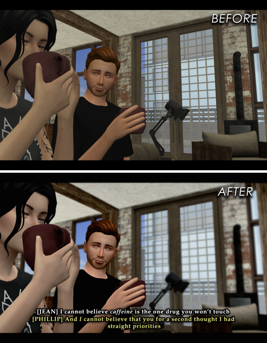
#also if all the images are different aspect ratios No They're Not
Photo


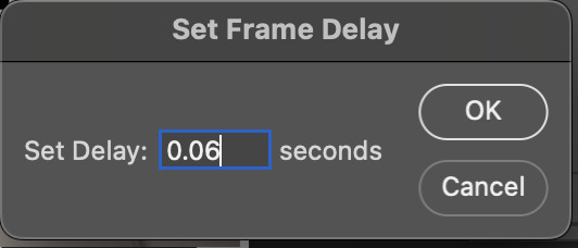
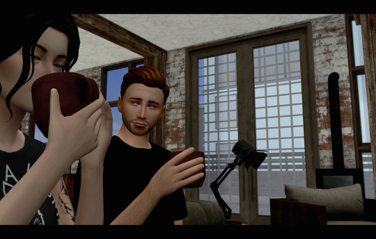
Happy DCBB! I had the pleasure of being paired with the lovely marchember this year for her Howl’s Moving Castle crossover, one of my fav movies! Please go check out her amazing fic here! (and wish her a happy birthday today, too! 🎉)
#dcbb 2022#dcbb#destiel#seriously this fic is so good go read it NOWWW#also if all the images are different aspect ratios No They're Not#draws
59 notes
·
View notes
Note
hello! im a newby gimaker and i want to follow your tutorial on sharpening but i dont know how you got to the photoshop page you started from where it looks like a video timeline. can you tell me how you got there? <3
Hey!!
Welcome to the wonderful world of gifmaking <3 yes i can lead you through to that point. I have a mac so this might look different for you, but all the steps stay the same - I just shifted from windows to mac so i know this xD
I'm going to show you how to do this on this gif:
I prefer to use screenshots for my gifs (I also don't know how else to make them), so I use Mplayer for that. I used to use MPV player but that stopped working with my new computer system.
First, you want to make sure that you're using a high-quality file. If 1080p is available to you, use 1080p at the very least. This will make sure your gifs are crisp and sharp.
Open your file with Mplayer. Then find the bit that you want to gif. I sometimes search forward by frame by using the ">" key. Once you're at the start point of your desired gif, pause the video. Then, Cmd/Ctrl + Shift + S to start screenshotting. The video will start to play slowly as the screenshots are captured. (They go to the desktop automatically but you can change that in interface settings).
The rest of the tutorial is under a cut:
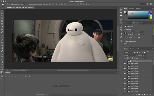
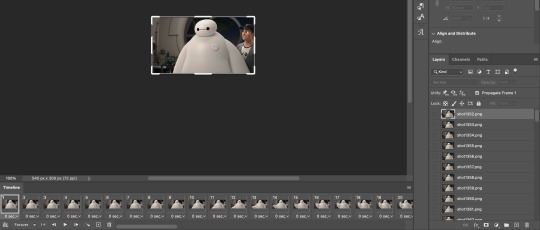
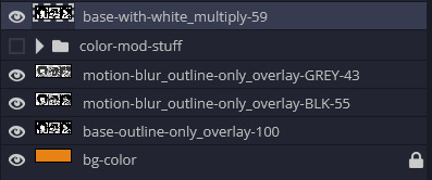
Once you get your screenshots, you're going to go Photoshop. File > Scripts > Load Files Into Stack.

You're going to get a dialogue box. Click Browse and load the screenshots that you want. This is what that looks like when you finish:
Next, you're going to crop your gif, using the crop tool. You can press C on your keyboard for this or use the tool with this icon in the sidebar.

For this, I'm using an aspect ratio of 540 x 400:

Click that checkmark to crop. Once you do, we're going to resize the image. Use the Cmd/Ctrl + I function to bring up this box. For tumblr gifs, you want to change the width. The height doesn't really matter but if the width doesn't match up, Tumblr is going to fix it for you and it'll look funky. Per row:
1 gif , we use 540px
2 gifs, 268px each
3 gifs, 177, 178, 177 px
We're just doing one, so I'm using 540px.

Now, you want to make sure you can add the timeline. In the top bar, go to Window > Timeline
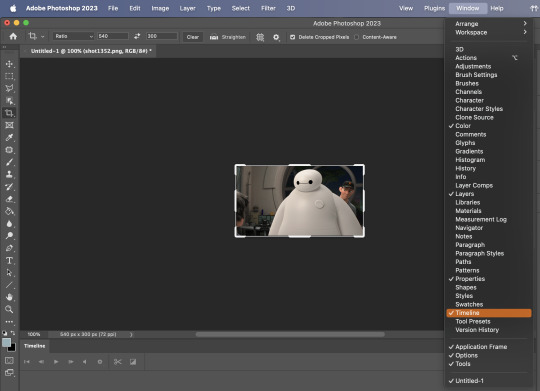
This will bring up the timeline.

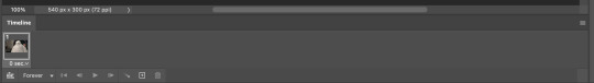
From there, click "Create Frame Animation" (you might have to press the arrow in the timeline bar first.)
It's going to look like this:
We're going to use those three lines in the corner of the picture above. The first option we'll select is "Make Frames From Layers"
That looks like this:
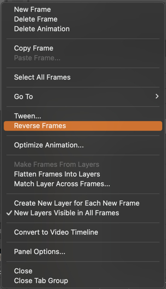
Now, when these load in, you may notice that they're all in reverse. To make them go back in order, we're going to go back to that menu and click "Reverse Frames."
Then, in that same menu, click "Select all Frames." We're going to change the animation speed. You want to make sure you have the first frame selected. We're going to click the arrow next to the "0 sec"
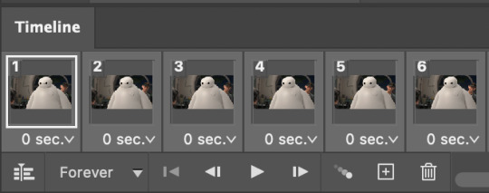
When you click that, it will give you a menu. Click, "other..." You should get a dialogue box that says "Set Frame Delay", just like the one below.
You want to use anywhere between 0.05-0.1 seconds. I find that anymore more is just too slow, so I prefer 0.06. This is fully changeable at the end of my sharpening tutorial, and you can use what you want, but that's what I prefer.
When you do that, it'll change the frame speed of all the gifs.
Now, go back into that little menu, and click, "Convert to Video Timeline."
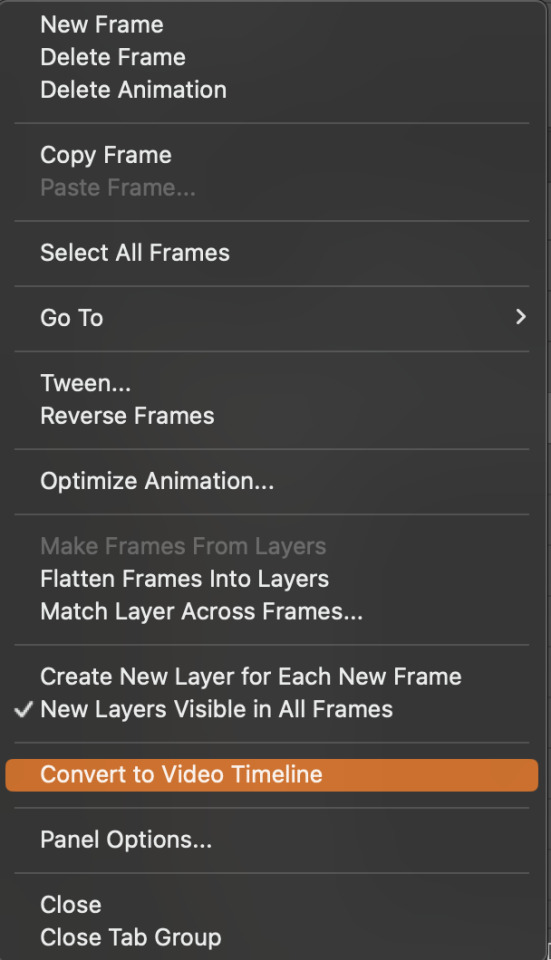
This is what it'll look like:

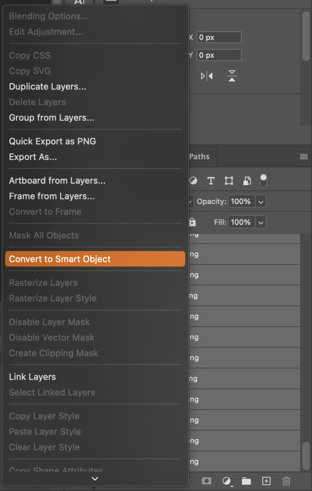
Now we're going to select all the layers in the right-hand pane. Once we do that, right-click and select, "Convert to Smart Object."
And you're there! Now you can use the sharpening tutorial to your liking.
Pro tip: Make an action with all these steps so you don't have to do them by hand with every single gif you make.
Hope this helps and it wasn't super long winded. Let me know if you have any questions <3 Happy giffing!
#zee answers#zee's tutorials#sharpening#gif creation#tutorials#gif tutorial#photoshop tutorial#resources#ps help#dailyresources#userphotoshop#completeresources
27 notes
·
View notes
Note
Heyy, I’ve been reading your wonderful one piece works for a while — and I couldn’t stop wondering how are you actually doing those magnificent headers?
Like… hello? The great quality, with additional 3D-alike details I could catch by my eyes? I got only Ibis Paint X on mobile, since I’m only a young man that literally two months ago went on a life-time ‘adventure’ of living alone in a small apartment.
In short — I got no money to pay for additional graphics/drawing programs, not yet at least
Hello!
Thank you! I'm glad you enjoy my writing - I'm curious to know what's your favorite piece / part? Also I'm so happy you like my headers? Makes it feel worth it to spend time on them! :D
I have excellent news for you, I used a mix of Canva and Photopea. They're both FREE!
I'll be explaining the process for making these two kinda? The full tutorial is below the cut, to be courteous to the other folks, hope you don't mind?
Though I am hearing that Canva has given people some grief. But Photopea is just *chefs kiss*
If you've ever used photoshop, Photopea is essentially a free photoshop, and it even has the automation tools! An absolute lifesaver when you have multiple layers you want to export (but that's for larger projects not this)
I'm going to assume you have basic knowledge of layers in digital drawing programs for this. If anything isn't clear: ask me, I'll clarify!
//-------------------------------------------------
My General Process is:
Search for official art / images
bring it into canva / photopea
crop / arrange images to match the dimensions
select a thematic color that is associated with the character
separate the foreground from the background
mess around and test things until they work
//--------------------------------------------------
Given "Louder than Words" is the latest one I've made, I'll start with the process for it.
Dimensions: 3000 x 1055 px
dpi: 96
//-------------------------------------------
Let's Get Crackin'
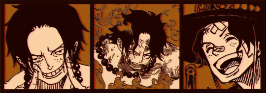
Alright let's grab some official art so we're not using any fanart without the artist's permission
I try to pick images that feel relevant enough to what I'm trying to make.
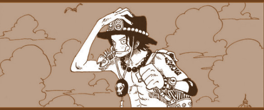
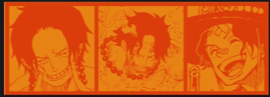
For example: the image for the Matching banner shows the ASCE tattoo which is super important in that fic
2. Let's arrange them onto a banner where each individual image has the same/similar dimensions to the rest
That's probably part of why you like these. To a certain extent they have similar dimensions, so they have a uniformity that's pleasing to the eye! (It's not perfect because I threw perfectionism to the wind because this is tumblr not my portfolio)
Tip: if you have 3 images and only 2 that have similar dimensions, and the 3rd one can't be cropped logically: but the one that's a different aspect ratio in the middle!
3. lets arrange them in such a way that the borders all feel like they're the same/equal width/thickness
you might find that you have to shrink some images for this, that's fine.
ALTERNATIVELY: if you're going with one image crop it so it's just the relevant info and it matches the dimensions (3000 x 1055 px)
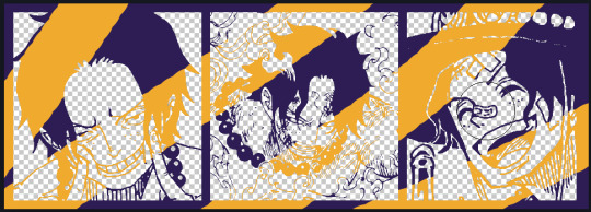
We have our base! Now let's add some color, and direct the viewer's eye together!
4. pick out a color that you think matches your character / vibe - that color is going to be your background
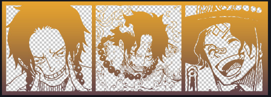
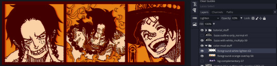
Given I'm making an Ace banner: orange is the color I'm going with
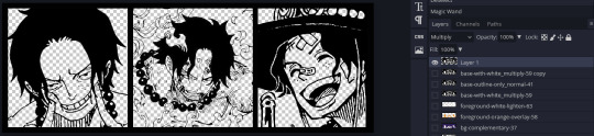
I went and named my layers for this lol. The numbers represent the opacity, and they aren't important. I just kept changing the opacity until I liked the way things looks. But here's the secret to the 3D feel:
Motionblur (+ moving it about)
Separating the foreground and background and dulling out the background.
I'm going to show you my process so you can see the effects, but first let's give you some quick skills:
//------------------------------------
SKILLS / THINGS I THINK ARE HELPFUL
//------- Select Similar
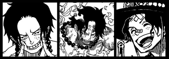
magic wand -> select something -> right-click -> select similar
This works best when you have high contrast images (like manga panels that are black and white). You can select the black or the white areas. Depending on what works better for you.
TIP!
Invert selections with ctrl + i
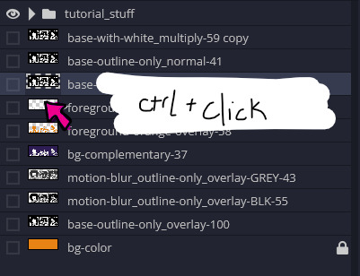
Say you know that you want to select everything but Ace's face in the second panel. Select his face with the magic wand then ctrl + i, and that's the only thing NOT selected


TIP!!!!!!!!!!!!!!!
Please, please, please, duplicate your original image and work on the duplicate layer. This helps you SO much. !!!!!!!!!!!!!!!!!
TIP!
Check your selection tolerance! This could be why too little, or too much is being selected.

//------- The Move Tool
Shortcut key: v
While the move tool is active, you can nudge the stuff on whatever layer with your arrow keys
Shift + arrow key = 10 px move (generally)
//------- Layer Locking
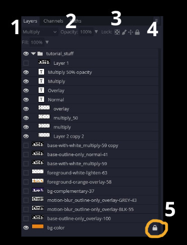
1- Layer Blending Mode (see Overlay vs Multiply vs Normal) for how this can affect results)
2- Opacity: how see through it is / isn't
3- Lock Transparency (it's the little checker board)
4- Lock Layer (looks like a lock)
5- Lock icon that appears when anything on the layer has been locked
More on 3 Lock Transparency: You can only paint on / modify what's on that layer. You CANNOT add anything to any area that is already transparent
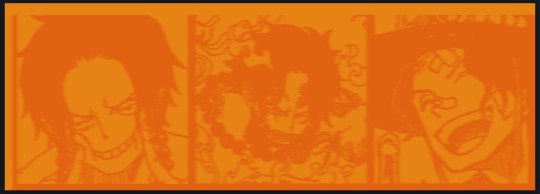
Here's a demo of what you can do with this power:
Here's the original Image - notice how it's just the lineart with a transparent background.
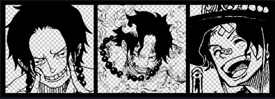
It's powerful: abuse it
//------- Overlay vs Multiply vs Normal
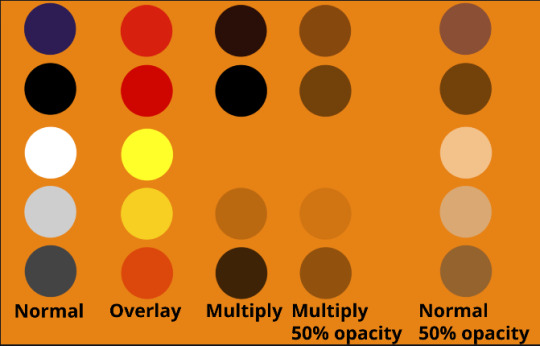
I think seeing this is the best way to visualize how different modes can affect the color.
//--------------------------------
Back to the Tutorial
!!I IMPORTANT NOTE !!
Please play around with the opacity slider to figure out what opacity works best for you on the multiple different layers we're about to make / work with. It's up to your own style to figure this out.
Next: please feel free to not follow all of it. Add more layers, add less layers, take the base principles and go wild! :D
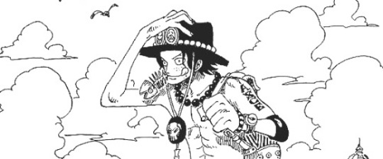
5. Separate the lineart from the background and save it as a new layer
6. Duplicate it and set it to overlay, or set it to overlay immediately
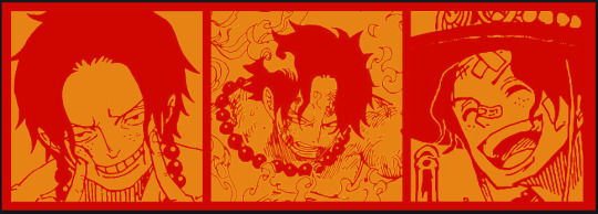
7. Duplicate that lineart layer twice and set the blending mode to overlay
8. lock transparency on the top one and change it to be a dark grey
9. Apply motion blur to both:
Main menu bar -> Filter -> Motion Blur
I made it so that the grey layer was blurrier than the black layer
10. More them around a little to give it a "3D effect" as you called it.
It creates shadows under the lines - I was aiming for an effect similar to chromatic aberration (chromatic aberration is a valid way to add punch to your stuff too!)
So this is what things look like now - painful, but let's keep going
11. Duplicate the ORIGINAL / BASE lineart layer, that you DID not apply motion blur to -> set the blend mode to multiply (reduce opacity for it to actually take effect)
okay that's less painful
here's what the layers look like right now:
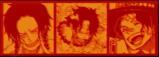
let's bring more focus to Ace's face, and push the background farther away:
12. Use the magic wand tool to quickly select large areas of the faces / focal area / foreground and the lasso tool to refine things
TIP!
Hold shift + click -> add to selection
Hold Alt + click -> subtract from selection
13. On a new layer with blending mode -> lighten, fill that selection to be white
If you look at it, you'll notice that it is ALREADY starting to draw our attention to his face, but the background is kinda aggressive, so let's dim that down
TIP!
Right-click on the gradient tool to find the paint-bucket tool

TIP!
Sample All Layers:
Turning this option off makes it so that you only work with the content on THAT specific layer. Turning it on makes it so that it is working while taking all other layers into consideration.
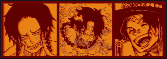
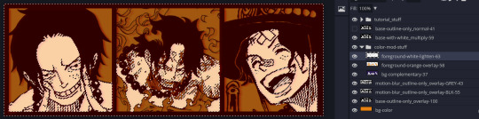
14. ctrl + click on the "white foreground" layer to select the contents of that specific layer (pink thing is your mouse)
15. ctrl + i to invert selection and ON A NEW LAYER (layer mode -> multiply) fill that with a complementary color
16. I did one last thing where I took the original base (before we separated the lineart) and added it to the very top and played with the opacity to get something less in your face (layer blend mode was set to NORMAL)
And that's it!
More considerations that I take:
I want the banner to be "thin" or not square, so it doesn't take up too much screen real estate on people's devices
I don't want readers having to scroll too much to get to my writing (which is the whole point of the post, let's not waste their time making them look for things)
I want the banner content to be relevant enough?
ie: with Matching: I wanted the ASCE tattoo to be visible. With matching I wanted Ace to not look too happy in some of them.
I'm also trying to avoid spoilers, I hated getting things spoiled, so I'm trying to be careful that the images I pick don't spoil anything really.
Congrats on starting life on your own! I did that whole living by myself thing too! Tip: keep the pantry stocked with lentils, beans, pastas, baking essentials, rice. They really come in a clutch when you're hungry.
#photopea resources#photopea psd#tutorial#tutorials#tumblr banner#photoshop#photoshop tutorial#digital art#fuck adobe#adobe photoshop
12 notes
·
View notes
Text
Okay actually I do have a proper thought on the "sylki is incest" wank. which is that the "anti" take seems to be that Loki/Sylvie is obviously, glaringly, an incestuous pairing but its shippers deliberately ignore that because they like the pairing otherwise (yet also the accusation involves them liking the incest element... honestly it's a bit of a muddle, but let's move on). But. Well, here's the thing that is obvious, at least to me...
Go to AO3 and have a look to find the most popular (in terms of number of works) Loki pairing in the Marvel Cinematic Universe fandom as a whole. Actually, i'll save you the effort:

(These numbers are slightly out-of-date but the ratios remain accurate. I checked.)
Now, that. That is an incest pairing, isn't it? There is some fic which specifies an AU of some sort in which Thor and Loki are not related to each other but most of it is about brothers who are also lovers.
"But they're not really related," you say? Sorry, but in the important ways, they are. Every one of those films, and the Loki series, frames them as siblings-with-issues, and yes one of those issues is whether or not they agree that they are siblings, but I'd say the MCU comes down pretty firmly on the side of "they totally are."
And the point I'm making here is that the actual incest pairing is treated as such by its fans. If you don't feel up to reading any thorki fic I'll save you again and say that it overall leans into the "forbidden love" angle, and the shame and internal conflict of an incestuous attraction or relationship. So shippers of a given pairing do indeed know what incest is and they rarely try to avoid that aspect of such pairings.
Whereas. If you read the Loki/Sylvie stuff, that whole "thorki vibe" is entirely absent. Fans vary on variants, in terms of in what ways these two are or are not "the same person" but they agree on one thing: fucking some other version of yourself is not incest. This is pretty much a unanimous belief, and here I'll mention something else I think is relevant: there are a few sylki twincest AUs (many of which seem to have been written out of spite - LOL, fandom!) and in all of those the AU also features another crucial change - they are not both Loki variants in those fics.
Yeah, that's right! To make Loki and Sylvie siblings you have to remove the selfcest element entirely. Because - this may shock some of you, so sit down before you read this next part - you are not your own sibling. Even identical twins are obviously different people. A clone of yourself might get us into more philosophical territory but that's not what multiversal variants are either. Allow me to illustrate with another informative image:
You get me? Yeah, you get me.
So, to meander towards an actual conclusion here. The MCU!Loki fandom does not, in general, refuse to accept that romantic/sexual pairings that would be incestuous actually are incestuous. In fact if anything it embraces that element of such pairings. It is usually seen as the defining feature of them. If they think siblings are fucking then they will write about those siblings fucking, and they will not be shy about it!
And aside from that mentioned handful of AU fics, sylki is not written as incest. Because it just isn't incest. Look, if you personally see Loki and Sylvie as siblings to the point where the pairing squicks you out, then fair enough there's not much either of us can do about that. Do your best to avoid that content and don't be a wanker about it and I wish you well in your endeavours. But that isn't what most of the complaints stem from, is it? As usual in recent years fans who didn't like a pairing (which, btw, is allowed) wanted to have the moral high ground and some bright spark hit upon "this pairing is INCEST" via some slightly odd logic and it spread from there. Because we can't just not like something, can we? (Actually, that's also allowed!) No, we have to be better than those fans over there, who are all terrible people in some way. They are problematic.
And this is a lot of words for me to essentially say "no, the sylki fic and the thorki fic have very different vibes actually" but... well, they do. The sylki shippers are not denying the incest, because there is no incest there, and even if we for a moment pretend that "siblings" is a reasonable and indeed expected interpretation of the variants concept, it is clear from their content that the people who ship Loki/Sylvie do not see them that way. And that has nothing to do with DNA or otherwise, which I can prove with this very quick question: in one word (or less, if you can), what is the relationship between Loki and Thor?
You said "brothers" or "siblings," didn't you? No, you did. I know for a fact that you did, don't play coy with me on this. We all understand that these two characters who definitely share no DNA are, in every way that matters, brothers. This is not a difficult concept, it's not somehow confusing large numbers of fans either way.
tl;dr - Sylki isn't incest but if it was we'd all know that because the fans of it would not be constantly denying what would, almost certainly, be the main appeal of that pairing for them if that was the case. You can deny that all you want but 11,731 thorki fics (as of 10th December 2023) back me up on this one.
So there.
#sylki#thorki#loki series#cw: incest#like actually incest WHICH WE ALL RECOGNISE WHEN WE SEE IT DON'T WE JAN???#fandom wank#wow that was a lot of words to state the completely obvious#if anyone's wondering yes i have read and written both sylki and thorki fic. PLEASE be sure to cancel me for the right one.
18 notes
·
View notes
Text
SUBMISSION PERIOD: OVER!
(propaganda is always open, though!)
CURRENT ROSTER
like vocaloid* music? like girls? like vocaloid* music about girls? you have found your people. one must rule them all.
*"vocaloid" is used here to increase traction; songs made with any vsynth engine under the sun are welcome!
welcome :-) got a character from a vocal synth song you really like? well, if they're girl-adjacent, toss them in my direction!
you can also submit propaganda on why that girl should win
[thank you to vocalokat's discord server KATNATION for this idea...!]
the submission period is currently over!
please read the criteria under the cut before submitting!
submission criteria:
• the submitted character is from a song with a title formatted as "(ADJECTIVE) girl" or anything adjacent
• the submitted character has a design that differs at least marginally from the design of the vocal synth used for the song
(all with nuance of course, submissions will be present to The Council™ for review)
submission guidelines:
• you can submit more than one girl, just keep it to one per ask, please! this is for sorting reasons!
• it'd be cool if you could include a link to the song your girl is from! youtube, spotify, vocadb, niconico, etc. all work
• you can include an image, that'd be so awesome! do note i might end up digging for an image myself so i can set up image aspect ratios right and whatnot ^^"
• if you can, please check the current roster section below to see if the girl you want to submit is already registered! there's always the chance that i've gotten them in already! additionally, even if i just haven't updated the roster yet, don't be afraid to send in a girl you don't see in the current roster, i'll understand if i get repeats and the girl is not already on the roster!
...and, that's all you have to worry about if you're just submitting a girl! but, if you really, really want to convince the people to vote for your girl, you can also submit propaganda! submitted propaganda will be attached to all polls the girl is featured in. your propaganda will be posted anonymously, even if sent off-anon, as a bulleted list beneath the poll!
propaganda guidelines:
(these are a little heftier, sorry! this is the scarier section because it's free writing on your end)
• the "one per ask" rule is opposite here, please, as much as you can, if you are one person submitting propaganda, keep it to one ask! i can forgive forgetting one or two things in your ask and needing to squeeze in another, but for maintenance's sake, please avoid spamming as much as possible
• stay appropriate please. this is not the confessions altar this is a random internet poll
4 notes
·
View notes
Text
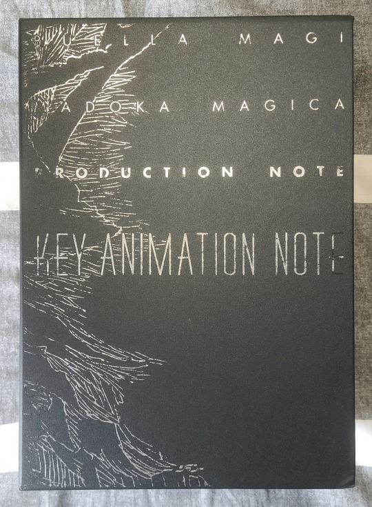
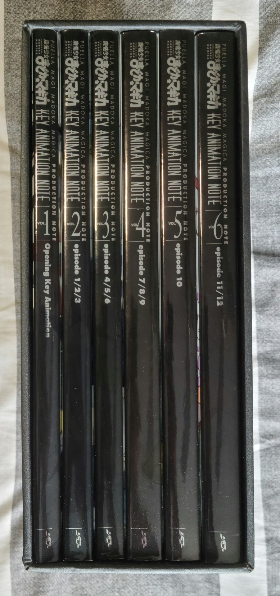
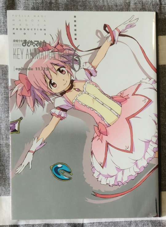
Madoka Magica Key Animation Note Box Set
Talk about crazy cool. This box set is a collection of 6 volumes that pull from the greatest/biggest moments of the original anime, and split them accordingly. I mean, episode 10 has a whole volume to itself, and these things aren't pamphlets or anything. They're 120+ pages of animation greatness to take in.
I'll just give a little tour of the exterior first, because I was really surprised with the quality of the actual box for the box set itself. Though in hindsight, it'd have to be good, considering the overall heft of the collection since it weighs in at around 7kg. Also, something that can be a real pain is how snug a fit a box set is. You want it to be tight enough that volumes won't slip out, but loose enough that it's not a fight to get them out. Thankfully, this set does a surprisingly good job finding a balance between the two.
Now, the only thing that's hard to really capture with these volumes are the metallic/glossy covers. I'll admit, they do look nice, but at the same time I wouldn't have minded something that was a bit less intense on the eyes (though there is matte designs on the cover itself, beneath the dust jacket). It's worth noting that that black line/mark and whatever else is going on at the bottom corner of the image is not any damage. It's just the tiniest bit of a reflection of my hat.
Anyways, the actual content. It's really incredible, and I love how varied it is. Most of the keyframes adhere to a 1:2 ratio on their respective pages, but Shaft mixes it up all over the place to better convey scenes and moments and layouts.
Here's an example of the typical 1:2 that serves as the default throughout the volumes.
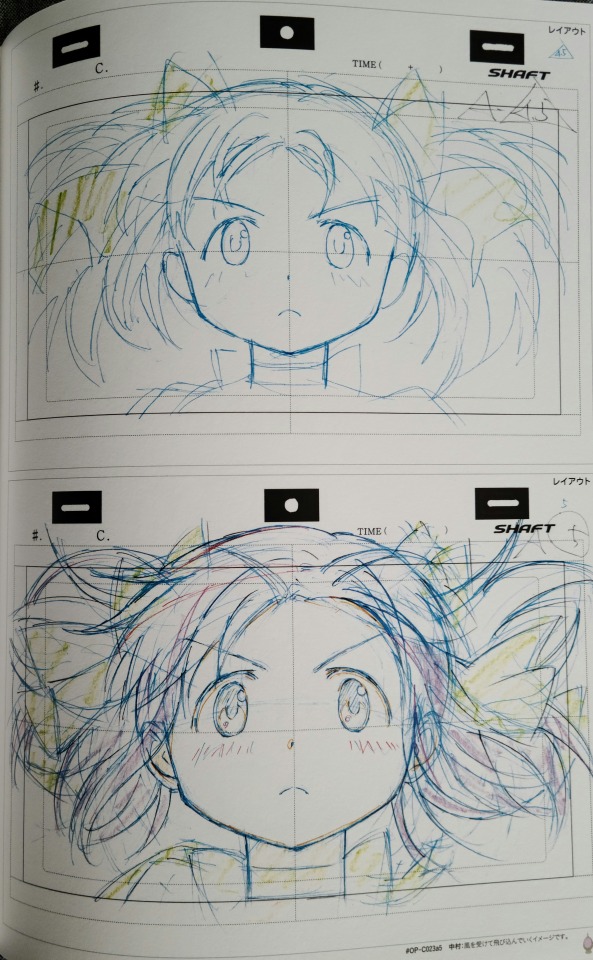
It's really quite interesting because even though these are the defaults, there's quite a few different ways they'll show up. Sometimes you'll get the full sheets scanned in like this (you can tell by the holes at the top denoting animation paper) with all the extra info and lines and the like, and then other times you'll have really cleaned up keyframes, along with all sorts of in between versions that can have different lines or framing or whatever else.
But for just as many of these "regular" keyframe pages, there's just as many different and unique ones, and even storyboards that they throw into the mix. It's really really cool, like this page that follows the above one.
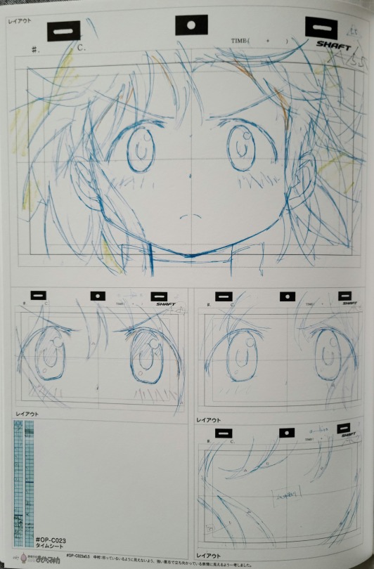
Of course, the appearance of the keyframes is similar to the earlier ones since they come from the same cut, but they change up how they're displayed to give readers a better idea of the overall flow. And, while it's definitely not something most are overly interested in, I think it's incredibly awesome that they include a timing sheet with sequences like this. If you want to learn what a timing chart/sheet is, I highly recommend this YouTube video going over what it is and how it's used in animation.
Anyways, there's just a lot of passion put into the release of this material. In how they organize it, in what they show, all the added detail and information. It's got a world of stuff out there that shows you at least some information from every core aspect.
Some of my favorites are the sequenced keyframes though. Just the feel you get from them, and how they come together is really something else. Plus, seeing the amount of effort that goes into them when so much of it can be out of frame? Such a crazy thing to think about.
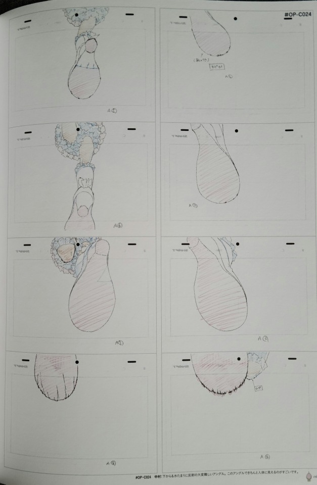
And then there's the keyframe vs finished product pages that are just so stunning. Incredible to get a side by side of the art.
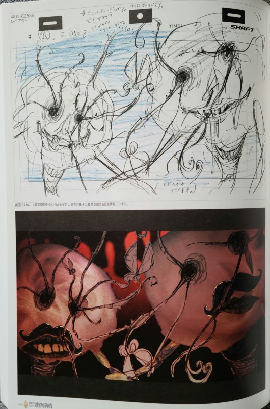
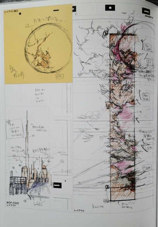
And they even go as far as showing some of the corrections made by ADs throughout the production (denoted typically by the yellow paper color). Just really interesting odds and ends that work together to create such a broad look at the production of the series.
Also last one, I just really love how some of the keyframes are used as a fancy version of storyboarding almost, and the way they organized these ones was super cool, as it essentially shows the "full" picture that can't fit in just one frame.

At the end of it, it's another one of those art book collections that just really stuns when you flip through it. With compositing and color and motion, it's laughably easy to forget about the insane amount of detail and effort that goes into each frame of animation. Getting the opportunity to own and experience this collection really helps me remember just how incredible animation and animators are.
And it also makes me really want to get more of the Madoka Magica art books.
#madoka magica#puella madoka magica#puella magi madoka magica#mahou shoujo madoka magica#魔法少女まどか★マギカ#magical girl madoka magica#studio shaft#anime art book#art book#madoka kaname#homura akemi#anime and manga#anime
18 notes
·
View notes
Text

Coping with the new Tumblr Mobile image layout (outdated)
Tumblr has once again made a bad decision. As you may know gifs in mobile now work different and many stimboards/moodboards have been ruined by it. Here are some tips to make your boards consistent on both mobile and web.
Why is this happening?
Tumblr mobile now show images as their real size. Before if you have a 600x600px image beside a 400x400 one the images would scale down perfectly since they had the same aspect ratio. Now if you have a 600x600px image beside a 400x400 one the images will be disproportionate to each other throwing off the whole board.
About moodboards
With moodboards I'd personally recommend just compiling them all in one big image then posting that image to Tumblr. This protects your board from current and future Tumblr tomfoolery. I personally use Photopea to make mine but other popular sites include: Canva, Picsart and Ibis Paint. Also you should export your big image as a png since they are higher quality and compress better.
Here is a template for a moodboard layout but you can make your own if you want special layouts or want to make it fancy.
About stimboards
Stimboards require a much more tedious process. You will now have to resize all your gifs and central image to be the exact same size being the same aspect ratio doesn't cut it anymore. I'd recommend going with 300x300px or 350x350px since 400px is where a good amount of gifs start to go over the file size limit (10MB).
For resizing I'd recommend using EZgif it is your best ally when it comes to editing gifs.
What about my old boards?
They're kinda messed up forever now. Unless Tumblr fixes their mistake or adds an option for different ways to display images in a post. If you want to redo them I would hold off for now since this is a relatively new update and it only affects mobile so there is a chance it will be undone.
#sharing my light : tutorials#stimboard#moodboard#stimboard making#moodboard making#stimboard tutorial#moodboard tutorial#tumblr image update#image size update#image update
12 notes
·
View notes
Text
I know people have stated many times before that Tumblr's presence as a social media site is distinct from others due to its sense of community—and this brand identity is definitely being encouraged by the site's staff/marketing team—but it genuinely does make me happy, and it makes the site itself feel worthwhile and worth caring about. I'm always intrigued by the little changes being made, regardless of if they're good or bad; it's not like other sites where every update is nigh incomprehensible to its users, and generally followed with nothing more than a sigh and a "Oh god what is it this time". I'm genuinely interested in the mechanics of all these new updates: what they serve to improve, the purpose behind their implementation, etc. That or I'm saying "Oh god what is it this time" with a bewildered, morbid sort of glee, which is equally good.
This interest is encouraged by staff blogs like changes and wip, and that's just a fun kind of relationship to have to a website. Rather than silently accepting whatever new nonsense a corporation has decided to do to their site (presumably in the interest of exploiting their users in terms of time & money), Tumblr's sense of community tends to encourage exploration of what exactly it is being changed—critically, analytically; it doesn't go unnoticed. And 'critical' and 'analytical' are two adjectives you don't find most other social media platforms encouraging in their user populace, LMAO.
It helps to see the silver linings in these types of things. The frequency at which features are added, removed, altered, broken or bugged, speaks to the humanity of the site's coders and staff—and, more likely, the occasional complete incompetency of their higher-ups, but let's not get into that LOL. Aside from a few particularly awful or unintuitive elements, these uncertainties and imperfections tend to be enjoyable and even valuable, in my eyes. They're quirks, but not in the sense of a 'quirky' fast food brand with a 'silly social media guy'—who is, in reality, the result of highly calculated marketing efforts. What differentiates Tumblr in this case is that these imperfections aren't really artificial. They're simply being embraced. And that's… kinda nice?
In a site that serves to foster expression through the digital medium in so many different ways, there are bound to be certain boundaries broken, for better or worse. Think of all the strange, inexplicable glitches Tumblr has experienced through the years. The relative lack of limitations—on file size, on media type, on character counts—naturally leads to all sorts of strangeness. A few months ago I made a post that displays as an image when viewed on a blog page, thanks to some HTML style elements I was strangely able to include. I don't know why that's possible, but it is! Even excluding silly exploits like that, users are free to play around with comically long, obtrusive posts whenever they please. The fact that "Do you love the color of the sky" is a site-wide staple speaks volumes about the kind of platform Tumblr is.
You're allowed to reblog a post 100 times in a row, and that post can be an obnoxiously long sequence of the sky. Rather than fight against pitifully low character counts, you're free to type up sprawling, rambling blocks of text, and it's up to you whether or not that goes under a read more. Your images aren't cropped or downsized, or crammed into neat, tiny aspect ratios. In terms of a clean, intuitive user experience, this is... objectively awful. And that's what makes it great. You're allowed to be obtrusive. In the near infinite space allowed, you're free to exist in any format you see fit.
It's easy to be cynical about this stuff; trust me, I'm well aware that this sense of 'humanity' is propagated primarily to create a likeable brand identity, also in the interest of generating profit from its users—but come on, that's just kind of a given, and severs aren't free. I don't think it's bad to embrace the community formed as a result of this, and I'd argue that having an interest in the site surrounding the community you enjoy is just genuinely good. I still highly encourage everyone to learn how to make their own websites (due to the plentiful easy to use resources and platforms available), but I recognize that this isn't a one-size-fits-all solution. There are many benefits a large social media platform has over an independent website, and you'd be ignorant to ignore them. And when so many websites are being sanitized, sterilized, and swallowed whole by an all-consuming interest in profit alone, it's nice to see Tumblr try to cultivate chaos instead. Basically, it's a cool social media website with a cool community, relative to the other options out there. And that's pretty cool!
Anyway all of this is to say that I still think the new 30 image limit is awesome. SERIOUSLY WHAT OTHER SOCIAL MEDIA SITE WOULD LET YOU DO THAT
#listen there's a billion bad things i could also say about tumblr and the many questionable decisions of its staff#but being excited over silly things like this is important for me OKAY?#there's certainly a LOT more to be written regarding this. buuuut not today & not by me right now.#also you have no idea how tempted i was to write this entire post using the [tumblr] thing. why is that a feature
42 notes
·
View notes
Text
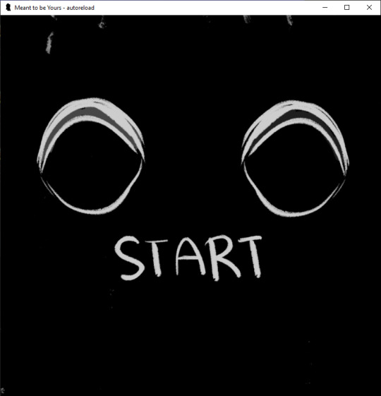
Perfect Love VN Devlog #1
I will probably try doing these at the end of the week so I can detail what's happening.
This week I focused mostly on sprite editing. As of current, I have pretty much all of the sprites done, but they require a few adjustments. I have about four different sprites for each version of Milo, but the headsizes and eye positions were inconsistent so I had to change them in Photoshop again. I also added the sprite edits for the last choice where his eyes sort of change color. I was dumb about it and didn't use my tablet but rather my mouse. I have to edit the last of the Violence Milo sprites this week, which shouldn't be too difficult.
I drew some of the mini cgs that pop up during certain events, but I'm missing some for the second choice. Because they're all in black and white it's a lot easier so I can afford to put in a lot of them. I also worked on the Main Menu which is whatever you're seeing above. I haven't quite coded in the Load, Extras, Preferences and Exit yet. The idea is that the eye changes depending on the form that Milo is in. Above it's defaulted at Eris's eyes, and I wanted to check how Glass Minds did their eye shifting in their game. Turns out it's a video, so I'll have to pop open After Effects again possibly or try to remember how to do animation in Photoshop again. The idea is that the eyes will look around as the player selects things. I thought about it looking directly at the player when something is chosen, but I have no idea how to code that in plus it's not super important.
I did do some coding for the sprites as it leads up to the ending. Layered Images are honestly so much fun- they remind me of the type of game modding I like to do, so expect there be a lot of facial expression changes. I added some new layers for the Bully, since he's not as expressive as Milo is. That was drawn with my mouse too so hopefully nobody notices haha.
I haven't touched sfx or bg music yet but I did save a bunch of the free ones on Renpy. I know a couple of other places to get sounds for free, but I'll have to check later on. I'm hoping for a slightly eerie one for the Main Menu screen, but we'll have to check later. I'm planning on doing that last though.
Finally I have to resdesign the UI. The game is set in a weird aspect ratio, which is what I wanted, but it also forces the save screen to be kind of messed up. I was going to redo the UI anyways because I personally like remaking it so it looks...less like a renpy game, no offense to renpy. Plus it will probably look more unique and I think it's fun to make the UI look different, haha. Harks me back to the game modding I did as well where I redid the entire UI for it like 4 times.
I think that's the majority of it. If you have any questions on renpy or anything that I've done, I can try to answer it if you're interested. That being said, like a lot of yandere vn creators, this is my first game, so I probably don't know anything too detailed.
8 notes
·
View notes
Text
How to Identify the Quality of LED Display Screen?
Email: [email protected]
WhatsApp & Wechat: +86 18038197291
www.xygledscreen.com
People tend to shop around for the best value for money. It's easy for us to identify the quality of some daily necessities because we use them frequently or are familiar with them. But what if you have to purchase an LED display screen? It's certain that you will make a lot of mistakes in the process as you are not familiar with it. Today I will teach you how to identify the quality of LED display screens with this article and nine important features from all aspects of LED display screens are contained. The first point to the eleventh point is applied to general LED display screens, and the twelfth point extends to small-spacing ones.
1. Flatness.
The surface flatness of the display screens shall be within ±1mm to ensure that the display image will not be distorted. A convex or concave display screen will cause blind spots from viewing angles. The flatness is mainly determined by manufacturing technique.
2. Brightness and viewing angle.
The brightness of indoor full-color display screens should be above 800cd/m, and it should be above 1500cd /m for outdoor full-color display screens, so as to ensure the normal operation of them. Otherwise, the images on them will be fuzzy out of the low brightness. The brightness is mainly determined by the quality of the LED die. Since the magnitude of the viewing angle, which is mainly determined by the way the die is packaged, directly determines the audience of the display screens, wider is better.
3. White balance effect.
White balance effect is one of the most important indicators of display screens. From the perspective of chromatics, it can show pure white only when the ratio of red to green to blue, namely the three primary colors, stands at 1: 4.6: 0.16. Any deviation of the actual ratio can cause the deviation of white balance. Generally, we have to pay attention to whether the white is stained with blue or yellowish-green. White balance is mainly determined by the control system of display screens, and the die also has a certain effect on color restoration.
4. Color restoration.
Color restoration of display screens refers to the high consistency of the colors on the display screens and the image source, which can ensure the realism of the image.
5. Whether there is mosaic or dead points on the display screen.
Mosaic refers to small squares keeping bright or dark on the display screen, namely module necrosis phenomenon, which is mainly caused by the poor quality of screen connectors. Dead points refer to the single points keeping bright or black on the display screen, the number of which is mainly determined by the quality of the die.
6. Whether there is any color block on the display screen.
Color blocks refer to the obvious color difference between adjacent modules. The color transition is based on modules. Color blocks are caused mainly by poor control system, low gray level and low scanning frequency.
7. Wavelength determines whether the color is pure and consistent.
Users do not have professional equipment generally. So how can we confirm the wavelength accuracy? It is easy to do that. Firstly, make the whole screen white. The white should be pure without being mixed with any other colors. If you think it doesn't matter if it's a little reddish or bluish, you will be all wet, as the color deviation proves that the display screen has problems with its materials, process quality control and so on. The longer it is used, the more serious the problems will become. Secondly, make the whole screen red, green and blue respectively. It will show standard red, green and blue under central wavelength. If the colors look darker or lighter than they're supposed to be, it proves the wavelength is deviated. If a certain color is inconsistent, it proves that the wave difference is too large. The wave difference is controlled at 3nm for green and blue and at 5nm for red of high-quality display screens within the range of central wavelength.
8. Power consumption per square
Power consumption per square refers to the power consumption generated by an LED display screen with an area of one square meter, whose unit is watt. We always use watts per hour as the unit of electricity consumption. For example, if we say the working consumption of an LED display screen of one square meter reaches 300 watts, it means the display screen consumes 300 watts of electricity per hour per square meter. There are usually two indicators for the power consumption of LED display screens, one of which is the maximum power consumption, the other is working consumption. The maximum power consumption refers to the power consumption when the LED display screen is at its maximum brightness. How to identify the maximum power consumption with eyes? An easy way to do it is to count the number of power supplies behind the box, multiplied by the maximum power of each power supply, and you can calculate the maximum power consumption per square meter then according to the size of the box.
9. Refresh rate
Refresh rate refers to the number of full displays of the display information of the LED display screen per second, and its unit is Hz. Low refresh rate will make the images dithering from people's eyes and make scanning lines appear in cameras when people shoot on the screen. Generally speaking, human eyes require the refresh rate to be above 300Hz, which is to say as long as the refresh rate is above 300Hz, people will not see the images dithering on the screen with naked eyes. While as for shooting, the refresh rate has to be at least above 600HZ to keep the scanning lines out of the cameras according to different settings for different cameras. High refresh rate can improve the brightness and color fidelity of the display screen, which can be detected with a digital camera. If the screen has a high refresh rate, the camera will take very sharp pictures without snow spots or scanning lines. This indicator is especially important when it comes to leased screens and the ones for television relay.
10. About contrast
Contrast refers to the measurement of different brightness levels between the brightest white and darkest black in the light and dark areas of an image. The larger the range of difference is, the greater the contrast will be, and the smaller the range of difference is, the lower the contrast will be. Contrast is very important to the visual effect. Generally speaking, the higher the contrast is, the clearer and more eye-catching the images will be, and the brighter the colors will be. The low contrast will just make the whole picture gray.
11. Color temperature
When the color of the images on the display screen is inconsistent with or different from that of the image source, it means there is a serious image distortion, which is related to the color temperature of the white balance of the LED display screen. The color temperature of the white balance between 6500K to 8000K will be appropriate when people look at the display screen directly with their eyes, while it should be adjusted to about 5500K when the screen is used for television relay so as to ensure that the picture on the display screen will be real after being recorded and broadcast by cameras.
0 notes
Text
What are the three components of Responsive Web Design with examples?
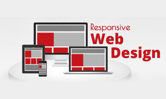
What is a Responsive Website Design?
Responsive Website Design is building a website that works on all devices and screen sizes. It will automatically adjust for different screen sizes. It is designed for usability and user’s satisfaction. These designs are intended to fulfil the needs of a wide range of people by web development company in Chennai. The components of Responsive Web Design are
Fluid Grids
Fluid Images
Media Queries
The single greatest way to develop a website that performs well on any platform, mobile or non-mobile, is through responsive web design. However, few individuals have even a rudimentary understanding of what responsive design entails. Let's have a look at what we can do about it.
Fluid Grids
The paper size was your defining trait in terms of layout when you ran a magazine, newspaper, or other print media. You couldn't fit more than 10.5 inches of text on a typical piece of paper, no matter what additional tactics you used.
For a long time, everyone viewed web pages in the same way — you have the width of your screen and the length of...until you run out of options. The width of your screen, on the other hand, isn't constant.
I can flip from my iPod, iPad, laptop, and desktop screens, and I frequently browse the same website on multiple devices at the same time. Instead of static numbers of pixels, responsive websites use elements that are defined as percentages of the screen's width.
(To be more precise, elements are formed with elements defined as percentages of the wrapper that specifies the website's edges, which aren't always the same as the screen's edge, but that's a technical remark.)
Fluid Images
Similarly, the responsive design employs CSS to specify pictures that have a maximum size (to avoid being stretched or pixelated) but no minimum size (to allow them to shrink proportionally to fit inside the context of the content they're a part of). Because CSS keeps the aspect ratio constant, there should be no pixelation.
Media Queries
Media queries are the undisputed king of responsive design. For years, CSS has used media queries, which essentially tell a CSS style sheet to "ask the browser a query and only do X if you get Y as a response." CSS can, for example, ask a browser, "What width is your frame now set to?
If the response is ">400 pixels," CSS will generate a two-column page; if the response is "400 pixels," CSS will create a single, much longer column. Even the most flowing grid has 'breakpoints' where it does not look nice.
When the website reaches such points, media queries allow it to re-define itself on the fly, allowing new elements to appear while keeping the page as pleasing to the eye and as functional as the screen size allows.
Design the Mobile Site First
The greatest advice from web designing company in Chennai is to build your mobile site first, then add elements so that it naturally 'grows' into a mobile site. The rationale for this is simple: because a mobile site can only include a limited number of elements.
It compels you to concentrate your efforts on the features that your audience will find most appealing. It means that your desktop site will be unable to lose those core pieces, and the extra information that appears around them will also be core-centric.
These three elements, when paired with a current thought process, are used to create sites that are adaptable and don't have any preconceived notions about the resolution of a screen.
Although responsive web design is still a new concept, it offers several benefits to users, including the ability to browse a single site from many devices. The ability to work across various devices provides consumers with a consistent experience without the need for a separate mobile site, which is a big benefit for any website.
This presents new issues for designers. According to recent research, testing web designs across numerous devices is a common issue for web designers. This can be a problem if a designer does not have direct access to all of the devices that are regularly used to access the internet.
Smaller design firms may find it costly to evaluate if their site operates effectively across multiple platforms because mobile devices are always changing.
Device sharing is one option, which has gained traction in some design circles but is still uncommon. There are some mobile emulators and site validators available, but you may need more than one to test all types of devices.
Demonstrate Responsive Design To Your Clients
Instead of explaining the responsive design to your clients, show them what it looks like. This will have a greater impact on them than explaining it to them in technical jargon that they may not comprehend. Although media queries and fluid grids are standard words for web designers, most of your clients will not comprehend them.
Begin by displaying a site on a variety of devices. Demonstrate how wireframes and sketches may be extremely useful tools. Remember that you won't have any pixel-perfect visual designs to show them until their site is finished. This was a lot easier for them to grasp, but you still need to show them how RWD will make their site more usable.
Some designers believe that responsive design is the only method to construct new websites since it allows them to react to their client's requests and accommodates the swipe and touch functionalities found on most mobile devices.
Overcoming RWD Issues
There are challenges with RWD, like with other new technologies; however, most of them have been resolved without too many hassles. To begin with, some designers encountered issues with pictures, navigation, and tables. However, these issues were overcome by combining SVG, icon fonts, and scripts with a uniform design.
There are extra challenges for pre-existing sites that are built on a predetermined width. Other challenges arise as a result of the significant differences between traditional and responsive design. When faced with an issue like this, a designer has two options:
Reverse the site's design: This isn't always the greatest solution, and it takes a lot longer than recreating a site. However, due to a variety of variables, this may be the only option available at times.
Rebuild the site: It is often faster and less expensive to create whole new style sheets and templates. The designer will be able to construct a more responsive device and organize the information correctly as a result of this.
When a site visitor is using an older type of browser, another difficulty with responsive design arises. As a result, the site may appear to be too small for the viewer's browser window. Filler can be used to solve this issue.
Is Responsive Web Design Right for You?
If you don't use RWD, you can be limiting your audience's viewing options. This will not be useful to your company. Because individuals use a wide range of browsers and devices to access the internet, sites that can engage with all of them will have better metrics.
This will result in more site visitors converting to leads or paying customers, which is usually why businesses have a website in the first place! People are increasingly using their mobile devices as their sole means of accessing the internet.
They are not using their laptops or desktops at all. As a result, not having a responsive site will make things tough for consumers on the go, therefore eliminating a significant segment of your potential clients.
Responsive design will be here for the foreseeable future, thanks to the fast-expanding options for viewing the web and their ever-increasing availability. RWD may become the only option to build a high-quality, user-friendly website.
0 notes
Text
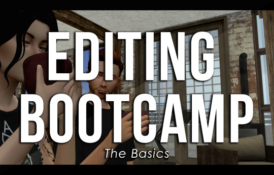
EDITING BOOTCAMP: WARWICKROYALS EDITING PROCESS
So, about five hundred years ago (or somewhere in that ballpark), an anon kindly asked me to share my editing process. It's been a long time coming because I've recently stopped using Pixlr (a free online photo editing program) and have moved on to 2020 Photoshop. I really recommend using Photoshop, it might be confusing or overwhelming at first, but I think it's worth it and ultimately it cuts your editing time in half once you get the hang of things. However, you can still use this tutorial if you're using GIMP, PIXLR, or whatever else. So, let's get into it (YUH)!
STEP 1 | ASPECT RATIO & SIZING
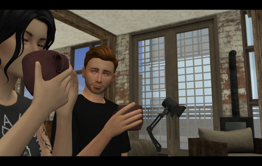
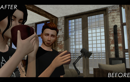
Alrighty, so what we have here is what I call a "raw screenshot." After playing around with multiple versions of ReShade and countless presets, I have come to the conclusion that I hate it. It makes my game slower, switching between filters is a pain and they just get in the way. But this is just my opinion, there are some very pretty ReShade filters out there, I just don't think they're necessary for a pretty screenshot.
When I load up my screenshots they are almost totally vanilla. I do use Luumia's NoGlo and NoBlu mods, but that's about it. I do not resize my screenshots at all, they are 1600x900 by default. However, one of the first things I do is add an aspect ratio (those two black bars you see at the top and bottom of the image) to give it a more "cinematic" feel.
I do this by adding a background layer and resizing the width from 900 to 1020. With the untouched screenshot in the centre, there should be two bars above and beneath it that are 60 px wide. I then colour the background layer black with the paint bucket tool. BOOM. Aspect ratio. Technically my edited posts are 1600x1020 when edited, but the screenshot remains 1600x900.
STEP 2 | PSD/PHOTOSHOP ACTIONS
The next step is for me to add my PSD. Think of it as your own personalized filter that changes how your screenshots will look. What your PSD does to your images is really just based on personal taste. For me, I love a rich screenshot with lots of contrast and strong blacks and more dramatic shadows. So, that's what my PSD does!
Your own PSD might look totally different for you. Maybe you what a lot of brightness, with warmer undertones, and lots of bloom. It's totally up to you! I recommend you play around with Photoshop's setting until you find an aesthetic that suits your own taste.
You can also download some Sims 4 PSDs and Photoshop actions from other creators. I really recommend those from @/intravertt here on Tumblr. They make ReShade presets, PSDs, and have a variety of other resources that are stunning.
Here's what my PSD looks like.
STEP 3 | SHADOWS AND HIGHLIGHTS, BRIGHTNESS, AND SHARPNESS
After adding my PSD I do some further edits to change how my screenshot looks. Because the shadows are so overwhelming, I add some highlights and might tweak with the exposure just to make sure nothing is too dark/under-exposed. I sometimes draw in some light shadows, but this is quite time-consuming so I don't most of the time. I also add a bit of sharpness to make certain details stick out some more. If the screenshot is taken outside, I will add some vibrance just to regain some warmth and make it look like my characters are in the sun.
Like PSD what you chose to edit, and how, it 100% up to you and what you what to achieve from your screenshots. I again recommend playing around with different settings to find something that works for you.
STEP 4 | ADDING TEXT
I recommend a text size of at least 35 pt. My texts are also bolded, outlined, and have a drop shadow, just so that it's easier to read for some people. Text tends to blend into the background and it's super annoying, so those elements help a lot. I also recommend using a sans serif font (ironic, I know, but I'm using a serif font exclusively for this arc for a reason, I swear). Also, make sure that the spacing is all good so the text isn't jumbled or crammed together. If your posts are word-y like mine (lol) you might feel the need to lower the spacing, just don't go crazy with it.
My text is centre justified. I write the name of the character who is speaking only once before their first line [LIKE THIS]. I start a new paragraph each time a new character starts speaking. To tell characters apart I assign different colours to each character, based on the order they are speaking in. The first character to speak is white, the second is yellow, the third is blue, etc. I recommend having some colour variation between characters' dialogue. Even if you have the name of who is speaking before each line, text of the same colour blends together easily.
Fun fact, I also often don't close off my paragraphs with a period or any punctuation (unless it's an exclamation point). Screw grammar, I just prefer it that way.
Here are some of the fonts I recommend, both serif and sans-serif:
Arial
Garamond
Century gothic
Book Antiqua
Josefin Sans
Perpetua Titling MT (this is the font I use in my banner)
Alte Haas Grotesk (My main sans serif font)
Can you tell I'm a author?
My loser ass legit has a list of favourite fonts
STEP 5 | BLUR/OVERLAYS/FINISHING TOUCHES
Adding blur to my posts is something I've just started doing at I don't know why. It's a great way to focus on certain objects/people and put things into perspective! It doesn't have to be a lot, but it does wonders. I just use a brush tool to go over the areas I want blurred. However, there are other faster ways to do this for sure such as cutting out and blurring the area you want out of focus separately.

If there are any clipping issues, like skin poking through clothing, I will go in with a tiny brush tool and paint over the skin with the same colour as the clothing's fabric. Sim's joints always look strange and jagged when bent (like the skin clips around a sim's bent elbow or leg, so annoying) so I'll often go in with the smudge tool with very little strength/hardness in order to remove that
Sometimes my posts have lens flares or little dust particles. These are just simple overlays I add with a layer mask + reduced opacity. You can find overlays like that easily online and maybe I'll make a post about how exactly I use them but we're DONE 'N' DUSTED for now. I hope this tutorial is useful for someone. This was fun! I'm totally down to do more in the future.
31 notes
·
View notes
Note
Hey there, it's the same anon who asked about Slit's love for lizards! Your headcanons were so so cool, I'd love to see more from you! I love the description of how Slit supports his male lizard buddies when they're attempting to present for a female lizard and eventually mate. This mental image made me think, though: if Slit were trying to impress someone, how would he act/what would he do? Once again, your headcanons kicked butt! Thanks so much! :D
I am thrilled you enjoy my ramblings of the crazed Lizard King! So thrilled in fact that I will take this as another opportunity to spew my headcanon thought-gush all over the place!
How does Slit impress someone??? Why, he does pushups of course! Well, maybe not pushups exactly, but regardless of his intentions, whether he’s trying to impress, flirt, or intimidate, it usually involves some display of Slit’s physical prowess. War Boys are all about physical strength and domination, to the point of toxicity, and Slit is no exception, in fact he may very well be the epitome, or something close to it. Nothing Slit does is ever without a little aggression. He is an ever-changing ratio of temptation and aggravation, and it fluctuates with his mood as much as with his environment.
This got a little long. Under the cut is a bunch (like, seriously a lot) of paragraphs of my attempts to study the bizarre social habits of the Lizard King in his natural habitat:
So Slit wants to impress somebody? Maybe that one Imperator whose crew gets all the good privileges? He’ll showcase his skills like an anole showcasing his bright red dewlap, wooing the Imperator and warding off the other War Boys with the best of his abilities to prove his worth. Like a big flashing advertisement from Before, Slit conveys his message through interpretive dance body language “Look at this! You want this! You need this! My skills are useful, LOOK! LOOK! LOOK!”, while at the same time the back of the billboard of Slit is like “Challenge at your own risk. You know you don’t want to mess with this. Messing with this will mess you up. It will make me look better. I want you to mess with me, so I can make you look worse. Do it you fucker! Make my day! FITE ME!”
Now say some other War Boy is stepping on Slit’s turf, sittin on his rock, climbing on his (lancer’s) perch? A challenger approaches! I’m sure we all remember what went down between Slit and Nux when Slit tried to step on Nux’s turf by taking his wheel. All that head bumping and growling? That was pure Slit. That was Slit’s threat display. Now, granted it didn’t work on Nux, and Slit stopped there for REASONS, but I like to imagine Slit does this to other War Boys as well, and if they hold their ground unflinchingly like Nux (which I doubt they would cuz Nux saw it coming and they probably don’t and that shit’s scary he is big and fighty), then Slit would probably escalate the situation into a full blown brawl right there and right then. At that point the victor is whoever comes out on top. Slit is big, strong, healthy, and mean, so he’s got a lot of good things going for him, but fights can be very unpredictable. These fights probably fuel someone’s gambling addiction.
Alright, so now Slit’s tryin’ ta woo somebody? Well, what kind of somebody? Doesn’t really matter to Slit right then. Unless he’s got some seriously significant motivation he’d most likely approach this sort of thing the same way he does with everything else. Hissing, growling, intense eye contact, and lots of flexing. He probably puts a lil something extra in the hips when he moves, sways a lil more, struts a lil more, banking off of what he’s best at like he would when he tries to impress an Imperator. He is an efficient, powerful machine. His billboard is now promoting a sports car to an insecure middle-aged man going through a mid-life crisis with money to spare. “You would love to get with this. Getting with this will make you look good. It will be great. You will be great, because I am great.” He might even move a little slower than he normally would, to give the object of his “affections” the chance to admire his physique, linger a little bit, like a flashy slo-mo reel of that sleek sexy sports car driving through rain in the middle of nowhere—mmm car metaphors…
All that being said, there’s probably a lot of mixed signals, misunderstandings, miscommunications… Slit’s display is equal parts a show and a warning. He’s coming for someone, he is going to get very, very physical, and they don’t always know why. A lot can go wrong. “Is he tryin’ to start somethin’? He’s tryin’ to start somethin’ isn’t he?” Slit is always DTF, be it fuck or fight. It is either one or the other, the odds are 50/50 and they’ve just used their last Before coin as shrapnel for a thunderstick. Someone might end up getting punched—probably Slit, but I cannot imagine a lil tap in the jaw would be enough to turn him off, given that he is a Nasty Lizard who just won’t quit. His off switch is dysfunctional. It is equally possible that a tap in the jaw would turn him on more. Communication is probably severely lacking among War Boys. It will take several more “taps” for Slit to get the message and back off, but I’m sure the recipient of Slit’s wooing will have probably caught on to his intentions by then and decided whether they want the wooing or not. If it is someone familiar with Slit, they will most likely catch on much sooner and (hopefully) have a technique to deter him. Nasty Lizard.
Now, clearly Slit’s sexy lil billboard is aimed at War Boys in the above scenario. They like cars, that’s why I used a car metaphor, I am a literary genius I know, bask in my glory yes har har har, I am secretly a fool. But, back to the topic at hand. This advertisement strategy won’t work on other target audiences like, shall we say, a woman recently freed from an oppressive sexually abusive tyrant, single and not all that ready to mingle, who is probably very not okay with large lizards climbing on top of them and hissing, take that for what you will.
Now, depending on if all things go as right as they possibly can in this scenario, Slit is committed to a long haul wooing and subsequent relationship with aforementioned lady, Slit must change his marketing strategy to appeal to this new audience. The benefits of this are similar to impressing an Imperator, extra privileges go to the ones on their crew but these privileges are extra, extra good, so it’s kinda like Imperators with Benefits which I’m sure Slit would be All For, and it’s probably worth rolling over for someone softer than he is.
Unfortunately this is very not easy for Slit who likes being big and bad and scary and mean. But the power of love lust must prevail! Slit cannot resist showcasing his “assets”, again he must bank on his physicality, but he must do a different sort of display, appeal to what this new target audience wants.
He is very strong and healthy. Why does she not like that? That can’t be right. Maybe he is too scary? (a very conflicting sentiment for Slit). But what if he was only scary to other people and not her? She doesn’t like it when War Boys approach her, so maybe he should stop them from approaching her because he is so scary! Yes! Genius! Such a smart lizard! Look at that impressive dewlap! The sleek sports car becomes a dependable minivan with plenty of trunk space, seats, and a heavily armored, reinforced chassis with spikes to ward of potential threats!
“Look at this!” the billboard of Slit proclaims! “Getting with this will stop anyone else from getting with you! Still not good enough? Well, getting with this will also stop other people from getting with your friends too! Now comes with a bonus feature of messing people up so you don’t have to, and I’ll throw in this complimentary knife so you can gut me if you are displeased with the product and want a refund!” If that doesn’t work, Slit is doomed to extensive, tedious, invasive, possibly painful character development, which I know we all love.
Disclaimer: these headcanons do not apply to everything. Alternate headcanons that emphasize different aspects of the Lizard King are equally valid and some will not support these musings. Things like these and differing character development can easily change the headcanons I have made, and I am totes magotes okay with that and Down To Explore alternate variations of Slit, and I used ‘totes magotes’ completely unironically because that is how passionate I am about this.
#inbox stuff#slit#mmfr#mad max#rambles of cha#mad max headcanons#my headcanons#i use car metaphors and lizard metaphors#the lizard king is a complicated creature#totes magotes okay to reblog
10 notes
·
View notes
Text
Representing the Real - Week 1:
Thoughts on Documentaries:
Prior to our first lecture, we were asked to watch the documentaries below and give our thoughts on them.
A Portrait of Ga:
Link: https://movingimage.nls.uk/film/3698
This feels like a very personal film, due to the subject nature and the location, both things very close to the filmmaker's heart. The music and peaceful scenery helps create a calming, contented feel, which are words that could also be used to describe the character of Ga. We get hints of who Ga is, but still feel like we are being held at arm's length and not seeing the full picture of who this woman is, much like her children and grandchildren would. Oftentimes, Ga is distant from the camera or is looking away, or we only see a part of her in the frame. Sometimes, she will be speaking, but we won't be able to hear what she is saying. Similarly, the narration - provided by Ga’s daughter, adds to the distanced perspective to her, as opposed to if it were provided by Ga herself.
The Pigeon Game:
Link: https://vimeo.com/292880858
vimeo
This documentary feels very naturalistic, like the camera just happens to have recorded these interactions, and never feels staged. It can sometimes feel a little amateurish - sometimes the focus is off, or the certain shots are over exposed - but this unpolished nature arguably adds to the naturalistic feeling. This feeling is aided by the fact we never see the interviewer - if we did, it would take the viewer out of this world and remind them this is a documentary, so opposed to just someone going about their life. Sometimes it feels a little weird a face is very attached to this voice, but I suppose it could allow the audience to project themselves onto the interviewer.
This film helps to give a very good feel for who these people are, just following them and letting them be themselves, and helps this little world, which someone might initially think is quite odd, to feel very normal.
Same but Different:
Link: https://loadingdocs.net/samebutdifferent/
This documentary felt slightly less candid than the previous one - the subjects were sat down, deliberately framed and (presumably) lit by off-screen lighting, but it didn't feel staged, as opposed to just more formal. The use of the old photos, in a different ratio to everything else, helped to create a sense of what things used to be like for these friends. The interview was also very honest with both friends being very transparent about their feelings. Certain shots however, of the friends setting off on their walk by the mountainside, did feel staged, and while they're just staging a pretty minor moment and not some kind of important conversation, it doesn't feel as real as The Pigeon Game.
Lester:
Link: https://player.bfi.org.uk/free/film/watch-lester-film-london-jarman-award-2008-2009-online
This film creates a very good sense of place and feels very personal, in the way it will often focus on random trivial details in the room that only the people living there would notice. The handheld nature of the film adds to this feeling and the use of 16mm film also gives it a warm, lived in but vibrant feel. The use of the grainy film and the music gives it a very nostalgic feel.
Personally, I was less sure of the story being told here - while I gained a sense of place and the attachment to it, I was less sure who lived there, for how long, or any of those details. I still thought it was interesting, but due to not necessarily understanding what was happening, did not engage with it as much as I did with the others.
Our Documentary:
Our main project for this semester is to make a five minute long documentary, primarily focused on a single person (either someone a member of the group knows or a historical figure) and a certain aspect of their life, in groups of between three to five people. My group consists of Ben McMorran, Jack Weir and myself.
Our initial idea was to tell the story of Ben and Jack’s friend Sean, whose university application to study film was rejected due to reasons outside his control, who is trying to apply again this year, and would follow him making his film to show the university. The film would touch on how his interest in filmmaking began, what went wrong with his previous attempt and what he intends to do to change things.
There are several pros to this idea:
Sean is someone who Ben and Jack are both able to see and record footage for the documentary with, which is convenient in these COVID times.
Audiences can empathize with people who have failed but are trying again, so should hopefully like Sean.
Watching the stages of a filmmaking process can be an interesting thing.
However, having taken some time to think about it, I’m not completely convinced by the idea, and i have come up with various cons to this idea:
Is Sean’s motivation interesting enough? If Sean had done something wrong in his initial application (his story hasn't been very good or his directing had been poor), there is the potential for a story about personal growth and improving his craft the second time around. However, if the problem is that something out with his control happened, there's not really a lesson to learn beyond maybe to be more careful with your footage, and the audience might struggle to invest as much.
Is the story that interesting? Or will it just seem like some footage of some old films, some scenes of Sean talking to the camera (or whatever form the interview segments would take) and some behind the scenes footage of the film shoot has just been stung stitched together in the hopes it’ll be interesting enough to pass as a narrative?
What distinguishes Sean from other young filmmakers? If the subject of the documentary isn't this interesting, it doesn't matter if you employ some fancy techniques or some interesting editing - if the foundation of the documentary isn't there, the whole thing will fall apart before it's even begun.
How would the university see this (as the university he is applying to is Edinburgh Napier)? The university may see this as us using this project to con them into accepting Sean to the university, and this could well jeopardize his application. If he was applying for any other university this wouldn’t be an issue (or even another course at Napier, as the module leaders on that course would be unlikely to see this film) but seeing as he is, it would probably be wise to avoid this option (even if everything else about the idea was perfect, which in this instance isn’t the case, so letting go of this idea shouldn't be too difficult).
I imagine we will probably go back to the drawing board and see what other stories we could tell. Ben has mentioned there could be some members of his family you could make for interesting subjects, but that is something we shall talk about in greater depth soon. With regards to my own family, I don’t know of any particularly interesting stories I could tell about them, and imagine they wouldn't be too eager to share them anyway, unless they absolutely had to.
If all else fails, doing a documentary on Sean is always an option we can turn back to, but I'm sure we'll come up with a better idea soon, and won't need to use this one.
0 notes
Text
Dell's XPS 17 Proves Big-Screen Laptops Are Back, and They're Awesome
A few years back, a lot of major laptop makers began quietly paring down the number of 17-inch laptops they made (aside from monstrously large gaming rigs), with Apple and Dell dropping the 17-inch MacBook Pro and XPS 17 respectively. However, thanks to improvements like smaller bezels and improved energy efficiency, thin and light laptops with plus-sized screens and big performance are making a comeback.
After Apple re-envisioned its big-format laptop as the 16-inch MacBook Pro in 2019, Dell made a similar move by bringing back the XPS 17 this year. While the circumstances are different this time around (especially considering 2020 is a tire fire of a year), the revival of Dell’s flagship 17-inch laptop couldn’t have come at a better time. Big-screen laptops are back, baby, and they’re even better than before.
For the big reintroduction of the XPS 17, Dell didn’t deviate too much from the classic XPS design. The XPS 17 has a tapered wedge-shaped body with a silver aluminum lid, a big carbon fiber deck in the middle, and another aluminum tub on bottom. Despite its overall size (14.74 x 9.76 x 0.77 inches) and weight (5.53 pounds), the XPS 17 still manages to feel quite sleek and surprisingly portable—until you stack an XPS 15 on top and see how big the difference really is. In some ways, the size and design of the XPS 17 feels like a mirage, because when you open it up, you can’t help but appreciate how much display you get from a system that seems smaller than it is, especially when you consider the last time we saw the XPS 17 was back in 2012, when it weighed more than eight pounds instead of five.
Along its sides, the XPS 17 comes with an ample assortment of ports, including four USB-C ports with Thunderbolt 3 (all support charging, too), a headphone jack, and a full-size SD card reader. The only ports you might be missing are HDMI and USB-A, though Dell has that covered too with an included dongle.
Inside, Dell maximizes the XPS 17's display (which comes in a multitude of options, from a 1900 x 1200 non-touch panel to a 4K UHD+ screen), with razor-thin bezels. Dell’s super tiny webcam and IR camera module, which sits above the screen, are exactly where you want them. The built-in IR camera offers support for Windows Hello face login, while the 720p HD webcam is meant to handle all your video-calling needs, though I must say that the XPS 17's webcam image quality and resolution aren’t quite as high as I’d like.
Below on its deck, Dell flanks the keyboard with large stereo speakers that feature a 2.5-watt woofer and 1.5-watt tweeter on each side capable of delivering rich, room-filling sound. And as for the keyboard itself, Dell wisely hasn’t messed with the feel of the XPS 17's keys, which are crisp and bouncy. I’m not gonna call them perfect, but the XPS 17's keyboard is pretty much my platonic ideal of how keys on a laptop should feel. And finally, there’s that huge 6 x 3.5-inch matte touchpad, which leaves just enough room for your wrists on either side while providing accurate gesture recognition and more mousing room than most people probably need.
The one potential oddity about the XPS 17's deck is Dell’s decision not to include a dedicated numpad like you sometimes see on 17-inch gaming systems. Some might bemoan that call, but on a well-rounded system like this, I think sacrificing the numpad for bigger speakers and an overall cleaner design was ultimately the right choice.
And then there’s that screen. Our review unit features the upgraded 4K 3840 x 2400 touchscreen, and I just can’t get enough. It puts out over 450 nits of brightness and has some of the richest and most vivid colors you can get from a laptop LCD panel today. If you’re intending to buy an XPS 17 to edit photos or videos, I would highly recommend upgrading to the 4K screen instead of the base FHD+ panel. Furthermore, with its 16:10 aspect ratio, the XPS 17 also provides a bit more vertical screen real estate, which is exactly what you want from a big all-purpose laptop.
The XPS 17 ain’t no slouch when it comes to performance, either. The base config comes with a 10th-gen Intel Core i5-10300H CPU, but our more expensive review unit came upgraded with a Core i7-10875H CPU, and it absolutely flies. In our CPU rendering test in Blender, the XPS 17 took almost four minutes less to render the same image (4:40) as MSI’s Creator 15 (8:33), despite the smaller Creator 15 having the same CPU.
And when it comes to graphics performance, it’s a similar story, with the XPS 17 (6:26) beating the MSI Creator 15 (8:36) by more than two minutes in our Blender GPU rendering test, once again with both systems featuring an RTX 2060 GPU. This kind of performance makes the XPS 17 a great choice for content creators, and while it’s not intended to be a competitive gaming machine, the XPS 17 is able to pump out more than 80 fps in Shadow of the Tomb Raider at 1080p with all the graphics bells and whistles turned on, so it’s not a bad fragging machine either. Thermal headroom also seems quite respectable, because while the XPS 17 will throttle itself a bit when maxed out, I didn’t notice any major lag or dips in performance during more normal loads.
Even the XPS 17's battery life is pretty solid for a system this big, with it lasting just shy of 9 hours (8:58) on our video rundown test, nearly two hours longer than the MSI Creator 15 and an hour longer than HP’s ZBook Create G7.
After using the XPS 17 for several weeks, I only really have one complaint: its price. Because even though it starts at just $1,350 for a 17-inch FHD+ screen, Core i5 CPU, 8GB of RAM, 256GB SSD, and integrated graphics, when you start upgrading components, the cost balloons quite quickly. So in comparison, our review unit, which features a 4K touchscreen, Core i7 10875H CPU, 32GB of RAM, 1TB SSD, and RTX 2060 GPU, costs more than double the price at around $2,750. And annoyingly, if you want to cut back on a few components like RAM or storage to save money, currently the cheapest model with an RTX 2060 card starts at $2,450. Thankfully, if you’re less concerned with graphics, you can split the difference for a system with a GTX 1650 Ti GPU, which starts at around $1,800, and if you’re looking for the best balance between price and performance, that’s where I’d start.
But for me the biggest takeaway about the XPS 17 is the way it fits into 2020. While a lot of people wait for the world to get back to normal, I feel like it’s also important to think about what normal even means. Right now there are millions of people who have to work or learn from home, and even when things start opening up again, a lot of people won’t be returning to the same buildings or positions they were in before. This makes it even more important to consider what you need from a personal computer.
For years, 15-inch systems have been the most popular laptop size, as they generally offered the best balance between price, power, and portability. However, if you’re the kind of person who is only going to travel with their laptop a handful of times every year (or less considering the ongoing pandemic), a bigger system like the XPS 17 suddenly becomes a very intriguing option. Not only does its bigger screen translate into more productivity (or better movie-watching) when you’re stuck at home, you also get more ports and a wider range of upgradable components.
Meanwhile, the XPS 17 doesn’t suffer from being tied to a desk or table like a normal desktop or all-in-one. And all of this comes in a package that’s not that much larger (or much more expensive) than an XPS 15. (Though you will want to make sure you have something to carry it in, because the XPS 17 definitely doesn’t fit in my normal messenger bag.) So in a strange way, 2020 was sort of the perfect time for Dell to bring back the XPS 17. You get a bigger, more powerful system from one of the best laptop lines on the market, but in a body that’s way less of a burden than its predecessors from the not-too-distant past. So even if a 17-inch laptop might not be in your immediate future, the XPS 17 has demonstrated why they’re making a comeback, and it’s done so with power and style.
0 notes
Conversation
ParadoxbyCoronum Twitter 8/5/2020
Rose: Update on the frozen coffee as ice cubes in my cold coffee thing. Good idea in practice, but if you like to doctor your coffee with syrups or creams, you have to keep getting up to adjust the ratio. But if you drink coffee black, you should be fine.
ParadoxbyCoronum: Huh!!
ParadoxbyCoronum: I guess that makes sense! As it melts more and more of it mixes into the coffee, offsetting the balance.
Rose: Exactly. I don't want to over-doctor my coffee, but for ease of drinking over time I might have to. Not sure how I feel about this.
ParadoxbyCoronum: Maybe make it reeeaaally strong, and then let it sit for a bit to let the ice melt??
Rose: You might be onto something there. More science is at hand. I'll try again.
ParadoxbyCoronum: :O
Rose: Also I just saw the WackyWisdomWednesday post. Are you in charge of those?
ParadoxbyCoronum: Why? Did I get something wrong??
Rose: No, not at all. I just reminded me of a study where men and women (sadly no nonbinary people) were tested to see how they react to male and female voiced AI, and how men tended to get furious when told what to do by a male voice.
Rose: I'm wondering if I can find it again.
ParadoxbyCoronum: Oh...
ParadoxbyCoronum: But... doesn’t that still mean that they preferred a female voice??
Rose: they do, but it's fascinating to think about how it didn't matter if the female voice said things the exact same way. Just the fact that it was a masculine voice was enough to change their opinion.
Rose: The gender aspect of it is fascinating.
ParadoxbyCoronum: Oh!! Yeah, I guess so!
ParadoxbyCoronum: Maybe it’s some kind of instincts thing? Or at least something they were taught?
Rose: I definitely think there's some form of sexism involved, but not sure where the origination of it comes from. Some people think it's because babies instinctively react to their mother's voice as early as in the womb, and others think its a learned behavior sort of deal.
ParadoxbyCoronum: Yknow, like if they were taught as kids to stand up for yourself or to be the head of the pack or something, then being told what to by what sounds like competition might make them angry!
Rose: That too!
ParadoxbyCoronum: Maybe it’s just who they’re used to listening to parents wise?
Rose: That's also possible. Sadly I'm not finding the original study, and every article referencing it isn't including a link. This is frustrating.
Rose: I did find a study where apparently if you spoke on the phone to an AI, via an interaction voice response system, male sounding voices were more "usable" but female sounding were more "trustworthy".
ParadoxbyCoronum: Usable??
Rose: I guess they're using "usable" as dependable. Which that alone sounds iffy to me.
Rose: Found an image from a 2019 publication but I feel like it's worth sharing?
Rose: And then we get things like this- "The late Stanford communications professor Clifford Nass, [...] wrote that people tend to perceive female voices as helping us solve our problems by ourselves, while they view male voices as authority figures who tell us the answers to our problems. We want our technology to help us, but we want to be the bosses of it, so we are more likely to opt for a female interface."
ParadoxbyCoronum: https://sheffield.ac.uk/news/nr/422-1.174743 I looked around and found this article thingy!
ParadoxbyCoronum: Oh... so it’s just... engrained gender roles?
Rose: Oh, I'm going to read that article you linked for sure.
Rose: And apparently so?
ParadoxbyCoronum: So what you’re saying is that if more men were perceived as kind and caregiving and the such, then people would be less likely to see them as authorative, and then we might have more male AI?
Rose: That's at least what this study and the specialist thinks.
ParadoxbyCoronum: Huh!
Rose: I think it's really interesting. I'm sorry if I bombarded you with a lot of information.
ParadoxbyCoronum: No no, it’s fine!! It’s been a slow morning anyways!
ParadoxbyCoronum: I’ve been waiting for that person to show up again, so you keeping me company has been great!
Rose: I'm glad I can give you something to do then.
Rose: And that person? What person?
ParadoxbyCoronum: Oh!! Someone came through the backdoor yesterday without me realizing! And sat down in one of the offices.
ParadoxbyCoronum: When I realized they were there I kinda hid at the front desk.
Rose: That's scary! Did you ever find out who it was?
ParadoxbyCoronum: I... didn’t end up talking to them.
Rose: Were you nervous/scared?
Rose: There's nothing wrong with that if so. Being startled is totally normal
ParadoxbyCoronum: I guess I was scared? I didn’t expect them to be there and they came in unannounced!
Rose: That's totally fair. Plus what if they're like your supervisor or something? I do hope they'll introduce themselves to you soon, if only so you're not as startled next time.
ParadoxbyCoronum: Eheh... about that...
Rose: ?? What's up?
ParadoxbyCoronum: They came back today, through the front door this time.
ParadoxbyCoronum: They brought us coffee and Hashbrowns as an apology for yesterday!
Rose: Sweet, free food and coffee. An immediate positive point in my books. Did they introduce themselves? Who are they?
ParadoxbyCoronum: They said to call them Saretsky, though that’s... kind of a weird first name?
Rose: Saretsky? Maybe it's a last name.
ParadoxbyCoronum: Oh, maybe!!
ParadoxbyCoronum: Anywhosies, they apologized for last night, which was nice!
Rose: That is very nice of them! Do you think you will get along with them?
ParadoxbyCoronum: I hope so!!
Rose: Me too. I hope it'll make the office feel less lonely. Or well I assumed it was lonely if it was just you and Lynn.
ParadoxbyCoronum: Most of the day it’s just us!
ParadoxbyCoronum: You’d think they’d have other people here though. Unless they’re yet to come!
Rose: You did say Paradox was a new location. Maybe they're steadily hiring people?
ParadoxbyCoronum: Oh, maybe!!
ParadoxbyCoronum: I guess it’s possible!
Rose: Seems silly to hire people though if the location doesn't even know what they're doing though. Did you hear anything at all on what Paradox is supposed to be?
ParadoxbyCoronum: Just that we’ll “find out soon” apparently!
Rose: Hm. The anticipation is getting to me. How are you handling this?
ParadoxbyCoronum: I’m honestly trying to think about it as little as possible!
ParadoxbyCoronum: That and lots of caffeine!!
Rose: You're valid and don't let anyone make you think differently, Ray.
ParadoxbyCoronum: Thank you!!
#August#5#2020#Ray Schultz#Ray#Twitter#direct message#Rose#S. Saretsky#Saretsky#ARG#Paradox#Coronum#Alternate Reality Game
0 notes
Last Seen Blogs

umustworkdontplay
С белочками эта земля не та
bumblingbabooshka
Probablea

airinfomation
AirInfomation

shomaa-zz
certified belphegor kinnie
musicaddictartist
Rae_imagines