#also I hate typography
Text
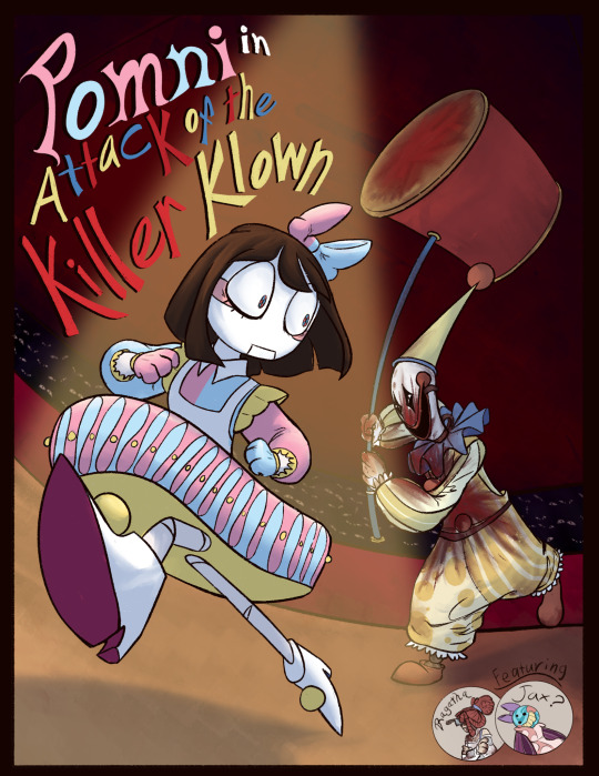
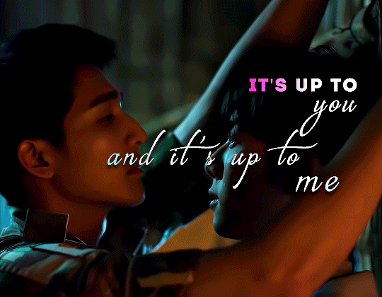
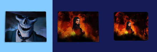
Tonight, we proudly present the first performance of our newest performer!
Pomni, in Attack of the Killer Klown!
Woof, this took forever but I’m so glad how it turned out.
I like to imagine that most performances have their own poster to accompany them after, or at least everyone’s first. So of course, why not capture the hell that is Pomni’s first. Bloody Kaufmo and all. :3
Sorry Pompom, but the audience demands a show.
Oh yeah, I think you’d like this @hootbon, ENJOY!
#digital circus#tadc#the amazing digital circus#tadc au#tadc freakshow#freakshow au#tadc pomni#tadc kaufmo#tadc ragatha#tadc jax#(sorta)#this took so long#also I hate typography#it’s so annoying to do#but it looks so good#oh yeah#tw blood#tw blo0d#tw bl0od#why are there so many diffent ways for blood#just say blood#tw horror#art
1K notes
·
View notes
Text
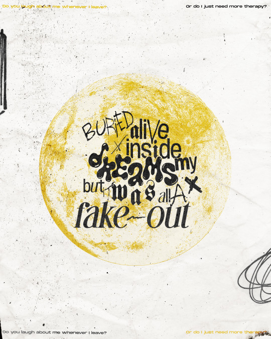
Remember us just like this forever but this can't last, won't last
#fob#fall out boy#so much (for) stardust#fob art#so much for stardust#smfs#fake out#can you tell that the thought behind this one was ver complicated like dreams->night->moon#and the yellow is just because i felt like it#as always i think i pretty much hate this but i just want to put it out there#also you can probably tell that i was running out of ideas there at the end with the typography composition but oh well its over complicate#enough as it is so i decided to just leave it#i hope compression isnt too bad on this one i honestly dont know what the hell i did ñflkajsdl
511 notes
·
View notes
Text

#kingdom#louis#yang dongsik#kingdomnet#kflops#nugudom#malegroupsnet#* my gifs#kd.gif#kd.ds#these are just okay but do not worry abt it (<- says that abt almost all my gifs)#the caption was gonna be 'pov louis offers u a jacket' or smth but i didn't like it so it's captionless and u can imagine one urself#ALSO i wasn't gonna put captions In the gifs but i couldn't make sense of whether it'd make sense without context so shrugs#i hate captioning inside gifs because i hate typography sorry. least favorite thing ever.
10 notes
·
View notes
Photo


#ATOTSREWATCH2022
#atotsrewatch2022#earth pirapat#a tale of thousand stars#mix sahaphap#atots#asianlgbtqdrama#thaidramaedit#atotsedit#prangon gifs#usernuria#userbillkin#uservik#lextag#userpharawee#typography style#me: ughh i hate making lyrics set#also me: but this fits to perfectly for them uwu
182 notes
·
View notes
Text
best part of drawing fantasy map: you will have a cool fantasy map for your fun fantasy project
worst part: labels
#I hate typography#I dunno how the hell I got through my typography class w/ an A#I am SO BAD AT TYPOGRAPHY YOU HAVE NO IDEA IT IS SO HARD#like my text looks Fine if I hand-letter it and actually Try but I refuse to hand-letter an entire map#also hand-lettering is...hmm...only good for some arts#cartography is not one of those arts for me#also I just hmm...hate positioning all the little labels and stuff and making the text tool Actually Work For Me#very tedious but not in a fun way#I'm working with 3.5 or 5 font I won't even be able to read this if I print it RIP#but if I made the map larger than it is the program would crash I know from experience#which is fine I hate large files anyhow BUT THESE STUPID LABELS#I'm only doing this so I have good worldbuilding notes for the future for this particular project#I'm almost done with labels and then I just need to do some other stuff#and this map I've been working on literally all year so far will be complete#and then I can maybe do other arts#I know ''you can work on multiple arts etc. etc.'' but listen I will not finish this map if I start a new art project#I Want To Finish but mmhhmmmm do I hate typography~#I literally hand-drew an entire border filled with swirls no problem but these labels....#I literally hand-drew everything but THESE LABELS#anyhow that's my art vent post for the day#I swear I love art but sometimes I need to scream in frustration y'know#bc typography#oracle of lore
3 notes
·
View notes
Text
something painful about having back 2 back thumbnail reviews. we just reviewed the thumbnails theyre not gonna be that different the next day. I get its the final review but OUGH
#beef trimmings#played graveyard keeper all afternoon by accident so im sitting here grouchily workign on ymthumbnails at 10 pm#i also dont care about the thumbnails at all like this brief just. 0 interest its killing me#ur killing me we just came off a really fun 2 weeks of typography#and now im doing metaphor thumbnails n i hate it sm#liek its fine its basically over but gooughghghhghfjgj#hope narrative is better. kinder. more loving.#also yes the thumbnail swill be different bc ill be taking the feedback and improving upon it BUT MAN#MY BRAIN SIMPLY DOES NOT CARE! ABOUT THIS!#DIES
5 notes
·
View notes
Text
Man vs nature? Man vs man? No thanks, I only care about The struggle of deciding between the animation and slide transition functionality of PowerPoint vs the actually decent and useful typography controls of InDesign.
#the great whine shark#design stuff#i hate doing typography in pp because it's limited and you can't define presets like in design (i use min. 5 paragraph styles for anything)#but indesign presentations look so boring#i like using animations to direct listener attention#also powerpoint's sad excuse for page numbering controls is DISGUSTENG#and i'm not writing another virtual basic script to fix all that
1 note
·
View note
Text
Rose Recaps Rose Tinted Glasses
It's been three months since I made a post thanking this community for being a place for me to share my love of BL.
And since then, every day I feel a little bit more comfortable here.
This place is so special to me for so many reasons and the fact that I found it is a small miracle. I was talking with my friend Neely about something BL related and they told me that they think I'm doing much better since I came here. So thanks again.
I was never a part of any online fandom. And before BL I never really felt like I was missing something. Maybe because I always found someone irl that I could freak out about whatever I was watching I never really felt the need to go look.
And the people here are exceptionally kind. Before, I made a point to never engage much online, except for certain support groups, because of the hate that sometimes exists in certain spaces. So I was very much surprised by the kind humans that exist in this bl fandom in this corner of the internet.
Also. There is some serious brilliant people here.
Look giffing is not easy, it takes a long time, sometimes you spend so much time with a set only to hate it by the end and never posting it. And sometimes you post something and you're really proud and crickets. And sometimes you post it just so it doesn't go to waste and all of a sudden it explodes. It's all part of the magic.
I keep my sets pretty simple so I'm in awe of how some people make these beautiful art pieces with layers and colouring and typography. It's incredible and I applaud your creativity and patience.
Speaking of brilliance, I'm constantly in awe of the meta writers. That shit is not easy.
It takes way longer than we think, to make it neat and readable, adding gifs or shots to illustrated a point, sometimes wasting so much time finding the gif you want in the mess that is the gif search (I understand it now, cause yesterday I was on the hunt and it would've been quicker to make the damn gifs), and reviewing it before posting, changing it in the process, sometimes leaving it in drafts because the idea is not completed. I'm tired just thinking about this. I'm not able to do that. Sure I can talk for hours about this stuff but actually organize my ideas into a coherent point of view and writing it down. Nope. Not me. So bravo meta writers. I applaud you.
And of course all the people that share the stuff that really matters. Like the colours, the wardrobe, the places we see, the news about what's coming, language nuances, pictures of the pretty people in sometimes ridiculous or beautiful outfits, sometimes the pretty people before shirts were invented, and some of the funniest commentary I ever encountered.
I don't wanna single people out by tagging them because truly there are way too many. So I just want to thank some people that helped me navigate this place and made this time so enjoyable.
First and foremost.
@twig-tea You were the first person I talked to here and you were so kind and patient with me and my awkwardness and lack of knowledge of how this place works. She also writes great meta and is brilliant and everyone should be following her.
@lurkingshan because of the Sahara-Sensei post that you tagged me in and made me feel so seen.
@pharawee because IFYLITA just wouldn't have been the same without your sets.
@respectthepetty because she helped get the colour coded subs right and she appreciates the bokeh in all its glory.
@itsallaboutbl for screaming with me in portuguese.
@mikuni14 Because she's been so incredible kind to me.
@iguessitsjustme because of many reasons.
And If I ever reblogged anything from you, consider yourself tagged in this post. All of you are amazing.
And finally...
@blmpff for a lot but mostly for the most unexpected and incredible moment I experienced in this short time. The day that a bird took over my dash. Khun Feathers was such a treat and this masterpiece was the highlight of the day.
image by @blmpff
It's been a wonderful year and I look forward to see what happens tomorrow.
Wishing you all a happy new year!💜
54 notes
·
View notes
Text
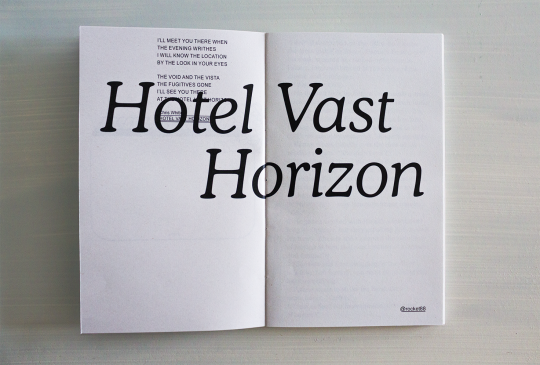
Hotel Vast Horizon by @rocket-eighty-eight
Heat (1995) | Vincent Hanna/Neil McCauley | 16,202 words | 100 pages
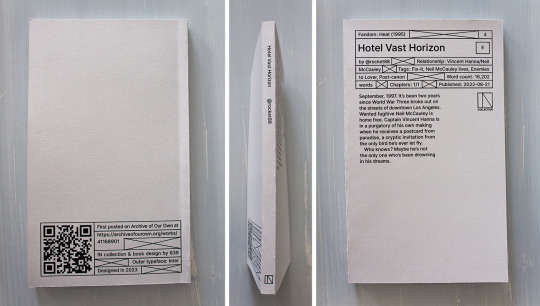

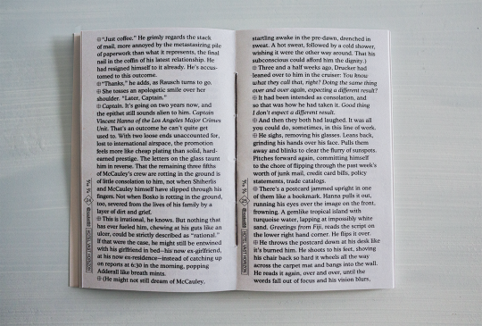
You can see and download the whole typeset HERE.
You can also print it if you want a copy for yourself! I provide printable files below. Check out the guide first ↓ The book is 11x18cm AKA 4,3x7,1" & can be printed with a coptic stitch or staples. Mine's printed on 80gsm grey recycled paper & 210gsm grey paper for the cover.
DOWNLOAD THE FILES / PRINTING & BINDING GUIDE
PRINTING NOTES: This typeset goes pretty close to the edges of the pages, so be careful when cutting it, and the first signature or so has double-spread images, so I'd really recommend making sure your double-sided printing is calibrated for this one (whether you're doing it at home or at a printing shop).
HEY!!!! HI! finally. If you've checked the Heat (1995) (Al Pacino and Robert De Niro Go on a Date: The Movie) tag on AO3 in the past year you've probably checked out Hotel Vast Horizon (Michael Mann Could Never: The Fic). Welp here it is on paper.
The common thread in the typeset was always the ocean (and shit, I said the o-word. did you know there are like 20 references to water, seas and storms in HVH, and yet never once "ocean" is said?). The other thread was the Bitstream Cooper typeface, which is round and curvy and so pleasing on the eye. Isn't it? Also Arial (underrated), because I needed it for the sequencing to show that Michael Mann is a loser. I'm kidding. Or am I? But this brings me to another major thing: the sequencing. (The common denominator between movies and books: the sequence.) That can only be apprehended on the full PDF/book, and it's really something that did not really exist (in so much depths) in the previous typesets.
As to what the sequencing is saying, or what the hell this intro is about (no I did not have a stroke when I did it), I will not say much if only that it is about the vocabulary, the image, the movie, the things that go beyond fate, a little bit Neil vs Vincent and a lot the reason vs the heart. More things shall remain unexplained because I feel they would be better experienced than laid out here.
If you'd still like to know what's actually going on in this thing don't hesitate to send in an ask lol.
More details on the technical matters + a visualization at the bottom, because there is work involved and my micro typography is so clean it could give Neil McCauley a boner.
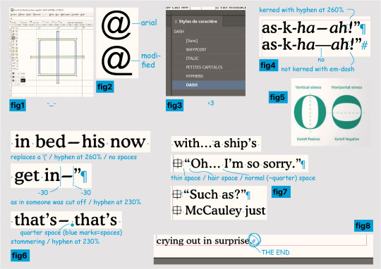
help where do i even begin? I learnt how to use FontForge to create a new typeface specifically for that symbol at the beginning of the paragraphs in order to implement it in InDesign (see fig.1 below), I changed the Arial's @ in FontForge too (fig.2) to have it fit with the underline in @ rocket88, what the hell.
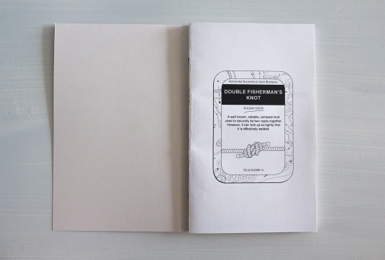
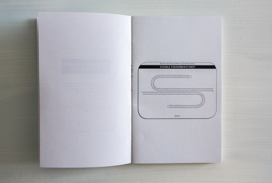
2. I also drew 11 (I think) illustrations for the intro (yes, those knots......), but that wasn't as complicated as I thought it would be. I do deeply curse InDesign's "Print Booklet" function for how much it hates images though.
3. I would like you to meet my InDesign characters styles (fig.3) as they simply are impeccable and the best you will ever see, I could not have been more professional if you had paid me 5 grand for this. The hyphens! The dashes! The custom small caps!
4. To get even further in the micro typography. It is, in most, most cases, much too time-consuming to properly kern (=modulate the space between your characters and/or words) your text for how little the average eye will get out of it, and/or your average graphic designer is certainly not getting paid enough to actually do it properly. I, on the other hand, am insane and unemployed, therefore yes, I kerned this shit. Micro typo is actually the sculpture of the white spaces of your page. When done thoroughly it does mean checking every characters with your own eyeballs.
So in english, since this typeset is in english, the rules are no spaces for punctuation. Right? and not right ? It makes for a pretty tight block. I do argue too tight - although of course you'll also have times where you want tight. (And this is all within the 5% of the time where kerning matters.) That might not sound too bad until you get to em-dashes, this '—' thing. Which is a literally useless punctuation mark that is so hysterically long it'll leave an unnatural horizontal void in your text and draw all attention to it—you know, instead of the text itself. Useless, because it can always be replaced by commas, colon, semicolon, or parentheses. Unnatural, because em/en-dashes do not follow a typeface's characteristics (when hyphens do! fig4), so they hardly fit with serifs, AND characters are generally vertically stressed in latin (fig5: which one looks normal?) except... well. So you'll have the tightest group of punctuation marks humping each other?!"— then a dash literally the size of a whole ass m that looks nothing like the rest. ridiculous. absurd.
Anyway the point is I said bye-bye to this aberration and used hyphens stretched at 260% (lmao. it works so well?). And sometimes 230%. Sometimes with a space after, sometimes not - if not the same meaning then why the same treatment (fig6)? I wondered at this point if I wasn't going too far (lol) but this is the point of micro typo, so, whatever. See fig7 for more kerning stuff.
5. I have far less things to say about this part than the last even though I must have spent twice as much time on it, but I just wanted to say that I manually set the text rag on all 69 pages, it looks nice, I love tetris, AND!!!! the greatest thing about the whole fucking book (fig8): the text starts on the top line of the first column, and ends, on p.91, on the LAST line of the column, at the very bottom of the page, and IT IS NOT. BY. CHANCE!!!!!! HAHAHAHAHA!!!!!!
thanks for reading. perfection has not been achieved and there might still be typos. see you later.
62 notes
·
View notes
Text
DmC: Devil May Cry Thoughts
So I finally decided to experience the DmC Reboot, and my overall verdict is: Not As Bad As I Expected.
I took notes, so let’s break it down. This is over 3 pages in a doc btw, so buckle up I guess. Hope it was worth the wait.
What I Liked
Level Design
This is probably the game’s biggest strength. Great amount of variety, and the atmosphere of each level was great.
Limbo is a really cool concept.
The twin’s special abilities (like Dante’s grappling hook type weapons) made for some really cool platforming.
The typography really works in this game. Like, words and phrases appearing in the environment to taunt Dante or just provide additional flavor to whatever is happening. Very comic book.
The Bob Barbas boss battle had a really cool neon techy aesthetic, which isn’t something I would have expected for this game. Neat!
The game show levels leading up to Lilith’s boss fight were cool too!
The Succubus boss battle made really good use of the environment.
Enemy Design
General demon mobs are automaton-like, which is pretty neat. I’m not a fan of that sort of aesthetic, but I respect the creative direction.
All the bosses had decent variety in terms of design and battle mechanics.
Item/Weapon Design
I think this was another pretty strong point for this game
It’s a small thing, but the designs of the orbs were nice.
Rebellion’s shape shifting is neat. Rebellion doesn’t really have any cool powers like Yamato does in the mainline games, so it was nice to see it do something besides being a big sword.
AQUILA IS SUCH A COOL WEAPON
Ebony and Ivory were pretty, but didn't seem particularly useful what with all the other weapons Dante had at his disposal.
Misc
Combat looks dynamic and satisfying, and I can see the influence it had on DMC5’s combat.
The voice acting is good
Occasionally, it was genuinely funny
The Vergil gameplay at the end? INCREDIBLE.
The music was good. Nothing really stood out to me, but it did enhance the game.
What I Disliked
Lilith
I really hated her character design. And I’m not saying it wasn’t effective character design, or that it was bad. I just personally didn’t like it.
Her weirdly pulled skin, the corset piercings, the way her skin bunches up around the tops of her gloves… ugh.
And maybe that’s the point! I’m probably supposed to find it offputting! But I hated looking at her.
Pregnancy is a really intense squick of mine, so all that was just no! No! No! No!
I wish I could unsee her boss battle
Minor Design Complaints
Dante’s DT design was a little disappointing, especially considering how well designed everything else is.
Yamato’s design was also lackluster.
Misc
The fatphobia was disappointing but not surprising, especially considering the year this was released.
Mundus sex scene… ew
The sniper abortion scene wasn’t as shocking as I expected it to be, but it sure was there
The way Vergil pronounces Yamato lol. Ya-MATT-o
Pronouncing Mundus differently was a little weird. The mundus amungus….
Mundus’ boss fight was uninspired. Wow, a giant statue trying to squash Dante on a platform. Never seen that one before.
A lot of this game has a ‘gross’ factor, which I’m not really into. That’s just personal preference, because I do think it mostly works in context. Just not my thing.
Characters:
In general, I found the characters to be pretty one-dimensional.
The Twins
The two of them working together in Mundus’ tower, one in each world, was really cool. If you’re going to have twins in a setting with two worlds overlapping, having one in each is (chefs kiss). Being able to play as both of them to achieve the goal would have made it even better.
I really enjoyed the scenes they had together, but there just weren’t enough of them.
It was nice seeing them share physical affection (in the form of a mutual shoulder pat)
But “I loved you, brother” just didn’t have the emotional impact I wanted it to have.
And the issue is really… they’re strangers. They may be brothers, but they barely know each other. Their relationship just didn’t get as much attention and buildup as it should have.
Vergil
He’s so friendly and helpful sounding at the beginning, it was kind of cute.
But it is revealed he’s pretty cold and calculating, willing to sacrifice Kat because saving her wasn’t worth the risk to him.
His mad hax lol
give him his hat back, cowards
Even though he was carrying Yamato around, I wasn’t sure he could even fight until the very end. He just seemed so weak. The thing about the twins is that they’re equals on the physical level. IDK, it was just weird to see a Vergil that didn’t fight.
honestly, a way more interesting character than Dante.
Dante
A devil-may-care character that learns to give a shit? Always a classic.
As unnecessarily edgy as he seems, his poor coping mechanisms make sense for how he grew up.
Kat
An assault survivor, because of course she is. It’s just disappointing. Was it necessary? Was it??
Overall, she’s fine. No real strong feelings about her.
Despite having a ‘role’ (guiding Dante through Limbo and helping him escape it), her job could have been given to Vergil and the game would have worked fine. Maybe even better.
Sparda and Eva
Having Sparda outlive Eva and be responsible for hiding the twins was an interesting choice. I also like that we have confirmation for what happened to him (eternal torture).
I would have expected an angel and demon to be a power couple, but they seemed to have been beaten pretty easily. For plot, I guess.
The Story
I wasn’t really all that invested, tbh. There’s nothing wrong with the story, but at the same time there isn’t really anything notable about it (except Vergil’s bit).
It’s a hack n’ slash, so I’m not expecting a masterpiece, but it was pretty one note.
WHY is there a war between demons and angels? Where did the Nephilim come from, how many were there, what role did they play? More importantly, why should I care about any of this?
The twins avenging their parents should have felt like… like taking on a mantle to continue their cause, and I really didn’t get any of that. There wasn’t any weight of legacy. And the main games handle that so well.
Overall, I just felt like there wasn’t enough emotional impact, especially between the brothers. There wasn’t enough time to really grow to care about the three protagonists, imo.
Dante's character arc is... learning to give a shit, I guess, but even then, his decision to be the protector of humans feels really out there. Did he really show that much growth throughout the game for this declaration to really feel deserved? Rewarding?
Likewise, Vergil's shift from revolutionary to would-be king is equally abrupt. Like maybe the entire point of it was to be out of left field, but from a storytelling standpoint... an out-of-nowhere twist like that just doesn't feel rewarding. Having more time with Vergil as Dante throughout the course of the game, to have a subtle buildup so that when you look back and say 'the signs were all there and I missed them', that would have been really good. Like, disregarding the fact that any fan of DMC knows Vergil is going to abandon everything for power.
Vergil’s gameplay and story at the end was a lot more compelling than the rest of the game combined. It’s literally the only thing I’m interested in learning more about.
Final Thoughts
The game was… alright. Not as bad as I expected it to be, but I’m not sure I would call it good, either. There were a lot of really interesting concepts that just didn’t reach their full potential. The ‘hard’ elements like design and combat were there, but the characters and story were lacking. Making a DMC game heavily influenced by the Divine Comedy is a great idea!
I think that there are two things that really held this game back.
Making it a DMC game. As its own thing, it could have been really good. Could they have told a story based on the Divine Comedy with twins named Dante and Vergil without stepping on DMC’s toes? Probably not. But with some changes, it could have worked.
The marketing. I didn’t see it in real time, but we’ve all heard of the weirdly homophobic marketing for this game. And I think that really soured people’s opinions of the game. Still does, tbh. ‘Dante is not a gay cowboy’ as if that isn’t his entire appeal….
Anyway, I don’t think it quite deserves the hate it gets. If you go in knowing you’re not getting a ‘real’ DMC game, it’s not bad.
Rating: 5/10
21 notes
·
View notes
Text
i reread the clockmaster today for the first time in a year and. holy shit i love it so much. truly it brings me so much joy. i love orion and rosie and garret and the silly gags and the clear progression in my art that can be tangibly graphed page by page, week by week. the little failures, the small victories, the tiny experiments.
god i cannot wait to work on it again. the year long break i took from it taught me a lot about comic making as well, with the doujinshis and all other side projects. My linework and panelling and typography are so much stronger now. I feel much more confident in my visual language, and my page making process has become so efficient. And I cannot wait to see how it all of that contributes to shaping the clockmaster in the future.
reading it today made me realise that truly, unequivocally i do not care if nobody remembers the clockmaster after my year long break or wont pick it back up or whatever else. I just want to create it. I want to have more fun with these characters and the world they are in. They mean so much to me and bring me so much happiness
I have always struggled with loving any of my works because they are all so imperfect and ugly to my little brain - they are far in quality from the masters I look up to.
so I can’t possibly express what it means to me that when I look at tcm, and I see all the occasional flaws in pages here and there - the wonky frames, the graphic-design-is-my-passion typography, the illegible speech bubble order - and all they do is decorate my face with the most sincere of smiles because all I feel for this comic is this deep profound love. a love for something I made
it’s imperfect and clumsy in the same way a child eating their favourite chocolate smears the stickiness all over their face, but no matter how bad it gets it’s also the sweetest expression of eagerness and excitement and how could I ever hate any of it?
i look at it and all i want to do is to cherish it further
#sorry for the word soup im not even gonna make an attempt at making this coherent#im just#hrgh#im still mid other project#s#there are still so many things i need to take care of#but i know#i am certain of it#when all of this wraps up I'll go back to tcm#I had my doubts#I had my worries#I thought I was growing distant from it#I thought I was losing interest#but like Orpheus turning around to look at Euridice I am still very much in love#and i am happy to find im full of love for the process of creating still#tcm
125 notes
·
View notes
Note
forr the ask game: 49 + 33 + 16 + 7
hi, my dear robinson 🫡
49. what does your last text say?
thiss, i was talking about like an internship program: "lo q me cae mal. es q quiere q vaya 5? meses. cuando podría terminar en 2 meses y medio" — trans: "what i don't like. is that he wants me to go in for like 5? months. when i could finish in 2 months and a half"
33. do you sleep with your door open or closed?
closed! since like forever, i don't like hearing any outside-my-room noises.
16. want any tattoos? what of?
yess. stuff like random quotes/words, with cute typography design ofc. i also really like neotribal and cybersigilism. i would probably get some anime/videogame related stuff as well.
anyway these are some latine artists i really enjoy, mwah:
belmar / dani tinajero / fernando maleta / sid / estéfana / gazlau
7. what’s your ideal number of blankets to sleep with?
usually one, if it's too cold then three. bc i kinda hate getting under my comforter 🙁
→ ask game
7 notes
·
View notes
Text
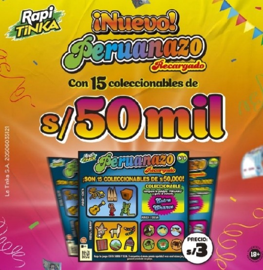
Hey, are you bored? Do you like history? Anthropology? I wanna tell you about something curious that happened in my country. I am from Lima, Perú. I want tell you about what this two pictures have in common (i am sorry for my english in advance)
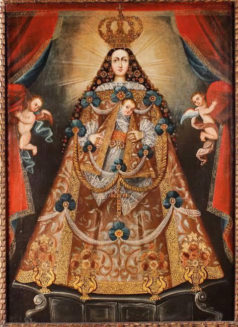
Let's start with the first one: This one is a beautiful baroque religious painting called The lady Of Belen, painted anonymously in Cusco in XVIII. This painting had a purpose (apart from being a beautiful piece of art) and it stars with the arrival of the Spanish to Perú on ~colonization times~. As you know, those fuckers hated the local folklore and wanted to turn everyone catholic. The millenarian peruvian culture is very colorful and cheery, its motivs are always about nature, the sun and the ground, they worshipped the hills (we call them cerros) but most importantly La Pachamama, which is basically The Earth, because it's the sacred place where we live and it feed us with rich yummy food <3 (it's not just that but that's for another post)

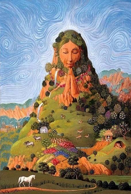
So the colonizers invaded Cusco, they brought all their religion and their catholic churches and they wanted to turn everyone catholic. My people was very resilient and they kept doing their business. The spanish, sick of their efforts to turn everyone into christianity, had one of the earliest marketing ideas and they decided to create catholic imagery where the virgin Mary would be depicted using a cape that would make her have a cone-like shape that symbolized a hill (or cerro)
Examples:


Did it work? Of course! With the help of enormous church buildings and, you know, the atrocities.
Now, what does the second image has to do this this? First, the second image I showed you is a lottery publicity, do you observe the vibrant colors and really the cool typography they're using?? Well, in the 70's (don't know if you know) my country started suffering a political conflict that lasted almost 22 years (ending in 1992) radical groups literally killed people for their political believes. It happened everywhere. In those times, Lima, the capital of Perú was (is, if you ask me) very centralized, the country "progress" was only visible or heard of in Lima, other provinces (you could say states) of Perú were forgotten. These cities were poor, forgotten by the government and also lived the brutality of multiples terrorist attacks. Many Death and many Destruction.
So, forgotten by the government and with that constant fear of death, the town people started to migrate to Lima, thousands of families left their land.
And guess where they started to live? HILLS. Lima is full of them!! And they were empty, these hills did not have the basic necessities housing needs (like running water or draining systems) because Lima is a desert but my people are fighters and they stayed. All the hills were filled with new houses.
This photograph show the early stage:
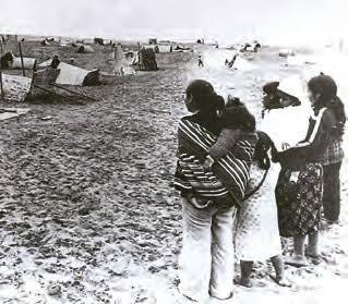
This photograph is how the hills look now:

Migrant people brought their vivid colors with them <3 they are know to be hardworking, also started to make their own parties with their music and their food. Although the culture kept that characteristic essence, eventually it got mixed with other ones that also were present in Lima and the most popular mix is what we call Cultura Chicha.
The Chicha culture, which was more notable in the music, was a huge success. It was so relevant it had (IS very relevant, because it is still very much popular) a lot of awarded singers and bands. The most legendary of them all was a singer called Chacalón, even the UNESCO gave him a prize for a song that is considered an hymn for the people who migrated. He was also given a legendary phrase that says "Cuando Chacalón canta, los cerros bajan" which literally means "When Chacalón sings, the hills come down" meaning that when he sings, all the people that live in the hills come down to hear him. Isn't that very cool??
Going back to the lottery propaganda: This Chicha parties are massive and, to promote them, Chicha poster designers also use vibrant colors and funky typography and it works! If you visit the streets of Lima is very likely you can see at least a wall filled with them!!
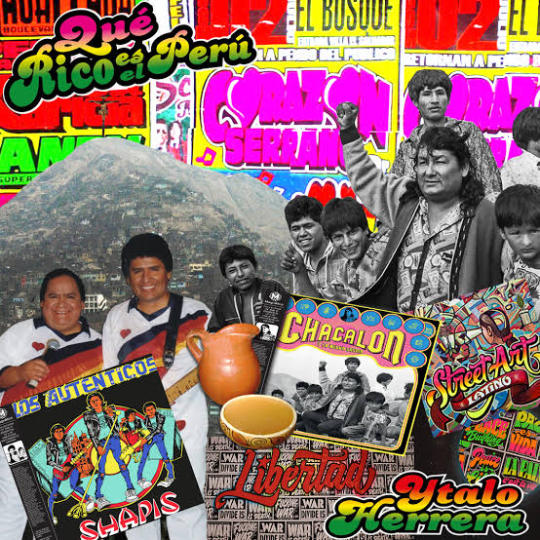
The most rich and successful marketing companies (the lottery one from the beginning) noticed this and tried to imitate the Chicha colors and typography to get the attention of the huge migrant demographic in Lima. Does it work? Apparently yes because they keep using them.

To conclude, isn't it amazing how these colors and designs have passed and survived too much history?? And they're still here. Apart from being used by corporations, you cannot take Chicha culture from its people and I think that is beautiful <3 thank you for your attention!! Have great day and try a peruvian dish called Papa a la Huacaina if you ever step foot in a peruvian restaurant, you will not regret it, it's *chefs kiss*
7 notes
·
View notes
Text
Review/Rant: Official Merch Store
General Short Version
Remember how he said he would hire professional artists for the official merch store? Yeah, Landy lied bc of course he did. Pretty sure he designed this stuff himself. I mean, a too big amount of items are his doodles.
I didn't expect much, didn't even hope for merch for my favs, but I expected at least some new SP art instead of recycled art (some art is so old it's still from when the first trilogy was released) and well, text.
And no, Landy's shitty 5-second doodles of Skul and himself don't count as "art". Neither does the skull silhouette on some items. Couldn't even be arsed to add eye socks and nose smh :/
3 pages full of garbage merch. He really went for quantity over quality here.
And to add further insult to injury, the prices of the items he sells are heavily overpriced.

So yeah, this entire store is a sign of disrespect and balant insult to the fandom. I hope no one buys this.
Long Version
The Notebooks/-pads

Too much empty space. WAY too much empty space. You couldn't possibly have done this in a lazier way.
The sarcasm one is hardly even SP-related. Plus, he didn't even attempt to pretty the text up a little with typography. He didn't use the 'bold' font for "Caution" which would have been the bare minimum. This doesn't even count as trying.
I TRIED to make the two with characters on it a little better by reducing the empty space, but it's really hard to polish a turd. Especially if ya don't wanna put more than 5 min in lol
Totem Bags
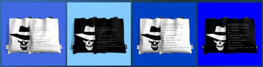
This store has totem bags, but they are worse than the Kickstarter one. At least the Kickstarter one had text big enough that you could read it from afar. For the text on the new ones, you'll need a magnifying glass.
Clothing
Some of the text has the same problem as the totem bags: too small to read. The only time text should be that small is if it isn't meant to be read or when it's "if you can read this you're too close" T-Shirt.
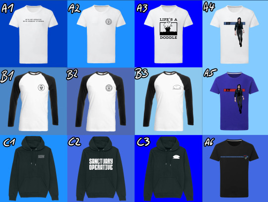
This applies especially to A6.
If you have B2 you don't need B1. What happened here? Did he have an item amount quota to reach?
A3, B3 and C3 are Landy's shitty 5 second doodles again. Unless they are used to signed the cloths they don't belong on the clothes. Pay for a custom design, you cheap ass scammer!
A4 and A5, the stripe with Skul should be thicker. If it's on a shirt you shouldn't need a magnifying glass to see it. Also, the blue stripe needs more contrast, the blue is eating the black outlines of Skul. The red stripe on the blue shirt... I just really don't like that blue tone and I hate that he doubled down on it. For the website too.
C1 should have had the sold letters bc you can't read it from further away with that effect on top.
C2 at last you can read this one. Not getting any creativity points from me tho. Once again it's just text and probably took him 5 seconds to design.
Now listen, here is what I want instead. I have this zip-up hoodie from Killstar. I love and essentially I want this but in SP.
Faceless One version:
The symbol on the front is the Faceless Church symbol.
The back is a picture with Mev in the middle and his generals around him and it's done in the style of those stained glass windows you see in Christian churches but black and white.
I don't know what I want on the sleeves. Maybe bursts of flames, symbolizing Mev's fire attacks. Or perhaps just parts of the 'Gospel of the Faceless' scribbled along on the arms in English, Latin or even Irish??? Or one arm a snake to symbolize Nef and the other a lion to symbolize Baron as his right and left hand men?
China Sorrows Version:
The symbol in the front should be a crest with a scorpion on it.
The back image is a drawing of China in the Art nouveau style.
The arms should be a roll of paper curling down each arm with various symbols drawn on them, artfully intervening with each other.
Hats
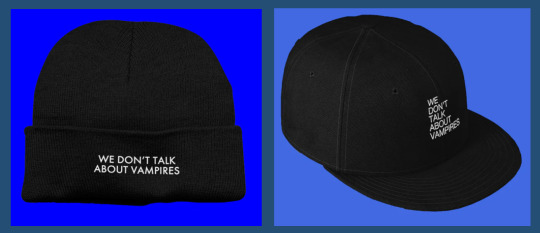
I wouldn't say that "We don't talk about vampires" is one of the more iconic quotes of the series, but besides that not even an attempt was made at typography. Or like, a little vampire head silhouette with an open mouth and exposed fangs. or even just fangs around the text or anything at all even.
It doesn't assault my eyes, but it's also incredibly boring.
To the people saying they wanted to buy Skul's head: just go to a hat store and buy a fedora. It's gonna be better quality than whatever Landy would smack on the store for a criminal price.
Everything with his face on it

No.
How full of yourself do you have to be to try and sell merch with your face on it. The quotes are awful too
The quotes on the postcards are so awfully 2012 Tumblr "quirky" I'm-not-like-other-people ^w^ edgy bullshit vibes. Wasn't cute when it came from the emo kids back then and it coming from a +50 year old man trying to be relatable to the kids these days is just sad and cringe.
Also, I'm pretty sure by sending people that greeting card is how you end relationships including familiar relationships.
Baby's first InDesign Skull

It's what it says in the title. Should have just used the iconic Skul logo instead to make it look like SP and less like random shit you can find on Etsy after reaching page 100.
Really should have just used the old school icon. Thee is a reason it's so iconic: it's easy to recognize as Skul and not random skull/skeleton number 5643489. Plus, using the old one is about the same amount of effort as making the new one.
Honestly, it should have been custom art, but the iconic SP icon would be the lesser evil by a far.
On top of hat, black text is hard to read on a red background js.
Also, what kind of chaotic evil alinged bastard uses a metal pencil case???
Prints

Ngl I always thought the "Mortail Coil" cover was one of the best of the entire series. I also really love the OG "Dark Days" cover. OG book covers as prints? Easy win! Still fucking overpriced tho.
Plus the OG covers also would have looked good on clothing, way better than the shit he ended up slapping on there.
As for the collage with all of the characters in it: I always thought it looked awful. The characters were just thrown in there without much thought or care. Also hate that he used the ugly ass SoW Nef instead of the way better-looking Book 1 cover Nef.
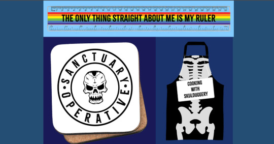
Rainbow Ruler
This isn't even Skulduggery-themed.
I feel like HarperCollins told Landy he had to put something in the store for the gays but instead of making something like a cute lil Valkyrie/Militsa pin he just smacked this into the store.
The Skulduggery Apron
The only thing that makes it SP-themed is that they smacked a sign saying "Cooking with Skulduggery" on it. Otherwise, it looks like every other skeleton apron you can get around Halloween.
Coaster
So empty and boring again. It looked way better with the moth eventho it was a "Silent of the Lambs" movie poster rip-off. Still don't know why a skull is the official Sanctuary logo. Seems kinda weird for the good guys. On a meta level: I guess literally EVERYTHING in universe has to revolve around Skulduggery.
Make the Sanctuary seal more interesting and then invert the values so the background if black and the lines are white and this could actually look decent.
Skulduggery Clock
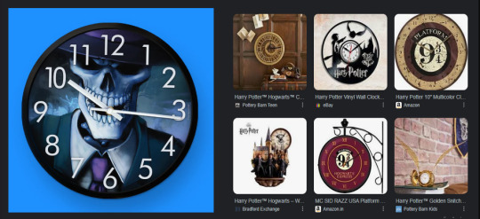
This looks like a your-photo-here clock that you can order at every random print shop. Here are some examples from HP to show HOW a custom clock for the fans is meant to look like next to it. (Also look at this Thresh watch, it's so good I almost regret not wearing watches.)
Lunchbox and Waterbottle

Same thing as with the clock. Tho the water bottle also has too much white space.
Mouse-/Gamerpads
Recycled art again. The mousepads look weird with Val placed smack dead in the middle. Plz apply the rule of thirds and move her a little to the right.
Pillows and Bag

AGAIN WITH THOSE SHITTY DOODLES
Someone tell Landy that if it takes about 5 seconds to draw it does NOT belong on merchendise!
Also, that floating "Bad Magic" Skul really doesn't work on it's own, Just... just use the damn Skul icon if you gotta be lazy.
Final Words
Overpriced lazy garbage that Landy definetely designed himself. No person with self-respect would even consider participating in this cash grab.
It's an insult to every fan, really.
How to fix this? Delete everything from the website, hire a professional artist, go for quality over quantity. A few items that sell really well are a million times better than a bunch of items that don't sell. If the shop goes well you can always expand.
Almost all of the store should have been custom art apart from a few exceptions where old promo art and book covers are used for tops and posters.
#skulduggery pleasant#sp merch#long post#well this was a waste of time#that I regret#I did not expect it to take this long#but there is just so much merch#and none of it good#rant#art rant
9 notes
·
View notes
Text
🇵🇸 🇵🇷🐢🏝️ i got tired of complaining constantly on my main blog (@thewingedwolf is me!) about how sansa and rhaenyra did nothing wrong and also i needed a way to organize my theories and stuff. yes i have read all the books. yes i have (unfortunately) seen the whole show. yes i have seen all of hotd as well. so here we go. my stances are this, so you have an idea what to expect:
i am a catelyn, sansa, brienne, elia, and rhaenyra stan FIRST and a person SECOND
i would die Gaemon Palehair, Lady Essie, and Sylvenna Sand, those are my canon OCs, and that’s why they’re my header.
Sansa and Bran are my favorites! I am a Sansa will be Queen in the North truther and a Bran will be the King in Harrenhal conspiracy theorist, It Is Heavily Foreshadowed In The Text and I stand on that!!
I'm well aware Rhaenyra has plenty of faults, I am simply saying that the greens (as in, the characters) do not like her because of her gender, and not for stuff she does that’s actually wrong, also, idc that she did all of that i simply think she’s neat.
Helaena really IS the one who did nothing wrong tho.
i am a Dark Daenerys believer. no, i don’t hate her - in fact, i really love her, although i do hate her show counterpart - I just think her arc is heading towards a dark path and being a villain protagonist is the more interesting route for her character.
House Martell will rise or I will piss in old man germ’s cornflakes.
I Will talk about the racism Dorne faces in the text and outside of it and neither your favorite house nor my favorite house is exempt from this. If you have a problem with that, keep it to yourself bc i do not care 🙏🏽
i multiship!! just bc i ship it doesn’t mean i think it’s gonna happen in the series, i just like the dynamic!!
i am in fact the annoying book jonsa truther they warned you about. i will Stay bitter about this. argue with the wall.
with that said, i also like theonsa, throbb, daemyra, laenyra, rhaewin, nedcat, braime, briensa, and a million other ones. faves listed here. several of them are dead dove-esque; what can i say, that's just george's style.
you decide whether it’s romantic or platonic when it’s an incest one, my opinion changes by the hour & im gonna fight grrm for making me think this much about incest.
i don’t like jonerys!!!!!! i'm sansan & sanrion ambivalent and i simply do not care about littlefucker like that. i would say i’ve thought positively about basically every other ship.
i’m in the middle of a reread, as of this moment (april 2024) i’ve kinda stalled on the beginning of a dance with dragons but i Have started a rewatch of the tv series as a form of torture.
i first read this series when i was 16 in like 2012-2013. i love to bitch about the takes i’ve seen. i sometimes reblog really old ass graphics bc they deserve new life even tho the creators are long since deactivated. i sometimes make graphics that look like they’re from 2014 bc we should bring that style back dammit i hate the typography movement going on rn.
big on tagging triggers so lmk (i’ll tag for all characters & major triggers but i’m fine with adding a specific one if asked and don't worry about it being a "weird" trigger - if sean bean's face or knives or wolves or whatever trigger you, i'm happy to tag for that!).
i have a tag page that is more organized than the slapdash nonsense on this post, feel free to check it out here.
i may sound angry but i promise i am genuinely just here for a laugh. i just have resting bitch voice and no feel for tone and use the word fuck too much. it’s fine and unserious.
#getting on my soap box#some of my more commonly used tags are-#gender politics in asoiaf#lyanna and the starklings#smallfolk rise up#jon lyannason first of his name#the ghost of elia martell#the curse of visenya the conqueror#ados speculation#twow speculation#true knights#knighthood and oath keeping#ashford tourney theory#alysanne of harrenhal au#dreamer aegon au#there is always a lighthouse. there's always a man. there's always a city.
33 notes
·
View notes
Text
2023: A Year in Review
tagged by the wonderful @weiwuz thank you!!
rules: link your favourite and/or most popular post from each month of this year (it's totally fine to skip months and tag some CCs you love!)
i'm going to link more than one because i feel like i've improved a lot over this past year as i adapted more to using photopea & explored a lot more when it comes to giffing using it & i'm proud of how far i've come this year! (also you can see when i went from only doing 1 gif a month to like multiple 🤣) apparently i didn't make very many sets in may that aren't in my eyes "boring" 🤣
JANUARY
first love: hatsukoi + terminal by lewloh & julia gartha
kurodachi | cherry magic + moment by jeff satur — for userdramas event 3: beginnings
lan wangji | the untamed (golden core reveal & all the things he said to wwx when he didn't know he was coreless because i love inflicting pain)
FEBRUARY
kodama sakuko | koisenu futari — for userdramas event 4: love
asatsune | reversal orchestra (with a quote by r.m. drake)
MARCH
asatsune | reversal orchestra ep 8
mike chinnarat in midnight museum ep 2 (this one might also be most popular people were rightfully unhinged when they saw this set/him in this drama)
asatsune | reversal orchestra ep 9
core four | brush up life
APRIL
jiang cheng | the untamed — for userdramas event 6: second time to shine
JUNE
takahashi satoru | koisenu futari — for userdramas event 7: identity
(it's rainbow coloured what else can i say)
jeff satur lucid mv
(aka the set i still kick myself for forgetting i could've used this for userdramas bingo)
wasteland by kang daniel set
(another set where i kinda used b&w and didn't hate it also i just love the blending in this set, & the og mv for SOS was like yellow)
JULY
wei wuxian | the untamed — for userdramas get to know me bingo: character
AUGUST
takahashi satoru | koisenu futari — for userdramas event 9: icon
SEPTEMBER
xiyao | the untamed — for userdramas event 10: emotions
(i really loved how this one turned out with the transition of the colours & just the colouring in general i really love)
asatsune | reversal orchestra — for userdramas get to know me bingo: relationship
(i had a lot of trial and error with this set, it took a whole like 7 months for me to finish it because i kept going back and redoing the colouring because reversal orchestra if you haven't seen it is like literally colour coded yellow/orange, you can also tell it took me this long because this is one of the few sets after like july where i used my old gif size)
OCTOBER
xiyao | the untamed — for userdramas event 11: inspiration
NOVEMBER
songxiao | the untamed — for userdramas event 12 loss
(this one is actually probably my favourite set of mine of all time)
yaojing | lost you forever — for asiandramanet nov bingo: animation
(fade transition effect used, this one took me a long time to make & it turned out so much better than i expected)
tushan jing | lost you forever — for asiandramanet nov bingo: quote
(i'm not a lover of using yellow in my gifsets & i actively tend to avoid it but i wanted to use yellow because i think it embodied the quote well and i surprisingly loved how it turned out)
tang lian | the blood of youth — for asiandramanet nov bingo: blending
DECEMBER
zhening | story of kunning palace — for asiandramanet dec bingo: black & white
(b&w is another thing i tend to avoid with my gifsets because i usually dislike the outcome but i really loved how this turned out)
yunqing | reset — for userdramas secret santa + asiandramanet dec bingo: overlay
jinwoo/moeun | tell me that you love me — for asiandramanet dec bingo: free choice
(i've been wanting to use this quote for agessss and it was just perf for them & this set has grown on me a lot)
yaojing | lost you forever (ep 33) — for asiandramanet dec bingo: typography
(ironically for this what i love about it is the colouring)
jinwoo/moeun | tell me that you love me (ep 9) — for asiandramanet dec bingo: comfort
i'm too lazy to tag people so please feel free to say i tagged you, & if you read the whole of this post ilysm
#lex waffles#long post#me: i don't use b&w often#also me: here's a bunch of sets with a few b&w gifs#okay this got hella long#really proud of myself this year#and i feel like the set i'm working on right now could also make the december list but i won't be getting that done until before sunday lol#the way i colour my gifs & the way i blend i also changed like midway through the year along with my gif sizes lmfaoo#i can't pin point where exactly the colouring/blending change happened but i feel like i want to say it was the xiyao emotions set
5 notes
·
View notes
Last Seen Blogs

aurorevernat-blog
Aurore Vernat

harunaksoy
HarunAKSOY
ffbuilder
ffbuilder
canelonesdecanela
Ascendente en fase lútea
sainzfilm
cherry-coloured funk