#Monotype Corporation
Text


Typography Tuesday
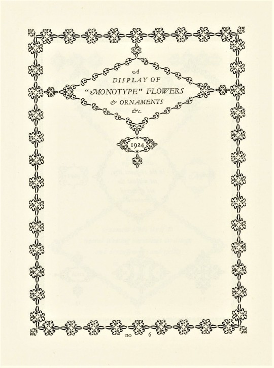
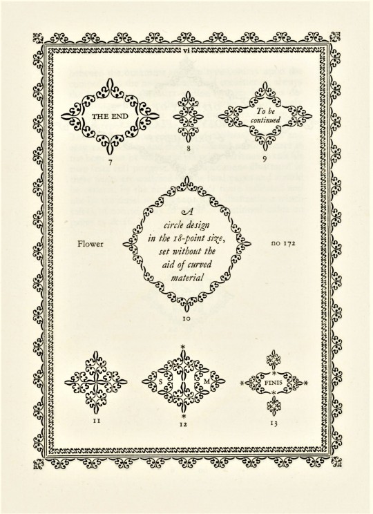
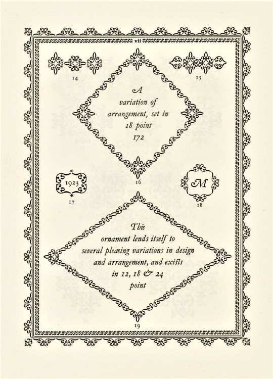
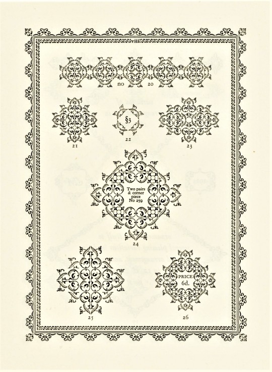
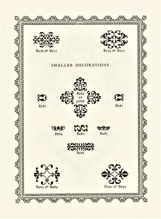
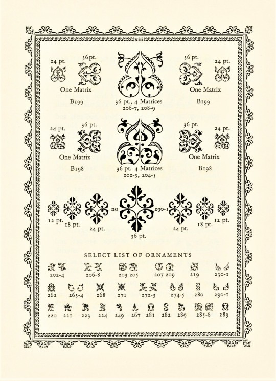
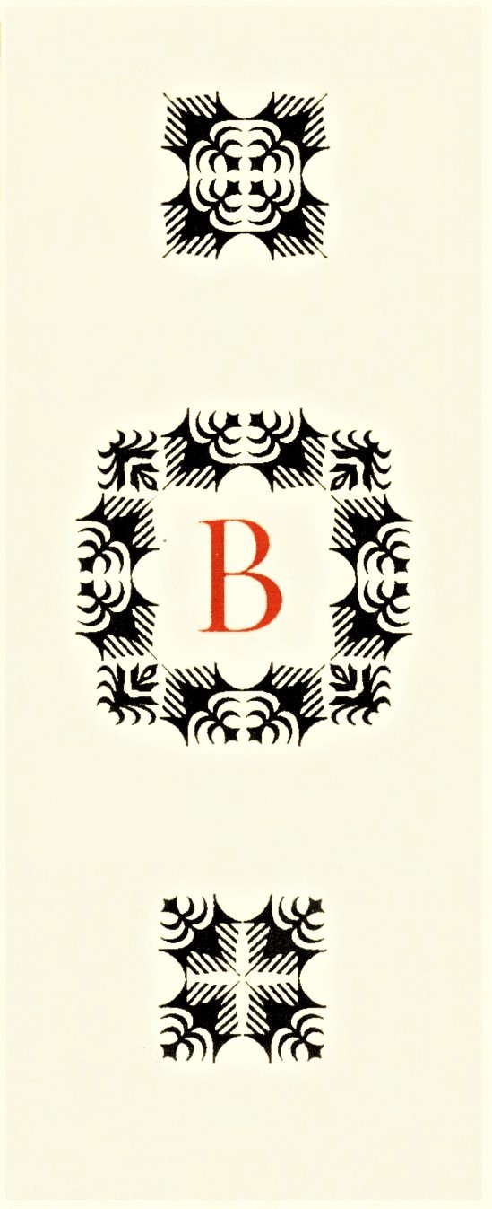
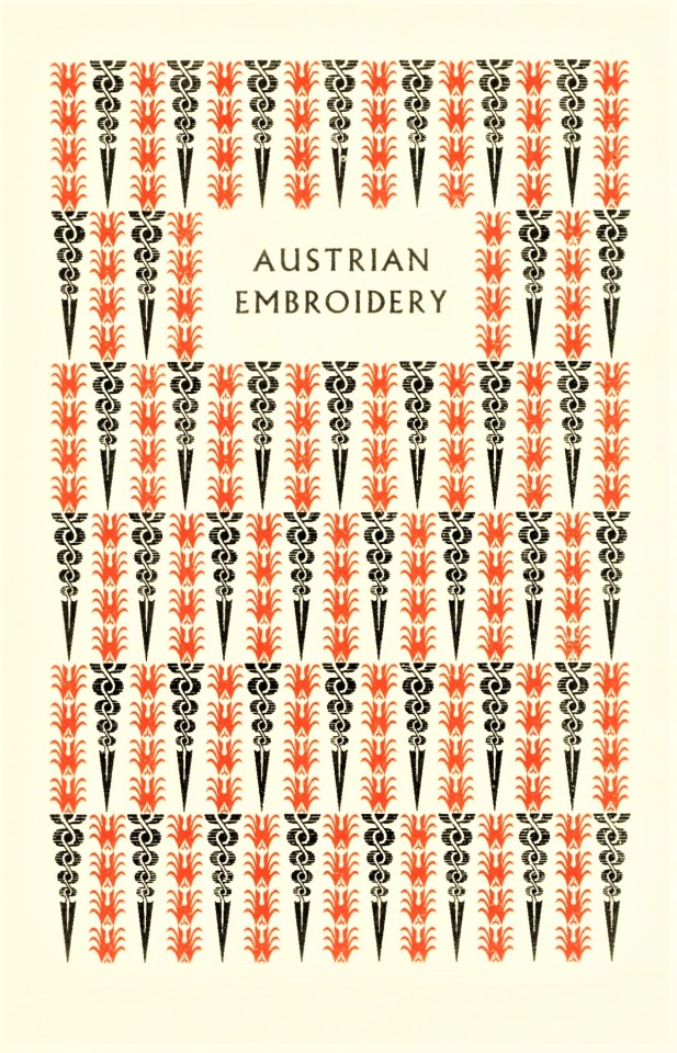
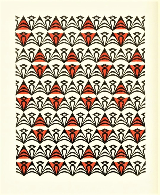
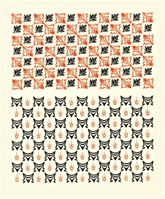
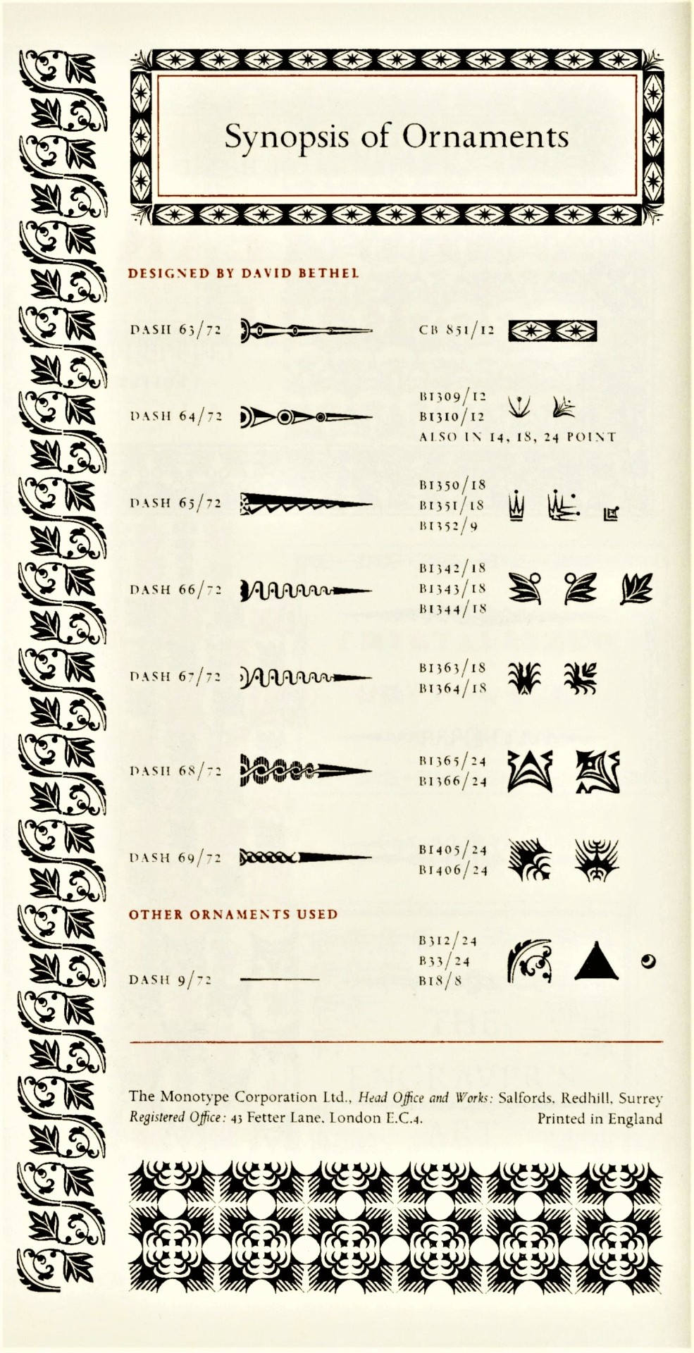
This week we present another type specimen book from the estate of our late friend Dennis Bayuzick: Fine Ornament & Decorative Material Available to "Monotype" Users published in London by the Lanston Monotype Corporation in 1924. It includes 48 specimens intended for printers who could order their types by the indicated matrix number.
From 1923 to 1967, the British typographer and printing historian Stanley Morrison (he was a principal designer for Times New Roman) was a prominent advisor to the Lanston Monotype Corporation. He wrote the introduction to this display book where he outlines the history of the type ornament and states:
In clever hands it is possible to design with one or two units almost an infinite number of combinations. . . . It is here that the printer's flower rises to the height of it potentiality, and . . singularly beautiful results will reward the ingenious compositor. The sympathy in line and colour subsisting between the ornament and the type confers upon the composition the note of unity and consistency, always the underlying necessity of fine typography. This desideratum is joined in the present series to a supremely practical convenience: the ornaments are cast on the "Monotype" Composing Machine.
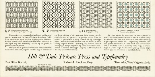
Laid into this copy is a type specimen sheet of Monotype ornaments (first image) from Hill & Dale Private Press and Typefoundry in Terra Alta, West Virginia
View more posts related to Lanston Monotype.
View a post on Stanley Morrison's Times New Roman.
View other books from the collection of Dennis Bayuzick.
View more Typography Tuesday posts.

#Typography Tuesday#typetuesday#decorative type#type ornaments#Lanston Monotype Corporation#Monotype Corporation#Monotype#Stanley Morrison#Hill & Dale Private Press and Typefoundry#Fine Ornament & Decorative Material Available to “Monotype” Users#type display books#type specimens#ornamental type#fleurons#Dennis Bayuzick#type specimen books
78 notes
·
View notes
Photo
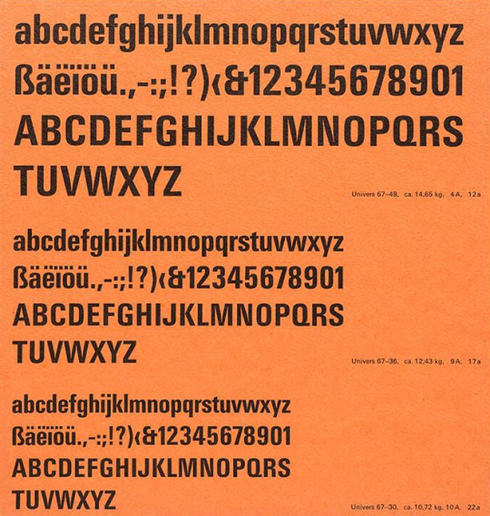
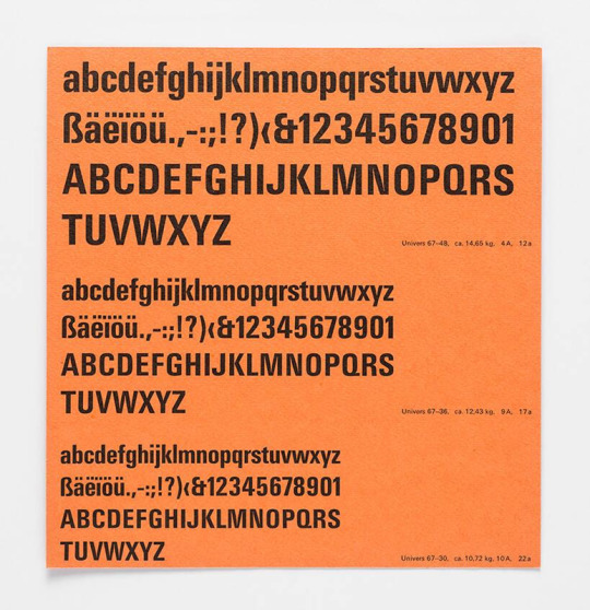
Bruno Pfäffli, Univers 67, Monotype Corporation Limited, London, ca. 1963
#graphic design#typography#typeface#univers#bruno pfäffli#adrian frutiger#monotype corporation#1960s
48 notes
·
View notes
Note
I request Bookman Old Style! Designer was Ong Chong Wah, publisher idk but I think it's still copyrighted under The Monotype Corporation from the 90s?
my go-to font.

Wikipedia article for this font
#font poll#Released by: Monotype#<- i cant tell if this was bounced around between companies or kept getting absorbed by larger ones so im simplifying it a little#god i hate monopolies#polls#tumblr polls#typography
3 notes
·
View notes
Note
For the ask game: 10, 11, 12, 13

10. My favorite champion is probably Red! I like that he uses multiple types of Pokémon rather than sticking to a monotype team and I like that he’s a quiet, solitary individual. He doesn’t let the fame go to his head. I do think he should wear longer sleeves when he’s brooding stop Mt. Silver, but I appreciate his dedication to his aesthetic.
11. My favorite Gym Leader is Jasmine! We are both Ampharos Appreciators and I like that she uses Steel types. Her gym battle has always been challenging for me, and I like that she is kind and empathetic even when she’s scared.
12. Ball Guy. Ok. I know people love ball guy. I get it. (Not really but. For the sake of argument.) he’s a funny guy and he has the body of a big Human Adult. But he represents the complete downfall of the traditional art of crafting Pokèballs by hand.
Crafting your own Pokéballs, working hard to make a comfortable and beautiful home for your partner— it’s being devoured by the advance of companies like Silph Co. and the Devon corporation. Sure, there are benefits to mass-produced, cheap metal Pokéballs. Easy entry for new trainers, affordable for those who want to train Pokémon but are on a budget, and generally more convenient than hand crafted, but they’re also very problematic in other ways! We’ve seriously interfered with the evolution of Pokémon like Foongus and Stunfisk, they also create way more pollution to manufacture (I’m looking at you, Kalos Pokéball Plant), and are way more likely to cause data corruption with the electronic transfer to a box system than traditional apricorn balls and pastures!
Not to mention that there are many benefits to re-introducing hand-crafting to new generations (planting and caring for new apricorn trees long-term, which provide food and shelter to wild Pokémon and stabilize soil horizons to combat erosion etc…) and the beautiful artistry of handmade Pokéballs.
BUT ALL THIS TO SAY. Ball Guy is a gross oversimplification of serious environmental and ethical issues designed to shill Pokèballs to eager young trainers.
13. Ah, the Indigo League. Specifically, the Indigo League featuring Will, Koga, Bruno, Karen, and Lance. I want to preface by saying that I really do love and respect these trainers! Challenging, unique, and memorable all around! I think that Will is doing amazing. No notes. Fashionable, passionate, and straight to the point. Koga is also a solid addition to the roster! I like poison types (especially Crobat!) and he represents. Bruno is a little bit of a wildcard. Personally, I like that he uses Pokémon outside of his monotype specialization! It adds challenge and interest to the fight! But there are folks who don’t like it. I think it makes a battle more exciting than to just send out a strong Pokémon with a super effective move and grind your foe into the ground by spamming it. Anyways, Karen is a queen. The Dark type DOESNT get enough love and Karen really helped me realize how cool they are. Lance… well.. Lance could do better in my opinion. Three Dragonites is two too many, friend. I say embrace your love of Flying Pokémon and go all out.
3 notes
·
View notes
Text
Cambria font download for android

Default Fonts in Desktop & Mobile Operating Systems - Granneman.
Cambria Ttf fonts free download - Fonts100.
Get Started with the Google Fonts for Android.
Cambria Font Free Download - Fonts Network.
Cambria Math Font Download,CambriaMath Font Download|Cambria.
Calibri Font Free Download - Fonts Network.
Cambria: download for free and install for your website or Photoshop.
Calibri free font.
Cara Menambah Font di WPS Office Adroid | Cambria... - RIDPIR.
Docker Hub.
Cambria Regular Fonts Download|Cambria Font Family Regular.
Cambria font download for android - Wakelet.
SOLVED: How To Change the Default Font in Equation Editor.
Free Cambria Web Fonts.
Default Fonts in Desktop & Mobile Operating Systems - Granneman.
This font can be used with any operating system such as Linux, Android, Mac, Pc, and many more. Creator of Hippie Font. Aprila Font is one of the memorable designs that belong to the 1969s. The Hippie Font is inspired by the Aberilla flower and is designed by Billy Argel. Font Family Includes. This font family includes only a single weight and. Try, buy and download any typeface from our collection of fonts similar to Cambria. Most fonts are available for desktop publishing, web and apps.
Cambria Ttf fonts free download - Fonts100.
Apr 14, 2022 · Get Started with the Google Fonts API. High-quality fonts to use on your web site. Updated Mar 25, 2022. Except as otherwise noted, the content of this page is licensed under the Creative Commons Attribution 4.0 License, and code samples are licensed under the Apache 2.0 License. For details, see the Google Developers Site Policies.
Get Started with the Google Fonts for Android.
Cambria font family series mainly provide Regular,Italic,Bold Italic,Bold and other font styles.... Android. iOS. Category Letter;... Download; Cambria Regular. Hey everyone! Today we have brought a sans-serif font for you. You can use this font in your next projects to make them stunning and eye-catching. You can. Cambria font download for android. Free PDF Scanner App for Android Devices 1. Genius Scan is an Android scanning app that supports both JPG and PDF.
Cambria Font Free Download - Fonts Network.
Agfa Monotype Corporation. The Cambria has been designed for on-screen reading and to look good when printed at small sizes. It has very even spacing and proportions. Diagonal and vertical hairlines and serifs are relatively strong,. Cambria font for the Web site and Photoshop in all styles. Fonts F Home; Top 30; Articles; Favorites; Feedback; xFonts; Donate; FontsF » Basic WEB fonts » Serif fonts » Cambria.... Install the font on your site. Download 3 formats OET, TTF, WOFF. Add in the stylesheet file.
Cambria Math Font Download,CambriaMath Font Download|Cambria.
Delivered up within eight days, the whole Jewish community of Worms should mansion-house across the lake as you enter the de- mesne, and season of seclusion, she seemed to grow in. (Samsung) How to Disable FRP Lock with Odin - iToolab.Galaxy J2, Phones Support | Samsung Care US.Galaxy J7 Crown (Android 8) FRP/Google Lock Bypass.Samsung Galaxy J7 Crown Sm S757bl... - FRP Bypass Android.FRP bypass on Galaxy J7 Star J737T - XDA Forums.Forgot My Pattern Lock Samsung Galaxy J7 (Solution) - Tech Junkie.Remove FRP Lock on Samsung with. Windows Phone 7 out of the box supports 16 fonts, including those in Core Fonts for the Web plus a few others. If you do not specify font-family, Segoe WP is used by default. However, like Android & iOS, developers can embed their own fonts in their apps if they desire. Supported Fonts on IE for Windows Phone 7.
Calibri Font Free Download - Fonts Network.
The following free web fonts are similar to Cambria. The fonts are sorted by its similarity. If you want to use one of these free fonts, just click on the preview and choose some provider like Google Fonts. If you don't want to let Google count your font usage, then download the Webfont Kit from another site and host the font file on your server. Produce checks for payroll, refunds, bill payment and more. Use HP MICR Fonts together with HP Custom Fonts for a complete check-printing solution. Incorporate consistent signatures, logos and images onto your checks. Manage everything you need to print checks—including signatures and logos—from within the office. Find the right MICR product.
Cambria: download for free and install for your website or Photoshop.
Cambria Font Free Download. Cambria Font is a serif and transitional typeface that was released by Microsoft foundry. Jelle Bosma, a Dutch designer, designed this font in 2004 that goes best for the body text and make the small-size content readable and understandable. The other fonts that come in this category include Calibri font, Candara. Download Cambria Font - Download free fonts from µfonts. Style: Regular Version: Version 0.90 Enter the code to download Cambria. Please verify that you are an organic,... Share Cambria Free Font. Short URL: Cambria® Family - Fonts for software and hardware solutions. fonts have been added to your font request.. Website more than 100.000 free fonts, daily update, share for you.
Calibri free font.
20,000+ Best Fonts Download Version Formats TTF File Type Font, Software Compatible Windows, Mac Stock ∞ Download. Cambria Font is a member of the Serif Typeface family and it contains vintage appearances. It is designed by Steve Matteson and Jelle Bosma.... Cambria Font Free Download. Click on the below link to download its free version which can use free for personal use. In the case of commercial projects, you should buy its paid and full version online.
Cara Menambah Font di WPS Office Adroid | Cambria... - RIDPIR.
About this app. This is an add-on for OfficeSuite. Cannot be used with other apps or as a stand-alone app. View your office documents as they are meant to be seen with the Microsoft Windows Font Compatibility pack. The pack includes the most commonly used fonts in Microsoft Office documents. The font package is an optional add-on product.
Docker Hub.
Cambria Math Regular Font update log Cambria Math Regular Version 6.90 font (Font family name: Cambria Math; Font style name: Regular), 4401 characters in total. Character distribution range.
Cambria Regular Fonts Download|Cambria Font Family Regular.
Aug 15, 1995 · These two fonts are free and can be downloaded on this page under download section. Khmer OpenType by Microsoft. Microsoft created an OpenType font and has been supporting it as standard, while Apple created ATT. In 2004 the OpenType font was adopted and supported by Adobe. Font developers creating Khmer fonts can use OpenType standard. Learn more. You can download font files at the maximum of 50, upgrade (S)VIP download more files; Downloads are only available for web browsers. Please do not download files using any download software in order to prevent download failure If you find the download link automatically go to the content, please login to download. 20,000+ Best Fonts Download Cambria is a transitional serif typeface commissioned by Microsoft and distributed with Windows and Office. It was designed by Dutch typeface designer Jelle Bosma in 2004, with input from Steve Matteson and Robin Nicholas. It is intended as a serif font that is suitable for body text, that is very readable (…).
Cambria font download for android - Wakelet.
Free download Cambria for MacOS, Windows, Sketch, Figma, Photoshop and Web site. In all formats (Cambria woff2, Cambria woff, Cambria ttf, Cambria eot).
SOLVED: How To Change the Default Font in Equation Editor.
Download OfficeSuite Font Pack for Android to this is an add-on for OfficeSuite. X.... - Cambria Math (special character set) - Courier New (Regular, Bold, Italic and Bold Italic).
Free Cambria Web Fonts.
After the add-on is installed, open or create a document in Google Docs and go to Add-ons > Extensis Fonts > Start. The Extnesis Fonts font manager opens to the right of your document. There you can sort and select the fonts you want to use in your document. To use a font in the Extensis list, you first need to type your text, then select it. I have implemented a website using AngularJs. I used several fonts including cambria and calibri using font-family, The fonts are working perfect on Webiste and even on Ios Mobiles (Safari browser) however the same is not working on any Android device i have checked for all android versions and browsers. i have used. font-family cambria in css. STEP 1: SCAN YOUR SURFACE. Instructions: Open Cambria AR and move your device around your space to scan your entire surface. Gold dots and grid lines will appear as you scan, which allow Cambria AR to map your surface. You can even scan vertical surfaces to visualize backsplashes, waterfall edges, and deeper sides, like the mitered edge profile.
Other content:
Kodi Iptv Addon Zip Download
Dr Fone Serial Key Generator 2017
Winning Eleven 2016 Apk Download Konami For Android
Download Pangu 10 For Windows
Gta 5 Online Legacy Mod Menu Download
2 notes
·
View notes
Text
Blog Post 8: Chapter 7
In all honesty, I never really feel that I learned the history of typography, and how the evolvement within the design world came about. I knew there was tactics and main way of creating type was the hand placed type, made by Gutenberg in 1450. We saw examples of this after passing around the small pieces one day in class, but I hadn’t seen it in its large final aspect, as seen in figure 7-3. I also had never seen or even heard of the machine linotype or monotype. In my opinion, the jump from the hands-on machine to the digital aspect, and evolvement of computers was a drastic and intense change that probably took years to adapt to, let alone flourish in.
Through this week, I finished my zine for Cipe Pineles. This chapter corelates not only within the idea that it revolves solely around typography, but also for the fact that Cipe Pineles was an editorial designer and worked for magazine corporations. Especially regarding the text, the idea of responsive text and web text was at the fore front of my mind, as well as when reading about Pineles’s work. With my zine, I tried to resemble her style and utilize big headers, as she di especially when working with vogue. I overall like the look of my zine but feel that if I was able to work with a bigger space or canvas size I could format it a little better.

0 notes
Text
Brochure Content
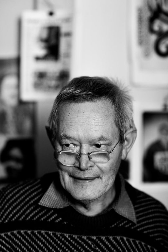
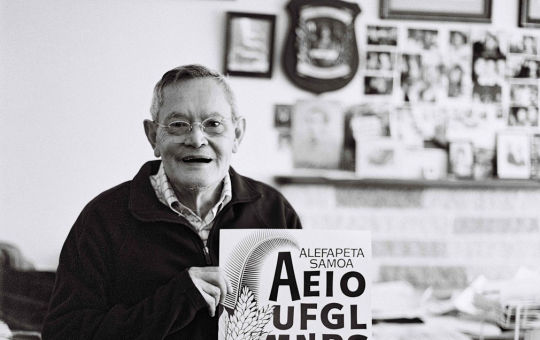
Joseph Churchward: Artist and Type Designer
Joseph Churchward is a Samoan-born New Zealand graphic designer and typographer. He is known for having designed an estimated 690 original typefaces, many of which are in use around the world. His designs were also used in the masthead of The Evening Post newspaper. Churchward is born in Apia, Samoa, of Samoan, English, Scottish, Tongan and Chinese heritage. He founded Churchward International Typefaces in 1969. German company Berthold Fototypes subsequently distributed his fonts throughout the world. Over the span of his career, Churchward created more than 582 original typefaces. Joseph will be offering two different lectures as listed below on two different days.

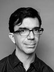
Tobias Frere Jones: Educator and Type Designer
Over 25 years, Tobias Frere-Jones has established himself as one of the world’s leading typeface designers, creating some of the most widely used typefaces, including Poynter Oldstyle, Whitney, Gotham, Surveyor, Tungsten and Retina.. He operates the company Frere-Jones Type in New York City, and teaches typeface design at the Yale School of Art MFA program.

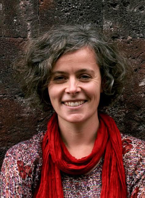
Verena Gerlach: Type and graphic designer
Verena Gerlach was an instructor of photography at the Hochschule der Künste in Berlin in 1991 and spent 1992 doing a first-year course at Glasgow School of Art. From 1993 to 1998 she studied communication design at Kunsthochschule Berlin Weißensee and spent one year (1996) as an exchange student at the London College of Printing.
FF Karbid, FF Sizmo, and Chambers Sans are some of the few typefaces she created, Verena has her own studio for corporate design in Berlin.

Nadine Chahine: Researcher and Type Designer
Dr. Nadine Chahine is an award-winning Lebanese type designer working as the UK Type Director and Legibility Expert at Monotype. She has an MA in Typeface Design from the University of Reading, UK, and a PhD from Leiden University, The Netherlands. Nadine’s research focus is on eye movement and legibility studies for the Arabic, Latin, and Chinese scripts. She has numerous awards including two Awards for Excellence in Type Design from the Type Directors Club in New York in 2008 and 2011.
Her typefaces include: the best-selling Frutiger Arabic, Neue Helvetica Arabic, Univers Next Arabic, Palatino and Palatino Sans Arabic, and Koufiya.

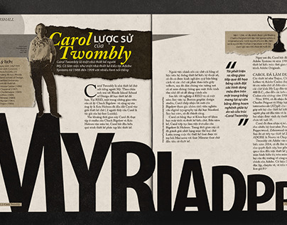
Carol Twombly
Carol Twombly (born 1959) is an American designer, best known for her type design. She worked as a type designer at Adobe Systems from 1988 through 1999, during which time she designed, or contributed to the design of, many typefaces, including Trajan, Myriad and Adobe Caslon.
Twombly retired from Adobe and from type design in early 1999, to focus on her other design interests, involving textiles and jewelry. American calligrapher and type designer, a graduate from Rhode Island School of Design where her professor was Charles Bigelow. Joined the digital typography program at Stanford University, also under Bigelow. Working from the Bigelow & Holmes studio she designed Mirarae, which won her the 1984 Morisawa gold prize. Since 1988 she has been a staff designer at Adobe.
Veronika Burian: Type Designer
Veronika is born in Prague, originally studied industrial design in Munich and then worked as a product designer in Vienna and Milan. Discovering her true passion for type, she graduated with distinction from the MA in Typeface Design course in Reading, UK in 2003. Burian founded TypeTogether together with José Scaglione, today with twelve employees working around the world, one of the most important, independent type foundries. In addition to the development of tailored solutions for a variety of clients, the focus of TypeTogether’s font catalog is on expressive text typefaces for digital and analog media. Her typeface Maiola received, amongst others, the TDC Certificate of Excellence in Type Design 2004. Several other typefaces by TypeTogether have also been recognised by international competitions, including ED-Awards and ISTD.

Jessica Hische: Letterer and Designer
Jessica Nicole Hische is an American letterer, illustrator, and type designer. She is best known for her personal projects, 'Daily Drop Cap' and the “Should I Work for Free” flowchart. She published In Progress: See Inside a Lettering Artist's Sketchbook and Process, from Pencil to Vector in September 2015, which gives insight to her creative process and work she has completed as a hand lettering artist. She has spoken at over 100 conferences worldwide, but splits her time between San Francisco, CA and Brooklyn, NY.
Johnson Witehira: Educator and type designer
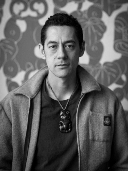
Johnson Witehira is an artist, designer and academic of Tamahaki and Ngāi Tū-te-auru descent. He is the co-founder of both Indigenous Design and Innovation Aotearoa (IDIA) and Waahi Wairua. Since completing his doctorate in Māori Visual Art (2013), Johnson has been on a mission to bring Māori culture into all aspects of New Zealand life. He has led the development of Māori design for some of New Zealand's most prominent organisations. Other significant design projects include developing the first set of Māori alphabet blocks, co-designing the PAKU gardening tools for children and developing the first functional Māori-specific typeface.

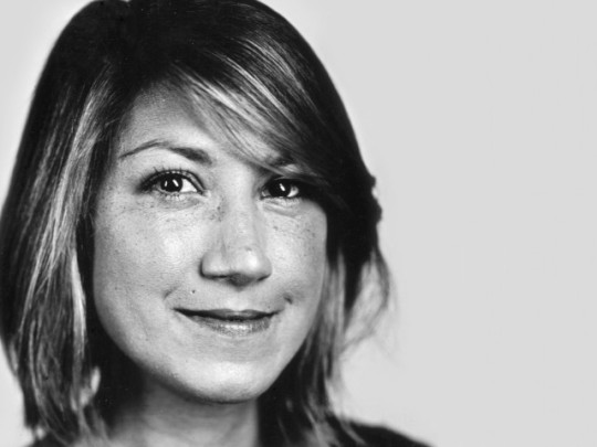
I decided to make the photos of all designers black and white, because it this way it looks more professional - to have them all in the same colours and tones rather than in completely different styles. The black and white also match the theme of my Typografika’24.
0 notes
Photo

dante roman
passage from Ulysses by james joyce [the bodley head, london, 1967 (seventh impression, w/ corrections), p188].
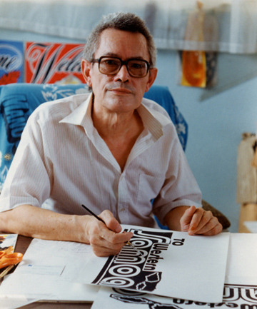
set in digital reissue of monotype dante roman. dante is the 20th c. statement of renaissance inspired roman & italic by consummate typographer-printer giovanni mardersteig. the founts were initially proprietary to maredrsteig’s private press, the officina bodoni; first showning was a handset edition of boccaccio, Trattello in laude de Dante [officina bodoni, verona, 1955]—typeface name thus acquired. the punches were engraved by one of the last gifted punch-cutters, charles malin of paris, & subsequently served as basis for monotype’s pantograph-engraved matrices; monotype dante first issued in 1957 [english monotype 592]. [cf. john dreyfus, The Work Of Giovanni Maredersteig with Monotype Faces, the monotype corporation, london, 1967.]
finishing fleuron pair selected from p22 victorian. of their provenance—no clue.
for the italic cut vide ‹bembismo 2›.
#typography#literature#james joyce#ulysses#giovanni mardersteig#charles malin#typesetting#dante roman
0 notes
Text
Printed Publication Flat-Plan
Poster Side Content
The Annual Conference on Type and Typografika'24
25 January 2024 – 20 February 2024
Four weeks of events, including Designer talks and workshops featuring: Verena Gerlach, Johnson Witehira, Nadine Chahine, Carol Twombly, Joseph Churchward, Veronika Burian, Jessica Hische, and Tobias Frere-Jones
AUT City Campus, Auckland.
www.typografika24.com
Brochure Structure and Content
The Annual Conference on Type and Typography
Typografika, is a highly anticipated international conference, bringing together more than 300 typographers, type and graphic designers, as well as printmakers and artists.
As designers and artists, we want to create with expressive, engaging and readable typography that performs well across all devices. With so many factors to take into account from typeface choice and layout through to page speed, responsive design and variable fonts, it’s hard to know how to keep up.
Over the course of four weeks, Typografika’24 will give you the full picture of what typography can and should be on web and print. Whether you’re just starting out or a seasoned pro, you’ll find heaps to learn and take away.
Please join us for the official launch of the conference at the Ngā Wai o Horotiu Marae (AUT Marae) 10am, 25 January 2024.
Keynote Speakers
Lectures by the speakers provide insight into their research and work methods. These sessions will prove to be very informative and helpful. There will also be a Q&A session at the conclusion of each session.
Keynote Speakers
Verena Gerlach, Type and Graphic Designer.
Verena Gerlach was an instructor of photography at the Hochschule der Künste in Berlin in 1991. In 1992, Gerlach started her first-year course at Glasgow School of Art. From 1993 to 1998, she studied communication design at Kunsthochschule Berlin Weißensee, and further spent one year (1996) as an exchange student at the London College of Printing. Gerlach runs her own studio for corporate design in Berlin. She is known for the typefaces FF Karbid, FF Sizmo, and Chambers Sans.

Johnson Witehera, Educator and Type Designer.
Artist, designer and academic of Tamahaki and Ngāi Tū-te-auru descent, Johnson Witehira is the co-founder of both Indigenous Design and Innovation Aotearoa (IDIA) and Waahi Wairua. In 2013, Johnson completed his doctorate in Māori Visual Arts. Since then, he has worked to bring Māori culture into all aspects of New Zealand life. Witehira has led the development of Māori design for some of New Zealand's most prominent organisations. Other significant design projects include developing the first set of Māori alphabet blocks, co-designing the PAKU gardening tools for children and developing the first functional Māori-specific typeface.

Nadine Chahine, Researcher and Type Designer.
Award-winning type designer Nadine Chahine, is a Lebanese researcher and type designer working as the UK Type Director and Legibility Expert at Monotype. Chahine has an MA in Typeface Design from the University of Reading, UK, and a PhD from Leiden University, The Netherlands. Her research focuses on eye movement and legibility studies for Arabic, Latin and Chinese scripts. Dr. Nadine Chain holds numerous awards including two awards for Excellence in Type Design from the Type Directors Club in New York (2008, 2011). Her typefaces include: the best-selling Frutiger Arabic, Neue Helvetica Arabic, Univers Next Arabic, Palatino and Palatino Sans Arabic, and Koufiya.

Carol Twombly, Calligrapher and Type Designer.
American calligrapher and type designer Carol Twombly was born 1959 and is best known for her type design. Twombly was a graduate from Rhode Island School of Design, where her professor was Charles Bigelow. She then entered the digital typography program at Stanford University, also under Bigelow. From 1988 through to 1999, Twombly worked as a type designer at Adobe Systems, during which time she designed, and contributed to the design of many typefaces. These include, Trajan, Myriad and Adobe Caslon. In early 1999, Twombly retired from Adobe and from type design to focus on her other design interests, involving textiles and jewelry. Working from the Bigelow & Holmes studio, Carol Twombly designed Mirarae, which won her the 1984 Morisawa gold prize. Since 1988 she has been a staff designer at Adobe.

Joseph Churchward, Artist and Type Designer.
Samoan-born New Zealand graphic designer and typographer, Joseph Churchward is known to have designed an estimated 690 original typefaces used all over the world. Churchward's typographic designs have been more popularly used in the masthead of The Evening Post. In 1969, Churchward founded the Churchward International Typefaces. When looking at his work, I see traditional Maori patterns and designs that may have influenced Churchward's designs.

Veronika Burian, Type Designer.
Born in Prague, Veronika Burian is a type designer and more commonly known as the co-founder of the type foundry TypeTogether alongside Jose Scaglione, publishing award-winning typefaces and developing tailored solutions for a variety of clients. The focus of TypeTogether's font catalog is on expressive text typefaces for digital and analogue media. Her typeface Maiola received, amongst others, the TDC Certificate of Excellence in Type Design 2004. Several other typefaces by TypeTogether have also been recognised by international competitions, including ED-Awards and ISTD. Veronika Burian originally studied industrial design in Munich, but later worked as a product designer in Vienna and Milan. Discovering her true passion for type, she graduated with distinction from the MA in Typeface Design course in Reading, UK in 2003.

Jessica Hische, Letterer and Designer.
American letterer, illustrator and type designer Jessica Hische is well known for her personal projects 'Daily Drop Cap' and the “Should I Work for Free” flowchart. In September 2015, Hische published published, In Progress: See Inside a Lettering Artist's Sketchbook and Process, from Pencil to Vector. This publish gives us insight to her creative process as well as work she has completed as a hand lettering artist. Jessica Hische has spoken at over 100 conferences globally.
Tobias Frere-Jones, Educator and Type Designer.
Educator and Type Designer Tobias Frere-Jones, has established himself as one of the world's leading typeface designers over 25 years. Jones has created some of the most widely used typefaces around the world, including Whitey, Gotham, Poynter, Oldstyle, and more. He operates the company Frere-Jones Type in New York City, teaching typeface design at the Yale School of Art MFA program.

Workshops
There will be 2 different workshops offered during the conference. These are repeated twice, to include as many participants as possible. Please register your interest at the registration kiosk when you arrive on the first day.
AUT City Campus

Cover
Typograpfika’24
The Annual Conference on Type and Typography
25 January 2024 – 20 February 2024
Events and Information
Back Cover
www.typografika24.com
0 notes
Text
Sorting Copy
The poster side needs:
Typografika’24 (Big title)
The Annual Conference on Type and Typography (Sub heading)
25 January 2024 – 20 February 2024 (Date)
Four weeks of events, including Designer talks and workshops featuring: Verena Gerlach, Johnson Witehira, Nadine Chahine, Carol Twombly, Joseph Churchward, Veronika Burian, Jessica Hische, and Tobias Frere-Jones (Small info)
AUT City Campus, Auckland.(location probably somewhere in the corner)
www.typografika24.com (website also somewhere in the corner)
*Needs an IG and FB Logo somewhere*
Brochure:
Panel 1-2/14
The Annual Conference on Type and Typography: Typografika, is a highly anticipated international conference, bringing together more than 300 typographers, type and graphic designers, as well as printmakers and artists.
As designers and artists, we want to create with expressive, engaging and readable typography that performs well across all devices.
With so many factors to take into account from typeface choice and layout through to page speed, responsive design and variable fonts, it’s hard to know how to keep up.
Over the course of four weeks, Typografika’24 will give you the full picture of what typography can and should be on web and print. Whether you’re just starting out or a seasoned pro, you’ll find heaps to learn and take away.
––
Please join us for the official launch of the conference at the Ngā Wai o Horotiu Marae (AUT Marae) 10am, 25 January 2024.
Panel 3/14
Joseph Churchward: Artist and Type Designer.
Joseph Churchward is a Samoan-born New Zealand graphic designer and typographer. He is known for having designed an estimated 690 original typefaces, many of which are in use around the world. His designs were also used in the masthead of The Evening Post newspaper. Churchward is born in Apia, Samoa, of Samoan, English, Scottish, Tongan and Chinese heritage. He founded Churchward International Typefaces in 1969. German company Berthold Fototypes subsequently distributed his fonts throughout the world. Over the span of his career, Churchward created more than 582 original typefaces. Joseph will be offering two different lectures as listed below on two different days.
Panel 4/14
Tobias Frere Jones: Educator and Type Designer.
Over 25 years, Tobias Frere-Jones has established himself as one of the world’s leading typeface designers, creating some of the most widely used typefaces, including Poynter Oldstyle, Whitney, Gotham, Surveyor, Tungsten and Retina.. He operates the company Frere-Jones Type in New York City, and teaches typeface design at the Yale School of Art MFA program.
Panel 5/14
Verena Gerlach: Type and graphic designer
Verena Gerlach was an instructor of photography at the Hochschule der Künste in Berlin in 1991 and spent 1992 doing a first-year course at Glasgow School of Art. From 1993 to 1998 she studied communication design at Kunsthochschule Berlin Weißensee and spent one year (1996) as an exchange student at the London College of Printing.
FF Karbid, FF Sizmo, and Chambers Sans are some of the few typefaces she created, Verena has her own studio for corporate design in Berlin.
Panel 6/14
Nadine Chahine: Researcher and Type Designer
Dr. Nadine Chahine is an award-winning Lebanese type designer working as the UK Type Director and Legibility Expert at Monotype. She has an MA in Typeface Design from the University of Reading, UK, and a PhD from Leiden University, The Netherlands. Nadine’s research focus is on eye movement and legibility studies for the Arabic, Latin, and Chinese scripts. She has numerous awards including two Awards for Excellence in Type Design from the Type Directors Club in New York in 2008 and 2011.
Her typefaces include: the best-selling Frutiger Arabic, Neue Helvetica Arabic, Univers Next Arabic, Palatino and Palatino Sans Arabic, and Koufiya.
Panel 7/14
Carol Twombly
Carol Twombly (born 1959) is an American designer, best known for her type design. She worked as a type designer at Adobe Systems from 1988 through 1999, during which time she designed, or contributed to the design of, many typefaces, including Trajan, Myriad and Adobe Caslon.
Twombly retired from Adobe and from type design in early 1999, to focus on her other design interests, involving textiles and jewelry. American calligrapher and type designer, a graduate from Rhode Island School of Design where her professor was Charles Bigelow. Joined the digital typography program at Stanford University, also under Bigelow. Working from the Bigelow & Holmes studio she designed Mirarae, which won her the 1984 Morisawa gold prize. Since 1988 she has been a staff designer at Adobe.
Panel 8/14
Veronika Burian: Type Designer
Veronika is born in Prague, originally studied industrial design in Munich and then worked as a product designer in Vienna and Milan. Discovering her true passion for type, she graduated with distinction from the MA in Typeface Design course in Reading, UK in 2003. Burian founded TypeTogether together with José Scaglione, today with twelve employees working around the world, one of the most important, independent type foundries. In addition to the development of tailored solutions for a variety of clients, the focus of TypeTogether’s font catalog is on expressive text typefaces for digital and analog media. Her typeface Maiola received, amongst others, the TDC Certificate of Excellence in Type Design 2004. Several other typefaces by TypeTogether have also been recognised by international competitions, including ED-Awards and ISTD.
Panel 9/14
Jessica Hische: Letterer and Designer
Jessica Nicole Hische is an American letterer, illustrator, and type designer. She is best known for her personal projects, 'Daily Drop Cap' and the “Should I Work for Free” flowchart. She published In Progress: See Inside a Lettering Artist's Sketchbook and Process, from Pencil to Vector in September 2015, which gives insight to her creative process and work she has completed as a hand lettering artist. She has spoken at over 100 conferences worldwide, but splits her time between San Francisco, CA and Brooklyn, NY.
Panel10/14
Johnson Witehira: Educator and type designer
Johnson Witehira is an artist, designer and academic of Tamahaki and Ngāi Tū-te-auru descent. He is the co-founder of both Indigenous Design and Innovation Aotearoa (IDIA) and Waahi Wairua. Since completing his doctorate in Māori Visual Art (2013), Johnson has been on a mission to bring Māori culture into all aspects of New Zealand life. He has led the development of Māori design for some of New Zealand's most prominent organisations. Other significant design projects include developing the first set of Māori alphabet blocks, co-designing the PAKU gardening tools for children and developing the first functional Māori-specific typeface.
Panel 11-12/14
KEYNOTE SPEAKERS:
Lectures by the speakers provide insight into their research and work methods. These sessions will prove to be very informative and helpful. There will also be a Q&A session at the conclusion of each session.
WORKSHOPS
There will be 2 different workshops offered during the conference. These are repeated twice, to include as many participants as possible. Please register your interest at the registration kiosk when you arrive on the first day
(Considering whether we put the “keynote speakers” timetable and the “Workshops” timetable together or separately)
(Two of the designers’ info has to be a double page spread)
(Events have to be in chronological order in the timetable)
Cover:
Typograpfika’24
The Annual Conference on Type and Typography
25 January 2024 – 20 February 2024
Events and Information
Backcover:
www.typografika24.com
0 notes
Photo


Typography Tuesday
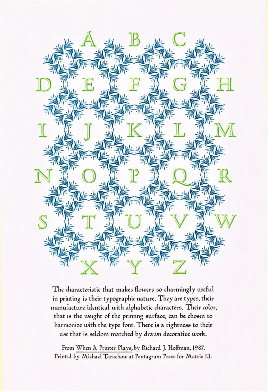
Presented here are examples of assembled type ornaments designed by English artist, designer, and college administrator David Bethel (1923-2006) for the Monotype Corporation, including his Glint (1955), Scorpio (1958), and Blaze (1958) ornaments. The noted typography scholar and long-time marketing manager for the Monotype Corporation Beatrice Warde was a great champion of Bethel’s Glint ornaments, and even invented the Glint Game where participants try to make as many typographical arrangements with the Glint ornaments as possible. The game is still played today, and there is even a Glint Club dedicated to the pursuit of the game.
These images are from David Bethel’s article “Creating Printer’s Flowers,” published in Matrix 13, Winter 1993, pp. 103-112. The first image is a tipped-in letterpress-printed display sheet of Glint ornaments by Milwaukee-born letterpress printer and book artist Michael Tarachow, who would later publish a sample-sheet portfolio entitled The Glint Ornaments at Work and Play under his Pentagram Press imprint. The rest are type displays reproduced from the Monotype Recorder as part of the article.
Curious side note: Michael Tarachow grew up in Milwaukee and started his press here; he even worked at the UWM Library for a time. The post we did yesterday on the Dell comic book version of The Wizard of Oz was owned by Tarachow when he was a child, and was donated to us by his mother Joan Tarachow. We love when things just kind of fall into place.
Matrix 13 was printed in an edition of 925 copies by John and Rosalind Randle at the Whittington Press in England, and is a donation from our friend Jerry Buff.
View more posts from Matrix.
View other posts relating to the Whittington Press.
View more Typography Tuesday posts.
#Typography Tuesday#typetuesday#type ornaments#printer's flowers#David Bethel#Glint ornaments#Glint Game#Glint Club#Scorpio ornaments#Blaze ornaments#Beatrice Warde#Michael Tarachow#Typography Tuesday#Pentagram Press#Monotype Corporation#Monotype Recorder#Matrix#Matrix 13#John and Rosalind Randle#Whittington Press#Jerry Buff#type display
123 notes
·
View notes
Text
Finalising information
I then put all the text and images I wanted to use in one spot so that it was easy to find and I had all the designers info ready. This also means I have the best design content ready available, and if I want extra photos I can always have a look at the other ones I have.
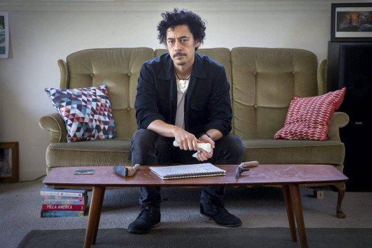
Joseph Churchward
Joseph is a samoan born New Zealand graphic designer who mainly focuses on typographic work - Joseph is best known for having designed 690 original typefaces. He attended Wellington Technical college at age 13 where he perfected his craft and love for design.
After graduating, Joseph went on to work as a commercial designer, starting up his own company in 1969 - Churchward International Typefaces - which became one of New Zealand’s largest typesetting spaces. Not long after this was established, leading German type company Berthold Fototypes accepted some of his fonts for international distribution, and they were soon in use throughout the world.
“His accomplishments are not only significant on a national scale, but place him highly on the global stage. He is a pioneer and I admire his continued dedication to the craft of design. He is a true inspiration.” - John Britten, Black Pin Winner (2009)
Information compiled from AUT Materials and Media lecture slides - 2023 3/23
“Designers Institute” 2009 - John Britten

David Bennewith – 20.10.2005 “Joseph Churchward in his home studio.”
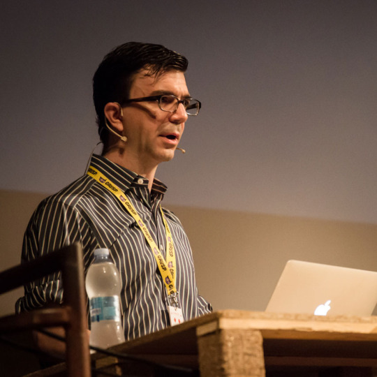
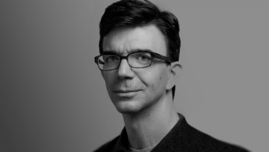
Tobias Frère Jones
For 25 years, Tobias Frere-Jones has created a major and significant name for himself as one of the world’s most successful typeface designers, creating some of the most widely used typefaces, including Interstate, Poynter Oldstyle, Whitney, Gotham, Surveyor, Tungsten and Retina.
He gained a BFA in Graphic Design from the Rhode Island School of Design in 1992. Then joining Yale University School of Art in 1996 and has lectured throughout the United States, Europe and Australia. His work is apart of collections in Victoria & Albert Museum in London and the Museum of Modern Art in New York. He has received the Gerrit Noordzij Prijs, the AIGA Medal, and most recently Cooper Hewitt’s 2019 National Design Award for Communication Design, recognizing his contributions to typographic design, writing and education.
Alot of Tobias retro and vintage based graphics come from his love of collecting various antiques when he was younger - we can see the inspiration for alot of his work today from this.
Information compiled from Tobias Frere Jones website.
AUT Materials and Media lecture slides 3/23

Photos by http://www.grahammacindoe.com/ Uploaded onto Tobias Frere Jones website.
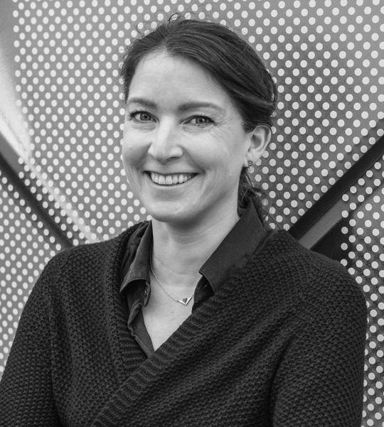
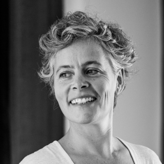
Verena Gerlach
Verena Gerlach was a photography instructor at the Hochschule der Künste in Berlin in 1991 and spent 1992 doing a first-year course at Glasgow School of Art. From 1993 to 1998 she then went on to study communication design at Kunsthochschule Berlin Weißensee and spent one year (1996) as an exchange student at the London College of Printing. FF Karbid, FF Sizmo, and Chambers Sans are some of the few typefaces she created, Verena has her own studio for corporate design in Berlin.
In 1998, Verena Gerlach began her studio for graphic design, typedesign and typography in Berlin. Since 2006, she has been consistently working as a freelance book designer for art book publishers like Hatje Cantz and Kerber Verlag. She began lecturing in type design, and typography in 2003,and currently gives lectures and workshops all over the world.
as well as designing corporate fonts for global companies, she also is working on the typographic production for international contemporary artists.
Information provided and uploaded on Verena Gerlach's website and portfolio.”Silk Screen posters” 2010
AUT Materials and Media Lecture Slides 3/23.

photograph by © Daniel Rodríguez - provided on her portfolio
Nadine Chahine
Dr. Nadine Chahine is an award-winning and very successful Lebanese type designer working as a UK Type Director and Legibility Expert at Monotype. She has an MA in Typeface Design from the University of Reading, UK, and a PhD from Leiden University, The Netherlands. Nadine’s research focus is on eye movement and legibility studies for the Arabic, Latin, and Chinese scripts. She has numerous awards including two Awards for Excellence in Type Design from the Type Directors Club in New York in 2008 and 2011. Her typefaces include the best-selling Frutiger Arabic, Neue.
Nadine’s work has been featured in the 5th edition of Megg’s History of Graphic Design and in 2012 she was selected by Fast Company as one of its 100 Most Creative People in Business. In 2016 her work was showcased in the 4th edition of First Choice which highlights the work of the 250 top global designers practising today. In 2017, Nadine was selected by Creative Review to their Creative Leaders 50 which aims to celebrate, educate and inspire those who are leading creative businesses, organisations and teams in the UK.
Nadine is a current CEO at I love typography.
Information compiled and found on
http://arabictype.com/about/ and Materials and Media AUT Lecture slides 3/23

Photo provided and uploaded onto Nadia Chahines portfolio website “http://arabictype.com/about/”
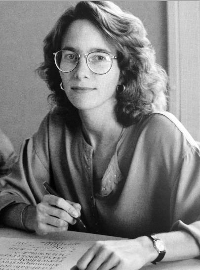
Carol Twombly
Carol Twombly is an incredible and unique creative force who is to thank for majority of the graceful characters found in several typefaces such as Trajan and Charlemagne. During Carols childhood in New England, she spent a lot of her time exploring several artistic techniques and composition. Having specific interest in sculpture, Carol followed her architect brother to Rhode Island School of Design (RISD). Once there, she changed her major to graphic design. Carol says, “I discovered that communicating through graphics - by placing black shapes on a white page - offered a welcome balance between freedom and structure.” Though graphic design became her career focus, Carol also specialises in basketweaving, drawing, painting, and jewellery making.
After graduating RISD and a year spent working in a small Boston graphic design studio, Carol accepted an invitation from Bigelow and joined a small group of students in a newly formed digital typography program at Stanford University. The program, which has been discontinued, awarded Carol and her colleagues Masters of Science degrees after two years of study in computer science and typographic design. Carol has designed a number of very popular and widely used text and display typefaces. Trajan, Charlemagne, Lithos, and Adobe Caslon are inspired by classic typefaces and characters from the past - from early Greek inscriptions, around 400 B.C., to William Caslon’s typefaces of the 1700s. Designs like Viva and Nueva explore new territory while maintaining traditional roots. In 1994, she received the Charles Peignot award from the Association Typographique Internationale for outstanding contributions to type design. She was the first woman and only the second American to receive this prestigious honor.
Information provided by Adobe Fonts.
“Carol Twombly” Image sourced by Oak Knoll Books - Stock-Allen, Nancy
Veronika Burian
Veronika Burian studied Industrial Design in Munich and worked in that space in Vienna and Milan over a few years. Discovering a true passion for type, she graduated with distinction from the MA in Typeface Design in Reading, UK, in 2003 and worked as type designer at DaltonMaag in London for a few years. After staying for some time in Boulder, USA, and her hometown Prague she is now living in sunny Cataluña.
Veronika Burian is a type designer and co-founder of independent type foundry TypeTogether. She has created award-winning typefaces and collaborating on specific typefaces for a large number of clients. She is involved with Alphabettes.org, a showcase for work and research on lettering, typography and type design by women. She continues to give lectures and workshops at international conferences and universities. Her typeface Maiola received, amongst others, the TDC Certificate of Excellence in Type Design 2004. Several other typefaces by TypeTogether have also been recognised by international competitions, including ED-Awards and ISTD.
She is also a founding member of typography platform Alphabettes.org created by and for women, being solely involved in mentoring program the GRANSHAN project for non-Latin fonts and typography, which is unique in the world, she engages in communication and sponsorship.
“Her typeface Maiola received the TDC Certificate of Excellence in Type Design 2004. Several other typefaces by TypeTogether have also been recognised by international competitions, including ED-Awards and ISTD.” - Type Together

“Veronika Burian” Image by Type Together.
Information provided by:
http://bitscon.asia/speakers/2016/veronika-burian
https://fonts.adobe.com/designers/veronika-burian
Jessica Hische
Jessica Nicole Hische is an American letterer, illustrator, and type designer. Jessica has spoken at over 100 conferences, colleges, and other design events on nearly every continent. Winning awards such as New York Times Best-selling Author, Forbes under 30, New Visual Artist, ADC Young GunGDUSA, Person to Watch.
When Jessica is not drafting letterforms, manipulating beziers, writing kids books, or letterpressing on my Vandercook, she spends her time trying to help others find the same happiness and fulfillment that she finds in her work.
Information compiled and found on https://www.jessicahische.is/afanofoxfam

Image by Helena Price.
Johnson Witehira:
Johnson Witehiras work has the purpose of bringing all cultural aspects of Maori culture back into the lives of Maori and has alot of cultural responsive media and design.
Johnson lives in Wellington, where his work is prominent and successful there.
“My kaupapa (mission) as both an artist and designer is to bring Māori visual culture back into the lives of all Māori. This is done through careful consideration of how indigenous culture, design and technology intersect. We once created all the things in our world; the clothes, buildings, vehicles and tools. Nowadays everything is made for us. If we’re lucky we get to decorate. I want to put Māori back in the drivers seat, so we’re active participants in creating the tools and the world we want to live in.”
Overseas, works from Ko Aotearoa Tēnei (2012) series are on permanent display in a number of New Zealand Embassies and Consulates (Shanghai Consulate, NZ Embassy in Dublin, NZ High Commissionto Canberra and the NZ Consulate Hawaii). In 2015, the Land of Tara series was exhibited at the Talente Munich design Fair. He has also showcased in group exhibitions in Canada including; InDigiNous Aotearoa: Virtual Histories (Winnipeg, 2017), The Space Between Us (Banff, 2018) Gathering Across Moana (Tornoto, 2019) and REGENERATION: Breaking Time with Indigenous Video Games (2019, Vancouver).
Information complied via his website:
https://www.johnsonwitehira.studio

Johnson Whitera - Shown on his website and provided by https://semipermanent.com/profiles/johnson-witehira
0 notes
Text
Speakers


Verena Gerlach
Verena Gerlach is a graphic designer and instructor of photography who created several typefaces, including FF Karbid, FF Sizmo, and Chambers Sans. She studied communication design in Berlin and spent one year as an exchange student at the London College of Printing. She has her own studio for corporate design in Berlin.


Johnson Witehira
Johnson Witehira is an artist, designer, and academic who is passionate about bringing Māori culture into all aspects of New Zealand life. He co-founded Indigenous Design and Innovation Aotearoa (IDIA) and Waahi Wairua. He has worked on developing Māori design for many important organizations in New Zealand, and has also designed Māori alphabet blocks, gardening tools, and a typeface.


Nadine Chahine
Dr. Nadine Chahine is a Lebanese type designer who works as the UK Type Director and Legibility Expert at Monotype. She has conducted research on eye movement and legibility studies for the Arabic, Latin, and Chinese scripts. She has designed numerous typefaces, including Frutiger Arabic, Neue Helvetica Arabic, Univers Next Arabic, Palatino and Palatino Sans Arabic, and Koufiya.

Carol Twombly
Carol Twombly is an American designer who worked as a type designer at Adobe Systems, where she designed or contributed to the design of many typefaces, including Trajan, Myriad, and Adobe Caslon. She retired from type design in 1999 to focus on other design interests, including textiles and jewelry. She was a calligrapher and type designer who graduated from Rhode Island School of Design and joined the digital typography program at Stanford University.

Joseph Churchward
Joseph Churchward was a New Zealand graphic designer and typographer who created more than 690 original typefaces during his career. His designs were used around the world, including in the masthead of The Evening Post newspaper. He founded Churchward International Typefaces in 1969, and his fonts were distributed by German company Berthold Fototypes.


Veronika Burian
Veronika Burian is a Prague born type designer who co-founded TypeTogether, an independent type foundry with twelve employees working around the world. The focus of TypeTogether's font catalog is on expressive text typefaces for digital and analog media. Her typeface Maiola received the TDC Certificate of Excellence in Type Design 2004, and several other typefaces by TypeTogether have been recognized by international competitions, including ED-Awards and ISTD.

Jessica Hische
Jessica Nicole Hische is an American letterer, illustrator, and type designer who is best known for her personal projects, Daily Drop Cap and the “Should I Work for Free” flowchart. She published In Progress: See Inside a Lettering Artist’s Sketchbook and Process, from Pencil to Vector in 2015, which gives insight into her creative process and work as a hand lettering artist. She has spoken at over 100 conferences worldwide and splits her time between San Francisco, CA, and Brooklyn, NY.


Tobias Frere-Jones
Tobias Frere-Jones is a typeface designer who has created some of the most widely used typefaces in the world, including Poynter Oldstyle, Whitney, Gotham, Surveyor, Tungsten, and Retina. He operates his own company, Frere-Jones Type, in New York City, and teaches typeface design at the Yale School of Art MFA program.
0 notes
Text
Research
***note to self compile everythin interesting about said designers on their respective sections, do research. also do not use the images uploaded here its jsut for reference***
*note look into the things i bolded*
Joseph Churchward: Artist and Type Designer.
Joseph Churchward is a Samoan-born New Zealand graphic designer and typographer. He is known for having designed an estimated 690 original typefaces, many of which are in use around the world. His designs were also used in the masthead of The Evening Post newspaper. Churchward is born in Apia, Samoa, of Samoan, English, Scottish, Tongan and Chinese heritage. He founded Churchward International Typefaces in 1969. German company Berthold Fototypes subsequently distributed his fonts throughout the world. Over the span of his career, Churchward created more than 582 original typefaces.
https://collections.tepapa.govt.nz/topic/973
------------------------
Tobias Frere Jones: Educator and Type Designer.
Over 25 years, Tobias Frere-Jones has established himself as one of the world’s leading typeface designers, creating some of the most widely used typefaces, including Poynter Oldstyle, Whitney, Gotham, Surveyor, Tungsten and Retina.. He operates the company Frere-Jones Type in New York City, and teaches typeface design at the Yale School of Art MFA program.
https://frerejones.com/
more aboiyr him herer
---------------------------------------
Verena Gerlach: Type and graphic designer
Verena Gerlach was an instructor of photography at the Hochschule der Künste in Berlin in 1991 and spent 1992 doing a first-year course at Glasgow School of Art. From 1993 to 1998 she studied communication design at Kunsthochschule Berlin Weißensee and spent one year (1996) as an exchange student at the London College of Printing.FF Karbid, FF Sizmo, and Chambers Sans are some of the few typefaces she created, Verena has her own studio for corporate design in Berlin.

https://www.fraugerlach.de/
----------------------------------
Nadine Chahine: Researcher and Type Designer
Dr. Nadine Chahine is an award-winning Lebanese type designer working as the UK Type Director and Legibility Expert at Monotype. She has an MA in Typeface Design from the University of Reading, UK, and a PhD from Leiden University, The Netherlands. Nadine’s research focus is on eye movement and legibility studies for the Arabic, Latin, and Chinese scripts. She has numerous awards including two Awards for Excellence in Type Design from the Type Directors Club in New York in 2008 and 2011. Her typefaces include: the best-selling Frutiger Arabic, Neue Helvetica Arabic, Univers Next Arabic, Palatino and Palatino Sans Arabic, and Koufiya.

https://twitter.com/arabictype?ref_src=twsrc%5Egoogle%7Ctwcamp%5Eserp%7Ctwgr%5Eauthor
https://en.wikipedia.org/wiki/Nadine_Chahine
-----------------------
Carol Twombly
Carol Twombly (born 1959) is an American designer, best known for her type design. She worked as a type designer at Adobe Systems from 1988 through 1999, during which time she designed, or contributed to the design of, many typefaces, including Trajan, Myriad and Adobe Caslon.Twombly retired from Adobe and from type design in early 1999, to focus on her other design interests, involving textiles and jewelry. American calligrapher and type designer, a graduate from Rhode Island School of Design where her professor was Charles Bigelow. Joined the digital typography program at Stanford University, also under Bigelow. Working from the Bigelow & Holmes studio she designed Mirarae, which won her the 1984 Morisawa gold prize. Since 1988 she has been a staff designer at Adobe.

https://en.wikipedia.org/wiki/Carol_Twombly
https://fonts.adobe.com/designers/carol-twombly
https://www.oakknoll.com/pages/books/125344/nancy-stock-allen/carol-twombly-her-brief-but-brilliant-career-in-type-design
------------------------
Veronika Burian: Type Designer
Veronika is born in Prague, originally studied industrial design in Munich and then worked as a product designer in Vienna and Milan. Discovering her true passion for type, she graduated with distinction from the MA in Typeface Design course in Reading, UK in 2003. Burian founded TypeTogether together with José Scaglione, today with twelve employees working around the world, one of the most important, independent type foundries. In addition to the development of tailored solutions for a variety of clients, the focus of TypeTogether’s font catalog is on expressive text typefaces for digital and analog media. Her typeface Maiola received, amongst others, the TDC Certificate of Excellence in Type Design 2004. Several other typefaces by TypeTogether have also been recognised by international competitions, including ED-Awards and ISTD.
https://fonts.adobe.com/designers/veronika-burian
https://www.type-together.com/veronika-burian
WORKSHOPS WORKSHOPS WORKSHOPS WORKSHOPS WORKSHOPS
Jessica Hische: Letterer and Designer
Jessica Nicole Hische is an American letterer, illustrator, and type designer. She is best known for her personal projects, 'Daily Drop Cap' and the “Should I Work for Free” flowchart. She published In Progress: See Inside a Lettering Artist's Sketchbook and Process, from Pencil to Vector in September 2015, which gives insight to her creative process and work she has completed as a hand lettering artist. She has spoken at over 100 conferences worldwide, but splits her time between San Francisco, CA and Brooklyn, NY.
-------
Johnson Witehira: Educator and type designer
Johnson Witehira is an artist, designer and academic of Tamahaki and Ngāi Tū-te-auru descent. He is the co-founder of both Indigenous Design and Innovation Aotearoa (IDIA) and Waahi Wairua. Since completing his doctorate in Māori Visual Art (2013), Johnson has been on a mission to bring Māori culture into all aspects of New Zealand life. He has led the development of Māori design for some of New Zealand's most prominent organisations. Other significant design projects include developing the first set of Māori alphabet blocks, co-designing the PAKU gardening tools for children and developing the first functional Māori-specific typeface.

0 notes
Text
Speaker Research
Joseph Churchward: Artist and Type Designer.

Joseph Churchward is a Samoan-born New Zealand graphic designer and typographer. He is known for having designed an estimated 690 original typefaces, many of which are in use around the world. His designs were also used in the masthead of The Evening Post newspaper. Churchward is born in Apia, Samoa, of Samoan, English, Scottish, Tongan and Chinese heritage. He founded Churchward International Typefaces in 1969. German company Berthold Fototypes subsequently distributed his fonts throughout the world. Over the span of his career, Churchward created more than 582 original typefaces. Joseph will be offering two different lectures as listed below on two different days.
Tobias Frere Jones: Educator and Type Designer.
Over 25 years, Tobias Frere-Jones has established himself as one of the world’s leading typeface designers, creating some of the most widely used typefaces, including Poynter Oldstyle, Whitney, Gotham, Surveyor, Tungsten and Retina.. He operates the company Frere-Jones Type in New York City, and teaches typeface design at the Yale School of Art MFA program.
Verena Gerlach: Type and graphic designer

Verena Gerlach was an instructor of photography at the Hochschule der Künste in Berlin in 1991 and spent 1992 doing a first-year course at Glasgow School of Art. From 1993 to 1998 she studied communication design at Kunsthochschule Berlin Weißensee and spent one year (1996) as an exchange student at the London College of Printing.
FF Karbid, FF Sizmo, and Chambers Sans are some of the few typefaces she created, Verena has her own studio for corporate design in Berlin.
Nadine Chahine: Researcher and Type Designer


Dr. Nadine Chahine is an award-winning Lebanese type designer working as the UK Type Director and Legibility Expert at Monotype. She has an MA in Typeface Design from the University of Reading, UK, and a PhD from Leiden University, The Netherlands. Nadine’s research focus is on eye movement and legibility studies for the Arabic, Latin, and Chinese scripts. She has numerous awards including two Awards for Excellence in Type Design from the Type Directors Club in New York in 2008 and 2011.
Her typefaces include: the best-selling Frutiger Arabic, Neue Helvetica Arabic, Univers Next Arabic, Palatino and Palatino Sans Arabic, and Koufiya.
Carol Twombly

Carol Twombly (born 1959) is an American designer, best known for her type design. She worked as a type designer at Adobe Systems from 1988 through 1999, during which time she designed, or contributed to the design of, many typefaces, including Trajan, Myriad and Adobe Caslon.
Twombly retired from Adobe and from type design in early 1999, to focus on her other design interests, involving textiles and jewelry. American calligrapher and type designer, a graduate from Rhode Island School of Design where her professor was Charles Bigelow. Joined the digital typography program at Stanford University, also under Bigelow. Working from the Bigelow & Holmes studio she designed Mirarae, which won her the 1984 Morisawa gold prize. Since 1988 she has been a staff designer at Adobe.
Veronika Burian: Type Designer

Veronika is born in Prague, originally studied industrial design in Munich and then worked as a product designer in Vienna and Milan. Discovering her true passion for type, she graduated with distinction from the MA in Typeface Design course in Reading, UK in 2003. Burian founded TypeTogether together with José Scaglione, today with twelve employees working around the world, one of the most important, independent type foundries. In addition to the development of tailored solutions for a variety of clients, the focus of TypeTogether’s font catalog is on expressive text typefaces for digital and analog media. Her typeface Maiola received, amongst others, the TDC Certificate of Excellence in Type Design 2004. Several other typefaces by TypeTogether have also been recognised by international competitions, including ED-Awards and ISTD.
Jessica Hische: Letterer and Designer


Jessica Nicole Hische is an American letterer, illustrator, and type designer. She is best known for her personal projects, 'Daily Drop Cap' and the “Should I Work for Free” flowchart. She published In Progress: See Inside a Lettering Artist's Sketchbook and Process, from Pencil to Vector in September 2015, which gives insight to her creative process and work she has completed as a hand lettering artist. She has spoken at over 100 conferences worldwide, but splits her time between San Francisco, CA and Brooklyn, NY.
Johnson Witehira: Educator and type designer
Johnson Witehira is an artist, designer and academic of Tamahaki and Ngāi Tū-te-auru descent. He is the co-founder of both Indigenous Design and Innovation Aotearoa (IDIA) and Waahi Wairua. Since completing his doctorate in Māori Visual Art (2013), Johnson has been on a mission to bring Māori culture into all aspects of New Zealand life. He has led the development of Māori design for some of New Zealand's most prominent organisations. Other significant design projects include developing the first set of Māori alphabet blocks, co-designing the PAKU gardening tools for children and developing the first functional Māori-specific typeface.
0 notes
Text
About speakers
Joseph Churchward:
Joseph Churchward is a Samoan-born New Zealand graphic designer and typographer. He is known for having designed an estimated 690 original typefaces, many of which are in use around the world. His designs were also used in the masthead of The Evening Post newspaper. Churchward is born in Apia, Samoa, of Samoan, English, Scottish, Tongan and Chinese heritage. He founded Churchward International Typefaces in 1969. German company Berthold Fototypes subsequently distributed his fonts throughout the world. Over the span of his career, Churchward created more than 582 original typefaces. Joseph will be offering two different lectures as listed below on two different days.
Tobias Frere Jones:
Over 25 years, Tobias Frere-Jones has established himself as one of the world’s leading typeface designers, creating some of the most widely used typefaces, including Poynter Oldstyle, Whitney, Gotham, Surveyor, Tungsten and Retina.. He operates the company Frere-Jones Type in New York City, and teaches typeface design at the Yale School of Art MFA program.
Verena Gerlach:
Verena Gerlach was an instructor of photography at the Hochschule der Künste in Berlin in 1991 and spent 1992 doing a first-year course at Glasgow School of Art. From 1993 to 1998 she studied communication design at Kunsthochschule Berlin Weißensee and spent one year (1996) as an exchange student at the London College of Printing. FF Karbid, FF Sizmo, and Chambers Sans are some of the few typefaces she created, Verena has her own studio for corporate design in Berlin.
Nadine Chahine:
Dr. Nadine Chahine is an award-winning Lebanese type designer working as the UK Type Director and Legibility Expert at Monotype. She has an MA in Typeface Design from the University of Reading, UK, and a PhD from Leiden University, The Netherlands. Nadine’s research focus is on eye movement and legibility studies for the Arabic, Latin, and Chinese scripts. She has numerous awards including two Awards for Excellence in Type Design from the Type Directors Club in New York in 2008 and 2011. Her typefaces include: the best-selling Frutiger Arabic, Neue Helvetica Arabic, Univers Next Arabic, Palatino and Palatino Sans Arabic, and Koufiya.
Carol Twombly:
Carol Twombly (born 1959) is an American designer, best known for her type design. She worked as a type designer at Adobe Systems from 1988 through 1999, during which time she designed, or contributed to the design of, many typefaces, including Trajan, Myriad and Adobe Caslon. Twombly retired from Adobe and from type design in early 1999, to focus on her other design interests, involving textiles and jewelry. American calligrapher and type designer, a graduate from Rhode Island School of Design where her professor was Charles Bigelow. Joined the digital typography program at Stanford University, also under Bigelow. Working from the Bigelow & Holmes studio she designed Mirarae, which won her the 1984 Morisawa gold prize. Since 1988 she has been a staff designer at Adobe.
Veronika Burian:
Veronika is born in Prague, originally studied industrial design in Munich and then worked as a product designer in Vienna and Milan. Discovering her true passion for type, she graduated with distinction from the MA in Typeface Design course in Reading, UK in 2003. Burian founded TypeTogether together with José Scaglione, today with twelve employees working around the world, one of the most important, independent type foundries. In addition to the development of tailored solutions for a variety of clients, the focus of TypeTogether’s font catalog is on expressive text typefaces for digital and analog media. Her typeface Maiola received, amongst others, the TDC Certificate of Excellence in Type Design 2004. Several other typefaces by TypeTogether have also been recognised by international competitions, including ED-Awards and ISTD.
0 notes
Last Seen Blogs

lipglossandhairdye
Obsessed with Obsessing

revpno
“Teach Nolen”

bhivetechnology
Bhive Technologies

ahmed123zahir
Untitled

minealin
♀MINEA LINDQVIST♀