#John and Rosalind Randle
Photo


Wood Engraving Wednesday
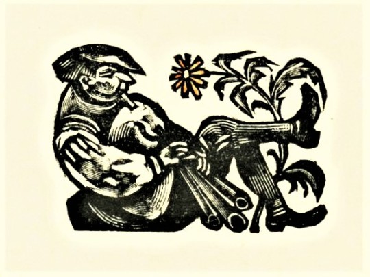
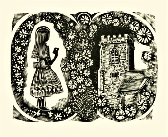
HELLMUTH WEISSENBORN
The painter, illustrator, and wood engraver Hellmuth Weissenborn (1898-1982) was a German exile who fled to the United Kingdom in 1939, where he became a successful book illustrator, freelance graphic artist, and private press publisher along with his wife Lesley Macdonald. When Weissenborn died, Macdonald donated all of his wood and Perspex blocks to John and Rosalind Randle’s Whittington Press. These blocks have been used extensively by the press over the years.
The first 7 images shown here are hand-colored prints from Weissenborn’s blocks printed at Whittington for a broadside titled Malá Zahrada Vysázená pro Matrix 26 Hellmuthem Weissenbornem, printed on handmade Czech Velké Losiny paper in 2006 in an edition of 80 copies. Another uncolored version of the broadside was folded into the Whittington Press’s journal for printers and bibliophiles Matrix 26 for an article by Amsterdam bookseller Willem Keizer on the “Hand-made Paper from Velké Losiny” printed in an edition of 760 copies, Winter 2006, pp 113-118.This issue also includes an article by William Waterhouse on the Weissenborn family, “Musicians and Graphic Artists: the Weissenborns of Leipzig and London,” pp. 159-164.The last three images include wood engravings from Matrix 26 by Helmuth Weissenborn.
Our copies of both the broadside and the journal Matrix are another generous donation from our friend Jerry Buff.
View more posts that include work by Helmuth Weissenborn.
View more posts from Matrix.
View more posts related to the Whittington Press.
View more posts with wood engravings!
#Wood Engraving Wednesday#wood engravings#wood engravers#Hellmuth Weissenborn#Lesley Macdonald#Whittington Press#John and Rosalind Randle#Matrix#Matrix 26#broadsides#Velké Losiny paper#fine press books#Jerry Buff#Malá Zahrada Vysázená pro Matrix 26 Hellmuthem Weissenbornem
67 notes
·
View notes
Photo


Wood Engraving Wednesday
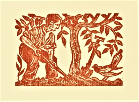
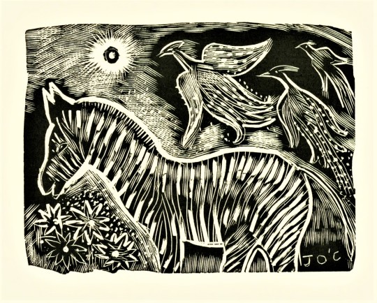
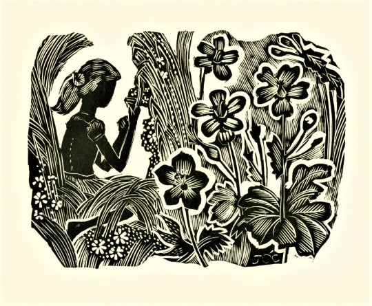
JOHN O’CONNOR
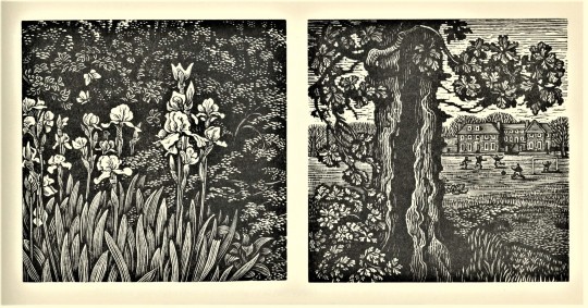
We return to engravings by the English wood engraver John O’Connor (1913-2004) published in People & Places, printed in 1999 by John and Rosalind Randle’s Whittington Press in Herefordshire, England in an edition of 375 copies. John O’Connor’s career spanned over six decades, beginning with engravings for an edition of Joan Rutter's poems Here's Flowers in 1936.
The wood engravings in People & Places are a compilation of engravings he created to illustrate a column in Richard Ingrams’s Oldie magazine. O'Connor produced a wood-engraving every month for the magazine from 1992 to 2001, just three years before his death. Even at the end of his career, O’Connor maintained his creative energy despite using a wheelchair and suffering from increasing deafness. In his obituary, The Guardian noted that O’Connor’s work,
is filled with a profound - almost romantic - love of the natural world. He had a pastoral vision, albeit one imbued with melancholy, at the passing of time and a changing world.
He saw his favourite painting places in Suffolk - the ponds, willows, briars and honeysuckle - disappear beneath the bulldozer and combine harvester, and eventually moved with his wife to the emptier spaces of southwest Scotland.
Tap on the images to see the titles.
View more posts from People & Places.
View all posts with engravings by John O’Connor.
View more posts related to the Whittington Press.
View more posts with wood engravings!
#Wood Engraving Wednesday#wood engravings#wood engravers#John O'Connor#People & Places#Whittington Press#John and Rosalind Randle#Richard Ingrams#The Oldie#letterpress printing#fine press books
83 notes
·
View notes
Photo
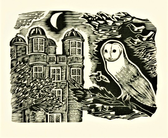
Monday Motivation Owl
This stately wood-engraved Barn Owl is maintaining its vigilant watch over the Hunting Tower on the Derbyshire Dales historic Chatsworth Estate to keep it free of vermin despite being mobbed by smaller birds. The tower was designed by Elizabethan architect Robert Smythson and was built in 1582 for Bess of Hardwick. It stands on an escarpment 400 feet above Chatsworth House, on the edge of Stand Wood, and was used as a summer house for the ladies of the estate to observe the hunting activities in the parkland below. Today it has been restored and can be rented as a holiday cottage for vacationers where the barn owls stand watch nightly to keep pesky critters at bay.
This image is by English wood engraver John O’Connor (1913-2004) and appears in a retrospective of O’Connor’s work, People & Places, printed in 1999 by John and Rosalind Randle’s Whittington Press in Herefordshire, England in an edition of 375 copies.
View more posts from People & Places.
View all posts with engravings by John O’Connor.
View more posts related to the Whittington Press.
View more motivated (and some unmotivated) owls.
View more posts with wood engravings!
#MondayMotivationOwl#owls#Barn Owls#wood engravings#wood engravers#John O'Connor#People & Places#Chatsworth House#Hunting Tower#Chatsworth Estate#Derbyshire Dales#Stand Wood#Robert Smythson#Bess of Hardwick#Whittington Press#John and Rosalind Randle#birds#birbs!
71 notes
·
View notes
Photo
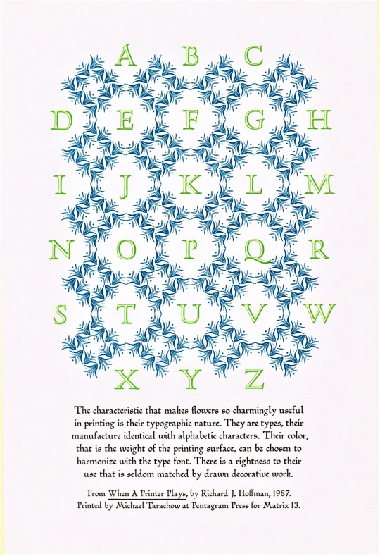


Typography Tuesday
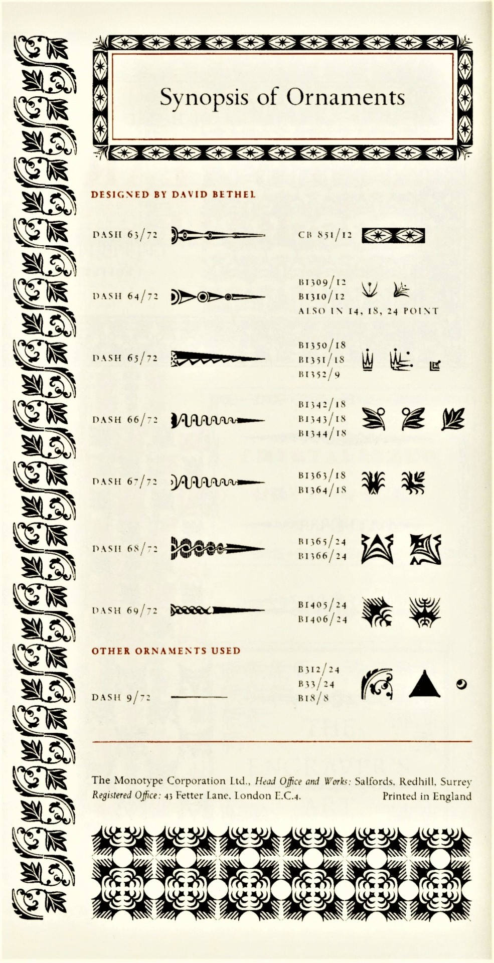
Presented here are examples of assembled type ornaments designed by English artist, designer, and college administrator David Bethel (1923-2006) for the Monotype Corporation, including his Glint (1955), Scorpio (1958), and Blaze (1958) ornaments. The noted typography scholar and long-time marketing manager for the Monotype Corporation Beatrice Warde was a great champion of Bethel’s Glint ornaments, and even invented the Glint Game where participants try to make as many typographical arrangements with the Glint ornaments as possible. The game is still played today, and there is even a Glint Club dedicated to the pursuit of the game.
These images are from David Bethel’s article “Creating Printer’s Flowers,” published in Matrix 13, Winter 1993, pp. 103-112. The first image is a tipped-in letterpress-printed display sheet of Glint ornaments by Milwaukee-born letterpress printer and book artist Michael Tarachow, who would later publish a sample-sheet portfolio entitled The Glint Ornaments at Work and Play under his Pentagram Press imprint. The rest are type displays reproduced from the Monotype Recorder as part of the article.
Curious side note: Michael Tarachow grew up in Milwaukee and started his press here; he even worked at the UWM Library for a time. The post we did yesterday on the Dell comic book version of The Wizard of Oz was owned by Tarachow when he was a child, and was donated to us by his mother Joan Tarachow. We love when things just kind of fall into place.
Matrix 13 was printed in an edition of 925 copies by John and Rosalind Randle at the Whittington Press in England, and is a donation from our friend Jerry Buff.
View more posts from Matrix.
View other posts relating to the Whittington Press.
View more Typography Tuesday posts.
#Typography Tuesday#typetuesday#type ornaments#printer's flowers#David Bethel#Glint ornaments#Glint Game#Glint Club#Scorpio ornaments#Blaze ornaments#Beatrice Warde#Michael Tarachow#Typography Tuesday#Pentagram Press#Monotype Corporation#Monotype Recorder#Matrix#Matrix 13#John and Rosalind Randle#Whittington Press#Jerry Buff#type display
123 notes
·
View notes
Photo


Typography Tuesday
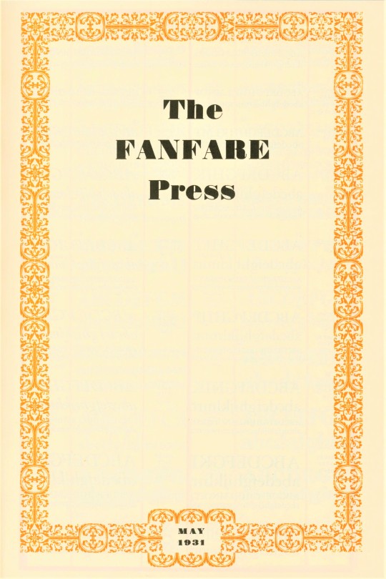
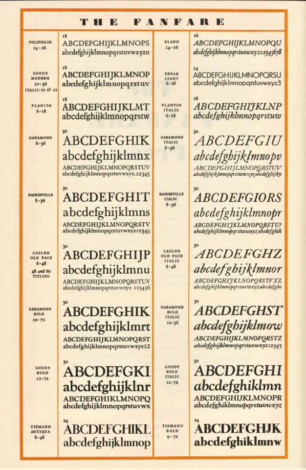
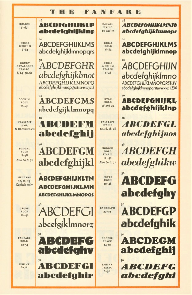
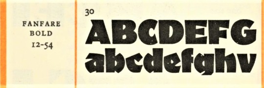
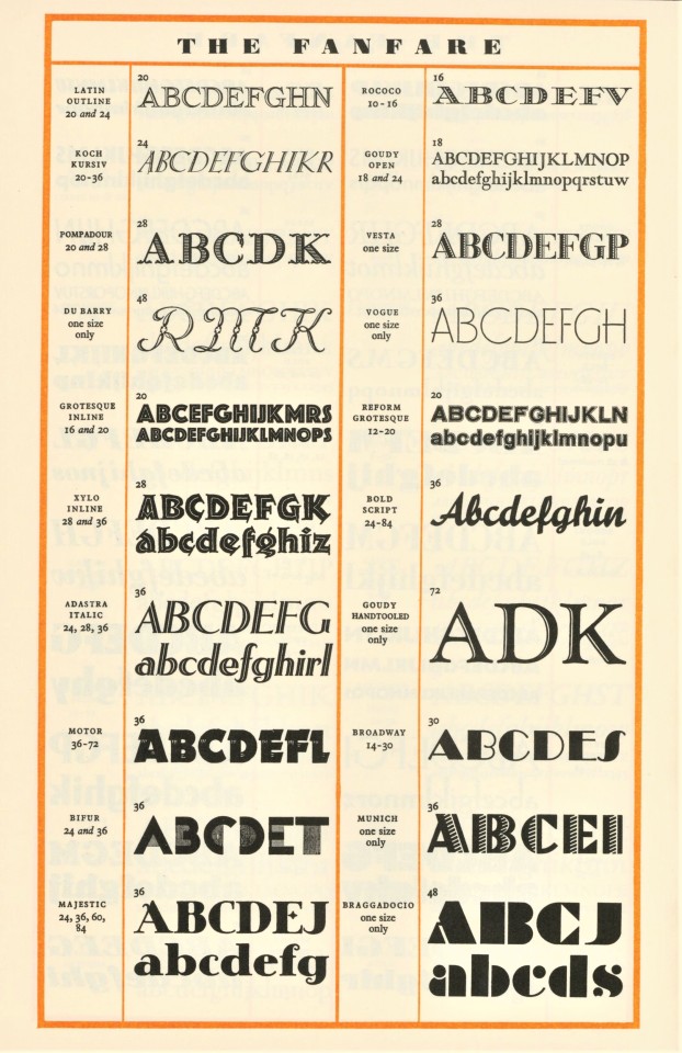
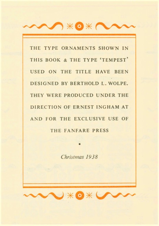
We made two posts in the past week on a publication printed for Nonesuch Press by the Fanfare Press in London. Not much useful information about the press can be found on the interwebs, but there is an article about the Fanfare Press by former Trinity College, Cambridge, librarian David McKitterick published in Matrix 18, Winter 1998. pp. 24-43, that not only discusses the press but also displays the types and ornaments used by the press (shown above).
Fanfare was founded in 1925 by the flamboyant advertising publisher Charles William Hobson, but it was more closely associated with its managing director Ernest Ingham, who developed a reputation for impeccable design and printing and forged close working relationships with important type designers of the day, especially Eric Gill and Stanley Morison. The press “was designed on a deliberately modest scale: for setting publicity and advertising copy, employing an increasingly diverse range of typefaces,” but it soon became much more than that. Two of the firm’s major clients during the 20th century were the Nonesuch Press in England and the Limited Editions Club in America.
Shown above are the 1931 Fanfare Press type specimen and a 1938 display of type ornaments designed for the press by noted German type designer Berthold Wolpe.
Matrix 18 was printed in an edition of 825 copies by John and Rosalind Randle at the Whittington Press in England, and is a donation from our friend Jerry Buff.
View more posts from Matrix.
View other posts relating to the Whittington Press.
View more Typography Tuesday posts.
#Typography Tuesday#typetuesday#Fanfare Press#Ernest Ingham#David McKitterick#Matrix#Matrix 18#Charles William Hobson#Berthold Wolpe#type ornaments#type specimens#John and Rosalind Randle#Whittington Press#Typography Tuesday#Jerry Buff
45 notes
·
View notes
Photo


Typography Tuesday
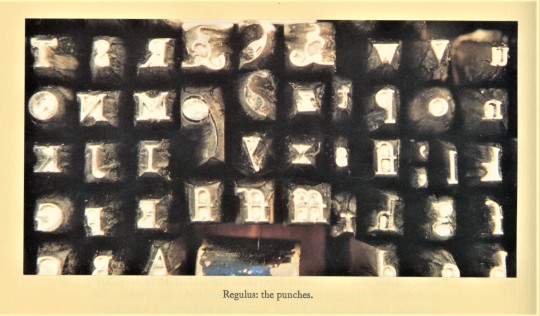
REGULUS TYPE
In 1996, American poet and type designer Dan Carr, co-founder with his partner Julia Ferrari at Golgonooza Letter Foundry & Press, designed and hand-cut his Regulus typeface. The font is named for the star rising in the constellation Leo when the first alphabet was completed. Of this endeavor, Carr writes:
Making this type required that I learn to cut punches well, to strike and justify matrices accurately and make or acquire all the necessary tools. In this process I gained fresh insights into the history of making type. . . . Cutting a typeface is like building your house with stones, you must hold each stone in your hands. Finding the shape and weight of each part of every letter and placing it where it fits involve choices that reveal the taste a punchcutter has for letters.
With the entire font of type complete after nearly ten years, Carr and Ferrari began setting their first first book in Regulus, Carr’s own Gifts of the Leaves, an exploration of the seasons through the symbolic alphabet of trees. Shown here are the prospectus for the book along with photographs of the punches and matrices for the type from Carr’s article “Making a Visible Spirit: Cutting Regulus Punches by Hand,” published in Matrix 16, Winter 1996, pp.19-25.
Matrix 16 was printed in an edition of 925 copies by John and Rosalind Randle at the Whittington Press in England, and is a donation from our friend Jerry Buff.
View other posts with work by Golgonooza Letter Foundry & Press.
View more posts from Matrix.
View other posts relating to the Whittington Press.
View more Typography Tuesday posts.
#Typography Tuesday#typetuesday#Regulus typeface#Dan Carr#Julia Ferrari#Golgonooza Letter Foundry & Press#Golgonooza Letter Foundry#punchcutting#punches and matices#Matrix 16#Matrix#type design#type designers#John and Rosalind Randle#Whittington Press#Typography Tuesday#Jerry Buff
24 notes
·
View notes
Photo
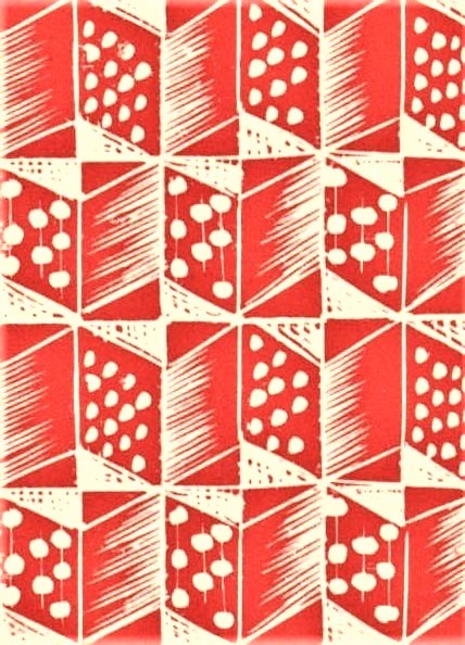
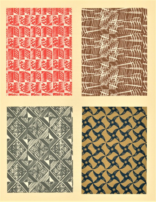

Decorative Paper Sunday
Earlier this week we shared some typography from the Winter 1998 issue of Matrix, a typographic journal celebrated both for its content as well as its production and design. The above pattern paper samples are also from Matrix 18, printed at Whittington Press in Gloucestershire County, England by John and Rosalind Randle in an edition of 825. John and Rosalind founded the press, named after their Gloucestershire village, in 1971, producing the first edition of Matrix in 1981.
The first collection of papers (image three above) accompanies a reprinting of the obituary of painter and designer, Enid Marx, written by art historian and scholar of architecture and design, Alan Powers. The selected papers represent four of the five Marx-designed papers published by the short lived Judd Street Gallery (run by Powers and his wife, Susanna), selected from unpublished pattern blocks in Marx’s studio. Power’s writes, “Marx’s genius for patterned design, more jazzy, risk-taking and lively than that of her male friends was as instinctive as perfect pitch.” Also included in this issue is an essay on the interaction of production and design by Marx, originally published in the February 1944 edition of Architectural Review.
The second set of pattern papers (image four) appear alongside a review of In Praise of Patterned Papers. The 1997 publication by Incline Press collects essays on patterned papers, some of which are reprinted classics like a 1927 Paul Nash essay from The Woodcut, with some newly commissioned for the book. Reviewer David McKitterick writes:
“This remarkable book, spoiled though it is with innumerable misprints, is both a monument to a passion and a collector’s piece in itself. Much of the writing in it has a fervency and immediacy that no cold-blooded historian could match. More than ninety tipped-in examples enliven the whole volume with a sense of immediacy that no reproductions could command, allowing one both to test the weight and quality of the paper, and also to gain a much better sense of the tactile nature of so many of these papers.”
You can find more on Enid Marx from our collection here.
Find more posts from Matrix here.
View more Decorative Sunday posts here.
-Olivia, Special Collections Graduate Intern
#Decorative Sunday#Matrix 18#Matrix#Whittington Press#Decorative Paper#Pattern Papers#Enid Marx#Alan Powers#In Praise of Pattern Papers#Incline Press#Graham Moss#Paul Nash#David McKitterick#John and Rosalind Randle#decorative arts#decorative plates#olivia
53 notes
·
View notes
Photo

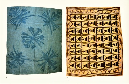
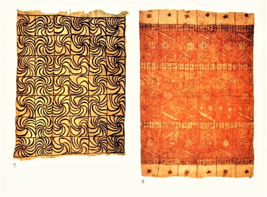
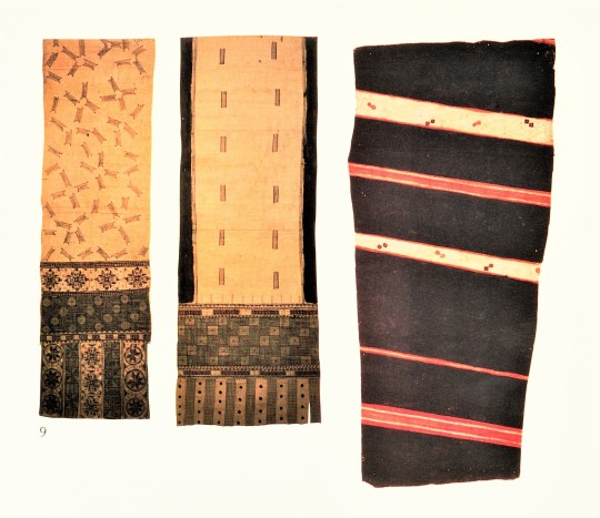
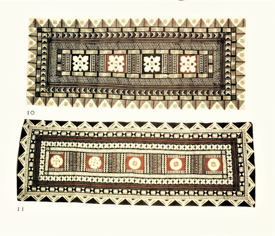

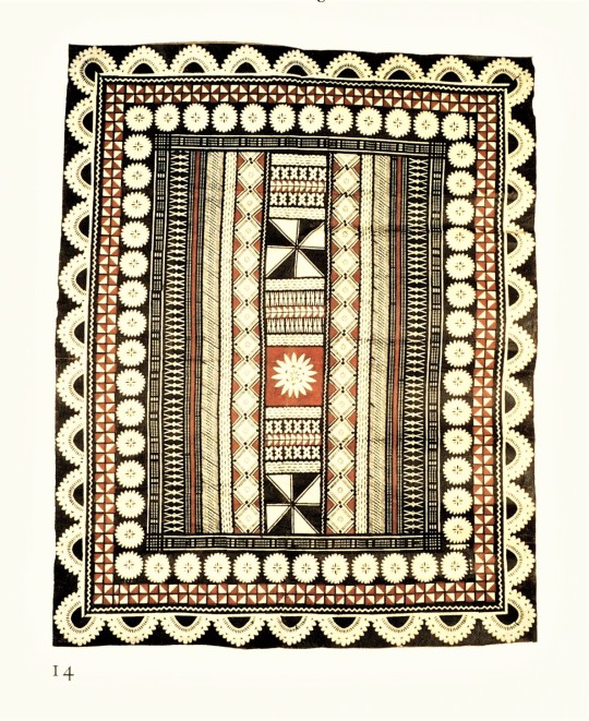
Decorative Sunday
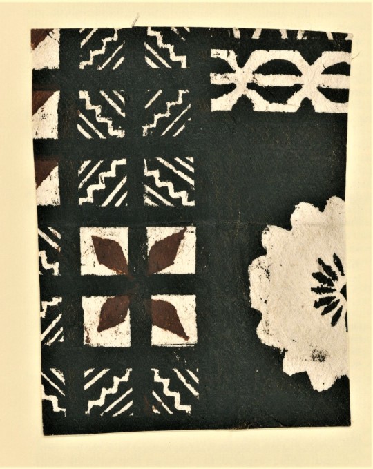
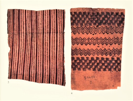
POLYNESIAN BARKCLOTH
These images come from an article by noted New Zealand-based print historian Roderick Cave and New Zealand artist Jo Toor, “With Beam and Beetle: the Bark Cloth of the Pacific,” published in Matrix 11, Winter 1991, pp. 110-123. Bark cloth is a paper-like substrate called tapa. It is manufactured throughout the Pacific islands, but it is also known by other names such as kapa on the Hawaiian islands, siapo in Samoa, and masi in Fiji..
Tapa is made from the inner bark of the paper mulberry (Broussonetia papyrifera), the same plant that is used to make paper in China, Korea, and Japan. However, instead of beating the bark to separate the individual fibers to reform into paper, mulberry bark is simply pounded into a flat surface that is then smoothed over to make tapa. This substrate can then be decorated by painting, rubbing, stamping, stenciling, smoking, or dyeing.
Click on the images to see the captions.
Matrix 11 was printed in an edition of 955 copies by John and Rosalind Randle at the Whittington Press in England, and is a donation from our friend Jerry Buff.
View more posts from Matrix.
View other posts relating to the Whittington Press.
View more Decorative Sunday posts.
33 notes
·
View notes
Photo


Typography Tuesday
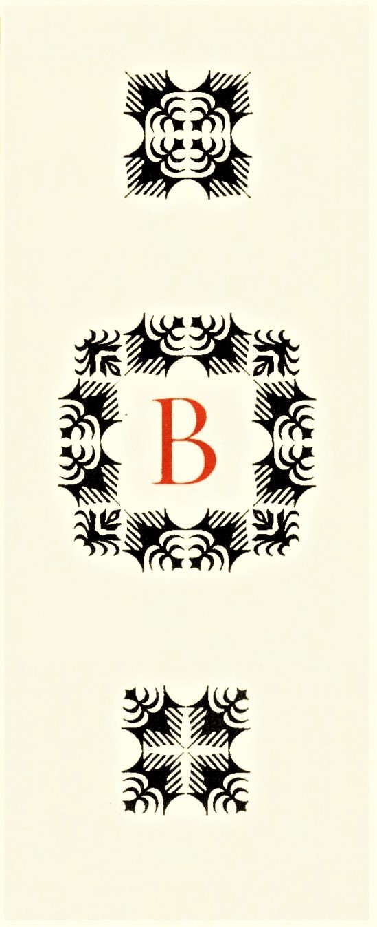
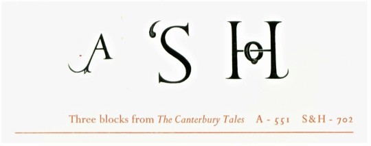
The Wood-engraved Initials of Eric Gill
The grand English type designer Eric Gill designed most of the type for the Golden Cockerel Press, including its own proprietary typeface, during the ownership of wood engraver and printer Robert Gibbings, 1924-1933. Almost all the extant type from this period is now owned by Rampant Lion Press in Cambridge, England, including a number of wood-engraved initials Gill produced for Golden Cockerel. Shown here are some of those initials printed from the original blocks by the Rampant Lion Press’s current proprietor Sebastian Carter as an insert to his article “Letters are Things: The Wood-engraved Initials of Eric Gill” in Matrix 15, Winter 1995, pp. 6-10.
Included is one of the only complete type sets Gill ever engraved and initials from Golden Cockerel’s two major undertakings during the Gibbings period, The Canterbury Tales (1929-1931) and the The Four Gospels (1931). Of the samples from the The Four Gospels shown here, Carter writes,
There is a T with a flamboyantly devilish serpent squiggling down the margin introducing the temptation of Jesus in the wilderness in Matthew, and later in the same gospel an A interlaced with a whip introduces the scourging of Jesus. There is a foliated B which begins the parable of the fig tree in Luke. And there are two words, WHEN and JESUS [use several times in the edition].
Matrix 15 was printed in an edition of 855 copies by John and Rosalind Randle at the Whittington Press in England, and is a donation from our friend Jerry Buff.
View more posts from Matrix.
View other posts relating to the Whittington Press.
View more Typography Tuesday posts.
#Typography Tuesday#typetuesday#Eric Gill#woodcut initials#wood-engraved initials#Golden Cockerel Press#Rampant Lion Press#Sebastian Carter#matrix 15#Matrix#The Four Gospels#The Canterbury Tales#John and Rosalind Randle#Whittington Press#Jerry Buff#Typography Tuesday
150 notes
·
View notes
Photo


Wood Engraving Wednesday
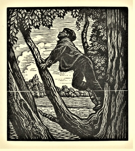
DIANA BLOOMFIELD
Diana Bloomfield (1915-2010) was an English wood engraver especially noted for her bookplates and commercial work. She also taught wood engraving at several south England institutions. In her work on bookplates she was greatly influenced by the master bookplate engraver Reynolds Stone. In her commercial work she composed designs for Oxford University Press (OUP) and Penguin Books, among others. Among her prints for OUP were wood engravings for the press’s quarterly journal The Periodical.
The engravings shown here are seasonal images from Bloomfield’s work for The Periodical. They were reprinted from the original blocks and separately bound into Matrix 16, Winter 1996, between pp, 16 and 17, as part of Bloomfield’s own small memoir “Engraving for The Periodical.” In search of subject matter, Bloomfield would often make excursions into the countryside where “I would stand, pen and pad in hand, knees slightly bent in my intense concentration and would make a quick drawing, returning home to translate it onto my woodblock.” Of one of the winter scenes, she writes:
I was obviously influenced by Thomas Bewick, whose vignettes, with so many tones of grey, entranced me, all my working life. I remember, for this design [of the woman and child walking home], trying to create the icy temperature: tree roots, like griping fingers, sky lines parallel and merging with the chimney smoke, and the little couple, driven by cold wind. I made the child look look up to the old lady, for comfort in their stormy struggle home.
Bloomfield remembered her work with The Periodical with great fondness: “I did not feel alone in these adventures to become a wood-engraver. I seemed to hear John Bell’s [OUP’s literary editor] kind encouragement, and fair criticism, as I went on my sketching walks. He was, for me, the perfect editor; a man who could get me to do my best and enjoy it.”
Matrix 16 was printed in an edition of 925 copies by John and Rosalind Randle at the Whittington Press in England, and is a donation from our friend Jerry Buff.
View more posts from Matrix.
View other posts relating to the Whittington Press.
View more posts with wood engravings!
#Wood Engraving Wednesday#wood engravings#wood engravers#women wood engravers#Diana Bloomfield#Oxford University Press#The Periodical#John Bell#Matrix#Matrix 16#John and Rosalind Randle#Whittington Press#Jerry Buff
135 notes
·
View notes
Photo


Typography Tuesday
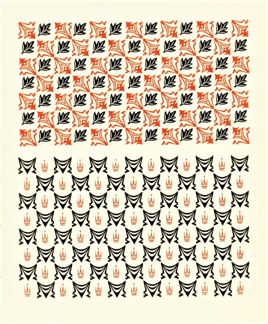
PRINTERS’ FLOWERS
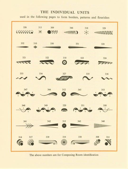
A few weeks ago we presented a specimen sheet of historic types collected and printed by the English type and printing enthusiast Mark Arman. This week we are showing some specimen sheets of printers’ flowers collected by Arman and handprinted in an edition of 1000 at his Workshop Press in Thaxted, Essex, for his article on “A Collection of Printers’ Flowers” published in Matrix 9, Winter 1989, pp. 92-96. Of his collecting of these type ornaments, Arman writes:
The collector is attracted to those things that are difficult to find: the magpie delights in accumulating treasures; what is known to be rare is prized. Thus the typographer who begins with an interest in type is in danger of becoming a collector, and his discoveries may lead him to collecting printers’ flowers. This is precisely what happened to me, as my collection began modestly in 1949 and now has developed beyond the confines of reason.
Arman has printed a description below each specimen. Shown here from top to bottom are:
1.) 15th-century-style arabesques and moresques recut in the 20th century by Monotype Corporation.
2.) 18th-century Fournier-style type ornaments recut by Monotype.
3.) Late 19th-century decorative type issued by Stephenson Blake.
4.) 20th-century decorative type designed by Percy Smith and Edward Bawden for the Curwen Press.
Arman’s process for making these 2-color prints is to raise the non-black type above the other type by placing 3-pt. leads underneath them, so that during inking only the raised type gets inked and may be printed in red or blue. After printing the full run, those printed type forms are removed and replaced by quads and other spacers which rest below the type that remains, so that only that type gets inked and printed in black on the next run.
Matrix was printed by John and Rosalind Randle at the Whittington Press in England, and is a donation from our friend Jerry Buff.
View more posts from Matrix.
View other posts relating to the Whittington Press.
View our other Typography Tuesday posts
#Typography Tuesday#typetuesday#printers' flowers#ornamental type#decorative type#Mark Arman#Workshop Press#Matrix#Matrix 9#arabesques#moresques#Monotype Corporation#Pierre Simon Fournier#Stephenson Blake#Percy Smith#Edward Bawden#Curwen Press#Typography Tuesday#John and Rosalind Randle#Whittington Press#Jerry Buff
202 notes
·
View notes
Photo


Wood Engraving Wednesday
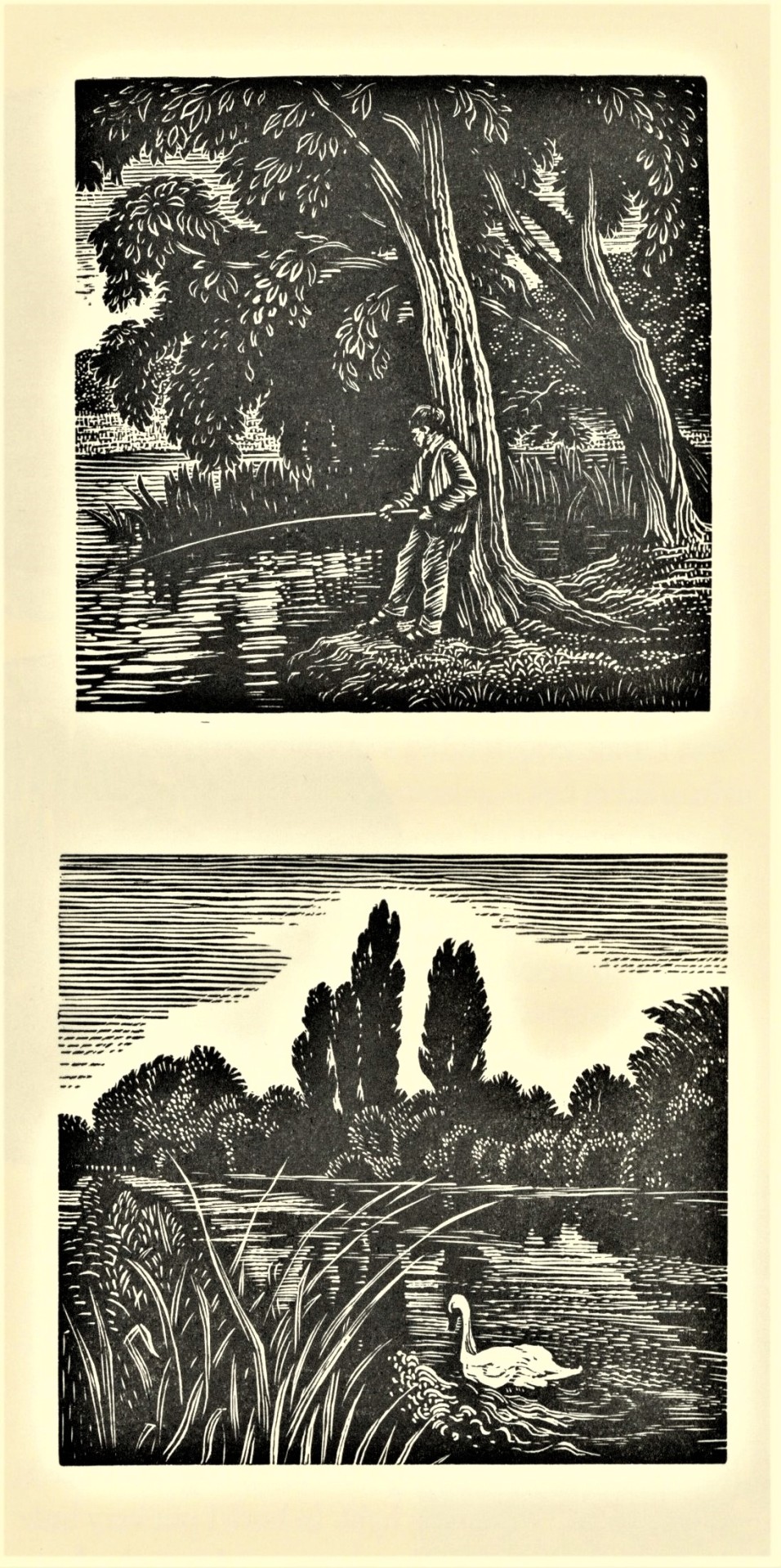
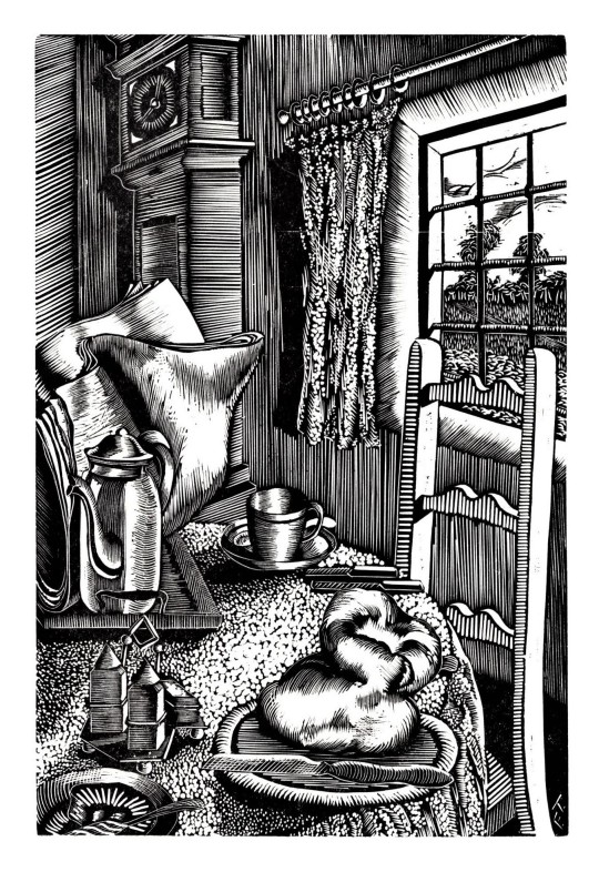
Today we were introduced to yet another wood engraver we were unfamiliar with, English painter and printmaker Freda Tremlett (1909-1997), four engravings of whose we are showing here. They were originally cut in the 1930s and were reprinted as an insert in Exeter City Museum research officer Hal Bishop’s article “Freda Tremlett, the Ruskin School, and Farrago” published in Matrix 20, Winter 2000, pp. 202-215. Unlike Thomas W. Nason, who we learned about for the first time in the last couple of weeks, there are some good reasons we have not encountered Tremlett’s work before.
Tremlett learned wood engraving from John Nash and Eric Ravilious at the Ruskin School of Drawing from 1928-1932, and showed with members of the Society of Wood Engravers in the early 1930s, and may also have been a member, although there is some dispute about that. This time from 1930-1935 appears to be her only period of artistic output in wood engraving, after which “her post-war engraved work amounted to little more than designs for cards and labels,” although she remained active as a watercolorist. Bishop writes:
As an artist, the circumstances of illness, gender, family, and the war certainly conspired to prevent Freda realising her potential; one senses that a talent which had briefly and dramatically flowered slowly and simply withered.
The engravings shown here are:
Fishing, 1931
Breakfast Table, 1931
Interior, 1930
Sinodun Hills, 1931
Matrix 20 was printed in an edition of 825 copies by John and Rosalind Randle at the Whittington Press in England, and is a donation from our friend Jerry Buff.
View more posts from Matrix.
View other posts relating to the Whittington Press.
View more posts with wood engravings!
#Wood Engraving Wednesday#wood engravings#wood engravers#women wood engravers#Freda Tremlett#Hal Bishop#Matrix 20#Matrix#John and Rosalind Randle#Whittington Press#Jerry Buff
77 notes
·
View notes
Photo


Wood Engraving Wednesday
JOAN ELLIS
Former Exeter Royal Albert Memorial Museum (RAMM) curator Hal Bishop introduced us once again to a wood engraver we are unfamiliar with, English artist Joan Ellis (1904-1989). It may not be surprising that we were ignorant of Ellis’s work. Bishop writes:
It seems extraordinary that an engraver of exceptional talent should be lost for over half a century, but this was the fate of Eleanor Joan Ellis; between 1924 and 1934 she produced around forty wood-engravings, most of astonishingly high quality in creativity, composition, and execution. But between 1934 and 1994 she largely disappeared from the history of wood-engraving, unnoticed by art historians, other engravers, and most collectors.
The engravings shown here were printed from the original blocks as an insert for Bishop’s article “Joan Ellis: a Lost Engraver from the Underwood School,” published in Matrix 17, Winter 1997, pp. 41-52. Ellis studied at Leon Underwood’s progressive Brook Green School of Art from 1923 to 1925. Her classmates were a virtual who’s who of artists and wood engravers of the time, including Henry Moore, Gertrude Hermes, Blair Hughes-Stanton, Nora Unwin, and Mary Groom. Bishop concludes:
It may have taken over sixty years but the critical acclaim which greeted her work when it was gathered together for the first time in 1997 (for a retrospective exhibition at RAMM) will ensure that she will be overlooked no longer.
Matrix 17 was printed in an edition of 770 copies by John and Rosalind Randle at the Whittington Press in England, and is a donation from our friend Jerry Buff.
View more posts from Matrix.
View other posts relating to the Whittington Press.
View more posts with wood engravings!
#Wood Engraving Wednesday#wood engravings#wood engravers#women wood engravers#Joan Ellis#Eleanor Joan Ellis#Hal Bishop#Matrix#Matrix 17#John and Rosalind Randle#Whittington Press#Jerry Buff
59 notes
·
View notes
Photo


Typography Tuesday
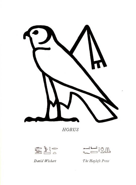
In his article “On Hieroglyphic Type” in Matrix 6, Winter 1986, pp. 116-129, David Wishart, proprietor of the Hayloft Press, writes:
Faced with a passage of Egyptian hieroglyphs (figure 1), the lay reader may well sympathize with the words of Jean-François Champollion: “All these signs, of such different forms, are constantly mixed together and a hieroglyphic inscription looks truly chaotic; nothing relates to anything else; objects most opposed in nature are in direct contact and produce monstrous alliances.”
Champollion, of course, would go on to decipher Egyptian hieroglyphs in 1822, after which there became a need for hieroglyphic types to publish about Egyptian writing. Wishart again writes:
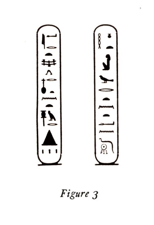
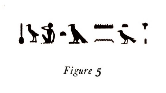
During the 1840s several founts of hieroglyphic type were designed and cut to expedite the publication of Egyptian texts; . . . one German (known as the Lepsius or Theinhardt fount., with the signs in outline, figure 2) and one French (with the signs solid, figure 3). . . . A fount (the characters solid, in the French manner), was cut in England for the first English-Egyptian Dictionary and Grammar (figure 5, 1867). . . . A century after Champollion’s decipherment, Sir Alan Gardiner . . . decided to commission a fount for his own use (figures 1 and 4) [for his 1927 book Egyptian Grammar].
Gardiner presented the matrices for the fonts to the Oxford University Press in 1945, where they remain. Figure 6 shows how Champollion began deciphering Egyptian hieroglyphs first through their alphabetic use to spell Greek names (Egyptian hieroglyphs used a mixed logographic system, but there was also an alphabet used almost exclusively for foreign words).
Figure 7 shows the first type-case for the French font at the Imprimerie Nationale. The lower part of the case is filled with alphabetic characters, the upper half with the most common phonograms and determinatives. The other cases contain 144 compartments each so that, in order to accommodate 7000 characters. about 50 cases are required.
Matrix was printed by John and Rosalind Randle at the Whittington Press in England, and is a donation from our friend Jerry Buff.
View more posts from Matrix.
View other posts relating to the Whittington Press.
View our other Typography Tuesday posts
#Typography Tuesday#typetuesday#egyptian hieroglyphs#hieroglyphics#hieroglyphic types#David Wishart#Jean-François Champollion#Matrix#Matrix 6#John and Rosalind Randle#Whittington Press#Jerry Buff#Typography Tuesday
89 notes
·
View notes
Photo
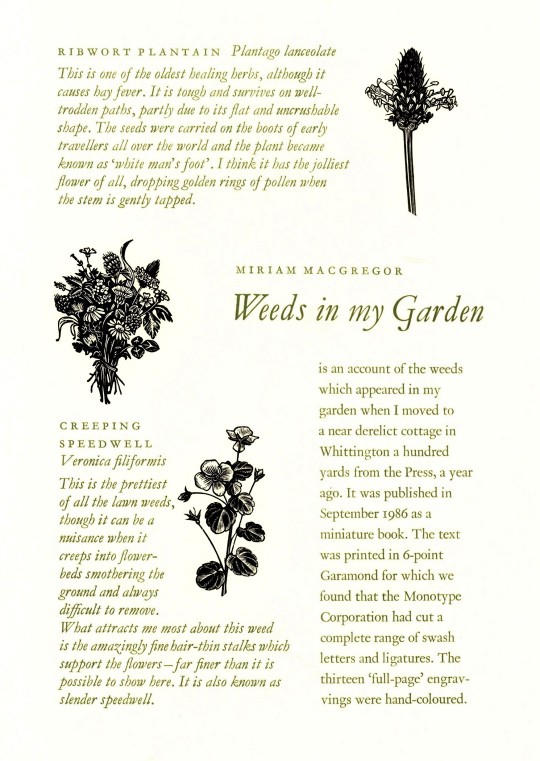
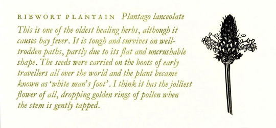

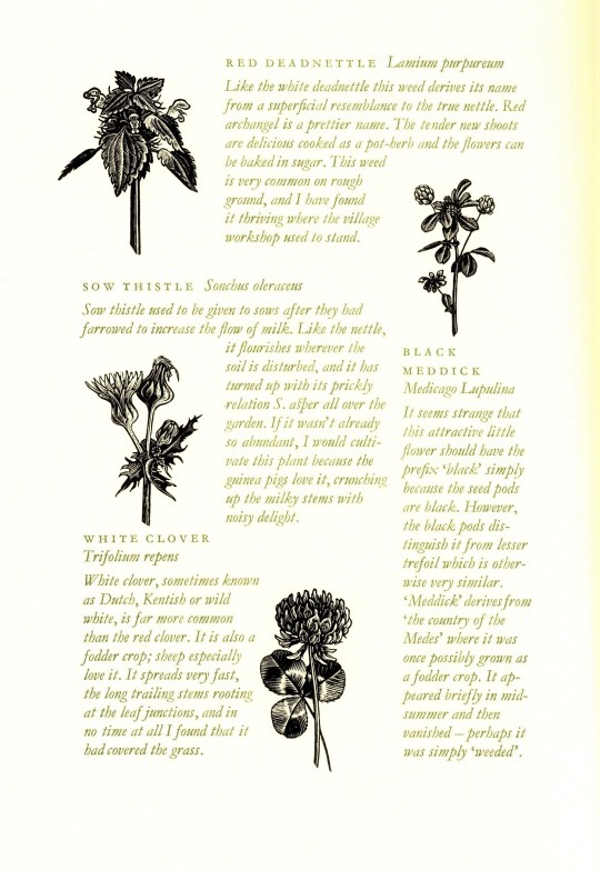

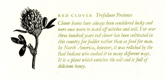


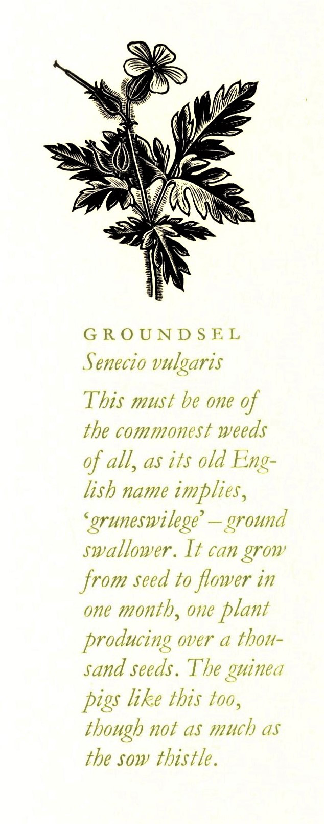
A Weedy Wood Engraving Wednesday
Indian-born British wood engraver and type compositor Miriam Macgregor is a keen observer of her rural Gloucestershire home. She has also been a principal illustrator and compositor for the Whittington Press since 1977. In 1986, Whittington Press published Macgregor’s small book Weeds in my Garden in an edition of 175 hand-colored copies. This printing of Weeds in my Garden was printed from the original blocks in an edition of 800 copies and inserted into Matrix 6, Winter 1986, between pp. 64 and 65. Macgregor writes:
Weeds in my Garden is an account of the weeds which appeared in my garden when I moved to a near derelict cottage in Whittingham a hundred yards from the Press, a year ago [1985].
Matrix was printed by John and Rosalind Randle at the Whittington Press in England, and is a donation from our friend Jerry Buff.
View more posts that include the work of Miriam Macgregor.
View more posts from Matrix.
View other posts relating to the Whittington Press.
View more posts with wood engravings!
#Wood Engraving Wednesday#Flora and Sylva#wood engravings#wood engravers#Miriam Macgregor#Weeds in my Garden#weeds#Matrix#Matrix 6#Whittington Press#John and Rosalind Randle#Jerry Buff
115 notes
·
View notes
Photo


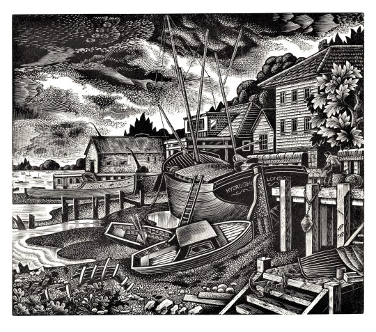
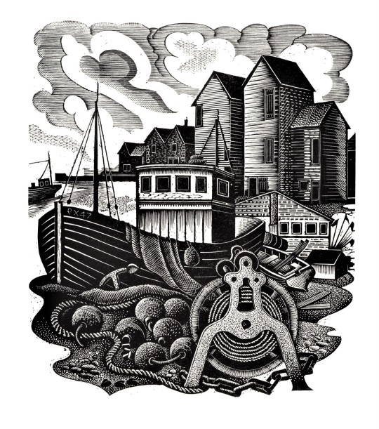
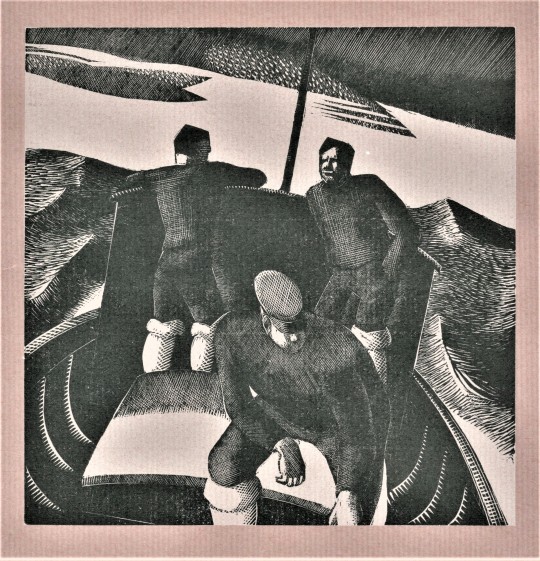
Wood Engraving Wednesday
This week we present some very rich wood engravings by English artist, educator, and wood engraver Ronald Salmond. Salmond spent the bulk of career as a teacher, serving as art master at Preston Manor School, Middlesex, from 1939-1975, and really did not begin actively making engravings until after his retirement when he was in his sixties. Salmond wrote that he studied
the engravings of John and Paul Nash, Clifford Webb, [and] John Farleigh. . . . It was Clifford Webb’s formalised treatment of trees, buildings and water that gave me a new insight into wood-engraving, whole I greatly admired the freshness and ease with which Eric Ravilious handled his tools, and the wonderful simplicity of his later work.
The engravings shown here were printed as an insert for Hal Bishop’s article “Ronald Salmond - and Old Master,” in Matrix 28, Summer 2009, pp. 33-37, which was printed in an edition of 700 copies. Of the first print shown here, Burford Bridge, Bishop writes,
In Burford Bridge [Salmond] produced a mature work, the architectural structures an integral composition rather than being part of the disposition of pattern. It is overwhelmingly rich, with an intense ‘busyness’ on the engraved surface. . . . The treatment of light, and the subtle reflections of the bridge in the water gives true depth to the picture without conflicting with the controlled emphasis of the foreground flowers or the rich display of vegetation elsewhere.
The next three prints -- Old Portsmouth, ‘The Hydrogen” at Burnham-on-Crouch, and Hastings -- represent Salmond’s favored subjects from the 1980s, harbor scenes. Salmond writes,
I have always been fascinated with harbours and boats lying on their sides at low tide; their beautiful shapes and lines made fine subjects for engraving . . . the fisherman’s gear and their drying huts ideal for my compositions . . . .
Matrix was printed by John and Rosalind Randle at the Whittington Press in England, and is a donation from our friend Jerry Buff.
View more posts from Matrix.
View other posts relating to the Whittington Press.
View more posts with wood engravings!
#Wood Engraving Wednesday#wood engravings#wood engravers#Ronald Salmond#Hal Bishop#Matrix#Matrix 28#John and Rosalind Randle#Whittington Press#Jerry Buff
71 notes
·
View notes
Last Seen Blogs

navybluehues
writing prompts & scribbles

four-bladed-fan
A fan with three blades

vibrancyvictoriam
Vibrancy Victoriam


shippingeruri
Eruri is love | Eruri is life