
materialsmedia603oliveroneill
M+M 603 - Oliver O'Neill
14 posts
Don't wanna be here? Send us removal request.
Last Seen Blogs
oblivion-rising
Oblivion’s Rise

obsessedwithegos
Content Creation and Whump Blog!

handstandcomics
HandStand Comics

singlesploot
Single Sploot
medicatedmaniac
medicatedmaniac
Text
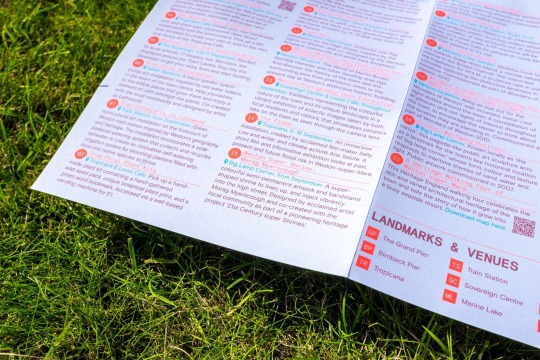
MAP Development

For the map on the brochure side I started with a screenshot from the Open Street Maps website. Some big changes I made was rotating the screen shot so that Saint Paul street was parallel as that is the main reference point. I then chose to highlight the buildings where events were being held with the colour orange then leaving the rest of the buildings as blue.

Finally this is my finished design where I decided to remove the stroke, and added in street labels as I believe this would help people who are new to AUT.

0 notes
Text
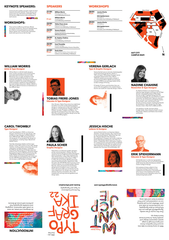
Image Treatment Process
The first step I used in creating my images was to use the quick selection tool to get a rough outline of each speaker, eliminating any unnecessary distractions that might be in the background of each image.
I then turned this into a layer mask - further refining the hair on some of the speakers and some errors by photoshops ai.
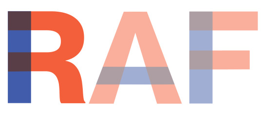
For the colour I used a gradient map, with the orange and the blue colours that I used across the rest of my design, adjusting the start and end point for each colour slightly per image so they matched.
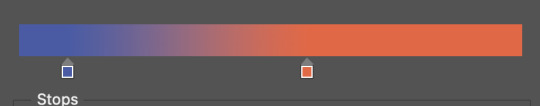
I like how the final outcome looks, and I think it fits in well with the rest of the design.

0 notes
Text

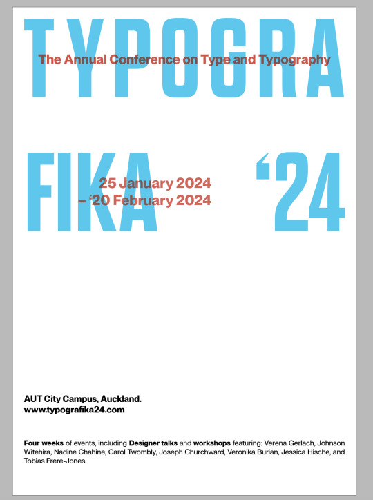
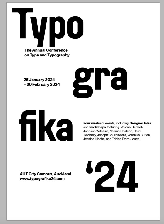
I started exploring with a poster layout like this which I do really like, then I refined it more into this.

I think this one has more of a sense of hierarchy with my eyes flowing from the Title then to the year then finally to the info about the speakers in blue. I think this is helped by having some of the text in blue.
The heading type was based of the typeface Neue Montreal by Pangram Pangram which I then manipulated using Illustrator by breaking up each letterform into where I imagined lines would overlap.
0 notes

Text
First experiments with type and layout inside of Indesign
I tried experimenting with a few different typefaces using the multiply technique but I don't really vibe with them yet. I like the first one but the layout needs refining.

0 notes
Text
Further research on using Multiply

George did show some work that used this style in todays class, which leads me to think that this style does have some merit. This might be interesting to see how many other students pick up this style. I wonder if I can use an analog process like screen printing then digitally scan these images and add them to my work.
I do also like the line art style treatment of these images, but I wonder if they are too destructive for the brief.
0 notes
Text
Week 2 Lecture
Look at how other designers have tried to solve problems and learn from then.
Creativepro.com
When working with print, Printing drafts is the only true proof. Yellows, Oranges, Reds all change when printed.
How well do I work collaboratively, how can I eliminate pain points if I were to hand off my work to somebody else.
Play nicely with others.
Use a non destructive - non linear workflow - Allow yourself the ability to go backwards if needed.
0 notes
Text
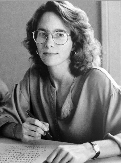
Speaker Research
Joseph Churchward: Artist and Type Designer.
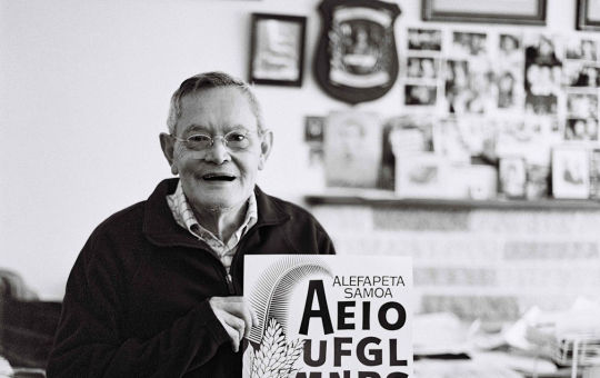

Joseph Churchward is a Samoan-born New Zealand graphic designer and typographer. He is known for having designed an estimated 690 original typefaces, many of which are in use around the world. His designs were also used in the masthead of The Evening Post newspaper. Churchward is born in Apia, Samoa, of Samoan, English, Scottish, Tongan and Chinese heritage. He founded Churchward International Typefaces in 1969. German company Berthold Fototypes subsequently distributed his fonts throughout the world. Over the span of his career, Churchward created more than 582 original typefaces. Joseph will be offering two different lectures as listed below on two different days.
Tobias Frere Jones: Educator and Type Designer.
Over 25 years, Tobias Frere-Jones has established himself as one of the world’s leading typeface designers, creating some of the most widely used typefaces, including Poynter Oldstyle, Whitney, Gotham, Surveyor, Tungsten and Retina.. He operates the company Frere-Jones Type in New York City, and teaches typeface design at the Yale School of Art MFA program.
Verena Gerlach: Type and graphic designer


Verena Gerlach was an instructor of photography at the Hochschule der Künste in Berlin in 1991 and spent 1992 doing a first-year course at Glasgow School of Art. From 1993 to 1998 she studied communication design at Kunsthochschule Berlin Weißensee and spent one year (1996) as an exchange student at the London College of Printing.
FF Karbid, FF Sizmo, and Chambers Sans are some of the few typefaces she created, Verena has her own studio for corporate design in Berlin.
Nadine Chahine: Researcher and Type Designer


Dr. Nadine Chahine is an award-winning Lebanese type designer working as the UK Type Director and Legibility Expert at Monotype. She has an MA in Typeface Design from the University of Reading, UK, and a PhD from Leiden University, The Netherlands. Nadine’s research focus is on eye movement and legibility studies for the Arabic, Latin, and Chinese scripts. She has numerous awards including two Awards for Excellence in Type Design from the Type Directors Club in New York in 2008 and 2011.
Her typefaces include: the best-selling Frutiger Arabic, Neue Helvetica Arabic, Univers Next Arabic, Palatino and Palatino Sans Arabic, and Koufiya.
Carol Twombly

Carol Twombly (born 1959) is an American designer, best known for her type design. She worked as a type designer at Adobe Systems from 1988 through 1999, during which time she designed, or contributed to the design of, many typefaces, including Trajan, Myriad and Adobe Caslon.
Twombly retired from Adobe and from type design in early 1999, to focus on her other design interests, involving textiles and jewelry. American calligrapher and type designer, a graduate from Rhode Island School of Design where her professor was Charles Bigelow. Joined the digital typography program at Stanford University, also under Bigelow. Working from the Bigelow & Holmes studio she designed Mirarae, which won her the 1984 Morisawa gold prize. Since 1988 she has been a staff designer at Adobe.
Veronika Burian: Type Designer

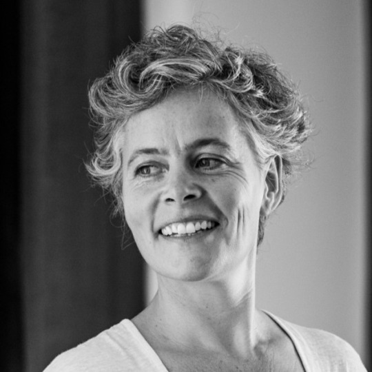
Veronika is born in Prague, originally studied industrial design in Munich and then worked as a product designer in Vienna and Milan. Discovering her true passion for type, she graduated with distinction from the MA in Typeface Design course in Reading, UK in 2003. Burian founded TypeTogether together with José Scaglione, today with twelve employees working around the world, one of the most important, independent type foundries. In addition to the development of tailored solutions for a variety of clients, the focus of TypeTogether’s font catalog is on expressive text typefaces for digital and analog media. Her typeface Maiola received, amongst others, the TDC Certificate of Excellence in Type Design 2004. Several other typefaces by TypeTogether have also been recognised by international competitions, including ED-Awards and ISTD.
Jessica Hische: Letterer and Designer


Jessica Nicole Hische is an American letterer, illustrator, and type designer. She is best known for her personal projects, 'Daily Drop Cap' and the “Should I Work for Free” flowchart. She published In Progress: See Inside a Lettering Artist's Sketchbook and Process, from Pencil to Vector in September 2015, which gives insight to her creative process and work she has completed as a hand lettering artist. She has spoken at over 100 conferences worldwide, but splits her time between San Francisco, CA and Brooklyn, NY.
Johnson Witehira: Educator and type designer
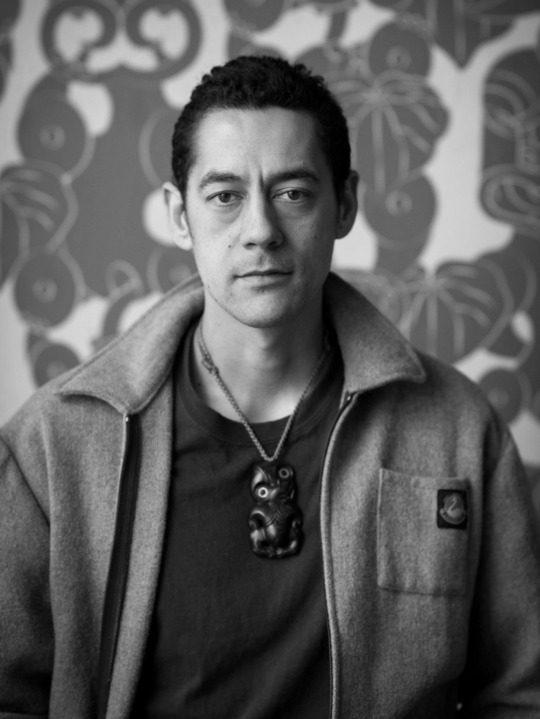
Johnson Witehira is an artist, designer and academic of Tamahaki and Ngāi Tū-te-auru descent. He is the co-founder of both Indigenous Design and Innovation Aotearoa (IDIA) and Waahi Wairua. Since completing his doctorate in Māori Visual Art (2013), Johnson has been on a mission to bring Māori culture into all aspects of New Zealand life. He has led the development of Māori design for some of New Zealand's most prominent organisations. Other significant design projects include developing the first set of Māori alphabet blocks, co-designing the PAKU gardening tools for children and developing the first functional Māori-specific typeface.
0 notes
Text
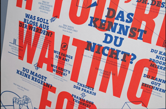
More Design Inspo.
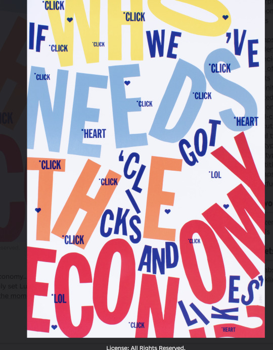


I really dig this look of using blending modes to overlay text and imagery, and I also really like the two tone colour scheme of the bottom imagary.
0 notes


Text
Target Audience
My target audience is new graduates and junior designers, as they already have a keen eye for good design and a well honed set of skills, but they could benefit from hearing words of advice and participating in workshops from the more seasoned creatives that Typografika offers.
As a result my publiction should be attractive and well designed to young creatives in their twenties but also something that people younger and older would still want to pickup.
0 notes
Text


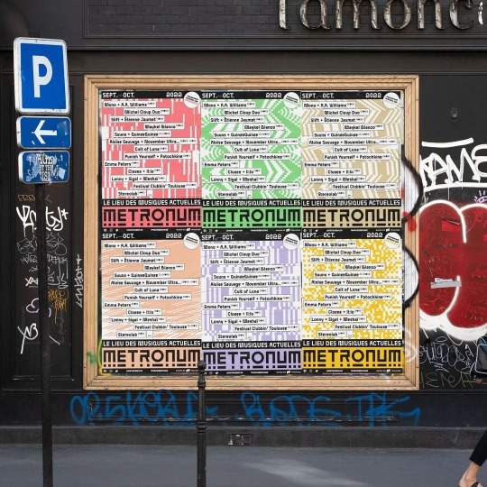
I wanted to focus on this publication as I really like the use of the blocks of colour and patterns and how they interact with the text. The blocks could prove to be quite useful in guiding the viewers eyes and to create areas of interest especially on a large page.
0 notes


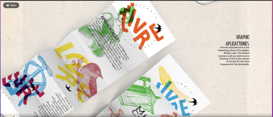
Text
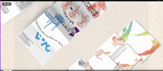
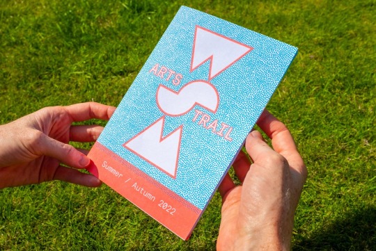
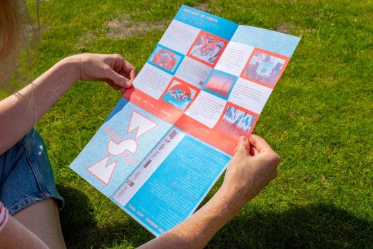
Here is my first exploration with a folding poster concept. This feels very natural and easy to unfold.
0 notes