emgrad603materialsandmedia
GRAD603 Emily Langridge
A collection of research and thoughts
30 posts
Don't wanna be here? Send us removal request.
Last Seen Blogs


yoa-artblog
Yoa's Sketch Blog
kenzovintage
Be Who You Need

dreamhospital
Dream Hospital

stonersheep
This is just me..
Text
Reflecting on design decisions
Reflecting on various kinetic type designs I have looked at - I wanted to create something simplistic with a key focus on gridding, type alignment and size - by using the typewriter typeface and a plain background, I wanted to emphasise a more simple / basic design aesthetic focusing on minimalism and negative space - where the key words are highlighted with size, I did this by playing with weights and how bold the type is. Alot of what Sir Edmund says is very inspirational and motivational so I wanted to highlight the background music and tie it in with the type so that everything worked cohesively.
0 notes
Text
Design decisions

In our lecture last week we learnt about combining seperate compositions - I did This by focusing on realignment and also opacity levels, so two different sections and areas of type work well together.
A couple of projects I looked into that have driven my design aesthetic and choices.
https://www.behance.net/gallery/72905057/Kinetic-Typography-Experiments
https://www.behance.net/gallery/167001017/36-Day-of-Type-23
0 notes
Text
Storyboarding and framework

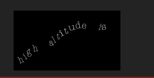

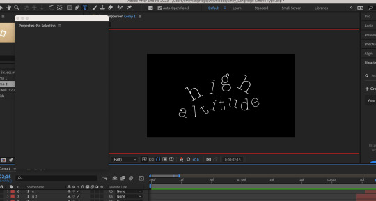


At this stage in my Kinetic Type process I had a look at various bechance projects and wanted to go for a type writer esque style, about halfway through this timeline I wanted to encorporate and try out various weights through each frame and try something new that was appropriate for what Sir Edmund Hilary is saying.
For example “At high altitudes” I moved around the type to fit what he was saying, I also have looked at moving the type back and forth and changing the opacity to fit with a typewriter.
In our lecture today we looked at volume and importing music - So I did my background music and changed the volume to work with the speaker.
0 notes
Text
Examples of end credits
https://www.behance.net/gallery/138117303/Midsommar-End-Credits-(CONCEPT)
https://www.behance.net/gallery/147241963/Alice-In-Wonderland-End-Credit
I found some examples on behance of examples of story boards I liked - I really enjoyed this one as I love the simplicity of the illustration style, something im really familiar with.


0 notes
Text
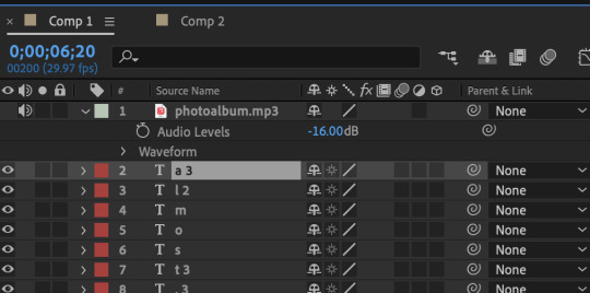
Royalty free music
https://www.bensound.com/free-music-for-videos
Had my favourite free music - I really like the “Photo album” Track, as its inspiring and uplifting - so works well with my speaker.
0 notes
Text
Tutorials
https://www.youtube.com/watch?v=B2tmgJ0HKxo&pp=ygUWYWZ0ZXJlZmZlY3RzIHR1dG9yaWFscw%3D%3D
https://www.youtube.com/watch?v=5tQ0hf2SCeo&pp=ygUWYWZ0ZXJlZmZlY3RzIHR1dG9yaWFscw%3D%3D
https://www.youtube.com/watch?v=voppKYfT7XU&pp=ygUWYWZ0ZXJlZmZlY3RzIHR1dG9yaWFscw%3D%3D
https://www.youtube.com/watch?v=tOX9hLmBxho&pp=ygUWYWZ0ZXJlZmZlY3RzIHR1dG9yaWFscw%3D%3D
https://www.youtube.com/watch?v=BsuR0kt0I4k&pp=ygUoa2luZXRpYyB0eXBlIGFmdGVyIGVmZmVjdHMgdGVtcGxhdGUgZnJlZQ%3D%3D
https://www.youtube.com/watch?v=ao6YZ6XnT-c&pp=ygUoa2luZXRpYyB0eXBlIGFmdGVyIGVmZmVjdHMgdGVtcGxhdGUgZnJlZQ%3D%3D
I also found a large amount of tutorials and type packs which I can refer back to and use when I need - some of these are also type packs which means I can download them and use them as templates to achieve my story board.
0 notes
Text

I then made a storyboard by hand of where everything could go in aftereffects, drawing it up helped me have a flat plan of where I can put everything.
Taking into consideration pauses, spaces and gaps in the transcript.
0 notes
Text
Sir Edmund Hilary Transcript & Brief
Digital Hand-in
Size – Full HD (1920 x 1080 pixels) Frame rate – 25 frames per second. Published using Adobe Media Encoder – in the mpeg-4 format. Upload final animation to the Assessments area on Canvas
URL for blog/research. (example: GRAD603.tumblr.com). This should include AT LEAST some research on speech and speaker, concept development, ideas, progress screenshots, storyboards, experimentation, and some reflection on design decisions.
“One of the effects of high altitude is, its a little bit like having a dose of influenza almost, being at high altitude alot of your energy and alot of your drive tends to be sapped and people feel fit, and feel able to cope with altitude at different times - even during the single few months within an expedition, so obviously you've got to get people who have got the drive and the enthusiasm, to sort of throw them towards the summit and say go to it.!”

- Edmunds early life included beekeeping, and tramping.
- four days before the coronation of Queen Elizabeth II – Hillary reached the summit of Mt Everest and became the first to do so.
- Hilary a became New Zealand ambassador to India in 1985, a member of the Order of New Zealand in 1987 and a Knight of the Garter in 1995.
0 notes
Text
Draft + Test


This was my draft print out test in black and white - As shown in the poster + Zoom ins, the font was really pixelated so I ensured everything was above size 9 - Making sure that everything Is legible as everything smaller than that was very hard to read.
Printing in black and white was a good design choice as it gave me a clear direction as to what I needed to change before I printed all in colour and used a different paper gram.
0 notes
Text
Finalising + Reflection


After getting some feedback this was the final result for my print based publication.
My key takeaways from my feedback was to ensure that my kerning was accurate and consistent which I changed so everything was legible.I had some issues printing where the font was too thin and was difficult to read so I changed the typeface to bold so that it was darker and easier to read.
Changing my kerning also meant that there was consistency amongst my design. The main element I found really challenging was fixing my errors in the preflight panel, I really struggled with getting these all to line up and match as they kept changing and were really inconsistent. Im really pleased with how I worked with it however, I gained alot of new skills that I definitely would not have been able to do a few months ago.
One thing I would like to change if there was more time or for a future project is to ensure there is accurate and clear communication with my design, I got a critique that the typewriter did not clearly communicate a typography event as it was too far removed from typefaces, my initial idea and thought process behind the concept was to show the origins and the beginnings of writing and digitising type. However I can completely see the critique now, and think potentially for future design works and with more time I can challenge myself with the communication and see if everything is really working.
Im also very happy with how the table came out - I struggled alot with spacing and making sure all the information fit into a small page, however I managed to with the help of my lecturers and fixing the spacing of the table margins + educating myself on how to use tables in indesign, I was able to. I think it is crucial and very important to include all information provided by the client so I ensured that I did this.
I also really enjoyed printing on watercolour paper, as I loved the grainy texture to the paper and think it really adds some depth to the brochure and gives it that tactile element that you would lose if this was advertised digitally.
0 notes
Text
W5 Lecture
Deadline - 12th April
1. Brochure - not folded.
- Packaged indesign file uploaded zipped into one file.
- URL for blog and research entered as a comment (Link)
0 notes
Text
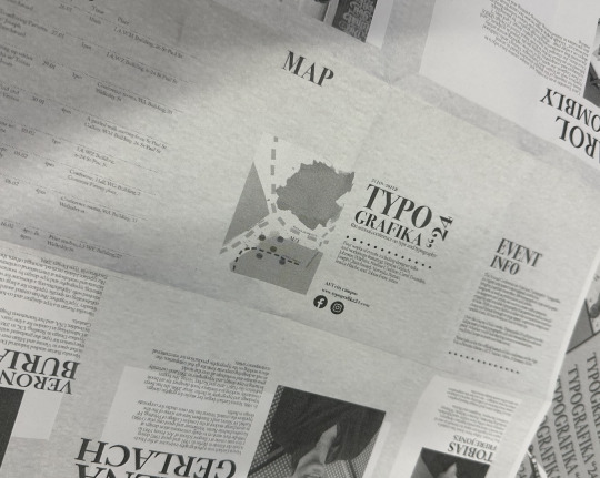
Map

I then got the map provided to us and created a clear, simple, easy to understand map with all the necessary information. I may or may not need to add some more details to the roads but this was my first mockup so I could see how It would look on the brochure.
I also did it in watercolour as it works well with my brochure which has a very organic and traditional feel and I wanted to use a medium that would work well with the paper texture and grain.

0 notes
Text

- Played around with some allingment and really happy with the dots breaking up the text, creates some separation and and image, works well with the design aesthetic.
0 notes
Text
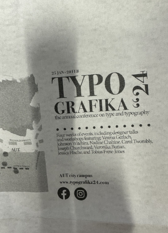
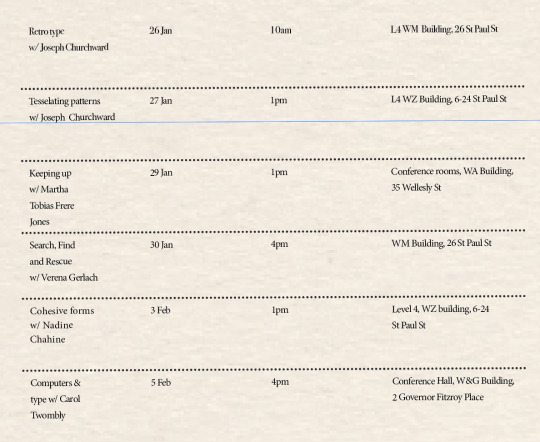
Brochure iterations / feedback / reflection


- Need to add some more rows for remainder of workshops
- Really enjoying the paper texture with the poster - continuation


- Played around with text within shape and prefer the text being snug and closer to the image.

0 notes
Photo


MY PROCESS
For this poster iteration I went through a serious of different colour palettes and angles to see whether or not the ink background worked or not.
I really like the dark grey typewriter, and also the transparent one - so this could be something I could experiment with when it comes to my final poster - which works better with the type?
I wanted to keep the paper grain texture and the ink so it feels organic and there is traditional feel to it - I definitely prefer the dark grey type writer, it feels as though there is a lot more contrast with the background and text as opposed to the light grey typewriter.
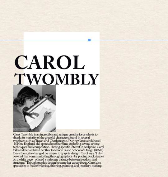
I used Carol Twomblys fonts, and I really enjoy the final result, it was definitely something I was wanting with my result, and it feels like an actual type writer font - I think I will be experimenting with some more varied fonts when it comes to the brochure side.
The blue background seemed a little out of place so I definitely preferred the beige and grain paper backgrounds.
0 notes
Text
W3 Lecture - Composition
IN Proximity - In design, how far elements sit together / distance between. Spacing - how the eye moves around the work. How the information sits together, piecing information together, easy to digest & easy to read.
SPACE
Ross F George - Speedball Textbook, 1935 Negative space Repeating
Aim to analyse how designers use elements - why does the design work? “Best Awards”
Restrained colour palette generally works. / Areas of colour can be bought through.
CONTRAST
Large typefaces which can be used against body copy - difference between two texts.
Contrast creating playfulness and tension between varied elements.
Horizontal breaks & geometric pattern.
HIERARCHY
Level of importance - what do you want the reader to see first?
- What/when/how etc
- Guiding the eye.
- Contrast leads hierarchy.
- Dividing information.
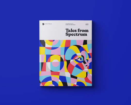
“Tales from Spectrum” - Shanti Sparrow, Behance / Annual Book design.


Repetition
Repeating the style, smaller and larger blocks of text that are continuous across the spread.
Repeating in scale.
“Nigel French” - Tutorials on LinkedIn
0 notes
Text
Font exploration
I then looked at fonts, I think the best choice for my style and poster would be a couple of Carol Twomblys fonts, she has a lot of strong typewriter display typefaces and a variety of nice, easy to read fonts I could use for body text.

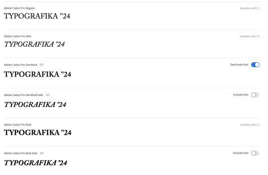
Bold is definitely the best choice for my display and poster text - could use regular for body text?
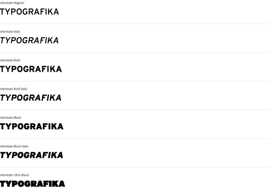
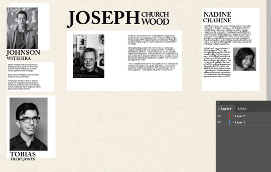
I would also like to play around with Tobias Frere Jones font - Interstate, it's a really beautiful typeface that I think would work really nicely for either my body copy or display on my poster. It has alot of different weights, so could be suitable for various parts of my work.
0 notes