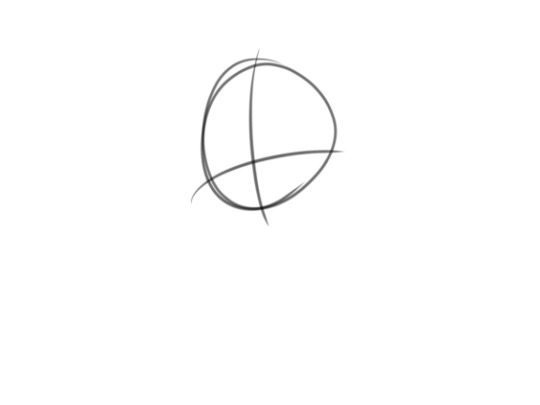
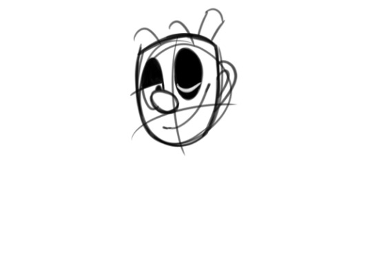
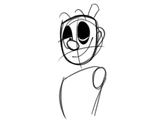
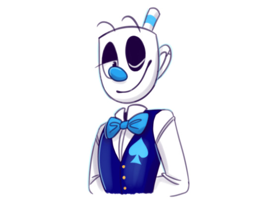
#I remembered to colour the lineart this time lol
Text

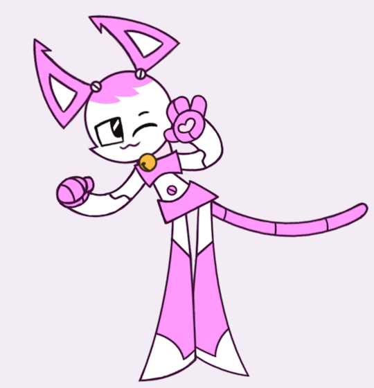
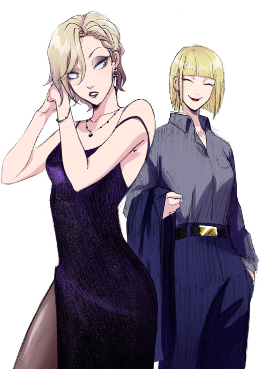
Jenny animation! (With a pink version just for fun)
I made this over the span of like two days overall and I spent an entire day doing almost nothing else except working on it to the point I gave myself a headache lmao. However, I am happy with how it came out! It's a bit janky in some places but I just... Not enough for me to want to fix it rn I'm done with this lol
I've toyed with animation here and there over the years but rarely do I make anything substantial, so I am happy this turned out as good as it did. Though I also just find Jenny fun to draw, so that probably helped
#I remembered to colour the lineart this time lol#What is it about Jenny she's making me insane with how much I've been drawing her#I didn't even grow up on this show bruh#Also this was inspired by the Sad Cat Dance meme#Though I can't edit for shit and don't want to lol#So it's staying as a gif#At least for now. Maybe sometime I'll do something more with it#art#drawing#digital art#my art#animation#fanart#mlaatr#my life as a teenage robot#jenny xj9#xj9#jenny wakeman#2danimation#sad cat dance#Kind of. Look she's a catgirl and dancing close enough#gif
117 notes
·
View notes
Text
DAY 14 - «On Thin Ice» Good Omens AU - Triptych Tribute for @blairamok
Part 2/3: "Fallen Serpent" Crowley


Please, listen to this
Race
Life's a race
And I am gonna win
Yes, I am gonna win
And I'll light the fuse
And I'll never lose
And I choose to survive
Whatever it takes
You won't pull ahead
I'll keep up the pace
And I'll reveal my strength
To the whole human race

Yes, I am prepared
To stay alive
I won't forgive, the vengeance is mine
And I won't give in
Because I choose to thrive
Yeah, I'm gonna win!
Race
It's a race
And I'm gonna win!

Tomorrow, they will be together for the Grand Finale... See you there! ;-)
[Previous] [Next Day] [First Day]
Don't forget to 💕/ reblog ;-)
↓Come on, check the behind-the-scenes!↓
Personal challenge: a simple sketch each day
Goal: forcing me to keep things simple - inking, shading, just a few sashes of colour
Improvement pursued: to get the movement, the emotion, finding how to add depth, learning how to leave things barely finished
Max time allowed: 2 hours, as usual for my Daily Challenges.
Tribute Time, so I threw the timer away, lol :-p. As for my Fallen Angel Aziraphale (link), I spent more or less 3 hours on the lineart, plus 1h30 on the colouring/shading.
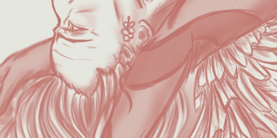
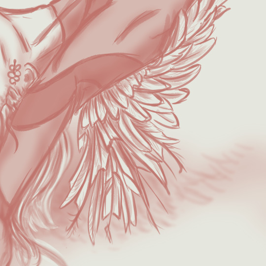
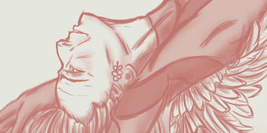
Crowley, as my « Fallen Serpent ».
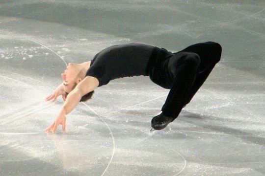
“On Thin Ice”'s author Blairamok describes the Cantilevers figure as « one of the biggest fuck yous to physics », and so one of Crowley’s signature moves. As I was searching drawing references about this amazing figure, I found a lot of ways to perform it, all beautiful and impressive. I finally chose this particular one (I am sorry I don’t know the original performer’s name on the picture I used, but to me he seemed so powerful, yet relaxed and happy on the picture, so I couldn’t resist). Though I had to slightly re-adapt the figure to Crowley who is taller, thinner and maybe even more flexible (ssssnaky, duh).
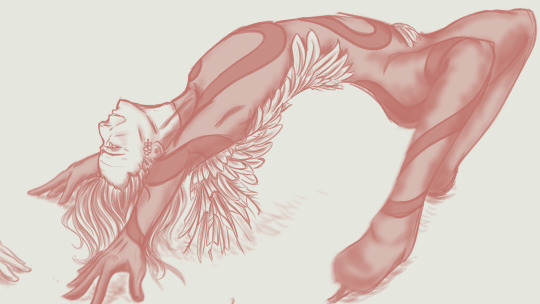
I had so much fun re-thinking his clothes for my sketch. I used the scrumptious💕 black and red « Serpent » clothing that Blairamok created, and I added my own « signature move » : wings – or, well, feathers. As Crowley is THE Fallen Angel here, the feathers are slightly burnt, some of them almost torn apart. They cover his shoulder blades, then spread out as a unique short and damaged wing at the back of his right shoulder, go down on his right flank, then cross his back as they slightly go embracing his left hip. The Red Serpent Pattern is quite the same as Blair’s clothing, but it still continues on his leg and circles his right ankle like a leg shackle.

I am particularly proud of Crowley’s eye and expression. Remember? I dearly wanted Crowley sharing a glance with Aziraphale while he was doing his Cantilevers, and Aziraphale was supposed to glance back to him. I had to give up on this idea later – because the figure I chose for Aziraphale definitely couldn’t allow such a shared glance. (but wait for the third part of this triptyque, it will be posted tomorrow!)
So, my Crowley still has this ethereal, strangely happy, almost enthralled expression. It kind of represents my own interpretation of the Cantilevers figure : it’s a proof of complete trust, in yourself, in your skills, in your art and your environment. And I like to imagine that if Crowley is able to have such confidence in himself, then maybe he can and will trust his partner Aziraphale with quite the same strength.

Thanks for reading! See you tomorrow for the third part - our Ineffable Partners will be toghether, finally! (aaaand they will be not talking but whatever the acting will speak for them)
[Previous] [Next Day] [First Day]
Don't forget to 💕/ reblog ;-)
#on thin ice#blairamok#I am so happy about it!#good omens#good omens fanart#Aziraphale#Crowley#aziracrow#art#my art#ineffable husbands#David tennant#Michael Sheen#ElenPersonnalChallenge#ElenthyaAndGoodOmens#Ineffable Feathers#good omens au#Ineffable lovers#Ineffable Ice Skaters#MUSE#Survival by MUSE#MUSE FAN FOREVER#ElenthyaGallery
131 notes
·
View notes
Note
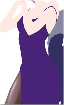
can you pretty pretty please with extra sprinkles on top drop the speedpaint for your most recent rookvil art? i wanna see how you did vils pretty dress and everything else cause its all so beautiful
I am so happy you like how it looks!! I would love to make a speedpaint, but unfortunately, I didn’t record it + the base for the drawing was actually done traditionally with a pencil. A lot of my drawings are done this way, actually…
Even though I can’t drop the speedpaint, I’ll do the next best thing and explain my process for this specific drawing step-by-step. It’s actually not that complicated!
Here is how the sketch looked initially. As you can see, I shaded the dress very crudely; in fact I was kind of upset with how the dress looked at this stage. Ironically, I ended up not doing much to the pencil shading, and it still turned out okay somehow?? Anyways, the first thing I did was to prep the sketch for the colouring stage: I adjusted the contrast, fixed Vil’s face, and erased some dirt and imperfections.

Then I create a new layer, set it to Multiply (this way I can colour the sketch without disturbing it, as if I was just colouring a digitally done lineart) and do a base colour layer. There is a gradient in Vil’s hair and Rook’s belt buckle, but other than that, all the colours are flat at this stage.

Before doing all the shading needed for this sketch, I add details such as makeup and tights. If you want to know how I did these, let me know, but I basically looked at a tutorial once and then simplified it lol

Now, the dress.
To be completely honest, there isn’t any proper technique to what I did, everything is always just trial and error and an hour of me going “does that look good? NO IT DOESN’T >:(“ until both Katsu and I are satisfied. This time I was lucky, because it didn’t take very long, and the “solution” was pretty simple.
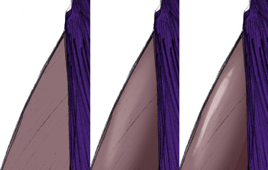
Starting with the base colour. I turned off the sketch layer to show that it is indeed completely purple. And it looks kind of bright at this point, almost too bright even, especially considering that the dress is supposed to be mostly black, or at least dark purple. But bear with me.
Next I added some highlights (new layer, set on Overlay or Screen, depending on what looks best). Usually I would add the shades first, but I wanted to make the fabric look more “shiny”, you know, the type of fabric that would reflect the floor and make this highlight under the boob lol.
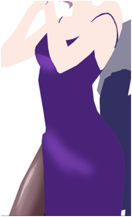
And after that I just went ahead and added black gradient (on a new Layer) from the bottom of the dress to make it look darker, silkier and a little bit more interesting for the eye. I erased some parts of the gradients as you can see, because it looked too dark on the highlighted parts… could’ve just placed the black gradient layer under the highlights layer and saved myself a headache, but hey, where is the adventure in that.

Finally, it turned out looking like this. It looks better than it used to look like initially, but there is one more thing to do. We don’t get to do this one too often, so it always excited both Katsu and me: THE SPARKLES!! Somehow, making the dress sparkly makes everything much better.

How do I do the sparkles: I use the star brush… or was it a snow brush? I use this brush when I draw both of these things lol + when I draw anything sparkly. I would’ve given you this specific one, but I don’t really remember where I got it from, and I honestly think that any starry or snowy brush would work wonderfully as long as the specs are small enough.
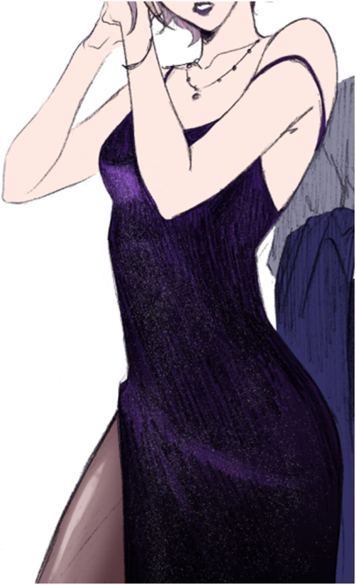
After that is done, I just shade the rest of the drawing. Nnew layer set on Multiply, the shading is done with darker purple/red + darker blue, whatever looks better on any particular material: the skin really likes warmer colours, but Rook’s suit looked bad with red shades, so I adjusted it to blue.
And here is the post where I talk about how I colour hair! Good thing I already wrote that one, this post is getting long lol
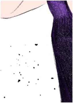
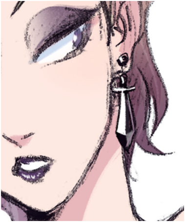
And the last step is to add details. The original sketch was done in a rather small (smaller than A6) sketchbook, so I couldn’t draw all the details like Vil’s earrings and stuff properly. Basically I just paint on a separate layer on top of everything.
And there you have it! I hope it makes sense, please let me know if you have questions.
94 notes
·
View notes
Note
Hello!! I really like the way your art looks- style, coloring, and everything!! I’m kind of curious how you draw faces, that’s one of the main things I’ve always struggled with (maybe because I used to just draw a ton of Sans and Wheatley who…don’t have much going for faces)
Anyways that’s all!! You don’t have to tell if you don’t want to!
-Starlo fan
hii! thanks for the ask :D made this Real quick 4 u:

sooo im admittedly not that good at drawing different facial features/ expressions. the main things i do though are big eyes, lines on the nose and cheeks, big ears. i want it to look sorta like a mix btween cartoony and anime??
might be a little long so more under cut :]
whenever i draw a character, first thing i do is choose a shape that suits them! ill base it on personality most of the time. (explained further next paragraph). for the eyes, theres 2 main ways i draw them! ill either make the pupil half black with a highlight in the middle, or make the eye 2 colours with a highlight on the side!
A big thing i like to focus on is shape language! an example of this is how i draw Pearl and Marina from splatoon! i use sharp, triangular shapes for Pearl, on her eyes, tentacles, clothes, basically everywhere. For Marina, I use round, circular shapes! ig to portray the contrast in their personalities? something like that. My main inspiration for this and my artstyle in general is starrysharks (twt & tumblr)!!!! please check out his art its so shapey and colourful probably my favourite artist ever.
if u struggle w making faces even, what i do is duplicate for example most of the time ill draw one eye, duplicate then flip it lol. u could also use the symmetry tool!! i usually never use guide lines and the sketch is my lineart most of the time.
big piece of advice that helped me a lot is to copy!! if you really like the artstyle of ur favourite show, try redrawing a screenshot from it! just remember to give credit if u reference from an artist👍👍
aaaand thats all i can think of to say!!! hope this helps! thanks sm for reading, have a nice day :D i drew a starlo for u!!!!!
-another starlo fan
64 notes
·
View notes
Note
Do you have any art tips for beginner artists?
hi! i'll do my best to list the most useful ones for me from the top of my head! but if you're asking about something specific, lmk too!
always use references! this is 100% the fastest way to improve quickly! and don't forget if you're posting artworks using references, to always ask for permission if needed and to credit the reference! here's a very good post with links to various art tutorials and references :) try to do things out of your comfort zone!
i remember my sister drilling this into my head as a kid lmao: if you're going to draw people, make it a habit to draw the whole body, not just a face or bust. this way you can improve drawing the face and body at the same rate, rather than perfect the face and have like. a shoddy body HAHAHA (<- speaking from experience - my sister warned me but i still did not listen) here's an example from when i was 12 lol i went so hard on the eyes but my anatomy wasn't great so the drawing looks kind of goofy
if i'm being honest nothing has really changed even now HAHAHA you can still tell i spend too much time on the faces and neglect my anatomy studies a lot 🥲
3. don't worry too much about building a signature art style if you're a beginner! experiment and imitate art styles that you like, and it'll eventually develop into something you're comfortable with
4. speaking of art styles, Naoki Saito-sensei does very in-depth art videos for people looking to develop and improve their art, and he covers a variety of different topics! the link i provided is for his new YouTube account, since his first one was unrightfully terminated :( since it's new, there aren't a lot of videos up yet but he'll be re-uploading all his old ones soon
5. this video by tppo is also a useful tutorial/explanation for style breakdowns, using Mika Pikazo-sensei's artworks! also another good reference for building art and colouring styles
6. unless you're going for a specific art style, try not to use black colours for shading. Instead, try using a darker version of your base colour with the hue slightly adjusted. it's a little difficult to explain so i made a tiny diagram underneath:
it makes the colours pop a lot! Kurahana Chinatsu-sensei and Akiakane-sensei are really good at doing this 😭💖 that can also apply to lineart! but again, only if you're going for this kind of colourful art style :') do what feels right to you!
7. lastly try to enjoy drawing! if you do what you enjoy, learning and improving will come so much easier to you :) i can understand the urgency to improve (it's like my default state of mind 🥲) but if you keep focusing on that, drawing will eventually just start to overwhelm and frustrate you. try to combat it by doing something self-indulgent! i like to draw my ocs whenever i start getting burnt out :')
8. actually i lied this is the last one!! never give up!! it's so easy to feel bad or frustrated about your art no matter where you are in your art journey, so what i like to do to try and fight that is to look at my old art and compare the improvements! here's one of the earliest oc drawings i could find from my childhood vs my most recent oc drawing :pensive:

#this is a tiny psa to please dont bully me for my incredibly early 2000s core naruto oc i was a victim of the times#/lh#i hope this helps a bit! i'm really bad at making these lists im so sorry 😭#but from the top of my head these are the most helpful tips that have rlly stuck with me since i first started drawing#also confession#i'm actually very guilty of rarely using references bc im lazy#thats why my art sucks!!!!!!! dont be like me#also i'm so sorry for this incredibly late reply#!#ive been thinking for the longest time on how to answer it and this is the best i could come up with 🥲#za answers#Anonymous
216 notes
·
View notes
Note
Hey remember me?
Lol but uh can you show us your drawing process?-
Also sorry for about being annoying
Yep yep ofc I remember u teehee
and sure! I can show u, full w/ images and explanations
here's the finished thingy if u can't be bothered reading all that shi

First I just start with a simple circle with guidelines for the face
then I actually add the face, almost always with the head shape and hair (if the character I'm drawing has any, since I'm drawing Mugman, I don't need to add any hair)
after that I draw in smth like a rectangle, except it's kinda not a rectangle? I forgot the word help
w/ that I put an oval where the closest shoulder is, for some reason I only do one tho which is kinda weird
I just go straight to clothes at that point, add the arms after since they're less important than the rest of the image lmao /j

most the time I add abt 3 or 4 separate layers for the sketch so I can modify certain parts w/out ruining the rest of it or making it too messy
once I'm done w the sketch I turn the opacity of it down like, real real low, inbetween like, 10%-20% so I can see what I'm doin with the lineart (side note, linearts usually a really dark colour but almost NEVER black)

Once linearts done I add another layer and colour w a lil tool called the lasso fill, it makes colouring drawings like 10 times faster and way more enjoyable for me


after dat shi, depending on if it's a complete drawing or not, I make a new layer and shade it w the same colour I used for the lineart
sometimes tho I make it lighter so it doesn't look dry or soulless n stuff, it rlly depends on what vibe you're going with ur drawing tho
for highlights I make another layer and put it over the lineart layer. usually I'd use a yellow but light blue looks better w Mugman
Lastly I just give it some kind of background thing and I'm done teehee, thanks for readin this shi lmao
179 notes
·
View notes
Note
Poor thang.. just wanted to climb a tree 😞
Good luck on the healing process tho! About your art, who or what was your biggest inspo for your lineart/colors? I think they’re beautiful! 🫶
sighs........... such is my playful nature...........😞
thank you, it's been going well!!!! <3 as for lineart/colours.. hmm it's tough, i think all artists are continuously inspired by new things all the time.... the colours i use are honestly just all my favs, over and over again LOL! i like jeremy sorese's colours, specifically 2018-2019 stuff
i remember sophia foster-dimino(i think) tweeting(i think) that people underestimate the power of tangents, and that sometimes they shouldnt be avoided but utilized.. that definitely stuck with me, now i use tangents intentionally in my lineart all the time LOL!

27 notes
·
View notes
Note
The coloring process also
Your art doesn't seem to one or the other both are essential to making the abusolute eye candy that you make
HAHAH thanks so welcome back then
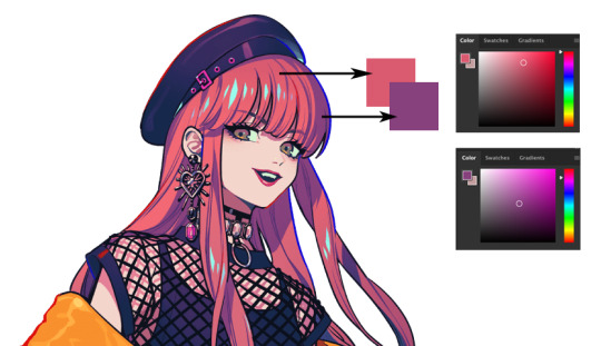
im gonna use the scuffed giovanni for this . you should have a gray background by the way (in the progress at least, white backgrounds in the end are fine)

pick a white (which is not white) (i might change it later)
base colours (i like to go pastel / less saturated so the shading can be the heavy + showy but you can do whatever)
you have all the base colours in 1 layer then you do this (described in the other post) basically you put a gray layer above it so you can picture better where the shading would be

i was going to show the next step but remembered some tips to help stuff blend better
(first one adds the tone of the skin to the bangs) (second one adds fading on the forehead) LOL now back to giovanni
above the grey layer you create a new one in the same mode where it doesnt go out of the lines and you shade with red (or any colour, its your choice)

you delete the gray layer anddd you copypaste the shading layer 3 times (in the colours i recommend :>)
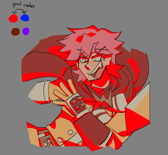
gotta look like this , i like to put the brown, red and blue in multiply (the layer mode) and play with the opacity until i find something i like (purple not that much)

(%25 brown multiply, %13 blue multiply, %5 red multiply if you like the recipe)
tada (im going further in shading but this actually is a good solid result to end in) okay okay , now new layer on top

you go and fill the shading enough so it has an outline (i understand myself) and experiment with the layer modes again , im gonna try light blue/purple and green, not pink because giovanni is already pink , he has warm colours so gotta go to the opposite side of the wheel
%13 of green on luminosity if u care, i could try flashy colours but no need to over-do it, its just him chilling

this isnt part of the tutorial i just like to add shade to his face like if he was up to something, also i made him look evil idk i dont like how he looks (bc i wasnt planning on colouring this)
now lets put colour in the lineart

better
i went to add fading to his arm because i dont want it to be the focus and i ended up adding light also to his cape LOL pretend i know what im doing (soft light layer)
im stopping here but thats it
18 notes
·
View notes
Text
“Advice Unmasked: Team Fortress 2”
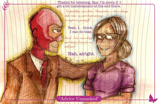
{Transcript}
Miss Pauling: “Thanks for listening, Spy. I’m sorry if I got a bit melodramatic at the end there.”
Spy: “No problem, ma chère. Remember— these things take time, so just keep aiming to improve yourself.”
Miss Pauling: “Yeah, I… think I can do that.”
Spy: “Good. Now, run along and shoot Scout for me, will you?”
Miss Pauling: “Hah, alright.”
Description: Spy giving his usual high-quality French advice after listening to Miss Pauling vent about work problems.
(Made with a hint of inspiration from the AO3 fic “A Pauling’s Attire” by Lizziefij / elrong, with her wonderful headcanon of Spy and Miss Pauling being somewhat close— specifically stylistically!
Here is the link- go read it when you can. It’s super well-written, professional, and the artwork that goes along with it is just phenomenal!! <3 :
~ * ~
Started January 28th, 2024 at 1:00AM, Home
Finished January 30th, 2024 at 4:45, Home
Art Notes:
This is a gift / apology art for the user @slimsnipes , after them being very kind (and tolerant of my incessant blabber mouth… so sorry about that... 😭) during a stream and helping improve my art skills and motivating me to keep creating!
Please, if you haven’t already, go check them out! They make wonderful art— especially Speeding Bullet-related content!!! >u< — and are just really cool in general, so if you want to be crying in awe for two hours straight (like me…), here’s the person to go to!
As for the artwork, I made it really late at night and really quickly— not because I was rushing but more because I made it during a spontaneous burst of inspiration at 1AM that even my sleepiness couldn't stop. -w-
Probably due to my inability to think straight from the tardy inspo-explosion, I made a mistake when drawing where Spy's ear and jawline ended up being WAYYY closer to his eyes than physically possible. I re-drew it in Markup and covered it up with shading (because I can't be bothered to erase the colouring and rip the paper LOL), and now, aside from the general area and lineart being slightly darker than the rest of his face, you can barely tell there was a change at all!
Plus, it helped improve my colouring a little bit, which was great because that was my initial goal with this drawing in the first place.
This work is not something I'm immensely proud of since there are a lot of flaws with it, like the entire wonky anatomy of Spy, that I feel I could have avoided if I had just made it during the day and... not so randomly... but I'm still going to post it here just to document the experience and take it as a lesson to learn from!
And, again, to reiterate, my standards are pretty low for what I post here-- anything that doesn't look like chicken scratch or scribbles-- because I want to post things that I truly express myself with, so I won't be leaving this one out!
Anyhow, that's about it for this one! Remember to check out slimsnipes and Lizziefij when you can, they are both super talented and they've really shaped the way I create, and I'm sure they'll inspire you too, in the best way possible!
Have a good one, pally~ ^.^
~ Rosain Quivan
Credits: ‘Team Fortress 2’ by Valve, “A Pauling’s Attire” by Lizziefij / elrong, slimsnipes
Image source: Rosain Quivan
Created by: Rosain Quivan {Cross posted on Amino ( Rosain Quivan )}
#tf2#team fortress 2#art#tf2 art#tf2 miss pauling#tf2 spy#chr: spy#chr: miss pauling#gift#traditional art#artwork#Miss pauling and spy
12 notes
·
View notes
Text
my drawing process (thank you @pepper-ika!)
i draw and colour for a long long time. i don't do the traditional sketch + lineart + colour -- sketches are hard to line, they're kind of time-consuming and usually they end up better than the lineart, so i just draw like normal and clean it up before colouring. i start at the head and end at around the feet, kinda like a person showering (lol). here i'm using your typical pencil brush you can find in any standard art program.

a tip i got from another artist was to colour using a thick, opaque pen brush that varies a lot in width. it saves a Lot of time. before they showed me that, i made the mistake of using a soft, painterly brush to colour my art. it hurt my wrist because i had to press really hard to get flat colour -- when all that time i could have just been using a pen brush! also, i start with soft colours because they're nicer to look at.

2. i do colourful midtones like redness in the skin or maybe a blue five o clock shadow if they have one. from this point onward, i use a flat square-ish brush combined with a painterly smudger and a soft airbrush.
i read somewhere that you should apply perfume on the moistest parts of your body so i kind of use that same idea when drawing redness. usually i do it where skin meets skin: folded arms, a crunched back, closed hands, and that place where the thighs touch the buttcheeks, lolol. and of course: the nose, lips, and ears. it makes the skin look real and warm and lively!

3. i lay down my shadows and lights, usually in that order. and at this point, i'm throwing extra shadow on wrinkles, fat, bumps, lumps, etc. a body without rolls is like an angel without wings!
also i smudge like CRAZY here. just like how it's impossible to have "too much gravy" on your chicken, it's impossible to have "too much blending" when you're drawing skin. blend that ish.
when it comes to the colour of the shadows, i always make shadows the base colour but darker and more saturated, and i move the hue a little to the left (for example: orange goes to red, green goes to yellow, purple goes to blue). i do that with, like, every colour. i can't tell if it's lazy or not but at this point i'm too scared to ask.

4. finally i make some minor adjustments like liquifying to fix lopsided eyes or oversized heads/hands. when i was in high school, my art teacher would say "great, but watch the size of the feet, hands, and neck," lolol. he was right ofc. when i go "hm... that looks a little weird," i have to trust that gut feeling because when i do fix it, it ends up looking way better. here is a horrifying gif illustrating that.

AHH!!!
alternatively you could do a messy line and color, then do a whole paintover like i did here. this is awesome for details because you dont have to go back and change the lineart - you just paint over and add whatever you want and redraw the line to fit it.
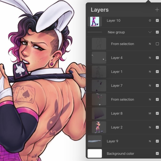
i dont really use the different layer modes that much. in this one i used a gradient map of the drawing as an overlay. idk if that really does anything major but it does create a new range of colors to play with. i also used a multiply layer to cast a big shadow over the card (layer 8) because it has this tiiiny little pattern that would be a pain in the butt to draw shadows over. everything else is pretty standard.
(and no i dont name my layers... yes i will be changing my name and moving countries)
another thing worth noting: i use airbrushing A LOT. i remember reading somewhere that using airbrushes is like. a cardinal sin. it’s not, man. it’s great. airbrushes and smudging are dope and i use them all the time.

i hope you found this helpful! have a great weekend <3
33 notes
·
View notes
Note
Heyyo! Hope this ask reaches you well nwn. I have a couple hundred questions about ur art style and storytelling methods if you don’t mind :3
Most important one: How do you draw Mewtwo fingers so well 😭😭😭😭
Also, what program(s) do you use? Canvas size for different projects? What brush settings? And how do you sketch, line and colour? Which step is your favourite? How long do you normally take from piece to piece?
How do you come up with your different AUs? Any particular inspirations? What tips would you give someone just starting out a comic on tumblr?
And uhh any general tips on getting around tumblr? Blogs you really like?
Sorry for all these questions, really big fan if you can’t tell :’D I actually really love the pride art piece you did~
So i tried answering this before and it doesnt post so uhhhhh heres to hoping it works?
1. I base Mewtwo's paws as hands, worked without the rounded digits first then moved to rounded digits so... Take that as you will?
2. I use Clip Studio Art and Procreate! Mostly, anyways XD i also sometimes default back to Paint tool Sai, or Fire Alpaca if i want a different brand lol.
3. I vary in size for different projects. My animations are different than my sketches, my sketches are different from my completed art and my completed art is different for my comics! It also helps my brain not get tired XD
4. I tend to favor my lineart and rendering! Though both of them take equally long times, i render less But i love it more.
5. Depends on the project. I can typically churn out colored pieces in like an hour or so! Sketches are faster.
6. A lot of them are inspirations of something else. Shiny AU was just cause i liked Shiny Pokemon. But Dead AU was based off Danny Phantom and Mimikyu au was a "What if" scenario of the dead au!
7. Oop, Danny Phantom for the Dead AU. Legendary Mew was based off the whole Chosen one BS XD False Twins was slightly based off of TC but was actually based off another AU where Ash and Mewtwo were sorta close friends.
8. Tagging is your best friend~ don't be afraid to interact with other blogs. If someone is being mean, just block em and move on!
9. Getting around Tumblr? I'd say reblog, follow peeps, go to your favorite fandoms/tags! You'll get mutuals in no time!
10. Uhhhhhhhhhhhhhh a lot of peeps but i dont wanna bother then with tags XD so nontagged peeps!
Phlurri
XxTC-96xX
MewtwoAndMe
Bluesues
DistortionMewtwo
Mewtales/Mewdump
Penumbra
Loupy Mongoose
Ask-Mirage-Twos
TazerPones/MegaMew and Crew
The Mew Crew
And a few more but i cant remember tumblr names djdbdb
And thank you! I have one more peice i want to finish before i forget- its a peice i didnt get to do last year XD
19 notes
·
View notes
Text
Tag someone you want to know better
I've been tagged by @wuxia-vanlifer! Thank you so much!
Favourite color: Green. Especially lime green. I know a lot of people dislike the colour, but...I love it. XD
Also, I've grown to love pink even though I didn't used to. Especially darker shades.
Last song: I've been drawing while listening to cdrama soundtracks. The last song would have been 'Chilly' from the amazing Ten Miles of Peach Blossoms.
youtube
Last movie: I honestly don't remember. I do remember watching and really enjoying The Yin-Yang Master: Dream of Eternity, though!
Currently watching: I mean...

And this isn't even all of them, because I also have Dream of Chang'an (Stand by Me), Venus in the Sky, Lost You Forever, and the Bleach anime open and ready to watch.
Also, I am rewatching Mysterious Lotus Casebook because I'm making lots and lots of gifs.
Currently reading: I don't really read much anymore. (I'm sure you can tell why. XD)
I have @shamera's fic open to read, though! Just need to find the time.
Currently working on:
I've finished the sketch for a Fang Duobing drawing and I'm hoping to get the lineart done today. (That way I can maybe paint it this weekend.)
I'll be drawing a companion Li Lianhua piece on the same paper once I'm done with that.
I recently finished a Di Feisheng drawing, but I didn't like the paper I did it on so I don't know if I want to post it.
I've finished the sketch and lineart for a drawing of Tinn from Laws of Attraction. I need to find time to colour that (with markers).
I also finished and lined characters from The Legend of Anle( 1) and Heroes (2).
Colouring and painting always take me much more time, so I usually leave that till later/the weekend.
Other than all the drawings I'm working on my protective!Fang Duobing gif collection. As of now we're at 112 gifs from 30 episodes.
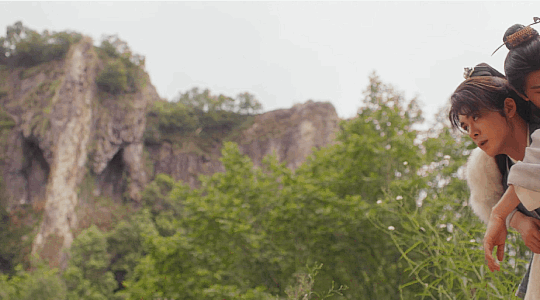
Currently obsession: LOL. Mysterious Lotus Casebook. The fact I'm working on three drawings and have already finished 100+ gifs in like two weeks should be enough of a clue, I think.
As usual, I'll tag the last few people I either followed or became mutuals with: @heyyo-heyyo , @thefakefangirl , @khahahahahahah , @purplexedhuman , @wangxianbunnydoodles , @dancing-out-in-space
(Please play if you want to!)
And anyone who wants to participate!
15 notes
·
View notes
Note
hello! just wanted to let you know that i've been a fan of your art for many years. you're one of my favorite artists and i keep your username on a little .txt (along with a couple other artists) so i can always remember who i look up to and who i hope to become as good as someday.
i love your art. all of it. even the transformers fanart, and i don't even like transformers. i especially like your choice in colors (and i never see anyone comment on it!! it's such a key component to your style and nobody talks about it!!) but i also take inspiration from your lineart and poses. the way you draw teeth is unsettling but it grabs the viewer's attention, it might as well be your style's trademark.
i'm an artist, too, and i'm not nearly as popular as you are. (... probably because i'm only on twitter, i post infrequently, and when i post i only post ocs lol.) i just want to say that you've been one of my biggest inspirations and your art drives me forward. it reminds me that if someone can continue as long as you've been going, then i can continue, too.
i haven't always had a tumblr account. i made a couple just recently, and today i remembered that you exist, so i came to your blog. and read through it. all the way back to 2019. and liked several of your posts. so if you see a rando that liked a bunch of your old posts and left you a follow, that would be me. ^^;
since i didn't have a tumblr account, how did i know about your art? well, a lot of it (mostly your JJBA fanart) is on pinterest. some of it is even credited 😭 (pinterest users are notorious for reposting fanart without linking back to the creator). so yeah, your art is on pinterest, sometimes it's credited, sometimes it isn't. but yeah, you've got a ton of fans on pinterest that can't make their presence known to you. we all support you from afar until the day we make tumblr accounts.
this got long. sorry for being weird. i promise i'll buy from your shop and support you more directly someday, but for now i remain a broke nerd. don't feel like it's necessary to respond to this, i just wanted to let you know that you inspire a lot of people, even though you probably already know that.
your art is wonderful and i encourage you to continue with it! please stay safe and take care of yourself. and... thanks for reading my little essay ^^
Ohhh Lovely Anon;;
This is genuinely so, so sweet, and I've been thinking for two hours now how I should even reply to this because I'm very touched by it ;_;
Thank you so, so much, seriously. I'm happy you like my colours, that's honestly a great thing to hear because I have absolutely no idea what I'm doing with them;
It means tons to me when people enjoy what I do, whether I can see it or not, so this all means so fucking much to me; I don't know what to say really other than Thank You a million times over, seriously. You people have been keeping me going for years now by just enjoying stuff I doodle <3 I've found my drawings on pinterest before too when looking for refs of characters and it means a lot to me that there are people like you who go out of their way to find me still ;__; Thank you!
And you don't need to buy anything from me at all <3 I appreciate anyone looking at stuff I've made! Thank you so much for taking the time to write me such a lovely message!
I wish you the absolute Best for yourself and your path as an artist, always keep on doing what you love no matter what, and keep up your OCs!! <3 That's so powerful of you!! <3<3<3
Take good care!!
#Lovely Anon#I genuinely don't know what to say imr eally touched#sorry this is such a short answer but it means so much and i just dont know what to say without repeating myself;;
61 notes
·
View notes
Text
sketches sketches sketches
got inspired by looking at some of those year end wips (by artists way better than me) and decided to post some old sketches i could find bc sometimes i enjoy the sketches more than the final illustration lol. so without further ado:
similar to the one of jon i posted above, here's a really ancient one of arya. don't know where i was going with this one i think it was just a doodle
here's a progress pic of the sansa collage i posted way back that looks godawful to me now but whatever. hashtag behind the scenes
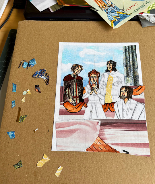
i made a whole bunch of collages that i never got around to posting (i should). here's a progress pic of one of those (as you can see i colour the necessary bits first, then add the cutouts, then the final lineart):

and here's a screenshot i took in the middle of drawing the cat and brienne scene. i actually think i overworked it a little, i liked it better with flats (also the colours look like ass here, they always look more vibrant in procreate but when i export the pics they end up super desaturated. idk why)

NOW to the fun part! so when i first read the books way back i had this notebook that i doodled scenes that i liked or made an impact on me (i guess) in. i might or might not post some in the future - they're simple pencil doodles and super old and certified rubbish but they're still kinda funny because of that lol. in any case here are a few of them in the rough sketch stage:
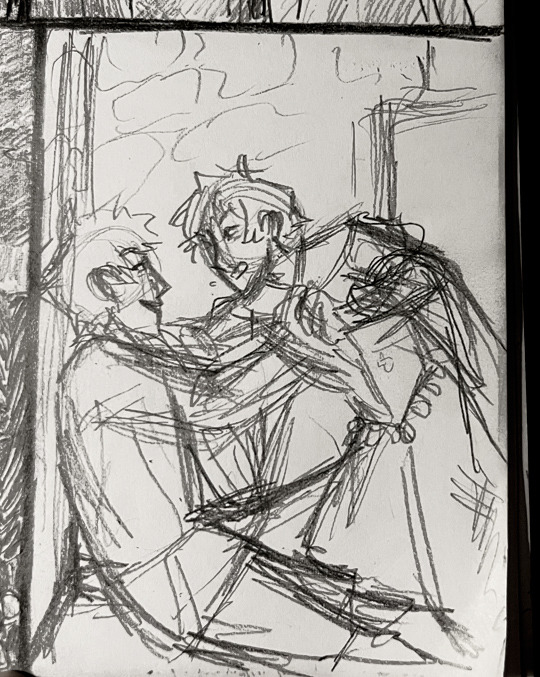

arya and gendry playfighting at acorn hall, mel visiting davos in jail (LMAO)
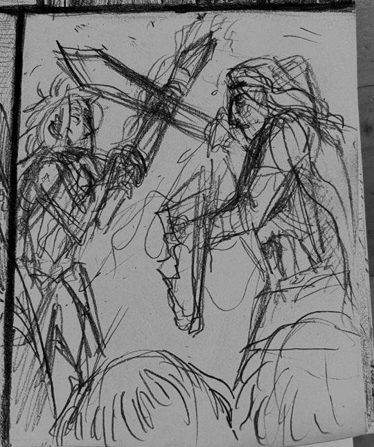
jon and ygritte first meeting (you can barely tell what's going on there at all lol). sandor and beric fight
Ok so now it's theon time. in that drawing i made of him with reek!ramsay in acok i initially yassified his crown and had to stop when i remembered it's supposed to be shit.
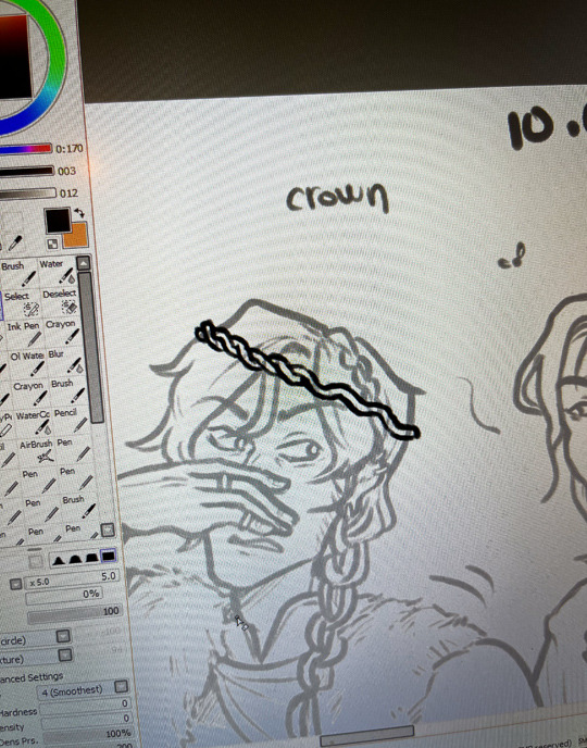
"crown" (it does look a little like worms at this stage so i guess it's not so ill-fitting after all)
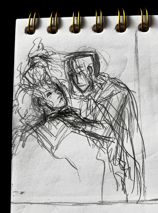
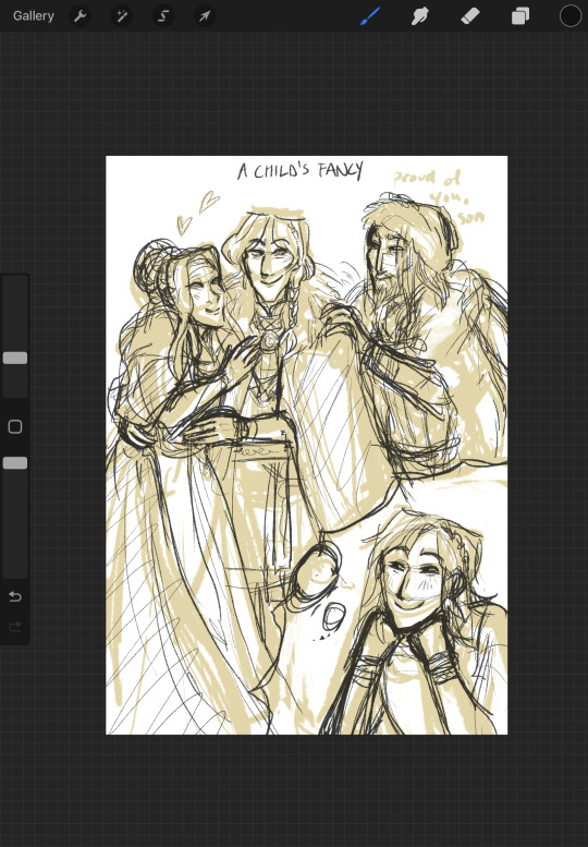
uhh anyway you all know what this next one is about. love this delusional child <3 (might just refine it to make it post-worthy so look forward to that i guess...........)
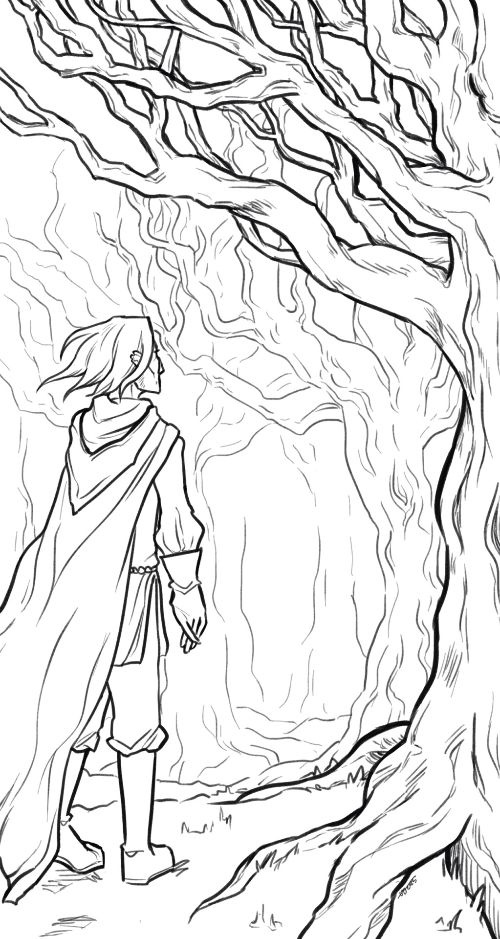
and finally the Tree drawing but it's just the lineart bc my colouring skills are... lacking
#my drawings#some of these ARE incredibly cringy imo but i'll put myself on blast idc it's funny#there are more for sure#i wish i drew even more asoiaf related stuff so there could be more Quality but unfortunately it's all like this#sketchpost
5 notes
·
View notes
Note
i do adore your art style a lot, but i totally understand your struggle with shading and backgrounds as well- i also feel like my art takes forever, and i enjoy doing lineart the most. once flat colors are down everything after feels like such a slog. but i can guarantee others who see your art can tell you are great at drawing. elden ring characters are ridiculously difficult to draw yet you manage to make them look so consistent every time. if you dont mimd me asking, how long did you spend drawing the catboy mohg photoset? I feelike im faster than average and even i think id spend like a week+ on it!
oh god, i don't even know. the file with the sketches was last modified on the 14th of october, and while i can't remember exactly how long i spent on the sketches, it was probably at least a few days (the last modified date of the drawing i did before them was the 10th of october). so about a week, give or take a day is probably how long i spent on them. which is why i'm a little sad that i couldn't make them look nicer and more appealing, because i worked hard on them (and was generally excited about drawing them because i thought the idea was cute and funny) and really liked the end result...until it was time to colour. it was all downhill from there lol and idk, it sounds weird and might not make any sense but i feel like i can't do my own drawings justice. like i'm usually happy with the poses and anatomy and expressions and such, and i'm happy with the lineart, but i feel like being bad at colouring and not having an eye for it drags my art down?
not to make a cake comparison (i hate the two cakes metaphor so much lmao) but it's like. i make a cake that tastes nice and is of good quality, but i have no idea how to decorate it so it just doesn't look appetizing. or maybe that's a really bad comparison and i'm just stupid.
25 notes
·
View notes
Note
I really like your first iteration of Tulia and Miguela, it looks like you spent more time on it, they're beautifully back-lit, the structure of their faces conveys more depth and their features look more unique to them. You have some delicate details which is really nice, I love em both tho, I think that is a fun exercise. Your art is lovely ♡
Thank you for the compliment! ❤️ And for the feedback too!
Yeah, i never said the first picture was bad, i really like it, it holds a special place in my heart, especially since it's started my journey. I remember feeling allll kinds of butterflies in my stomach while drawing it. But! I will talk about the improvements that i see in the new version:
(Oh boy there's a lot of text, prepare)
The back-lit lighting is pretty, but makes no sense in this particular piece. I tried to do it when redrawing, but such lighting would mean, that i would have to put the source of the light behind the ladies. The prettiest option would be to make them stand in front of a big beautiful landscape. But i didn't want to cheat and make myself from the present look better by changing the composition of the picture, so i kept that blank wall in the background. I did decide to spice it up a tiny bit and changed the lighting to fill the empty background with the shadows of the ladies.
Also! In the old version "the wall" is done very lazily with just a textured brush at whatever paste. In the new version i actually took time to paint the wall myself.
What I wouldn't agree with you on is the structure of the faces. I was still figuring things out at the point of the first drawing, so the proportions are all over the place. To me it is especially noticeable in the placement of the eyes. And in the postures of the ladies. I also wouldn't say that the features changed and became less unique, i'd say the opposite actually, they became sharper, more defined and unapologetically themselves. Just look at Miguella's nose proudly sticking out hahah
When redrawing this picture i also didn't want to change the rendering style, cause that wouldn't be fair, so i kept the simple "lineart over flat colours" style. There are some fully rendered pieces with Tulia and Miguella, like this one or this one. There they do, of course, look more realistic. But i see no use in drawing more realistically in such simplistic style, so i just showed off what my drawing style has evolved into during this year. Previously i didn't have a differentiation between more stylistic and more realistic types of art. NOW i do.
Also. The costumes. They now look like actual historical costumes. Not just cheap halloween knock-offs lol
So in conclusion to me it's pretty clear that now i actually know what i'm doing and every decision in my artworks is mindful. Which i consider to be a success!
4 notes
·
View notes
Last Seen Blogs
cursedofthestars
COTS - Cursed Of The Stars

catboykizaru
題名未設定
sweet-26
dolce.26
ate2much
Ate 2 Much

shamelessmilkshakepanda-blog
Insurance