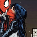
#I love the clean linework so much!!
Text

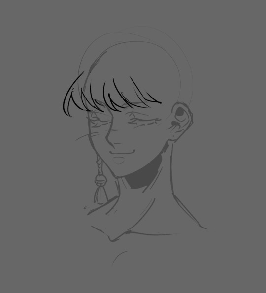
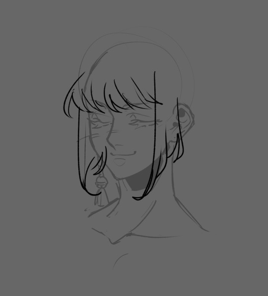
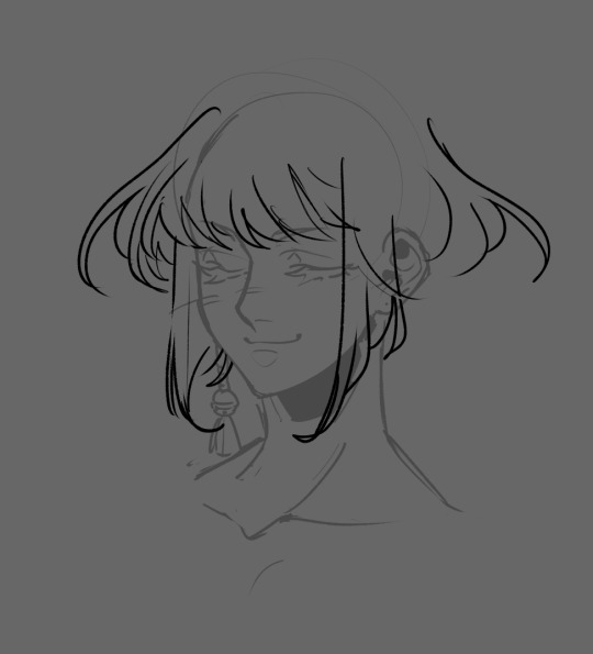
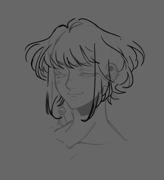
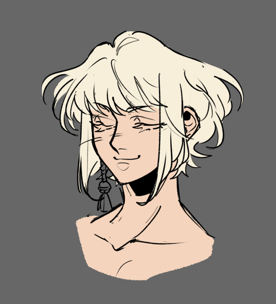
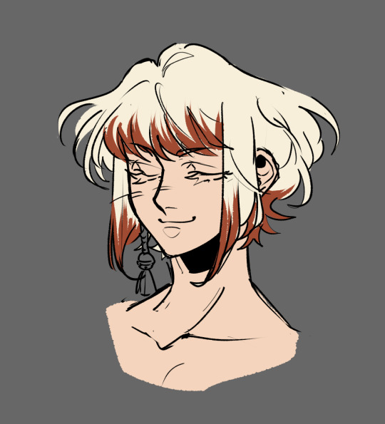
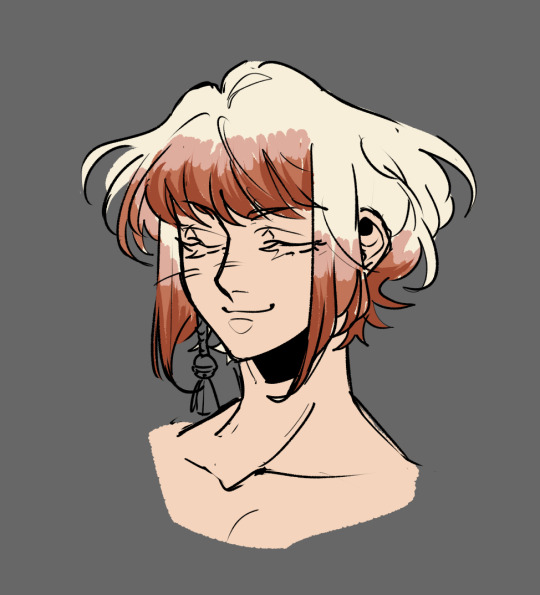
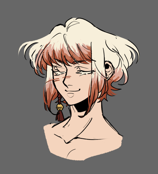
100 Days of Miku
Day 4. Unique Parade
#my art#hatsune miku#miku#vocaloid#miku fanart#I was just playin around with this one#I should have been a bit looser with my lineart but I love clean linework so much that i struggle to loosen up#Unique Parade
18 notes
·
View notes
Text
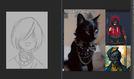
I'm taking a drawing course and we have been drawing statues with charcoal for the last two classes and I drew these four of the same statue!
First the big one (A1?) (used a brush and the charcoal dust to make the softer shadows!),

then the A3 size linework one,
A3 sized squiggly one,
and the last one is A4 sized drawing from the front of the statue with my left hand as a challenge.

And here's the statue (squiggles to cover another student to the side)
#charcoal#sketches#life drawing#kinda :D#this class has been fun and I've drawn so much!!#won't be posting any of the previous stuff because we have been drawing one another and I don't have permission from the other students#but it's been really cool!!#I struggled with this A1 sized one. it was fun trying out this medium and trying different ways to draw and “paint” with it#I used a paintbrush to blend it a lot and so it looks a bit smudgy but I think I got the values down pretty nicely with it#I have been loving this clean linework style using more angular shapes so I had to draw like that too :D#and the teacher likes to draw in the squiggly style and I hadn't tried that before so I had to do that too#a#my art
4 notes
·
View notes
Text
LOVE the japanese kekkaishi and birdmen mutuals I have on Twitter. I am reading all your text posts through Google Translate and I'm captivated. I'm waving wildly from the sidelines. And occasionally. Very occasionally. We will write each other compliments that are very hinged and normal at each other
#just thinking thoughts...#it is taking me EVERYTHING to say normal compliments.#'I love how clean your linework is! rei and rui look like they're having so much fun!'#instead of#. you know#GHLKGHLKGHDSGSDG i am going to EXPLODE I AM. SHAKING THEM!! THEY ARE LAUGHIONG AND SMILING AND UNBURDENED! ! ! !#I NEED TO BURY MYSELF 10 METERS BELOW THE CRUST OF THE EARTH IMMEDIATELY#crunching your linework with the beastlike viscerality of biting through 10 pringles at once#and such.#so normal. i am so normal. i can get. a good grade. in. compliments.
7 notes
·
View notes
Note
art I did instead of sleeping cause I made bad choices
!!!!!!
!!!!!!
!!!!!!!!!!!!!!!
THIS IS SO BEAUTIFUL OH MY GOD
I love your art style it's so shiny and your linework is so clean!!!! this makes my eyes go brrrr the background and the lovely flag just AAAA thank you so much you are so kind!!!!!!!!!!!
1K notes
·
View notes
Text
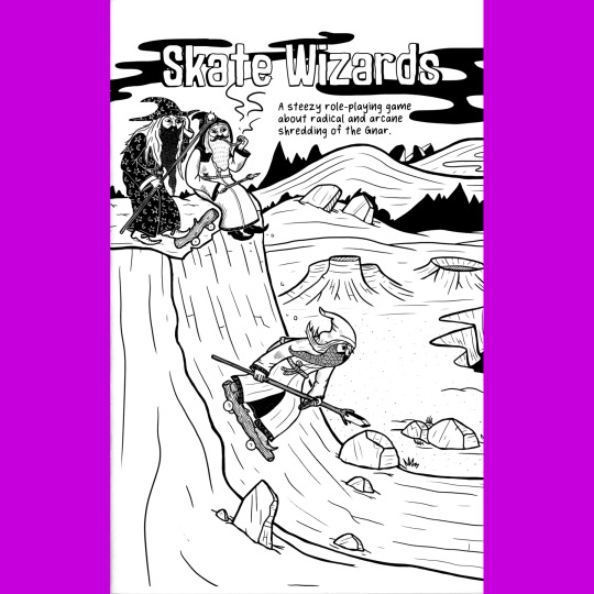


Skate Wizards is another zine that feels like it should forever be a zine, never a book. A collaboration between Michael C. Hsiung and Loot the Body, it's about, well, skating, cool tunes, wizards and…uh…pipe weed that is totally medicinal. The back cover perhaps says it best, “Once the world was cool. Then it sucked for a really long time. How it has a chance to be cool again or suck forever. It’s all up to the Skate Wizards!”
The system is based on Maze Rats (which I am unfamiliar with) and Nate Treme’s In the Light of a Ghost Star (which I am). This boils down to a lite, three attribute D&D derivative with some unusual spells. Each skate wizard gets the same Permanent spells that they can cast at any time — Ramp, Sidewalk and Rail — which conjure the necessary skating surface. They can also cast one Rando spell per day, the effects of which are determined by rolling on a table and mixing descriptive words, which are then hashed out by the player and the GM. I just rolled “Dope Expanding Fire Tree.” Finally, a Skate Wizard has one Bootleg spell prepared from their collection of skate videos that allow them to perform a specific reality bending trick, like defying gravity for five minutes. There are skater specific magic items and if a Skate Wizard’s health drops to zero, they become a Poser and roll on a table of six lame-o fates they suffer in their new normie existence. A big heap of adventures and a table for generating skate trick names rounds out the package (though, online, you can also listen to the kickin’ soundtrack).
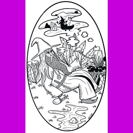
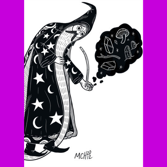
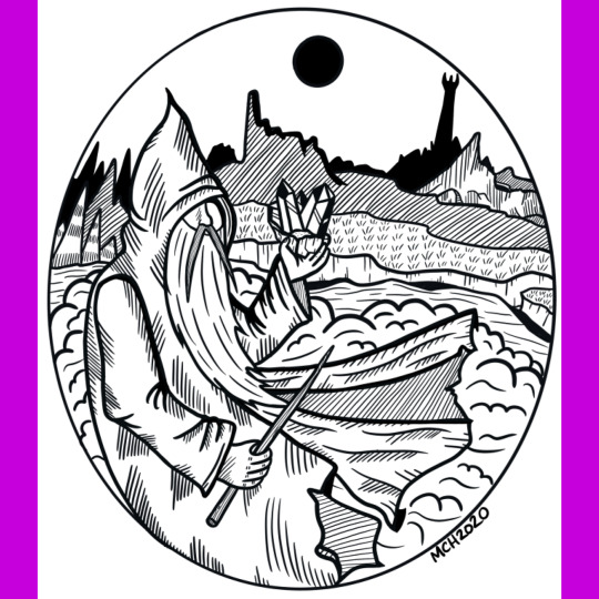
It’s a real treat to have so much of Michael’s wizard art in one place. I love his bold, clean linework and how he often flattens details and patterns so they look like textiles or stitching. And the illustrations are just bursting with humor and personality. Classic.
121 notes
·
View notes
Note
Hey my friend love your art! Have you ever taken the time to describe how you paint/draw your art? I'm so very interested in it!
I feel it's nothing remarkable. It starts with references and a sketch
Then I move on to linework. I used a few brushes but this step is pretty much the same and the end result is either clean or messy to fit the needs of the piece. There's some colors in this particular example because near the end I went back and added highlights and other tidbits and didnt see the need for a new layer.
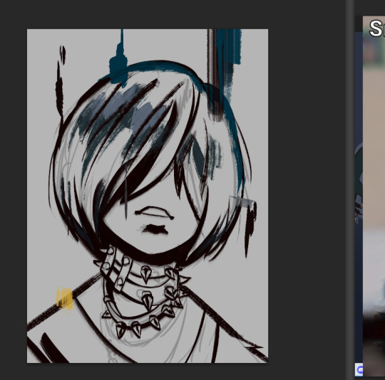
Then it's the colors. I color pick a lot because I'm colorblind and I don't trust myself much with it. I follow references (lighting, volumes of face) and also go with what I know (hair and jewelry). For this particular style I try to keep brush strokes visible. I use square bristle brushes to replicate a traditional painterly style and add texture. Important to keep your light source in mind, I forget all the time.
Then at that point, the drawing is pretty much done and I add a background and other details that are best placed at the end when most things are already in place. This takes like an hour and a half total for this kind of drawing. Bigger drawings with full body characters, cleaner lines and complex backgrounds take much longer, upwards to 6-8 hours depending.
It's all pretty standard to me given I've been doing this forever but hopefully this is useful to you. I use photoshop CS6. Not for any reason other than it's what I learned to draw on in 2012 and did not really want to try anything else.
300 notes
·
View notes
Text
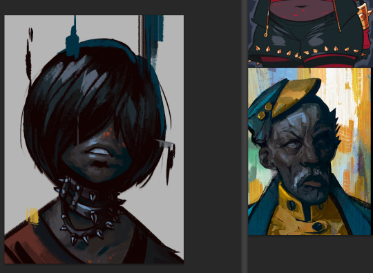
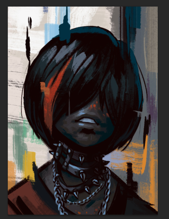
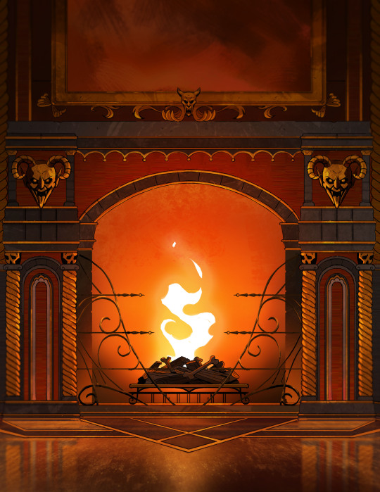
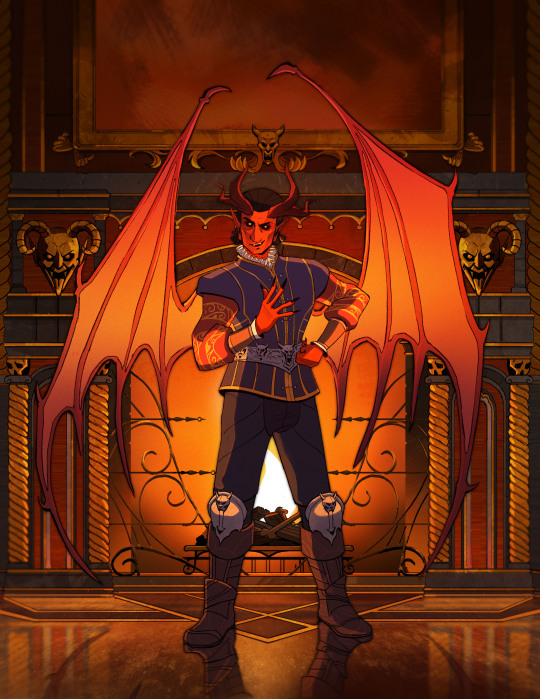
Here are some process shots for this one of Raphael from BG3! That magnificent bastard...

So I started out with a sketch of Raphael. He's got such a charismatic swagger doing the whole "What's better than the Devil you don't know? The devil you do" scene. I just wanted to do a caricature study and have a bit of fun.
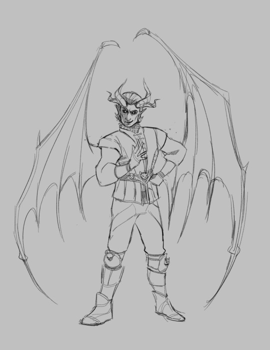
Moving from rough sketch to clean line art is always challenging for me as I often get bored or what was originally loose and fun can become stiff.
I had to redo the linework twice because I didn't like how the first one turned out! Second time is always the charm.
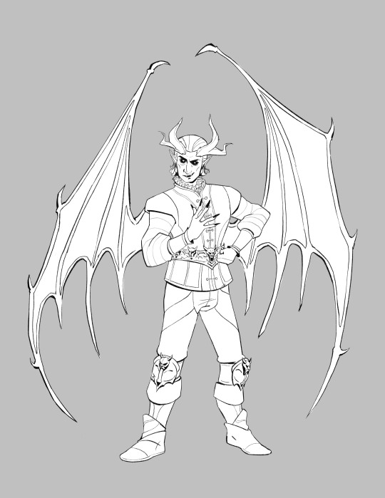
I initially only planned to draw the character but I love the design of House of Hope too much, so I went back into the game and took a bunch of screen shots and sketched out the rough bg.
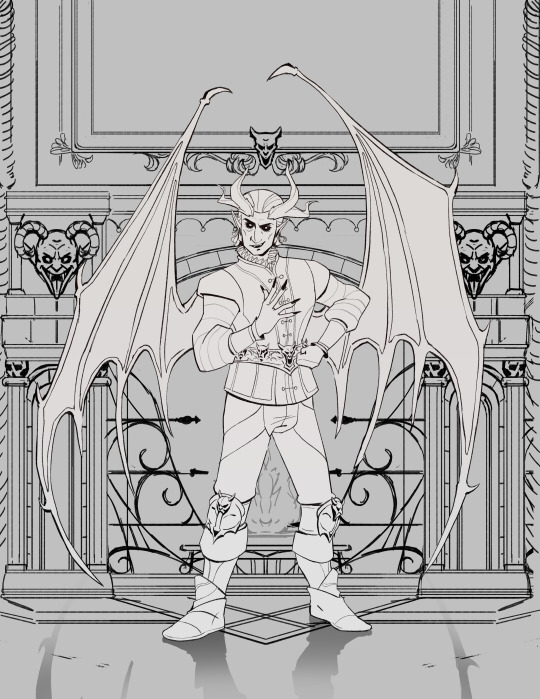
Then I went ahead and cleaned up the bg. At this point is when I group the layers properly, so there is a clear separation between foreground, and background as well setting up the layers for animation. (Making sure the fireplace guards overlaps the walls behind it.)
At the next stage I adding in the flat colors. I wanted to keep the style treatment of this piece more on the cell shaded/cartoony instead of super painterly. So I keep the color treatment fairly flat with a small amount of texture with the intention to add lighting as a fx overlapping treatment instead of painted in.
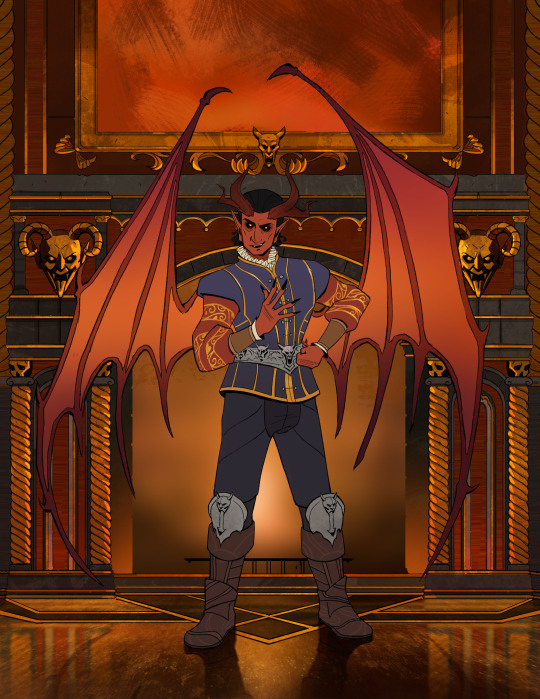
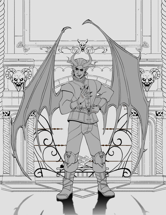
I work on the characters and the bgs at the same time to keep the values and color temp consistant, constantly adjusting as I go. From habit from work, I always paint the entire BG JUST incase I need to make changes or make adjustments to subject in from. Here is the bg all done, with fire painted in as a place holder.
And finally, adding the final lighting layers added on Raphael. I keep it simple here, just a redish/purple multiply player with the areas in the light masked out, and inverse mask on an orange/red overlay layer of the areas in the light.
Animating the fire took ironically the longest, the animation tools in photoshop is clunky and I haven't animated since school days. I looked up a lot of references and tutorials! It's not perfect but good enough for me!
#raphael bg3#raphael baldur's gate 3#bg3 animation#bg3#badlurs gate 3#bg3 fanart#artists on tumblr#sketches#drawing#art#artprocesses#art tutorial#bg3 art#art process#art style#animation#bg3 spoilers
131 notes
·
View notes
Note
First off, love your art so much and love watching your progression! The mage & the knight is my fave one but I can't find a version with just the linework on your shop. Do you have any plans to add it? Xxx
Heyyyyy thanks so much! So I had a look at the photoshop file and I think the reason I hadn't extracted the line art before was because my layers were a lot messier back when I made that one :P
Took some time to extract it and clean it up and it's up in the shop now :D
129 notes
·
View notes
Note
Do you have a coloring tutorial or recommended digital brushes? I love the way you render! It feels polished while maintaining the roughness and charm of a sketch!
I’m an artist who can get linework down pretty easily but when it comes to rendering that’s where I struggle. Any wisdom helps! ❤️
Hello!! Thank you so much! <3
I did a simple tutorial awhile ago but It's not the best
Rendering is also my weak point but I can outline a few things I do!
But overall my Process is:
- rough sketch
- clean sketch/lineart
- flat colors
- shadows
- highlights
- merge layers and use adjustment filters to get the look i want before I start rendering ( Color balance/hue + saturation/gradient maps/adjustment layers)
!! This is generally where I stop if i am not doing a painting and keeping it as a lined drawing !!
- I will add finishing details like eye shine etc.~
DONE
if I am doing a painting styled piece i keep going.
- I will start just painting on top of everything
- I generally just stick with the same brushes I sketch with because I'm comfortable with them and I find switching brushes to be kind of tedious. So its the HB Pencil and Basic Sketch a lot of times.
- Use the eyedropper tool to pick colors to blend and using adjustment layers like multiply to deepen shadows then merge down again.
- Using to many layers makes me frustrated.
- Render render render
- When I'm happy or just don't feel like I want to work more on it I add some noise and chromatic aberration and Viola!

I use almost all of the adjustment tools but the big 3 for me are:
Color balance (this helps me adjust my color choices and unify the vibe of the piece in going for)
Noise! adds some nice grain to the art and makes it a bit more tactile.
Chromatic aberration just adds such a cool look and depth.

as for brushes I have a page on my Caard that lists my most used ones
I have a tag on my page with tutorials as well
I hope some of this helps!
#redundantz speaks#ask#redundantz ask#brushes#tutorial#art reference#art tutorial#art tips#im sorry this probably isnt what you were looking for im pretty shit at explaining how i do things#long post
66 notes
·
View notes
Text

✦•······················•✦•······················•✦୨୧✦•······················•✦•······················•✦
ℑ𝔯𝔬𝔫 ℌ𝔞𝔫𝔡𝔰
Ferrus Manus x female oc (Argena Seeva)
Other parts in the reblogs
Ferrus, in a bid to one up his pain-in-the-ass brother Fulgrim, takes up drawing. Gets some reference help from his long suffering friend and senechal, Argena.
Part of my AU I have cleverly called the Primarch Wife AU. Happy endings, the boys get the help they need, Big E is a good dad and, most importantly, everybody gets a wife. Because big husband and small wife makes brain go brr
Sexual content/NSFW after the cut - Very lewd-but-not-lewd touching, Ferrus jacking off to his future wife while trying to get work done, idiots in love.
@thevoidscreams @pringles-plaguehaus
✦•······················•✦•······················•✦୨୧✦•······················•✦•······················•✦
₊˚ ‿︵‿︵‿︵୨୧ · · ♡ · · ୨୧‿︵‿︵‿︵ ˚₊
“Gena?” Ferrus asked, sounding uncharacteristically nervous. “I have a…strange favor to ask of you.”
Argena put down the loop of silver she’d been polishing and turned around on her stool to face him as she heard him out. Throne, he even looked uncomfortable, and she wondered what exactly he needed that he was looking so hot under the collar. Ferrus Manus was many things, but wavering was not one of them.
Actually he was kind of cute like that.
She mentally slapped herself almost as soon as the thought crossed her mind. HE. IS. YOUR. BOSS.
She’d been with him for over a year and half at this point. It felt like it should have been longer. Falling into the role of his senechal had been so easy after a while. Especially after they’d started spending more time simply enjoying each other’s company. He was a surprisingly layered man once he opened up enough to show it. And, she heavily suspected, a lonely one too. So they’d gotten close more easily than she would have first thought. It even showed in the way he addressed her. Gena, a more tender nickname than her given.
“Does it have anything to do with your ongoing attempts to one up your brother?”
He rubbed the back of his neck. “It does, yes. Look, I can’t help it. Fulgrim has been driving me mad recently, so I want to pay him back in kind.”
“I know, I know. And if you pull it off you’ll make him absolutely seethe.”
“It” in question was Ferrus putting a serious effort into learning how to draw. He could already, but it was an entirely different kind. Technical drawings, machine blueprints, weapon schematics. Nothing really artistic, although it could be counted as a form of art in its own right if you asked her. Watching him work was hypnotic, the movement of the pencil or stylus in his metal hands impossibly graceful. Elegant even.
But most people didn’t see it that way. Resident artsy fuck, Fulgrim, certainly didn’t. Constantly making little jabs and jokes at his best friend’s inability to produce anything else than purely practical drawings. Finally, Ferrus had enough and announced to her in private that he was going to produce a piece of actual art better than anything Fulgrim could do (and he wasn’t as good as everyone thought he was, including himself) out of pure brotherly spite. The early results were rough, but promising. Argena herself had quite a bit of skill, picked up from her goldsmithing hobby, and he’d come to her with practice sketches, rudimentary shapes and simple three dimensional objects. It took him a while, but he was definitely getting it. His talent for technical drawings was beginning to shine through with the clean linework.
In short, it seemed he might actually do it.
“That is the goal.” He said, just a little smug.
“So what do you need me for, pray tell my lord?” She prompted.
The Primarch seemed to steel himself for a moment. “Well…I feel I’m ready to move on to…organic materials now. I can only draw my own tools so much before I cease to learn any more from the exercise. I was going to ask if I could study you. Your anatomy, I mean.”
And it already sounded like that would involve less clothes than she started with that day. “...Study my anatomy? How so? Moreover, why?”
“Feel up your body. Your muscles, skeletal structure, general build. How everything connects and moves together. I find that I learn best when I am up to the elbows in it so to speak, so being able to touch it would be the best thing. You are the only person I feel comfortable coming to with this. It is, ultimately, quite a petty thing I’m after. You have been very understanding of me. More than I thought would be possible.”
Ferrus paused for a moment, wondering if what he had to say next was even a good idea before deciding he’d take that chance.
“Also, you are objectively a very beautiful woman. Whatever someone’s personal tastes may be, nobody could look at you and deny it. And subjectively, I think you are a beautiful woman. For those reasons you’d make the best subject for what I’m trying to accomplish. If the goal of art is to create something pleasing to the eye, something that captures the beauty of the world and the enthusiasm of the creator in a still image, you would be a perfect basis. Not like the mess of colors and lines Fulgrim throws on his canvases.”
He spoke so frankly. Ferrus was always a very no-nonsense type of person, but to have that direct, blunt nature used in such a glowing description of her was something else entirely. Because you knew for a fact when he said something, he meant it. It made her feel very warm inside.
“And this is purely for research, right?” She asked tentatively.
“Purely objective.” He swore. “And I won’t go any farther than you want or touch you anywhere you don’t want to be touched. I’ll fill in any gaps in my knowledge with an anatomy book. Just tell me where to stop, and I will.”
Somehow a Primarch who’d grown up in the wilderness eating sand had a better concept of boundaries than many people.
“Well...I trust you, so I suppose it wouldn’t hurt.” She said after a moment, rubbing her upper arm. “I’m willing. Let’s do it.”
He gave her one of his rare smiles (that seemed to be becoming less rare nowadays come to think of it), genuinely grateful. It made her feel more at ease with the agreement. Who knows, it might even be fun.
₊˚ ‿︵‿︵‿︵୨୧ · · ♡ · · ୨୧‿︵‿︵‿︵ ˚₊
#warhammer 40k#warhammer#warhammer 40k x oc#primarch x oc#primarch x female oc#mating press march#ferrus manus#ferrus manus x oc#ferrus manus x female oc
31 notes
·
View notes
Text
Process Post
Hi everyone! Here's a process post on my previous Rolan painting study.
Time-lapse from Procreate above.
More details, inspo, references, and writing under the cut:
I haven't drawn or digitally painted in years but Baldur's Gate 3 got me drawing fanart, especially Rolan. I love his design and storyline so much. I draw him almost every day, whether as a warm-up sketch or full illustration - and I can see how much has changed from when I first started drawing him to how I draw him now. More importantly, it's crazy amazing to have found a community because of an NPC. Also, receiving all the love and support here has been crazy wonderful, I read all your reblog tags and they always make my day - thank you sm.
Inspo / ref image board on left, my clean up sketch on right.
Linework and inking are fun for me but I struggle with color, rendering, and digital painting. I find that referencing artists and images helps immensely when I paint, so I often collect images and combine them into a board. J. C. Leyendecker is a big inspo for me, especially his color, mark-making, and poses. I also ref a ton of in-game screenshots, the one above is from @ / emerald_witch9 on twitter. I use the iPad side-by-side window feature so I can look at my image board and Procreate at the same time.
I like painting in this style, but it does take me awhile, so I'm not sure how long I'll continue to paint this way. However, I think it'll help me develop a quicker and more personal sense of render style.
Lastly, here's a detail shot of my paint study because freckles hah.
34 notes
·
View notes
Note
would you consider dropping some tips on how you color? your art always has such a nice feeling to it
Thank you so much, and yes, absolutely!
So... I have been agonizing over how to answer this question for over a week because I tend to make a lot of my major decisions based on what looks and feels good to me in the moment. It’s sort of hard to explain. Then I started getting philosophical with it (“how does one color? How do I explain aesthetic?”), and I started rambling, and had to cut the answer way, way, way down lol.
But here’s what I can help with right now. I think the most important part of how I color is my tools and what they allow me to do. These are currently my favorite brushes to use:

From top to bottom, I use Kyle T’s Gouache for just about everything. A lot of my recent pieces are done entirely in that– I love the chunky texture and how the pressure mimics traditional gouache. It’s great for children’s book illustrations, and filling linework, and realistic portraits. She is my soft wife and I love her.
I practically never use the default hard round. Ignore that.
The roller brush is another one I use for painting. It was my go-to before KT’s gouache, so you’ll find it a lot in my older work (and as a big texture thing in my current works). The “Sampled Tip” below that one I usually use for children’s book styled illustrations. It’s like a really dense, waxy crayon, so it’s fun for textured lines and details.
I always paint in my own shadows and highlights, but I like to use the soft round if I want to blow the shadow or highlight out. It’s for extra large areas.
And finally my pencil. I use it for sketching as well as linework, if I plan on doing a linework-centric piece. I don’t think there’s much of a difference between the two there… one is probably smoother than the other.
______________
The reason why I like textured, pressure-sensitive brushes so much is because they’re important to how I paint. When I blend, I don’t use a blender brush or a smudge tool. What I do is layer two colors– lightly– then use the eyedropper to select the color between them and continue painting with it. That’s probably the key to most of my work. I’ve gotten pretty fast at it, so I’m constantly selecting colors from the painting and reusing it throughout my painting.
I still use the color-wheel to hand-pick what I think will look best, though. This is probably going to be a really frustrating answer, but I choose color palettes based on basic color/lighting theory combined with personal aesthetic preference. It can take some studying (of both theory and other artists’ work). If you’re ever looking for a really great reference on the former subjects, I highly recommend Color and Light by James Gurny. Even if you’re not into watercolor or dinosaurs or realism, the guy is a master at explaining all that different stuff in depth.
Shape and negative space are also pretty important to me, but that's a whole other thing. And as a side-note, I recommend following more children’s book illustrators. Their work may look simple, but a lot of intention goes into how they use color, shape, space, and texture.
Also, on texture, I hand-draw most of mine. I love to add little scratches and drops and splashes when the painting is almost over. It's one of my favorite things to do :')
____
Now, the other most important tip:
Once I’m happy with the sketch/linework, and once I’ve laid down the basic colors of my piece, I do a Really Terrible Thing. I become a graphic designer’s worst nightmare and collapse everything onto one layer.
Then I paint directly on top of it, linework and all.
I do this for a lot of reasons, but mostly because 1) my tiny brain is overwhelmed by the clutter of too many layers, and 2) it forces me to approach a piece as if it was traditional media– a process which I find a lot more comfortable and rewarding. I paint right on top of the base colors, and right on top of the linework, effectively redoing and cleaning up what I already have there. Even if I'm working with a blank background, I'll paint a new blank one on top because it gives the feeling of a more unified piece, if that makes sense.
Basically, I approach my drawings as if I’m using traditional media. I like chunky brushes, utilizing (what I personally think are) interesting color combinations and textures, and smashing everything down onto one page so I can just paint.
Anyway, please let me know if there’s anything specific you’d like me to go into detail on, any pieces of mine you’d like to know how exactly I went about it, etc etc etc. I’m happy to answer ^^
114 notes
·
View notes
Text
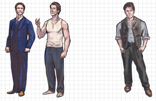
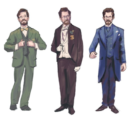
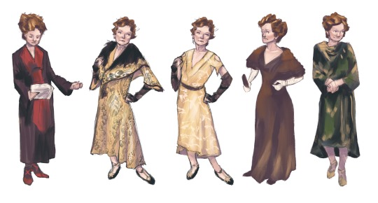
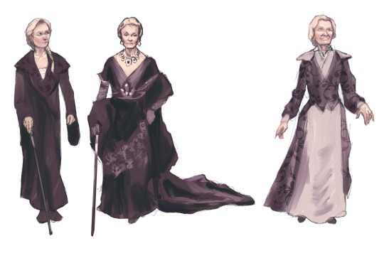
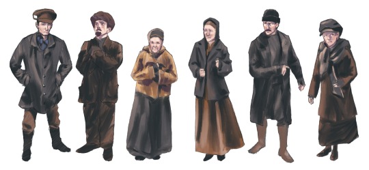
we're almost to the halfway mark, so i thought i'd share another progress update on this little (big) project!! (previous update)
i've almost finished drawing half of all the assets (according to my spreadsheet) and then we can start assembling them into a "book." the bulk of the assets are characters/costumes, but i've also completed several props and started working on some backgrounds as well. I need to decide how the book will be laid out before i make much more progress on those, though. i've been trying to hold off on finishing the principal cast because i think saving them for ~dessert~ will keep me motivated to power through the rest, but i'm so anxious to get to them because i want to play with them in photoshop and put them on their associated backgrounds like little paper dolls 🙈 so that's why ballet tuxedo!dmitry doesn't exist yet, and why i've yet to color the rest of anya's act ii wardrobe.
anyway. progress in my workflow is hardly ever linear, but you can kind of see how i approach the rendering process from these images, i hope. the drawing carries the weight of the image so that step always takes the longest, since getting the likeness, the proportions, the folds, and the expressions right is the most important. if any of that looks off no skillful painting or rendering can save it.
and then i always color skin first because everything else (clothes, hair) goes on top of skin. you can see the color palette i'm using is the same for almost all of them, though act ii requires a few more saturated hues than act i (bright blue, some reds, and green every once in a while). coloring the rest in doesn't usually take very long. once the flats are down i go in for a final pass, laying down those patterns and textures that always give me a hard time lol. and then i clean up and recolor the line work and mark it as done! since i'm working digital i use alpha lock and clipping masks for that.
director's cut commentary of each image included (under the cut bc this post is already so long):
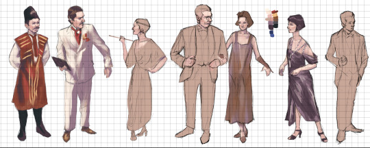
anya's act ii lineup. her phtk outfit is the only one i've marked complete (the linework on the others is still black and need just a few more touchups). I've yet to lay in the flats for the maroon travel coat because i think the drawing needs more work. i might change a few things on big red, maybe her expression, but i haven't decided yet.
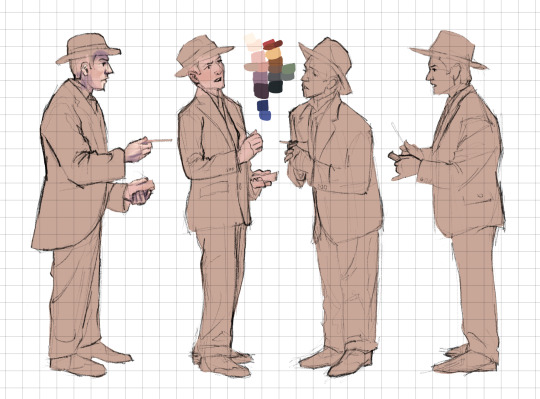
dmitry's act ii lineup (sans tuxedo). he just needs a final pass on the first two on the left, and then his finale look is finished, because it's the same from act i :)
vlad's act ii lineup. he's almost done, just needs a final pass on the finale and phtk outfits.
lily's act ii lineup. i'm going to redo the pattern on her neva club dress (linda cho i love u but god) but otherwise she's all finished.
the dowager's act ii lineup. she's done! :) maybe i'll find something to pick at later but rn i'm marking her done lol.
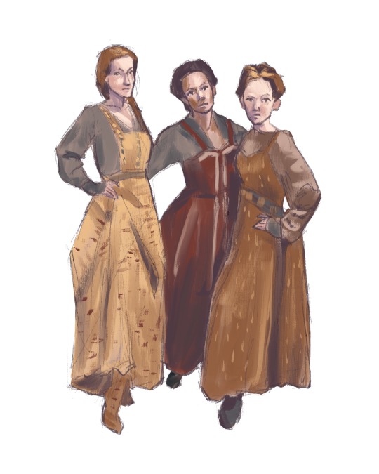
petersburg citizens from rumor! i think these guys are all done. there are more people i could include, but there isn't enough variation on the costumes to make it worth it imo.
neva club patrons. the only two marked complete are the two on the left, sergei the doorman/the male server and count leopold. i still need to find a good reference for the female server lol.
the press! just the men for now lol. i used the obc program as a reference for this one, so i'll get the two ladies in soon :)
the hussies! i've marked it complete, but. we'll see if there's more adjustments i can make.
there's still more i've completed that's not pictured, but i'll definitely share more soon. act i is nearly finished entirely, which is cool, and the only big ensemble sheet i've yet to make much progress on is everyone in phtk. i may end up just drawing one or two people from that and then copying them with different patterns because, honestly, the shape of the dresses and suits are all very similar. hopefully that won't be boring to look at lol.
if there's anything in particular you'd like to see/have any questions, or even suggestions, lmk!! and follow my 'anastasia illustrated guide' tag for more updates :)
89 notes
·
View notes
Note
Popping in to tell you that you’re art is so tasty and I will never understand how you always draw Suegiku’s hair so perfectly <3 (I love them, but their hair is the bane of my existence)
THANK YOU SO MUCH WAAA <3 <3 <3
i offer some headshots i did just for this ask actually
[id: colored sketches of jono saigiku and suehiro tetcho from bungo stray dogs. they are bust shots, where only their collar up to their head is drawn. jono is drawn with closed eyes and a smug expression, while tetcho is drawn with a bored expression. /end id]
-
-
i felt such a strong urge to provide a walkthrough, so i hope you don’t mind my blabbering about how i draw their hair! (it’s also the bane of my existence)
very long and detailed walkthrough / rambling below the cut for those curious!
starting with tecchou! since i drew him first....
compared to other characters, i have a different technique specifically for him, because i always disliked how my detailed linework for his hair would turn out
i would draw these thick strand guidelines first; i put more thought into the strands for his bangs since this will decide how i frame his face
after that, i just connect the lines together and shade it black or whatever linework color i’m using! i also add the longer hair strands during this step, and modify any strands if needed.
the next step happens during my flat coloring phase, and is arguably the most fun part of this technique. i paint over the solid black hair with dark brown hair strands over top! that way i can provide depth and details in his hair, without much hassle since this doesn’t interfere with the linework

i add some thinner strands after! then modify some areas when all the layers have been merged (since my coloring style is just me painting over everything)
-
-
onto jouno! who takes more steps...
i always start with the bangs! i follow his current hairstyle where his bangs are evenly cut and swoop to the right from our view

next step is.... whatever this is....... my friend calls it antennas. these parts of the side hair is meant to be longer to frame his face! i’m sorry i’m not brave enough to give him short side hair bits like in canon </3
after that, i draw the rest of the side hair!
after that, i work on the back hair which puffs up by from the top to below the ears, and then gets much thinner and stops right around the back of his neck
with the help of clipping layers, i work on the tips of his bangs, side hair, and back hair. compared to canon, i like to have more gradient-like red tips. i color in the red tips before adding the light red and pink parts

after that, i clean up the colors to look like this!
i add thinner hair strands and modify other parts like usual as final touch, or when i’m preparing to render!
-
since you’ve read to the end, i offer a bonus jouno! thank you c:

#tuna answers#bungou stray dogs#bsd jouno#bsd tecchou#suegiku#bsd#bsd jouno saigiku#bsd saigiku jouno#bsd saigiku#bsd suehiro tecchou#bsd tecchou suehiro#i had to draw tecchou's hair twice.#hate them both
352 notes
·
View notes
Note
Hello! I love your work so much especially how you do your animatics and animations! I have a couple of art related questions if that’s alright but no pressure at all I understand!
I’ve been wanting to get into more digital art/animation but I was wondering what program do you use and what canvas size do you rec for uploading to TikTok and other social media? I’m using procreate but just wondering! (Your work looks so crispy and clean and I struggle with quality drop at times 🫡) do you use a custom brush for your linework or the default brushes in your program? Also what do you use to edit for videos? Do you adjust the image to fit when making a video or do you use a canvas size that will work with TikToks? Lastly what program do you use to animate?
I’m sorry this is pretty long but thank you so much for reading I appreciate your time and patience!
Also your ATHF designs are so effen amazing I just started watching the show because of you!! Sending good vibes! ♡ ♡ ♡
Ok these questions I have received quite often and I will be genuinely honest, I don't know how to answer them KkkkKkKkK
I don't consider myself nor am I a professional artist, this is mostly a hoobie that I enjoy very much and have been doing for long years so first of all it's all practice, practice and more practice. Everything is achieved with hard practice even though it sounds repetitive!
Regarding what programs and tools I use; IbisPaint and my trusty finger. I draw with my cell phone and I have always used Ibis because I think it is one of the most comfortable programs to make art, very easy to use and learn to master especially with the little instructions it gives you. My brushes are the default, crayon type brushes, only with some configurations. My canvas size is always 2550x2550 (the limit so it doesn't go slow, lol), I make all the drawings, move them to the same folder and then I move that folder to the center of the canvas so it looks like it does in my videos.
For animating, I'm just getting back into it since I haven't animated for many years but what I do is to take a reference video (in my athf video it was a jjk scene, now what I do is to record myself to have better and accurate references of what I want) and take a capture frame by frame, then I pass each of those frames to Ibis and draw over them! Regarding what app I use for editing, Capcut 乁| ・ 〰 ・ |ㄏ
Sorry if this isn't the detailed response u would have expected, but thank you sooo much for your message!!!!<3333
#rambles#inbox#I once tried to draw with those digital pencils but istg it was IMPOSSIBLE#refusing to learn from cero w them#at least not now ;;;;;;
25 notes
·
View notes
Note
hello! i love your art so much ^-^ both painting and your lineworks are so clean and good to the eyes. i'm inspired by you to learn how to lineart lately! do you have any advice on how to create clean, and good lineart? ^-^/ i hope you have a great day!!!
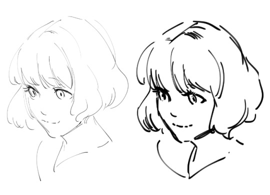
The first thing to remember when you want to draw clean lineart is to avoid the chicken scratch lines, I found this video on twitter the other day on how to achieve the confident and clean line strokes (source: x)
In the first example, you can see that the person is only focusing on a small area as they stroke the pencil to create a shape, this result in the chicken scratch lines, it doesn't look clean and you'll have a hard time figuring out the shape of the object you're drawing. However in the second example, you can see how the person tries to look at the bigger picture first before determining where the line strokes will start and end, this results in a cleaner lineart.
Another way to get the clean lineart result is by maximizing the pen stabilizer,
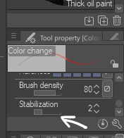
You can also use smaller brush to achieve the clean lineart look, the thicker the brush is, the more noticeable every "flaws" in the lineart so it'll be a bit harder to make the lineart look clean unless you set the stabilizer to 100, but if you use smaller brush, even if your line is sketchy, it'll still look neat when zoomed out!
Thank you so much for your kind words Anon and I'm really so SO sorry for the late reply 😭 I hope this helps!!
285 notes
·
View notes
Last Seen Blogs
misfit-mimi
Welcome to My Trash Heap
cnfpetagroup1-blog
Creative Non-Fiction Students
factorials
slut!

devotedlynuttytimemachine
Untitled
wolfliving
Wolf in Living Room