vintagerpg
Vintage RPG
Instagram @VintageRPG | Chronicling the art and history of tabletop roleplaying games | From the collection of Stu Horvath | Posts daily | Podcast episode every Monday | Book with MIT Press out in October 2023
2408 posts
Don't wanna be here? Send us removal request.
Last Seen Blogs

prevaricatingexcuses
Prevaricating Excuses

misguidedhunter67
Come on,Sammy! Lets have a beer...

paintingcontractor1-blog1
Things You Should Know About Selecting a Painting Firm
mylittlenovathings
mylittlenovathings

filmentertainer
Screenwriter, Producer & Podcast Host
Text
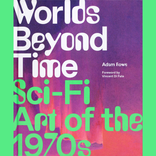
There is, I think, no arguing that contemporary genre art has a character distinct from previous decades. I also think that while there are big shifts in aesthetics somewhat aligning with each decade of the 20th century, here in the 21st things have definitely slowed down — I feel like the look of genre art has fossilized somewhat in the last 20 years. I don’t have a good explanation for why. Sometimes I wonder if I’m blinded by nostalgia, and that there really aren’t any obvious objective differences at all.
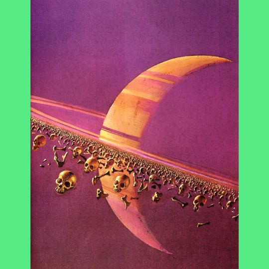
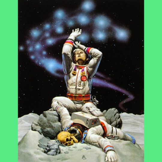
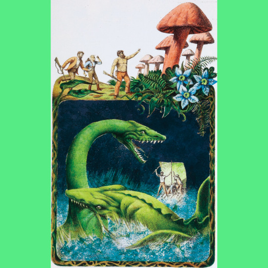
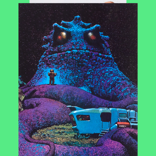
Worlds Beyond Time: Sci-Fi Art of the 1970s (2023) is a compelling argument, I think, that there ARE definite differences. The book, by Adam Rowe (and spinning out of his social media accounts dedicated to, well, ’70s science fiction art) looks at both artists and thematic categories of art from the period, mostly from paperback covers, and offers commentary and historical context in the text. The result is startling: a body of work by a variety of artists working in their own styles that nevertheless seems visually unified. With the exception of a couple outliers, this stuff all feels of the ’70s. The fact that there are some inclusions from both the ’60s and ’80s makes this even clearer.
I think the most interesting thing about this is how bizarre some of the ’70s art seems to be. A lot of these artists appear to be entirely off the leash, delivering work they WANTED to produce rather than what they were directed to produce (you can see a shift toward clearly pairing the cover art with the content of the book in the later part of the decade). There was also more money in the work, then, so speed wasn’t quite so big a part of the equation as it is now.
And, greater questions of genre art aside, Worlds Beyond Time is still a mesmerizing collection, worthy of your time even if you just want to feed pictures to your eyeballs.
45 notes
·
View notes
Text
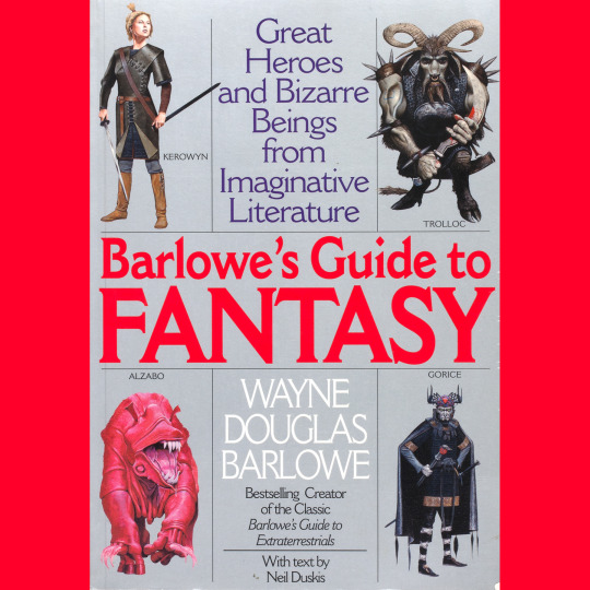
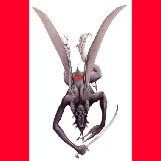
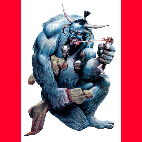
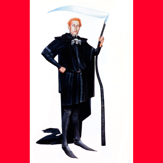
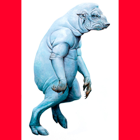
Barlowe's Guide to Extraterrestrials was well received and won a couple of awards (and a second edition, I think in ’87?). It took a little while for the sequel to emerge: Barlowe’s Guide to Fantasy hit shelves in 1996.
Even though I am not super widely read in either fantasy or science fiction, Barlowe’s fantasy book is the one I really vibe on. Maybe because it allows him to do stuff like Grendel from Beowulf and Gorice from The Worm Ouroboros. Wouldn’t have expected Gideon Winter, the antagonist from Peter Straub’s odd novel Floating Dragon to be included, but he was. Other surprises are the Psammead from Five Children and It and the Saw Horse from Oz.
One of the coolest things about these books is the fold-out size comparison charts. I love a good size-comparison (and again, this is a big feature of those Petersen’s Guides for Call of Cthulhu, and I am sure it came directly from here).
255 notes
·
View notes
Text


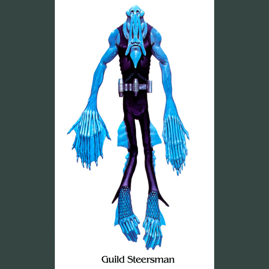
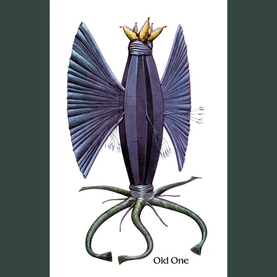
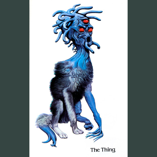
Barlowe's Guide to Extraterrestrials (1979) is a fun little book that looks at aliens from a variety of science fiction stories through the (slightly) in-universe framing of a field guide, complete with notes on ecology and biological functions.
Artist Wayne Barlowe’s selections are an interesting cross-section of the genre (I don’t recognize a lot of them, honestly) and his interpretations (of the ones I do recognize) always walk the fine line between capturing something essential that I pictured in my mind’s eye while also being surprising or unexpected in many ways. Among the beasties I did not photograph are the Overlords from Childhood’s End, the Puppeteers from Ringworld, the Izchel from Wrinkle in Time, the Masters from the Tripod books and Ursula Le Guin’s Athshean.
In a way, the Guide feels like an extension of the larger interest in fantastic art in the ‘70s, embodied most in the Gnomes, Fairies and Giants books. It, and its Fantasy companion (see tomorrow) certainly wouldn’t come out today, but for me, they’re just amazing. They gave Barlowe a whole book to draw monsters and aliens; monster and alien enthusiasts like me got a pile of rad illustrations to look at; and a stack of sci fi writers got low-key advertising for their works. Wins down the line.
Worth mentioning that this is likely a direct inspiration for Call of Cthulhu’s pair of Petersen’s Field Guides (Cthulhu Monsters and Dreamlands), right down to little nuances of layout formatting. I would bet that they were also on someone’s mind when the Ecology articles began to appear in Dragon Magazine (those started in ’83 with the Piercer).
#roleplaying game#tabletop rpg#dungeons & dragons#rpg#d&d#ttrpg#Wayne Barlowe#Barlowes Guide To Extraterrestrials
250 notes
·
View notes
Text


John Blanche is an absolute legend. As an artist and art director, he essentially steered the rudder of Warhammer and, through it, British fantasy art, for decades. Among a pile of important work, my favorite is probably his illustrations for the four-volume Sorcery! gamebook series by Steve Jackson.
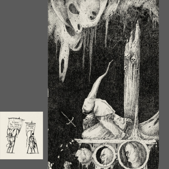
I’m not sure how the Hollow Press edition of Voodoo Forest (2022) got on my radar, but it did (and thank goodness, because through it I found Vermis). The first version appeared in 2015 and was the product of a decade of work. This edition includes additional plates and was resequenced. The back matter says it’s the project’s definitive form.
It’s impressive! There are 46 full-page illustrations, each accompanied by a second, smaller one, and one 2-page spread. In a lot of ways, Blanche’s style seems unchanged, which is a curious thing for an artist with a career spanning multiple decades (compare to Ian Miller, who has had a number of stylistic periods). It’s strange to see his work without any direct references to the worlds of Warhammer. There are subtle, perhaps reflexive visual references, like the way the demon woman’s claw hands resemble the canon Slaaneshi demonette, or how all the secondary illustrations depict a variety of folk carrying banners. Those banners serve as cryptic titles. Many are quotes from Macbeth. I assume many others reference other works, but I haven’t quite figured them out. The doomed atmosphere of the Scottish play sort of overrides all other associations for me (though there is very little in the visuals that would make me think of Shakespeare, though there is one man in a kilt).
Taken as a whole, the thing is unsettling, a sort of dream or nightmare landscape that clearly conforms to some organizing principal, but the logic of which remains obscure. There is not much gore or violence, but violence seems imminent in nearly all the plates. I would not want to explore this particular forest, but I am glad to have it on my shelf.
96 notes
·
View notes
Text
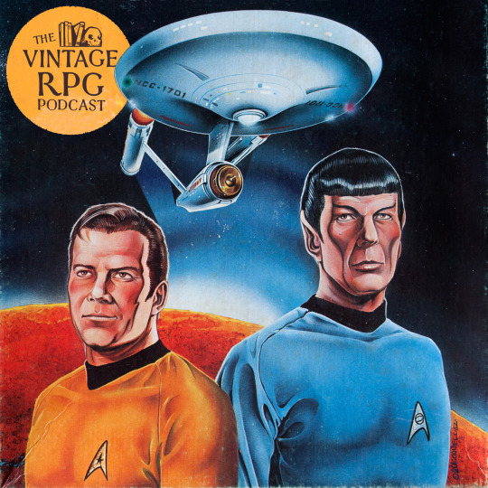
Set phasers to stun! This week on the Vintage RPG Podcast, we check out FASA’s 1982 Star Trek RPG. It’s an interesting game in it’s own right — a hack of Traveller, when it comes down to it — but is also super interesting in regards to fandom, IP canon and licensed RPGs. Climb on board as we explore these strange old worlds!
18 notes
·
View notes
Text


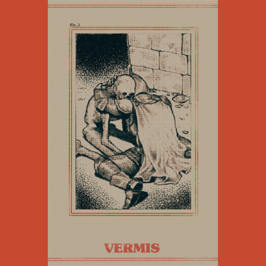

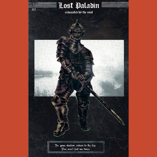
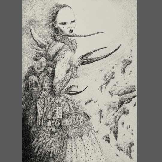
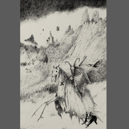
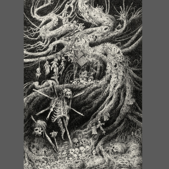
Vermis I (2023) is a narrative art book by @Plastiboo. It’s a gorgeous and darkly layered homage to a variety of influences, new and old — Souls games, old videogames like Shadowgate, more recent ones like Shadow of the Colossus, perhaps Fighting Fantasy gamebooks, perhaps Warhammer. There are many possibilities. And yet it also stands as very much its own thing, a world unto itself. The book’s central question “Which flesh is your flesh?” goes a long way in establishing the sorts of horrors we’ll find on our journey.
There are two things that really make Vermis come to a diseased sort of life. The first is the decision to arrange the book as if it were a strategy guide for a videogame that doesn’t exist. This allows for the introduction of little icons and hints at mechanical systems without committing to building them, which is an enticement to brains like mine to figure out how they MIGHT work. And by providing level maps and strats for boss fights and profiles of magic items, I wind up playing the game on a meta level, reflexively, through the act of reading. This sensation is strange and unique and made for one of the most memorable book-experiences I’ve had in a long time.
The other thing is the texture of the art, the way everything is buried under pixelation, cathode grain, moire ripples and other distortions. It unifies all the book’s visuals in a sort of murkiness that add an almost painful sense of mystery and danger and inscrutability to the narrative.
Vermis is a dark masterpiece of creeping dread, and anyone who tells you it isn’t a game to be played isn’t to be trusted.
263 notes
·
View notes
Text
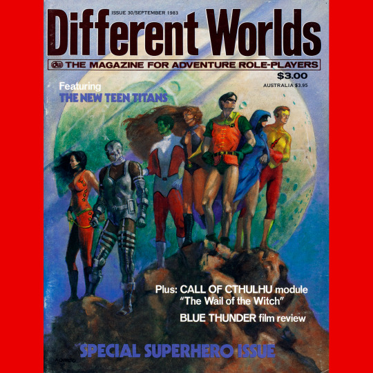
Different Worlds 30 (September, 1983). A two month gap — I feel like that at this point, the magazine was being published “intermittently.” The cover is another painting by Alan Okamoto, a rather striking group portrait of DC’s Teen Titans.
#rpg#d&d#dungeons & dragons#tabletop rpg#roleplaying game#ttrpg#Chaosium#Different Worlds#Alan Okamoto
55 notes
·
View notes
Text

Different Worlds 29 (June, 1983). And back to bi-monthly. I suspect this was deeply frustrating for readers. The cover is “The World of Pandora,” by Alan Okamoto, a much quieter composition than the previous cover. Nice light, very subtle shadows. I like that the reviews of Star Frontiers and Return of the Jedi are set at an even level of importance.
#roleplaying game#tabletop rpg#dungeons & dragons#rpg#d&d#ttrpg#Chaosium#Different Worlds#Alan Okamoto
41 notes
·
View notes
Text


Final Challenge (1984) is the lone solo adventure in the Role Aids line. Your friend joined the Black School and now he wants to conquer the world with an army of the undead, so you have to stop him.
Fun thing 1: if the first character can’t manage and dies, there is a second character who can pick up the fight. Fun thing 2: There are only ten weeks of game time to travel the land and find a way to stop the necromancer. Fun thing 3: the hexes randomly generate their encounters. The rest is solid if unremarkable. The encounters are interesting, the story straightforward, the combat cut and dried. There is one solution, though the path to it is eased or complicated in relation to what the hexes generate. Despite this, it’s about two hours of play, max, and has next to no replay value.
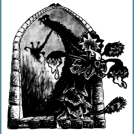
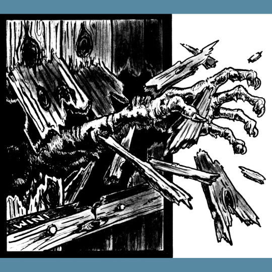
Cover by Tom Kidd is fine, and I think maybe commissioned for the module. I’m neutral on Winifred Williams’ interiors, they remind me a bit of TSR’s Fantasy Forest pick-your-path books aimed at kids. And there just aren’t enough of them, to be honest. The town map is quite nice though.
52 notes
·
View notes
Text
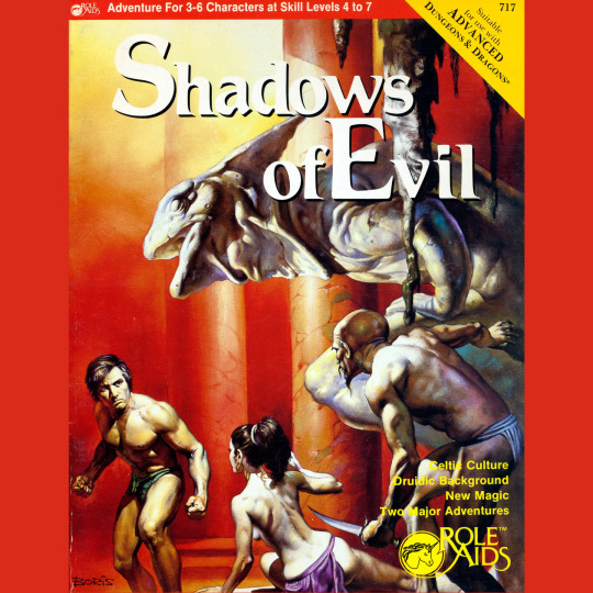


Shadows of Evil (1984) is the biggest adventure in the Role Aids line, clocking in at 80 pages plus map pull-outs. There is some source material at the front of the book for roleplaying in the Celtic world (or, I guess, the post-Roman Celtic world, more accurately) and a set of powers and items designed as a supplement for the D&D Druid class (reprinted from an earlier article in Dragon Magazine). This focus on Celts is a little jarring, as the Boris Vallejo cover is pretty generic looking fantasy, and, aside of some narrative trappings, the adventures don’t have much Celtic flavor.
There are two linked adventures. The first concerns a, well, a weird place. It was a site of worship for Dark Druids, then a Roman fort and now it is a manor that doubles as an abbey for some good Druids that seem rather Christian, really. They’ve been corrupted, though and in order to set things right, an evil artifact of great power must be retrieved. The second adventure requires the destruction of the artifact lest its use bring about the return of an evil pre-Celtic deity. To do so, the player have to travel to an evil citadel…owned by a witch-king…and throw the thing…into a pit of fire. Which seems a lot more Lord of the Rings than Celtic mythology. All of this is further undercut by pretty standard dungeon design populated by a prosaic complement of D&D monsters. I actually like the dungeons and how generic they are, but they feel real weird in the Celtic context.
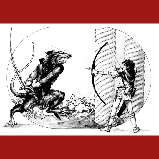
Nice art throughout by Robin Wood. Very different, I think, from her work in Swordthrust.
47 notes
·
View notes
Text
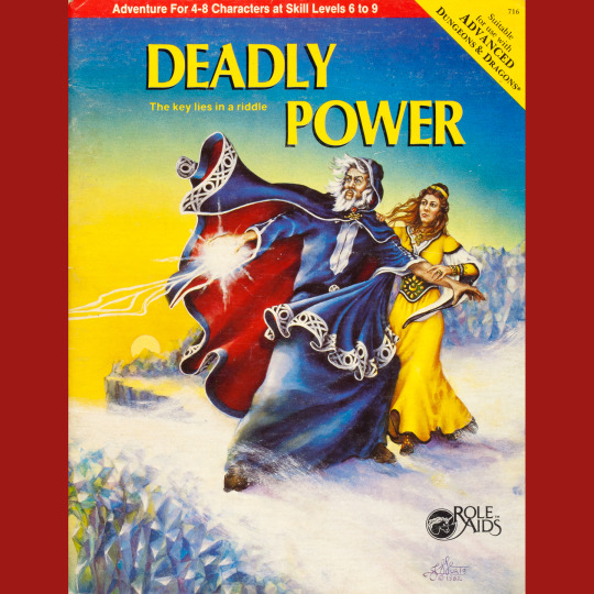
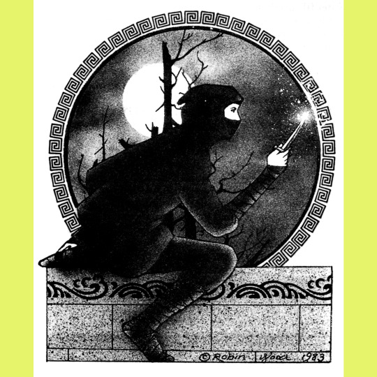
Deadly Power (1984) is similar to Evil Ruins in that it attempts to use past events — again, the schemes of royalty mixing with the diabolic — to fuel the forward motion of the adventure. This one has a magical mix of leaves that can give the eater the ability of mass charm. Powerful! But there are a bunch of limitations and requirements and eating them wrong is deadly. And the power only last as long as they’re in the eater’s digestive system. Lotta trouble for something so, uh, passing. None of that stops a handful of factions from trying to coax, cajole and murder the players into giving them the leaves.
Plot aside, the series of dungeons is OK. The primary one — a wererat warren, has the most potential but it feels somewhat unrealized here. The secondary locations, particularly the nicely designed mausoleum, feel more thought out and complete, but maybe that’s because they’re relatively brief. The maps are all solid, though.
Cover art is a fairly generic recycled piece by Janny Wurts. Interior illustrations are by Teanna Byerts. They’re pretty good! Missed opportunity for some demon drawings, but I really like the falling dwarf illustration, so I suppose it evens out.
46 notes
·
View notes
Text


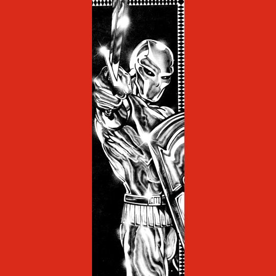
We did a whole episode of the podcast on Swordthrust (1984) last year. That probably tells you something about the adventure’s place in the line. If not, I’ll say it directly: this is probably Role Aids at its weirdest, most experimental and, consequently, at its best.
In short: a titan sleeps atop a high mountain. The party goes in the titan’s ear and explores his brain, looking for a powerful artifact that is calling to them. Inside, there are monsters that have taken up residence, angelic creatures that are manifestations of the titan’s better nature, reptilians that embody his baser impulses, and strange apparitions that are, essentially, his dreams and memories made flesh, making for a very odd variety of environments inside what is supposed to be a complex of ice caves.
All of this is super interesting, especially for the year it was released (compare this to any give Dragonlance module, for instance). It doesn’t go as hard or as bizarre as it could, but that’s OK — it paved the way for plenty of others to get weird (Silent Titans sprints immediately to mind) and leaves plenty of room for the GM to odd it up.
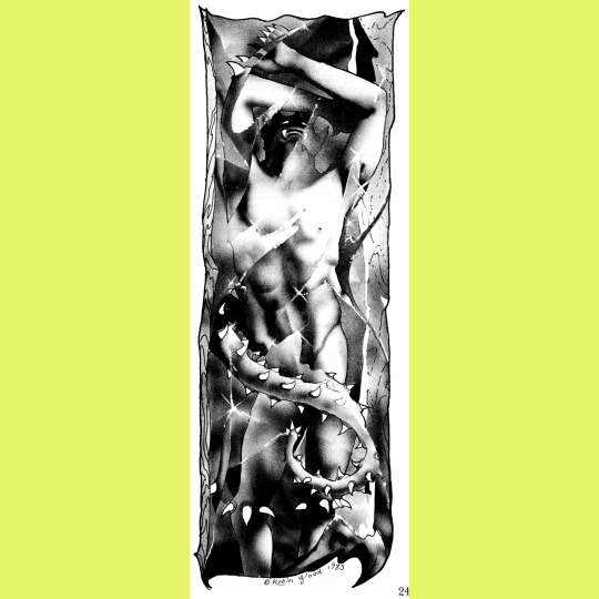
Cover art is another recycled Boris Vallejo, though in this case, the authors incorporated the scene in the adventure — there, this guy is one of the Titan’s dreams who left the brain to live on the mountain and has, essentially, become real. He’s an interesting chap. Interiors are by Robin Wood. She did a lot of Role Aids work and it’s rather variable — I think she was using it as an opportunity to experiment with different styles. These drawings are pretty solid!
108 notes
·
View notes
Text


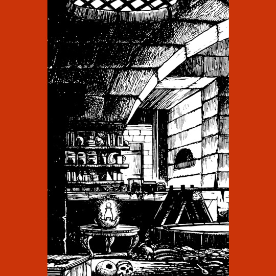
Right off the bat, I love the name of Evil Ruins (1983). It doesn’t get more generic than that, and generic is sort of the Role Aid aim, right? Second, the Boris Vallejo cover painting is a favorite. To my knowledge, it was originally used on the Science Fiction Book Club edition of Roger Zelazny’s Nine Princes in Amber (1979) and it is just as preposterous there as it is here.
The adventure itself is pretty good. The ruins (modeled after the real-world Castle Tintagel for no particular reason) have a rich history of tragedy and betrayal. Unraveling that history is the only way to entirely deal with the pair of evils currently inhabiting the dungeons. The story isn’t super surprising (resentment and murder among the royal residents several generations ago lead to the establishment of a temple of evil in the depths, as well as the haunting by a tormented spirit) but it works as a good puzzle to drive exploration and keep players thinking. I like this one a lot.
Solid interior art by Hannah Shapero. The altar of Arawn is particularly nice.
129 notes
·
View notes
Text

Road trip! This week on the Vintage RPG Podcast, we talk to John Patrick Cooper about Get in the Van, his live music-themed Troika hack. Form a band (hardcore, hair or thrash) in the year 198X, hit the road, do battle with the audience, rock their faces off and get to the next gig. A tight, fun little ode to the road dog life. Also, surprise, Cooper designed Dead Mall, our favorite Tunnel Goons hack about exploring monster-filled abandoned malls, so we talked about that some too!
#roleplaying game#tabletop rpg#dungeons & dragons#rpg#d&d#ttrpg#podcast#John Patrick Cooper#Exalted Funeral#Get In The Van#Dead Mall
13 notes
·
View notes
Text
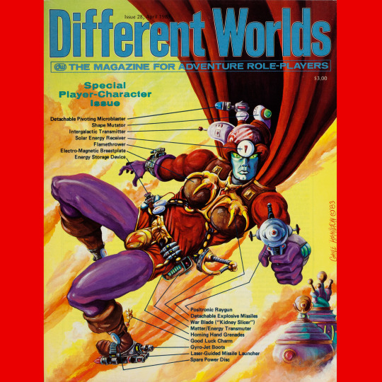
Different Worlds 28 (April, 1983). Monthly again, but for how long? “Jarnon of Zaffar,” by Gayle Hamilton. This cover is ridiculous and I love it. “Breast plate?” I’ll say. How come the codpiece with the down arrow doesn’t get a call out?
#roleplaying game#tabletop rpg#dungeons & dragons#rpg#d&d#ttrpg#Chaosium#Different Worlds#Brad W Foster
64 notes
·
View notes
Text
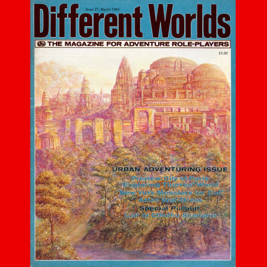
Different Worlds 27 (March, 1983). “Dawn of the East,” by Mark Roland. This reminds me a lot of Dragon 31. The texture and palette here are too much for me, though I do like the way the city reminds me of the Palace of Fine Arts in San Francisco.
#roleplaying game#tabletop rpg#dungeons & dragons#rpg#d&d#ttrpg#Chaosium#Different Worlds#Mark Roland
31 notes
·
View notes
Text
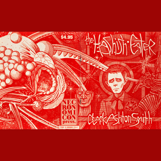
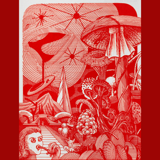
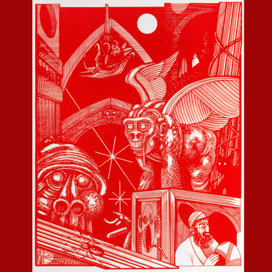
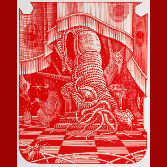
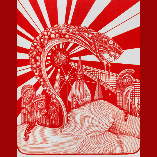
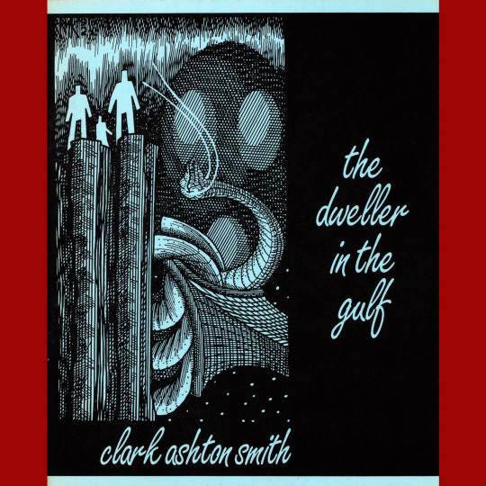
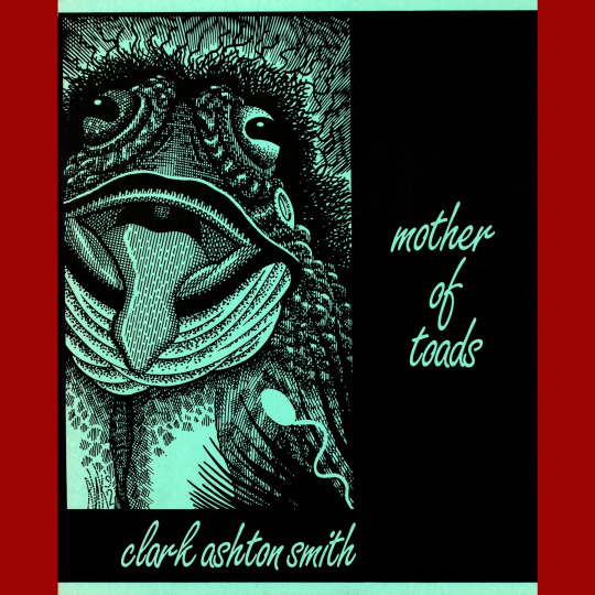

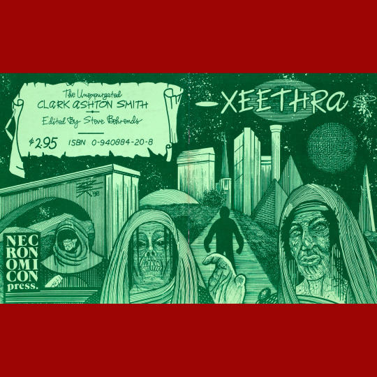
While I have a special affection for Jason Eckhardt’s work, it would be unfair to look at Necronomicon Press and not give some love to their other prolific house artist, Robert H. Knox. As luck would have it, he did all the art on the Clark Ashton Smith chapbooks — some of my all time Necropress faves.
Again, these feel important for their time. When I was getting into weird fiction in the early '90s, I had easy access to most of the important authors. The exception? Clark Ashton Smith. His dedicated collections were all out of print and scarce and a serious effort at definitive collection of his work didn’t get underway until the five-volume set from Nightshade, begun in 2007. Until then, it was the occasional anthologized story, or Necropress chapbooks.
Most of these represent efforts by series editor Steve Behrends to issue corrected texts of stories that better reflect CAS’ intentions. Xeethra (1988) is a melancholy Zothique story that weird tales deemed too poetic. Mother of Toads (1993), an Averoigne story, was too erotic. The Vaults of Yoh-Vombis (1993) is a tale of Mars that was heavily revised for print, which CAS was unhappy about. Another Martian tale, The Dweller in the Gulf (1993) was so tampered with that CAS stopped writing fiction for a time. The Hashish-Eater (1989) is a lengthy, cosmic poem, unbothered by editors during its author’s lifetime.
Knox’s covers are fantastic, but holy wow those interior illustrations for The Hashish-Eater are something else. Dripping, psychedelic vistas fit for Troika. I’ve loved flipping through this one for over three decades.
#roleplaying game#tabletop rpg#dungeons & dragons#rpg#d&d#ttrpg#Clark Ashton Smith#Necronomicon Press#Robert H Knox
90 notes
·
View notes