#Display Advertisement
Text
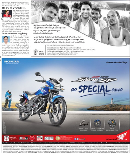
Design Tips for Eye-Catching Newspaper Display Advertisements
#display advertisement#display advertisement in newspaper#newspaper display ad booking#book display ad online#online display ad booking#display advertising#newspaper display ads online#display advertising in newspaper
0 notes
Text
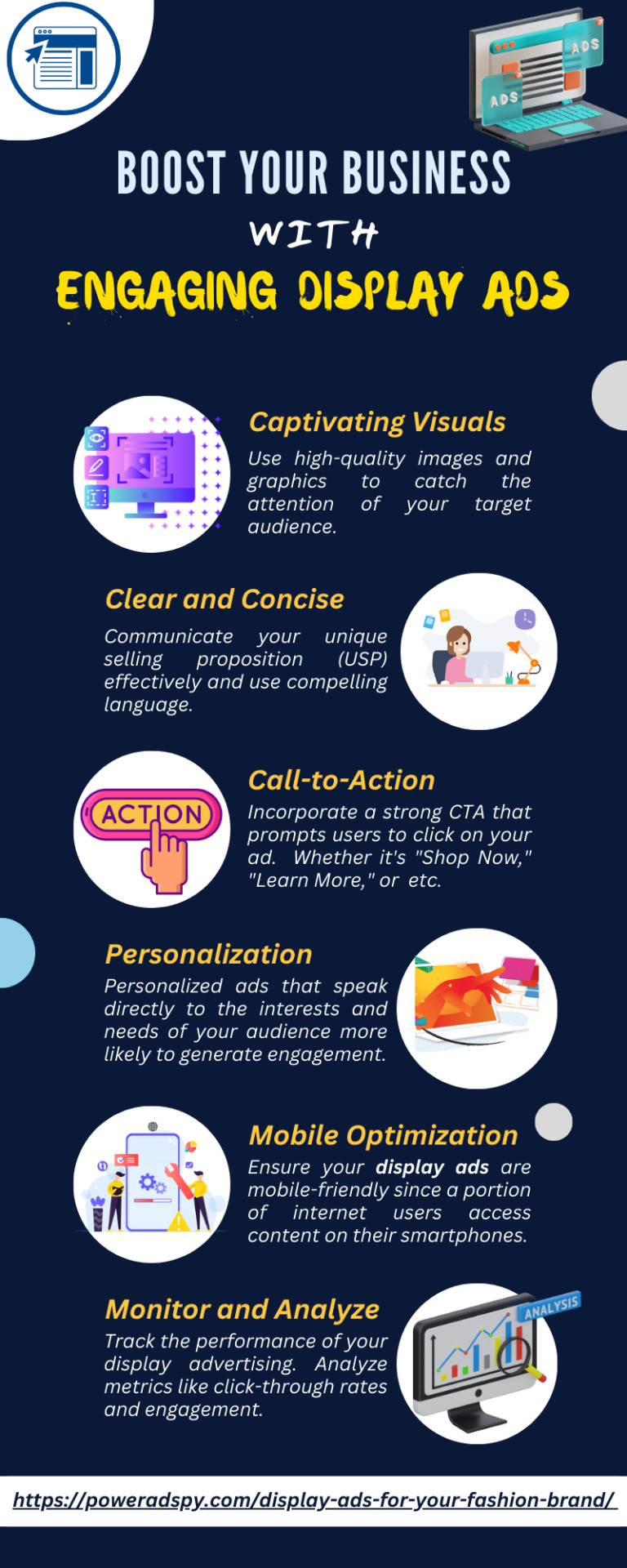
If you are looking to get the best out of your advertisement, consider Display Ads. It will help to boost your business engagement and conversion.
1 note
·
View note
Text
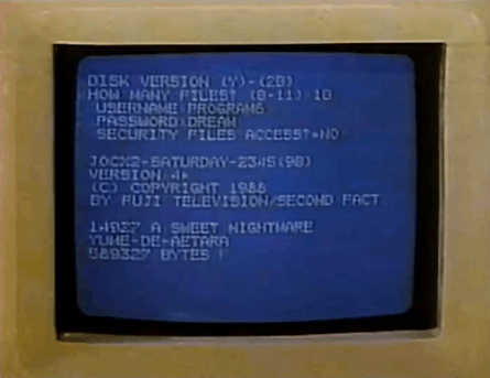
#animated gif#animated gifs#gif#gifs#old advertisements#old ads#retro#vhs#computers#80's#old tech#old computers#tech#80s#589327 bytes free#sweet nightmare#why does it just display her password like that
74 notes
·
View notes
Note
To me, all Taylor swift songs about an age gap are actually about rosquez. Specifically dear John
sorry this doesn’t answer you entirely but i read it back and it got me THINKING. about marc age 20-22 versus marc age now. and again i’m listening to my podcasts having thoughts. as i do. and they’re all talking about how visibly HAPPY marc is this season. like we’ve allll noticed the dancing the twerking the VERY public and endearing goofy clownery. marc voice i am show :3 and all the podcast guys seem to agree it’s the happiest he’s been in a while, but notably NOT since 2019 (when he was at the height of his powers wielding competitive momentum like a fucking broadsword). they say it’s the happiest he’s been since 2014 ! way back ten years ago when the sky was roses ! which. YEAH that was his most dominant season. but. BUTTTTT. i would also wager (yaoi googles on please hold) that kind of happiness preceded the flavor of the sport changing for him pretty dramatically due to his feud with valentino…. post breakup hits different… and now vale’s GONE. marc sees him like five times a year. out of sight out of mind, at least a little. marc maybe doesn’t have to THINK about him every single day that he’s at work two feet away from him in a press conference. so you take that and add that his arm is something resembling a little more functional (still obviously very fucked lmao) and he’s on a good bike and he’s not winning yet but he’s maybe feeling like his old self a bit more. and i imagine that all feels pretty good !!!
#the pods also had a VERY good point about how he’s using the dancing/public displays of happiness as an advertising tool#to basically make him more attractive to ducati versus the catastrophic vibes deficit from martin.#and he IS winning at that particular battle VERY handily#motogp#callie speaks#asks#getting slightlyyyy away from the sound of the woman that loved him. slightly.
29 notes
·
View notes
Photo
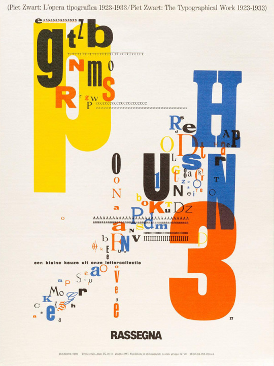

Piet Zwart: L'opera tipografica 1923-1933 / Piet Zwart: The Typographical Work 1923-1933, by Bruno Monguzzi and Vittorio Gregotti, «Rassegna», N. 30, Preface by Pierluigi Cerri, Designed by Bruno Monguzzi, Editrice C.I.P.I.A., Bologna, June 1987 [Museum für Gestaltung Zürich. Design Reviewed, Bradford. Display, Graphic Design Collection]
#graphic design#typography#advertising#magazine#cover#magazine cover#piet zwart#bruno monguzzi#vittorio gregotti#pierluigi cerri#editrice c.i.p.i.a.#museum für gestaltung zürich#design reviewed#display#1980s
167 notes
·
View notes
Text


Typography Tuesday
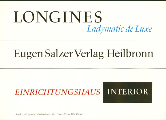
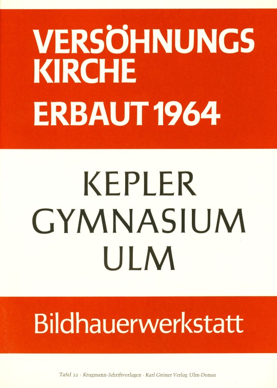
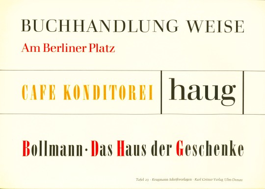
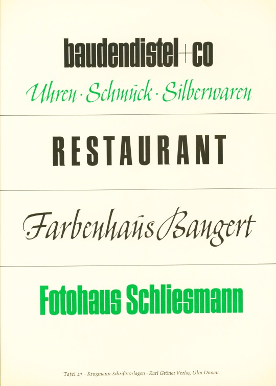
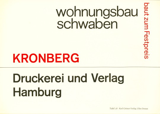
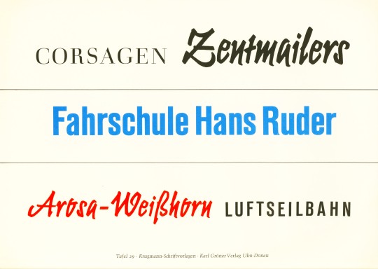
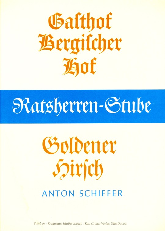
German type and graphic designer Alfred Krugmann produced the type specimen portfolio Schriftvorlagen für die Praxis in 1964, published in Ulm-Donau, Germany by Karl Gröner Verlag. The portfolio was intended as an instruction set, and the title translates as "Font Templates for Practice." It presents 20 plates of serif, san-serif, Gothic, and script typefaces along with 10 more plates demonstrating how these fonts might be used together for advertising presentations. Today we present those last ten plates demonstrating applications of the templates. We will present the type specimen plates in the future.
View other type specimen books.
View more Typography Tuesday posts.
#Typography Tuesday#typetuesday#type specimens#type specimen books#type display books#Karl Krugmann#Schriftvorlagen für die Praxis#Karl Gröner Verlag#advertising#type for advertising
19 notes
·
View notes
Text
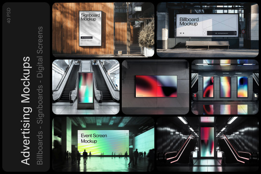
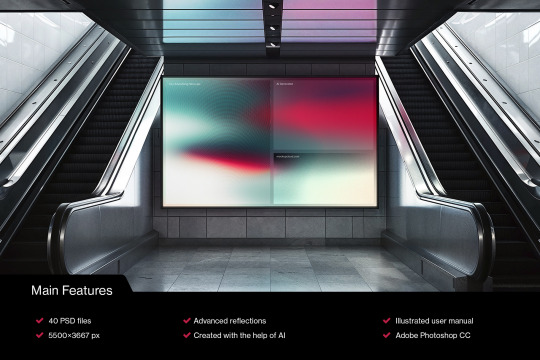
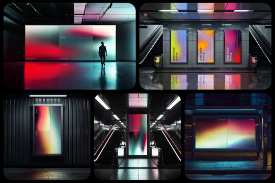
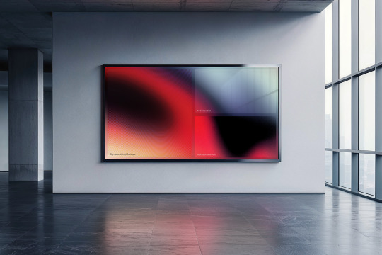
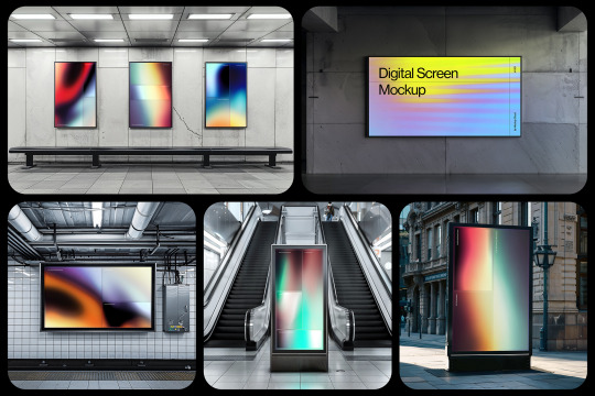

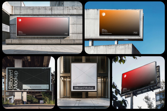
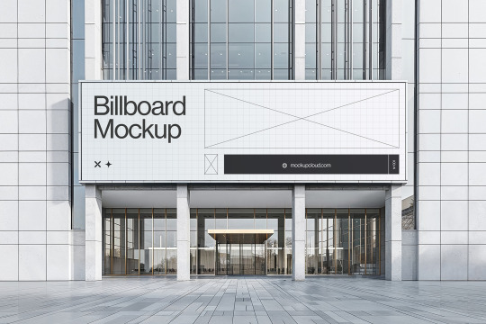
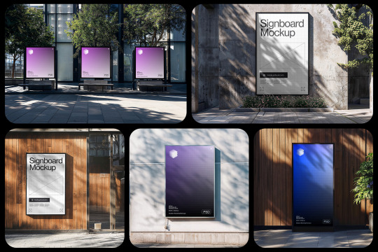
NEW! City Advertising Mockups Bundle
40 advertising PSD mockup templates featuring billboards, signboards, digital screens, and posters. Unique locations, advanced lighting, and reflections.
Available now at ��Mockup Cloud
#mockup#branding#psd#mockupcloud#download#free#freebie#billboard#signboard#digital screen#advertising#sign#urban#mockups#mockup cloud#display#screen#subway#outdoor#surface#city
8 notes
·
View notes
Text

1973
#vintage#vintage advertising#70s#seventies#1973#mutuals come stare at the Decorator Inspired Light Displays w me#1970s#vintage interiors#vintage interior design#radio shack#vintage advertisement#70s aesthetic#70s style#hsc:dci*#uploads*#queue
36 notes
·
View notes
Note
HI! Sticker anon back again! lol
I ended up buying the stickers on your redbubble lol. I didn't even know you had one or I would have bought them sooner 😅
They are ALSO very cute, so I am looking forward to getting them ❤
Ahhh, thank you so much, I hope you enjoy! 💖💖
#Shepherds of Haven#Redbubble#stickers#merch#I haven't advertised the redbubble too much for some reason but will make it more prominently displayed once the game is out!
16 notes
·
View notes
Text
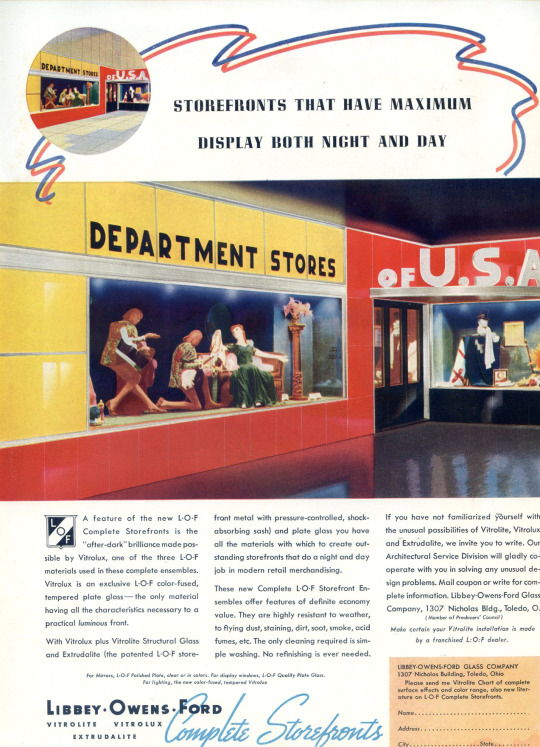
Edward Hopper, Window Display Designer.
Architectural Record 1938
#vintage ad#advertising#vintage ads#advertisment#1938#store display#art deco#1930s#193os ad#1930's ad#1930's#funny#humor#humour
15 notes
·
View notes
Photo

Seasons Greetings from 7-Up!
#7-up#7 up#seven up#soft drinks#chistmas#christmas holiday#seasonal displays#vintage advertising#vintage illustration#the uncola
79 notes
·
View notes
Text

#wizard101#hey thats me!!#oh man its been YEARS since i got a newsletter feature#well then again its been years since i posted on a ki-appropriate social media website#but hey cool that my first tweet in years got a feature#also i know i never really advertise say what my online uh moniker should be but the fact that they called me yup is#hilarious#its my twitter display name btw#and is also a joke and not meant to be taken seriously#and also i forget that it is my display name sometimes#i should probably change it hmm#also for reference for anyone that cares you can just call me wizardo
48 notes
·
View notes
Text
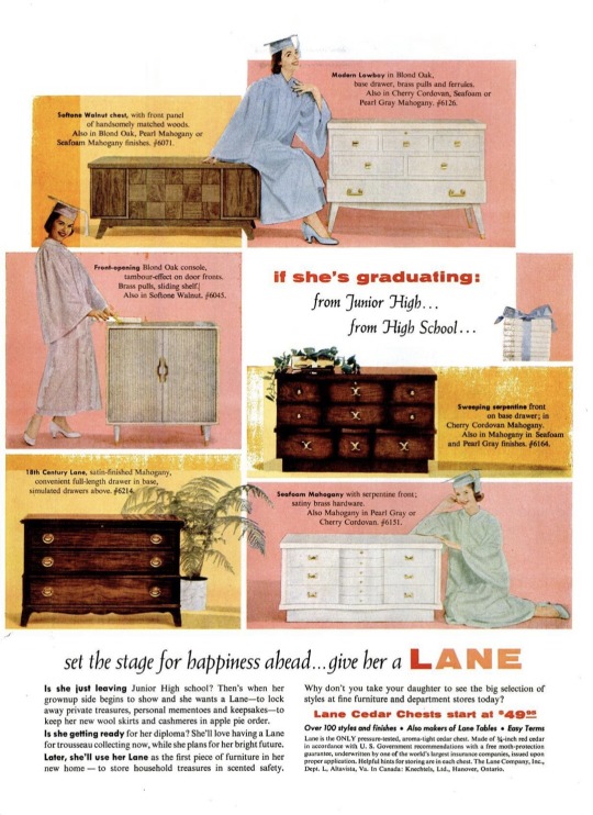
1956 Lane Furniture Advertisement
#1956#lane#furniture#bedroom#nightstand#hutch#display#vintageadsmakemehappy#vintage magazine#vintage advertising#magazine#advertising#1950s#50s#midcentury#mcm
22 notes
·
View notes
Text
Lost in dungeon. Back soon.
#reading dunmeshi#someone tell me why it makes me so hungry#i am not immune to the propoganda. its actually been proven that i am especially susceptible to food related advertising#if there is good looking food on display i get hungry. this was a terrible decision to make#when i worked at the factory and heard nothing but doctor pepper commercials 24/7 i shit you not i drank more dr pepper than in the rest#of my life combined.#this isnt the only reason ive gone missing. but it is A reason
4 notes
·
View notes
Text
Vintage slinky advertisement
110 notes
·
View notes
Last Seen Blogs

myorit
Ori

bluffmaster121-blog
Untitled

apparitionism
Wire Work

celestialcherrys-blog
HAPPY 2K19, KING.

ductransport
Đức Transport