#Also I think the grayscale illustration is cool
Text
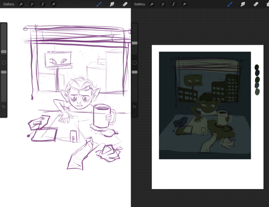
Collection of concept art for the Termitary in Pathologic 1
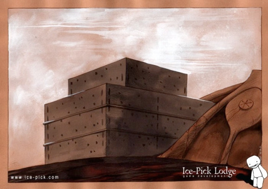
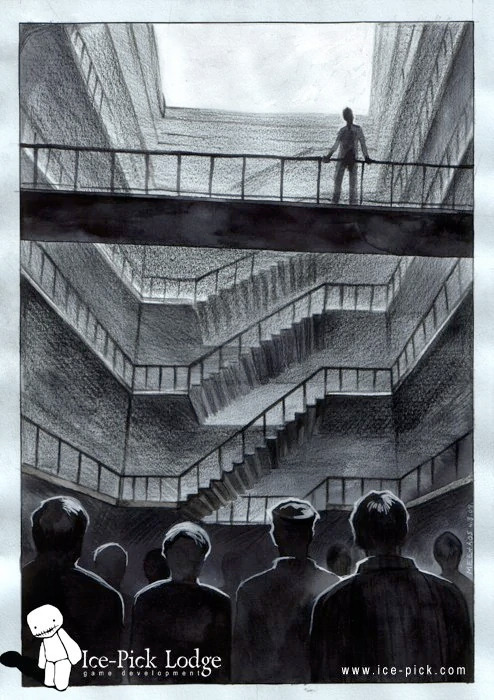
Official art from www.ice-pick.com
#pathologic#pathologic 1#concept art#buildings#I missed these earlier but putting it on with the Abattoir as an addition felt clunky#So here we are with a short seperate post#If you want some vague floor plans and a better comparision of both termitary blocks with the Abattoir check out that post#Also I think the grayscale illustration is cool
139 notes
·
View notes
Note
how do you color??? your coloring is so scrumptious and unique and i love it but also i struggle with the coloring process and i want to get an idea of how other people do it
awww thank you!! to be honest i learned a lot from reading vast error! here’s just like a really random example but a lot of the webcomic is just really pretty
if you’re struggling with your colors blending together in general i’d suggest at least trying lineless! without lines it really makes you think about contrast and stuff like that. or just going grayscale helps too!
in terms of color picking in general though, pushing your color palette for a piece or character design towards one color really helps the palette be cohesive!
i think this piece is a good example of that… everything from the whites of the eyes to the blues of her iris and the background is pushed towards more of a teal to match her yellow hair and skin tone. this skill i think is really good for illustrations and stuff like that!
EDIT: the shadows are also a cooler color to match the blue, and also because that’s how light works! :)
however, that doesn’t mean pops of contrasting color don’t come in handy!! like with this piece:

the whole THING is yellow. haha, maybe i just really like yellow…. anyway, my main point is there’s that sharp contrasting electric blue that really pops the whole thing. that’s them complimentary colors working with analogous colors!
i’d also advise you to just look up color tips too, because i’ve forgotten a lot of where i learned things from and its just become second nature LOL. i wouldn’t be very fun to learn from if i just said “now do it like THIS!!” would i??
if you want to see something really crazy though i would watch THIS person’s speedpaints because holy shit they’re fucking cool. i’m like still trying to learn how to do this LOL
youtube
hope this helps!! i love color i’m kissing it on the mouth btw
45 notes
·
View notes
Note
Another Possible RQG ask/prompt:
Grizzop and Wilde in the colour palette Poetic Justification? ✨
RQG request #32! i was going to go with something silly at first, but the palette was very moody and i was in the mood for wash, so... i got thinking about how the last time wilde ever saw grizzop was when he was in the anti-magic cell in damascus. i wonder if he thought about that in the future, if he regretted it, if grizzop got to realize they wouldn’t see each other again before he died. i would have liked more screentime for that, but it’s cool to just imagine.
also, i forgot halfway through that this was supposed to have a palette attached to it so i panicked and kind of started throwing colors until it worked and it kind of does? there were also just some minor fixes to the wilde on the bottom, the messiness of the original worked kind fo well with the splotchy colors.
thank you for this request, it made me emo. hope it does the same for you 😈🤪
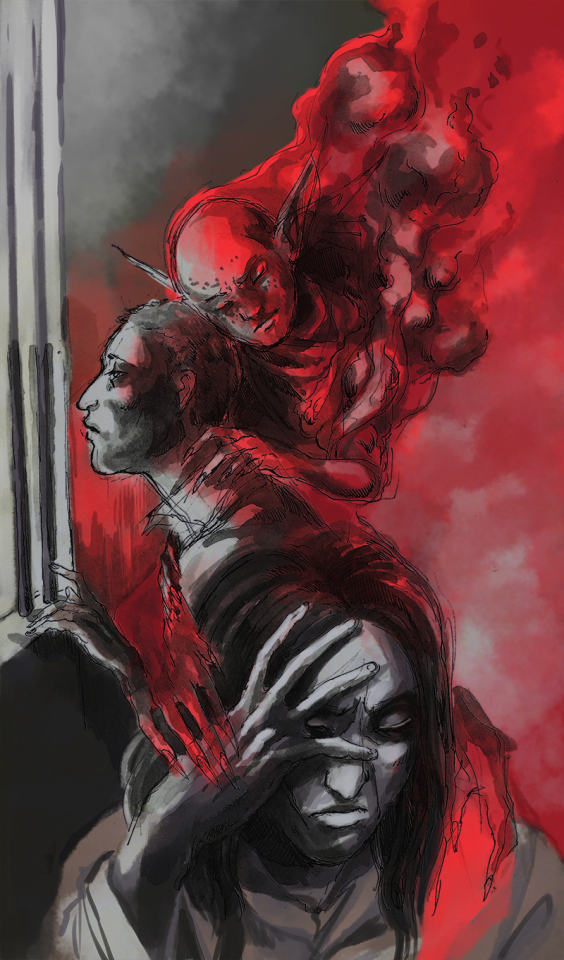
i’m kidding, there’s a surprise below the cut with the id from when i thought i’d just leave this one in grayscale.
fineliner and inkwash on cream paper, with digital color.
ID under the cut!
[ID: an illustration of wilde and grizzop. it's drawn traditionally with sketchy black lines and inkwash, and colored digitally with dark grays and bright red. it shows wilde in profile, staring out a barred window of the cell in damascus, with his head shaved and looking exhausted and forlorn. behind him, a spirit in the form of grizzop is coming from the top right corner and leaning his head against his, putting a clawed hand to the back of his neck tenderly. his eyes are closed and his expression is a resigned frown. the figure is well-formed from the shoulders up, and the rest is smokey. the image turns into wilde alone in the bottom half, with his hair long and a scar on his cheek, half hiding his face between his right hand. he looks regretful and tired. ghostly clawed hands are touching his shoulder and hand without him noticing.
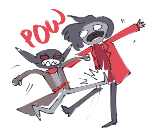
below there’s a bonus doodle of an ugly scribble of grizzop kicking wilde in the dick. he’s making an angry, snarling face and wilde is yelling, his eyes bulging out. they’re colored haphazardly withthe reds and grays of the requested palette. above grizzop it says ‘’POW’’ in red letters.
end ID]
#rqg#rusty quill gaming#rqg spoilers#grizzop drik acht amsterdam#rqg wilde#rqg oscar wilde#mixed media#fanart#doodle#2022#the great swarm of rqg requests 2k22
91 notes
·
View notes
Text
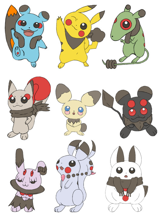
So, on October 19th 2021, exactly two years ago as of posting this, GinjaNinjaOWO over on the YT did a very fun video discussing swapping the concepts of Pokémon's two mascots, Pikachu and Eevee. That was also when I was really getting into the swing of character/creature designing, so I wanted to try my hand at it myself. I did the original pass in about a month, but recently looked over them and went "I can do this better," so here we are.
Here's the first pass from 2 years ago (before I got my tablet). I kept the first few designs I worked on, adding new concepts and motifs while scrapping the final 3 designs I did. When I did them originally, I think I was feeling a bit of burnout by the end, and was just going with the first things that came to mind, rather than coming up with something really creative.

Pichu was the first one I went back over. Originally, I just tweaked June's Pichu concept designs as I was more interested in designing its evolutions. The one thing I did keep from that first draft was the cheek placement under the eyes. All baby Pokémon reference something babies do, and having these faux-tear marks that then further evolve into other things as it itself evolves was something I liked and wanted to keep. As for the patterns, I wanted to go with something very generic, or template since it was going to evolve into 8 different rodents. I also drew it in multiple poses (something I did with every design), as movement is very important to modern Pokémon.
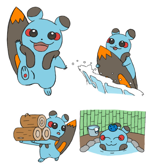
Zazachu was the third design I worked on (we'll get the the second later). With aspects like the surfboard tail and life vest fluff, it very much informed aspects I would add to all the other evolutions. I also tried to keep the colors in mind. I imagined this being one of the three Gen 1 evolutions, and Gen 1's color palette was very influenced by being sprites first, so I tried to choose colors that would be distinct when grayscale.
The second new Gen 1 design is Hirachu, a Flying-Type. One of the things I was trying to keep in mind was to not limit myself to the Types Eevee uses, and instead use ones that fit either Pikachu or the gimmicks I wanted to use. Since Pikachu was well known for learning Surf and Fly in Gen 1, I thought I'd incorporate that not only into its Types, but into its evolution method, having Pichu evolve into Pikachu, Zazachu, or Hirachu based on whether you teach it Flash, Surf, or Fly (all of which are HMs and have infinite uses). In Gen 1, I imagine it would evolve immediately after learning the move, but this would change in Gen 2 for reasons we'll discuss soon.
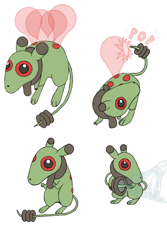
As for design elements, its spots and fluff are meant to invoke an aviator scarf and goggles, and I think I did a good job of illustrating how it uses its tail. I imagine the balloons are created by it secreting a sticky substance from the spots on its back to mimic how Pikachu would summon balloons when it used Fly in games like Pokémon Stadium.
We now move onto the Gen 2 designs with Orachu (which is a Jojo reference). Most Pikachu-like, and all Eevee designs are used to demonstrate a gimmick introduced in its introductory game. Pichu is breeding, Plusle and Minun are double battles, Pachirisu is the physical-special split, Dedenne and Sylveon are Fairy-Type, Pawmi is movement-based evolutions, Espeon and Umbreon are the day-night cycle, and Glaceon and Leafeon are location evolutions.
I wanted to keep with the breeding theme Pichu used in Gen 2, as well as the evolution method I started using in Gen 1, so Orachu evolves by leveling up while knowing Counter, which Pichu could only learn through breeding in Gold and Silver.
But then, if Pichu evolves by leveling up while knowing one of four different moves, what would happen if it knew two or more? That's where our second Gen 2 design, Nanichu, comes in. This was a design I had a lot of fun with. It's a Ghost-Type, and I thought it'd be cool to make its eyes and cheeks match and glow in the dark (similar to Umbreon) so that it looks scary if you came across it in a dark alley (or your pantry). As I evolved the design in the second pass, I added the scruff and changed up the tail to add even more to that theme.

As we move onto Gen 4, I wanted the two designs to be based on the physical-special split. Originally I had a physical Psychic-Type and a special Steel-Type, but I wasn't happy with either of them, so I scrapped them both and started fresh. The first new Gen 4 design I made was this special Dragon-Type, Ukichu. I liked the idea of a rabbit coming out of a hat, but to tie it more into the magical elements of Dragon-Types I incorporated a lot of elements from the Jackalope and Wolpertinger. I moved the cheek spots to below the collar to mimic a bow tie, but also made the horns on its head red to keep that visual element present in the face. This one feels a little busier than all the others thanks to the fluff, but it still feels like it fits.
And as Ukichu is special, its partner in Gen 4 had to be physical, hence the Ice-Type Sharichu. I feel like there isn't a ton to say about this one. I made it very snowman-y, and had it so it could freeze over the brown parts of its fur for attacking or defending. I think I did a good job of illustrating how it works.

And as both Dedenne and Sylveon were Fairy-Type, it stands to reason my Gen 6 counterpart should be as well. My first take on Fuwachu was very just-Sylveon, so I really wanted to break away from that on this take. As Fairy-Types are heavily associated with both being tricksters and gemstones, I tried incorporating both those elements into this design, with the necklace motif, crystalline tail claw, and its tail resembling itself from the back to trick others.

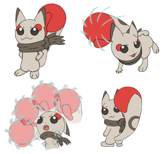
And the last design we'll talk about is Pikachu. Of course. This is actually my third pass on Pikachu, as I wasn't happy with my second. It stuck too much to the original and didn't incorporate some of the elements I used in the other designs. I still didn't change a lot, adding the tail cloud on the second pass so it would have the brown element and functionality all the other evolutions I made have. And on the third pass I gave it an adventuring bandana, which felt on-brand for Pikachu in any universe.
Overall, this was a fun experiment, and I can imagine how easily you could expand upon it. If Pikachu and Eevee are swapped, then is that true of the show? Since Meowth is a cat chasing a mouse, would it be swapped out to match Eevee? What Eevee evolutions would replace the Pikachu clones? How would all these things domino to affect the series? etc. I drew 43 Pokémon for this in total (not all pictured here), so it was a lot of work, and I hope you enjoyed this little design doc, or at least the pretty pictures if you didn't bother reading. And here's the crappy shiny edit, if you're curious.
9 notes
·
View notes
Note
Hey, thanks a lot for sharing that process video, I always feel like I learn a lot with them. Do you mind me asking you a question? I see you use greys ale first and then colorise, any reason why? I know it's recommended by some, but also discouraged by others. Mostly based on the arguments than your shadows will be more flat, instead of taking colour theory into account (putting blue in the shadows of your red fabric for example).
I'm generally unbothered, but I am still fairly new to digital, and when painting irl the greyscale to colour pipeline isn't an option so... Just curious to hear your arguments in favour of it, I guess?
That’s a very interesting question, thank you! I’ll try to answer with the best of my ability, but keep in mind that I’m no professional nor there are wrong or right way to paint, the most important thing is to find the technic that will fit you.
The reason why I use grayscale is because it’s a big time saver when I create detailed illustrations with environment, it allows you to focus primarily on the values, and values are the most important thing when it comes to painting a scenery for exemple. First because you’re only using a limited range of gray values; it’s way easier, because you’re not lost in the vast choice of colors, and second because it sets the main focus of the painting. While closer objects tends to be darker, long distance objects will be lighter. Of course, its not a unique rule, depending on your light source, closer objects can be brighter than your background. But you get the idea, grayscale helps you determine how you will use values to set up the mood and the structure of your piece. By using it, you can give a near finished look to a thumbnail or a sketch made only with shapes, just because your values are cohesive. It’s a very useful technic when working for a project that requires a lot of different sketches, with différents setups, lighting, and mood. Because in no time you can create several different primary ideas and even though it’s still at a rough stage, you can look at them and understand what the finished product will look like.
Now, grayscale has its pros and cons ofc, it’s not the ultimate technic. First, there’s a lot of tinkering to do once your grayscale thumbnail is done. If you try to apply your colors above your layers and leave it as it is, it’ll be muddy, because well, your gray values are.. gray. So you’ll have to use a lot of different features to change the hue of the shadows: gradient maps, color balance, saturation, opacity, curves and brightness. And that’s where grayscale might be more difficult for traditional artists. Second, It might be more difficult as well if you didn’t learn color theory first. Because at the end of the day, you’ll still have to use colors to finish your artwork. But, keep in mind that your lighting will greatly influence on your colors, may it be warm or cool. That’s something you have to think about when applying your first row of colors. If it’s a cool blue light, it will influence the color of the skin, the fabric, the furnitures, your skin will be a bit more pinkish or purplish, you’ll add blue and purple in your red fabric etc. it all depends on your choice of lighting and shading. Once your layers are merged into one normal layer again, you can start rendering and emphasize some colors, apply subtle touches of a particular hue to make the subject « pop » a bit more.
In conclusion, grayscale is a very useful tool when creating the structure of your painting, a good way to set the atmosphere of the piece, but it requires a lot of trials and error, learning values and how light interacts with environment. Some people are only using grayscale, other despise it, it really depends on what you feel more comfortable with, really.
I hope it helps, I’m sorry if it wasn’t very clear I wish I could just idk project my thoughts directly on my phone in a perfectly written synthesis Ahah
33 notes
·
View notes
Text

#JakeReviewsItch
A Lullaby of Colors
by andyman404
Genre: Action
Pitch: "This is a blissful psychedelic relaxation experience made for both VR and non-VR."
My expectations: I don't have a VR headset, so right away, I'm worried this game's primary reason for existing (if it is a game at all) will be lost on me. Developer andyman404's Itch page lists 70 releases in the last seven years, along with a claim that he's participated in more than 140 game jams.
I'm hoping andyman404's catalogue is sprinkled with a miracle or two, but I get nervous when I see someone bounce from project to project that quickly. Is he mixing all of them with love?
Review:
Create a matrix.
Create some blocks.
Use the values of the matrix for the positional z-value of each block.

Apply a mathematical formula to change the values in the matrix over time, within a defined range.

Congratulations. You made art, I guess.
If you want to get really fancy, generate a grayscale image and extract the value of each pixel to populate your matrix. Wheeeee!


The above is my own explanation with my own illustrations. Let me be absolutely clear: A Lullaby of Colors is not about creating and manipulating matrices. A Lullaby of Colors is this:
I like rainbow blobs just fine, but I’ve seen this kind of height mapping a hundred times. I’m over it.
Changing hues is done pretty much the same way as changing heights.
Touch a bouncing ball, and the mathematical formula changes. Maybe this is cool in VR? I ran the game on max settings and encountered frequent frame-rate dips. I dropped to the lowest settings, which looked worse, but performance didn’t improve at all. Seems potentially nauseating.
The bouncing ball makes wind chime sounds, and someone loves their keyboard's “Choir” choir setting. Aaaaa… Aaaaa… Naaaaah…
+ Rainbow blobs are pretty.
+ Inoffensive, unobtrusive, new-age-y sound. The kind of backing that's popular in guided meditation.
– Not much to see or do.
– Minor performance issues. Not a big deal on a monitor, but think twice before trying it in VR.
🧡🤍🤍🤍🤍
#JakeReviewsTwitch is a series of daily game reviews. You can learn more here. You can also browse past reviews...
• By name
• By rating
• By genre
#JakeReviewsItch#Computer Games#Video Games#Itch.io#Reviews#A Lullaby of Colors#andyman404#Digital Toy#Meditative#Wave for Me#Mike Shillingburg#Game Jam
0 notes
Text
Dragon Age Library Edition Volume 1 annotations & additional pages/art compilation
Dragon Age Library Edition Volume 1 is a hardcover collection of some pre-existing Dragon Age comics that was released in 2014. It comprises of all issues of The Silent Grove, Those Who Speak and Until We Sleep. In places, it includes additional annotations/commentaries by the illustrators and authors, as well as a few additional pages with additional art. iirc these additional annotations and pages/art aren’t featured or available anywhere else (in the franchise I mean; other people have probably put them online at some point I’m sure).
From what I can see at least, Library Edition Volume 1 is no longer in print, and as such listings for it on resale sites etc are.. price-inflated & prohibitively expensive (~£100+, which I’m sure we can all agree is just not reasonable or accessible to most people). Due to this, I’ve compiled the additional annotations and pages here in this post. Thank you and credit to @artevalentinapaz, who kindly shared the material with me. This post has been made with their permission. The rest of this post is under a cut due to length.
These commentaries are in the context of The Silent Grove, Those Who Speak and Until We Sleep. If you notice any errors or annotations missing, or need anything clarified, just let me know. I think the annotations are in chronological order. In places I elaborated in square brackets to help explain which part of the comics an annotation is referring to. A note before you proceed further: some of the topics referenced in the annotations/additional pages are heavy or uncomfortable. The quotes here are word-for-word transcriptions of dev/creator commentaries, not my personal opinions or phrasings.
(Also, I do recommend always supporting comic creators by purchasing their comics legitimately. I own each issue of these comics having bought other editions of them all legitimately. The reason I put this post together is because this specific Library Edition volume has been discontinued and the consequently-inflated cost is so high, rendering the additional material inaccessible to most.)
-----
The Silent Grove annotations
Illustrator Chad Hardin: “I used to be an environmental artist for video games, so I built a 3-D model of Antiva City using the program Silo. Many of the buildings are simple cubes, but a few are more detailed. Overall, I spent the better part of a day building it, but I used it again and again throughout The Silent Grove to maintain continuity in the backgrounds.”
Script Writer Alexander Freed: “Even working with David Gaider, it took me several drafts to find Alistair’s voice. His narrative had to convey his humor and self-doubt from Dragon Age: Origins while suggesting a newfound weariness earned during his years on the throne. For readers familiar with the character, he needed to seem like a changed Alistair - but Alistair nonetheless.”
Chad Hardin: “If you read a lot of comics, you might wonder why the majority of the heroes wear skin-tight suits. Well, I can tell you: they are easy and quick to draw. In video games, you build the model once and then animate it, so details don’t slow you down. In comics, everything has to be rendered by hand. Varric and Alistair’s outfits were quite detailed. It took me a long time to get used to them, and even longer to memorize the designs until drawing them was second nature - Varric’s knee armor in particular! Oy vey!”
David Gaider: “One of my favorite scenes in the entire series [when Varric and Isabela are disarming traps and picking locks together while Alistair looks on]. Isabela and Varric, doing what rogues do. I had a suggestion for how to put it together, but Alex managed to make it fit and did a great job with it.”
Chad Hardin: “I never used to keep any of the artwork I created for comics. I would just hand the pages over to my agent to sell. This page [when Alistair, Varric and Isabela are in a tavern together, with hookah in the foreground] I kept for myself. I love the hookah-smoking elves in the second panel and Isabela’s face in the last panel. I rendered the first four chapters of The Silent Grove in grayscale using ink washes, gouache and Copie markers.”
David Gaider: “For a little while, Varric [in these comic stories] was supposed to be Zevran from Dragon Age: Origins, which would have made sense, Zevran being Antivan and all. I know that some fans would have loved to see him, but the dynamics of the group just didn’t work as well. Then a planned cameo later had to be cut for space. Ah well, Zev, another time.”
Alexander Freed: “Isabela at her most dangerous [climbing up the side of the cliff]. This scene - featuring a scantily clad, dripping-wet woman who tends to flaunt her sexuality - could easily have come across as exploitative, but Chad did a lovely drop portraying Isabela as purely focused and deadly.”
Chad Hardin: “Isabela rising out of the water and scaling the cliff with the knife in her mouth is one of my favorite parts of The Silent Grove. It is one of those moments where the writing really inspired the art. Hats off to Alex and David. This is another page I kept for myself.”
Colorist Michael Atiyeh: “This is one of my favorite Dragon Age pages. Chad is such an amazing artist; I feel very fortunate to have had the opportunity to work with him.”
Chad Hardin: “I love that this page [when a guard spots Varric and shouts ‘Intruder!’] made it in uncensored. So many times in comics, I draw something and some stuffy lawyers come out of the woodwork and tell me to tone it down. Dark Horse and BioWare always let me have fun, and this turned out to be one of my favorite pages with Varric and Bianca. Any guesses to which word he is mouthing in the second panel?”
Alexander Freed: “Note the simple decency of Alistair as he gives his cloak, without comment, to Isabela. For all his flaws, he’s genuinely kind at heart - a rare enough trait in Isabela’s world that I think it’s much of what she values in him.”
Chad Hardin: “I love the opening panel to this chapter [the opening panels to Chapter 3, when the team are on a ship at sea]. It’s the image I use on the homepage of my website. This page was a gift to my cousin Wendy, who loves pirates. Seascapes with sailing ships might be clichéd in fine art, but for me it was a first.”
David Gaider: “I wanted to have this story center on the group travelling to a Witch of the Wilds other than Flemeth, and originally I had set it somewhere else - until I remembered a Codex entry from Dragon: Age Origins that offhandedly mentioned a witch in the Tellari Swamps. Brilliant! It’d look like I planned it all along. I didn’t.”
Michael Atiyeh: “I love opportunities where I can show a change in the time of day as you move from panel to panel [when the ship heads towards and the team arrive in the Tellari Swamps]. I feel the palette of each panel is very distinct and beautiful.”
Alexander Freed: “Why did Alistair choose two people he barely knows to be his companions on this quest? We never make this explicit, but of course Varric is on the right track. Alistair wants to surround himself with people who don’t know him and won’t judge him, yet it’s Alistair’s idealism that Isabela and Varric work to preserve.”
Chad Hardin: “Another page where the writing inspired the art [when the group suddenly encounter a dragon]. I love the dragon bursting onto the scene and Isabela’s stare. Some writers will try to cram six or seven panels on a page like this and the pacing just doesn’t allow the artist to give each moment the right punch. Can you imagine if the first panel was crammed into a single square inch?”
Chad Hardin: “Yavana was one of the only characters that we did no preliminary sketches for. I don’t know how that happened, but thankfully it worked out.”
David Gaider: “I love how Yavana looks like a cross between Flemeth and Morrigan. Flemmigan? She’s totally Chad’s design, and it’s great. Typical for these witches, she never says things straight. In my mind, this Alistair is the one who did the Dark Ritual in Dragon Age: Origins - and I was half-tempted to have him lose his cool in this first scene [opening panels of Chapter 4] with her. Too early, though.”
Alexander Freed: “Through this whole sequence [the page when Varric aims Bianca at Yavana], Yavana is dropping cryptic hints and Alistair is refusing to play along. He’s met Flemeth and Morrigan - he knows Yavana won’t give him a straight answer, and he won’t give her the satisfaction of asking needlessly.”
Michael Atiyeh: “Sometimes it’s the little things on a page that spark my interest. Here [when the team navigate vines and mud to get to the temple], the sunset panel came out great and the mud looks really thick and gooey. It’s fun to focus on these details and make them stand out.”
Chad Hardin: “I hated drawing this scene [when Isabela gets kicked] where Isabela gets the boot to the face. Call me old fashioned, but I was raised to believe that only a coward would ever hit a woman (even a battle-hardened pirate adventurer). I draw at home, and my girls often watch me work in my studio. This was a page I didn’t want them watching me draw. I do like, though, that Isabela gets up, yanks the arrow out, and then soldiers on (and later extracts brutal revenge).”
Michael Atiyeh: “Poor Isabela. It seems I gave her more bruises and black eyes than any of the other characters. [when Isabela is yanking the arrow out]”
Chad Hardin: “It’s always interesting to go back and look at artwork because it reminds me of what was going on in my life at the time. I inked this page [opening panels of Chapter 5] at a ‘draw night’ session at an anime convention in St. George, Utah. I was one of the special guests, but I missed the first day because I was at my grandfather’s funeral in Las Vegas, Nevada. Seeing this page brought back those memories.”
David Gaider: “‘Bianca says hello.’ [quoting the panels being referenced] I adore Varric. I was tempted to have him narrate the entire series [in reference to these three comics], but then again I liked the idea of having each series center on one of the trio’s viewpoints. This book belongs to Alistair, but that doesn’t stop Varric from getting all the best lines.”
Alexander Freed: “Claudio, of course, is not a terribly sympathetic figure. But I wanted to emphasize that he takes this fight as personally as Isabela - he sincerely loved Luis and blames Isabela for the man’s death. I think it’s important to give every character, even the most loathsome, some dignity. [when Isabela and Claudio are fighting]”
Chad Hardin: “Payback! Here is where Isabela extracts her revenge on Claudio [when Isabela stabs Claudio]. I never enjoyed killing off a character so much. I particularly enjoyed putting the look of shock in his eyes. He had it coming. There is something satisfying about killing a ‘made man’.”
Chad Hardin: “Every now and then when drawing comics, I wish I could animate some panels and watch them as a cartoon. It would be great to see this sequence [when Yavana catches Claudio’s soul] in full motion as Yavana snatches Claudio’s soul, makes it reenter his corpse and then extracts information from him until he bursts into flame. It was a very Hellboy-ish moment. I enjoyed the movie that played in my mind while drawing this scene. Hope everyone liked the result.”
Chad Hardin: “As I mentioned on page 17, I rendered the first four chapters in grayscale, which made the black-and-white art look great, but had a neutralizing effect when it came to colors. By the time I drew chapter 4, I had seen the effect it was having and decided to stop using the grayscale so the colors would pop. When I saw this page [when Alistair says to Yavana ‘And we helped you find it’] in print, it confirmed to me that I made the right decision. I honestly feel this art was the best of The Silent Grove.”
Chad Hardin: “I practically painted these pages [when Yavana says ‘It is permitted. Tonight and only tonight’] in thumbnails hoping it would help me choose how to render them in ink. It is so hard trying to figure out how to get a full range of value out of just black and white. There are some artists and inkers that make this look easy. Mark Schultz comes to mind. Michael saved my bacon. Colorists really do so much work when it comes to rendering; this page came out awesome because of him.”
David Gaider: “Here we reveal the existence of Great Dragons (as opposed to High Dragons), and also that Yavana was the source of the return of dragons to Thedas after their departure for so many centuries. But why? There’s the rub, and not even Alistair can trust that she’s telling him the truth.”
David Gaider: “Here’s the controversial scene [Alistair killing Yavana]. I think some fans don’t like that Alistair did this, and have said they consider it out of character. I don’t. From his perspective, Flemeth and her daughters have been toying with the world for reasons that can’t be trusted. They dragged Maric away from his family, from him. One might think his judgement foolish, but considering what Alistair was capable of deciding even back in Dragon Age: Origins, it’s certainly not out of character.”
Chad Hardin: “[same scene as above] This was a controversial page, and there were a lot of people who thought it was out of character for Alistair to kill Yavana (I didn’t see it coming - I mean, you just don’t kill a Witch of the Wild), but here is the thing: this page is Alistair acting as a king. Yavana has been manipulating him, trying to play him like a pawn, and he just can’t allow that. There’s too much at stake, for himself and for his subjects.”
Alexander Freed: “The end? An end, at least [the trio walking off into the distance]. The series needed a note of closure while leading into Those Who Speak (which wouldn’t arrive until many months later). David tweaked the ending in the outline several times, and I did my best to balance resolving Alistair’s emotional journey without resolving the quest. It’s not as clean as I’d have liked, but fortunately, now it’s all in one volume...”
Those Who Speak annotations
Alexander Freed: “Capturing Isabela’s narrative voice was much easier for me than capturing Alistair’s - partly because I’d already written The Silent Grove, and partly because of my own writing proclivities. Rereading now, I wonder if I laid on the (mild) profanity a bit too thick. I’ll leave you to judge.”
David Gaider: “I like the additional detail Alex and Chad put in, letting us see more of Qarinus and more of Isabela’s crew. Alex wanted to give her crew more of a presence, and let her first mate have some face time, so they weren’t just parts of the scenery. Good call on his part.”
David Gaider: “I’m really fond of the formal getups Chad made for the party. Isabela’s actually comes from a concept we didn’t use from the cancelled Dragon Age 2 expansion, if I remember right. And Maevaris came from me asking for ‘someone who looks like Mae West’ - with the wonderful outfit all Chad’s doing.
Chad Hardin: “Maevaris. I love Mae. When David and Dragon Age art director Matthew Goldman spoke to me about designing Mae, they wanted her to be fully female with the exception of her biology. They told me to think ‘Mae West’. Well, when I think of Mae West, I think of her... womanly shape. So, drawing Maevaris was always walking a fine line between portraying Mae’s identity and her biology. The process endeared her to me.”
Michael Atiyeh: “Just like in The Silent Grove, we are introduced to another gentleman from Isabela’s past [when the team meet Lord Devon and Isabela threatens him]. As was the case with Claudio, he will meet his fate at her hands.”
Chad Hardin: “When I was drawing Titus, my kids asked me why I was drawing ‘angry Jesus’ or ‘evil Jesus’. I can’t remember which term they used exactly, but it made me chuckle. I was going for a mix of Rapustin and Joe Stalin, but ‘evil Jesus’ would do.”
David Gaider: “I’m not sure it’s apparent here [when Alistair says ‘I’d really rather not’], but Alistair was supposed to be using one of his Templar powers on Titus (that’s why Titus recognizes what he is on the next page) and disrupting his magic.”
Alexander Freed: “Isabela is witty and charming enough that it can be easy to forget that she’s not, in fact, a nice person. Even after finishing the outline, David was concerned about making her too unsympathetic - but I loved his approach in this series. The dark deeds Isabela commits - this murder included [Isabela killing Lord Devon] - are what make her guilt tangible and no easy matter to overcome.”
Alexander Freed: “I thought the notions of Isabela’s pride in her captaincy and dedication to her crew were some of the most interesting aspects of her character in David’s story. In scenes here [when Isabela is on her ship saying ‘Keep them focused and keep them sober’] and elsewhere, I did my best to emphasize their place at the core of Isabela’s world.”
Chad Hardin: “Most of the time I draw from imagination, but because of the complexity of this page [Qunari trying to board Isabela’s ship] I decided it would work better if I had photo reference. On this page are my nephews Jared (Varric) and Adam, my niece Melissa, my kids Erica, Tasey Michaela (Isabela) and Chad (Alistair), my friend’s daughter Amy, my wife Joy, and the neighborhood kids as Isabela’s pirate crew. (The crew member mooning the Qunari is out of my ol’ noodle.) I paid their modelling fee in pizza and root beer. Also, I had originally drawn cannons on Isabela’s ship, so if there are parts of it that look slightly wonky, chances are there was a cannon there.”
David Gaider: “Ever since the BioWare artists finally did a concept for female Qunari, I’ve been itching to include one in the game. It’s always slipped through my fingers, so I was going to be damned if I’d have a Qunari plot in a comic - without the same technical limitations - and not have one present.
Chad Hardin: “I had no idea this was the first time anyone outside of BioWare had seen a female Qunari.”
Michael Atiyeh: “I really like the lighting in this sequence [Isabela in her cell thinking ‘I haven’t eaten in days’], especially the strong white light and the characters in shadow.”
David Gaider: “The entire sequence of Rasaan interrogating Isabela was something I plotted out in detail when this series began. Here they discuss names - something treated in a manner peculiar to the Qunari, considering how much importance they apply to what things are called (and not called), because it forms the core of their identity. Isabela brushes it off, but as we find out later it’s also at the core of her identity. I liked that parallel.”
Alexander Freed: “To balance out the relatively static talking pages elsewhere in the issue, I hoped to make the interrogation and flashback sequences beautiful and full of information. I proposed an approach to Chad, and he wisely reshaped it into what you see here [the page with the scene where Isabela says ‘I’ve made a lot of stupid mistakes’]. Anything that succeeds on these pages should be credited to him; anything that fails is my fault.”
Chad Hardin: “Probably the most challenging spread I have ever done. My friend Stacie Pitt was the model for Isabela on this page, and my wife Joy was Rasaan. I saved these pages [around the scene when Rasaan says ‘Mistakes can be corrected’] for myself.”
David Gaider: “Sten from Dragon Age: Origins becoming the new Arishok of the Qunari was something we'd planned even during Dragon Age 2. This was a great opportunity to show that, and also to show that Sten didn’t acquire horns even despite the makeover the Qunari received in DA2. Hornless Qunari are considered special, and Sten is no exception.”
Michael Atiyeh: “I think that David, Alex and Chad handled Isabela’s flashback [to when she was sold by her mother] in an interesting way, and it created a nice flow to the story.”
David Gaider: “This was a controversial scene [what happened to the slaves Isabela was transporting], the end result of a lot of discussions between me and Isabela’s original writer on the team, and it went through a lot of revisions over that time. It needed to fit with the story Isabela told the player in DA2, but fill in the blanks of what she didn’t tell. We didn’t want Isabela to be someone who became who she is because she was ‘broken’ but instead as a result of her own actions - yet also not be completely beyond redemption.”
Chad Hardin: “These were hard pages [as above] to draw. It was difficult knowing that events such as this are part of human history, such as the Zong massacre in 1781, where the British courts ordered the insurers to reimburse the crew of the Zong for financial losses caused by throwing slaves overboard when faced with a lack of water. Horrifying beyond words.”
Michael Atiyeh: “Here, Isabela visits here crew, and I wanted to play up that she was in the light and they were in a dark cell. The light streaming through the bars gave me the opportunity to highlight Brand, who also had dialogue in the scene.”
Alexander Freed: “I struggled to find a way for Varric to contribute to victory without distracting from Alistair and Sten’s big fight. I’m happy with the solution: a brazen lie seemed appropriate to the character without taking away from the main show.”
David Gaider: “I believe my original plan had Isabela’s and Alistair’s fight scenes happening separately, but I like how Alex intertwined them in the script and I especially like how this ends up highlighting the differences between their characters when their fights are resolved. Isabela is defiant, revealing her name not because Rasaan demands it but because it’s her choice. In both cases, mercy is strength.”
Michael Atiyeh: “The brush I created for the clouds really gave them a nice watercolor effect here [on the deck of the ship, Sten calling Alistair ‘kadan’]. That brush has become a staple in my toolbox.”
Alexander Freed: “With the strong theme of names running through these issues, I liked the notion that Isabela had outgrown being, well, ‘Isabela’. When her name comes up in Until We Sleep, it’s largely played with ambiguity.”
Until We Sleep annotations
Alexander Freed: “The story of ‘Arthur’ is one of my favorite minor sequences [Varric infiltrating and fighting his way into the fortress]. It tells us something about Varric and it delivers plot information - and it’s also a reminder that our heroes kill an awful lot of people during these series and cope with it in their own ways. In general, writing Varric let me skirt the edge of metacommentary, which I greatly enjoyed.”
David Gaider: “Varric, as always, is my ‘voice of the narrator’. Here he’s expressing some of my own amusement at Alistair’s growing list of peculiarities [‘Your majesty is quite the special snowflake’]. To think, back at the beginning of Dragon Age: Origins he was just the player’s goofy sidekick who grew up in a barn.”
Michael Atiyeh: “By the third series, Until We Sleep, I really started to have a complete feel for what I wanted the final art to look like. As an artist, it’s important to continue to evolve and grow. The close-up of Sten’s face [same page as above] is a perfect example of how I wanted the rendering on the characters to look.”
Alexander Freed: “David’s outline called for a short, somber reveal of the Calenhad story by Sten. Fueled by my desire to avoid ‘talking heads’ sequences, I scripted it as a full-on storytelling flashback. David made sure the history worked (at least from the Qunari point of view), and Chad did a beautiful job handling it in a mere two pages.”
David Gaider: “Blood is important in Dragon Age, as a theme. Here we tie in the dragon blood that was mentioned all the way back in The Silent Grove and explain what it means at last. I was a bit hesitant to tarnish the legend of Calenhad the Great in this way, but I comfort myself with the knowledge this tale is but a viewpoint and not necessarily the entire truth.”
Michael Atiyeh: “Titus melting the attacker is a great example of classic comicbook storytelling and exactly what made me fall in love with the medium.”
David Gaider: “I was really happy with how Chad handled the reveal of Mae as transgender [the scene with Mae in the cell]. My worry was that Varric finding her disrobed might be potentially titillating, but I think he handled it nicely. I only wish there was more time to have Mae properly respond to being exposed in this manner, even to a friend.”
Chad Hardin: “I originally drew Mae as female [same scene as above], then changed her anatomy, so the psychological violation and humiliation she felt would be the focus. Hope that came across.”
Chad Hardin: “When in doubt, have Bianca shoot it [Varric shooting the artifact].”
David Gaider: “This scene [Varric and Bianca the dwarf] with Varric was one I wanted to do for a very long time. We’ve hinted that Varric’s crossbow was named after a real person, someone he never wants to talk about. Now I finally had the chance to show why.”
Chad Hardin: “Of all my Dragon Age pages, this scene was hands down my favorite, because Varric is my favorite. It was awesome to get to draw Bianca in her dwarven form. These scenes give you a glimpse of the love Varric and Bianca shared. It doesn’t tell you the whole story, but you can assume plenty from what is shown. You get to see Varric mostly naked (you’re welcome), but most of all you witness Varric’s heartbreak. I felt privileged to draw it. I got so obsessed with drawing this page I did an entire watercolor painting based on the last panel [Varric gets up to leave, ‘This isn’t right’ - ? or perhaps the scene where he opens the door to leave].”
Alexander Freed: “Unreliable narrators are always tricky - done wrong, they can just confuse the reader. But I’m fairly happy with Varric’s lies throughout this series, most of which are used to downplay the emotional cost of events rather than whitewash the events themselves.”
Michael Atiyeh: “This palette worked perfectly [Varric standing in front of the doorway/portal in the Fade proper], but I can’t take all the credit because BioWare provided reference for the Fade. I added the hot orange energy for the doorway, which looks great with the sickly green sky.”
David Gaider: “This scene [Isabela’s Fade nightmare] was actually inspired by a fan named Allegra who did a cosplay as a Qunari version of Isabela. I knew I wanted something like this for Isabela’s Fade section of the comic, but it didn’t really solidify until I saw the cosplay.”
Chad Hardin: “Isabela is more affected by her encounter with Rasaan than we were led to believe. A portent of things to come?”
Michael Atiyeh: “I love this shot of Mae in the fourth panel [on the page where Isabela is affected by vines]. I would be remiss if I didn’t mention what a great character she is in the series, and Chad captures her beautifully in this shot.”
Alexander Freed: “I saw this issue as a sort of downbeat victory lap. Over the course of the previous series, our protagonists largely came to terms with the inner demons the Fade confronts them with here. The fact they’ve come so far lets them win this last battle... but they still have scars that will never completely disappear.”
David Gaider: “Maric was in the first two novels I wrote for Dragon Age. Seeing Chad’s rendering of him as a regal, grown-up version of Alistair made me incredibly nostalgic. Some characters you just never let go of.”
Alexander Freed: “I feel Varric’s lines (‘tell yourself the stories you need to tell’ but ‘never live your own lies’) are the natural endpoint of all the exchanges he’s had with Alistair, starting from the end of Chapter 1 of The Silent Grove. And of course it plays off the story of ‘Arthur’, as well.’’
Chad Hardin: “I’m happy with the way Titus came off in these pages [Titus attacking and saying ‘The last magisters of Tevinter were so close’]. He looks threatening and powerful when fighting Alistair, Isabela and Varric, but genuinely confused by his inability to defeat Maric. Bye-bye, evil Jesus.”
Alexander Freed: “I can’t help but feel for Titus. He was unthinkably corrupt, but I see him as genuinely motivated by Tevinter’s glory. (The fact Alistair reads zealous ideology as a lust for power says a lot about both characters.)”
Michael Atiyeh: “I love the seamless transition of color from Titus’ magic to the dragon breath and then back into the orange remnants of his magic in the smoke. This was a really fun panel to color [Titus saying ‘Die by what wrought you’].”
David Gaider: “‘You are not the dreamer here. I am.’ I always have a scene or a line that’s in my head when I begin a tale, and this line of Maric’s was one I wanted all the way back when I started working on The Silent Grove.”
Chad Hardin: “I love this page [Maric and Alistair clasping hands]; Mike’s colors are spot on. We get to see all our heroes in an ideal state for the last time. This is the last Dragon Age page I saved for myself.”
David Gaider: “This scene kills me [Alistair destroying the Magrallen]. I knew it needed to happen; I knew I wanted it to happen even back when I began the story. Alistair lets Maric remain in the Fade rather than dragging him back to a world which has moved on. Alistair’s ready to move on, but forcing him to give up that hope... it makes me feel like a bad person.”
Chad Hardin: “Heartbreak for Alistair as he realizes that once again, as a king, he must kill: this time, his own father (granted, the Magrallen did most of the work). I really like how Maric crumbles away in the end. This was my last page, and the emotions on the page and in my studio were very final. Altogether, this was a year of my life in the making. On my last page, I wrote a thank you to everyone involved, the crew at Dark Horse and the crew at BioWare. I’d like to take this opportunity to thank them again. It was a thrill. Finally, a huge thank-you to the Dragon Age fan community, whose support was overwhelmingly awesome.”
Michael Atiyeh: “As the story came to an end, I knew I was going to miss these characters. Writing these annotations reinforces the fact that I hope to work with this great creative team again one day. Many thanks to Dark Horse and BioWare for the opportunity to work on Dragon Age.”
Alexander Freed: “The tension between the art and the narration on this page [the one with Alistair sitting on his throne while nobles argue] is something you can only pull off in comics. Neither tells the full, bittersweet story alone. Similarly, these issues wouldn’t have been possible without everyone on the team; thanks to David, Chad, Michael, and everyone I lack space to list!”
Additional pages / art
Library Edition Volume 1 also came with some additional pages, with additional art and commentary. These are as follows (I’m including them for the sake of completion, click the links to see):
1. Alistair and dragon concepts
2. Rasaan and Maevaris concepts
3. Sten, Titus and Yavana concepts
4. A series of cover pages 1
5. A series of cover pages 2
In case anyone has trouble reading the notes that accompany these images, I’ve transcribed them below:
1. Dragon Age Sketch Book
Alistair Concept
Dragon Age / Dark Horse
Chad Hardin: “The headshot of Alistair is from a finished sketch with a rejected armor design. In order to save time, the redrawing was completed on the computer, where tweaks and changes are quick and easy, if somewhat less glorious.”
[Dragon] Head #1 / Head #2
Chad Hardin: “Everyone liked this dragon sketch so much that Dark Horse printed it for signings at conventions. You can see I did multiple proposals for the dragon’s head. It was more effective than drawing the body over and over.”
-
2. [arrow pointing to Mae’s sleeve] concealed [I think that’s what it says anyway] daggers / shurikens?
Chad Hardin: “When designing Rasaan and Maevaris, I wasn’t exactly sure how their roles would play out in the series. Maevaris’ outfit was inspired by brothel madams of the Wild West. I thought it would be cool to have some weapons concealed in the formal wear. These never came into play in the series, but they were there in my mind.”
-
3. Chad Hardin: “Although we only see Titus in his battle garb in one issue, I really liked the design of his armor. The sketch of Yavana was done on the fly and served as both a rough preliminary sketch and as a panel layout. You have to work hard and smart in comics to keep up with the deadlines.”
-
4. Cover Artist Anthony Palumbo: “This was my first assignment for Dark Horse, and I was both excited and nervous. I drew pencil sketches of the main characters, scanned them and played with different arrangements, poses and color schemes in Photoshop.”
-
5. Anthony Palumbo: “Fellow illustrator Winona Nelson helped me by sitting for photo reference. I created the mock-jewelry with gold-painted Sculpey. That’s a quick photo of my own gaping maw, to help with the image of Varric.”
#dragon age#bioware#video games#artevalentinapaz#alistair theirin#fav warden#morrigan#queen of my heart#long post#longpost
63 notes
·
View notes
Note
your last post made me think about how I loooove how you use color in your art, it's so vibrant and full of life and movement and expression! I was wondering if you had any advice on how to do color studies? perhaps doing drawings with limited palettes? or anything similar?
First things first, thank you, I really do appreciate comments like these!
this post now also has a follow up for finish limited palette pieces
I'm obviously very fond of limited palette art and color studies/color thumbnailing are great ways to get that done. When people think limited palette there's often the association of unrealistic and fantastical color palettes, but learning to limit your color use absolutely applies to semirealism and just builds stronger color theory in general. I was planning to talk about limited palettes in more realistic color use in this post, but this already ended up way too long. If that's something people want to hear about I can talk about it later.
Color theory basics crash-course! I'm sure almost anyone who has colored anything is familiar with this, so I'll be SUPER brief, but I want everyone to be on the same page for this. Color has three qualities you need to take into account: Hue, saturation, and brightness. Hue is what we think of as the 'color'. Saturation is the vibrancy of this color; how bold or dull it is. Brightness is how light or dark the color is. Here's this all labeled on a color picker I stole from google.

As a rule of thumb, things that look good in color should look good in grayscale. Having a strong range of values (brightness) makes for a strong image. Keep this in mind when you're picking colors – knowing what areas need to be light and what areas need to be dark before you start coloring will make your life easier. I'm going to teach you when and how to break this rule later, but for now let's just talk about picking a palette. I've found five to seven different colors to be a really nice sweet spot for working with limited palettes.
There are three main types of color palettes ill work with and ill provide examples each of them. I expect you to all politely refrain commenting on the amount of homestuck fanart that's here.
Monochromatic, where the piece is all within one color family with slight variations in hue, and larger variations in brightness and saturation

Accent, which is essentially the same as a monochromatic type with the addition of a strong, contrasting secondary color in one or two variants. Normally the accent color is lighter and serves as a highlight. This is not any kind of a hard rule, but is instead just what I like.
Split. There are two (or more) main colors at play, each with a couple of different shades.

Cool. Now lets see how we'd go about making one of these palettes.
I'm grabbing an inconsequential sketch i've already got and we're gonna slap some color on it. Let's start monochromatic – I've gone and just tossed six pretty random shades of green on it, picking what goes where based on what I want to be light and what I want to be darker.
Keep in mind, by monochromatic, I don't mean just picking one color and making it lighter or darker! Adjust your hue within the same color family – some of these are very blue, definitely more blue than green, and some are much warmer and yellower. Play around. In this stage I like to have every color on a distinct layer, so I can just recolor the entire layer at once as I tweak the palette.
On the right, I have each color lined up in order of lightest to darkest just so I can get a sense of what I'm working with. Lets go ahead and call this one thumbnail. Now I'm gonna group the layers, duplicate them, and flatten the copy. I'll shrink it down and shove it off to the side so I can compare it to the other ones I make later.
Okay, I did a few more almost completely arbitrary monochromatic palettes. Here they are compared with their grayscale counterparts.
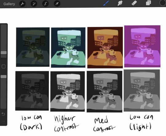
All of them have the same number of colors, and lights stay lights, darks stay dark, midtones stay mid consistent between all of them, but the range of values is different between them all. The difference in light or dark between each tone is different and it gives a different mood that you can see even in black and white. None of them is more 'correct' than any other, and it's all about establishing the tone and atmosphere you want. Experimentation is key.
Now lets try making this a complimentary palette. With a strong accent color, your accent should be placed at areas of importance. People are naturally drawn to contrast and when using an accent color in a piece it'll make that area stick out, so make sure you're placing your colors with intent. For this I went back to that first set of greens I had because it was my favorite. Since this palette is over all very dark, I am going to make my accent the lightest color, because that'll stand out more. In a lighter palette, try making your accent the darkest color. Once again I must stress these are not hard rules – there are very few hard rules in art at all – but these are very useful tips for getting emphasis in the right place. This is just an example piece so I'm not being huuugely thoughtful with how I'm placing the color.
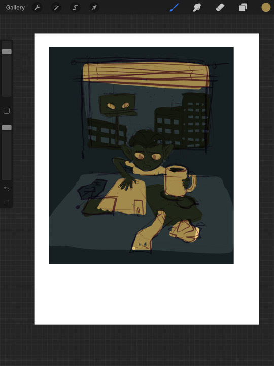
Here's the same image but with the lightest green just swapped out for a far more vibrant accent of yellow. Looks pretty terrible. I don't want all of the papers and blinds to seem so prominent. So let's scrap this and try a different approach. We're gonna instead add our accent as a sixth color to our palette.
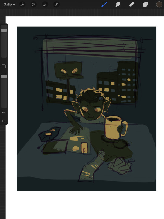
By adding another color, I've added another level of detail. Figuring out how to manage detail isn't just dependent on how many colors you have, but this is already going to be ridiculously long so I'll spare you that spiel. This is another one of those things I'll talk about more later if people want to hear my #thots. Using the new yellow accent, I emphasized the eyes, the mug, and added some interior detailing to the objects on the table. I also decided to place yellow in some of the windows of the outside buildings, to add a bit more interest in that area, and to justify giving yellow back lighting to our little goblin lad here, which makes him stand out nicely.
A split palette makes things a whole lot more complicated. Now that you're gonna be working with two different base colors you don't just only have to worry about which one is lighter or darker, you have to worry about how the hues look next to each other. Lets work with an orange on top of our original green here. I picked two of the greens and replaced the darker one with a darker orange, and the lighter one with a lighter orange. Now our palette is six colors split 50/50 between orange+yellow, and green.
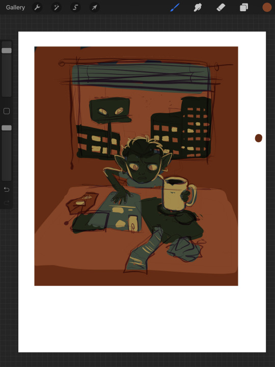

But now something interesting is happening. Let's take a look. If you're particularly keen eyed, you might have noticed that there's a third set of colors here, using a greyish brown in place of the oranges. What's up with that?
Well, what's up with that is, they are orange. The palette on the far right is what happens if, instead of choosing my own oranges, I simply hue-shifted the bluegreens until they were technically orange in hue.


The oranges I chose just based on how they looked without actually checking the value and saturation of actually changed the value hierarchy of the whole piece. The table, instead of being in between the objects stacked upon it in terms of brightness, is lighter than either. This isnt bad at all – there's absolutely nothing wrong here. It's just important to be aware of things like this! This is why I said a split palette is the most complicated of the three I'm talking about here – in many occasions, the hue hierarchy can top the value hierarchy. Keep that in mind for slightly later.
I think split palettes work really well for comics, and I like to make my comics with split palettes. Whereas with a single illustration, you can just putz around with your color thumbnails until you get something good, for a comic you're locked into your palette once you've done the first page. Unless you're some sort of insanely meticulous person, in which case I envy you, you probably don't have every single page of your comic blocked out with respective values and can't apply your palette to the whole thing at once to test it. This means you'll need a palette that's pretty versatile. Having a split palette where one of the hue sets is lighter than the other overall allows you to decide whether you're going to create an overall light panel with dark accents, or vice versa. I'm gonna compare two palettes I'm using for comics to make this point.
Here's a sampling of the comic pages in full color, at 0% saturation, and adjusted for grayscale respectively. You'll notice a slight difference between the desaturated colors and the grayscale colors – grayscale seems to hold truer to the full color version, doesn't it?
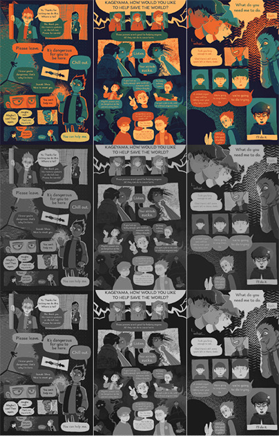

Now, here are the palettes themselves, and some grids showing the relationship between every pair of colors. When you don't know exactly what you're going to be using any given palette for, the relationship between any two colors becomes more important than ever. The bottom palette is split three ways, red yellow and blue each with a light and a dark, and then a completely neutral dark gray color. I'm using it for a long ongoing ace attorney comic I'm drawing. The top one has 4 shades of blue that go from darker and cooler to lighter and warmer, then 3 shades of orange that get yellower as they get lighter. Underneath is just the values – you'll notice that the top palette has a larger value range, with its lightest color being lighter than that of the bottom palette, and it's mid tones spaced further apart.


What you'll also notice about the bottom palette is that instead of the reds being lighter than the blues and darker than the yellows, the value alternates dark red dark yellow light red light yellow. Take a look at the color grids. You'll notice that for the most part, every color in the palette on the right looks good with every other color. That's not nearly as true for the palette on the left. The light blue has a weird vibration where it meets either of the reds, and a few of the pairings just aren't particularly pleasant. Honestly, from any objective ideas of color theory, this palette kind of sucks shit. Lets make some adjustments to it.

I've changed the dark yellow and light red hues so now the light red is slightly darker than the dark yellow. That's the palette that's on top now. Looks better, doesn't it? But so now the question becomes why am I using a palette that looks awkward, disharmonious, and visually strained when I know exactly how to fix it? The simple answer is because I wanted a color palette that's awkward. I wanted that visual strain. I have trouble working on comics and general, especially anything as long as this one, and I wanted a color palette that already meant things would come out looking a little bit wonky, so I wouldn't be as concerned with nitpicking all the details and making everything pretty. I think the sort of visual upset also fits the tone I'm keeping with a lot of the comic.
Remember earlier when I said I'd talk about breaking the rule of stuff looking good in gray scale and in color? That's now. Take a look at this image.
Which of the three colors is darker: the red, blue, or yellow? The stupid truth of it is that there's not really a proper way to tell. All three are technically the same 'brightness' but our brain tells us that the blue is the darkest, and the yellow is the lightest. Why do our brains do this? Let’s make em gray now.
On the bottom you can see what the colors look like when they are set to 0% saturation; as you'd expect it's a homogeneous gray blob. So then what the fuck is going on with the grayscale one? The grayscale one is closer to the way our brains interpret the colors, but we know this to be an improper rendering of their respective values. Which is the correct version, then – the grayscale or the desaturation? Luckily, we're using a computer, so we can have photoshop tell us the exact balance of hue, saturation, and brightness of any given pixel. Let's take a look now.
Wait, huh? We can plainly see that all three of the colors are at 49% brightness. But neither the desaturated value or any of the 3 grayscale values have a brightness of 49%. So what does a brightness of 49% look like?
Okay. Sure. Why not.
All of what I've just shown you regarding grayscale is to emphasize the point that your best judgment for which colors look good is a far better measuring stick for a good color palette than any technicalities. Even if the value is the same, the hue can differ enough that you can still get a beautiful finished drawing. Color and our perception of it is so, so vastly technically complex. You can not allow yourself to be bogged down by this. Simply practice, and color will become intuitive to you over time. I have a lot more I could say on the subject of picking and using your colors, but this is already insanely long. Feel free to ask any follow up questions, I hope this was of literally any use!
450 notes
·
View notes
Note
A question to sort of piggy back on that-one-pizza:
What’s your process when it comes to choosing color palettes to fill in the parts that aren’t shadows? (obvi there are already colors established when it comes to Mando specifically) For example, I sometimes do a quick grayscale fill to explore the tone/mood I want to convey then move the color slider to match the tint or shade. My way is def quite a bit of work but usually isn’t done for comic illustrations, maybe it’s as simple as just...picking a color?
Appreciate your input and your work! From what you post here, your style is beautiful. Finally going to read Consolation Prize and I’m over the moon about it!!!✨
Oh god, I think my coloring is absolute garbage and I totally suck at it... but i'll do my best to answer!
So, I have several pallets saved for several characters and environments and usually just fill everything with its normal flat color right off the bat. From there I usually fill the panel with a pale shade of whatever tone fit's the scene (Like cool or warm or whatever) Then I usually test out blending options with the tone color. I usually find multiply the be the most useful for this, but sometimes other blending modes work from me.
Once I have a more uniform tone I try to keep it simple. Like, just adding a large gradient overshadow on multiply to the background or edges of the panel to emphasize whatever the main point or figure is in the the frame. I also add small shadows to characters features but I've been drawing back on that lately since I feel like it undermines my line work and I kind of view that as the star of my art rather than the colors.
And really that's another big thing to remember too as an artist. Make all parts of your style work together. I really felt like my coloring wasn't doing my line work justice for a long time because I would turn off my color layers and just look at my ink work and would just be like "Wow, I like it like this so much better." It's easy to go too far for me. I wan't my color's and shading to minimal if they're not important, but I think I'm finally getting happy with my coloring style and you'll defiantly see a change in this new comic.
I think the use of coloring and shading something in greyscale first is an awesome technique and I know A LOT of artists that do it. It's fast and efficient too. It just doesn't work for me personally.
Coloring's a bitch and color theory's and even bigger bitch to figure out. Keep working at it and you'll get to where you wanna be!
This probably didn't help but thank you for the ask and support! Good luck with your art!
9 notes
·
View notes
Text
Hyunjin "Play With Fire (Feat. Yacht Money)" (원곡 : Sam Tinnesz) | [Stray Kids : SKZ-PLAYER] ~A Love Letter~
I talk about why I love this video so much and deliver an excruciatingly detailed play by play of it, but why read a two thousand word, five page essay on a three minute video when you can just go watch the aforementioned three minute video? Forget me spending hours writing this, why are you here, seriously, it would take you significantly less time to watch the actual video. Regardless, enjoy my attempt to refrain from saying the same three things, “he's so cool”, “I love him”, and “this is so good”, in exchange for a more, hopefully, academically professional sound.
Watching him perform never fails to put me in a trance, it’s incredibly captivating how precise and sharp while simultaneously lively and energy-filled his movements are. This video feels reminiscent of enjoying a movie I’ve seen countless times, memorized every line of dialogue from, and genuinely think of every part as the best it has to offer. I greatly missed seeing him dance and having this as his grand welcome back into the spotlight is nothing less of a gift. Every second leaves my heart pounding and as excited as the last, as he continuously tops himself the longer I watch. I feel that revisiting the video is the least I can do, for giving it only one view doesn’t feel morally acceptable if I intend to truly appreciate it for that art that it is. Dramatic of me? Perhaps, but I can’t help but perceive it as more than just this one video that was uploaded onto their YouTube channel. It isn’t just about all of the work he and others put into the making of this particular video, his choreography for the song was a result of years upon years of practice and learning different techniques. A performance this good doesn’t only involve technical skill though, but also skill in regards to one’s inner mind. To have confidence in one’s self, to hit every move powerfully, to know what you’re doing and be unapologetic about it, that is skill. Sure, the performer is at the focus of any performance, but don’t forget that it’s also about the audience, it is after all for the enjoyment of the viewer. If the audience senses your doubt and insecurity and uncertainty, it will make your stage that much less enjoyable. Whatever you feel, they can feel too. When I watch him, I don’t feel any of that. In fact, I feel the exact opposite, I feel inspired, motivated, confident, excited to advance in my own endeavors. The emotion that this video evokes from me goes beyond anything Stray Kids or K-Pop or even dance itself, it makes me want to be a better person, be kinder to myself and work harder. That might sound like a lot for one video to do for someone, but it’s the truth. All of the details, even down to the individual frames, it all works together to create the most gratifying viewing experience. At the time of writing this, the video has just hit five million views and has over one million likes, only a mere three days after its initial upload.
The first shot of his footsteps alone, as he goes to stand in front of the mirror, I already feel this sense of importance coming from him, delicate, yet powerful. The setting, cold and empty, yet inviting, it makes room for him and gives him just enough light to be seen, for he doesn’t need all that much help to surely shine. The credits that pop up use a dark shade of pink-red for it’s background color and white text that acknowledges the same deep red imagery and text associated with the material of the original work. His outfit is neat and pristine with some sparkle, resembling one a prince would seem fit. He stares at his reflection, holding a sheer white ribbon in his mouth, gathers a section of hair behind his head and proceeds to tie it with said ribbon. The music starts as he finishes tying and lets his arms fall down at his sides. The over the shoulder shot looking into the mirror, shows that his expression is neutral, almost calm. This can most certainly be described as “the calm before the storm”, except the storm itself is antonymous to a tragedy, because when the singing starts, it’s as if his performance persona was turned on by a switch, a charismatic possession that took place in a matter of seconds that sends chills down your spine in the best way. His previously neutral, calm-like expression and gently resting arms are quickly replaced by the sudden placement of his right hand around his neck and a look that resembles more of a vengeful, hesitant, and somehow playful one. Similar to what I’d imagine a villain would look like right before being bested during an epic fight sequence at the climax of a film. It’s satisfying to see him popping to the beat’s rhythm, his arms, wrists, and head smoothly illustrating the flow of the words, his focus and the secure angles he’s able to form before even fully utilizing his lower body. On the line “Got secrets I can’t tell”, he delicately places his pointer finger in between his teeth, as he turns back to meet the camera with his eyes, the shot now semi-closely focusing on both Hyunjin and his reflection as opposed to just one or the other. He extends his right arm, his hand forming a fist, and the camera movement making it as if I’ve been punched and sent flying. He stumbles to the middle of the room, does an opening gesture with his arms, like a proud baker showing off their completed wedding cake, along with a dramatic spin incorporating his thin, white, flowy cape. Reaching the pre-chorus, we get to see the room more clearly, like the stone pillars and the contrast of the small, warm lights on the walls to the grand grayness radiating from the large window that makes him appear as a near silhouette. There’s a certain holiness about him spending a count with his head down and arms out, much like the Crucifixion of Christ, before showcasing more of a demonic energy when he faces the window with his body, but bends backward and looks to the camera upside down. He rips off the cape, tosses it behind him, to his right. This could symbolize a transformation, an abandonment of a particularly purer image of oneself, a liberation. The music picks up, and the manner in which he dances is like a visual representation of one’s inner turmoil combined with an agenda to seduce those watching, wanting to dance for himself while taking us along for the ride. Now that the first minute of the video is out of the way, let’s continue.
The music fades into the background and the video takes on a sudden widescreen and grayscale appearance as he falls back on his right hand, flings his left hand over to his right shoulder, as though he’s been shot, and is being supported by his knees. He leans forward, places his right hand on the ground in front of him, uses his left hand to push his right knee over to achieve ideal balance, setting up his body roll. He extends his right leg back, getting close to the ground, and there’s something quite feral, yet intimate about the way he traces the length of his arm with his face and left hand. It looks like he’s taking out his frustrations through his moves while never sacrificing the detailed quality of the performance as a whole. It reminds me of how it’s more than common for artists to use their pain in their art, whether it be a point of well-intentioned expression with a specific purpose or simply an outlet for them to channel into. Hyunjin is the definition of aggressive elegance. The fullscreen, colorful display and music entirely return when he spins and lands on the ground in a Spider- Man esc pose, the room a lot warmer than even before the stylistic grayscale section. There’s hints of red, acting as a match that’s set to illuminate and ignite the puddle of gasoline that is him and his performance, that replaces the once colder, icy blue that previously enveloped his silhouette. He bounces to the beat showing off his proud, devilish smile that, instead of striking fear, makes me feel proud, as I’m essentially rooting for the villain in the movie. If the transition to the grayscale widescreen was him getting shot, then the transition back to fullscreen color is him emerging from his grave, an awakening. His shirt is no longer neatly tucked into his pants, but rather, hanging very loosely and mostly unbuttoned. He covers his face with his left hand, pulling it down for just a second before revealing his expression that has swiftly reverted to a roughly indifferent one. The inner conflict has greatly subsided, and focuses on the hesitant-free embracing of his newly discovered self, one of immense confidence and sex-appeal. Although, something about the flow of how he averts his gaze, looking to the left and not the lense, while pointing and doing body rolls at the camera, covers his eyes with crossed arms, and then allows for his hair to cover his eyes as well, makes me feel like he doesn’t want the viewer to know he is still at least a little bit shy. He quickly makes you forget though, because the next and final minute exaggerates everything he’s shown us up until this point, taking it to a whole new, spectacular level.
The bridge of the song creates a slower, softer atmosphere, which is beautifully interpreted with how Hyunjin carries himself during this part. Bigger gestures that blend into each other seamlessly, centering on really taking up the space he’s in. He gently and precisely lowers his body to the floor, collecting a white rose between his teeth. As soon as he returns to his upright stature, the setting changes dramatically. His hair now completely down, he’s under a spotlight in an otherwise pitch black and foggy room. There’s blue and red light reflecting off of his white top and his skin as he dances. This part feels more humane compared to the rest, with more of an obvious balance between sharp, impactful moves and tender, compassionate ones. He draws attention to his shoulders, brings his hands and feet close to his body, and showcases his red lit back. I particularly enjoy when he flicks his wrists and twists his ankles to the right in unison on the second syllable of “unstoppable”. For the “legendary animal” part of that line, his arms create a cage-like structure by doing a climbing motion and carrying it over all the way to the left. A cage in which he destroys the walls and breaks out of, shown by him punching downward on beat. From holding the rose in his mouth to holding it in his hand, he brings it over his head to his left shoulder, and raises his heels. He carries the rose down and around his left arm, his left arm momentarily resting at his waist, his right arm extended downward, he raises his heels again. His whole body lowers as a rigid wave starts at his up flicked wrists and subsequently elbows and shoulders. This collection of gestures results in petals falling off of the rose. He then inevitably throws it into the void, out of the reach of the lovely spotlight. I see this spotlight dance as a danse macabre, or dance of death. The white ribbon, white shirt, and white rose all coming together to illustrate this innocent and pure quality to him, that through this dance, he finalizes the renouncement of. He is more than ready to embrace a new and different side of him, but especially to get rid of the older and repetitive side that felt restrictive more than anything. The spotlight dance ends with Hyunjin looking directly into the camera, tracing his right hand down his chest and to his side, and the camera backing away. The last chorus of the song brings us back to the oh so familiar main room, Hyunjin’s hair back to being tied up, the lighting is the same, but there’s something that stands out. His shirt is on the verge of being completely unbuttoned and that allows for something alluringly shiny to be fully in view compared to before. The video comes full circle with Hyunjin’s hand around his neck, he stands in the hallway, and walks away a new man as the screen fades to black.
As I wrap up this essay on Hyunjin’s “Play With Fire (Feat. Yacht Money)”, original song by Sam Tinnesz, Stray Kids: SKZ-PLAYER, the video has reached six million views, a million more than when I first started writing this, and I feel proud to have spent a day simply pouring my heart and mind out on this wordy display of my appreciation. Don’t be fooled though, for my necessary research, I guess you could call it, for this project may no longer be so necessary, I shall continue to watch and applaud the masterpiece and experience that is this video for my own personal enjoyment, much like how this whole piece was written for my own personal enjoyment. It was an interesting challenge to properly voice not only the contents of the video but also my thoughts and feelings on it. Hyunjin is a highly valued dancer, member of Stray Kids, and person and five pages isn’t ever going to be enough to fully explain the respect and admiration I feel for him and his various projects. I think he’s really cool, I experience all sorts of fiery euphoria watching him dance, his rap and singing alike are addictive as hell, and he’s pretty, haha. I missed him a lot while he was inactive, and I’m so happy to have him back and doing great things as per usual. I’m excited to see what he and the rest of the group have left to show us this year. I advise you to watch the video if you haven’t, but somehow ended up reading an essay on it first, and if you’ve already seen it, watch it again, yeah. I’ll leave you with lovely thoughts and lovely vibes and I hope you too can appreciate the work he’s put into the video, as well as my work on this essay. Thank you for taking the time to read my love letter, essentially, and bye for now ^ ^
2 notes
·
View notes
Text
recently i’ve reorganised my tagging system, so i made this post to serve as a directory/explanation of all tags i use! feel free to ignore it as it’s mostly for my personal reference ^___^
tags that are used for blacklist purposes (except #moths and #isopods) aren’t listed below!
GENERAL
#fav - i like to look at these :]
#insp - stuff that inspires me!
#heart tag - for when i’m sad!
#trans tag - i’m trans and happy about it :)
#nd tag - i’m neurodivergent (and also very sexy)
#polskie - i’m so so sorry
#important - mostly social justice stuff
#boost - donations, crowdfunds, things that need attention imo
#politics - yeah
#misc - miscellaneous things! mostly textposts and stuff to laugh at
#tweets - ...self explanatory
#vid - this too
#music - there’s only one post under this tag
#save - things to read/look through. includes mental health reminders
#writing tips - oh you know
#tutorials - for drawing!
CREATION-RELATED
#art - things with clear artistic intent!
#other’s art - artwork of other tumblr users! i gush a lot after this tag.....
#paintings - as it says on the tin. not necessarily made with paint, tho
#illustrations - either scientific ones or artwork not looking like “traditional” paintings
#photography - real life captured!
#textiles - fabric :]
#words - either poetry or typography! there aren’t a lot of things because i. rarely read
CONTENT-RELATED
#landscapes - artwork/photography with an open composition! or else
#nature - for when animals and/or vegetation are the main focus of an artistic piece
#plants - for when only plants are the main focus of an artistic piece
#people - mostly photography of models :]
#cementaries - please ignore the misspelling and the fact that i forgot the word “graveyard” exists
#buildings - includes interiors!
#space - ...well!
#canids - dogs, wolves, etc.
#cats - cats! :) mostly includes photography of irl ones
#isopods - i think they’re neat
INTERESTS-RELATED
#birdblogging - birds are my first and biggest special interests!!!
#paleoblogging - DINOS!!! THE CAMBRIAN PERIOD!!! paleontology/paleobiology is my second special interest!
#moths - ...moths! i’m slowly getting into them :)
#techblogging - i don’t know much abt it yet, but old tech is cool!
#off - as in. the game
#dorohedoro - <3
#flight rising - i’m currently on hiatus, but i have a sentiment for my stupid gay little dragons
#warrior cats - ew
#ENA - by Joel G!
MY CITY NOW
#my art - i draw sometimes :)
#OC: - general tag for posts that remind me of my own characters! neither all of them have their own tag, nor are from the same story, but here’s a list of those who do have their own space on this blog:
#Maike
#Esme
#Fiołek - not his actual name
#Irma
#Ivo
#Yuria
#Svante
#Yana
#Touko
#Valentine
#Kyou
#Irenka
#Klemens
#Jack
#Sonja
#Enkhjin
#Basia
#Ilion
#Wish
if you see any name that isn’t EXACTLY after the OC: tag...... then it’s of a real person and a mutual of mine
#little gildings insp - inspiration for my original universe that encompasses two stories of mine! it’s forever a wip, but i love it to pieces
#lore insp - formerly a tag for my Flight Rising lore, but i’ve turned it into an original story set in a semi post-apocaliptic setting in an original universe :)
#better island insp - this story isn’t even named this way anymore, but whatever
#ans - an. unnamed story of mine on which i can’t start even working, because it requires knowledge of advanced physics and maths. i’m a junior in highschool.
#in the last day of my youth - a short story i’ve invented in a suddern burst of creativity and it infested me with brain worms
#untitled insp - a surrealistic universe i saw in a dream once
#01 - brown/orange/sepia/rustic aesthetic! my fav :)
#02 - uuhh....... i don’t know, really. mostly white/grayscale/pale things
#03 - RED.
#04 - colourful stuf!! mostly pink :)
#05 - green and blue! very nature themed
2 notes
·
View notes
Text
ROTBTD - OUAT AU Episode 2 (Part 2)
ROTBTD - OUAT AU Episode 2 (Part 2)
REVISED. I forgot it was supposed to be a snow day and tweaked this a bit. I also placed the former Part 3 in here since both parts were short.
Note: Bit of a short one for now! But still here! This fic still exists! And hopefully the fandom ;)
If you came here not having read the first Episode then you might want to check that one out first. Here's the LINK to the very first post for this Fic. Otherwise this part is pretty confusing.
ROTBTD - The Big Four – OUAT AU
Hugo
Hugo balanced the book in his lap while sitting under a snow covered tree, already absorbed in the story of a Viking choosing to learn about the dragons instead of seeing them as an enemy. Somehow he identified with the hero, even if he wasn’t sure he’d ever defended anything in that same way, other than the occasional attempt at standing up for his friend, Freddie, and any other fellow nerd (though silently). He continued to quietly marvel at the illustration of the Viking boy with his hand outstretched, palm up, as the dragon reluctantly bowed its forehead to him.
Okay, but no way does this guy look like me, he thought, assessing just how scrawny the boy was drawn, thin arms, legs, and a shirt that seemed much too big for him secured by a belt. Okay maybe a little like him. He wouldn’t have known this was supposed to be a Viking boy if the text didn’t include it. Weren’t Vikings supposed to be all big and brawn and intimidating, rah, rah rah? And then there was the dragon which didn’t even look like your typical European dragon guarding the cave full of treasures, nor did it look like those cool Chinese dragons that represented rivers in stories he’d read. If anything its head was too oval, like a dark watermelon with a little snout, and his eyes were big in its face like a cat’s. But the dragon really did look like the one in his dreams, whatever type it was supposed to be derived from in imagination. The Night Fury. He could even remember, in great detail, what it felt like to ride the dragon in the dream, even though he wasn’t exactly sure what he looked like in it. Dreams were weird that way anyway, he considered, you weren’t really sure if you were an omniscient observer or a character playing a part in the dream. One thing’s for sure is that there’s something happening and the information is clear as memory a little while after he wakes up and is able to gather his thoughts.
His attention and gaze were too fixated on the book that he didn’t really see his surroundings. Naturally, he got hit in the head by a tennis ball.
"Sorry!" came a voice, approaching, as Hugo rubbed at the spot at the side of his head. Somehow it seemed fitting that this sort of thing would bring him back out of his little fantasy of being that Viking hero. He took off his glasses, only then realizing how smudged the lenses were all this time, checked if it’s still in one piece, and then attempted to wipe the snow off with the hem of his shirt. Blurry eyes squinted at the legs of a girl in gray leggings and snow boots and then looked up quickly in case she’d think something of it. She must’ve been playing Tennis because she carried a racket over her shoulders and, when he picked up the ball that broke him from his reverie, it was, in fact, small, lime green, and Tennis-ball like. In this weather? At the same time Hugo readjusted his glasses.
"I’m really sorry. I was—“
Their eyes met—sky blue against earth green—and for a split second there was a moment of recognition that Hugo couldn't place. The girl wore an aquamarine sweater over a white collared polo shirt. She had hair that was a mass of wild curly red, like a crackling flame in the middle of the grayscale day. He suddenly felt self-conscious.
"Playing tennis," she continued.
Hugo noticed there was nobody else around.
"By yourself? And in this weather?"
"Aye, I'm trying to find my next sport." She had a distinct Scottish accent and spoke a bit as if she was out of breath. "And the weather's not that bad." Her face was flushed and her wide blue eyes had a cheery light in them, the kind you’d expect to see in someone about to chortle. She seemed like the type of person who was capable of chortling. He wasn’t sure what to make of it.
"What happened to the old one?" he said, realizing he sounded monotone and must’ve looked deadpan. If not a little too nerdy, still-getting-used-to-the-voice voice.
"Got bored with it. I seem to be good at a lot but champion of none,” she responded. She had the ball in her hand but she was still talking to him and didn't seem to be in a hurry to leave. If anything she looked like she wanted to sit down. “I want to know which one will make me feel free."
He thought about how she said it. Mostly he wondered why he'd never noticed her there earlier because, well, she was cute.
"Free?"
"Aye, like adventure free. Getting away from the mundane free, more like."
She was still talking to him and his voice was still the same boring drone! Why was this cute girl still talking to him? Why was he complaining? Add a little variety, Hugo. Keep the conversation going! He cleared his throat.
"Track and Field? Hiking? Definitely a lot of getting away and freedom in that."
She smiled. Did she find him amusing? "Have I seen you before?"
He thought the same, but wasn't about to jump up and announce it. Instead he said, “If you mean, skulking in a corner somewhere, then maybe yes. That could be me."
She laughed. She laughed. "Sorry bout' your head again, er...?"
His name? Did she want his name?
"It's alright. I tend to be a magnet for trouble." What was that? He mentally kicked himself. "I mean, I get hit on the head a lot so there's nothing to worry about. Not that anyone's hitting me in the head, no. People are generally good to me. Ignoring me and pretending I don't exist to disappoint but-" Why am I still talking? "I'm a klutz."
"Really?"
Hugo pursed his lips in that way that made his cheeks bunch up and shrugged.
"But what is your name though, klutz boy? I was just going to ask."
"Hu-Hugo. It's Hugo." He blushed.
"H-Hugo? Really? Do you always hiccup your name that way?"
"No, I was just stuttering."
She laughed again. Ask her for her name, genius!
"Erm...so..."
"Mairi," she said. "Mairi Reid. My friends call me Mair, though."
"Mair."
For some reason this was happening and he didn’t have the presence of mind, nor the will power, to ask her what it was all about, why she bothered to ask for his name at all. Not that it automatically meant anything. Not that maybe she was interested in him. It was probably just polite conversation for hitting him in the head with a Tennis ball. That was probably it. He couldn’t help noticing how she looked at him, a fierce stare that shot straight.
She had just turned to leave when he mumbled, "How about Archery?"
"What?" Her eyes were wide.
"Archery? Have you considered Archery? It's, you know, probably a lot of fun. Maybe even liberating."
"Hmm. I do have good hand eye coordination. I never miss."
"You just hit me in the head with a tennis ball."
She winked at him and then left him stunned with the realization.
"See you around, H-Hugo."
He had a funny smile on his face when he turned the page of the book and there's an illustration of the young Viking riding the dragon.
Past
“We should be safe here,” Merida said, settling herself and her bow against the wall of a cave. Her hair was damp from the spray of the falls and her heart had just about relaxed at finding a place to hide. Hiccup guided Toothless, who didn’t seem to have a problem with the relative darkness, inside and scrambled next to Merida. The sun had already started to set outside
“Good, because I think we all need a breather, don’t you?” Hiccup said, heaving as he adjusted his position on the cave floor and picked away at a rock he accidentally sat on. He, then, placed a hand on Merida’s shoulder. She could only barely see the details of his face in the dark. “You okay?”
“Why wouldn’t I be? We’re on the run. It’s exciting.” If he’d notice the way it sounded half-meant he didn’t, couldn’t, show it either. She’d always wanted adventure, ran after it on a most awaited day and daydreamed about it when she was stuck in the castle with princess lectures. This kind of running, with a young Viking, a dragon, and clans of men hunting them down, was just the kind of thing she would’ve expected herself to like, and yet she wasn’t as excited. Her fate was changing, she could feel it. But wherever it was leading her she wasn’t about to go anywhere without the person sitting next to her now.
“Is it just me or is it too cold here in this cave? Freezing cold?” Merida shivered as if to emphasize her point. It was a welcome distraction away from her lingering doubts about leaving Dunbroch. Hiccup scooted a bit and placed an arm over her shoulder. It wasn’t as awkward a gesture as his usual attempts at being romantic, probably because it comes naturally out of concern. She snuggled closer, pulling her legs against her chest.
“I’m used to it.” Hiccup rubbed at her shoulder just as Toothless curled as gracefully as he could next to Merida, breathing through his nostrils to give her warmth. “We should probably light a fire.”
“The smoke would be seen.” Merida was quick to shake her head.
“We can’t stay here very long. Maybe we could leave in the middle of the night. They’d be tired eventually.”
She nodded a bit, then sat up straight, only just realizing another complication. “Except they’d all know I’ve gone by now. The search party would be endless.”
She felt the heavy rise and fall of Hiccup’s chest. He shifted in his seat.
“I was thinking,” he said slowly, “of taking you back up to the castle before I left.”
“What?” She pulled herself away. “No. It’s too risky. We’re trying to get you away from the clans not back to them. And what makes you think I want to go back? Didn’t I follow you?”
It was dark but she could see Hiccup’s silhouette with what little light the setting sun provided and he was raking his fingers through his hair in frustration.
“Maybe you shouldn’t have followed me.”
“You said!” her voice grew angrier, she could tell. It echoed. “You said you were waiting for me. If you didn’t want me to follow you then you should’ve left!”
“I said I was waiting in case you were following me. Merida, this is just the kind of thing I had a feeling you’d do.” Her mouth fell open. If he could see her well enough he’d see fire in her eyes enough to keep both of them warm in the stupid cave.
“What? What kind of thing?”
“This! You said so yourself, there is going to be search parties looking for you! And all the clans and young lords, I suppose?” His voice took on his usual ramble but it was annoying with the tone of condescension instead of cute. “How was that going to help?”
“I didn’t want there to be. Who knows if they even noticed anyway? I just assumed!”
“Sure, no one’s bound to notice you’re gone.”
Merida threw her hands up and groaned, mirroring his frustrated hair-raking gesture. “That’s not fair. I make my own decisions, Hiccup, alright? I chose you!” She said it as if ‘I’, ‘chose’, and ‘you’ were in three different sentences of their own.
“It’s…it’s not about that.” He faltered, clearly not expecting her to confess with such passion and certainly not during an argument. “I’m sorry. I didn’t mean to make it sound like I’m telling you what you can and can’t do. I’m just…I shouldn’t even have been an option.”
“Well you are,” she said with an added huff. “Besides, it’s not like I make much of a difference if I’m there. My mum’s got it handled.”
There was no denying that deep down it felt like she was just abandoning her kingdom until things died down with the other clans and her mum would finally be forced to tell them that the princess won’t go through any sort of arranged marriage at all. Ever. As much as Hiccup was her choice, back at home she was practically left with no other choice but to follow her stubbornness. No amount of years and growing up would do the job. She couldn’t just accept, grow to love whoever is ‘right’ in time. She didn’t expect breaking tradition was this hard, let alone extreme. It would be so much easier if she could ask him to stay. If he could stay.
“Oh, come on. What if your kingdom needs you?” Hiccup was more careful now. He really did believe she was meant for something great and that she could do it all by being her version of a princess, she could tell. If only they could just be. Just the two of them.
“Do you really want me to go back where I’d have to make the decision of who I’m going to marry?” She wasn’t sure if she was more irritated, amused or just plain tired at the fact. Merida hugged her legs closer to her again, prompting her chin against her hands. “My kingdom made it clear what purpose I have for it.”
Hiccup was silent for a moment. Toothless was either watching, waiting for them intently in the dark or already asleep.
“You do realize what this looks like?” Hiccup said.
“What what looks like?”
“Like I’d kidnapped you, little do they know this basically counts as eloping.”
Merida snorted. Hiccup moved slowly in the ever growing darkness and tried to reach for her face. She felt his fingers tug absently at the damp mess of curly hair.
“Aye, I was never ready for an arranged marriage before,” Merida whispered, surely staring at the way what little light they had casted the outline of Hiccup’s face. “I realize I would never be ready ever. I’d fallen in love with no prince.”
“A Viking? Of all things.” Hiccup thought out loud. Almost playful. “What would your people say?”
“They should’ve known I’d follow my heart and my own time, and my heart’s getting really impatient. It wants to be with you.”
“Oh yeah?”
“Maybe we do get to decide. Maybe we can forget where we’re from because of this. We can just be…this.” Her fingers intertwined with his, and she knew it was all a bunch of the sappy silliness that they were feeling when they were alone together. The lot of things she’d been saying, she wouldn’t have pegged herself to be the type to come up with them before. But she felt like she could be anything with him, most especially herself.
She had just fumbled enough in the dark to think he was closing in for a kiss, but he moved away, sat back and just seemed to consider her.
“We’ve been branded as invaders for so long,” Hiccup said, all serious again. “Much as I’m all for being with you, I have a responsibility to Berk.”
Something about that stung and it took her a second to process before biting back. He was standing up and she didn’t know why that sudden act alone made her jumpy. .
“As have I to our kingdom, we’ve established, but don’t you get it? I’m not just considering throwing it away for nothing. I’m doing this for you. For me. For us. I want us to have a chance to find a better path.”
“I’m that nothing, Merida. Maybe we should think about this first.”
She was on her feet before she could do that thinking he suggested.
“Oh, don’t start with me now. I know that. I know we need to think about it. Which is why I need you to help me…think of a way we can be together without…without you leaving.” There! It had to be said as well.
“I don’t exactly have a choice. Like you said, all the other clans are after me. I can’t just forget about Berk, I have people who expect me to lead…even if I’m not sure how to, dragons to take care of.”
“And Astrid.” She sounded whinier than she’d intended. Luckily he couldn’t have seen her face at all, otherwise he would have seen the immaturity in her expression. It wasn’t just his previous romantic relationship, but he had other friends who were important to him too. A father, a family. It was a little too late now, she was blinded by the jealousy that was too apparent and one she’d kept stamping down for too long.
“Why? Why does this keep coming up? You know that’s over, Mer, can we not bring this up right now? She isn’t even part of the issue.”
“Then what is the issue? It’s not like I’m making you pick between me and Berk, I’m just asking you to consider that maybe there’s a way where we can have both.”
“Well, if there is we can’t see it now by being together for too long. We both have to go back.” It was lucky she couldn’t see his expression. It was lucky he couldn’t see hers. It was bad enough hearing how they argued so easily. Why did she let it get this far? Why couldn’t she stop feeling for a second a think about how to fix this?
“You expect me to just go back and forget whatever happened between us?”
“That’s not what I—“
“Fine.” No. Because maybe it was hopeless. It was too desperate, a cry for help and compromise, but maybe she knew from the start. Maybe she wanted this argument. She was already in the process of leaving, grabbing her bow, clenching her fists, and overcome by emotions as he continued to ramble on. This was getting them nowhere. It already hurts.
He was clearly ready to give up what they have to hopelessness and so was she.
She had tears in her eyes but she rubbed them away with her sleeves hastily, then huffed. She wanted to be angry instead of desperate. She needed to be furious instead of wanting so much to beg him to stay because she knew they couldn’t make the rest of the world adjust so that they could be together.
The climb down was difficult and messy since she tended to stumble and scrape her knees and arms with the rate at which she moved. Hiccup was probably looking down at her or at war with himself whether to let her cool off or come after her on Toothless. It was almost cruel the way she went off, considering he couldn’t just chase her with his leg the way it was.
She made it to a ledge, wide enough for her to sit and rest. It gave her a moment to cry. And that’s when she noticed a wisp appear a few feet away from her, blueish light unmistakable in the dark.
She followed it and it led her to the Dark One.
“I suppose fate has led you to me then. In need of a bargain?”
(End of Part 2)
Episode 1
Part 1
Part 2
Part 3
Part 4
Episode 2
Part 1
Tag List: @rose-sparks13 @beautifulslimezonkpaper @rosesnvines@jewishicequeen @hiddenwriterspirit @shiroi-majo
Just let me know in the comments if you want to be tagged!
Thanks for reading!
#the big four ouat au#the big four fanfiction#rotbtd#mericcup#jelsa#jackunzel#fanfiction#rise of the brave tangled dragons#rotbtd au#rotbtd fandom
31 notes
·
View notes
Text
Cold Sweats Were Made To Be Broken - How Emily Carroll Creates Effective Horror By Bending The Rules
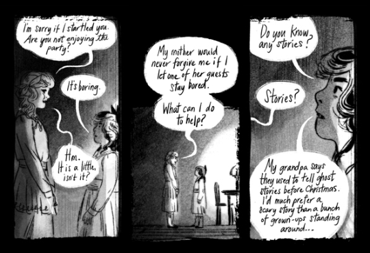
I believe that, with enough time and resources, someone with a good eye for horror would be able to create a good horror story with just about any medium. With prose, you have the advantage of vivid description and getting to intimately know the character’s inner thoughts and fears, like in the works of Stephen King. With film, you get the advantage of visuals and audio along with the dread that comes with being a helpless audience member, such as the in the works of John Carpenter. And while the poor video game is often given a bad rep among other, older art forms, video games actually are one of the most ideal ways to experience horror stories, since the audience must become an active participant in the story to move it forward, not even allowed the escape of being a passive viewer.
It’s actually for very similar reasons that I find comics to be one of the ideal mediums for the horror genre. You get some of the benefits of prose, some of the visuals of movies, and even a bit of the forced participation of video games, in the fact that readers must choose to advance to each next page- a happy medium, if you will. There’s also one of my favorite features of sequential art as a whole- the fact that the artist has a tight amount of control over the pacing of the story. You can enhance the drop a world-shaking reveal on the reader by devoting a splash page to it, or pull out a scene with agonizing slowness with multiple, decompressed panels- storytelling devices that become lethal weapons in the hands of a good horror writer.
Keeping this in mind, it’s no surprise that horror comics have always been a huge part of comic history. In modern times, American comics are almost always associated with superhero stories, but there’s actually a rich history of horror comics- the rise of gruesome true crime stories and horror anthologies like Tales from the Crypt are why we have the infamous Comics Code, after all. Today we have titles like 30 Days of Night and The Walking Dead (though their more cinematic adaptations are typically more well-known). The huge world of European comics have given birth to a huge number of horror titles, like Italy’s Dylan Dog or Britain’s semi-tongue-in-cheek Scream! And of course, Japan has been the birthplace of great horror comics from the days of Mizuki Shigeru to the advent of modern horror with figures like Junji Ito and Masaaki Nakayama.
But of course, those figures and titles only exist in the world of print comics. In the age of the Internet, it would be remiss to ignore the staggeringly massive world of webcomics in any discussion of comics, let alone horror comics. This is due to any one of the many, many, many webcomics that exist online, but for this essay, I want to focus on an artist who doesn’t just happen to focus on horror comics while publishing them on the internet, but uses and utilizes both the medium of sequential art and the Internet to bring out the best in her comics.
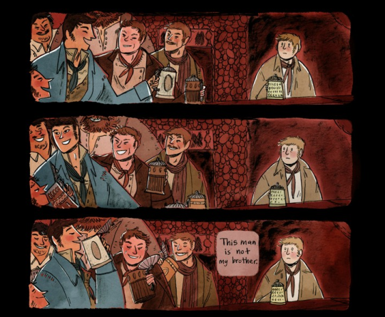
Originally an animation student, Emily Carroll had only just begun to venture into the field of comics when she went hurdling to the attention of the webcomic community in 2010. His Face All Red was only her third comic, and its runaway success (helped by the recommendation of another name in horror comics, Neil Gaiman) was something she admits to be caught off-guard by. But she clearly has seemed to have taken it in stride, considering that her website now hosts almost 20 webcomics, many of them some sort of horror story. She’s also done print comics, including the original anthology Through the Woods and the upcoming graphic novel adaption of Laurie Halse Anderson’s powerful YA story Speak. As grandiose as it may be to say this, I believe Carroll’s style and approach to storytelling was made for the medium of comics, and I believe she deserves a spot up there along with Gaiman and Ito when it comes to naming masters of the horror comic.
But how does she do horror comics so well? It’s not just good writing, or good art, though she’s certainly talented on both those fronts. After spending an amount of time looking through her comics, I think I’ve come up with a solid answer, an answer that can be used to teach anyone interested in comics and in storytelling in general.
Emily Carroll is a master of breaking rules.
When I say rules, I don’t mean that there’s actual rules some God Of Comics has written down somewhere. Rather, the “rule-breaking” Carroll does refers to how she subverts expectations and goes against the conventions of storytelling that have become familiar over time. In doing this, Carroll’s comics have an air of unpredictability to them, and the reader must not only advance through the comic at their own pace, they must do it with the knowledge that the comic will surprise them in some way. In short, when a story breaks “the rules,” it creates the illusion of the audience’s safety being lost.
But how does Carroll break the rules? This is a bit of a nebulous thing to analyze- I mean, I don’t even think “breaking rules” is something Carroll consciously sets out to do. But over time, I’ve noticed recurring themes and storytelling methods in Carroll’s comics, and I think it’s worth analyzing them to gain a better understanding of sequential art and how sequential art can continue to evolve.
Breaking “The Rules” of Each Comic
One thing I like about Carroll’s webcomics is that, since they’re all self-contained short stories, they each have their own unique visual “language.” This can apply to comic’s palette (like how The Hole The Fox Did Make is all grayscale), the format of panels (like how When The Darkness Presses is told through several 4-panel pages), or even the format of the writing (like how The Prince & The Sea is told as a poem). This gives all of Carroll’s comics a sense of cohesion, similar how to repetition is used in visual design to create a sense of rhythm and reason.
But, of course, what’s even more important than the “rules” Carroll establishes for each individual comic, is when Carroll chooses to break these rules.
The Hole The Fox Did Make is all grayscale- so when the colorless 4-panel strips are replaced with a mass of panels mostly rendered in an angry red, it comes as a shock. When The Darkness Presses is told through several 4 panel pages- so the reader knows that the long vertical segments that accompany each scene about the door are meant to be considered different than other scenes. And once the reader sees what is behind the door…
Suddenly changing the established visual language of a comic is easy shorthand to let the reader know that the scene is important in some way, but in a horror comic, it can also be a subtle way to catch the reader off-guard. Rebecca’s ghost story in All Along The Wall is told in a simple style and over-saturated colors to distinguish it from the “real” scenes, but the contrast in the story’s bright, colorful palette to the sketchy grayscale of the rest of the comic almost makes it feel more menacing in contrast. The fact that it’s explicitly a ghost story rendered in these almost cheerful hues make it even more uneasy- and ends up saying a lot about the kind of person Rebecca is. In short, it’s good, creative storytelling that also serves to scare.
These breaks in the established format work best when combined with one another. The Prince & The Sea takes part mostly on land- specifically, in single-panel illustrations that show only the meeting place of the prince and the mermaid- with a colorful palette that’s equal parts earthy and warm. When the story shifts under the sea, the palette shifts to eerie, cool colors that reflect both the dark atmosphere and the horrifying turn of the plot. But in addition to this, the story finally breaks the single-illustration format, going vertical to simulate the feeling of diving, and adding in “floaty” panels surrounded by black, giving a true feeling of being underwater. Carroll uses not only tone and format shifts but shifts in space- which, incidentally, brings us to one of the most notable and important features of Carroll’s work.
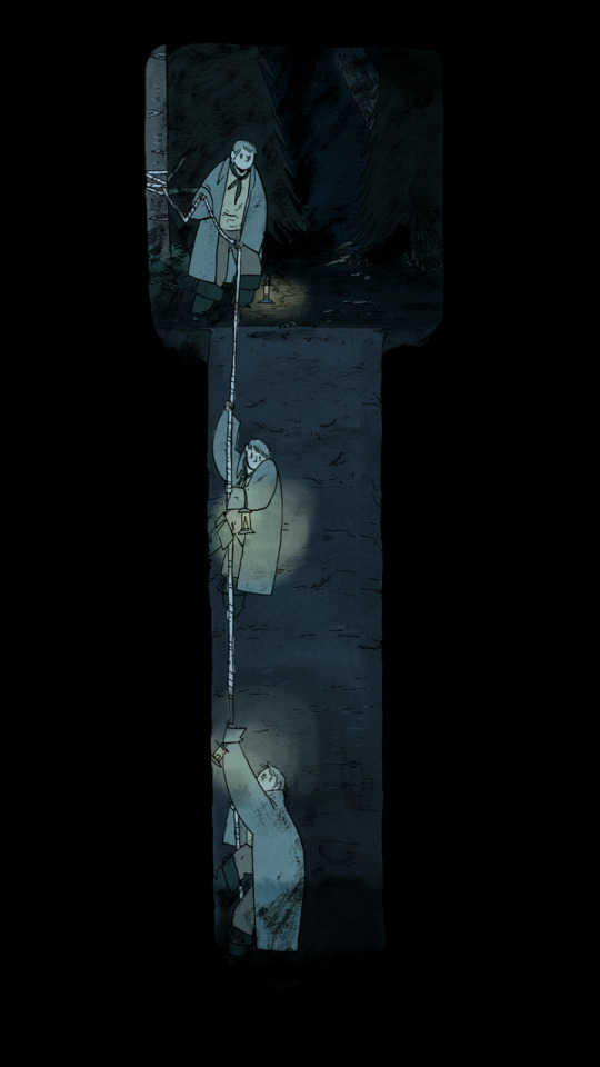
Breaking “The Rules” of Comics As A Whole
In 2000, the comic book artist Scott McCloud published the book Reinventing Comics: How Imagination and Technology Are Revolutionizing an Art Form, in which he made several predictions about the necessary changes that would need to occur in the field of comics in order for the medium to survive, with a major focus on the Internet and webcomics. One interesting idea McCloud proposed was the concept of “the infinite canvas,” the idea that a comic could have limitless storytelling potential thanks to the almost limitless size and space offered by a webpage.
In the year of 2000, the art of the webcomic was in its infancy, consisting mainly of typical comic strips like you’d see in newspapers, leading to a lot of skeptical response to these ideas-- but as it turns out, McCloud was basically completely correct. We’ve seen this from the long vertical formats typical of many Korean webtoons like The Sensual M and Chinese manhua like Tamen de Gushi to the textlogs, flash games, and fully animated segments of the ambitious multimedia-mishmash Homestuck.
Of these examples, however, I think Carroll’s techniques are closest to what McCloud had in mind when he proposed the infinite canvas. His Face All Red famously had the wonderful, wordless sequence of the protagonist descending deep into a hole, depicted by the downward scroll of the reader. When The Darkness Presses switched deftly between standard “real world” pages, long vertical dream sequences, and the dramatic horizontal reveal of what lay behind the door.
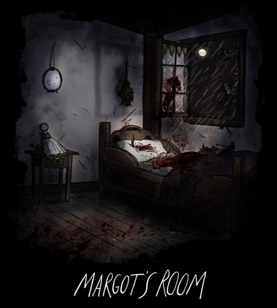
To this day, I think Carroll’s most impressive use of the infinite canvas is still Margot’s Room. Initially presented as a month-long event during October 2011, Margot’s Room starts with a grim poem over a grim image, with every important word in the poem relating to a part of the picture, which the reader would click to go to a new part of the story. Each week, a new line of the poem would be revealed alongside a new link, with the last part being released, of course, on Halloween. This creative use of hyperlinks is interesting enough, but the final, shocking scene is almost breathtaking- the events are violent, chaotic, and wild, heightened only by the wide spread of panels over a massive, empty blackness, linked only by words and furious splashes of blood. It’s something that couldn’t really exist in print comics (unless on a much smaller scale) and seeing how effective it is here, it almost make one wonder why it’s not more widespread among webcomic artists.
Without the limits of the printed page, Carroll has a better opportunity to break the typical conventions of sequential art. But she actually goes beyond that, using the medium of the Internet in even more creative ways than McCloud imagined. Besides her use of hyperlinks in Margot’s Room, links are also used to tell the non-linear “story” of Grave of The Lizard Queen, or show two sides to a tragic tale in The Three Snake Leaves. Carroll even employs animation in her work, to an extent. An animated GIF in Out Of Skin conveys the horror of seeing something terrible just out of the corner of your eye, and a certain “trick” panel in All Along The Wall may make you jump out of your skin if you don’t know what exactly it’s going to do. And that’s how it’s brilliant- comic panels aren’t supposed to change, after all. Carroll knows that, and knows just how to use the reader’s unconscious knowledge of the rule of well of course comic panels are always static against them. You don’t think twice about it... until the rule is broken.
Breaking “The Rules” of Storytelling
One of my favorite examples of Carroll’s unique take on the infinite canvas is in When The Darkness Presses. Despite being a short comic released all in one go, it’s presented as a recently completed longform webcomic, complete with animated ad banners. I don’t want to spoil what becomes of these ads later, but it’s very interesting to point out that one of them is for “Alo-Glo,” the skin product that features heavily in Some Other Animal’s Meat. This is especially interesting once you realize that Some Other Animal’s Meat is technically a sequel to When The Darkness Presses.
I say “technically,” because it’s actually entirely possible to read both comics and not know this, the way I first did. They’re two different self-contained stories that just happen to involve two characters at two points at their life.
There’s no real meaning to it- and in a way, this is perhaps Carroll’s favorite rule to break: the all-encompassing question of what does it all mean?
Ever since His Face All Red, Carroll has faced this question, or at least variants of it. How did the man’s brother come back? What was that thing in the hole? In a 2014 interview with Hazlitt, Carroll admits to feeling self-doubt when readers began clamoring for concrete answers:
“People were saying, ‘What’s the meaning of this? What’s the meaning of this?’ and … I felt very much like, I need to justify this somehow, otherwise they will see that I am a faker that has faked my way into some kind of Internet buzz, so there has to be a one-to-one meaning for everything.”
Thankfully, Carroll has been able to move past this initial doubt- I believe, very much for the better. Leaving unanswered questions is almost a trademark of Carroll’s now- from the tree in Out of Skin to the “mystery man” in The Groom to the door in When The Darkness Presses. The thing that plagues the main character of Some Other Animal’s Meat. The voice that calls Regan to the river in The Hole The Fox Did Make. The list goes on.
And it’s not just monsters. From early on in my love of Carroll’s works, I began to notice connecting threads through many of her comics. What did it mean that His Face All Red draws attention to “a tree with leaves that looked like ladies’ hands” (similar to the tree in Out Of Skin) and “a stream that sounded like dogs growling” (a sentence almost identical to how the stream in Margot’s Room is described)? What did it mean that The Hole The Fox Did Make and The Groom featured Regan, or that All Along The Wall is technically a prequel to a comic from Through The Woods? What did it mean that events of When The Darkness Presses are brought up by the main characters years later in Some Other Animal’s Meat?
The answer, of course, is that there is no answer- other than the answers and ideas that begin to form in our heads when we’re presented with an unsolved mystery. Ever since early humans looked up at the stars and put together shapes in the gaps, the nature instinct of human beings drives us to pick patterns out of randomness. Our brains try to find meanings or answers where there is none, whether we want to or not, or even if we are aware of our minds doing so or not. And of course, this almost whimsical trait of ours is also one of our most massive burdens- the horror of imagination. The infinite possibility of the conclusions each person reaches on their own will always be far, far more frightening than any single answer a writer can give.
In a way, Carroll’s most mundane “broken rule” may be her most powerful tool. In the age of endless theories and fiction analysis, in the light of humanity’s eternal, inescapable desire for the solutions for every puzzle, Carroll’s works are unanswerable. And because of this, I think the unexplained monsters of Carroll’s works are some of the scariest in fiction.
Funnily enough, despite basing this essay around the concept of breaking rules, I stated early on that I don’t think Carroll herself sees her approaches to sequential art like that. While researching for this essay, I came across an interview by The Comics Journal with Carroll from 2011, not too far after the runaway success of His Face All Red. It’s a great interview, but what probably stuck with me most is Carroll’s description of how she approaches comics:
“It stems more from just what I think will be most fun, really. And since—when I started doing comics—I’d never done comics for print, I wasn’t in the mindset of doing pages anyway, which maybe led to me not really adhering to that standard when I started in on my own attempts. I like the idea of scrolling just because it’s fun to play around with revealing images that way, but you can play around with the same thing using page turns too really.”
I wanted this essay to be a tribute to one of my favorite artists, but I also initially intended it to be a way to encourage artists to shake up typical comic conventions and try to create unique art. Upon reading this quote, however, I realized that I had one more thing to learn from Carroll, one thing I want artists to know as well. Carroll has carved out her own, unique approach to sequential art, and in the process has happened to buck several storytelling conventions. You too can learn from this and know that you have the freedom to break these same rules- but perhaps the most important thing to take away from this is that Carroll does this because she has fun doing this. Carroll’s comics work not just because they break the rules, but also because she enjoys creating them.
Your own unique style should be what is most enjoyable for you. Creating new and unique artwork is all well and good, but what will make or break your art are the feelings you have while creating it.
And if you have fun in breaking rules, then more power to you.
All of Emily Carroll’s online works can be found on her personal site (general NSFW warning for nudity and disturbing content). You can buy Carroll’s anthology Through The Woods here.
261 notes
·
View notes
Text
New to Digital Art? Here are 5 Essential Tips for a Digital Artist
Digital art is becoming increasingly relevant in today’s society especially for illustrators thanks to technology and the use of television, social media, mobile apps, cartoons, animation, etc. It’s becoming more imperative for an artist to know or at least be familiar with digital art platforms such as Photoshop. I recently transferred over to doing more digital art because I found the tools very useful and you can make some pretty cool artwork without some traditional art troubles. Even though there are many that I think are important, here are top 5 digital art techniques that I found useful to achieve my illustrations.
1. Use Textures and Customize Brushes!
One of the most common mistakes beginner artists make is using the same brush throughout the whole piece, or not indicating a change in texture in different objects. For example, you should use a different brush for someone’s hair than the one you use for the face. The face has a texture where you can indicate pores and smooth transitions, and the eyes have a glossier feel. The texture of say maybe trees in the background have a rougher texture. You can make custom brushes that fit the type of texture to make things a little easier. You can potentially use the same brush for an illustration if you can use it to indicate different textures. I just think using a variety of textures gives the image more life. In the end it all comes down to your stylistic preference!
2. Make Use of Reference and Tools!
If anyone told you that using reference is bad or cheating, then they’re wrong! Most, if not all, professional artists use reference or source point when constructing their illustrations. References are good for finding a theme as a starting point, inspiration, proportion, research, the list is endless! References can help make your illustrations seem more believable. I recommend researching your subject before going right in to the final drawing. If you combine an existing idea and combine it with the image in your head, you can get some pretty awesome results! Also use your digital tools that makes constructing an image much easier! For example, rotate or flipping the image to check proportion and use layers, warp and cut and paste to fix errors you find later on without destroying your art.
3. Don’t color pick reference!
As tempting as it may be, don’t do it! I’m saying this for the sake of your growth as an artist! Color picking is almost the equivalent of tracing as it is the act of placing a pixel of color in the same spot you couldn’t figure out yourself. Besides, you don’t want to be just a copier, that’s what photos are for! Instead, study the reference and pick your own colors as close as you can, or try different temperatures. This not only develops an observant eye, you’ll learn what hues and what colors work together. That’s more knowledge in your color library. It’s your job as the artist to make your illustration better than the reference!
4. Try Drawing in Grayscale Before Adding Color
It’s always tempting to start right away with color, for you have these beautiful colors already in your head but then turns out when you use them, they don’t look right. This often happens because the values aren’t though-out first. Figure out a way to effectively place the values then worry about color later, as that is a whole different beast to overcome.
5. Have a Portable Tablet/Drawing Device
This last tip is just for convenience and when you need to draw on the go. As an artist it’s important to observe the world around you and draw often. Having a tablet can be useful when traveling and if you spot something that inspires you or you might need reference for later, you can sit and sketch it quickly and get some good practice in!
2 notes
·
View notes
Note
Could you perchance explain how you paint/color metal? such as gold, silver, steel, etc? Your work is very inspiring, and was wondering how you achieve the metallic coloring. Very professional and lovely art btw ♥
WELCOME TO TIERGAN’S (very poorly made) METAL TUTORIAL
This season is crap for my energy levels so I have no idea if this will actually be of any use at all, but I didn’t want to leave you hanging forever waiting for me to get my shit together so LET’S DO THIS.
Shoving this bad boy under a cut

BEHOLD THIS SHINY SEMI-RECTANGULAR BLOB. I have no idea what it is, but I’m hoping it looks glossy and maybe even slightly metallic to you.
When painting metal, I tend to think a lot about ‘bands’ of light and shadow. Especially bands of light and shadow that kinda alternate and sandwich together occasionally.

One thing to keep in mind is that shiny metal is obviously a reflective surface that acts a lot like a mirror. It tries to reflect its surrounding environment. However, since usually the metal we’re painting isn’t on a flat plane like an actual mirror is, the reflection is getting stretched and warped to follow the form of the object we’re painting.So those bands of light and shadow are really just a reflection getting stretched and warped over the surface of something. To help illustrate what I mean, I drew some red lines showing the bands of shadow following the form of my ambiguous metal semi-rectangular blob. You’ll notice both the shadow and light bands kinda wrap around the bottom and top edges, following the form, giving it a vague sense of shape.
I wish I could tell you I have some kinda formula for figuring out where to shove these bands of light and shadow - but I don’t. I mostly go with what feels right. What I can tell you however, is that when things look like garbage, I know it’s because my brain doesn’t have enough material to work with to properly make shit up. So I dig for reference of shiny metal that’s slightly similar to what I’m painting. I have googled the words “LOTR One Ring” a hilarious number of times when having to paint metal shit, because you can always count on at least one person out there to post up some super close detail shots of a one ring knock off with lots of cool reflections to feed your brain with lots of ideas on how these bands of light and shadow might look.

If your metal is slightly more matte instead of super high gloss, make your bands of light and shadow fuzzier and less sharp. (You can use an airbrush-type tool for this, just make sure not to go too crazy with it or your metal will look like lumpy mashed potatoes.)
When applying color, if your base grayscale values are correct and your object feels like a reflective chunk of metal, you can use blending modes to add whatever color you want and make it feel like gold/silver/steel. Below I used one Multiply blending mode layer to set the base color and layered on 1 or 2 Overlay blending mode layers to subtly shift the colors to how I wanted them. Sometimes I also throw in a Color blending mode into the mix.
I can’t overstate how awesome blending modes are, because they let you separate the work of figuring out light/shadow/values from figuring out color. They also let you get spread subtle gradations of color over your bands of light/shadow that would be much more difficult to achieve without them.
With silver/steel, I don’t really have a set color formula, especially since steel/silver tend to pick up more surrounding environment color (like mirrors). Depending on what is sitting around your steel or silver object, you’ll want to add hints of that environment color in the object to help it ‘sit’ in the world.
With gold however, I tend to go a little warmer/redder/orangier in the shadow areas while going cooler, more yellow-green in the highlight areas - but that’s just a personal preference. To me, gold somehow feels more ‘gold’ when the shadows are warmer.
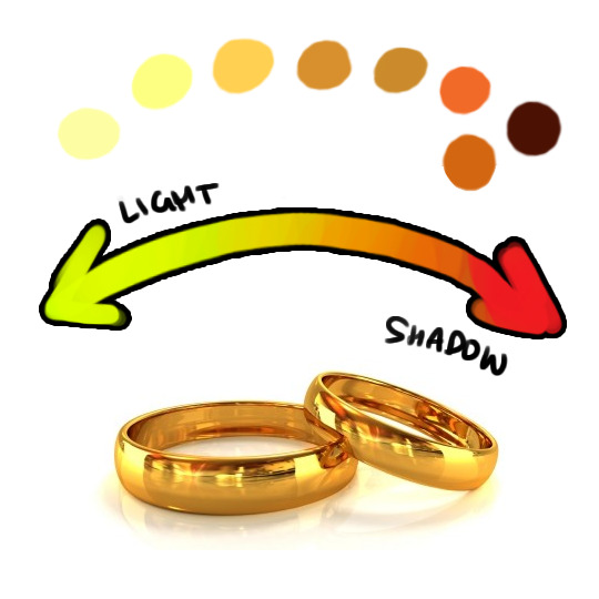
THAT SAID - remember gold doesn’t always look like the way it does above (sometimes it can be more of a pale orange, rose gold is more of a pink-ish color), and sometimes you need a slightly different shade of gold so that it doesn’t fuck up the color harmony of your piece. So sometimes when I’m feeling stuck picking out my colors for gold, I literally go back to google, type in ‘gold jewelry’ and start surfing until I find the EXACT shade of cooler gold I like. Then I start color picking. There’s lots of pictures out there with a variety of shades.
I hope this kinda sorta helps! I’m sorry it wasn’t more informative. A lot of my process honestly just is “I’ma squish some bands of light and shadow over this object until it feels right and then splash some color on it.”
101 notes
·
View notes
Text
2. Live Brief - 505
Before I begin working on the cloth cat brief, I’ve started working on a film with some of my friends on the BA Film course, also at USW. They approached me early November and asked me if I’d like to illustrate the end credits for their film, 505. I have never worked on a project like this before, and after a zoom call with the director and cinematographer of the film, I thankfully realised that what they had asked of me was do-able within my schedule of work, and would also be a lot of fun. Not only do I get to help my friends on their film, but it also counts towards my 70 hours of live brief for this module. We came up with a moodboard whilst chatting, and they told me that they wanted the main inspiration to come from the end credits of the new Star Wars show; The Mandlorian. By this, they meant they wanted detailed, coloured, concepts/illustrations that they could place the end credits on top of. The colour palettes they want to go with are quite cool-toned to reflected the chilling, slightly eerie storyline of the short film.
Not long after our meeting, I took the opportunity to join the guys on set on the 17th of November, which meant I got to watch them film 505 at a local nature reserve. It was an amazing experience, and one I hope to repeat on any future projects that may come my way if they decide to recruit me again. Despite sitting in the cold for 8 hours, it was fun to see how they work together on set, and I also had the opportunity to do some research and create moodboards for my Clothcat brief, as I came up with an idea for a kids book/ show a few months ago that I think would be perfect for the brief. As they shot the film, I also got some rough sketches done of the shots they wanted to feature in the credits. I found it really helpful being on set because I got a better idea of what the scenery looked like, and I got to reference the shots basically as soon as they were filmed, as well as being able to get feedback as soon as I sketched. The day after shooting, Josh sent me the shots I needed so that I can reference them again once I begin some more detailed drawings.
So far, I’ve discussed with the crew that I’m going to make some coloured and relatively detailed, concept-like illustrations, like the ones featured in the Mandalorian credits. I’ve currently only drawn some grayscale/ black and white sketches since filming, and I’m really happy with how they look, especially as this is the first time I’ve drawn predominantly in black, white and grey. I think the outcome looks really nice and this monochromatic look is something I would like to play around more with on future projects.
My next project to be getting on with is Clothcat, which I’m really excited for as I’m super happy with my idea and I’m looking forward to getting on with bringing my idea to life, and exploring some more children’s cartoon-style work, which I haven’t really explored before. I’m also looking forward to the feedback from the crew to see what they think of my work so far, as well as the final cut of the film with my art at the end.
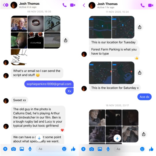


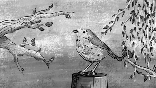


0 notes
Last Seen Blogs

vainamoinentino-blog
star hopping
donut371
Donut Downpour

pasteljian
[Rest]
kitty-cutie-pie-cat
Pet me Feed me
juniperhillpatient
movies don't create psychos