#<- i put alt text
Text


write what he's doing on that ipad. in the tags
ref stock photo (lol):

#iwtv#iwtv fanart#interview with the vampire#the vampire armand#louis de pointe du lac#amc interview with the vampire#loumand#maybe.#Girl idk......#described#<- i put alt text
2K notes
·
View notes
Text
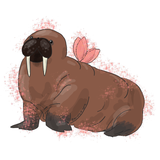
but what if the walrus was a fairy
now on redbubble!
#walrus vs fairy#thanks for helping beat the art block i guess#if this gets 100 notes i'll put this on my redbubble#my art#silly art#id in alt text
8K notes
·
View notes
Text
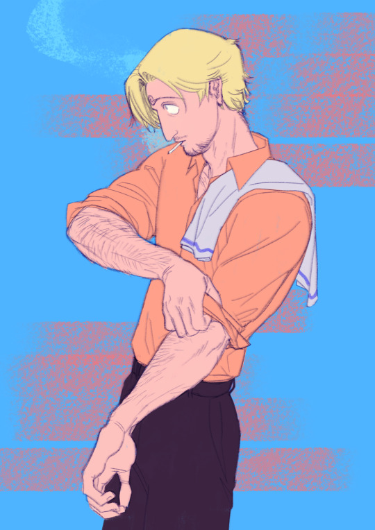
Work to be done 🍳
#One Piece#sanji#description in alt text#blatant thirst trap bc I think he'd have nice forearms. like yes of course he's Leg Guy but he puts those arms to work too!!
8K notes
·
View notes
Text
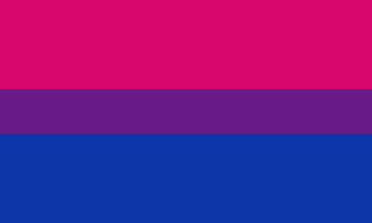
as a bi person, the bisexual flag brings me infinite joy and always puts a smile on my face, however as a person who has a Passion for Graphic Design, that undersaturated shade of purple infuriates me when it's used digitally
like, on an actual flag - which was its original purpose - it looks great!

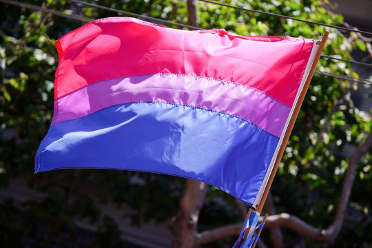
those look fine! lovely, even! with the semi-transparent fabric, the way it catches the sunlight, it looks beautiful!
but now look at how it looks digitally

the pink and blue are so vibrant compared to the sad, lonely lavender!
and let's look at this statement from Michael Page, the creator of the bi flag:

(sidenote: he created this flag in 1998, so if his takes on bisexuality is different from yours, it's okay to notice that! a lot has changed since the 90s when it comes to lived experiences and the way we describe them. but, it's also important to respect his thoughts about this and the way he presented them, even if today, we'd probably not say that bi people "blend unnoticeably into both the gay/lesbian and straight communities.")
so in pantone colors, the pink is 226 C, the blue is 286 C, and the purple of the flag is 258 C.
but...here's the deal
Michael talks here about how the key to understanding the symbolism is to know that the purple blends into both the pink and blue. and on a physical flag, I think you can see that!
but digitally, it absolutely does not blend. it clashes badly, and looks oddly separate from the other two colors.
which got me wondering...what purple do you get if you actually blend 226 C and 286 C?
oh! oh, my god.
look at that! look at how nicely it fits between those colors!
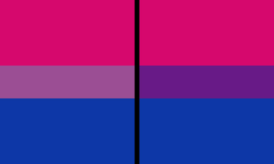
look at it next to the original color scheme! look at how much more vibrant the purple is!
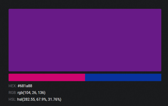
and friends. this is just blending through rgb! you get even more purple variations when you use other color spaces!
let's compare all of them:
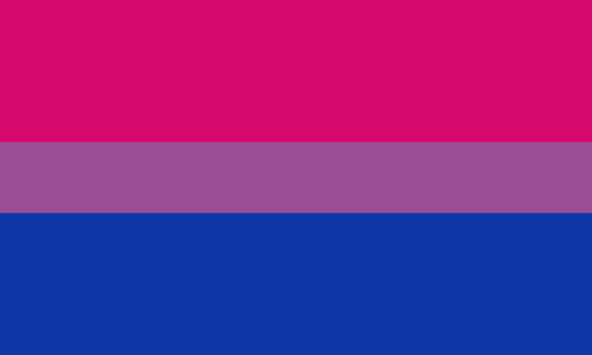


(top: original, lab. middle: lrgb, lch. bottom: rgb, hsl)
look at all of the different purple options you can get just by combining these two colors!
if you want almost too-vibrant saturation, you can go hsl, if you want something more relaxed that's closer to the original, you can go lab or lrgb. and if you want to split the difference, lch is bright and violet, while rgb is there with its saturated but darker purple.
anyway, I guess I don't really have a point here? this isn't so much an informational post as it is Me Getting Weird About Colors, but I think it is a useful lesson about how colors look very different on screens compared to how they look on objects in real life.
and sometimes, I think it's okay to compensate for that.
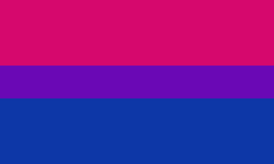
out of all of these, this is my favorite bi flag:

it's the one where the colors were blended in lab color space. for me, the lighter, softer purple is close enough to the original bi flag purple, while also feeling like a smoother blend of the blue and pink
but that's just me! and it might not even look the same to you, since every screen is different, because technology is a nightmare!
anyway, thank you for coming with me on this colorful journey! I will now retreat back to inkscape and make pained sounds about inkstitch gradients until something tangible pulls me back into reality
#bi#bisexual#bisexuality#bi flag#bisexual flag#sbs rambles#graphic design is my passion#id in alt text#but#the ids are probably deeply unhelpful for the different variations of flags#in the alt text of the six flags all grouped together#I just put what method the purples were blended with#and then tried to describe them more in the paragraph below#but this is an inherently visual post#so if you're reading it with a screen reader I am sorry :(
19K notes
·
View notes
Note
TUMBLR LEGWND ITSDEIFNITLEY ALSO DRAWS SANDERS SIDES?!?!???
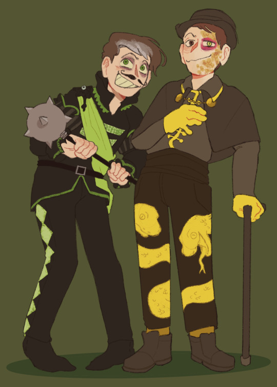
i dabble
#sanders sides#remus sanders#janus sanders#id in alt text#definitely art#(patton voice) now what did we learn#sigh. don't rewatch selfishness v selflessness + the redux and working through intrusive thoughts first thing in the morning#i couldnt find a good reference for their bottom halves and i didnt want to spend too long looking for one. so i improvised#i designed a more flashy cane for janus i just didn't want to draw it. maybe he was focused more on mobility than style. who knows#i didn't want to shade this. or like. put too much effort into this because it was a warmup#so if you see imperfections. n. nuh uh. no you don't
2K notes
·
View notes
Text
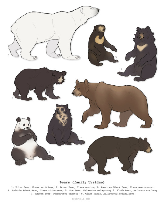
behold: bears
#id in alt#illustration#wildlife#animals#bears#still working on the text for the mini zine version#hoping to have that for patrons later this week + will do a flip-through video and put it in my ko-fi shop for everyone eventually#sizes aren't quite accurate in comparison to one another#but they should be more or less correct as far as being largest to smallest. sun bears are real small and polar bears are real big#& sorry if there is a Best Practice in terms of the order the names are written i did what felt right !!
2K notes
·
View notes
Text
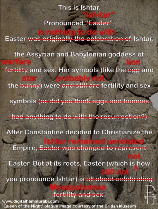
It’s that time of year again. Courtesy of digitalhammurabi.com
Addition about the image, courtesy of Twitter user @lui_log: wrt the background image, which is a stone plaque showing a winged goddess flanked by owls: “Also, we don't know whether this is a depiction of Ishtar, as the piece has been looted, thus has no archaeological context that could point us to whom it shows. Nor does it bear an inscription. The owls could mean that it is Ishtar's sister Ereshkigal, Goddess of the Underworld.”
#I Hope the alt Text feature on this site works properly now bc that’s where I’ve been putting the alt text bc I forgot it used to be broken#Ishtar#Easter#tagamemnon
13K notes
·
View notes
Text
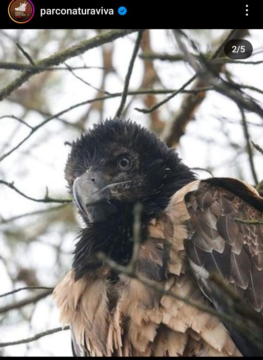
Ehy Birblr ATTENTION pls
DO YOU LIKE BEARDED VULTURES? Even if you don't, Well we need all help possible.
Bearded Vulture Eglazine is Missing
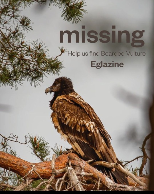

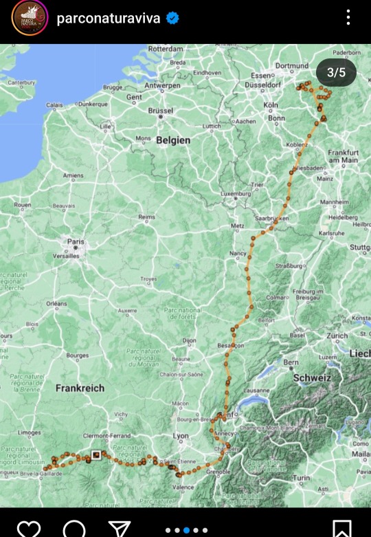
Eglazine was born at Parco Natura Viva in Italy in 2020 and released in the wild later that year in the French Massiv Central. Since then she flew all around France, Belgium, Netherlands and Germany.
As of May 2023 her GPS has stopped sending signals and we have no information on her status. Her last know position was in Normandy. Neither her or the tag have been found. This is a call to all vulture lovers, birdwatchers and photographers to keep an eye out for her and help search for Eglazine.
But HOW Do I recognize Eglazine?
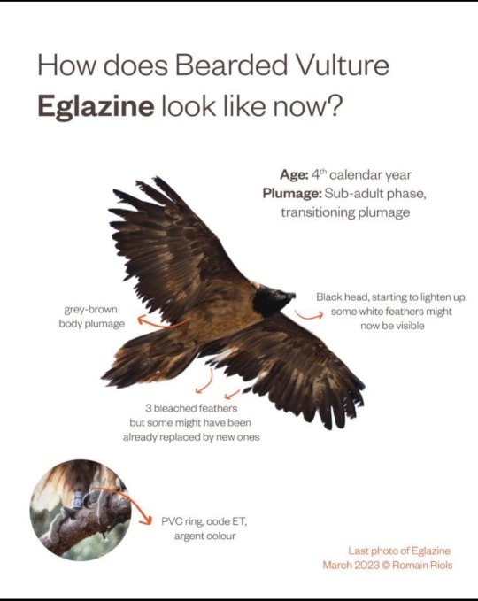
Eglazine is currently in her sub-adult phase, which means she is transitionig her plumage. Black head with some possible white feathers starting to show up, gray-brown body plumage, on her wings she had 3 bleached feathers as of her last sight but more could be present now, she has a PVC ring argent color with the code ET.
If you happen to find a Bearded Vulture that seems to possibly be Eglazine please share informations and photos to the Vulture Conservation Foundation at [email protected]

Best case scenario she just lost her GPS Tracker while molting her feathers, in the worst case scenario...
Please reblog and share this so more people can keep an eye out for any trace of her.
Photos and pictures shared are from the instagram page of Parco Natura Viva ( @parconaturaviva )I got permission to share
#birblr#birdblr#ornithology#bearded vulture#missing#eglazine#vulture conservation#wild animals#wild animal missing#zoo#conservation#i don't know what tags to put to have this seen so please please every reblog counts#this is a very different post from my usuals but i have to do what little I can#also would like if anyone would check the alt text
3K notes
·
View notes
Text
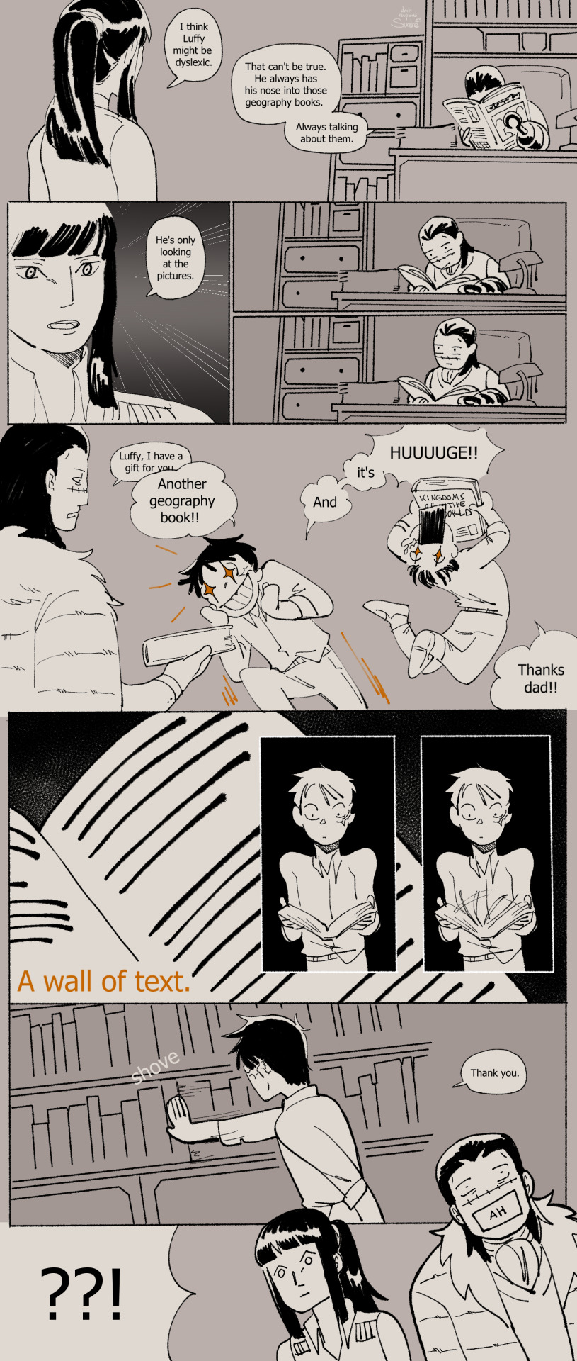
Mr 0 and Miss All Sunday investigate.
(timeline)
#one piece#nico robin#sir crocodile#monkey d luffy#crocodad au#my art#my comic#described in alt text#ive finished it!! :'DD this comic was about how no matter the universe luffy just cant read. i love how easily it is to read luffy as bein#neurodivergent/having (at least one) learning disability. so i wanted to put it here in the au. its important to me. also. quietly#establishing a few things for later. meheh
6K notes
·
View notes
Text
how similar zuko and ozai look from side profile got me thinking:
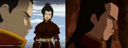
i mean they have the same straight forehead, same brow, and the long and sharp nose. having a familial resemblance to the person you hate most in the world is real and it sucks. i imagine this bothers zuko for a long time, bc every time he looks in the mirror he's reminded of ozai.
until one day he gets socked in the face by an assassin and breaks his nose. ever since then he has a nose bump and he's very happy with it

#id in alt text#i've been hanging on to this idea for years#every time i draw him side profile i put extra effort in his little nose bump#got to spread the agender#zuko#click for quality#avatar#avatar the last airbender#firelord zuko#atla#fanart#zuko fanart#my art#this is your reminder to FLIP THE CANVAS i had to do so much liquifying 😭#also that rightmost zuko?? prettiest thing i have ever drawn wtf and i barely used a reference image. how did i do that#tea arts🍵
2K notes
·
View notes
Text
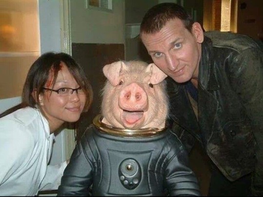
obviously this is a behind the scenes shot and not something that was actually taken in universe but could you imagine jack trying to keep tabs on sightings of the doctor one day and he spits his coffee out after seeing a picture online of tosh causally posing with him next to some fuckinf creature (whilst she also has a bleeding head wound)
#ID in alt text#torchwood#toshiko sato#doctor who#naoko mori#ninth doctor#blood tw#tw blood#sorry i only just realised i should put that in the tags
2K notes
·
View notes
Text

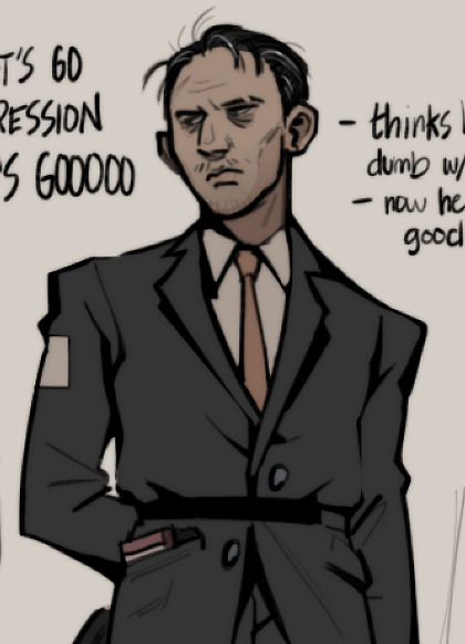
MORE SWAPS, quick doodle of an idea for a portrait of swap!kim. i just wanted to draw a man so drab and miserable PFTT
#disco elysium#kim kitsuragi#disco elysium roleswap#ok so. duller sadder colors was the first order of business#he doesnt have his undercut his colors are greyer but i did want to put that orange somewhere in his design#i also wanted to include just the tiniest hints of orange in the background but make it look like the white was painted over it. +#like to hide it.#ok goodbye i love you#described#id in alt text#sunnysidedraws#sunnysidedoodles#den's disco swap
1K notes
·
View notes
Text

Boyfriend shirt before you know it's a boyfriend shirt
#one piece#zosan#description in alt text#this isn't meant to be super shippy just cute so I figured I'd put it here
7K notes
·
View notes
Text
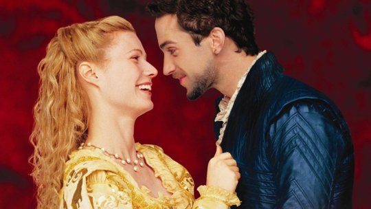
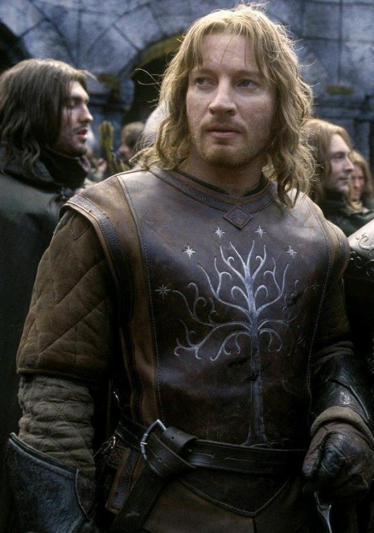
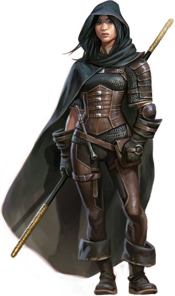
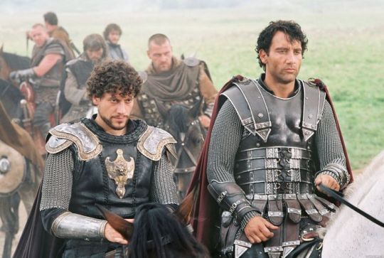
So I accidentally almost got into an argument on Twitter, and now I'm thinking about bad historical costuming tropes. Specifically, Action Hero Leather Pants.
See, I was light-heartedly pointing out the inaccuracies of the costumes in Black Sails, and someone came out of the woodwork to defend the show. The misunderstanding was that they thought I was dismissing the show just for its costumes, which I wasn't - I was simply pointing out that it can't entirely care about material history (meaning specifically physical objects/culture) if it treats its clothes like that.
But this person was slightly offended on behalf of their show - especially, quote, "And from a fan of OFMD, no less!" Which got me thinking - it's true! I can abide a lot more historical costuming inaccuracy from Our Flag than I can Black Sails or Vikings. And I don't think it's just because one has my blorbos in it. But really, when it comes down to it...
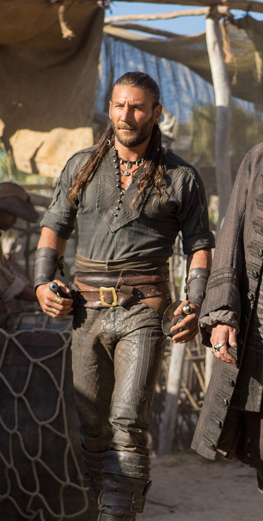
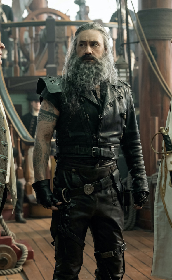
What is the difference between this and this?
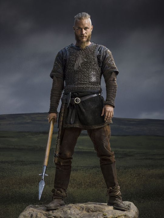
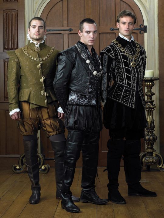
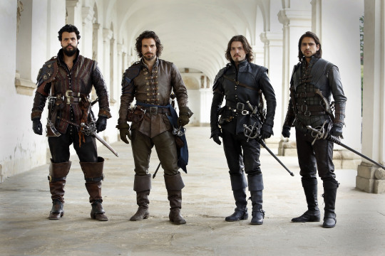
Here's the thing. Leather pants in period dramas isn't new. You've got your Vikings, Tudors, Outlander, Pirates of the Caribbean, Once Upon a Time, Will, The Musketeers, even Shakespeare in Love - they love to shove people in leather and call it a day. But where does this come from?

Obviously we have the modern connotations. Modern leather clothes developed in a few subcultures: cowboys drew on Native American clothing. (Allegedly. This is a little beyond my purview, I haven't seen any solid evidence, and it sounds like the kind of fact that people repeat a lot but is based on an assumption. I wouldn't know, though.) Leather was used in some WWI and II uniforms.
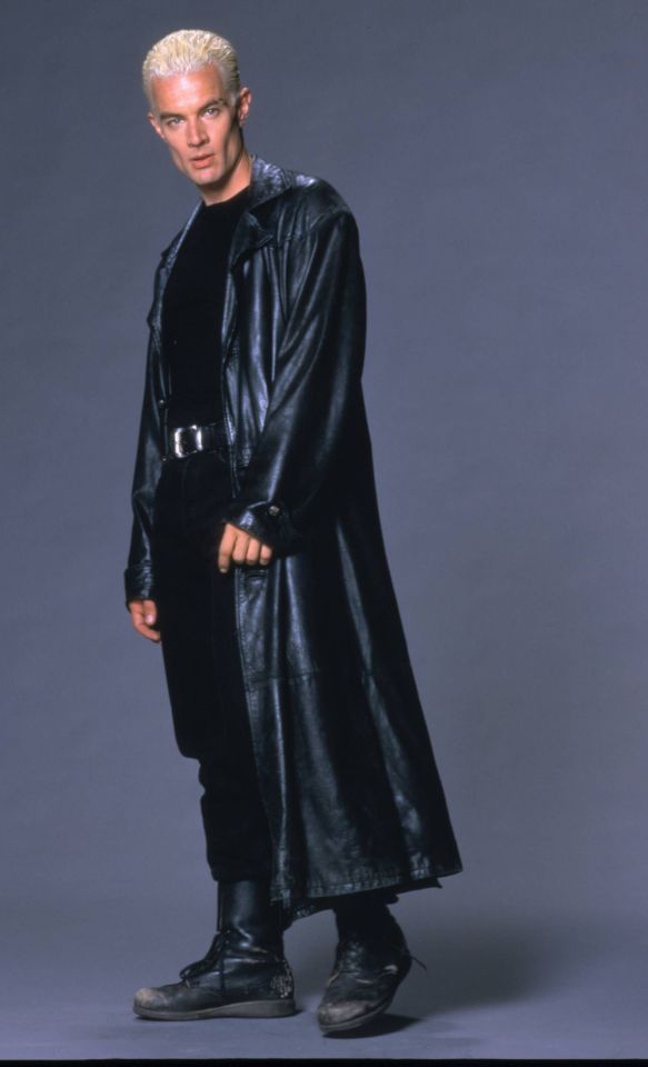
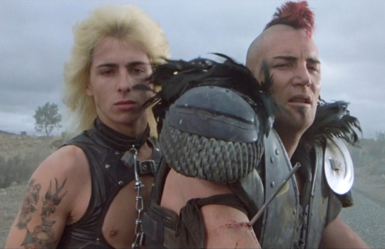
But the big boom came in the mid-C20th in motorcycle, punk/goth, and gay subcultures, all intertwined with each other and the above. Motorcyclists wear leather as practical protective gear, and it gets picked up by rock and punk artists as a symbol of counterculture, and transferred to movie designs. It gets wrapped up in gay and kink communities, with even more countercultural and taboo meanings. By the late C20th, leather has entered mainstream fashion, but it still carries those references to goths, punks, BDSM, and motorbike gangs, to James Dean, Marlon Brando, and Mick Jagger. This is whence we get our Spikes and Dave Listers in 1980s/90s media, bad boys and working-class punks.
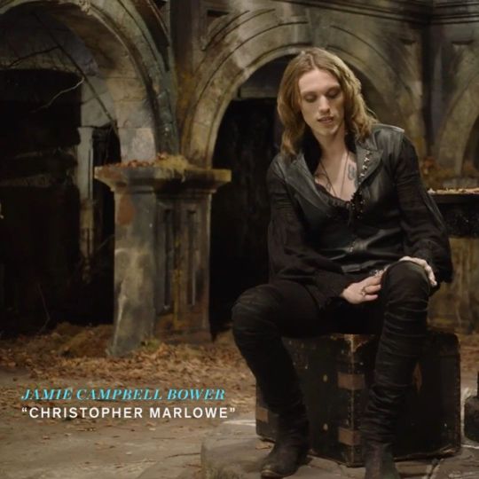
And some of the above "historical" design choices clearly build on these meanings. William Shakespeare is dressed in a black leather doublet to evoke the swaggering bad boy artist heartthrob, probably down on his luck. So is Kit Marlowe.
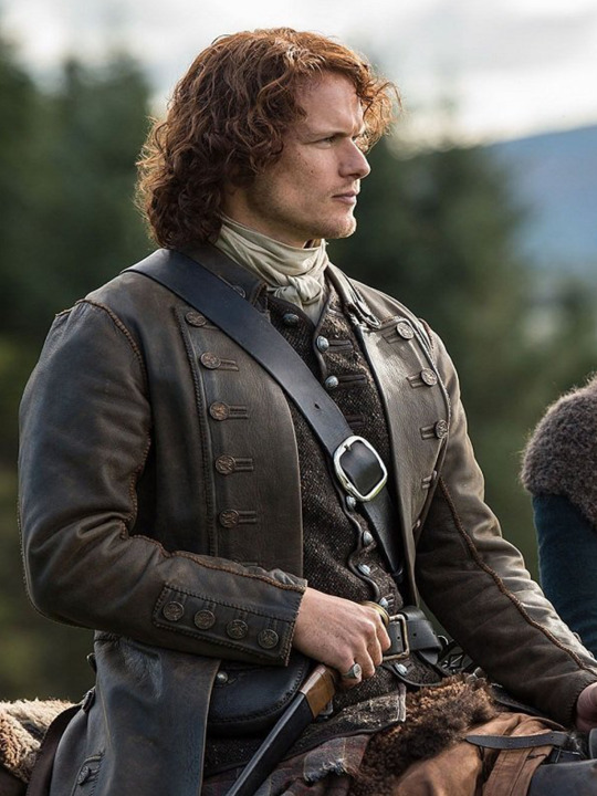
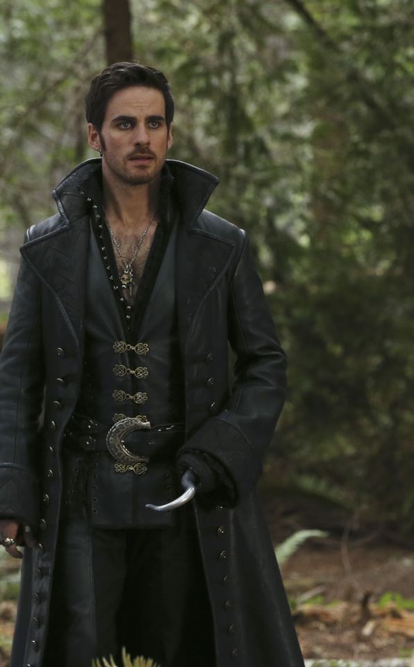
But the associations get a little fuzzier after that. Hook, with his eyeliner and jewellery, sure. King Henry, yeah, I see it. It's hideously ahistorical, but sure. But what about Jamie and Will and Ragnar, in their browns and shabby, battle-ready chic? Well, here we get the other strain of Bad Period Drama Leather.
See, designers like to point to history, but it's just not true. Leather armour, especially in the western/European world, is very, very rare, and not just because it decays faster than metal. (Yes, even in ancient Greece/Rome, despite many articles claiming that as the start of the leather armour trend!) It simply wasn't used a lot, because it's frankly useless at defending the body compared to metal. Leather was used as a backing for some splint armour pieces, and for belts, sheathes, and buckles, but it simply wasn't worn like the costumes above. It's heavy, uncomfortable, and hard to repair - it's simply not practical for a garment when you have perfectly comfortable, insulating, and widely available linen, wool, and cotton!
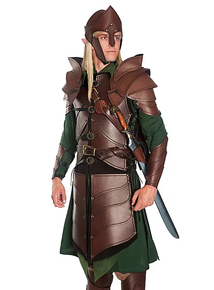
As far as I can see, the real influence on leather in period dramas is fantasy. Fantasy media has proliferated the idea of leather armour as the lightweight choice for rangers, elves, and rogues, a natural, quiet, flexible material, less flashy or restrictive than metal. And it is cheaper for a costume department to make, and easier for an actor to wear on set. It's in Dungeons and Dragons and Lord of the Rings, King Arthur, Runescape, and World of Warcraft.

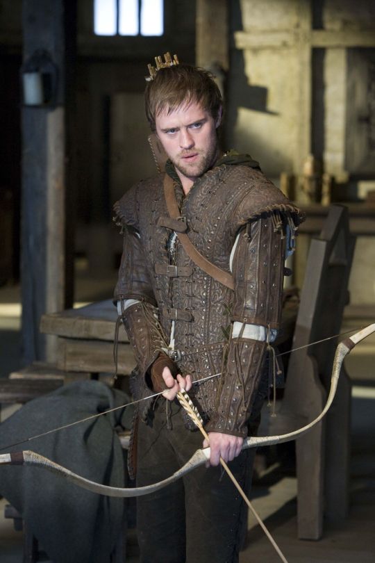
And I think this is how we get to characters like Ragnar and Vane. This idea of leather as practical gear and light armour, it's fantasy, but it has this lineage, behind which sits cowboy chaps and bomber/flight jackets. It's usually brown compared to the punk bad boy's black, less shiny, and more often piecemeal or decorated. In fact, there's a great distinction between the two Period Leather Modes within the same piece of media: Robin Hood (2006)! Compare the brooding, fascist-coded villain Guy of Gisborne with the shabby, bow-wielding, forest-dwelling Robin:
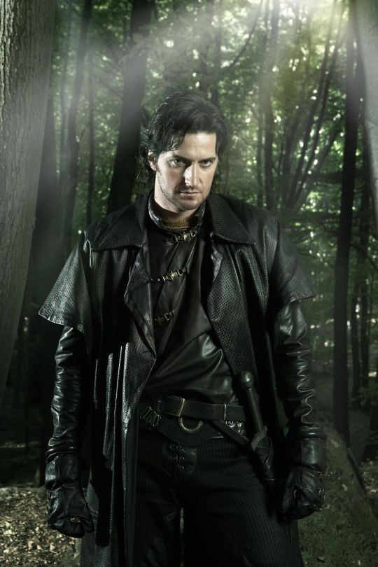
So, back to the original question: What's the difference between Charles Vane in Black Sails, and Edward Teach in Our Flag Means Death?
Simply put, it's intention. There is nothing intentional about Vane's leather in Black Sails. It's not the only leather in the show, and it only says what all shabby period leather says, relying on the same tropes as fantasy armour: he's a bad boy and a fighter in workaday leather, poor, flexible, and practical. None of these connotations are based in reality or history, and they've been done countless times before. It's boring design, neither historically accurate nor particularly creative, but much the same as all the other shabby chic fighters on our screens. He has a broad lineage in Lord of the Rings and Pirates of the Caribbean and such, but that's it.
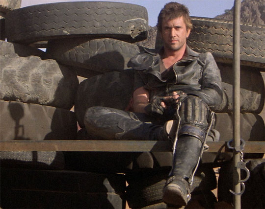
In Our Flag, however, the lineage is much, much more intentional. Ed is a direct homage to Mad Max, the costuming in which is both practical (Max is an ex-cop and road warrior), and draws on punk and kink designs to evoke a counterculture gone mad to the point of social breakdown, exploiting the thrill of the taboo to frighten and titillate the audience.
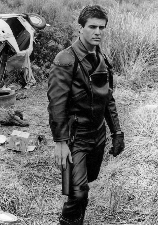
In particular, Ed is styled after Max in the second movie, having lost his family, been badly injured, and watched the world turn into an apocalypse. He's a broken man, withdrawn, violent, and deliberately cutting himself off from others to avoid getting hurt again. The plot of Mad Max 2 is him learning to open up and help others, making himself vulnerable to more loss, but more human in the process.
This ties directly into the themes of Our Flag - it's a deliberate intertext. Ed's emotional journey is also one from isolation and pain to vulnerability, community, and love. Mad Max (intentionally and unintentionally) explores themes of masculinity, violence, and power, while Max has become simplified in the popular imagination as a stoic, badass action hero rather than the more complex character he is, struggling with loss and humanity. Similarly, Our Flag explores masculinity, both textually (Stede is trying to build a less abusive pirate culture) and metatextually (the show champions complex, banal, and tender masculinities, especially when we're used to only seeing pirates in either gritty action movies or childish comedies).
Our Flag also draws on the specific countercultures of motorcycles, rockers, and gay/BDSM culture in its design and themes. Naturally, in such a queer show, one can't help but make the connection between leather pirates and leather daddies, and the design certainly nods at this, with its vests and studs. I always think about this guy, with his flat cap so reminiscient of gay leather fashions.
More overtly, though, Blackbeard and his crew are styled as both violent gangsters and countercultural rockstars. They rove the seas like a bikie gang, free and violent, and are seen as icons, bad boys and celebrities. Other pirates revere Blackbeard and wish they could be on his crew, while civilians are awed by his reputation, desperate for juicy, gory details.
This isn't all of why I like the costuming in Our Flag Means Death (especially season 1). Stede's outfits are by no means accurate, but they're a lot more accurate than most pirate media, and they're bright and colourful, with accurate and delightful silks, lace, velvets, and brocades, and lovely, puffy skirts on his jackets. Many of the Revenge crew wear recognisable sailor's trousers, and practical but bright, varied gear that easily conveys personality and flair. There is a surprising dedication to little details, like changing Ed's trousers to fall-fronts for a historical feel, Izzy's puffy sleeves, the handmade fringe on Lucius's red jacket, or the increasing absurdity of navy uniform cuffs between Nigel and Chauncey.
A really big one is the fact that they don't shy away from historical footwear! In almost every example above, we see the period drama's obsession with putting men in skinny jeans and bucket-top boots, but not only does Stede wear his little red-heeled shoes with stockings, but most of his crew, and the ordinary people of Barbados, wear low boots or pumps, and even rough, masculine characters like Pete wear knee breeches and bright colours. It's inaccurate, but at least it's a new kind of inaccuracy, that builds much more on actual historical fashions, and eschews the shortcuts of other, grittier period dramas in favour of colour and personality.
But also. At least it fucking says something with its leather.
#everyone say 'thank you togas' for not including a long tangent about evil rimmer in red dwarf 5x05#Our Flag Means Death#Togas does meta#and yes these principles DO fall apart slightly in s2 and i DON'T like those costumes as much#don't get me wrong they're fun and gorgeous - but generally a bit less deep and more inaccurate. so. :(#I'm not sure this really says anything new about Our Flag but I just needed to get my thoughts out#i hate hate hate Gritty Period Drama costumes they're so boring and so ugly and so wrong#god bless OFMD for using more than 3 muted colours and actually putting men in heels (and not as a shorthand for rich/foppish villainy) <3#looking at that Tudors still is insane like they really will go to any lengths to not make men feel like they've got bare legs XD#image descriptions in alt text#and yes i DID just sink about two hours into those so you'd better appreciate them
1K notes
·
View notes
Text
and to you, character i like, i bestow upon you the highest honor i can give. grey hairs.
#i'm probably still gonna draw him 2d#but now he has a human form. for research purposes#definitely not because i need to put him in a Situation#prismo the wishmaster#scarab the god auditor#adventure time#fionna and cake#jake the dog#id in alt text#ough that id took me forever hopefully it's not swamp ass#definitely art#prohibitedwish
3K notes
·
View notes
Text

#time for crab#crab#tumblr#crabs#image desc added#my first time doing alt text let me know if I need to change them#i just was another person reblog this as no id#IS THE ID IN THE ALT TEXT OR NOT I MOSTLY USE MOVILE BUT I DID PUT THEM#5k#10k#this looks like it might become an accursed 20k post#cursed 20k#ok i don’t care abiut this post anymorw bye#nix explanation
25K notes
·
View notes
Last Seen Blogs

extremoduroesmio-blog-blog
extremoduroesmío
pennsylvaniahbg
Untitled

thechildbesuffering
✨JIN✨
xtoothless
xToothlessx

audortho
Aude d'Ortho