#yeah colors are in digital
Text

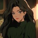
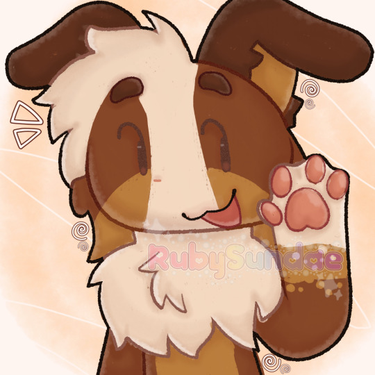
Inktober day 4 - Werewolf
#my art#inktober#inktober 2023#traditional art#yeah colors are in digital#werewolf#female werewolf#borzoi#I'm proud of the design
65 notes
·
View notes
Text
I think 90% of my gripes with how modern anime looks comes down to flat color design/palettes.
Non-cohesive, washed-out color palettes can destroy lineart quality. I see this all the time when comparing an anime's lineart/layout to its colored/post-processed final product and it's heartbreaking. Compare this pre-color vs. final frame from Dungeon Meshi's OP.


So much sharpness and detail and weight gets washed out and flattened by 'meh' color design. I LOVE the flow and thickness and shadows in the fabrics on the left. The white against pastel really brings it out. Check out all the detail in their hair, the highlights in Rin's, the different hues to denote hair color, the blue tint in the clothes' shadows, and how all of that just gets... lost. It works, but it's not particularly good and does a disservice to the line-artist.
I'm using Dungeon Meshi as an example not because it's bad, I'm just especially disappointed because this is Studio Trigger we're talking about. The character animation is fantastic, but the color design is usually much more exciting. We're not seeing Trigger at their full potential, so I'm focusing on them.
Here's a very quick and messy color correct. Not meant to be taken seriously, just to provide comparison to see why colors can feel "washed out." Top is edit, bottom is original.
You can really see how desaturated and "white fluorescent lighting" the original color palettes are.
[Remember: the easiest way to make your colors more lively is to choose a warm or cool tint. From there, you can play around with bringing out complementary colors for a cohesive palette (I warmed Marcille's skintone and hair but made sure to bring out her deep blue clothes). Avoid using too many blend mode layers; hand-picking colors will really help you build your innate color sense and find a color style. Try using saturated colors in unexpected places! If you're coloring a night scene, try using deep blues or greens or magentas. You see these deep colors used all the time in older anime because they couldn't rely on a lightness scale to make colors darker, they had to use darker paints with specific hues. Don't overthink it, simpler is better!]
#not art#dungeon meshi#rant#i'm someone who can get obsessive over colors in my own art#will stare at the screen adjusting hues/saturation for hours#luckily i've gotten faster at color picking#but yeah modern anime's color design is saddening to me. the general trend leans towards white/grey desaturated palettes#simply because they're easier to pick digitally#this is not the colorists fault mind you. the anime industry's problems are also labor problems. artists are severely underpaid#and overworked. colorists literally aren't paid enough to do their best#there isn't a “creative drought” in the anime industry. this trend is widespread across studios purely BECAUSE it's not up to individuals#until work conditions improve anime will unfortunately continue to miss its fullest potential visually#don't even GET ME STARTED ON THE USE OF POST-PROCESSING FILTERS AND LIGHTING IN ANIME THOUGH#SOMEONE HOLD ME BACK. I HATE LENS FLARES I HATE GRADIENT SHADING I HATE CHROMATIC ABBERATION AND BLUR
2K notes
·
View notes
Text

"gentlemen i believe... we are lost."
(entering the new year with a stv drawing since im still on a st movie kick from the marathon my dad and i had HEHE >:D)

#churro art#digital art#illustration#fanart#star trek#star trek the original series#star trek tos#james kirk#jim kirk#spock#s'chn t'gai spock#bones mccoy#leonard mccoy#OKAY LOOK I KNOW STV IS LIKE THE ODD ONE OUT OF ALL THE MOVIES#and yes definitely watching it between 4 and 6 wsa a bit of a whiplash. BUT!!!!!!!!#it gave me many a main space trio interactions to enjoy so JUST FOR THAT. i count it as a blessing OK#also i cant help it a lot of the silly humor does get to me ToT ToT#anywayssss this is a bit different its completely lineless#mostly cus i also rewatched klaus and was enamored with the coloring and lighting!!!!#but anyways yeah this was mostly for fun i needed some time on the big ol tablet again and this helped a lot :D#immeeee gonna go watch s3 CUS I STARTED S3 OF TOS!!! WOOOO#OH laso the movies were GREAT its genuinely so awesome that me and my father can connect over st :"D
3K notes
·
View notes
Text
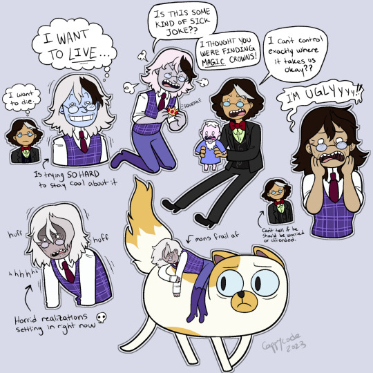
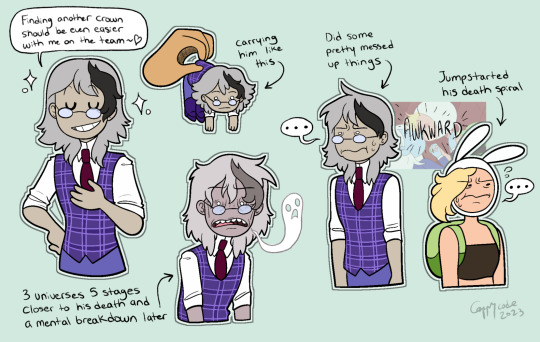

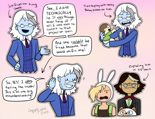
CONCEPT DOODLES for an AU I dabbled in with a few friends after the winter king episode but kinda forgot about after the Fionna and Cake finale... I decided to revisit it and explore a little more after coming to terms with everything LOL... So, it's another "Winter King doesn't die immediately after his crown gets nuked" AU, but THIS TIME he's just dying really slowly (like Simon in the Betty episode) and ALSO joins Fionna, Cake, and Simon on their search for magic crowns. There's no logic behind this tbh, we just wanted to put him through The Horrors. And make them all friends. But mostly The Horrors. :) (he only gets to live as a treat, because I think he's funny).
Bonus (old screenshot), because this is still funny to me:
#adventure time#atimers#fionna and cake#winter king#simon petrikov#fionna campbell#cake the cat#shared custody au#winter stowaway au#fan art#digital art#flat color#2023#this is my blog so whatevers man... ima just post what I want now... and what I want rn is silly simon AUs LOL...#so expect more of me releasing my stash tomorrow#this AU makes the story like 500x more messy but it's fine it's funny that's the point don't think too hard about it#this is their fault for killing him now I gotta make up scenarios where he is alive#his design is inspired by some doodles my friend crayon did#ALSO I wanted to keep some of his features different from default simon so they're easier to tell apart...#like YEAH they're the same character... but also I just think it'd be fun... if they had subtle differences... because alternate universes#ALSO HE'S PALE BECAUSE HE'S DYING. JUST MAKING THAT DISCLAIMER... HIS SKIN TONE IS KINDA CLOSE TO DYING SIMON IN THE BETTY EP#BUT IN NORMAL CIRCUMSTANCES HE'D BE CLOSER TO SIMON'S COLORS
2K notes
·
View notes
Text

Out of everything that could've possibly made me want to draw I was not expecting it to be a tangled series. But... cassandra you stole my heart
#digital art#fanart#tangled#tts#tangled the series#cassandra#tw bright colors#listen shes just. relatable#and a very tragic character#and i like her design#and disney princesses has never been a trope for me but im here taking part and its literally just for. cassandra#the staff 'purposefully made her as gay coded as possible' (their own words) and yeah. shes lesbian i declare it#apparently thats what was said anyway but it might be a white lie
1K notes
·
View notes
Text
anyways now that that’s all said and done
post over, look at this icon I drew for someone on toyhouse :3


#furry#furry art#digital art#artists on tumblr#sfw furry#furry oc#oc#oc art#silly#silly art#others ocs#rubys art#:3#anthro#furry anthro#anthro art#anthro oc#decided i’d go for a bit of a messier look for the coloring on this one and I think it turned out neat :3#if you’re wondering what the og post was just look at the reblogs#yeah
854 notes
·
View notes
Text
Public domain Willy and Gally

Alt.
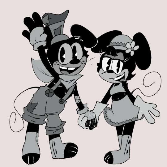
#my art#art#drawing#digital art#mickey mouse#jai art#disney#minnie and mickey#minnie mouse#AAAAAA#I wanna try and design them#colors were kinda hard to pick for the b&w one#but yeah I did it#Minnie name is Gally in here because why not lol#Willy and Gally#steamboat willie#Willy Rodent#Gally Rodent
589 notes
·
View notes
Text
Alright who wants slasher iii ⁉️
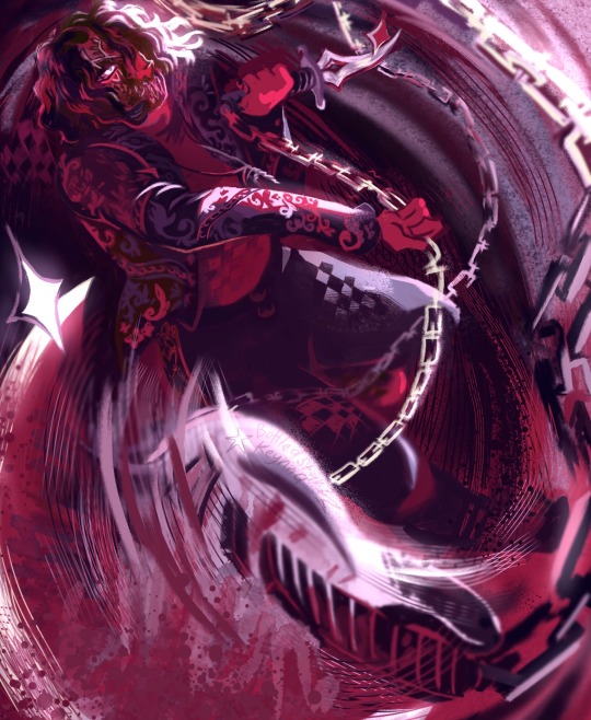

The chain bass strap drove me insane a bit some influence from Richter Belmont Transylvania and Chidori Persona 3 as well
#sleep token#iii#sleep token iii#hackus art#sleep token band#fan art#band art#illustration#yeah yeah iii with a bass axe what if it has chains too haha!?#digital art#iii sleep token#limited color palette#red#purple#digital drawing
235 notes
·
View notes
Text


these
#also yeah only the first one it's colored. got lazy#anyways just something quick#found a new brush and i love it#might do more of these they're so fun to make#tadc#the amazing digital circus#tadc jax#tadc ragatha#tadc pomni#tadc gangle#tadc zooble#tadc caine#jax x ragatha#bunnydoll#raggedyrabbit#pomni x gangle#jesteribbon#scaredylovers#also I wanted to change the bisexuality one to pansexual since I hc Jax as pan but anyways#my art
567 notes
·
View notes
Text
chaggie my lovely chaggie I need more chaggie in my live
also bird gf flying with her goat gf
I’m so sorry all moth vaggie enjoyers I’m gonna pretend like she’s a bird
#art#fan art#hazbin hotel#vaggie#charlie morningstar#chaggie#I don’t understand why everyone hates this shipname#I mean it’s cute 😭#rainbowmoth#also I have no idea if it’s traditional art or digital#line is traditional and color is digital#so yeah tradigital#I think I’m so funny
353 notes
·
View notes
Text
Even more legends of Avantris bullshiticus!
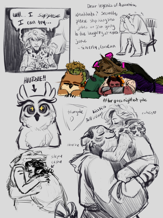
The pile is like… Gideon on the floor, while Frost Kremy and Torbek all lay as close as they can to tThe Heat Source (TM) and Hootsie and Gricko sleep a lil off to the side because they’re a feed back loop of warmth I guess?
#legends of avantris#loa#once upon a witchlight#ouaw#gricko grimgrin#hootsie grimgrin#morning frost#kremy lecroux#gideon coal#coalecroux#what’s frost and grickos ship name or whatever#gricko x Frost#morning grin#or something idk#if we’re doing like cute shop names the. for coalecroux it could be like.#sinners fire#y’know?#anywho#art#yep#arty art#doodles#digital art#sketch#colored sketch#dnd art#yeah
264 notes
·
View notes
Text
trio from the only game ever

erm and i guess im back.....hello to the one person who might vaguely remember seeing a drawing of mine once
#ace attorney#aa4#trucy wright#apollo justice#klavier gavin#please dont call out my obsession with the halftone brushes#anw i just really wanted to color them in digital so......yeah#aa fanart#apollo justice ace attorney#ace attorney trucy#ace attorney apollo justice#aa klavier#ace attorney klavier#klavier my babygirl oh my god i miss him#obligatory mikeko and vongole
171 notes
·
View notes
Text
tumblr is gonna ruin the quality but idc!! TAKE PATHETIC MAN PROFILE PIC!! please :3 (with credit ofc) dont mind his frostbite btw...
Randy Jade Demi-boy PFP that i took too long on sorry guyz
REBLOGS ARE APPRECIATED !
#art#fanart#my art#digital art#digital fanart#randy dialtown#dialtown#dialtown art#dialtown fanart#randy jade#randy valentine jade#randy jade fanart#dialtown randy#dialtown pfp#randy jade pfp#feel free to use btw im not sure i mentioned that yeah its usable#demiboy#queer#lgbtq#indie games#dialtown game#dialtown spoilers#maybe?#limited color palette#lgbt pfp#demiboy pfp
156 notes
·
View notes
Text
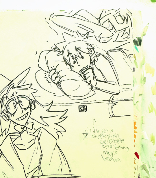
Some Bettys!!! I kept on not finishing! But finally did finish today! After remembering they existed and being unable to work on anything else instead of them lol
(Also! In case it’s hard to read, the 3rd pic says: “It’d be fun if she physically couldn’t sleep after becoming magic woman” cuz I’m… evil ghg- I’m that bastard who likes drawing my fav characters suffering…! this isn’t new! This is a known fact about me! Also it /would/ be fun ghgh-)
#adventure time#fionna and cake#betty grof#first drew these around the same time I drew those simons in my style#and then just… kept forgetting to finish it ghgh#but it’s done now!!!! because… they just needed digital coloring and stuff#and I can’t draw in my sketchbook rn cuz I’m visiting family.. and there’s a 4 year old and 7 year old all up in my business cONSTANTLY#I can get a lil bit of drawing done when there at school but. it’s still difficult lol#so. circumstances of life has forced me to finally finish these Betty’s lol#hopefully.. there will be more art. soon.. hopefully. ghgh#hopefully at least more then there were last month lol. aka none ghgh#anyway yeah!!! enjoy the Betty’s!!!!
338 notes
·
View notes
Text

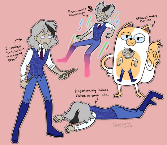

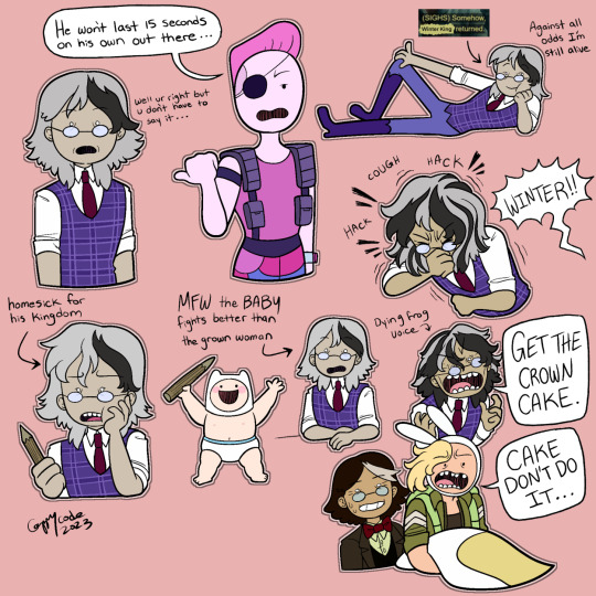
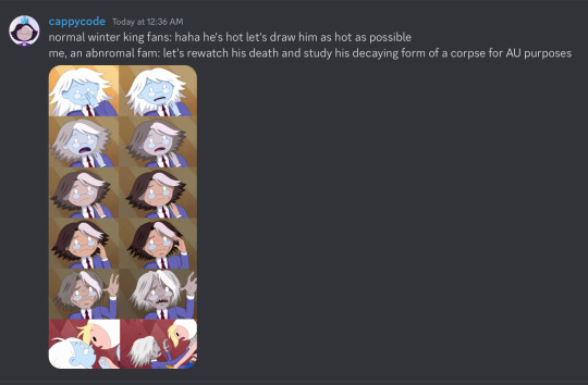
MORE OF SHARED CUSTODY WINTER! Ah… love watching this perfect little pretty boy go through his ugly cringefail phase, 💕. These doodles are kinda chronological... kinda... top 2 are in babyworld and bottom 3 are obviously in vampworld (also 4th one is a totally legit wow he was there the whooooole tiiiiime edited screenshot, hehe).
#adventure time#atimers#winter king#simon petrikov#fionna and cake#fionna campbell#cake the cat#shared custody au#winter stowaway au#fan art#digital art#flat color#2023#the bottom two doodles are older but they happen chronologically after these so... they get a pass#I am NOT normal about him I wanna grab him by the arm and swing him around like a feral toddler with a lil plush toy#i love him. I want to watch him suffer#I don't remember what bubblegum in this universe is called...#oh yeah baby finn is there too ig
1K notes
·
View notes
Text

Ghostsoap western au sketch!
#it’s really a wip but I don’t wanna color this#Ghoap#ghostsoap#myart#call of duty modern warfare#cod mwfii#digital art#and I kinda don’t like it but I worked too hard on it so I hope y’all can enjoy it more than I do lol#and yeah my ghost is black btw!#ghost cod#soap cod
559 notes
·
View notes
Last Seen Blogs