#visual art: when artists of color create
Text
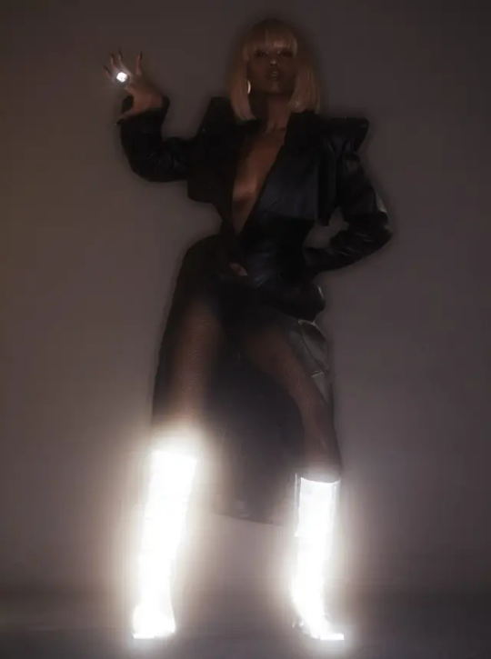


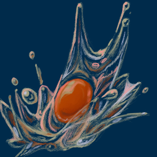
Kelela by Aidan Zamiri
#Kelela#Aidan Zamiri#visual art: when artists of color create#light and such#color theory#texture: a feeling#the coolest marvels in the underspace#embodiment as grace#strobe light beauty#luminous beauty#daring beauty
171 notes
·
View notes
Text
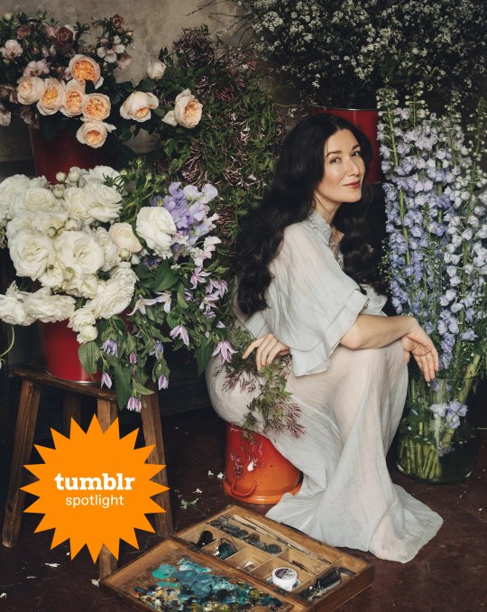
Writer Spotlight: Jamie Beck
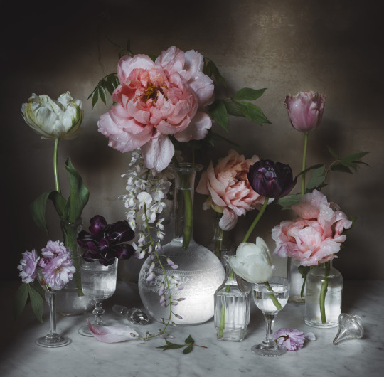
Jamie Beck is a photographer residing in Provence, France. Her Tumblr blog, From Me To You, became immensely successful shortly after launching in 2009. Soon after, Jamie, along with her partner Kevin Burg, pioneered the use of Cinemagraphs in creative storytelling for brands. Since then, she has produced marketing and advertising campaigns for companies like Google, Samsung, Netflix, Disney, Microsoft, Nike, Volvo, and MTV, and was included in Adweek Magazine’s “Creative 100” among the industry’s top Visual Artists. In 2022, she released her first book, An American in Provence, which became a NYT Bestseller and Amazon #1 book in multiple categories, and featured in publications such as Vogue, goop, Who What Wear, and Forbes. Flowers of Provence is Jamie’s second book.
Can you tell us about how The Flowers of Provence came to be?
I refer to Provence often as ‘The Garden of Eden’ for her harmonious seasons that bring an ever-changing floral bounty through the landscape. My greatest joy in life is telling her story of flowers through photography so that we may all enjoy them, their beauty, their symbolism, and their contribution to the harmony of this land just a bit longer.
(Photograph: Jamie Beck)
How do your photography and writing work together? Do you write as part of your practice?
I constantly write small notations, which usually occur when I am alone in nature with the intention of creating a photograph or in my studio working alone on a still life. I write as I think in my head, so I have made it a very strict practice that when a thought or idea comes up, I stop and quickly write the text in the notes app on my phone or in a pocket journal I keep with me most of the time. If I don’t stop and write it down at that moment, I find it is gone forever. It is also the same practice for shooting flowers, especially in a place as seasonal as Provence. If I see something, I must capture it right away because it could be gone tomorrow.
(Photograph: Jamie Beck)
You got your start in commercial photography. What’s something you learned in those fields that has served you well in your current creative direction?
I think my understanding of bridging art and commerce came from my commercial photography background. I can make beautiful photographs of flowers all day long, but how to make a living off your art is a completely different skill that I am fortunate enough to have learned by working with so many different creative brands and products in the past.
(Photograph: Jamie Beck)
Do you remember your first photograph?
Absolutely! I was 13 years old. My mother gave me her old Pentax 35mm film camera to play with. When I looked through the viewfinder, it was as if the imaginary world in my head could finally come to life! I gave my best friend a makeover, put her in an evening gown in the backyard of my parents’ house in Texas, and made my first photograph, which I thought was so glamorous! So Vogue!
You situate your photographic work with an introduction that charts the seasons in Provence through flowers. Are there any authors from the fields of nature writing and writing place that inspire you?
I absolutely adore Monty Don! His writing, his shoes, and his ease with nature and flowers—that’s a world in which I want to live. I also love Floret Flowers, especially on social media, as a way to learn the science behind flowers and how to grow them.
How did you decide on the order of the images within The Flowers of Provence?
Something I didn’t anticipate with a book deal is that I would actually be the one doing the layouts! I assumed I would hand over a folder of images, and an art director would decide the order. At first, it was overwhelming to sort through it all because the work is so personal, and I’m so visual. But in the end, it had to be me. It had to be my story and flow to be truly authentic. I tried to move through the seasons and colors of the landscape in a harmonious way that felt a bit magical, just as discovering Provence has felt to me.
(Photograph: Jamie Beck)
How do you practice self-care when juggling work and life commitments alongside the creative process?
The creative process is typically a result that comes out of taking time for self-care. I get some of my best ideas for photographic projects or writing when I am in a bath or shower or go for a long (and restorative) walk in nature. Doing things for myself, such as how I dress or do my hair and makeup, is another form of creative expression that is satisfying.
What’s a place or motif you’d like to photograph that you haven’t had a chance to yet?
I am really interested in discovering more formal gardens in France. I like the idea of garden portraiture, trying to really capture the essence and spirit of places where man and nature intertwine.
Which artists do you return to for inspiration?
I’m absolutely obsessed with Édouard Manet—his color pallet and subject matter.
What are three things you can’t live without as an artist?
My camera, the French light, and flowers, of course.
What’s your favorite flower to photograph, and why?
I love roses. They remind me of my grandmother, who always grew roses and was my first teacher of nature. The perfume of roses and the vast variety of colors, names, and styles all make me totally crazy. I just love them. They simply bring me joy the same way seeing a rainbow in the sky does.
(Photograph: Jamie Beck)
#writer spotlight#jamie beck#the flowers of provence#art#photography#flowers#cottagecore#aesthetics#naturecore#flowercore#still life#nature aesthetic#artist#artists on tumblr#fine art photography#long post#travel#France#Provence#original photographers#photographers on tumblr
1K notes
·
View notes
Text
About scale, process, palette and canvas: a few considerations on pixel art as a medium
User moredogproblems answered an interesting and legitimate question by another, DiscountEarly125, regarding my work and canvas size. He also perfectly isolated two central concepts of pixel art, which are scale and process. Canvas size, which was the theme of DiscountEarly125's specific request, is more of a dependent variable to those two aforementioned concepts, rather than a starting point. I hope the following considerations I shared may help or prompt some other ideas, but this is what I could come up with 15-ish years of experience with pixel art (and a few more years of art and media studies). I was quite in the mood of writing down these few thoughts that have been floating for a while. I apologize as this may also result in a confusing wall of text, but it is all part of a my work and research, and I would love to polish all the material, hopefully with some thoughts, insights from other colleagues, as well as pictures and materials!
A. Scale and canvas size
It is true that the bigger the canvas, the more distance one may visually create from pixel art, but I personally think this is to be possibly considered a matter of perceiving pixels, rather than a fundative problem of the medium. In fact I concur with the idea of "process makes the medium" rather than identifying pixel art as how (evidently) pixeled the result feels. The general picture, or the sum of pixels, though, is a really important matter to the medium nonetheless! Pixels themselves work in relation one with another, so it's their overall result that gives context and makes the subject recognizable. This relationship between pixels links back to all the art fundamentals that each artist is taught, from color theory to shape and composition - and so on.
So, the canvas size debate usually boils down to a matter of scale or necessity of your subjects.
As long as the dimension (canvas) of your subject (as in: a drawing of an apple, a character sprite, a mockup environment) allows you to operate, control and keep an eye on the quantity (number/area of pixels together) and quality (color, shaping of multiple pixels, texturing obtained through color and shapes) of isolated single pixels or pixeled areas, you're in the pixel art universe.
The other way around to define the matter of scaling: in order to be operating pixel art fundamentals and techniques, your subject has to be on a scale that allows you to apply principles of pixel art within the space of your canvas and your personal style.
These very same principles, or basics, can be applied with different results and extent to bigger and smaller canvases alike, each with their own specific difficulties and variables. It is important to adapt your scale when learning, and trying classic canvases per subject like "16x16px" (standard tile or character sprite unit, tied to older consoles and screen ratios, it's a bit complicated there) is always a nice idea - they also tend to be industry benchmarks and necessities so in case you'd like to consider a professional output, that's very useful.
Scale also applies to the array of colors, and there lies the concept of palette: a number of single hexadecimal hues we are using for each single pixel. Any single pixel can have one hexadecimal color only.
Consequentially it is absolutely true that either a huge canvas or a palette too broad may prevent a viewer from perceiving immediately the "nature" of your medium, namely seeing square pixels, recognizing a certain amount of color - or more thoroughly recognizing that you made some choices for each subject on a pixel level. What could possibly happen on a huge canvas (without zooming in) is that you can't really grasp the pixels, but just the "overall picture" - and that may not differ too much from digital, raster art, which is of course also based on pixels. Therein appearently lies a sort of threshold that is really hard to pin down for us pixel artists, as it depends on screen size, visualization methods, distance, filters and lots of other inherently subjective parts.
This kinda is my case sometimes: I make big environments (possibly too big, and too detailed in each part I tell myself) that are a sum of many lesser parts: both tilesets and sprites that relate (but not strictly adhere) to a basic space unit that is 16x16pixels. You can indeed consider scale in a broader sense as a subdivision or magnification issue, much alike squinting your eyes to focus on a picture's overall contrast or, conversely, analyzing its fundamental parts with a magnifying glass, and then a microscope - an analogy as follows:
a. the picture as a whole is like a colorful rock that you can analyze by magnifying its grain.
b. the characters, geographical elements and textures, works like the different substances that compose the rock and give its visible characteristics grain and complexity,
c. single pixels constitute the very atoms of those previously recognized substances.
I mean "atom" in the traditional, classical meaning of indivisible, fundative object. That's a "quantized" part of information, which for pixel art is ultimately color (or a binary value, like yes/no black/white).
If you were, for example, to crop some parts of my work - let's say 160x144 pixels (a gameboy screen resolution in pixels) you would see the substances that are characters and elements of nature, and when you zoom in again, every atom becomes visible as a single entity of color. There are 29 different type of "atoms" in Ruin Valley as in different, singularly hexadecimal colors that work together in different combinations and shapes to create different substances and characters. 18 of them are used for the different qualities of the environment, and 11 more for extra hues for characters and other elements to pop out a bit.
It's really interesting to see how many pixel artists push this "threshold" of pixel art canvases to the extremely small or the extremely big, whereas, notably, palettes are less open to growth: it is indeed my opinion that pixel art tends to quantize color (quality) over than dimension (quantity). Palettes, notably, do not grow exponentially, but tend to a lower, fixed, controlled amount of individual values instead. This usually gives the artist the true possibility and toolkit through which is possible to think about/with pixels. In other words: color (or its absence) is the founding unit and identity of pixel art as a digital medium.
B. Pixels as process or pixels as objective?
Pixels themselves (as strange as that may sound!) are not to be considered an objective of pixel art, I think, but the founding matter of its research as a medium instead. I think that making pixel art is not just devoting oneself to show those jagged, squarey areas or blunt edges that we all know and love: this is just one of the possible aesthetics that pixel art conveys or adopts - especially on small canvases. Pixel art is not about denouncing itself as pixels, but, rather, embracing the square, atomic unit to build an ensemble that conveys a content or a style. That's the important part of the discourse that emancipated pixel art into being a medium, and not just an aesthetic choice or style of representation. Again: process makes this medium. Speaking of that, I consider pixel art as part of a broader family of "quantized art", namely media that operate on/with "indivisible, founding bricks and unities" that can assume a certain quality (color, mainly) within a certain quantity (palette, canvas size) and in relation to its surroundings to describe something.
This puts pixel art, with its specifics and with a certain degree of semplification, among other mediums such as cross-stitch, bead art, construction sets, textile art (on a warp and weft basis), (micro-)mosaics and others.
A classic threshold example of process vs objective: oekaki art. Oekaki art - which I love and also happen to make from time to time - doesn't really work or "think" specifically on a pixel base: it doesn't place pixels per se, but uses pixel-based areas and textures on bigger canvases with a certain degree of freedom, like one would normally do with brushes on raster digital art programs (adobe ps, gimp, clip studio and so on) in order to convey an aesthetic with fewer colors and a certain line style and texturing. That way, oekaki uses and knows pixels in a deep way, but doesn't see them primarily in a quantized way. As a result the "overall picture" shows pixels to a certain extent, and it's possible to recognize distinct pixels for each part, but the objective is not an analysis and use of pixel and quantized information, but the use of an aesthetic based upon accessibility of resources, their control and a certain rendering style.
A huge part of pixel art is its absolute accessibility: everyone with a fairly outdated computer or screen and a basic drawing program can study the medium.
To be fair, it's indeed considering accessiblity that I highly support an inclusive approach to the term "pixel art" and I think traditional oekaki is a close, beautiful relative that builds upon the rules and techniques of pixel art and pixel rendering, yet keeping its identity as its very own medium - somehow like a dress may be built around/upon textile design. Anyway, boundaries are meant to be crossed and I think there definitely are lots of oekaki and pixel-based art that meet traditional pixel art mid-way - or further.
I also think the "is it pixel art?" discourse possibly ensuing - and generally speaking any media belonging purist ontology - is a treacherous, slippery terrain leading to excesses, and this is not my focus today, neither am I able to tackle that subject extensively at the moment.
C. Conclusions and a few good exercises
Everything above may be farfetched or too complicated as a starting point. I tried to write all down as orderly as possible. The point of this (possibly discouraging) analysis and the reasoning between scale and process is that (pixel) art is about trying different canvases, and reasoning on one's subject and objective, rather than limiting oneself to presets sizes or styles. It's important to choose something that resonates with us and, in doing so, thinking about other, more interesting limitations: that's the discourse about quantity of space and quality in color. Limiting is the best possible exercise and one I wholeheartedly encourage: by doing so we are progressively delving deeper on the basics, as we learn the fundamental relationships between shapes and colors that we can achieve through pixels.
A few good exercises that I too implemented in my own workflow come to mind:
1. Trying different canvases (or sizes) for the same subject (sprite, character art, illustration or so on). This helps a lot finding a comfortable size to apply pixel techniques, as well as getting a hold over fundamentals such as aliasing, linework, conventional representation and so on.
2. Trying different palettes for the same subject, both by varying colors themselves (therefore learning about values and contrast and readability, as well as atmosphere and mood!) or singular hues and their components, in order to discover possible relationship between them. Have fun!
3. Reducing the width of the palette progressively for the same subject: reducing the number of singular colors forces a reasoning on shapes, rapresentation. You may go from 1-bit art (just black/white) to 3 colors, 4, 8 and so on. We'll not talk about transparency as a singular color there, but if you happen to be interested in retro art, transparency counts to the palette size. This exercise is very useful in rendering, and possibly tricky. And definitely fun. :')
4. Choosing an objective and usage of our work: for example trying to learn about old pixel art limitations for games, in order to reason within specifics. Get inspired by traditional games (spriters-resource is your best friend here, in case you have a specific retrogame you're thinking of)! I will probably talk about limitations and style on another post.
5. Four eyes (and other multiples) are better than two: try to talk with people and friends and other artists you trust and feel comfortable with to get their point of view. This can be scary, I know, especially at the beginning. You're not forced to, of course, but if you do (in a safespace) there's lots you can learn about concepts such as readability, subject recognition, rendering and composition. Our eyes and brains get accustomed to something, and pixel art being a rather analytic medium made of synergies, subtle changes, limitations and conventions is especially tricky on the artist's eyes on the long term.
Either way, the important thing about pixel art is understanding that this medium is about recognizing and enjoying the process rather than the eventual aesthetic and in order to do so the best choice is to start simple, small, with few colors and techniques at a time!
Have fun and hit me up with your progress and considerations. :')
336 notes
·
View notes
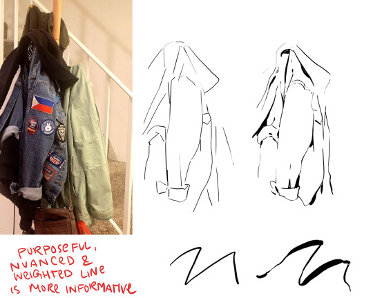
Note
sorry if this has been asked before, but i wanted to ask about your lineart! the weight and line economy are just so nice, i get stars in my eyes looking at your lineart and doodles. could i ask what your approach to lineart is and what tips you might offer?

Wow I love these questions - Line is so interesting!!! It's a really big topic so I feel like any tips I give will be just barely scratching the surface. It's like deceptively simple...any given line drawing is essentially taking all the information we glean from seeing something irl ie light, shadow, dimension, texture, perspective, etc and boiling it down to the simplest possible visual information.
I think most commonly my line is informed by light source so like. thicker more continuous lines face away from the light and thinner more broken lines towards. and a lot of my spot blacks r simply cast shadows.

here's a more extreme example

BUT like everything to do with art there's no hard and fast rules. I use blacks when I think it'll be effective or interesting and I leave them out when I don't need em. umm couple things I find myself doing a lot... using spot blacks to make the separation between characters clearer. I like casting shadow in between characters so its easy to separate and read their silhouettes even when they're mashed together.

u can go even further to purposely create a silhouette like

to draw attention to a finger or tongue LOL. There's some comic book artists who are absolute masters at this type of stylization. Alex toth and his spiritual successor Chris samnee come to mind for me right away.
(toth)
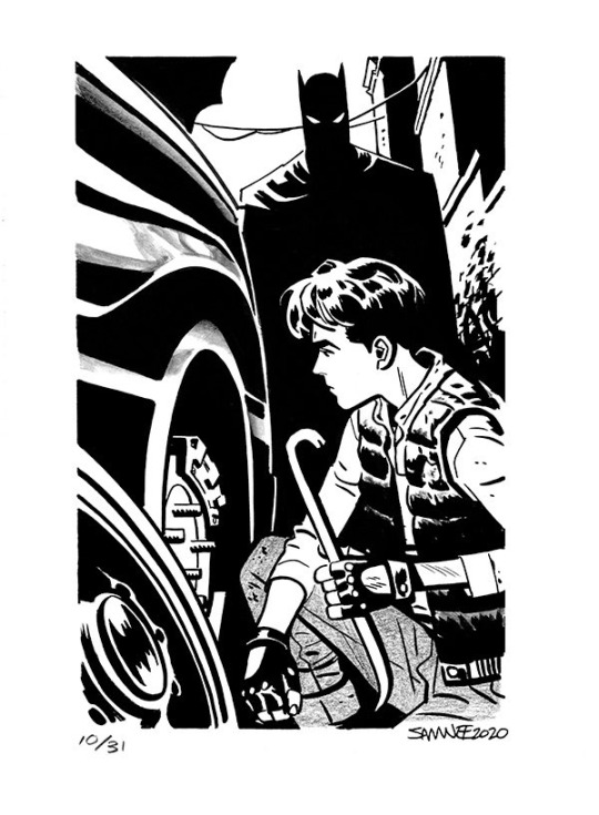
(samnee)
I feel like I'm also often using line weight to separate planes receding in space

im naturally a really heavy handed and scribbly drawer(...?) draftsman. and im nearsighted so when i see things i percieve and break it down into big shapes over thin contours. so stuff like spot blacks and shadows came easy to me, the tricky part was making the rest of the lines lighter when they needed to be so the blacks could actually have impact LOLL. a lot of effective visual communication is about balancing contrasts. like I had to really train myself to press less hard on the pen. I think this is actually really evident if u go back in my archive to older sketches LOL
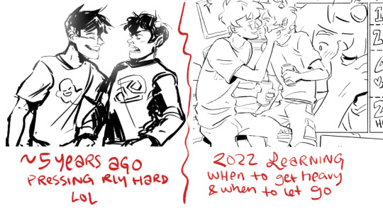


I actually feel like a lot of how I trained my hand to tackle line weights was thru stuff like hand lettering where you rly have to focus on being sensitive to that kind of thing.. contrasting strokes etc.

also exercises like figure drawing will have you flexing those muscles constantly

I'm starting to just regurgitate lessons from freshman year of art school so I'll stop here with the demos but yeah...I hope this was helpful!? I love line!!! I want to get even better at line work so I can feel confident posting work that's only line no color or value... I'll leave you with a bunch of artists who I think have particularly expressive and beautiful linework (not including toth and samnee who I already mentioned and who's work I love so much). You can probably learn much more from them than you can from me...!

Charles dana gibson LOL


Matias bergara
tonci zonjic

naoki urasawa

Daniel warren johnson


shiyoon kim

michel breton
also yoji shinkawa, tomer hanuka, leo romero, I feel like I'm gonna post this and think of so many more. there's so many good artists...!
1K notes
·
View notes
Text
✨ EDMON RAMPART (Amalthia's Version) ✨ You know I once swore to never draw him, well that was of course before he got the James Norrington treatment so it's the Alexsandr Kallus Effect for me again. Talk about from fuck this man to I wanna fuck this man.
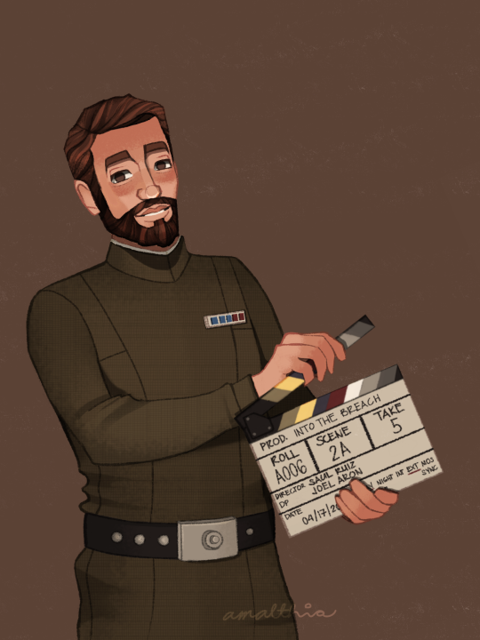
Teeny weeny fandom salt and salt in general coming up so if you don't like that, you can go scroll down. There used to be a cut here but I removed it. I will always be polite, but I know WHEN to talk.
From now on, I will be calling my fanart "Amalthia's version". I hope I don't come across as tone deaf or insensitive about this, but I wish I was good at art.
I've seen posts that say "I wish artists would stop drawing [character name] with [this] or [that]" or "stop drawing [character] with [this]". While it's great to hear about your preferences, please bear in mind that at the end of the day, fanart CAN BE an artist's take on a character. For me, THIS is how I draw Edmon Rampart. This is with regard to the art style I developed and the color palette that I constantly use to keep up with my blog's theme.
Another ick is an ongoing issue in the TBB fandom. In my Hunter and Omega art, I did something I don't usually do, which is add a secondary light source. A few minutes after posting, I got an anon telling me to unwhitewash the characters. I immediately messaged one of my friends for their honest opinion and they said I don't whitewash the characters. I went on to the drawing file and tried to study my own drawing and see if I really did whitewashed the characters. Edit: There really are some artists who whitewash the characters and I was trying to do a SELF-CHECK bec maybe I'm one of them.
I found out that the thing that made the difference is the secondary light source that I added. This secondary light source is lighter in color than their skin, and it created the Contrast Effect. Due to the nature of the human eye and visual processing by the brain, there's an optical illusion that the same color will look different depending on the color beside it and/or the background. It's in psychology class, paying attention would help.
In addition to the secondary light, it could also be the brown background color that caused this effect. And before anyone goes, "are you sure?" Yes, I am. I sat with a Psychology major to discuss about this whole Contract Effect thing.
This does not only apply in colors, it could also be to objects, that why they say all things are relative. One thing could appear bigger or smaller depending upon the object beside it. One of the things they 'check' to see if a certain artist whitewashed a character is the size of the nose. Once again, please do apply Contrast Effect. Some artist really draw their characters stick-like so try to compare all the noses they had drawn in their entire lifetimes and maybe, just maybe they did draw the noses wide in comparison to their other artworks, it just looks like that because it's part of their art style.
Edit: Please do try to analyze things first before casting down your judgement.
It's so difficult to be an artist AND IN THIS FANDOM. We never seem to be enough. If we do the character with artistic freedom, you'll say "stop drawing them like that bec they don't have that in the show" and when we try to draw them as close to the show, you'll say "unwhitewash the characters". We are never good enough for you.
So yeah, I wish I was good at this.
Link to the rest of this series:
1 || 2 || 3 || 4 || 5 || 6 || 7 || 8 || 9 || 10 || 11 || 12 || 13 || 14 || 15
#i'm gonna add this tag: AMALTHIA IS ANGRY#the bad batch#the bad batch season 3#the bad batch s3#tbb s3 spoilers#tbb rampart#edmon rampart#yeah i'm not tagging vice admiral rampart#HE'S BEEN DEMOTED#tbb#star wars#small artist#artists on tumblr#amalthiaph#the bad batch actors au
112 notes
·
View notes
Photo
Creator Spotlight: @scottlava
Scott Campbell has illustrated numerous children’s books, including SKULLS!, Sleepy the Goodnight Buddy, and Zombie In Love. He was author/illustrator of the much-loved HUG MACHINE. He enjoyed a long career in video games, where he art directed the critically acclaimed game Psychonauts and Brutal Legend for Double Fine Productions. Great Showdowns is his ongoing online series. Scott’s work has appeared in galleries and publications around the world. You can see more of his work at ScottC.com.
Check out our interview with Scott below!
How did you get your start in art, and more specifically, with Great Showdowns?
I went to art school in San Francisco and have been painting, making comics, and designing video games ever since with Double Fine Productions. The Great Showdowns began at the first Crazy 4 Cult exhibition at Gallery 1988 in Los Angeles back in 2007, an exhibition of artwork inspired by the cult classics of cinema. The first 10 little paintings were intended to be snack-sized pieces for people to easily collect. They began with perhaps the most iconic of wild west showdowns from A Fistful of Dollars with Clint Eastwood. I pulled some of my favorite moments from films like Ghostbusters, Predator, Exorcist, and Planet of the Apes and placed them all in simple little dust-colored squares as if they were in the dirt streets of a wild west town. They began as good versus evil but grew to all kinds of showdowns between people and objects and often moments of great love between people. I started a tumblr for them a few years later, and I have been posting them ever since. We have published three Great Showdown books and have had 3 solo exhibitions along with worldwide scavenger hunts. There are over a thousand of them up on the site by now, and i do not plan on stopping any time soon.
Which 3 famous artists (dead or alive) would you invite to your dinner party?
I would like to gather Jim Henson, Walt Disney, and Richard Scarry together for dinner and chats. They have all created my favorite and most joyful worlds. I think we would have some of the most delightful chats.
What is a medium that you have always been intrigued by but would never use yourself?
I love collage, but every time I try it, I get frustrated and just quit. Someday I will get into it when my kids are old enough to really mess around with various mediums. I plan to have boxes of textiles and magazines for them to just annihilate.
What does your work set up look like?
Oh, it’s just a table with an old mug for water and an old plate for my watercolors and not much else. I share a studio with a bunch of very inspiring people who make wonderful things, from fabricated creatures to VR experiences and films. I have probably the simplest little area in the space. I do have an old oak flat file that I love to look at.
Advice you would give to an aspiring creator?
The biggest thing I would push upon everyone would be to not fret about one’s visual style. The style will grow and present itself as you experiment with mediums and expose yourself to various cultural delights. Just have fun and try all kinds of things.
What is one interaction you had from a fan of yours that has stuck with you over the years?
I gave a game design presentation many years back on a game I had art directed at the time called Brutal Legend at a game conference in Leeds. The game followed a roadie to the age of metal in the land of metal, with demons and chrome volcanoes and hot rods growing from the ground, and rivers of happy and cheering fans. After the talk, I spoke with someone whose work I had seen in earlier portfolio reviews at the conference. She was very shy but incredibly talented. She came up to me after the talk feeling pretty emotional and inspired to the point of tears and sobbing. It was probably the most extreme reaction I have ever gotten from someone, and it touched me deep down in my guts. That’s why we make things! To bring on the tears!
From video games, to illustrations, and children's books, you've worked on many projects. What was the most challenging, yet rewarding one?
Video games take an enormous amount of work over a long period of time and rely on the skills and talent of many like-minded people. It is sometimes difficult to corral such an effort, but it is incredibly rewarding to see it all come together to create such epic worlds. That said, though, children’s books are very enjoyable in a cozy way. It’s just me right there working on a world and all the pressure is on me. I cannot rely on all the talented people around me to make it look great.
Who on Tumblr inspires you and why?
I love perusing old fashion and film blogs and artists like Bob Jinx and Neil Sanders and collections like Its Colossal.
Thanks for stopping by, Scott! Be sure to check out the Great Showdowns over at @scottlava!
1K notes
·
View notes
Note
Hello! I was wondering if you had any tips for visual artists who haven’t really drawn pixel art, but would like to get into it? Using my usual workflow usually ends up with me creating something that looks like a low res drawing rather than a piece supposed to be pixelated
Love your art! It’s gorgeous and a great inspiration for backgrounds which I’m trying to practice
it sounds like you just need more control over your color usage and shapes!!
pixel art is hugely focused on silhouettes, and limited color palettes. when learning try to use more contrasting colors and less gradients, the contrast helps figure out shapes. most of my early pixel artwork was monotone until i used palettes then eventually making my own palettes!
127 notes
·
View notes
Note
Hey Flans :), was just reading Wikipedia on the debut and it says that you 'pasted up' the art on the cover.
How much of the cover did Rodney do Vs you? Or was it just a case of Rodney doing the individual elements on the cover and you combined them?
JF: oh I realize my terminology is so archaic, it might be confusing. First to be clear--Rodney Alan Greenblat created ALL the artwork including the handwriting on the first album cover. It was a work of his imagination and he deserves full credit.
To explain "paste up" Before computers, a paste up artist (which was my job for a number of years) was one of the lower level folks in an art dept. at a newspaper, magazine or book publisher. You created the mechanical, which was a board with black and white art (either type or xeroxes of art sized the board), with all the typographic information as well as art instructions usually in blue pencil so it wouldn't get reproduced--and that, along with the original color illustration or photography, was photographed to be folded in as a layer in the photo-offset printing process.
The type was output by a dedicated machine--a very early computer essentially--and there were also photostatic machines, nicknamed stat machines that would put moire dots on artwork (those patterns of dots you see in newspapers) along with resize things or marry various visual elements together into one stable piece of art.
All these tasks would require a magazine to have a staff of a dozen or so people to put out a monthly edition. When computers came in, it was one or two folks finishing the same amount of work.
74 notes
·
View notes
Text
So I'm on of those people who enjoys a good "art style challenge" videos. Looking through a lot of different "styles" of art, I've noticed a sort of spectrum that slides between two points.
Stylization and Rendering.
I've made this handy blob to to visualize this spectrum.

Stylization to me is the design of something using shape language, proportions, details vs simplicity, and exaggeration or lack thereof.
It slides between Semi Realism: being more based on reality, Semi Abstract : based more on shape and exaggeration, and Stylized: having a basis in reality but takes artistic liberties to emphasize on certain aspects/feelings.

Rendering to me is the application of form or lack of on a design. Lighting (shade, highlights, rim light), textures, patterns, and lines (there or not). Leaning more graphic or more form based.
No or Low Rendering leans into being graphic. Stylized being some lighting to get an idea of form but not too much to clutter the scene or slow down production. Hight Render leaning on form.

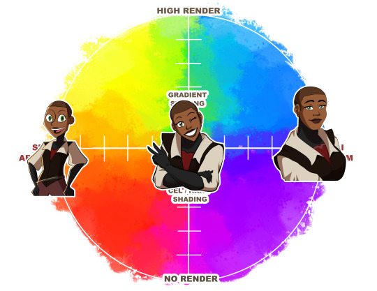
Here are some examples of how different visual stories fit on the scale.

Here you can have stylized character designs with different scales of rendering. Stylization is mostly seen in Japanese Anime and those inspired by Disney.

Same with Semi Abstract designs with different rendering styles. Semi Abstract comes from the UPA shorts from the 50s that really pushed into exaggerated shape language.
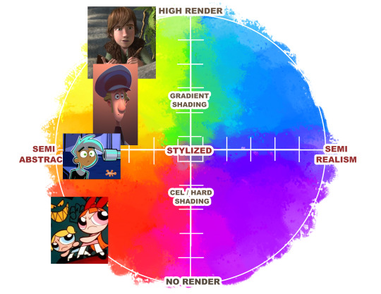
Semi Realistic designs can change with how you render them. Semi Realism is based more on reality.

Works the other way around with Rendering.
You can have the same amount of rendering but take in a story way different with how a character is designed.
Most high rendering is seen in high budget 3D animated features because it would take forever to ask an artist to render this much detail at 24 frames per second. And we already torture animators as is.
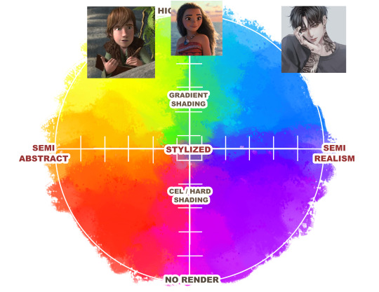
Gradient rendering is seen mostly in webcomics, Korean comics, and illustrated books. Though with Klaus we are starting to see it more in animation.
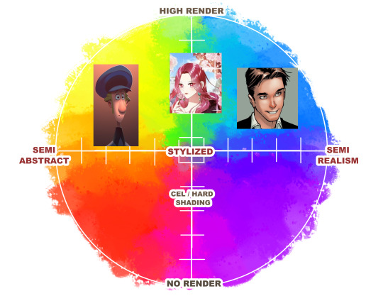
Cel Shading is most common in 2D animated series and movies. Gives it more form and gets the point across.

Low or No Rendering becomes more graphic and emphasizes on color and design.

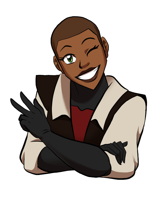
I will use Donna from my comic Legend Catcher as an example.
Same design, different ways to render.
Same amount of rendering, different ways to stylize.
This was just some things to think about when looking at and creating art.

If you wanna check out the process in how I drew all these, check out my Ko-Fi for the video at https://www.ko-fi.com/tessshadowcast
Just some fun thoughts I had. If there are other points to make, let me know!
#style#art styles#Donna Dale#Donna#style spectrum#Style Blob#fun thought experiment#thought experiment#art tip#art tips#stylization#rendering#visual arts#cartoons#comics#ATLA#Avatar The Last Airbender#She Ra#she ra and the princesses of power#powerpuff girls#power puff girls#Klaus#Peter Parker#korean manhwa#Danny Phantom#Moana#Disney#American comics#Ghost in The Shell#castlevania
236 notes
·
View notes
Text
Eggtober 6th 2023

"Splat" or "Fun with Colors": Raw Egg.
(Clip Studio Paint, Gouache Brush, Pencil brush for details and highlights. 12 colors, I think? 1 Hour.)
I actually really liked the rough version I made, so you're gonna get that one at the end as well, for anyone who also likes the rough one better than the smooth one.
But first... I finally discovered a feature of CSP, so now I am unstoppable and I will NEVER AGAIN have to ask myself "How the fuck did I do that?"
Because now I have EVIDENCE. Now curious friends, followers, and my forgetful ass, can watch the full process of how I made a thing. Including what references I used so it's clear how much is iterative and how much I am drawing directly from the visual reference. Today I had to do a lot from imagination because I couldn't find an exaggerated splashy egg, but sometimes I really am just making a study and trying to do a one-to-one recreation of a reference. So now y'all get to know all my filthy little secrets. I was intending to grab footage starting with Eggtober 1, 2023 but OBS needs a version of an NVIDIA driver that will absolutely wreck my computer with BSODs because I own a junker apparently. But it turns out CSP (or at least V2, IDK if it was in V1) has a way to capture a speedpaint natively when you create the file.
Now I am unstoppable, powerful. No more taking a break from art when life gets busy and coming back to pieces I drew 10 years ago and wondering "How the hell did I manage that?" I can just check. It's over for all of you. Once I practice anatomy again and start being able to draw shapes and volumes perfectly from imagination, I will become all-powerful. I will ascend. Hell, maybe someone might even pay me if I learn to draw anything that isn't an egg or a meme. XD Radical self-confidence, baby. I can art now, and I have evidence. My horizons are infinite!
And now, hopefully, any baby artists that are just starting out can get an idea of how I do it from this and future pieces so I can pull you all up with me in a bid of apotheosis. For the EGGsthetic! (Aesthetic.)
I wonder which version of this egg @lady-quen's breadbugs will snap up?
And I wonder which one @quezify will like best? My money's on the sketchy one.
I can't tell which I like better honestly. The smooth one us much more "My aesthetic" because it matches how I render eggs but... The rough pencil-y gouache lines you get with light pressure really remind me of how the classic modern quezify eggs look, and I of course only started doing eggs because of the first Eggtober so, like. On the one hand, smooth and painterly look that goes with all but one of my previous eggs (Eggtober 1, 2023 was a study from memory of quezify's style, after all). But on the other hand... dramatic color changes! Textrure, shine! Colors that aren't in the actual references! EXPRESSIVENESS.
Two different moods on the same egg art and I really dig both of them honestly.
163 notes
·
View notes
Text

Ayo Edebiri by Emman Montalvan
#Emman Montalvan#Ayo Edebiri#visual art: when artists of color create#color theory#light and such#texture: a feeling#pouring liquidity and grace#delicate beauty#ready for a close up#and against the haze of the afternoon the softest light
141 notes
·
View notes
Text
[Information regarding the visual stylization and anthropomorphization in my OC world/story in development 'circusworld']
The "animals" in circusworld are all people. They are drawn as anthropomorphic animals for stylistic and symbolic purposes. Any species may exist, but I tend to prefer to draw my favorite animals or the animals which are most symbolically important to me. So while birds, reptiles, fish, and insects exist in their world, you are more likely to see lions and zebras as the main characters. They should all be drawn with human bodies and limbs, including plantigrade legs/feet, with the exception of ungulates which may be given ungulate feet. Insect species may have wings on their backs. Bird and bat species may have wings either on their backs or as extensions of their fingers. Their hands are humanlike with the exception of paw pads and claws for mammals, and the aforementioned avian species. Their heads should have humanlike foreheads, brow ridges/eyebrows, and eyes, but they may have animalistic noses and mouths. They have hair on their heads. They have animal ears and tails. For all intents and purposes, they are "humans," but artistically, they are "animals" who are undoubtedly people.
They may have flat chests or defined chests, including through transitional surgery. Nipples are not drawn. Lower genitalia is not drawn. Both of these features technically do exist in their world for reproductive/child raising purposes, but it is not the focus of the story and is not necessary to illustrate them. They may have body hair in addition to the fur/feathers/skin/scales on their bodies. They do not necessarily feel the need to wear clothes. Many of them do, for various reasons. Clothes may be physically necessary for warmth, protection, or as a uniform. Some clothes are worn simply for fun or fashion. Many circus characters enjoy clothing as costume.
Feral animals exist in their universe and appear and behave exactly as they do in our universe. They cannot talk, and they are kept as pets and used as livestock. It is not seen as weird for an animal person to own a feral animal pet, because animal people are entirely separate beings from feral animals.
Essentially, animal people are just people. Thus, their species is not often commented on by other animal people, and is often entirely irrelevant to their lives. There is no species discrimination or predation amongst animal people, although certain animal people species may have more of a taste for feral animal meat than others. In addition, some species behaviors may be adapted into personality or lifestyle traits, such as a sea lion enjoying swimming. However, a cat could enjoy swimming just as much. Animals of all different lifestyles and personalities exist.
Animal species are often used to symbolize different traits that we humans attribute to animals. For example, a lion symbolizes bravery/courage, devotion to a group/family, and physical strength. As such, a lion character may embody these themes more heavily. In the case of zebras, they are used specifically because of their symbolic meaning as a representation for under-diagnosed/rare medical conditions, and zebra characters are likely to be used to explore concepts related to illness and disability.
In conclusion: I am a furry artist above all else. I thrive when I am making furry art. I love the creative freedom and opportunity to explore symbolism that is inherent to furry art. I do not think I could tell a story or create a world that I was satisfied with if all of the characters were humans, because of the way my brain thinks in colors and symbols like this. But with this project specifically, the characters are just people who happen to be animals.
#art#circusworld#IM SICK OF FURRY MEDIA BEING WEIRD ABOUT THIS STUFF#no more furry racism and antisemitism metaphors that are always poorly handled
163 notes
·
View notes
Note
Does bill have "a type"? Since you said he only dates every millennium, what kinds of stuff would catch this lunatic's eye? What would motivate him?
You're getting a read more because I listed every single blessed thing I could think of. The tl;dr:
artists (who depict him)
hot eyeballs (subjective)
no head
bright natural coloration
emotional doormats
party animals
nerds, provided they're also attractive other ways
worshipers
things that can injure him
getting gifts
someone who expresses interest first but lets him take the lead
really tacky expensive displays of wasting wealth
someone he thinks is similar enough to "understand" him
This is the first point because it's the answer he'd give: if you ASK him, he'll say he's "a complete sucker for those deep, brooding artist types." He'll say this like it's his biggest weakness. He says it like it's a charming little character flaw. This is the narrative he tells himself. What he ACTUALLY means is if you hit on him, and if you have created art of him (visual art, sculpture, music, poetry), the odds that he'll return the interest go up by 1000%. He is incredibly vain, he loves art of himself, and "willing to give Bill art of himself" is an insanely attractive trait.
Some species have sexy eyeballs. Other species don't. It just so happens that Earth, as a whole, has evolved an array of eyeballs that are by and large pretty sexy when compared to the multiversal baseline. Those little, like, thready filament things in the irises? Mesmerizing. Visible veins?? Drive him crazy. Bloodshot eyes? Gonna be haunting his fantasies for weeks. Top tier is those frog eyes with multiple colors or crazy crackly-looking patterns.
He's not a fan of heads. Like, when a species puts a face on a little bobbly looking thing separated from the rest of the body, rather than right on the torso where it belongs? Looks weird. It's not a dealbreaker but he's definitely more attracted to species that put their faces where they belong. Similarly, a mouth without an eye in it looks weird.
Big fan of bright colors. You know what's attractive? Looking like Lisa Frank colored you. Wearing bright colors isn't as good as being bright colors, but he still finds wearing bright colors to be an attractive trait.
If you combine the last three points, I think that I accidentally made Bill's ideal lover a poison dart frog.
Usually at some point pretty early in the dating process he's gonna say something like "Just so you know—really, I'm not as bad as all the rumors and gossip and ancient legends and globally-broadcasted warning PSAs make me sound. But: I am totally crazy. You wanna stick with me, you've gotta be cool with crazy." What he's looking for is someone who says "oh I am SO cool with crazy, I am the MOST cool with crazy, crazy is GREAT." When he says this, he's not saying "I'm actually mentally ill and need someone who's supportive and understanding." He's also not saying "I'm a wild crazy fun party guy and I want a partner who can keep up with that lifestyle." What he's saying is "I am an inconsistent and inconsiderate asshole who will show no regard for you, and in a year when you're complaining about the selfish harmful things I'm doing, I'll get to roll my eye and go 'I THOUGHT you SAID you were COOL with crazy. Are you NOT cool with crazy??' And then I'll complain about you to my friends." So: he'll focus on naive emotional doormats he can push around. He'll probably draw back from someone who stands up to him, unless he got seriously interested in them before they grew a spine.
But that said, he is also more likely to show interest in people who can keep up with his lifestyle. He parties with apocalypse machines. If he sees an alien at a party where three absolutely wasted demigods started mixing sink chemicals and accidentally set off a big bang that took out half the neighborhood, and the next weekend he sees that alien at another party? That means they party hard, they don't scare easy, they don't die easy, and they avoided the cops. That's somebody he wants to spend time with. If they're not lover material, they might be Henchmaniac material. Similar opinions on substance use and mass destruction a plus.
He's kinda into nerds. Not in and of themselves, but if they already hit other traits he likes, that's a plus. If he has a choice between two identical people and one's dumb as a rock, he prefers the one who knows lots of things and likes to share facts and trivia. Bill goes for long, long stretches without feeling curiosity, and those stretches typically coincide with when he feels most depressed; someone who can drive him to think a little bit is a godsend.
If someone literally worships him, like as a god, he's into that. It's not partner material but he'll put a star next to their name in his booty call list.
Any novel Extreme Sensations, he likes. Particularly pain. Not a lot of stuff can hurt him in his true form. If someone can make him feel pain, that's interesting to him. Not even necessarily in a BDSM way. If holding someone's hand feels like being electrocuted, or they give off a gas that makes everything too loud and makes him see weird colors? That's someone he wants to touch.
I think I've just added another trait to the "poison dart frog" column.
His love language is gifts & favors, both giving and receiving. If somebody gives him a gift, he'll remember them positively. Even if it's a kinda lame gift. It makes him feel liked. Roses & chocolates would work on him.
He's not liable to be the first to express interest, because he finds being rejected utterly devastating. On the other hand, he prefers to take the lead/call the shots in a relationship. So if somebody lets it be known that they're interested in him, but then hangs back to allow him to make the first move? Appealing.
He's a sucker for gold and tacky displays of wealth. Like he's sort of disgusted by wealthy people, but he's very into wealth. If you're rich have fun with it. If you're not ordering a $900 sundae coated with gold leaf just because you can then what's the POINT. Also, Bill is tacky. If some multidimensional billionaire decides to show an interest in him by gifting him an extremely ugly diamond-covered top hat, he'd probably let them do things to him that he wouldn't even confess to his doctor. (He doesn't have a doctor but.) I think what this boils down to is that he's only into rich people who are living like they want to go broke as soon as possible.
He goes through most of his existence feeling like Nobody Understands Him. Part of this is because he's bad at communicating his sincere feelings & emotional needs and even worse at relating to or caring about other people; but part of it is just because there's not a whole lot of people who can directly relate to "my ambition drove me to destroy my entire universe and ever since then I've been grappling with the paralyzing guilt while struggling to find a new universe." So when he DOES meet somebody who he believes can really, truly understand him the way most people can't? He emotionally latches onto them HARD. Not necessarily romantically, but it easily could be. This is last on the list but probably the most important point to getting a genuine emotional connection rather than fleeting physical attraction from him.
Example that hits multiple of the above points: one of his longest & most emotionally meaningful relationships was with a sentient black hole who—quite literally—destroys anyone who gets too close to her, and is constantly wracked with chronic pain due to being a fucking black hole. She did poetry at open mic nights. She'd go up to a mic and say something like "this poem is called The Taste Of Unwillingly Consuming The Solar System You Called Your Home" and then scream into the microphone for five minutes without pause. Bill was like "she's the only one in the multiverse who Gets It." He is a sucker for brooding artists. She let him get away with unspeakable things because he's one of the only entities powerful enough to get physically close to her and survive. Which was incredibly painful, but hey, he was into that too.
Maybe they'd still be together if she looked like a frog.
#(and it's more like once every million years. but that's ON AVERAGE not a schedule)#(like he might have three partners in a millennium but then a billion year dry spell)#anonymous#ask#about my writing#bill goldilocks cipher
94 notes
·
View notes
Text
TMNT & Art
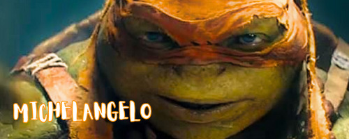
Everyone knows the Mikester is the resident artist.
Spray paint, acrylics and oils, any form of colorful substance is his medium of choice.
There isn't a surface in the lair or the sewer system that is safe from his splashes of color. You have even become his canvas on a few occasions.
Your skin and nipples pebbled under the cool liquid paint on his brushes. Tingles and shivers ran over your body when he blew air through straws to direct the splotches of color across your shoulders and breasts.
Sadly, his art on you never lasts very long. Heck, most of the pieces never reach completion before your lips find his and he forgets the task at hand to chase your taste.
There is more to this big guy than meets the eye.
He expresses his soft side knitting in various styles and patterns. He keeps everyone warm during the cold New York winters by providing blankets, scarves, and mittens.
However, when he's agitated, his yarns aren't always his go-to artistic outlet. He'll carve out his aggressions into blocks of wood or lumps of stone. He can shape the rigid wood to an elegant dancing ballerina or he can turn solid stone into pieces that look like flowing water.
You often wake, nude under his knitted blankets, to find him whittling away at a new art piece. You can spend hours watching his large hands mold and shape the harden materials to his will.
Snuggled beneath the soft interwoven yarns of his blankets, watching those huge hands work their magic, you find yourself growing hot and longing for him to run his calloused palms over your surfaces.

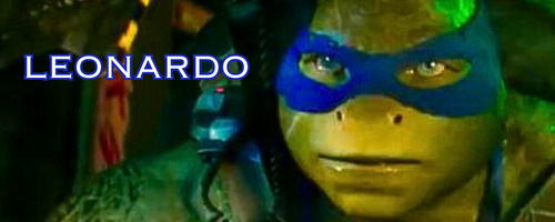
This genius has a passion for more than numbers, chemicals, and electronics.
He finds the world of highlights and contrasts intriguing. From the slides of fungus on under his microscope to the silhouette of the New York skyline, he finds the shapes, colors, and patterns visually stunning and he is masterful at capturing them with his cameras.
He has an eye for seeing beauty in everything and when he saw you it was no different.
Others walk past you all day and never take notice the angle of degree of the slope of your cute nose, the balanced ratio between your eyes and your mouth, of how your face is so close to pi that you are the perfect ideal.
He often requests your attendance for artistic and sensual boudoir photo sessions that he keeps in his private collection.
You feel his expert eyes roaming over your exposed skin from behind the camera lens, it is thrilling and sexy. You hear the husk in his voice as he asks you to lift you bottom a little higher and arch your back just a millimeter more.
His photo shoots always end the same way, with him sauntering out from behind the camera to finish undressing you and spending the rest of the evening studying your angles up-close and personal.
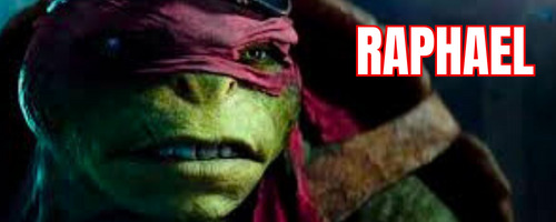
Fearless found his artistic side almost by accident, or rather due to an accident.
It was an unfortunate mishap as a child that had him sitting on the sidelines in the dojo with a broken leg wrapped up in a makeshift cast, having to watch as his brothers got to do their daily routines with their father.
Not wanting to fall behind, he started focusing on the forms and lines created by their bodies as they moved through their poses. It wasn't long before he started bringing his pencils and a notebook into the practices to capture the forms and lines for review and reference.
His pencils etched masterful body studies into the pages of his book. He skill with perspective and shadows grew and eventually, he started to rival his namesake in drawing.
He kept his art quiet and private from you for a long time. However, one morning, waking up in your bed, you were surprised to find the terrapin sketching you by the breaking morning light.
He confessed, you are his muse. His bedroom walls are adorned with graphite recreations of the shape of your eyes, of images of your hair flowing over your shoulder, even intimate studies of your cute feet and tiny toes.
His most treasured pieces are the ones he has you sit for, nude, lounging in his bed as he breathes life into his pages.
His intense stare has a whole new meaning when it comes from behind a sketch book. He is all business trying to capture your beauty as accurately as possible. You know that he will not stop until he's completed the drawing, but you know once he done hours of passion await.
#tmnt#teenage mutant ninja turtles#tmnt bayverse#raph tmnt#raph x reader#raphael#tmnt raphael#leo tmnt#tmnt donatello#tmnt leo#leonardo tmnt#tmnt mikey#bayverse leo#bayverse tmnt#bayverse leonardo#mikey tmnt#mikey x reader#donnie tmnt#donatello#donatello x reader#donatello x you#donnie x reader#tmnt donnie#tmnt raph#michelangelo#leo x reader#tmnt x reader#leonardo#tmnt 2014#tmnt 2016
154 notes
·
View notes
Text
The DCA Palooza is finally here! We're so excited to have you here.
After years of hard work...
The DCA Palooza is finally here.
And here's the intro post.
Why was the Palooza created?
Recently, I made a note commenting on the atrocious reblog-to-like ratios for the Daycare Attendant Fandom. As @chandlelures calculated using their own art, 18 percent of their notes were reblogs, and the rest were likes. Now some are fine with this. For them, likes are any other type of validation except that logic falls flat when you consider how this site works. Reblogs put art on your follower’s dash, keeps the art circulating, and you can leave nice compliments in the tags which artists will probably screenshot and read when they’re feeling sad. It’s about a feedback loop of good vibes and participating in community. The ratio particularly affects smaller artists who may average 10 notes at best, and when over half of those notes are likes–well, it hurts their chance of growing their audience and having more people see their hard work.
That’s why I’m excited to introduce the DCA Palooza!
It’s not just about fixing numbers, or asking people to reblog more. It’s creating an event space where we can share our ideas and art, while also promoting image accessibility (writing IDs, tagging for eyestrain and flashing, etcetera) for disabled fans too! It’s addressing the wider cultural shift that many older fans have complained about, where we’ve started treating ourselves as content creator and consumers, instead of fans all obsessed with the same blorbos. To do our part in fighting against this and building community…
Here are our main goals:
Encourage fans to reblog and support smaller artists.
While we love the concept of “gallery spaces” from @roachworks Gallery Jamboree! You don’t need to create a sideblog to become a curator. If you want to join Monthly Wrap Ups (where you promote new artists and AUs you found) all you need to do is tag @dca-fanart-gallery to join the event! We’ll see your tag, reblog from you, and then go hunt down those artists you mentioned and reblog from them too :D!
Host weekly magmas and community events
Magmas are a place where multiple artists can draw on the same canvas. It’s a great way to find new artists and their art styles, and have fun with their community. They’re currently hosted by @venomous-qwille every Saturday, and we post the art pieces in our Discord
Raise awareness about accessibility
In the Discord Server, we ask that you write short IDs for every image you post and hopefully learn to write IDs for your own art. The main gallery will promote accessible artists and link to resources for writing image descriptions, as well as write IDs for much of the art we reblog. It doesn’t take too long to learn, and as the original artist, you’ll know what to emphasize in an ID than we’ll ever can!
How can you support us?
Check out and follow @dca-fanart-galleryl! It’s run by a blind Y/N who’s trying to understand where the heck these blorbos came from. Donate your abandoned sketches to become coloring pages for the @dca-coloring-book! Look at the ID guides tag and make your art accessible for your fellow blind/visually impaired fans. And most excitedly...
Join our discord server and have loads of fun!
188 notes
·
View notes
Text

☁️ 2024 Artist Resolutions ☁️
Happy New Year, everyone! 🌻
Just sharing my annual artist resolutions (this is my 3rd year doing this, I think?):
colors & palettes: I would like to try and experiment more with color, including probably (re-)teaching myself color theory (and actually trying to understand it this time lol), working with more mindful color choices like limited palettes and overall trying to use color to make more visually interesting pieces.
video content: I actually really like the process filming and editing little progress/behind-the-scenes videos, but I didn't do much of that at all this year. I'd honestly like to go back to doing some of that again! Also I had a brief stint of streaming art on Twitch around this time a year ago and haven't gone back to it...still on the fence but I may revisit that as well this year.
comics: I've always enjoyed drawing silly little daily life comics and would like to continue with that, but 2023 made me realize how much I also enjoy creating more long-form webtoon and comic book-like pieces as well! I definitely want to explore and expand more upon that in 2024~
composition: I've been very lazy about composition! Going back to wanting to use color to create more visually interesting pieces, I'd also like to focus more on composition to do the same as well.
(soft) freelance: I used to have an online shop that I shut down almost 3 years ago now...I don't know what I feel brave enough to tackle this year in terms of being an independent artist outside of my day job; whether that's commissions, ko-fi/patreon, product design for a shop reopening or tabling at conventions, but I hope I'll figure it out and get over my hesitations about it...soon.
sketching & journaling: I really super-mega-absolutely neglected sketching and journaling for the entirety of 2023 which TRULY HURTS MY JOURNAL-LOVING HEART. I want to try some things to find a new system of sketch-journaling that fits my time and lifestyle better these days so I can incorporate that back into my life.
My previous artist resolutions from 2023 and 2022~
I think I only really got to two goals from my 2023 list; drawing more backgrounds and entering my 'villain era' by drawing more selfishly (though I'll be honest: I didn't expect that to manifest the way it did when I had written it out, but yeah okay, smutty art it is I suppose lmaooo)
We don't talk about 2022 lol.
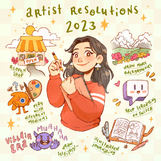
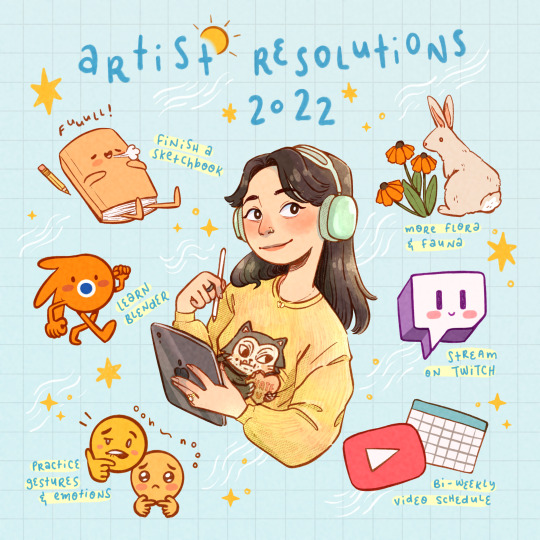
Hope everyone is having a great start to the new year~
Relax! Rest! Recharge! And may we achieve all (or at least most of) our goals we're hoping to in 2024 💗

#lost track of time and basically missed midnight last night#ended up ringing in the new year while in the shower lmaooo#started off the year squeaky clean tho!#artists on tumblr#artist resolutions#art goals#illustrators on tumblr#digital sketch#digital sketchbook#celdraws#just celery things#celerydays
90 notes
·
View notes
Last Seen Blogs

alvalcaste
Al Val Caste

wutbju
What in the World!
changedgreengrass
Pure But Changed
bamtamtime
Tim
insizeid
Untitled