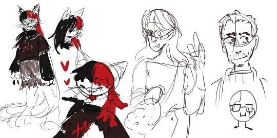
#traditionally drawn digitally edited
Note
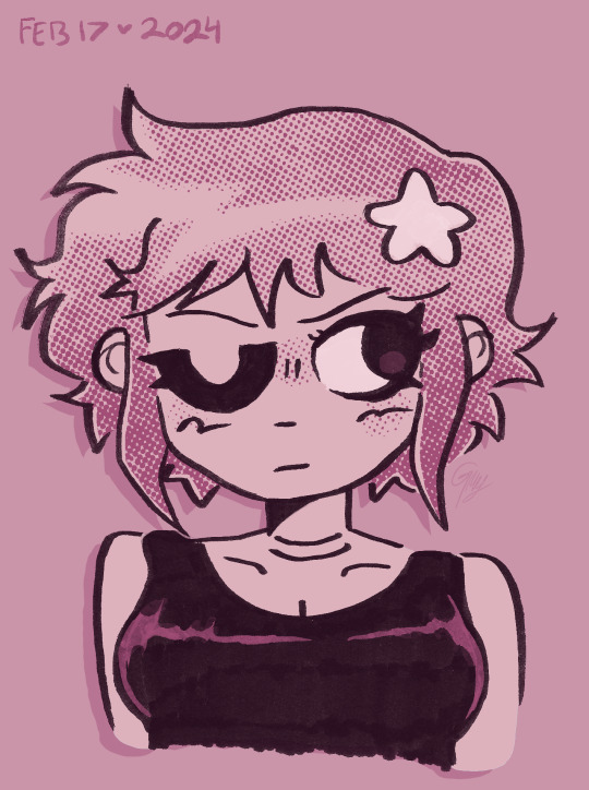
New Do Same You Clip is so huggable looking..
he is! he has four arms! perfect for hugging! he loves giving hugs
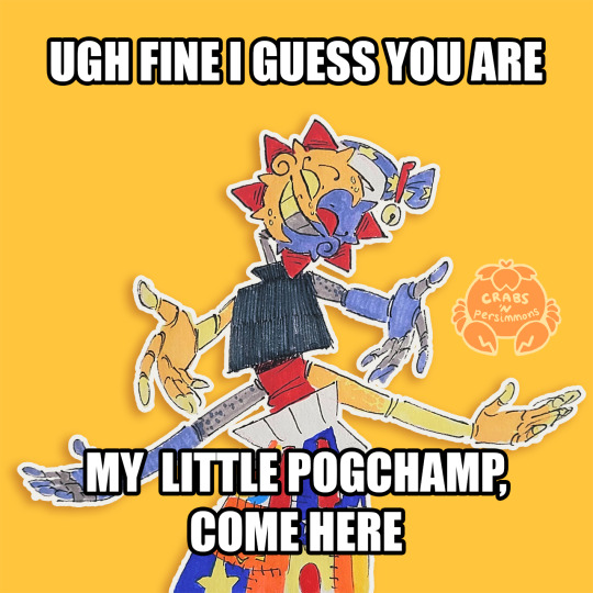
Clip: if my post gets more notes than Moon's, i'll show you all my special trick!
Moon: it's... not a competition, Clip.
Moon: Starlights, come on, don't let me down, he won't ever let me hear the end of it!!
#fnaf eclipse#New Do Same You AU#Clip New Do Same You AU#dca fandom#dca oc#crab art#traditional art#traditionally drawn digitally edited#sorry i took so long to reply!#went with the meme's original wording cuz i think it fits Clip more as a gamer#Clip is a memer#because i'm a memer#i guess this means i gotta do one for Sun eventually#wonder which colouring style i'll go with for Sun's hmmm
277 notes
·
View notes
Note
i just found your account and i'm so so so so so in love with your ocs and your artstyle and it's all just so AMAZING!!!! leave some swag for the rest of us fr!!
i've seen some of your traditional stuff and wanted to ask what pens/pencils you use to sketch?? and have you ever tried coloring/making finished illustrations traditionally?
i'm a traditional artist (i just fill sketchbooks and never make anything finished) and everytime i see tutorials for comicbook/misprint/vintage-y art it's always digital (probably because of the aging and editing possibilities). so I'm curious if you've ever tried it (or if it's even possible lol)
thank you so much for sharing your art with us!!
Oh thank you so much!! 😭
I do make lots of traditional art, and I looove working with ink. I gravitate towards Pilot fine points and Speedball for making comics, but really just experimenting with different ones on different media is the best :]
And it is totally possible to make hand-drawn misprints! Once you got your linework, get yourself some alcohol markers (preferably in cmyk colors) and lay them down individually in layers, staggering each color to one side/outside the lines a little! Also tracing over your lines with a different color pen gives you a chromatic aberration appearance, too!
Also, even if you do a little ink wash/water color over your work, it can really make it pop! You can even add "stains" to the art that way...


Also, lastly, solid blocks of color and linework over it reflecta the UPA style, which is SUPER fun to do with paint and pens!
So there's tons of ways to get your traditional art to look vintage :D I'm glad you asked, thank you!
113 notes
·
View notes
Note
naoto (p4) and/or makoto (p5) please?? 👉👈
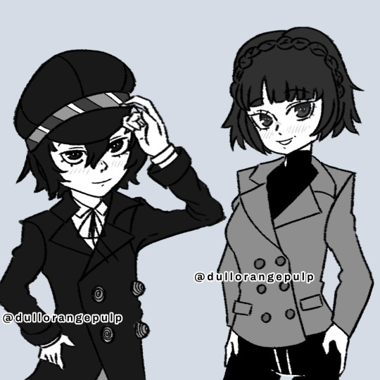
I assumed since I've been posting my digital art lately that you didnt want them drawn traditionally. But if you did, im very sorry! I hope you still like the art anyways!
For all of my followers reading this, next time (just to be safe) pls clarify which medium you want the doodle to be in, otherwise i'll just default to traditional. this time is the one exception
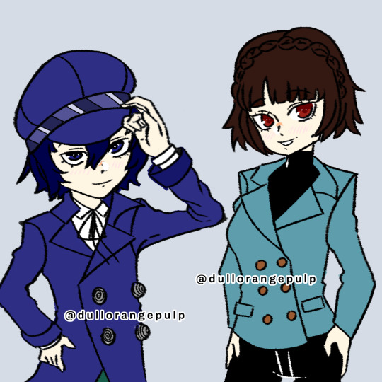
EDIT: coloured ver below
#dop art#persona 4#p4#persona 4 golden#p4g#p4 golden#persona 5#p5#persona 5 royal#p5r#p5 royal#naoto shirogane#makoto niijima#dop asks
46 notes
·
View notes
Note
do you have any tips for an artist who wants to start making one off comics? i really enjoy your artistic direction and style of story telling so i’m very interested in your thoughts on it
yes, definitely!!
-read lots of comics! and a variety of them, too--both ones in the sort of genre/style you'd like to make, but also ones in completely different genres, lengths, places of origin, traditionally/indie/digitally published, simple to experimental formatting, etc
-in relation to the last one, if a comic you read really speaks to you, take some time to study some page layouts from that comic! how do the panels vary from page to page? how much space is the text taking up? what sort of "shots" (to borrow from cinematic language lol) are they using? these shouldn't be fancy, just little thumbnails, but i find it really helps. here's a few i did from a guest in the house by emily carroll
-start smalllll. its really important to build up your stamina, just like with any new sort of skill. if you wanna make a graphic novel thats 200+ pages long, you should make some comics that are 1, 20, 50 pages long and see them through to the end before taking on a super big project.
-this is related to the last point, but i think keeping your cast of characters small at first can also help build up your comic stamina. signals was the first longer comic i made, so i specifically really wanted to focus on just jeanne (and occasionally her parents and peers when they showed up)
-character sheets are helpful, but i also think the easiest way to start getting your characters drawn consistently is through actually drawing the comic! there's also gonna be panels where they look "off" or whatever, and its literally fine, i promise
-through the smaller comics, experiment with how you go about writing your story! theres no right or wrong way to write/plan out a story so, it takes some trial and error to figure out what will work best with your work flow. for me, i've found success in making a timeline of events for the story -> loosely guessing how many pages i'll need/want per section of the story -> freewriting (trying not to edit too much, just dumping all the words out) -> thumbnailing/loose sketching/editing text (all sort of happens in the same step; i find i need the layouts in front of me to understand what i need/don't need from the text i wrote) -> tight sketching -> final . but, if that flow doesn't work for you, try something else! i know a lot of comics people find success in writing a script first, with indications of page and panel-by-panel breakdowns
-take shortcuts often and without guilt. its a lot of work to make a comic! theres just a lot of drawings involved, that most people aren't gonna look at for very long! i especially recommend for infrequent/difficult things, like buildings or crowds or cars or bookcases, using some sort of 3d asset/brush to make your life easier. if you can reuse a drawing and change the crop/expression, do it!
-use some sort of tracker to track your progress on how many pages you've sketched/inked/finished. even if you don't have an external deadline, i think it's still good to give yourself some sort of timeline to work on (i recommend setting "ideal" goals and "realistic" goals, especially if you're working/still in school/etc). for signals, i used google sheets, because you can set up columns to be attached to little circle charts, so as you check off your progress, you can really easily see how much you've done/how much you have left to do (as i type this i highkey forget how i did that before, with signals, so...you might need to do some sheets experimentation to actually do this lol. but there's probably other trackers you can use too)
-understanding comics and making comics by scott mccloud are both great books, highly recommend them (easy to get second hand/from your library/🏴☠️)
-lastly, haveee funnnnn
146 notes
·
View notes
Text
another ramona drawn traditionally and scanned + coloured digitally <3
really proud of this one!! you can tell from the line art around the left side of the hair that my brush pen is starting to fray a bit 😭
over the years ive constantly been switching from digital art to traditional and back to digital but ive kinda recently discovered i like to mix them together like this. it gives this beautiful texture on the lines and i dont have to worry too much about errors since i can just remove them digitally. i still like to try and avoid errors ofc, but like for example i made her ears wayy to small so i just resized and then redrew them digitally.
i highly recommend trying this technique at least once if you have the printer and programs available!! this illustration was drawn on strathmore bristol paper, with a faber castell pitt brush pen. i used col-erase prisma colour pencils to sketch it. this is scanned with a basic 10+ year old HP Printer-copy machine, and edited in procreate. the half tone textures are from a brush pack made by true grit texture supply.
#ramona flowers#ramona#scott pilgrim#scott pilgrim takes off#scott pilgrim vs the world#spto#spvtw#someone please get me a new brush pen </3
45 notes
·
View notes
Text
ALL OF MY UNFINISHED DOODLES FROM PURGATORY (digital edition because I have a lot more traditionally)
Starting off strong is this Thumbnail of the Soulfire leaders that I never finished!! The original one is a lot sketchier than this, but I cleaned it so you could actually tell what was going on

Next is my first drafts for Badboy Halo, because I had never drawn him before. Wanted for him to look "shadowy", creepy and demon-like! A lot of the art I made is design work for my soulfire designs (you can see them here)
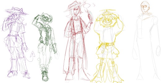
This one was, again figuring out character designs (but not purgatory themed). From left to right, Tina, Tubbo, Bagi, Baghera and Fit. Baghera is my favourite out of these <3
This one is Niki, Lenay and Pierre, characters that I hadnt drawn before also (I had a lot of fun with qNiki)

You can see here that my initial concept for Soulfire wwas having matching jumpsuits! I was also debating Niki's colours and having fun with Bad's demon form (dont mind the random ppl on the left)

Last design is here with Lenay, adorning the Iconic soulfire bomber jacket, and me trying and failing to figure out clothes for bbh </3
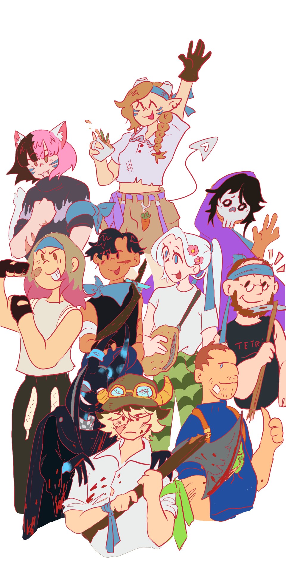
Last but not least we have this MASSIVE soulfire ilustration that I wwas drawing since the FIRST SOULFIRE STREAM. I was having trouble because I was originally going to do only the members who logged in, but then Mariana logged in which really put a spanner in the works. This ilustration was based around the idea of the blue team encapsulating what SoulFire meant. The people who worked around the farming being the team's SOUL while the fighters who wwere out for blood being the FIRE. Im thinking of maybe revisiting this piece and finishing it, really all Id do is balance out the colouring, shade and highlight it and write Soul Fire on it. (Also make the lineart blue, why tf did I make it red😭😭😭)


+Bonus pose that was going to be Roier I think? (or Etoiles. maybe all of ggninjas) and a Pac doodle that I just thought was really cute
Anyways thanks for bearing with me and my yapping. If you'd like to see the traditional doodles let me know!!!
@ultra-raging-ghost @thesmpisonfire this ones for you💪💪
#qsmp#qsmp fanart#qsmp tubbo#qsmp soulfire#qsmp tina#qsmp badboyhalo#team soulfire#qsmp niki#qsmp lenay#qsmp polispol#qsmp pierre#im not tagging all that#my art tm
47 notes
·
View notes
Note
hi, correct me if i'm wrong but i seem to remember you saying that you're majoring in illustration! i'm currently in the process of applying to colleges and i plan on majoring in illustration as well, so i was wondering if you had any advice for portfolios. I could really use some tips on the presentation aspect specifically, bc I'm a little lost when it comes to stuff like the arrangement/organization of pieces, how I should crop my pictures, etc. any advice you can give me is greatly appreciated!!
hi yes i can totally help you out with this! i like to think my college portfolio was pretty good bc i got accepted to every school i sent it to lol :) the main pieces of advice that i was given when building it were this:
studies and pieces that show off your technical skill are great, but limit them to around a third of your portfolio at most. art schools DO want to see that you're technically skilled and can like, draw a charcoal still life or a self-portrait, because those ARE important skills to have, but ESPECIALLY if you're applying to a school that's more known for contemporary fields like animation or illustration, it's much more likely that they want to see your creative mind at work. the single best thing you can put in your portfolio is a BODY OF WORK, and specifically a body of work that shows off your own ideas and your own take on whatever you're producing. this means 3+ pieces that are interconnected or related to the same central theme. my portfoilo, for example, consisted of 2 or 3ish traditional, technical pieces which showed that I had a certain level of technical skill, and the ENTIRE rest of it was devoted to a series of original interconnected narrative comics I'd written and drawn. Every reviewer I met with told me that this was what made my portfolio stand out to them--it showed that I was not only technically skilled, but that i had something i wanted to DO with that skill, that I had direction and drive with my art and was able to produce work that reflected that. If you're maybe (definitely) not quite as ambitious as me, something like a series of 3-5 interconnected illustrations or a short comic if you're into that might do the same thing.
as a side note, if you DO have a body of work as the central focus of your portfolio, a lot of colleges will be interested in your process as well! for example with my comic portfolio, i used one slot to demonstrate my process, because I penciled every page traditionally before digitalizing it and i had extensive character and worldbuilding sketches. I wouldn't devote more than one slot to it, but if you have a body of work where the process is important to you it could be worth throwing in!
arrangement is tricky, but the advice I generally heard was "put your best stuff first." whatever you're most excited about, whatever is going to grab someone's attention the fastest, that's what you want to have in your first slot. (I actually don't think I followed this advice on my applications LOL but it's what i was TOLD to do and i think it's solid advice.)
in terms of editing, assuming we're talking about traditional pieces being photographed, you want to make sure your pieces are 1. well-lit, (DO NOT TAKE YOUR PHOTOS WITH OVERHEAD LIGHTING. wait for an overcast day and take them outside trust me) 2. legible, (no weird shadows obscuring parts of the piece, high-quality enough that no details are lost due to digital pixelation, etc) and 3. as color-accurate to real life as you can make them. most of this is just about getting a decent-quality camera (a newer iphone should be fine) and a good location. (outside and overcast, as previously mentioned) you may want to throw your pics into photoshop and play with the balance slightly, but I wouldn't do anything too drastic, try to get the most accurate photo possible without any editing. (if your pieces are small and flat, scanning them in may work better. most public and school libraries have scanners you can use for free.)
finally, cropping. the general rule that I was taught is to crop the piece, not the photograph. if you've got a piece on paper and you're not sure you like how the actual drawing is oriented on the paper, crop the PAPER down to size, and THEN photograph it. your photos should aim to show the ENTIRE piece from edge to edge (unless it's a detail shot obv) and I even like to include a little bit of extra "breathing room" around the piece so that it's clear exactly where the dimensions of it end. here's a piece I used for my college portfolios for reference:

i lowkey do not like this piece now but that's not the point. this is what i mean by breathing room--a few extra inches of space around the actual canvas so it's clear that this isn't a closeup and you can see where the canvas actually ends. the same is true for digital pieces. if it's a full bleed illustration (something with full color all the way to the edges of the canvas) just make sure you like the composition cropped the way it is and submit the full piece as-is. if it's a floating spot or something similar without hard edges, leave a bit of white or transparent breathing room around the edge of your image.
hope this helps! if you have any more specific questions lmk :)
#asks#^ guy who is terrified at the prospect of having to build a portfolio for fucking JOB INTERVIEWS now lmfao
88 notes
·
View notes
Text


daily crk front and back of page 17
4/3/24-4/4/24 drawn traditionally, scanned, then edited digitally
#pure vanilla cookie#pure vanilla crk#black pearl cookie#black pearl crk#cookie run kingdom fanart#crk fanart#traditional art#scanned#art#fanart#queued post#iambirchu503 daily crk
22 notes
·
View notes
Note
i love your art style! any tips for beginner artists?
thank you so much!! here're a few that popped into my head:
always use references! if you don't know how to draw something - look it up on the internet or (even better!) take a picture of yourself and draw it. drawing things from photos and nature will help you improve much faster than trying to draw everything from imagination and memory.
ps. try not to use references drawn by someone else in the beginning because then you'll most definitely duplicate someone else's possible mistakes and we don't want that.
don't focus too much on finding your own art style. learn the rules first so you can break them later and apply them to your drawings. I can't count how many times I was angry that each of my drawings looked different until I realized that this is also a part of the whole "finding my own art style" process, so look for interesting styles and be inspired by artists you like.
and I don't know if this is a tip but I feel like I need to say this - it's okay to be inspired by someone else's art style. my art for a very long time was inspired by burdgebug (raise your hand if she was your art style goddess too) and many times I even copied her drawings too, and that is fine HOWEVER I never posted them anywhere and signed them as my own. and my point is - study art styles that you want your own style to be based on but never copy or trace someone else's drawings and post them as your own. AND if you draw something inspired by your favorite artist - tag them! I'm sure they'll be thrilled to see that their work has inspired someone. :)
digital art and tablets are great but don't forget about sketchbooks! using different types of media, from pencils to paints, give you freedom that no screen can. and if you're posting your art on social media - don't feel pressure to post every sketch online, not everything you draw has to be content.
also not everything you draw has to be perfect, let yourself experiment and learn from it!
if you're drawing digitally remember to flip your canvas! and if you're drawing traditionally you can look at your drawing in the mirror or take photo of it and flip it in the photo editing app.
don't shade with black! it will make your drawing look mudy.
I really like to draw studies from my favorite movies or tv shows because they allow me to learn how the light and shadow work in different setups so I recommend you doing that too!
I know it sounds scary but try to draw full bodies and backgrounds too and not only portraits (but they're so fun to draw right?!) so you'll improve all of these three things at the same rate. I was teriffied of drawing feet for a very long time and look where I am now - still can't draw them, why do people even need feet...
and what is most important - have fun! draw what you want, experiment, use defferent medias and art styles and find what suits you best. it's a very long road, a lifelong even, so don't be upset at first if something doesn't look the way you wanted it to (it hardly ever does even if you're on the higher level in being an artist). someday you'll be able to draw something that you've imagined for years and it's the greatest feeling in the whole world! just be patient and try to enjoy the road you're on instead of looking at the final destination.
bonus tip or more of a uplift for begginer artist that post their drawings on social media: YOU ARE AWESOME AND YOU DESERVE EVERY RECOGNISION, try not to pay attention to engagement and numbers on your posts because they can ruin your motivation like nobody's business, and remember that you are what you create and not how your art performs on the internet. <3
that's a long ass post, but I hope it's somehow helpful! I could make a post with useful resources (mostly for digital art) so let me know if you'd be interesed in that~!
79 notes
·
View notes
Text
Practicing Molluck

Last night, I had an urge to draw Molluck with traditional art supplies since I have felt like drawing some traditional art for some days. This is basically a sketch practice thing again. I felt like drawing him from an 'unusual' perspective for practice reasons.
Last time I drew a pencil portrait of Molluck like this was about 2½ years ago:
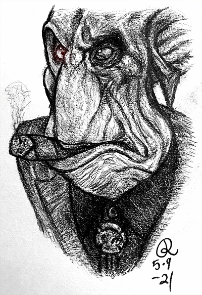
I'm kinda just getting tired of drawing with a computer mouse and I feel like I enjoy doing traditional art the most, even I have done it rarely during the recent years. The main reason why I haven't done more traditional art is my self-hatred since I have felt like I'm just gonna waste those art supplies for drawing/painting some trash.
Man, I got so many art supplies to try out and it would be nice to have a challenge where I draw the same thing with different art supplies; I did such a thing in high school with five different supplies for the art course. Oh, and I really wanna do a Molluck statue to myself, like a lil golden bust, like the one on his blimp!

This is just such a nice little detail we can barely even see. I mean, I would love to take a much closer look at that bust!
But yeah, my point was that after all, I feel like I don't enjoy doing digital art so much. I used to like drawing with the mouse and that's the main reason why I have kept drawing with it but over the time I have just seen better and better how it restricts me and that's why I feel like I do draw better traditionally than digitally even I have drawn mainly digital stuff for a decade. Maybe one day I try out some proper digital art supplies but I don't know if it's truly my thing. I just feel like I can also draw more precisely when I do traditional stuff.
But yes, both medias have their own pros and cons but I do enjoy doing traditional art more. Man, sometimes I think about painting a huge portrait about Molluck... I bet that Molluck would love it too! I just kinda love it that Gluks love their own faces so much. And I also just would find it fun to paint a portrait and frame it like it was something that Molluck would have hanging on his wall. I just agree with him that he is such a beautiful Gluk and I just cannot get enough of him...
I have started yet another digital practice thing but not sure if I finish it, or I more like might redo it. It's quite a WIP to me but I can show an edited one:
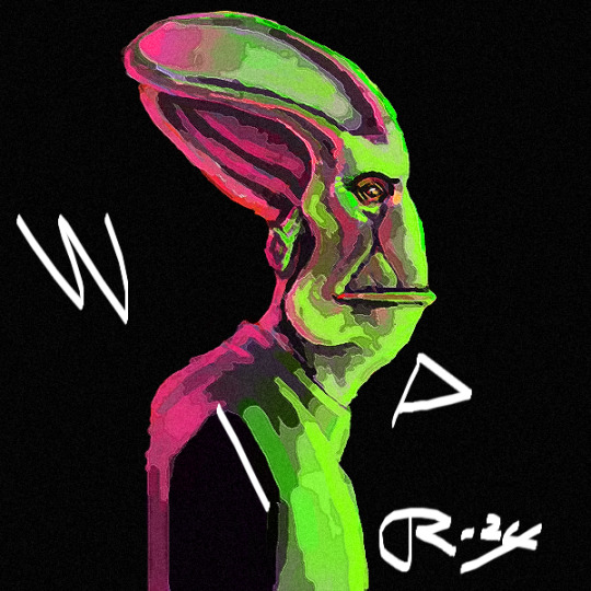
I guess that you can get it why I chose those colours (It's the logo!). I know that some spots don't look right but it feels like it would be easier to draw this traditionally, so this is what I mean with redoing this. I also haven't used reference to this one like to the those pencil sketches since I kinda wanted to practice building 'a mental 3D model' of Molluck. Yeah, practicing drawing Molluck over and over again feels like precising my mental image of him. Drawing him both without and with a reference is a part of that.
Oh, and I remember loving drawing on a black paper with colour pencils, so I would like to draw something like this traditionally. I'm still not stopping digital stuff and I got some digital WIPs to finish but I would just like to focus more on traditional art. Just screw this self-hatred; I'm gonna use those art supplies!
I do hope that this 'art year' is gonna be better than the previous one. I really need to draw more to improve and get these ideas out of my head... Yeah, even I have been drawing mainly Molluck for 2½ years, I feel like I still have a lot to learn about drawing him.
18 notes
·
View notes
Text
The Dusk Is Upon Us.
My first time digitally colorizing. The only reason why I decided to color it digitally is to help give off the aesthetic I am attempting to convey. There is a normal Sharpie and colored pencil version in my sketchbook, but it was a nightmare to digitally edit and I do not really wish to share it.
Anyways, I think I nailed it. Maybe more works in the future will be digitally colorized. But they will forever be traditionally drawn. I can promise that.
#furry#sfw furry#clean furry#furry art#furry character#furry anthro#furry fandom#foxes#fursona#arctic foxes#fox furry#furries#furry artist#furry artwork#furry oc#furry sfw#furrydrawing#sfw furry art#furryoc#fursona art#red fox#arctic fox#red foxes#fox
35 notes
·
View notes
Text

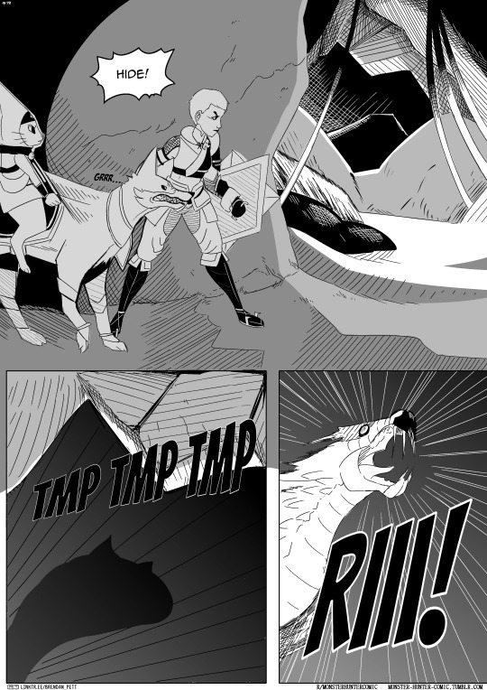
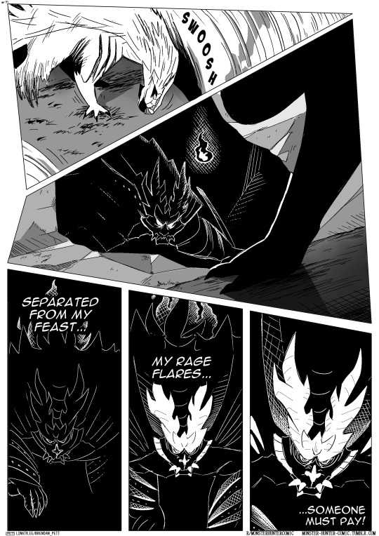
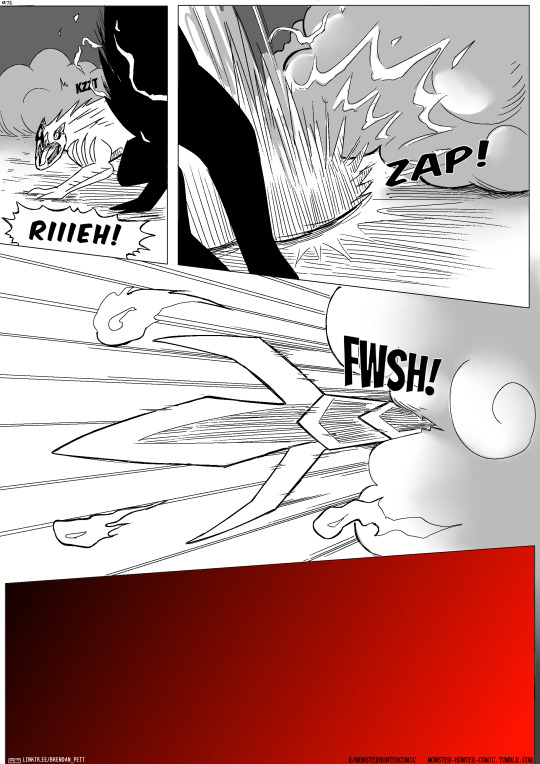
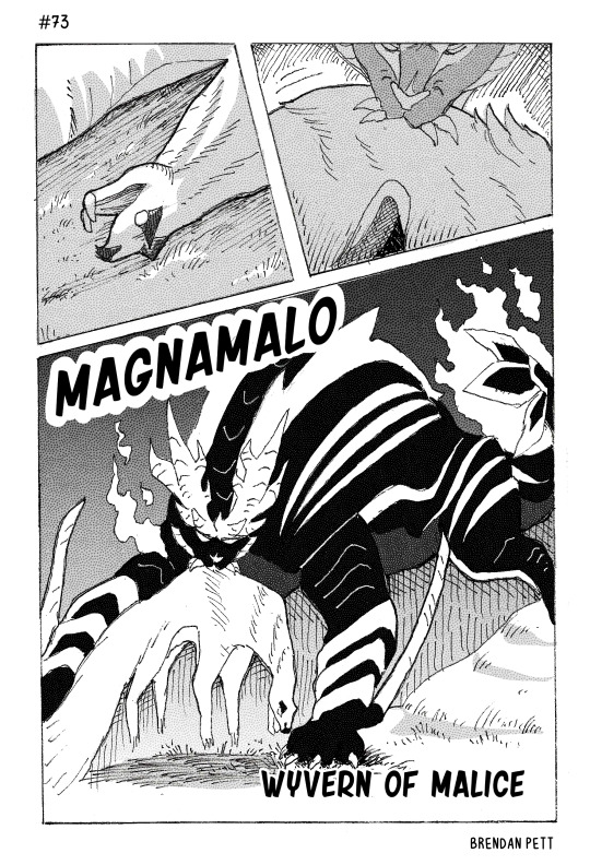
Monster Hunter Comic: Mami #69-73
beginning | previous | beginning of chapter
if you'd like to support the comic, take a look at my social links.
oh, by the way, page 73 was formatted using traditional manga dimensions, drawn traditionally on paper with pen, scanned into the computer, and then digitally edited and colored in grey. i've gone back to doing things digitally as of page #77, but i'm keeping the new dimensions and formatting.
#monster hunter#comic#webcomic#illustration#art#artists on tumblr#monster hunter rise#manga#mh#magnamalo
43 notes
·
View notes
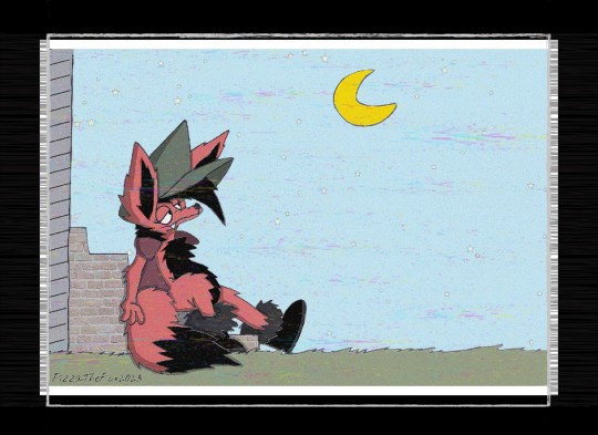
Text

RiseTober day 3: "Hide"
I had to draw the Gumbus for this one, I love that episode.
Drawn traditionally, and edited digitally.
206 notes
·
View notes
Text

Today is release day for the Mega Man Battle Network Legacy Collection!
WE MADE IT, FOLKS!!
Yes, I know we're celebrating the game's re-release, but I took a character from the anime for this event -- specifically, Oozono Yuriko, shown here in Cross Fusion. This piece is based on the final fight in episode 19 in Stream, taking place on the hospital roof. I... didn't know whether I could show other characters in the shot, so it's probably not as apparent, but for context, her opponent here not pictured was Bombman.
Honestly, the whole scene is a lot shorter and less relevant than I thought (there's another unrelated fight in the same episode that kinda overshadows this one,) but it stuck in my memory regardless. [Insert a joke about my regular medical field-related rambles here.]
Yuriko isn't my favorite character, but she is still one I'm fond of, and one I feel gets picked on a little too much sometimes. Like a number of the anime cast, she kinda got the short end of the stick in terms of... everything, so I guess I'm doing my part to try to make up for that. Somehow.
This piece is super late, due to a number of issues; most notably, this month I've had problems both with chronic pain and mental health, and it's kinda hard to draw when you feel like you've been hit by a bus. The other issue was the good five or so drafts I had before landing on this particular composition, and the sheer amount of digital art and editing skills I had to learn very quickly. The sketch was drawn digitally here, but everything from the refined underdrawing to the coloring were done traditionally, with multiliners and alcohol markers. It's by far my largest piece in a couple years at least, possibly overall. (Yeah, I know it looks kinda simple, but inking buildings and other structures with a normal ruler is harder than it looks, I've learned.) There's a few errors here and there due to both exhaustion and expedience, but I think it's acceptable enough.
Here's to a new breath for the series, and here's to all the folks who've worked so hard on this collaboration!
Plug in, transmission!
#MMBNLCCountdown#Rockman Exe#Megaman Battle Network#yup it's going in the english tag#Oozono Yuriko#Cross Fusion Needleman#Cross Fusion#rapo draws#tags in reverse order this time#anyways here's to me being able to finally play games 2-6#and here's to me getting stuck at airman's labyrinth(dungeon? stage?) again#locked and loaded let's rock and roll!#IT'S NOT EVEN 5AM AND THERE'S ALREADY OTHER POSTS FOR THIS UP TOO#bruh i was expecting posts at like 10am or something not before sunrise#speed posting i guess
61 notes
·
View notes
Text
Guess who made more fanart? This lil' guy!
@crinklytinfoil 's Series The Best Laid Plans of Crewmates and Imposters has been carrying my mental state(Funny considering how dark and fucked it gets) for the past few months so it was only natural for me to make some more, finally getting out those little scenes in my head on to something.
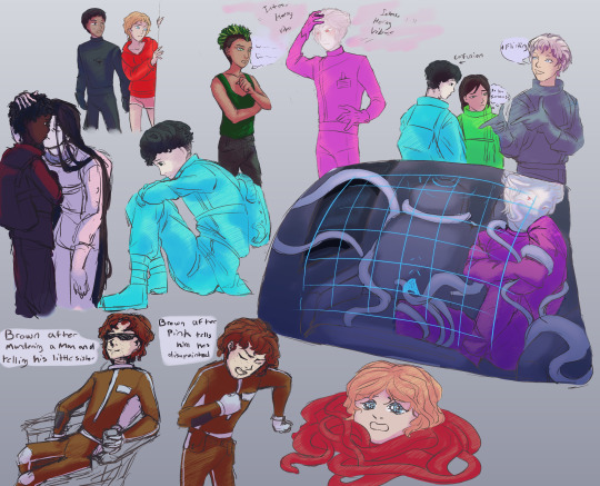
I know that the uniforms should all be the same but I just couldn't help myself! I just couldn't get the idea that the Emancipator and Parmenides gets special uniforms out if my head, like Parmenides is a special base/mission thing so they get some bulkier, more insulating outfits and the Emancipator is like the best Gaurdien Ship in Mira so they get the cool fancy outfits to signify how important they are. Kinda backwards but I designed the standared Mira suits(Browns) last so I already ran out unique uniform suloetes which is why its skin tight, not what I would typically give to them but the Parmenides ones where already what I would tyically give to an astronaut or whatever but I thought they looked too cool for your average crewmate and Mira sucks so they get the dumb skinsuits. Don't ask why the fancier uniforms are monocolor and basic ones have grey accents, I needed something to make it more intresting.

So I drew this like a month ago and I kinda hate it but also still like it. I figured I may aswell show it since I did work hard on it. This was atcually drawn traditionally, like I inked it and then edited a photo so I could add the colors digitally which is why its a little more janky than the first doodles and theres ink everywhere. I love Yellow so much, that pose made all the bs I delt with with the ink worth it. Also if you hadn't noticed Dani's design is different, yah I made this a month ago and only realiseds like two days ago that Dani was described with black locs not brown curls! Wish it didn't take me that long to realise that becuse locs are SOOO much eaiser to draw than curls, esspecially shorts curls I hate them so much! Atcually I hate drawing short hair in general, this has been a somewhat tourturous experince for me!

This is from another tradtional sketch I colored but it was the only doodle I liked so behold! Cyan and Grey being cute together on the way to the tower(?)
I love this doodle so much, it the only one i have of any one with their helmets on and thats kinda a shame becuse I feel like geting rid of the face makes me give them more expressive body language. I've been struggling to make the helmets with the other uniforms look good so thats probly why. The Parmenides uniform have that tall neck that connects the head to the body better but the other two are having this odd bobblehead(heh) effect. I need to experiment more with it.
Anyways its 3 am and I need to stop staying us so late! Have a good time of day!
#crinklytinfoil#among us#The Best Laid Plans of Crewmates and Imposters#The Crewmate Who Knew TOO Much#Can you tell the CWKTM crew are my faves?#Not Purple FUCK PURPLE#And Tan too but not as much as Purple#Also if you hadn't noticed it I would like to point to Red wearing those little short shorts#Funfact about me: I am obsessed with putting my cute favs in little short shorts#I keep drawing Red Cyan and Dani in distress and I don't know why?#fanart
18 notes
·
View notes
Text
Blog and Tags
wheee I have a lot of posts
Y'all can just call me Azure (she/her)
this is mostly an art blog, but it's also just my general blog, so here's the art tags if you wanna see the art
Azure arted-- any and all art of mine (hopefully, if I can remember to tag), digital or traditional
drawings in the big sketchbook :)-- always traditional, done specifically in one 17x14 sketchbook i have. probably will be graphite
Azure animated-- mostly animatics, a good number with traditionally drawn frames
Azure writed-- equally terrible grammar for this one, this is snippets of my writing, I guess.
Here's my Fic tags (will be updated as I write more):
TSoTW/tsotw-- related to my Pirate AU fic (as is the Pirate AU tag) (this will probably only work on my blog, i didn't realize it was a tag lmao)
Iri fic-- posts relating to my fic about my current specialest OC and her... *Counts on fingers* ..sixteen(?) followers. This will not be posted for a LONG while, and it's mostly for me to finally get an idea that's been cooking in my head. And also to get back into writing for fun, because uhhhh it's been a while since I've written for something other than school and I wanna fix that. EDIT: I have to cut down the number of followers. Too many. I want them to talk.
6th House AU: an au I originally thought up in March of 2023 and have decided to actually look at again.
That is all, thank you very much
Also, I will probably use British spellings, but I am not British, just grew up reading that stuff, so it might flip back and forth.
#Azure arted#Azure animated#azure writed#drawings in the big sketchbook :)#tsotw#iri fic#6th House AU
7 notes
·
View notes
Last Seen Blogs

barrychannel131
Barry channel
speedonagito
cool flower

kn4xx
kn4xx
kn4xx
kn4xx

rebekamendes
mundo de Beka😜