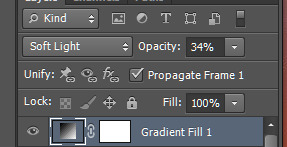
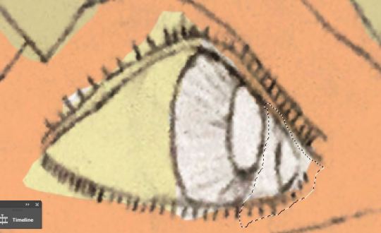
#so then i had to increase the opacity and darkness of the shadow color
Text
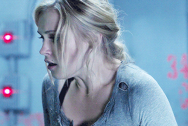
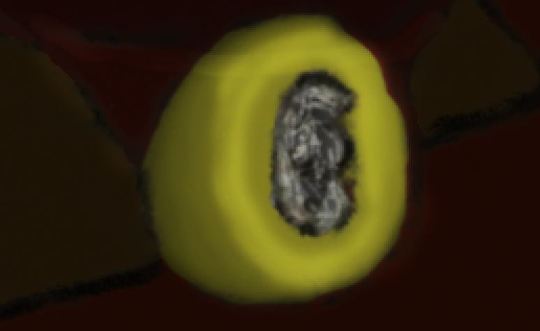
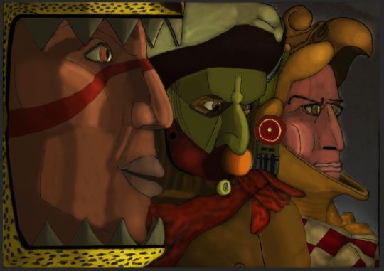
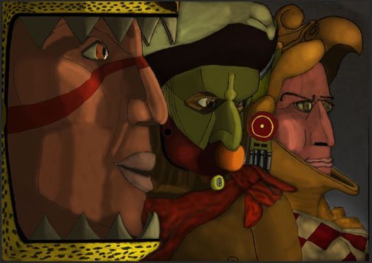
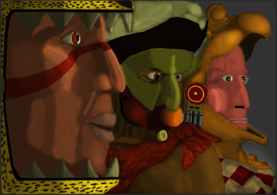
what if oj's face was on his liquid
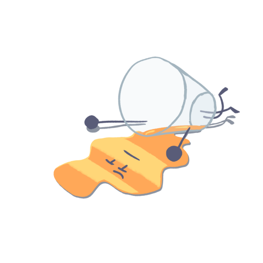
#wheucto#art#inanimate insanity#ii#ii oj#oj#i've seen one character who was like this and i think its peak character design#next question how do you get his face back in. do you have to scoop it up#when drawing this i put the shadow layer on multiply??? i dont know why i thought that would work#so then i had to increase the opacity and darkness of the shadow color#originally it was a darkish desaturated blue but now its a really dark blue#theres like. 0 way this is canon but i want to believe
608 notes
·
View notes
Text
How To Fix Halos In Your Landscape Photos Using ON1
If you are trying ON1 Photo RAW, the ON1 plug-ins like ON1 Effects or ON1 HDR, or upgrading your ON1 software to a newer version, please consider using my affiliate link. There is no extra cost to you and it helps support ON1 tutorials like this one. Ready to buy? Use the offer code SDP20 at checkout and SAVE 20%!
Landscape photography is synonymous with dynamic range. Deep shadows and bright highlights are present in the scene, and high contrast edges are common. These extremes of light and shadow is what make for the most compelling landscape images. They are also a recipe for a nasty side effect - halos.
What Is A Halo?
A halo is a bright band of pixels outlining a high contrast edge. They are most exaggerated at high contrast edges, where there is an abrupt change from dark to light or vice versa. A halo can appear in color and black & white imagery. In the example below, there is an unattractive halo around edges of the rock formation where it meets the sky.
When we process landscape photos, it is typical to increase contrast. Adjustments such as Dynamic Contrast or other detail enhancers that bring out textures in your scene do so by increasing local contrast. This also exaggerate halos. The more you add contrast, the more pronounced the halo becomes.
Find The Cause Of The Halo
As you process your landscape photo, you may start to see halos appear. Sometimes a halo appears immediately and other times it may not be apparent until several adjustments have been made. There is no quick shortcut to finding the cause of a halo. Fortunately, ON1 Photo RAW makes it easy to turn off and on various filters to see which has the most pronounced impact creating a halo.
Usually, if halos are to appear in my images, I will begin to see them after Develop and Effects adjustments have been made. In the photo above, I applied a camera profile, auto-corrected Tone & Color, and did an auto-white balance in Develop. Then, a few Effects filters were added, including Dynamic Contrast and Sharpening. The halo began to appear.
I take a divide an conquer approach to determine what adjustment is contributing to a halo.
In Effects, take the overall Opacity slider down to zero. This eliminates all Effects filters.
If the halo remains, the issue in in Develop. Otherwise, it’s with an Effects filter.
Next, walk through the adjustments in Develop or Effects
In Effects, it’s a simple matter of toggling off and on each of the filters in the filter stack.
In Develop, it’s a matter of resetting certain sets of sliders, then Undo-ing the reset.
In this photo, my Dynamic Contrast filter contributed most to the halo. Sharpening had a smaller, less noticeable effect on the halo.
Pro tip: If disabling a filter or resetting an adjustment did not have an affect on the halo, re-enable its prior setting. You set those sliders to get your photo the way to want it. If the changes aren’t a contributor to the halos, keep them as-is.
How To Fix A Halo
As noted earlier, halos happen at high contrast edges. In general, the contrast at these edges needs to be reduced. Reducing contrast for the photo overall in Develop can work, however it will also change your photo. Similarly, reducing the strength of an Effects filter may temper a halo. However, reducing contrast or changing the filter strength may not deliver the look you want for your image.
In my example, Dynamic Contrast contributed to the halo. Reducing its opacity did downplay the halo, but at the tradeoff of losing the crispness and punch in the rocks. A similar tradeoff happened by reducing the sliders within the filter. Masking an individual filter is also a possibility. Though there is another way - a method I prefer to tackle halos.
Remove A Halo With A Local Adjustment And A Luminosity Mask
My preferred method to reduce - and sometimes eliminate - a halo is to use a Local Adjustment with a luminosity mask. There are a few steps to this technique and several ON1 masking tools are involved.
Step 1 - Adjust the Window Slider For The Luminosity Mask
After adding the Local Adjustment and clicking the Lumen button to create the luminosity mask, adjust the Window of the mask to target the halo. I like to work visually when creating this mask. Turn on the mask overlay with the View button in the masking area (the Grayscale overlay is best here). Next, adjust the controls for the Window slider, watching the preview area as you work. Your goal is to isolate as much as possible the halo’s edge.
In this photo, the halo is along the ridge of the rocks where they meet the sky. The Window slider ends up being a narrow band in the midtones. Notice the thin gray line outlining the the rocks. That’s the halo!
The Window slider is the first step and you should aim to get 80-90% of the mask surrounding the halo as near to black as possible.
Step 2 - Fine Tune The Mask With Radials And Brushes
The Window slider will likely leave many other areas of your photo still included in the mask. Use a Radial masking bug and the Masking Brush to refine and isolate just the halo. I start with a Masking Bug using the Edges shape. Position and shape the oval so it covers the halo edge. Everything outside of the oval (outside its edges) are masked black. The feather of the mask can be small to zero - you don't need a smooth fade for this type of work.
Next, reach for the Masking Brush and turn on the Perfect Brush. With an opacity of 100% and the brush in Paint Out mode, brush around the halo removing any excess areas of the mask. The end goal is a mask that is just the halo - a thin line. In this photo, the mask of the wavy halo looks like a stock ticker or a medical monitor readout
Pro tip: Zoom out with Command/Control-minus to easily see the masking bug controls. Once the general shape of the oval is in place, zoom back in to refine with the brush.
Step 3 - Refine The Halo Mask With The Chisel
Halos can be very thin lines, sometimes just a pixel or two wide. Before making adjustments to change the tonality of the halo, the mask usually needs to be broadened a bit. The Chisel Tool is the tool for the job. Activate the Chisel from the Retouch Tool Group, set its mode to Add, and make the Amount very small. Brush over the entirety of the mask. The result broadens the halo edge just a little. This is a subtle touch, yet an important one.
Step 4 - Adjust The Sliders And Fix The Halo
Finally! With your mask ready, you can now make changes to the Local Adjustment sliders and fix the halo. Each halo is different, so your adjustments will vary from what is shown below. Usually a combination of Exposure, Highlights, and Whites adjustments do the trick. Almost always you are reducing the sliders (moving them left) because the halo is a brighter set of pixels compared to its surroundings.
Conclusion
All things being equal, we wouldn’t make such strong adjustments that trigger halos. Sometimes that is unavoidable lest the entire image lose its punch and power. When needed, ON1 Photo RAW has the tools available to reduce and remove halos. If your photo has several halos, work through each segment with its own Local Adjustment. Removing halos does require some effort, when the final image is done, it’s totally worthwhile.
0 notes
Note
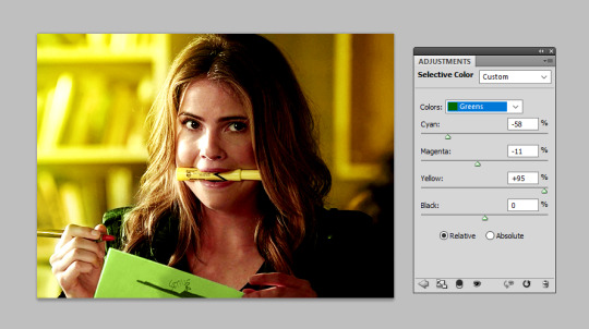
📝hiii first of all,,, congrats on 15k!!!! honestly, you deserve it because your edits are beautiful!!!! your latest malia gifset was so GORGEOUS🥺 I was wondering if u could do a tutorial on how you color the background so it looks SO GOOD and if u also use selective color or tone/saturation when u color the clothes because jfc I'm always so amazed at how good it all looks!!! like, that thingie looks gorgeous in every one of ur edits but your malia one just,,,, I kinda went slack jawed because I'm in love???? you're super talented??? how are u so amazing???? like, it doesn't have to be a super detailed tutorial tho just maybe if u use the solid color or something and then use the color option for blending or whatever jdjdjd thank youuuuu💖💖💖💖💖 (sorry if the names are wrong my ps is in spanish and idk the eng version djdjjdjd)
thank you so much, this is so incredibly sweet of you!! all of these compliments, my heart is actually melting 🥺 and don’t worry i totally get what you meant by all the names!
ok so first thing’s first please do check out my colouring tutorial because that covers my general colouring process and will give you a really good basis on how i work with colours. i generally use painted colour layers because i find this gives a stronger coloured background, but i’ll leave it to that tutorial to explain what i do!
but i do have a few little tricks and tips to really make those colours pop that might help you out. so i’m going to talk about how you can really make those colours stand out below the cut, and just talk you through the general process i went through for making this gif:

so let’s get started! i started off with my very basic gif colouring (steps 1&2 in the above tutorial). but as i knew i wanted to work with yellows i also added a colour balance layer on top and added just a small amount of yellow shadows and midtones.

this just enhanced the yellows/greens and gives you a smoother look when you start to introduce your colour layers. so now, i have my very basic colouring:

the yellow
the next thing i did was grab a light, bright yellow (i used #ffed87) and just painted that onto a layer set to colour and opacity 50% (check out step 3 of the above tutorial). i had to do it frame-by-frame (step 5) for this gif because of the movement of her hand but i only did this for two gifs in this set so it’s very much achievable to avoid this, you just have to chose a shot with less movement. so now when that is all done, i have this:

now it’s still a strong yellow, but you’ll notice it’s not quite as bright as my finished gif! so now begins the little tips for making your colours ‘pop’
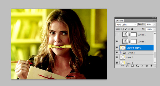
tip 1: use a large paint brush to add a light shade of your colour to the background and set this to ‘hard light’
a good way to brighten up an area of your gif and really enhance that ‘pop’ of colour is to use a hard light layer. this is achieved pretty similarly to how we coloured the background before, but instead i’m grabbing quite a large brush and setting this to ‘hard light’, then reducing the opacity (i used 36% here but the darker your background the more you’ll need to reduce the opacity so it’s not as harsh). ‘soft light’ also works, but i tend to use hard light just that little bit more. it’s about seeing which one looks better on your gif.
as you can see below, this has added a real ‘pop’ of colour to the top left of my gif:
tip 2: use a dark layer as contrast to really make your colours stand out
it’s also possible to use a very dark coloured brush on the opposite side, usually i set this to multiply or soft light, and this can darken that area and create even more of a ‘pop’. this is what i did for this gif so that the pop of colour was concentrated on the right-hand side:

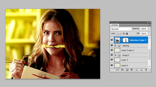
tip 3: selective colours
selective colours are a dream and now we have a good base, i played with the selective colours to get the exact shade of ‘gold’ i wanted. increasing the yellows here can get you a really strong, bold colour. it may be tempting to use a vibrant layer to create that colour but selective will give you a smoother finish:

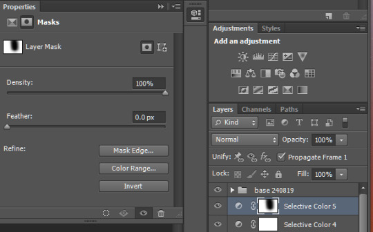
now i was happy with this shade i just made sure to use a layer mask to black out the selective colours that had effected the skin tone of her face just so we don’t end up yellow-washing her:
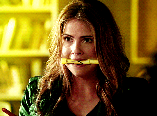
and that was me all happy with the yellow!
the green
so next i wanted to introduce some green into the gif as the prompt i was given was yellow and green. to do this i repeated painting layers, but this time i used a light green brush (#b8fead) over her jacket and the paper. again i did this frame-by-frame because of movement, but if you choose a scene with less movement you won’t need to:
this did most of the work but i also played around with the selective colours here to help get the shade i was looking for:

i even did two players just to really bring out the yellows in that shade of green so the two would compliment each other nicely:
and there we have it, i’m now done with my gif:
this is a rather extreme example (because it was sadly the only one from this set i saved as a psd) as i did frame-by-frame colouring, but many of the other gifs in that set were just achieved by using one layer set to colour, and then bringing the colours out using the hard light/selective colours tips i’ve explained here!
i really hope this helps you out and you can create the colour fix you need because let’s be honest, the world is only made brighter by colourful gifs :)
#wanderermatthews#i always feel like i ramble on 10 times more than i need to when i do tuts but i really hope this actually has some helpful tips#it's rly like a 'part 2' to my og colouring tut so do check that out first#fyeahps#completeresources#itsphotoshop#gif tutorial#tutorial#ps help#*15k
314 notes
·
View notes
Text
show your process
To continue supporting content makers, this tag game is meant to show the entire process of making creative content: this can be for any creation.
RULES - When your work is tagged, show the process of its creation from planning to posting, then tag up to 5 people with a specific link to one of their creative works you'd like to see the process of. Use the tag #showyourprocess so we can find yours.
I have been tagged by @lordbelacqua to talk about this gifset (thank you sm, I always wanted to make my own sort of gif tutorial hehe). Also, shout-out to lordbelacqua’s gifset here.
Since this is going to be long, I put everything under the cut.
planning: so since this is an inspired gifset, obviously the idea came from another post, this one here and as you will see this post has an insp credit on its own, but the user changed their url so I had to do some search to find their gifset. anyway, it’s here. the first gifset includes the greek words ‘eros’, ‘philautia’, ‘storge’, ‘philia’ but you will notice in my gifset I have an extra word which is ‘agape’ (my personal favorite as a greek person), this extra word I saw from the second gifset.
At first, I wanted to do this with #alina starkov from #shadow and bone, but I realized that the word ‘eros’, i.e. romantic love would go for #darklina, whilst ‘storge’, i.e. familial love, would go for alina and mal, and becaure of the ship wars in the fandom, I didn’t want to potentially attract haters from doing this. btw, someone else did this after I posted the yennefer gifset and I was really happy to see it, especially because they used many moments/relationships I had in mind, so shout-out to @darkstarkova for the gifset.
anyway, I also ended up choosing yennefer because for me it just felt much more meaningful to do such a gifset for her, since she has so much love to give and so few chances to do so. I also wanted to do right by it and use quality frames, so I went the extra mile and downloaded higher quality episodes. then I had to choose the shots that would work. some of the words, like “eros” and “storge” and “agape” I already had an idea what they would be, but for the words “philautia” and “philia” I had to fast-rewatch some episodes again. long story short, I first planned to blend this gifset for “philautia”, i.e. self love:
but then I rewatched the scene at the end where yennefer burns it all and as she was remembering all the times she’d been abused and maltreated, I teared up (I always do) and that scene just felt much more powerful to me, because it was then that she truly accepted herself and “let her chaos” be unleashed.
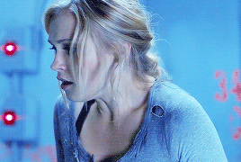
giffing: to sharpen my gifs, I used the light sharpening action from this post. for the coloring and blending I’ll use the first gif as an example, but more or less, I didn’t follow any specific color palette, but went with what looked nice and what didn’t. so at first I had this gif:
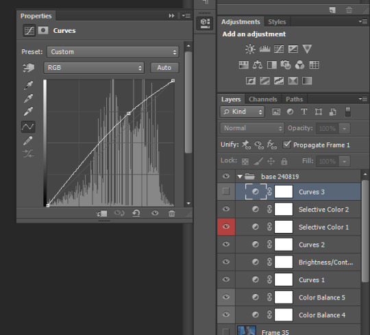
after I finished staring at this (took me a few minutes), I actually focused on the coloring. so first I used a curves layer and chose the light and dark areas (left pic below). Basically you choose the marker in the yellow circle to choose the lightest spot on yor gif, and the marker in the dark circle to choose the darkest spot respectively. I also play individually with the greens, blues and reds (right pic below) until I get a lighting base that I like:

Now at this part I usually just add a levels and brightness layer to further enhance the light and dark spots. At this point the gifset looks like this:

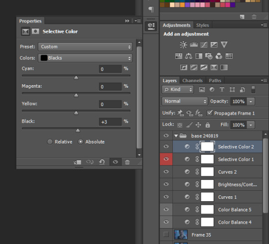
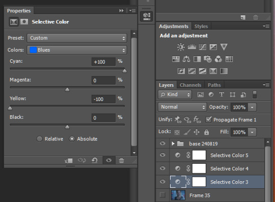
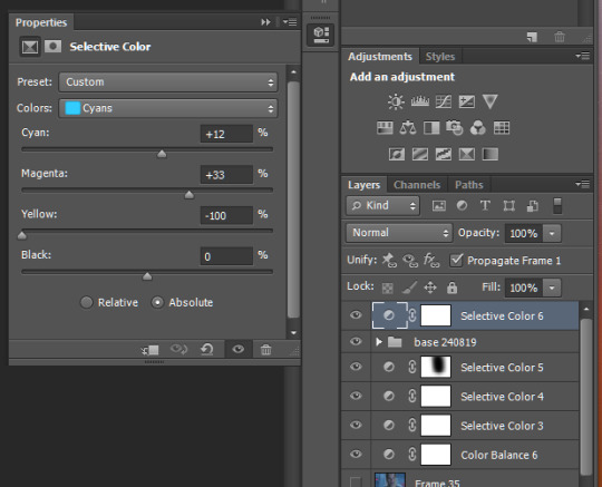
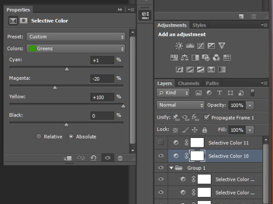
personally I didn’t like the red tint on their faces and the cyan tint on geralt’s hair, so I used a selective color layer and turned up the cyans in the reds and turned down the cyans in the cyans like below. I also turned down the yellows in the cyans but I see that this didn’t change much, so it’s something I simply forgot to turn back to normal.

I also added a color balance layer. With this I usually increase the blues, the magentas and cyans for midtones, shadows and highlights. So now:

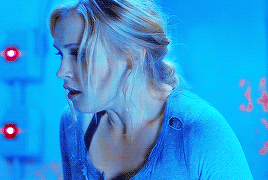
At this point, I add a gradient map layer in b&w, right-click on it, select ‘blending options’ and turn it to soft light, then play with the opacity if necessary:

Usually this is where my coloring ends, but I still didn’t like the result so I played around some more and ended up adding a second gradient map layer in b&w, left it at normal blend mode and turned the opacity down to 47%. So this is what I have finally:
So then I colored the second gif similarly and blended it in. For blending gifs, I follow this tutorial here. So now I had this:

As you can see, the coloring and light of the blended gif doesn’t match the base gif. Adding a similar second gradient to the blended gif didn’t really work nice. Then I decided to turn it b&w with a simple black and white layer and voila, the result just clicked.
For the text I downloaded various fonts from here. So the title line “eros” is in the Bellerose font and the rest are in the Avenir font from here. I used the gradient text effect described here for the title line. And as for the second subtitle text, I simply opened “blending options” again, set the fill opacity to 0 and used a white stroke of size 1 px. Final result:

For the rest of the gifs I did similar coloring and blending.
arranging: To arrange, I simply play around with what looks good. The size I used is 540 x 450, because in the first gif I needed yennefer’s dark hair to take quite a large proportion of the gif, so that I could place the blended gif on (it does not show on light areas), so this determined the dimensions for the gifset.
posting: I always “save as draft” before I post any gifset because I want to make sure all gifs play out correctly and also I want to see if the mobile app shows them correctly as well. So after I verify this, I add the caption and I search the necessary blogs to tag to spread awareness.
I’d say it is my most quality gifset yet and I am kind of proud of it :)
I’m tagging:
@starkkov for this gifset | @captainheroism for this gifset | @swanthief for this gifset | @aleksander-alina for this gifset | @the-darkling for this gifset
of course you can just ignore this or choose another creation of yours to show the process for <3
13 notes
·
View notes
Text
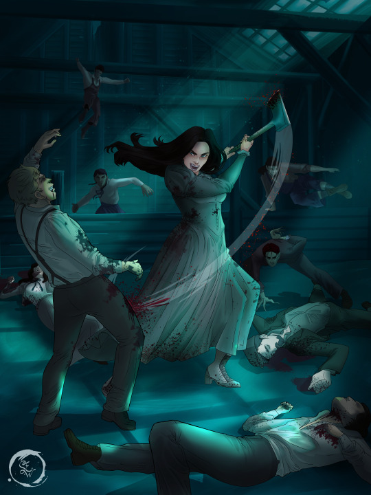
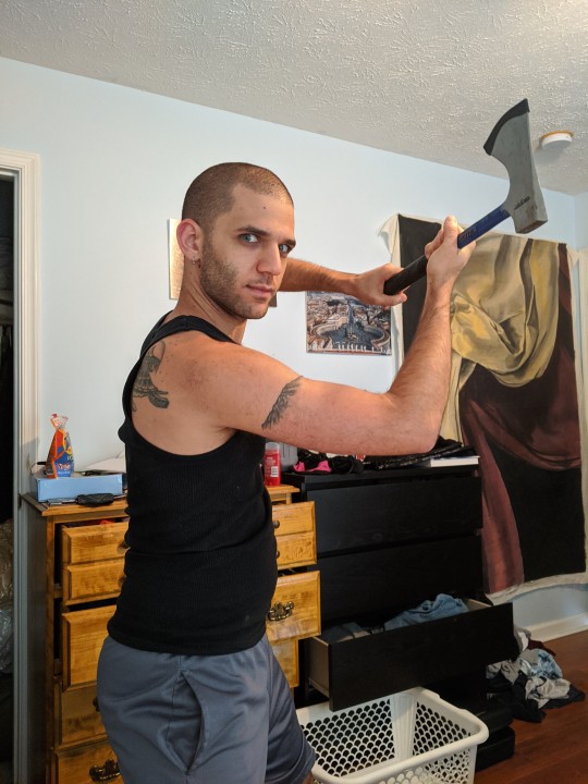
How I Digitally Paint like a Scenic Artist/Designer
Aka: how I did this and put my degree to good use.
LONG POST WARNING
Step 1: Research.
First off, get to your image search. If you are going to be using Google, you may want to type “-pinterest” in the search to eliminate the countless boards.
I had to figure out clothing that is vaguely late 1800s. I found a multitude of reference images that were fancier clothes- but I wanted to find images of clothing for kindred across all social classes. Photographs from the era and paintings are your friend. They will more accurately showcase what was worn.
After Fashion research comes location research. The 1890s in America is known for the rapid industrialization. Factories were getting bigger and work days were getting longer. But, I wanted the moonlight to be cascading into the place, illuminating the scene. This means I needed to find a structure that had skylights or let sunlight in. And the best images I found? Slaughterhouses. Fitting, huh?
The same rule for fashion still stands- if you can find photographs or paintings from the era- they’re better. There are tons of places still standing today from the 1800s. But today, they look WAY different. Ya know, Abandoned! So just be sure to take this into consideration if you search “abandoned slaughterhouses” or go trespassing like I did.
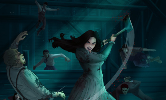
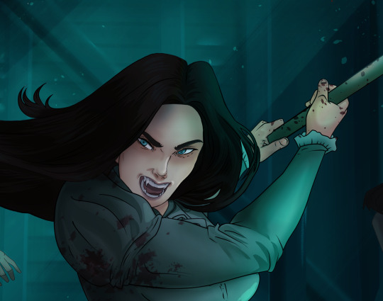
Lastly, pose research. Finding the poses for a fight scene can be tedious. So, I enlisted some help from a few fight choreographers and stunt men. You can record their fights and play them back at quarter or half speed. You can also get a mirror and flop on the floor a bunch. I did both. This lets you see the action/motion lines you are going to replicate in the drawing. Heres how we initially did fina’s pose:

And sometimes you have to go back and get a clean shot. I ended up using this pose for the axe.
Step 2: Set up and Background!
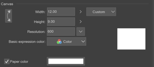
When you open a new file, set it to the dimensions and resolution you want. I was working at 600. Usually, I’m working at 300-350. You can always reduce resolution. Its hard to prevent fuzzy lines if you increase it later.
I cannot stress the following enough:
You work background to foreground. Big Shapes and areas to little shapes. Work your way forward. What this means is you need to fill in as much space as possible first. Then build your details. I prefer working as follows: Big Solid tones, Soft shadows, Dark Shadows, Highlights, then final blend. Once you finish this, put an overlay on top. This knocks everything back and helps create the illusion of depth. See this at work with the video below or here
Step 3: Figure Drawings + Composition
Utilize that research and images you collected to pose your characters. I create subfolders for each set of figures. Organization is important here. This will help keep you on the right layer and prevent the eternal digital artist struggle of “Fuck that was on the wrong layer!”
Even after you move on to lineart and shading, Keep the sketch layer as a reference. You may need to see what youre original notes/ figures looked like as you do the lineart and shade. Don’t be afraid to move them around and alter the composition rn. You want to be able to make changes. Make notes! Detail light sources!
I’m about to through out some art jargon:
You want to think about asymmetric balance. The easiest way to achieve this in an eye-pleasing manner is to use the Fibonacci spiral. Yeah. This boi:

Place your figures and actions in a similar sequence to the spiral and the viewer’s eye tends to naturally follow it. This is sometimes called the Golden Ratio in the art world.
Doesn’t need to be perfectly on the spiral. You can break it- but its an excellent tool to plan how things move in the piece.
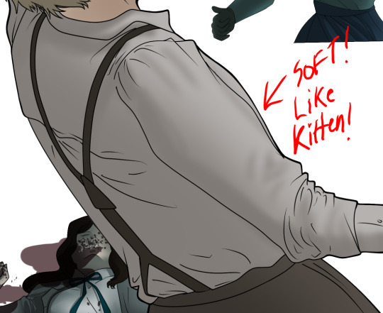
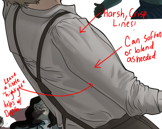
Step 4: Lineart
Once you got things sketched- its time to do the lineart. I’m using clip studio paint’s standard brushes. Nothing fancy. I often switch between the G-pen and the For Effect Liner. Mapping and Turnip are for thicker lines.

Usually I set these pens to a specific thickness depending on where I’m drawing.
My background figures are lined at 0.05 thickness, the midground is .1 to .2, Fina is .3 and the foreground is .4. I set my stabilization high to help keep my lines smooth. Stabilization 100 means there’s a significant delay between where the pen is and the cursor. I like the stabilization to be at 20 for freehanding and at 50 ish for outlining. Dont become completely reliant on the stabilization though. Good and smooth lineart is drawn from the arm not the wrist. Your range of motion is severely limited if you only move your wrist. Practice moving from your elbow and you’ll be surprised how much smoother your lines get.

Once I finish lining the figures, I usually go around it with an outline. This does three things:
1. Solidifies the figure and cleans lineart for paint bucket tool. More on that in the next step.
2. Its a stylistic choice. Helps give it that comic book feel with a heavy outline.
3. Pushes figures forward or back in the composition. Thicker outline helps denote that a figure is farther forward than another. My background figures have no outline to push them away
Step 5: Digitally coloring
For each figure you are going to select outside the lineart.
Create a new layer under the lineart
Invert the selection. Paint bucket. You should now have a solid shape of the figure under the lineart. Do not deselect.
Create a new layer above the one color. Title it solid colors. Paint in thick, solid tones. I like to use the mapping pen and turnip pen to color in my solid tones: skin, clothing, hair, etc.
After that, deselect. Create a multiply layer if you can. If your program does not have a multiplier function, Pick a tone you want to use for shadows and lower the opacity (usually 30-40% I like to use lavenders or blue tones). It will not be as vibrant, but you can edit it in post. Select off of the solid colors layer. I like to start with skin tones. Use the airbrush tool to create soft shadows. You don’t want to create harsh lines on this layer.
Then repeat this process with harsh lines.
Then knock it all back with an overlay. If you dont have the ability to create an overlay, you can again drop a solid color and lower the opacity, but you’ll have to mess with the color balance/ brightness/contrast to let all the hard work come through.
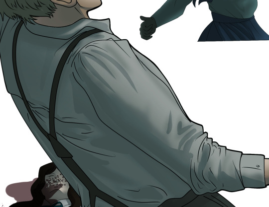
You’re going to repeat this for every single figure. Here’s a few color theory tips though.
Your overlay colors should be darker (not more vibrant) in the foreground and lighter (avoid using pure white) in the background. This helps with the depth of the piece. Things closer tend to be darker (not always true, depends on lighting)
You can choose to use color theory to aid your shadows. Instead of choosing black or grey for shadows, choose a complimentary color. I used a lot of green for this piece, I used red for really dark shadows. Its not that black drains color- its just loses some depth if not used carefully.
Keep your colors consistent. Helps unify the piece. You can strategically break the consistency to draw focus. For example, Fina is the only figure with a true blue overlay. This helps her stand out from the other figures who have reds and greens.
Step 6: Touch Ups and Final Renderings
Now comes the most tedious part. If you’re like me, your computer fans have been whirring for the last few hours trying to render this monster of a file. If you havent already, SAVE FOR THE LOVE OF ALL THINGS GOOD

These are the last four layers I have for the entire piece. Here, I am trying to create effective and believable lighting. This kind of work I have only been able to achieve in clip studio or photoshop. You can do it with normal layers, but choose your colors CAREFULLY. Stay away from pure white. Carefully utilize your knowledge of light and shadow to create soft highlights. Harsh lines tend to be a stylistic choice for me. The final layer, subtract, dulls out harsh red tones. I used this as a final overlay to help put everyone and everything in the scene. Without it, things are a little too green and skin tones are a little too blushed for vampires.
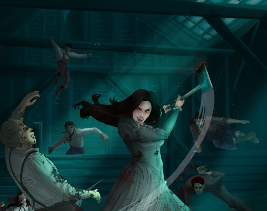
The challenge here is I want to tone down the red, but not lose the vibrancy of the blood. So, shift it to a blue. This also helped reinforce the “nighttime” effect. Its only a slight change.
Final thoughts:
Whenever you finish something, its important to reflect.
1. I am so FUCKING PROUD OF MYSELF. This is easily one of the most complicated pieces I’ve done in a while- and I’ve made 16′ tall faux stained glass. Brag. Let yourself feel awesome cuz you just made something awesome.
2. I timed myself on the piece. I could have easily spent another 7 hours on it. But its important to know when to stop messing with it. Partially for budget reasons but also when you get down to the details you can make yourself go insane. Theres also a ton of detail work I lost cuz of overlays or its just too small to notice. Fina’s face? hard to see cuz its not close enough.
3. I needed to take frequent breaks for this piece. That was good. Resting and stretching was very important. That is one of the reasons why I was able to work so fast.
4. I started doing more digital art in April 2020. I have to say, practice makes perfect. I practice drawing and digital painting for at least 3 hours a day.
That discipline has allowed me to improve so rapidly. So- I don’t wanna hear shit about I can’t possibly get this good! Or I couldn’t even draw a stick figure! BULLSHIT. You can. Get yourself some free software like Krita or Autodesk sketchbook and start playing!
And thats what I got! Thanks for coming with me on this long post!
27 notes
·
View notes
Note
Just curious, how do you edit your makeup pics & what do you use?
hgghg I’m sure most people are more professional and know how to use photoshop or whatever, but I use just my computer’s own built-in editing tools in the photo viewer, since you can do stuff like contrast, warm colors, etc. If I need to blur something or do anything a little more detailed, I use that free website ribbet.com, which I’ve literally been using since middle school lol
(rest of post under read more since it got a little long ) ...
------
As for “how”, I don’t know what you mean.. Are you asking like what specifically I do? Let me know if you meant something else! Generally, not much, mostly I just always make it a little sharper and make the colors warmer. Sometimes with costumes, I’ll also edit small things, like if a color shows up less vibrant in a photo than in person, or if I messed up a line or something, For example -

Photos above are from a costume I haven’t posted yet lol (at least not at the time of drafting this). I edited the contrast and sharpness a little, made the colors warmer (the original ones are fine, but my brain is just like ‘Everything Must Be Slightly Orange Always’ hgh, I guess it’s a personal aesthetic preference), and the most major thing is I used the tinting tool on ribbet to draw over the black lines and purple shadings in my makeup faintly on a low opacity, because in the original picture I felt like they weren’t vibrant enough. Like the hair is a VERY bright purple, and the black in the clothing I have on is really black, so in comparison, the faintly purple eye-shadow colors and dull black eyeliner don’t look like they match the rest. I went over them a little just to make the black more black and the purple more purple, etc.
Usually it’s stuff like that, where I’ve taken the photos/already removed the costume, THEN I realize something like my dark hair has been showing from under a white wig, or there was a smudge on my face the whole time or a color shows up weird, etc. and I’ll try to edit it. Sometimes I also edit my eyes since I can’t afford contacts/am afraid to put things in my eyes lol

I think there’s a paid option on ribbet to do this, but I just do it with their free options by using the seasonal Halloween tools, going over the colored part of my eye (the iris?? whatever’s around the pupil lol) with “Ghoul eye” on white setting, then the same with “vampire eye” on white setting, then once that part of my eye is light enough to be colored in, I can use the normal ‘hand tint’ to color it. But if you have light eyes naturally, you could maybe just tint them right away without having to do the effort of making them like white first lol. It’s obvious and doesn’t look realistic, but I’m usually going for a fantasy aesthetic anyhow!

And for outfits I do the least. I up the sharpness/clarity/contrast and make it warm just like everything else, blur the background, and make sure that my face isn’t showing (use the collage tool on ribbet to do multiple pictures). For example

Anyway! Really I just like to make things more vibrant and warm and clear (since photos straight from my camera the colors look a bit more dull/cold than I feel they are in real life and etc., also just stylistic choice), and I may blur backgrounds/color over it to hide objects in the background, or do random misc. edits like that. If you were looking for more of a tutorial or something, I don’t think it’s needed since I don’t really know how to do anything extreme. Pretty much anyone can adjust a contrast slider or draw blur over a background lol.
Sometimes I do wish I had the skill to do more fancy stuff like changing my facial features or smooth baby skin or having a different face shape, etc., especially when going for more fantasy/alien looks or something, but I’m also not really too inclined to learn I guess, since I’m afraid of it affecting my self perception. I already get frustrated often because stuff will look cool in the mirror but then doesn’t show up that way in pictures, or an idea itself will be cool but then I hate it once I do it, or I feel like one of my facial features (that can’t be modified with angles/makeup alone) ruins a certain look, etc. I’d be hesitant to learn/get accustomed to more advanced editing, since I feel like altering too much digitally would make that disconnect even worse, and I’d post costumes even less because I’d be more discouraged about them all the time lol. I’m even weird about changing makeup colors/making colors more vibrant like mentioned above unless it’s like absolutely necessary, since I feel like otherwise I’d just be setting up a standard for myself that I obviously couldn’t achieve naturally, and again, it’d lead to me just feeling like shit whenever I put on costumes and they don’t look right, which I don’t need more of ghghjg.. BUT yeah! Rambling aside lol..
Just use whatever you have on your computer’s photo viewer, or ribbet.com can be good for other things as well! Though, I’m pretty sure it does reduce the quality of your pictures when you save them lol, so sometimes I over-increase the sharpness to make up for the fact that once I save it it’ll probably be a bit blurry. But they have actually a lot of cool features for a basic free editing thing, like you can add stickers, and do different effects, draw on it or hand tint things or etc. It’s neat to play around with. I don’t know, I couldn’t entirely tell what you were asking but hopefully that answered it or was helpful in some way lol!!!

#long post#I sound like I'm promoting ribbet photo editor but I promise I'm not gyhgh it's just what I use but I don't think it's very different#than any other free photo editor you could find online or something#Really I just use it because I'm used to it and it's easy to make collages and a few other free sites I've tried to make collages on#are hard! So with outfit photos I usually want to do like three photos in one and ... ribbet allows this easily.. thank god#I tried to use one free photo thing that was so weird and complicated and you couldn't rezise of adjust the collage etc. etc.#*or adjust#I could manually make collages in firealpaca ( the free art program I use) by importaing all the pictures and lining them up next to#each other or whatever which WOULD allow me to save them without the image quality going down but like... wow... hashtag Effort#I Would Like Things To Be Easy Pleabse#replies
7 notes
·
View notes
Photo
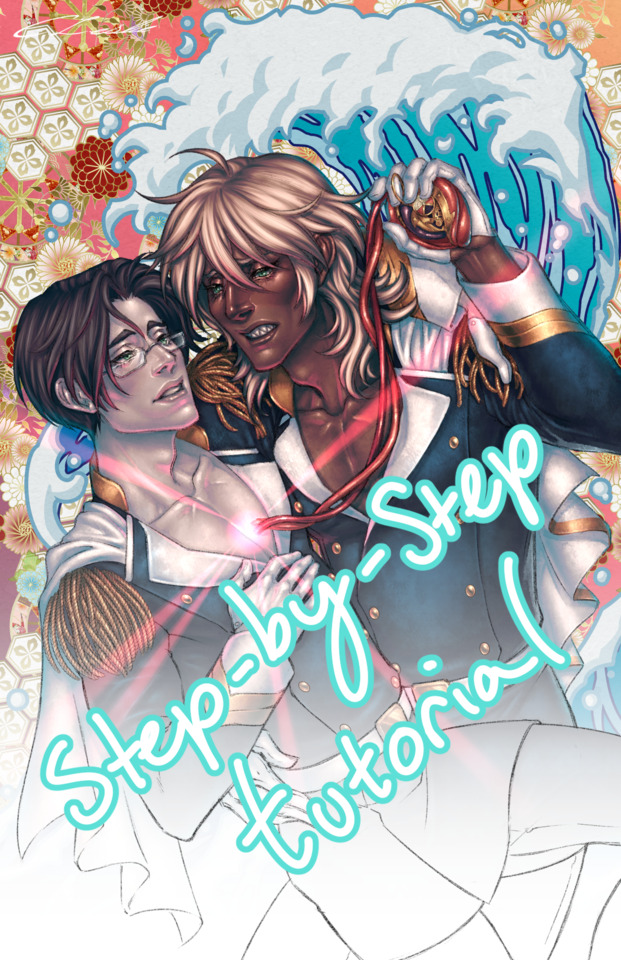


I threw together a little step-by-step walkthrough of my process from this piece for anyone who might be interested. I use Clip Studio Paint, so exact layer modes, brushes, etc. will vary between art programs. I’m happy to answer follow-up questions and I’d be incredibly grateful for reblogs of this or the original art post if you find the tutorial helpful as well~ Detailed breakdown under the cut!
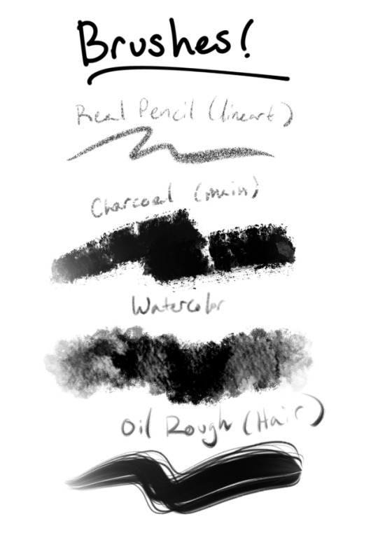
Brushes: I can probably dig up the download links if needed. My main rendering brush is from the dp-fuzzy charcoal set.
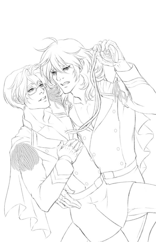
Step-1: Sketch. I had a rough pass or two before this, but this is the lineart-ready sketch. I use a blunt round brush to keep from over-detailing at this stage. I usually draw separate body and clothing layers unless the pose is very simple.
Step 2: Lineart. I often opt for a pencil lineart rather than ink for color pieces to avoid overwhelming contrast and let the color and value carry the piece, similar to using color holds. Additionally, a pencil lineart needs less precision than an ink lineart and tends to be less time/labor-intensive to produce. The drawback is that it doesn’t stand as well on its own as an ink lineart and requires strong rendering to make up the difference. It’s also much harder to fill cleanly with the selection wand.
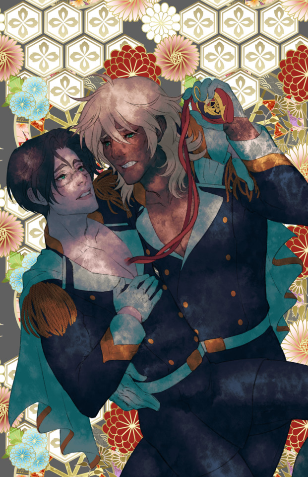
Step 3: Underpainting. I do most of my rendering in grayscale with color layers on top. Here I filled the figures and laid down a basic black and white value scheme with the big textured watercolor brush. Then I overlaid that with a cerulean blue Difference layer at 35% opacity to set the temperature of the light and shadows (this tints your image with a light-dark gradient of your chosen color and its complement. Blue-green in the shadows and yellow-orange in the highlights, in this instance. If I were painting a night scene with a cold light source I would use a red/orange layer. Warm light makes cool shadows and vice versa). A similar effect can be achieved with a gradient map. (Never color against a white background if you don’t intend to leave it white. It’s harder on the eyes and compromises your ability to accurately gauge color, value, and contrast.)
Step 4: Base Colors. I do the base colors on Hard Light layers on top of the Difference layer. It’s important to have basic values down at this stage so you can see what the full value range looks like for each color. I usually end up adjusting and readjusting them all by the end anyway. A few notes on skin: Be mindful of the undertone of your subject’s skin (pink/yellow/grey) when choosing a base. Lips should only be a step or two darker in value than the skin and just a bit more saturated/reddish. Avoid bright pink lip colors on characters with darker skin, especially. I always add a 30-35% Soft Light layer of red across the cheeks, eyelids, and nose, as well as knuckles, knees, and elbows if visible. I also add a 10-15% opacity dark, dull blue-green Normal layer over the lower face/jaw, especially for characters who grow facial hair (even if they’re clean-shaven.)
Step 5: Rendering. I realize the jump to this step from the last is a bit “draw the rest of the fucking owl”, but this the stage where most of the hard work happens. I do my underpainting on the grayscale layer under the colors and Difference layer using the big textured watercolor brush for the broad strokes and charcoal brush for precision work and blending. Keep your details in the highlights and leave your shadow areas a little loose for the sake of focal point.
Step 6: Highlights. This what really makes a piece look tactile and complete. I used a light yellow Add(Glow) layer and shifted the color a little on the hair to match. The uniforms got a midtone blue green. Leave the highlights slightly sharp and distinct rather than soft blended on the focal points, especially on faces. Anything wet, metallic, or otherwise shiny is likely to have more distinct, hard-edged highlights. There tend to be many on and around the eyes since these areas are smooth and draw moisture. (Don’t mirror your eye highlights. If they’re from the same light source they should be on the same side in both eyes.) Highlights typically stand out and have more dramatic impact on darker skin due to increased contrast.
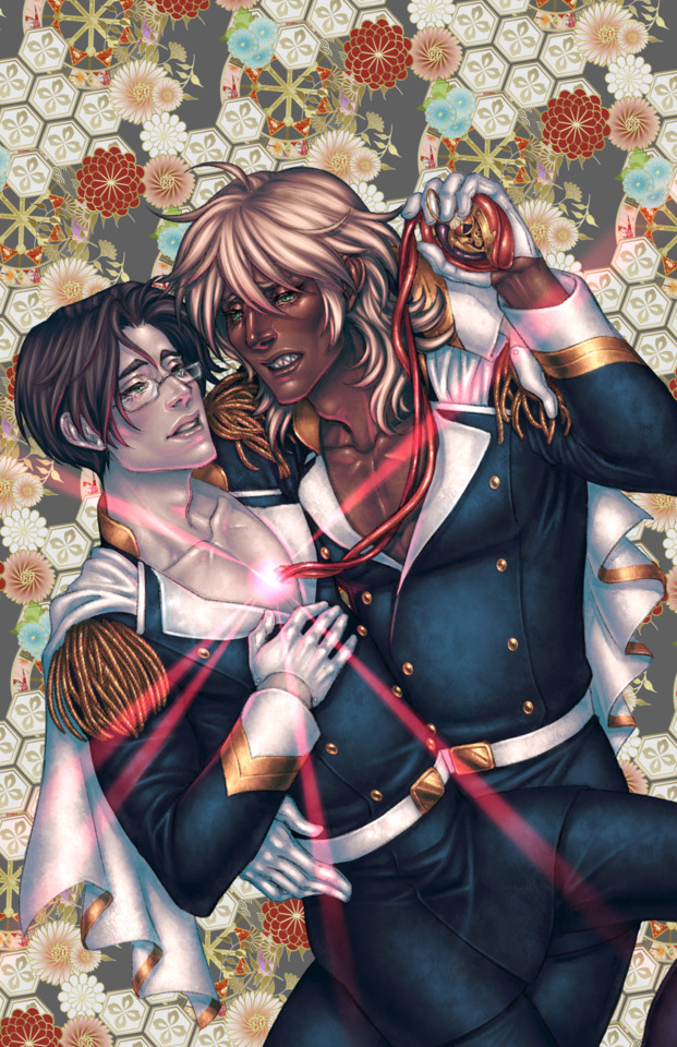
Step 7: Secondary light source. I often add some kind of funky colored secondary light source over the reflected light areas, but this piece called for that glowy pink orb, which made a similar effect. I layered an Overlay, Add(Glow), and Color Dodge layer to make the orb and an Add(Glow) for the rays and the cast light on the figures. I typically use a Normal layer for really strong, colorful rim lighting and the like since they’re opaque and won’t react with the underlying colors/values the way Add(Glow) layers do.
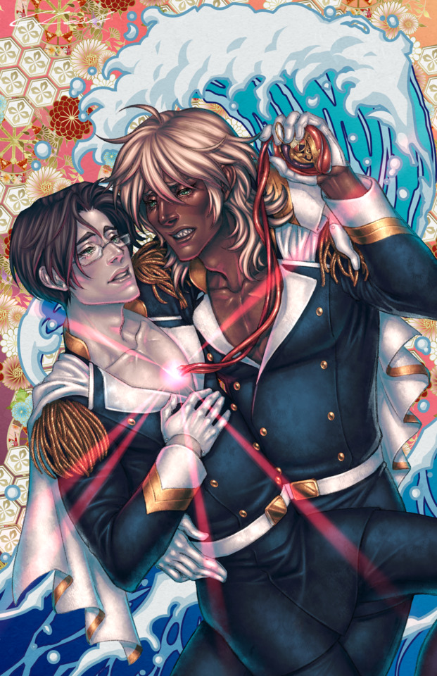
Step 8: Background. I condensed this all to one step since the process wasn’t terribly complicated. The floral kimono bg pattern is a vector asset from the Clip Studio marketplace and I dropped a purple/red/orange gradient behind it. I made the wave by drawing shapes with the solid pen tool and added a border in the layer settings so they would outline themselves in a color, then recolored the main base water shape with a blue gradient. Finally, I dropped a subtle paper texture set to Linear Burn over just the background layers to complete the ukiyo-e aesthetic. And lastly, SIGNATURE. Sign your work! Especially if you’re sharing it online.
#sarazanmai#reomabu#tutorial#art tutorial#digital art#illustration#fan art#art#step-by-step#process#art process#digital painting tutorial#painting process#clip studio#clip studio tutorial
38 notes
·
View notes
Note
Any chance of you doing a tutorial on how you color? Like your latest Raven set for instance, it’s so gorgeous
I’m not quite sure how specific you wanted this so I’m just gonna go through my usual ‘routine’ below
though really, I will say that colouring is just a lot of trial and error, so you just gotta get into photoshop and fiddle. and if you’re like a real beginner, what was most useful for me when i was learning how to colour years ago was downloading every psd i liked and going through the filters, turning them on and off, adjusting things, etc. to learn what effect each one had and how they worked together (the Essentials™ are Colour Balance, Curves, and Selective Colour)
anyway basic colouring tutorial:
step one: base
so you gotta have your gif made and sharpened before colouring, i’m gonna use this one (because I was working on it when i got your ask lmao)

and the first thing i’m gonna do is add what i call a base colour (i’m sure plenty of other people do too). I have a recurring psd I usually use as a base, but it’s pretty simple to replicate so i’m just gonna do that instead and add two Colour Balance layers
in the first I’m going to use Shadows and set the Red +1, Green +1, and Blue +2

and in the second i’ll use Highlights and set it to Red +8, Magenta -4, Yellow -11, and I also like to put my filters in a group now (name it something obvious, like base)
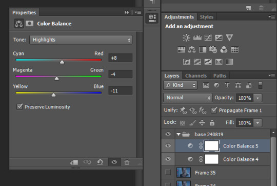
you can use both highlights and shadows in the same layer but I like to keep them seperate in case i edit them later (also why I’ve coloured the layers in grey, differentiate ya know)
my gif now looks like this:

after Colour Balance comes Curves and Brightness/Contrast
TIP: don’t try and do everything on one layer, use more layers and move incrementally, it’s harder to edit later and it typically won’t look as good, i’m not really sure why but you tend to lose qualilty when you try to make big changes all in one (see: hue and saturation layers)
so i’ll add a Curves, then a Brightness/Contrast, then another Curves:

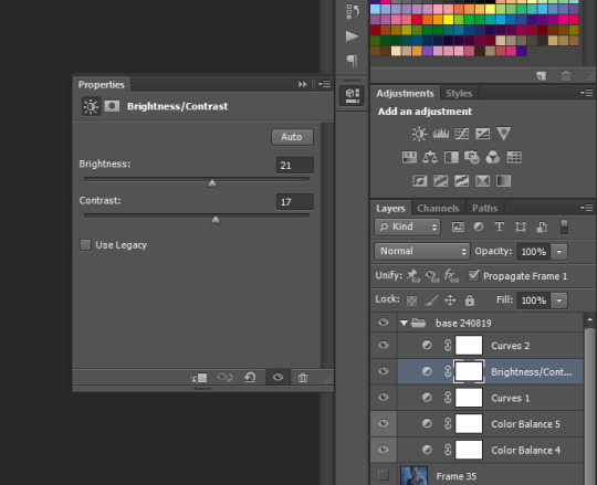
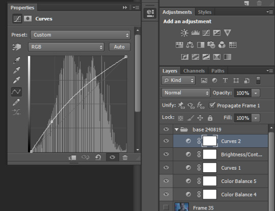
and now I have:
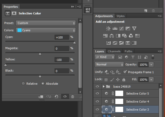
then I move onto Selective Colour, I use two Selective Colour layers here, though the first is situational as it relates to skin tone, so it’s not gonna do much for this gif, but if i’m editing with, say, Raven in it, it becomes necessary so that I can avoid accidentally whitewashing her/Lindsey

I’ve highlighted this layer in red so I know where to find it quickly because i’ll occasionally need to increase the Magenta or Yellow
and for the second layer
which gives us:

then finally I’ll add another curves layer on top, this is another Optional™ layer, aka I’ll use it if a scene is darker but turn it off otherwise
since i don’t need it for this gif i’m leaving it off, and that’s the base done
step two: the Colour Proper
so… basically use selective colour over and over again. I want to make this gifset really blue so first i’m just going to increase the blue itself with a few selective colour layers
TIP: put your selective colour layers under the base, that way the base’s filters will apply to these ones as well
with just one layer i get
and then with all three i made
but with the third the blue has started to bleed into the skin tone, which is where you really have to start just playing around with things. I can use a layer mask to correct it, but that’s harder on gifs with more movement

still looks alright though
or i’ll put a midtones layer underneath my selective colours and increase the midtones reds and yellows, though it’s worth testing the highlights too

and i get

which way to go really just depends on what look you prefer/are going for in your gifset, or in this case, i’m gonna do both
so if i just wanted to make a mostly cyan gif, i’d probably just leave it here, but say i wanted dark blue. my first three selective colour layers are just there to boost the existing colour, but now i’m actively trying to change the colours
so first i’d put a selective colour above the base

and it looks like this
if i put the new selective colour below the base it’ll look like this

which, ya know personal style but the cyan is still apparent in the lower one because all the colours below the base are effected by it, ergo, they’re made lighter
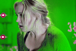
and then, say i wanted to make it green instead: i know some people like the hue/saturation filter but i personally don’t really like using it cause it ends up looking more pixellated, so once again i’m just gonna use selective colour and in the cyan and blue colours set the yellows to +100
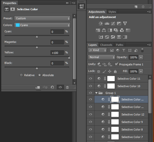
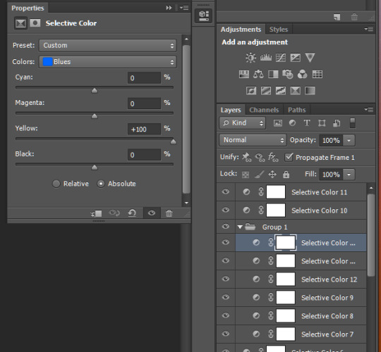
then just repeat until there’s no blue left

and then i’d go in with a few selective colours in green to make it the actual shade i want

and then its just smaller touch ups, like that red patch on the right, so i’ll go back under the base (and turn it and all other layers above it off) and create a new layer, then use the dropper tool to get the colour of the background

then paint over it, usually with a soft brush on like 40% opacity, then set to darken (though that depends on the gif, so try the other settings like lighten too, jic)
then turn all the other layers back on and
boom ugly red spot gone
i could also do more touch ups with layer masks and all for the green that’s bled into the face we already went over that
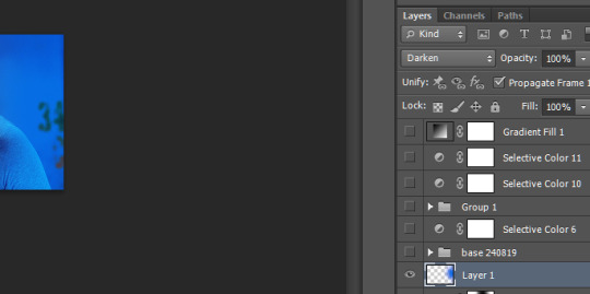
and really the only other thing i might do is add a b&w gradient, set it to like 30% opacity and soft light, but that really depends on the Look™ i’m going for ya know

and yeah that’s it
#all the tutorials i've made before have been for more specific stuff so lemme know if there's something else you wanted#long post tw#tutorial#colouring tutorial#answered#anonymous#can u tell i took like 3 hours in between making this
9 notes
·
View notes
Photo


Tutorial: how do I give depth to the skin
(AKA contour/shadows&highlights/WHATEVER)
You need photoshop or any similar program.
1: Prepare your screenshot in case you want to remove the background or liquify.

2: Duplicate the layer and remove the hair the clothes, makeup, anyting (we just need the skin).

3: Also remove mouth, nostrils and eyes (with these last make sure that the edge is soft with a low opacity eraser).
4: Now select a color similar to the skin but dark and saturated.

5: Duplicate the skin layer and hide one, now selecting the skin layer go to Layer/Layer Style/Inner Glow.

6: Modify the options at your convenience but make sure you change screen for multiply and the yellow color for the color that we had chosen.

7: Make the effect a single layer and delete the skin we used to make it.

8: Load the selection of the skin duplicate that was occult and invert it so we can remove the rests of the effect layer.

9: Hide all the layers and unhide the skin layer, now open Select/Color Range and select the lightest parts of the skin.

10: Over the effect layer make a Brightness/Contrast layer and increase the brightness till you are happy. And that's it!
Optional: you can blur an remove the excess of these two layers for a softenn result.
I hope this was useful and clear, in case you have doubts send me a question.
413 notes
·
View notes
Text
Moving Video Call Backgrounds
Animated Backgrounds in Video Calls & Virtual Meetings
Overview
Coworkers have been asking me how I get animated and moving backgrounds (and foregrounds) in my video conference calls and virtual meetings. So, I’ve created this article to give an overview of the process and tools. For this article’s background example I chose a video that won’t get me into copyright trouble. Its background is a recording of the city gates of Amnoon. And its a scene I recorded while playing the game Guild Wars 2.
The method to create this effect is layering. In oversimplified terms, the background is the bottom layer. In my example I used a video instead of a static image. Layered on top of the background is the output from my webcam. And finally, the very top layer is a graphic with some text. I combined all these layers using the free software tool OBS (Open Broadcaster Software) and output that as a single video feed.
Since I’m not actually “broadcasting” or streaming (OBS is primarily for Twitch, YouTube, Facebook Live, etc.), I need something to convert the broadcast into a useable format. Therefore, I’ve installed the OBS plugin VirtualCam, which makes the OBS output look like a webcam to other programs. Instead of selecting my actual webcam as the input for my video-conferencing software, I set it to the virtual device named “OBS-Camera.” This technique works for Microsoft Teams, Zoom, Skype, Jitsi, and GotoMeeting. I’ve done so much testing that some of the results are fading into a memory fog. So, I’m only “mostly positive” that it will work with Google Hangouts, Google Meet, and Discord. The only “failure” I distinctly remember is for my doctor’s tele-medicine product, and that was because it would not let you choose an input device.
OBS is just one “link” in the chain of tools used to create my desired output, and each software tool runs on a fairly beefy computer (see the end of article for details). Below is more detail on each link in this chain of tools. They are presented in a logical sequence: from the source to the destination. Along the way I’ll also mention some alternative tools that I’ve experimented with, since they may suit your needs better. And at the end of the article is a collection of miscellaneous notes, tips, and tricks.
The Chain of Tools
Environment
I’ve arranged my environment to improve the image and audio quality I can produce. I’ve added lamps and baffles to diffuse, bounce, direct and control the temperature (color) of the lighting. Not only of my face but also of the background (so it’s easier for the computer to cleanly “remove” my real background). For audio I do the same to optimize conditions: I set the timer on my air conditioner so it cools the room beforehand, and automatically turns off just prior to the start of the next meeting. I then turn down fans and other background noise. I’ve also covered the glass (bordering our front door) with a decorative overlay so the dog is oblivious to the comings and goings in our neighborhood. And finally, I close the office door if the grandchildren are visiting.
Audio hardware
My primary microphone is a dynamic mic with a cardriod sensitivity pattern (i.e., it minimizes off-axis and extraneous background sounds and focuses on just my voice). It’s a Samson Q2U in a Rycote InVision USM shock mount on a Gator Frameworks boom and stand. The mic can be connected via USB, but I’m using an XLR cable to a Zoom H6 acting as my computer’s Audio Interface. The Zoom H6 lets me mix multiple audio inputs, directly monitoring the mic, control gain, enhance the audio (e.g., volume compression), etc.
video hardware
Built-in webcams typically produce terrible video (grainy, choppy, dark, and low resolution) and at the wrong angle. Dell is notorious for their “nostril” cameras, which are mounted below the screen. Therefore, I began my journey with equipment already at hand. For video I used an iPhone XS Max because it has an awesome camera. To make my iPhone act as a webcam, I used Kinoni’s EpocCam app and PC software. To hold the phone at the proper height and angle, I used a Ram Mount X-grip with an extension arm and custom base (a glass brick filled with decorative river stones). A wireless Qi charging pad from Anker was stuck to the back of the X-grip to supply continuous power.
Although the iPhone was a high-quality solution, I wanted a dedicated webcam because I kept forgetting it was still mounted above and behind my monitor. Not only did I keep leaving it behind, it was also inconvenient to use the phone, as a phone, in this configuration. Although the cameras on iPads and Touch iPods are not as good as recent iPhones, they could be a dramatic improvement over the built-in webcams you’re using. And EpocCam works with Android devices and on macOS as well, as well as other competitors that I’ve heard of from other users.
Before for buying a dedicated webcam, I also experimented with other “normal” cameras configured to work as webcams. One option was using the HAYOX capture device to convert HDMI output to USB input (e.g., when connecting a GoPro HERO8 Black in a Media Mod “cage”). But the latency and low-light performance was poor. I also converted a security camera I had on hand (the Wyze Pan Cam) into a webcam by applying a special firmware change. This was purely out of curiosity since the camera has an extremely large field of view that makes it undesirable except for the most desperate of users. You also lose the Pan/Tilt/Zoom controls and Infrared features, so it’s now restored back to its “security camera” configuration. And I can feed it into OBS as a secondary camera view using an iPad connected with an Apple HDMI adapter—it’s pretty cool, but not particularly useful for virtual meetings.
None of the above experiments compared to the performance of a dedicated webcam like the Logitech Brio (which is what I’m currently using). The less expensive Logitech C920s, C922, and StreamCam are also great alternatives. And I’ve craved pricer upgrades such as the HuddleCam HD or an Alpha-series Sony mirrorless camera (e.g., the wallet-busting a7S III). But those are more suited to professional streamers and media influencers that broadcast for a living.
The final piece of hardware equipment I have is a “green screen” (for chroma keying). I would NOT recommend it for most users, and I only use it for special situations. A lot of the software that I mention below can be used without it. Green screens can be tricky to set up because they must be evenly lighted (no shadows or brighter areas) and can “splash” a green glow onto the subject if the light angles or distance are wrong. And when the screen is far enough back from your position, then it has to be humongous to still fill the camera’s FOV (field of view)! I use the Valera Explorer 90 and even at this size it is a challenge to position so that it fills my webcam’s FOV. I wish it came with other color screens (chroma blue, neutral gray, and white), and I may make some by hand if the vendor doesn’t add them. I had originally contemplated a retractable ceiling-mounted backdrop that pulls down like a movie-projector screen. But I went with the Valera since it collapses easily and is small enough to store out-of-sight in a closet corner. If I were a professional streamer, and had a larger office/studio, then I’d probably go for a fixed screen (like this massive 8x8 foot backdrop) or perhaps a wall covered with special chroma green paint.
Software
I use multiple software programs to create the video feed used in virtual meetings. And the combination changes based on the look to be achieved. If I’m using a static image as my background, then no additional software is needed. Both Microsoft Teams and Zoom include excellent features that do background replacement.
A more complex composition, like my example video above, uses a few more tools. Let’s look at the layers (from front to back) and the tools used for each. In the foreground is a graphic with text that provides additional information. The broadcast industry calls this a “Lower Third” (or L3) since it typically appears at the bottom of the screen. In my example video above, my L3 is actually positioned in the upper right corner. It was created using the free art program Paint.NET but any graphics software (CorelDraw, Photoshop, Procreate, etc.) could be used. I save my L3 graphics in the PNG format since it lets me save images with transparent backgrounds. But also because PNG does a superior job of compressing mostly solid, non-gradient colored shapes and text, which is what most L3s are.
Both L3 examples above have a section for a ticker (scrolling text). This text is layered over the L3 and comes from, and is configured in, OBS. The ticker is a “Text” layer with a “Scroll” filter added. Below is a screen shot from OBS for an AFK (Away From Keyboard) screen. At the bottom (second pane from the left) is the SOURCES pane and it shows the two layers that make up the preview being displayed. The bottom layer is named “Please Stand By TV” and it pulls in the background image. On top of that is the ticker: a layer named “AFK Text” which contains the “I will be back in just a moment” message (including settings for placement, color, font, size, speed, opacity, etc.).
For my example video at the top of this article there is a middle layer, which is me via the webcam. In OBS this is a “Video Capture Device” layer type. However, there is a software component that sits between the Logitech Brio and OBS. The “Logitech Camera Settings” application lets me adjust and optimize the camera’s video. I adjust saturation, white balance, contrast, etc. to match the background (whether moving or static). For example, if it’s a sunny beach scene then I would set the white balance to a warmer golden cast, increase the contrast, and bump up the brightness so it matches the scene. I also adjust my office lighting so that the shadows fall in the same direction as in the background. If the background is of a thunderstorm at sea, then I would match my image with a cooler white balance (i.e., a subtle blue cast), a darker exposure, and less contrast. I’ve also taken the opposite approach, and selected backgrounds that already match the lighting in my office. With more believable backgrounds (like a photo of an office or kitchen versus the cockpit of a spaceship), the matched lighting has been realistic enough to cause people to think I was actually in those locations!
In addition to the camera’s utility software, OBS can also apply filters, and adjustments, and LUTs (adjustment Look Up Tables). A LUT is customized to both your specific camera and to your specific lighting conditions. To create a LUT, you first capture an image from your camera, which is taken under set lighting conditions. Then use a photo (or video) editing program to make adjustments to the captured image until it looks best. The adjustments are not applied directly to the captured image. Instead they are put on a separate layer, and you’re viewing your image through the adjustment layer. (Think of it as if you were painting on a pane of glass that is sitting on top of a photo.) Next, you replace, cover, or hide your captured image with a LUT reference table (original and unmodified). The LUT table is now sitting below those same adjustments. The results are flattened (the layers combined) and saved to a PNG image. This file is a custom LUT that can be applied to your camera’s output so all video gets the enhancements. Below is the before-and-after for a Wyze Pan Cam, a camera that’s optimized for security monitoring, not image quality. As you can see it adds a terrible yellow cast to the video, but with a custom LUT applied, the colors are much more natural.
For an animated, moving background I’ve been using YouTube videos. Yep, it’s just that simple! In OBS this is a “Browser” layer and would be positioned at the bottom. If your videoing or photographing your own (or when choosing someone else’s) backgrounds, be mindful of the angle. In a meeting, your webcam is at eye-level while seated! So choose/take photos at that same height to create more natural backgrounds.
Picking a good background is a balancing act. If it’s too plain, then the artificial outline—the edge where the computer cut you out from your real background—will be very noticeable. A bit of detail and texture in the background helps to hide that outline. If the scene is too busy and detailed, it becomes distracting and you blend with it instead of being in front of the background. In real TV studios they use a “hair light” to ensure distinction and depth—to make the person stand out from, instead of blend into, the background.
When removing and replacing your actual real-life background, you want it to be plain and as uniform as possible. A blank wall would be excellent. This helps the computer distinguish your outline from the background. Angle your lights and use baffles (I use foam core boards) so that the light falls on your face and shoulders but not on the wall behind you which are slightly darker. To prevent “hot spots” and deep shadows on your face, bounce the light off the walls instead of pointing lights directly on yourself. This will soften and diffuse the lighting and create a more appealing appearance.
While on the topic of texture and detail in background images, it’s important to not go overboard. Some software cannot cope with an image that is too intricate. I had a photo of the interior of the NASA space station. The original was too complicated for Microsoft Teams to even display. Also, you don’t want to overload the software by having it to constantly downscale large images. And photos from modern cameras and phones are massively oversized compared to a computer screen. They are so large they can crash your software. To prevent big images from slowing down or crashing my software, I proactively resize my backgrounds to “Full HD” size—that is, 1920 pixels wide by 1080 pixels tall. (This is also the size that MS Teams would reduce a background image to, so it saves the time and effort required to convert it every time,) And while I’m cropping, sizing, and enhancing backgrounds, I will also flip them so the incoming light in the image matches my actual lighting. For example, a background photo may have a window (with incoming light) that is on the left. I will flip that photo so the window is on the right-hand side, like my real-life window.
While we’re discussing software limits, don’t load too many backgrounds into your meeting software! I learned the hard way that MS Teams will crash if you have over 100 custom backgrounds. I now keep all my custom backgrounds in their own folder and only copy about 75 to MS Teams at a time. Below is a script I use to replace old custom backgrounds with a set of fresh “finished” images.
DEL /Q C:\Users\Craig\AppData\Roaming\Microsoft\Teams\Backgrounds\Uploads\*.jpg COPY /Y C:\Backgrounds\Finished\*.jpg C:\Users\Craig\AppData\Roaming\Microsoft\Teams\Backgrounds\Uploads\
Tips, Tricks, & Notes
Use a wired ethernet connection when video conferencing. It’s not only faster, but also more reliable and stable than WiFi.
The Zoom H6 can be used with an iPhone/iPad, even without AA batteries! When the H6 boots up, select PC (instead of iPAD) as the connected device.
Video processing can be intensive and requires a computer with sufficient capabilities. My Windows 10 PC has a Core i7-7700K at 4.2GHz, 32GB of RAM, a Samsung 850 Pro 512 SSD, 4 Toshiba 7200RPM 500GB drives in a RAID 5 array, an ASUS Prime Z270-AR motherboard, an Anker 10-port powered USB3.0 hub, a 1000 watt Corsair power supply feeding dual video cards, and a Corsair Hydro H100i liquid cooling system to supplement two case fans to keep the whole thing from burning itself out. This computer sits next to a window air conditioner that counters all the heat coming from this PC, the monitors, and accessories. Before the AC was installed the office could reach 80°F even in the dead of winter with all the heating vents closed.
0 notes
Photo


Giffing rambling
So lately I’ve been experimenting with layer effects on colours. Somewhat by accident, while making this Thin Ice gifset, I sent the layer blending mode to 'overlay’ instead of ‘normal’. It’s something that I used to do a lot way back in the day when I toyed around with making graphics from scratch, but some reason I’ve never thought of using it for gifs. Especially not for colouring a gif.
You can see the instantaneous difference - the top two gifs are basically the base scene (with lighting turned up), and the second with a selective color layer added and absolutely nothing done except to set the layer to overlay. I was instantly blown away - one tiny little step instantly made the entire scene’s colours richer and warmer, and deepened the shadows (which I normally do manually and possibly a bit excessively to give the image more depth). I didn’t even have to mess around with brightness, contrast or vibrance!
I had way too much fun with overlay layers for that blue and red gifset, and was inspired to go try making gifsets of some really dark and dingy scenes with crappy lighting. Because apparently I like pain.
Fast forward to this Journey’s End gifset. As much I like this scene, it tends to come out brown, brown and brown, with a dash of additional brown on top. 10′s TARDIS and its grunge look is hard enough to colour even on a good day with the lights on. Dark lighting scenes are hard to colour because of the loss of detail. And now you’ve got this hellish mix of both - the TARDIS with its lights out, the Doctor in his brown suit is practically blending into the background.
By necessity, this gif has a whole truck load of lighting and colouring layers on it. (I usually have about 3 - 4 layers on a gif, 5 if I’m feeling particularly adventurous, of which 1 is lighting (mostly because I’m lazy). This gif has 3 lighting layers, one vibrance, two color balance and two selective color. (Admittedly a lot of the extra colour layers is because I was being extremely picky about the colour of the wall. Go figure.)
But I’m here to ramble about the whole picking how your layer blends into other layers thing. The first thing I found was that overlay was way too harsh for this scene. Overlay is always pretty harsh, increasing contrast quite dramatically. For a dark-on-dark scene like this one, I had to, as a starting point, ramp the lighting way up, so it was practically a light-on-light scene. Overlay indiscriminately darkened practically everything except for Ten’s face - nice horror movie effect(!), but not what I was looking for. So I switched over to an old favourite of mine, ‘Soft light’, and dropped the opacity of the layer down to 50%, which basically got me where I wanted - balanced the colours and the contrast quite nicely. I also used the effect on my color balancing layer, which gave the additional advantage of being able to be more aggressive on the color balancing (normally, a little adjustment goes a long way, but with opacity down, you can drag the slider right to the end and just end up with a mild blue/magenta/whatever tinge).
You can also see from the Journey’s End gifset how nicely the soft light layer worked for Donna’s hair.
All in, after a run of fairly bleh gifsets, I’m really happy with how this one turned out.
2 notes
·
View notes
Text
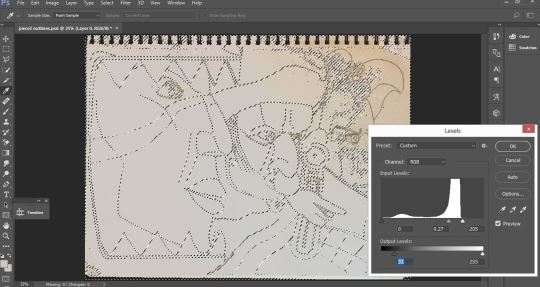
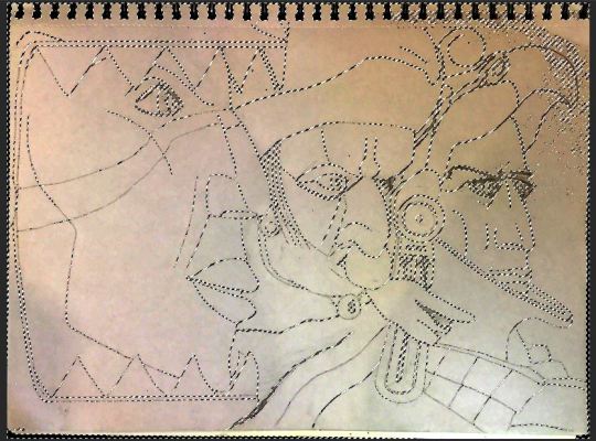
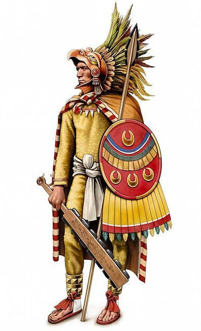
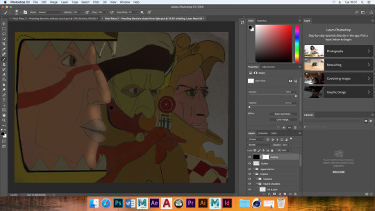
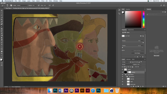
Prowling Warriors Piece
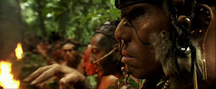
Subjects Captured
The way these Aztec warriors were captured mimics the way Apocalypto shot military Mayans sneaking up on villagers. It’s a tense shot where I can solely animate a flickering light source for good effect which was one of the reasons I chose to use the drawing to create this piece.
I really struggled to get the pencil lines to stand out using the colour levels feature due to the photography capturing less than ideal light sources. This left some irksome shading. Following the colour level alteration, adding more black and white disparity to the contrast feature, my Quick Selection tool was still thrown off from solely capturing the lines of my art. The persistent shading kept getting picked up too.
There was a trick that helped somehow. After using Quick Selection as best as I could and filling the lines with black, I dragged those over to a fresh Photoshop file. This mitigated the level unwanted shading.
Past Methods
The use of the Magnetic Lasso Tool to make perfect layer masks was redundant due to the lines fading in places and not being so easily picked up. Also, tracing would have been a needless use of time due to my increased reliability in erasing mistakes and painting in corrections.
Tactic In How to Erase Effectively
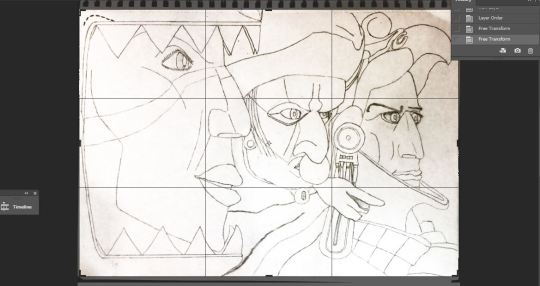
The bigger any given coloured section is, among other sections, the better it is to have that higher in the layers panel. That way you only need to correct blemishes of the large spill of colour and you can splash with the majority of the lower level colours with less concern for correction - due to how inaccuracies are covered by content above it. All the while, there is less switching between layers to fix mistakes.
On my drawings there were perspective based mistakes. I corrected these using the Lasso Tool and the Free Transform Tool
I would only feel content replacing any drawing lines with digital ones if the lines looked as authentically faded. The Dry Brush Tip Light Flow for the paintbrush was the way to go.
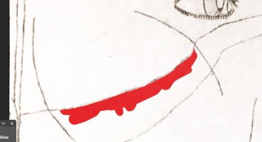
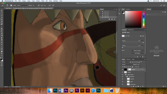
I realized that the composition of my drawing did not entirely make sense. This was due to the drawing of the scarf belonging to the right warrior. It’s visual extended left to the point where there would not be enough room to complete the middle warrior details. That’s why I erased the colour and lines where appropriate and created new ones.
The choices of colour referenced directly, the Pinterest pictures with the very warriors being created.
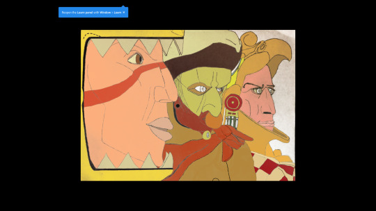
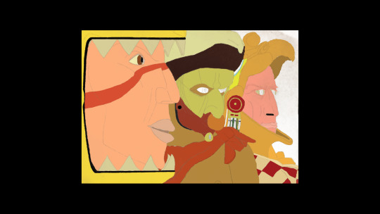
As you can see below, removing the visibility of the drawing lines gives this ethereal energy to the subjects. The only issue is that as of the moment, without shading, there is too little sense of depth. I would also need to create fresh eye brows for the warrior on the right as those where defining characteristics of the drawing and therefor this final piece.
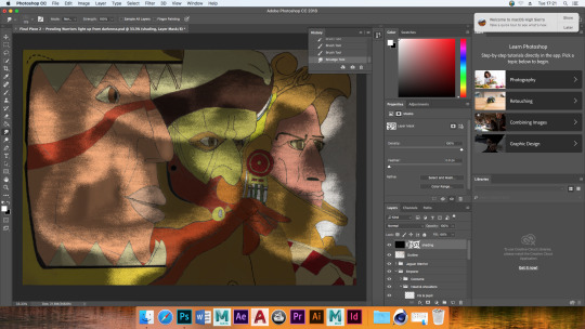
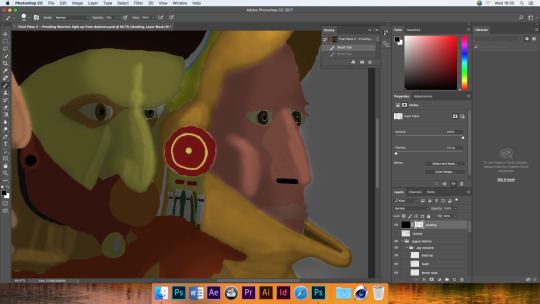
Shading and Lighting
After giving all individual areas their base colore, experimentation was done on a separate layer to see what means of applying lighting and shading was easiest to grasp, and also quick too. Initially, I tried equipping a soft edged paintbrush tip with black paint, set to low opacity. This allowed me to stroke subtle shadows within the face and clothing shapes. However I remembered that the environment captured was going to primarily be dark. Therefor, in such a place where shadow is omnipresent, it makes more sense to plaster the spare shading layer with a black Paint Bucket. After lowering the layer’s opacity to 41%, I give it a layer mask and made strokes on it that where opposite in contrast. Touching on areas of the face that where going to be lit by a torch, there where fewer areas to tweak than their would have been if I had continued applying lots shade to an already lit picture.
On the layer mask for lighting effects, I messed around briefly with a Mixer paint brush. It was to see if any effects could be put to good use. I had no firm idea of how to integrate it in a seemly manner however, so I left the Mixer brush alone.
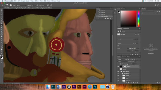
(I won’t leave the cross out feature in) Upon testing the lack of drawing lines again, I see that it would have benefited me to save the quick selection of the hand drawn lines. That way I could have simply lowered their colour to the gray of the remaining ‘photographic’ shade. Instead, the stark white of the background showed through the line shaped gaps.
I give all the hand-drawn lines a lighter.
Thoughts on Warrior Piece so far
I have applied a 3D effect with the use of the shading alone. But I think I can still get that heavy contrast between light and dark just by altering a the contrast slider. This would thematically suit the story because there are supposed to be torches held out in front of the warriors faces at dawn.
I consider this a form of stylized neo-impressionism as I have used semi-effective shading effects while retaining the lines for both the outlining and subtle facial features. It seems awkwardly implemented for the cheek bone of the right-side warrior however. I could have erased that line, with the only negative effect being it would have left that lack of sync with the gray shading in the hand-drawn lines-layer. I considered treating that as a battle scar for that ‘eagle warrior,’ but it also would have been awkward if an implicated scar just so happened to curve over the cheekbone exactly where the light was meant to rest on.
Checking with a tutor, it was made apparent that the lip structure of the predator-cat-warrior was not authentic. Furthermore there wasn’t an impression of the created lip’s right side curving around the face, out of view.
Without the lines their is a nice sense of impressionism, however I think that is better for a visual of wide scenery than a close-up of subjects. That’s because the finer details which would not be up-close details are made as an ‘impression,’ for a lack of closer detail. I could have settled for this unlined, impressionist style if I had applied more intricate shading on the whole, as well as fine tuned the edges of the colour so that they did not leave little white gaps. As was the case last year, time pressure was an issue and the main reason for this.
0 notes
Text
Edit Away – The quest for a perfect HDR
A big thanks to everyone for visiting! This photo has 55’000 views and 550 favorites!
View Large ‘Edit Away’ On Black
(This is a re-edited HDR of Forest Railroad Bridge)
Note: Below tutorial was written for Photomatix Pro 2.22. Photomatix latest software version has similar but slightly different settings.
The quest for the perfect HDR – A Photomatix Tutorial
I’ve had a few people ask me how I make my HDRs, so I decided to post the guide here.
I’m not really explaining what a HDR is, as that has been explained really well before. (Check the links there too)
I use Photomatix, which you can try for free and download here: www.hdrsoft.com
I use the full (pro) version, which gives you the option to do Tone Mapping. I didn’t have that option with the free basic version, so you will have to buy the pro version as far as I know to make HDRs and to tone map them.
I almost always used a tripod so far, and generally make 3 exposures (3xp). These xp would all be 2 stops apart. So one with the highest xp (xp +2), one with xp 0, and one with the lowest xp (xp -2). For some photos I also used 5xp, where they are all 1 stop apart. I shoot JPG, as my camera doesn’t have RAW shooting options. 🙁 Sponsor me for a new camera? 🙂 Donate with Paypal
One thing you should keep in mind is that more xp has its advantages and or disadvantages.
Advantages of more xp
Higher color range – More different xp to get the color information from.
Less blur in some cases – If you are photographing things that are close to you in windy conditions, like leaves on a tree that are 1m or closer away from you, taking 5xp or even 7xp or more, will make sure that at least some of the photos will be aligned. This reduces blur on the final HDR because the 1 or 2 photos that might be unaligned will not be as visible if you have 5 that are. If you would only take 3xp, there is a great chance that if one of them is unaligned, it will show pretty clearly in the HDR, which is not always nice. I am not talking about soft blur, which usually does look pretty nice; I am talking more about seeing two leaves overlapping each other for example, which is not what we want. The more xp you take, the higher chance you have of your unaligned photo turning out to add soft blur, which is good.
Disadvantages of more xp
More work & takes longer – Logically, you are going to have to take an extra 2 or 4 photos. Sometimes you have to work fast because of changing conditions or movement, photographing people that have to sit still for a long time is hard for example.
More possibility of unaligned photos – Of course, the more photos you take, the higher the chance is that you get one that is not aligned. With only 3xp, if you are fast and your camera is stuck securely, and it’s not windy, you have a good chance that you won’t have any unaligned photos. But if you take 7xp there might just be one or two that won’t be aligned. Still, this might be part of the advantages as I explained above, since that might result in an accidental soft blur.
Soft blur
I have used this technique on some of my HDRs, and I think it looks very nice. So how do I do this? Well, if you haven’t found out yourself yet, it’s pretty easy. Blur one of the photos; usually I take the middle one or one that is a little overexposed, xp 0 or xp +1. However you do this is of course up to you, and I will let you experiment for yourself with that. I used Gaussian blur in Photoshop with a blur of 5 or 10 pixels.
Then you make the HDR as normal, and I have done this in 2 ways so far. Let’s say we have a photo that we made 3xp of and we use xp + 1 to blur. Either you can replace xp +1 with the blurred version, and make a HDR of 3xp of which one is blurred, or you can add the blurred version to all 3 originals. Then you will have 4xp. I like this result better usually and it’s not really more work.
Tip: Make the HDR from the normal exposures first, then blur one of the exposures, and add it to the other exposures, take them into Photomatix again, and use the button “Previous Settings” to get exactly the same HDR coloring and contrast etc as you got in the non-blurred HDR.
Edit: To get a blurred photo, of course you can also just set your camera to macro mode or make an unfocussed photo by focussing incorrectly. Doing this gives different results than blurring with Gaussian blur in Photoshop.
Edit 2: Lately I have been using a different method. Finish the HDR, then open it in Photoshop. Double the layer, and do a gaussian blur between 10 and 50 pixels or so. Set the layer to "overlay" mode and reduce the opacity to 50% or so if that looks better. Play around with the brightness and saturation of the blurred layer as this can give some nice effects as well. I sometimes also only blur certain parts of an image if that looks better.
Tone Mapping
This it one of the most important steps in getting a nice HDR. Take your time for this. I spend more time tone mapping sometimes than taking the photos.
I will explain the tone mapping in Photomatix, as that is the only program I have used so far.
If tone mapping is a magical machine that can create beautiful dreamy photos, then this machine has 7 weird dials and levers that can help you find the right combination of the perfect HDR.
Of course I must say that making a perfect HDR also requires perfect photos… 🙂
I will explain these "levers and dials" only as far as I know, I am no pro, I just try things out myself as well. The italic text is from Photomatix’s help file.
Luminosity
Adjusts the brightness of the shadows and the amount of local contrast enhancement. Moving the slider to the right has the effect of boosting shadow details and brightening the image. Moving it to the left gives a more natural look to the tone mapped image.
Slide this to the left to make the image generally darker, and to the right to make it brighter. I have more often used it to make things brighter so far, because I love bright daylight images, but if you want a more natural, or darker image, maybe the left side is better.
Strength
Controls the strength of local contrast enhancements. A value of 100% gives the maximum increase in local contrast.
Be very careful with this setting. This is one of the strongest edits. Play with it as much as you like, you will see the difference. It depends as well on what your photo is. If you have clouds in the photo, setting this higher than 50% often creates grey shadows on clouds that are the typical ugly HDR. I have only seen a very few HDRs with dark clouds that looked good. I only set this to 100%, or often around 70% when I have few or no clouds or sky in the photo. This setting can be set lower to reduce halos around clouds and other subjects in your photo as well.
Color Saturation
Controls the saturation of the RGB color channels. The greater the saturation, the more intense the color. The value affects each color channel equally.
Set this low to create a flat image with less color, or to the right to make a bright colourful image. I often set this (too?) high, because I love color.
White Clip & Black Clip
Both sliders control how the minimum and maximum values of the output image are set. Moving the sliders to the left increases global contrast. Moving it to the left reduces the clipping at the extremes. The White Clip slider sets the value for the maximum (pure white or level 255). The Black Clip slider sets the value for the minimum (pure black or level 0).
I usually set White Clip anywhere between 0.250% – 5.000% and Black Clip pretty low around 0.100%. Setting black too high, often creates halos around clouds, and makes the image seem weirdly dark.
Smoothing
Controls the amount of smoothing of luminance variations. A higher value tends to give a more natural look to the image. A lower value increases sharpness.
I agree completely with Photomatix, and can only add that I prefer High, or Medium. I hardly ever use the lower settings, but have a look at them anyway just in case.
Microcontrast
Controls the accentuation of local details. The default value (0) is the optimal value in most cases. However, this control may be useful in the case of a noisy image or when the accentuation of local details is not desirable (e.g. seams of a stitched pano in a uniform area may become visible when local details are too much enhanced).
So I assume that with the default value they mean “Very Low”? Im not sure. At least, Microcontrast does what it says it does. It makes the contrast between small details Very Low, Low, Medium or High. I usually use Medium or sometimes High. I find the lower values make the image too flat.
For the rest you find buttons under tone mapping for Settings to use Previous tone mapping settings, Default settings provided by Photomatix, these have never looked good according to me, and load and save settings. Save your settings if you think they look good and you want to use them more often. I use preview size 768, which is unfortunately the highest, I would like a higher resolution. (Set this size to be default: View > Default Options > tab HDRI > Preview Size 768.)
Hope this all helps; I would love feedback or suggestions. Let me know what you do differently, I’m interested in everyone’s techniques, as HDR is a powerful tool that can give very nice results if used correctly.
I will post this guide on some of the HDR groups, as I think it will be interesting for everyone!
Enjoy your quest for the perfect HDR!
and if you’ve found it, let us know of course! 🙂
Christiaan
Posted by Christiaan Leever NL on 2006-05-14 00:10:45
Tagged: , forest , railroad , bridge , hdr , softblur , dream , green , catchycolor , netherlands , nederland , holland , rails , train , tracks , tutorial , help , quest , learn , technique , tone mapping , luminosity , strength , saturation , white clip , black clip , smoothing , microcontrast , exposure , high dynamic range , 81 Points
The post Edit Away – The quest for a perfect HDR appeared first on Good Info.
0 notes
Text
This summer, Get Tanned Without Leaving Home with Photoshop
Now summer comes and, with it, the photos in the pool , on the beach ... The heat squeezes and the clothes let you see more skin. And of course there will always be a funny friend who reminds you how white you are. But not everyone is lucky to be able to get brown in summer . Some because they work, others because they go directly from the nuclear white to the red shrimp ... The fact is that getting brown is not always easy. Until now!
With Photoshop we can easily change the tone of our skin to simulate a beautiful summer tan. Do you want to know how to get it? Let's see it step by step.
I will use as an example to illustrate this process the following photograph of a beautiful couple walking on the beach. As you can see, neither is too dark, so it will be great to practice this technique.
1. Select the Skin
The first thing we should do is select the skin. It is not necessary that you make a hurried selection, since then we will fade its edge a bit. In addition you can always improve areas that have not been well by editing the mask that will be created along with the adjustment layer; Then we will see how.
To easily select the skin you can use the Quick Selection or the Magic Wand . In this case I have used the Quick Selection. Remember that if you press Alt while selecting, you can subtract parts of that selection, to get the best possible leave. If you don't know how to use the selections, I recommend that you go through our article " Discover What Selections are in Photoshop and How to Use the Most Basic. please follow the link for getting a service clipping path service.
2. Switch to Color Lab Mode
To darken the skin and simulate a beautiful summer tan we will use a Level adjustment layer. As you know, you can apply it from the Layer / New adjustment layer menu or from the quick button that you will find below the layers window. As soon as you add the adjustment layer with the active selection, the associated layer mask will adopt this selection, leaving the selected part blank and everything else black, so that the adjustment layer only affects this selected area (in this case, to the skin).
However, as soon as you start touching the level adjustment you will notice a problem: not only will it affect the brightness but the colors will begin to saturate and become very unreal. How do we solve this?
The simplest way to avoid this problem is to change the color mode in which we are working. By default we edit all our photos in RGB color mode. But if we want to forget about retouching the color and want to focus solely on the brightness (as is the case), it will be much better to work in Color Lab mode . You can change it from the Image / Mode / Color Lab menu .
If you enter the Channels tab (next to the Layers window) you will see the difference between the two modes. Just as in RGB mode we find the 3 color channels separately, in Color Lab mode what we find is a Brightness channel (which is what we are going to work on) and two more channels (a and b) that are the ones that contain Image color information.
3. Darken the Skin with a Level Adjustment Layer
If now, in Color Lab mode, we add the level adjustment layer again, you will see that all the changes that you add no longer alter the color of the image. This is because, if you look, in the drop-down that used to put RGB, now what it says is Luminosity. So, we are not working on a channel that contains color information and, therefore, we only alter the brightness of the image.
What we have done to darken the skin of our beach couple is to move the triangle of the blacks (the left) and that of the halftones (the central one) to the right to darken these tones, and move the triangle of the high lights ( the right) a tad to the left to gain some contrast.
Then, on the other hand, we have moved to the left the triangle of the level of exit of the targets to darken a little also the high lights of the skin. As you can see, both have acquired a somewhat more brown tone than in the original photograph, and most importantly, the colors of their skin have not been saturated or distorted .
If you double-click the mask associated with the adjustment layer , the Mask Properties will be displayed . We are going to give it about 3 pixels of fading so that the cut of the selection is not so hard and is more natural.
4. Hurry the Mask of the Adjustment Layer
Now let's take advantage to improve the mask. Apart from softening it, it will also be interesting to correct some areas that have not been well. In this particular case we had two significant problems:
Small pieces of the background that had been selected by mistake had darkened.
Having no hair selected, the change between the face and hair of the two portrayed was too abrupt, and it felt unnatural even with the small fade of the mask.
Correcting them was quite simple.
On the one hand, with a black brush with 80% hardness I painted on the layer mask the bottom areas that should not be affected by the adjustment layer. So I managed to hurry the selection without complicating life too much. Many times it is easier to arrange the selection so fight with the selection tools at the beginning.
And on the other hand, I painted with a white brush and very diffuse the hair of both so that the Level adjustment layer also affected the hair. However, now it was too dark and contrasted. How to solve it? Easy.
Instead of using the white and diffuse brush at 100% opacity, I lowered the opacity to 20% and gave several strokes, so that the mask became whiter around the face and more gray in the hair, making this abrupt cut that was generated now will be much more natural. I used this same technique to soften the cut between the girl's arm and the long hair that falls on him.
5. Use a Brightness / Contrast Adjustment Layer
If you want to get an even more pronounced brown, you can add other adjustment layers. Of course, keep in mind that the darker the skin, the more it will cost you to be realistic. A subtle touch up will always give you better results. Remember, the best touch up is the one that doesn't show .
But well, let's give this happy couple a little more tan, to illustrate the example completely. To add a new adjustment layer we need to have skin selection active again. But don't worry, we won't have to do it again. Simply press Control + Click on the mask of the Level adjustment layer from before and it will become a new selection. In addition, it will not be the original selection, but the improvements we have made before painting on the mask with the brush will be applied.
Now, with this selection active, add a Brightness / Contrast adjustment layer , from the Layer / New adjustment layer menu or from the quick button that you will find below the layers window. Lower the brightness to darken the skin more and increase the contrast so that the lighter areas are not too dull.
If you look, the girl has been a little whiter than the boy. From the beginning she was much more white, so when applying exactly the same settings, she has not been so dark. So, let's now darken it a little more alone to her.
To do this, make Control + Click again on any of the two masks to activate the skin selection again, and use the Lasso to deselect the boy. Remember that to deselect you must draw the selection by pressing and holding the Alt key . I have simply drawn a circle keeping the Alt key pressed, and I have cut the selection at the height of the couple's hands.
Now that we have selected only the girl, we can add another adjustment layer of Levels or Brightness / Contrast, to give a greater tan only to her. I, in this case, have chosen to use a new Brightness / Contrast adjustment layer. And voilà! We already have our beach couple with a nice tan. for learning more about cliping path, please visit https://helpx.adobe.com/photoshop-elements/using/clipping-masks.html
6. Improve Color
Now we can finish giving the final adjustments to the picture in general. However, as we are in Color Lab we will not be able to use practically any adjustment that affects the color of the shot, nor the Camera Raw Filter.
So the simplest thing will be to attach the image from the Layer / Attach image menu and change the mode to RGB Color again from the Image / Mode menu .
Now we will be able to improve the color of the photograph in the usual way. Personally, I really like to use the Camera Raw filter to improve the color of the shot, specifically from the HSL Panel . To get to this panel go to the Filter / Filter menu of Camera Raw and go to the fourth tab called HSL Settings .
Here you can change the hue, saturation and luminance of each color separately, which gives you great freedom to adjust all the tones of the shot to taste. In this case I have modified the tones and saturation of the colors red, orange and yellow to give the skin a more natural shade. In addition, I have also saturated the blues and aquamarines a little to give the sea and the sky a little more presence.
I have also touched the sliders of the first tab called Basic , to improve the white balance , the contrast, the levels of shadows and highlights and the intensity of the colors in the photo.
Then I clicked the OK button to apply all these settings and return to the Photoshop interface.
Finally, I would also like to show you another adjustment layer that can be useful to improve the tones of your photography, especially if the tan colors have not been as natural as you would like. This is the Selective Correction adjustment layer . You know, you can add it from the Layer / New adjustment layer menu or from the quick button that you will find under the layers window.
Here you can choose each of the basic colors and modify the amount of cyan, magenta and yellow they contain, to vary their tone slightly. You can also vary the amount of black they contain to lighten or darken them. It is a subtle setting but it will help you get exactly the skin tone that you like the most , modifying the red, yellow and sometimes magenta tones.
And ready! We already have our beach couple much more brunette. Here you have the "before" and "after" photos so you can appreciate the difference.
Do you dare to tan digitally with Photoshop? Now you know how it is done!
0 notes
Photo


Hi Fest - Zine
For this project we had to produce a video, zine, placemat or window installation. For the illustration festival ‘Hi-Fest’ in Hastings, which took place on the 3rd to the 4th of december at printworks. Our work would also have the chance of being displayed in a shop window in the one of the busiest parts of Hastings.
As i was finding it hard to think of ideas, i decided to link my essay theme with each of the forthcoming projects. The theme broadly being art produced within the Soviet Union, this led me to find Oleg Vassiliev a soviet nonconformist artist who played around with the angles and perspective of photos to create something which would be striking or pop out at you, like the first walk in spring piece, which shows the transition between winter and spring. And how the man is, perhaps reluctant to go as he is old and close to death, wanting to savor the moment for a bit longer before pushing into the new year.
Vassiliev breaks up the composition of the photos symmetrically and geometrically, which recreates the images in a whole different way, especially in ‘Before the Sunrise’ where its almost as if he cuts out what would be the peripherals in order to focus in on the silhouette against the warm orange, giving the subject increasing importance and leaving no where else to look other than the white space on either side of the centre.

Before the Sunrise
The main point of my theme, was to imagine Britain (Hastings) in a Soviet dystopia as if the cold war had been a real war and Soviet Union had won and expanded the eastern bloc to the west of Europe, furthermore how this would translate into the graphics produced, showing influences from all different kinds of artists and movements. (Constructivists, Soviet Non-conformist artists)
https://en.wikipedia.org/wiki/Soviet_Nonconformist_Art
Development -
Taking a mixture of influences ranging across the whole of the 20th century from early Soviet Constructivist propaganda and late contemporary work which shows similar values but in a more artistic and aesthetic composition. The geometric forms of the subjects in early propaganda show influence in the later non conformist art as you can see the artist thinking about the composition in a symmetrical and geometric way when breaking up/composing his/her photos.
I began to split up photos I had taken in Hastings which show off obvious parts of the town. One showing the harbor however, I feel i over edited it a bit which didn't allow the subject of the photo to come through but rather the relief and patterns which i had added.
I focused more on the geometric side of the piece in my first attempt at incorporating Vassilievs style. I think it holds too many colours and tones, however the white space in the middle feels like the sun on the horizon which was what I was trying to go for, producing an effect from nothing other than symmetry and separation.

Here I created a front page for my zine using photomontage and the threshold tool in photoshop which allowed me to get these really detailed black and white versions of the original photos I used and allowed me to put them with each other without feeling out of place. This also allowed me to use bold block colours to break up the composition and having the leading lines coming round and towards the viewer.
Admittedly I used the same composition as Vassiliev’s before the sunrise, however rather than having white space either side i incorporated it into my piece by having the main tallest tower of the building in the middle showing importance and keeping the balance. I then posterized the photo to decrease the detail and make it look and feel more like a painting. Using the burn and dodge tools to adjust the lighting to fit with the borders, these tools really helped bring out the top which does feel very much like a oil painting, they also allowed to fade the images out into the black background easily.

Here i took my photo of my lamp and cut it out geometrically, then overlayed it on the composition using layer blends, which made it feel very much like an eye, almost feeling slightly 3D which made me take this piece even further, to see how far i can take this before it stops working.

I added shadows (block black with the opacity down) to represent the ‘eyelids’ and slightly offset them to give a highlight to the side of the eye making it seem even more 3D. The inside of the eye (the photo) compliments the outside well showing the B/W relief background to balance out against the vibrant colours in the centre.

With the final piece I took it even further and complimenting the blue colour scheme in the middle by adding a dark blue starry night which would give off a surreal and off world feel, and it also gives the subject a sense of place. It essentially being a photo of a building, yet now being an integral, aesthetic part of an eye.


I decided to then create a piece promoting the improvements which are going to be made on the observer building in the near future. Using photomontage with relief and typography to create a varied piece full of randomness with fits together well. The photo of the woman shows off empowerment, linking it with the observer building to show the improvements empower the town itself. the blending options on my lamp photo, eliminate the womans dress, almost as if to personify the observer building and the ‘change’ it is going to go through.
Incorporating more geometric measures I refined this piece to have more place and stand out with fidelity.

I’ve produced a 3d effect using two K like shapes which are filled with a dark grey to blackish gradient, which when used in conjunction with the blending options ‘Color Dodge’ and ‘Linear Dodge (add)’ produce a faint white which fades back and produces depth within the piece. Repeating and fading the typography went well against the new geometric lines which I had created, reinforcing their meaning and presence. This is the final piece for the observer building, as i felt the new effects brought the whole image together well, rather than before, when it felt stretched out and with out a focal point.
Keeping with the simplistic geometric theme I created this opening page for the observer building part of my zine. With gradual white fade in gradients from either sides, which varies the contrast on an otherwise contrast-less area, and keeps the focus on the sign in the middle.
I used Illustrator and then later photoshop to create this piece, taking a photo of the inside of the observer building where there had been graffiti art put onto pillars.
So i decided to super impose the observer sign coming out of the mouth of the graffiti subject trying to give it a floating feel, and after not knowing what to do for a while i added the red and yellow borders which contain relief and also on the left conform with the direction of the sign.
Evaluation
I felt like i explored the extremes of the two influences i chose well (early constructivist propaganda and post cold war non-conformist art) and added my own style/ideas, such as creating the eye out of the photo-montage or slowly developing the observer piece into a proper soviet bloc like final image. I feel like i couldve built up a better narrative to this project rather than having random parts of Hastings under the theme of a soviet dystopia. I hope to show full my narrative skills through image in the final project this semester. Finally I feel like i couldve researched more into other artists and other themes more related to the illustration festival and Hastings other than just Hastings landmarks.
0 notes
Last Seen Blogs
bugajakab
BugaJakab
pistolslang
feels like home.
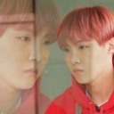
wolfwasnthatbad
Just A Simple Kpop Blogger
petrichor-idyllic
Petri
daddybalkan
Daddybalkan