#ply straight wallpaper
Text


ply straight wallpapers!
Ply Straight: Someone who identifies as poly(sexual, romantic, etc) and straight. An intentionally vague term, for a broad umbrella that community can gather under. Mostly used by multigender, genderfluid, and otherwise nonbinary individuals, though it is not a closed label. Also known as ply het.
#ply straight#ply straight pride#ply straight positivity#ply straight wallpaper#mspec straight#queer#pride#mspec mono#mono mspec#ply het#plyhet#polysexual straight#polyromantic straight#my wallpapers#mine
4 notes
·
View notes
Text
Starry Mspec Gay Wallpapers!
Staright Gay/Straightcian/Pastel


Bi Gay/Pastel


Pan Gay/Pastel


Ply Gay/Pastel


Omni Gay/Pastel


#mspec gay#mspec straight#straight gay#straightcian#bi gay#pan gay#ply gay#omni gay#pride month#pride flag#pride#free wallpaper#free lockscreen#rainycolors
25 notes
·
View notes
Note
kastle for the ship meme? ;)
who is more likely to fall asleep on the couch:Ooh, okay, I’d say Frank because of all the fic I’ve read where he falls asleep on her couch before they’re together, but u know what? I’m gonna say Karen. Because some nights she’s up late writing an article and other nights she’s stumbling in after late hours researching for nelson and murdock and page and she doesn’t want to wake up Frank. Whether she wakes up on the couch is another story.
who makes meals and who is more likely to hoard take-out menus:Frank’s more likely to make meals (reminds him of better times and he likes taking the time, it’s a meditation for him). Karen’s used to not having enough money and trying to create a nestegg for herself, so she’s hoarding so many take-out menus they could be the apartment’s new wallpaper.
who gives nicknames:Neither. Karen likes having things in a nebulous idea and names are easier to keep them there than nicknames and Frank’s nicknames are only for assholes and his time in the military.
favorite non-sexual activity:leaning into each other on the couch and watching tv or walking down the street, arm in arm while they walk the dog
who leaves notes for the other to find:Frank does and Karen dies a little inside every time he does it. Like, she thinks her heart’s about to burst. She’s so happy she’s part of his ‘after.’
who crosses the street to pet a cute dog:Frank really wants to, but hesitates, so Karen pulls him bodily over to talk to the owner and ask if they can pet the dog. All dogs are cute dogs to them, so they take forever walking around.
who takes notes on the other’s favorite foods and makes sure the fridge is stocked:Frank does cuz noticing things is His Thing and it’s not really intentional most of the time. Karen’s taken to trying to figure out his favorite foods, so she’s always plying him with new things to figure out what he Really Likes (joke’s on her, he really just likes watching her watch him eat anything she throws at him because while he likes good food, he’ll eat just about anything and like it).
who initiates sex most of the time:it’s an equal thing more often than not, but Karen usually does so if she’s riding high on adrenaline after something at work.
who apologizes first after a fight:Frank does. Karen doesn’t always know how, but she’s learning.
who is more protective:They’d both fight tooth and nail for each other.
who says “I love you” first:Frank does. He finds her after he feels like he’s got his head on straight (or at least enought) and after all the shit with Fisk happens without him there and he sits down with her and says the words and they move forward from there.
send me a ship and i’ll gush
11 notes
·
View notes
Text
Prologue - What Am I Doing Here?
July 15, 2006.
Mahmoud’s feet smell.
A stale, sweaty fug fills the cab. It’s a sticky Saturday night in mid-July, so the windows are rolled up and the air-conditioning is blasting. It’s keeping us cool but only serves to circulate the smell. I tell him I’d rather have some fresh air and roll down the window.
“It’s okay,” he says, turning off the A/C. “I stink, don’t I?”
He sounds embarrassed but also unapologetic, which suggests that while he does care, there’s also nothing he can do about it right now. Briefly, I feel chastened.
“Sorry about that,” he continues, “but it’s been so busy that I haven’t had time to shower since Wednesday.”
He hasn’t had time to sleep much, either. Ever since the war between Israel and Hezbollah broke out on Thursday morning - claiming Lebanon’s only international airport as its first victim - life has been frenetic for the taxi drivers plying the Beirut-Damascus route. Mahmoud’s been shuttling back and forth in his big yellow cab four, maybe five times a day.
“Thursday and Friday were crazy. I had Saudi tourists fighting to get a seat. They were offering me anything to get out. Some trips, I had 8 or 9 passengers at a time, sitting on top of each another. I haven’t even had time even to change my clothes.”
I tell him not to worry. I don’t really care and besides, I have much larger concerns. Like whether we will get to Beirut in one piece, what with the Israeli air force patrolling the skies, blowing up roads and bridges all over the country. Besides, without Mahmoud and his fragrant feet, I’d still be standing outside the Syrian border post at Jdeidet Yabous.
Like the rest of the world, the July 2006 War caught me off-guard. When I’d left Beirut 10 days earlier on assignment to write a guidebook on Dubai for Wallpaper Magazine, the city had been in full summer season swing, chock full of Gulf tourists who come to summer in the cooler climes of Lebanon’s mountains.
Small at the best of times, Beirut had been bursting at the seams. Bumper-to-bumper traffic and restaurants so crowded that even places that never asked for reservations had waiting lists. It was the city’s busiest tourist season since 1974, the year before Lebanon plunged into the decade and a half of civil and not-so-civil wars that turned it into a household word for urban hell.
This reputation was something Beirut still struggled to escape, even though by the time I first turned up in 1998, eight years after the fighting ended, it was already out of date. By 2006, the city had recovered most of its pre-war swing and if it was not entirely at peace with itself, it was only in the breathless opening paragraphs of nostalgic war correspondents who last visited in the 80’s (and their younger wannabe protégées), that it was still a dangerous place to be.
Which is not to say that sometimes, bad old Beirut didn’t resurface. The previous 18 months had been extremely rough, even by Lebanese standards. On Valentine’s Day the year before, the former Prime Minister Rafic al-Hariri and 33 others had been murdered in a massive car-bomb attack on Beirut’s seafront. That act was so callous, it brought over a million Lebanese - a quarter of the population - out onto the streets, demanding justice and that the Syrian Army, which had been occupying the country for almost 30 years, go home. After months of protests, as well as counter protests by factions that profited from the status quo, the withdrawal had finally happened, much to everyone’s disbelief.
A string of car-bombings followed. As these were exclusively targeted at cultural and political figures known for their opposition to Syrian control of Lebanon, it was often assumed that these were Damascus’ parting gifts to the Lebanese.
Despite this, in late June 2006, as I began to plan my trip to Dubai, the country seemed so buoyant that for the first time in eight years, I hadn’t felt the need to keep an eye on the news while I was away.
On Thursday the 13th, the day before I was due to fly home, the friend I was staying with in Dubai mentioned something about a ‘flare-up’ along Lebanon’s southern border. There wasn’t much online, so I switched on the TV and tuned into a Lebanese satellite channel just in time to see Israeli fighter jets blow craters into both runways at Beirut International.
For the next few hours, no one was sure whether this first round would escalate or if Israel, having instantly severed Lebanon’s only air bridge to the outside world, felt it had delivered its latest ‘message’.
Almost immediately, repair crews were out trying to fill in the holes so that planes could resume landing. Just as they finished, Israeli jets returned and made even bigger holes. Tel Aviv obviously intended for Lebanon’s only international airport to stay shut. Then, they began bombing the rest of the country.
I spent most of the day on the phone, calling friends to make sure they were safe and trying to reach Lebanon’s national carrier, Middle East Airways, to find out how I was going to get home. By the evening, I still didn’t know. The following day, the start of the weekend in Dubai, the MEA offices were closed and the helpline at the airport in Beirut went straight to answer phone. I called the MEA office in Beirut only to get a pre-recorded message explaining that they were working on finding alternate ways of getting passengers home and that I should call again later.
The only real possibility was for MEA to re-route to Damascus but as I discovered when I finally got someone on the phone the following morning, for reasons best known to themselves and which possibly involved pique over having been forced out the previous year, the Syrians weren’t allowing this to happen. I was told apologetically that all MEA could do under the circumstance was to fly me to Cyprus or Jordan.
As the ferry services to Cyprus had not run since the 1980’s and landing in Amman would mean going overland through Syria anyway, the quickest way back into Lebanon was to fly directly to Damascus.
If Syria decided to close the border at Jdeidet Yabous, which it might do if the Israelis followed up the airstrikes with an invasion, I would be cut off. If Israel extended its airstrikes to Syria, as it had threatened to do in the past in the event of renewed conflict with Lebanon, there would be no way back. I had no intention of sitting the conflict out in Dubai. I couldn’t afford to wait. I ditched the MEA ticket, booked a one-way flight with Emirates and a few hours later, was on my way.
The plane was practically empty, just three Syrian businessmen, a couple of ashen-faced Lebanese, a Kuwaiti on his way to find his brother, who had been summering in Lebanon but wasn’t answering his phone and a Saudi on his way to his villa in the mountains to rescue his terrified wife and children. Like me, they spent most of the time in the departure lounge making calls.
I still faced the issue of how I was going to get into Syria. Journalists are required to obtain special visas, regardless of their reason for visiting. Most came through in a couple of days but mine always seemed to take a bit longer.
As I couldn’t afford a delay, I took a gamble. Rather than follow procedure, I decided my best bet was to force the issue by presenting my arrival as a fait accompli. Calling the Syrian Ministry of Information just as I boarded, I told them that I was enroute to Damascus, that I wanted to back into Lebanon and would they please issue me permission to travel from the airport to the border?
“I arrive in four hours,” I told the poor, befuddled assistant. “I’ll need a transit visa on arrival.”
Before she could protest, I hung up. My heart was pounding. There was no guarantee this would work. The Syrians were under no obligation to let me in to their country and legally, had the right to deport me but I was banking on the exceptional circumstances warranting an equally exceptional response.
By the time I landed, my visa was waiting. Coasting through Immigrations, I jumped into a cab and was at Jdeidet Yabous barely forty minutes later. I needn’t have hurried. It didn’t look like there was anyone here but us.
I’d sensed on the drive out that the cabbie, who’d boldly informed me at the airport that he’d take me all the way to Tel Aviv if I wanted, was having second thoughts. When he asked for half the fare upfront as we pulled up at passport control, I had a feeling he might not be there when I came out.
For the second time that day, Syrian officialdom was efficient and gracious. After a few questions, asked with a touching concern that nevertheless made it clear I must be entirely mad to voluntarily drive into a war, the border police stamped my passport and sent me on my way with an Allah ma’ak.
God be with you.
If ever there were a time to be a believer, it was now.
Leaving the building, my suspicion was confirmed. The taxi had vanished. Thankfully, my bag hadn’t and was sat on the pavement. Waiting next to it was a rather embarrassed stranger. He apologised as I walked over and told me the driver had asked him to tell me that ‘something had come up’, so he’d had to rush back to Damascus.
We both knew that was a big fat lie but honestly, who could blame the guy? Who in their right mind would drive into a war voluntarily, anyway? I briefly wondered if I’d finally lost mine. But there was no time for that now. I was already checked out of Syria.
Wishing me luck, the stranger ambled off in the direction of a nearby café. It looked like it was closed.
“Hey,” I yelled after him, “don’t suppose you’ve got a car and fancy a drive to Beirut, do you?”
He turned and gave me a goofy smile and a kind of Charlie Chaplin shrug, which made us both laugh.
“God be with you, khaweja,” he said, using an old word variously used as an honorific or as a polite term for a foreigner. “See you some day in Beirut, maybe.”
Maybe. But the border post at Masna’a was eight kilometres away and there wasn’t exactly a steady stream of traffic heading in that direction. Probably because one of the air strikes that morning had targeted a small convoy of cars at the Lebanese border post. They’d been incinerated.
It was almost sunset. Briefly, I considered walking to Masna’a, but with night on its way, the idea of getting caught in the dark wandering around in the middle of a war in the strip of no-man’s land between the Lebanon and Syria, didn’t seem very clever.
A warm wind blew up the road from Lebanon. But the air was the only thing that was moving. The highway was so deserted and dusty that if tumbleweeds had rolled by, I wouldn’t have blinked. I dug a warm bottle of water out of my backpack and sat on my case. There was no choice. I needed transportation of some kind, so I settled in and prepared to wait.
1 note
·
View note
Text
Knight House, University of Sheffield
Knight House, University of Sheffield, New Yorkshire Housing Architecture, English Project
Knight House for University of Sheffield
7 Nov 2020
Knight House
Design: AHR, Architects
Location: Sheffield, northern England, UK
74 creates stunning landmark and interiors at Knight House, University of Sheffield, for iQ Student Accommodation
New landmark student accommodation Knight House in Sheffield has been masterplanned and designed by Manchester-based architects and designers 74, who additionally created the project’s full interiors scheme, including bedrooms, corridors, wayfinding and all amenity spaces. The new-build architecture for the class-leading student accommodation offer was implemented by Leeds-based architects Cunniff Design, with 74 acting as client-side architectural advisor.
’We worked on this project from its very earliest days’, 74 Founder David Holt commented. ’74 was initially engaged to examine the ongoing strategy of iQ Student Accommodation’s Sheffield campus, made up of three buildings adjacent to the University of Sheffield. The brief was to re-organise the existing buildings on the site, but further study of the plans and immediate environs revealed the potential of an adjacent site that turned out to be in the company’s ownership, in use at the time as a car park. A promising further discovery was a lapsed planning permission for a 12-storey building on the site, whilst under previous ownership. Once we had the client’s go-ahead to propose a new building, we sought to maximise the development volume and created the design for a 257-bed, 17-storey student accommodation building, which we are delighted to say has now completed and is set to become a key part of the iQ Student Accommodation Sheffield campus.’
Architectural Brief
The brief for the building was to design a high-quality landmark structure to serve as a focal point for the area and to sit harmoniously within the context of both large- and smaller-scale existing buildings in the vicinity. The design proposal consisted of two main forms: a 6-storey podium and a tower element which rises above the podium by a further 11 storeys to create the final 17-storey building.
‘Although the planning process was challenging, we developed a very positive relationship with the urban planning team and planning permission for the proposed scheme was eventually obtained’ David Holt explained.
74 designed the building form, the proportions of the apertures and spaces between to create an elegant overall building appearance, exemplified by the slender vertical emphasis of the façade articulation, which includes bronze, anodised metal feature panels. Large windows run along the full length of the ground floor and lower ground floor amenity spaces.
Anne Knight Lobby Artwork
Knight House was named after feminist pioneer Anne Knight (1786-1862). A notable public art piece dedicated to Anne Knight now greets visitors in the building’s lobby, in the form of a mosaic wall installation by artist Coralie Turpin. 74 was closely involved in the initial artist interviews and design-stage review process for the commission, as well as inputting into the final colour scheme, using the same yellow as used within the interior scheme.
Entitled ‘Anne Knight and the Dawning of the Women’s Movement in the UK’, the mosaic was constructed by the artist in her studio at Yorkshire Artspace and installed by Anglian Tiling. Anne Knight was a Quaker and anti-slavery activist and formed the first women’s suffrage society in Sheffield in 1851. The mural represents Anne’s legacy as a pioneer feminist, and the cyclical progress of the women’s movement in Britain from the era in which she was born to our present day. Like this mural, the women’s movement has developed in waves, but consistent throughout has been the aim to achieve equality for women in political rights and representation, education, work, health, sexuality and in the family.
‘It is something special that Sheffield is the birthplace of a campaign that finally attained its objectives when Parliament passed the Representation of the People Act (1918), and, a decade later, the Equal Franchise Act (1928)’, Julie V. Gottlieb, Professor of Modern History, University of Sheffield, who created the historical timeline for the commission, explained. ‘These achievements are not to the credit of great leaders alone but to the power of collective action, solidarity and sisterhood. An artwork conceived as we marked the centenaries of women’s (partial) suffrage and women’s entry into Parliament, artist Coralie Turpin gives visual form and texture to the uneven and fluctuating yet overall progressive movement towards gender equality in Britain.’
Interior Design Scheme
After the lobby, visitors go through to the reception and waiting lounge area, allowing glimpses down to the main amenity space on the lower-ground floor. There are postboxes in red for each student directly opposite, sourced from The Safety Letterbox Company. The reception zone to the left features a bespoke desk with a ply geometric pattern-printed front, designed by 74, and an emerald green marmoleum desktop, along with green wallpaper to the rear and a green ceiling area above, whose shape directly reflects the deskfront.
The new logo for iQ Student Accommodation sits behind reception in neon, whilst three pendant lights with an orange knot hang over the reception desk, ‘The interiors concept was inspired by the surrounding landmark architecture and great natural landscapes all around the city’ Bianca Yousef, Associate at 74 commented, ‘as well as by the city’s industrial ties to the steel industry, taking form in both a bold colour palette, with a core emerald green supplemented by red, yellow and orange and strong geometric patterning throughout.’
Alongside reception is a waiting lounge, with a variety of seating arrangements. Acoustic panels on the ceiling are a motif used throughout, whilst in other areas, the ceiling is treated as a part of the design canvas and features green timber slats, interspersed with strip lighting. Pillars throughout are in a half-and-half colour scheme, using one of scheme’s three main colours, together with a marble-effect film, adding a playful take on classicism in the midst of an otherwise highly-contemporary treatment. Curtains are also split at the same level as the pillars (1500mm), in a green and orange colourway.
Furniture in this space includes high-level red chairs at a laptop table, with a bespoke red rope back feature, another motif of the whole amenity-space the scheme. Flooring is a two-tone Amtico vinyl in an oak effect, with a darker-toned floor set at ninety degrees to designate the circulation areas. Feature inset carpeting in a geometric pattern beneath the casual seating arrangements is from Newhay.
A new set of iQ Student Accommodation brand language and illustrations was employed on this scheme. As well as the new identity, the branding also includes a series of bespoke, new, playful and location-specific illustrations, with the first iteration applied to the glazing here, in the form of a continuous line tracing out icon silhouettes of, for example, mortar board hats, pens, hands and laptops.
To the left of reception is the private dining area. A further brand illustration is located here, depicting a chef, whilst a wraparound linking wall features iconic images of Sheffield, from music to parks to famous buildings such as The Crucible Theatre. The private dining room features a blue Howdens kitchen with a stainless-steel splashback and geometric-patterned wallpaper on the opposite wall to the illustration. The communal dining table and chairs are by Telegraph Contract Furniture, who supplied furniture throughout.
To the right beyond reception, a red feature stair leads down to the lower ground floor, where the scheme’s social and activity spaces are located. The first area is an inset lounge area for board games and hanging out, with the printed plywood treatment used on the reception deskfront applied once again to the lower wall ply cladding that wraps around the inset seating booths and the TV and gaming screens. Yellow pendant lights and table legs add a bright highlight to the booths. Further illustrations from the new branding are used on the glazing here, featuring faces and hands to denote social exchange, whilst faux leather booth seating is complemented by freestanding furniture, once again featuring red rope-threaded backs. A small nook area has a darker and quieter feel, with a backing of geometric wallpaper, in grey this time. The metal studs on the banquettes here allude to Sheffield’s great steel industry heritage.
Huge overhead ceiling rafts over the lounge and gaming areas are in strong geometric patterns and are made of plywood with integrated lighting. A dry bar features bespoke lights and three sets of demarcating red metal grids in powder-coated steel – two zoning the lounge area and one forming the back rear wall of the kitchen, where cupboards are in a dark grey concrete-effect laminate. Three lights on giant steel U-shaped loop frames against the kitchen back wall were bespoke-made for the project by Enigma Lighting.
Leading off to the right from the social area is the TV amphitheatre, where pegboard ply steps and integrated seating with emerald green faux-leather seat pads are arranged to face the screen wall. The ceiling slats continue into this space, as do the two-tone curtains and the oak-effect flooring, although laid in a straight, non-herringbone pattern.
The game area to the rear of the main space includes pool, table tennis and table football. The same long pendants used over the main reception, with orange knots, feature here and there are also acoustic panels in red in the ceiling. A window bench seat in emerald green faux leather is by Telegraph Contract Furniture, whilst black demarcating panels in the flooring echo the acoustic ceiling panels in their zigzag shape.
Up on the first floor is a further amenity space, overlooking the entrance lobby, in the form of a small study area with a teapoint, herringbone flooring, two curving banquettes, geometric wallpaper, acoustic ceiling panels, faux-leather benches in green and grey with metal studs, plus a herringbone timber effect floor. Other elements of the ground-floor amenity space also repeat here to link the spaces, including two-tone columns, inset Newhay carpets, red geometric frames to demarcate separate areas and a ‘student at work’ brand illustration on one wall.
The bedroom designs, with each room slightly different, feature a similar palette. Dressed with a strong use of yellow, the furniture is in oak, grey and white, with a feature wall in dark green and others in papyrus white with a slight grey-green tint. Flooring is oak-effect by Amtico. Two-tone pillars feature in some of the rooms, which are arranged either as cluster rooms, with a communal kitchen, or as individual studio rooms with built-in kitchens. The bathrooms feature an acrylic-panel pod design and were pre-fabricated and craned in, with shower pods and backlit mirrors, manufactured by Walker Modular to 74’s design.
Knight House for University of Sheffield, England – Building Information
Architectural Design: 74
Implementing Architect: Cunniff Design
Client Architectural Advisor: 74
Interior Designer: 74
Anne Knight Artwork: Coralie Turpin
Installed by Anglian Tiling
Contractor: nmcn
Furniture Supplier: Telegraph Contract Furniture
Lighting Supplier: Enigma Lighting
Flooring: Amtico Newhay
Joinery: Manufactured by Andy Thornton & installed by PDS Design & Build
Postboxes: Safety Letterbox Company
Bathroom Pods: Walker Modular
About 74:
74 are architects, interior designers and placemakers, specialising in student living, workplace, hospitality and BTR projects. The Manchester-based practice, named Commercial Interior Design Practice of the Year at the Northern Design Awards 2019, offers clients a design-led, commercial approach and a thoroughly integrated mix of disciplines. Clients include iQ Student Accommodation, Future Generation, Grainger, Moorfield Group, Wyndham Hotel Group, Greystar, Ekistics, UrbanSplash, and Royalton Group.
Photographer credit: Gu Shi Yin
Barbara Hepworth Building at the University of Huddersfield images / information received 071120
AHR Architects
Another University of Huddersfield building on e-architect:
Oastler Building at the University of Huddersfield
Design: AHR Architects
image courtesy of architects
Oastler Building at the University of Huddersfield
Address: Queensgate, University of Huddersfield, Yorkshire, northern England, HD1 3DH, UK
Phone: +44 1484 422288
Yorkshire Architecture
New Yorkshire Architecture
Yorkshire Architecture:
RIBA Yorkshire Awards
York Theatre Royal Building Redevelopment
Design: De Matos Ryan
Artists’ Impression : De Matos Ryan
York Theatre Royal Building
Hepworth Gallery, Wakefield
David Chipperfield Architects
photograph © Iwan Baan
The Hepworth
Building for sculptures by late Barbara Hepworth + Wakefield public art collection
Yorkshire Buildings in Major Cities
Leeds Buildings
Sheffield Buildings
Bradford Buildings
FUTURE PARK
Design: Bond Bryan / Fallon
image courtesy of architecture practice
FUTURE PARK Yorkshire Building
Yorkshire Higher Education Buildings
York St. John University Creative Centre Building
Design: Tate Harmer, Architects
image courtesy of architects
Creative Centre at York St. John University Building
Bradford Academy
Bond Bryan Architects
Bradford Academy building
Castleford Bridge
McDowell+Bendetti with Alan Baxter Associates and Arup
Castleford Bridge
Castleford Project Bridge
DSDHA
Tickle Cock Bridge
Sheffield Hallam University Furnival Building
Bond Bryan Architects
Yorkshire building
Sheffield Hallam University Faculty Building
Bond Bryan Architects
Sheffield Hallam University
Sheffield University Building
RMJM
Yorkshire University Building
University of Sheffield – Advanced Manufacturing Research Centre
Bond Bryan Architects
Yorkshire building
University of Sheffield Environmental Research Centre
Bond Bryan Architects
Yorkshire building
English Architect
County Architecture adjacent to Yorkshire
County Durham buildings
Humberside Buildings
Lincolnshire Buildings
Website: Oastler Building at the University of Huddersfield
Yorkshire Building Designs
Comments / photos for the Knight House, University of Sheffield page welcome
Website: University of Sheffield
The post Knight House, University of Sheffield appeared first on e-architect.
0 notes
Text
Ayesha Alyassi g00067734
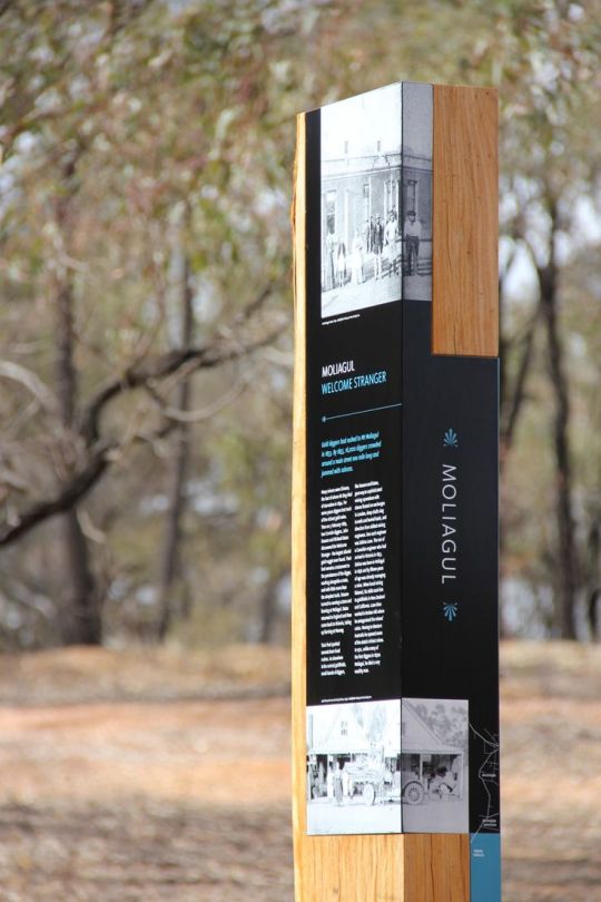
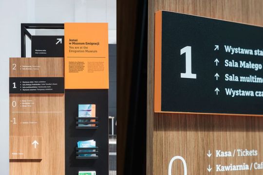
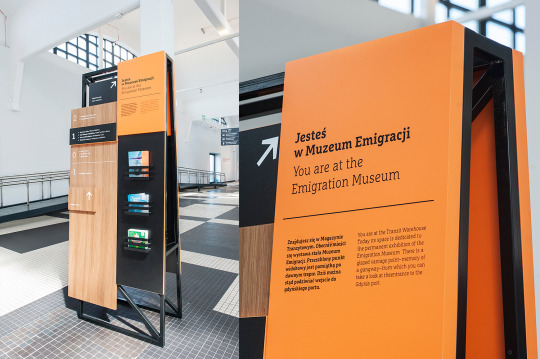
Typical Elements way finding consists of?
Typical graphic wayfinding information includes systems made up of text, pictograms, maps, photographs, models, and diagrams.
What materials and printing techniques are used?
1. ACM clad – This stands for Aluminium Composite Material, but is also commonly known by the brand, Dibond. It’s made from two thin coil-coated aluminium sheets bonded to a non-aluminium core (polyethylene or foam). Printed ACM can be applied straight onto site hoarding to promote new developments, while adhering to health and safety regulations. It’s a superb material for hoarding because it flexes and is very durable, offers sound reduction and is fireproof. The overall affect is a streamlined, contemporary look and feel.
2. Acrylic – Perspex® is a well-known brand of acrylic sheeting. It is a tough, transparent, versatile thermoplastic used in many applications, particularly in visual communications, design and architecture. Acrylic is very resistant to shock, flexing, scratching and weathering. It comes in many colours and finishes and is totally recyclable. We apply acrylic shapes to hoardings to bring them to life, as well as for use in general signs and wall installations. It can be sprayed in different colours and makes brand logos stand out. We often use it self-coloured or reverse printed acrylic for stand-up letters, CGI pictures on hoardings and building exteriors.
3. Aluminium – A strong, light metal used widely in industry, aluminium is the most abundant metal on the planet. It’s malleable, so it’s easy to make into whatever shape we need, and it’s resistant to corrosion. We use aluminium for architectural features and walls, fingerposts, desk receptions, built-up letters and extrusions for banner frames.
4. Correx – Also known as fluted, or corrugated, polypropylene board, Correx is an inexpensive and efficient way to produce temporary signs or displays. Tough and lightweight, it’s easily cut to shape and comes in any number of colours and thicknesses. Correx is fully recyclable and is used a lot for outdoor signs such as estate agents’ boards.
5. Films and finishing – The effectiveness of our products is down to the materials and the finish we give them. Whether they need to weather gracefully to blend into a historic or rural environment or endure harsh conditions, the surface layer needs to do its job. The vinyl film or laminates that goes over our hoardings add to their longevity.
6. Foamex – A versatile, lightweight PVC foam sheet, that’s durable and easy to cut and shape. Foamex also has low water absorption, making it suitable for indoor and outdoor use. It comes in a range of colours and is a popular material for signage and displays. We can print directly on to foamex and it can be sprayed in different colours. We like to apply it to hoarding to bring it to life, adding a stand-out, 3D affect. We’ve even created an entire Santa’s grotto from foamex!
7. Glass – A hard but brittle fusion of sand, soda and lime, we’re surrounded by the many applications of glass and we use this canvas to apply graphics for signage and marketing purposes. We can create messaging on glass for marketing suites, using frosted messages, and apply crystal edge window manifestations to make subdivisions of internal spaces clearly visible.
Glass signage is also good for external architectural projects and we supply optically clear vinyl for windows. Toughened, low-iron glass is extra clear, noted for its higher light transmittance and reduced green tint. This glass is used with wayfinding architectural signage where information may change.
8. Graffiti proofing – We can apply a special anti-graffiti laminate seal to hoarding and signs to ensure they last. This is a special coating that makes it easier to clean your signage if it’s vandalised.
9. Green walls – Also known as a living wall, this is a vertical surface partially or completely covered with living greenery, complete with a growing medium and integrated watering system for interior spaces. Green walls are great especially if your external or internal space has a green and environmental theme.
10. Lighting – Signage can work for you 24-hours a day if it’s illuminated well. Here are some of the methods we use to spotlight your brand:
• Illuminated lettering and lightboxes – These are additional ways to light up a hoarding and highlight your key selling points. Internally illuminated, they’re hard to miss, especially at night, and colours look bright and crisp. Lightboxes, with opal acrylic inlays for exceptional illumination, can be single or double sided, wall mounted, projecting, hanging or free standing. We can even fit them to hoardings, which we rout out and light up from behind.
• LED, ribbon or strip lighting – A flexible product, this can have self-adhesive backing for use on any surface. We use this lighting in the headers and kickers of hoarding, to accent the design and draw attention to key elements, rather than trying to light up the whole hoarding.
• Neon – These are luminous, gas-discharge tubes that contain inert gases, usually neon. Neon lighting can light up your logo or wayfinding signage in a bright and colourful way. Neon has a classic, retro look but we’ve also used it to add urban chic ambience to an ultra-modern setting.
11. Powder coating – This is applying paint in dry powder form to a metal surface, using a spray gun. The powder bonds electrostatically to the surface and then it’s heat treated to produce a tough coating that looks like a traditional liquid paint finish, but it doesn’t run and it’s more environmentally friendly. Powder coating is good on wayfinding signage because it’s both protective and decorative.
12. Printed manifestations and digital wallpaper – These are large-scale printed materials applied to walls, glass and even floors. They act like murals and can be used to add any design to your interior. Digital wallpaper – or super graphics – is artwork printed onto large areas to transform office walls, whether to support your corporate identity or brighten up the office space with some bold pop-art.
13. Reflective or pearlescent vinyl – This has a base colour and an accompanying colour. It is reflective and appears glossy, so we use it for hoardings and for vehicles.
14. Steel and stainless steel – Strong, durable and versatile, this long-established construction material is made from mixing iron and carbon in the right proportions at high temperature, but other additives give it particular qualities. Adding chromium creates stainless steel, which is highly resistant to corrosion. We use steel mainly for architectural and industrial signage, but stainless-steel fret-cut letters add an eye-catching element to signs and even hoarding.
15. Stone – Whether a natural-look stone or slate, we can cut it to size and shape, including bespoke lettering. This material is great for traditional architectural signage where the natural surroundings can blend around it. Stone signage also gives a sense of permanence and solidity to any environment.
16. Textured wall coverings – A technical name for wallpaper, it adds depth and interest with a huge range of aesthetic looks and feels. It’s tactile, encouraging interaction, so it works well in marketing suites.
17. Verometal – A thin, metallic coating containing bronze that’s sprayed onto a surface, verometal gives your signage the appearance of solid metal. We can create a matt, satin polished, high polished, rusted or patinated look to fit your requirements. Verometal is ideal for wayfinding and permanent outdoor signage.
18. Vinyl and painted wall graphics – These can be used to create bright, colourful and creative designs. They are adhesive, and can be applied directly to walls so we mainly use them for internal branding and wayfinding.
19. Vinyl wrapped ply – This can be added to hoarding to make it more rigid and it is popular for luxury building developments.
20. Vitreous enamel – This is made by fusing powdered glass to a surface by firing at high temperatures and can be opaque or coloured. The technique is more than a century old and has immortalised London street names as well as London Underground’s signage. Vitreous enamel is ideal for exterior heritage signage, standing the test of time beautifully.
21. Wind mesh PVC – Perforated PVC is used to make wind mesh banners. There are tiny holes in its fabric to avoiding wind damage, so it’s ideal for advertising large, new-build developments, such as apartment blocks.
22. Wood – Good quality wood can have excellent durability and looks high-end, ageing well when looked after. We use wood when it’s important to match the surroundings, such as the ply plaques we installed for a wetlands project. Timber frames are also used for gantry signs.
23. 3D models – working with 3D technology specialists, we can develop a 3D printed masterplan to showcase housing projects. These are made from resin and printed through a process known as stereolithography (SLA). They depict with great accuracy a 3D visualisation of a new development for use within sales and marketing suites.
Make a list of elements typically found in way finding systems?
There are five primary architectural wayfinding elements:
(1) paths/circulation,
(2) markers,
(3) nodes,
(4) edges,
(5) zones/districts.
These, along with visual accessibility, are the design criteria for highly legible and comprehensible urban environments.
0 notes
Last Seen Blogs

knifeofjuliet
The sky was clear.

catlife300-blog
Hot Takes On Fake Snakes

derivataprima
DerivAnto

maddaddamnovelstudy-blog
MaddAddam NovelStudy

xtremesmobileapplications
Untitled