#period image
Text
So I accidentally almost got into an argument on Twitter, and now I'm thinking about bad historical costuming tropes. Specifically, Action Hero Leather Pants.
See, I was light-heartedly pointing out the inaccuracies of the costumes in Black Sails, and someone came out of the woodwork to defend the show. The misunderstanding was that they thought I was dismissing the show just for its costumes, which I wasn't - I was simply pointing out that it can't entirely care about material history (meaning specifically physical objects/culture) if it treats its clothes like that.
But this person was slightly offended on behalf of their show - especially, quote, "And from a fan of OFMD, no less!" Which got me thinking - it's true! I can abide a lot more historical costuming inaccuracy from Our Flag than I can Black Sails or Vikings. And I don't think it's just because one has my blorbos in it. But really, when it comes down to it...
What is the difference between this and this?
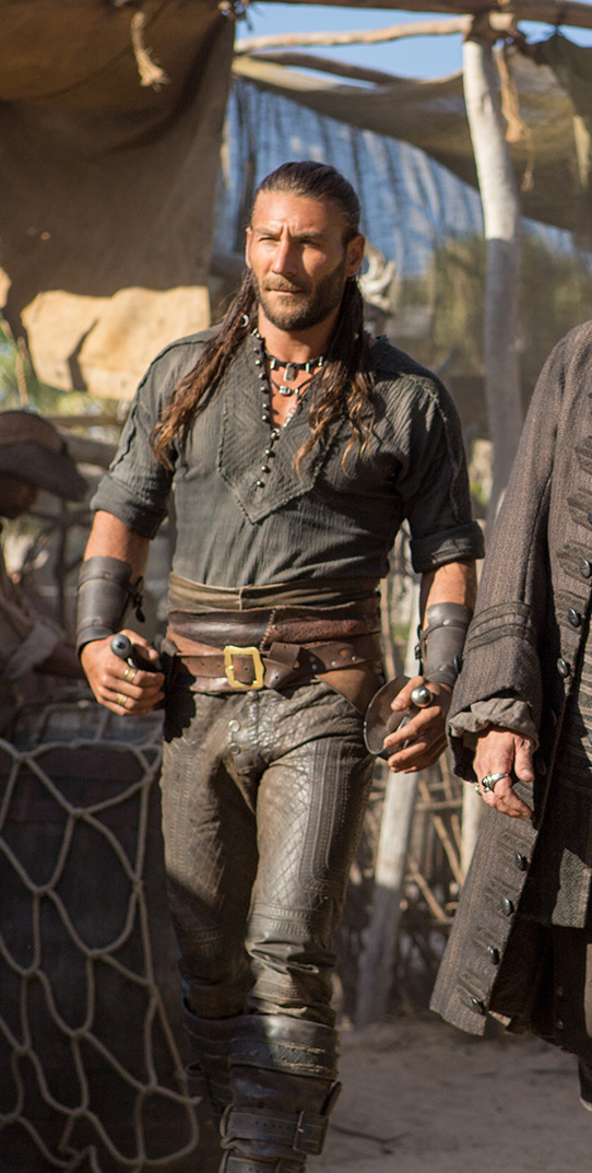
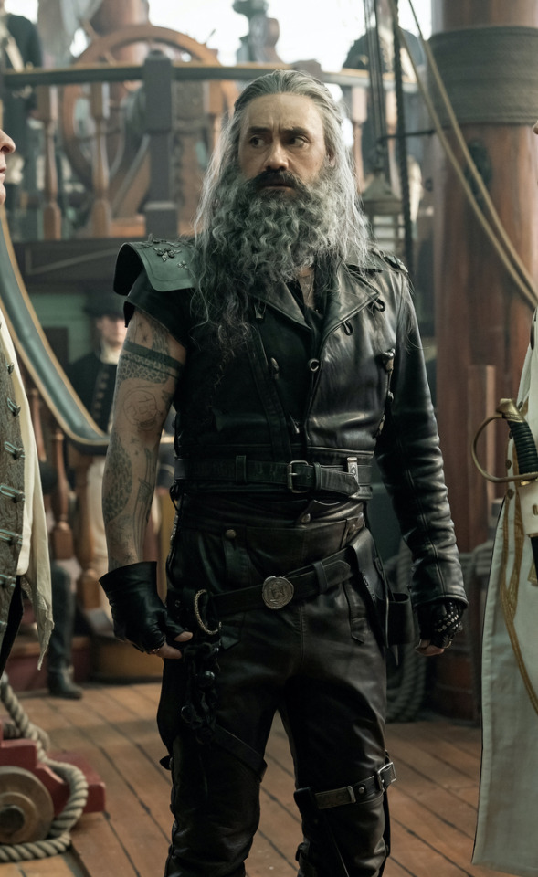
Here's the thing. Leather pants in period dramas isn't new. You've got your Vikings, Tudors, Outlander, Pirates of the Caribbean, Once Upon a Time, Will, The Musketeers, even Shakespeare in Love - they love to shove people in leather and call it a day. But where does this come from?
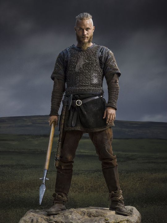
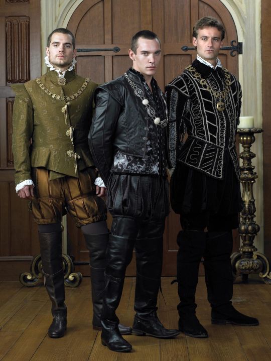
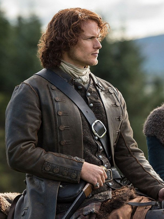

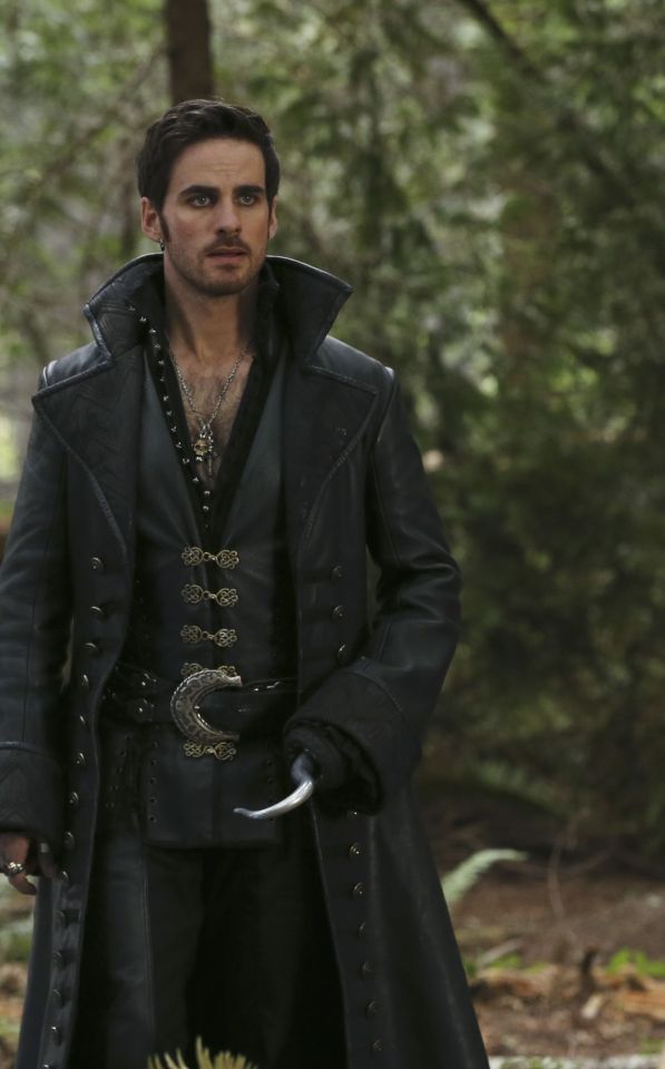
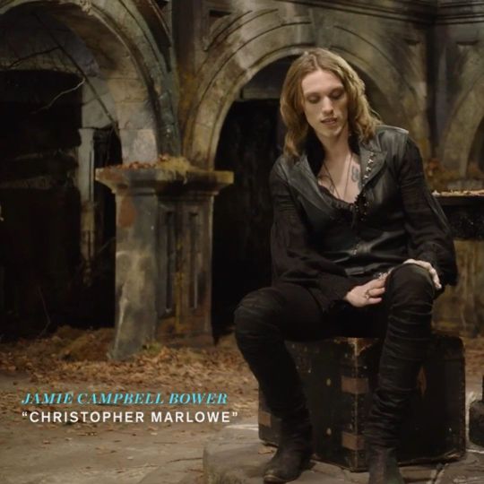
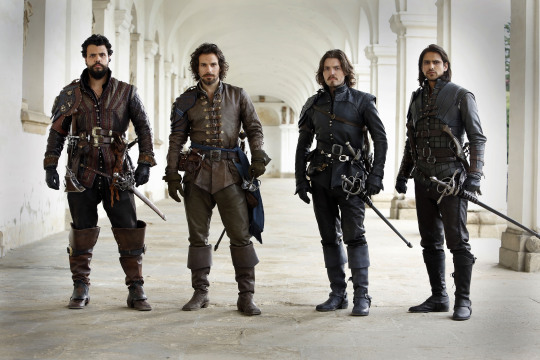
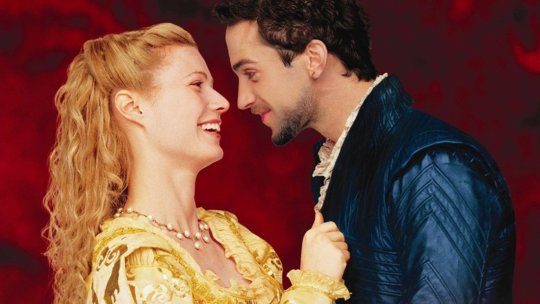
Obviously we have the modern connotations. Modern leather clothes developed in a few subcultures: cowboys drew on Native American clothing. (Allegedly. This is a little beyond my purview, I haven't seen any solid evidence, and it sounds like the kind of fact that people repeat a lot but is based on an assumption. I wouldn't know, though.) Leather was used in some WWI and II uniforms.
But the big boom came in the mid-C20th in motorcycle, punk/goth, and gay subcultures, all intertwined with each other and the above. Motorcyclists wear leather as practical protective gear, and it gets picked up by rock and punk artists as a symbol of counterculture, and transferred to movie designs. It gets wrapped up in gay and kink communities, with even more countercultural and taboo meanings. By the late C20th, leather has entered mainstream fashion, but it still carries those references to goths, punks, BDSM, and motorbike gangs, to James Dean, Marlon Brando, and Mick Jagger. This is whence we get our Spikes and Dave Listers in 1980s/90s media, bad boys and working-class punks.
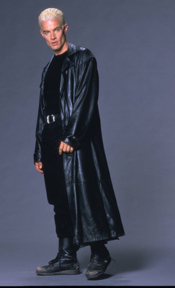
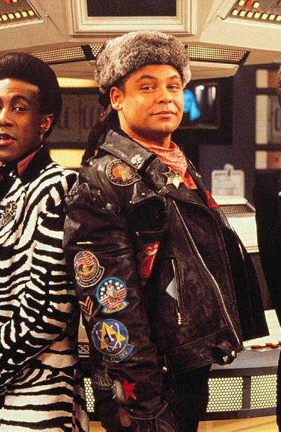
And some of the above "historical" design choices clearly build on these meanings. William Shakespeare is dressed in a black leather doublet to evoke the swaggering bad boy artist heartthrob, probably down on his luck. So is Kit Marlowe.
But the associations get a little fuzzier after that. Hook, with his eyeliner and jewellery, sure. King Henry, yeah, I see it. It's hideously ahistorical, but sure. But what about Jamie and Will and Ragnar, in their browns and shabby, battle-ready chic? Well, here we get the other strain of Bad Period Drama Leather.
See, designers like to point to history, but it's just not true. Leather armour, especially in the western/European world, is very, very rare, and not just because it decays faster than metal. (Yes, even in ancient Greece/Rome, despite many articles claiming that as the start of the leather armour trend!) It simply wasn't used a lot, because it's frankly useless at defending the body compared to metal. Leather was used as a backing for some splint armour pieces, and for belts, sheathes, and buckles, but it simply wasn't worn like the costumes above. It's heavy, uncomfortable, and hard to repair - it's simply not practical for a garment when you have perfectly comfortable, insulating, and widely available linen, wool, and cotton!
As far as I can see, the real influence on leather in period dramas is fantasy. Fantasy media has proliferated the idea of leather armour as the lightweight choice for rangers, elves, and rogues, a natural, quiet, flexible material, less flashy or restrictive than metal. And it is cheaper for a costume department to make, and easier for an actor to wear on set. It's in Dungeons and Dragons and Lord of the Rings, King Arthur, Runescape, and World of Warcraft.
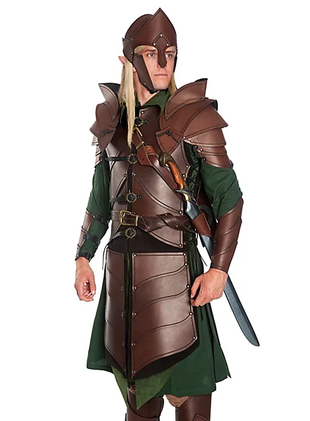
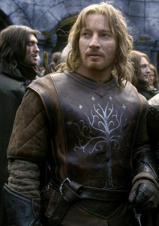
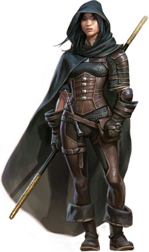
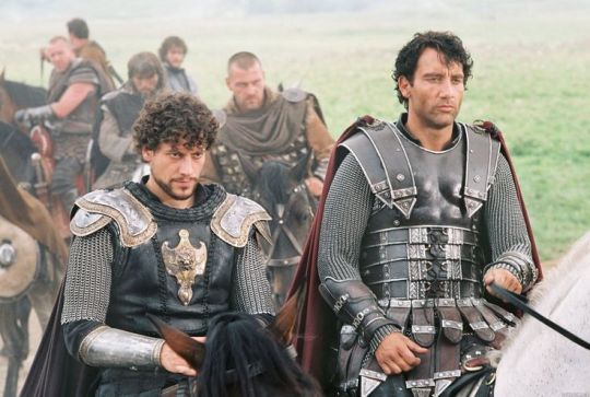

And I think this is how we get to characters like Ragnar and Vane. This idea of leather as practical gear and light armour, it's fantasy, but it has this lineage, behind which sits cowboy chaps and bomber/flight jackets. It's usually brown compared to the punk bad boy's black, less shiny, and more often piecemeal or decorated. In fact, there's a great distinction between the two Period Leather Modes within the same piece of media: Robin Hood (2006)! Compare the brooding, fascist-coded villain Guy of Gisborne with the shabby, bow-wielding, forest-dwelling Robin:
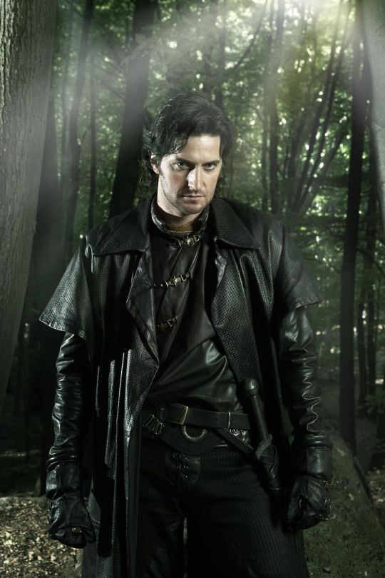
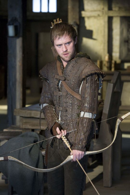
So, back to the original question: What's the difference between Charles Vane in Black Sails, and Edward Teach in Our Flag Means Death?
Simply put, it's intention. There is nothing intentional about Vane's leather in Black Sails. It's not the only leather in the show, and it only says what all shabby period leather says, relying on the same tropes as fantasy armour: he's a bad boy and a fighter in workaday leather, poor, flexible, and practical. None of these connotations are based in reality or history, and they've been done countless times before. It's boring design, neither historically accurate nor particularly creative, but much the same as all the other shabby chic fighters on our screens. He has a broad lineage in Lord of the Rings and Pirates of the Caribbean and such, but that's it.
In Our Flag, however, the lineage is much, much more intentional. Ed is a direct homage to Mad Max, the costuming in which is both practical (Max is an ex-cop and road warrior), and draws on punk and kink designs to evoke a counterculture gone mad to the point of social breakdown, exploiting the thrill of the taboo to frighten and titillate the audience.
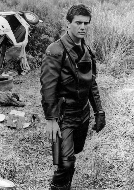
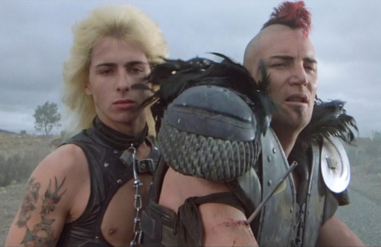
In particular, Ed is styled after Max in the second movie, having lost his family, been badly injured, and watched the world turn into an apocalypse. He's a broken man, withdrawn, violent, and deliberately cutting himself off from others to avoid getting hurt again. The plot of Mad Max 2 is him learning to open up and help others, making himself vulnerable to more loss, but more human in the process.
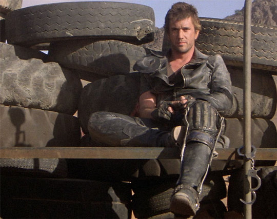
This ties directly into the themes of Our Flag - it's a deliberate intertext. Ed's emotional journey is also one from isolation and pain to vulnerability, community, and love. Mad Max (intentionally and unintentionally) explores themes of masculinity, violence, and power, while Max has become simplified in the popular imagination as a stoic, badass action hero rather than the more complex character he is, struggling with loss and humanity. Similarly, Our Flag explores masculinity, both textually (Stede is trying to build a less abusive pirate culture) and metatextually (the show champions complex, banal, and tender masculinities, especially when we're used to only seeing pirates in either gritty action movies or childish comedies).
Our Flag also draws on the specific countercultures of motorcycles, rockers, and gay/BDSM culture in its design and themes. Naturally, in such a queer show, one can't help but make the connection between leather pirates and leather daddies, and the design certainly nods at this, with its vests and studs. I always think about this guy, with his flat cap so reminiscient of gay leather fashions.
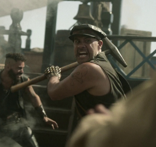
More overtly, though, Blackbeard and his crew are styled as both violent gangsters and countercultural rockstars. They rove the seas like a bikie gang, free and violent, and are seen as icons, bad boys and celebrities. Other pirates revere Blackbeard and wish they could be on his crew, while civilians are awed by his reputation, desperate for juicy, gory details.
This isn't all of why I like the costuming in Our Flag Means Death (especially season 1). Stede's outfits are by no means accurate, but they're a lot more accurate than most pirate media, and they're bright and colourful, with accurate and delightful silks, lace, velvets, and brocades, and lovely, puffy skirts on his jackets. Many of the Revenge crew wear recognisable sailor's trousers, and practical but bright, varied gear that easily conveys personality and flair. There is a surprising dedication to little details, like changing Ed's trousers to fall-fronts for a historical feel, Izzy's puffy sleeves, the handmade fringe on Lucius's red jacket, or the increasing absurdity of navy uniform cuffs between Nigel and Chauncey.
A really big one is the fact that they don't shy away from historical footwear! In almost every example above, we see the period drama's obsession with putting men in skinny jeans and bucket-top boots, but not only does Stede wear his little red-heeled shoes with stockings, but most of his crew, and the ordinary people of Barbados, wear low boots or pumps, and even rough, masculine characters like Pete wear knee breeches and bright colours. It's inaccurate, but at least it's a new kind of inaccuracy, that builds much more on actual historical fashions, and eschews the shortcuts of other, grittier period dramas in favour of colour and personality.
But also. At least it fucking says something with its leather.
#everyone say 'thank you togas' for not including a long tangent about evil rimmer in red dwarf 5x05#Our Flag Means Death#Togas does meta#and yes these principles DO fall apart slightly in s2 and i DON'T like those costumes as much#don't get me wrong they're fun and gorgeous - but generally a bit less deep and more inaccurate. so. :(#I'm not sure this really says anything new about Our Flag but I just needed to get my thoughts out#i hate hate hate Gritty Period Drama costumes they're so boring and so ugly and so wrong#god bless OFMD for using more than 3 muted colours and actually putting men in heels (and not as a shorthand for rich/foppish villainy) <3#looking at that Tudors still is insane like they really will go to any lengths to not make men feel like they've got bare legs XD#image descriptions in alt text#and yes i DID just sink about two hours into those so you'd better appreciate them
1K notes
·
View notes
Text
Not a day goes by where I do not think about the advent of medicine like PrEP and wonder just what the people - especially queer people - who passed from HIV/AIDs during the AIDs crisis would think
And then, I read this survivor's testimony and it just makes me emotional. I think this is the closest answer we have. HIV has changed, and we must always remember the people who didn't see that change before it happened.

#gay#queer#lgbt#lgbtq#described images#image description in alt#i do try to learn from older queer people about this tome period because i wasn't around for it#but i always wondered what the people who didn't make it would have thought of where we are now#there's this weird grief and celebration because i am so glad we are where we are. i just wish everybody cpuld have seen this#this is why it's so important to learn from each other about everything#it takes a village to create community#i have been thinking about that twitter post at LEAST once a month since i first saw it#very complex feelings on this one folks#there is so much left to learn i think but this just hits me in a specific way
3K notes
·
View notes
Text
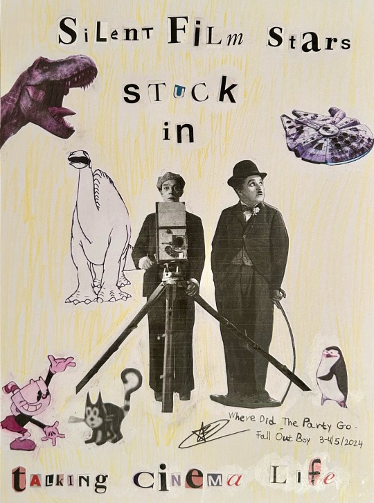
So let's fade away together one dream at a time
#amalia's art#art#artists on tumblr#fall out boy#save rock and roll#where did the party go#fob#fob lyrics#srar#fob fanart#fall out boy fanart#fob art#fall out boy art#fobcreators#collage#collage art#analog collage#fanart#two collages for one song? it’s more likely than you think#sometimes there are lyrics in songs that give me such a vivid image it stays in my head for long periods of time#thinking about ‘talking cinema life’ got me thinking about the evolution of cinema and how far it has come#this was kinda inspired by old movie posters#gertie is the white dinosaur in the back and felix is the cat with the question mark tail#finding good screenshots and photos took the longest I’d say#buster keaton#charlie chaplin#felix the cat#gertie the dinosaur
276 notes
·
View notes
Text
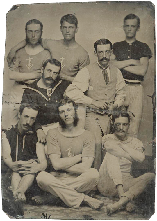
Tintype of a group of barefoot sailors at ease, c. 1870s
#I love images like this where there's such a jolting contrast between modern-looking elements and very period-specific elements#like center front guy's casual pose and t-shirt wouldn't be out of place on a modern man but then MASSIVE MUTTONCHOPS#and his buddy on the left—did this guy straight up rip the sleeves off his naval uniform?! punk's not dead... punk's not even born yet#19th century#19th century men#19th century fashion#sailors#men's fashion#fashion history#historical fashion#19th century photography#tintype#ferrotype#1800s#1870s
1K notes
·
View notes
Text
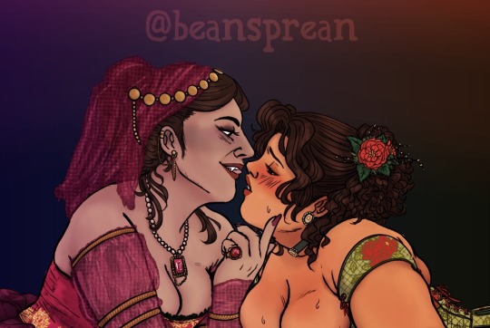
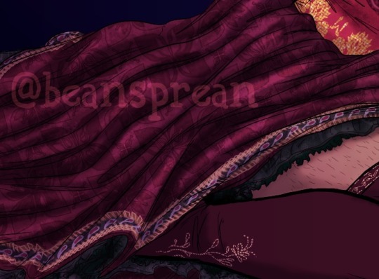
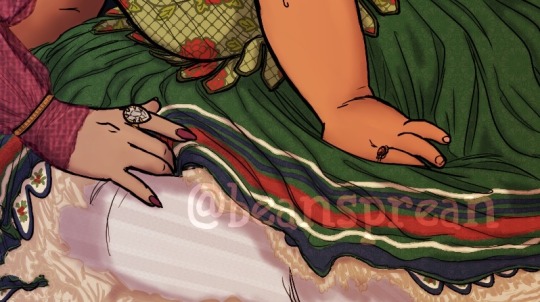
Femdermo based on that promo image from the marriage of figaro...
See the full image on Patreon!
(ID in alt and under cut)
ID: 1. Cropped shoulders up drawing of fem!Nandor and fem!Guillermo dressed in decadent gowns leaning close to each other until their mouths are barely an inch apart. Nandor has her hair loosely up, a diaphanous pink veil hanging off the back of her head, golden jewelry dangling from the top and along her ear. Around her neck is a string of pearls with a large square cut ruby. She is wearing a sleeveless back-laced red bodice with gold details cut low over her breasts and detached sleeves in the same material as her veil cinched with gold bands. Her left hand is tipping Guillermo's chin up towards her as she gazes down, smiling with her tongue between her teeth. Guillermo has her hair half up and pinned with a red poinsettia, along with carved mother of pearl earrings and a matching choker. She is swearing green stays with a red flower pattern on bare skin, the straps slipping off her shoulders and her breasts spilling out the front. She stares up at Nandor with hooded, wanting eyes, red lips parted and cheeks flushed.
2. Close up on Nandor's hip and right leg where she sits on the floor. Her red-violet skirt is glossy with darker patterns, hemmed with bote jeghe and underlain with black lace. She is wearing matching red-violet stockings with beaded flowers up to her thigh.
3. Close up on Guillermo's left hip and splayed legs where she sits on the floor. Her skirt is green and lightly patterned, with white blue and red stripes at the hem, a scalloped edge with holly berries, and layers of off white ruffles beneath. Her stockings are ribbed and white. Nandor's right hand comes in from the left to caress Guillermo's leg, tucking her middle and ring finger into the crease behind her knee. /end ID
#wwdits#nandermo#femdermo#wlw#period gowns#listen i know u dont wear stays on bare skin but its HOT sue me#what we do in the shadows#what we do in the shadows fx#my art#fanart#image described
231 notes
·
View notes
Text
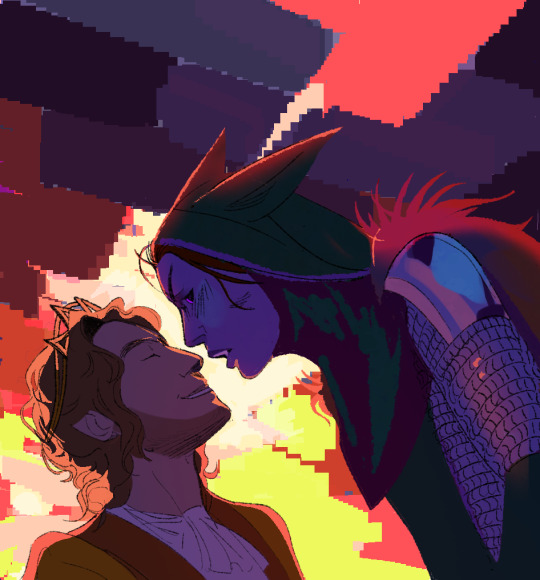
there's a gap in between
there's a gap where we meet
where i end and you begin
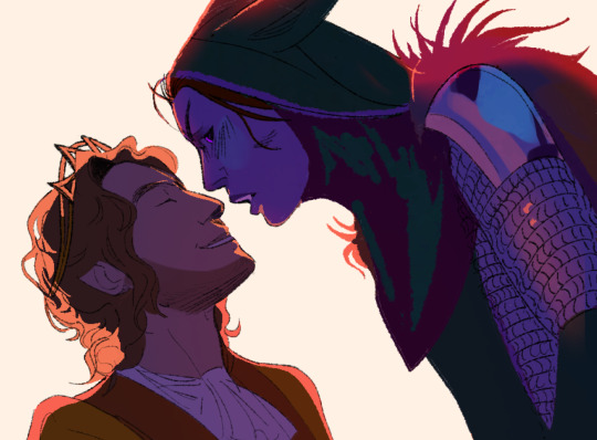
#lifesteal#lifesteal smp#lssmp#princezam#vitalasy#vitalazam#lifesteal season 4#i have been periodically redrawing this image unsatisfied with the results for the past 5 months i need someone to take it away from me#like fuck. whatever. my visual treatise on “Are you guys arguing or kissing”
160 notes
·
View notes
Text

nonsense scribbles
#the words unscrambled say ''Your purpose. what is it anyway? For what reason have you come here?' (with a comma instead of a period ofc)'#wanted to play around with scribbles n stuff#art#drey draws#accidentally made the canvas size of this Too Fucking Big so i now have to suffer the consequences#the consequences being that i had to resize it so the image quality is slightly worse than usual
2K notes
·
View notes
Text

to be sebastian vettel touching the butts of two f1 legends at the same time
#sorry i'm now deep in getty images#but i'm still sick so i can't look at my phone for long periods of time and be very annoying#but i want to know if he squeezed or was it a gentle tap?#lewis hamilton#sebastian vettel#micheal schumacher#f1#jo.text
308 notes
·
View notes
Text

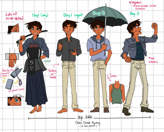
Hattori heiji wardrobe part 3
[part 2] [part 4]
#this period cements the naniwa serial murder wallet-stab case outfit as heiji's main image wardrobe#my art#dcmk fanart#detective conan#hattori heiji#heiji keep getting arc that continuously lasts for 2+ days... (<- in pain cuz i had to draw way more than i thought)#also taking this chance to record his phone evolution ^-^#heiji outfit
483 notes
·
View notes
Text

a study of liv's handsome face :') also a van practice drawing! ☀️
#yellowjackets#yellowjackets fanart#van palmer#liv hewson#do you know how hard it is to keep looking at images of liv for long periods of time… without dying… THEY ARE J;uSt So Attr?actIVE#i survived >:)
213 notes
·
View notes
Note
For how much Machete is described by others as off-putting, he really is a beautiful dog. Does Vasco ever tell him so? That his eyes make him look earnest, his fur the most comforting shade of white like cream, the way his ears catch light like stained glass? If someone doesn't tell him so, he'd forever think he was ugliest duckling
I think Vasco definitely tries, sincerely and often, but Machete is very reluctant to accept compliments and positive feedback. Especially if it's about something as personal and innate as his looks.
#he quietly spends a lot of time and effort trying to make himself look his best so appearances aren't a trivial thing for him#he's always very clean and neat and presentable#except on those occasions when he's soaked in blood but that's totally besides the point#white fur is kind of high maintenance any tiny bit of dirt or staining becomes an eyesore and if it dries it may be hard to remove#he bathes very frequently way more than average considering the time period#some of the outfits he wears are worth more than the combined lifetime earnings of like six generations of his family#silk was outrageously expensive and the brightest red dye came from pulverized cochineal insects that had to be imported from America#which had been colonized less than a century ago so those tiny little cactus bugs were really troublesome to get and the demand was huge#he doesn't quite have the nerve to wear perfume despite it's widespread popularity at the time#but he makes sure the smell of frankincense burned during church services sticks to his fur and clothes#in general when you spend your entire life around strict emotionally congested highly religious men#you might not end up developing a very healthy self-esteem or body image#once you've internalized that sense of inferiority it's hard to unlearn it#he's so thirsty for approval and praise but when he receives some he immediately gets uncomfortable and distrustful and vaguely angry#he absolutely struggles to compliment people back as well at least on any meaningful and personal level so there's that#answered#anonymous#Machete
289 notes
·
View notes
Text
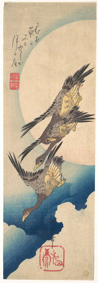

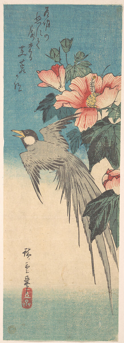
Left to Right: Wild Geese Flying under the Full Moon, Snowy Gorge, Hibiscus Mutabilis and Long-Tailed Bird
Utagawa Hiroshige (1797–1858)
#art#japanese woodblock#woodblock print#utagawa hiroshige#ukiyoe#ukiyo-e#japanese art#illustration#nature#edo period#art history#edo art#favorite artists#god bless high res public domain images#doing gods work#need to get some of the ukiyoe prints printed again... had some in my dorm in college#posted art
260 notes
·
View notes
Note
Can you make a oneshot about how Simon or woud be when We Are on Are periods and they have to go out and my pads and tampong

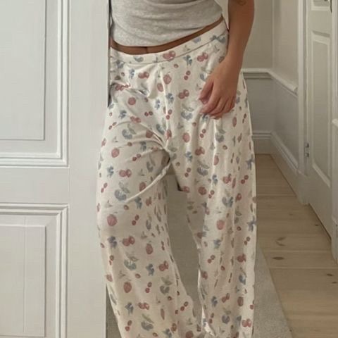

Period -W2S/Miniminter
Words: 0.3k+
Warnings: none just fluff.
In which the boys take care of you while you’re on your period.
a/n: thank you for all of your lovely requests! I love writing them🫶🏼 I hope this is what you were thinking and you enjoy💞

W2S:
“How you doing?” Harry asked after he kicked his shoes off and dropped his backpack by the front door. “I’m ok. Did filming go okay?” I asked referring to the long shoot he had today. “Yea I’m actually really excited to see the final edit.” He answered before plonking himself down on the couch next to me. He scanned his eyes over my frame, curled up in a ball with a blanket wrapped around my body. Shuffling closer to me I unravelled myself and leaned into him. He wrapped his arms around me and held me tight then placed his large, warm hand under my pyjama top and onto the base of my stomach, slightly reliving my uncomfortable cramps. I sighed contently “thank you.” He answered with a soft kiss to my temple then used his free hand to gently stroke my hair.
Miniminter:
“Simon?” I stepped out of his bathroom. “Yea babe?” He looked up from his phone. “I just started my period and I- I didn’t bring anything with me.” I said nervously. We’ve only been dating for around 3 months so haven’t really had that many conversations about anything to do with my monthly cycle. He stood from the bed “do you feel ok?” He asked, placing his hands on my cheeks. I leaned into his touch “yea.” I replied quietly. “Good. I’ll run out and grab you some stuff.” He said walking back over to the bed and grabbing his phone. “Oh Si, you don’t have to.” He shook his head “I’ll be back in 15.” He said with a light smile.
He came back almost exactly 15 minutes later with an array of different sanitary products, saying “I wasn’t sure which ones you liked”, along with a bar of dairy milk chocolate and popcorn. “Wanna watch a movie in bed?” He asked. I smiled “you’re so cute.”
#w2s#harry lewis#harry w2s#wrotoshaw#w2s imagine#wroetoshaw x reader#wroetoshaw oneshot#wroetoshaw#harry lewis x reader#w2s x reader#simon minter x reader#miniminter x reader#miniminter#simon minter#fluff#period#fanfic#image#oneshot#x female reader#x fem!reader#x y/n#x you#x reader
95 notes
·
View notes
Text
Friendly but firm reminder that neither image descriptions nor audio/video transcripts should be in weird fonts, colors, or small text. With audio transcripts, it's presumably obvious why readability makes or breaks a caption, and with image descriptions, I genuinely understand the source of the misconceptions, but not all people who use IDs use screen readers. Some use large text instead, and weird fonts mess with that.
This is text that I personally have to squint to read more than a few words of, because the font has such a low weight.
["Chat" text reads: "This is text that I personally have to squint to read more than a few words of, because the font has such a low weight."]
Having to read text like this might be difficult for some people, or possible but eyestrain-inducing for others.
[Italicized text reads: "Having to read text like this might be difficult for some people, or possible but eyestrain-inducing for others."]
Here, the font is fine, but the colors are too low-contrast to be read on lots of tumblr themes.
[Green text reads: "Here, the font is fine, but the colors are too low-contrast to be read on lots of tumblr themes."]
And this is just way too small to be a useful accessibility feature for anyone who reads image descriptions directly, as well as anyone who reads transcripts.
[Small text reads: "And this is just way too small to be a useful accessibility feature for anyone who reads image descriptions directly, as well as anyone who read transcripts."]
For people using desktop who can't read some of this text, XKit Rewritten's AccessKit provides options to disable special colors and fonts (not to mention a nice alt text display option). But to my knowledge, there's no workaround for mobile users. That's why it's critical to include captions that are accessible themselves!
If you're on desktop and able to copy-paste, and a post you intend to reblog has an inaccessibly formatted ID or transcript, please consider taking just a second to copy the description in plain text. (Same for IDs under read more tbh, because we all know how glitchy that function can be.)
I do this often, and have never had anyone get mad about it — only the occasional sincere question as to why. Addressing misconceptions from well-intentioned users — and trust me, I used to have misconceptions too — is the best way to make Tumblr (or any other comparable website) more accessible, one or two posts at a time.
(guide to image descriptions) / (second alternate guide)
(guide to describing tags) / (make your blog's colors readable)
#accessibility#image descriptions#like genuinely i totally understand if you didn't know this#i periodically find old posts on my blog where i did IDs in italics and go back to edit it into plaintext#but i feel like i'm seeing it a lot lately so it's important to put this out there
155 notes
·
View notes
Text

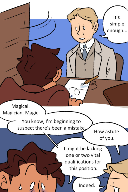
I started reading A Marvellous Light and I'm already deeply invested in this poor bastard just having THE worst first day of his new desk job.
#and then things only proceed to get worse from there#a marvellous light#robin blyth#edwin courcey#PLEASE don't pay attention to my actual like. character design or anything. i started this yesterday because this scene made me laugh#i had to exorcise it before i could continue reading#so hair and clothing do not match the time period very well#also i have now read SIGNIFICANTLY more and my mental image of them has evolved#but c'est la vie it will work for a quick GO READ THIS BOOK doodle#go read this book#i am in love i can barely put it down long enough to slap colour on this#my art
370 notes
·
View notes
Text


*gently places this shitty ms paint comic on the table in front of you* dinner is served, sire
#humbly offers you this#fan art#i cant focus on anything but medic tf2#tf2 medic#medic tf2#tf2#medic fanart#tf2 fanart#this is extremely self indulgent#when is my work not tho#anyway yeah i hope you like it#come get yall food#also period cramps do suck a lot#inspired by that one fucking image of herbert west saying uterus removal
63 notes
·
View notes