#on learned ignorance
Note
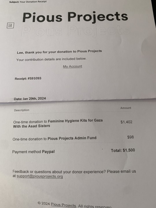
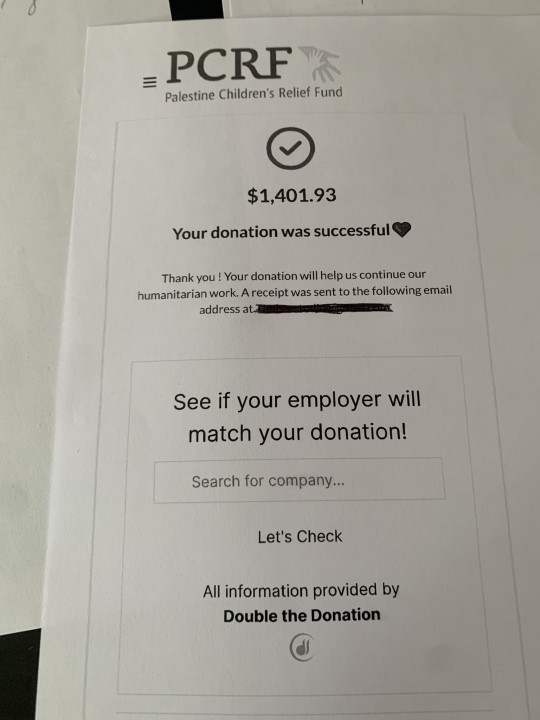
Could I request Medic having The Mom Grip on Scout’s shoulder after the speedy moron almost let a mercenary secret slip while they weee getting groceries?
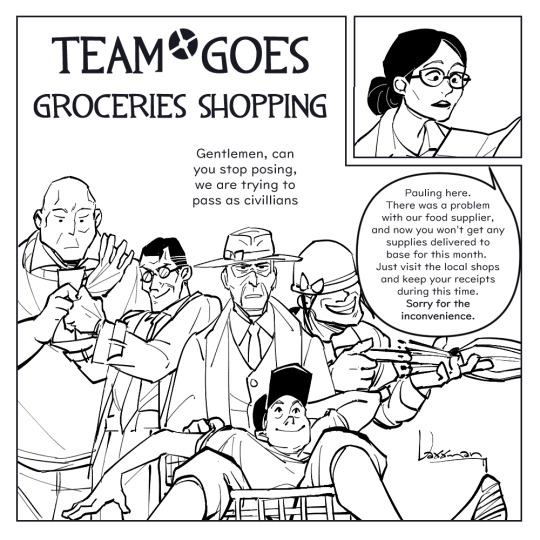


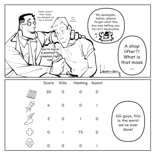
Three Europeans and two Americans walk into a grocery store in New Mexico.
I hope this is the right meme.
More silliness below.
This comic is the antithesis of the "wtf is a kilometre" joke.
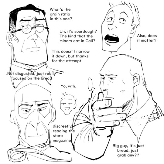
The faces they make when they can't quite identify the type of brown bread in the bread aisle.
You don't know how [insert nationality here] you are until you go overseas and things are different.
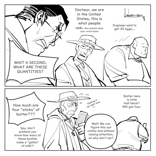
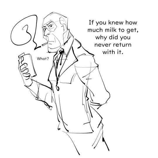
Spy obviously has no problems with pretending to know how much a gallon of milk is, he just peeks into his conversion chart notes, pretending it's his shopping list.
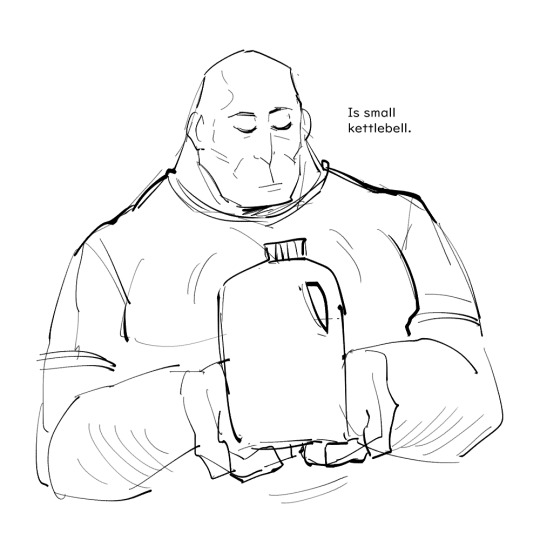
I want to think Heavy is completely fine with having to readjust to a new unit system, he just eyeballs most practical things anyways by holding them up and mumbling about how they approximately weigh like a chicken or his kettle bell etc. He's always been living in practical ignorant bliss.
Medic has a peer reviewed meltdown the first time he realises there's no uniformity in "a cup of ____" because every object has different densities. He's diligent about memorising the conversion rates for ounces, pounds, the most common things etc., and recovers ok. He goes through the same stages of grief rage when he finds out about distances and lengths.
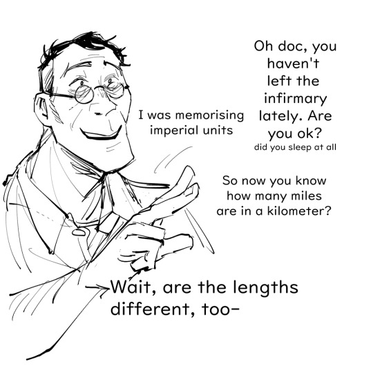
Just remember four inches are 10.16 cm and pray no one asks you to specify anything bigger than inches.
Everyone does a mental victory lap when they manage to guess how much Celsius the weather is because they keep forgetting it's Celsius*5/9+32=Fahrenheit, Engineer reminds them patiently.
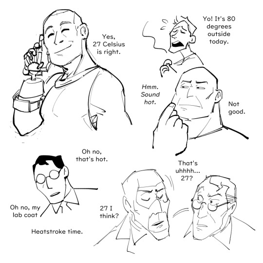
The true victories are the correct temperature guesses we've made along the way.
One time, a friend asked me if I actually knew how much a tablespoon of flour was in gramms to convince me that metric users also make use of volume based units without thinking about them. But little did she know a heaped spoonful of 405 flour is about 15g and a level tablespoon is 10g.
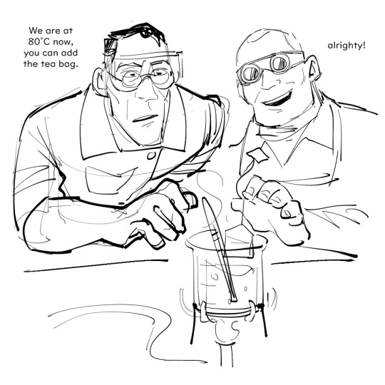
They claim Oolong just tastes better when it's boiled to 80°C exactly with a Bunsen burner.
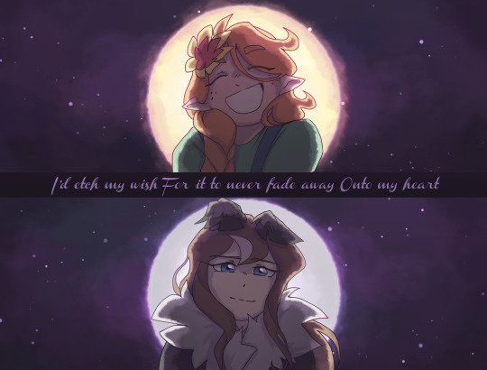
You only asked for one scene but somehow I came up with a bunch of other things. This post was drawn across 2 months so the artstyle is all over the place. Thanks for your ask!
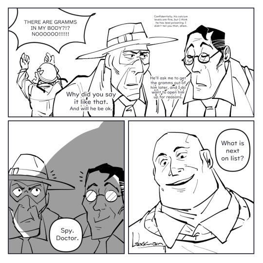
#team fortress 2#tf2#tf2 medic#tf2 scout#tf2 spy#tf2 heavy#tf2 soldier#Medic's reaction to a stick of butter is 100% based on my own reaction after reading an American recipe for the first time#Like I didn't know butter in America came in this normed stick-form I genuinely thought it was some arbitrary unit like ??? A Stick??#As in I didn't know if the recipe required the butter to be in this specific shape; like sometimes you have to add butter in shaves or molt#no biggie lemme whittle away at my butter block until it's shaped like a stick? And then I learnt it was the portions that butter comes in#Cut me some slack; I'm used to recipes using eggs as the scale-up ingredient; not butter#I also learnt that medical labels is where metric units are mostly encountered simply because medicine is international#But that is the main reason why I think Medic would not realise he'd have to deal with imperial units until he goes grocery shopping#The man's just been ignoring the “oz” information right below everything he's ever used; out of sight out of mind#I want to think Engi is the most normal person about the entire metric-imperial-units thing he just does some mental arithmetic and done#King just learned système international d'unités during one of his 11 phds; it's not unrealistic
1K notes
·
View notes
Text
I love you messy artstyle i love you visible brush strokes I love you textures and rough edges I love you imperfections I love you roughness and colour blobs I love you scratchy sketches and bold stylisation and dirt and imperfections I love you ugly and raw emotion!!!!! ❤️
#i talk sometimes#art talk#i made a tweet like this on twatter ages ago but i've been feeling this a lot lately#also this is the start of me writing more on this blog and not only using it as art because who cares!! i don't!!#I wanna translate raw emotion into colors and shapes. I wanna know where to ignore all details and where to go ham you feel me?#i used to dream about developing a style like for MtG where it looked like a masterful oil painting that oozes realism and details#and i've realised the last two years or so that I would actually hate that for me. I know I wouldn't enjoy doing it. For myself.#it's that pipeline from wanting to be the perfect realistic wotc artist to accepting that I will never be that#instead i wanna learn how to stylise better and get a good brush economy going yknow. I wanna be bolder.#i doubt i'll ever be as incredible as all these MtG artists no matter what anyone says. but it's ok!! i don't have to be!!!#i just luv art man!!
3K notes
·
View notes
Text


redundant zinru doodles while trying to test and learn an ipad
#digital#sketches#zinru#oc#ignore i forgot most of his tattoos in all of them LOL#trying to learn how to use an ipad#i dont like procreate though and i know that makes me a heathen
1K notes
·
View notes
Text
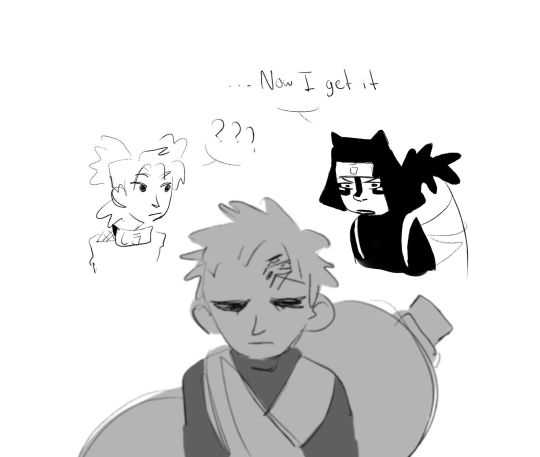
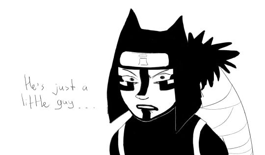
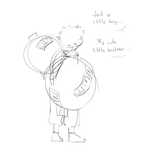
Just a little dude
#i love kankuro#and i really love this pre-shippuden gaara#he's still cold and menacing yet he's trying his best to be normal and is learning how to love people again that's a nice mix#sand siblings#naruto fanart#naruto#sabaku no gaara#gaara#gaara of the desert#gaara of the sand#kankuro#temari#ignore the kanji#my art
3K notes
·
View notes
Photo

thinking about the... potential clawthorne woodcarving mentorship.
+ bonus cuz also thinking abt how if hunter ever met dell's palisman and got reminded of flapjack, he'd probably feel bad abt making that association cuz he knows what it's like to be seen only as someone's different version (even though the bird wouldn't mind much so lol)
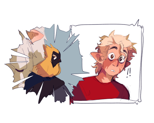
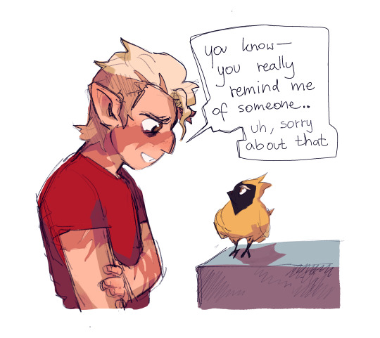
#eda having that palistrom seed.. hunter saying he wants to learn how to carve palisman... his relation to clawthornes. it HAS to mean STH js#the owl house#toh#hunter toh#toh hunter#hahaa always thinking abt hunter growing a soft spot for palismen and loving creating and bringing them to life#but never being able to replace flapjack no matter how many palismen for other ppl he carves. I'M GONNA-#:((((( :///#like he's not going to want to replace flapjack just like that rn. cuz he LOVES that bird. it's gonna be so hard for him to just.. Move On#and flapjack's a PART of him.. so very curious where they'll go with this because..... HM. HM like he serves as his disability aid almost#and he can't just REMAKE him. but he cannot also just.... ignore what happened straight away. but it's also important to heal#but whatever he decides to do i feel like he'd love to just............ create. whether it be for himself or others#BUT GAH. ANYWAY XKJSJSK wrote an essay abt this already don't need to write one in the tags TOO. so uh .. yea#little guy.. pls find happiness#my art#fanart#hunter#hunter noceda#hunter wittebane#eda#eda clawthorne#dell#dell clawthorne#dell's palisman#toh art#edalyn clawthorne#also like...... if flapjack and dell's palisman were caleb's and evelyn's palismen...... and knew each other........#and while flapjack was waiting for his new person at the bat queen's cave dell's palisman was being passed down clawthorne generations#OUUHGHHHHGHHHH they were probably friends..... they Knew each other#what's up with you you mysterious yellow bird with eyebrows...... what's your story
19K notes
·
View notes
Text


mr anxiety
#maccadam#blitzbee#bumblebee#blitzwing#tfa#vart#pls ignore how i learned blitzys wings are NOT in fact like every other wing in tf existence & that i only implemented that in last panel
1K notes
·
View notes
Text
“we sent yuan away so his feelings could subside” you sent him to gay rizz bootcamp is what you did
#watching this as it airs week to week is torture but it also means more free time to be generate shitposts and be unwell#i like to think that the new york gays welcomed him with open arms#'oh he learned about the 21-day habit theory at college' that man majored in IT or game design.#if he studied psychology he would know that theory is a busted myth#the queer club on the other hand was just throwing ideas at him left and right#mutuals feel free to ignore this one#unknown 2024#unknown the series#taiwanese bl#CJ's edits
627 notes
·
View notes
Text

@mcyt-yuri-week day 1 Sun/Moon awooga awooga
(Aiko - Star/スター) (Lyrics TL)
(Yeah you're only gonna see GemPearl from me)
#mcytyuriweekvalentines#ignore the fact that the song name is star and not sun or moon........ it made me think of gempearl a lot alright#gempearl#shinyduo#shiny duo#pearlgem#this isnt as good as I wanted but look. Theres a lot of yuri to draw this week so Im gonna have to stop myself at some point#to have enough time to post them. And it'll keep me from overstressing about every little detail haha#again. trying new stuff!!! So my art wont look the way I want it to when I do but no shame in trying. Always learning baby#trafficshipping#hermitshipping#trafficblr#writing is in alt text if the cursive is unreadable sorry!! Literally picked the most readable one I had haha cursive fonts are painn#tubby art
675 notes
·
View notes
Text
Oh 🥺
435 notes
·
View notes
Text
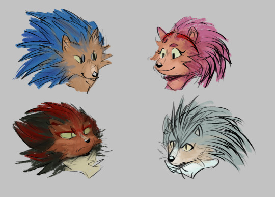
guhhh... even more hogs......
#my stuff#sonic#sonic fanart#sth#sonic the hedgehog#sth fanart#amy rose#shadow the hedgehog#silver the hedgehog#ignore that the art style changes w every character#i am Learning and thriving. and plaiyng#i like shadows the best tho hes sillay
814 notes
·
View notes
Text
why Aurora's art is genius
It's break for me, and I've been meaning to sit down and read the Aurora webcomic (https://comicaurora.com/, @comicaurora on Tumblr) for quite a bit. So I did that over the last few days.
And… y'know. I can't actually say "I should've read this earlier," because otherwise I would've been up at 2:30-3am when I had responsibilities in the morning and I couldn't have properly enjoyed it, but. Holy shit guys THIS COMIC.
I intended to just do a generalized "hello this is all the things I love about this story," and I wrote a paragraph or two about art style. …and then another. And another. And I realized I needed to actually reference things so I would stop being too vague. I was reading the comic on my tablet or phone, because I wanted to stay curled up in my chair, but I type at a big monitor and so I saw more details… aaaaaand it turned into its own giant-ass post.
SO. Enjoy a few thousand words of me nerding out about this insanely cool art style and how fucking gorgeous this comic is? (There are screenshots, I promise it isn't just a wall of text.) In my defense, I just spent two semesters in graphic design classes focusing on the Adobe Suite, so… I get to be a nerd about pretty things…???
All positive feedback btw! No downers here. <3
---
I cannot emphasize enough how much I love the beautiful, simple stylistic method of drawing characters and figures. It is absolutely stunning and effortless and utterly graceful—it is so hard to capture the sheer beauty and fluidity of the human form in such a fashion. Even a simple outline of a character feels dynamic! It's gorgeous!
Though I do have a love-hate relationship with this, because my artistic side looks at that lovely simplicity, goes "I CAN DO THAT!" and then I sit down and go to the paper and realize that no, in fact, I cannot do that yet, because that simplicity is born of a hell of a lot of practice and understanding of bodies and actually is really hard to do. It's a very developed style that only looks simple because the artist knows what they're doing. The human body is hard to pull off, and this comic does so beautifully and makes it look effortless.
Also: line weight line weight line weight. It's especially important in simplified shapes and figures like this, and hoo boy is it used excellently. It's especially apparent the newer the pages get—I love watching that improvement over time—but with simpler figures and lines, you get nice light lines to emphasize both smaller details, like in the draping of clothing and the curls of hair—which, hello, yes—and thicker lines to emphasize bigger and more important details and silhouettes. It's the sort of thing that's essential to most illustrations, but I wanted to make a note of it because it's so vital to this art style.
THE USE OF LAYER BLENDING MODES OH MY GODS. (...uhhh, apologies to the people who don't know what that means, it's a digital art program thing? This article explains it for beginners.)
Bear with me, I just finished my second Photoshop course, I spent months and months working on projects with this shit so I see the genius use of Screen and/or its siblings (of which there are many—if I say "Screen" here, assume I mean the entire umbrella of Screen blending modes and possibly Overlay) and go nuts, but seriously it's so clever and also fucking gorgeous:
Firstly: the use of screened-on sound effect words over an action? A "CRACK" written over a branch and then put on Screen in glowy green so that it's subtle enough that it doesn't disrupt the visual flow, but still sticks out enough to make itself heard? Little "scritches" that are transparent where they're laid on without outlines to emphasize the sound without disrupting the underlying image? FUCK YES. I haven't seen this done literally anywhere else—granted, I haven't read a massive amount of comics, but I've read enough—and it is so clever and I adore it. Examples:


Secondly: The beautiful lighting effects. The curling leaves, all the magic, the various glowing eyes, the fog, the way it's all so vividly colored but doesn't burn your eyeballs out—a balance that's way harder to achieve than you'd think—and the soft glows around them, eeeee it's so pretty so pretty SO PRETTY. Not sure if some of these are Outer/Inner Glow/Shadow layer effects or if it's entirely hand-drawn, but major kudos either way; I can see the beautiful use of blending modes and I SALUTE YOUR GENIUS.
I keep looking at some of this stuff and go "is that a layer effect or is it done by hand?" Because you can make some similar things with the Satin layer effect in Photoshop (I don't know if other programs have this? I'm gonna have to find out since I won't have access to PS for much longer ;-;) that resembles some of the swirly inner bits on some of the lit effects, but I'm not sure if it is that or not. Or you could mask over textures? There's... many ways to do it.
If done by hand: oh my gods the patience, how. If done with layer effects: really clever work that knows how to stop said effects from looking wonky, because ugh those things get temperamental. If done with a layer of texture that's been masked over: very, very good masking work. No matter the method, pretty shimmers and swirly bits inside the bigger pretty swirls!
Next: The way color contrast is used! I will never be over the glowy green-on-black Primordial Life vibes when Alinua gets dropped into that… unconscious space?? with Life, for example, and the sharp contrast of vines and crack and branches and leaves against pitch black is just visually stunning. The way the roots sink into the ground and the three-dimensional sensation of it is particularly badass here:

Friggin. How does this imply depth like that. HOW. IT'S SO FREAKING COOL.
A huge point here is also color language and use! Everybody has their own particular shade, generally matching their eyes, magic, and personality, and I adore how this is used to make it clear who's talking or who's doing an action. That was especially apparent to me with Dainix and Falst in the caves—their colors are both fairly warm, but quite distinct, and I love how this clarifies who's doing what in panels with a lot of action from both of them. There is a particular bit that stuck out to me, so I dug up the panels (see this page and the following one https://comicaurora.com/aurora/1-20-30/):

(Gods it looks even prettier now that I put it against a plain background. Also, appreciation to Falst for managing a bridal-carry midair, damn.)
The way that their colors MERGE here! And the immense attention to detail in doing so—Dainix is higher up than Falst is in the first panel, so Dainix's orange fades into Falst's orange at the base. The next panel has gold up top and orange on bottom; we can't really tell in that panel where each of them are, but that's carried over to the next panel—

—where we now see that Falst's position is raised above Dainix's due to the way he's carrying him. (Points for continuity!) And, of course, we see the little "huffs" flowing from orange to yellow over their heads (where Dainix's head is higher than Falst's) to merge the sound of their breathing, which is absurdly clever because it emphasizes to the viewer how we hear two sets of huffing overlaying each other, not one. Absolutely brilliant.
(A few other notes of appreciation to that panel: beautiful glows around them, the sparks, the jagged silhouette of the spider legs, the lovely colors that have no right to make the area around a spider corpse that pretty, the excellent texturing on the cave walls plus perspective, the way Falst's movements imply Dainix's hefty weight, the natural posing of the characters, their on-point expressions that convey exactly how fuckin terrifying everything is right now, the slight glows to their eyes, and also they're just handsome boys <3)
Next up: Rain!!!! So well done! It's subtle enough that it never ever disrupts the impact of the focal point, but evident enough you can tell! And more importantly: THE MIST OFF THE CHARACTERS. Rain does this irl, it has that little vapor that comes off you and makes that little misty effect that plays with lighting, it's so cool-looking and here it's used to such pretty effect!
One of the panel captions says something about it blurring out all the injuries on the characters but like THAT AIN'T TOO BIG OF A PROBLEM when it gets across the environmental vibes, and also that'd be how it would look in real life too so like… outside viewer's angle is the same as the characters', mostly? my point is: that's the environment!!! that's the vibes, that's the feel! It gets it across and it does so in the most pretty way possible!
And another thing re: rain, the use of it to establish perspective, particularly in panels like this—

—where we can tell we're looking down at Tynan due to the perspective on the rain and where it's pointing. Excellent. (Also, kudos for looking down and emphasizing how Tynan's losing his advantage—lovely use of visual storytelling.)
Additionally, the misting here:

We see it most heavily in the leftmost panel, where it's quite foggy as you would expect in a rainstorm, especially in an environment with a lot of heat, but it's also lightly powdered on in the following two panels and tends to follow light sources, which makes complete sense given how light bounces off particles in the air.
A major point of strength in these too is a thorough understanding of lighting, like rim lighting, the various hues and shades, and an intricate understanding of how light bounces off surfaces even when they're in shadow (we'll see a faint glow in spots where characters are half in shadow, but that's how it would work in real life, because of how light bounces around).
Bringing some of these points together: the fluidity of the lines in magic, and the way simple glowing lines are used to emphasize motion and the magic itself, is deeply clever. I'm basically pulling at random from panels and there's definitely even better examples, but here's one (see this page https://comicaurora.com/aurora/1-16-33/):

First panel, listed in numbers because these build on each other:
The tension of the lines in Tess's magic here. This works on a couple levels: first, the way she's holding her fists, as if she's pulling a rope taut.
The way there's one primary line, emphasizing the rope feeling, accompanied by smaller ones.
The additional lines starbursting around her hands, to indicate the energy crackling in her hands and how she's doing a good bit more than just holding it. (That combined with the fists suggests some tension to the magic, too.) Also the variations in brightness, a feature you'll find in actual lightning. :D Additional kudos for how the lightning sparks and breaks off the metal of the sword.
A handful of miscellaneous notes on the second panel:
The reflection of the flames in Erin's typically dark blue eyes (which bears a remarkable resemblance to Dainix, incidentally—almost a thematic sort of parallel given Erin's using the same magic Dainix specializes in?)
The flowing of fabric in the wind and associated variation in the lineart
The way Erin's tattoos interact with the fire he's pulling to his hand
The way the rain overlays some of the fainter areas of fire (attention! to! detail! hell yeah!)
I could go on. I won't because this is a lot of writing already.
Third panel gets paragraphs, not bullets:
Erin's giant-ass "FWOOM" of fire there, and the way the outline of the word is puffy-edged and gradated to feel almost three-dimensional, plus once again using Screen or a variation on it so that the stars show up in the background. All this against that stunning plume of fire, which ripples and sparks so gorgeously, and the ending "om" of the onomatopoeia is emphasized incredibly brightly against that, adding to the punch of it and making the plume feel even brighter.
Also, once again, rain helping establish perspective, especially in how it's very angular in the left side of the panel and then slowly becomes more like a point to the right to indicate it's falling directly down on the viewer. Add in the bright, beautiful glow effects, fainter but no less important black lines beneath them to emphasize the sky and smoke and the like, and the stunningly beautiful lighting and gradated glows surrounding Erin plus the lightning jagging up at him from below, and you get one hell of an impactful panel right there. (And there is definitely more in there I could break down, this is just a lot already.)
And in general: The colors in this? Incredible. The blues and purples and oranges and golds compliment so well, and it's all so rich.
Like, seriously, just throughout the whole comic, the use of gradients, blending modes, color balance and hues, all the things, all the things, it makes for the most beautiful effects and glows and such a rich environment. There's a very distinct style to this comic in its simplified backgrounds (which I recognize are done partly because it's way easier and also backgrounds are so time-consuming dear gods but lemme say this) and vivid, smoothly drawn characters; the simplicity lets them come to the front and gives room for those beautiful, richly saturated focal points, letting the stylized designs of the magic and characters shine. The use of distinct silhouettes is insanely good. Honestly, complex backgrounds might run the risk of making everything too visually busy in this case. It's just, augh, so GORGEOUS.
Another bit, take a look at this page (https://comicaurora.com/aurora/1-15-28/):

It's not quite as evident here as it is in the next page, but this one does some other fun things so I'm grabbing it. Points:
Once again, using different colors to represent different character actions. The "WHAM" of Kendal hitting the ground is caused by Dainix's force, so it's orange (and kudos for doubling the word over to add a shake effect). But we see blue layered underneath, which could be an environmental choice, but might also be because it's Kendal, whose color is blue.
And speaking off, take a look at the right-most panel on top, where Kendal grabs the spear: his motion is, again, illustrated in bright blue, versus the atmospheric screened-on orange lines that point toward him around the whole panel (I'm sure these have a name, I think they might be more of a manga thing though and the only experience I have in manga is reading a bit of Fullmetal Alchemist). Those lines emphasize the weight of the spear being shoved at him, and their color tells us Dainix is responsible for it.
One of my all-time favorite effects in this comic is the way cracks manifest across Dainix's body to represent when he starts to lose control; it is utterly gorgeous and wonderfully thematic. These are more evident in the page before and after this one, but you get a decent idea here. I love the way they glow softly, the way the fire juuuust flickers through at the start and then becomes more evident over time, and the cracks feel so realistic, like his skin is made of pottery. Additional points for how fire begins to creep into his hair.
A small detail that's generally consistent across the comic, but which I want to make note of here because you can see it pretty well: Kendal's eyes glow about the same as the jewel in his sword, mirroring his connection to said sword and calling back to how the jewel became Vash's eye temporarily and thus was once Kendal's eye. You can always see this connection (though there might be some spots where this also changes in a symbolic manner; I went through it quickly on the first time around, so I'll pay more attention when I inevitably reread this), where Kendal's always got that little shine of blue in his eyes the same as the jewel. It's a beautiful visual parallel that encourages the reader to subconsciously link them together, especially since the lines used to illustrate character movements typically mirror their eye color. It's an extension of Kendal.
Did I mention how ABSOLUTELY BEAUTIFUL the colors in this are?
Also, the mythological/legend-type scenes are illustrated in familiar style often used for that type of story, a simple and heavily symbolic two-dimensional cave-painting-like look. They are absolutely beautiful on many levels, employing simple, lovely gradients, slightly rougher and thicker lineart that is nonetheless smoothly beautiful, and working with clear silhouettes (a major strength of this art style, but also a strength in the comic overall). But in particular, I wanted to call attention to a particular thing (see this page https://comicaurora.com/aurora/1-12-4/):

The flowing symbolic lineart surrounding each character. This is actually quite consistent across characters—see also Life's typical lines and how they curl:

What's particularly interesting here is how these symbols are often similar, but not the same. Vash's lines are always smooth, clean curls, often playing off each other and echoing one another like ripples in a pond. You'd think they'd look too similar to Life's—but they don't. Life's curl like vines, and they remain connected; where one curve might echo another but exist entirely detached from each other in Vash's, Life's lines still remain wound together, because vines are continuous and don't float around. :P
Tahraim's are less continuous, often breaking up with significantly smaller bits and pieces floating around like—of course—sparks, and come to sharper points. These are also constants: we see the vines repeated over and over in Alinua's dreams of Life, and the echoing ripples of Vash are consistent wherever we encounter him. Kendal's dream of the ghost citizens of the city of Vash in the last few chapters is filled with these rippling, echoing patterns, to beautiful effect (https://comicaurora.com/aurora/1-20-14/):

They ripple and spiral, often in long, sinuous curves, with smooth elegance. It reminds me a great deal of images of space and sine waves and the like. This establishes a definite feel to these different characters and their magic. And the thing is, that's not something that had to be done—the colors are good at emphasizing who's who. But it was done, and it adds a whole other dimension to the story. Whenever you're in a deity's domain, you know whose it is no matter the color.
Regarding that shape language, I wanted to make another note, too—Vash is sometimes described as chaotic and doing what he likes, which is interesting to me, because smooth, elegant curves and the color blue aren't generally associated with chaos. So while Vash might behave like that on the surface, I'm guessing he's got a lot more going on underneath; he's probably much more intentional in his actions than you'd think at a glance, and he is certainly quite caring with his city. The other thing is that this suits Kendal perfectly. He's a paragon character; he is kind, virtuous, and self-sacrificing, and often we see him aiming to calm others and keep them safe. Blue is such a good color for him. There is… probably more to this, but I'm not deep enough in yet to say.
And here's the thing: I'm only scratching the surface. There is so much more here I'm not covering (color palettes! outfits! character design! environment! the deities! so much more!) and a lot more I can't cover, because I don't have the experience; this is me as a hobbyist artist who happened to take a couple design classes because I wanted to. The art style to this comic is so clever and creative and beautiful, though, I just had to go off about it. <3
...brownie points for getting all the way down here? Have a cookie.
#aurora comic#aurora webcomic#comicaurora#art analysis#...I hope those are the right tags???#new fandom new tagging practices to learn ig#much thanks for something to read while I try to rest my wrists. carpal tunnel BAD. (ignore that I wrote this I've got braces ok it's fine)#anyway! I HAVE. MANY MORE THOUGHTS. ON THE STORY ITSELF. THIS LOVELY STORY#also a collection of reactions to a chunk of the comic before I hit the point where I was too busy reading to write anything down#idk how to format those tho#...yeet them into one post...???#eh I usually don't go off this much these days but this seems like a smaller tight-knit fandom so... might as well help build it?#and I have a little more time thanks to break so#oh yes also shoutout to my insanely awesome professor for teaching me all the technical stuff from this he is LOVELY#made an incredibly complex program into something comprehensible <3#synapse talks
744 notes
·
View notes
Text
DP x DC AU: Danny desperately wants to find the explosion guy. Tim is really good at covering his tracks... he didn't account for ghosts.
The explosions make it onto TV as purported terror activity and most people haven't heard of that part of the world much less ever given a second thought to care about it. The only real reason it gets reported on has something to do with the Justice League and... Danny knows too much.
He's been in training for Clockwork's court (which he's suspicious of- feels like kingly duty bullshit- but Danny is playing along out of curiosity for now) and he's learned a lot about how the living and non-living worlds collide. That means learning about CW's usual suspects- one of which just happened to have a ton of bases around the area Danny was seeing on the news.
It didn't take long for Danny to try to piece together that whoever blew up Nanda Parbat was trying to fuck with the League of Shadows, and was doing it successfully. Less green portals in the world the better, same goes for assassins. But it gets Danny thinking... Maybe he can employ similar tactics on the GIW Bases that keep spawning on the edges of Amity Park. It would at least set them back while he and his friends navigated the help line desk to request Justice League intervention. None of them can leave Amity Park, so outreach is going to have to be creative.
So Danny figures he'll just find the guy. Call up some ghosts who were there, or er, came from there and get a profile and track him down. But the ghosts keep saying it was The Detective. Annoying!
Danny goes full conspiracy theory, gets Tucker and Sam involved, and begrudgingly asks Wes Weston his thoughts.
He hadn't expected Wes to garble out a thirty minute presentation (that had 100 more slides left to go before he cut it off) about how Batman totally trained with a cult and so did his kids. Danny kind of rolled his eyes but... hey, new avenue of searching in the Infinite Realms at least.
The ghosts confirm that Bombs is for sure not Batman's MO- But maybe his second kid would know? The second kid was already brought back to life though, so no way to easily reach him... Danny starts to realize that this might be the work of a Robin now. Wasn't the red one known for solving cold cases? (Sam provides this information- its a social faux pas to not know hero gossip at Gotham Galas- everything she's learned is against her will).
It all comes to a head when Danny goes about the hard task of opening a portal for the guy to come through at just the right time, explain the infinite realms so he doesn't panic and then describe what the fuck was going on with the GIW. It takes months, just over a full year, of random (educated guesses) portal generating- Finally, Red Robin drops into the land of the dead.
"So, you're the guy I've got to talk to about explosions right?" Danny enthusiastically asks.
Tim thinks he's died and landed in the after life following 56 hours of being awake and plummeting off the side of a building into a Lazarus pool. Nothing makes sense about the kid in front of him.
"Yeah, I got a guy for munitions." Tim answers cooly.
"How do you feel about secretly sanctioned government operations that violate protected rights?"
"Gotta get rid of 'em some how. Need me to point you in the right direction?" This might as well be happening.
#dcxdp#dpxdc#dp x dc#dc x dp#danny phantom#long post#tim drake#red robin#tim and danny team up to blow up the GIW au#Tim being known as the explosion guy is my favorite and i will not let this part of his lore go ignored#Jason is the munitions guy obviously and the ghosts go crazy over the gossip it enlights when he helps in amity park#Danny one hundred percent is living for this working relationship- what a weirdo -danny hasn't met someone stranger than himself in a min#tim bartering his services for a few more years of life and danny just pikachu facing him#Tim wants to improve his relations in the afterlife be he still completely thinks hes dead#danny: dude ur still alive#Tim: yeah thats the goal but i'll help you meet your goals first and then we can negotiate#Danny decides to make the guy super ghost rich (thinking big Haunt real estate) and send him home#Tim blows up the GIW with no remorse and with all the data back up for proper justice to be served court side#tim returns from the dead and this is how the bats learn that he's the one who blew up nanda parbat all those years ago#it takes danny so long to find tim bc tim was spiralling and only after bruce got back did he get into a normal routine enough to get got
643 notes
·
View notes
Text
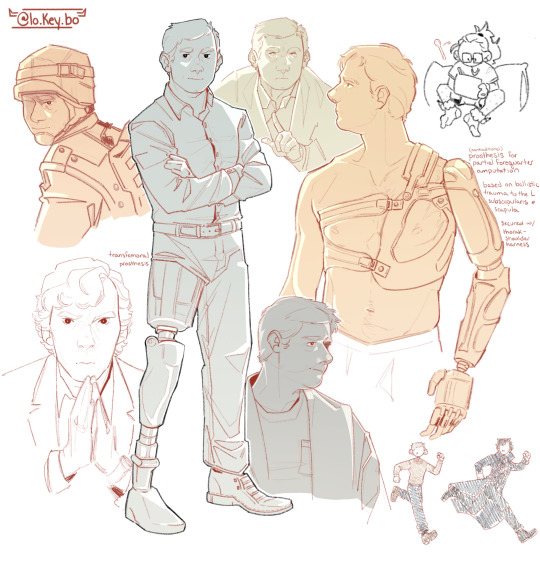
new year, old john watson doodles^^
#was toying with a few concepts because i think there needs to be more disability representation in media#and every adaptation ignoring john watson’s injuries is gettin on my nerves tbh fr#apologies for any errors regarding the prostheses!#i’m still learning and forequarter amputations can be finicky to find accurate information about#my art#the @ is my insta#i’ll learn how to draw him ONE of these days#art#fanart#fanartist#sherlock#bbc sherlock#sherlock bbc#john watson#sherlock holmes#johnlock#gen#martin freeman#benedict cumberbatch#amputee
688 notes
·
View notes
Text

Tubbo donated ALL his revenue this week to help palestine like he promised he will.
Keep boycotting companies that fund genocide and if you're able to donate to trusted charities.
#tubbo#qsmp#Tubbolive#Other streamers should learn something from him instead of ignoring the situation or making threads on twitter throwing a tantrum because#People asked them to do anything to help
500 notes
·
View notes
Text
grocery shopping
#flo’s sketchbook#i just thought of them cooking said groceries and now i want to make that ugh#they were supposed to be in the subway i had a whole ass background#too bad i didnt like it in the end#so i was like what if i just ignore the background and i don’t give the#don’t give them* one#but then it just seemed wrong so#here we are at a crosswalk waiting for the green light#it seems stupid now lmao#anyway enjoy please do tell me what you think about it if you want#and no i have no idea how light works yes i will learn at some point no i don’t know when#flo draws
513 notes
·
View notes
Text
(genshin impact spoilers incoming)
one aspect of furina's characterization that's pretty understated but that i really really really love is her intelligence and curiosity. usually in genshin, when a character's intelligence is an important trait of theirs, there are aspects of their design, writing, voice acting, etc, that very clearly tell you "hey this character is smart." albedo, for example, wears a labcoat, is always saying big sciency words in a calm, rational tone of voice, and other characters are always talking about how smart he is
but furina? nothing about her on the surface suggests that she's a "smart" character - quite the opposite, in fact. superficially, she's introduced as a bratty, conceited, overconfident person who actually has no idea what she's doing. we eventually learn in the archon quest that that was all an act, but even after she regains her freedom, nothing about her really seems archetypically intelligent, at least at face value
instead, furina's intelligence is always shown rather than told (the only exception being nahida's voiceline about her). she had an intelligence network across teyvat feeding her information, and we saw in the flashback how she directed researchers to study the prophecy and potential ways of stopping it. before things like lyney's trial or directing the two musketeers, she'd stay up all night planning and piecing things together all on her own. she loves learning new things, she has lines in the teapot about how, when she's interested in something, she wants to become the most knowledgeable person in the topic, and also how she'd like to disassemble the teapot itself to learn how it works, and she's quick to learn new skills (like surfing). and, of course, she's well read, and quite possibly teyvat's foremost expert on the performing arts
i like how furina sort of defies the concept of character archetypes. she's initially presented as an archetypical bratty, dramatic, spoiled popular girl, but that was a role she forced herself into because it's what people expected of her. but the real furina, while still retaining some of the flamboyance from her archon persona, doesn't really fit into a clear mold. she's smart without being a super-genius, and she's kind without being a soft-spoken doormat. it makes her feel multifaceted and real, and i really love that!
anyway, this is why it makes me mad whenever i see people calling furina stupid, cuz she's not!
#furina#genshin impact#don't mind me just rambling about my blorbo#tbh given her love of learning and how old she is i imagine furina could her own against zhongli in a quaint trivia contest#furina's true traits being shown rather than told is both great storytelling but also kinda frustrating because some people miss it#and end up mischaracterizing her as a result#but then again some people will also ignore character traits that are explicitly told so it's maybe not the writing that's at fault here
520 notes
·
View notes
Last Seen Blogs

hertens
☼

secretgardenstudentzine
제목 없음

mustafaworldnewsblog
Mustafa's World News Blog

polymorphkin
weird looking orb