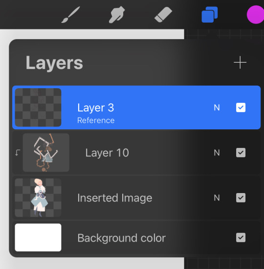
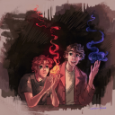
#no sketch layer piece heh
Text

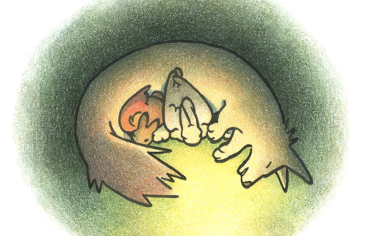
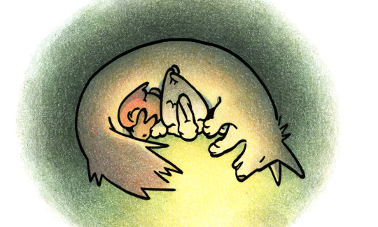
"Your debt I remember, your soul I took
I don't give a fuck about your therapist, you've got me instead!
Got 10 knives, one for each finger in your stomach
With every slice, I'm feeling meaner, your body I shred
My cutie smile, you cannot stand, you cannot bear
Sink into the madness, you can't escape my stare!"
[ x ]
#tw unreality - song linked#no sketch layer piece heh#i really really tried to draw him in Undertaker's/Babadook's top hat but hats are so hard to draw.#tw scopophobia#soul eater#soul eater fanart#stein#franken stein#black butler#undertaker#soul eater stein#scopophobia#my art
50 notes
·
View notes
Note
hello! do you have any tips for drawing in paint?
I ended up making a little tutorial so. .
My MSpaint workflow!
(not applicable to everyone each person has their own way to use each program)
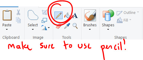

Start with a sketch!

Do lineart over sketch, and make sure its in a DIFFERENT COLOR!

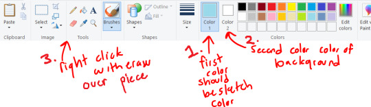
From here you can isolate the lineart by just erasing the lineart color! (and ctrl + makes the tool your using bigger)

Now we have just the lineart!
From here I color, just using the paint bucket tool and drawing the markings on
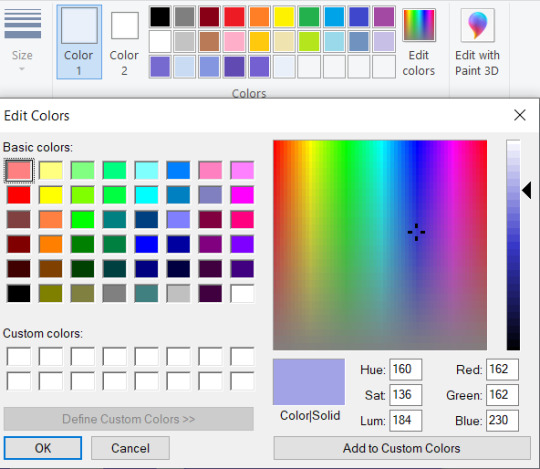
Adding the shading, I choose the colors I chose, then use the edit colors tool to make them darker and a slightly different tint.

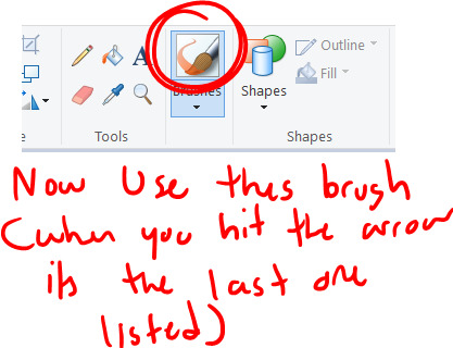

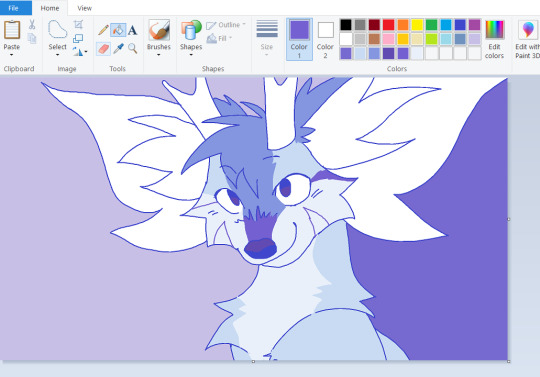
Now for the painting process, I use this to mix my colors together. Basically find two colors, paint a line inbetween them using this paint brush tool and one of the colors, then select the inbetween color. This is mostly the same as how I paint in other programs.

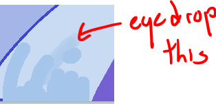
COLOR TANGENT!! When digitally paintings it is sometimes better to just choose a color that would be inbetween, ESPECIALLY with yellow and blue. Its kinda complicated but how the computer does its calculations it can grey out your colors.

But I basically do the painting mixing and coloring all around the piece, choosing inbetweens everywhere, and smoothing out the shading lines, I tend to go over my lineart here

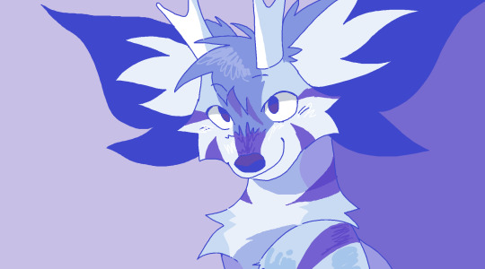
And Im done!
Just adding a lot of details + I tend to do the bg last
My style depends on which piece im working on, sometimes I use the paint brush for all of the piece so its a lot smoother
This was done with the paint brush in MS Paint (the one I used in the mixing section) but it is still the same process, I would just use the paint brush instead of the pencil

but this one was done entirely with the pencil tool, so its up to you which style your going for
Hope that was helpful, and at least taught some fun ms paint tricks heh. Its really fun to work with because it forces you to work on one layer
#long post#ms paint#tutorial#ms paint tutorial#painting tutorial#digital painting#digital painting tutorial#i hope this makes any sense at all LMAO#i can never tell with tutorials#but i thought it would be fun : D
655 notes
·
View notes
Note
How do you post so much beautiful art so fast! I’m amazed!
Is it pretty streamline for you now or like do you have tricks up your sleeve to speed the process?
For me it take a few days to make one of those pieces even the memes! So I am in awe
It's a mix of things tbh. Part of it is I worked on my webtoon without missing deadlines for 2+ years (I'm missing them all now but it's for a good cause lol). Which involved making 60-70 panels every week heh. It both made me really quick and less perfectionist, which ultimately cut down the time I used to spend second-guessing things like composition or cleanliness.
Part of it is I streamlined my process in a way that means as long as I have a background reference (or, for instance, screenshots/royalty-free images I can blur out) I colour things in like 10min. I always use the same ish layer combination, automatic actions, etc
I also work at sizes so small that they force me to not even think about detailing or clean lines, and use pencil brushes that make that still kinda work ✏️
Plus I ALWAYS sketch ideas when they come to my head then close the canvas, so at any given point I'm sitting on a pile of WIPs ready to speedrun haha
164 notes
·
View notes
Note
Any tips for an amateur writer? I've been writing a pmd:eos fic series on ao3 that's been getting praise, but I still feel inexperienced
Yooo pokemon mistery dungeon explorers of sky? Hell yeah best pokemon game to make fanfic of, easily. its an absolute BANGER
Ok i got a few pieces of advice for ya, i don't mind sharing!
1 - One of the most important ones for me personaly, is to know and understand yourself and your own style of writing. By what i mean its like; you get an idea for a story, or a concept. But knowing your writing style, your capability to write scenes, and even the characters in question, do you KNOW that you can write this story? Its actually pretty important; Because writing takes up a LOT of time and effort, and if you just start blanking halfway into it, you'll have wasted so much time with a story that you don't exactly know how to do. I personaly have so many ideas, but i only execute on the ones that i am aware i can work on, and would know where to take, even if the idea is small. (For example, i had an idea for writing a fic of rarijack but only when theyre older, after the events of FIM. I started writing immediately because i knew exactly that i could do it; and am already 25 pages in and might finish today, heh)
2 - Write horizontaly, not verticaly. by that i mean; don't start at the beginning and work from there, consider all of your story's structure before you even start, act 1, 2, and 3, and its most pivotal moments. Much like you would sketch a drawing before lining and coloring, its important as hell that you are planning all your setups and payofss in advance, all of the arcs and character progression in tandum and stuff. This applies well to the first advice too! Don't be afraid to make an ugly ass sketch of a story, as long as youre aware that this is indeed a story you can make. Make the skeleton before adding the meat, and only after do you add the makeup. And as you write, more ideas will come to you!
3 - This one is more for my own, personal taste, but never be afraid of writing multigenre! By that like. If you're writing romance, dont be afraid to put action, if you're writing drama, dont be afraid to put a moment of comedy here and there; stories are infinitely more interesting when they're not just one note, not just a single tone! And the readers would absolutely be delighted on having moments of respite or shock, it keeps them on their toes.
4 - This one is hard to execute, and i cant give examples that arent long, but like. None of your scenes and sequences should be just what they are in the surface. Like; A character knows something that the other doesnt, or the audience knows something that neither character knows, or the underlying conflict is constantly clashing silently. A short example i can give is a scene in on of my fics in which a character was being asked about her past, and she spoke ernestly, but every once in a while i'd add a "She lied" after the information she provided; And i didn't need to add anything else, that in itself is enough for the audience to understand and consider why this character is doing what shes doing, and just that simple little thing added an really interesting layer to the simple conversation. Essentialy, there's no reason why a conversation should *just* be a conversation in your stories, and there is no reason why you should have filler for the sake of it. Pacing is important, and you can make every single scene and chapter on your story interesting, nothing stops you but you!
The "She lied" thing is specialy important, because you don't have to treat your audience like babies. I didn't explain why she lied, because if any reader was paying attention, they'd understand completely, everything would simply click. A character can sometimes say something, and all you need to do is write the tone of their voice, and the reader can already connect the dots, or even something as simple as describing a facial expression or body language without explaining why it is what it is; It makes your story more engaging!
I have a million other advice, but i felt like these were the most important ones i specificaly could provide. Good luck!
16 notes
·
View notes
Note
😭 and ❗? :D
Thank you for the ask anon! ❤️
😭 an idea i attempted but had to abandon
Heh, in November I watched Danny Phantom for the first time since secondary school and I wanted to draw Evil Adult Danny! I don't mind the sketch, but any attempt at colouring made me feel awful.

[ID in alt text]
❗️ a particularly ambitious piece
I don't have many of those this year, but I guess I'm working on one right now! I'm teaching myself how to screen print using CMYK layer separation. So far I've made a couple mistakes, most of which have to do with the marks that are supposed to help me line up the layers, which makes the process kinda really hard ^^;
Cyan and magenta (as seen below) went ok, but the marks on yellow are invisible. I attempted lining that layer up in a different way, which seemed to work but then the ink didn't come through the screen properly.. So I took a break from it for new years but I wanna get back to work tomorrow!

[ID in alt text]
18 notes
·
View notes
Text
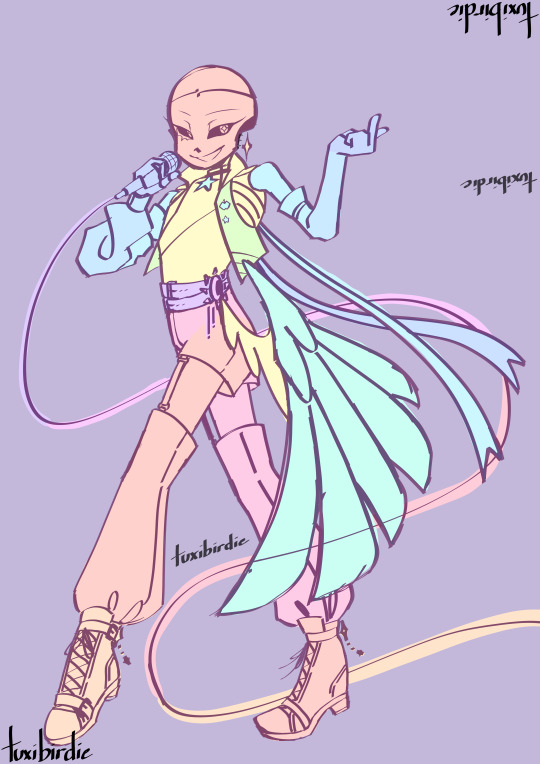
@askpocketsans hi sorry this took so long I didn't know where to start lmao
so first off, here's a speedpaint of the initial drawing
(also a little peek into the design process of dream!)
(and yes, this big piece did come before the proper ref lmao)
now to itemize what the heck just happened:
the initial sketch!
a test rendering of the sketch (to work out colors and lighting)
coloring the sketch according to what I want to make move (there's no rhyme or reason to the colors--just don't let the same color touch if they're on different parts)
rendering each piece individually (as you can see I did lineart first and then coloring)
rendering the background
and done!
here's a clearer look at the separation sketch thing
(the colors don't have the most contrast but it gets the point across lmao)
also! it's not necessary to draw every piece separately; you can just finish the initial thing and then separate it after the fact, I just prefer to separate it from the get go so I don't have to do any cleanup work haha
once that's done I merge each body part/piece so each layer is a body part/piece
and that ends with this:
(man I even popped out the layer tab and there's still not enough space to show every layer 💀)
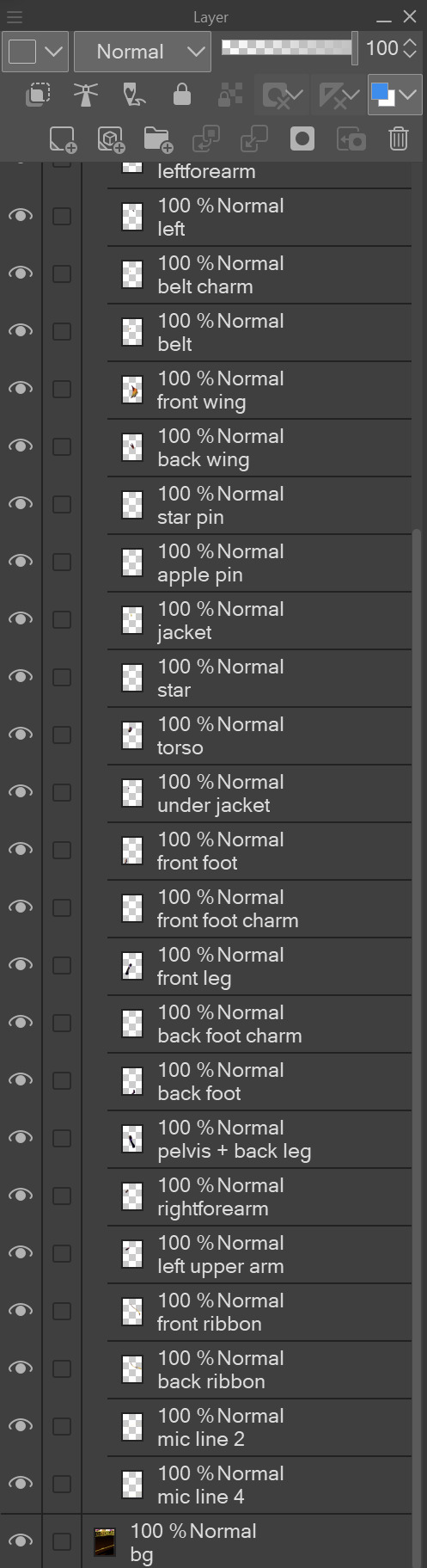
so like
one layer looks like this

once I'm done merging the pieces, I export the whole thing as a .psd (Very Important!!!)
now for rigging!
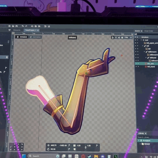
I boot up dragonbones and go to "New Project" > "Create Animation" > "Armature Template" > "Finish"
that will bring up the main workspace
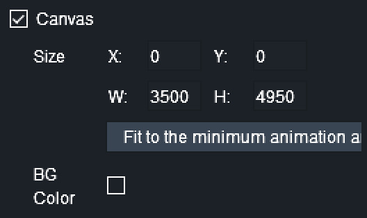
from there, I go to "File" > "Import Assets to Stage" > select the .psd file > "Open" > "Import"

that leaves me with this
(note: right click empty space to deselect)
(also, if the background doesn't import you may have to go back to the psd and cut it up into smaller pieces)

from there, I check the canvas option and set the size
(yeah I know I use really big canvasses)
now for rigging!
when I rig I like to hide everything except for the specific things I'm rigging
it makes things less cluttered
now, select the "Create Bone" tool (or just press "E")
and then click and drag where the bones should be
that leaves us with something like this:
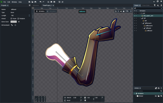
in this case, the bones should automatically be attached (if you move the upper arm the rest of the arm will move with it)
but in cases where that is not the case, you can manually set the parent bone by right clicking it > "Set Parent" (or press "P") > then clicking the bone you want to attach it to
now to make ik constraints (controllers) for the bones
I'll be showing you both types of controller--the type you want to use depends on how you want it to move
click on the bone you want to move, then go to the "IK Constraint" section on the left sidebar
(ctrl + click to select multiple bones)
for the arm I like to use "Create IK Constraint at End of the Bone"
and "Create IK by Pick" for the hand
(don't forget to rename the controllers!)
this makes it so that you can move the bones like so
(don't mind how crunchy that gif is lmao)
since I have the upper and forearm bound to the same ik constraint, they move in tandem, and said ik constraint is bound to the end of the forearm bone
the hand (bone) will always point toward it's respective constraint (the little red dot in the gif)
and then rinse and repeat for every moving part
heres the fully rigged skeleton (heh):

(also make sure to lock all the bones and assets after you make the controllers so you can only move the controllers)
now to animate!
go to the animation workspace in the top left
(Ctrl + B to hide the bones)
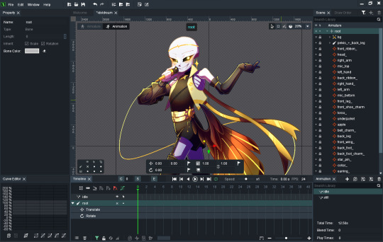
you set the loop here (in frames)
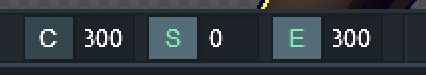
C: current frame
S: start of loop
E: end of loop
I set the initial and last keyframes of the loop here by selecting every controller (Ctrl + click) and clicking the flags
(that way the first and last frames are the same, making for a smooth loop)

now to actually start animating
I prefer to have this option selected:

it auto keyframes, so if I move a controller it's automatically saved to the timeline
(from here I genuinely don't know how to explain so bear with me here lmao)
those diamonds are all keyframes: aka poses that the animation *will* hit at the point in time
to make it actually move you need to go to a point between the start and end of the loop and move the pieces to wherever, then set it as a keyframe (or just move it if you have auto keyframe on)
once that keyframe is set, if you press space/play, it should automatically move between those two keyframes, smoothly
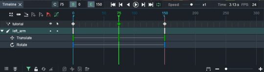
you can change how smoothly it moves with the curve editor
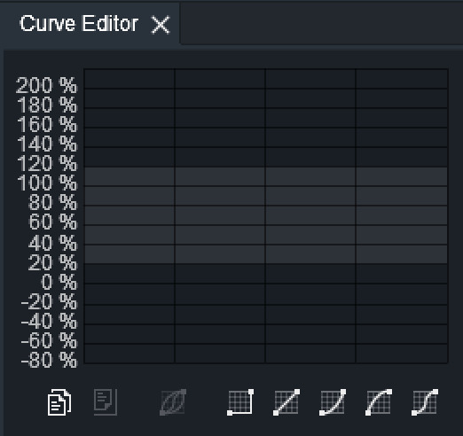
I don't really use the curve editor unless I think something needs to be eased in/out (like dreams arms in the original idol post)
(I don't really know how to explain further the animation is really a hand-on thing to me 💀)
here's what my timeline looks like when everything is done and animated
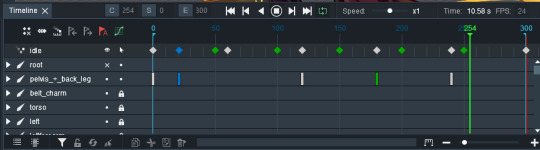
(I prefer to just pick a few points in time and animate everything to those points but you can keyframe at any point)
now to export the thing!
go to "File" > "Export" > pick whatever if you get the "This Texture is oversize" popup, I usually choose "Multiple Textures" (nothing really changes) > "Image"
and now we're here
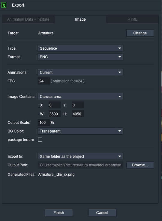
things to make sure of:
Type: Sequence
Format: PNG
Animations: Current
FPS: whatever fps you were working in
Image Contains: Canvas area
Export to: wherever you want it to (you can see I have it going to the project folder with the rest of the idol stuff) (I suggest making a subfolder specifically for the frames bc they can stack up *real* fast
and then "Finish"
and then you wait for a bajillion years for it to export :)
finally, time to make it a video!
I use blender to turn the PNG sequence into an mp4, so here we go!
to the video editing workspace!
"Add" > "Image/Sequence"

navigate to the folder with the frames
press "A" to select all
set "End Frame" to the number of frames you have
set "Fit Method" to "Scale to Fit"
then hit "Add Image Strip"

that leaves us with this
(make sure to set "End" at the bottom right to the number of frames you have)
now for settings
go to format and change the resolution and frame rate

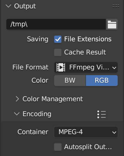
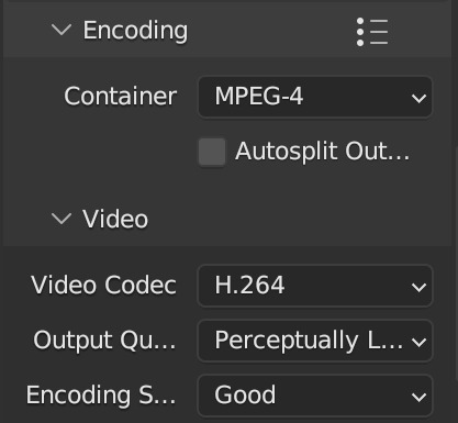
next, go to output
set the file destination
File Format: FFmpeg
open Encoding menu
open Video menu
Video Codec: H.264
Output Quality: Perceptually Lossless
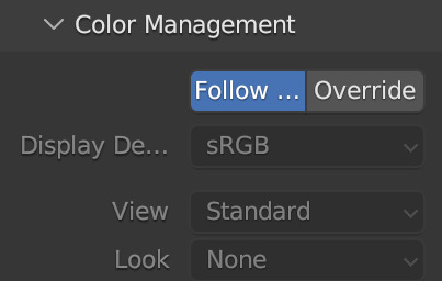
open Color Management
View: Standard
Look: None
finally, hit "Render" > "Render Animation" in the top bar and sit tight while it exports
now, that was probably confusing so here are some videos I used myself (bc this was the first time I touched dragonbones in like a year lmao) [vid 1] [vid 2]
and also bonus video that I had on loop while I was making this hehe
12 notes
·
View notes
Note
hey kels i was scrolling through my dash and then i caught a glimpse of your new fallon drawing and i want you to know that i went absolutely buckwild and then i scrolled further to see the whole drawing and i'm pretty sure i squealed. kels ever since ive started following you and your art and fallon have slowly nestled yourself inside my brain its amazing how excited i get whenever u upload a new drawing. also ive noticed that i'm slowly but surely starting to sound more and more unhinged and wild like you. how the fuck do you have so much influence on me.
ALSO i love the new fallon drawing!! you are so right blue gold and white are just her colours they fit her v well!! and i love how much texture you used throughout the whole drawing and her shoes are AWESOME!! also love the whole winter fairy-ish vibe <3
ALSO i was wondering if you could like sort of,, idk explain your drawing process on this drawing? like if you did the colouring first or the lineart and stuff bc i just love how it turned out and id love to try something similar!!
AW!!! i am so hype for my awful girl to be Enjoyed so much!! she is my favorite dressup doll i love to play barbies with her most of all heheh. also i am THRILLED that my Unhinged and Unwell nature have rubbed off on u. i know i am a Strong personality and it makes me V POLARIZING (i am either LOVED or LOATHED i havent met many ppl who are just like meh abt me. i am an Experience) and its always a DELIGHT when someone finds my feral animal traits endearing or positive and kind of picks up on them. i think because life is short that we should all be as bananas as we please at any point in time. PURE ID HERE BABY
AND TY TY!! my girl has a strong aesthetic and this piece kind of went a liiiiittle against some of that (its a lot of hard angles vs i normally give her a lot of ovals and rounded edges) but for the setting its appropriate bc im trying to give her a bit more of a """"harsh"""" or """"severe"""" vibe (like as harsh and severe as she can possibly look which isnt very). i LOVE to use texture brushes they are such an easy way to get out of drawing details myself because i am SO lazy!!
okay i “”answered”” this i GUESS technically because i typed words in response but its a whole lot of jack shit so like. here ya go. SORRY PAL.
here are some more shoes as u can see i basically draw her in the same ones always except when i draw her in a plugsuit

OKAY THE DRAW IN QUESTION i kind of cheated on bc i literally just traced over one of my older draws i did for a very obscure au i made of who made me a princess (i am always doing such ridiculously niche shit i love to sit in my little sandbox and have no one else understand my barbie rps) BUT the process is the same as basically every draw i do like this. it is very simple so dont worry (or do, maybe)
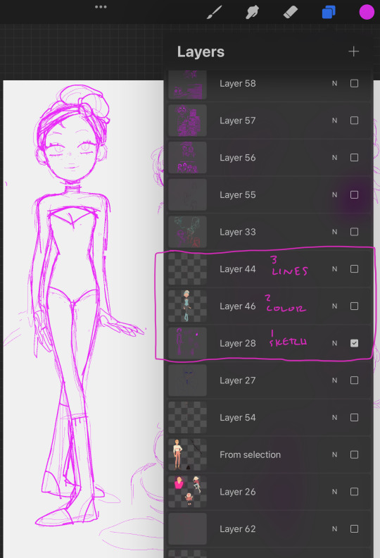
i use 1-3 layers at a time and then immediately merge when i feel like im done and LIVE W MY MISTAKES if not!! anyway prepare to be massively underwhelmed heh
this is so funny i cant believe i literally traced my own drawing im a fuckin FRAUD im the laziest bitch i know. anyway. my sketches are way messier than this but it always starts out either scratch ass lines or color blocking w this bright ass magenta bc thats what feels right!!!!!!
HERES THE LAYERS I USED LOL i do all textures n shit as a clipping mask so actually i used 4 layers for this bc id set down one texture or pattern that was gonna overlap on a diff layer so i wouldnt have to work harder to erase and then BLINDLY MERGED to make things more difficult if actually i fucked up before that!!! work smarter not harder except when it is absolutely braindead to do otherwise is my motto
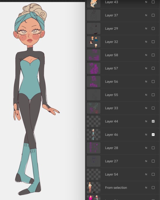
IF IM DOIN SMTH NICER like this then i usually make sure all my lines connect (this is also why i do a lot of angles and simple clear shapes when i draw) so i can set that layer as reference and USE THE FUCKING FILL TOOL BAYBEEEEE!!!!! this also makes it easier to fuck around with COLOR imho bc you can just rapidly swatch with zero efforts. i Love to take shortcuts. i Love to be lazy. i HIGHLY rec this, if i have colored smth that stays in the lines then its bc i connected the lineart and used the bucket fill underneath. if my lines dont connect sometimes ill make a temp line and erase after i filled. im dedicated. ALSO u can see here that my patterns layer is all overlapping and fucked up bc i didnt check and erase fully but i use p limited palettes in general so... IT DIDNT MATTER THIS TIME!!!!!!!!.
anyway after all that i lock the lineart layer if i havent already and color some of the lines for some PIZAZZ. easy way to immediately fake effort i do love to do that
HERES AN ACTUALLY MESSY SKETCH:
i do all of my fucking draws on the same canvas bc im a horrible little beast, so the only reason i didnt erase the sketch and use it for the colors layer was bc there were others on that layer already and i didnt wanna scoot them so i could cap the finished draw. i did NOT connect my lines for this one i colored like a toddler. who gives a shit we all die in the end anyway!!!
YOU DIDNT ASK FOR THIS BUT LINELESS MY LOVE... i just color blocked for this one alas i do not have process caps, i will do that next time i draw i guess if anyone wants that!!? i typically only use a single layer for lineless- block out the shape, alpha lock, then color and carve from there. EASY PEASY!! ive shown it before but i spent all my formative draw years on v limited feature programs (mspaint, oekaki, TEGAKI MOST OF ALL) so i dont explore tools much and do what seems easiest and most intuitive to me... im sorry i dont have any sick tricks or real process i am but a feral little clown drawing in the DIRT. also here is the tegaki overlay i use whenever i am Blocked or fatigued w procreate layout. it makes me feel NOSTALGIC and INSPIRED so i do this instead of like, actually getting on tegs2
this ended up long as fuck and FOR WHAT?? its just 10 images and several paragraphs of “sorry im the laziest fucker ALIVE”
#idk what to say here every time i type anything i thnk it makes me seem just completely detached from reality#its not untrue i GUESS. im Unwell but in a stable SUCCESSFULLY COMPLETED THERAPY AND HAVING FUN WITH IT kind of way#kels talks#damn sorry anon this was a whole lot of not answering you at all
23 notes
·
View notes
Text
Wednesday Progress Shots:

More below the cut.
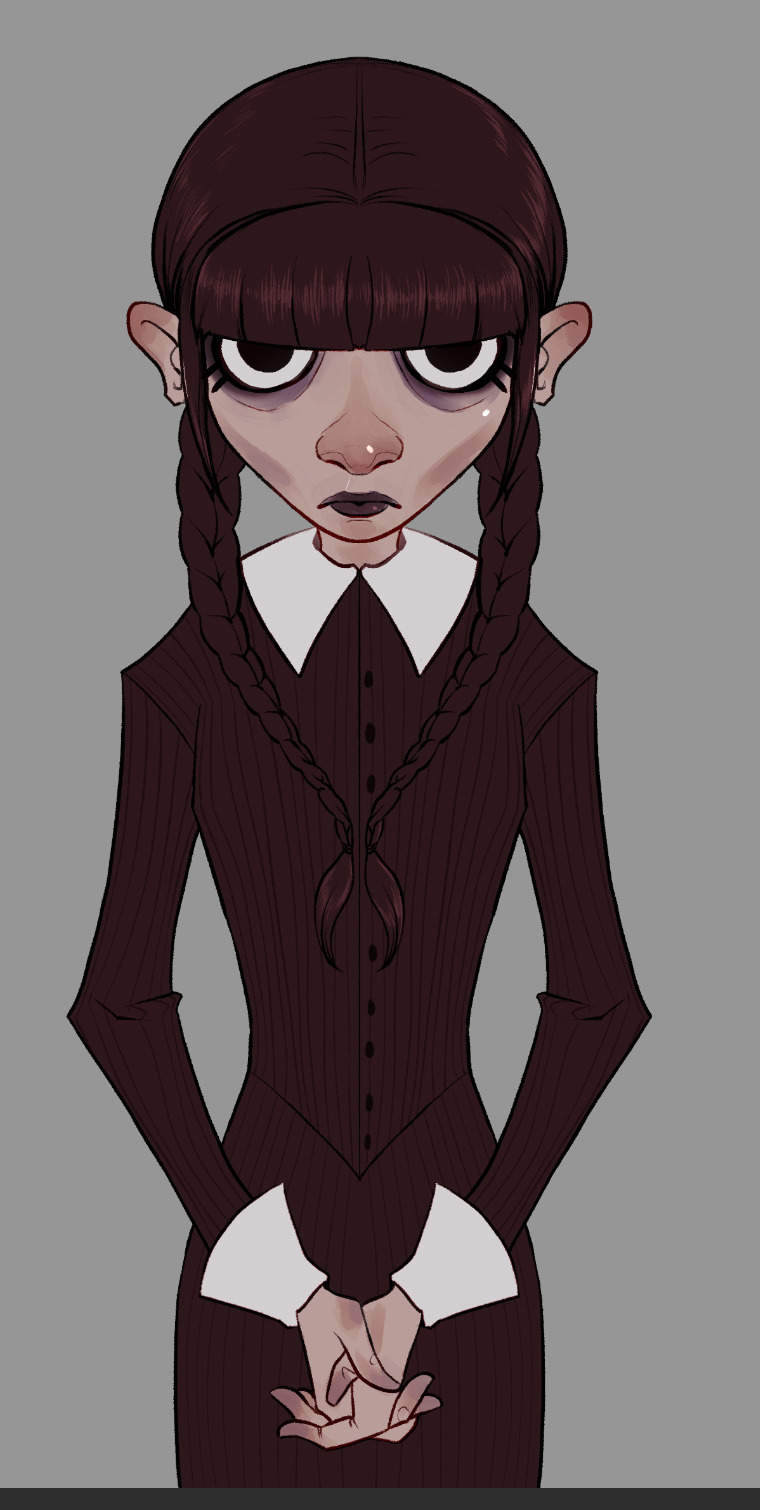
Original rough sketch.
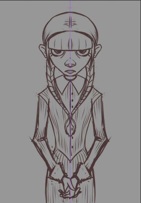
A more refined sketch; I decided I wanted it to be more like a creepy family portrait and added in her hands. I used symmetry for this one; I felt like it made it more uncanny.


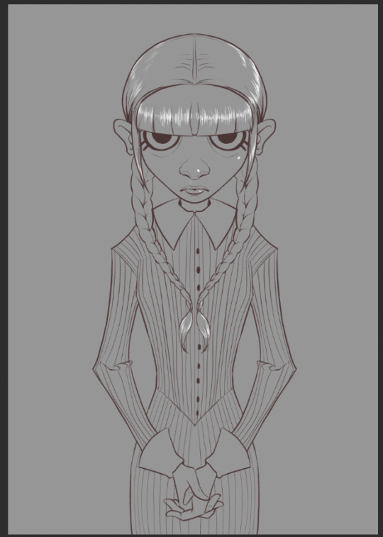
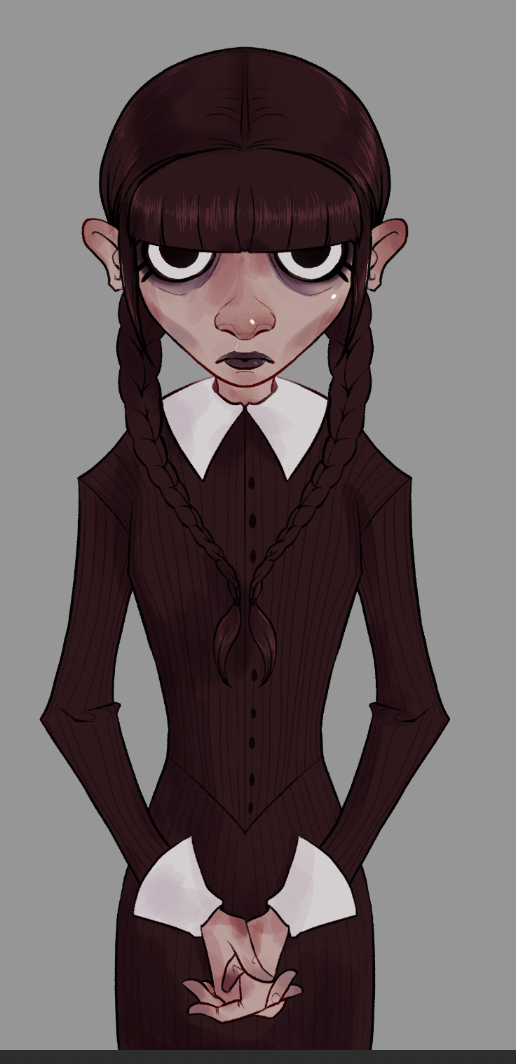
Lineart. I use a rough, pencil-like brush for my linework.

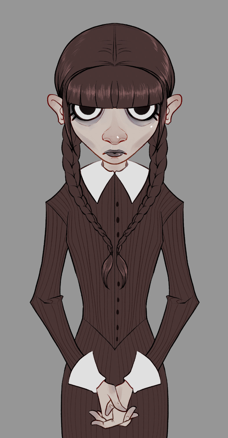
I painted in some flats. I always include a little extra color/rendering on extremities to give it a little more, er… life. x) I decided the "blacks" shoulder be the same deep maroon I used for the lineart so the lines faded at this stage. However, I go in and change them to overlay, or multiply, or color burn, depending on what looks best. :)
Flats, with lineart adjusted for overlays and color.

I paint in and plan an approximation of my light source(s) in grayscale.
Shadows added in two layers. How much I used and how many layers varies from piece to piece. Whatever looks good and feels right to me.
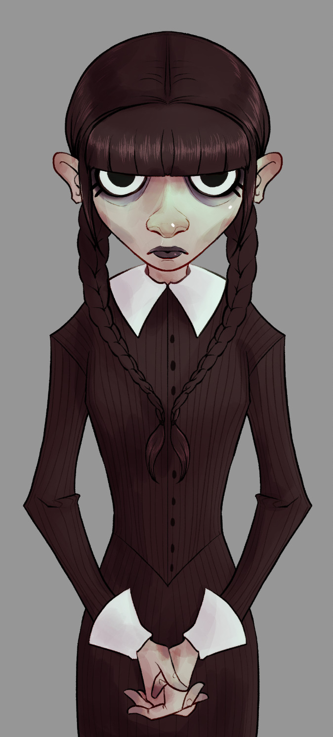
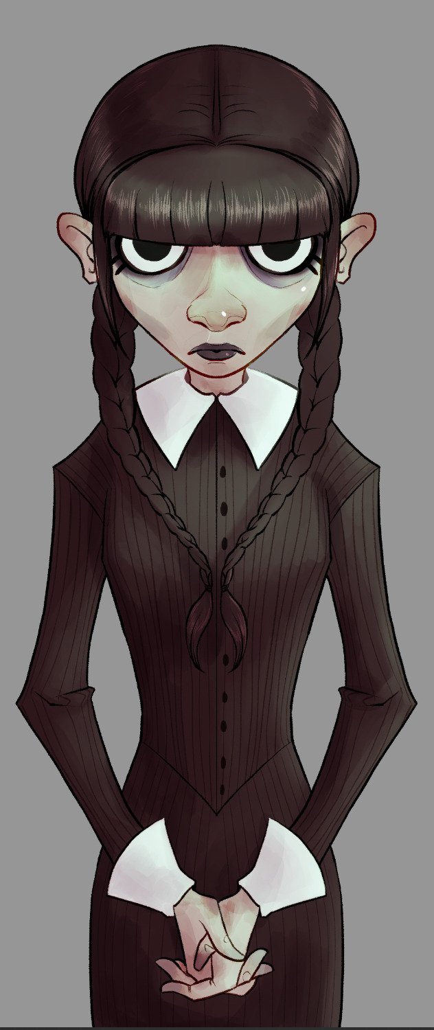


Once I've painted in my lightsource, it's just a matter of adjusting the colors until I like how they look. I went with a sickly green, cold light for this one. It wasn't bright enough originally, so I created a new layer. I continued adding details until I was happy with it.

Then I add a layer of green set on "darken." It knocks out any whites. I tend to play around with this setting on most of my pieces just to see how things look. Another thing I do frequently (that is, when I remember), is set up a layer that allows me to check my values at a glance (basically, an all-black or -white layer set to hue or color). I can make sure I don't have too many midtones and such.
Yep. She looks good like this, too. After this, and most importantly I like to let the work "breathe." Especially if I'm unsure about it. I let it sit for a day (sometimes longer, if I've got the luxury), before returning to it.


The left was what I had. Sure, she looked okay, but I decided some things were missing, and her hair was way too light to be Wednesday's sharp black. Originally when I saw the piece in my head, I planned my light source from directly above. As the piece developed it came more from the side. So I added a little shadow to her face, too. And yet, we are still not done. Umm. I like adjustment layers. I like adding a flash of unpredictability to my art. Keeps me from being too nitpicky, and forces me not to get too stuck with one version of a thing. I'm bad about things like that.
So… I smack on some curves, or adjust color balance. Sometimes I just put layers with different colors over them. In the end, though, I always add some noise, chromatic aberration, and sharpen.
…and let's not forget to sign it, either. Heh. I usually add a simple square with my real initials in it, as well as one (if not more) of my social media platforms. Anymore that tends to be my tumblr because I've taken a fancy to this place.
So. Yeah. A walkthrough my process that you never asked for and I didn't really plan, so there aren't any pictures of tools or anything. Umm. Questions from the class? x)
The final result:
#IndyDraws#IndyDrawsArt#my art#Wednesday Addams#Wednesday#Process#Progress#Walkthrough#i don't know how to tag this honestly#The Addams Family#fan art#csp#Clip Studio Paint#dunno if anyone would be interested in something more… official? like me actually trying to make this make more sense#i guess if ya'll would like i'd consider doing it#some of you ~cough biscia~ ~cough wizard-laundry~ have seen the shit-show my layers are lol
7 notes
·
View notes
Note
Hello Rab, I just wanted to say that your art is huge inspiration to me. There just isn't many artists out there who work with color pencils, and your artworks with them are absolutely charming. If you have any tips along the lines of "things I wish I knew", I'd definitely be interested! (no pressure, of course !)
I'm sorry I'm so late in replying to this! This ask has made me so happy; thank you <3333
Things I wish I knew:
Sometimes expensive things are worse, but Prismacolors are GLORIOUS. Other colored pencils feel like working with tree bark compared to the pillowy-softness of Prismacolor wax.
I've tried soooo many different types of paper over the years. The more tooth (texture) to a piece of paper, the more layers of color you can pile up. I prefer less tooth because it requires less time to fill in those pesky white gaps you get while working with textured paper...but "good" paper like Bristol is actually TOO smooth for me. It took me like ten years to find this paper, which is my current favorite (not so smooth that you can't build up a couple layers of color, but not so toothy that you get white patches). It's not archival AT ALL though, which sucks.
I used to struggle a lot with line art, since the pencil wax would cover the lines. Here's my process now:
- I sketch on your average sketch pad, then use a LightTracer (light box) to ink my sketch onto Xerox paper. The nice thing about this method is I never lose the sketch, so if I mess up with my brush pens (which happens VERY OFTEN) I can just restart on a new piece of Xerox paper.
-Once I'm done with my line art, I scan the page. THEN I color my line art. Once I'm done, I scan the page again. Next I overlay the two scans in Photoshop via auto-align, and set the line art to "multiply" to create clean dark line art. I'm not sure whether the auto-align tool is available on other programs...I'm pretty sure you can do it on photopea, though. If you use colored pens for your line art, you can also use the hue tool to change your line colors.
Pic without separate line art layer:
With line art layer:
Don't be afraid to use a pencil eraser to lift some color off the page. An eraser won't get rid of a color, but I regularly use erasers as damage control for areas that get too dark or muddy. Erasers can also be used to add texture.
Be aware that pure black can flatten or muddy a scene. You'll often see me "deepen" my black areas with colors like tuscan red, process red and indigo blue (or avoid black altogether).
On that note, don't be afraid to go dark! It can take courage to rip off the bandaid and put down a dark layer of color, but you gotta do what you gotta do to get some contrast. When I remember to play by the rules (heh), I color the light parts of my work first, then lay down a layer of indigo blue or dark green or tuscan red over all the dark areas to sort of force myself to stay dark.
Don't let anyone convince you traditional art is unmarketable, or that you'd be "smarter" to work digitally. Work with whichever materials or programs you want.
It's okay if you work slower than other artists. This is the lesson I'm still trying to learn! But it's true: You can't expect yourself to work "quickly" with colored pencils. As much as I love colored pencils, they're slow and can be very boring lmao. Don't burn yourself out with grand expectations.
16 notes
·
View notes
Text
Live Watch: Thousand Autumns Episode One
Oh wow someone got the good... guzheng? Something in that family of instruments anyway. They got the good music for that. And the animation is beautiful and beautifully synchronised to the clip excerpts.
And the imagery! The opening with the symbol of the Dao, and then main character number 1, Shen Qiao, all in white, in a fantastically and subtly ornamented outfit - I love the textures of the cloth they put in on the animation here, cloth and clothes textures are so easy to get wrong and they’ve done it beautifully here. I think this is supposed to be Shen Qiao’s original sect leader/zhangjiao outfit and he looks properly leaderly in it.
And this, followed by a closeup of Yan Wushi’s hand holding the ring of contention, and then Yan Wushi himself, very handsomely rendered in 3d animation - and again I have to voice my appreciation of the cloth textures. That’s actual subtly 3d brocade textures they’re rendering there, with the correct flow for how cloth hangs on the body, and the correct variances of light on the areas with thicker brocade and it is, frankly, very impressive. And they didn’t lose colour saturation doing it either, making that purple robe look suitably luxurious. The shiny hair ornament and one sidebang in white is a nice touch as well. As are the hints they set right in the opening that Shen Qiao and Yan Wushi are ... opposites, and complements, linking them back to the Yin/Yang balance of the symbol of the Dao.
So much love for this opening song it’s so good. Also going to be a pain to translate accurately with a proper sense of the poetry of it, but so good.
Alright episode 1 proper, 风雨欲来. The coming of the wind and rain, literally, I think. Maybe even the foreboding or oncoming storm, if you’re going for the feel of the term instead of literal translation. Oh. Oh that opening montage with the bird’s eye view and the fog and the high mountains - I was so taken by this scenery I sketched and tried to paint it at least 3 times. It’s a very moving shot. Also very much in the grand tradition of xianxia/wuxia, and also, even without a word, hinting at the traditional stance of the Mt Xuandu sect - to 出世, to remove themselves from the world to cultivate in the seclusion and clarity of the literal peaks above the clouds and dust of the world.
Oh. Oh that opening shot. The challenge to combat by Kunye to Shen Qiao. The.. subtle and ornate embroidery and brocade and patterning on Shen Qiao’s sect leader robes is so awesome. The wave motifs repeated in the 3 layers of robes, even on the hair ornament/冠 in his hair, the resolute look on his face! The closeup shot of the 山河同悲 sword - and what a name for it. A sword named for, if I may be excused poetry in translation - compassion and pity and fellow feeling for the griefs and pains and trials of the world as encompassed by the mountains and rivers - what a blade, and what a name, and what a bearer that would be worthy of it. A very good hint, at the kind of person Shen Qiao is, even before they have him open his mouth.
The contrasting costuming decision for Kunye et al is also very nice, hinting at the cultural differences between, say, the peoples that live on the central plains and the more nomadic groups living on less kindly land, shown in the different materials available/preferred - leather, furs, etc vs cloth, silk, cotton etc
And the fight choreography! So nice! The 3d animation works really well here,in that there’s no limitation to the capabilities of human bodies and it’s possible to really show in the visual medium the knock out drag down fight between 2 people whose martial - and quasi magical - capabilities are already at potentially mountain splitting levels. Not to mention also, showing that a Shen Qiao who isn’t being handicapped by sabotage... really can wipe the floor with Kunye if he wants to. And then, of course, once the fight gets to Half-step Peak and they’re out of sight of inconvenient witnesses, the signal for the ambush. And then the effects of the sabotage take hold.
Ah, flashback to 20 years ago, to provide the audience with the world info we need to understand the rest of the story. Not to mention also informing us why Hulugu would even bother. Or why Kunye coming in to challege Shen Qiao is so narratively important. And also introducing the ring that so many would fight over later.
Yan Wushi’s character introduction.. is quite something. As is Yu Shengyan’s. Ah, Shizun, congratulations on exiting your 10 year cultivation seclusion, would you like the highlights on the changes in the world in the past 10 years? But also a good show of character, because they have him not even looking at Yu Shengyan, but looking away in the distance, and telling him to only tell the most important bits, he’s not interested in useless words. Also serves as a nice introduction to some people who’ll be important later, and giving us a time marker for when Shen Qiao ascended to the sect leader post - 5 years ago, after the death of his shizun Qi Fengge. Ah Yan Wushi, your characteristically arrogant attitude - aside from Qi Fengge, who in life was worthy of being the first among all the wuxia world, the rest are not worth even mentioning. And here too a little hint that Yan Wushi might care a little bit in some way for those who are his, including his disciples - He tells Yu Shengyan that this location, this Half Step Peak that they’re at, because of its physical characteristics, is good for him to cultivate to the next level of understanding/enlightenment of the martial arts used by Huanyue Sect.
I love it whenever they hint that the more... developed characters whose martial arts are very good have improved senses. A little flow of blood in the water, Yu Shengyan notices something is wrong, looks at his shizun, and receives a nod of affirmation that he perceived correctly and should take action. And then after that, they come upon a body of one of the Mt Xuandu disciples, and Yan Wushi’s verbal remark that today, Mt Xuandu is troubled and not pure and clean. And then Shen Qiao literally falls from the cliff top - and the pan up makes it very clear that for most people, this is a lethal fall.
And then the surviving ambushers attempt to finish the job when Yu Shengyan checks whether Shen Qiao is still alive... and Yan Wushi takes the training opportunity when he sees it, and tells his disciple to use his strongest techniques to take on the remaining assassins. And then, when Yu Shengyan can't quite wipe the floor with them... criticizes his lack of growth, as might be expected of Yan Wushi, and steps in to really wipe the floor with the assassins, as might not be expected of Yan Wushi. Also doubles as a really nice display to the audience of his level of strength. In fact.. listening to the voice, I think one of those assassins appears, unhidden, in later episodes. Heh. Plot continuity, a nice one. As are the assassins having common sense, recognising Yan Wushi's infamous technique, and running before they're cut down.
Ahahahaha yes Yu Shengyan, your shizun really had you pick that fight for training, and he's really about to pick up Shen Qiao and have him rescued on a whim. Also nice to review, on rewatch for the details, that part of this whim is perhaps curiousity as to Shen Qiao's ability to survive and/or recover, as hinted by the thin thread of strength provided by the Zhuyang Ce, that Yan Wushi identifies as the thin strength keeping him alive, despite the aforementioned lethal fall.
Heh. Yu Shengyan – and maybe Huanyue Sect's other job – information gatherers aka spies.
Ah, Yan Wushi, you really are fascinated by people's reactions under stress, aren't you.
Shen Qiao awakens! Oof, the amount of damage – can't see, amnesia – damaged or even broken meridians – the donghua doesn't mention how much time passes, but given that Yu Shengyan mentions that Shen Qiao's broken bones have only just finished healing – could not have been a matter of days. Weeks, maybe even a month, minimum. Unless Yu Shengyan meant that the bones have only just been set – which could mean a few days. And then the mindscrew from Yan Wushi, telling poor amnesiac Shen Qiao that, yes, your name is Shen Qiao, oh, and you are one of my disciples from Huanyue Sect! Someone sure is hasty to put his poke the injured person plans into action! Ah Yan Wushi, if you could please give Shen Qiao a break, he just had a near death experience! But also – the scope of the injuries – yes, it benefits Yan Wushi's plotting but also – Shen Qiao was injured beyond the scope of ordinary medicine? Yu Shengyan has to be stationed to basically care for him until he is able to awaken – and presumably recover – appropriately!
Alright, time marker, 3 months after previous events.. okay. Shen Qiao can walk, some, though the animators were careful to make it a clearly pained walk, in comparison to how he was moving pre-Kunye fight. And then of course the blindness, which may also explain how they've animated him moving with more cautious steps. And the coughing, and the eyes that can't focus – all in all, a detailed and careful show of how badly injured Shen Qiao still is. Can't help sniggering at every 'shidi' I'm hearing him say though. And Yu Shengyan... yes, really, even though you and your shizun can't quite believe it, there really is a person this kind and considerate of other people.
The appearance of the weiqi board motif! Strategy, and planning, and part of the arts of the refined gentlemen..and the hint of how Shen Qiao is perceiving/visualising the input that he hears, since he can't see right now. And the hint that he might be using qi to help sort through what he hears – well enough that he can identify it's a weiqi board, and even the piece being placed. Very Awesome. Especially when they show Yan Wushi possibly testing Shen Qiao's capability to perceive the world around him by hesitating and purposely not putting down his piece.. and Shen Qiao very naturally picking up the piece – black, the correct colour and the one Yan Wushi was about to play – and putting it in the correct position on the board that Yan Wushi was about to place. Is it any wonder that the next thing Yan Wushi checks is the state of his recovery?
And then we have Yan Wushi's characteristic multipronged planning – creating trouble for Hehuan sect, training for Yu Shengyan, testing opportunity for Shen Qiao. Very excellent, any and every outcome has benefit to Yan Wushi.
Ah the encounter at the medicine shop. Hm. Okay, the sharing of the medicine is clearly a hint to Yan Ziwen of some kind that he and his should be especially cautious tonight, perhaps even to run for their lives tonight. Though it's maybe a hint in the actions, and not the words, because the words don't sound suspicious at all. Neither do the actions, if you were watching as a observer and didn't know Yan Ziwen's paranoid character – a blind person would unsurprisingly wish to be extra careful where they put their hands. And at night, on the attack... for all that Shen Qiao can't quite see, and is currently relying on the rest of his senses... he can tell that something's off about Yu Shengyan's actions. And then... Shen Qiao remembers... the sword, and what Qi Fengge taught him. And then the confrontation, and the near strangulation by Yan Wushi... Shen Qiao has such a nice literary register to his speech. Four word phrases even under severe near strangled stress, with the right philosophical meaning to make his point to Yan Wushi. And then the reveal of Yan Wushi's plotting. Very nicely done.
And now, the first of Yan Wushi's many many invitations to Shen Qiao to forsake his daoist path and join Yan Wushi's ... evil sect is not the right word. Demonic path is technically correct but has moral overtones that don't fit. Join Yan Wushi's cultivation path, maybe. Join and get bloody revenge on everyone who's wronged Shen Qiao – and already there are so many of them. And we the audience wonder for half a second – is he going to do it? Is this going to be a revenge story? And Shen Qiao flat out refuses in words, in the first of many times. And then Shen Qiao walks away from Yan Wushi. Here the animation is a delight again – the audience gets to see the little micro expressions that flit across – he's actually walking away?! And then Yan Wushi does his dramatic gifting of the bamboo stick. And too, a few seconds later, the reveal of their movements being spied on by Duan Wenyang, and Yu Shengyan's orders to continue searching for .. something. Ah, the plotting in Thousand Autumns. Always a delight.
13 notes
·
View notes
Photo


Artist Commentary -- ‘Spotlight’
Okay friends I’m awake slightly later than I should and that must mean it’s time for artist notes on this thing... which... uh... A-heh, happened so quickly I didn’t actually save any phases on it. At all.
Like usually when I make a ‘bigger’ piece, I do segment-by-segment WIP saving for rough sketch, refined, linework, flats, and then final with maybe an extra step in there for base shades depending on how nutty I go with the effects at the end. But this? Well, I made it as a gift for mentat-mayor, who is having a time rn and desired a new banner for their blog. The part of my brain that likes to show affection through making things went YES WE CAN DO THAT WE CAN GET ALL UP IN THAT BUSINESS and legit 30 hours later we had this thing.
And it’s various color variations XD So I guess I’ll talk about those instead.
First image without the titling is the original image, and the one that has become my most popular post to date [thank y’all for that, damn]. I knew that mentat had a bit of a red theme going on though, and we’d talked about me playing with the colors a bit and making out multiple versions and them using the one they liked best, so next up we got a ‘higher contrast’ version-- I used a red overlay layer keyed to 50%, over the piece but under the title effects to make the colors ‘pop’ a bit more, which honestly is my fave and turned out to be theirs too XD Next up we got ‘kinda red’ which is a red color layer at 50%, and then REALLY RED which is that color layer on top of everyone at 100%.
Finally, turns out the image wasn’t quiiiiite wide enough for their main page to fit without some stretching, so tonight we did one last edit on mentat’s preferred color grade. And while yes, I coulda just blurred out the edges and added some black bumpers, my brain saw that empty space and went THING. ADD THING.
So. I added thing.
Onywhoozit this exists now.
32 notes
·
View notes
Note
Hey! So kinda a stupid question and I'm not sure if you'll have the time to answer, but I was wondering how you did your 'line less' art? I've always wondered how people made it look so smooth and- well not choppy? I've tried before but could never get facial features and the likes to look correct, so I was curious and hoping you could help? Anyways! Sorry to bother, hope you're having a good day!
hey! no, this isn’t stupid at all, what the heck.
Honestly, it actually boils down to the basics of one way to approach digital painting; the way I do it in particular comes from the practice of silhouetting, especially for iterations of character design. Boiling down the gibberish, I’ve been working on the thumbnails of my art being based in silhouettes rather than sketches - this encourages greater clarity in pose & design, and so on.
It also makes for a stellar start to figuring out one approach to lineless art!
That said, I’m no pro. I highly recommend checking out simple tutorials on YouTube, for either lineless art or for digital painting basics or even for silhouette character design, but! I’ll show you a quick, easy way to approach it:
1) do the flat basic idea of your piece!

Honestly, while you’re figuring out how to do it, just go for something simple - a bust/headshot works great. You’re focusing on learning a new technique - don’t add all the variables of poses and depth and dynamics and backgrounds and so on! One thing at a time.
As you can see, I literally just have her face & hair. Use a big brush for the majority of this step. I’m working on a 1000x1000 canvas here, but I’m really only using about a third of it tops, for the record - and challenge yourself to not be fully zoomed in here. Work from ‘further back’ for the base head shape & hair, to force yourself to think about the overall look rather than the details. Once you’ve got it roughly right, you can zoom in a bit and make sure you’ve got your curves right, use a smaller brush and add a bit smaller detail, etc. Again, though, try not to go too ham yet - you’re getting the hang of this for now.
2) refine some & add basic shadows
I personally made my life easier by doing this on a clipping layer above the initial layer - it allows you to keep in the lines of your previously set silhouette limits. Honestly should’ve left the extra shadow from step 1 for this step, but it works out fine.
Something to note too is that the eraser is your friend! Taking things away can be just as beneficial as adding them - try making bigger shapes with a large brush, then using a slightly smaller eraser to smooth out curves or add different kinds of detail and shape you couldn’t otherwise. (This is especially useful if you want a ‘pointy tip’ in lineless work like this!)
General tip: If you want to work in layers, try and keep them logical! EG, first layer is the overall base, second layer (clipped) is basic shadows, third is basic details...
3) add details!
Personally, this meant I decided to play with curl shadow possibilities (still on that second layer), before remembering this is a simple tutorial and calling it good, heh. From there, I used a third layer - clipped again - to add some quick face details.
Note: general advice I’d have is to try to avoid zooming in too much or working with too small a brush when you’re just getting started with lineless work. I definitely tripped up there around the eye details - it starts to become too fine, and the style stumbles a bit because of it. Keep the big picture in mind!
The only thing not self evident here is how I did the eye. Basically, I did the ‘shadow’ as a base shape, then overlaid the white of the eye, then the iris/pupil/etc, then did the lashline.
That’s what it breaks down to, in the end: start with your base shapes, and build up. Layers & clipping can make it easier to go back and change things up.
Like I said, it’s far from great, but that’s the gist of it! I mostly use silhouetting for thumbnailing right now, but it is very literally the basis of digital painting, so it’s a great place to start. Painting used to be a mystery dark magics to me before I figured out the link there, honestly.
Hopefully that’s helpful and clears things up! There’s a lot of great tutorials on YouTube out there - I frequently nose about and watch them for ideas and tips on how to approach all kinds of things. Sometimes it sounds like incomprehensible jargon, or leaping from step A to step Q, but after a while you start to realize what they’re talking about and experimenting on your own becomes all the easier.
#night answers#art tutorials#(simple as hell... sorry it wasn't anything fancier but I figure the basics are what you're after anyways!)#there's all kinds of ways to go about lineless work#including just 'bucket filling'#but the 'silhouette' approach helps think about 3d space more in the long run if you're just getting started#or that's what i think#Anonymous
70 notes
·
View notes
Text

It’s so late but I finished an overdue art project this morning ^^
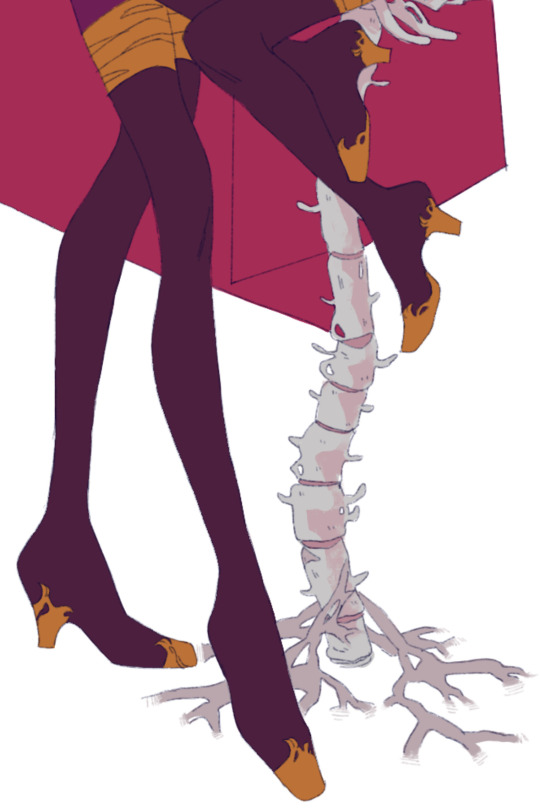
It’s supposed to be about us so I used plenty of symbolism (my teacher tries to make us write but I prefer letting people put the pieces together or make inferences on their own. In writing you show, don’t tell do why should visual art be any different? But that’s just my preference) a heart in fire is passion and a snake is loyalty or service (got these from a family crest based activity in history that went into the meaning behind the figures) so I used my own flaming heart symbol but replaced the heart with how I picture my soul to be and the snake is remenecent of Maple which connects to my characters and stories. The Headphones and scarf are things I wear to help me in my daily life and have grown attached to. Then there’s the Bone-arrow (heh) that has broken through the crystalline outer layer to reach the small soul it protects. Basically UT, mainly the skeletons, has really hit hard with me and is part of who I am now. The last part is the ribs which has less of a major part of me kinda value and more of an “I added it as a joke to the sketch cause it was feeling empty over there but now it looks good and I have to follow through” it is a nod to something but y’all can theorize for yourselves >w•
Also-! Here’s the sketch! I like it more than the sculpture but then again I do drawing, not sculpting -/(0w•)\-

2 notes
·
View notes
Photo

Time for a sword guide! This one was for specifically Gramr, from Hellblade, but most of the documentation is for the raw construction process so it should be applicable to most any sword one would want to build, particularly one with a straight blade.
Materials for this, from beginning to end, were:
- Wood - one board, 6′ long by 3″ by 1″. I used softwood, as it’s easier to work and cheaper, but hardwood would probably help make a smoother blade.
- Acrylic paste. I used Golden.
- Paperclay. Regular air-dry clay would probably work, too.
- A Screw + screwdriver or drill
- A strip of leather. I was fortunate enough to have a scrap strip that worked almost perfectly.
- A good, strong glue. I used Wellbond, but a wood or Gorilla glue might have been better.
- Access to a woodshop, particularly a skillsaw and belt sander. One could theoretically use a handsaw and hand sanding block, but it would take much longer.
First thing, I found some good reference images for scale and to break the sword into basic shapes:

This is, too be frank, a big-ass sword. I am very tall. In order to figure out exactly how long to make it, I took a stick I had lying around and played with it - held it above my head and at belt level, to get an idea of how big would look ‘big’ on me. It’s also important to note here that Gramr is a two-handed sword, at least for Senua, which for me means the hilt must be around 10 inches. After some research and some consideration of what’d be feasible for me, you know, standing, I settled on a 34-inch blade, for a total length of 44 inches. I went to some effort to find a 3″ board because I wanted the blade to be 3″ across, and 1″ in order to cut down on shaping time without sacrificing strength.
However, the shape isn’t super distinct. It’s helpful to look at a variety of sources to find references - the best image I found of the shape was actually the icon for the “Gramr Released” achievement:

Here we can see the shape clearly. I also marked down those lines to show equal lengths - so the crossguard is just as wide as the hilt is long. From there, I moved on to drawing the shapes onto wood. Here you can see the drawn shape of the crossguard. I marked the relative positions of the circles (based on the width of the sword), used the bottom of a shotglass to trace them, then drew the connecting pieces:

Here’s another picture showing both the hilt and blade outline. It gives a better sense of scale. Tips for drawing the blade: mark out the center of the blade from base to tip, make marks an equal distance from that center at regular intervals, and trace between them. For example, measure to 2″ wide of center 15″ from the base, then 1″ at 25″, and use a straight edge to trace between them.

After everything’s been drawn, it’s time for a trip to the woodshop. I used a skillsaw to cut out both the blade and crossguard. If you’re not familiar with the equipment, please get help - skillsaws aren’t quite as scary as tablesaws, but they’ll still take your fingers, and the blade can snap and and fling metal everywhere. On the plus side, this is where we can start to see a sword!

Note that at this stage I have two copies of the crossguard. The idea is to use one on each side of the blade and sandwich them together. Instead of trying to draw the exact same thing, I simply traced the first one after cutting it out.
That done, it’s time to shape the blade. My first attempt here I tried to use a hammer and chisel, but I was afraid I’d overcut and destroy the line of the blade, which I really Did Not Want, so I went with the slower but more precise method of using a power sander. I think a belt sander would be ideal, but I didn’t have access to one, so I ended up on an oscillating drum sander. Either way, I eventually ended up with a passable approximation of a blade:

After that, I finagled the crossguard pieces - I cut them each in half longways, so I had the original shape 4 times. I then sanded out the center of two of the four, so I had room for the blade, and cut another into thirds. I discarded the center piece and used the outside two to fill in the gap between the two outer pieces.

Unfortunately, I completely forgot to take pictures of... the rest. of construction. sorry. However, I can still provide some step by step instructions:
- Secure the cross guard pieces to each other and the blade using glue. I placed a pencil under and atop each outer circle, then stacked a barbell weight on top to make sure they stayed, and left it overnight.
- For extra strength, use a screw or nail through the intersection of crossguard and blade. Be careful, as this may splinter the thin crossguard, especially if you’re using softwood.
- Acrylic paste to fill in the gaps between the pieces and create a cohesive surface, including smoothing out the screw or nailhead. I also layered some over the circles, to make them stand out more. These circles also have designs on them, which facilitated one of my favorite uses of acrylic paste. I spooned some into a ziploc bag, clipped the corner off, and... essentially frosted them on. Wait for it to dry, plunk on some contrasting paint, and viola:

Not as finely detailed, I concede, but I was quite happy with it. Illustration aside, before painting:
- Paperclay is used to form the larger, stiffer pieces - the pommel and the band around the base of the blade. Once all those pieces are dry,
- Wrap the leather strip around the handle. I did a few test wraps, then glued down one end, wrapped tightly, and secured the other end also with glue. If possible, staple gunning one or both ends would make a stronger grip, but it frankly won’t go through the same amount of stress as say a hand tool.
- Paint! I used a mix of gold and brown to get the bronze look, and pebeo moon in a dark metallic in an effort to get that marbled iron look. I also used fabric paint on the leather, to help the grip look cohesive, and backed up to that achievement icon to get a handle (heh) on the pattern that’s apparently inlaid and sketched it out.

- Not really a part of the sword proper and I don’t have a ton of pictures, but I did also make a sheath. To make the base, I just laid the sword down, traced one edge of the blade, flipped it over, and traced the other edge. Sew down middle. Sheath. However, I did wet form the sheath when I was done to make it more structurally sound,, and I wanted to provide a Warning: when wetforming a sheath, consider inserting something small to bulk up the blade so that it can be extracted easily. I slid a paint mixing stick in with the sword, and if I hadn’t drawing and sheathing it would be a whole lot clumsier.
That’s about all I got! Have fun, and happy swording.

#Hellblade#Gramr#Hellblade cosplay#Prop Build#Sword tutorial#con is in 10 days so I'm making a bunch of Process Stuff#sadly most of the documentation is just of the woodshop process#so it's kinda one two skip a few 99 100#hopefully it can still help someone out tho!
8 notes
·
View notes
Text
Gargoyle Process
This painting started from a sketch in 2015 that I didn't touch for a bout a year, then came back to after ruminating on it on and off over that lapse. It's loosely centered around this legend of the walled city of Agartha, and the guarding demons and djinn that would keep the unworthy from entering.
Here I sketched out the environment surrounding the figure and arranged the composition a bit. I wanted the environment to have a sort of Mediterranean feel to it, almost classical ancient Greek/Roman with a little hint of tropical. I ended up changing the perspective quite a bit because I wanted to paint in a lot of texture in the landscape of the background, and also wanted to drive home a feeling of the figure standing on a really high wall far above the ground below. So I raised the horizon line almost to the top of the canvas and redid a lot of the figure to fit in with a more top down perspective.
Here you can see the new perspective and wings, and my attempt at dumping colors all over the place that I felt gave off the feeling I wanted for the piece, which was a sort of bright and sunny warm day in the afternoon, soon approaching the golden hour.
Here's some images that I felt captured the mood and lighting I wanted to portray
Let the render fest begin! As I was painting the torso my power supply for my computer started crapping out and it was pretty terrifying to paint for fear of losing work. I had finished just about the entire torso and arms when it crashed when I tried to save it, and had to do it over, about 5 hours of work. The second version definitely came out better though. I threw in a crazy weird mandala-lever-table-mechanism I thought would be interesting but ended up chucking it for the sake of time and it threw off the composition a bit. It's inspired by this talk I listened to about the physicist Wolfgang Pauli and his therapy sessions with C. G. Jung. From what I remember, through deep trance or in a dream, Pauli saw this mandala that represented perfect rationality and other dimensions or concepts like increments of time integrated into each other. The idea was to sort of have the Gargoyle in control of one of the levers, hinting that your perception of reality may be manipulated or something along those lines. I mostly wanted an excuse to make a shiny 3D object and render it so that I could have perfect shiny reflection in the painting. I got my jollies in that regard with the mace that I replaced this mandala with.
Here's the talk and a picture of the mandala:
Here's some of the references for the skin and torso. In the old master painting with the man pointing toward the sky I really liked the way their skin looked really pale in some parts and very tan or oily/dirty in others and tried to replicate that effect on the figure with a sort of red-grayish green and a more yellow green. I imagine there being less callous spots that would be lighter and more "juicy" like when the skin is stretched it'll lighten up in those areas, kind of like when some plastic bends it gets lighter in those spots that are really stretched out. It's sort of an effect or look that produces a sensation that I wanted to portray and think looks cool and not much more.
Here's about where I had gotten before I lost my file to the dark lords of psd corruption. Lots of rendering and minute fiddling, pulling and pushing forms and moving around muscles underneath the skin. Reference is a lifesaver when it comes to anatomy, or anything really, but especially anatomy because of how complex it is and how easy it is for people (who all have bodies) to recognize when something is off. I remember this is where I really felt like I was going somewhere with the painting and it had some potential.
Got the rest of the human parts nailed down. I almost went fully Egyptian with his undergarments but decided against it. I found out the name for this type of clothing though, "shendyt" if you ever need to know that. Lots of challenging but enjoyable intricacies worked out here. If I could give a tip on picking color it would be to learn how to really feel it out. If you try to do this with only your intellect and calculate every aspect of surface color and lighting and reflection you mostly end up getting in your own way (not that this isn't important). If you can grab a color that feels ok and run with it you're better off than being indecisive and worrying that the color isn't perfectly accurate. Make a choice and observe the result. What happens when you lay that color next to the others, how does it feel deep down in your gut and heart. What does it need more of? It's like tasting pudding, when you put it on your tongue and smack it around in your mouth how does it taste? What would make it taste more like the most perfect pudding you can imagine? You also have to have good taste to make things that taste good.
Focused heavily on the wings and tree here. I took a big leap with the dappled lighting and just went for it. I knew it would be really hard to make it look realistic and it kind of became abstracted, but I learned a lot. After having finished it I've seen multiple images that would have been much better reference for the dappled lighting than what I used, but such is life. In place of accurate lighting effects I had fun making cool shapes and swirlies. I tried to create an effect similar to some sort of vectoring of light blobs where their outer edge sort of merges with the nearby blobs, similar to when you squint your eyes and look at lights out of focus. On the upper/outer edges of the wings I tried to pull of the effect of something being in shadow on a sunny day and heavily reflecting the blue of the sky. Since that surface isn't being blown out by sunlight you can really see other ambient light sources reflecting on it.
I darkened the shindyt loin cloth by plopping a multiply layer over it and touching it up a bit. I though the lightness of the previous color was attracting a little too much attention and contrast. But when I look at it now I almost like it better.
I also tried to get down some of the awesome patterning on eucalyptus trees that I see here around town. They're some of the coolest looking trees in my opinion and really wanted to capture that dramatic contrast of values and colors they have on them along with the smooth swirly lumps. This tree was extremely difficult and I redid it at least once. I still don't think I pulled off the look I was going for with it but I like it in it's own right.
Here's the bottom before and after the redo. I really wanted to pull off a section of surface that's lit evenly but has two different values/surface materials and have it look cohesive. This was a pain but I'm starting to come around to the idea of doing stuff over even if it's really close to what you want or it feels like too much work. It almost always comes out better.
I also had a friend help out and do a paintover to try and tie up the values which explains the darkened corner on the ground. Much more moody and dramatic. He also taught me this technique to strategically adjust the levels with brush strokes using a mask.
Create a levels adjustment layer. Depending on how you want to adjust the levels (lights, darks or midtones) move the sliders around to a spot you like, and this is the awesome part is it doesn't have to affect the whole image, so you can pick an area you want to change the levels of, adjust accordingly, and target that spot. To do this click on the blank white square (red X) and paint bucket it fully black, then go back to the levels adjustments (click on the layer name or graph square) and start painting or lassoing in white in the spot that you wanted changed. This helps a TON.
More progress! I started experiment with texture in the background by making some brushes and messing with them. I was really inspired by the way Craig Mullins can pull off seemingly intricate detail with abstract shapes and textures and wanted to try something similar. Maybe next time lol. I was also inspired by Dean Cornwell and looking at his work for the texture on the ground, trying to make nice big juicy blobs of paint that almost look like clumps of mud or stones. I also really had fun with trying to make a compelling pattern that was still in perspective. For the background I was looking at the Walter Everett painting above a lot, trying to get a beautiful harmony of really light values and colors, having forms be defined with only hue and not much value change at all. It's really hard to pull off.
I went nuts on the background. I replaced the original idea of a golden glittering canyon with a more earthy and gradient filled landscape. I also tweaked the values much brighter, which I think I darkened back down later. I was heavily inspired by Whit Brachna and had at least one of his paintings open the entire time I was working on the background.
These are some of my all time favorite paintings. Just look at them, gotdang.
3D mace! Mostly inspired by spiky black metal aesthetic. I made a very rough (but that's really all I needed) model of the mace in Cinema 4D. The most tedious part was obviously all the spikes. There's probably a way you could pull them out of the sphere in 2 seconds but I'm not versed enough to avoid tediously scooting each individual spike one at a time. I then took it into ZBrush and just scrubbed it over with a cool texture brush that gave it a bunch of amazing details that you can't even see in the painting. I tried to set up a scenario in C4D that was as close to the painting as I could muster to get the lighting right. I copied a bunch of disc tubes to try and replicate leaves and branches. Since the figures hand, and most of his upper body was cast in shadow I tried to strategically place some "leaves" over the top half of the mace.
I messed with a bunch of different surface materials and render settings and ended up going with the shiniest one, heh.
Here it is before and after being painted on, very minute adjustments.
I'd say the rest is pretty straightforward and can't really think of any extraordinary advice except maybe doing more quick studies of your weak spots. I'm realizing I could get a lot of benefit from doing a higher quantity of less elaborate stuff to really improve more.
I really hoped this helped and if there's anything you'd like me to elaborate on or that you felt was left out please don't hesitate to ask!
Here's some meaty juice for you. I made a 2000px tall resolution gif of all the process images which is included in the .zip, containing over 30 of the aforementioned 2000px res process pics, some full resolution (8000px) crops of the final image, and a few other random in progress shots. And finally here's the full resolution (8000px) final .jpg, the final .psd file (2000px), and my brush presets. Enjoy!
I'm not sure how to export your presets as new brushes and you may already need the .abr file for the presets to work, so if you have any tips on that let me know. Most of the brushes I use are straight from other sets or slightly tweaked and saved as a preset.
Anyway, I think this will conclude this massive post. I truly hope it's helpful, or at the very least mildly interesting. Thanks for reading!
24 notes
·
View notes
Text
A Vision for Impressionism
Entry 2
Before going, we had to search up this place to see how long it will take us to get there. Google maps told us 1 hour. One hour metro ride. wow.
Welp.. here we go. We took the metro 6 and changed to 1 on the Louvre. But then for some reasons the metro stops were all closed so our metro 1 kept going nonstop to our destination, Les Sabron, a station outside of Paris. (Lucky us heh)
But let's just say, even if we did have to take an hour metro to the Fondation Louis Vuitton, It is totally worth it. We did go to check out the exhibition, but we also went around looking at other works that were held, and we also got to (thank you Bri) go into the Infinity Mirror Room by Yayoi Kusama and experience being in presence, actually being inside a sculpture. (It was awesome)

Anyways, we bought our ticket to go inside. One story up the escalator and we were in front of the Courtauld Collection exhibition. This exhibition, according to the FLV website, is held from February 20 to June 17 and it contains different collections of the British entrepreneur and art patron Samuel Courtauld.
This collection is made of 110 works, including 60 paintings and graphic pieces and even "museum-rare" medium, watercolor. Some artworks were a replica but there were also originals by Manet, Cezanne, Van Gogh and more.

Samuel Courtauld is “an English industrialist who is best remembered as an art collector and he is the founder of the Courtauld Institute of Art and Courtauld Gallery in London” (FLV).

Artworks made by artists including Edgar Degas, Paul Gauguin, Henri Matisse, Claude Monet, Camille Pissarro, and Vincent Van Gogh were displayed in the exhibition.

I really loved how different the artworks were from each other. The ones on top were frames that were about 20 cm to 15 cm in size (around 7x5) and I thought they were very interesting because we don't usually see small paintings in museums. These paintings were by Georges Seurat which really surprised me because I knew him as a neo-impressionist painter (the style that is used for the painting on the bottom). However, these paintings were not painted in a pointillist way, but in a very impressionistic style. Which then, I read the descriptions which said that these are an early version of his style that Seurat did not choose to pursue it.
I think that is one thing that is very unique in this exhibition. A lot of the artworks are by famous artists that we know of but the artworks in this collection that Courtauld also has very early works of these artists.

There were also chalk and conte pieces, which I thought was something unusual to see in a museum. Drawings were considered to be more of a sketch than a finished piece so the fact that these drawings by Matisse, Seurat and others.

And then what fascinated me the most was the presence of watercolor. I honestly think I can say that this was the very first time I've ever actually spotted a watercolor piece in a museum. These two artworks that I took a picture of were both a work by Paul Cezanne and his medium was graphite and watercolor.
I feel like watercolor has the same reputations as drawings, where they are considered to be sketches instead of a finished artwork which is why it is really rare to see watercolor pieces in museums. But this exhibition has both watercolor and drawings, and even earlier artworks by famous artists making the exhibition such a cool exhibition to go to.

Oh, I also had to point out the difference in lighting in the museum. The dark side of the room was where all the watercolor pieces were held. I personally think the curators made those spots darker because watercolors fade away faster than other artworks so they intentionally kept it darker (but that is my opinion).

The very last part of the exhibition was a small room of watercolor works by Stephen Turner (by the way, the exhibition was broken up into 8 rooms, dedicated to different artists - Cezanne, Seurat, and Turner having a room to themselves).
This artwork is a watercolor piece done by Stephen Turner titled Chepstow Castle. The piece is 20.9 x 29.9 cm (8.2 x 11.8).
I found myself in awe when I saw this piece. Just the fact that there are no watermarks and really well (and lightly) rendered just gave such a subtle vibe to the piece.

The graphite was visible but they were not a negative but gave texture to the painting. Speaking of textures, I love how he uses little dots to indicate the bumpiness of the bridge.

He handles the watercolor very well, as mentioned before, there are no watermarks. the sky is very well controlled, having a slight gradation with negative spaces to make clear clouds. He uses the same type of technique (using negative space to make white) for the water surface, with a darker contrast.
Because of this contrast, it is obvious to see that the painting is made up of a lot of layers. As the medium is watercolor, he uses the addition technique of starting out light and adding more color on top of them to increase the color contrast. The color is very dull and he uses a lot of cool colors, greenish black, grey, blue, and cool brown to depict the different parts of the painting.
Overall, I really loved the exhibition, seeing different types of artworks other than oil and old master style paintings. I was very happy that Samuel Courtauld took sketches (drawings and watercolor) as art and was willing to keep it in the collections. Thanks to him, I was able to see these artists' ‘sketches’ and earlier works. It was really cool to see the different styles the artists had to experience to find the one that they would eventually pursue in.
0 notes
Last Seen Blogs

wildchildsixx
It’s so nice to meet you, let’s never meet again
andreil
taylor

seoulicit
서울icit

autumn-heart
Autumn Heart

miroticicons
mirotic icons and headers