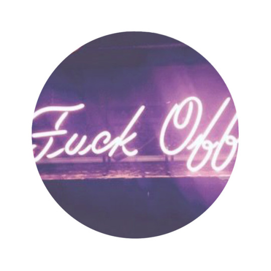
#my typog
Text
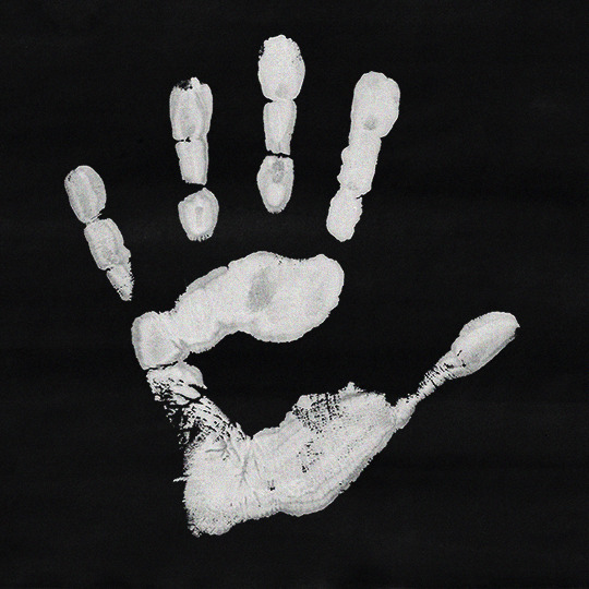

September 18, 2008
#destieledit#deancasedit#spnedit#supernaturaledit#destiel#deancas#supernatural#deancas mine#spn mine#my edit#my typog#my stuff#it's been so long since i last posted something here that i had to check what tags i used lmaoo#and also the photo post editor is different agdsfgh
508 notes
·
View notes
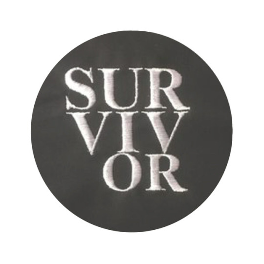
Text


𝗙𝝠𝗡𝗖𝗬 𝗗𝗜𝗦𝗖𝗥𝗘𝗣𝝠𝗡𝗖𝗬 ⚛️
𝗗𝗘𝗟𝗨𝗫𝗘 𝗠𝗘𝗠𝗘𝗦 ☣️
𝗠𝗘𝗠𝗘𝗦 𝗠𝗬 𝝠𝗦𝗦 ☢️
𝗠𝗬 𝗠𝗘𝗠𝗘𝗦 👽
𝗣𝗨𝗡𝗞𝗦 𝝠𝗥𝗘𝗡’𝗧 𝗗𝗘𝝠𝗗 ☠️
𝗠𝝝𝝝𝗗 𝗕𝝝𝝠𝗥𝗗 / 𝗣𝗨𝗡𝗞𝗦𝝠𝗥𝗘𝗡𝗧𝗗𝗘𝝠𝗗 / 𝗟𝝝𝗩𝗘 & 𝗟𝗘𝗧 𝗟𝝝𝗩𝗘 / 𝗟𝗜𝗩𝗘 & 𝗟𝗘𝗧 𝗟𝗜𝗩𝗘 / 𝗞𝗘𝗘𝗣 𝗜𝗧 𝗦𝗜𝗠𝗣𝗟𝗘 𝗞𝗘𝗘𝗣 𝗜𝗧 𝗥𝗘𝝠𝗟 / 𝗡𝝝 𝗚𝝝𝗗𝗦 𝗡𝝝 𝗠𝝠𝗦𝗧𝗘𝗥𝗦 / 𝗣𝗥𝝝 𝗟𝗜𝗙𝗘 𝗠𝗙𝗭 / 𝗣𝗛𝗨𝗖𝗞 𝗧𝗛𝝠 𝗦𝗬𝗦𝗧𝗘𝗠 / 𝗙𝗟𝗨𝗙𝗙 𝗬𝝝𝗨, 𝗬𝝝𝗨 𝗙𝗟𝗨𝗙𝗙𝗜𝗡 𝗙𝗟𝗨𝗙𝗙 / 𝗜 𝗗𝝝𝗡’𝗧 𝗚𝗜𝗩𝗘 𝝠 𝗣𝗛𝗨𝗖𝗞 / 𝗣𝗛𝗨𝗖𝗞𝗜𝗧𝟰𝗣𝗛𝗨𝗡 / 𝗙𝝝𝝝𝗟𝗜𝗡𝗚𝝠𝗥𝝝𝗨𝗡𝗗 / 𝗧𝗥𝝠𝗦𝗛𝗠𝗘 / 𝗧𝗥𝝠𝗦𝗛𝗖𝝝𝗥𝗘 / 𝝠𝗡𝗗𝗥𝝝𝗜𝗗𝝠𝗥𝗧 / 𝗘𝗘𝗞 𝗣𝗘𝝝𝗣𝗟𝗘 / 𝗚𝗟𝗜𝗧𝗖𝗛 𝝝𝗥 𝗗𝗜𝗘 / 𝗚𝗟𝗜𝗧𝗖𝗛 & 𝗖𝗥𝗬 / 𝗚𝗟𝗜𝗧𝗖𝗛 𝗠𝗬 𝗟𝗜𝗙𝗘 / 𝗕𝝠𝗟𝗖𝝝𝗡𝗬𝝠𝗥𝗧 / 𝗘𝗡𝗘𝗥𝗚𝗬𝗦𝗨𝗖𝗞𝗘𝗥𝗭 𝗡𝝝𝗧 𝗪𝗘𝗟(𝗟) 𝗖𝗨𝗠
#xheesy #glitchmylife #glitchmafia #artsyfartsy #artfuckery #expressyouself #iphoneart #popart #appforthat 4 @len0r #punksarentdead #newcontemporary #worldoffmusicon #trallala #Digitaloriginal #photoart #photoartist #photoartwork @frenchpsychiatrymuderedmycnut @bigbonzo @inbetweenneeds #photoartistic #photoarts #blissfulphotoart #photoartistique #photoarte #photoartistry #contemporaryphotoart #photoartists #photoarty #photoartgallery #photoartspirit #urbanphotoart #darkphotoart #photooftheday #photographylovers #aesthetic #photographylover #ilovephotography #photographyart
Soundtrack: Die in the Disco by Night Club

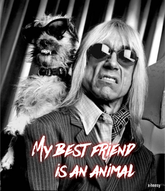
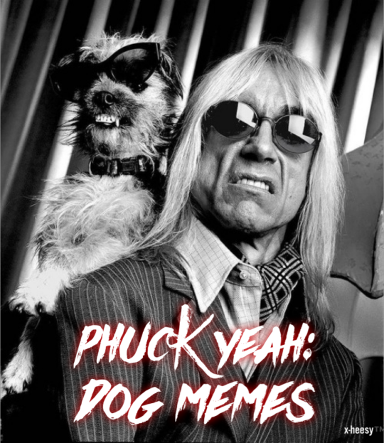
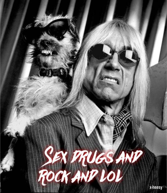
#crying 😂😂😂😂#iggy pop#x-heesy#my meMes#my art#artists on tumblr#2/2024#meme#memes#dogs#dog#dog memes#I wanna die in the disco#i wanna be your dog#my best friend is an animal#sex drugs and rock n roll#Sex drugs and socks with holes#artful quotes#text art#typog#pop art#neo pop art#Wisdoom#now playing#music and art#contemporaryart#l o v e#stay wild moon child#music
28 notes
·
View notes
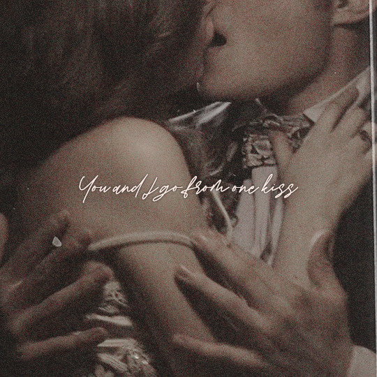
Text
quickie for our musical pubmat collection
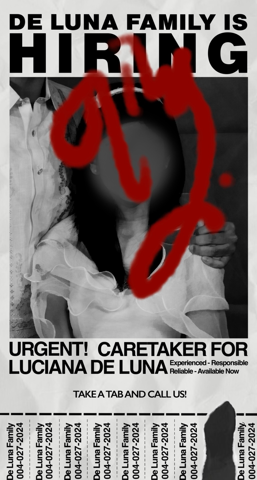
i actually really hate this 🤍 the initial poster was all half assed typog lawl helvetica in black just shift & turn—it’s so low effort (???) i like the tab + rip tho:3 my friends suggested those when i was asking for inspo
errr i might just be dramatic bc it doesnt look that bad . what irks me is the fact that anyone else can easily make it xD cus wtf am i doing if everyone else can simply replicate it!
then i had to draw a bg bc the poster would not fit for posting . i had like ???? a few hours to get it done bc it was a spur of the moment decision :’( so i genuinely dislike the final output. i cant graffiti and bg 💔 and i had to do all of that here with a little perspective included. if i had prior knowledge ab those, i would have enjoyed making it and maybe even the final output
0 notes
Text
(ARTS246) Ch. 6: The Typographic Message & Project #2 - UCDA POSTER COMPETITION
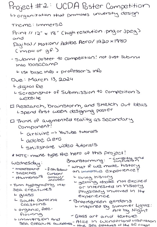


An immersive experience using augmented reality? What does it mean to create an immersive experience? These were some of my initial thoughts during the assignment brief for Project #2. The objective of this project is to design a poster for the UCDA Poster Competition, an annual contest organized by the University & College Designers Association. The purpose of this competition is to motivate students to create artwork that inspires positive thinking. Participants can design an original poster for print or online use. The theme for this year's competition is Immerse, in which students are encouraged to explore the unlimited possibilities of immersive design through the use of augmented reality using software such as Artivive and Adobe Aero.
I have to confess that I felt nervous and overwhelmed when I found out that I needed to incorporate augmented reality in my poster design. Learning new software can be challenging, and I was worried about the potential learning curve that usually comes with it. Before my first year at the University of South Carolina, I was unfamiliar with Adobe products. However, through experience and practice, I have gained confidence in using the software. Perhaps learning augmented reality will not be too different? To better tackle this project, I have decided to divide it into two parts: creating the initial poster design on paper and developing the augmented reality component. My professor encouraged me to take on the project this way, as learning new software can be a challenging experience, and those fears should not overwhelm me to the point of not beginning the project at all.
One of the first ideas that come to mind with the word "immerse" is the physical art exhibit experiences. For instance, the "Italian Renaissance Alive At Biltmore" and "Immersive Van Gogh Alive" at the Biltmore are examples of such experiences. These events offer a unique and immersive way to explore art. My first experience with immersive art was at the MoMA in New York City in 2016. I visited an exhibit called "Teiji Furuhashi: Lovers." According to the MoMA's official website, the exhibit is a large-scale multimedia installation created by the Japanese artist Teiji Furuhashi (1960-1995). It provides an immersive experience for the viewers, taking them into an empty room with projections along the walls. Life-sized images of the artist are projected onto the walls of a darkened room from a tower of computer-controlled video and slide projectors at its center. The figures in the sequence move in overlapping paths, sometimes running past each other or pausing in an embrace, but their bodies never touch. In further research on the exhibit, I discovered that the artist created it a year prior to his death from an AIDS-related illness. Lovers explores what the artist described as "the theme of contemporary love in an ultra-romantic way." I couldn't help but reflect on my freshman year of high school when I heard that the theme for this project was immersive. I remember this unique and creative exhibit that introduced me to a fascinating artistic expression and creation form.
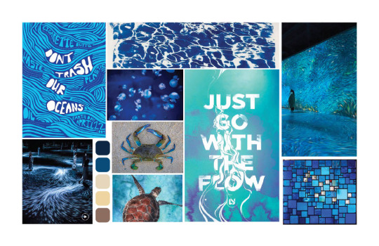
During my brainstorming process, I stumbled upon the words immersion and submersion. These words immediately made me think of water and the ocean. I decided to delve deeper into this topic and searched for water-immersive experiences. To my surprise, I found a plethora of exhibits that showcase the movement of water and how it can be used as an art form. These exhibits piqued my interest and I was inspired to create my version of this immersive experience using a poster and augmented reality. I created a mood board to showcase visual and typography ideas for the poster. During the assignment brief, my professor instructed me to make typography the hero. This is precisely what I intend to do! To achieve my goal, I will experiment with the impact of various paper types on typography when exposed to water. I was inspired to experiment with water after my professor shared his experience playing with typography using fire during his college days. He had taken pictures of fire, lit objects, printed typography on fire, and captured stills of each experiment. Though the exercise sounded fascinating, it also sounded a bit scary. But I am ready to take on the challenge! I plan to do the exercise where I will print my typography on different types of paper, such as copy paper, tracing paper, cardstock, construction paper, etc. Then, I will experiment with how the type interacts with water. I will take inspiration from two TikTok videos and use them as guides to explore various ideas for this exercise:
For the readings this week, the textbook covered the topic of typography being used to convey a multidimensional message and as a universal language. I believe typography is a form of storytelling that can convey messages across cultures, even without a shared language. This chapter has helped me to further understand the concept of typography as a means of expression and to establish a relationship between content and form. Type can act as a gateway for a message to reach a wider audience through the use of words and visuals in a clarifying and expressive way. Understanding the function of expression is essential for truly conveying messages through typography, which can be achieved through the use of type, visual hierarchy, color, abstract forms, etc. Having a clear plan or goal for the function of a design is crucial to ensure that the message is effectively communicated to the audience. Without a well-thought-out purpose, the message may appear flat, dull, or even lost within the typography. In the design world, it is crucial to understand why things are created and their purpose. Simply stating that a design looks cool is not enough to convey a message to the audience. When creating something, it's best to not just focus on aesthetics and the fun aspect of it. Rather, it's important to take the work a step further and make intentional design decisions behind it. I'll definitely keep these factors in mind as I approach this next project!
NOTE: I have uploaded my notes from a guest speaker event that took place at McMaster 323 on Thursday, February 22nd from 7-8pm. Jon Sorrentino, a freelance designer, discussed his corporate experience versus freelancing with the GD+I Club. After listening to the talk, I learned that freelancing is not for everyone. Great freedom comes with great responsibility and finding balance and time management is key. Practice is the key to improving your skills as a designer. What you put into your work is what you'll get out. Always be curious and always ask questions to communicate effectively with clients.
0 notes
Photo
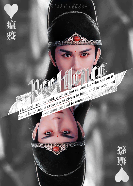


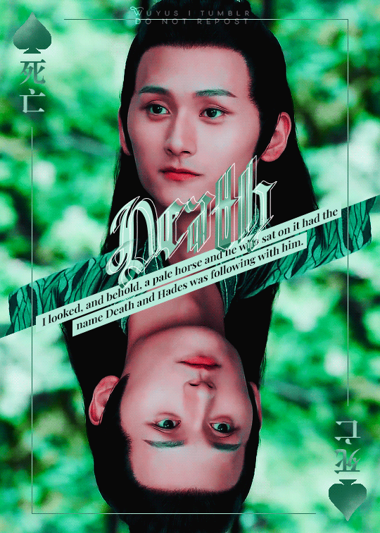
cql + the four horsemen of the apocalypse - a reinterpretation of this old set with shitty typography
@mdzsbingo • shapes + blackletter font
Pestilence is Jin Guangyao, sick with plans up his sleeves, his ambition a plague that ceaselessly grows, his greed a fatally corrupting disease that conquers his soul and the innocence that once was. Wherever he goes, he spreads his malaise: some are similarly corrupted, avarice blackening their veins; some are asymptomatic, oblivious to the infection that spreads beneath their noses yet culpable in their ignorance; and others die, succumbing to this epidemic, mere numbers in his viral covetousness for power. And so Jin Guangyao is the White Rider, white like the tainted peony embroidered on his ill-begotten robes.
War is Wei Wuxian, for his single-minded devotion, for the beliefs that he fought and died for. He laughs in the face of his enemies even when he stands alone against them all, taunting them to fight and spill blood. Is that the best you can do? Draw your sword and take your best shot, for I will come back to fight you once more. When he raises his weapon and the haunting refrain echoes over the battlefield like a battle cry, blood is spilled – his enemy’s and his alike. And so Wei Wuxian is the Red Rider, red like the bloodied ribbon in his hair, fluttering in the wind like a tattered banner over a pile of the fallen corpses of those who once stood in his path.
Famine is Xue Yang, hungry for violence and revenge, yet starved of attention and love. Behind him, he leaves a cracked desert: people ravished and weakened, tongues stolen, unable to speak, unable to taste, unable to cry for help. Men and women, young and old, rich and poor – he devours them all, licking the meat off their bones like a child with candy, playing with their skeletons when he is done. A hungry wolf prowling in the night, feral and rabid, his cold eyes fixed on his prey, sharp teeth hidden behind a crooked smile. And so Xue Yang is the Black Rider, black like the eyes of the hollow bodies he leaves in his wake.
Death is Nie Huaisang, for his hard work, this backbreaking labour that can never be finished in a day. They say Death is just, but cross him, and he will cross you out. He flits through the unsuspecting living, playing their charades and indulging in their arts, but oh, is he always there, there without them knowing, watching and lurking in the shadows, to take them when they least expect. When it is time to go, he looks at those dearly departed souls with eyes sometimes cold, sometimes resigned, sometimes with a tinge of regret, and then he will carry on with his work, for it will never be done. And so Nie Huaisang is the Pale Rider, pale like the paper of the fan that masks his face.
bingo card ⇩

#mdzsnet#mdzsbingo#theuntamededit#asiandramanet#chineseartistsinc#fytheuntamed#cdramaedit#the untamed#mdzs symbolism#*a#*i#*gfx#jin guangyao#wei wuxian#xue yang#nie huaisang#ew @ my old typog
1K notes
·
View notes
Text
Late night realization hits different.
#thoughts#personal#typog#poems and quotes#moving on#love#quotes#self healing#when will you realize how much you’ve hurt me?#heartbreak#love yourself#self love#no sleep#selfcare#you broke my heart#breakup#sadness#2am thoughts
1 note
·
View note
Photo


‘i want you to know,’ noah said, pressing the carved bone against his adam’s apple, hard, as if it would squeeze the words from him, ‘i was … more … when i was alive.’
#trcedit#litedit#noahczernyedit#thesquadtm#chwie#noah czerny#trc#the raven cycle#*#*typog#my glittery ghost son#i miss him#500#1k
1K notes
·
View notes
Photo


3k edit 11/? - Andreil Aesthetic
#andreil#3kedit#fucccckkkk#extrajostensquad#all fot the game#tfc#aftg#the foxhole court#WAHOO#this is more of like typog and aes than anything BUT whoops#its 130 am and i accidentally published this on my other blog and then had to go back downstairs to get my laptop to fix t
212 notes
·
View notes
Text

If you know it in one glimpse, it's legendary.
#chairedit#ggedit#gossipgirledit#dailycb#chuck x blair#chuck and blair#gossip girl#chair mine#gg mine#my typog#my stuff#me making a chair edit on the year 2024? more likely than you think#rewatch was a Big Mistake#(fingers crossed this gets notes lmao)
29 notes
·
View notes
Text
my main goal while making a rwrb typog is to cause a reread
4 notes
·
View notes
Photo

Christian Dior S/S 2017 Couture
#christian dior#my edit#fashion#typog#bw#f: couture#asteriea#neilsjosten#gansaey#vildes#kaitegecko#softplum#softheat#theodoramuldanis#noorawiliam#winonaryder#softgansey#moongloss#cuipid#hecvbe#archistratego#illuminosity#stcrwar#moonslesbian#oydssey#chrispenetrator#czernys#oscarcash
857 notes
·
View notes
Photo
Ok, now I’m gonna chill on it. I finally have a final version that I’m comfortable with. I’d like to thank you all for the suggestions on my previous post, specially @chrisbenicio - PS. this is not a logo, just a typography design, maybe for a t-shirt. Again, thank you.. the design community here on Instagram is awesome! ♛♛Visit our shop art Design Topography CLIC HERE ♛♛ #design typography fonts #design typography inspiration #design typography poster #design typography shirt #text design typog
1 note
·
View note
Video
Feedback from lecturers and peers:
This video is me after my brochure review. Mainly posting this one to compare how im changing my layout and folding method. My new brochure is a bit easier to use and isn’t flawed.
There were a lot of really great points Hazel and George brought up in regards to my brochure design.
Poster -
Maria in class insisted that I refine the TYPOGRAFIKA typeface so that it’s 3D and pops out more,
I was quite confused what she meant by this comment but I believe she either meant add a drop shadow or some more shading into the font.
My lecturer Hazel insisted that I should split the TYPOGRAFIKA into
TYPOG
RAFIKA
I really appreciated this feedback as I was having a lot of trouble fitting the whole title onto the poster.
The more I think about it the better this idea is. The typeface is blocky so it stacks onto itself really perfectly. Even though the number of letters is uneven - the “i” isn’t exactly that big, this means the typeface can perfectly stack on itself.
I also got told I should make the speaker names larger on the poster as that’s what the audience is interested in apart from the title. After that the hierarchy falls into WHERE THE EVENT IS and WHEN, then subheading then extra info.
Information side -
There were a lot more comments on the informational side. Initially I begun by criticising myself, I had worried my portrait illustrations were too cartoonish and didn’t fit a professional theme very well. George seconded that and agreed I should just manipulate photography, I would incorporate the colour palette to show the vibrancy and fun of the event.
I also got told I should minimalize the use of colour as it ruins the hierarchy of information. I always get too ambitious when it comes to the use of colour, however this time I understood I’ve compacted three complimentary colours in a small space. In future I’m going to hide a lot of this colour and use it for information highlighting. Specifically to signifiy seperate parts of the brochure, kinda like what I was already doing but ‘less in your face’.
My schedule needed a lot of redoing due to the layout of my brochure. I had originally left out the date and event section from the speaker biographies, this was because I didn’t think there would be enough space. However now I am determined to figure out a way to link the speakers and their events more clearly. Maybe with colour coding?
There were a few small things that needed adjusting like body and title text having switched fonts sometimes. My first page also needed a lot of redoing as it wasn’t compositionally working.
0 notes
Photo


This was the pdf I presented to my group when it was the next feedback session. Most of the people in my group were going for a more minimalistic approach to their brochures and used rather pale colours to mine, which did put doubt in my mind that maybe mine was a bit to much in your face. But george said the colour was a nice additive to the design so i think I’m going to keep it. I made some other notes during the lesson on what he recommend me look into further.
- Hierarchy needs to be looked at especially on the poster side
- Poster side also needed to change the way TYPOGRAFIKA was read due to the text being typog-fika not typo-grafika use black and white colour to improve, also make the title bigger
- Spacing between paragraphs needs to be edited, too big, make it more eye pleasing
- Front cover panel needs to be more cohesive with the poster side as it looks to different “So if I were to pick up this brochure I know that it matches the poster I have seen”
- Image captions with references need to be added
- Make sure background image colour is the same as the background panel so it blends in
Using this feedback I’m going to touch up my brochure and try finalise everything.
0 notes
Photo

Repost from @magdiellop using @RepostRegramApp - Staying Alive Link in bio for & hi-res images of all my posters By @magdiellop . . . . #poster #magdiellopez #postereveryday#designeveryday #zayd #adobe #graphicdesign #typog#printsraphy #365 #designspiration #modernart #art#print #aiga #itsnicethat #xuxoe #graphic#inspirationseed#simplycooldesign#designard #graphicroozane#graphicdesignc#adobeentral #gfxmob#ps_zerocompromise #c4d #slantedpublishers #stayinside https://www.instagram.com/p/B-pOIh7IHWL/?igshid=14xu9k7vjbi21
#poster#magdiellopez#postereveryday#designeveryday#zayd#adobe#graphicdesign#typog#printsraphy#365#designspiration#modernart#art#print#aiga#itsnicethat#xuxoe#graphic#inspirationseed#simplycooldesign#designard#graphicroozane#graphicdesignc#adobeentral#gfxmob#ps_zerocompromise#c4d#slantedpublishers#stayinside
0 notes
Text
the funniest thing about typogate as I’m calling it is that it was in a title for a lecture that was corrected by the speaker at a later date, so pretty much I forgot to change it like ONE fucking place of the fifty places I needed to change it. Also, I’ve worked here for 25 years and they are just now catching on about my typo problem? Bitch, look at me, I’m made of typos...
3 notes
·
View notes
Last Seen Blogs
pixier0t
˗ˋˏ ♡ ˎˊ˗
tyrellbutts
ultimate soffpotatis
mirien3
I turn at last to paths that lead home
homemade-clones
But your honor, clones. I love them.