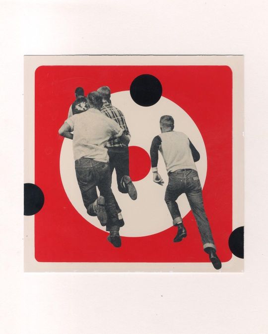
#itsnicethat
Photo

ItsNiceThat x BBC Earth - rosepilkington.com
313 notes
·
View notes
Text
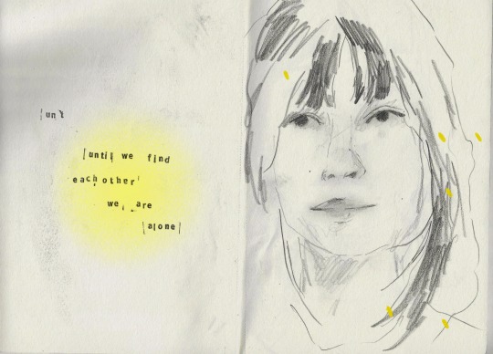
words from hunger by adrienne rich
prints
instagram
#art#art journal#artist#collage#collage art#my art#artists on tumblr#journaling#words#poem#adrienne rich#audre lorde#illustration#illustrator#women in illustration#itsnicethat#behance#visual art#visual poetry#visual design#graphic design#portrait#sketchbook#art student
296 notes
·
View notes
Photo
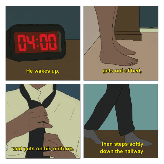
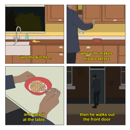
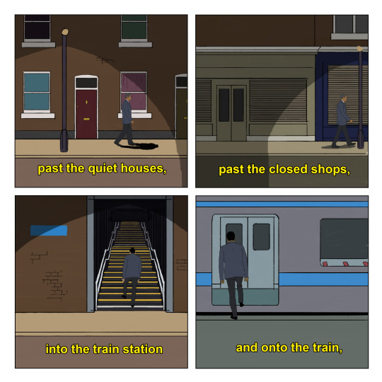


“Routines” by Jordan Bolton
Part of “Scenes from Imagined Films” Issue 2 - Order on Etsy now!
#comic#comix#jordan bolton#scenes from imagined films#routines#morning#illustration#dribble#itsnicethat#graphic design
1K notes
·
View notes
Text
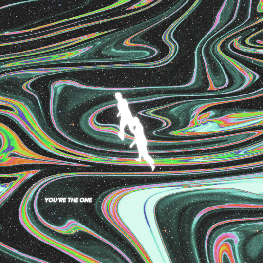
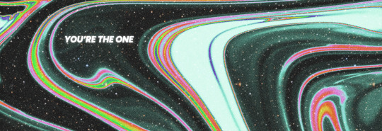
you’re the one.
#digitalart#coverart#visualart#digitalcollage#artist#collage#art#artwork#graphicdesign#digitalgallery#graphicposter#photoshopartist#posterdesign#designfeed#dailyposter#certainmagazine#itsnicethat#youretheone#space#stars#spacearts#typographicposter#lyrics#darkspacearts#posters#posterunion#digitalarchive#surrealart#song lyrics#i lost my body
820 notes
·
View notes
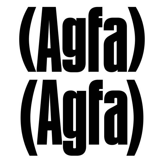
Text
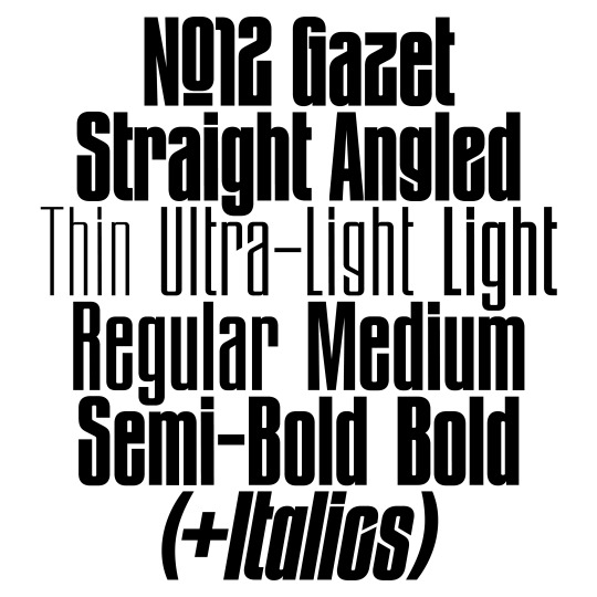
The original »Bold Angled« style has been complemented by lighter weights, italics and an entire family with straight endings making it a versatile family for a wide variety of display usage. OpenType features such as a monocace feature allows tight line spacing and creative typesetting.
www.new-letters.de
#newletters#typography#gazet#condensed#grotesk#thomasjohn#release#graphicdesign#eyeondesign#grafikradar#tomorrow_featured#typeinspire#contemporarytype#typegoodness#thedod#designfeed#typetype#365typefaces#aigadesign#itsnicethat#designeverywhere#type01
29 notes
·
View notes
Text
Please Be Seated by Paul Cocksedge
Is this the opposite of hostile architecture?
25 notes
·
View notes
Photo
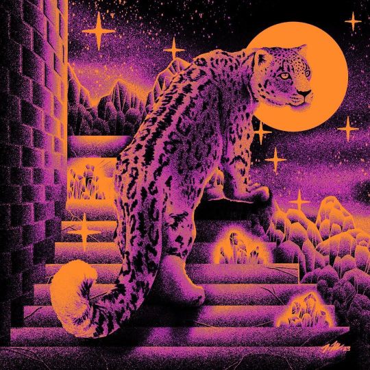
« 𝕬𝖘𝖙𝖗𝖆𝖑 𝕾𝖙𝖊𝖆𝖑𝖙𝖍 » 🐆✨ Digital Illustration, 2023 . . . . . . . . . . . . . . . . . . . . . #leopard #snowleopard #illustration #illustrator #illustrationartist #swissart #swissartists #switzerland #digitalart #digitalillustration #cosmos #truegrittexturesupply #procreate #visualsnack #brutsubmission #itsnicethat #juxtapozmagazine #myart #design #acidart #acidgraphix #crystals #scifiart #retroscifiart #surrealism #surrealistart #artspromoter #dreamart #moon #illustree https://www.instagram.com/p/CoSWBs2IKAA/?igshid=NGJjMDIxMWI=
#leopard#snowleopard#illustration#illustrator#illustrationartist#swissart#swissartists#switzerland#digitalart#digitalillustration#cosmos#truegrittexturesupply#procreate#visualsnack#brutsubmission#itsnicethat#juxtapozmagazine#myart#design#acidart#acidgraphix#crystals#scifiart#retroscifiart#surrealism#surrealistart#artspromoter#dreamart#moon#illustree
60 notes
·
View notes
Text
by CC Studio
3 notes
·
View notes
Photo
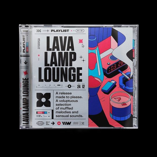
Animated illustration by @coen_pohl_design for @bashbash.waves ⚡️ Design, additional Motion & Creative Direction by @rhox_ 🪐 _______ #graphicdesign #fruitsartclub #designinmotion #typography #icographica #designinmotion #visualcommunication #typeism #graphicindex #brutalism #posterreposter #grafikdesign #posterdesign #typosters #collectgraphics #ideamagazine #playlist #inonica #thedesignblacklist #adobecreativecloud #itsnicethat #visualgraphc #vibin #chill #lavalamp #andersonpaak #macmiller #kaytranada #jungle @anderson._paak @macmiller @kaytranada @hooverphonicoff @jungle4eva https://www.instagram.com/p/Cogo7MJSGqM/?igshid=NGJjMDIxMWI=
#graphicdesign#fruitsartclub#designinmotion#typography#icographica#visualcommunication#typeism#graphicindex#brutalism#posterreposter#grafikdesign#posterdesign#typosters#collectgraphics#ideamagazine#playlist#inonica#thedesignblacklist#adobecreativecloud#itsnicethat#visualgraphc#vibin#chill#lavalamp#andersonpaak#macmiller#kaytranada#jungle
23 notes
·
View notes
Photo
¿Quién no ha pensado en huir de aquí? Dejar una nota al salir: "Lo hice por mí" Ruido, es solo ruido ruido, es solo ruido... ♾️ Collage inspirado en la canción solo ruido de @shinovaoficial . Collage sobre señal fluorescente encontrada en un hotel abandonado de Almería. . . . #collage #collageart #erregalvez #itsnicethat #collagewave #marcopolorules #pasteup #sign #geometry #collagear #shinova https://www.instagram.com/p/Chmx-KFjUUf/?igshid=NGJjMDIxMWI=
#collage#collageart#erregalvez#itsnicethat#collagewave#marcopolorules#pasteup#sign#geometry#collagear#shinova
55 notes
·
View notes
Photo

ItsNiceThat x BBC Earth - rosepilkington.com
168 notes
·
View notes
Text
💫 Keep your unrealistic punctuality expectations to yourself 🤚 | Here’s a rough timelapse of the making of Louise. I first sketched her years ago in an old sketchbook I no longer own. As soon as the pen-and-paper sketch was ready, I began drawing her on my iPad, which explains why you see me tracing digitally from a notebook page.
I often start a sketch, and in the process, a story or a piece of dialogue will come to me—that’s how I’ll know I have something. This process reminds me a bit of how songwriters create music: some of them come up with the melody first and then the lyrics, while for others, the lyrics always come first. Well, in my case, the sketch usually comes first, and the story takes shape as I draw.
As nothing came to me while tracing her for the second time, I set her aside for months—years, actually—and I’d nearly given up on her until a few weeks ago, when I found her while looking through my old sketch files for inspiration. And then it came to me, so here she is 💖 our queen of running late, Louise.
#runninglate#sketchbook#sketchprocess#creativeprocess#creativity#illustrators#procreateprocess#tardiness#punctuality#alwayslate#coolgirls#comics#cartoons#sxsw#sxswbabes#drawme#drawingprocess#artistsofinstagram#femaleartists#ladieswhodesign#womenwhodraw#itsnicethat#toxictraits
2 notes
·
View notes
Text
instagram
#illo#illustrationartists#flowerillustration#illust#illustree#gouache#womenwhopaint#prints#tdkpeepshow#itsnicethat#behance#illustratorlife#illustragram#flowerpainting#chamomile#camomile#Matricaria chamomilla#Chamaemelum nobile#Instagram
3 notes
·
View notes
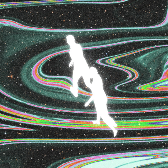
Text
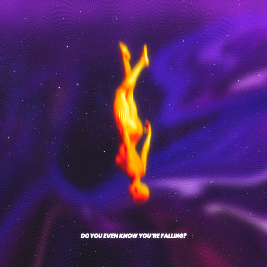
do you even know you're falling?
#digitalart#coverart#visualart#digitalcollage#artist#collage#art#artwork#graphicdesign#digitalgallery#graphicposter#photoshopartist#gfxmob#visualgraphc#posterdesign#designfeed#dailyposter#thedesigntipl#certainmagazine#itsnicethat#photoshop#illustrator#typographicposter#designspiration#posters#posterunion#digitalarchive#trippyart#grunge#surrealart
412 notes
·
View notes
Text


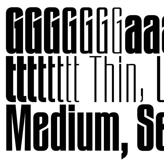
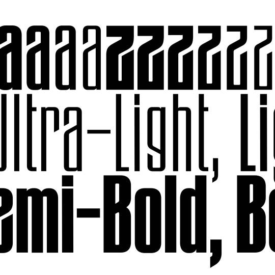
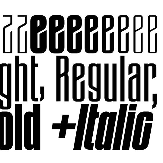
Gazet features a variety of OpenType features making it a versatile tool for all types of creative typesetting. A monocase feature makes even the tightest line spacing possible and contributes to the typefaces dense construction with very little white space.
A historical OpenType feature is a homage to the typefaces origin within the times of art nouveau and is present within the uppercase A, E, F and lowercase p and q.
www.new-letters.de
#newletters#typography#gazet#condensed#grotesk#thomasjohn#release#graphicdesign#eyeondesign#grafikradar#tomorrow_featured#typeinspire#typespire#contemporarytype#typegoodness#thedod#designfeed#typetype#365typefaces#aigadesign#itsnicethat#designeverywhere#type01
14 notes
·
View notes
Last Seen Blogs

theaccountingsavvy
Bailey Williams

eduardouzae
eduardo;uzae

weird2chewgum-photography
kazua M vang

stellarstoryteller
Untitled

gemmasphere
GEMMASPHERE