#my shiny pokemon series
Text
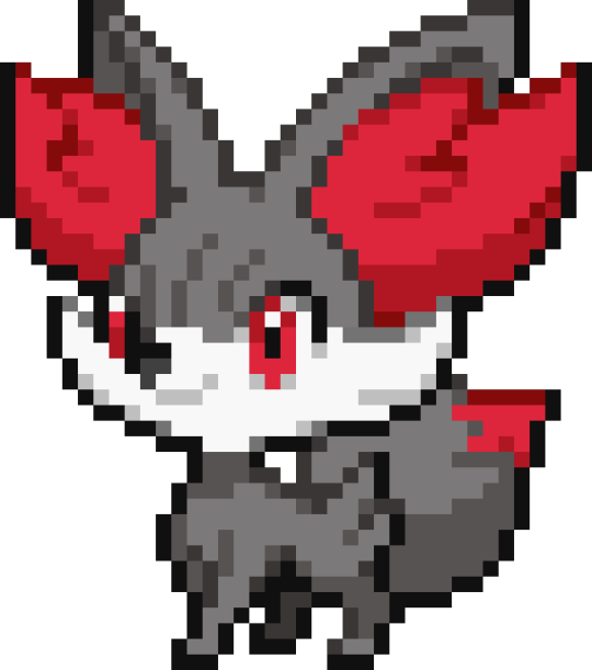
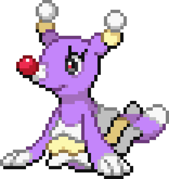
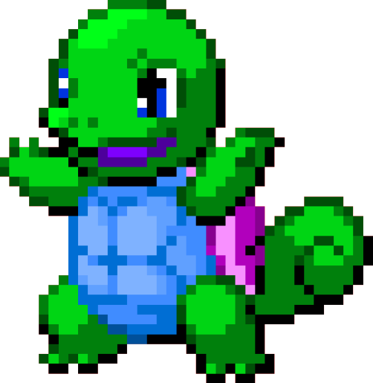
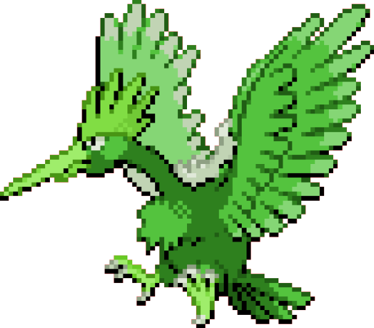
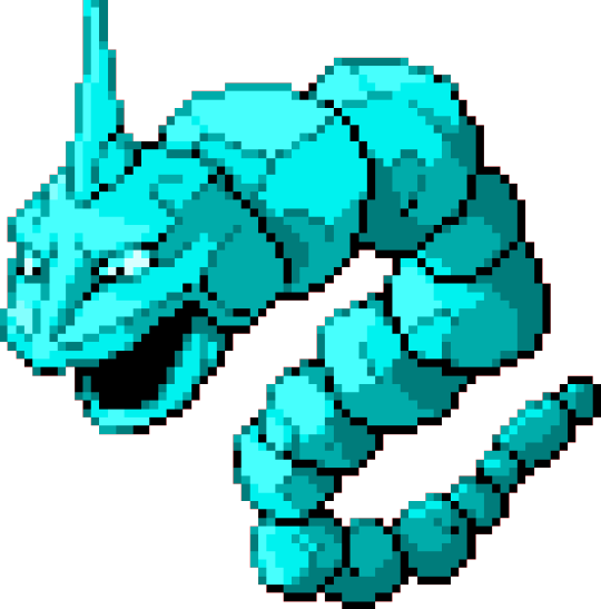
653-655 - Fennekin Line
When in doubt, make it darker.


#pokemon#pokemon fanart#pokemon recolor#pokemon sprite#shiny pokemon#my shiny pokemon series#generation 6#starter pokemon#fennekin#braixen#delphox
47 notes
·
View notes
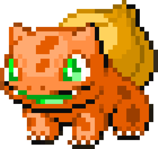
Text
What if–
What if I–
just—


did it all over again?
#but quicker#and more efficiently#and with a better eye for colour#and just overall better#not saying I will cause I'll probably get bored but#i did make a bulbasaur#pokemon#pokemon fanart#my shiny pokemon series#stch
2 notes
·
View notes
Text
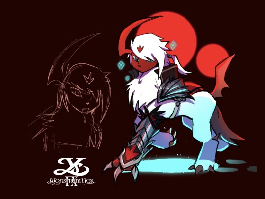
Every fandom deserves a PMD AU
list under the cut

I went back and forth on a lot of these but its mostly just surface level thoughts lol
#ys series#ys ix monstrum nox#adol christin#im not gonna tag all the other monstrums#pmd#pokemon mystery dungeon#team monstrum#also half of everyone ended up shiny#my art
14 notes
·
View notes
Text
My boyfriend got Pokemon Scarlet as a Christmas gift last year as I've been playing it here and there the past week and I've already gotten a shiny.

#my posts#pokemon scarvi#i have 3 badges and only done 1 of each other things#sadly its one of the pokemons i dont like#but hey its something#he has gotten one shiny in his life and that was in scarlet#i have gotten like 25 in total over the course of the series#also some in pokemon infinite fusion
3 notes
·
View notes
Note
how's the new game going? been seeing a crazy amount of takes in every direction about it
short version is it is SO BUGGY (all the comments you have definitely already heard about the terrible performance issues are no joke; i don’t give much of a shit about graphical errors, of which there are many, but i’ve encountered a few bugs that actually ruined gameplay moments)......but also SO AMAZINGLY FUN...i don't want to put it down 😭😭
#it definitely should have been given more time in the game oven etc etc but oh my god it is SO fun????#i LOVE it unfortunately...#if you really love Pokemon i think you'll really enjoy the game#buuuut if you're not so big on Pokemon the performance issues might be too much of a hurdle to overlook#imo the open world aspect is incredible and i always feel like there's something for me to be doing#and yet i keep getting distracted because i see something shiny in the distance...and then i get horribly lost#just like what would probably happen to me if i actually lived in the Pokemon world sklf;jkl....#a lot of new Pokemon that i didn't like much at first glance i've grown to like more after seeing in-game#because they have a lot of personality...the story has been entertaining so far etc...#if not for the performance issues i feel like these games would maybe be a couple of the best in the series#unfortunately now they're probably only going to be remembered for the bugs though 😂#i've seen people who don't even like Pokemon coming out of the woodwork to dunk on them and it's like Okay Come On Guys
22 notes
·
View notes
Text

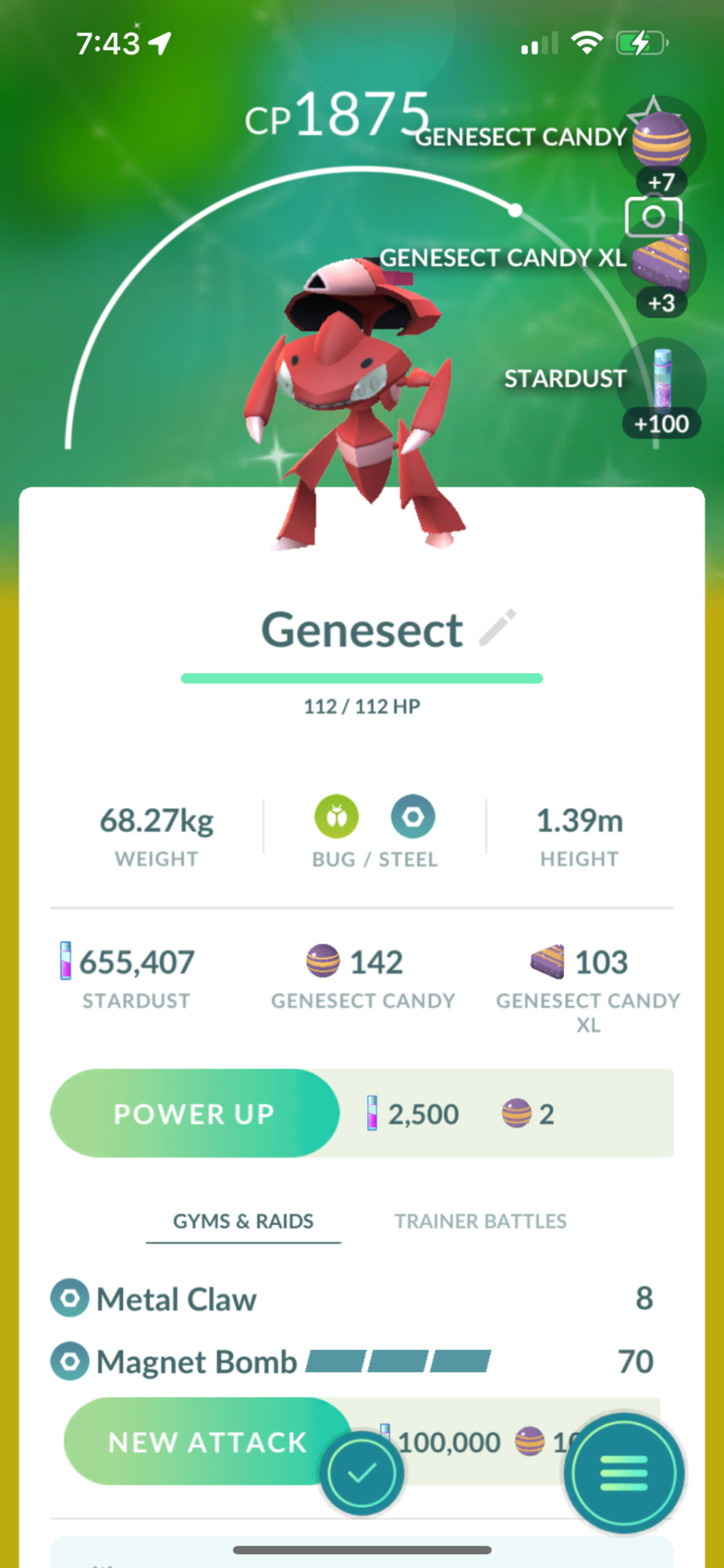

AFTER 72 RAIDS
#THIS IS THE SHINY IVE WANTED SOO BAD FOR SOO LONG#YOU CANT TRADE FOR IT CUZ ITS MYTHICAL AND YOU CANT FARM ANY MAIN SERIES GAMES FOR IT#FINALLY HAVE NEWTWO’S BUGGY FRIEND 😭#pokemon go#Genesect#went all out and blew all my saved up coins on this bc idgaf about PoGo anymore lol
4 notes
·
View notes
Text
Hello I’m Alex ! Fairy tail and Pokémon is my life, plus multiple other things you can read about in my carrd. I would love more mutuals if you are interested 🥺 oh I also draw fakemons and shiny recolouring 💙

#please reblog if you like me and think people should also follow me <3#I’m a shy bean and don’t make a lot of conversation#and I’m not active in fandoms#but my moots say I’m really sweet so I guess it’s still worth it 🥺#thanks Ily all !#look at these tags for the fanart ->#what I think shiny [blank] should look like✨#fakemons serie✨#alex.txt#promo✨#self promo✨#tagging my fave things ->#fairy tail#pokemon#fma#fullmetal alchemist#fruits basket#darker than black#akatsuki no yona#death note#spy x family#edens zero#animal crossing
10 notes
·
View notes
Text
I thought I posted this around Christmas time but guess it didn't go through??
Anyways! I got a big Pokemon Card booster pack(?) for Christmas! 😄
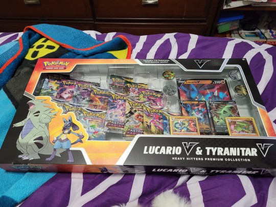
And here are the card that were in the pack! :D
Here were the first things that came with the pack!
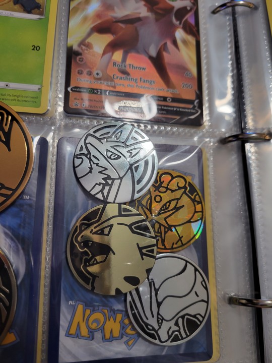

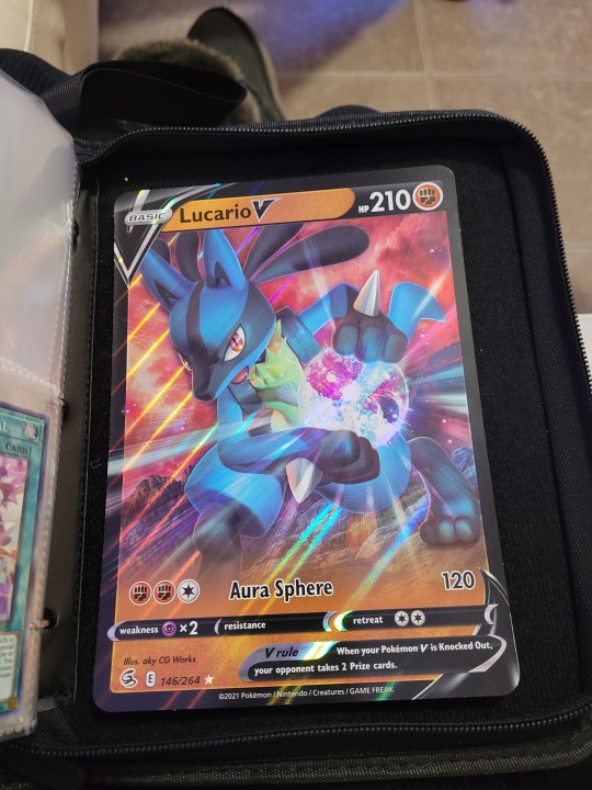
Some flipping coins, holo & V-holo cards, and a huge holo V-card Lucario card!
Sadly I don't know where to put it for now since I can't find any cheap binders that can hold the recent jumbo cards... ;-;
Here are the cards I got/decided to keep (mostly due to getting many duplicate cards)


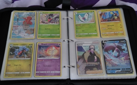


#pokemon#pokemon cards#pokemon trading cards#card opening series#late christmas gift#Lucario v and Tyranitar v pack#Lucario-V#Tyranitar-V#Origin Forme Dialga-V#Holo Flapple#Charizard-V#Holo Jolteon#Genesect-V#Radiant Greninja#also holy frick Greninja is my first shiny Pokie card!! :O#Holo Octillery#Holo Kamado#Lumineon-V#agh curse 10 image limit
3 notes
·
View notes
Text
I had barely started on Gible's Pokédex page. I was just trying to check some boxes. What even is this madness? I'm a Gible-ing wreck.


Bashful Blue Baby Boi.
#i hasten to remind everyone i don't have the Shiny Charm yet#what even is my luck#like boop shiny gible appears with his back turned to me#i mean i'll take it#gible#shiny gible#oh wait Shiny Garchomp is like the worst shiny in the series ohnoes#pokemon#pokemon legends arceus#legends arceus#shiny pokemon#mass outbreak
3 notes
·
View notes
Text
I am doing an ultra moon nuzlocke and this little dude just appeared

his name’s Lucio and I love him
#pokemon#shiny pokemon#noibat#pokemon ultra moon#nuzloke challenge#my first shiny in a main series pokemon game#full odds#and in a nuzlocke#I love him so much#hope he doesn't die
2 notes
·
View notes
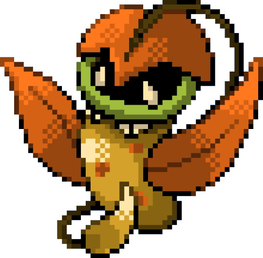
Text
728-730 - Popplio Line
grey seal becomes beautiful purple mermaid prima donna
more uplifting stories at seven.

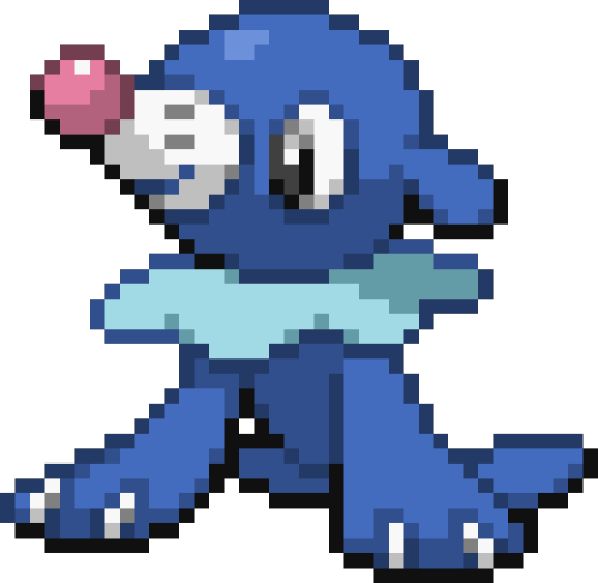
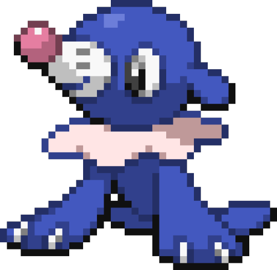


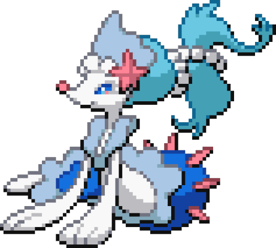

#pokemon#pokemon fanart#pokemon recolor#pokemon sprite#shiny pokemon#my shiny pokemon series#generation 7#starter pokemon#popplio#brionne#primarina
33 notes
·
View notes
Text
My Shiny Pokemon
So I've been thinking about this series of images I used to make and I thought well since I'm thinking about it I might as well make a write up for it. Overview it, go over some of the blunders I made while making it, and maybe at the end I'll show you some of the good ones.
My Shiny Pokemon was a series I started in 2014 of recoloured Pokemon sprites, created with the purpose of "improving" their shiny forms. Or maybe just making them different? The problem comes in when you realise I was 9 in 2014, and had no idea what I was doing. From failing colour theory to creating the sprites in the most inefficient way possible. I would recreate the sprite from scratch (often using a cross stitch pattern as my guide), then upscale it by screen shotting the sprite zoomed in to the size of my monitor. I know that's inefficient. You know that's inefficient. 9-12 year old me did not.
Of course as I grew older I got better at creating sprites. I had a better eye for colour, raised my standards for reference sprites (basically just the BW sprite from Bulbapedia), and learned how to change the interpolation method from "linear" to "none" when scaling. What always stayed the same, even when I knew better, was I'd create the sprite from scratch.
Sometimes I think about redoing/finishing the series, but then I get a few in and decide this is not how I want to waste my time. As it stands I've finished generation 1 and 2, around half of gen 3, with a few old ones scattered in 4 and 5.
With all that being said, let's go over some of the many (visual) blunders I made while creating this series (especially in the early days).
1. Neon is Cool, Right?
It's probably not surprising that a ten year old doesn't have much of a grasp of colour theory. This is very obvious with some of my first, where the base colours lie in the very top right corner of the HVS square, and the shades stuck strictly to the edges. For a prime example, look at my first.

It could be cool, an interesting choice even, to have a neon blue Snivy. If only it was a deliberate choice. And the mixture of neon blue with seafoam green is a very odd one. The hue and saturation of the colours are far too similar to put next to each other like that. The outline colour isn't nearly dark enough, so the black outline looks completely out of place. And that white gap where it's meant to be transparent? A result of not using layers, and forgetting about it when I was exporting these without backgrounds.
I. Was not expecting to critique this one Snivy to that degree.
But we're no where near done!
2. Colourations that just Do Not Make Sense
Why is his mouth green.
Okay yes I know it's because I changed its eye colour to green and the eye colour is the same as the mouth but why would I change it to green?
Also this image isn't fully transparent. You know why? Because I used a blue-screen approach to making these scaled-up-by-screenshotting images transparent. Actually, even then, it shouldn't have resulted in this. Part of me wants to think I cut it out from a background using a lasso tool, but kept anti-aliasing on, and did it really badly. But why on earth would I do that? Actually, no. I remember what I did. I used the "colour to alpha" tool and clearly didn't have the threshold high enough. Honestly I'm not even talking about colour choices anymore I'm just criticizing my methods. Which, don't get me wrong, are worthy of criticism, but not what I'm meant to be focusing on.
What is this Squirtle? Why is it so, so, green? Clearly I had learned how to pick colours, the blue is proof of that, but why is he green? What made me choose that colouration for a Squirtle? Why would I choose those colours, in that order, in that saturation? Am I meant to be making these shinies better, or worse? So many unanswered questions, so little time.
3. Changing the Sprite Beyond Colouration
Shinies, by definition, only change the colour palette of a Pokemon. They do not change the shape of the sprite, or where colours are used. There are some sprites which I think look quite cool, and have some cool ideas, but which go beyond the limitations of a shiny.
A Venusaur with a decaying flower. A cool concept, if you ask me, and apart from maybe the outlines, I quite like the execution. But it adds transparent holes in the petals, which aren't allowed.


These two have the same problem. They look cool, but they change colours where they can't be changed. All the feathers on Ho-Oh are the same colour, same with Chandelure's flames. With a palette swap they'd have to stay the same colour. (Also they both suffer the same problem of bad upscaling and transparency, but I promise I won't mention it again).
4. Using Low Quality Sprites
"[X] pixel art grid"
"[X] sprite grid"
This is what I'd search on Google Images to get my reference sprites. A lot of them would return a result of a decent quality cross stitch pattern, usually based on its DPP or BWB2W2 sprite. Sometimes they'd return a very low resolution version of that pattern. Sometimes they'd return low quality patterns, which changed all the outlines to black (which doesn't sound that bad but was very noticeable). And sometimes I'd do shit like this:

Cop out.
But also the main problem here is that I'm using the menu sprite.

Hopefully here you can see the difference between a low quality and high quality reference sprite. I've deliberately chosen one where I didn't change much when I remade it.
Why did I do this?
I chose to use the GS sprite for this one. This was a deliberate choice.
(Irrelevant but also why did I make it green? It's not as objectionable as Squirtle because the shades are chosen competently just, why this colour for Fearow?)

This one's subtle. I used the RSE sprite for some reason. Perhaps I used an out of date pattern.
Also I had this tendency to make a lot of grass Pokemon Autumn or decay theme. Yes it's cool but did I have to do it to all of them?
5. Playing Pokemon Art Academy
A 2DS touch screen is 3" big. That's 6" smaller than my Intuos's working area, which is still small by drawing tablet standards. My point is it's not great for drawing with.

That did not stop me from trying.
One good thing about this is that it did allow me to experiment with Gen 6 Pokemon, which don't have 2D sprites (unless you count Smogon's sprite art project, which for the sake of this I do, but didn't then). I also got more creative with colourations here. Like this rainbow Ditto.
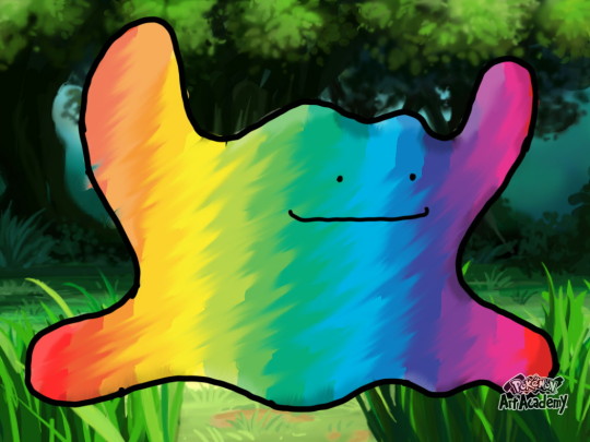
When I later made Ditto's sprite I just made it a bluer purple.
Also you know this guy?

Yeah fuck that guy.

6. Not Playing Pokemon Art Academy

"Huh? What's this 'digital art' thing?"
"That, that's kinda cool, I wanna do that!"
"How- how do I do that?"
"A mouse I guess."
Buying an Intuos on clearance was the best $50 I ever spent. I don't have a direct comparison for this...

...but I think you can tell the difference without one.
Any these last couple haven't had anything to do with the sprites, I just wanted to show my non-sprite shinies for a bit. But last, and certainly not least, I present the final blunder.
7. Emboar.

I don't think I could wrong Emboar more if I evolved my shiny Pignite, released it, deleted the save file and destroyed the cartridge.
...actually that's inaccurate, I'd die before I let anything happen to that Pignite.
What. What was I doing.
It's represents everything I did wrong with this series.
This is rock bottom.
No matter what, it all went up from here.
Now, let's look at my favourites.
You've suffered through a lot of bad sprites. Let's celebrate with some of my favourite sprites, randomly picked by me scrolling through my shiny pokemon folder.

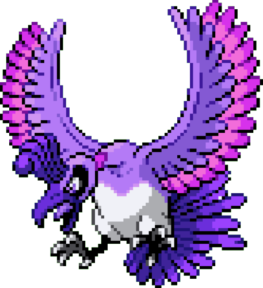
She's majestic. She's a god. She's even a black shiny.
The jewels are blood red, and if you ask I'm sure he'll tell you how he made them that way.
You know why this happened.
You know.
You can probably guess what Butterfree looks like too.

He's a diamond in the rough. The very rough.

Autumn and decay. It's overused for a reason.

I don't know what makes it so cute, it just is.
Midway through Gen 2 I realised the original sprites changed the hue when they changed the shades. I started doing it too and I think it shows.
I've never been able to replicate this beautiful orange.

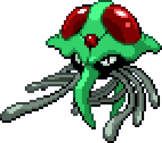
Kelpdra.
My redemption arc. Yes the rainbow Ho-Oh looks cool, but purple Ho-Oh... is also cool but I won't say cooler.

Honestly I forgot this wasn't Ralts's shiny for a while. Which is embarrassing because I have one.
Anyway I've hit the 30 picture limit, so I'll leave it at that, and perhaps if this gains traction I'll show off more. Because there are definitely more I want to show off.
2 notes
·
View notes
Text
i think for my next pokemon plush i would like to get a well made shiny eevee
#afaik pokemon center doesnt officially make shiny plushies so i would have to make a trip to etsy for one#it would have to be very well made and cuddly and fairly firm but not too firm and a good size to hold#have i ever mentioned i had a webkinz obsession as a child. this series is revitalizing my plushie fanaticism. woops#thesilentpotato
1 note
·
View note
Text
ok, beat scarlet! final, spoiler-free thoughts:
i wish they’d held off on releasing it for at least a year, both for the devs’ sake, and so that we could have gotten a fully finished, polished game. but even with its flaws, i really loved it and i think it’s my new favorite main series game!! the story is the best they’ve done since gen 5 imo (though gen 5 definitely hasn’t been dethroned, and i don’t think it ever will). also i love the sub-legendaries, they’re so cool.
#ghost town... 2!#pokemon#pokemon scavio#maybe i'm just easily impressed but idc#anyways to tpc: i do not want to see you guys release another main series game for at least 3 more years#maybe a spinoff in that time is ok if you MUST keep that video game money rolling in. since those are at least partially outsourced#but i s2g i don't want to see you guys announcing fuckin... pitch black and radiant white or something in a few months#(or ever if possible. after what happened with bdsp i think we're good on a gen 5 remake. no thanks. those games were perfect already)#sincerely: someone who has been hyperfixated on your franchise since age 4#alright anyways my one complaint about the game itself (aside from the obvious stuff) is that shiny hunting is gonna take. so much focus.#i know i said i didn't really care but they could have at least made it so wild shinies emit constant sparkles like in pixelmon 😭
1 note
·
View note
Text
So, since I've not been in the mood to draw, I've been playing a lot of Scarlet, doing some outbreak hunts and leveling up some old buddies.
Eventually, I thought it would be fun to finally build a Shiny Dream Team.
Darren was already level 100, and has been for years. I started raising Mist the Zoroark, and later Ruri the Gardevoir, and it hit me... I had a good shiny team going! So I went on a scavenger hunt to decide the last three members.
All of them come from various points in my shiny hunting (and not hunting, I'll get to that) timeline, and are all more dear to me than other shinies I have. (Aside from Akoya. Nobody tops her.)
This lovely team consists of:
Darren, male Flygon, Timid, Mischievous; Hatched via Masuda Method in Soul Silver, my first ever hatched shiny.
Mist, female Zoroark, Rash, Somewhat vain; Hatched via Masuda Method in Pokemon Y. I'm sure you can imagine the joy I felt at seeing that it was female. :3
Phillip, male Decidueye, Lax, Takes plenty of siestas; Hatched via Masuda Method in Pokemon Sword.
Sulfur, male Lucario, Hardy, Alert to sounds; Hatched via Masuda Method in Shining Pearl. (Yes I'm throwing him in even though he's part of a separate group. He is a shiny I've acquired of a childhood favorite Pokemon, so he's a Dream Team Shiny~)
Ruri, female Gardevoir, Jolly, Scatters things often; Lucky find in Alpha Sapphire.
I was training during a Nuzlocke, and on my way back to heal, the radar thingy went off. When I saw it was a Ralts, I thought "Alright, just in case it's shiny..."
It was shiny.
Tira, female Talonflame, Serious, Somewhat of a clown (lol); Extremely lucky first-egg hatch in Y. I can't remember if it was Masuda or not, but I don't think so. (I wasn't hunting for a shiny, I just wanted a Flame Body bird for my bro. XD)
Ironically the two birds are named after characters in book series' I like.
I tried real hard to not have any type overlap, and by my calculations, the only type they have no STAB advantage over is Flying. But there are ways counter that weakness. I'm very happy to see these guys all come together like this. :3
145 notes
·
View notes
Text


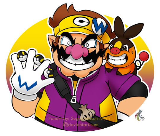
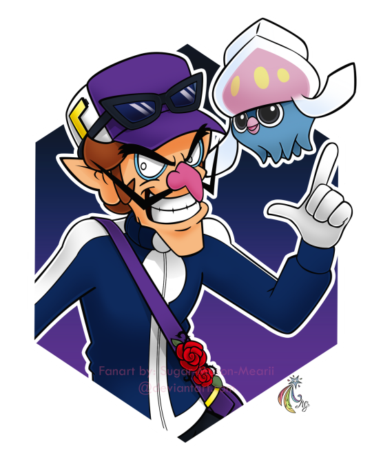
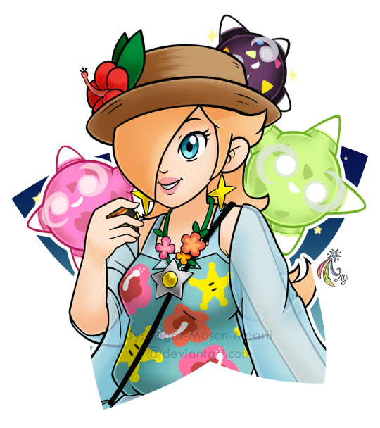

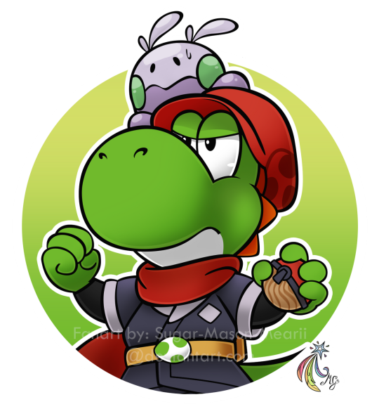
[Repost] Mario Pokémon Trainers Series
---
Almost a year ago, I started this mini drawing series, where I drew the eight well-known human main characters from Super Mario in outfits of the player trainers from all Pokémon regions, in (almost) their official 2D art style, by Shigeru Miyamoto. It's actually hard to capture the full essence of the 2D art style, so I could only get as close as I can. But I think I did okay.
The inspiration behind this series was the stickers from Mario Party Superstars, and since I had been drawing so much Pokémon and missed drawing some Mario, yeah this was the result.
Three months of work, and I did all of this before on computer mouse so it's no easy task. Although after I did Yoshi, I closed off this series and moved on to making more Commissions and finishing my own projects. Despite that, these still get the attention of many in DeviantArt, not so much on Twitter anymore cuz these are literally my first art entries in that site.
I chose a Pokémon from the region assigned to each character:
Mario - I chose Kanto for him, as well as Pikachu because the first Generation is the mascot region of Pokemon, reflecting Mario being the mascot of Super Mario ofc.
Luigi - Johto is actually a region beloved by a lot of people, and Luigi is almost the same, sometimes even more preferred than their counterparts. Although Chikorita's there cuz... green.
Peach - My origin region Hoenn. I chose Skitty for her cuz pink and cute, and perfect for a princess like her.
Daisy - Ironic for a Princess living in a hot biome to be assigned in the coldest region, but at least she has a shiny fellow warm-biome friend Luxio.
Wario - Unova, like Wario and Warioland series, two things that only get the love they deserve way later. Picked Tepig for him, although there are other Unovan Pokémon that'd fit along.
Waluigi - The least loved region, paired with the unloved Luigi Clone. Inkay is due to its evolution method, which also alludes to Waluigi's emblem being an inverted L.
Rosalina - Frankly it's due to the Minior why I assigned her to Alola.
Pauline - Same thing with Grookey that's why she's assigned to Galar.
Yoshi - Someone begged and guilt-tripped me nonstop from the comments in DA, that's why this thing happened. 😑 This too is why I had to strictly implement the "No Free Art Requests!" rule.
Will the series continue? Apparently it did because of this commission. But again, I don't intend on voluntarily continuing this series. So if your character didn't came out, you can always commission me :) ...
---
If you're interested in a commission from me, [do check here] for details. Or you can check my [Carrd art commissions.] Or you can DM me too.
You can support me via [Ko-fi] and/or [Patreon] too!
---
Fanart: Me
Super Mario and Pokémon: (c) Nintendo and Game Freak
Do not rip, trace, steal, copy, distribute, or use without consent please!
#crossover fanart#mario and pokemon crossover#super mario#pokemon#mario#luigi#princess peach#princess daisy#wario#waluigi#princess rosalina#pauline#yoshi#pokemon trainers#mario pokemon trainers#pikachu#chikorita#skitty#luxio#shiny luxio#tepig#inkay#minior#shiny minior#grookey#goomy
646 notes
·
View notes
Last Seen Blogs

tale-as-old-as-honey
darkness exists to make light truly count

doctorqueensanatomy
sheamus

gofordigitalindial
Gofordigitalindia

friendof-blahaj
One Tequila, One Rum n Coke, and One Onikoro