#my gif tutorial
Text
Hello @crispyliza !! So I'm replying in a separate post because this is too long for a reply on the post. Hope you don't mind. I also think it might benefit others who have asked me in the past and those wishing to start gif making. Especially with whumptober just around the corner.
So here's a full look at how I make my gifs. This got very long so I put it under a read more
A quick thing before I start: I use windows and google chrome. If you're a mac or firefox user I'm not sure of this will work for you in terms of programs. The techniques I use in photoshop should though.
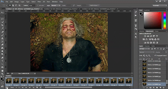
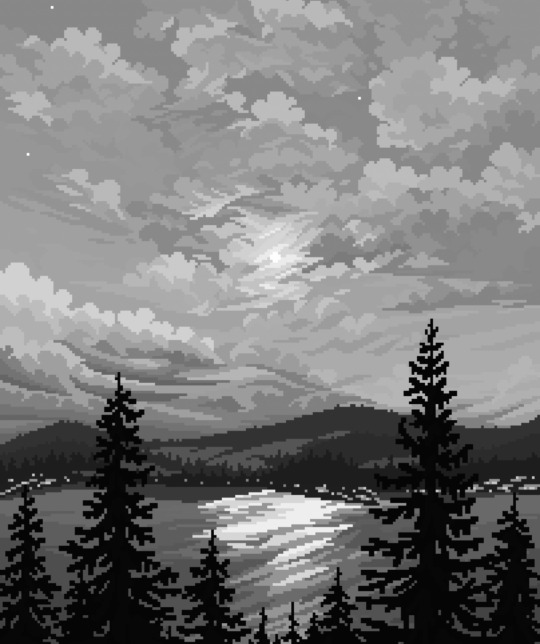
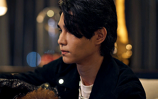
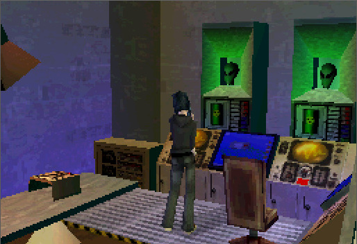
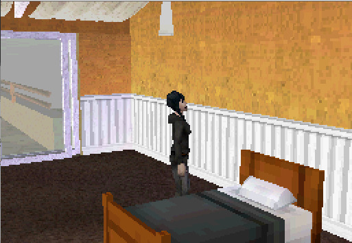
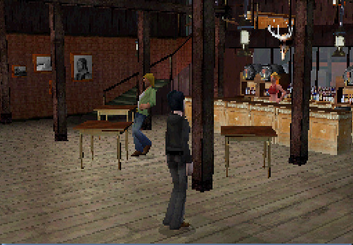
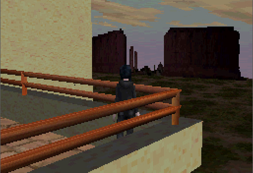
Okay for this demonstration I'm going to show you how I made the gifs for this gifset
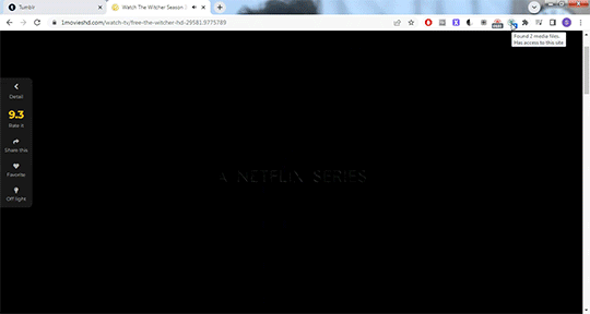
To start we need a video. I don't torrent because my internet connection will cut out a random which makes using vpns rather pointless. I've tried. My internet would cut out halfway through a torrent download and then my internet provider was notified to what I was doing. It was just not great. So I found a new way to download videos off the internet! You can use torrents though. If you've got a vpn, go for it.
There are several streaming sites that I go to to get my videos. 1movies, and bstsrs are my go to right now since soap2day is gone (rip i miss you).
Now there are three ways I can get a video depending on what website I'm using. Bstsrs is the easiest because they have a whole bunch of links available. I always go with mixdrop because it has an easy to use built in download button. Unfortunately this site doesn't have movies. Just tv shows and sometimes it's not the best quality or there aren't links available. That's when I go to 1movies. Once you've found your video I use the chrome extension Cococut to download it. Click the extension button to open, then the download button. Then you just have to wait until the video is rendered. Click save. Wait until its downloaded.
Okay we now have our video! The next step is to turn the scene you want to gif into frames. For this we're gonna need KMPlayer. This video player makes it really easy to turn scenes into frames/screencaps. Open your video. Find the the scene you want and pause the video. Type control-g to open this screen:
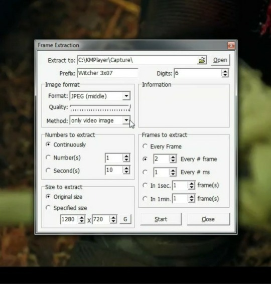
Here you choose the destination you want your frames to be saved. Decide what to name your frames and match up your settings with mine. You want to continuously extract frames, original size, and I stick with every 2 frames. Then, and this is important, choose video images only.
Now click start then start playing your video until the scene you want to gif is done. When you've got everything you wanted, pause the video. Hit ctrl-g again to reopen that screen and click stop. You now have all the frames you need so go ahead and exit out of KMPlayer. You don't need it again unless you need to redo frames or get the dialogue or something.
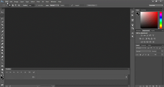
Next up we are gonna open Photoshop. I use Photoshop CC 2014.
Click on File -> Scripts -> Load files into stack -> Browse.
Go wherever you saved your frames and select the ones you need. Click okay and let the frames load completely before doing any thing else. Depending on how many you've selected this could take a while.
Once all of your frames are loaded, click "Create Frame Animation". Next click the little arrow button on right followed by "Make Frames From Layers" so we have all of our frames laid out. Now we need to reverse the frames because they're backwards so click that little button again and then click "Reverse Frames"

Okay you've got your frames loaded and all set to go. Time for all the cropping, resizing, setting the speed, and editing.
First thing I do is set the speed because otherwise I forget and it's important to do and a pain in the ass to do after all the editing is done. So do it first and get it out of the way. Select all of your frames. Click the little button beneath a frame where it says 0.0 and pick your time. I usually go for .1 seconds but .05 is also a popular speed. Just test one out and see which one you like best for your gif. You can hit the play button at any time to test your gif.
To set speed:
After this I do one of two things. Either I go into cropping and resizing or I separate frames. Depends on how many frames I uploaded. If I uploaded all the frames needed for an entire gifset this is the part where I separate them out onto individual gifs. So let's do that.
Originally I was just gonna do one gif but I have 115 frames uploaded which is waaaay too many for just one gif. I like to keep my gifs between 30 and 80 frames. So I'm going to split this into 3 gifs I think. It'll make a nice balanced gifset.
Select the frames you want for the first gif and copy them using the copy frames option in the same menu as the make frames from layers menu. Open a new document with the same dimensions as your current document. Click "Create Frame Animation" and paste the frames over the selected frame. Make sure that first frame is the same speed as all the other frames. Repeat until you have your desired gifs.
Next up I crop and resize. For this gif I'm going to first crop out the black bars above and below the image because we don't want that in the gif. Use the select tool to pick what you want to keep then "Image" then "Crop".

Now I could leave it as it but I think for this gifset I'm gonna focus more on Geralt so I'm going to crop it in a bit more.
Once cropping is all set i'm going to resize the gif to tumblr dimensions. Click "Image" then "Image Size" and change the width to 540px. The height can be anything and best not to mess with it so your gif keeps it's proportions. 540px is the width of a tumblr post and I plan on making these gifs stacked one on one.
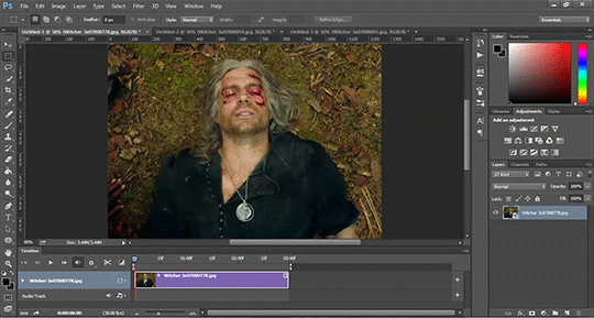
Okay the gifs are all cropped and sized. Now it's time to do some editing. Go back to your first gif. We'll do all the work on this first gif and apply the same things to the other ones later because the scenes are the same. If they were different each gif would be colored and edited individually. First thing to do is turn it from frame animation to timeline. Timeline mode makes applying things like sharpening and brightness much easier and smoother.
So just click this button in the bottom left corner to go into timeline mode. Next up select all your layers. They're on the right side. Make sure you've selected ALL of them. Then click on "Filter" -> "Convert for Smart Filters" THIS IS AN IMPORTANT STEP! We can't edit until this is done.
This button to switch from frames to timeline:
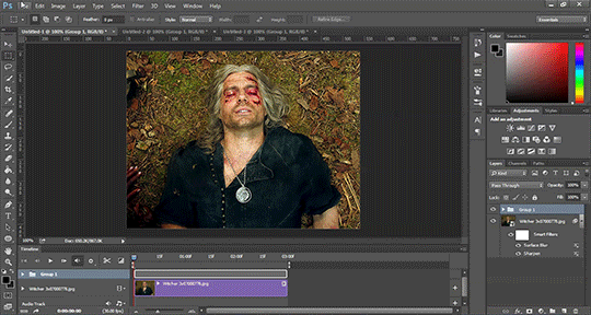
First thing I do is sharpen. You can use one of the presets or try to do manually do it with smart sharpen. I use the preset labelled "sharpen" because I'm lazy and this one does a fine job for my gifs. I also add a layer of surface blur to smooth things out. Just a small touch. Like barely any blur but I think it smooths noise a bit and makes it look better.
Next up: Editing!! This step is going to be different for each and every gif you make. It all depends on the colors in the scene your giffing so you're gonna have to do a lot of experimenting to get the right look you want. Personally that's what I like about it. Makes it fun.
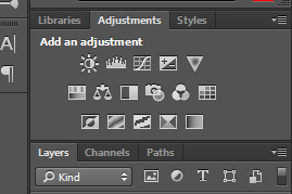
All your adjustments can be found found on the right side of the screen:
I almost always start with the "Levels" layer to brighten up the image because as we all know, every freaking whump scene is sooo dark. So with levels you just slide the little arrows around until you get a look you like.
Then I add a layer of "Curves". I love curves. With curves you can select the whitest white and the darkest black and the middle tone to change the brightness and colors of your gif. Or you can use this part and just brighten or darken a specific part. It's really versatile and i love it. It does take some practice and experimenting though.
Now a layer of "Contrast" and a layer of "Vibrance".
After this it's all about the selective colors, photo filters, and color balance to work on the colors and brightness. For this gif I'm only doing a tiny bit of editing cause I like the coloring but sometimes I'll have multiple layers of these to create a good coloring.
Once you're satisfied with how your gif looks it's time to save it!
Click "File" -> "Save for Web" and wait until it's all loaded. Important thing too look at here is the size of the gif. You can't upload any gif that is larger than 10mbs so make sure it's under that. Sometimes even 9.8 is too big because tumblr is a butt. I go for anything below 9.8. If your gif is too big try resizing it or removing a few frames. Make sure you gif is set to loop forever. Otherwise it'll just stop after a little bit. Don't forget to change this!
Here are the rest of my settings:
After that you can click save.
And that's it! You've made a gif! Congrats! If you have any questions or want clarification feel free to message me :)
27 notes
·
View notes
Text
A general cane guide for writers and artists (from a cane user, writer, and artist!)
Disclaimer: Though I have been using a cane for 6 years, I am not a doctor, nor am I by any means an expert. This guide is true to my experience, but there are as many ways to use a cane as there are cane users!
This guide will not include: White canes for blindness, crutches, walkers, or wheelchairs as I have no personal experience with these.
This is meant to be a general guide to get you started and avoid some common mishaps/misconceptions in your writing, but you absolutely should continue to do your own research outside of this guide!
This is NOT a medical resource!!! And never tell a real person you think they're using a cane wrong!
The biggest recurring problem I've seen is using the cane on the wrong side. The cane goes on the opposite side of the pain! If your character has even-sided pain or needs it for balance/weakness, then use the cane in the non-dominant hand to keep the dominant hand free. Some cane users also switch sides to give their arm a rest!
A cane takes about 20% of your weight off the opposite leg. It should fit within your natural gait and become something of an extension of your body. If you need more weight off than 20%, then crutches, a walker, or a wheelchair is needed.
Putting more pressure on the cane, using it on the wrong side, or having it at the wrong height can make it less effective, and can cause long term damage to your body from improper pressure and posture. (Hugh Laurie genuinely hurt his body from years of using a cane wrong on House!)
(some people elect to use a cane wrong for their personal situation despite this, everyone is different!)
(an animated GIF of a cane matching the natural walking gait. It turns red when pressure is placed on it.)
When going up and down stairs, there is an ideal standard: You want to use the handrail and the cane at the same time, or prioritize the handrail if it's only on one side. When going up stairs you lead with your good leg and follow with the cane and hurt leg together. When going down stairs you lead with the cane and the bad leg and follow with the good leg!
Realistically though, many people don't move out of the way for cane users to access the railing, many stairs don't have railings, and many are wet, rusty, or generally not ideal to grip.
In these cases, if you have a friend nearby, holding on to them is a good idea. Or, take it one step at a time carefully if you're alone.
Now we come to a very common mistake I see... Using fashion canes for medical use!
(These are 4 broad shapes, but there is INCREDIBLE variation in cane handles. Research heavily what will be best for your character's specific needs!)
The handle is the contact point for all the weight you're putting on your cane, and that pressure is being put onto your hand, wrist, and shoulder. So the shape is very important for long term use!
Knob handles (and very decorative handles) are not used for medical use for this reason. It adds extra stress to the body and can damage your hand to put constant pressure onto these painful shapes.
The weight of a cane is also incredibly important, as a heavier cane will cause wear on your body much faster. When you're using it all day, it gets heavy fast! If your character struggles with weakness, then they won't want a heavy cane if they can help it!
This is also part of why sword canes aren't usually very viable for medical use (along with them usually being knob handles) is that swords are extra weight!
However, a small knife or perhaps a retractable blade hidden within the base might be viable even for weak characters.
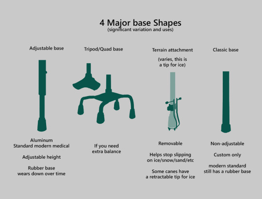
Bases have a lot of variability as well, and the modern standard is generally adjustable bases. Adjustable canes are very handy if your character regularly changes shoe height, for instance (gotta keep the height at your hip!)
Canes help on most terrain with their standard base and structure. But for some terrain, you might want a different base, or to forego the cane entirely! This article covers it pretty well.
Many cane users decorate their canes! Stickers are incredibly common, and painting canes is relatively common as well! You'll also see people replacing the standard wrist strap with a personalized one, or even adding a small charm to the ring the strap connects to. (nothing too large, or it gets annoying as the cane is swinging around everywhere)
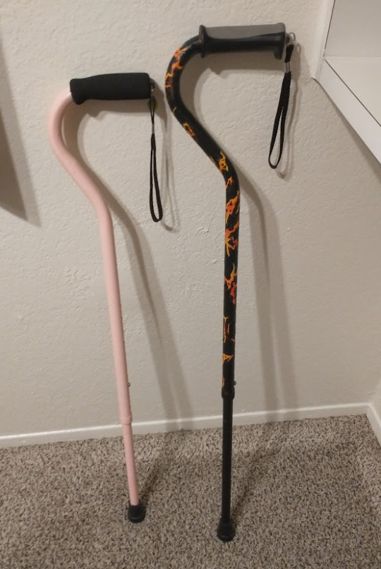
(my canes, for reference)
If your character uses a cane full time, then they might also have multiple canes that look different aesthetically to match their outfits!
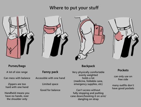
When it comes to practical things outside of the cane, you reasonably only have one hand available while it's being used. Many people will hook their cane onto their arm or let it dangle on the strap (if they have one) while using their cane arm, but it's often significantly less convenient than 2 hands. But, if you need 2 hands, then it's either setting the cane down or letting it hang!
For this reason, optimizing one handed use is ideal! Keeping bags/items on the side of your free hand helps keep your items accessible.
When sitting, the cane either leans against a wall or table, goes under the chair, or hooks onto the back of the chair. (It often falls when hanging off of a chair, in my experience)
When getting up, the user will either use their cane to help them balance/support as they stand, or get up and then grab their cane. This depends on what it's being used for (balance vs pain when walking, for instance!)
That's everything I can think of for now. Thank you for reading my long-but-absolutely-not-comprehensive list of things to keep in mind when writing or drawing a cane user!
Happy disability pride month! Go forth and make more characters use canes!!!
#mobility aid#cane user#writing tips#writing advice#drawing tips#art tutorial#art tips#art reference#art resources#art help#my art#long post
75K notes
·
View notes
Text
HOW I ANIMATE 🤌
I couldn’t make individual gifs of this whole this so MADE A VIDJEW FOR YEW GOIS ! I didn’t know what else to make of my animation, so I decided to make it into a little quick tutorial. Hope it helps!
19K notes
·
View notes
Text


+bonus
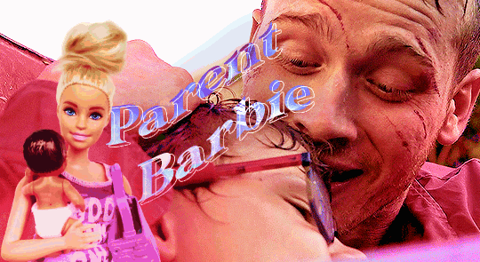
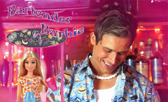
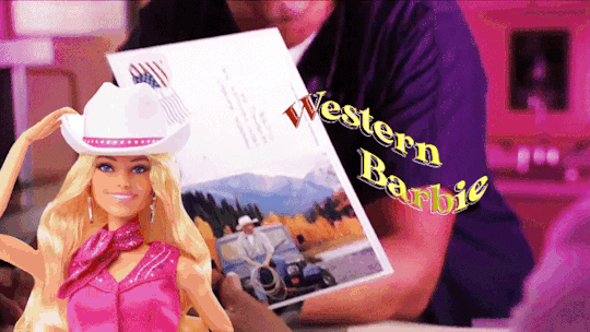
This Barbie is... Evan Buckley
#be nice this is my first gifset that i made using photopea#and i saw like three tutorials only lmao#evan buckley#evan buck buckley#christopher diaz#buck and chris#911 fox#911 on fox#911 abc#911 on abc#911 edit#911 edits#911edit#my edits#my gifs
3K notes
·
View notes
Note
Hey! Just wanted to ask, got any tips for highlights in pixelart? Ive got shadows down decently enough that i can at least stand looking at them a week later, but i have struggled with highlights and brighter lights in general. Also, awesome stuff, your space elevator piece got me into trying pixelart and it has been a fascinating journey so far
honestly when i first started i worked a LOT in black/white/values. i also tend to work dark to light, so ill build a piece up from its darkest areas, then finish with the highlights.
here is some of my art edited so you can see the values:
contrasting highlights against shadows will always make them stand out more and be more striking. i usually add a lot of rim lighting to pieces bc it’s like easy mode for focal points so i def recommend looking that up and learning about that!! truly though working in EXTREME values will help you get to more nuanced values so def try to work with a small color palette for a few times and seeing how that changes your understanding. when i first started out a LOT of my art was monochromatic just because i was focusing on values instead of color and i think that helped a lot!! examples of that:

#artist on tumblr#art help#artist help#artist tutorial#pixel art tutorial#values#i hope this helps it’s hard for me to explain my thoughts a lot lol
670 notes
·
View notes
Text


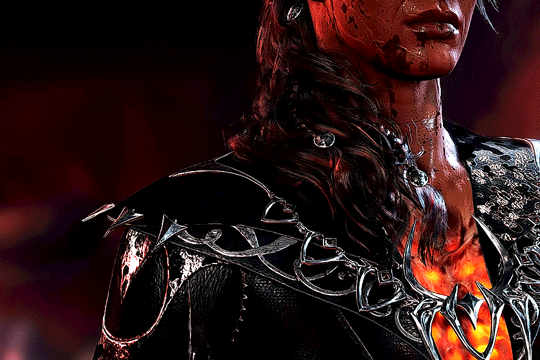
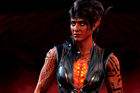
Baldur's Gate 3 - Karlach Cliffgate, The Infernal Heartthrob of the Avernus
#this is for anna and anthi my go-to karlach girlies#karlach#karlach cliffgate#bg3edit#baldur's gate 3#bg3#baldur's gate#gamingedit#videogameeedit#bg3 karlach#i cant get past the tutorial until i gif all of the companions in this good lighting#my edit
3K notes
·
View notes
Note
I was wondering can u do a tutorial on Sonic eyes and face?
Okay so, my process for drawing Sonic characters usually amounts to 'severely winging it', like so:
I draw a circle, I ignore the circle, you know how it is. I'm not sure I'd be super helpful trying to explain how I do it dfbfh
However!! I can redirect you to this really good tutorial by @tatck! A lot of the techniques in it are stuff I do as well!
#ask#my art#sonic#sth#sonic the hedgehog#amy rose#timelapse#speedpaint#gifs#gif#animated gifs#maybe I'll attempt to do a proper tutorial one day but rn? too tried fbff
609 notes
·
View notes
Text
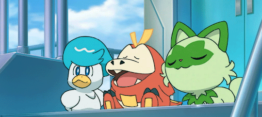
#pokegraphic#pokemon gif#pokemon horizons#quaxly#fuecoco#sprigatito#my gifs#pkmngifs#the amount this took me bc i had to reference a tutorial since i couldnt remember LMAO#i miss making gifs so throws this here
1K notes
·
View notes
Text
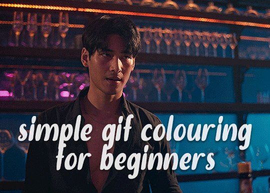
✨ Simple Gif Colouring for Beginners ✨
I wrote up my basic gif colouring process for a friend recently, but a couple of people here mentioned they'd also find it helpful! so, as requested, this is a beginner-friendly walkthrough of the way I colour my gifs :) it's aimed at brand new gif makers with no prior experience with photoshop or photo editing.
when I first started gif making I found colouring and photoshop in general suuuper daunting, so I've tried to simplify everything here as much as possible. hopefully this will be relatively easy to follow and not too intimidating!
a couple of things to begin with:
I'm only talking about colouring here - this is not a full gif making tutorial. I've linked to some of my favourites of those here!
I personally like to make bright, 'clean' looking gifs with vibrant but natural colours, so that is the style of colouring this tutorial is geared towards. most of gif colouring is subjective and about personal taste - the only thing that I'd say is possible to get wrong is skin tones, which I talk about a lot in this guide.
as I mostly gif Thai dramas, most of the advice is geared towards colouring for East Asian/South East Asian skin tones - but the techniques should be fairly universally applicable (and here are some tutorials that talk about gif colouring for other skin tones).
I'm not an expert! I'm not claiming this is the best or the only way to colour gifs - it's just how I do it.
this post is very image-heavy. if the images aren't loading (or the gifs are running slowly or cutting/looping weirdly), then try viewing the post in its own tab (rather than on the your dash or someone's blog) and refreshing the page.
okay, full walkthrough beneath the cut!
contents:
1. intro
a. natural gif colouring goals
b. very very basic colour theory
2. super simple colouring (the essentials)
a. curves
b. selective colour (and skin tone correction)
c. hue/saturation
d. saving and reusing colouring
e. another simple colouring example
3. other adjustment layers
a. brightness/contrast
b. levels
c. vibrance
d. colour balance
e. channel mixer
4. troubleshooting
a. curves
b. saturation
5. fin!
1. intro
the colouring part of gif making can be super overwhelming, especially if (like me when I first started!) you're completely new to photoshop and/or have no experience with colour theory or photo/video editing.
if you're opening photoshop and making gifs for the first time, I highly recommend getting used to making a few basic, uncoloured gifs to begin with. just to practice, rather than post anywhere (though you can always come back and colour them later if you want) - but it'll make the rest of the process much easier if you're already beginning to get used to working in timeline mode of photoshop. give yourself a bit of time to practice and get a feel for things like how many frames you tend to like in a gif, where you like to crop them for the best loop, what kind of aspect ratio you like etc* - so that you're not trying to navigate all of that for the first time on top of everything else!
* frames: for me between 60-90 frames is ideal, but 40-120 frames is the absolute min-max I'd personally use in a normal gifset
loops: for the smoothest loops, try to avoid cutting someone off mid-movement or mid-word if possible.
aspect ratio: for full-size (540px) gifs, I tend to go for either 8:5 (slightly 'skinnier' gifs), 7:5, or 5:4 (particularly big, thick gifs lmao)
✨ natural gif colouring goals
part of what can be so daunting about starting gif making is not knowing where to start or what you want to achieve. this is definitely something that gets easier with practice - the more gifs you make, the more you'll get a feel for what kind of look you like and the more instinctively you'll know how to get there. it also helps to see if any gif makers you like have made "before and after colouring" posts - these can help with getting a sense of the kinds of changes made through gif colouring. here's one I made!
in general, I like to make my gifs bright and 'clean' looking, with vibrant but natural colours. these are the things I'm usually hoping to achieve with colouring:
brighten dark scenes
remove muddy, yellowish lighting or filters
saturate colours
correct any skin lightening filters or overexposure
make lighting and colours as consistent as possible between gifs within a single gifset, especially gifsets featuring gifs from multiple scenes/episodes/videos
this guide is focusing on natural colouring, but of course there are many cool ways to make stylised/unnaturally coloured gifs. imo you'll need to master these basics first, but if you want to learn how to do things like change the background colour of gifs or use gradients or other cool effects, then @usergif's resource directory has loads of super helpful tutorials!
✨ very very basic colour theory
[disclaimer! I don't know shit about fuck. I do not study light or art. this is just an explanation that makes sense to me exclusively for the purposes of gif making.]
the primary colours for light/digital screens are red, blue, and green. having all three colours in equal measures neutralises them (represented by the white section in the middle of the diagram).
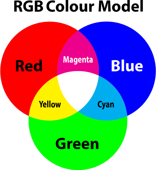
so to neutralise a colour within a gif, you need to add more of the colour(s) that are lacking.
in practice this usually means: the scene you want to gif is very yellow! yellow is made of red and green light, so to neutralise it you need to add more blue into your gif.
it can also mean the reverse: if you desaturate the yellow tones in a gif, it will look much more blue.
looking at the colour balance sliders on photoshop can make it easier to visualise:
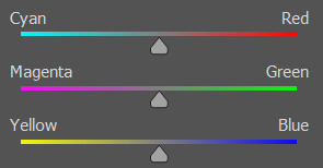
so making a gif more red also means making it less cyan.
removing green from a gif means adding magenta.
taking yellow out of a gif will make it more blue.
tl;dr:
neutralise yellows by adding blue (and vice versa)
neutralise reds by adding cyan (and vice versa)
neutralise green by adding magenta (and vice versa)
2. super simple colouring (the essentials)
starting with a nice sharpened gif in photoshop in timeline mode. (these are the sharpening settings I use!)
some scenes are much harder to colour than others - it helps to start out practising with scenes that are bright/well-lit and that don't have harsh unnaturally coloured lights/filters on. scenes with a lot of brown/orange also tend to be harder.
I usually save a base copy of my gif before I start colouring just in case I end up hating it, or find out later that it doesn't quite fit right into a set and need to redo it etc.
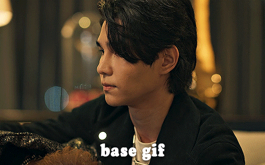
so here is my base gif!

it's an okay gif, but it has a bit of a yellow tint to it that I want to reduce.
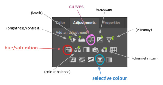
colouring is easiest to do in adjustment layers, which can be found under layer -> new adjustment layer - or for me they are here:
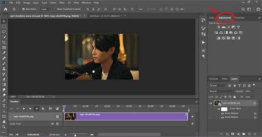
there are lots of different types of adjustment layers that do lots of different things - but for me the absolute essentials for colouring are curves, selective colour, and hue/saturation.
I also use brightness/contrast, levels, exposure, vibrance, colour balance, and channel mixer sometimes, depending on the gif - but I use curves, selective colour, and hue/saturation on every single gif.
✨ curves layer
the first thing I always do is a curves layer. when you first open one it will look like this:
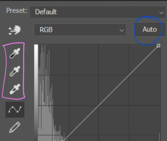
first I usually click the ‘auto’ button, just to see what happens. sometimes it makes a big difference (it usually brightens the gif a lot) - but on this gif it didn’t do much.
if it had made the gif look nicer then I would have kept it and added a second curves layer on top to do the rest of these steps.
the next step is selecting the white and black points with the little eyedropper tools.
the bottom eyedropper lets you pick a white point for the gif. click somewhere super light on the gif to see what happens - for this gif, I clicked on the lampshade on the left. if it looks weird, I just undo it and try somewhere else - it usually takes a few goes to find something that looks good.
here's what that did to the gif:

then I pick the top eyedropper and use it to pick a black point by clicking somewhere really dark, again playing around until I find a black point that looks good.
here's what the gif looks like after picking the white and black points:

this can take some experimenting, but you can make super easy drastic changes to your gif just with this. in this case, the curves layer took out a lot of that yellowy tint.
and this is what the curves graph looks like now:
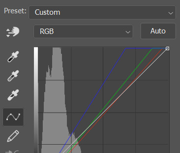
you can click and drag those lines to make further changes if you want - I usually leave them alone though. the colours of the lines indicate which colours have been changed in the gif - for example, you can see from that steep blue line on the graph that blue has been added to neutralise those yellows.
next I usually do another curves layer and just press the ‘auto’ button again to see what happens. usually it brightens the gif a bit more, which I like.
‼️if nothing is working: usually with a bit of fucking about a curves layer works well - but sometimes you can’t find a good white and black point anywhere, and instead your gif turns wacky colours and nothing looks good. this happens more often with very heavily colour tinted scenes :( the troubleshooting section at the end goes over some options, including starting with a levels layer instead.
✨ selective colour (and skin tone correction)
skin tones are made up of a mixture of yellow and red.
removing yellow (or adding blue or red) to a gif will make the skin-tones too red - and removing red (or adding cyan or yellow) to a gif will make the skin-tones too yellow.
adding blue to this gif with the curves layer took out the yellowy tint, which I wanted - but it also took the yellows out of Kim's skin tone, which I don’t want. so I need to put yellow back into the skin tones specifically - without putting it back into the rest of the gif.
selective colour layers let you select an individual colour and adjust the levels of other colours within that colour. you can change how yellow the green shades are, or how much cyan is in the blues, for example.
I need to add yellow back into the red tones to correct the skin tones on this gif. this is the case for most gifs in my experience - the vast majority of the time, unless a scene is very heavily tinted in another colour, a curves layer will add blue/remove yellow.
in the 'colors' dropdown, select the 'reds' section and drag the 'yellow' slider higher - this will add more yellow into just the red shades within the gif.

the amount of yellow you need to add back into the reds depends on how much yellow was taken out of the gif initially - I just play around with the slider until it looks right. if you're not sure, it helps to have some neutrally-coloured (not white-washed!) reference photos of the people in your gif to compare to.
here's the result. Kim's skin is a lot less pink toned and much more natural looking:
✨ hue/saturation
this adjustment layer lets you adjust the hue and saturation of the gif as a whole, and also of each colour individually.
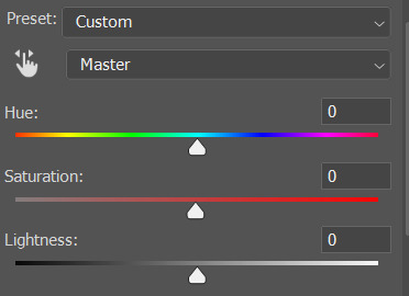
I don't use the hue or lightness sliders unless I'm trying to do something more complicated with the colouring.
clicking the dropdown menu that says 'master' lets you edit the saturation of each colour individually. this is useful if your gif is still super tinted in one colour.
I thought the yellows on this gif were still slightly too bright, so I switched to the yellow channel and desaturated them slightly. (remember if you do this then you need to go back to selective colour and add more yellow into the red skin tones to balance out the desaturation!)
then I increased the 'master' saturation of all the colours to +5:
I usually find the right amount of saturation is somewhere between +5 and +12, but it depends on the gif.
‼️if the gif feels undersaturated, but the saturation slider isn't helping/is making the colours worse, try a vibrance layer instead.
done!
✨ saving and reusing colouring
you can copy and paste adjustment layers between gifs to make your colouring even across each of your gifs for one scene - so if you're making a set of multiple gifs of the same scene, or you think you might want to gif the same scene again in the future, you can save it as a psd so you can reuse the colouring again later.
each gif's colouring will then still need tweaking - different cameras/angles/shots of the same scene can still start out with slightly different colouring.
I recommend uploading the gifs as a draft post on tumblr so you can see what they all look like next to each other and catch any inconsistencies.
✨ another one! (speedrun!)
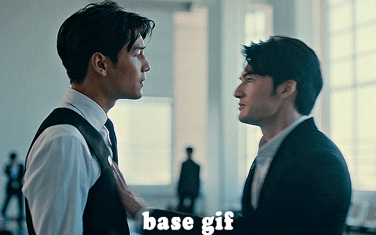
HI KEN!
the white point for the curves layer was in the window behind them.
the curves layer removes the muddy yellow tint, but again it makes their skin tones (especially Ken's) very red toned, which is adjusted by the selective colour layer.
3. other adjustment layers
imo many many gifs can be coloured really nicely with just those three adjustment layers, but some need different adjustments.
✨ brightness/contrast
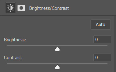
pretty self explanatory!
I personally usually avoid using the 'brightness' slider because I rarely like the effect - I only tend to use the 'contrast' one.
the 'auto' button is sometimes useful though, especially if you’re struggling with the curves layer.
✨ levels

levels alters the white and black points of the gif, like curves - but unlike curves it doesn't also alter other colours.
use the sliders beneath the graph to alter how dark/light the gif is. you can slide the black slider further to the right to make the blacks darker, and the white slider to the left to make the whites lighter.
levels is a good place to start if your curves layer isn't working.
(I'm going to hit the image limit for this post lol so here are some screenshots of a table I made to demonstrate this rather than actual gifs. sorry!)
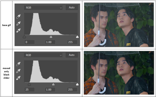

on both sides, I dragged the sliders up to where the big jumps are on the graph - this is usually a good place to start!
✨ vibrance
vibrance... makes the colours more vibrant. it's more subtle than saturation.
it's really helpful for gifs that feel grey. sometimes adjusting saturation just makes the greys kind of weirdly tinted, but a vibrance layer can fix that.
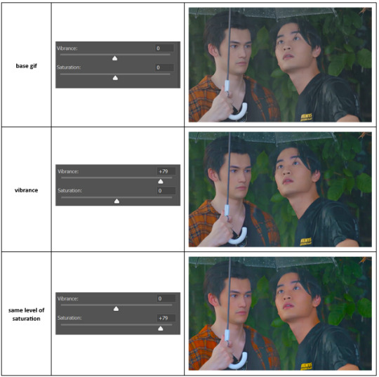
vibrance is much more subtle!
✨ colour balance
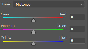
colour balance affects the overall balance of colours within a gif.
it's good for scenes with heavy tints.
I tend to stick to the 'midtones' dropdown, but you can also alter the colour balance within the shadows and highlights if you want.

✨ channel mixer
I avoided channel mixer for such a long time because it scared me. but it's great for scenes that are very heavily tinted in one colour.
basically, it works with the levels of red, green, and blue within a gif. you select an output colour and then play around with the levels of the colour you selected within each other colour.
kind of the reverse of selective colour?
so in the 'blue' channel, the levels of blue are at 100%, and the levels of red and green are at 0% - but you can impact how much blue is in the reds and greens and blues.
this tutorial explains it well - but imo the best way to get to grips with channel mixer is just to play around with it a bit (sorry)
(when I made this guide for my friend, I also made a slightly more complicated gif colouring walk-through that included using channel mixer. there isn't space to include it within this post, but if anyone is interested I could always upload it as an 'intermediate' gif colouring tutorial - lmk!)
4. troubleshooting
‼️curves
usually with a bit of fucking about a curves layer works well - but sometimes you can’t find a good white and black point anywhere, and instead your gif turns wacky colours and nothing looks good. this happens more often with very heavily colour tinted scenes :(
for example, with this base gif:
using many of the brightest points as a white point turn it wacky colours, like this:

yikes :(
some options for these cases:
try brightening the gif first with the 'auto' button on the curves layer or with a levels layer. having a brighter gif to start with can give you better options for picking a white point.
try finding an alternate, whiter/brighter white point. look for places the light reflects - on this gif, using the light on Porsche's cheekbone works well as the white point. it also helps to find places that would be white if the scene wasn't tinted - the lightest part of a white shirt is often a good place to start, for example.
skip the curves layer, and instead use a levels layer to alter your white/black points, and colour balance or channel mixer to balance the colours.
‼️over/undersaturation
if your gif (especially the skintones) is looking a little washed out or lifeless, it might be undersaturated. boost that saturation - or if that's not working, try a vibrance layer.
oversaturation is often easiest to spot in the mouths and ears of any people in a gif. if the mouths are looking unnaturally, vibrantly red, then you've gone too far with the saturation.
5. fin!
and done! I hope this was coherent helpful to somebody.
if there's anything that I've missed or that doesn't make sense pls feel free to shoot me an ask or a message and I'll do my best to help! I've also collated a bunch of additional reading/resources below.
happy gifmaking 🥰
✨ some links!
photoshop basics by @selenapastel
gifmaking for beginners by @hayaosmiyazaki
gifmaking guide for beginners by @saw-x
dreamy's gif tutorial by @scoupsy-remade (includes instructions on how to blur out burned-on subtitles or annoying video graphics)
beginner's guide to channel mixer by @aubrey-plaza
how to fix orange-washed characters by aubrey-plaza
colour correcting and fixing dark scenes by @kylos
does resampling matter? by usergif
how to put multiple gifs on one canvas by @fictionalheroine
watermarking using actions by @wonwooridul
resource directory by @usergif
#i got a couple of asks about this so i figured i'd type it up as a post#it's been sitting in my drafts for a while now though i'm so sorry omg.#i had to replace my laptop and it took me a while to get round to downloading photoshop on the new one#but i hope this is helpful!!#gif making#tutorial#photoshop tutorial#colouring tutorial#coloring tutorial#gif colouring#gif coloring#photoshop resources#gif tutorial#gif resources#userbunn#uservik#darcey.txt#darcey.gif#usergif
445 notes
·
View notes
Text
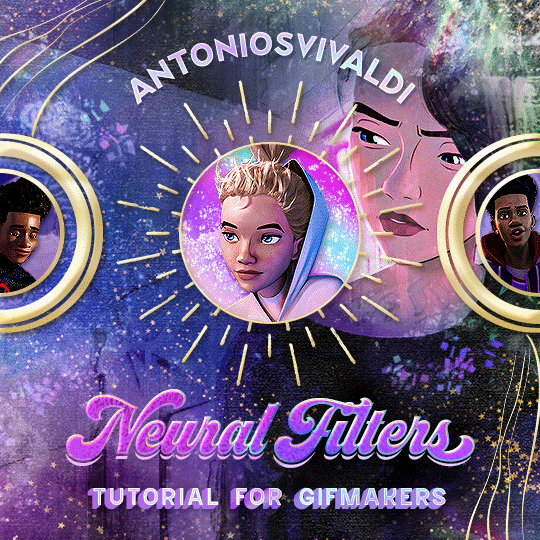


Neural Filters Tutorial for Gifmakers by @antoniosvivaldi
Hi everyone! In light of my blog’s 10th birthday, I’m delighted to reveal my highly anticipated gifmaking tutorial using Neural Filters - a very powerful collection of filters that really broadened my scope in gifmaking over the past 12 months.
Before I get into this tutorial, I want to thank @laurabenanti, @maines , @cobbbvanth, and @cal-kestis for their unconditional support over the course of my journey of investigating the Neural Filters & their valuable inputs on the rendering performance!
In this tutorial, I will outline what the Photoshop Neural Filters do and how I use them in my workflow - multiple examples will be provided for better clarity. Finally, I will talk about some known performance issues with the filters & some feasible workarounds.
Tutorial Structure:
Meet the Neural Filters: What they are and what they do
Why I use Neural Filters? How I use Neural Filters in my giffing workflow
Getting started: The giffing workflow in a nutshell and installing the Neural Filters
Applying Neural Filters onto your gif: Making use of the Neural Filters settings; with multiple examples
Testing your system: recommended if you’re using Neural Filters for the first time
Rendering performance: Common Neural Filters performance issues & workarounds
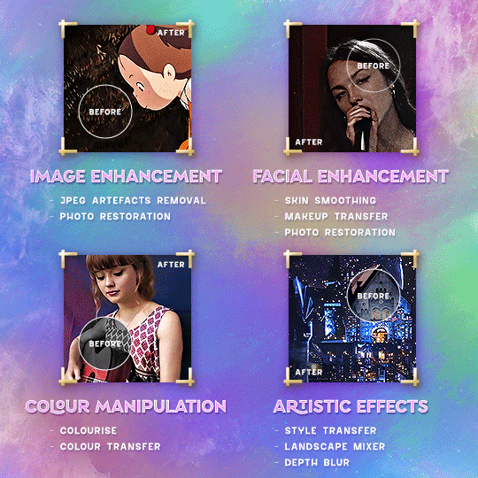
For quick reference, here are the examples that I will show in this tutorial:
Example 1: Image Enhancement | improving the image quality of gifs prepared from highly compressed video files
Example 2: Facial Enhancement | enhancing an individual's facial features
Example 3: Colour Manipulation | colourising B&W gifs for a colourful gifset
Example 4: Artistic effects | transforming landscapes & adding artistic effects onto your gifs
Example 5: Putting it all together | my usual giffing workflow using Neural Filters
What you need & need to know:
Software: Photoshop 2021 or later (recommended: 2023 or later)*
Hardware: 8GB of RAM; having a supported GPU is highly recommended*
Difficulty: Advanced (requires a lot of patience); knowledge in gifmaking and using video timeline assumed
Key concepts: Smart Layer / Smart Filters
Benchmarking your system: Neural Filters test files**
Supplementary materials: Tutorial Resources / Detailed findings on rendering gifs with Neural Filters + known issues***
*I primarily gif on an M2 Max MacBook Pro that's running Photoshop 2024, but I also have experiences gifmaking on few other Mac models from 2012 ~ 2023.
**Using Neural Filters can be resource intensive, so it’s helpful to run the test files yourself. I’ll outline some known performance issues with Neural Filters and workarounds later in the tutorial.
***This supplementary page contains additional Neural Filters benchmark tests and instructions, as well as more information on the rendering performance (for Apple Silicon-based devices) when subject to heavy Neural Filters gifmaking workflows
Tutorial under the cut. Like / Reblog this post if you find this tutorial helpful. Linking this post as an inspo link will also be greatly appreciated!
1. Meet the Neural Filters!
Neural Filters are powered by Adobe's machine learning engine known as Adobe Sensei. It is a non-destructive method to help streamline workflows that would've been difficult and/or tedious to do manually.
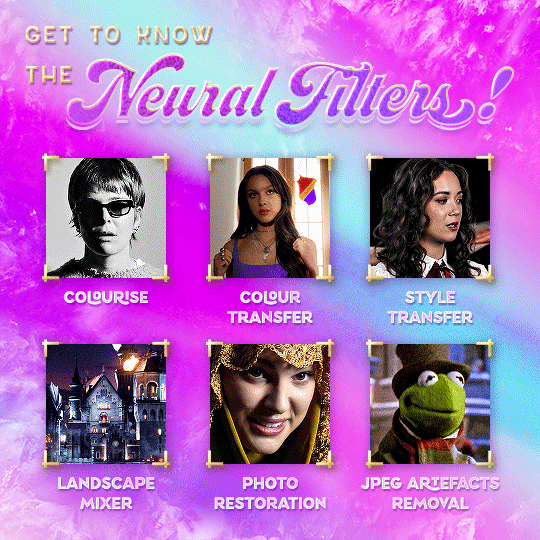
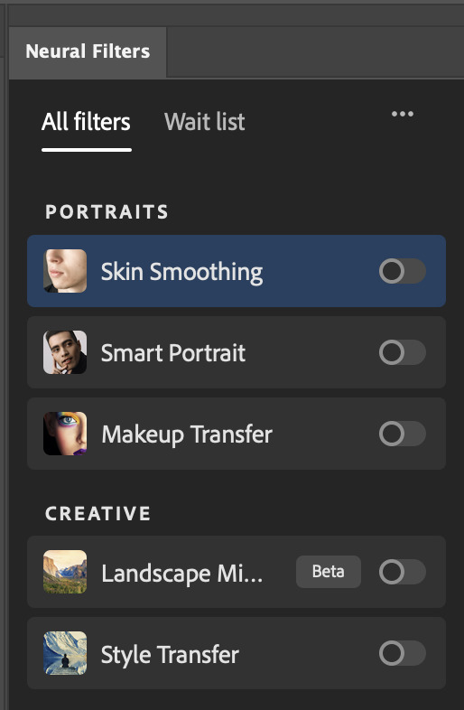
Here are the Neural Filters available in Photoshop 2024:

Skin Smoothing: Removes blemishes on the skin
Smart Portrait: This a cloud-based filter that allows you to change the mood, facial age, hair, etc using the sliders+
Makeup Transfer: Applies the makeup (from a reference image) to the eyes & mouth area of your image
Landscape Mixer: Transforms the landscape of your image (e.g. seasons & time of the day, etc), based on the landscape features of a reference image
Style Transfer: Applies artistic styles e.g. texturings (from a reference image) onto your image
Harmonisation: Applies the colour balance of your image based on the lighting of the background image+
Colour Transfer: Applies the colour scheme (of a reference image) onto your image
Colourise: Adds colours onto a B&W image
Super Zoom: Zoom / crop an image without losing resolution+
Depth Blur: Blurs the background of the image
JPEG Artefacts Removal: Removes artefacts caused by JPEG compression
Photo Restoration: Enhances image quality & facial details
+These three filters aren't used in my giffing workflow. The cloud-based nature of Smart Portrait leads to disjointed looking frames. For Harmonisation, applying this on a gif causes Neural Filter timeout error. Finally, Super Zoom does not currently support output as a Smart Filter
If you're running Photoshop 2021 or earlier version of Photoshop 2022, you will see a smaller selection of Neural Filters:

Things to be aware of:
You can apply up to six Neural Filters at the same time
Filters where you can use your own reference images: Makeup Transfer (portraits only), Landscape Mixer, Style Transfer (not available in Photoshop 2021), and Colour Transfer
Later iterations of Photoshop 2023 & newer: The first three default presets for Landscape Mixer and Colour Transfer are currently broken.
2. Why I use Neural Filters?
Here are my four main Neural Filters use cases in my gifmaking process. In each use case I'll list out the filters that I use:
Enhancing Image Quality:
Common wisdom is to find the highest quality video to gif from for a media release & avoid YouTube whenever possible. However for smaller / niche media (e.g. new & upcoming musical artists), prepping gifs from highly compressed YouTube videos is inevitable.
So how do I get around with this? I have found Neural Filters pretty handy when it comes to both correcting issues from video compression & enhancing details in gifs prepared from these highly compressed video files.
Filters used: JPEG Artefacts Removal / Photo Restoration
Facial Enhancement:
When I prepare gifs from highly compressed videos, something I like to do is to enhance the facial features. This is again useful when I make gifsets from compressed videos & want to fill up my final panel with a close-up shot.
Filters used: Skin Smoothing / Makeup Transfer / Photo Restoration (Facial Enhancement slider)
Colour Manipulation:
Neural Filters is a powerful way to do advanced colour manipulation - whether I want to quickly transform the colour scheme of a gif or transform a B&W clip into something colourful.
Filters used: Colourise / Colour Transfer
Artistic Effects:
This is one of my favourite things to do with Neural Filters! I enjoy using the filters to create artistic effects by feeding textures that I've downloaded as reference images. I also enjoy using these filters to transform the overall the atmosphere of my composite gifs. The gifsets where I've leveraged Neural Filters for artistic effects could be found under this tag on usergif.
Filters used: Landscape Mixer / Style Transfer / Depth Blur
How I use Neural Filters over different stages of my gifmaking workflow:
I want to outline how I use different Neural Filters throughout my gifmaking process. This can be roughly divided into two stages:
Stage I: Enhancement and/or Colourising | Takes place early in my gifmaking process. I process a large amount of component gifs by applying Neural Filters for enhancement purposes and adding some base colourings.++
Stage II: Artistic Effects & more Colour Manipulation | Takes place when I'm assembling my component gifs in the big PSD / PSB composition file that will be my final gif panel.
I will walk through this in more detail later in the tutorial.
++I personally like to keep the size of the component gifs in their original resolution (a mixture of 1080p & 4K), to get best possible results from the Neural Filters and have more flexibility later on in my workflow. I resize & sharpen these gifs after they're placed into my final PSD composition files in Tumblr dimensions.
3. Getting started
The essence is to output Neural Filters as a Smart Filter on the smart object when working with the Video Timeline interface. Your workflow will contain the following steps:
Prepare your gif
In the frame animation interface, set the frame delay to 0.03s and convert your gif to the Video Timeline
In the Video Timeline interface, go to Filter > Neural Filters and output to a Smart Filter
Flatten or render your gif (either approach is fine). To flatten your gif, play the "flatten" action from the gif prep action pack. To render your gif as a .mov file, go to File > Export > Render Video & use the following settings.

Setting up:
o.) To get started, prepare your gifs the usual way - whether you screencap or clip videos. You should see your prepared gif in the frame animation interface as follows:

Note: As mentioned earlier, I keep the gifs in their original resolution right now because working with a larger dimension document allows more flexibility later on in my workflow. I have also found that I get higher quality results working with more pixels. I eventually do my final sharpening & resizing when I fit all of my component gifs to a main PSD composition file (that's of Tumblr dimension).
i.) To use Smart Filters, convert your gif to a Smart Video Layer.
As an aside, I like to work with everything in 0.03s until I finish everything (then correct the frame delay to 0.05s when I upload my panels onto Tumblr).
For convenience, I use my own action pack to first set the frame delay to 0.03s (highlighted in yellow) and then convert to timeline (highlighted in red) to access the Video Timeline interface. To play an action, press the play button highlighted in green.

Once you've converted this gif to a Smart Video Layer, you'll see the Video Timeline interface as follows:

ii.) Select your gif (now as a Smart Layer) and go to Filter > Neural Filters
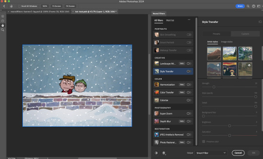
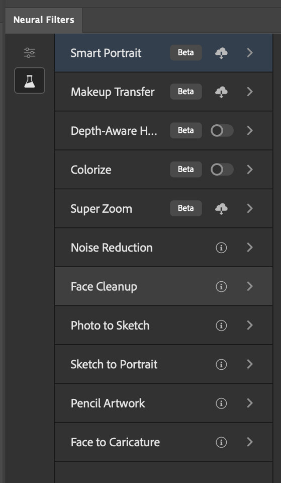
Installing Neural Filters:
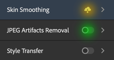
Install the individual Neural Filters that you want to use. If the filter isn't installed, it will show a cloud symbol (highlighted in yellow). If the filter is already installed, it will show a toggle button (highlighted in green)
When you toggle this button, the Neural Filters preview window will look like this (where the toggle button next to the filter that you use turns blue)

4. Using Neural Filters
Once you have installed the Neural Filters that you want to use in your gif, you can toggle on a filter and play around with the sliders until you're satisfied. Here I'll walkthrough multiple concrete examples of how I use Neural Filters in my giffing process.
Example 1: Image enhancement | sample gifset
This is my typical Stage I Neural Filters gifmaking workflow. When giffing older or more niche media releases, my main concern is the video compression that leads to a lot of artefacts in the screencapped / video clipped gifs.
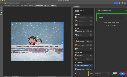
To fix the artefacts from compression, I go to Filter > Neural Filters, and toggle JPEG Artefacts Removal filter. Then I choose the strength of the filter (boxed in green), output this as a Smart Filter (boxed in yellow), and press OK (boxed in red).
Note: The filter has to be fully processed before you could press the OK button!
After applying the Neural Filters, you'll see "Neural Filters" under the Smart Filters property of the smart layer

Flatten / render your gif
Example 2: Facial enhancement | sample gifset
This is my routine use case during my Stage I Neural Filters gifmaking workflow. For musical artists (e.g. Maisie Peters), YouTube is often the only place where I'm able to find some videos to prepare gifs from. However even the highest resolution video available on YouTube is highly compressed.
Go to Filter > Neural Filters and toggle on Photo Restoration. If Photoshop recognises faces in the image, there will be a "Facial Enhancement" slider under the filter settings.

Play around with the Photo Enhancement & Facial Enhancement sliders. You can also expand the "Adjustment" menu make additional adjustments e.g. remove noises and reducing different types of artefacts.

Once you're happy with the results, press OK and then flatten / render your gif.
Example 3: Colour Manipulation | sample gifset
Want to make a colourful gifset but the source video is in B&W? This is where Colourise from Neural Filters comes in handy! This same colourising approach is also very helpful for colouring poor-lit scenes as detailed in this tutorial.
Here's a B&W gif that we want to colourise:

Highly recommended: add some adjustment layers onto the B&W gif to improve the contrast & depth. This will give you higher quality results when you colourise your gif.
Go to Filter > Neural Filters and toggle on Colourise.
Make sure "Auto colour image" is enabled.
Play around with further adjustments e.g. colour balance, until you're satisfied then press OK.
Important: When you colourise a gif, you need to double check that the resulting skin tone is accurate to real life. I personally go to Google Images and search up photoshoots of the individual / character that I'm giffing for quick reference.
Add additional adjustment layers until you're happy with the colouring of the skin tone.
Once you're happy with the additional adjustments, flatten / render your gif. And voila!

Note: For Colour Manipulation, I use Colourise in my Stage I workflow and Colour Transfer in my Stage II workflow to do other types of colour manipulations (e.g. transforming the colour scheme of the component gifs)
Example 4: Artistic Effects | sample gifset
This is where I use Neural Filters for the bulk of my Stage II workflow: the most enjoyable stage in my editing process!
Normally I would be working with my big composition files with multiple component gifs inside it. To begin the fun, drag a component gif (in PSD file) to the main PSD composition file.
Resize this gif in the composition file until you're happy with the placement

Duplicate this gif. Sharpen the bottom layer (highlighted in yellow), and then select the top layer (highlighted in green) & go to Filter > Neural Filters

I like to use Style Transfer and Landscape Mixer to create artistic effects from Neural Filters. In this particular example, I've chosen Landscape Mixer
Select a preset or feed a custom image to the filter (here I chose a texture that I've on my computer)
Play around with the different sliders e.g. time of the day / seasons
Important: uncheck "Harmonise Subject" & "Preserve Subject" - these two settings are known to cause performance issues when you render a multiframe smart object (e.g. for a gif)
Once you're happy with the artistic effect, press OK
To ensure you preserve the actual subject you want to gif (bc Preserve Subject is unchecked), add a layer mask onto the top layer (with Neural Filters) and mask out the facial region. You might need to play around with the Layer Mask Position keyframes or Rotoscope your subject in the process.
After you're happy with the masking, flatten / render this composition file and voila!

Example 5: Putting it all together | sample gifset
Let's recap on the Neural Filters gifmaking workflow and where Stage I and Stage II fit in my gifmaking process:
i. Preparing & enhancing the component gifs
Prepare all component gifs and convert them to smart layers
Stage I: Add base colourings & apply Photo Restoration / JPEG Artefacts Removal to enhance the gif's image quality
Flatten all of these component gifs and convert them back to Smart Video Layers (this process can take a lot of time)
Some of these enhanced gifs will be Rotoscoped so this is done before adding the gifs to the big PSD composition file
ii. Setting up the big PSD composition file
Make a separate PSD composition file (Ctrl / Cmmd + N) that's of Tumblr dimension (e.g. 540px in width)
Drag all of the component gifs used into this PSD composition file
Enable Video Timeline and trim the work area
In the composition file, resize / move the component gifs until you're happy with the placement & sharpen these gifs if you haven't already done so
Duplicate the layers that you want to use Neural Filters on
iii. Working with Neural Filters in the PSD composition file
Stage II: Neural Filters to create artistic effects / more colour manipulations!
Mask the smart layers with Neural Filters to both preserve the subject and avoid colouring issues from the filters
Flatten / render the PSD composition file: the more component gifs in your composition file, the longer the exporting will take. (I prefer to render the composition file into a .mov clip to prevent overriding a file that I've spent effort putting together.)
Note: In some of my layout gifsets (where I've heavily used Neural Filters in Stage II), the rendering time for the panel took more than 20 minutes. This is one of the rare instances where I was maxing out my computer's memory.
Useful things to take note of:
Important: If you're using Neural Filters for Colour Manipulation or Artistic Effects, you need to take a lot of care ensuring that the skin tone of nonwhite characters / individuals is accurately coloured
Use the Facial Enhancement slider from Photo Restoration in moderation, if you max out the slider value you risk oversharpening your gif later on in your gifmaking workflow
You will get higher quality results from Neural Filters by working with larger image dimensions: This gives Neural Filters more pixels to work with. You also get better quality results by feeding higher resolution reference images to the Neural Filters.
Makeup Transfer is more stable when the person / character has minimal motion in your gif
You might get unexpected results from Landscape Mixer if you feed a reference image that don't feature a distinctive landscape. This is not always a bad thing: for instance, I have used this texture as a reference image for Landscape Mixer, to create the shimmery effects as seen in this gifset
5. Testing your system
If this is the first time you're applying Neural Filters directly onto a gif, it will be helpful to test out your system yourself. This will help:
Gauge the expected rendering time that you'll need to wait for your gif to export, given specific Neural Filters that you've used
Identify potential performance issues when you render the gif: this is important and will determine whether you will need to fully playback your gif before flattening / rendering the file.
Understand how your system's resources are being utilised: Inputs from Windows PC users & Mac users alike are welcome!
About the Neural Filters test files:
Contains six distinct files, each using different Neural Filters
Two sizes of test files: one copy in full HD (1080p) and another copy downsized to 540px
One folder containing the flattened / rendered test files
How to use the Neural Filters test files:
What you need:
Photoshop 2022 or newer (recommended: 2023 or later)
Install the following Neural Filters: Landscape Mixer / Style Transfer / Colour Transfer / Colourise / Photo Restoration / Depth Blur
Recommended for some Apple Silicon-based MacBook Pro models: Enable High Power Mode
How to use the test files:
For optimal performance, close all background apps
Open a test file
Flatten the test file into frames (load this action pack & play the “flatten” action)
Take note of the time it takes until you’re directed to the frame animation interface
Compare the rendered frames to the expected results in this folder: check that all of the frames look the same. If they don't, you will need to fully playback the test file in full before flattening the file.†
Re-run the test file without the Neural Filters and take note of how long it takes before you're directed to the frame animation interface
Recommended: Take note of how your system is utilised during the rendering process (more info here for MacOS users)
†This is a performance issue known as flickering that I will discuss in the next section. If you come across this, you'll have to playback a gif where you've used Neural Filters (on the video timeline) in full, prior to flattening / rendering it.
Factors that could affect the rendering performance / time (more info):
The number of frames, dimension, and colour bit depth of your gif
If you use Neural Filters with facial recognition features, the rendering time will be affected by the number of characters / individuals in your gif
Most resource intensive filters (powered by largest machine learning models): Landscape Mixer / Photo Restoration (with Facial Enhancement) / and JPEG Artefacts Removal
Least resource intensive filters (smallest machine learning models): Colour Transfer / Colourise
The number of Neural Filters that you apply at once / The number of component gifs with Neural Filters in your PSD file
Your system: system memory, the GPU, and the architecture of the system's CPU+++
+++ Rendering a gif with Neural Filters demands a lot of system memory & GPU horsepower. Rendering will be faster & more reliable on newer computers, as these systems have CPU & GPU with more modern instruction sets that are geared towards machine learning-based tasks.
Additionally, the unified memory architecture of Apple Silicon M-series chips are found to be quite efficient at processing Neural Filters.
6. Performance issues & workarounds
Common Performance issues:
I will discuss several common issues related to rendering or exporting a multi-frame smart object (e.g. your composite gif) that uses Neural Filters below. This is commonly caused by insufficient system memory and/or the GPU.
Flickering frames: in the flattened / rendered file, Neural Filters aren't applied to some of the frames+-+
Scrambled frames: the frames in the flattened / rendered file isn't in order
Neural Filters exceeded the timeout limit error: this is normally a software related issue
Long export / rendering time: long rendering time is expected in heavy workflows
Laggy Photoshop / system interface: having to wait quite a long time to preview the next frame on the timeline
Issues with Landscape Mixer: Using the filter gives ill-defined defined results (Common in older systems)--
Workarounds:
Workarounds that could reduce unreliable rendering performance & long rendering time:
Close other apps running in the background
Work with smaller colour bit depth (i.e. 8-bit rather than 16-bit)
Downsize your gif before converting to the video timeline-+-
Try to keep the number of frames as low as possible
Avoid stacking multiple Neural Filters at once. Try applying & rendering the filters that you want one by one
Specific workarounds for specific issues:
How to resolve flickering frames: If you come across flickering, you will need to playback your gif on the video timeline in full to find the frames where the filter isn't applied. You will need to select all of the frames to allow Photoshop to reprocess these, before you render your gif.+-+
What to do if you come across Neural Filters timeout error? This is caused by several incompatible Neural Filters e.g. Harmonisation (both the filter itself and as a setting in Landscape Mixer), Scratch Reduction in Photo Restoration, and trying to stack multiple Neural Filters with facial recognition features.
If the timeout error is caused by stacking multiple filters, a feasible workaround is to apply the Neural Filters that you want to use one by one over multiple rendering sessions, rather all of them in one go.
+-+This is a very common issue for Apple Silicon-based Macs. Flickering happens when a gif with Neural Filters is rendered without being previously played back in the timeline.
This issue is likely related to the memory bandwidth & the GPU cores of the chips, because not all Apple Silicon-based Macs exhibit this behaviour (i.e. devices equipped with Max / Ultra M-series chips are mostly unaffected).
-- As mentioned in the supplementary page, Landscape Mixer requires a lot of GPU horsepower to be fully rendered. For older systems (pre-2017 builds), there are no workarounds other than to avoid using this filter.
-+- For smaller dimensions, the size of the machine learning models powering the filters play an outsized role in the rendering time (i.e. marginal reduction in rendering time when downsizing 1080p file to Tumblr dimensions). If you use filters powered by larger models e.g. Landscape Mixer and Photo Restoration, you will need to be very patient when exporting your gif.
7. More useful resources on using Neural Filters
Creating animations with Neural Filters effects | Max Novak
Using Neural Filters to colour correct by @edteachs
I hope this is helpful! If you have any questions or need any help related to the tutorial, feel free to send me an ask 💖
#photoshop tutorial#gif tutorial#dearindies#usernik#useryoshi#usershreyu#userisaiah#userroza#userrobin#userraffa#usercats#userriel#useralien#userjoeys#usertj#alielook#swearphil#*#my resources#my tutorials
406 notes
·
View notes
Text
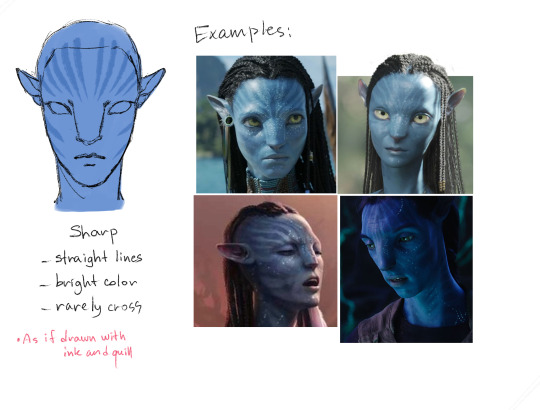
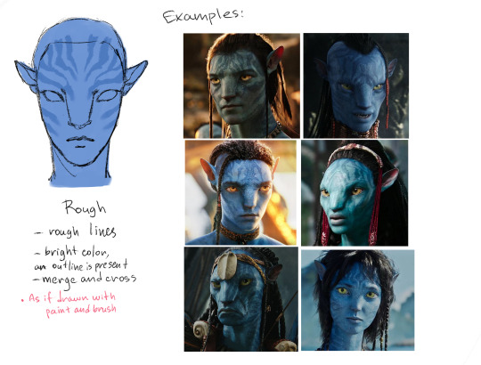
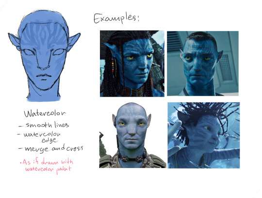
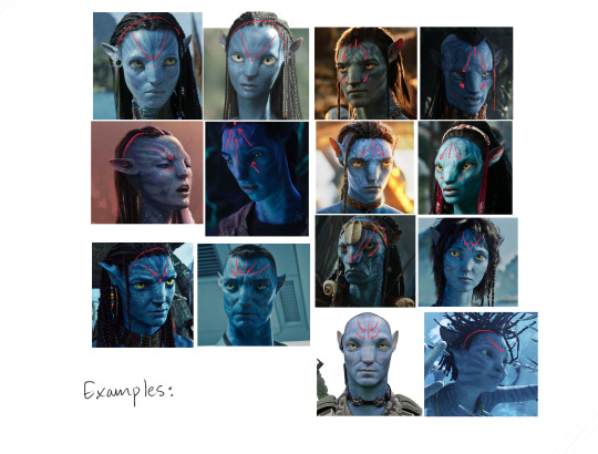
Face stripes for forest Na'vi tutorial
Sooo my friend was struggling with na'vi stripes so I made this whole tutorial so you won't struggle anymore like he was! Excuse me for my english mistakes
Let's start!
Shape
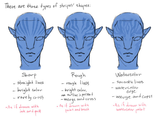
Examples:
Arrangement
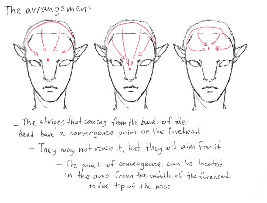
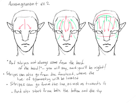
Examples:
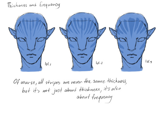
Thickness and frequency
Summary!
Important!
All the described rules are not axiomatic, and the structure of the stripes is very flexible and unpredictable. This tutorial isn’t intended to drive the authors of the OCs in the frame, but only to help those who have problems with this topic
Interesting Facts
Let's finish this short tutorial with a few facts about Na'vi stripes that you need to know:
- The pattern of stripes is independent of genetics. That is to say, nothing, not the shape, not the location, not the thickness, not the frequency is dependent on the parent. It's absolute randomness, just like fingerprints
- The stripes don't have to be perfectly symmetrical
- They can likely change with age as the skin renews itself, but not significantly (examples: Neytiri in the first and second movies; Kiri, who supposedly has stripes identical to Grace's but slightly different)
- The type of stripes on the face aren’t entirely dependent on the stripes on the body. The face, for example, may have frequent stripes, while the body stripes are rare. (Should we expect a tutorial for body stripes?)
- The rough type appears to be the most common, especially among male characters
- The sharp type comes next, but is more common in females (from what I've noticed)
- The watercolor type only appeared in The Way of Water, so we haven’t seen these characters in the first movie, however this type is also valid
Thanks for reading!
#it's my first ever tutorial please be nice(#english is not my first language#art#art tutorial#original characters#character tutorial#avatar#avatar tutorial#avatar fanart
856 notes
·
View notes
Text
hmm... im sure someones made a good guide out there somewhere, but i personally havent used any
but thats not a good answer, so another place to start is to use a real game as a ref! this is the sims 2 ds:

most of the detailed textures are only used for the player sims hair/face/clothing
you can see by the jagged edges of this sims vest that its still a little lower than the faces texture (this is probably because the body has more clothing variations than the face and they needed to save memory)
static parts of the environment have a higher res, because they can tile/repeat the textures. this game has a million variations on bed/chair textures, so they're notably lower res
this is a ripped texture of most(?) of the things used to make an area in the game (image credit) :
the desert background here is just a 2d image, relatively low res because the player will never be able to reach it
i guess this is just a long winded way of saying "things that arent that important or the player will generally be lower poly + less detailed" but i hope it helps a little
#its hard to explain bc its difficult to set rules unless you try to set the entire environment to the same style rules //#i mostly went into textures here bc ds games are much lower textured than psx or similar most of the time //#i need to actually learn more abt ds stuff sdkfhsdjh im mostly just eyeballing this instead of knowing much abt it //#long post#scopophobia#gif#not my art#sims 2 ds#tutorial#...ok not really but how do i tag this//#newbiealliance#image heavy
665 notes
·
View notes
Text


The taste in the mouths of the starving crowds
Oh, pulling at the leaves, pulling off to me
In feet first the savage dust
Don't leave me be, leave me be
#merlinedit#bbc merlin#bbcmerlinedit#merlin#merlin emrys#colin morgan#merlin tv#*#*gs#*merlin#usersmia#xuserann#thank you so much for the tutorial links they helped a lot and thought id share :')#aithusar#thebookluvrr1816#i'm in my blue and orange era apparently
375 notes
·
View notes
Text
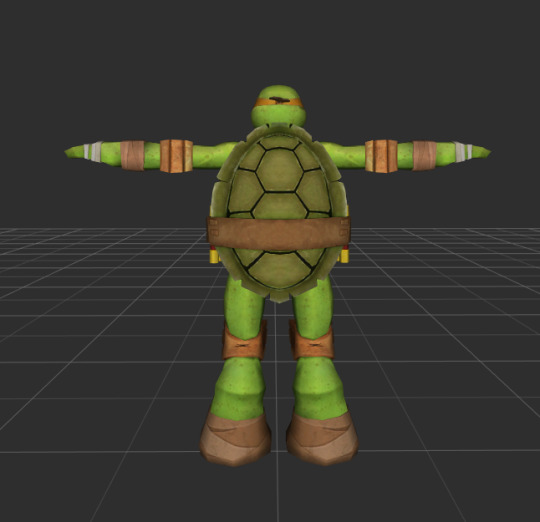
How to draw TMNT 2012 Part 1 - The Carapace's Shape, Costal & Vertebral Scutes, and Marginal Scutes
Turtle shells are comprised of three main components:
The carapace - the part of the shell on a turtle's back
The plastron - the part of the shell that is on the turtle's front
The bridge - the part on the side that connects the carapace and plastron together

Today, we will be focusing on the carapace of the shell
#1 The Shape
The carapace's shape is essentially an oval. Now, how wide the oval is actually varies between the four turtles. If you look closely, the shape and size of the carapace between Leo, Raph, Donnie, and Mikey isn't exactly the same. But, we will get more into that in a different tutorial


For now, let's just sketch out a generic shell shape that can be used as a base for any 2012 turtle, starting with a basic oval. This will be our "inner ring"
Afterwards, add a slightly bigger oval around it to form the "outer ring"

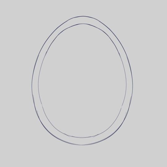
Now, sharpen the upper and bottom edges of both ovals very slightly as illustrated below


You now have the base of a turtle shell
#2 The Costal and Vertebral Scutes
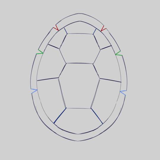
There's quite a bit to break down in this part, so let's take it one step at a time
First of all, what are scutes? Scutes are external plates found on the carapace of a turtle. In other words, you see those hexagonal shapes on the shell? Those are the scutes
Now, what are the costal and vertebral scutes? These are the scutes on the "inner ring" of the carapace that you drew in step one (Vertebral scutes are labeled with a "V", costal scutes are labeled with a "C")


As you can see, the vertebral scutes are located along the spine of the turtle. Meanwhile, the costal scutes surround the vertebral scutes
So, how do you draw the costal and vertebral scutes? We’ll break them down into three categories: The middle vertebral scutes, upper and lower vertebral scutes, and the costal scutes
The Middle Vertebral Scutes:
These are the only scutes that form a complete hexagon. They are located in the middle of the carapace. It’s important to note that in tmnt 2012 there’s only two of them. Now, you would expect these to be centered exactly in the middle of the carapace, but that's actually not entirely true. The middle vertebral scutes are actually placed slightly higher in the carapace rather than directly in the center
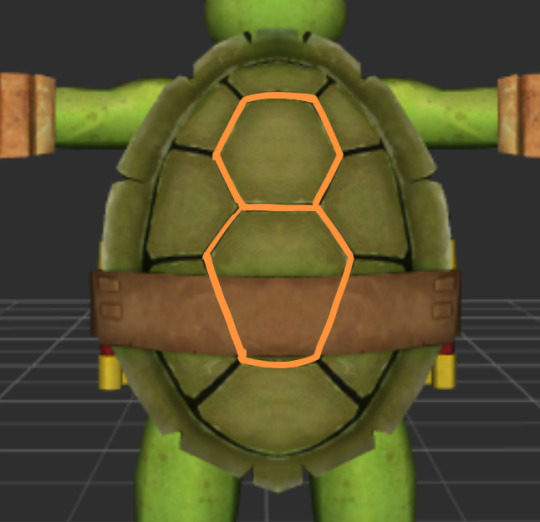
There's still one issue though, the belt the turtles wear. While the top middle vertebral scute is in full view, the bottom one is covered by the belt. Sure we could imagine what the bottom middle vertebral scute looks like, but we want to be accurate. Luckily, there's one scene in the show were we actually get to see it uncovered without the any gear in the way
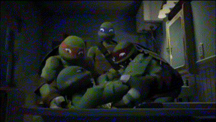
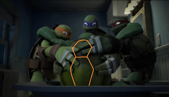
In this frame where Leo's brothers are pulling him out of the tub we can see what the bottom middle vertebral scute looks like. Rather than being a perfect hexagon, it's more elongated and vertical
"Okay, that's nice and all but how do you actually draw any of this?"
For the top middle vertebral scute, you're going to want to draw a normal hexagon near the top of the carapace:

For the bottom middle vertebral scute, the process is similar. However, instead we're going to stretch out the lower half of the hexagon vertically to make it longer
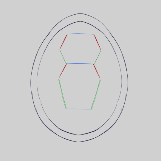
The Upper and Lower Vertebral Scutes:
Due to the offset of the middle vertebral scutes, this makes the upper vertebral scute very small and the lower vertebral scute very big
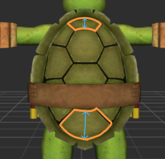
To draw them, pay attention to where the red circles are. That's going to be where we will start connecting lines

First we're going to draw two diagonal lines upwards from the top middle vertebral scute where the corners are
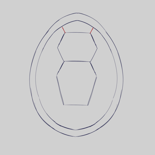
Then from there we're going to draw two diagonal lines downwards from the bottom middle vertebral scute where the corners are
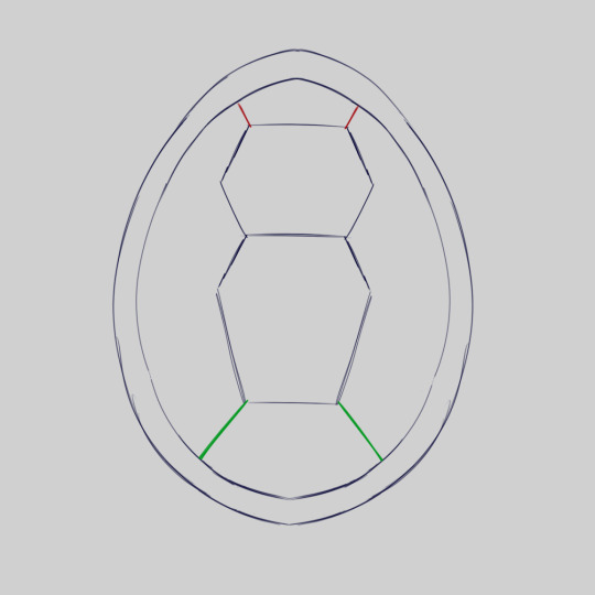
And just like that, the upper and lower vertebral scutes are completed
The Costal Scutes:
The costal scutes can be found surrounding the vertebral scutes. Drawing these scutes is actually quite easy
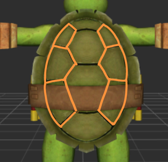
Once again, we're going to look at where the red circle are on the sketch. Those are the points where we will be connecting lines to
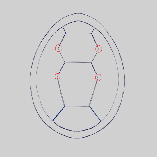
Starting with the top middle vertebral scute, we're going to draw lines at a slightly upward diagonal angle from where the middle points of the hexagon are

Now, we're going to repeat the same with the bottom middle vertebral scute. But, instead, we're going to draw the lines at a slightly downward diagonal angle

The costal and vertebral scutes of the carapace are now completed. Let's move onto the marginal scutes
#3 The Marginal Scutes
Alright, time to add some more details to your turtle shell. Now we're going to be focusing on the marginal scutes
The marginal scutes are the "outer ring" of the carapace

As you may have noticed, there's many cracks within the marginal scutes in tmnt 2012. But, did you notice there's a pattern to where they appear?
Each crack in the marginal scutes is located near the top of each costal scute with an additional two on the upper vertebral scute and four on the lower vertebral scute
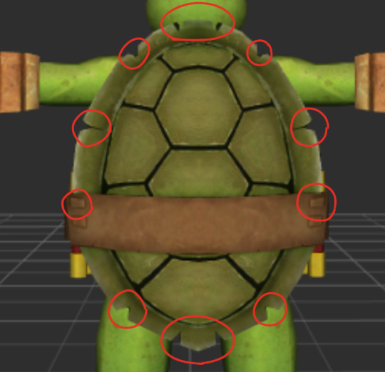
To draw the cracks in the marginal scutes, first we're going to put them near the top of each costal scute
Next, we're going to draw the two cracks that are above the upper vertebral scute and the four that are below the lower vertebral scute
Note that the cracks on the upper vertebral scute are very close together. Meanwhile, the outer cracks on the lower vertebral scute are very far apart while the cracks in the center are very close together

And just like that, your carapace is now completed. You could technically stop here, but if you want to add more details then let's continue
Extras
Everything from here on out is optional to the tutorial and is just to help add some extra flare to your shell. Now, let's begin, shall we?
Creases:
One tip to add some extra detail into your shell is to thicken the creases of the scutes. This can add the illusion of depth into your artwork
Grooves:
While we don't have access to the models used in the tv show, we can take a look at the models from one of the video games
If we zoom in we see that there's grooves within the scutes in the pattern of a spiral. This is reflective of turtles in real life. By adding these spiral grooves into your drawings, you can add texture into your artwork

Define Your Marginal Scutes:
Another important detail to note: While not shown in any of the models, in real life the marginal scutes are actually comprised of many sections, rather than just one big outer rim. By separating the marginal scutes into sections you add both more realism and detail to your carapace
By combining all of these extra little details together our shell ends up looking like this

I hope you guys enjoyed the tutorial! This took a long time to make and there's so much more I could go into. But, I'm going to have to split them into different parts or else this post would never end
I want to end this with saying I am not an expert on any of this stuff. There's always a chance some of the information in these posts could be wrong. But, hopefully they're still helpful to you in some way
Part 2 | Tutorial Masterpost
#tmnt#tmnt 2012#Leonardo#Leo#2012 Leo#2012 Leonardo#Raph#Raphael#2012 Raph#2012 Raphael#Donnie#Donatello#2012 Donnie#2012 Donatello#Mikey#Michelangelo#2012 Mikey#2012 Michelangelo#my art#system art#art tutorial#long post
234 notes
·
View notes
Text

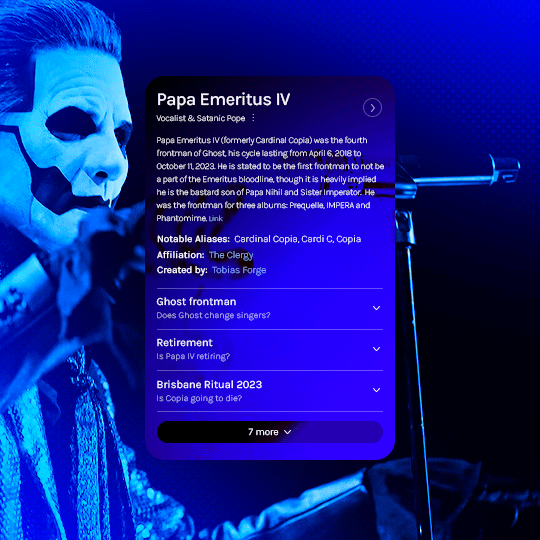
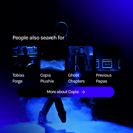
prompt: something for the silly ol' rat man?
[template tutorial insp]
[fan vids: ♡ ♡ ♡]
#the band ghost#ghost#ghostedit#dailymusicians#blogmusicdaily#usergif#musicgifs#usermusic#tobias forge#copia#papa emeritus iv#cardinal copia#bandsedit#musicedit#batslook#*papaseries#*gfx#~#id in alt#wanted to do this since i saw the template go up! so fun and simple to follow the tutorial too#needed something new to learn today so i broke my content ban just this once#prays no one has already done this and i was unaware orz
297 notes
·
View notes
Text
curse of the pharaoh
#made my first gif ever#idk why i chose this moment it just spoke to me#dan and phil#phan#gonna make some more gifs and try to understand what coloring is or how you're supposed to do it#if anybody has any good tutorials to recommend lmk!!#mygifs#gifs#heydanandphil
210 notes
·
View notes
Last Seen Blogs

fedeanselmo
Sin título
edet678
Emerging Technologies
intellectual-aesthetics
Simple Design

red-unicorns
Unicron Dreamer
magical-ronin
Sneaking back around.