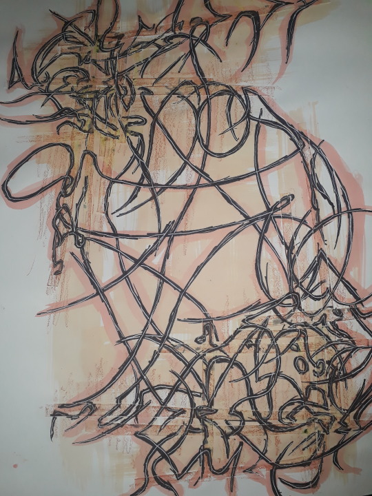
#more like inspired by mandalas but there's no other word to use for it yet
Text
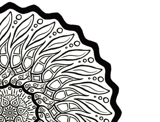
Started a new digital piece, initially I was gonna make a set of printed holiday cards since I knew I couldn't finish the traditional ones in time, but life really got in the way so now this is just a standalone piece.
I've had it sketched out for weeks, so all it needs is lining, colouring, and finishing.
#art wip#artists on tumblr#mandala#more like inspired by mandalas but there's no other word to use for it yet#'radially symmetrical primarily geometric design' doesn't really roll off the hypothetical tongue...
4 notes
·
View notes
Text
Stress Coloring ~ *Bang Chan*

Summary: Both you and Chris need a break. And what better way to spend a break than by coloring together? It’s very therapeutic.
Pairing: Bang Chan X G/N!Reader
Genre: Fluffyish Drabble
Word Count: 804
Warning: A tiny bit of crying but it’s resolved quickly
Masterlist
Taglist: @foxwinter @maeleelee @mxnsxngie @kpop-will-kill-me
A/N: What do we do when we have strong feelings and yet are so exhausted to properly convey them? We write. And we hand write when our eyes are too puffy from allergies to open all the way. So my hand hurts.
As soon as he walked through the door and saw that the light was still on, he sighed. They must be tired. Carefully and quietly, Chris slipped off his shoes, put his keys and wallet away, and hugged them from behind.
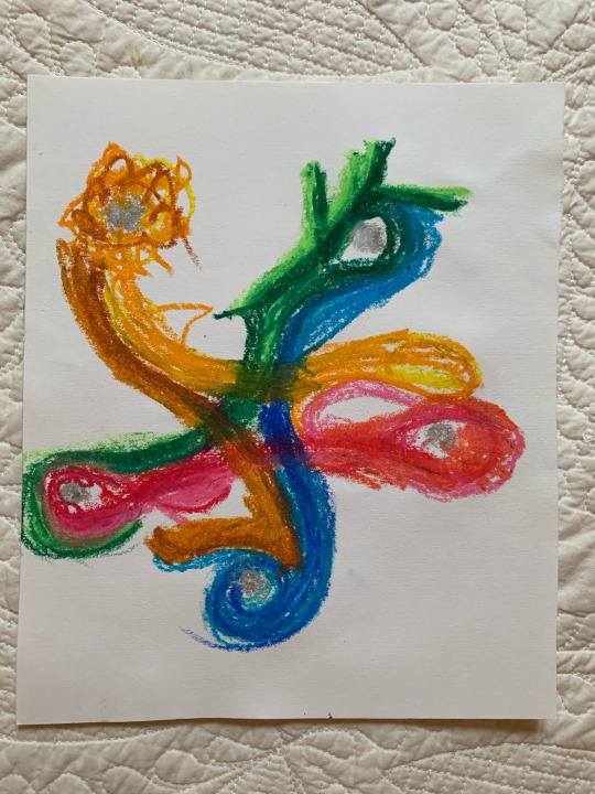
They hummed in response, leaning into his embrace. Amongst the mess of notes, outlines, and assorted pens and highlighters, they had their markers and coloring pages out. There was a half finished piece and a completed mandala on top of everything. Shades of orange and yellow mixed with the pinks and purples to create almost a sunrise scene. It was very ethereal and serene. It also reflected that they could really use a break right about now.
Kissing their cheek, Chris asked, “Need any help?”
“No.” They shook their head.
“Then do you mind if I join you?”
Again, they shook their head before flipping through their coloring book. It was sort of a tradition here. Whenever one or both of them needed a break, they would bust out their vast array of coloring books and coloring supplies. Sometimes, when they were less tired, the two of them would use crayons and make Kindergarten drawings of the other. If they needed more inspiration, there was a stack of canvases and acrylic paints in the back of their closet that was always well stocked. But when they were stressed out and tired, markers or colored pencils did the trick. They weren’t the only one needing relief tonight, which was why he asked to color too.
Chris finally selected one before saying, “What colors do you see?”
It’s not that he wasn’t creative; on the contrary, the two often joked that he had all the artistic ability in the relationship. But everytime they saw an uncolored black and white page, they knew exactly how they wanted it to look. So he let them decide the colors for him. It always made him smile when they carefully selected each color.
They shook their head. “Not colors this time. I see a style, a theme.”
“Oh yeah? What’s your vision?”
“Wizard of Oz.”
Chris nodded as they laid out each color of marker, explaining what each color represented. As they did so, he glanced back at what they were coloring. Besides the completed sunrise mandala, the half-finished piece looked like a hodgepodge of random colors. It wasn’t like their normal style.
So he pointed it out. “What are you coloring?”
They paused, reflecting on their work. Eventually they said, “My thoughts and feelings.”
He nodded again before taking his markers and sitting in the chair opposite of their desk. Carefully scrutinizing each color and the empty picture before him, he tried to envision the Wizard of Oz the same way they did. Eventually he managed to figure something out and he began coloring.
About twenty minutes in, Chris was about halfway done when he heard them heave a dejected sigh. Looking up, he noticed a tear slowly crawling down their cheek. Abandoning his paper and markers to drop onto the floor, he spun their chair so that they were now facing him. Using the pads of his thumbs, he wiped their tears, cupping their face as he did so.
“Hey, look at me.” Chris breathed as their eyes, still glittering with tears, found his. “You’re okay. You’re going to be okay. I promise.”
Slipping out of their desk chair, they hugged him tightly. “It’s just so much piling up out of practically nowhere.”
Stroking their hair, he kissed their cheeks. “I know love, I know. But you can get through this. One day at a time, just like we always say. Besides, you know I’ll always be there when stress coloring isn’t enough.”
Pulling away, they wiped their eyes and nose. Chris got them a tissue to help. Sniffing, they asked, “Promise?”
Smiling, he kissed their lips before pressing his forehead to theirs. “Of course I promise. What kind of boyfriend would I be if I wasn’t?”
They laughed before slowly crawling back into their desk chair. Blowing their nose once more, they gave him a small smile to let him know they were okay now. With a soft nod, he settled back into his own chair and got to work coloring again.
It was another thirty minutes later when they presented their art to each other. They nodded before giving him a bright, albeit tired smile. “It’s definitely Wizard of Oz.”
“Yours is a lovely hodgepodge as well.”
The two of them laughed before they shyly added, “I’m also halfway done with my essay as well.”
Chris perked up even more, his smile stretching wider. “See? I told you you could do it. I’m so proud of you, love!”
Again, they chuckled before they returned to their coloring book. Ripping out another page, they asked, “Another?”
#Stray Kids#Stray Kids Fanfiction#Stray Kids Drabble#KPop#KPop Fanfiction#KPop Drabble#Stay#Bang Chan#Bang Chan X Reader#Bang Chan Fanfiction#Bang Chan Drabble#Bang Chan Fluff#Chris#Chris X Reader#Chris Fanfiction#Chris Drabble#Chris Fluff#Oneshot#Fluff#Angst
63 notes
·
View notes
Text
Warli Paintings: Exotic form of simple art
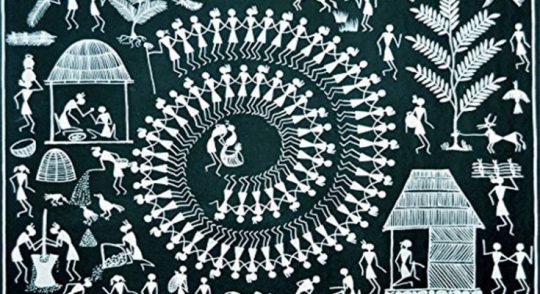
A Picture is a ballad without words. The Warli Art shape is the pictorial dialect used to speak to the tribal people craft of the early tribes of Thane area, Maharashtra.
It portrays the dancing, chasing and development of land with the tribal hovels made in a dark, mustard yellow or the white foundation. Keeping in mind the end goal to educate these structures to the understudies, we embrace a particular showing strategy, so that even non-craftsmen can paint the lovely warli. All these and more can be investigated about the antiquated India.
The word “Warli” originates from “warla” which implies a real estate parcel or a field despite being in such closeness of the biggest city in India, Warli tribesmen are as yet not urban. Warli Art was first found in the mid-seventies. While there are no records of the correct beginnings of this workmanship, its underlying foundations might be followed to as right on time as the tenth century AD. Warli is the distinctive articulation of day by day and get-togethers of the Warli tribe of Maharashtra, utilized by them to enhance the dividers of town houses. This was the main method for transmitting fables to other people who are not familiar with the composed word.
These works of art don’t portray fanciful characters or pictures of divinities, however delineate social life. Pictures of individuals and creatures, alongside scenes from everyday life are made in a free cadenced example. Painted white on mud dividers, they are entirely near pre-notable buckle artistic creations in execution and as a rule delineate scenes of human figures occupied with exercises like chasing, dancing, sowing ,collecting, going out, drawing water from well, drying clothes.
It fundamentally comprises of geometrical examples
1. Circle: speaking to the sun and the moon
2. Triangle: triangle got from mountains and pointed trees
3.Square: showing a consecrated walled area or a land parcel. So the focal rationale in every custom painting is the square
These geometric figures are consolidated to shape lovely examples .Like two summits of triangles are combined to frame a human figure.
Warli canvases on paper have turned out to be exceptionally prevalent and are presently sold all over India. Today, little compositions are done on fabric and paper however they look best on the w alls or as colossal wall paintings that draw out the tremendous and otherworldly universe of the Warlis. For the Warlis, convention is still clung to however in the meantime new thoughts have been permitted to leak in which encourages them to confront new difficulties from the market.
Learn this simple art, find designs & explore the world of warlis at Penkraft through our workshop.
Penkraft conducts classes, course, online courses, live courses, workshops, teachers’ training & online teachers’ training in Handwriting Improvement, Calligraphy, Abacus Maths, Vedic Maths, Phonics and various Craft & Artforms — Madhubani, Mandala, Warli, Gond, Lippan Art, Kalighat, Kalamkari, Pichwai, Cheriyal, Kerala Mural, Pattachitra, Tanjore Painting, One Stroke Painting, Decoupage, Image Transfer, Resin Art, Fluid Art, Alcohol Ink Art, Pop Art, Knife Painting, Scandinavian Art, Water Colors, Coffee Painting, Pencil Shading, Resin Art Advanced etc. at pan-India locations. With our mission to inspire, educate, empower & uplift people through our endeavours, we have trained & operationally supported (and continue to support) 1500+ home-makers to become Penkraft Certified Teachers? in various disciplines.
4 notes
·
View notes
Text
Intoxicating(Sero x F!Reader)
Genre- fluff, friends to lovers, smut (mostly smut but with storyline)
Word count: 4250
Warnings- drug use, shotgunning, fingering, penetrative sex, praise kink, stoner hanta, hand fetish, mutual pining, sero being a gentleman, size kink?
Notes- This is my first fan fiction so I’m sorry if it’s bad, please enjoy! This was inspired by High Enough by K.Flay https://open.spotify.com/track/1qwno7xb5mJe71xtMS6jl2?si=-5ErHlgtTo-WD_SHyGL6uw
♡ ♡ ♡ ♡ ♡ ♡ ♡ ♡ ♡ ♡ ♡ ♡ ♡ ♡ ♡ ♡
“Are you on your way yet?” Mina spoke over the phone, pressuring you into coming to a hangout for once. You had missed all of the bakusquad meetups for a week and Mina was tired of being the only girl there.
“Minaaaaa, it’s awkward. I can't face Sero and the rest of them after I confessed to him” you spoke shyly.
“Y/N, you were drunk, He was drunk. We were all drunk. I don't think he even remembers it, I barely even remember that night.” she said convincingly. It was likely that Mina didn't remember it, she was a lightweight after all.
“Even if he doesn't remember, I do. And I can't do it.” you spoke, holding your ground.
“You haven't shown up for a week. If you don't come tonight I’ll tell Sero what happened so it won't even matter if he remembers. Be there at 7, it’s movie night.” Before you could answer Mina hung up the phone.
“Mina wait-” you spoke hurriedly. Shit, Now you actually had to show up. And worst of all the movie was at Sero’s house tonight. Despite not going to see any of your friends this week, you had the group's schedule memorized and knew where the bunch would be tonight. Sighing, you got out of bed and checked the clock, 5:04, I’ll hop in the shower and have a light dinner before I go over, You thought to yourself before walking over to the bathroom and hopping in the shower, closing the glass door. You looked in the mirror through the door watching as the hot water poured over your bare skin. If Sero does remember, would he even return my feelings?
You pulled up to Sero’s apartment complex, fresh damp (H/C) hair and PJs on. It was already 7:15 and you were basically running up the stairs to ensure that Mina wouldn't do anything stupid. You barged in the door and five pairs of eyes turned to look at you as your chest heaved, soft black shorts ridden up your thighs, cream-colored tank top straps falling off of your shoulders and a dark green oversized zip up hoodie barely hanging on your arms. It was mid-summer so you had dressed lightly, Sero’s small apartment didn't have very good ventilation and having five extra bodies sure didn't help.
As you calmed down, walking into the room you scanned your friends for shocked looks or anything that would point towards the fact that Mina had spilled. You saw nothing out of the ordinary, Sero and Denki were standing by the counter, rolling joints. Bakugou and Kirishima chatting calmly, which was out of the ordinary for the usually enraged blonde. Mina was looking at you, seeming relived and happy. Sero stared at you extra long after everyone acknowledged your presence. You looked beautiful. Cheeks red and flushed from the running, (H/C) hair messy and disheveled, (E/C) eyes boring into him. Oh shit you were looking at him. He quickly looked away and continued where he was before, clearing his mind of the way you had looked at him. Trying to focus oh his joint, rolling it carefully between his thin and long fingers Denki spoke
“Real smooth bro, what was that look about? Is she mad at you or something?”
“I have no idea, I don't remember at least.” Sero returned, still confused.
“Weird,” Denki mumbled, lighting his joint and walking over to the couch plopping himself down in between Mina and Kirishima. Sero walked over to his hammock, the joint in his hand looked incredibly small, carefully placed between his fingers as he took a drag, light gray filling the space around his head. As he sat down, swinging a little you looked around and noticed there were no more seats. You had always known Sero’s apartment was small but with the tension in the air it felt ten times smaller. Having the old brown leather couch covered in Sero’s tape from rips being filled by Mina, Denki, Kirishima and Bakugou, you opted to sit on the floor.
“Wait wait wait, (Y/N) you don't have to do that, come sit in the hammock with me.” Sero spoke, smoke billowing out of his lips. You clenched around nothing and your heart beat frantically. You had always thought Sero was so attractive, but when he smokes? Don't get me started, he was like another person.
“You sure?” you asked. “I don't want to invade your space and I’m really fine with the floor.”
“I’m sure, you're my guest and my friend. Don't be stupid.” Sero said flatly. He was confident in his answer and he knew he had done the right thing when you started walking over, slowly climbing into his hammock. Swinging back and fourth he got a nice view, his lazy dark eyes settling on your ass, shorts riding up as you stretched over the lanky man. You scooted around and settled between his legs, there wasn't really anywhere else to go.
Turning around, you looked him in the eye as if to ask if where you were sitting was okay. He looked back at you, his signature smile settling on his face, he took a quick puff from the shortening joint in his hand and blew it into your face. You coughed, waving the smoke away as your eyes started to water. You punched Sero in the arm turning back around and looking at the TV. You felt him chuckle, sending vibrations through your body. Your heart thrummed and you squeezed your thighs together.
Sero laid back, pulling you to his chest. The smell of citrus, sage, and weed filled your nose. As you lay there feeling more comfortable than you had been in weeks, you couldn't help but wonder if Sero had heard your confession the other day. You pointed your eyes towards the screen avoiding Mina’s prodding gaze as she clicked the play button.
You settled back into Sero’s chest and you could feel yourself drifting asleep. The up and down of his chest, the warmth of his body, his overwhelming smell, the soft cotton of his flannel, all mixed with the sounds from the TV and Sero’s occasional laughs sending soft jolts of excitement and nervousness through your body all lulling you to sleep. Before you knew it, you were out cold and flipped over, hugged into Sero’s chest, your breath tickling his neck. He couldn’t help but feel excited. He had had a crush on you since high school and here you were, your soft breasts pressed up against him, legs entangled with his while your now dry hair brushed his nose.
The movie ended and everyone slowly shuffled out. It was now 10pm and you were dead asleep, now slightly drooling on the black haired man’s shirt. Oh man, how he wanted to tilt up your face and kiss you. Your soft pink lips were right in front of him. But he knew he couldn't. There was no way you felt that way about him. “You're so beautiful” he whispered into the top of your head, nuzzling his face in your hair and smelling your shampoo before scooting up into a sitting position and carefully wrapping his arms around you as to not wake you. He carried you to his room, his strength had always been startling despite his fairly lean build. He set you on the bed in a mound of pillows, throwing a light blanket over you. As he detached his arms from you, you mumbled “mmm Hanta don't leave, you smell so good.” His breath hitched. He knew you were asleep and probably had a second hand high but he couldn't help himself. He kissed your forehead and retreated to his shower, intent on reliving his now growing issue.
You wake up, feeling a little fuzzy but well rested in a mound of pillows. You could hear the shower running in an adjacent room, through the wooden door to your left. You didn't recognize where you were but you could assume it was Sero’s room. You had never been in here before, looking around it wasn't anything like you had imagined for years on end. There were red LED lights and twinkly fairy lights around the ceiling, circling the room in a soft haze. Band posters littered the walls and there was a mandala tapestry behind the bed. The floor was hard wood, like the rest of his house, but in here, it felt different. Everything was more comforting, Sero was comforting. Sitting up and realizing what bed you were in, you immediately laid back down and enjoyed the softness of his pillows. His usual citrus and sage scent enveloping the room, this was your heaven.
You sat back up as you heard the shower turn off, the bathroom light flickered out as the door opened, Sero exiting. He looked delicious. His wet black hair clung to his neck, one of his long pale arms reaching up with a towel to dry it. Sweat shorts and a baggy t-shirt, water dripping off of him. You still felt a little dazed, you almost pounced on him except for the small amount of self control that you still had in you. He walked over to the bed and grabbed your chin, you heart halted. “How are you feeling? Still tired?” He asked, tilting your head from side to side in his enormous hands, checking your physical wellbeing.
“I-I’m fine Hanta, let go of me” you mumbled, embarrassed by how red you had gotten. You hoped it would be drowned out by the lighting.
It was not unusual for you guys to call each other by your first names, you had been best friends since high school and now you were in college, aspiring heroes. Still, whenever his first name came out of your lips, he was done for. The way you looked right now, clothes strewn and hair progressively getting messier over the night, your foggy mindset obvious in the way you slurred out your words. He wanted to know if he could make it worse, if he could wreck you beyond recognition. He wanted you, messy, broken, calling his name like it was the only word you knew. Letting go of your face, he slowly traced his fingers down your jaw. He sighed, reaching into his beside table, pulling out his stash.
He sat down on the bed across from you and started rolling his second joint of the night. You didn't see it well before, so you paid attention now. It was his art, every small movement of his digits and the rolling of the paper, it was obvious he had been doing this for years. Ever since you guys reached legal age, him and Kaminari had become stoners. Sero was dedicated to it, but Denki just kinda did it when he felt like it. No matter how often you had seen Sero do this, pinching the smoke between his large fingers, the small paper roll making his already large hands look gigantic, you would never get used to it. You had memorized everything about this man, especially including his hands. His slender palm rising from his even skinnier and boney wrist, long and rough fingers, scars here and there. The tendons in the back of his hand, emerging when he moved, light purple veins tracing his whole upper arm. The placement of his knuckles, his chipped black nail polish topping everything off. You had long imagined these hands being inside of you. Looking at him bring his right slowly to his face, moving his fingers accordingly to take a drag, you wanted them. You wanted to reach out and touch them, trace them, feel them, praise them.
He looked up at you, half lidded with his lazy eyes, “Wanna hit?” he asked, noticing your lingering gaze.
“Yes” you agreed, reaching out before you knew was was happening, desperate for skin on skin contact with him.
“Woah woah woah, wait, did you say yes? You've never done this before, are you sure? I don't mind sharing but I was only joking” he said rushed, suddenly more awake from your shocking statement.
“No, I wanna try it, I’ve wanted to for a while” you said, your eyes looking into his to convey your seriousness. He looked you over, and handed you the joint. The tightly rolled cylinder looked so much larger in your hands, were his really that big? You brought the joint up to your lips, closing them where Sero’s had just been. You took a drag and he watched in amazement before you started coughing wildly. Concerned, he quickly moved closer to you, patting your back and rubbing small circles, taking the joint back from your shaking hand.
“Oh my god- I’m so sorry I forgot it would be hard for you at first, let me bring you some water” he mumbled, getting up from his seat next to you. You grabbed his arm before he could leave, dragging him back towards to you. “I’m not thirsty, I wanna try again” you said defiantly. He looked back at you, concern now covering his previously laid back and calm face.
“Okay.. “ he started hesitantly. “well if you wanna try it again can I help you? There's an easier way for beginners. Ever heard of shotgunning?” You shook your head, looking up at him confused. He sat back down on his bed, this time closer than he ever was. He took a long drag from his joint and lightly grabbed your face, his grip gentle on your soft skin. He looked you in the eyes, searching for uncertainty or hesitation but couldn't see any. Instead, your eyes were dark, an emotion he couldn't quite place.
He brought your face close to his and pushing your lips open with his finger, your breath hitched. God did he love seeing you like this. He closed the gap, opening his mouth to yours, the smoke entering you. You inhaled it, you inhaled everything about him you possibly could. Slowly, and regretfully, he pulled away. “Just like that, basically I just transfer smoke to you so you don't have to take it directly since otherwise it can be pretty harsh.” he said, mesmerized in the way you looked at him with wonder.
“I don't feel anything” you mumbled childishly.
He chuckled at your confusion “It takes a second, tell me how you feel in 10 minutes.”
“I want to do it again, I want to kiss you.” you whispered softly, peeking up at him through your lashes.
Shocked, Sero leaned back “Y-you what? (Y/N) are you okay? was the smoke too much?” he asked frantically, confused by your sudden confession.
“Hanta, I feel fine” You assured him. “You're telling me you don't remember what happened last time?”
“Last time? What do you mean? Oh shit did I do something when we went out? (Y/N) I'm so sorry is that why you've been avoiding us?” he asked.
“No, you didn't do anything, I did.” He looked bewildered so you continued “We all got really drunk and I told you I loved you.” Sero stopped moving, his panicked fidgeting coming to halt. “Did you mean it?” he questioned, his voice deeper than before. “Mean what? Oh, yeah-” Before you could finish your sentence he was on top of you, his mouth on yours as he slowly pushed your frame back onto his bed. “I love you too” he mumbled against your lips, resuming his attack on your face. You were flustered but kissed back. There was no time to question it, both of you were high and needy, years of longing built up.
He sat back and looked you in the eye “I know I’m not exactly sober but I want you to know that I mean every word of what I’m about to say. You’re absolutely intoxicating, you leave me feeling higher and happier than weed ever could. You are the drug that I need to survive.”
“Hanta, I only have eyes for you. It's always been you.” You stated, your heart bloomed at his confession. He looked you in the eye, studying you, confirming to himself that what you were saying was true. Sero had never been very confident of himself, he was always seen as average and you were the most beautiful and kind girl he knew. By the look on his face you could tell he accepted what you said.
Diving back into you, his hands met your body, dragging, pinching and squeezing everything within his grasp. It was everything you imagined. His body heat melting into you but his fingers still had a cool touch to them. He traveled your body, memorizing it and making a map in his mind. His nimble fingers slipped under your shirt, smothering you. He felt your smooth skin as his hands went up and down on your waist and hips. He lowered himself, pushing his rock hard length against your shorts, slowing grinding into you, finding friction. “mmm Hanta, you feel happy.” you mumbled into his ear, nibbling on it as your hand traveled down to his sweats. He groaned in your ear, rutting against your hand, desperate for your touch.
Suddenly he pulled back and looked at you. His already dark eyes were darker and clouded with lust. A light pink dusted his face. “you're absolutely beautiful” he stated, absolutely confident in his words. “Hanta, you're just high” you whined, never having been good at taking compliments. He was on you again, pulling your shirt up, glancing at you before doing anything to make sure it was okay. He ran his hands up your chest, gently cupping your breasts. “No I really mean it... I’ve loved you for years... And not just for your body” He said in-between kisses, his lips were soft against yours. Slowly his head moved down, pressing open-mouthed kisses into your jawline and collarbones, sure to leave marks. You moaned quietly and he bit down, surprising you and causing louder sounds to erupt from your chest. Your whole body was throbbing. “Don't be quiet, I wanna hear the sounds you make pretty girl” he growled into your shoulder. The nickname made your core throb. You wanted him so badly.
You pulled off his shirt, running your hands over his chest, admiring his lean muscular build. The man looked like a god. His skin was clear and glistening from his shower, his body dwarfing yours in sheer height. He had already been tall in high school but now he towered over all of his friends. His hands slowly unclipped your bra, pressing soft kisses on them. His tongue swirled around one of your already hard nipples, his fingers pinching and playing with the other. Switching breasts, he moved his available hand down to your shorts to pull them down. Realizing this was harder than he thought, he detached his mouth from you with a wet pop. He used both hands to pull down your shorts, looking at you adoringly.
His hands traced the outline of your panties, and then palming your mound. You moaned and arched your back towards him, in desperate need of relieving all of this tension. “Hey pretty girl, we’ll get there, slow down” he chuckled. Your eyes popped open and glared at him. “Hanta, I need you. Now.”
His breath hitched at your bold statement. He yanked your panties down quickly, surprising you and getting a gasp from you. He grinned as a string of arousal connected your now disposed panties to your exposed core. It glistened with wetness, you had been waiting so long for this moment. Sero couldn't tear his eyes off of it, slowly he reached out his large hand, sliding a finger over your slit and then softly stroking your folds. “Is this all for me sweet girl? You're too kind.”
You arched your back, done with his teasing. Before you could even complain he stuck a finger inside, your velvety walls wrapping around him. You needed more. He could tell by your face, years of observing you closely now coming in handy. He stuck in another digit, pumping them in and out slowly as his thumb reached up to circle your clit. You let out a long whine, music to his ears. At that he went faster, still watching you closely. The way you stopped breathing when he hit one spot, he knew he had found it. Focusing all of his energy on that spot, going quicker and harder. He simultaneously hit your g-spot and rubbed your clit, getting you unraveling under him faster than any man ever had. He guided you through your high, slowing down and eventually pulling out his fingers, leaving your thighs shaking and your cunt clenching around nothing.
He observed his slick coated fingers and licked them clean. You stared at him in shock, baffled at his actions. “mmm (Y/N) you taste so sweet, I’ll have to explore that another time though” He groaned, palming his painful erection. You swiftly pulled down his sweat shorts and boxers in one motion, his cock springing up against his stomach. You had never really thought that dicks were pretty, but everything about Sero was beautiful so you weren't surprised.
He had average girth, but an amazing length. He had a few prominent veins that you traced, leaving him shuddering at your touch. His slight left curve looked delicious. You moved your hand towards the head, red and glistening as you traced a finger over his slit, dripping with pre-cum. You tried to wrap your hand around his base, but your fingertips barely touched on the other side. You did a few experimental pumps, you were afraid that even with your preparation it might be too much for you to take. You bent your head down, swirling your tongue on the tip, giving small kitten licks. He tasted salty, but better than other men. You weren't surprised about that, you knew he took good care of himself. You ran your tongue along the bottom, dragging it slowly and tracing all of the bumps and ridges.
He couldn't take it anymore. He pushed you back onto the bed, grinding himself against you, using his small amount of restraint to not push into you there and then. “Condom?” he asked desperately, looking around. “Don't need one, I'm on birth control” you spoke softly, hushing him with gentle kisses. He sighed contentedly at your response. He ran the head up and down your slit, getting ready to line himself up with your small hole. Your kisses crept up towards the side of his face, you licked a strip up his jaw and whispered directly against his ear, warm breath fanning his neck, “Plus, I want to feel you when you're inside me” you blew lightly on his ear and giggled. He didn't think it was funny.
Before you could say anything he lined himself up with you and pushed inside in one motion. Your walls hugged him in all the right places.The stretch burned but when he leaned down to say “So tight. You're so good for me, taking all of my cock like a good girl” all the pain faded into pleasure. As he mumbled praises int your skin, he rutted into you, his previously gentle motions now rough and fast. Want, need and lust filled the room. The smell of weed fading, covered by the smell of sex and your overwhelmed sense of mind. “Hanta, you feel so good inside me” you groaned. This seemed to spur him on, he went faster, if at all possible, attaching his thumb to your clit and rubbing harshly without hurting you. He could feel you clenching around him and he knew you were close. He was barely hanging on.
“Where should I-”
“Inside. Come inside me. Please” you cut him off, begging.
With a few final strokes you spasmed around him, and as you fell down from your high, he chased his own. Whispering your name over and over like he was praying, he spilled his seed inside you, white thickness covering your insides and dripping out onto your violently shaking thighs. “Oh, my god. That was amazing. You're amazing.” Sero ranted. You smiled brightly at him, too tired to move and your voice a little hoarse from all your whining.
The black haired boy got up and went to his bathroom. He returned with a warm washcloth and a cup of water. You sipped on the room temperature water while Sero cleaned you up. He always treated you so well, even when you were just friends. He grabbed one of his clean t-shirts and a pair of boxers, helping you get dressed. Sitting up, you faced him while he beamed down at you.
“How are you feeling?” Sero asked, genuinely concerned for your well-being.
“I’m good, it felt good.” you hummed contentedly.
“What does this mean for us? Are we gonna tell the rest of the guys that we are dating? That is only if you want to date of course, I wouldn't want to pressure you into anything” Sero mumbled, saddened by his own assumptions.
“Is this your way of asking me to be your girlfriend?” you grinned.
“Depends, are you saying yes?” Sero smiled back, your positive reaction upping his mood. You answered his question by pressing a chaste kiss to his lips. “Yes, always.”
#serohanta#sero x reader#bnha#ouid#smokersero#friendstolovers#druguse#sizekink#handkink#mha#bnha smut#mha smut#mha x reader#mha x you#mha fluff#bnha sero
170 notes
·
View notes
Text
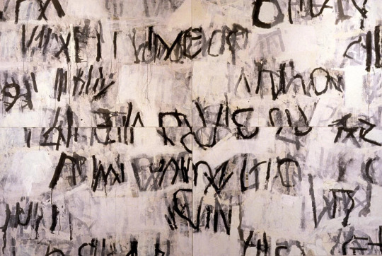
Asemic writing
Today we created our own abstract messages and secret script (asemic writing) by layering wet and dry media and creating opportunities for suggestions of letter forms by weaving slices of writing together. we used our articles to inform what our initial writing would be and researched Pokras Lampas, Simon Williams, Cecil Touchon, Fabio Zanino and Jerry Iverson to take inspiration from and create ideas from their form of asemic writing.
Simon Williams
Simon Williams is a contemporary painter who mainly uses Alkyd oil and acrylic paint to create his abstract painting. He takes inspiration from many things such as childhood comic books, propaganda posters and graffiti art, which personally I think really shines through in his work due to the large sweeping curves and the bold colours shown throughout.
Texture is a very prominent thing within his work as there are many brush strokes where it appears as though the brush didn’t have that much paint on it and therefore the brush has left a scratchy texture. This contrasts with some of the very smooth round shapes created in his work which have an almost 3d look to them due to the way the paint has been applied. I really like the curves and flow of the lines in this piece and that is something I would like to achieve in my own work at some point.
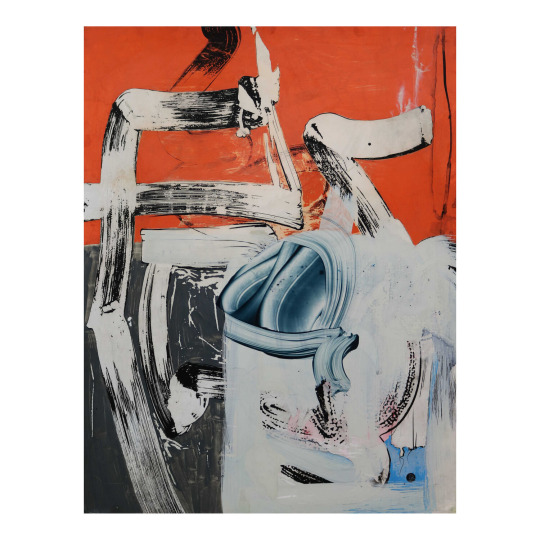
I also like the use of colour in this as Williams has put the majority of the vibrant colours in the background, leaving the foreground to be mainly black and white. This intrigues me as it is something I have never thought about doing in my own work but definitely something I should experiment with. I really like the simplicity of this piece and how the shapes created could suggest letters but it is not obvious from which language or alphabet the are derived from, since they don’t actually exist. This is the exact effect I want to create in my own work.
The piece below is my favourite because of the colours found within it. While the main colours appear to be teal and purple, a small amount of pink and red can also be found within the black which is very interesting to me as it makes me wonder why Williams decided to include such a small amount of a warm colour which contrasts the cool colours throughout the rest of the piece. In my opinion it could be to send the message that a warmth and hope can be found in every cold bleak situation.
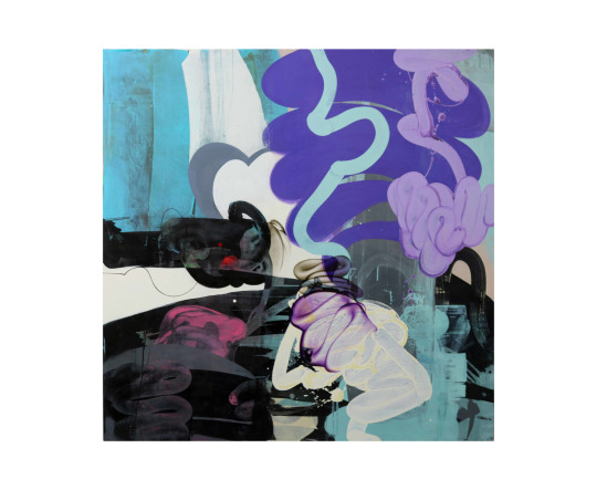
This piece is also different to the previous piece as there is colour in the foreground and the background. There are also much more hues of all the colours used, which is something I would like to do in my own work along with creating textures similar to how Williams does in is work, with very dry brushes containing only a small amount of paint. I would also like to create a general theme with the shapes I create as Williams only uses very round curves and I would like to only use one type of shape in my work, possibly the opposite shape, with many angles and straight lines.
Pokras Lampas
Pokras Lampas is a graffiti artist from Russia who has created many large scale installations and worked with many brands on advertising campaigns due to his eyecatching patterns which resemble letters. His lines have a very calligraphic style to them and usually follow an overall uniform shape for example lines of the asemic writing forming circles in a similar way to a mandala.
I really like the colours within his work and how it is usually a black background with colours over it as I could achieve this effect by inverting some of my own work which is going to be made on white paper. I also really like the large scale and versatility of his work as it works on many different surfaces such as walls, cars and even people in a very detailed and interesting way as by using these different canvases the intricacy isn’t lost.
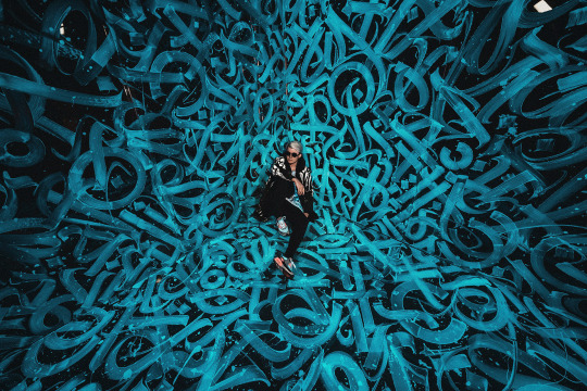
I particularly enjoy the piece above as the brightness if focused surrounding man and the art gradually gets darker and more shadowed towards the edges of the photograph. I also like the way this has been captured as by having him sit in the middle of the art it displays the central focal point and how large the installation really is in a photograph which prior to him sitting there wouldn’t have made clear the scale of the piece.
The campaign and product below are some of the most visually appealing pieces by Lampas that I have seen due to the variety of colours used in the body paint and how vibrant everything is. The way the lighting makes the shadows appear as pink ties the whole photograph together as without the adding neon pink it would’ve appeared rather bland.
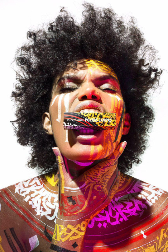
The shapes of the the letters in Lampas’ work remind me a lot of blackletter and therefore if I wanted to display something old and ancient in my own work I could use shapes similar to this o=to do so as Blackletter is the oldest typeface.
I do also like the combination of red and yellow and how the shapes fram the neck and shoulders in a similar way to how clothes do. From looking at Pokras Lampas’ work I have learnt that in my own asemic writing I should think about what shapes my asemic letters are making and whether they form any other shapes such as circles in his work.
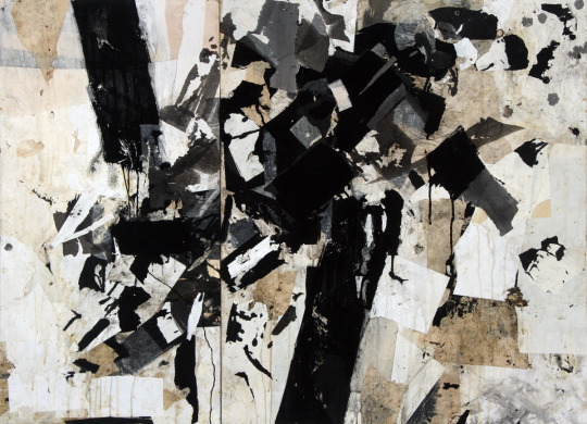
Cecil Touchon
Cecil Touchon is an artist who creates abstractions based on typography. The he creates hints at letters and has much depth to it due to the way he makes the rectangles and rounded wedges overlap and interact with eachother. He uses billboard fonts as inspiration for the type of font he is subtly adding into his work and this makes for some big bold shapes and colours that are very striking to catch people’s attention as billboards typically contain adverts and are definitely made to be noticed.
I really like how he has mixed a very natural colour such as tan with a bright periwinkle blue in this piece as I could use this in my own work to portray the messages of my articles as many of them draw parallels between 2 very contradicting subjects, for example nature and technology. The colours also remind me of the sea and a beach and therefore the dark areas could be pollution, or the white and blue could be the sky and the tan could be the ground.
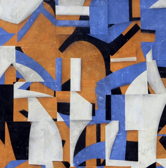
I really like how colours and shapes carry over many of the rectangular shapes and connect them all together, creating very abstract shapes in the process. In my own work I could use this as I could think about how long I want to continue a line for and how much I want the shapes within my work to overlap and affect eachother as by not having them overlap I could end up with a very different outcome than if I did.
The second piece I looked at by Touchon is very different to the first one as it contains no colour and the shapes of the letters are much more similar to letters usually seen in everyday life. We took inspiration from this in our own work as we started our pieces by weaving together some black and white type. This piece reminds me slightly of David Carson’s work as it has the same elements of a glitchy sort of type and scramble up words that his work commonly contains.
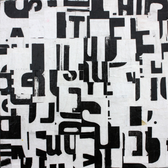
This also reminds me of the tomato project due to the black and white and bold lettering which is making shapes in an unnatural way. I think it would be very fun to try and create a piece similar to this in photoshop as I could splice together words and then use the threshold tool to make them very dark and computerised, which would work well for many of my articles, especially the one about robot flies as that is very technological and I think that the outcome could be very technological and futuristic.
Fabio Zanino
Fabio Zanino makes sculptures which are created from objects which he has broken apart and then put back together but only using certain pieces to give the entire object a new identity. He calls this work “Decostruzioni” as he deconstructs things and reassembles them to give them a new purpose and makes them abstract artworks.
I think Zanino’s work is extremely interesting in the way that he will take something which already had a purpose, destroy it and separate it from the original purpose and somehow rebuild it in a way which makes it yet again purposeful. By ridding the objects words and textures of their meaning he can then manipulate them by changing the shape and arrangement of the object and make the textures be interpreted in a completely different way.
Unlike the other artists researched today, Zanino doesn’t necessarily create asemic writing all the time as not all of his pieces contain text, but the way in which he works is similar to that of asemic writing and we took a lot if inspiration in how we worked from him as we disfigured our own writing and our own work and then rearranged it to give it new meaning and new purpose, and I then even went on to rearrange and reweave the asemic pieces I had already created and manipulated them further giving it a third layer of hidden meaning.
Jerry Iverson
Jerry Iverson creates art based on the balance and grace if Asian calligraphy. To do this he uses many layers of paper ink and glue to chop up the words and experiment with how black lines can look like words even if they mean absolutely nothing. I really like this nihilistic approach to asemic writing where the intention is to have it be meaningless as it more or less gives Iverson the freedom to do what he wants without having to think about context. This may have been why there is no colour in this piece as while many of his pieces aren’t colourful some have very subtle colour and this has none to show how it means absolutely nothing.
I really like the texture created by a dry brush and ink in this piece and that is definitely something I could put into my own work and maybe even create something similar using oil pastel or charcoal as they both have a very scratchy texture similar to this.
I also really like how a lighter wash of ink has been used in his work to create a shadow like image behind the harsh black lines that replicates them. The shapes in this piece are something I would like to use in my own work as they are very harsh fine lines with lots of texture which really appeals to me as texture is something I want to include more of in my own work. I also like the way he has copied some of the lines in a lighter wash to add depth as it makes he entire piece more visually appealing in my opinion due to the use of many tones.
The piece below is from the series “Line Bombs”, based on the wars in Iraq and Afghanistan and the disruption they have caused. Iverson has displayed this disruption very successfully by using many layers and textures in a very messy way which is effective for showing an explosion. The ink splatters could represent the corruption and damage that the bombs and wars are doing.
The choice of applying ink in this way could also be to display the aggression and anger associated with war and the way that the ink interacts with the other media on the page could be as a representation to how that anger goes on to affect people unknowingly as you cant plan how ink is going to react to the page you are putting it on.
I really like the use of many shapes and textures and the way that Iverson chooses to layer his work as it makes interesting compositions with lots of depth and many different shades from black to white, I also like how he doesn’t opt to use gradients and instead applies colour in a more jarring way to send the harshness of the messages he is portraying across.
My asemic writing
For my own asemic writing I decided to based all on my article about mammoths being revived, as I haven’t done much work concerning this subject and alspo I thought it could work well for asemic writing due to them being ancient and how I could link them to cave drawings.
For all my pieces I first started off by writing words rather largely on an A4 piece of paper repetitively to then be cut into strips to weave together and hide the message. The words I chose were “mammoth revival extinct animal restoration” as they all link to the chosen article and almost make sense as a phrase. When slicing my words up I decided to do it lengthways down the paper to allow myself longer strips to weave together as I wanted to weave across most of the page and this would be easier to do with longer strips.
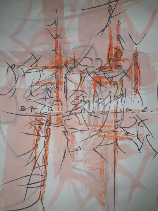
I then went on to create the asemic writing and I did this with a biro at first just to extend the lines and shapes created by the sliced up letters and continued the shapes they made, overlapping and connecting some of them in a way which reminds me of Pokras Lampas. I also wanted to replicate something which looks like It could’ve been made in caveman era, but I don’t think I achieved this in my writing very well as it reminds me more of Asian or Russian architecture and the patterns seen on that. I did however make the ends of all my lines very scratchy and not uniform to hopefully replicate some of the textures which could been seen in very old cave drawings.
After continuing the lines I added some oil pastel to create the rocky scratchy texture I was trying to achieve. I think it did a successful job of adding texture and following some of the weaving which was glued down on the page already. Because of the ridges in the paper due to the weave it made very interesting depth as the oil pastel would pick up more in some areas than others. I then also used oil pastel to highlight some of the shapes I created and enlarge them in grey in a similar way Jerry Iverson. I think the grey and the orange look very nice together as it is a warmer grey and therefore more on the brown side than the blue side.
Finally in this piece I added an ink wash of a very pale peachy orange colour which ties the whole thing together as it makes the whole think have a colour overall. I got this idea from looking at Simon Williams work as he using long sweeping strokes and I tried to make my brush not too wet to display some of the brush texture like he does. I also used the ink to further replicate some of the shapes I saw and give the piece a border with shapes that make sense in context to the rest of the piece. Overall I believe this outcome was very successful and other than the writing not looking exactly as I had Hoped I really like how the textures turned out and I believe I achieved my goals regarding texture and composition as it all works in harmony with eachother.

In the second piece I wanted to aim to have the writing be more reminiscent of the textures and shapes seen in caves so I used oil pastel instead of biro to do the original asemic writing and I do think this helped overall give the entire thing more of a rocky texture. I then went on to add some blue oil pastel too as mammoths lived in the ice age and I though it would make sense to use blue as blue is a cold colour associated with ice. I like how the blue oil pastel turned out so I added more blue and this is where it all went wrong.
When adding the blue ink I added too much of it and completely covered the whole piece, overwhelming it, which is not at all what I wanted to do, so I tried to fix this by adding white acrylic paint. I like how the white acrylic looks as it adds a frosty look to the blue but it didn’t many to fix the mistake I made and therefore I don’t like how this outcome ended up. If I was to do this again I would use a small brush for the blue wash or maybe I would choose a different colour than blue altogether or maybe a different shade as it doesn’t look like ice as I hope and instead looks much more bright and possibly happy.
On the other hand I do like how this composition started and how the oil pastels looked when used as the original writing and I do believe that there are many appealing textures within this which the addition of acrylic helped a lot with as it made the piece even more rough and scratchy which is overall the appearance I was aiming for.
For my final piece of asemic writing I wanted to create an overall shape and have all the lines I created be inside of it. To do this, when I was placing the weave I considered how I could frame the page so I decided to put the weaving in 2 corners diagonally from eachother so I could connect them with lines through the middle of the page, I used a black sharpie to do the base writing and I made the lines very thick to develop onto them later. I made them very sketchy as well to create a similar effect to the previous piece but in a different medium. Some of the lines got extended very far across the page to connect both halves together. I really like the way that placing the weaving in this way affects the lines as it makes both corners much more full with lines than the middle and I think this works very effectively in creating a balance across the whole page.
I then used oil pastel on the weaving to dark the corners, causing the middle of the page to be a break of light in the darkness. This also added a lot of depth in areas where I wanted it and worked just as I had hoped it would. From doing all these pieces I have learnt I really enjoy the textures which oil pastels can create and how using them subtly can change the entire theme of the whole piece.
I then added ink washes in the shape of the piece and I think it worked very well to tie the whole shape together and emphasise how the piece shows and follows an overall shape, which is something I started to consider in the first place because I looked at Pokras Lampas.
Finally I added white down the centre of each black line which made the overall piece have lightness where it needed it so it wasn’t tot dull. Overall the outcome of this composition is something I enjoy very much and I think it was very successful in the way that it flows from one side of the page to the other, If i was to fix elements of it I would’ve made the white lines much less jagged and more smooth compared to the way that it is so that they could contrast the jaggedness of the black lines they are surrounded in.

As an additional composition I photocopied my first piece and put it into negative as well as one normal photocopy and I weaved them together as I had been with the rest of the pieces. I really like how this turned out as the contrast between both pieces is very visually appealing to me. If I was to fix any elements of this I would’ve cut the pieces into strips more neatly as they look rather jagged and not in straight lines the way I wished they are. I do really like how I weaved from one side of the page to the other as that is something I think make the page very balance in a simple way.
1 note
·
View note
Text
A Portfolio of Recovery
If you’ve been following my entries, you’ll know that I recently had to go through some medical treatment. I am at a point now where I am willing to share some of the products of the art therapy that went along with that process. With each piece I’ll explain the prompt or the intention behind it and how I interpret the visual cues.
Please note that I will be talking about eating disorder behaviors, body image, and trauma. I use vague terms, but if these are triggering topics, then do not read. If you are in need of help with an ED, NEDA can get you support.

“Timeline” (2019). Color pencil on paper. Prompted.
The only instruction was to create a timeline that represents the development of my body image. Instead of using text I felt more comfortable conveying sentiments through line and color. The horizon line in the center represents the neutral base while rises indicate positive emotions and declines are negative. The timeline is divided into five stages with vertical lines; infancy, lower school, middle school, high school, and college.
The main colors change as my favorite color changed over the periods, but also reflecting other experiences. I began with blues and yellows as a toddler. Open and wide like a shining sky. I was a happy kid. Who didn’t think themselves invincible back then? I first started having issues with self worth during Elementary school. I was picked on for being ‘dumb’, bullied for being too emotional. Most of the time I was told to ignore the bullies. That doesn’t work. So then I was told not to react. That didn’t work either. It just taught me that I was the one causing issues. I began suppressing displays of emotion. I liked myself, but I figured that I was just always going to be someone else’s punching bag.
Middle school was supposed to be a time of growth. You finally become a teenager. In my case, you have a bat mitzvah and are then an adult to the community. Kids were still relentless in bullying. Add in tween hormones and angst, and you have a powder keg. I hit a growth spurt but I didn’t ‘measure up’ to the other girls. When my parent’s got divorced I blamed myself even though there was nothing I could have done. I felt buried under the pressures of being the perfect daughter as shown with the brown curve. My sister (only 3 years older than me) was my parent; waking me up, getting me to school, taking me to Hebrew school, getting me dinner, etc. Over this period I was forced to become self-sufficient. I had to. I was complimented a few times for being so adult for my age. I latched on to that as a way to build up my self worth. If i couldn’t be pretty, at least I could be mature. I was looking forward to high school as a promised land of new beginnings.
I guess I got what I wanted.
I’m not going into details about what happened. It was a traumatic event. That’s all you need to know. But it left me angry, broken, grieving, and hateful. Once again, I blamed myself even though what happened was in no way my fault. The way I was treated as a result only tore my self worth and body image to shreds. I was ugly. I was at fault. I wasn’t worth caring. I wasn’t good enough. Several years of therapy have let me process a lot of this period in my life. It was the start of my ED behaviors as I tried to make myself worth caring about. Black tainted my experience through a series of deaths. My lowest point was when I realized that I would be the next one if I didn’t get help for my ED.
Hope is purple to me. I began seriously writing in high school (nothing good. Nothing you write in high school is good. You think you’re the next Harper E. Lee or John Green with these big themes that you really don’t understand yet. But it was a way to get some of these big emotions out.) It gave me something to value about myself when I was still belittled as ‘stupid’. When I started college I began to get therapy for anxiety and my ED. Since then I’ve been building myself again. I am stronger. I am a survivor. I do not exist for the approval of others. It sparked a new light, a new fire for me.

“Dance” (2019). Colored pencil on paper. Free draw.
The three overlapping figures represent different dance styles that I’ve done. Red is Hula/Shawl. Green is Irish Step. Blue is Judaic Circle. It all overlaps to me.
“Movement” (2019). Oil pastel on paper. Prompted
Visualizing a group exercise where we were passing items across space. I’m the blue.
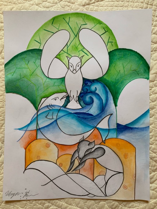
“Animals” (2019). Colored pencil and watercolor on paper. Prompted.
Draw three animals. The first is how you think others see you. The second is how you see yourself. The third is who you want to be.
Owl. The wise one. Solitary. Nocturnal. Independent. An omen maybe.
Salmon. Swimming upstream and trying to overcome the currents. Needs others to survive.
Fox. Cunning. Sleek. Adaptive. Wild.
I like the insular style of Tomm Moore and definitely took inspiration here. I wanted all of the animals to be connected in some way, so that style seemed best suited to that.
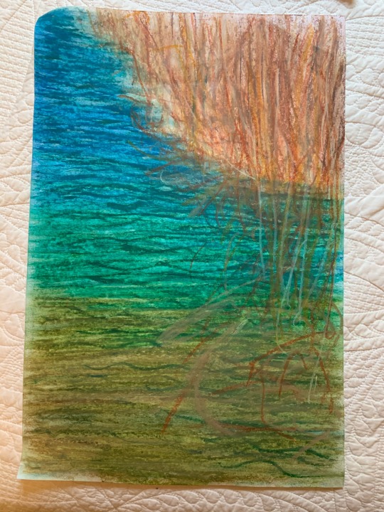
“Pondshore” (2020). Oil and chalk pastel on paper. Prompted.
What stood out the most during a walk outside?

“Nature walk” (2019). Crayon and oil pastel on paper. Prompted.
How did the nature walk make you feel?
I felt movement from the trees blowing in the wind, the grey sky over head, and my own body.

“How rare and beautiful it is to even exist” (2020). Pencil on paper. Prompted.
Create a mandala.
I pulled on the Tomm Moore style again with all of the components flowing into each other in some way. There are birds flying into the distance, a vine that becomes a raging sea, a woman before a fire, a sun in the sky and a half moon setting. Yes, the title is from Saturn by Sleeping at Last.

“Lyric” (2019). Colored pencil and pencil on paper. Prompted.
What inspires you?
I use sinuous lines of lyrics create my figure. I’m inspired by music and these are songs which have stuck with me.
Blue: “Hello, I've been waiting for you/ I didn't know if you'd recognize my voice/ Cause I've been whispering your name and I've been imagining this day hoping that I’ll say/ Welcome home/ Welcome home. (“Welcome Home” by Joy Williams)
Orange: “Well, I've been deep in this sleeplessness/ I don't know why/ Just can't get away from myself/ When I get back on my feet I'll blow this open wide/ And carry me home in good health” (“Who Do You Love” by Marianas Trench)
Red: “This is gospel for the fallen ones/ Locked away in permanent slumber/ If you love me let me go/ 'Cause these words are knives that often leave scars/ The fear of falling apart” (“This is Gospel” by P!ATD)
Yellow: “How do you write like you're/ Running out of time?/ Write day and night like you're/ Running out of time?/ Like you're running out of time/ Are you running out of time?/ How do you write like tomorrow won't arrive?” (“Non-Stop” from Hamilton)
Purple: “When I die/ I don't want to rest in peace/ I want to dance in joy/ I want to dance in the graveyards/ And while I'm alive/ I don't want to be alone/ Mourning the ones who came before/ I want to dance with them some more/ Let's dance in the graveyards/ Gloria, like some other name/ We kept on calling ya” (“Dance in the Graveyard” by Delta Rae)

“Billowing out a River from My Lungs” (2019). Watercolor, colored pencil, and oil pastel on paper. Free draw.
I’m actually working on a newer version of this. It was just something to explore mediums and a bit of meditative practice.

“Emotions (Sadness, Creativity, Loneliness, Hope, Grief, Sonder)” (2019). Watercolor on paper. Prompted.
Pick six emotions and represent them.
Sadness is dark to me, heavy, and spiraling. It’s a whirlpool that drags you down.
Creativity is spontaneous, bright and orange like flowers. I tried to convey that with different strokes and a golden spark in the corner.
Loneliness is hard and harsh absence. That feeling of emptiness despite being surrounded by love and compassion.
Hope is green, a path in the forrest that is moving upward, forward.
Grief is red and raw at first and then the longing fades in, dark and deep.
Part 2 is coming soon
8 notes
·
View notes
Photo
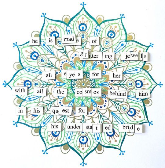
NaPoWriMo 2020 Day 0: Early Bird
he is made of
glittering jewels
all eyes for her
with all the cosmos behind him
in his quest for
his understated bride
____
Surprise! I think this is how I'm going to do NaPoWriMo this year: Mandala background + Mini Magnets. Or at least I'm going to try. This one took longer than expected because, naturally, I sit down to work on something I want to be done early in the day and I get interrupted for over an hour.
And of course, I think I'm already technically behind a day because this is the "early bird" prompt from napowrimo.net, which was, to my understanding, "your favorite bird." (Much to the bane of my existence, it seems that NaPo doesn't get a standardized all-in-one list like Inktober or some other monthly challenges, at least not on that site which seems to be the most "official" source. That said, there may be a second one posted late tonight so I'm technically "on time," or I'll decide to live and let live and just be consistently a day behind. I don't know yet.)
I tried not to, but in the end, I had to go with my honest answer: The peacock. It's cliche, but it really is my favorite bird and I was having a hard time coming up with another bird that was both not a cliche and still gave me good poetry inspiration, and that I still genuinely liked.
Likewise, the mandala I did in peacock colors and I tried to go with motifs/patterns/shapes that were like a peacock's feathers. I wasn't sure about it when I was about halfway through, but the further I went, the better I felt about how it was coming along. And I have to admit, I am quite pleased with it. And maybe this time you can see a bit of the sparkle from the glittery and metallic pens I used, since I'm going to try taking photos directly on the backgrounds this time instead of using a blue/green screen with the magnets, scanning the background, and then digitally combining them. This way is technically faster, and if I can't do the prompts ahead of time then I need as much help with speed as I can get.
I think most of my wording choices are pretty obvious, but just in case they aren't: Male peacocks are the typically very brightly colored and iridescent of the species, while the females are duller and more understated in color. The most popular theory for the male coloration, therefore, is that it helps them attract a mate and ward off predators. Additionally, the extra research I did on the birds for inspiration turned up that the peacock has a lot of religious symbolism in which their extravagant tales represent the universe and/or the stars, moon, and sun. (Fun fact: I did not previously know that this includes Christian imagery; I assumed there was no Christian connection to peacocks at all, so that was quite interesting to me!)
Visually, it might be a bit busy to have the words over all the white and patterns, but I wanted something different than the ink backgrounds I normally do for Inktober and this was my best idea for the time being, so this is what I'm sticking to.
Now, let's see if I can get the real Day 1 done and posted before midnight...
____
Artwork/Poem © me, MysticSparkleWings
Inspired by FridgePoetProject
____
Where to find me & my artwork:
My Website | Commission Info + Prices | Ko-Fi | dA Print Shop | RedBubble | Twitter | Tumblr | Instagram
2 notes
·
View notes
Text
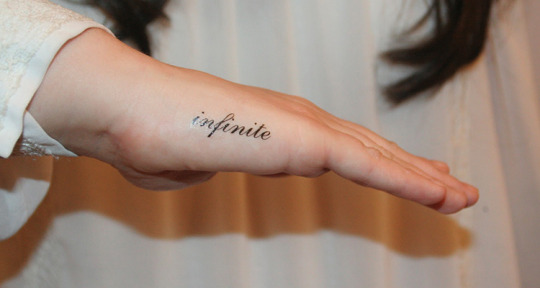
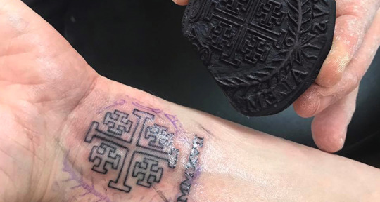
Amazing Hand Tattoo Designs For Men And Women
Hand Tattoo Designs for Men & Women

Tattooing is an art. People love to get a tattoo because of various reasons. Some get tattoos for displaying their love for someone, for some tattoos are just for fashion and style, whereas, many get it to show their support to a group or community. Well, whatever the reason be, tattoos are the way to unveil your true personality to the world. Any tattoo you get should match with your personality, should have relevance with who you are, whether it’s a tattoo on neck or a hand tattoo.
Though a tattoo can be placed on any part of the body, wherever you choose to, but tattoos on hands are most common amongst tattoo lovers. Hand tattoos are for those who want to have a tattoo that is visible easily, as hands are one of the most visible parts of our body. Also, not to mention hands and their movements while doing something or talking reveals too much about our personality. For instance, when we shake hands or move them while talking to people or crowd, we always make an impression with our hands. So, a hand tattoo can be a great way to leave a lasting impression!!
Hand tattoos are incredibly beautiful and amazingly stunning, and a skilled tattooist can always ensure a great artwork on your hand. Hand tattoos can be etched in varied shapes and sizes, based on your choice and hand tattoo design. Any design from a butterfly to an intricate mandala can look great as a hand tattoo.
Here is a list of top hand tattoo designs for you….. Don’t miss to see them all, you might find your favorite in the list…. Have a look!!
1. A beautiful white butterfly on your hand
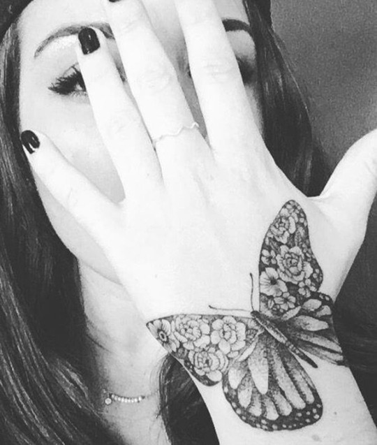
Butterflies are cute, I think cutest. And when they are tattooed they look mesmerizing. White tattoos are rarely seen, for, many people go for the darker shades. Yet, white butterfly tattoo will look amazing, especially when it is well-made. The delicate white wings of the butterfly look even more enchanting. White butterfly tattoos are very much feminine, nature-inspired and look striking on dark skin tone.
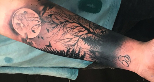
2. A pine tree on your hand
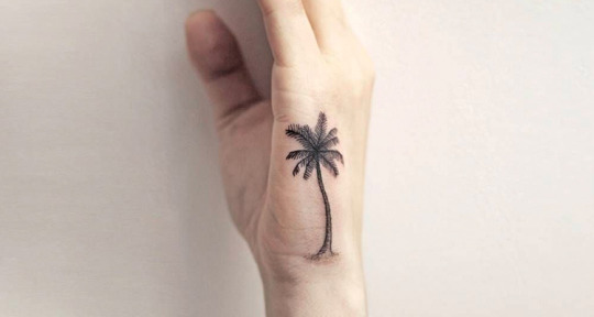
Pine trees, found naturally in the northern hemisphere make for a wonderful nature-inspired tattoo. This can be done in just black ink or you can get the tree inked in its natural color on your hand.
3. A poppy flower on your hand
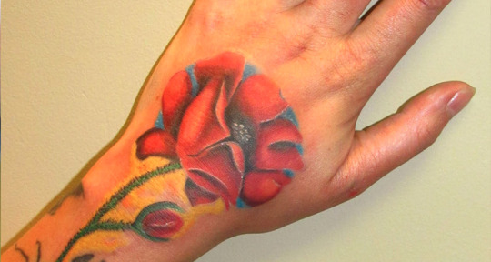
Poppy flowers have long been used as a symbol of sleep, peace, and death. However, red poppies are a common symbol of remembrance of soldiers who have died during wartime. A perfect tattoo design for your hands. Good design for soldiers! Get a red poppy etched on your hand, it will look mesmerizing.
4. A cute bumblebee on your hand

Bumblebees look cute when tattooed ☺. A bumblebee tattoo on your hand or on your wrist in black ink will look stunning. Bumblebee tattoos makes for a perfect small tattoo design for those who do not want to flaunt big art works on their body.
5. An autumn leaf on your hand

A subtle autumn leaf drawn on your hand will make for an eye-catching tattoo. This one will be in color and looks amazing on your hand. This is for those who do not want to go for big tattoo designs and just want to have something simple from nature. Get this in color, it will look original.
6. Henna-inspired tattoo on your hand

Henna-inspired tattoo has it all. This tattoo will have everything from beautiful leaves, flowers to other elements required for making a perfect henna-inspired tattoo on your hand. And intricate design that looks beautiful. Have this design on your forearm, you will never need to get a henna work on your hand, and this tattoo will take care of that part too. ☺ ☺
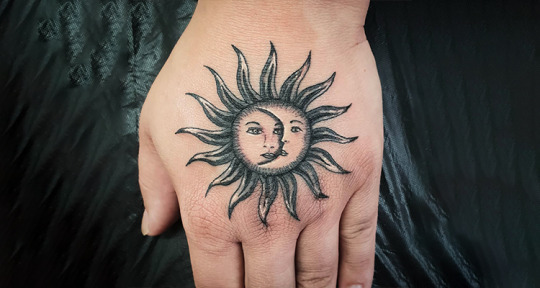
7. A captivating moon on your hand
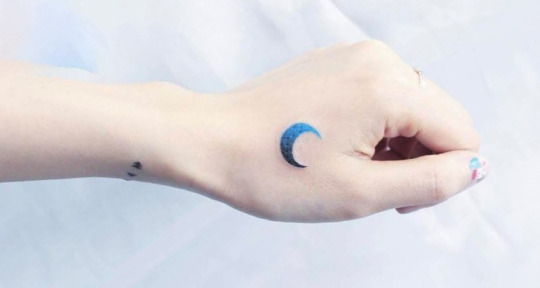
For all the moon lovers, simple moon will do the needful. Get a beautiful moon inked on your hand and see how people will react on it. You will love the compliments, as they are also going to be as beautiful as your tattoo design.
8. A rose on your hand
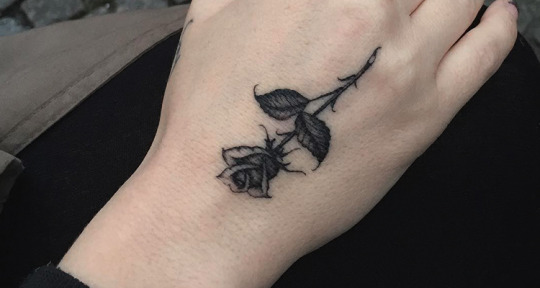
A rose tattoo on hand is for those who do not want to flaunt big artwork on their body. You can have any colored rose on your wrist or hand with leaves on it. Simple yet beautiful, this one makes for an insanely beautiful girl tattoo.
9. A tropical sunset on your hand

A tropical tattoo – for all the beach lovers! With all the elements creating a tropical scene, like a palm tree, boat, water, and the sun is setting, it will make for an eye-catching tattoo design on your hand. This will look like a pencil sketch. Get it either in color or just in black with shades.
10. Paw prints on your hand
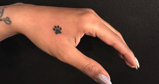
Paw prints on your hand or wrist will look stunning. This makes for a simple tattoo design, but looks really very, very cool! The design had only few paw prints in black and the tattoo still looks enchanting and captivating. Good for those who don’t want to have a bigger tattoo design.
11. A name tattoo on your hand
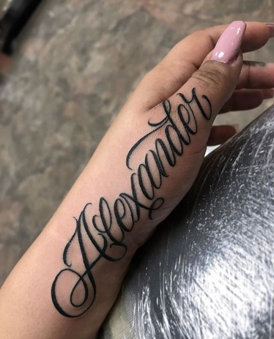
You may be thinking what’s so special in it, but trust this one looks so beautiful in italics…. You can get your name etched on your hand maybe in your or in different languages. It makes for an eye catching tattoos!!
12. A music symbol on your hand

A perfect design for the music lovers, especially for the ones who breathe music. Music symbol tattoos make for tiny tattoos. Specifically for people sensitive about music, who knows how to express their love for music without showing it off on a large scale to the world! A small symbol of music note on your hand will look super cool and stylish.
13. A quote or phrase on your hand
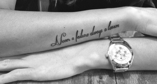
Quotes or phrases make for really wonderful tattoo designs. They look stunning. There are many quotes though, but you choose the one which you think represent you the best. You can get a quote on your hand in italics or in running font. Moreover, you can choose quote in any language, the only thing you need to take care is to know the meaning of the quote particularly.
14. Heart on your hand
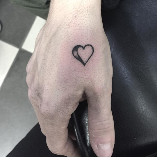
This one is a delicate tattoo design …! It is for those who wants to have a little more than a heart. This tattoo can be etched alone or along with a line stretching from the endpoint of heart and at a little distance the line will break and will have a small gap. This design looks really cool.
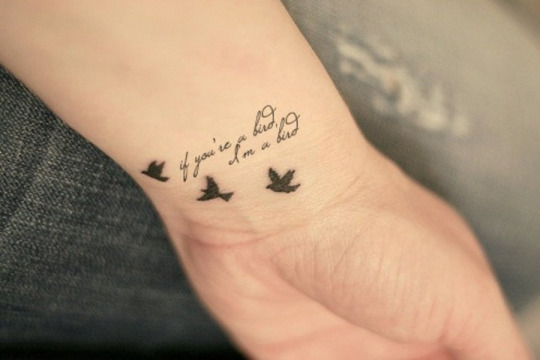
15. A phrase or quote with a miniature birds on your hand
Phrases or quotes make for a perfect tattoo designs. If you have any quote in your mind which you want to get inked on your hand, then that’s a perfect idea. Because of the uniqueness and elegance quote or phrase tattoo carries, many people go for a quote. If also like any quote specifically, get this with a miniature bird on your hand. It will look cool!!
16. An angel on your hand

An angel on your hand will make for an eye-catching tattoo design. Angels are however common tattoo designs, but believe you me they never lose their charm, come what may. If you also love angels and want one for yourself too, then get the one on your hand, it will look mesmerizing.
17. Roman number on your hand
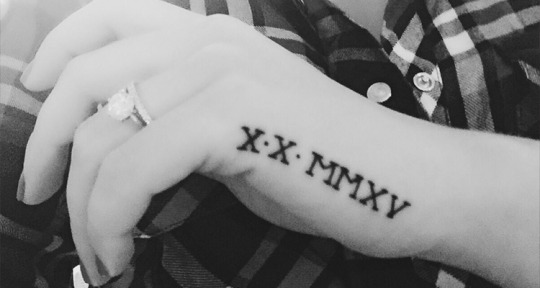
If you have some lucky number, which you want to get inked on your body, then don’t wait….go for it. Roman number look really cool when tattooed on the inside of your wrist. They really make cool tattoo designs. Roman numbers stand for grace, elegance and boldness. Getting a roman number tattoo on your hand will leave people awestruck.
18. ‘FAITH HOPE LOVE’ on your hand

This one lies under the category of a chain Ambigram tattoo. It has three words arranged in a way that they will form a shape of a diamond. Each word when viewed from different directions, will form the other two words. This one makes a classic tattoo and very creative. Ambigram tattoos make for a great tattoo designs and look perfect on hand.
40 Ambigram Tattoo Designs
19. Your loved ones name on your hand
For those who want to flaunt their love and care for the person they love, be it mother, father, wife, partner, etc. Just their name etched on your forearm will tell everything about the love and bond you share. If you also love someone get his/her name etched.
20. A crescent moon encompassing trees on your hand
Another beautiful tattoo design for hands is – a crescent moon encompassing trees. A beautiful tattoo for those who love moon in any way. The design looks very pretty and enchanting. Get it in black.
21. Just the initials on your wrist
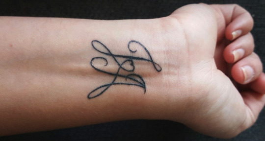
Some people do not go for the complete name, rather they prefer to get the initials of their loved one’s name etched on their wrist, chest or neck. If you also want to flaunt your love for your love, get her/his initials etched this time.
22. A compass along with a World Map
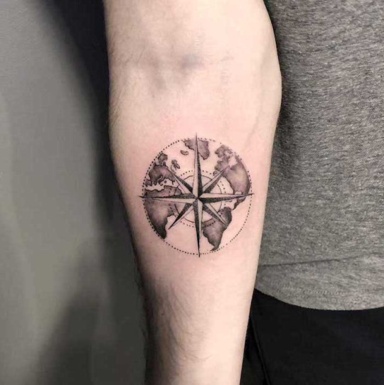
For the travelers, who are born to explore everything in the world! A beautiful compass along with the world map will make for an amazing tattoo design on your hand. The design has everything the direction and the destination ☺ ☺
23. A pair of feather on your hands

Well, if you want to have a tattoo in pairs, then a pair of feathers on both hands will make for a perfect tattoo. You will have one feather each arm. A cute tattoo design for hands.
24. An outlined heart on your hand

If you are looking for a sweet and cute tattoo design on your hand, then this is the one to go with. This little outline heart looks really sweet, simple, and adorable. Perfect for those who want to have a tattoo but do not want to flaunt it to anyone.
25. A sun on your hand
A beautiful tempting sun on hand, whether outlined in black ink or a colored looks great. Sun really makes for a cute tattoo designs for everybody. Simple yet beautiful!!
26. A heartbeat on your hand
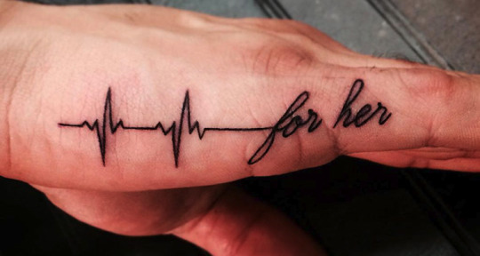
Heart beat tattoo looks mesmerizing! You can have this one in the form of a bangle and the heart between the beats, it will look amazing….. The tattoo can be done either in black color or in the combination of black and red, however you want.
27. An Egyptian architecture style tattoo on your hand
This hand tattoos are for those who are inspired by history. Egyptian art and architecture has always been famous for its excellent buildings and monuments. You can choose any design for your architectural style hand tattoo from this style of architecture. And not to mention the Pyramids. You can also get a beautiful pyramid etched on your hand along with the design.
28. An intricate mandala on your hand
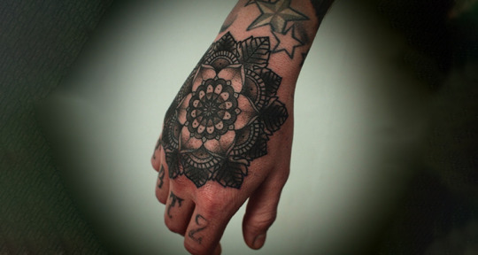
Mandala heart tattoo really looks wonderful, mandala designs are intricate and beautiful. Hence a mandala design done inside the heart also looks as beautiful as any shape mandala design. You can have this in black and white ink.
29. Greek revival architecture style tattoo on your hand
An architectural movement style tattoos are inspired by the style of ancient Greek architecture, particularly the Greek temple. The tattoo with Greek revival architecture have varying degrees of thoroughness and consistency. If you admire the Greek architecture then this designs can be yours!
30. A tattoo for your tommy on your hand

For all the pet lovers! Dogs are the most loyal and faithful animals, and if you think your tommy deserves some reward in return of its faith and loyalty and if you love your dog so much and want to show off your love or honor your favorite dog. Then this design is for you, you can get a tiny dog tattoo on your hand. It will only have the outline in black color and it will look amazing.
Pet Tattoo Ideas for Pet Lovers
31. An armband on your hand

An armband as the name says looks like a band on your arm as they encircle your arm just like a band does. Armband tattoos look elegant and graceful complementing your well-toned arms. A great choice for all, from a regular gym-goers to a college girl. You have a myriad of options when it comes to armband tattoo designs, as they come in numerous designs, which include floral patterns, wrath, Polynesian, barbed fence, name armbands, and tribal patterns. You can associate an armband to people you love, or to the memory of someone who is no more etc.
32. An orchid flower on your hand
Orchid flowers make for an insanely beautiful tattoo. Orchids come in a wide range of colors, they mostly appear to be hanging from a thread off of the stem. These highly coveted ornamental flowers represent love, beauty, luxury, and strength. Like a flower, orchid floral tattoos also look amazing.
33. Stamps tattooed on your hand
Stamps tattooed on your hand will simply represent your love for travel and will signify the countries that you have already traveled. You can get stamps from as many countries as you want etched on your hand. Or you can get those ones which you have already covered so far, or the ones you love the most, up to you!! ☺ ☺
34. A latin phrase ‘Soli Deo Glory’ on your hand
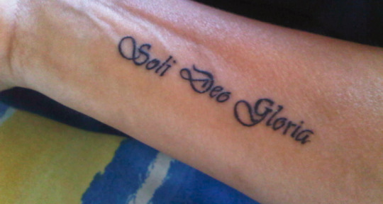
The meaning of this Latin phrase is Glory to God alone. The phrase will look mesmerizing of your hand. If you also believe in the glory of God then definitely this one is for you. The tattoo will not only look unique, but also will add charm to your beauty.
35. A feather with birds on your hand

Just imagine cute little birdies along with a feather etched on your hand. Yeah, the design looks stunning! The design will have many small birds giving appearance as if coming out of the feather. Just try it out in color or black.
Feather Tattoo With Meanings
36. A landscape in a circle on your hand
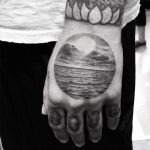
This one will be a colorful tattoo, as it has a lake, mountains, trees, sparkling water, and a beautiful moonlight. Actually a painting but tattooed on your hand. This tattoo looks beautiful, it is done inside the circle but if you want, you can get it without an outline too. A very beautiful and colorful tattoo to go for. Also, you can have variation in it, by simply adding a flying bird with trees and mountains, your tattoo will become extraordinary.
See More @ 55 Amazing Hand Tattoo Designs For Men And Women
#hand tattoo#tattoo#arm tattoo#tatto#tattoodesigns#tattoo ideas#armtattoo#tattooink#art#girlytattoo#mentattoo#hand#tattooing#Blog#tattoo blog#trending tattoo#girl#men#tattoos#article#tattooed#tattoous#tat#tatoo#feather tattoo#landsca[pe tttoo#handtattoos
7 notes
·
View notes
Text
An Interview with George Salis
Today, we’re chatting with MSJ alum George Salis, who has a new novel, Sea Above, Sun Below coming out from River Boat Books.
Upside-down lightning, a group of uncouth skydivers, resurrections, a mother’s body overtaken by a garden, aquatic telepathy, a peeling snake-priest, and more. Sea Above, Sun Below is influenced by Western myths, some Greek, some with biblical overtones, resulting in a fusion of fantastic dreams, bizarre yet beautiful nightmares, and multiple narrative threads that form a tapestry which depicts the fragility of characters teetering on the brink of madness.
DV: Tell us a little about yourself and your writing background.
George Salis: I’m a Swiss-Greek-American bibliophile and, by natural extension, a linguaphile who has just come out with his first novel, Sea Above, Sun Below.
I first started writing with any serious literary intent about halfway through college. Also, I started reading novels seriously around that time, after having ditched fantasy and other genre work in high school in order to read science-popularizing books. My nascent ambition was simply to write a story and then another and another. Of course, as momentum built, I became distracted by the external concerns of the writing world, wanting to be published in popular journals, obtain awards and residencies and an MFA, etc. Thankfully, these distractions did not last too long, and I soon realized how circumstantial if not totally meaningless most of them are.
My focus came back totally to the words themselves when I discovered the vast world of buried books and neglected authors. I learned that the work of these writers is usually much better than what people are told to read by The New York Times and other mainstream echo-chambers. It’s often the case that these neglected authors write works that are entirely devoid of the distractions named above and more, thus they are pure and fresh and stimulating. And so, in communion with writers such as Rikki Ducornet, Joseph McElroy, Wendy Walker, João Ubaldo Ribeiro, and many others, I write with freedom of intellect and imagination. Words are now my world.
DV: What was the inspiration for your novel?
GS: There was a kaleidoscope of inspirations, both before I wrote the novel and during, so it’s difficult to pinpoint one. I could potentially break it down into two chief mandalas, as it were: Icarus and Adam/Eve. In a way, my novel is a roundabout interpretation of those myths. But myths by nature do not exist in vacuums. The fall of Icarus echoes the fall of Satan which echoes the fall of Man which echoes the fall of Finnegan which echoes the recurrent falls of the skydivers in my novel. Most of these connections and more can be found within or between the stories that make up Sea Above, Sun Below.
DV: Your novel pulls together a lot of disparate elements. What do you consider the glue that binds them all together?
GS: I believe everything is connected. Considering everything is made of atoms, this is a scientific fact. But there are also more esoteric connections between things. Phenomena that might put the chaos into chaos theory. With this in mind, the structure of Sea Above, Sun Below features stories within stories, but even more than that, stories beside stories, connected on a thematic and genetic level, the science of aviation and ancestry, the science of nature. There are three main parts, but depending on how you count, there are about ten tales that weave into each other to form a tapestry. My inspiration for the structure can be traced to The Thousand and One Nights and Cloud Atlas, to name a couple of examples.
From an interpretative standpoint, a lot more connections can be projected by each unique reader.
DV: What is the coolest thing about being an author?
GS: I love to write because I love living in a world of words and the act of writing itself almost regularly brings epiphanies both large and small—revelations related to words, story, coincidence, and more. It feels great to exorcise my mind of obsessions and dreams, to literally have a hand in their birth, raising them into something beyond the nascent mental form they once existed as. This is the almost solipsistic joy that comes from writing, although I’d like to think that such joy is manifest on the page and can be shared with readers.
And speaking of readers, it’s also wonderful to see how they are responding to my novel on Goodreads (see here). Some people compare my writing to Borges or Ballard or Rushdie while others say I shirk all influences. I love seeing how readers interpret the prose and the work as a whole in their own unique and overlapping ways.
DV: What are you working on next?
GS: I’m over 130,000 words into an encyclopedic novel titled Morphological Echoes. I’ve been working on it for about three years and I have a few more years of work ahead of me. It’s a book that contains a universe of stories, connected across time and space by the rearrangement of schizoid atoms, the transmutation of the laws of physics. It’s a polyphonic, multilinear, omni-temporal epic with thematic and syntactic echoes, taking place in 1940s Japan, 9/11 New York, medieval France, ancient Egypt, Neolithic prehistory, and more, with a broken family at its kaleidoscopic core. The novel begins with a myth, a truth: the moon gives birth to a boy, and when he grows weary of life on the landscape of his mother, he yearns for a strange planet called Earth. After quarreling with his mother over the course of years, she eventually concedes with sadness, and she breathes in with the elasticity of a balloon, causing the moon boy to sink with her surface, and she breathes out, a supernal sigh that sends him on a trajectory straight toward the Earth….
An Interview with George Salis was originally published on Mad Scientist Journal
2 notes
·
View notes
Text
Spirituality: Synchronicity: The Universe's Software Programs
Considered to be an a-causal connection of two or more psycho-social phenomena, modern interpretations of synchronicity could be seen as the person who checks their phone for a call, only to receive the call immediately upon checking, a Deja-vu including but not limited to information from dreams occurring in waking life, or a seemingly random string of events leading the subject to a specific goal that could not have been achieved had their original plans gone accordingly—and of course any number of other events.
In order to understand these events, it is imperative to understand the postulates of precognitive ability, telepathy, and other forms of extra-sensory perception, as scientists have realistically been trying to make the Mainstream Media aware of ESP’s existence since the early 20th century with minimal success.
Unfortunately the only attention that any scientific studies receive from the press in the fields of parapsychology are the ones that get a good laugh, and the serious scientific analysis is engulfed in the tidal wave of sensory data that creates today’s age of social technology.
However, once people begin to understand the collective unconsciousness as the earth’s magnetic field, and the archetypes as specific primordial frequencies that the mechanics of everyone’s brains are apt to tune into, et cetera, it will be clear to see that ESP is not a matter of “having special powers” but simply more a matter of two human brains communicating with each other in the same way two neurons communicate through synapses.
Moving forward (or backwards), it is important to point out, as always, that humans’ ancient ancestors were well aware of all of these concepts well before Modern Man; which is not very coincidental since Jung was inspired largely in part by eastern mysticism with his psychotherapy.
However, “synchronicity” philosophy can be found in both eastern and western schools of spirituality.
Generally speaking, the eastern synchronicity was considered Taoism, which is a metaphysical school of philosophy that involves asceticism and meditation in order to further understand and perceive the Tao, which is the “universal flowing one-ness” of everything.
In modern terminology, the idea of the Tao can very much be considered a software engine, computing an existence through pre-existing algorithms that can be diligently studied and eventually interpreted.
The interpretation part was much more emphasized in the west, as eastern mysticism tends to shun “conceptualizing”, “assuming”, or “expecting”, but even Taoists attempted to interpret the language of physical phenomena, the definitive collection of their work titled the I Ching in the West, one of the things that Jung was quite fond of in his psychotherapy.
Divination was the ideology of synchronicity in the ancient west, and was not so much secular like a religion or Taoism, but rather was an umbrella category of crude “ancient-science”, like numerology, astrology and other traditional occult practices.
Specifically, divination’s primary postulation was that every personal interaction with the exterior physical world (each physical “effect”, basically) could be considered something similar to a “word” or “phrase” that had latent information within it, whether the subject interpreted it or not.
This same general process is also used in numerology, when the numerical value of alphabetical digits is determined and reduced down to its core value through specific calculation.
In this sense, it could be considered that divination is the acknowledgement of the synonymous nature of waking life and dreaming; meaning that both are perceived as linear experience of the self, and in both, the “outside” world can be considered an effect of a person’s unconscious projection.
In dreams this is obviously a bit more evident, but even in reality a person creates not the physical phenomena itself, but the entire categorical basis of it within their brain, which is clearly unique as a fingerprint compared to anyone else’s interpretation of the phenomena, and thus completely different and unique to the person’s own unconscious.
The Dalai Lama was quoted on the subject saying, “I am open to the guidance of synchronicity, and do not let expectations hinder my path,” and Terence McKenna referred to the quantum frequency spectrum in which synchronicities occur as the “Cosmic Giggle”.
Researcher David Wilcock wrote a book on the subject titled, The Synchronicity Key, and David Icke, Michael Talbot, and Graham Hancock have discussed the subject, among others.
Dr. Michael Persinger and his colleague Todd Murphy have, although not using the term “synchronicity” or any spiritual terminology, released an incredible amount of scientific data revealing the mechanisms that could quite literally describe the realities of Synchronicity and other Jungian concepts.
Even the Police released their album Synchronicity in 1983, which was openly inspired by the Jungian concept, and John Constantine of Vertigo Comics is often seen riding the metaphysical “Synchronicity Highway” (McKenna’s Cosmic Giggle) in order to get a leg up on many of his adventures.
In general the pervasive and unavoidable presence of synchronicity becomes reportedly much more evident under the influence of natural psychedelic drugs, which goes hand in hand with the ancient shamanic traditions surrounding the philosophy.
Setting aside all the esoteric philosophy and ancient tradition, synchronicity is indeed dealing with a frequency spectrum just like everything else, and the main broadcasters into this spectrum within the human body are the brain and the heart.
Ultimately the real tool to this spectrum can be considered a “self-aware consciousness” in general. This however can be quite difficult due to the multiplicity of layers within the brain acknowledged by just about every psychiatrist and psychologist in history, although the definitions vary substantially at times.
The reason for this is the reality that the different sections of the brain can be considered different organs in terms of goals and use, and because of this, humans are bombarded with a woven web of information that is basically a bunch of simple organs communicating biological responses to each other.
This is not to say that human consciousness is just the projection of a bunch of organs—but more to illustrate that the brain is not the pinnacle of intelligence that most people think it to be, and is instead just another organ looking to perform functions.
However, underneath all these functions is an intangible but undeniable core self; whether it be considered a “soul” an “intuition, a “higher self” or simply “enlightenment.”
There are four universal layers of the brain’s projection: We have the Self, the Anima/Animus, the Persona, and the Shadow.
When a person is born, they are physically one sex, so conceptually their consciousness becomes inverted at its root so as to allow the person a piece of the full spectrum; meaning that a woman has the male aspect of the Animus embodying her reason and spirit, and a man has the female aspect of the Anima embodying his sensuality and intimacy.
Some even spiritually characterizing this as a man’s link to his beloved throughout time. The persona is the literal cognitive mask a person paints of themselves for the rest of the world, the Self is the full fractal collection of all within the brain (often represented by a mandala).
The self is also often considered to be the positive spectrum of the whole—the yin, so to speak—which brings us to the fourth layer: the counter-mimicry of the self, the inversion, the Shadow—the yang.
The synthesis of these layers of perception, thoroughly described by Jung in his work and expanded upon by many others, is what a Taoist would call honing his mind to the flow of the Tao, or even what Thoreau emphasized when he spoke of sucking the raw marrow from the bones of life—it is learning to navigate the waves of one’s own mind, because only then will one truly be able to accurately navigate the waves of the world around them.
Of course, the simple definition to all this would be following one’s “intuition”, but unfortunately this is easier said than done.
Most people believe in themselves to such a little extent that making personal decisions is difficult enough, let alone making decisions on the present environment in order to accurately gauge the conditions of the future—in the present.
The only conclusions that can and should be drawn from this are that synchronicity events are a recurring and intimate piece of the human experience. The modern era is so unbelievably chaotic that it’s difficult to tune into anything these days, let alone the programming of the universe.
The translation of the programs of the universe is one’s own intuition; everyone experiences these synchronicities whether they are aware of it or not, similarly to the way that everyone dreams whether they recall or not; and finally, that the existence of synchronicity events further demonstrates the very fine line between waking life and dreaming.
No-Nonsense Naysayers will be inclined like always to chalk these things up to impractical reasoning and gullibility, but those who have experienced these intimate moments with the world around them cannot be swayed, especially since once a synchronicity has been experienced, they usually continue and often even the frequency increases.
Those who have not yet experienced this should take note to study the work of Carl Jung, and the ancient metaphysic philosophy of Taoism—and to a lesser extent the ideology of divination as well.
Although it should again be noted that this was not a brotherhood of diligent thinkers, but rather a definition of something that was emerging in the culture in general, and as a result is a bit more convoluted.
If a person wishes to unveil the programming of the universe, it is not particularly difficult, nor is it unnatural, but it requires a mindset without mental friction.
Although still largely misunderstood/unknown by modern science, Synchronicity Events cannot be denied their existence or their pertinence, and those who continue to remain blind to the universal coding will simply be left behind by the others, as they continue to ride the wave and explore their own nature through the interactive and multi-layered existence around them.
11 notes
·
View notes
Text
Sweet Pea X Hippie!Reader Blurb
Random Sweet Pea X !Hippie/Free Spirited Reader blurb that has been sitting in my drafts box for far too long.
Inspired by the album FREE Cody Simpson
Word Count: 1.2K
As the sunlight strained to reach into the small apartment placed above the bowling alley behind the White Worm, a sleepy eyed Sweet Pea stirred awake upon realizing that he was no longer under the covers of the soft feather duvet. While he sat up in bed to stretch the sleep away, he couldn't help but to let his eyes wander over to your side of the bed. There you lied peacefully wrapped up in the entire duvet, your calico kitten sleeping in the crook of your neck, slightly covered by your hair which was sprawled out like a beautiful disaster across the pillow case. Even after months of living together, it still brought a warm smile to the boy's face when he realizes where he's woken up and of course, with who.
He takes a moment to look around the room surrounding him. Technically he was in "the bedroom" but all that really was is a small room off the living room/kitchenette, which had previously been a filling room. The living room itself actually used to be an office as was the rest of the apartment. The only thing that separated the bedroom from the living room was antique wooden room divider, that had been found at a garage sale in Greendale, and a few mandala tapestries that hung loosely from the ceiling. Those had been a gift from Toni.
Eventually he let his eyes wander back down to your sleeping frame. You were facing away from him, and if he really tried, he could barely make out your soft snores. He lay back down on his side with his head propped up on his pillow as is fingers danced along your bare back, tracing the 'tattoos' you'd let him draw on you every once in a while (in sharpie mind you). Even in your sleep, he could still see the goose bumps that he gave you as the frigid temperature of his fingertips clashed with the warmth radiating off your back.
"Morning." He whispered as you begin to stir awake, slowly stretching your back before turning to him giving him a sleepy grin. The same grin that makes his stomach erupt with butterflies. He mirrored your smile, almost by reflex, though everything you did could make him smile.
"Morning Sweets" you answer whilst cuddling back into his chest, trying to block out the light steeping into your eyes.
"Careful babe, Basia's behind you."
"Damn cat"
"Uh if I remember correctly, it was your idea to let her live here."
"Uh I if I remember correctly, you didn't try to stop me" you mumbled into his chest making your statement barely audible
"Touché"
"Plus I don't mind taking in a stray every now and then, it's why you're here isn't it"
"Oh come on babe, don't be mean" he teases "plus I'm pretty sure that we took you in first"
"Touché" you yawned
You sat up slowly, scrunching your eyes shut, still adjusting to the early morning sun. Sweet Pea groaned beside you as Basia padded over to his side of the bed before settling on his chest, attempting to lick his chin.
"Damn cat" he chuckles with a lazy smile
"Basia" you cooed, picking her up and rubbing your thumb across the bridge of her nose, causing her to purr in contentment. You placed her on the floor before slipping out of bed yourself. Sweet pea watches as you stretch your arms above your head, lightly sighing and then reach into an open drawer to find a long burnt orange coloured t-shirt you gently pulled over your torso.
He rolled his eyes slightly as his mind wandered to your habits. Burnt orange. That was your colour. Anyone could see this by just stepping into their apartment. The wall space that could be seen was a greyish blue that made the orange accents pop. So really her colours were orange and blue, with an eruption of deep green. The green came from the infinite amount of plants in the room. They were everywhere. Hanging from the ceiling, sitting on window sills, in large pots dotting the room and propagating in containers on the kitchen counter. It really was a jungle that varied from small succulents to the four foot tall fig tree. Every container you could get your hands on became a flower pot of sorts (mason jars, tin coffee cans, small wooden bowls, old chipped mugs, etc). Not that he would ever complain. It made you happy which made him happy.
Though as much as you loved it, Basia had far more adventures in the small jungle that enveloped the living room. The both of you would get a good laugh at watching her creep underneath and between the couch and plants, looking like a child pretending they were on a safari. She would chase moths and the occasionally butterfly that would sneak in from the windows while you sat on the couch skimming old National Geographic's, looking for your next picture add to your travel wall. That wall was smothered in photographs of your current travel wish. Right now it was Australia.
You interrupt Sweet Pea's train of thought by sitting next to him on the bed and placing a plate of breakfast in his lap.
"Where'd you go Sweet's?" you ask curiously as you watch the boy slip back down to earth.
"Still here." he thanks you by placing a chaste kiss to your lips before taking a bite of his breakfast
Truth be told, he would stay here forever as long as you were with him, dancing around the room in whatever weird overalls and t-shirt combination you'd picked out. Though his favourite combination was overalls and no shirt. He loved watching you go about your day, humming a Beetles songs as you water the plants, climbing onto the counters to make sure you could reach them all. That would be his queue. He'd walk over and take the cup of water out of your straining reach and finish up the plants that were hard for you to reach. Then he'd put his hands on your hips, lifting you off the counter, giving you a kiss before setting down.
It was a funny slight really, the bad boy and the hippie. The most unusual combination that any of their friends had seen yet. He didn't care though. He loved being around you, you had a calming effect on him and boy did he need it. When ever he would get himself worked up about something, you'd just hold one finger to your lips, indicating that he needed to stop talking. Then you'd take his hand and pull him over to the living room and have him lay on the floor with you while some old album played in the background. Once you could tell he'd calmed a bit, you would ask him about what was bothering him. Those conversations usually led to other conversations, often landing on plans for the future. The two of you would lie head to head, starring up at the ceiling, smiling contently at the thoughts of spending forever with the other.
That's what he truly wanted. Those moments with you that made time stop momentarily, moments with his happy little hippie.
#sweet pea#sweet pea riverdale#sweet pea imagines#sweet pea x reader#sweet pea x you#sweet pea x y/n#sweet pea xhippie!reader#free spirited#riverdale#riverdale imagines#riverdale serpents#riverdale headcanons#riverdale headcanon#hippie#hippie!reader#I just saw a tag that said hippie!lucifer#hippie biker#another-hopeless-daydreamer#reetz's headcanons
122 notes
·
View notes
Link
With the National Council for Peace and Order (NCPO) slowly but gradually lifting restrictions on campaigning, scores of new political parties have stepped into the fray. Careful not to run afoul of the recently revised and tightened organic law on political parties, they are making sure their steps are in sync with the slow pace set by the junta. For over four years, Thais have patiently waited to cast their ballots, and parties are keen to stay qualified for the long-awaited game of musical chairs.
Among the new parties, two appear to represent the coming of hope, even for the impatient and the disillusioned—the Future Forward Party and the Commoners’ Party. Both cater to distinctive constituencies. Together, they present a sort of contradictory complementarity much needed in Thai politics.
(I note inconsistency in how English-language media spell the latter. While the Thai word samanchon is singular, independent media including Prachatai and The Isaan Record translate it as plural. By contrast, there is no consensus in mainstream media. Whereas Khaosod English uses the adjectival form—the Commoner Party—the Nation confusingly employs both the adjectival and plural forms. Here, I follow the usage of independent media outlets.)
Future Forward—whose future?
The Future Forward Party is led by a group of upper-middle and middle-class urbanites, scholars and activists, who previously played commentator roles from the periphery but appear now tired of second-hand democracy. Thanathorn Juangroongraungkit—a son of the Thai Summit family, which controls the biggest automobile company in Thailand—heads the party, now one of the most followed on social media. Future Forward presents itself as the third force, or a remedy to polarised politics.
Thanathorn is more than meets the eye. Despite his wealth, he has long been active in Thai progressive circles and is well known for his left-leaning ideals. Thanathorn’s politics crystallised during his period of student activism as the vice-president of Thammasat’s Student Union and the deputy-secretary of the Student Federation of Thailand. Regularly making rounds in Thai social media is a photo of Thanathorn caught between the police and the Assembly of the Poor, a front-page moment and a good caricature. In many ways, he represents the contradictions reshaping Thai contemporary politics.
The Future Forward Party is well positioned to tap into pro-democracy factions that shun Thaksin’s party line, including independent labour unions in metropolitan areas. He is aided by many progressive scholars and leftist activists including Piyabutr Saengkanokkul—an active member of Nitirat, a group of politically-critical legal scholars—and Sustarum Thammaboosadee, a committed advocate of the welfare state. Both are foreign-educated, young professors at Thammasat University. Thanathorn and his team have been well received even by mainstream media.
But Future Forward may only be a case of Thai urban, organised labour being left with the “lesser of two evils”: token representation. As the leftist scholar-in-exile Giles Ungpakorn comments, the Future Forward Party “is likely to be a party aimed at sections of the pro-democracy middle classes. It will prioritise the free-market and business interests while also claiming to support the poor in an abstract manner. Its leader, tycoon Thanathorn Juangroongruangkit, has stated that it will ‘protect capitalism for the benefit of the majority’. In the past, he has emphasised that business must make a profit before benefits for workers can be improved.”
Future Forward may offer a way out of military dictatorship, yet it is hard to imagine a set of coherent policies that is simultaneously laissez-faire and pro-labour, not to mention inclusive of meaningful power-sharing with the working class. Previously a lecturer at Thammasat myself, I share much of my background with the two scholars who support Thanathorn in moving the Future Forward. Nevertheless, as a labour advocate, I grapple with the contradictions between the party’s class interests and pro-labour claims.
The Commoners’ Party
In my view, the advent of the Commoners’ Party represents a more exciting, radical break with the status quo—one that has so far kept class privilege of the likes of Juangroongruangkit intact.
Contrary to the Future Forward’s elitist, think-tank style, the Commoners’ Party sets out to be governed by the working poor. Although some co-founders are from urban middle-class backgrounds, the party’s identity is shaped by shared concerns around the poor’s lack of power and the destructive impacts of uneven development in the Northeast—a region of origin for many activists.
Against the backdrop of hierarchical politics commonplace in Thailand, the Commoners’ Party has pledged to be truly bottom-up and build policies from the ground—an ideal I wholeheartedly support though follow with baited breath. Unlike Future Forward which centres on leaders’ charisma and grand ideas, the Commoners’ premise is to create a genuine platform for the voices of villagers, hitherto silenced or non-existent in parliamentarian politics. The party itself grew out of a grassroots movement that bears the same name comprising political activists and NGO workers from various right-based issues.
Despite state surveillance and restrictions on campaigning, the Commoners’ activists have been organising forums across the country to provide a platform for locals to voice concerns over various issues including communal rights and environmental justice. Early this year, the party led a group of protesters in marching over 450 kilometres to help shed light on neglected but crucial issues of food security and community control over natural resources. Most importantly, it may be the first time since the heyday of the 1970s student uprisings that a Thai political party has explicitly discussed social-democratic policies.
Having known the Commoners’ founders and some of its activist members myself, I cannot deny that the transition from a social movement to fully-fledged political party is full of contradictions: here comes to mind the image of a banner with an anarchist symbol that decorated the site of the party’s first general meeting in late September 2018. According to the Party’s elected chief Lertsak Kamkongsak, the activists have taken inspiration from a number of sources: Western-style green parties, eco-socialism, anarchism, European Pirate Parties, and the indigenous Zapatista group. The idea of creating a political party was entertained for years by a co-founder and the secretary-elect of the Commoners’ party, Kittichai Ngamchaipisit—a veteran peace activist and strategist who is personally drawn to Gandhi’s philosophy of non-violence and the Zapatistas’ style of direct democracy.
Soon after the Commoners’ first general meeting, the party was forced to face reality. It was struggling to meet the legal requirements of having a million-baht initial fund and five hundred members. Yet the Party has finally overcome the hurdles, having a first taste of what it’s like to play this electoral game.
The Commoners’ activists may be new to elections, but they are not to street politics and building grassroots movements. Lertsak has years of experience in organising with communities resisting extractive mining and dam projects. The trust bestowed on him testifies to the underlying issues important to his constituency: social inequality, economic exploitation, environmental degradation, and the marginalisation of the rural poor in the political process. In this sense, the Commoners’ Party embodies undercurrent ethno-regional and class indignations suppressed over several decades of uneven development.
These are, of course, crucial concerns shared also by red shirt supporters. But within the proxy war of rival elites, these issues have not only been unaddressed, but aggravated by competing populism.
A Commoners’ Future?
Despite my excitement and optimism, realistically the Commoners’ and Future Forward parties are and will be a minority in Thai politics. This realisation makes the idea of working together imperative. Yet according to Kittichai, regrettably irreconcilable differences between the Commoners’ and Future Forward foreclosed the prospect of merging the two.
I join other activists from the left who are suggesting that the two parties collaborate. That collaboration would need to take power differentials into serious consideration. What the Commoners stand for—the interests and livelihoods of their poor constituency—sit uneasily with the privileged positions of Future Forward’s supporters.
Given that their target constituencies would be mutually exclusive, the least the two parties could do is to endorse each other’s candidates. They could also make sure that their platforms do not compete, or cancel each other out. Apart from shared anti-coup sentiments, there are a variety of concrete issues they could jointly discuss ranging from downsizing Special Economic Zones, strengthening universal health care, advancing the idea of welfare state through progressive taxation, as well as land reforms and a living wage.
Both parties have their own strengths, which are variously oppositional and complementary: one pushes for change from above, the other from below. While Future Forward is well endowed with financial and social capital, as well as a well-versed network of scholars, the Commoners have deeper understanding of uneven development and how to work with the masses beyond the ballot.
15 notes
·
View notes
Text
Warli Paintings: Exotic form of simple art
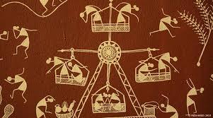
A Picture is a ballad without words. The warli-painting" Warli Art" shape is the pictorial dialect used to speak to the tribal people craft of the early tribes of Thane area, Maharashtra.
It portrays the dancing, chasing, and development of land with the tribal hovels made in a dark, mustard yellow, or white foundation. Keeping in mind the end goal to educate these structures to the understudies, we embrace a particular showing strategy, so that even non-craftsmen can paint the lovely warli. All these and more can be investigated about antiquated India.
The word "Warli" originates from "warla" which implies a real estate parcel or a field despite being in such closeness of the biggest city in India, Warli tribesmen are as yet not urban. Warli Art was first found in the mid-seventies. While there are no records of the correct beginnings of this workmanship, its underlying foundations might be followed to as right on time as the tenth century AD. Warli is the distinctive articulation of day by day and get-togethers of the Warli tribe of Maharashtra, utilized by them to enhance the dividers of townhouses. This was the main method for transmitting fables to other people who are not familiar with the composed word.
These works of art don't portray fanciful characters or pictures of divinities, however, delineate social life. Pictures of individuals and creatures, alongside scenes from everyday life are made in a free cadenced example. Painted white on mud dividers, they are entirely near pre-notable buckle artistic creations in execution and as a rule delineate scenes of human figures occupied with exercises like chasing, dancing, sowing, collecting, going out, drawing water from well, drying clothes.
It fundamentally comprises geometrical examples
Circle: speaking to the sun and the moon
Triangle: triangle got from mountains and pointed trees showing a consecrated walled-in area or a land parcel. So the focal rationale in every custom painting is the square
These geometric figures are consolidated to shape lovely examples. Like two summit triangles are combined to frame a human figure.
"warli-painting" Warli canvas on paper have turned out to be exceptionally prevalent and are presently sold all finished India. Today, little compositions are done on fabric and paper however they look best on the walls or as colossal wall paintings that draw out the tremendous and otherworldly universe of the Warlis. For the Warlis, the convention is still clung to however in the meantime new thoughts have been permitted to leak in which encourages them to confront new difficulties from the market.
Learn this simple art, find designs; explore the world of warlis at Penkraft through our "contact" workshop.
Penkraft conducts classes, course, online courses, live courses, workshops, teachers' training & online teachers' training in Handwriting Improvement, Calligraphy, Abacus Maths, Vedic Maths, Phonics and various Craft & Artforms - Madhubani, Mandala, Warli, Gond, Lippan Art, Kalighat, Kalamkari, Pichwai, Cheriyal, Kerala Mural, Pattachitra, Tanjore Painting, One Stroke Painting, Decoupage, Image Transfer, Resin Art, Fluid Art, Alcohol Ink Art, Pop Art, Knife Painting, Scandinavian Art, Water Colors, Coffee Painting, Pencil Shading, Resin Art Advanced etc. at pan-India locations. With our mission to inspire, educate, empower & uplift people through our endeavours, we have trained & operationally supported (and continue to support) 1500+ home-makers to become Penkraft Certified Teachers? in various disciplines.
0 notes
Photo

A Weird Magick Hack for Discovering Musical Masterpieces
There's a weird magick hack you can use to discover more favorite music. You've heard the Faustian stories of musicians like folk legend Robert Johnson who stood at a crossroads and sold his soul to the devil for guitar-playing prowess. He's not the only one, and the stories get glamorized over the years, but you know beyond a doubt that musicians get inspired, that the very word musician means "art of the Muses." (Needless to say, the Muses are the nine goddess daughters of Zeus and Mnemosyne, presiding over the arts and sciences.) When you love a musical album as a masterpiece, what's happening on a more celestial level is that the Muse who inspired that music has made a connection to your own guardian angel, spirit guide, or demonic handler. When you don't like an album, there's no connection like that, and what invariably happens is your intellect takes over and decides that the album fails to meet your expectations or falls outside your prescribed boundaries of taste. The problem is obvious -- you get blocked from musical masterpieces that you literally can't hear properly because the celestial streaming, as it were, couldn't go through. But as we said, there's a hack.
The hack requires a print-out of an old mystical diagram and an attitude adjustment. The print-out is easy, and the attitude part is easy, too, if you'll simply be open minded. It will sound like the simplest thing in the world, but it's a thousand-year-old occult secret that gets used for psychic entrainment for the purposes of genuine mind reading and (by practitioners of black magick) using others as puppets. The attitude is to decide in advance that you like something, understand it, and are enriched by it. To be clear, this is not auto-suggestion -- you aren't convincing yourself of something nor are you lying to yourself. In the case of a new musical album, you haven't even heard the content yet, but you begin by negating any negative preconceptions that might be looming in your unconscious. You hit the "play" button with a wholehearted expectation that you're going to be blown away. This, in conjunction with the diagram you'll print out, makes for a clear connection to the album's Muse. To be clear, you decide to come to any album in question without negative preconceptions but also with an expectation that it's the best album you've ever heard.
The mystical diagram is like an insurance policy for making that spirit-to-spirit connection. Wikipedia tries to demystify it by calling it an "inadvertent mandala," but there's obviously nothing inadvertent about it. The "Indian-Head Test Pattern" is a magickal diagram for fine-tuning a channel, and like a spirit medium you're "channeling" to the otherworld in which this music was inspired. This diagram, developed by RCA in 1939, used to appear on TV channels prior to 1970. Your great-great-great-great grandparents will recognize it. Print it out and place it near whatever device you use for music listening. If you have an LP sleeve, slip the diagram into it. If you have a CD jewel case, lay the case atop the diagram. The key is to formally associate, in whatever way you choose, the diagram with the music in question. This confirms to your guardian angel/demon and the Muse of the album that you are "tuned in" to discovering a new masterpiece.
What prompted us to share this magickal hack today was hearing Youtube responses to the new album by the Swedish band Ghost, Prequelle. Some fans recognized it as the band's best work to date (spoiler: they're right!), but others filmed themselves having nervous breakdowns over how disappointed they were. We realized that the band used a poorly-chosen magic word as their album title. "Prequelle" looks like "prequel," and we've all seen bad movie prequels in which the writers seemingly ran out of ideas for the linear storyline of the franchise and cheated by taking everything back in time (most often entailing different actors playing the characters' younger selves). And so fans of the band Ghost developed preconceived notions: the new album must be a step backwards, the band must have run out of ideas, the songs must be a reversal of all that fantastic music that came before. Those fans are wrong as wrong can be, but it's easy enough to see how their minds got there. What they need, what anyone needs, is an old mystical diagram and an attitude adjustment. We weep (seriously -- tears!) for the Ghost fans who missed out on hearing Prequelle as the masterpiece that it is. Just imagine how many other masterpieces are out there in the ethers, as it were, waiting for your spirit mediumship to make a connection that will enrich your life. Sure, it sounds so necromantic, but that Indian head is waiting for you.
79 notes
·
View notes
Text
Crystal Grid Masterpost
A grid can be defined so many ways. At the heart of its definitions however, it is a geometric pattern made of crystals; minerals and sometimes even herbs, flowers and other harvested flora; arranged with purpose and focused intent with the will to affect a change in our world.
***It's a magick mandala, folks.***
After they do a ritual act like a prayer, skit, meditation or chant, they ceremoniously destroy the work of beauty and art to symbolize impermanence and break material attachment.
Tibetan Buddhist Monks lay these elaborate, colored sand mandalas on a sacred surface. It takes days, sweat and an exceptional amount of stamina to pour that amount of energy into these mandalas. The end result is a gorgeous, aesthetically pleasing design of geometric shapes, patterns, symbols, words of intent and prayers.
***"Sounds fun! Let's go!"***
No. Hold your horses. This is the slow boring part but the good news is that all the time and energy you pour into preparing for the Crystal Grid, it counts! It only adds to solidifying your intent and building power for the ceremonious or ritual aspect of laying a grid. First things first, vision.
Crystal Gridding is a lot like this. You'll find a need, set your purpose, solidify your intent, select your crystals, assemble materials, prepare your materials, prepare your space, prepare yourself, arrange your crystals with intent, maybe add a bit of ceremony to it, activate your grid and after awhile, you'll destroy it.
What is your need? Guidance? Protection? Self Confidence? Prosperity? Okay, now we know. Try to clearly see this in your mind and work it down to one or two words for focus. Now is not the time to worry about details.
Good, now you have your need. It's going to become a purpose as you start to formulate your plan! Start thinking up things that correspond to your need, if it's prosperity we can surely think of a few things that represent money and gain! Pennies, currency symbols, basil is a common money herb, specific crystals and metals! Gold, copper, silver, etc. Oh, and squares have always been well know for prosperity as they symbolize buildings where business is done, dollar bills, service bills themselves! What about numerology? Four is a good money number, seven could be too but it doesn't match very well with a square, eight is awesome in a grid but doesn't really match the purpose so perhaps it would be better to stick with four?
So now we are focusing our intent by putting all these puzzle pieces together and drawing inspiration from those aligned influences or correspondences. This is the hardest part. It's the artistic part. This is where the details become more important and where everyone will "see" a different grid. Some may decide to add artistic flourishes, maybe add an appropriately colored candle or add the appropriate herbs to the layout. Maybe you'll go with a square grid. Perhaps round. Maybe asymmetrical! Could literally be in the shape of a currency symbol or laid into a runic shape. This is your grid, you makes the rules.
A word of caution here, just because you can do anything with your crystals doesn't necessarily mean you should do anything with your crystals. I'm all for individuality but there is a reason things have always been done certain ways. Do the runic shape, use a random herb you were called to use. Add that strange avocado shaped candle. Do what you have to do but if you're doing it, know why. The more your grid elements "tie in" to each other and purpose, the easier it will be for your intent and energy to flow through them.
Yup. I said it.
Now you have this awesome vision for a Crystal Grid, you've researched correspondences and squished them all together with the purpose of forming a power packed intention. Time to select your crystals.
Just because Jade and Green Aventurine are both linked to prosperity doesn't mean that they should appear in the same grid. Check your crystal definitions well and try to make them "tell a story" make them mean something by putting them next to each other. For example, I might use Green Aventurine to symbolize my wealth but pair it with Imperial Topaz for Manifestation of Will and Desires. Create a relationship between your crystals.
There are nearly endless possibilities here.
Like with your materials, correspondences and vision, you'll want to make sure your crystals are all aligned with your intent.
Furthermore, you'll want to make sure that your crystals are all aligned with each other.
Now we know what, why and which so now let's focus on the how.
I like to start from the bottom up with my grids, so lets talk grid mats. Some folks use them, some don't. It all depends on your preference, really. As for me, I find that one design, like a Flower of Life grid mat, doesn't really suit all of my grid intentions! I like to wing it on a bare surface. Which leads me to my next point, if you are not using a grid mat, try to find a small table, box top, slab of wood, stone, etc. to devote as your grid surface. As luck would have it, I found a pretty pie crust side table while walking through a flea market one day and for $10 it was my new grid table! I have also used grid mats, scarfs, swaths of fabric, a slice of oak and a sheet of slate. When selecting your surface, try to correspond it with your intent! For example, a grid for protection would do really well on a slice of oak with it's strong, earthy, protective vibes but a grid for increased focus and production would probably do best on a uniformed, clearly lined grid mat.
Now to prepare your space, materials and yourself for a gridding session! How exciting!
There are a fair number of ways you can do this, I usually go for two of the easiest and quickest ways. Sage smudge smoke or a bell. With the smudge smoke, you'll gently waft it's smoke around your gridding room or area, waft it over the materials, surface, anything that has to do with your grid... then waft the smoke over you! Like a waterfall of burning herbal smoke-water, let the sage cleanse your auric field and wash away any negative energy. You can also use a bell, which is excellent if you aren't able to use smoke, in which case you would ring the bell around the area, you and over the materials, visualizing it's sound waves vibrating and dissipating any negative energy.
Wow, that's a lot of work. We haven't even laid the grid yet and we have already done so much! Don't worry, you're almost through it!
1.) Clockwise directions represent opening or increasing energy. Counterclockwise directions represent closing or decreasing energy.
2.) Outwards directions represent sending out of energy. Inwards directions represent the drawing in of energy.
Why not rope that in to a Crystal Grid working? Now I don't make the rules, you do, but I really, really, really recommend laying your crystal grid down, center to edge, clockwise direction.
So start with the center stone. Some people like to use a candle here, or place a paper with the intention written under the center stone. Whatever floats your boat, the sky is the limit. But the very next stone should be the next layer OUTWARDS in the EASTERN side of your grid, the third stone should be a clockwise progression from the east. Think about how a spiral looks!
Now you've done all that work, your crystals are all laid out, everything is in place, now what? Seems strange to just walk away! Well, we won't do that then. Now we are going to activate our grids!
Wait, what energy?
So we are going to draw energy from one of two things. Either the cosmos or the earth. This is another thing that you should correspond with your intent! A grid for spiritual progress would be better activated by cosmos energy from the universe. An earthy need grid for prosperity would be better activated by the earth energy.
Here comes the fun bit! Laying the grid!
Now, there are a few things I have come to know about magick.
3.) East is a really nice direction to start any project in. As the sun rises there and sets in the west. What a lovely natural rhythm to tune into.
4.) The more thought and ceremony that goes into a magickal working, the more "oomph" you get out of it whether it is literal strength of power or quickness of it's influence.
Don't stress if you get excited and skip over one, gently refocus without selfjudgement, go back, do the thing and keep going. I usually take a moment to readjust my grid layers as I finish each full circle.
Either way, go out into the stars or down into the earth to pull down or up on the energy you find there. See it flowing from the center stone, down the paths, through your crystals and into your environment. Take as much time with this visualization, try to make it as strong in your mind as possible.
You may be a little dizzy or faint after pulling energy like this and working with the stones. Don't forget to eat something to ground you and rehydrate! If you have trouble grounding and centering after crystal gridding, try sitting or laying on the floor or earth. Send that extra energy into the earth.
A lot of people will tell you that you need a wand to activate a grid but that just isn't true. You can use your pointer finger or use your open palms to send the energy into the grid.
How long do I leave a Crystal Grid up?
This is at your discretion. Some people leave it up until their intention manifests. Some people take it down as soon as a curious cat compromises the energy flow (lol) and even still, others leave it up for 24-48 hours and deconstruct it.
How do I take down my Crystal Grid?
Very easily! Just the opposite as how it went up! So instead of going from the inside to the outside in a clockwise fashion starting in the east; start with the last stone you laid down and go counterclockwise from the east, outside to the inside, ending with picking up the center stone. It's nice to say a little thank you as you're doing this and any herbs or biodegradable materials used in your grid should be returned to the earth.
Thank you so much for reading through this tutorial, remember that it isn't a set in stone, only one way, thing. Play with my technique, create your own techniques, experiment, learn, enjoy!
Love n Light!
-Silverling

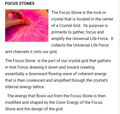
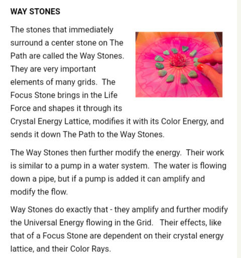
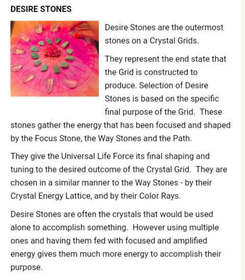
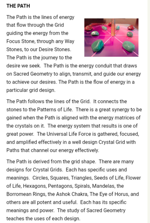
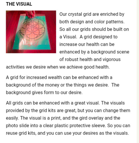
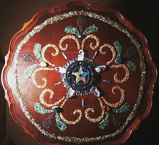
4 notes
·
View notes
Text
Five ways to use ceramic tiles
Five ways to use ceramic tiles tips, Building material advice, tiling help guide
Five ways to use ceramic tiles guide
22 July 2021
Ceramic tiles are popular in construction due to their durability and ease of maintenance. Being composed of a mixture of sand, quartz, water, and other clays, they offer a sturdy, water-resistance material that can be extremely versatile in its appearance. Generally, ceramic tiles are made with red, white, or brown clay, and are slightly less dense than alternative tiles.
There are many ways to use ceramic tiles due to their versatility, but this article will cover five of the key areas.
Flooring
One of the most common uses of ceramic tiles is for flooring. This is for various reasons, but it mostly centers around the way it remains intact. Ceramic tiles are extremely hard and durable, meaning they will not wear from foot traffic, unlike wood and carpet.
Ceramic tiles are also very good at conducting heat. Whilst some may consider their coldness to be a disadvantage, it allows for great cooling opportunities in summer when using AC. Alternatively, they heat up very easily when running hot water under them – like the Romans used to.
MindTile is a place in which many different ceramic tiles can be found for flooring – and other uses – and display the versatile possibilities it can offer, particularly in terms of aesthetics. They’re also very pet friendly.
Backsplashes
Backsplashes are the line of defence behind a stove or hob to protect the wall from the steam, smoke, and splashes when cooking. Ceramic tiles are absolutely ideal for this because of how easy they are to wipe clean. Very quickly, they can return to looking brand new and will not be damaged by things like smoke and oil splashes, and they are fully waterproof.
Of course, the decorative potential also makes them a popular choice for backsplashes too, as they’re easy to install to size and create interesting designs. Unlike glass backsplashes, which are very difficult to cut to size and install – and the material itself usually costs more too. Furthermore, ceramic tiles can easily become an extended backsplash across the entire kitchen wall, seeing as they’re so easy to install and extend on the fly.
Wall tiling
Ceramic tiling of walls has always been popular in bathrooms because it offers water resistance, easy-to-clean, and nice designs – just like the backsplashes. However, the benefits of the ceramic tile are starting to be realised around other areas of the home, such as bedroom walls.
Originally this may seem strange, but not if you consider the different materials and designs that can be achieved by the tiles. They can create appearances of cement, wood, metal, marble, and stone – many materials that can look stunning on a bedroom or kitchen wall. They can achieve an ultra-modern monochromatic look for a bathroom or a traditional rustic wooden look.
Of course, let’s not ignore the Mediterranean appearances that can be achieved with patterned ceramic tiles, such as Greek Meander or Spanish mandalas. Whilst ceramic tiles have a reputation for being modern, they can be used in alternative ways too, such as bohemian and romanesque.
Countertops
When constructing countertops, granite, quartz and wood all come to mind. However, ceramic tiles are extremely functional and are becoming increasingly popular for countertops due to their head resistance. It’s also understood that using large tiles can cut down on cleaning time, so less grout is in the way. In fact, coloured grout is often used to accentuate the tiles too and can hide dirt better.
Countertops tend to require the cutting of tiles because of their small size, unlike walls and flooring. It’s important to take into account the cut tiles when picturing what the end result will look like.
Decoration
We can take inspiration from all of these different uses, and all the accompanying designs, to create unique decorations that express our personalities. They’re a relatively quick way to completely change the dynamic of a room and increase the texture and feel.
We can create feature walls, murals (even by painting onto the tiles ourselves), and table runners. In fact, we can use leftover tiles for coasters, fridge magnets, planter boxes, bookshelves, tables, and many other creations. Mixing and matching designs are easy too, as many places sell tiles individually. They’re also very easy to place into the frame without actually installing them – so we can see exactly what they will look like in context prior to installing.
Final Word
Whilst porcelain tiles have their place in the home too, ceramic tiles are generally preferred for being less hard-wearing and abundant in modern designs. Generally, you will find many more adventurous and interesting designs with ceramic tiles, making them more versatile for a variety of uses. Of course, they are cheaper than porcelain too, which is important when looking at construction.
Generally, ceramic tiles are easier to cut, shape, and are available throughout Europe. It’s important to understand the difference between glazed and unglazed when choosing which tile to purchase, with the former being more protected and long-lasting, yet less rustic and artistic.
Comments on this guide to Five ways to use ceramic tiles article are welcome.
Building Articles
Gardens architectural designs
House designs
Interior designs + architects
Comments / photos for the Five ways to use ceramic tiles help guide page welcome
The post Five ways to use ceramic tiles appeared first on e-architect.
0 notes
Last Seen Blogs

shadowfox7651
Untitled
skinnyelflacoalf
a l f y

adorkable93
Daddys Good Little Girl
germaniccelt
WYRD

boredassinn68
just got to be me